Web style guide
Version 1.0
Layout
Responsive design
These sites have been designed to responsively reformat according to the screen size of the device used to access them. The maximum width of each page is 960px. As screen sizes reduce, the content is resized to fit the available space until at 767px pixels, the layout snaps to a different template for mobile devices such as tablets and smart phones.
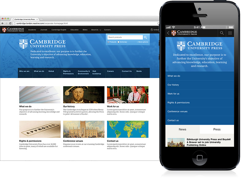
Hierarchy
Because pages reduce to a single column on mobile devices, it is important to consider where elements are located on the page as this will be different for mobile and desktop users. Mobile users have unique requirements so it is best to plan the content hierarchy for these users first and then consider the desktop layout.