
INTRODUCTION
The GUTE ORDNUNG (Good order, 1538–50s), an etched writing manual published by the Nuremberg schoolteacher Johann Neudörffer the Elder (1497–1563), features prominently in Michael Baxandall's Limewood Sculptors of Renaissance Germany. Footnote 1 In pursuit of the “period eye,” the shared visual sensibilities that would attune contemporaries to aspects of artworks not immediately obvious to later viewers, Baxandall noted a dearth of coeval critical terminology on the aesthetics of German Renaissance sculpture and instead widened his search for appropriate written sources.Footnote 2 These included Neudörffer's pedagogic preamble to the Gute Ordnung with its detailed illustrations and step-by-step instructions on the composition and character of lines and their assembly into words, rows, and entire pages of writing (fig. 1). Beyond comparisons of calligraphic flourish with “florid” displays of bravura in the folds of contemporary sculpture, however, Baxandall had to concede that Neudörffer's linear aesthetics could only be applied in very general terms to the three-dimensional works at the core of his study.Footnote 3 The “exaggerated attention to line” Baxandall identified as a broader characteristic of German Renaissance art, in turn, has been an enduring theme in scholarly literature on contemporary drawings and prints, the two media most closely related to Neudörffer's artistic practice.Footnote 4 Here, the works of Albrecht Dürer or Albrecht Altdorfer in particular are often described as calligraphic—either in reference to their nondescriptive flourish or, more generally, in relation to their overall linear bravura.Footnote 5
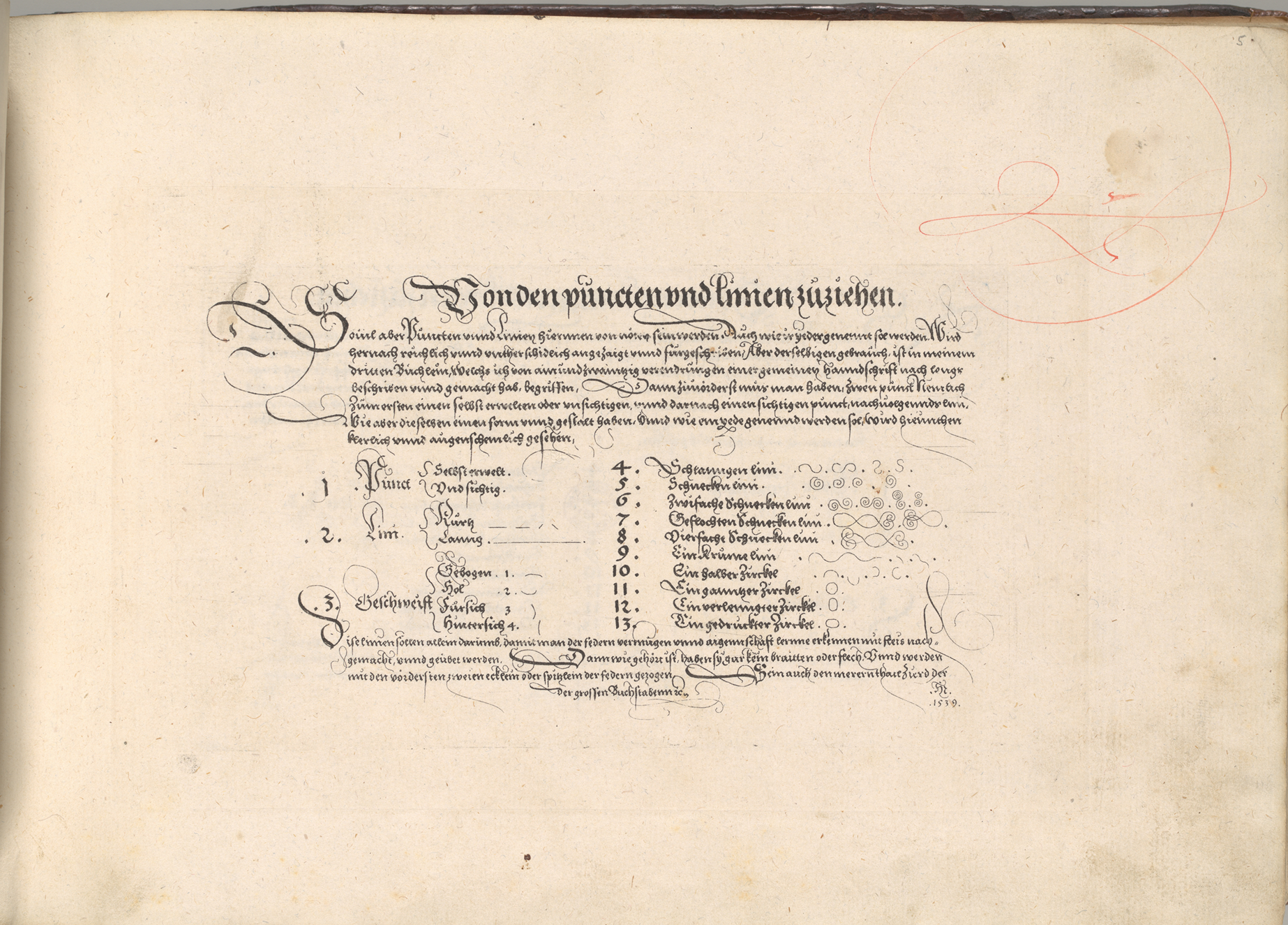
Figure 1. Johann Neudörffer the Elder. Von den puncten vnd linien zuziehen, 1539. Counterproof (corresponding to fig. 18) from Gute Ordnung, Nuremberg, 1538–50s. New York, Metropolitan Museum of Art, Department of Drawings and Prints, 28.106.28.
The present study proposes a more literal application of Baxandall's period eye, suggesting that the detailed terminology of Neudörffer's manual can provide insights into how sixteenth-century viewers may have seen lines and verbalized their perceptions. As one of the earliest German calligraphers to adapt his art from the late medieval craft system to the classroom or beyond through printed manuals, Neudörffer transformed the closely guarded trade secrets of beautiful writing—formerly passed on solely to apprentices in a workshop—into a teachable skill, available to all prospective students and applicable in a range of professions.Footnote 6 Writing masters like Neudörffer shaped visual skills by teaching literacy (and therefore the formation and perception of linear marks) to ever-wider segments of urban society, including both producers and viewers of art. Rich merchants, the educated urban elite, and nobility all amassed collections of graphic art in the sixteenth century, and had often received calligraphic training in schools like Neudörffer's. This education in forming beautiful written lines, it will be argued here, also contributed to turning them into sophisticated consumers of linear beauty in figurative art.
In addition to providing insights into how early modern artists conceived and their viewers perceived such lines, the Gute Ordnung is also a masterpiece of sixteenth-century printmaking in its own right (fig. 2). A closer study of the manual reveals that beyond calligraphic flourish or masterful handling of line, Neudörffer's etchings share with near-contemporary figurative works on paper a conspicuous engagement with technical ingenuity and aesthetic effect. Like Hans Burgkmair's or Dürer's early etchings or Altdorfer's landscape prints and drawings, Neudörffer's images of writing are acutely self-aware of their form and medium.Footnote 7 Careful analysis shows how the Gute Ordnung lays open the processes of its creation, from the conception of lines and the manual mark making on the plate to the traces of mechanical reproduction evident in the printed samples of handwriting. The resulting blurring of boundaries between printed and drawn lines in Neudörffer's manual repeatedly calls attention to the possibilities and limitations of etching as a medium for recording the hand of the artist that Dürer and Altdorfer had experimented with and that a new generation of printmakers like Augustin Hirschvogel would pursue from the mid-1540s. Placing Neudörffer among these artists not only lends us a period eye for their oeuvres, but also accords Neudörffer a prominent role in the history of sixteenth-century German graphic art.
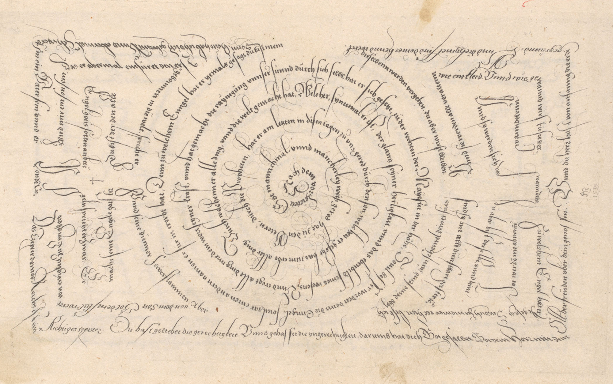
Figure 2. Johann Neudörffer the Elder. Labyrinth, 1539. Counterproof (detail) from Gute Ordnung, Nuremberg, 1538–50s. New York, Metropolitan Museum of Art, Department of Drawings and Prints, 28.106.28.
EARLY PRINTED WRITING MANUALS
The publication of writing manuals or model books like Neudörffer's Gute Ordnung was prompted by a growing demand for literacy, particularly among urban populations at the turn of the sixteenth century.Footnote 8 In cities like Nuremberg, numerous private German schools proliferated alongside city- or church-run Latin schools and catered to a market fueled by the increase in written communication for both business and personal purposes. Due to Neudörffer's renown as a scribe, mathematician, and teacher, the school he ran from the late 1510s until his death in 1563 at his residence in Nuremberg's affluent Saint Sebald neighborhood was considered a particularly prestigious establishment that attracted both local students and boarders.Footnote 9 Most pupils were between six and ten years of age if they were sons of craftsmen, or teenagers if they were the offspring of merchant families and had attended Latin school first, although more mature students were also readily accepted.Footnote 10 The curriculum was largely practice oriented, with reading, writing, arithmetic, and grammar as the core subjects. Though the term Modist for a scribe proficient in a range of hands suited to different purposes was widely used for school teachers, it was particularly appropriate for a writing master of Neudörffer's status, who managed to present no fewer than forty-eight variations of the capital letter K on a single plate in his Gute Ordnung. Neudörffer trained merchants- and craftsmen-to-be how to keep books or how to compose letters or contracts in Kurrent, a cursive hand for daily use.Footnote 11 Those studying for positions as professional scribes were also schooled in formal chancery (Fraktur) or possibly Italianate antiqua and rudimentary Latin. Remarkably—and in keeping with his school's distinguished reputation—Neudörffer offered additional instruction in fencing and music to his well-to-do students.Footnote 12
The copying of model texts supplied by schoolmasters had been a keystone for teaching writing since classical antiquity.Footnote 13 By the early sixteenth century, teachers had diversified the traditional incision of grooves into wax tablets to a range of new techniques, including tactile guidance through indented cardboards and cardboard cutouts mounted with string that would control the proportions of letters and the even flow of lines. Erasmus of Rotterdam (1466–1536), who described these methods in his pedagogic treatise De recta Latini Graecique sermonis pronuntiatione dialogus (On the correct pronunciation of Greek and Latin, 1528), also suggests that students might copy their master's writing by tracing through transparent sheets or by writing over samples in a light blue vegetable dye with a darker, brown ink.Footnote 14
While Neudörffer would have produced such handwritten samples for his students to copy in the classroom, he also explored the mechanical production of sample texts from the start of his career. In 1519, at the age of twenty-two and within a year of opening his school, Neudörffer published the Fundament (Foundation), a collection of woodcut images of his writing that constituted the earliest printed model book for scripts north of the Alps (fig. 3).Footnote 15 Neudörffer's foray into the mechanical production of cursives may have been prompted by high demand for his writing samples. His Italian contemporary, Ludovico degli Arrighi (1475–1527), similarly indicated in his Operina (Little work), a manual on chancery cursive published in 1522/23, that “because it was impossible to create sufficient models in my hand to satisfy all [requests], I sought to find this new invention of putting letters into print.”Footnote 16

Figure 3. Johann Neudörffer the Elder. Fundament, Nuremberg, 1519. Woodcut and pen and black ink. Nuremberg, Germanisches Nationalmuseum. 40 W.952 (Post Inc.).
Printing could certainly lighten the repetitive task of writing out samples by hand for large groups of students. At the same time, it opened up new markets by allowing for a potentially wider distribution of model sheets to advertise skill beyond the classroom, or indeed beyond Neudörffer's immediate circle in Nuremberg. Besides efficiency or commercial gain, Neudörffer must have also shared Arrighi's professed delight in displaying technical ingenuity by devising new methods for translating handwriting into print. How much pride—and competition—technical innovation could prompt in this period is well established through famous instances of deceit in sixteenth-century printmaking. Both Lucas Cranach the Elder (1472–1553) and Urs Graf (ca. 1485–1529), for example, are known to have altered dates on a color woodcut and an etching respectively to claim the invention of a new technique for themselves.Footnote 17
Neudörffer had gained his first insights into printing script when he contributed type designs to the Triumphal Arch of Maximilian (1515–18), one of the ambitious woodcut projects that defined the final years of the emperor's reign.Footnote 18 Maximilian I (1459–1519), who was sensitive to the formal and aesthetic properties of handwriting and prided himself on his calligraphic training, had repeatedly commissioned leading printmakers to produce printed texts that imitated manuscripts, such as his Prayer Book (1513) or the Theuerdank epic (1517).Footnote 19 In order to achieve a convincing manuscript look in these letterpress books, calligraphic flourishes were cast in type, and up to eight variants of individual letters provided. These imitated the slight variations in handwritten lines and in so doing they negated the inherent characteristic of print as a stable medium capable of accurate repetition.
In his Fundament, Neudörffer achieved a similar printed approximation of manuscript text, albeit by different means. Rather than assembling movable type modeled on handwriting into letterpress text, samples of Neudörffer's hand were cut into woodblocks as images of written words. From a technical point of view, this was an extension of a practice already familiar from late fifteenth-century blockbooks, where text was cut alongside images into the woodblock. Yet, while blockbooks catered to a popular audience and were often crudely cut, cheaper alternatives to letterpress books, the Fundament offered exquisite impressions of Neudörffer's handwriting.Footnote 20 Here, text did not serve an auxiliary, interpretive role to the image, but text was the image.
To produce matrices for the Fundament, Neudörffer would have written either on the wood itself, or he may have transferred lines written on a piece of paper to the block. The process probably resembled that described by the late seventeenth-century writing master Peter Tidemann, who suggested writing in an easily transferrable ink made from water and soot before placing and pressing the paper facedown on a block prepared with white wax for maximum contrast.Footnote 21 For the following step, the cutting of a relief image by removing all surface areas around the script, Neudörffer hired one of the leading blockcutters of the period, Hieronymus Andreae (1485–1556).Footnote 22 The two men had recently collaborated on text designs for Emperor Maximilian's Triumphal Arch and would later join forces on the design for an influential Fraktur typeface that was chosen by Dürer, another artist versed in the construction of letters, for his 1528 Treatise on Proportions. As Neudörffer acknowledged in his biography of the blockcutter, Andreae was unsurpassed in translating writing into print, from the swelling or tapering produced by the angling of the pen to the delicate yet dynamic lines of Neudörffer's calligraphic flourishes.Footnote 23 A quest for authenticity, rather than concerns over the quality of the earlier woodcut facsimiles of his handwriting, is therefore likely to have contributed to Neudörffer's eventual decision to switch to etching for the Gute Ordnung two decades later. Again, there are parallels to Arrighi's Operina. Like Neudörffer, Arrighi had managed to secure a highly accomplished printmaker for his woodcut project: Ugo da Carpi (fl. 1502–32) had produced the first Italian chiaroscuro prints and was entrusted with translating the designs of Raphael (1483–1520) and Titian (ca. 1488/90–1576) into print.Footnote 24 Despite da Carpi's undoubted credentials, however, Arrighi apologized to his readers that, though he had striven to provide a likeness of handwriting, “print cannot in all respects represent the living hand.”Footnote 25 If what Arrighi described as the “living hand” was also of concern to Neudörffer, then etching was its closest approximation, because it allowed for the production of transmissions, rather than translations of his handwriting in the Gute Ordnung. Without intervention from a blockcutter, Neudörffer could write directly into the wax layer covering his copper plates, thereby exposing areas of the metal that would be bitten once it was placed into an acid bath. The result was a plate containing the very marks Neudörffer's hand had produced on the printing plate, not lines cut into the block by even the most proficient intermediary.
THE PHENOMENOLOGY OF WRITING
Based on this similarity of facture of etched and drawn mark, I will temporarily suspend the distinction between written and printed line for a discussion of Neudörffer's linear aesthetics in the Gute Ordnung.Footnote 26 For, a second advantage of etching—besides the faithful transmission of marks left by a “living hand”—was its inherent allusion to process, rather than completion. A growing body of evidence suggests that by the early sixteenth century, educated urban or aristocratic collectors in Northern Europe were familiar with basic principles of both woodcut and etching and interested in their technical innovations. Developments in color woodblock printing were discussed in a correspondence between Emperor Maximilian's secretary, Conrad Peutinger (1465–1547), and Frederick the Wise in 1508 and contributed to the ensuing competition between Frederick's court artist, Lucas Cranach the Elder (ca. 1472–1553), and Peutinger's Augsburg compatriot Hans Burgkmair the Elder (1473–1551), the de facto imperial court artist.Footnote 27 In 1522, the humanist Frans Cranevelt (1485–1564), who appears to have had an interest in metalworking, received a letter from Gerard Geldenhouwer (1482–1542), a historian in the service of Philip of Burgundy (1464–1524), asking him to share his recipe for a copper mordant with the artist Jan Gossaert (ca. 1478–1532).Footnote 28 The Basel lawyer Basilius Amerbach (1533–91), who was particularly interested in artistic processes, kept burins and other metalworking tools alongside his collection of about four thousand prints.Footnote 29 And the compiler of an inventory of the study of Ottheinrich, Count Palatine of the Rhine (1502–59), consistently distinguished among woodcuts, engravings, and etchings and clearly considered these differences worth recording.Footnote 30
Such technically versed readers could have sought out comparisons between Neudörffer's translation of writing into woodcut and etching. Although the Fundament is now rarer than the Gute Ordnung (with only six surviving copies, compared to the later manual's eighteen), documentary evidence suggests that Neudörffer continued to print both works on demand into the late 1550s. Two surviving copies of the Gute Ordnung are bound with sheets from the Fundament.Footnote 31
Sophisticated viewers would have been aware that while the Fundament woodcuts showed facsimile images of completed calligraphy sheets Neudörffer had submitted to the blockcutter, the Gute Ordnung etchings recorded their own creation. They could reimagine how Neudörffer's hand had moved across the plate, where he had lifted the pen to apply it afresh in a separate stroke, where the pen had been angled to produce a broader stroke, or where the line work deposited in the initial etching process had been complemented by very fine drypoint work that was scratched directly into the copper plate.
This interest in a living hand recording a traceable process was shared by near-contemporary draftsmen, as David Rosand, Alexander Nagel, and others have shown in recent years.Footnote 32 In German art, such phenomenological aspects are particularly evident in the oeuvre of Albrecht Altdorfer.Footnote 33 Neudörffer and the Regensburg-based painter possibly knew each other because both had contributed to Emperor Maximilian's Triumphal Arch around 1518, and by the 1530s Neudörffer and Altdorfer were in the service of their respective city councils and may have crossed paths in administrative roles.
Altdorfer's drawings, such as his Saint Christopher Carrying the Christ Child (1512) in London, are characterized by what David Rosand has so aptly described as an “aesthetic of openness, of form and facture” (fig. 4).Footnote 34 In part, their bravura—sometimes described as their calligraphic nature—lies in the obvious speed with which Altdorfer's drawings were executed, and therefore the acuteness with which they evoke the artist's mastery of line and his ability to sketch an idea seemingly close to the moment of initial inspiration.Footnote 35 Viewers could trace the sequential genesis of the London Saint Christopher and other sheets like it through its layers of hatching or line work, from the thin, still-searching lines of the background landscape or the top of the saint's billowing cloak, to the thicker, more purposeful shading of his figure and the impasto of the white highlights.Footnote 36 They could perceive the speed with which lines were executed and even trace the temporal sequence and direction of individual lines where ink or body color eventually faded as their load on the pen had run out. By their very nature, the curved forms that dominate Altdorfer's drawing implied movement and transformation. Following the twisting and winding strokes that describe the fluttering folds of the saint's cloak, viewers could trace how the pen in Altdorfer's hand had changed angle and direction on its journey across the page. Similarly, the heaviness of the white bodycolor lines on the surface of the water or the outline of the saint's shoulder produced by the firmer application of the drawing tool not only described strong light or form, but served to lend kinetic emphasis to the core of Christopher's legend. This was, after all, the story of a ferryman of great stature who increasingly struggled to reach the far shore. The horizontal blocks of white in Altdorfer's sheet render the water gloopy and burden the strong man, showing the effect of the Christ Child's pressing gesture and the downward pulling lines of his tunic and feet. To an attentive viewer, the story of impeded movement was vividly expressed in the tension between dynamic and heavy line.

Figure 4. Albrecht Altdorfer. Saint Christopher, 1512. Pen and black ink, heightened with white, on dark brown prepared paper. London, British Museum, 1925,0509.1.
Although Altdorfer's virtuoso performance was as far removed from the precepts of a manual dedicated to teaching its readers the active skill of emulating linear marks, as a jazz pianist's improvisations are removed from a novice encouraged to practice their scales, both works share a concern in visualizing process and linear variety. While Neudörffer's Fundament had still acted as a pure model book intended for copying as part of medieval didactics of imitation and was complemented by in-class teaching, the Gute Ordnung fit a broader pattern of writing manuals that strove to explain the genesis of letters through the illustration of composite elements.Footnote 37
Though unusual in its explanatory depth and its detailed visual representation of individual steps, the Gute Ordnung was not the first publication to propose this new methodology. As early as 1522, Arrighi had articulated a rudimentary system of breaking letters into purely formal elements of straight and slanted lines in his Operina.Footnote 38 In 1525, the Silesian calligrapher Fabian Frangk (ca. 1489–1538) had called for a didactic based on the combination of basic formal elements of letters in his Schreibe Kunst (The art of writing).Footnote 39 And Erasmus of Rotterdam had advocated the teaching of individual pen strokes and explained the familial links between letters in terms that foreshadow Neudörffer's methodology in his aforementioned pedagogic dialogue on the correct pronunciation of Greek and Latin.Footnote 40
The first fourteen plates of Neudörffer's manual constitute a preamble that lays out his didactics and illustrates the process of forming letters. Neudörffer begins with advice on how the pen should be prepared and held before describing the basic marks of which all letters are composed (fig. 1).Footnote 41 He distinguishes between dots and lines that are created by the edge of the pen's nib, and broader marks, or planes (“superfities”) that result from the entire width of the tip being moved at an angle to the surface. Alongside samples of individual elements and their meticulous labeling, from wound helical lines (Geflochten Schneckenlinie) to squashed wound circle surfaces (Verlenngte gewundene Zirckelflech), Neudörffer provides introductions to the distinguishing characteristics and production of each type of line or planar figure. At this stage, mark making is still divorced from the purpose of constructing letters. Instead, Neudörffer writes that “these lines should be diligently copied and practiced solely so that one may learn and appreciate the pen's potential and attributes.”Footnote 42 In other words, they are both finger exercises that familiarize the student with how hand and tool move across the page, and visual exercises that hone awareness of individual lines and geometric shapes that will eventually form letters.Footnote 43
Neudörffer goes on to introduce the first of two organizing principles for letters. He initially divides the alphabet into six dispersals (Zerstreuungen) based on their shared first planar mark. The first dispersal, for instance, comprises the letters o, d, t, a, and q, because each begins with a regular circle surface. Each subsequent stroke is numbered and depicted in isolation before the full-formed letters are illustrated in the final step (fig. 5). This sequencing of individual pen marks is shown for every letter of the alphabet in cursive, chancery, and Fraktur, which are, respectively, labeled ordinary (gemain), wound (gewunden), and broken (gebrochen) transformations according to variations (Verwandlung) in their ductus—i.e., the way in which the hand moves the pen across the page.
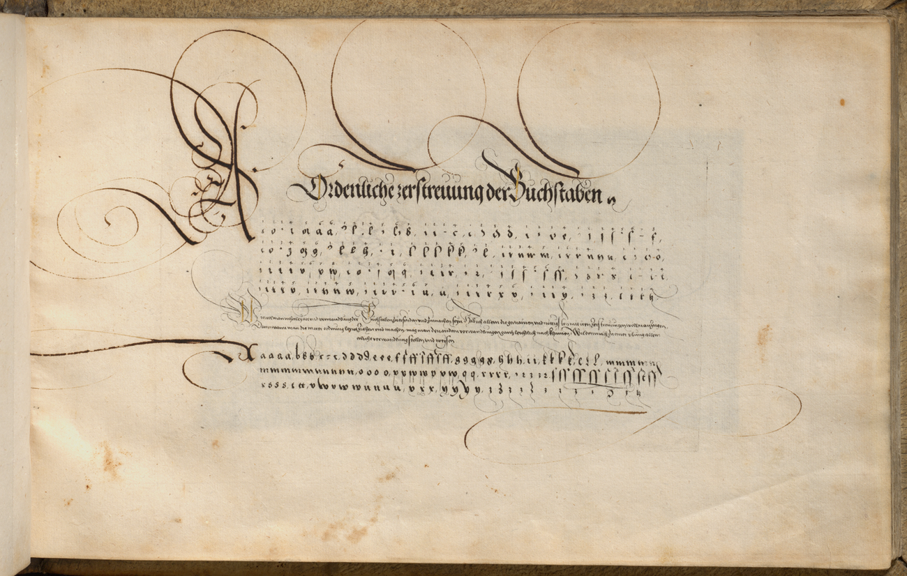
Figure 5. Johann Neudörffer the Elder. Ordentliche zerstreuung der Buchstaben. Counterproof (corresponding to fig. 13) with pen and ink and gold heightening from Gute Ordnung, Nuremberg, 1538–50s. Nuremberg, Bayerisches Gewerbemuseum, LGA-Gew.Mus. 3647.
Following this first, analytical organizational scheme, Neudörffer draws on a second, visual system that requires close observation from his learners, as he groups letters by overall shape, rather than initial pen strokes for his divisions (Zerthailungen). V and r, for example, belong to a division characterized by their pointed base, l and h to another on account of their looped upper stroke.Footnote 44 The purpose of these divisions is to illustrate how each letter “grows out of another.”Footnote 45 A short vertical shaft thus forms the letter c. A dot turns the c into an i. If the short shaft of the c is doubled, the letters n or u are formed. If the distance between the two parallel shafts is reduced, the result is an e. If the single shaft of the letter i is extended with a lower loop, it becomes a j, etc. Finally, Neudörffer turns to relations between individual letters. The comparisons of letters (Vergleichung der Buchstaben) ensures they are proportionate to each other, while their joining (Anhengkung) details how they should be connected. A sample line linking various letters of the alphabet with a double letter m (ammbmmcmmdmm, etc.) illustrates the importance of an overall even appearance of lines and accordingly blocks of text (fig. 6). Only once these basic principles have been laid out for lowercase letters does Neudörffer turn to capital letters and versals and their variations, now listing these in alphabetical order.

Figure 6. Johann Neudörffer the Elder. Zusammensetzung. Counterproof with pen and ink from Gute Ordnung, Nuremberg, 1538–50s. New York, Metropolitan Museum of Art, Department of Drawings and Prints, 28.106.28.
On account of this extensive preamble, the Gute Ordnung could act as a stand-alone manual with a broad geographic reach. Repeated references to pupils in the third person indeed suggest that Neudörffer envisaged other writing masters among his potential readership and hoped for a wider adoption of his pedagogic inventions in other German schools. At the same time, the preamble's detailed examination of Neudörffer's orderly, controlled lines lent itself more broadly to the close appreciation of much more expressive mark making in figurative images, such as Altdorfer's drawings.
GUIDING THE GAZE
The acquisition of fine penmanship brought with it not only the active skill of writing well, but also an eye for the elegance of letters based on their constituent parts and individual forms, as well as the proficiency with which letters were arranged into words or the layout of entire pages. Correspondingly, the circa forty writing samples that concluded the Gute Ordnung served a dual function as both model texts for students to copy and as artworks in their own right that testified to Neudörffer's supreme skill and invited active contemplation.Footnote 46
At times, the Gute Ordnung indeed acts as an illustration of the art of writing, rather than a pedagogic manual.Footnote 47 This is particularly evident in bravura pieces, such as the Labyrinth, where Neudörffer has shaped a quotation from Hebrews 1:1–14 into a text-image or calligram (fig. 2). Alongside the moral education of the young, religion features heavily among the token topics for Neudörffer's model sheets. In the image of a labyrinth, however, content merges with form to create meaning since the reader is led on a journey through a maze whose text path progressively reveals the abiding lesson of the biblical verse, God's supremacy on earth, as a guiding force that sustains the faithful on their meanderings in this earthly life.
The text winds outwards from the center and extends into the rectangular frame in the lower right corner, where it morphs into a bracket that initially echoes the circle along its inner edge, before forming a narrow rectangle composed of two lines. It descends briefly into the outer frame via an extended versal V, only to ascend again into the opposite small rectangle of the upper right corner, where it proceeds in a mirror image of the first corner. The text thus forms an orb surmounted by a cross, the first of two references to Christ's sacrifice that offer comfort and a way out of the labyrinth to the reader. The verse then winds outwards to allow the exterior line to extend to the left side of the sheet, where the pattern is repeated with the small but significant variation of the angled internal lines, which now form feet. Again, the calligram carries religious symbolism, as in contemporary German art, a pair of hovering feet commonly denoted Christ's Ascension.Footnote 48 To allow writing to progress from left to right, the orientation of letters in the brackets switches between outward and inward facing. The text therefore requires kinesthetic participation and close viewing to unlock its content: as the reader travels through the labyrinth, they need to rotate the page to trace the lines just as Neudörffer would have turned his plate to write them.
In his Gesprechbüchlein (Little book of dialogues), a textbook on the art of writing published in 1549, Neudörffer would provide a veritable checklist of how to judge elegant scripts.Footnote 49 In essence, however, all of these criteria were already outlined in the Gute Ordnung preamble. Viewers were to admire the meticulous distribution of writing and ponder the complexities of handling lines that at times wind, take sharp turns, or flip back on themselves. In this complex labyrinth layout, the size and form of letters are perfectly even, unless variation serves to connect text elements in the outer brackets. Closer observation reveals that with the exception of the purely ornamental webs of delicate calligraphic flourish, every single mark on the sheet references the overall pattern. All letters incline towards the center, slanting forwards (gesenkt) or backwards (gelegt) in the outer corners before turning upright again at the center of both the short and long edges of the sheet. Elongated ascenders and descenders refer back to the text's origin at the center by tying individual lines of text together, while also emanating outwards like rays—perhaps as a reflection of Christ's radiance of God's glory, as described in the text's second verse. The course of the spiral as implied by its content suggests a strong centrifugal dynamic, counterweighted by ascenders and the directionality of the script, which has been flipped inwards. The effect is a general impression of poised energy, or the power of Christ's word that upholds the universe.Footnote 50
While Neudörffer's elaborate and tightly controlled linear constructions shaped text into pictures, contemporary pen-and-ink drawings, such as Altdorfer's Mountainous Landscape with Willows (ca. 1511), had begun to blur the line between mimesis and calligraphy (fig. 7).Footnote 51 Like Neudörffer's Labyrinth, Altdorfer's sheet was in all likelihood a presentation piece produced as a testament to his supreme mastery of the pen.Footnote 52 The broad, heavy strokes in this landscape indicate untamed vegetation—for example, in the long grass at the foot of the fallen tree on the right, or indeed in the dense lines of the thick pollard and untended foliage under whose weight the old willow is buckling. By contrast, domesticated nature and signs of civilization, like the sparse outlines of buildings, were formed with the edge of the pen in order to produce thinner, drier lines. On the far right, the unruly willows have been tamed into both reeds and poles for a fence, two possible applications of branches and twigs harvested from pollard trees. In the meantime, the monumentality of the mountain ranges in the background is captured with great economy, as absence of line indicates mass.

Figure 7. Albrecht Altdorfer. Mountainous Landscape with Willows, ca. 1511. Pen and ink. Vienna, Akademie der Bildenden Künste, Kupferstichkabinett, HZ 2518.
Drawing on their own muscle memory of how the pen is held, how the nib is placed on the page, and how much pressure is required to release varying amounts of ink, sixteenth-century students of fine writing would have had an almost visceral connection to the expressive energy of Altdorfer's work and the diverse character of his lines. The rhythmic switch between left and right in the grassy ledge at the willow's base may have reminded sixteenth-century viewers of back- or forward-leaning writing described by Neudörffer as gelegt and gesenkt. They also would have been sensitive to the speed with which the unruly, curling squiggles on the pollard must have been drawn, as if the roughness of its subject had threatened to scramble control of the pen from the artist's hand. Finally, a period eye may have perceived the drawing as infused with writing, as woodland stretches diagonally across the middle distance like a body of text. Arranged into distinct lines, Altdorfer's trees form sequences of what might be ascenders of the letters s or t with occasional shorter corpus sizes that resemble vowels. Similarly, the contours of the mountain range materialize as written ridges, and the ground near the willows’ trunks is inscribed with impenetrable scribbles. This was not, however, one of the measured and tightly controlled scripts taught by Neudörffer. It was much looser, more agitated work that implied a hand capable of both capturing and harnessing wildness in form and content. Its closest equivalent in Neudörffer's oeuvre would have been calligraphic flourish, the line released from its function of describing letters in purely ornamental, manual free play that complemented rather than contradicted the strict harmony and proportions of the script and together with it formed the written artwork. In all likelihood, sixteenth-century viewers would have been attuned to such displays of ingenuity and virtuosity that turned subject matter into an excuse for the line: landscape served as a vehicle for Altdorfer's linear mannerisms and Bible verses provided an opportunity for displays of Neudörffer's superb penmanship.Footnote 53
THE SISTER ARTS OF WRITING, DRAWING, AND ETCHING
An elegant script was like a fine picture in that both provided pleasure not only to the author or artist composing them, but also to viewers who studied them, according to Erasmus of Rotterdam.Footnote 54 Drawing and writing were, in fact, considered mutually beneficial during the Renaissance and the term pictor could designate both a painter and a calligrapher.Footnote 55 Nevertheless, there was no mistaking the primacy of writing among the two sister arts. Since the ancient Greeks had taught their youth letters, gymnastics, music, and graphein, a term that could be read as both drawing or writing, art theorists like Leon Battista Alberti (1404–72) sought analogies to writing in their quest to elevate drawing (and thereby painting) to a liberal art.Footnote 56 Aside from its superior social status, the art of writing possessed pedagogic authority. As Georg Miller stated in his 1581 history of script, Wahrhafftige Beschreibung von dem Ursprung der Uralten von Gott gegebnen löblichen Kunst der Schreiberey (True account of the origins of the ancient and God-given, praiseworthy art of writing), writing could provide guidance and instruction to other arts because it accustomed the hand and eye to linear mark making, as well as basic compositional strategies.Footnote 57 Alberti and Leonardo (1452–1519) expounded the pedagogic principles of writing (from letters to syllables and words) for teaching the art of drawing.Footnote 58 In the sixteenth century, Giovanni Battista Armenini (1530–1609) declared that “those who are accustomed to write with a fine hand are considered to have made a certain good beginning in drawing. The better they write, the greater promise they show in drawing.”Footnote 59 In turn, Erasmus had proposed that occasional drawing exercises could offer a ludic element to the teaching of writing and thereby engage students who might otherwise “learn to hate letters before they can make them.”Footnote 60
Given their status as sister arts, it comes as no surprise that (pen-and-ink) drawing and writing should have responded similarly to the emergence of etching whose mark-making implements and processes so much resembled their own. The affinity of pen and etching needle as drawing tools to the movement of the hand across the surface opened up new approaches to printmaking. Three decades prior to Neudörffer's forays into etching, figurative artists already experimented with the new medium's ability to capture and print multiples of a living hand at work.Footnote 61 Even at their most basic compositional element, the line, these etchings differed fundamentally from other prints. Because the stylus could travel across the wax as a pen across paper, artists could show their (drawing) hand, rather than adapting their linear vocabulary to the print medium.Footnote 62 A lighter and more spontaneous touch, or, in Dürer's case, even a certain nervous energy, replaced the much tighter control of overall composition or shading in woodcut or engraving.Footnote 63 Far greater importance was lent to the process of creation and hence the matrix as the site of production, rather than the printed image as its end result.Footnote 64 Dürer's Man of Sorrows (1515), for instance, provides insights into its genesis through both its overall tentative line work and obvious corrections, such as the adjusted outline of Christ's right shoulder.Footnote 65 These alterations could easily have been cleaned up on the wax-covered plate, but they remained as records of the creative process (fig. 8).

Figure 8. Albrecht Dürer. Man of Sorrows, ca. 1515. Etching. New York, Metropolitan Museum of Art, Department of Drawings and Prints, Fletcher Fund, 1919. Acc. No. 19.73.22.
Peter Parshall has charted these fundamental differences through a close reading of lighting and figure placement in Dürer's prints and drawings.Footnote 66 Parshall found that from 1504, Dürer anticipated reversals in his engravings, ensuring that his designs were flipped during their transfer onto the matrix so that the image would appear in its intended bearing in the print. In his seminal Fall of Man, for instance, the extensive preliminary drawings share with the finished engraving not only the position of Eve on Adam's sinister side, but also the symbolic lighting from the left which casts Adam's face into shade as he turns to Eve. Yet, in etching and drypoint, the two techniques that favored lines worked directly into the plate, Dürer disregarded such concerns, producing a mirror-image facsimile of his drawing in the plate. His Christ on the Mount of Olives (1515), for instance, contains several mild dissonances, from the placement of the angel in the upper right, to the fractious-looking tree and the vista opening out onto the landscape with the sleeping apostles on the left (fig. 9). Most viewers are accustomed to seeing this topic illustrated in reverse and this is how Dürer himself had conceived the image in a preparatory pen-and-ink sketch now in Vienna (fig. 10).Footnote 67

Figure 9. Albrecht Dürer. Christ on the Mount of Olives, 1515. Etching. New York, Metropolitan Museum of Art, Department of Drawings and Prints, Fletcher Fund, 1919. Acc. No. 19.73.4.

Figure 10. Albrecht Dürer. Christ on the Mount of Olives, 1515. Pen and ink. Vienna, Albertina Museum, Inv. 3141. www.albertina.at.
Similar inversions occur in a series of landscape etchings by Albrecht Altdorfer that closely imitated the aesthetics of his pen-and-ink drawings of comparable subjects (fig. 11).Footnote 68 Although Altdorfer distributed hatching in his etchings so light would fall from the conventional left in the print, he left other compositional elements untouched. Foreground motifs, such as solitary trees on grassy ledges, often appear on the right, rather than leading the eye into the receding landscape from the left (fig. 12). Pictorial elements can lack clarity, when streams appear to be flowing uphill rather than downhill; and vegetation or clouds seem slightly unsettled, because Altdorfer's shorthand for these features is mirrored, slanting to the left instead of tilting to the right, as in his drawings.Footnote 69

Figure 11. Albrecht Altdorfer. Landscape with a Large Castle, ca. 1520–22. Etching with traces of hand coloring. Amsterdam, Rijksmuseum, RP-P-OB-2978.

Figure 12. Reversed image of fig. 11.
In their etchings, both Altdorfer and Dürer privileged the process of drawing into the wax-covered matrix over the effect of a drawing created through the mechanical means of a printing press.Footnote 70 While the laborious process of engraving demanded control and discipline, etching was characterized by freely flowing lines. The facility with which marks could be worked into the matrix—and record the artist's hand—was not to be impeded by prior mental inversion of the images, even if this refusal to invert could reveal the artificiality of the mechanical rather than manual production of etched lines.Footnote 71 They were multiples of the drawing in the matrix, rather than reproductions of drawings.
The same principles applied to Neudörffer's etchings for the Gute Ordnung, with one fundamental difference. In the figurative images, such inversions in the artist's ductus may only have been obvious to a connoisseur of Altdorfer's or Dürer's drawings.Footnote 72 In Neudörffer's case, however, his preference for writing into the matrix true-sided caused a rather fundamental drawback: it produced mirror writing in his prints (fig. 13). Neudörffer's decision to nevertheless opt for this approach for the majority of his plates may have been influenced by his prior professional exposure to etching as a technique for decorating metal objects.
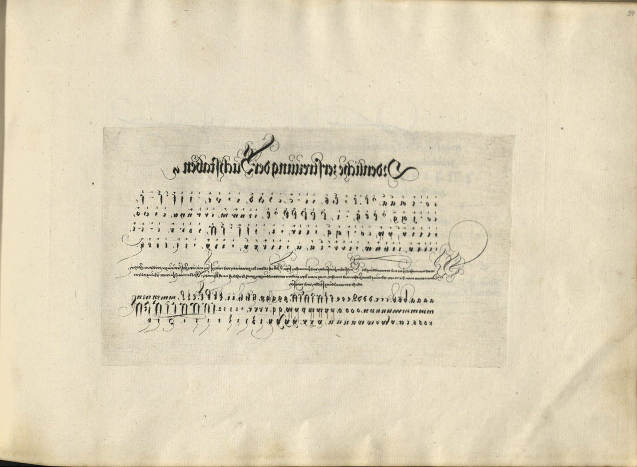
Figure 13. Johann Neudörffer the Elder. Ordentliche zerstreuung der Buchstaben. Etching (corresponding to the counterproof in fig. 5) from Gute Ordnung, Nuremberg, 1538–50s. Cambridge, MA, Houghton Library, HOU F TypW 520.43.603.
THE PLATE AS OBJECT
Neudörffer's transition from etching objects not intended for printing to producing etched matrices is, in fact, typical for the early history of the medium and to some extent typical for a writing master. Etching had emerged as a means for decorating weapons or vessels from the late thirteenth century and flourished as a means of adorning armor by the 1490s, before its practitioners began to apply it to flat iron plates suited for printing.Footnote 73 The first etcher-printmaker, Daniel Hopfer (1470–1536), was trained as an Ätzmaler, a craftsman who painted figurative images and ornament onto armor with a mordant.Footnote 74 Similarly, calligraphers like Neudörffer commonly accepted commissions for etching writing onto metal objects, such as dishes, beakers, or locks. Where fine-grained stone was readily available (including in the cities of Nuremberg and Augsburg), writing masters also etched limestone for tabletops, sundials, calendars, or epitaphs.Footnote 75 In Nuremberg, such interdisciplinary work across a number of traditional professions and materials was facilitated by the absence of a traditional guild system.Footnote 76 Indeed, the proficiency in exercising their calligraphy on various materials and in a range of media, including etching, could become a distinguishing feature for prominent writing masters. A panegyric on the art of writing composed in Nuremberg in 1588, for example, celebrates the skill and precision with which calligraphers could etch limestone, steel, iron, or gold.Footnote 77 And in 1591, the writing master Johann Krafft (d. 1620) produced a panel mounted with samples of his calligraphy on various metals and stone in support of an application to work as a schoolmaster in the southern German city of Ulm (fig. 14).Footnote 78 Neudörffer actively participated in this professional sideline. Although none of the objects etched by him survive, written sources attest to a tabletop inscribed with a genealogy of the Old Testament formerly kept in Nuremberg's city library, as well as a brass “theoria planetarum,” a chart of planetary movements and astrological calculations, for the locksmith Peter Henlein (1485–1542).Footnote 79

Figure 14. Johann Krafft. Demonstration Piece, 1591. Oil on wood and stone; etching on limestone and copper, tin, iron, and zinc (?); reverse glass painting. Ulm, Ulmer Museum, 1932.7095.
Work on the Gute Ordnung plates stretched over a number of years and copies printed between the early 1540s and the late 1550s vary considerably in length.Footnote 80 Three plates carry the date 1538, four are marked 1539, and another two are dated 1541 and 1543 respectively. Linke speculates that the 1538 version of the manual consisted of the six dispersals alongside a dated sheet of versals, as well as some text samples.Footnote 81 This was expanded in 1539 to include the six sheets on points and lines, the forty-eight variants of the capital letter K, as well as the Labyrinth.
The refined linear vocabulary of sheets like the Labyrinth demonstrates Neudörffer's considerable technical experience. For, despite etching's reputation as a technique suited to amateur printmaking (as opposed to woodcut and engraving, which required trained professionals to translate lines into the matrix), it proved to be a rather recalcitrant medium, as Antony Griffiths has observed.Footnote 82 The etched image was as much conditioned by the quality of resist and mordant and their chemical reactions with the metal as it was by the lines drawn into the wax. Even if bitten correctly, designs could look monotonous and lack the swelling or tapering that was typical of contemporary engravings and essential, for Neudörffer's purposes, to forming the surface elements of his letters. Care needed to be taken to work with a range of tools from needles to broader-tipped pens, or to bite different parts of the plate to varying depths to create variations in tone. Neudörffer alleviated many of these issues by choosing a small font size in order to restrict the proportional breadth of lines (his “superfities”) and by adding delicate flourishes with a burin or drypoint needle directly onto the plate once it had been bitten.Footnote 83 These fine additions were possible because Neudörffer had found a mordant suited to biting copper, a metal that was not only less prone to rusting than iron, but which also allowed for the combination of etched and engraved lines and therefore much greater nuance and variation in line. Altdorfer, Dürer, and other first-generation artists experimenting with etching in the 1510s and ‘20s would have been aware of these advantages of copper but had been unable to secure stronger (nitric) acid capable of acting as a mordant. Neudörffer's copper etchings were the first of their kind in Germany and he recorded his recipe in a manual intended for his sons alongside a larger collection of formulas pertinent to the art of writing onto metals, stone, paper, and glass.Footnote 84
In contrast to their duller iron cousins, copper plates also made for attractive objects in their own right, as Krafft's tondi (circular, inscribed plates) in his 1597 panel illustrate (fig. 14). It seems possible therefore that Neudörffer may have conceived of his writing samples for the Gute Ordnung in a dual function: as matrices that could occasionally produce a small number of prints—and as metal showpieces in their own right, similar to the tabletops or plaques he was accustomed to inscribing. When not in use for printing, the copper plates could either have been mounted in frames for open display or stored in wax paper wrapping ready to be shown in all their splendor to future students or visitors to the school.Footnote 85
REVERSALS
In a dedication letter written to Sigmund Held (1528–87), Neudörffer recounts that he had “this winter past again pulled a few more impressions of [his] artistic writings in copper and wood.”Footnote 86 This indicates that Neudörffer himself intermittently printed a small number of copies of both the Fundament and Gute Ordnung. Such self-sufficiency is highly unusual for an amateur printmaker. A century later, when Abraham Bosse (1604–76) addressed his Traité des manières de graver (Treatise on manners of line engraving, 1645) to amateurs wishing to dabble in etching, the understanding was that professional printers would offer their services for the technically complex and onerous procedures of preparing or printing plates.Footnote 87 Yet, given the occasional fingerprint or slippage on his Gute Ordnung plates, Neudörffer probably worked largely unassisted.Footnote 88 He could have found suitable infrastructure for his enterprise on the premises of his brother-in-law, the printer Johann Petreius (1497–1550). Or he may have invested in his own rolling press, despite his infrequent and small print runs. Similar instances of private press ownership are recorded in Nuremberg from the early 1500s onwards and the earliest, locally composed instructions by a professional printer for an amateur owner of a private press date to the early seventeenth century.Footnote 89
Free from the financial constraints of a commercial venture, Neudörffer had produced plates that required ingenious, albeit laborious, approaches to printing in order to render their content legible. One of Neudörffer's methods for reversing his writing was to print on carta lucida—that is, paper rendered translucent through the application of oil. By binding the mirror-written print on the verso of each opening, the writing became right reading and therefore legible through the transparent page on the recto of each previous opening (fig. 15).Footnote 90 Carta lucida itself had long been established as a means for tracing. As early as the 1390s, the Tuscan painter Cennino Cennini (ca. 1360–ca. 1440) recommended translucent paper for teaching drawing in his famous technical manual, the Libro dell'Arte (Book of art, ca. 1400). Erasmus of Rotterdam described transparent pieces of vellum for tracing writing samples in schools in his 1528 pedagogic dialogue.Footnote 91 And in 1579, Samuel Zimmermann would publish a handbook for professional scribes that contained among its technical entries a reference to “painters’ tracing paper” as well suited for classroom practice, because its surface could easily be wiped clean and the paper hence recycled.Footnote 92 Neudörffer himself recorded a recipe for rendering paper translucent in his recipe book and would have been familiar with the pedagogic applications in the classroom.Footnote 93 For the Gute Ordnung plates, he even opted to print some of his carta lucida sheets in red ink, despite the lower visibility of the lighter tone through the paper, possibly in order to mimic the process of a teacher writing outlines in a lighter-colored ink for the student to trace with black ink.Footnote 94
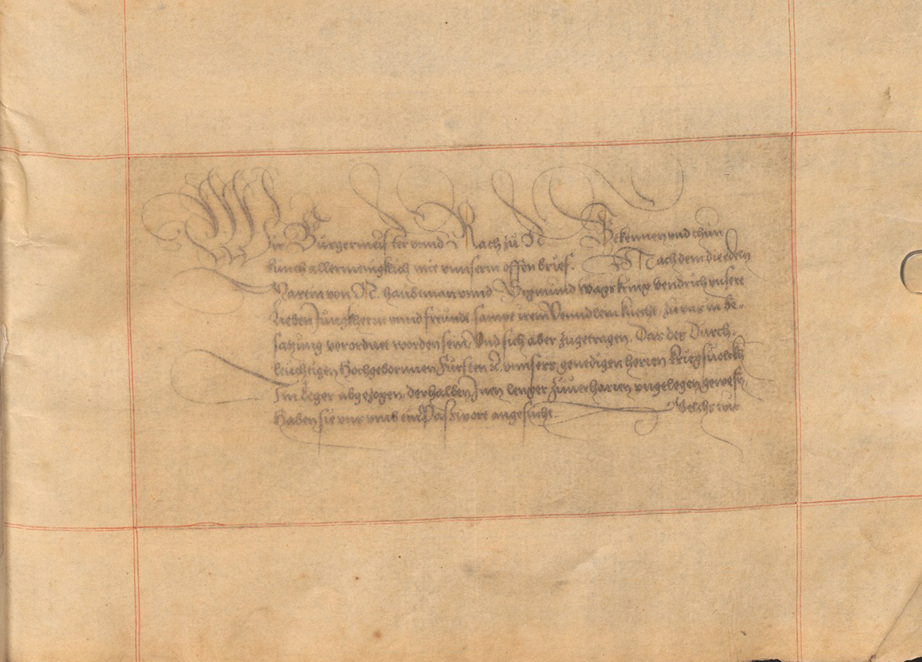
Figure 15. Johann Neudörffer the Elder. Wir Bürgermeister vnnd Rath zu N. Verso of an etching on carta lucida from Gute Ordnung, Nuremberg, 1538–50s. Munich, Bayerische Staatsbibliothek, HS Slg. Chalc. 18.
The novelty of Neudörffer's approach lay in his adoption of carta lucida as a printing surface, rather than a blank sheet to be placed on the intended model for tracing. The paper's translucency allowed Neudörffer to apply a principle familiar from contemporary reverse glass painting: he inverted the printed surface on the verso of the sheet and the viewed surface on its recto.Footnote 95 Though ingenious, the method was not without drawbacks. Full translucency proved to be short-lived as materials degraded and semi-transparent sheets blurred much of Neudörffer's finer line work. Only two copies of the Gute Ordnung on carta lucida survive, suggesting that Neudörffer soon preferred counterproofs as an alternative, print-based approach for inverting mirror writing.
For his counterproofs, Neudörffer placed a blank paper on the etching and ran both through the printing press so that part of the still-wet ink would transfer onto the clean sheet and here show the letters true-sided.Footnote 96 Printed counterproofs were not unheard of in the sixteenth century, but their function and frequency in Neudörffer's oeuvre is. The vast majority of contemporary counterproofs were byproducts rather than the end products of the creative process. Often taken while the line work on the matrix was still unfinished, counterproofs allowed artists to complete or revise their compositions with pen and ink because they created a model that faced the same way as the partial image already worked into the metal and were therefore easier to copy onto the plate.Footnote 97 The only pervasive, sixteenth-century use of counterproofs outside of Neudörffer's oeuvre occurred in the commercial production of large, symmetrical patterns for ornament prints, such as wallpapers. Here, counterproofs served as a cost-cutting measure, because they allowed printers to work with smaller blocks and save on ink while doubling their image output. The only German counterproof predating Neudörffer's work that was taken from a completed composition with the apparent purpose of reversing the design and illustrating the line work as it appeared in the matrix is an impression of Dürer's engraving The Dream of the Doctor (1498) in Washington, DC.Footnote 98
Seen purely in terms of clarity of linear expression, Neudörffer's counterproofs were another unnecessary complication. Their finicky two-step printing process not only doubled the amount of labor, but it could also give rise to both minor snags, such as the greyish hue of the offset ink, or even major ones, such as slippages during the second run through the press. As a professional scribe, Neudörffer would surely have been able to mirror the letters in his mind prior to committing them to the plate, in the same way that a dancer could be expected to perform a familiar routine in reverse. Alternatively, he could have employed a method for inverting writing for printmaking similar to that described in Zimmermann's late sixteenth-century manual in relation to woodcuts.Footnote 99 This involved pasting inscribed, wet parchment facedown onto a matrix covered in white varnish.Footnote 100 Once the parchment had dried, the sheet could be peeled off while the writing remained on the matrix as a visual guide. Fourteen of the Gute Ordnung plates were, in fact, written in mirror writing (fig. 16). As a result, they did not require counterproofs or printing on translucent paper, although Neudörffer occasionally produced such illegible sheets from plates written in mirror writing as visual hoaxes that would test and delight his attentive readers.Footnote 101 The technical complications of counterproofing or carta lucida therefore must have been conscious choices that carried distinct benefits. In addition to allowing for the copper plates to stand as legible, etched artworks in their own right, the use of carta lucida and counterproofs added a medial insight into the workshop, illustrating their respective functions as training tools or intermediary steps in the genesis of artworks.Footnote 102 Such insights would have been valued by collectors of Basilius Amerbach's ilk, who not only regularly purchased workshop contents from preparatory models to tools, but who also ordered his substantial collection of works on paper by placing drawings alongside prints made by the same master.Footnote 103 They would also have appealed to the readers of a popular early etching treatise first published in Nuremberg in 1531 that was addressed to “writers and learned peopled [who] practice manifold crafts” and sought to learn “how one should put writing, images, and other things onto steel, iron weapons and the like both raised and sunken.”Footnote 104
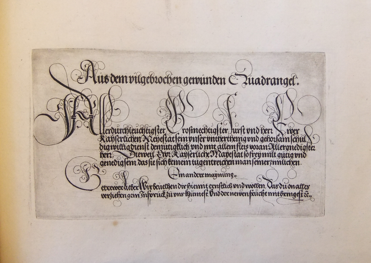
Figure 16. Johann Neudörffer the Elder. Aus dem vilgebrochen gewunden Quadrangel. Etching from Gute Ordnung, Nuremberg, 1538–50s. Cambridge, MA, Houghton Library, HOU F TypW 520.43.603.
While the content of Neudörffer's plates gave insights into the process of making letters from composite marks, the prints as objects drew attention to the process of their making, from alluding to the orientation of writing in the matrix through their own mirrored letters to the successive steps of inverting the orientation of script via counterproofs or translucent paper. And finally, both methods offered practical, pedagogic applications in a manual ostensibly intended for teaching purposes.
INVITATIONS TO LOOK
With the exception of the carta lucida versions, which contain only the etchings on transparent paper, all surviving copies of the Gute Ordnung illustrate both the etched intermediary step and the counterproof end products of Neudörffer's printmaking alongside each other.Footnote 105 However, rather than facing each other in one opening of the book, each pairing was bound on successive rectos, an arrangement that allowed the sheets to be viewed from either side. This was indispensable to how the Gute Ordnung operated and distinguished it from other writing manuals and from illustrated books in general. In popular blockbooks, for instance, unprinted versos of two pieces of paper were commonly pasted together in order to form the recto and verso of one page, while early art books, such as Dürer's Apocalypse (1498), were printed on both sides of the sheet, even though this could cause unsightly interference when traces of text were visible in the negative space of the woodcuts.Footnote 106 The arrangement of intaglio plates as a sequence of single-sheet prints, as well as its unusual landscape format, instead characterize the Gute Ordnung as a close relation of print albums, whose popularity among collectors grew sharply in the mid-sixteenth century. Such albums consisted of series of prints on a shared theme, like hunting or seasonal activities, issued by a single printmaker as a set and published with an engraved title page or short texts inscribed in the plates.Footnote 107
In the Gute Ordnung, this album-like placement served a practical purpose by extending a kinesthetic invitation to the reader. Because the mirror writing of the etching shows through the (relatively thin) paper, faint marks of Neudörffer's now true-sided writing were visible on the verso in the following opening opposite the corresponding counterproof (fig. 17). Students wanting to practice their hand could trace the faint outlines on the verso of the etched sheets before moving on to the more advanced stages of copying freehand from the counterproof rectos and finally graduating to their own repertoire of beautiful lines stored in the mind. Here was a printed rendering of tracing as a pedagogic strategy that could substitute the manual processes of different-colored inks or blind grooves mentioned by Erasmus, or the physical guidance of a teacher's hand that Neudörffer described in his Gesprechbüchlein.Footnote 108 The same hands-on pedagogic function of the Gute Ordnung is highlighted on its title page, where Neudörffer describes the book as a “short lesson on the noblest foundations that youngsters eager to write beautifully and with particular art and skill may learn from and practice with.”Footnote 109 In view of this declared intention, it is remarkable that not a single surviving copy of the manual actually contains such letter tracing by an owner and only some carry attempts of freehand copying.Footnote 110 Partly, this would have been a question of survival: copies used for writing practice were more prone to being discarded, while unspoiled ones were more likely to be preserved. Yet to a certain extent, this passive reception of the Gute Ordnung as a piece of (calli-)graphic art was also due to the principal readership of Neudörffer's book.
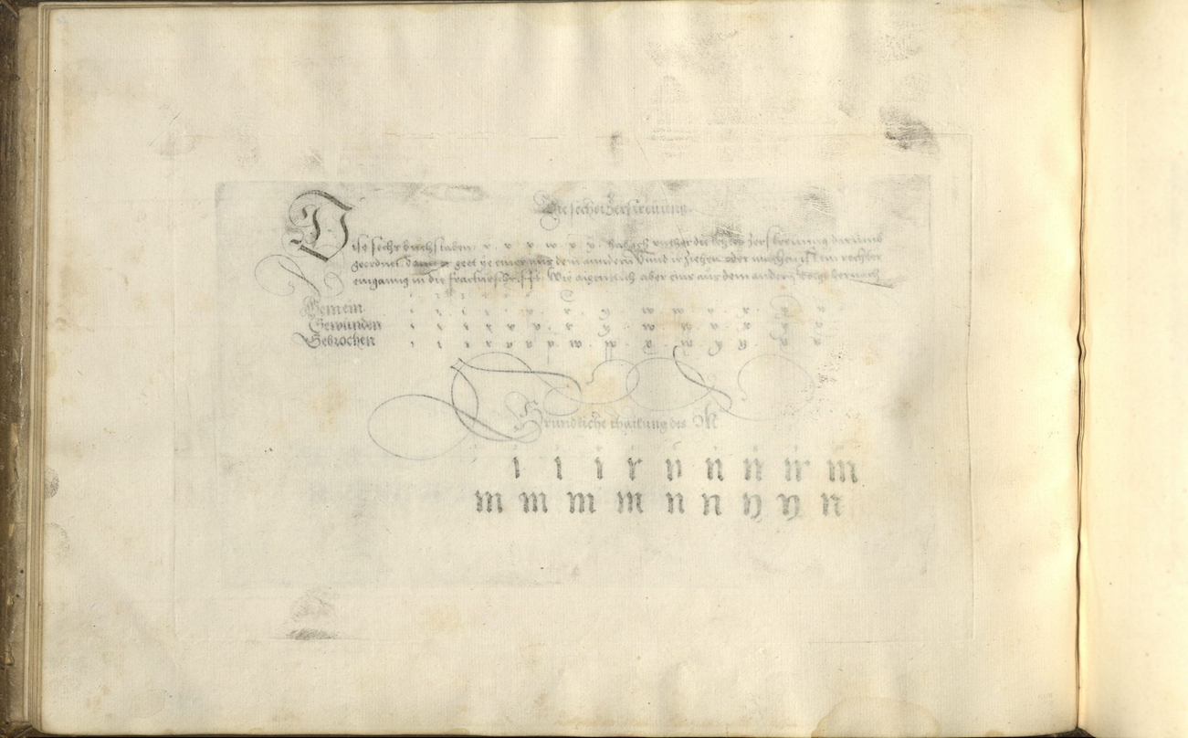
Figure 17. Johann Neudörffer the Elder. Die sechst Zerstreuung. Verso of an etching from Gute Ordnung, Nuremberg, 1538–50s. Cambridge, MA, Houghton Library, HOU F TypW 520.43.603.
Owner inscriptions in surviving copies suggest that Neudörffer regularly presented the Gute Ordnung to former pupils who had long ago passed these early learning stages and would therefore not have required the book for tracing practice. In a dedication to the high-ranking imperial court official Melchior Pfinzing (1481–1535) that was published in the Gute Ordnung, the manual is described as a souvenir “of the means and ways by which I led you to [adopt] a graceful script for everyday use so that you may keep it and practice with it.”Footnote 111 The Houghton Library copy contains a note written in 1556 by the Nuremberg merchant Hieronymus Köler (1507–73), who had studied with Neudörffer in the 1520s and whose two sons had attended the school in 1555. Here, Köler specifically records that Neudörffer had presented the book as a memento after the sons had completed their education.Footnote 112 On 5 September 1556, Levinus Tucher (1537–94) wrote from Lyon to his father Linhart to acknowledge receipt of a copy of Neudörffer's “art book” that must have formed part of the same print run as Köler's. Blaming a dearth of dispatches on his terrible handwriting, Levinus pledged to put the book to good use and to thank Neudörffer for his generous gift in due course.Footnote 113
The Leipzig merchant Hans Lebzelter (1535–88), who is identified as the first owner of a copy now in the British Library, would have received his Gute Ordnung at age fourteen, again possibly as a leaving present.Footnote 114 A second copy in London may have been owned by Veit Stoss (1533–76), the namesake grandson of the Nuremberg sculptor and a Neudörffer pupil who established himself as a leading calligrapher in the later sixteenth century.Footnote 115 At the age of thirty-one, the Nuremberg patrician Sigmund Held (1528–87) received his Gute Ordnung as a gift and sign of good will, according to an accompanying letter in the copy now in Staats- und Stadtbibliothek Augsburg.Footnote 116 And, though lacking a book plate or manuscript note of ownership, the bindings of the Gute Ordnung in the collection of the Metropolitan Museum of Art suggests that it may have come from the personal library of Georg Römer (1505–57), whose four sons had attended Neudörffer's school in the 1530s and 1540s. A discerning collector of medals, antiquities, and paintings, and patron of Neudörffer's biographies of Nuremberg artists, Römer is known to have owned other samples of Neudörffer's calligraphy, including the original manuscript of Neudörffer's “Notes on Nuremberg's Artists and Craftsmen” (1547), the earliest German collection of artists’ lives.Footnote 117 Römer would have appreciated the Gute Ordnung alongside these autographs, or indeed alongside other contemporary prints and drawings in his substantial collection.Footnote 118
These sophisticated readers no longer needed to manually trace lines. They were equipped to either use the Gute Ordnung plates for practicing freehand, or they could simply admire them for their linear aesthetics and as tokens of Neudörffer's ingenious printmaking. The latter approach is implied in the inventory of Ottheinrich's study, whose compiler described the Gute Ordnung as “etched and then printed” in reference to the two-step printing process and its illustration through the etching-counterproof sequence.Footnote 119 Both he and his employer were what Christopher Wood has termed learned beholders.Footnote 120 They looked closely, seeking to observe seemingly unmediated traces of the artist's hand, and were willing to work backward to uncover aspects of the artwork's creation.
A comparison of dates on the bindings of surviving copies and their sequencing of plates indicate that the book's content was increasingly understood as a collection of images of beautiful writing, rather than sequentially structured instructions on how to perfect one's hand.Footnote 121 In some copies bound in the late sixteenth century, little attention was paid to the thematic order of the pedagogic preamble or the grouping of sample letters as devised by Neudörffer.Footnote 122 Still, aesthetic and pedagogic functions of the Gute Ordnung were not mutually exclusive. While a student would carefully study the formation of lines, a collector could additionally consider how these lines had been translated into print. The sequencing of counterproofs and etchings illustrated the mechanical facture of Neudörffer's manuscript reproductions and invited viewers to spot differences—for example, by looking for plate tone, the grayish mid-tones resulting from small amounts of printing ink remaining on the polished surface of the plate after ink has been dabbed into the etched lines. Such plate tone is clearly visible in the etchings, but absent in the corresponding counterproofs, where only the much greater amounts of ink from the etched lines have been carried over in the second run through the printing press (figs. 5 and 13). For the same reason, the lines in the counterproofs also tend to look grey compared to the deep black of the etched lines.
A second distinguishing feature between the two categories of print in Neudörffer's manual are platemarks, the indentations left on the paper by the copper plate as both travel through a rolling press under great pressure. This process left a single platemark on the counterproof, while the corresponding etchings display a flattened indentation from the first run through the press with the etched plate and a second, projecting platemark from the unmarked copperplate that had been placed on the verso of the sheet to produce the counterproof (fig. 18). Besides allowing for better transmission of the finer drypoint lines, a blank plate that would add a second platemark may also have been intended to render the mechanical inversion open, clearly marking Neudörffer's counterproofs as prints, rather than manuscript text.Footnote 123
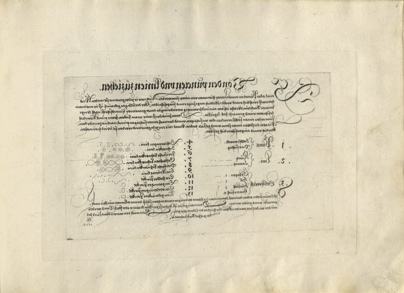
Figure 18. Johann Neudörffer the Elder. Von den puncten vnd linien zuziehen. Etching (counterproof corresponding to fig. 1) from Gute Ordnung, Nuremberg, 1538–50s. Cambridge, MA, Houghton Library, HOU F TypW 520.43.603.
PLAYFUL HYBRIDS
Neudörffer's playful intentions for his etching-counterproof pairs are evident in his propensity for visual jokes. On one plate, he wrote a sample alphabet and his monogram true-sided but below it added the crisscrossing sentence in reverse (fig. 19). As a result, whichever way this image is printed and whichever way the sheet is turned by the viewer, the reversal remains unresolved. Elsewhere, Neudörffer went so far as to parody his conspicuous use of counterproofs by including counterproofs for etchings printed from plates written in reverse.Footnote 124 The resulting counterproofs in mirror writing are entirely self-referential, serving no other purpose than to remind viewers of Neudörffer's technical ingenuity and invite them to look closely.

Figure 19. Johann Neudörffer the Elder. Alphabet, 1538. Counterproof (detail) from Gute Ordnung, Nuremberg, 1538–50s. Cambridge, MA, Houghton Library, HOU F TypW 520.43.603.
The more conventional role of counterproofs as working images in the artist's studio is echoed in a second category of visual play. Just as artists finalized printed designs through drawing on their counterproofs, Neudörffer annotated his printed images of text with manuscript lines. In part, these hand-drawn additions were driven by technical and aesthetic concerns. Manual lines could take on a depth or size difficult to achieve in a print where the average letter size was much smaller on account of the etching process.Footnote 125 In other words, because it was tricky to achieve clean lines of a width proportional to the height of very large letters, the font size had to be kept small. Neudörffer therefore usually omitted versals in the printing plate, preferring instead to complete the text by hand, because on the few occasions that he had attempted to include them in his etchings, their transition into counterproof had proved messy.
Other manuscript additions, such as the gold accents in the running text, which appear in most copies, were purely decorative, creating plays of light on the page (figs. 5 and 15). These manuscript flourishes also provide further clues as to how Neudörffer and his viewers engaged with the manual. Several copies of the Gute Ordnung thus contain red, hand-drawn frames around the etchings even when these showed writing in reverse. Designating a finished picture, these frames lent precedence to the overall pictorial effect of Neudörffer's images of text, rather than their didactic content.Footnote 126 The red ink matches the ink used for page numbering in Neudörffer's hand that appears in several copies of the Gute Ordnung, indicating that this framing and the associated viewing was intended by him (figs. 6 and 15). Just like other handwritten annotations, including calligraphic flourishes in black ink to highlight individual letters or words, these frames are self-aware gestures of making, which reveal their manual rather than mechanical origins by conspicuously exceeding the boundaries of the platemarks (fig. 5).
In the carta lucida copies, Neudörffer took this play between manual and mechanical mark further still. Here, he called into question tenets as basic as the plane on which a line manifests by applying additional pen flourishes by hand on the reverse side of the paper on which the letters had been printed. As boundaries between manuscript recto and etched verso collapsed, printed text and calligraphic flourish coalesced into a composite picture (fig. 15).
Part print, part drawing, these hybrids invited viewers of carta lucida and counterproof versions of the Gute Ordnung to not only admire their overall effect, but again to retrace their creation and distinguish between lines that seem to be handmade and those that are. In the counterproof copies, the etched preliminary steps provided a foil against which the composite manuscript-counterproof image could be checked for additional marks (figs. 5 and 13).Footnote 127 The presence of these etchings in mirror writing, however, also underlined an inherent paradox: although the counterproofs depicted faithful traces of Neudörffer's manual gestures, as facsimiles they were, in fact, twice removed from his hand. Even more so than counterproofs taken from drawings, Neudörffer's prints simultaneously gave the impression and lacked the very authenticity of a spontaneous artistic gesture—unless this gesture was again supplemented through exuberant flourish in the master's hand.Footnote 128
THE STATUS OF THE MULTIPLE
Early sixteenth-century etchings also occupied a grey zone between drawing and print in terms of numbers. Often, sheets that evoked the aesthetics and functions of drawings were initially produced in unusually small print runs. They were neither unique like a drawing, nor produced in many hundreds or even thousands of impressions, as could be the case with contemporary woodcuts or engravings.Footnote 129 In the case of Dürer's Desperate Man, for example, not a single of the numerous surviving impressions dates to the artist's lifetime.Footnote 130
At times, the low print runs and small etched oeuvres of most first generation etchers have been described as a series of false starts, during which artists grappled with the new technique while their viewing public was unprepared for the aesthetics of the medium.Footnote 131 More recently, however, Ashley West has proposed that printmakers reveled in the possibilities of the new medium and picked subjects to suit it.Footnote 132 The bold spectacle of Dürer's Sudarium of Saint Veronica, for instance, partly derives from its energetic, etched lines (fig. 20). Like Neudörffer's prints, Dürer's image contains an invitation to connect content and line, a principle described by Daniela Bohde as linear decorum.Footnote 133 Hovering among clouds against a dark and stormy sky, the work seems infused with gusts of air that account for both the angel's billowing robes and the unusual placement of the sudarium. Rather than displaying the image of Christ at the center of the composition, as one would expect from a conventional devotional image of the sudarium, here, the cloth has been blown upwards and turned upside down, as the angel struggles to hold on to the top corners. With the lines describing Christ's face set against the dark background hatching, and with a corner of the sudarium rolled up on account of the wind, viewers are required to look closely to see Christ's image.
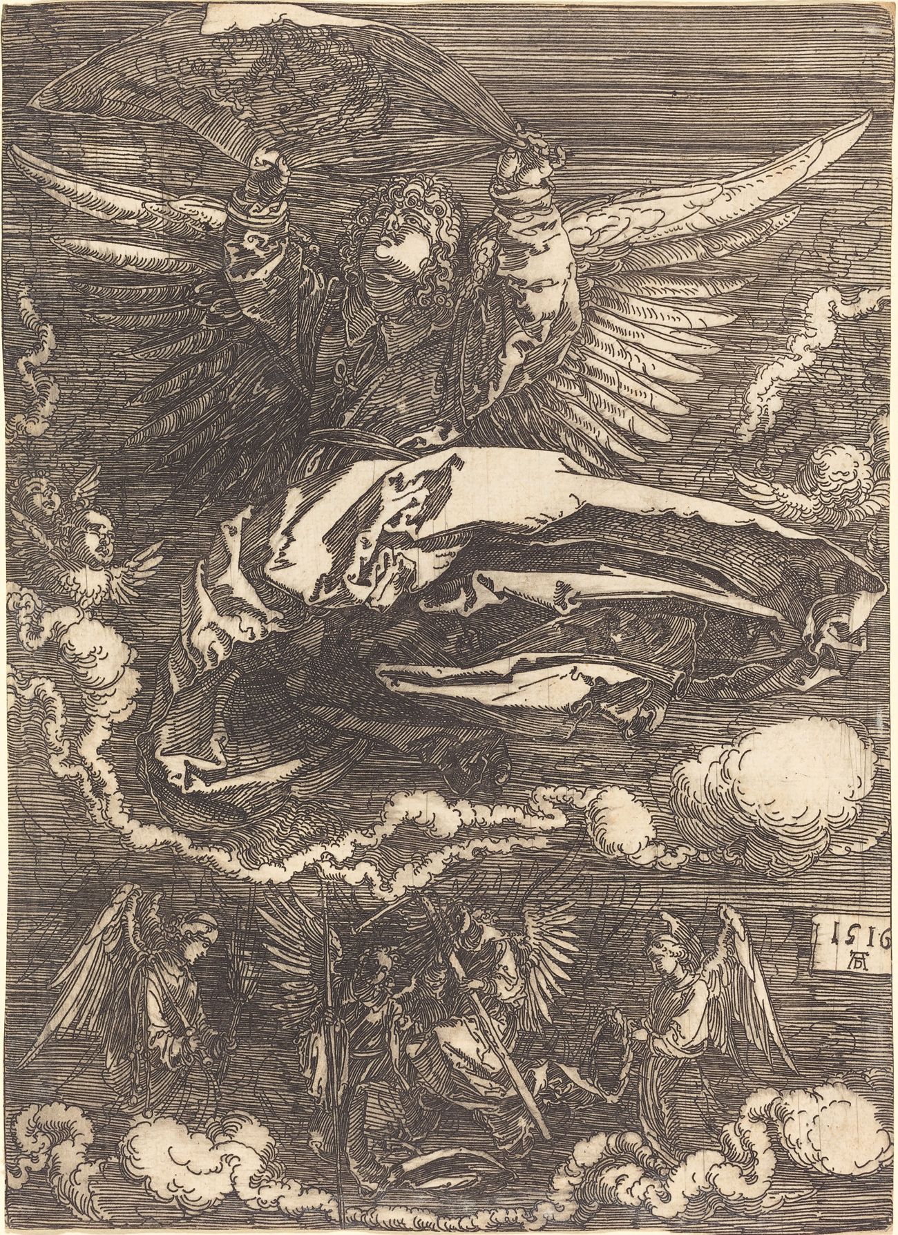
Figure 20. Albrecht Dürer. The Sudarium of Saint Veronica, 1516. Etching. Washington, DC, National Gallery of Art, Rosenwald Collection. Courtesy National Gallery of Art, Washington, DC, 1943.3.3535.
These often obscure iconographies or unfamiliar depiction of familiar subject matter in early etchings addressed a highly select band of well-read contemporaries, who would appreciate the novelty of both composition and line, as they were in all likelihood attuned to the different character of etched and engraved lines through their schooling in beautiful writing. As Wood has argued in relation to Altdorfer, these etchings were intended for an exclusive viewership.Footnote 134 Artists like Altdorfer appear to have treaded a fine line between fulfilling demand and oversaturating a collectors’ market for a new genre of pure landscapes on paper that was also reflected in Wolf Huber's (1485–1553) numerous contemporary landscape drawings.Footnote 135 Mechanical reproduction allowed a greater number of collectors to own an Altdorfer landscape and for Altdorfer to keep up with Huber's larger drawing output, while capping the number of impressions ensured the object's desirability.Footnote 136 This strategy clearly worked, judging from a number of exact pen-and-ink copies after his landscape etchings that collectors who had failed to secure copies of the prints themselves proceeded to commission from other draughtsmen.Footnote 137
Neudörffer's aforementioned reference to a small number of impressions in his dedication letter to Sigmund Held suggests that the Gute Ordnung was equally printed in very low and sporadic print runs.Footnote 138 There is no indication that Neudörffer ever considered commercial applications for his etched images of writing and plenty of proof to the contrary, from the gifting of numerous copies of the manual to the gratuitous, playful complication of its production. Like Dürer, Altdorfer, Burgkmair and others before him, Neudörffer clearly reveled in the experimental character of early sixteenth-century etching and the opportunities it offered for creative and technical innovation, from transferring his knowledge of etching objects to etching printing plates or finding a suitable mordant for copper, to engaging in nuanced plays of line and reversal, or sampling color inks. Neudörffer's etchings were as much about the process of making as they were about the finished product.
While Neudörffer's prints signified his technical ingenuity, their reproducibility also heightened the status of the corresponding handmade objects, as had been the case with Altdorfer's landscape etchings and drawings.Footnote 139 Copies of the Gute Ordnung were regularly augmented with autograph pages of Neudörffer's writing, some of them executed in vibrant hues of blue or gold (fig. 21).Footnote 140 Negating his own quest for printed approximations of his handwriting, Neudörffer even produced a manuscript version of the entire Gute Ordnung, presumably either for a particularly important patron or as another display of virtuosity that could be shown to visitors.Footnote 141 Notably, in these manuscript versions Neudörffer omitted the monograms that self-consciously identified him as the creator of the printed plates (figs. 1, 2, and 19). Perhaps he considered the intertwined monogram in the style of Dürer's or Altdorfer's a convention of authorial presence in printmaking that was not required in a manuscript.Footnote 142 Or perhaps he wanted to assert his intellectual ownership of the script designs and avow his pride of the technical innovations that had made the prints possible.

Figure 21. Johann Neudörffer the Elder. Folge nicht deinen bosen lusten, 1540–50s. Pen and blue and gold ink; bound with Gute Ordnung, Nuremberg, 1538–50s. Nuremberg, Bayerisches Gewerbemuseum, LGA-Gew.Mus. 3647.
Several of Neudörffer's most advanced students followed in their teacher's footsteps with further manuscript versions.Footnote 143 The most accomplished of these copies is now kept in Harvard's Houghton Library. It was compiled in 1555 by Philipp Stoss (1537–1603), a grandson of the sculptor Veit Stoss (d. 1533), who was employed as an imperial secretary following his training with Neudörffer (fig. 22).Footnote 144 Written at a time when Neudörffer was still printing copies of his Gute Ordnung, the manuscript would have served as an illustration of Stoss's own skill—and was accordingly signed by him—while also crediting his master's inventions on the title page. It, too, was undoubtedly intended for a rich patron, rather than a student of writing.
Figure 22. Philipp Stoss. Von den puncten vnd linien zuziehen, 1555. Pen and ink with gold heightening. After Johann Neudörffer the Elder, Gute Ordnung, Nuremberg 1538–50s. Cambridge, MA, Houghton Library, HOU GEN MS Typ 1121.
NEUDÖRFFER'S LEGACY
What prompted Neudörffer's idea of using a combination of etching and counterproof for the Gute Ordnung is unknown, but it is tempting to think that the handmade qualities of Altdorfer's and Dürer's etchings could have inspired him to make a parallel transition in drawing's sister art of writing. As the earliest German copper etchings that allowed for a subtler range of linear expression than the earlier process of iron etching, and as the largest group of sixteenth-century counterproofs, Neudörffer's Gute Ordnung wrote print history. In the context of sixteenth-century writing books, however, it remained an outlier. Despite the obvious advantages of translating a master's living hand onto the matrix through etching, the technique was not used for other printed writing manuals for almost six decades.Footnote 145 Again, synergies with the figurative arts proved greater, as a second generation of mid-sixteenth-century etchers became a more receptive audience for Neudörffer's technical innovations and their aesthetic implications.
Neudörffer was in close contact with the two artists usually credited as pioneers of German copper etching, Hans Lautensack (1524–ca. 1560) and Augustin Hirschvogel (1503–53), and he may have passed on his recipe for a suitable mordant to them.Footnote 146 It seems no coincidence that Lautensack switched from iron to copper plates shortly after he had completed the coat of arms of Neudörffer and his wife Katharina Nathan (d. 1568) in the mid-1550s.Footnote 147 By the mid-1540s, Neudörffer must have also shared both his technical insights and his Gute Ordnung with Augustin Hirschvogel, whom he describes as an excellent etcher in his unusually long biography of the artist in the “Nachrichten von Nürnberg Künstlern und Werkleuten” (Notes on Nuremberg's artists and craftsmen, 1547).Footnote 148 A descendant of the prominent Nuremberg family of glass painters, Hirschvogel had worked as a glass and majolica painter before turning to cartography and printmaking. Although he would have had prior experience of etching glass in his family's workshop, Hirschvogel only turned to etching as a printmaking technique in the final decade of his life. His first foray was a set of scientific illustrations for a treatise on practical applications of geometry he published in Nuremberg in 1543.Footnote 149 Neudörffer, whose own interest in geometry is well documented, is likely to have discussed the treatise with the artist and praised it in Hirschvogel's biography four years later; he may also have influenced the appearance of his friend's book.Footnote 150 In some copies of the Geometry, Hirschvogel replaced the coarser and more commercially viable woodcut illustrations with a set of delicate etchings, which were bound separately from the text in an arrangement reminiscent of contemporary print albums—and of the Gute Ordnung. Just as Neudörffer had opted for the transmission of his living hand, Hirschvogel may have wanted to rely on etching to accurately translate his diagrams into print.Footnote 151
These affinities between Hirschvogel's and Neudörffer's approaches to printmaking continued with the thirty-four landscape etchings Hirschvogel produced after his permanent move to Vienna in 1543. Hirschvogel had clearly studied the landscape etchings and drawings produced by Albrecht Altdorfer and Wolf Huber, as several copies and a number of compositional parallels indicate.Footnote 152 When it came to translating his landscapes into etching, Hirschvogel adopted Altdorfer's fluid lines and calligraphic freedom, but he greatly extended his predecessor's linear vocabulary. While Altdorfer's etchings are characterized by uniform depth and tonal variations achieved here through the closer spacing of individual lines, Hirschvogel's lines range from the fine mountain ridges in the background to the thick blades of grass along the equally pronounced outlines of the meadow ledges in the foreground (fig. 23). Hirschvogel's proficiency has in the past been attributed to his professional background in glass etching.Footnote 153 Yet, given their close contact and shared interests, Neudörffer's illustrations of fine linear modulation in etching through the angling of writing tools or the addition of drypoint on the copper plates may equally have left their mark on Hirschvogel.

Figure 23. Augustin Hirschvogel. Landscape with the Conversion of Saul, 1545. Etching. Washington, DC, National Gallery of Art, Rosenwald Collection, 1950.1.79. Courtesy National Gallery of Art, Washington, DC.
This is all the more likely in view of a second striking parallel in the two artists’ oeuvres: like Neudörffer, Hirschvogel printed a considerable number of counterproofs from his etchings. The surviving twenty-three impressions make Hirschvogel's the second largest group of sixteenth-century counterproofs after those contained in Neudörffer's Gute Ordnung.Footnote 154 Hirschvogel's interests in cartography and a resulting desire for topographical accuracy in his landscape etchings are often cited as a possible explanation for this cluster.Footnote 155 Then again, only one of the landscape counterproofs, a view of Ilgstadt near Passau, depicts an identifiable location. If topographical accuracy was a concern, it would have been more efficient to copy the drawing in reverse onto the plate. Evidence from his drawings suggests that Hirschvogel was aware of reversal techniques, such as the use of mirrors. When it came to drawing on an etching matrix, however, he generally sidestepped inversion, even where this would have made pictorial sense, as in the case of a hunter firing a gun with his left hand.Footnote 156 Like Altdorfer and others before him, Hirschvogel appears to have been attracted by the purportedly unmediated process of drawing into the wax. Inspired by Neudörffer's use of counterproof, however, Hirschvogel took Altdorfer's printed landscape drawings further by offering collectors the opportunity to acquire landscape prints that resolved the inversion of printmaking and showed the very lines the artist's hand had drawn onto the matrix. With their softer, greyish lines, counterproofs were also better suited to hand coloring, as in the Landscape with the Conversion of Saul formerly owned by Basilius Amerbach (fig. 24).Footnote 157

Figure 24. Augustin Hirschvogel. Landscape with the Conversion of Saul, 1545. Hand-colored counterproof. Basel, Kunstmuseum, Amerbach-Kabinett 1662, Inv. Aus. K. 26.31.
Collectors could place etching and counterproof alongside each other, comparing their merits and contrasting their differences. Amerbach's careful distinctions in his print inventory between originals and copies after printmaking greats like Dürer certainly suggests that he enjoyed close, comparative looking, while the medial connection between the etched and counterproof image would have appealed to his technical interests. Hirschvogel's sustained output of counterproofs indicates that by the mid-sixteenth century there was a market for such visible expressions of artistic process.Footnote 158 Perhaps trained in part by Neudörffer's Gute Ordnung, collectors had developed an eye for inversion and a taste for its manifestation in counterproofs.
NULLA DIES SINE LINEA
The title page to the Gute Ordnung concludes with the famous Apelles adage “Nulla dies sine linea” (“not a day without a line”). It is at once a prompt for Neudörffer's readers to practice the beautiful lines presented in his manual, and a confident declaration of his own skill. If Dürer was by the late 1530s long established as an Apelles of drawn lines, Neudörffer cast himself in the twin role of a master of written lines. Connections between the sister arts of drawing and writing were close in the sixteenth century. Their practitioners often articulated mastery of lines through calligraphic flourish. They shared teaching methods and claims to ancient learning, and those trained in beautiful handwriting also would have admired the linear aesthetics in contemporary drawings and etchings that emulated them. The sophisticated play with the genesis of lines in the Gute Ordnung demanded careful attention and kinesthetic engagement from its readers.Footnote 159 The manual was read as an invitation to retrace the creation and ponder the aesthetics of Neudörffer's calligraphy and could furthermore condition the collector's eye for the close viewing and phenomenological study of contemporary drawings and prints.
While the beauty and variety of his linear vocabulary in the Gute Ordnung illustrated Neudörffer's calligraphic acumen, the sheets themselves established him as a highly adept and innovative printmaker who clearly enjoyed the challenges posed by the relatively new medium of etching. Much as Dürer and Altdorfer produced prints that on the one hand looked like drawings and betrayed their awareness of their own fiction as multiples of unique, handmade marks, Neudörffer sought to capture his calligraphic inventions and broadcast his pedagogy to a wider readership via transmissions of his own, living hand. Like Dürer's and Altdorfer's early etchings, Neudörffer's sheets reflected on their own mediality: they were prints about printmaking, as much as prints about writing.Footnote 160
The Gute Ordnung's linear mastery and technical sophistication resonated widely. Beyond the urban upper classes of patricians, merchants, notaries, or doctors that had attended Neudörffer's school, it appealed to wider circles of scholarly and princely print collectors, as much as to a new generation of printmakers. Seeing Neudörffer's Gute Ordnung as a key work of sixteenth-century graphic art can therefore also provide new insights into the history of early modern German printmaking and viewing.


 Open access