Recognising a fine Bible
Can you always judge a good book by its cover?
Not necessarily – first impressions may be misleading! Bibles come in a variety of cover styles and materials, but the range of options available for a particular edition almost always share a common printed book-block ; the pages inside the book’s cover – and the true measure of quality therefore begins with an assessment of the text design and the paper and print quality. One sometimes sees high-quality supple leather covers wrapped round an inferior book block, the quality of which is better suited to a basic and inexpensive mechanical binding style designed for a mass-market. Conversely, in the Cambridge list even the basic hardback Bibles have similar quality features – design, paper, print quality, sewn bindings – to the fine-bound styles of the same edition.
Consider the essential elements of the book, from the inside out …
The essential elements of a Bible


Design
The Bible publisher’s first challenge has always been to present, within the covers of a single ‘book’, a large amount of textual content – more than three-quarters of a million words in the Old and New Testaments alone, equivalent to half a dozen or more novels. Traditionally this has been accomplished using carefully chosen typefaces and type sizes, and cleverly designed page layouts and by printing on very thin paper. The printed page should be easy to read, but a small format Bible cannot be printed in a large typeface without significantly increasing the number of pages and consequently the thickness of the book, so designers strive to find the optimum balance between readability and portability. The outer margins should be even, and in the centre of the book the inner, or ‘gutter’ margins should be sufficiently generous so as not to lose text in the gutter.

The Type
There are many variations in the styles and characteristics of typefaces or ‘fonts’ available to the designer. In order to be economical in the space it occupies and at the same time easy to read in small sizes, the font needs to be what was traditionally described as ‘large on the body’: the central part of the letter should be generously proportioned with modestly sized ascenders and descenders (e.g. the upward stroke of h and the downward stroke of p). A thin, spidery or condensed type may prove tiring to the eye, but one with over-thick strokes will make the page look too dark. Fussy or unusual letter forms may distract or irritate the reader.
Note that the official ‘point size’ listed for the text is not a universal measurement, nor is any specific point size in itself a guarantee of readability. Each font has its own characteristics, and an 8 point type in one font may well be considered just as legible as a 9 or 10 point in another. The amount of ‘leading’ between the lines, the length of the text line, and whether the text prints ‘line-on-line’ (see ‘Printing’) are all factors that may contribute significantly to readability.
The typefaces chosen for Cambridge Bibles have been selected to provide the most legible and attractive appearance for the particular style and size of each edition. Cambridge editions fall into two categories: traditional settings created during the time of hot-metal composition – a golden age of Bible design, and modern settings created using digital fonts selected to replicate the best characteristics of the familiar metal Bible typefaces. In effect, the older KJV settings such as the Concord, Pitt Minion, Turquoise or Cameo Reference are ‘facsimiles’ of the original editions created many years ago.

Paper
Because of their length, Bibles have usually been printed on very thin paper in order to achieve a suitably compact book. Nevertheless, irrespective of how thick or thin it is, paper in a Bible should have sufficient strength to sustain the usage it will receive. The best Bibles are printed on papers which are not only much thinner and finer than ordinary book papers, but which are also strong and have sufficient opacity to minimise ‘show-through’ from printing on the reverse side. Paper of 30gsm or less in weight – ‘20lb paper' in the US – is often described as ‘India paper’ and over 30gsm as ‘Bible paper’.
Cambridge Bibles are printed on high-quality lightweight paper, chosen to achieve the optimum readability for the minimum thickness. Various factors – strength, thinness, smoothness, shade and opacity, are considered in sourcing appropriate papers that meet internationally recognised environmental standards – all Cambridge Bibles use sustainably sourced FSC certified papers.
Some Cambridge reference Bibles have wide margins, so that users can make notes against the Bible text. The paper used in these Bibles is chosen for its superior resilience and its capacity to absorb handwritten notes. Nevertheless, it is advisable to test pens and pencils on the paper before making extensive notes, to ensure that the ink flow is not so great as to bleed through the paper. Making notes in standard Bibles without wide margins is not recommended.

Printing
The appearance of the printed page is a good indication of the quality of both the printing and the paper. The position of the type on the page and the width of the margins should be consistent throughout. All letters should be sharp and clear and the inking should be even and uniform on all pages. In red-letter Bibles the register (the relative position of the red and black type on the page) should be accurate and consistent. But see note further below concerning the characteristics of facsimile editions.
The best Bibles are designed to be printed ‘line-on-line’ (when one line closely matches the position of a line of text on the reverse side of the paper) and have minimal show-through, even when printing on the thinnest papers.
Accuracy in printing fine Bibles is best achieved when the presses are run at slower speeds than is usual for mass-market Bibles or books, but this extra care inevitably has an implication for pricing. There are differences applicable to different Bible editions even within the Cambridge list, but generally Cambridge Bibles are printed on presses running more slowly and therefore more accurately, than the norm.
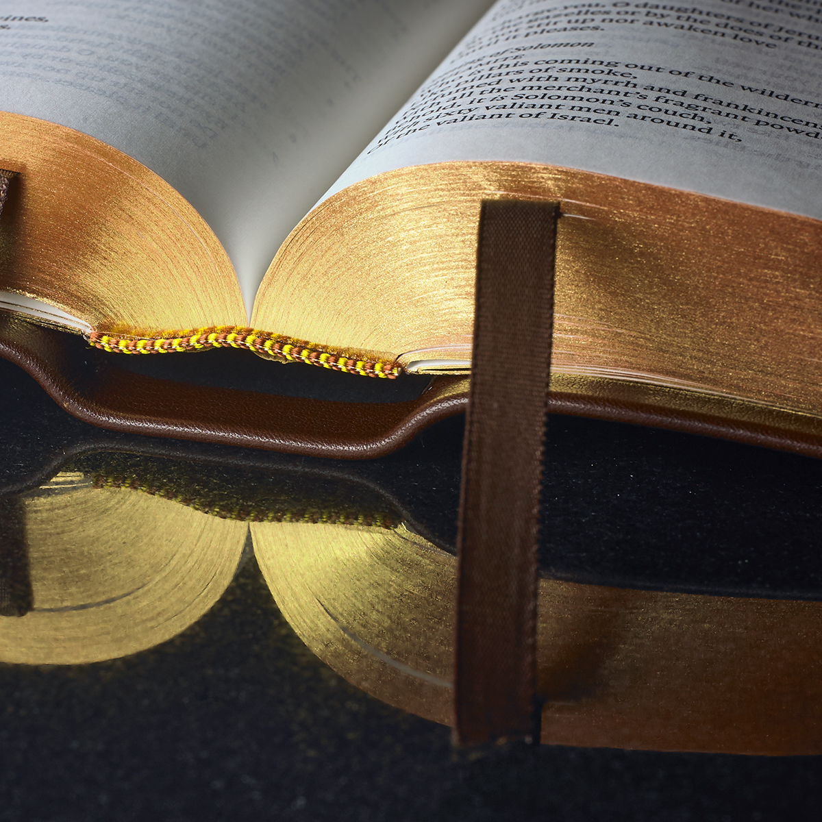
Another measure of printing quality is whether the pages are printed in the correct long-grain direction rather than cross-grain. As a simple test, run a finger along the inner margins of the book: if the pages are smooth to the touch, the book is printed long grain; if rough or crinkled, it is probably printed cross grain. Printing in the correct grain direction improves the ease with which the pages may be turned as well as their appearance, and also has an effect on the quality of the gilding. (The cross-grain edges of the book will appear wavy, and this effect is often highlighted by gilding).
In the Cambridge list, the older KJV settings such as the Concord or Cameo show text design at its classic best, albeit with some occasional minor blemishes in the print image (perhaps in individual character form) inherent in the process of converting typesettings created for letterpress printing into lithographic plates. Any such imperfections are a feature of ‘facsimile’ reproduction, and are not due to flawed page design or printing.

Sewing and Binding
To make a fine Bible demands more than skill in design and printing alone. If a Bible is to last and if its appearance and handling qualities are to satisfy, it must be bound in high quality materials with care and the attention to detail of a craft-made piece. Cambridge Bibles are always sewn (not merely glued as is usually the case with mass-market Bibles). This adds strength and makes them last longer, and it also ensures the books lie flat once open. The thread used to sew the pages together is strong but thin, and so the reader should always open the pages carefully at first to allow the threads to settle. Of course, bending the cover back on itself is likely to over-strain the thread and may, over time, cause the binding to split.
Note that all sewn books and Bibles are also glued for added reinforcement. The sections are sewn together loosely, then nipped together and lightly glued along the spine (usually with gauze fabric attached) to hold the book block together properly. The glue penetrates a little between the individual sections, but the advantage of a sewn book is that the individual pages are not separately attached by just a single very thin line of glue to the cover: each page is part of a folded section (a ‘signature’) of multiple pages; each signature is sewn to all the others; then all the signatures are glued to form a book-block before being casedin to the cover.
Each style of bound Bible in a particular Cambridge edition will use the same basic sewn book-block as one another; and so the less costly binding styles all offer the same quality of paper and standards of printing as the top-of-the-range fine bindings.

Attaching the case to the book block
There are two methods of casing-in a fine Bible: the first (‘paste-off’) is a semi-automated process of gluing the cover to the endpapers of the book block, while the second (‘edge-lined’) is a specialised handcraft process using a cover that is more flexible and that gives a firm attachment of cover to book-block. The hand-made edge-lined cover is attached to the book-block by means of a flap (of about half an inch in width) of the inner cover material being glued to the endpapers of the book. Because these covers are hand-made, each Bible is in effect unique – no two will look exactly the same.

The cover – the final stage that creates the first impression
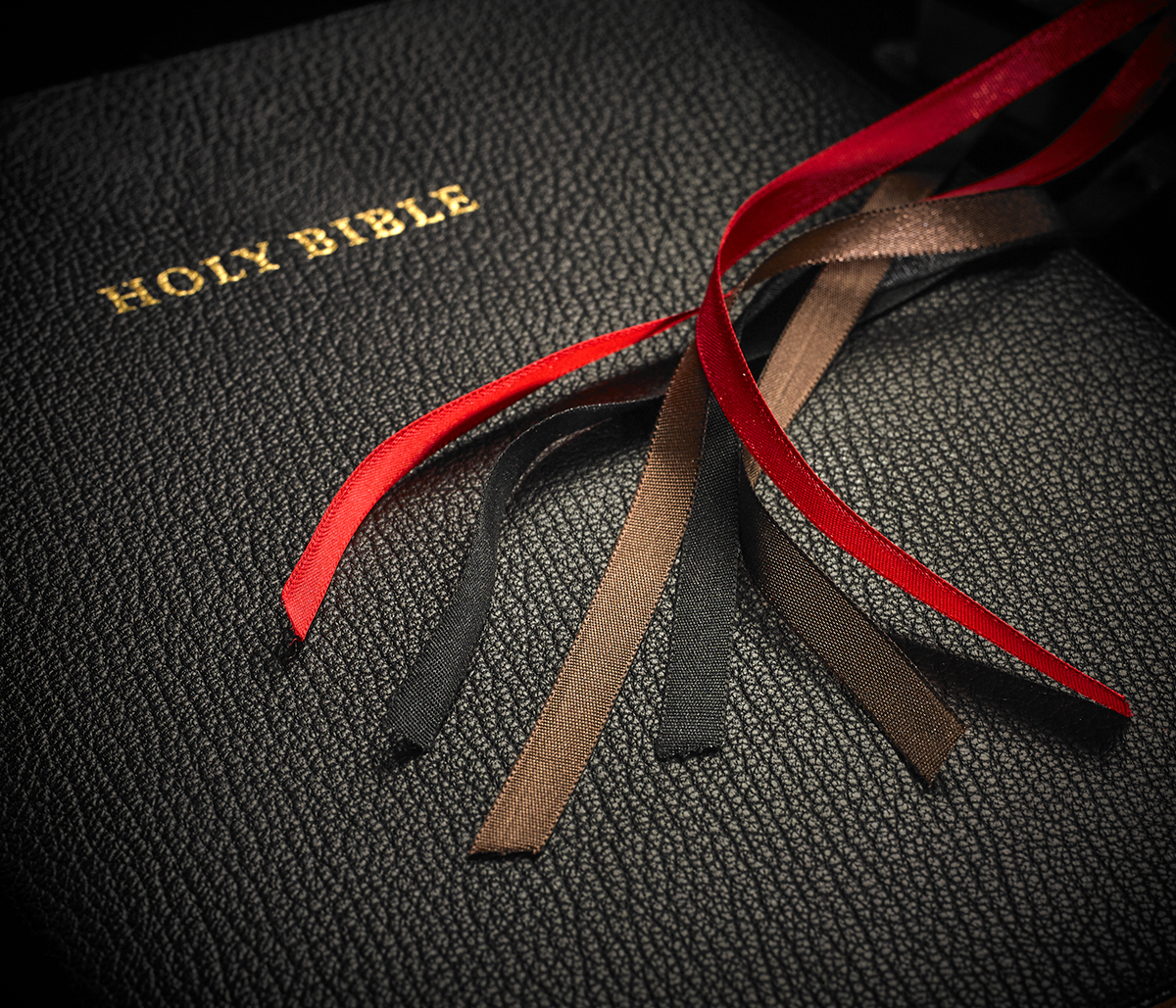
The cover material used in Bible binding not only affects one’s initial aesthetic response – both visual and tactile – but in the longer run also determines the durability of the book itself. The customer should balance these factors when considering a purchase. Except in Lectern, or Pulpit Bibles or other bindings deliberately stiffened by the incorporation of a board between the outer cover and the lining, covers should be reasonably flexible, but at the same time should lie flat. The overlap protects the gilded edges. It should be of fairly uniform width all around the book, and the corners should be well rounded, smoothed down and firmly glued. The lining should adhere evenly all over the cover and be positioned so as to leave a uniform amount of the turned-in outer cover showing evenly. Often, a pattern or graining is artificially applied to leather during its manufacture but the best or most expensive flexible covers will usually feature the natural grain of the animal hide.
Cambridge Bibles use a range of leathers, with different grains appropriate to the size of each book. To maintain the fine quality for which Cambridge is renowned, the leather tanneries used by our bookbinders carefully select and scrutinise the best leathers from around the world. Of course, because leather is a natural product – however it is processed – each leather-bound Bible is unique; a facet that is particularly noticeable when natural-grain leathers rather than when an artificially grained leather hide is used.
Additional features and decoration of a ‘fine’ Bible

Gilt Edges and Blocking
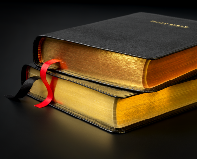
Many Cambridge Bibles and Prayer Books are decorated on their covers and on the edges of their paper with metallic (usually gold- or silver-coloured) foil. The book block is trimmed, the edges are sanded, and the corners are evenly rounded, so that when the book is closed these page edges will show as a smooth gold or silver surface. The material used in this process gives a rich, bright, and attractive finish to the book. Some Bibles have ‘art-gilt’ edges, where a lustrous finish is created by a combination of a coloured, usually red, dye and gilt foil.
Ribbon Markers
Ribbon markers allow readers to keep a place in the text while looking up cross-references, perhaps, or to mark a particular passage to which they will return. Care is taken in choosing ribbon markers for Cambridge Bibles. Strong ribbons of appropriate breadth for the size of each Bible are selected, so that they will not curl up, become thready or stringy or, in extreme cases, cut through the thin Bible pages. A generous length is specified, so that the ribbons do not get lost within the pages. If the Bible is one of the larger volumes or one of the premium leather bindings, it may have two or three ribbons, and the Lectern Bibles all have three, to allow easy marking for public reading.
Head and Tailbands
Headbands appear at the top of the spine and tail bands at the bottom. Traditionally, they were sewn onto the book block and protected the spine from damage when a book was taken down from densely stocked library bookshelves. Nowadays, they are added as a decorative item to all fine-bound Cambridge Bibles, as well as to many hardbacks, and the colours are chosen to complement the shade of material and gilding used in the binding.