


INTRODUCTION
The availability of granular geographical data, together with increasing computing power, provide researchers with new opportunities to gain insights on how local geography influences politics. Recent research uses such data to study the effects of neighborhoods on political behavior (Larsen et al. Reference Larsen, Hjorth, Dinesen and Sonderskov2019), racial politics (Enos Reference Enos2017; Nuamah and Ogorzalek Reference Nuamah and Ogorzalek2021), partisan sorting (Brown and Enos Reference Brown and Enos2021; Martin and Webster Reference Martin and Webster2018), public goods provision (Trounstine Reference Trounstine2015; Wong Reference Wong2010), housing (Hankinson Reference Hankinson2018), and political representation (Rodden Reference Rodden2019). These works have brought novel empirical evidence and new substantive arguments to a long-standing literature on the political and socio-economic consequences of local geography (Huckfeldt and Sprague Reference Huckfeldt and Sprague1987; Putnam Reference Putnam2000).
At the same time, these complex data pose methodological challenges of measuring and modeling one’s neighborhood. Foundational work conceptualizes neighborhoods as sub-units of larger geographies (such as cities or towns) that arise from population grouping, infrastructure, land use, and economic forces (Park, Burgess, and Sampson Reference Park, Burgess and Sampson1925; Suttles Reference Suttles1972). However, neighborhoods are inherently subjective because they are shaped by personal experiences and views (Chaskin Reference Chaskin1997; Keller Reference Keller2003; Paddison Reference Paddison1983).Footnote 1 Thus, two individuals who live at the same address may identify different local communities as their neighborhoods. This intrinsic subjectivity of neighborhoods leads to a substantial variation not just across places, but also across people (Coulton et al. Reference Coulton, Korbin, Chan and Marilyn2001).
Unfortunately, most studies do not account for this subjectivity when measuring neighborhoods. Many researchers approximate neighborhoods by administrative units such as census tracts and ZIP codes (Baxter-King et al. Reference Baxter-King, Brown, Enos, Naeim and Vavreck2022; Gay Reference Gay2006; Hamel and Wilcox-Archuleta Reference Handan-Nader, Ho, Morantz and Rutter2022; Hopkins Reference Hopkins2010). These approaches implicitly assume that all individuals who live in the same unit would define their neighborhood in the same way that exactly matches with an administrative boundary (Coulton, Jennings, and Chan Reference Coulton, Jennings and Chan2013; Openshaw Reference Openshaw1983; White Reference White1983). More recent work improves upon this shortcoming by using metrics based on distance and population density that are specific to an individual residence location (Brown and Enos Reference Brown and Enos2021; Dinesen and Sønderskov Reference Dinesen and Sønderskov2015). While such measures vary across people and places, they cannot directly account for factors that influence subjective neighborhoods. Such factors include the demographic and other characteristics of individuals, their behaviors and opinions, administrative boundaries, and physical objects in local areas such as buildings, parks, and roads.
These measurement challenges thus create persistent problems for a wide range of contemporary research. For research on the effect of neighborhoods on political behavior, researchers must rely on definitions of local context that do not fully capture the influential areas around each voter (Nathan and Sands Reference Nathan and Sands2023). For research on racial politics, residential proximity is frequently used as a proxy for intergroup contact but these studies cannot discern whether people perceive themselves as sharing geographic space with other racial groups (Enos Reference Enos2017). The measurement of segregation is similarly limited since the standard measures of local exposure may understate the extent to which people encounter other racial or ethnic groups (Athey et al. Reference Athey, Ferguson, Gentzkow and Schmidt2021; Hamel and Wilcox-Archuleta Reference Handan-Nader, Ho, Morantz and Rutter2022). To understand how geography may shape public goods provision, researchers must investigate how local governments view the areas they govern when making decision about where to allocate resources (Trounstine Reference Trounstine2015). Research on housing and NIMBYism requires accurate measurement of the areas where residents might be opposed to new development (Hankinson Reference Hankinson2018). Lastly, one common requirement of legislative redistricting is to keep communities of interest (COI) intact when drawing district boundaries, but these communities are subjectively defined (Chambers et al. Reference Chambers, Duchin, Edmonds, Edwards, Matthews, Pizzimenti and Richardson2022).
Therefore, novel methods are required to better understand the variation in perceptions of local geography across places and people. The main goal of this paper is to provide new methodological tools that address these limitations of existing approaches and further facilitate empirical studies of neighborhoods. In a pioneering study, Wong et al. (Reference Wong, Bowers, Williams and Drake2012) address this measurement problem by asking survey respondents to draw their own neighborhoods on a map (see also Wong et al. Reference Wong, Bowers, Rubenson, Fredrickson and Rundlett2020). We follow their innovative measurement strategy, developing software to collect such data and formalizing a model for analyzing how neighborhoods are defined.
Methodological Contributions
The methodological contribution of this paper is twofold. First, we develop an easy-to-use online survey instrument to measure subjective neighborhoods (“Measuring Neighborhoods” section). Our instrument is customizable and easily incorporated into standard online survey platforms such as Qualtrics, facilitating its use by other researchers. With this tool, researchers can collect maps drawn by survey respondents. As we illustrate in our empirical applications, the researcher may choose to ask respondents to draw their neighborhood or community of interest on a map. Our survey instrument can also be used for other purposes, for example, asking respondents to highlight their route to work, or, for scholars of civil war, collecting citizen perceptions of which areas different militia groups control. The tool is completely open-source and can incorporate different researcher design decisions (https://github.com/CoryMcCartan/neighborhood-survey).
As our empirical applications demonstrate, the most direct use of this survey instrument is to measure how people define their neighborhoods, COI, or other subjective geographic definitions. Our statistical model then allows researchers to model these maps as the outcome and quantify the predictive influence of aggregate and individual characteristics on the characteristics of one’s subjective neighborhood.
The survey instrument can be used for broader purposes as well. Many survey studies utilize contextual variables in their analyses. These include summaries of racial demographics (Anoll Reference Anoll2018; Bobo and Hutchings Reference Bobo and Hutchings1996; Gay Reference Gay2006; Hopkins Reference Hopkins2010; Newman Reference Newman2012), neighborhood economic conditions (Larsen et al. Reference Larsen, Hjorth, Dinesen and Sonderskov2019; Michener Reference Michener2013), local political context or partisan composition (Baxter-King et al. Reference Baxter-King, Brown, Enos, Naeim and Vavreck2022; Mason, Waronski, and Kane Reference Mason, Wronski and Kane2021), and many other variables that are measured at some geographic unit. For each of these studies, researchers must choose the relevant geography at which to calculate aggregate summaries. Instead of relying on such proxy variables, our survey instrument enables researchers to directly measure respondent-defined local context and compute its aggregate characteristics of interest within the neighborhood drawn by each individual.
For example, a survey on how neighborhood racial composition drives political attitudes could collect individual-defined neighborhoods, calculate percent Black, white, and Hispanic in these drawn neighborhoods, and predict attitudes as a function of these demographics.Footnote 2 This use of subjective neighborhoods as an improved measure of contextual variables has been advocated for in previous work (see Wong et al. Reference Wong, Bowers, Rubenson, Fredrickson and Rundlett2020), but our open-source survey instrument allows for any researcher to adopt this approach.
The second methodological contribution is the development of a new statistical model that takes full advantage of this new measurement tool. Existing studies, including those that measure subjective neighborhoods, do not directly model how respondent and geographic characteristics, and their interactions, relate to one’s neighborhood. Instead, they almost exclusively rely upon descriptive statistics of observed neighborhoods such as racial and economic demographics, neighborhood size, and agreement with administrative boundaries to describe subjective neighborhood definitions (Wong et al. Reference Wong, Bowers, Rubenson, Fredrickson and Rundlett2020). The absence of a formal statistical model makes it difficult to systematically analyze the characteristics of respondents and places that together determine subjective neighborhoods.
We propose a Bayesian hierarchical model based on the probability that survey respondents include each small local area (e.g., census block) at the margin of their neighborhood. The proposed model quantifies the degree to which characteristics of respondents, those of local areas, and their interactions shape subjective neighborhoods. Respondent characteristics can include demographic attributes and any attitudinal or behavioral measures, whereas the area characteristics may include census statistics, administrative boundaries, and the location of landmarks such as churches, parks, schools, and highways. Like the survey instrument, this model is implemented as part of an open-source software package (https://github.com/CoryMcCartan/nbhdmodel).
This new statistical model offers several improvements over simpler methods such as regressing neighborhood summary statistics on a set of predictors.
-
• The model uses more information. We model the probability that each constituent census block is included in a neighborhood, leveraging granular block-level characteristics. A summary-statistic-based regression typically average these characteristics, losing valuable information contained in the respondent’s decision to include or exclude each census block, especially those near the boundaries of subjective neighborhoods.
-
• Estimation uncertainty is quantified. Our proposed Bayesian approach naturally accounts for estimation uncertainty in the model parameters, which is propagated through posterior predictions and other post-analysis summaries.
-
• All characteristics of the neighborhood can be modeled simultaneously. The model can incorporate any characteristics of local areas, those of respondents, and their interactions. Because the model is at the level of the actual census blocks, any higher-level neighborhood summary statistic can be calculated for the model predictions and fitted values, allowing formal statistical quantification of differences in these statistics.
-
• The model can be used to make individual-level predictions for neighborhoods or portions thereof. We can sample new neighborhoods from the posterior of the model, including those for out-of-sample respondents or for counterfactual covariate values. For example, the model allows one to sample possible neighborhoods that would be drawn by a survey respondent with a certain set of characteristics if they lived at a different address.
In our empirical applications, we use the model to understand how individuals define their neighborhoods (broadly defined), and how they perceive their COI as it relates to city council redistricting. While our contributions are methodological rather than theoretical, we believe that the proposed methodology can facilitate conceptual development by enabling researchers to empirically study a host of questions about neighborhoods. For example, how do infrastructure and buildings such as churches, community centers, high-ways, and libraries shape the way in which people view their local areas (Huckfeldt, Plutzer, and Sprague Reference Huckfeldt, Plutzer and Sprague1993; Putnam Reference Putnam2000)? How do new zoning rules and administrative boundaries affect neighborhoods of different people (Shlay and Rossi Reference Shlay and Rossi1981)? Individual characteristics of neighbors may also be influential. People may define their local geography differently based on the race, religion, class, or even partisanship of the people they live around (Enos Reference Enos2017; Huckfeldt and Sprague Reference Huckfeldt and Sprague1987). The proposed model can quantify the extent to which these individual and contextual characteristics together influence their subjective neighborhoods.
For those who are more interested in institutions than individuals, our modeling strategy can be used to study any geographic unit related to governance, where it can illuminate how resources and political power are allocated. For example, our methodology could be applied to analyze political districts (La Raja Reference La Raja2009), school districts (Fischel Reference Fischel2009; Monarrez, Kisida, and Chingos Reference Monarrez, Kisida and Chingos2022), annexation and city incorporation (Austin Reference Austin1999; Leon-Moreta Reference Leon-Moreta2015), the allocation of public goods across geography—that is, which areas are the focus of urban renewal programs or grant investment (Trounstine Reference Trounstine2015)—which areas receive more or less policing (Soss and Weaver Reference Soss and Weaver2017), or historical redlining (Aaronson, Hartley, and Mazumder Reference Aaronson, Hartley and Mazumder2021). Each of these applications can be implemented if researchers have map data on the relevant geographic units and accompanying demographic data or other covariates.
Empirical Applications
We apply the proposed methodology to two original surveys. First, we examine whether people will define their neighborhoods in exclusionary terms, giving preference to in-group members and excluding out-group members—focusing on race and party as the salient group categories. The racial composition of one’s neighborhood is a powerful determinant of how individuals perceive the space around them (Wong Reference Wong2010), influencing residential sorting, neighborhood trust, exclusionary attitudes, and group conflict (Enos Reference Enos2017; Massey and Denton Reference Massey and Denton1993). Likewise, Democrats and Republicans are increasingly likely to live separate from one another (Brown and Enos Reference Brown and Enos2021; Rodden Reference Rodden2019), and this partisan homogeneity influences political attitudes and behaviors (Handan-Nader et al. Reference Hankinson2021; Perez-Truglia Reference Perez-Truglia2017). As such, when people consider their neighborhood or local community, they may define it along racial dimensions. Existing research also demonstrates growing affective partisan polarization, where voters of each political party increasingly express dislike for out-partisans (Iyengar and Westwood Reference Iyengar and Westwood2015). Thus, partisan composition, similar to racial composition, may be an important social dimension upon which people will define their neighborhood.
To test these hypotheses, we analyze the responses from 2,508 registered voters across three major metropolitan areas: Miami, New York City, and Phoenix. We demonstrate the model’s ability to quantify the degree to which racial and partisan compositions influence how individuals draw their neighborhoods. In addition to respondent characteristics (e.g., race, party, age, gender, education, and home-ownership), the model also incorporates various contextual variables that are known to affect the way in which local communities are formed (Hopkins and Williamson Reference Hopkins and Williamson2010). They include local institutions (e.g., schools, parks, and places of worship), physical characteristics (e.g., land area, population, and major roadways), administrative boundaries, and racial, partisan, and economic demographics of local areas.
Our analysis shows that race and partisanship are significant predictors of subjective neighborhoods. Net of other factors, white respondents are 6.0 to 13.6 percentage points more likely to include in their neighborhoods a marginal census block composed entirely of white residents compared to one with no white residents. Democratic and Republican respondents are 9.4 to 23.4 percentage points more likely to include an entirely co-partisan marginal census block compared to one consisting entirely of out-partisans. These predictive effects are found even after accounting for other socio-economic demographics, local infrastructure, and administrative boundaries and survey respondent characteristics.
In our second application, we examine how residents define their COI by conducting an additional survey of 627 New York City residents. When drawing political districts for Congress, state legislatures, and city councils, many states and cities require inclusion of COI in the same district (La Raja Reference La Raja2009). The exact definition of COI varies, but they refer to groups of people who live in geographic proximity to one another and share political, economic, and other interests. The New York City Charter (2022), for example, stipulates that city council districts shall “keep intact neighborhoods and communities with established ties of common interest and association, whether historical, racial, economic, ethnic, religious or other.” Preservation of these communities within single districts may reduce inequities or imbalances in the redistricting process (Barabas and Jerit Reference Barabas and Jerit2004). Some states and cities have collected citizen-drawn maps of COI, and recent work has collected these data and introduced methods for classifying them (Chambers et al. Reference Chambers, Duchin, Edmonds, Edwards, Matthews, Pizzimenti and Richardson2022). Our methodology can be applied to understand COI, quantifying which factors influence residents to define their political communities and demonstrating whether existing districts reflect these communities.
We ask these respondents to draw on a map the areas around where they live that reflect their community of interest and thus should be included in their city council district. Thus, unlike the first survey, we give respondents a specific definition of neighborhood to be elicited. To the best of our knowledge, we are the first to analyze citizens’ preferences in defining their COI, which represent a key factor in many legislative redistricting cases.
We use the same model specification as the first survey, inferring how individual and contextual characteristics influence definitions of COI. Our analysis shows that race plays even a stronger role in predicting one’s community of interest than for the subjective neighborhood survey. Both white and minority respondents demonstrate strong tendencies to include census blocks with more co-ethnic residents in their city council district. We also find similar co-partisan preferences for Democrats and stronger co-partisan preferences for Republicans.
After analyzing both surveys, we examine the out-of-sample prediction performance of the proposed model. We find that our model generally out-performs conventional neighborhood definitions based on distance and administrative units such as census tracts or ZIP codes. The proposed model has a higher out-of-sample prediction performance for COI than for subjective neighborhoods, suggesting that a more specific definition of subjective neighborhood may yield model prediction with greater precision. Additionally, we illustrate how these predictions can be used to incorporate COI into the redistricting process.
In both surveys, we find substantial individual heterogeneity in the size of drawn neighborhoods and communities. These findings, while making out-of-sample prediction more difficult, also underscore the limitations of one-size-fits-all approaches to empirically studying neighborhoods, such as using administrative units.
In the Supplementary Material, we provide three additional applications of the proposed methodology to illustrate its wide applicability. First, we conduct a survey experiment by randomly assigning respondents to draw their neighborhoods on maps with or without information about the racial and partisan makeup of surrounding areas.Footnote 3 We find that while the aforementioned patterns of racial and partisan homophily are present across experimental conditions, such information does not fundamentally change how voters draw their neighborhoods. Second, we collect respondent attitudes on the construction of new housing in their neighborhoods and test whether opposition to new housing intensifies exclusionary preferences. Lastly, we measure attitudes on trust in one’s neighbors, and test how these attitudes shape the influence of different factors on neighborhood definitions. These additional analyses further illustrate the wide applicability of the proposed methodology.
MEASURING NEIGHBORHOODS
In this section, we use one of our two original surveys to explain how our mapping tool measures subjective neighborhoods.
Survey Setup
Data for this study come from an original survey of 2,508 respondents across three U.S. cities: Miami ( $ n=473 $
), New York City (
$ n=473 $
), New York City ( $ n=450 $
), and Phoenix (
$ n=450 $
), and Phoenix ( $ n=1,585 $
). These cities were chosen to provide a variety of political and regional contexts, with the aim to collect large enough samples for each city to conduct within-city analysis.
$ n=1,585 $
). These cities were chosen to provide a variety of political and regional contexts, with the aim to collect large enough samples for each city to conduct within-city analysis.
Survey respondents were recruited via e-mail using a list of email addresses attached to registered voter records.Footnote 4 The list was provided to the researchers by the vendor TargetSmart. Those who did not respond to the initial invitation were sent up to 3 weekly reminder e-mails. No compensation was offered or provided to respondents and no deception was employed in this study. Section S1 of the Supplementary Material contains more information on the sampling process.
Among voters who received a survey invitation, response rate to the survey invitations was 0.8% (0.5% among total voters sampled). This is only slightly lower than previous survey recruitments using another email list a similar vendor (see, e.g., Brown and Enos Reference Brown and Enos2021). In total, we collected 7,691 responses, split evenly between five experimental conditions (see the Additional Supplementary Material for the details of the experimental conditions), but limit analysis to the 2,508 that drew their neighborhood on our mapping tool. We use the data from the control group to introduce and illustrate the statistical model while we discuss the details of the experiment and present experimental results in Additional Supplementary Material.
Respondents who accepted the invitation to take the survey were presented with a consent form informing them they were taking part in a research study. The consent form was followed by demographic questions including partisanship, race, age, income, employment, homeowner status, whether they had children, marital status, and how long they had lived at their current residence.
Section S1 of the Supplementary Material presents the summary statistics of the survey sample (control group). Across cities, the sample is approximately evenly divided between self-identified Democrats and Republicans, and a majority of respondents reported voting for President Biden in the 2020 general election. Tables S1 and S3 in the Supplementary Material compare the summary statistics of the sample with those of the overall adult population of the three metropolitan regions under study. We find that our sample is more predominantly white, wealthier, educated, and more likely to be a homeowner than the population of each of the cities in our sample.
Mapping Tool
Next, respondents were presented with an embedded mapping application where they enter their residential address, at which point the maps zooms to a centered view of their address. Then, the underlying census block grid was shown on the map over the road base map, and respondents used the brush tool to select the census blocks that they considered a part of their “local community.”Footnote 5 Our first survey used this terminology, mirroring previous surveys that asked respondents to draw their own neighborhoods (Wong et al. Reference Wong, Bowers, Rubenson, Fredrickson and Rundlett2020). These authors have shown that the phrase “local community” is a tangible concept in people’s minds, and further demonstrate the consistency of drawn neighborhoods when re-contacting survey respondents.
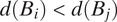
Our mapping application is comparable to these previous surveys in functionality. One difference is that in this case, rather than having respondents use a drawing tool to draw a circle around their residence that constitutes their neighborhood, the application offers a brush tool to shade in the census blocks around the residence that are included in the neighborhood. Respondents could zoom in or out on the map, and were able to make edits to their neighborhood after the initial shading. The only constraint was that neighborhoods had to be contiguous. Figure 1 shows a screen shot of the map drawing tool. We make our map drawing tool publicly available so that other researchers can use it for their own surveys (https://github.com/CoryMcCartan/neighborhood-survey). In particular, the tool can be embedded into a popular survey platform such as Qualtrics as done in our survey.
Map with Brush Tool Used to Draw Neighborhoods

Descriptive Statistics of Drawn Neighborhoods
Figure 2 shows the central tendencies and range of the population, area, proportion Democrat, proportion Republican, proportion white, and proportion Black of all drawn neighborhoods, broken out by city as well as pooled. Partisanship is measured using TargetSmart voter records of every registered voter in the three cities, using information on the residential location of each voter to create aggregate counts by census block. The population, area, and racial demographics are measured using the 2010 census.
Descriptive Statistics for Respondent Neighborhoods

We find a wide range of neighborhood sizes, both in terms of population and land area. The median number of residents contained in a drawn neighborhood is 3,020 residents, while its range extends from single digits to over 340,000 residents. Similarly, the median area is 0.78 square miles, but the entire distribution ranges from 0.01 to 344.74 square miles. This variation in size of neighborhoods is indicative of the variation in how different individuals experience their local geography and define their neighborhood. Accounting for this heterogeneity is critical in our statistical model we introduce in the next section.
We also find substantial variation in the demographics of the drawn neighborhoods (see Section S2 of the Supplementary Material). Figure S1 in the Supplementary Material shows the distribution of proportion white and proportion Black in drawn neighborhoods separately for white and non-white survey respondents. Drawn neighborhoods from white respondents are on average 21.1 percentage points whiter than those from non-white respondents. Figure S2 in the Supplementary Material contains the distribution of proportion Democratic and Republican separately by respondent party registration, with Democrats drawing consistently more Democratic neighborhoods and Republicans drawing more Republican neighborhoods.
These differences likely reflect objective differences in racial and partisan exposure across race and party, but may also be influenced by conscious or subconscious motivations for respondents to construct their subjective neighborhoods to include more members of their own racial or partisan in-group. Our statistical model can quantify the extent to which, net of other variables that may determine whether someone includes an area in their neighborhood, the added predictive effect of racial or partisan demographics on neighborhood inclusion. We now turn to our proposed statistical model of subjective neighborhoods.
MODELING NEIGHBORHOODS
To analyze the data collected through our survey tool, we propose a Bayesian model for neighborhood drawing that incorporates respondent characteristics, geographic factors, and their interaction. The model predicts the likelihood of including a given census block in a voter’s neighborhood. In addition, the coefficients of the model represent the direction and magnitude of predictive effects different variables have on this inclusion probability. Using this model, one can measure the degree to which the characteristics of respondents and geographic factors together predict subjective neighborhoods of different types.
Though the model is developed from explicitly spatial principles, ultimately it reduces to a generalized linear mixed-effects model (GLMM) with a particular link function, where every observation is a census block. Spatial information enters the model explicitly through the use of distance as a covariate, and implicitly in deciding which census blocks are included in model fitting and which are excluded. The simplification to a GLMM means that even without specialized software, practitioners can implement the model using existing statistical packages. Nevertheless, we provide an open-source implementation that is computationally efficient and tailored to the particular use case here (https://github.com/CoryMcCartan/nbhdmodel).
Notation and Setup
For ease of notation, we begin by describing the model for a single neighborhood drawn by one respondent. We start with an undirected graph $ G=(B,E) $
representing the layout of the city or town, with each vertex
$ G=(B,E) $
representing the layout of the city or town, with each vertex $ {B}_i\in B $
corresponding to a census block and the edges E corresponding to block adjacency. We write
$ {B}_i\in B $
corresponding to a census block and the edges E corresponding to block adjacency. We write $ {B}_i\sim {B}_j $
if
$ {B}_i\sim {B}_j $
if $ {B}_i $
and
$ {B}_i $
and $ {B}_j $
are adjacent, that is, the edge
$ {B}_j $
are adjacent, that is, the edge $ (i,j)\in E $
. We use
$ (i,j)\in E $
. We use $ K:=|B| $
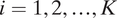
to denote the total number of blocks. In Figure 3, for example, the block with respondent’s residence is adjacent to four blocks labeled as “1a,” “1b,” “1c,” and “1d.” We do not consider two blocks that are touching one another with a single point as adjacent blocks (i.e., no point contiguity). Thus, the block with respondent’s residence is not adjacent to blocks “2a,” “2b,” and “2c.”
$ K:=|B| $
to denote the total number of blocks. In Figure 3, for example, the block with respondent’s residence is adjacent to four blocks labeled as “1a,” “1b,” “1c,” and “1d.” We do not consider two blocks that are touching one another with a single point as adjacent blocks (i.e., no point contiguity). Thus, the block with respondent’s residence is not adjacent to blocks “2a,” “2b,” and “2c.”
Model Schematic
Note: The respondent’s location is indicated by the black house in the center. Blocks are labeled in the order in which they are considered for inclusion in the neighborhood, with the number indicating the graph-theoretical distance and the letter the spatial distance tiebreaker. Blocks shaded purple have been included in the neighborhood, whereas blocks shaded light orange have been excluded. Parentheses around a block label indicate that it will not be considered for inclusion in the neighborhood because none of its neighboring blocks which are closer to the respondent belong to the neighborhood.

Without loss of generality, we number the blocks in order of their distance from the block where the survey respondent resides, according to some distance function $ d:B\to \mathbb{R} $
, so that
$ d:B\to \mathbb{R} $
, so that $ {B}_0 $
is this block,
$ {B}_0 $
is this block, $ {B}_1 $
its closest neighbor, and so on. Thus, if
$ {B}_1 $
its closest neighbor, and so on. Thus, if $ i<j $
then
$ i<j $
then $ d({B}_i)<d({B}_j) $
. In this application, we take d to be the graph-theoretical distance (i.e., the minimum number of edges between two nodes), with ties broken by spatial distance (i.e., the distance between centroids of census blocks). Figure 3 illustrates this ordering scheme. For example, block “1d” in the figure is numbered “1” because it is one step away from the respondent’s block, and “d” because among all the one-step-away blocks, it is the fourth closest to the respondent spatially. We note that the use of graph-theoretical distance introduces some dependency between the distance measure and population density: areas with higher population density generally contain smaller blocks. Graph-theoretical distance will increase faster in these areas over a given spatial distance compared to areas with lower population density.
$ d({B}_i)<d({B}_j) $
. In this application, we take d to be the graph-theoretical distance (i.e., the minimum number of edges between two nodes), with ties broken by spatial distance (i.e., the distance between centroids of census blocks). Figure 3 illustrates this ordering scheme. For example, block “1d” in the figure is numbered “1” because it is one step away from the respondent’s block, and “d” because among all the one-step-away blocks, it is the fourth closest to the respondent spatially. We note that the use of graph-theoretical distance introduces some dependency between the distance measure and population density: areas with higher population density generally contain smaller blocks. Graph-theoretical distance will increase faster in these areas over a given spatial distance compared to areas with lower population density.
Let $ {Y}_i $
be an indicator variable for the inclusion of
$ {Y}_i $
be an indicator variable for the inclusion of $ {B}_i $
in the respondent’s neighborhood, so that the neighborhood itself may be defined as the set of blocks with
$ {B}_i $
in the respondent’s neighborhood, so that the neighborhood itself may be defined as the set of blocks with $ {Y}_i=1 $
, that is,
$ {Y}_i=1 $
, that is, $ Y=\{{B}_j:{Y}_j=1\} $
. Since we require any neighborhood to contain the block where respondent’s residence is located, we always have
$ Y=\{{B}_j:{Y}_j=1\} $
. Since we require any neighborhood to contain the block where respondent’s residence is located, we always have $ {Y}_0=1 $
. We define a following connectivity indicator
$ {Y}_0=1 $
. We define a following connectivity indicator $ {C}_i $
to be 1 if block
$ {C}_i $
to be 1 if block $ {B}_i $
is connected to the respondent’s neighborhood by way of any closer blocks. Formally,
$ {B}_i $
is connected to the respondent’s neighborhood by way of any closer blocks. Formally,
 $$ \begin{array}{rll}{C}_i=1\{\mathrm{there}\ \mathrm{exists}\ \mathrm{a}\hskip0.3em j<i:{B}_i\sim {B}_j\hskip0.3em \mathrm{and}\hskip0.3em {Y}_j=1\}.& & \end{array} $$
This indicator checks whether, among the blocks which are closer to $ {B}_0 $
than
$ {B}_0 $
than $ {B}_i $
is, if any are in the respondent’s neighborhood. In Figure 3, blocks with parenthetic labels have
$ {B}_i $
is, if any are in the respondent’s neighborhood. In Figure 3, blocks with parenthetic labels have $ {C}_i=0 $
. For instance, block “3d” would be expected to be considered before “3e,” “3f,” etc. based on its location, but since none of “2d,” “3a,” and “3c” are in the neighborhood, “3d” is never considered.
$ {C}_i=0 $
. For instance, block “3d” would be expected to be considered before “3e,” “3f,” etc. based on its location, but since none of “2d,” “3a,” and “3c” are in the neighborhood, “3d” is never considered.
The Model
Under the proposed model, a neighborhood is generated sequentially, starting with $ {B}_0 $
and adding blocks in order of increasing distance from
$ {B}_0 $
and adding blocks in order of increasing distance from $ {B}_0 $
according to a probability. This probability is heavily influenced by the graph-theoretic distance between the block under consideration
$ {B}_0 $
according to a probability. This probability is heavily influenced by the graph-theoretic distance between the block under consideration $ {B}_i $
and
$ {B}_i $
and $ {B}_0 $
, and its connectivity. In particular, we assume that the neighborhood is connected and our survey tool does not allow respondents to draw disconnected neighborhoods.
$ {B}_0 $
, and its connectivity. In particular, we assume that the neighborhood is connected and our survey tool does not allow respondents to draw disconnected neighborhoods.
The core of the model is
 $$ \begin{array}{rll}{Y}_i\mid {Y}_0,\dots {Y}_{i-1}\sim \mathrm{Bernoulli}({\pi}_i\cdot {C}_i),& & \end{array} $$
where $ {\pi}_i $
is the inclusion probability of block
$ {\pi}_i $
is the inclusion probability of block $ {B}_i $
into one’s neighborhood provided that it is connected. As long as
$ {B}_i $
into one’s neighborhood provided that it is connected. As long as $ {\pi}_i\to 0 $
as
$ {\pi}_i\to 0 $
as $ d({B}_i)\to \infty $
, the generated neighborhoods will be bounded around
$ d({B}_i)\to \infty $
, the generated neighborhoods will be bounded around $ {B}_0 $
almost surely. Figure 3 illustrates the state of the neighborhood partway through the generation process, when block “3i” (shaded gold) is under consideration. The process concludes once the neighborhood is surrounded by light orange blocks, since then there are no blocks left which could be added while keeping the neighborhood contiguous.
$ {B}_0 $
almost surely. Figure 3 illustrates the state of the neighborhood partway through the generation process, when block “3i” (shaded gold) is under consideration. The process concludes once the neighborhood is surrounded by light orange blocks, since then there are no blocks left which could be added while keeping the neighborhood contiguous.
The specification of $ {\pi}_i $
determines the type of neighborhoods that are generated. Let
$ {\pi}_i $
determines the type of neighborhoods that are generated. Let $ \mathbf{X} $
be a
$ \mathbf{X} $
be a $ m\times K $
matrix of predictors, not including an intercept, with
$ m\times K $
matrix of predictors, not including an intercept, with $ {\mathbf{x}}_i $
the column vector of m predictors for block
$ {\mathbf{x}}_i $
the column vector of m predictors for block $ i=1,2,\dots, K $
. These may include the characteristics of the respondent, those of the graph or map (e.g., the demographics of blocks, locations of landmarks and roads), and their interactions. The inclusion probability can also depend on the inclusion of blocks whose distance to
$ i=1,2,\dots, K $
. These may include the characteristics of the respondent, those of the graph or map (e.g., the demographics of blocks, locations of landmarks and roads), and their interactions. The inclusion probability can also depend on the inclusion of blocks whose distance to $ {B}_0 $
is less than that of the block under consideration
$ {B}_0 $
is less than that of the block under consideration $ {B}_i $
. This means that the predictors can include the information about the partially drawn neighborhood. The factorization formulation above, however, precludes the possibility that
$ {B}_i $
. This means that the predictors can include the information about the partially drawn neighborhood. The factorization formulation above, however, precludes the possibility that $ {\mathbf{x}}_i $
depends on
$ {\mathbf{x}}_i $
depends on $ \{{Y}_j:j\ge i\} $
, that is, the inclusion of farther-out blocks.
$ \{{Y}_j:j\ge i\} $
, that is, the inclusion of farther-out blocks.
We model the inclusion probability using a kernel function that smoothly decays as the distance between $ {B}_i $
and
$ {B}_i $
and $ {B}_0 $
grows:
$ {B}_0 $
grows:
 $$ {\displaystyle \begin{array}{l}{\pi}_i=\pi \left({\mathbf{x}}_i,\boldsymbol{\beta}, \alpha, L,\sigma \right)=\mathrm{\exp}\left(-,|,\frac{d_{\mathrm{sp}}\left({B}_i\right)}{L}\mathrm{\exp}\left({\mathbf{x}}_i^{\top}\boldsymbol{\beta} +\varepsilon \right){|}^{\alpha}\right)\\ {}\hskip1em \mathrm{and}\hskip0.35em \varepsilon \hskip0.3em \sim \hskip0.3em \mathcal{N}\left(0,{\sigma}^2\right),\end{array}} $$
where $ \varepsilon $
is the respondent random effect,
$ \varepsilon $
is the respondent random effect, $ {d}_{\mathrm{sp}}({B}_i) $
represents spatial distance between
$ {d}_{\mathrm{sp}}({B}_i) $
represents spatial distance between $ {B}_0 $
and
$ {B}_0 $
and $ {B}_i $
, L controls the scale of decay, and
$ {B}_i $
, L controls the scale of decay, and $ \alpha $
controls its rate. In particular,
$ \alpha $
controls its rate. In particular, $ \alpha $
represents the sharpness of the neighborhood boundary. Along with L, the random effect
$ \alpha $
represents the sharpness of the neighborhood boundary. Along with L, the random effect $ \varepsilon $
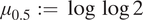
plays an important role in addressing the heterogeneity of neighborhood size across individual respondents. Figure 4 visualizes the kernel function we use where we choose an arbitrary length scale (horizontal axis) for illustration. As the value of
$ \varepsilon $
plays an important role in addressing the heterogeneity of neighborhood size across individual respondents. Figure 4 visualizes the kernel function we use where we choose an arbitrary length scale (horizontal axis) for illustration. As the value of $ \alpha $
increases, the inclusion probability decays faster as a function of distance.
$ \alpha $
increases, the inclusion probability decays faster as a function of distance.
Illustration of Kernel Function across a Range of Values of the $ \alpha $
Parameter, Indicated by Different Colors
$ \alpha $
Parameter, Indicated by Different Colors
Note: The length scale shown here is arbitrary; in the model, it is estimated as the L parameter.

Conveniently, the model reduces to a Bernoulli GLMM with complementary log-log (cloglog) link function for the exclusion probability
 $$ 1-{\pi}_i={\displaystyle \begin{array}{l}1\hskip-1pt -\hskip-1pt \mathrm{\exp}\Big\{\hskip-2pt -\hskip-1pt \mathrm{\exp}\hskip-2pt \Big(\alpha \log {d}_{\mathrm{sp}}\left({B}_i\right)-\alpha \log L\hskip-2pt +\hskip-2pt \alpha {\mathbf{x}}_i^{\top}\boldsymbol{\beta} +\alpha \varepsilon \Big)\hskip-2pt \Big\}.\end{array}} $$
That is, we can fit the model by regressing the non-inclusion indicators on the log distance, any covariates, and an individual random effect, using the cloglog link function. As discussed previously, we do not include every census block in the model—just those that are included in the neighborhood, and those which are not but border the neighborhood (i.e., those for which $ {C}_i=1 $
). This reflects the sequential generation process that underlies the model.
$ {C}_i=1 $
). This reflects the sequential generation process that underlies the model.
Since the link function is nonlinear, the marginal effect of each covariate varies by its underlying value, and is not simply equal to the value of the coefficient. We choose to focus our interpretation on the effect of each covariate on the “margin” of the neighborhood, where the probability of a block’s inclusion is 50%. We interpret the coefficient estimates by calculating
 $$ \begin{array}{rll}\mathrm{exp}(-\mathrm{exp}({\mu}_{0.5}+{\beta}_j))-\mathrm{exp}(-\mathrm{exp}({\mu}_{0.5}))& & \end{array} $$
for each coefficient $ {\beta}_j $
, where
$ {\beta}_j $
, where $ {\mu}_{0.5}:=\log \log 2 $
is the value of the linear predictor which corresponds to an inclusion probability of
$ {\mu}_{0.5}:=\log \log 2 $
is the value of the linear predictor which corresponds to an inclusion probability of $ 0.5 $
. This quantity reflects the percentage point change in the probability of inclusion for a one-unit change in the covariate
$ 0.5 $
. This quantity reflects the percentage point change in the probability of inclusion for a one-unit change in the covariate $ {\mathbf{X}}_j $
, at the margin.
$ {\mathbf{X}}_j $
, at the margin.
The model is completed with the following prior distributions:
 $$ \begin{array}{rll}\alpha \log L\sim {\mathrm{t}}_3(0,2.5)\hskip1em \mathrm{and}\hskip1em \sigma \sim {\mathrm{t}}_3(0,2.5).& & \end{array} $$
Prior distributions for the coefficients are formed indirectly by taking a QR decomposition of the centered covariate matrix (including the log distance variable) (Goodall Reference Goodall1993). The coefficients on the QR-decomposed (centered) covariates are given a $ {\mathrm{t}}_2(0,2.5) $
prior. This setup implies priors for the actual coefficients of interest which are weakly informative and adapted to the scale and correlation of the covariates. We have used importance sampling to fit the model under alternative prior specifications and found no measurable changes in the posterior distribution of the parameters.
$ {\mathrm{t}}_2(0,2.5) $
prior. This setup implies priors for the actual coefficients of interest which are weakly informative and adapted to the scale and correlation of the covariates. We have used importance sampling to fit the model under alternative prior specifications and found no measurable changes in the posterior distribution of the parameters.
Because of the sequential generation and the indicator function, the posterior distribution simplifies to
 $$ \begin{array}{lll}p(\theta \mid G,Y,\mathbf{X})\hskip0.35em \propto \hskip0.35em p(\theta ){\displaystyle \prod_{i=1}^K}p({Y}_i\mid {Y}_0,\dots, {Y}_{i-1},{\mathbf{x}}_i,\theta )& & \\ {}\hskip5.5em =p(\theta ){\displaystyle \prod_{i:{C}_i=1}}p({Y}_i\mid {Y}_0,\dots, {Y}_{i-1},{\mathbf{x}}_i,\theta )& & \\ {}\hskip5.5em =p(\theta ){\displaystyle \prod_{i:{C}_i=1}}\pi {({\mathbf{x}}_i,\theta )}^{Y_i}{\{1-\pi ({\mathbf{x}}_i,\theta )\}}^{1-{Y}_i},& & \end{array} $$
where $ \theta =(\boldsymbol{\beta}, \alpha, L,\sigma ) $
is shorthand for the parameters, and
$ \theta =(\boldsymbol{\beta}, \alpha, L,\sigma ) $
is shorthand for the parameters, and $ p(\theta ) $
is its prior distribution. This formulation only requires the computation of the likelihood for the blocks in the drawn neighborhood and all of their adjacent blocks.
$ p(\theta ) $
is its prior distribution. This formulation only requires the computation of the likelihood for the blocks in the drawn neighborhood and all of their adjacent blocks.
We assume individual responses are exchangeable, allowing us to simply multiply their likelihoods to create a joint model for all responses. The $ \beta $
, L,
$ \beta $
, L, $ \sigma $
, and
$ \sigma $
, and $ \alpha $
are shared across responses, but each respondent has its own error term
$ \alpha $
are shared across responses, but each respondent has its own error term $ \varepsilon $
common to all of its blocks. As appropriate,
$ \varepsilon $
common to all of its blocks. As appropriate, $ \beta $
may also contain hierarchical terms that vary by demographic categories, or metropolitan area or subdivision. Computational details for fitting models are described in Section S3 of the Supplementary Material.
$ \beta $
may also contain hierarchical terms that vary by demographic categories, or metropolitan area or subdivision. Computational details for fitting models are described in Section S3 of the Supplementary Material.
Model Specification
To illustrate the proposed model, we apply it to our survey data using the control group alone. We limit our analysis to the 468 respondents in the control group who drew a map that consisted of more than one census block. Because the census block that contained the residential address is highlighted by default, we cannot distinguish between respondents who selected single block neighborhoods and those who entered a residential address but decided not to draw a neighborhood. In Table S4 in the Supplementary Material, we show that neither respondent characteristics nor the experimental conditions are powerful predictors of who draw usable maps.
We fit a full model, which includes demographic information, as well as a baseline model, which includes only geographic information. We fit this model to a random sample of four hundred respondents from the 468 in the control group. The unsampled 68 will be the test set for our prediction analysis in the “Predicting Neighborhoods” section. Comparing the predictions of these two models will allow us to quantify the extent to which demographics contribute to the prediction of subjective neighborhoods. In the full model, we include as predictors individual characteristics consisting of voter race, political party, homeowner status, educational attainment, income, age, retirement status, and length of residence in current home. Individuals that differ along these characteristics may view their local area differently, and we quantify the predictive power of these factors about drawn neighborhoods.
We also include geographic characteristics of census blocks including race, party, and education demographics, whether the block contains a school, park, or church, and the distance to the closest of each of these features, whether the block is in the same block group as the voter’s residence, the same census tract, whether the block is bounded by the same major roads and railroads as the respondent’s residence, block population, and block land area. These aggregate characteristics account for features of place that may influence whether respondents include census blocks in their neighborhood. In particular, indicators for same block group, same census tract, and same road/rail regions should help disentangle demographic effects from the effects of physical boundaries, which can often align with sharp transitions in demographic composition. Block groups and tracts generally group blocks together following natural boundaries like existing neighborhood designations, highways, or bodies of water. The custom indicator for road/rail regions is designed to have the same effect.
In our analysis, we limited these infrastructure variables to those which could be computed from national data such as Census TIGER shapefiles, but researcher could also incorporate more specific geographic data, often available from municipalities, such as by using road speed or width data, or the locations of community centers and city facilities.
The model specification also includes interactions between respondent race and racial demographics, respondent party and party demographics, and respondent educational attainment and education demographics. Table S5 in the Supplementary Material contains detailed model specifications, including transformations and interactions of our covariates.
Our main coefficients of interest correspond to the three variables that measure the fraction of people in each block who belong to the same racial, partisan, and educational category as the respondent, respectively. We allow these coefficients to vary by the categories of each variable as well, to understand differences between groups. For example, the coefficient for the same race category variable can differ between white and minority respondents.
We fit a separate model to each city’s data. This decision is in part based on the fact that there are a sufficient number of respondents for each city, leading to relatively precise parameter estimates. Linking all three cities through a single hierarchical model is also possible, but fitting such a model to the entire data would substantially increase computational cost.
Empirical Findings
To interpret the fitted models, we use the method described earlier. We compute the posterior estimate of the percentage point change in the predicted probability that a respondent will include a census block in their neighborhood when increasing the value of the corresponding covariate by one unit, over a baseline probability of 50%, while holding other variables in the model constant. Figure 5 presents these posterior means and credible intervals (90% and 50%) for selected coefficients from the full model (see Section S5 of the Supplementary Material for the posterior summaries of all coefficients from the full and baseline models). Posterior summaries are plotted separately by city.
Selected Full Model Coefficient Posteriors, Scaled to Show the Percentage Point Change in Probability of a Block’s Inclusion for a Baseline Probability of 50%
Note: Plotted are 90% and 50% credible intervals, with posterior medians displayed to the right of each interval. Section S5 of the Supplementary Material contains the full results table for the other variables specified the “Model Specification” section.

Holding other variables in the model constant, a white respondent is 6.1 to 16.9 percentage points more likely to include a census block composed entirely of white residents compared to one with no white residents. We cannot be confident that this preference for racial homogeneity occurs for neighborhoods drawn by minority (non-white) respondents, as the credible intervals for each city sample overlap with zero. Partisan similarity exerts analogous predictive power. Democrats are more likely to include Democratic neighbors in their neighborhoods and Republicans are more likely to include Republican neighbors, holding other variables in the model constant.Footnote 6
We do not observe consistent results for educational similarity. College educated and non-college educated respondents include areas with more college educated residents, although the credible intervals for some of the city samples overlap with zero and the medians vary considerably across cities. Different results across cities could be due to contextual differences between cities but could also be due to sampling noise. Additionally, it is difficult to determine with the data what specific characteristics of cities might produce differential results.
Size and population of local areas also influence inclusion probability. In the New York and Phoenix, respondents are more likely to include populous census blocks in their neighborhoods. This interval is less precise and smaller in magnitude in Miami. In all three city samples, larger census blocks are more likely to be included in neighborhoods.
The presence of a church in a census block is negatively associated with inclusion of the census block in a neighborhood in the New York and Phoenix samples, with no predictive effect in the Miami sample. Distance to a church is also negatively associated with inclusion in each of the samples, meaning that census blocks that are closer to churches are more likely to be included. These results may speak to respondents opting to include residential census blocks over ones with churches in them, but their neighborhoods still being shaped by proximity to churches.
In Table S6 in the Supplementary Material, we report all the estimates from the full model described earlier (see Table S7 in the Supplementary Material for the estimates from the baseline model). These include administrative variables such as roadways, census block groups, and census tracts. We find that these administrative definitions and physical characteristics, net of other factors in the model, influence whether people include areas in their neighborhoods. For example, respondents are more likely to include areas in their neighborhood that fall on the same side of major roadways as their residence. Similarly, they are more likely to include areas that fall in the same census tract. These estimates demonstrate how objective features of neighborhoods influence subjective definitions.
PREDICTING NEIGHBORHOODS
The fitted model can also be used for posterior prediction of neighborhoods, for both in-sample and out-of-sample respondents. We first examine the ability of the model to predict respondent’s neighborhoods out-of-sample. While we find a large amount of individual heterogeneity makes highly accurate model predictions difficult, the model’s predictions still improve on naive methods such as using census tracts as stand-ins for respondent neighborhoods.
We then demonstrate possible uses of neighborhood predictions in-sample to visualize and understand the effect of various factors on a single respondent’s drawn neighborhood. Section S6 of the Supplementary Material takes this predictive framework one step further and connects aggregate-level model predictions to the substantive findings on co-racial and co-partisan preferences described above.
Out-of-Sample Predictive Ability
First, we examine the quality of model fit as measured by its out-of-sample predictive ability. There is significant heterogeneity in respondents’ neighborhoods, as reflected in the wide range of neighborhood areas and demographics shown in Figure 2. Neighborhoods range in size from less than 0.01 to over 100 square miles, and much of this variation in size is not captured by demographic variables. Any model will consequently struggle to make accurate predictions, especially for respondents not included in the data to which the model was fitted.
Despite these challenges, both the full and baseline models are more effective in predicting respondents’ neighborhoods than a naive approach based on circles centered around their residence locations. We measure predictive accuracy by first generating one hundred posterior predictions for each respondent’s neighborhood. This is accomplished by taking a random sample of parameter values from the posterior, and then sequentially sampling census block inclusions according to the model’s data generating process.
For each neighborhood prediction, we compute the precision and recall for the constituent census blocks, and then take their median values over predictions. Precision measures the fraction of the predicted neighborhood that is in the original neighborhood, while recall measures the fraction of the original neighborhood that is in the prediction. The baseline and full models have in-sample median precision of 0.32 and 0.34, respectively, and recall of 0.75 and 0.71. Out of sample, precision increases moderately to 0.38 and 0.48 for the baseline and full models, respectively. The out-of-sample recall falls to 0.69 and 0.64.
However, due to the contiguity requirement and the sequential nature of the neighborhood model, precision and recall in this context are driven largely by the size of the predicted neighborhood. As the neighborhood grows larger, the recall will increase at the cost of precision. In addition, by shifting the intercept of our model, we can grow or shrink the predicted neighborhood while maintaining the same discrimination with regards to predictive covariates.
Thus, to better contextualize this performance, we compare each posterior prediction (before averaging) to a circular neighborhood of the same radius as the prediction. We find this radius by taking the smallest circle centered on the respondent’s home which covers their drawn neighborhood. Using the same fixed-radius circle for comparison with all model predictions would not be appropriate given the wide variation in neighborhood sizes, but allowing the circular neighborhood to exactly match the modeled radius gives this naive approach a significant leg up—it can leverage all the information learned in the model about the neighborhood’s radius. We might therefore expect the baseline and full models to only minimally improve upon the circular neighborhoods, especially for out-of-sample predictions, where individual random effects have not been fit.
For the one hundred predictions for each respondent, we take the median of the difference in the F1 score, which is the harmonic mean of precision and recall, between the prediction and the matching circle. We also calculate this difference between the prediction and a census tract, the most common unit at which researchers measure local context (see Figure S8 in the Supplementary Material for comparison to ZIP Code Tabulation Areas). Figure 6 shows the results of this comparison, broken out by city. Both models outperform the circular-neighborhood approach by around 0.04 in-sample, and 0.03 out-of-sample on average. Importantly, both in and out of sample, only for a few respondents do the naive approaches meet or outperform the full model, as indicated by the bulk of each boxplot lying above the x-axis. And even in these cases, as shown above, the model is able to provide uncertainty quantification and coefficient estimates, which a naive approach cannot. Compared to census tracts, the predictive performance is similar, and only in New York City do we see consistent out-performance of the predictions compared to tracts.
Posterior Median of the Difference in F1 Scores between a Neighborhood Predicted by the Model and a Circular Neighborhood of the Same Radius (Top) or a Census Tract (Bottom)
Note: The boxplot shows the variation in this median difference across the respondents included in the model fitting (left plot) and excluded from the model fitting (right plot). Positive values indicate the model outperforming the circular baseline, on average, for a particular respondent. The baseline model includes geographic information only while the full model also includes demographic information. Section S5 of the Supplementary Material contains the full results tables for the full and baseline models.

The substantial heterogeneity in neighborhood sizes makes accurate neighborhood predictions difficult in general. However, the model’s use of local and individual covariate information allows it to improve on purely distance-based measures, even when these are well calibrated by matching the radius of a circular neighborhood to that of the model-based prediction.
In-Sample Respondent-Level Prediction
Model predictions can be useful in-sample as well. Here, we demonstrate the predictive influence of race on census block inclusion probability using a single respondent in Miami. This voter is white, female, and is not registered to a major political party. Figure 7 maps the racial demographics surrounding the respondent’s residential address in the left panel (each census block shaded based on the percent white of its population), and the change in the posterior probability of inclusion for each census block comparing the full model to the baseline model in the right plot. This respondent lives in a mixed but majority white area (indicated by light orange color in the left plot) that is just to the north of areas comprised largely of minority residents (dark purple color). Her drawn neighborhood (represented by a black solid line) adheres sharply to this stark southern boundary. The posterior probability map shows how these majority non-white areas are less likely to be included when demographics are accounted for in the model (indicated by dark brown color in the right plot).
The Left Plot Shows the Racial Demographics of Area Surrounding the Example Respondent
Note: The subjective neighborhood drawn by this respondent is indicated by the solid black line and each census block is shaded based on the percent white of its population. The right plot shows the difference in the posterior probability of a block being included in the respondent’s neighborhood between the full and baseline models. The baseline model includes geographic information only while the full model also includes demographic information. Blue areas are relatively more likely to be included under the full model, while orange areas are relatively less likely to be included.

Depending on one’s substantive questions of interest, other quantities may be of interest and can be directly computed from the fitted model though it may require additional causal and other assumptions. Examples include the probability of including one block, given that another block is or is not included; the change in an individual respondent’s posterior predictive neighborhood if their demographics were different; or how a change in the demographics of one block (say, by a new housing development) could influence the shape and size of a respondent’s neighborhood.
MEASURING AND MODELING COMMUNITIES OF INTEREST
This section uses an additional survey we conducted in New York City to demonstrate how the proposed methodology can be used to study political representation and COI as they relate to redistricting. The survey asked New York City residents to consider city’s official guideline for considering “COI” when redrawing city council districts. This guideline directs the city to “Keep intact neighborhoods and communities with established ties of common interest and association, whether historical, racial, economic, ethnic, religious or other” (New York City Charter 2022). Respondents are then directed to shade in on an interactive map “your community that should be kept together in your city council district.” This map drawing exercise is followed by similar demographic questions to the previous survey. Finally, we explore the ability to construct “consensus” neighborhoods from model predictions.
City Council Survey of New York City Residents
The survey was administered in two ways. First, similar to the previous survey, we contacted New York City residents via email, randomly drawing residents off of registered voter lists. Those who did not respond were sent a reminder email each week for 3 weeks. Of the 277,641 registered voters who were successfully contacted, we received 1,102 responses, for a response rate of 0.40%. Section S1 of the Supplementary Material contains more information on the sampling process.
The second method of survey administration was through targeted advertisements on Meta. From December 6, 2022 to February 21, 2023, we ran advertisements targeting New York City residents inviting them to draw their neighborhood on a map. Facebook users who clicked on the advertisement were led to the Qualtrics survey instrument. Based on statistics from Meta, 25,767 Facebook users clicked on our advertisements during this time period, of which 1,086 chose to take the survey.Footnote 7
In our analysis, we focus on the 627 respondents who drew maps consisting of more than one census block. Figure 8 shows the central tendencies of the population, area, proportion white and Black, and proportion Democratic and Republican for the drawn COI. These statistics are shown broken out by the email and Meta surveys, as well as the pooled sample. The median population of these drawn community of interests is 38,070 people, with the full distribution ranging from 319 to 455,384. The median area is 0.63 square miles (range: 0.01–12.41 square miles). The median percentage white is 56%, median percentage Black is 5%, and the median values for percent Democratic and Republican are 69% and 8% (out of registered voters). Figures S3 and S4 in the Supplementary Material show the breakdowns of map demographics by respondent race and partisan lean. The results show clear descriptive differences between whites and non-whites and between Democrats and Republicans in the racial and partisan demographics of their drawn COI.
Descriptive Statistics for Respondent Communities of Interest

Determinants of Communities of Interest
Next, we fit the proposed model with the same specification as the one used for the analysis of the first survey. We examine the way in which respondent traits, aggregate characteristics, and their interactions influence the inclusion of different areas into their COI. Similar to the previous analysis, we first take a random sample of five hundred (approximately 80% of the sample) responses as our training data and fit the model to this training set. All coefficients reported below are on this sample, while predictive comparisons in “Quality of Model Fit” section conduct out-of-sample predictions on the 127 neighborhoods in the test set.
Figure 9 displays the coefficients of interest from the model fit to the city council data (see Table S8 in the Supplementary Material for the full results). Holding other factors constant, white respondents are 14.3 percentage points more likely to include a census block comprised entirely of white residents in their community of interest. Minority respondents are 7.9 percentage points more likely to include census blocks comprised entirely of minority residents. The analogous estimates from the New York City sample in the subjective neighborhoods survey were 6.1 percentage points for whites and −7.5 percentage points for minority respondents (but not statistically significant). Therefore, the preference for racial homophily is stronger when respondents define the areas that should be included in their city council district than when drawing subjective neighborhoods without explicit direction as to the political implications of these definitions.
Selected Full Model Coefficient Posteriors, Scaled to Show the Percentage Point Change in Probability of a Block’s Inclusion for a Baseline Probability of 50%
Note: Plotted are 90% and 50% credible intervals, with posterior medians displayed to the right of each interval. Section S5 of the Supplementary Material contains the full results table.

We also find that Democratic respondents are 9.9 percentage points more likely to include Democratic census blocks, (slightly lower than that 11.1-percentage point estimate in the first survey), while Republicans are 28.1 percentage points more likely to include Republican census blocks (much higher than the 12.7-percentage point estimate in the subjective neighborhoods survey). The estimates for education are consistent in sign but smaller in magnitude as in the previous survey. Respondents, regardless of whether they graduated college or not, tend to include census blocks containing more residents who graduated college.
Looking at the other coefficients in the model, we find high levels of consistency between effect sizes and direction between the city council survey and the subjective neighborhood survey. For example, block population and block area are again positively associated with inclusion, while presence of a church and distance to the nearest church are both negatively associated with inclusion.
In sum, these results demonstrate that citizen conceptions of how they should be represented are shaped by local racial and partisan demographics, as well as by infrastructural and institutional characteristics of the places in which they live. Specifically, respondents are influenced by racial and partisan compositions of local areas when drawing subjective neighborhoods regardless of whether they are given specific definitions of neighborhoods. The magnitude of racial influence is particularly greater when drawing COI as they relate to legislative redistricting.
Quality of Model Fit
As before, we examine the quality of model fit using the city council survey. The top row of Figure 10 shows the distribution of the median difference in the F1 score between predicted COI and the matching circle, using the baseline and full model. The baseline model outperforms the circular-neighborhood approach by approximately 0.016 in-sample, and 0.049 out-of-sample on average. The full model outperforms the circular neighborhood by approximately 0.014 in-sample and 0.015 out-of-sample.
Posterior Median of the Difference in F1 Scores between a Community of Interest Predicted by the Model Prediction and a Circular Neighborhood of the Same Radius (Top) and a Census Tract (Bottom)
Note: The boxplot shows the variation in this median difference across the respondents included in the model fitting (left plot) and excluded from the model fitting (right plot). Positive values indicate the model outperforming the circle (tract), on average, for a particular respondent. The baseline model includes geographic information only while the full model also includes demographic information.

The bottom row of the figure shows that compared to tracts, the model shows a much more notable improvement. The median difference in F1 scores between the baseline model and tracts is 0.27 in-sample and 0.30 out-of-sample. For the full model, the median difference is 0.25 in-sample and 0.29 out-of-sample. The performance advantage is much higher than that observed in the tract comparison from the first survey. This improvement in predictive performance suggests that drawn maps are easier to predict when respondents are provided with a more concrete prompt related to redistricting.
Building Consensus Neighborhoods
A major challenge for map drawers in redistricting city council boundaries is to incorporate many COI at the same time. As we have consistently found, different people living in the same location may define their local community or neighborhood differently. When it comes time to select a “community of interest” for redistricting purposes, these varying individual communities must be somehow aggregated. We can use individual predictions to explore options for this aggregation process, and to understand how our substantive findings on same-race preference affect the difficulty of building an aggregate or consensus neighborhood.
We begin by sampling a synthetic residential population for a particular census block. We generate a random race, party, homeownership status, and educational level for one hundred individuals according to the census-reported demographics for the block. Then for each synthetic resident, we estimate the posterior predictive distribution over census blocks by simulating 20 neighborhoods from the posterior predictive distribution of the city council model.Footnote 8 Since we are simulating neighborhoods for synthetic residents who did not take the survey, we draw new random effects for each resident. While all the synthetic residents live in the same census block, they differ in their covariates, and so their posterior predictive neighborhoods are different as well.
We can now aggregate the one hundred residents’ posterior predictive distributions by calculating, for each block, the fraction of the synthetic respondents who assign at least 50% posterior probability to that block. Blocks which belong, with high probability, to almost everyone’s predicted neighborhood will have high values, while blocks that generally belong to only one or two residents’ neighborhood will have low values. These values are plotted on a map in the left of Figure 11, for a block in a highly racially diverse area of the borough of Queens.
On the Left, a Map Visualizing the Consensus Community of a Synthetic Residential Population of a Single Census Block, Which is Marked with a White Asterisk
Note: Darker blocks are those which are included in a higher proportion of synthetic resident’s predicted neighborhoods. On the right, the trade-off between the size of the community of interest and the degree of consensus is plotted for communities in two areas: one with high and one with low racial diversity.

Unsurprisingly, there is strong agreement for blocks close to the block where all the residents live, with the share of residents including a block falling with distance. This illustrates a fundamental trade-off in building consensus neighborhoods: all else being equal, a smaller neighborhood will have a higher level of consensus. We can visualize this trade-off directly by changing the threshold used to decide whether a block belongs to the consensus neighborhood in the left map of Figure 11. In other words, we consider modifying a minimum share of residents who include the block in their neighborhood. As we vary this threshold value (horizontal axis), the size of the consensus neighborhood changes as well.
This is visualized in the right plot of Figure 11 where the blue line represents the result for this highly racially diverse block in Queens. When we repeat this prediction exercise in an area of Brooklyn with low racial diversity, we obtain a different community consensus-size curve, which is represented by a yellow line in the plot. Specifically, in the low-diversity area, it is easier to build a consensus neighborhood: for any given neighborhood size, a higher fraction of block residents can agree on a neighborhood of that size. Conversely, for a given share of agreement, the neighborhoods in the low-diversity area are larger, on average.
These patterns reflect the individual-level findings from our fitted models: residents prefer racially homogeneous neighborhoods and communities. As a result, racially diverse areas will find it harder to agree on a common definition of a neighborhood.
CONCLUDING REMARKS
The study of political and social geography is often impeded by persistent measurement challenges. Progress on substantive questions necessitates methodological advancements in the construction and analysis of geographic data. We provide an open-source survey tool that allows researchers to measure subjective social and political geography. This survey tool can be used to collect any type of drawn map from survey respondents, and these collected data can be used as an outcome—to quantify why respondents drew the map they did—or can serve as more appropriate measures (compared to common practices of using administrative units such as census tracts or ZIP codes) of local context from which to measure geographic variables. Our survey module can be easily modified to directly measure various geographies of interest using different prompts, designs, and instructions. For example, researchers could use different sub-geographic units (such as housing parcels, rather than census blocks) as the building blocks for subjective geographies. Another possibility is to add or remove certain information about geographical units, buildings, and landmarks.
We also propose a statistical model that can be used to analyze the data obtained from our survey module. The model helps us better understand how people perceive their local geography, and this perception in turn informs the investigation of how perceived geography may influence social, political, and economic behaviors. Researchers can also use our model to analyze any type of geographic unit—creating opportunities for enhanced understanding of administrative boundaries, local governance, and the interaction of political institutions and geography. For example, one could take a dataset of census tracts and take the centroid of each tract as the point from which to operationalize distance, and then quantify how much aggregate characteristics of census blocks or any smaller geography predicts how census tracts are drawn. In terms of explanatory variables of the model, any information that is spatially measured can be incorporated into the analysis, and the model can produce estimates of its influence on neighborhood inclusion.
Our substantive applications illustrate the potential uses of this methodology, and demonstrate a striking relationship between racial and partisan demographics and subjective neighborhoods. Even after accounting for individual characteristics, aggregate socio-economic variables, and infrastructural characteristics, voters are more likely to include census blocks that consist of greater numbers of same-race or same-party residents. Variation in racial or partisan homophily produces sizable changes in inclusion probability, which in turn produce substantive differences in the kinds of subjective neighborhoods for respondents of different parties and races. These patterns spur further questions about the role of inter-ethnic and inter-party relations in shaping social geography.
Lastly, we demonstrate that our methodology can be used to make better out-of-sample predictions of subjective neighborhoods than distance-based measures, census tracts, or ZIP codes. This result suggests that researchers could, under certain circumstances, use our methodology to generate likely neighborhoods for individuals where drawn maps are not collected. To do so, researchers would need to collect drawn neighborhoods from a representative sample of their target population of interest. Even with a representative sample, researchers should still be mindful of the possibility that the measurement which is necessarily present in predicted neighborhoods could be correlated with the outcome of interest, leading to biased inference (Egami et al. Reference Egami, Jacobs-Harukawa, Stewart and Wei2023; Fong and Tyler Reference Fong and Tyler2021; Knox, Lucas, and Cho Reference Knox, Lucas and Tam Cho2022; McCartan et al. Reference McCartan, Goldin, Ho and Imai2023). This concern is present in any use of predicted data, and researchers should use caution when applying our methodology in this manner. But, once these conditions are met, researchers could use our model to improve the measure of local context in larger datasets.
SUPPLEMENTARY MATERIAL
To view supplementary material for this article, please visit https://doi.org/10.1017/S0003055423001429.
DATA AVAILABILITY STATEMENT
Research documentation and code that support the findings of this study are openly available at the American Political Science Review Dataverse: https://doi.org/10.7910/DVN/SDSUQG. Although our survey tool is publicly available, we are not able to publicly release our survey data to protect the privacy of respondents.
ACKNOWLEDGMENTS
The authors thank Ryan Enos for sharing TargetSmart voter file data, members of the Imai Research Group for input on the survey design, helpful feedback at the Political Methodology Society 2022 Summer Meeting and the Harvard University’s Applied Statistics Workshop, through IQSS’s Magaro Peer Pre-review Program, and Justin de Benedictis-Kessner, Michael Hankinson, Aaron Kaufman, Melissa Sands, and Kim Sønderskov for detailed comments. The open-source survey instrument for measuring subjective neighborhoods is available at https://github.com/CoryMcCartan/neighborhood-survey while the software package for analyzing the collected data is available at https://github.com/CoryMcCartan/nbhdmodel. The experimental analysis was pre-registered at Open Science Foundation, pre-registration materials can be found at https://osf.io/xdumv/.
FUNDING STATEMENT
This research was in part funded by Meta, who provided advertisement credits to collect some of the survey data. The survey advertisement content went through the Meta policy review. Meta had no other role in the design or conduct of the research and no role in the interpretation of the data or preparation of the manuscript.
CONFLICT OF INTEREST
The authors declare no ethical issues or conflicts of interest in this research.
ETHICAL STANDARDS
The authors declare the human subjects research in this article was reviewed and approved by Harvard University’s Institutional Review Board and certificate numbers are provided in the Additional Supplementary Material. The authors affirm that this article adheres to the APSA’s Principles and Guidance on Human Subject Research.


 Open access
Comments
No Comments have been published for this article.