If a welfare state had a logo, what would it be? And why a welfare state would need one in the first place?
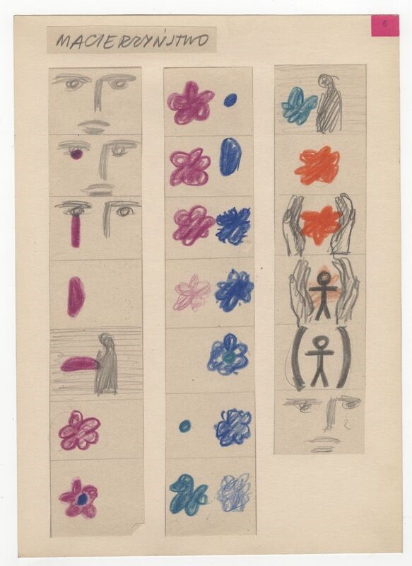
This reflection was prompted by my research into Poland’s display at the International Labour Exhibition Turin in 1961 which is the subject of my current article. An unassuming symbol of a stick figure placed within parentheses was designed by a creative duo Wojciech Zamecznik and Jan Lenica. Despite its simplicity, the logo served as an apt metaphor for the socialist welfare state and summarised the relationship between the citizen and the state in a concise way.
The Polish exhibition’s narrative revolved around the state’s commitment to protect individuals against the evils of the contemporary world. Those who lost their ability to work due to significant life changes, such as old age, maternity, illness, or the loss of the family breadwinner, could rely on the state’s support. Social securities were guaranteed to every Polish citizen by the Polish People’s Republic Constitution, fragments of which were displayed as part of the exhibition design. The exhibition additionally demonstrated the physical dimension of the state’s guardianship through a showcase of modern architecture. Photographs of newly constructed schools, housing estates, factories and recreation facilities were presented as the actual sites where the post-Thaw’s social policies were implemented.

The exhibition and the logo were conceived to communicate the welfare state project not to recipients of the social benefits but to the international public opinion – diplomats, bureaucrats, journalists and the broad audience who visited the show. This international context for which the sign was intended provides an answer to the second question about the purposefulness of the socialist welfare state logo. While non-artistic exhibitions have been widely recognised across the globe as tools in international diplomacy, the International Labour Exhibition offered an original opportunity for confrontation and competition. The socialist welfare project, and in particular its humanistic dimension, was employed by the Polish organisers to leverage the country’s international standing. Indeed, state-subsidised accommodation; free, compulsory, universal public education, introduced shortly after the war; full employment and organised holidays that Poland displayed in Turin were unmatched by the West. The article offers a reading of the exhibition as a diplomatic pursuit of Poland to manifest its distinctiveness as an original socialist state through social advancement and design expertise.
In personal interviews I conducted with Juliusz Zamecznik, he shared his memories from when his father and Jan Lenica worked on the Turin exhibition in their tiny apartment/studio in Warsaw. The designers were very content with their visually concise but conceptually rich metaphor of the welfare state. They joked that the brackets (which initially were designed as hands) that protect an individual could, on a whim, squash that individual too. This ambivalence of the relationship between the state and the citizens that people at home easily recognised, stayed concealed from the exhibition’s narrative, which instead celebrated the Polish state as socialist, humanist and well-designed.
Read the full open access article now: Socialist, humanist, and well-designed: Polish welfare state at the International Labour Exhibition in Turin, 1961 by Katarzyna Jeżowska.
Fig. 1. Logo of the Polish exhibition in Turin designed by Wojciech Zamecznik and Jan Lenica. Courtesy J. & S. Zamecznik / Archeology of Photography Foundation


