

1 Introduction
This Element begins with an intuitive illustration of the two types of variation that underlie statistical process control methodology: ‘common cause’ variation, inherent in the process, and ‘special cause’ variation, which operates outside of that process. It then briefly describes the history, theory, and rationale of statistical process control methodology, before examining its use to monitor and improve the quality of healthcare through a series of case studies. The Element concludes by considering critiques of the methodology in healthcare and reflecting on its future role.
The statistical details for constructing the scores of charts found in statistical process control methodology are beyond the scope of this Element, but technical guides are signposted in Further Reading (see Section 6) and listed in the References section.
1.1 Understanding Variation by Handwriting the Letter ‘a’
In this section, we use the process of handwriting to demonstrate the ideas that underpin statistical process control methodology. Imagine writing the letter or signature ‘a’ by hand using pen and paper. Figure 1a shows seven ‘a’s written by the author. While the seven letters appear unremarkable, what is perhaps remarkable is that even though they were produced under the same conditions (same hand, date, time, place, pen, paper, temperature, light, blood pressure, heart rate, and so on) by the same process, they are not identical – rather, they show controlled variation. In other words, even a stable process produces variation or ‘noise’.
Handwritten letter ‘a’


In seeking to understand this controlled variation, it might be tempting to separate the ‘a’s into better and worse and try to learn from the best and eliminate the worst. This would be a fundamental mistake, since the conditions that produced them were the same, and so no ‘a’ is better or worse than its peers. The total variation seen in the seven ‘a’s has a common cause, which is inherent in the underlying process. Efforts to improve the quality of the letters need to focus on changing that process, not on trying to learn from the differences between the letters.
What changes could we make to the underlying process to reduce the variation and improve the quality of the ‘a’s? We could change the pen, paper, or surface, or we could use a computer instead. Of these suggestions, we might guess that using a computer will result in marked improvements to our ‘a’s. Why? We can draw useful insight from the theory of constraints, which compares processes to a chain with multiple links.Reference Cox and Schleier1 The strength of a chain is governed or constrained by its weakest link. Strengthen the weakest link and the chain improves. Strengthening other links simply uses up resources with no benefit. In the handwriting process, the weakest link (constraint) is the use of the hand to write the letter. The pen, paper, light, and so on are non-constraints; if we change one of them, we will not make a material difference to the quality of our ‘a’s. Switching to a computer to produce our ‘a’s, however, will see a marked improvement in performance because we would have overcome the weakest link or process constraint (handwriting). So, a stable process produces results characterised by controlled variation that has a common cause, which can only be reduced by successfully changing a major portion of the underlying process.
Now consider the ‘a’ in Figure 1b. It is obviously different from the others. A casual look suggests that there must be a special cause. In this case, the author produced the letter using his non-dominant (left) hand. When we see special cause variation, we need to find the underlying special cause and then decide how to act. Special cause variation requires detective work, and, if the special cause is having an adverse impact on our process, we must work towards eliminating it from the process. But if the special cause is having a favourable impact on our process, we can work towards learning from it and making it part of our process (see the Elements on positive devianceReference Baxter, Lawton, Dixon-Woods, Brown and Marjanovic2 and the Institute for Healthcare Improvement approachReference Boaden, Furnival, Sharp, Dixon-Woods, Brown and Marjanovic3).
In summary, the handwritten ‘a’s demonstrate two types of variation – common cause and special cause – and the action required to address each type of cause is fundamentally different. The origins of this profound understanding of variation are described in the next section.
1.2 A Brief History of Statistical Process Control Methodology
This understanding of variation – which underpins statistical process control methodology – comes from the physicist and engineer Walter Shewhart.Reference Shewhart4 His pioneering work in the 1920s at Bell Laboratories in Murray Hill, New Jersey, successfully brought together the disciplines of statistics, engineering, and economics and led to him becoming known as the ‘father of modern quality control’.Reference Shewhart5
Shewhart noted that the quality of a product is characterised by the extent to which the product meets the target specification, but with minimum variation. A key insight was his identification of two causes of variation:
common cause variation, which is the ‘noise’ intrinsic to the underlying process
special cause variation, which ‘signals’ an external cause.
This distinction is crucial: reduction of common cause variation needs action to change the process, whereas special cause variation needs identification of the external cause before it can be addressed.
Shewhart developed a theory of variation which classified variation according to the action required to address it, turning his abstract concept into something that can be measured in the form of statistical process control methodology. The methodology has proven to be very useful in efforts to improve the quality of manufactured products. Its migration to healthcare appears to have happened initially via applications to quality control in laboratory medicine in the 1950s.Reference Karkalousos and Evangelopoulos6 Since the 1980s, the use of these methods has continued to expand, especially in monitoring individual patients,Reference Tennant, Mohammed, Coleman and Martin7 for example following kidney transplantation,Reference Piccoli, Rizzoni and Tessarin8 for asthmatic patients,Reference Gibson, Wlodarczyk and Hensley9 and for patients with high blood pressure.Reference Solodky, Chen, Jones, Katcher and Neuhauser10 Statistical process control is now used across a wide range of areas in healthcare, including the monitoring and improvement of performance in hospitals and primary care, monitoring surgical outcomes, public health surveillance, and the learning curve of trainees undertaking medical or surgical procedures.Reference Suman and Prajapati11–Reference Bolsin and Colson14
2 What Is Statistical Process Control Methodology?
Statistical process control methodology offers a philosophy and framework for learning from variation in data for analytical purposes where the aim is to act on the underlying causes of variation to maintain or improve the future performance of a process. It is used in two main ways:
to monitor the behaviour or performance of an existing process (e.g. complications following surgery), or
to support efforts to improve an existing process (e.g. redesigning the pathway for patients with fractured hips).
By adopting this methodology, the user is going through the hypothesis-generation and testing cycle of the scientific method, as illustrated by the plan-do-study-act (PDSA) cycle (see the Element on the Institute for Healthcare Improvement approachReference Boaden, Furnival, Sharp, Dixon-Woods, Brown and Marjanovic3), supported by statistical thinking to distinguish between common and special cause variation.
Box 1 highlights various descriptions and features of common versus special cause variation. In practice, a graphical device – known as a statistical process control chart – is used to distinguish between common and special cause variation. In the next section, we look at the three main types of statistical process control charts commonly used in healthcare.
| Common Cause Variation | Special Cause Variation |
|---|---|
|
|
2.1 The Statistical Process Control Chart
Statistical process control methodology typically involves the production of a statistical process control chart (also known as a process behaviour chart) that depicts the behaviour of a process over time and acts as a decision aid to determine the extent to which the process is showing common or special cause variation. Scores of control charts exist,Reference Provost and Murray15 but three main types have been used successfully in healthcare:
run chartsReference Perla, Provost and Murray16
Shewhart control chartsReference Mohammed, Worthington and Woodall17
cumulative sum (CUSUM) charts.Reference Noyez18
This section introduces the three main types of charts by using systolic blood pressure data from a patient with high blood pressure (taken over 26 consecutive days at home before starting any corrective medication). Figure 2 shows the blood pressure data over time using a run chart, a Shewhart control chart, and a CUSUM chart.
The run chart (top panel) shows the behaviour of the blood pressure data over time around a central horizontal line.
The Shewhart chart (middle panel) shows the same data around a central line along with upper and lower control limits.
The CUSUM chart (bottom panel) doesn’t show the raw data, but instead shows the differences between the raw blood pressure data and a selected target, accumulated over time.
Three types of control charts based on the blood pressure readings of a hypertensive patient. In part b, the top panel is a run chart, the middle panel is a Shewhart control chart, and the bottom panel is a cumulative sum chart


As Figure 2 demonstrates, several charts can usually be used to examine the variation in a given data set. In general, run charts are the simplest to construct and CUSUM charts are the more complex. This highlights an important point: although several (appropriate) chart options are usually available to choose from, there is usually no single best chart for a given data set. The ideal is to consider multiple charts, but in practice people may lack the time, skill, or inclination to do so – and may opt for a single chart that suits their circumstances.
We will now consider each of the three charts in Figure 2 in more detail.
2.1.1 The Run Chart
The first chart (Figure 2, top panel) is known as a run chart.Reference Perla, Provost and Murray16 The simplest form of a chart, the run chart plots the data over time with a single central line that represents the median value.
The median is a midpoint value (=174) that separates the blood pressure data into an upper and lower half. This is useful because, in the long run, the output of a stable process should appear above the median half the time and below the median the other half of the time. For example, tossing a coin would, in the long term, show heads (or tails) half the time. On a run chart, the output of a stable process will appear to bounce around the central line without unusual, non-random patterns.
The appearance of unusual (non-random) patterns would signal the presence of special cause variation. A run of six or more consecutive points above (or below) the median constitutes an unusual run, because the probability of this happening by random chance alone is less than 2% (=0.5^6) – for example the equivalent of tossing a coin and getting six heads in a row.
As illustrated by Figure 3, four commonly used rulesReference Perla, Provost and Murray16 may detect special causes of variation with run charts (although other rules have been suggestedReference Anhøj and Olesen19, Reference Anhøj20).
Rule 1: A shift.
Rule 2: A trend.
Rule 3: Too few or too many runs above or below the median.
Rule 4: A data point judged by eye to be unusually large or small.Reference Perla, Provost and Murray16
Four rules for detecting special cause variation on a run chart

The run chart can be especially useful in the early stages of efforts to monitor or improve a process where there is not enough data available to reliably calculate the control limits.
When there is enough data (typically we need 20–25 data points), we can plot a Shewhart control chart (middle panel in Figure 2).Reference Provost and Murray15
2.1.2 Shewhart Control Charts
This, like the run chart, also shows the blood pressure data over time but now with three additional lines – an average central line, and lower and upper control limits – to help identify common and special cause variation.
Data points that appear within the control limits (without any unusual patterns) are deemed to be consistent with common cause variation. Signals of special cause variation are data points that appear outside the limits or unusual patterns within the limits.
Five rules are commonly used for detecting special cause variation in a Shewhart control chart (also shown in Figure 4, enclosed by an oval shape).Reference Provost and Murray15
Rule 1 identifies sudden changes in a process.
Rule 2 signals smaller but sustained changes in a process.
Rule 3 detects drift in a process.
Rule 4 identifies more subtle runs not picked up by the other rules.
Rule 5 identifies a process which has too little variation.
Rules for detecting signals of special causes of variation on a Shewhart control chart. Signals of special cause variation are enclosed by an oval

In a Shewhart control chart, the central line is usually the mean/average value. The upper and lower control limits indicate how far the data from a process can deviate from the central line based on a statistical measure of spread known as the standard deviation. Typically, about
60%–70% of data from a stable process will lie within ± one standard deviation of the mean.
90%–98% of data points lie within ± two standard deviations of the mean.
99%–100% of data points lie within ± three standard deviations of the mean.
Upper and lower control limits are usually set at ± three standard deviations from the mean. Setting the control limits at ± three standard deviations from the mean will capture almost all the common cause variability from a stable process. In practice, it is not uncommon to see control charts with two and three standard deviation limits shown – usually as an aid to visualisation, but also as a reminder that a judgement has to be made about where to set the limits. That judgement needs to balance the cost of looking for special cause variation when it doesn’t exist against the cost of overlooking it when it does.Reference Shewhart4, Reference Provost and Murray15
It is important to understand that the variability in the data is what determines the width between the lower and upper control limits. For example, Figure 5 illustrates the impact of variability on the control limits. We see two randomly generated data sets (y1 and y2) with 100 numbers having the same mean (10) but different standard deviations (1 and 2, respectively). These data are shown with control limits set at ± three standard deviations from the mean. The increased variability in y2 is associated with wider control limits. Both processes are stable in that they show random variation, but the process on the right has greater variation and hence wider control limits.
Control charts for two simulated random processes with identical means (10) but the process on the right has twice the variability

We next consider another approach to charting based on accumulating differences in the data set using CUSUM charts.
2.1.3 Cumulative Sum Charts
The bottom panel in Figure 2 shows a CUSUM chart.Reference Noyez18 Unlike the other two charts, it doesn’t show the raw blood pressure measurements. Instead, it shows the differences between the raw data and a selected target (the mean in this case) accumulated over time. For a stable process, the cumulative sums will hover around zero (the central line is zero on a CUSUM chart), indicating common cause variation. If the CUSUM line breaches the upper or lower control limit, this is a sign of special cause variation, indicating that the process has drifted away from its target.
CUSUM charts are more complex to construct and less intuitive than run charts or Shewhart charts, but they are effective in detecting signals of special cause variation – especially from smaller shifts in the behaviour of a process. The CUSUM chart in Figure 2 is a two-sided CUSUM plot because it tracks deviations above and below the target. But in practice, a one-sided CUSUM plot is often used because the primary aim is to spot an increase or decrease in performance. For example, when monitoring complication rates after surgery, the focus is on detecting any deterioration in performance – for which a one-sided CUSUM plot is appropriate.Reference Rogers, Reeves and Caputo21
An important use for CUSUM charts in healthcare is to monitor binary outcomes on a case-by-case basis, such as post-operative outcomes (e.g. alive or died) following surgery. As an illustration, we can indicate patients who survived or died with 0 and 1, respectively. Let’s say we have a sequence for 10 consecutive patients, as 0,1,0,1,1,0,1,0,0,0. Although we can plot such a sequence of 0s and 1s on a run chart or Shewhart chart, this proves to be of little use because the data steps up or down on the chart constrained at 0 or 1 (Figure 6, top panel). However, the CUSUM chart (Figure 6, bottom panel) uses these data more effectively by accumulating the sequence of 0s and 1s over time. A change in slope indicates a death, and a horizontal shift (i.e. no change in slope) indicates survival.
Plots showing the outcomes (alive = 0, died = 1) and cumulative outcomes for 10 patients following surgery

3 Statistical Process Control in Action
In this section, we look at how statistical process control charts are used in practice in healthcare, where they generally serve two broad purposes: (1) to monitor an existing process, or (2) as an integral part of efforts to improve a process. The two are not mutually exclusive: for example, we might begin to monitor a process and then decide that its performance is unsatisfactory and needs to be improved; once improved, we can go back to monitoring it. The following case studies show how statistical process control charts have been used in healthcare for either purpose. We begin with the run chart.
3.1 Improving Patient Flow in an Acute Hospital Using Run Charts
Run charts offer simple and intuitive ways of seeing how a process is behaving over time and assessing the impact of interventions on that process. Run charts are easy to construct (as they mainly involve plotting the data over time) and can be useful for both simple and complex interventions. This section discusses how run charts were used to support efforts to address patient flow issues in an acute hospital in England.Reference Silvester, Mohammed, Harriman, Girolami and Downes22
Patients who arrive at a hospital can experience unnecessary delays because of poor patient flow, which often happens because of a mismatch between capacity and demand. No one wins from poor patient flow: it can threaten the quality and safety of care, undermine patient satisfaction and staff morale, and increase costs. Enhancing patient flow requires healthcare teams and departments across the hospital to align and synchronise to the needs of patients in a timely manner. But this is a complex challenge because it involves many stakeholders across multiple teams and departments.
A multidisciplinary team undertook a patient flow analysis focusing on older emergency patients admitted to the Geriatric Medicine Directorate of Sheffield Teaching Hospitals NHS Foundation Trust (around 920 beds).Reference Silvester, Mohammed, Harriman, Girolami and Downes22 The team found a mismatch between demand and capacity: 60% of older patients (aged 75+ years) were arriving in the emergency department during office hours, but two-thirds of subsequent admissions to general medical wards took place outside office hours. This highlighted a major delay between arriving at the emergency department and admission to a ward.
The team was clear that more beds was not the answer, saying that an operational strategy that seeks to increase bed stock to keep up with demand was not only financially unworkable but also ‘diverts us from uncovering the shortcomings in our current systems and patterns of work’.Reference Silvester, Mohammed, Harriman, Girolami and Downes22
The team used a combination of the Institute for Healthcare Improvement’s Model for Improvement (which incorporates PDSA cycles – see the Element on the Institute for Healthcare Improvement approachReference Boaden, Furnival, Sharp, Dixon-Woods, Brown and Marjanovic3), lean methodology (a set of operating philosophies and methods that help create maximum value for patients by reducing waste and waits), and statistical process control methodology to develop and test three key changes: a discharge to assess policy, seven-day working, and the establishment of a frailty unit. Overall progress was tracked using a daily bed occupancy run chart (Figure 7) as the key analytical tool. The team annotated the chart with improvement efforts as well as other possible reasons for special cause variation, such as public holidays. This synthesis of process knowledge and patterns on the chart enabled the team to assess, in real time, the extent to which their efforts were impacting on bed occupancy. Since daily bed occupancy data are not serially independent – unlike the tossing of a coin – the team did not use the run tests associated with run charts and so based the central line on the mean, not the median.
Daily bed occupancy run chart for geriatric medicine with annotations identifying system changes and unusual patterns

The run chart enabled the team to see the impact of their process changes and share this with other staff. It is clear from the run chart that bed occupancy has fallen over time (Figure 7).
The team also used run charts to concurrently monitor a suite of measures (shown over four panels in Figure 8) to assess the wider impact of the changes:Reference Silvester, Mohammed, Harriman, Girolami and Downes22 bed occupancy, in-hospital mortality, and re-admission rates over time before and after the intervention (vertical dotted line). Bed occupancy was the key indicator of flow. In-hospital mortality was an outcome measure, while admission and re-admission to hospital were balancing measures. The latter are important because balancing measures can satisfy the need to track potential unintended consequences of healthcare improvement efforts (see the Element on the Institute for Healthcare Improvement approachReference Boaden, Furnival, Sharp, Dixon-Woods, Brown and Marjanovic3). Plotting this bundle as run charts alongside each other enabled visual inspection of the alignment between the measures and changes made by the team. The charts in Figure 8 show:
a fall in bed occupancy after the intervention
a drop in mortality after the intervention
no change in re-admission rates
a slight increase in the number of admissions (116.2 (standard deviation 15.7) per week before the intervention versus 122.8 (standard deviation 20.2) after).
While introducing major changes to a complex adaptive system, the team was able to use simple run charts showing a suite of related measures to inform their progress. They demonstrated how improving patient flow resulted in higher quality, lower costs, and improved working for staff: ‘As a consequence of these changes, we were able to close one ward and transfer the nursing, therapy, and clerical staff to fill staff vacancies elsewhere and so reduce agency staff costs.’Reference Silvester, Mohammed, Harriman, Girolami and Downes22 As Perla et al. note: ‘The run chart allows us to learn a great deal about the performance of our process with minimal mathematical complexity.’Reference Perla, Provost and Murray16
Run charts for bed occupancy, mortality, readmission rate, and number of admissions over time in weeks (69 weeks from 16 May 2011 to 3 September 2012) with horizontal lines indicating the mean before and after the intervention (indicated by a vertical dotted line in week 51, 30 April 2012)

The next example shows the use of control charts for managing individual patients with high blood pressure.
3.2 Managing Individual Patients with Hypertension through Use of Statistical Process Control
Chronic disease represents a major challenge to healthcare providers across the world. A crucial issue is finding ways for healthcare professionals to work in partnership with patients to better manage it. In this section, we look at a case study that shows how this was achieved using statistical process control methodology.
Hebert and Neuhauser describe a case study of a 71-year-old man with uncontrolled high blood pressure and type 2 diabetes.Reference Hebert and Neuhauser23 Managing high blood pressure presents difficulties for both physicians and patients. A key challenge is obtaining meaningful measures of the level of blood pressure control and of changes in blood pressure after an intervention. In this case, the patient’s mean office systolic blood pressure was 169mmHg over a three-year period (spanning 13 visits to general medical clinics) compared with the target of 130mmHg. The patient was then referred to a blood pressure clinic.
At the initial clinic visit in April 2003, the first pharmacologic intervention was offered: an increase in the dose of hydrochlorothiazide from 25 mg to 50 mg daily, along with advice to increase dietary potassium intake. The physician also ordered a home blood pressure monitor and gave the patient graph paper to record his blood pressure readings from home in the form of a run chart. On his second visit, the patient brought his run chart of 30 home blood pressure readings. The physician later plotted these data on a Shewhart control chart (Figure 9, left panel). The mean systolic blood pressure fell to 131.1mmHg (target 130mmHg), with upper and lower control limits of 146mmHg and 116mmHg, respectively. The patient agreed to continue recording his blood pressure and returned for a third visit in September 2003. Figure 9 (right panel) shows these blood pressure observations with a reduced mean value of 126.1mmHg, which is below the target value with no obvious special cause variation.
Blood pressure control charts between two consecutive clinic visits

The perspectives of both patient and physician are recorded in Box 2, which highlight how partnership working was enhanced by the use of control charts.
| The Patient’s Perspective | The Physician’s Perspective |
|---|---|
| I enjoyed plotting my readings and being able to clearly see that I was making progress. The activity takes about 10 minutes out of my day, which is only a minor inconvenience. After several weeks of recording daily readings, I settled on readings approximately three times a week. After five months, I think this is an activity that I will be able to continue indefinitely. I feel that my target blood pressure has been met because the systolic blood pressure is generally below 130mmHg. Since I began this activity I have a good idea of the status of my blood pressure, whereas prior to starting, I had only a vague idea, which bothered me. Occasionally, a reading would be unusually high, for example 142. In such cases, I worried that the device may not be working, and I would check my wife’s blood pressure. She too has high blood pressure, and if her reading was close to her typical pressure, I would say that my own pressure really was high that day. I would not change what I do because of a single high reading and I would not be alarmed. If my pressure was more than 130mmHg for a week or so then I’d probably call the doctor. |
|
A systematic review of statistical process control methods in monitoring clinical variables in individual patients reports that they are used across a range of conditions – high blood pressure, asthma, renal function post-transplant, and diabetes.Reference Tennant, Mohammed, Coleman and Martin7 The review concludes that statistical process control charts appear to have a promising but largely under-researched role in monitoring clinical variables in individual patients; the review calls for more rigorous evaluation of their use.
The next example shows the use of statistical process methods to monitor the performance of individual surgeons.
3.3 Monitoring the Performance of Individual Surgeons through CUSUM Charts
The Scottish Arthroplasty Project aims for continual improvement in the quality of care provided to patients undergoing a joint replacement in Scotland.Reference Macpherson, Brenkel, Smith and Howie24 Supported by the Chief Medical Officer for Scotland and wholly funded by the Scottish government, the project is led by orthopaedic surgeons and reports to the Scottish Committee for Orthopaedics and Trauma. Its steering committee includes orthopaedic surgeons, an anaesthetist, patient representatives, and community medicine representatives. Scotland has a population of 5.2 million and is served by 24 orthopaedic National Health Service (NHS) provider units with about 300 surgeons.
The project analyses the performance of individual consultant surgeons based on five routinely collected outcome measures: death, dislocation, wound infection, revision arthroplasty, and venous thromboembolism. Every three months, each surgeon is provided with a personalised report detailing the outcomes of all their operations.
Outcomes are monitored using CUSUM charts, which are well suited to monitoring adverse events per operation for individual surgeons while also accounting for the differences in risk between patients. Figure 10 shows three examples of CUSUM charts.
The left panel is a CUSUM chart for a surgeon who operated from 2004 to 2010. Each successful operation is shown as a grey dot; each operation with a complication is shown as a black dot. The CUSUM rises if there is a complication and falls if there is not. The CUSUM for this surgeon remains stable, indicating common cause variation.
The middle panel shows a surgeon with a rising CUSUM mostly above zero – indicating a consistently higher-than-average complication rate. In 2010, the upper control limit is breached triggering a signal of special cause variation that merits investigation.
The right panel shows a CUSUM chart that is unremarkable until 2009 but suggests a possible change to the underlying process thereafter, such as a new technique or new implant, for example.
Because complications are rare events, they cause a large rise in the CUSUM, whereas multiple operations that have no complication will each cause a small decrease in the CUSUM. The two will therefore tend to cancel each other out, and if a surgeon’s complication rate is close to or below average, their CUSUM will hover not far from zero. On the other hand, a surgeon who has an unusually high number of complications will have a CUSUM that exceeds the horizontal control limit. Such a surgeon is labelled an ‘outlier’ in the Scottish Arthroplasty Project.
Example CUSUM charts for three surgeons

The value of the horizontal control limit line (in this case 2) is a management decision based on a judgement that balances the risks of false alerts (occurring by chance when the surgeon’s complication rate is in control), and the risk of not detecting an unacceptable change in complication rate. The project team chose a control limit of 2 because it allows detection of special cause variation for as few as four complications in quick succession.
This CUSUM-based monitoring scheme is part of a comprehensive data collection, analysis, and feedback system focusing on individual surgeons (see Figure 11). If a CUSUM plot for an individual surgeon exceeds the horizontal dotted line (Figure 10), the surgeon will be alerted, asked to review their complications and to complete and return an action plan to the project steering committee (see Figure 11).
Flowchart showing the process of data collection and feedback

A major advantage of this CUSUM scheme is that it identifies signals quickly because the analysis shows the outcome of each operation. This allows for the rapid identification of failing implants or poor practices and allows implants to be withdrawn or practices to be changed in a timely manner.
The CUSUM chart is reset to zero once the project steering committee receives an explanation from the surgeon involved. A comprehensive case note review reflecting a difficult casemix can also form the basis of a constructive response. Responses are graded into one of four categories, as shown in the table in Figure 12. The chart in Figure 12 shows how responses have changed over time. The authors note: ‘As surgeons have become more aware of the feedback system, particularly with the introduction of CUSUM, their responses have become more rapid and more comprehensive.’Reference Macpherson, Brenkel, Smith and Howie24
Table and accompanying graph showing how action plans were graded

The authors report that
[w]ithin the Scottish orthopaedic community, there has been a general acceptance of the role of Scottish Arthroplasty Project as an independent clinical governance process. From surgeons’ feedback, we know that notification of an outlying position presents a good opportunity for self-review even if no obvious problems are identified. When local management has questioned individual practice, Scottish Arthroplasty Project data are made available to the surgeon to support the surgeon’s practice. This type of data has also been valuable in appraisal processes that will feed into the future professional revalidation system. Data also can be useful to the surgeon in medical negligence cases. Although there were initially concerns about lack of engagement from the orthopaedic surgeons, our methodology has resulted in enthusiasm from the surgeons and 100% compliance. We have found that the process has nurtured innovation, education, and appropriate risk aversion.Reference Macpherson, Brenkel, Smith and Howie24
The next example is a landmark study that showed how statistical process control supported reductions in complications following surgery in France.
3.4 Reducing Complications after Surgery Using Statistical Process Control
Healthcare-related adverse events are a major cause of illness and death. Around 1 in 10 patients who undergo surgery are estimated to experience a preventable complication.Reference Duclos, Chollet and Pascal25 In a landmark randomised controlled trial, a multidisciplinary team from France investigated the extent to which major adverse patient events were reduced by using statistical process control charts to monitor post-surgery outcomes and feed the data back to surgical teams.Reference Duclos, Chollet and Pascal25
Duclos et al. randomised 40 hospitals to either usual care (control hospitals) or to quarterly control charts (intervention hospitals) monitoring four patient-focused outcomes following digestive surgery: inpatient death, unplanned admission to intensive care, reoperation, and a combination of severe complications (cardiac arrest, pulmonary embolism, sepsis, or surgical site infection).Reference Duclos, Chollet and Pascal25 Our focus is primarily on how the team used statistical process control methods in the intervention hospitals.
P-charts (where p stands for proportion or percentage) are useful for monitoring binary outcomes (e.g. alive, died) as a percentage over time (e.g. percentage of patients who died following surgery).Reference Duclos and Voirin26 The 20 intervention hospitals used a p-control chart to monitor the four outcomes (example in Figure 13). The charts included three and two standard deviation control limits set around the central line. A signal of special cause variation was defined as a single point outside the three standard deviation control limit or two of three successive points outside the two standard deviation limits.
Example statistical process control charts used in a study to reduce adverse events following surgery

The authors recognised that successful implementation of control charts in healthcare required a leadership culture that allowed staff to learn from variation by investigating special causes of variation and trying out and evaluating quality improvement initiatives.Reference Duclos, Chollet and Pascal25 To enable successful implementation of the control chart, ‘champion partnerships’ were established at each site, comprising a surgeon and another member of the surgical team (surgeon, anaesthetist, or nurse).Reference Duclos, Chollet and Pascal25 Each duo was responsible for conducting meetings to review the control chart and keeping a logbook in which changes in care processes were recorded. Champion partners from each hospital met at three one-day training sessions held at eight-month intervals. Simulated role-play at these sessions aimed to provide the skills needed to use the control charts appropriately, lead review meetings for effective cooperation and decision-making, identify variations in special causes, and devise plans for improvement.
Over two years post-intervention, the control charts were analysed at perioperative team meetings.Reference Duclos, Chollet and Pascal25 Unfavourable signals of special cause variation triggered examination of potential causes, which led to an average of 20 changes for each intervention hospital (Figure 14). Compared with the control hospitals, the intervention hospitals recorded significant reductions in rates of major adverse events (a composite of all outcome indicators). The absolute risk of a major adverse event was reduced by 0.9% in intervention compared with control hospitals – this equates to one major adverse event prevented for every 114 patients treated in hospitals using the quarterly control charts.Reference Duclos, Chollet and Pascal25 Among the intervention hospitals, the size of the effect was proportional to the degree of control chart implementation. Duclos et al. conclude: ‘The value of control charts and sharing ideas within surgical teams designed to eliminate patient harm has been mostly underappreciated.’Reference Duclos, Chollet and Pascal25
Compliance of hospitals in the intervention arm using control charts

The next example shows the use of statistical process control to compare the performance of healthcare organisations.
3.5 Comparing the Performance of Healthcare Organisations Using Funnel Plots
Monitoring of healthcare organisations is now ubiquitous.Reference Spiegelhalter27 Comparing organisations has often taken the form of performance league tables (also known as caterpillar plots – see Figure 15a), which rank providers according to a performance metric such as mortality. Such tables have been criticised for focusing on spurious rankings that fail to distinguish between common and special causes of variation.Reference Mohammed, Cheng, Rouse and Bristol28 Despite these concerns, they were widely used to compare the performance of provider units until the introduction of statistical process control-based funnel plotsReference Spiegelhalter27 (see Figure 15b: here, the funnel plot has two sets of control limits corresponding to two and three standard deviations).
Comparison of a ranked performance league table plot with 95% confidence intervals (part a) versus a funnel plot with 3 sigma control limits (part b) Adapted from SpigelhalterReference Spiegelhalter27


The funnel plot is a scatter graph of the metric of interest (post-operative mortality in Figure 15) on the y-axis versus the number of cases (sample size) on the x-axis across a group of healthcare organisations. Such data are cross-sectional (not over time), so there is no time dimension to the funnel plot. The funnel plot takes a process or systems perspective by showing upper and lower control limits around the overall mean instead of individual limits around each hospital (as shown in the caterpillar plot).
An attractive feature of the funnel plot is that the control limits get narrower as sample sizes increase. This produces the funnel shape that shows how common cause variability reduces with respect to the number of cases (the so-called outcome-volume effect). It makes it very clear that smaller units show greater common cause variation compared to larger units.
Funnel plots are now widely used for comparing performance between healthcare organisations.Reference Verburg, Holman, Peek, Abu-Hanna and de Keizer29–Reference Mayer, Bottle, Rao, Darzi and Athanasiou31 Spiegelhalter gives a comprehensive explanation of funnel plots for institutional comparisons,Reference Spiegelhalter27 and Verburg et al. provide step-by-step guidelines on the use of funnel plots in practice (based on the Dutch National Intensive Care Evaluation registry).Reference Verburg, Holman, Peek, Abu-Hanna and de Keizer29 Steps include selection of the quality metric of interest, examining whether the number of observations per hospital is sufficient, and specifying how the funnel plot should be constructed.
Guthrie et al.Reference Guthrie, Love, Fahey, Morris and Sullivan30 show how funnel plots can be used to compare the performance of general practices across a range of performance indicators. In Figure 16, the left panel shows a funnel plot for one performance indicator over all the practices in Tayside, Scotland. The right panel shows a statistical process control dashboard for 13 performance indicators across 14 practices. The use of red-white-green categories should not be confused with the usual red-amber-green (RAG) reporting seen in hospital performance reports;Reference Riley, Burhouse and Nicholas32 the former is based on statistical process control methodology, and the latter is not.
The left panel shows a funnel plot for percentage of patients with type 2 diabetes with HBA1c ≤ 7.4% in 69 Tayside practices. The right panel summarises the signals from 13 other performance indicator funnel plots across 14 general practices

Although funnel plots do not show the behaviour of a process over time, they can still be used to compare performance across time periods through a sequence of funnel plots. This can be illustrated using data from a public inquiry established in 1998 to probe high death rates following paediatric cardiac surgery at Bristol Royal Infirmary.Reference Kennedy33 The data included a comparison of death rates of children under 1 year of age with data from 11 other hospitals where paediatric cardiac surgery took place. Comparisons were presented over three time periods: 1984–87, 1988–90, and 1991–March 95. Figure 17 shows this data as side-by-side funnel plots.
The Bristol data, showing mortality following cardiac surgery in children under 1 year of age. Each panel of the figure shows a control chart for the three epochs (panels, left to right: 1984–87, 1988–90, and 1991–March 95). The numbers in the panel indicate centres (1–12), the horizontal line is the mean for that epoch, and the solid lines represent three-sigma upper and lower control limits. Bristol (centre 1) clearly shows special cause variation in the third time period (1991–95) as it appears above the upper control limit

Bristol (centre 1) exhibits a signal of special cause variation in the third epoch (time period) only. The factors that contributed to the high death rates at Bristol were subject to a lengthy inquiry (1998–2001), which identified a range of issues.Reference Kennedy33 A closer look at all three panels suggests Bristol’s death rate stood still, whereas all other centres experienced reduced mortality. Although external action to address concerns about paediatric cardiac surgery at Bristol Royal Infirmary took place in 1998, monitoring using control charts might have provoked action earlier, in 1987. The control chart usefully guides attention to high-mortality centres (above the upper control limit), but it also identifies opportunities for improvement by learning from centres with particularly low death rates (those below the lower control limit). For example, centre 11 appears to have made remarkable reductions in mortality over the three epochs. This clearly merits investigation and, if appropriate, dissemination of practices to other hospitals.
Statistical process control methodology, then, offers an approach to learning from both favourable (see the Element on positive devianceReference Baxter, Lawton, Dixon-Woods, Brown and Marjanovic2) and unfavourable signals of special causes of variation. So, how might we systematically investigate signals of special cause variation?
3.6 Investigating Special Cause Variation in Healthcare Using the Pyramid Model
The key aim of using statistical process control charts to monitor healthcare processes is to ensure that quality and safety of care are adequate and not deteriorating. When a signal of special cause variation is seen on a control chart monitoring a given outcome (e.g. mortality rates following surgery), investigation is necessary. However, the chosen method must recognise that the link between recorded outcomes and quality of care is complex, ambiguous, and subject to multiple explanations.Reference Lilford, Mohammed, Spiegelhalter and Thomson34 Failure to do so may inadvertently contribute to premature conclusions and a blame culture that undermines the engagement of clinical staff and the credibility of statistical process control. As Rogers et al. note: “If monitoring schemes are to be accepted by those whose outcomes are being assessed, an atmosphere of constructive evaluation, not ‘blaming’ or ‘naming and shaming’, is essential as apparent poor performance could arise for a number of reasons that should be explored systematically.”Reference Rogers, Reeves and Caputo21
To address this need, Mohammed et al. propose the Pyramid Model for Investigating Special Cause Variation in HealthcareReference Mohammed, Rathbone and Myers35 (Figure 18)Reference Smith, Garlick and Gardner36 – a systematic approach of hypothesis generation and testing based on five theoretical candidate explanations for special cause variation: data, patient casemix, structure or resources, process of care, and carer(s).
The Pyramid Model for investigating special cause variation in healthcare

These broad categories of candidate explanations are arranged from most likely (data) to least likely (carers), so offering a road map for the investigation that begins at the base of the pyramid and stops at the level that provides a credible, evidence-based explanation for the special cause. The first two layers of the model (data and casemix factors) provide a check on the validity of the data and casemix-adjusted analyses, whereas the remaining upper layers focus more on quality of care-related issues.
A proper investigation requires a team of people with expertise in each of the layers. Such a team is also likely to include those staff whose outcomes or data are being investigated, so that their insights and expertise can inform the investigation while also ensuring their buy-in to the investigation process. Basic steps for using the model are shown in Box 3.
1. Form a multidisciplinary team that has expertise in each layer of the pyramid, with a decision-making process that allows them to judge the extent to which a credible cause or explanation has been found, based on hypothesis generation and testing.
2. Candidate hypotheses are generated and tested starting from the lowest level of the Pyramid Model and proceeding to upper levels only if the preceding levels provide no adequate explanation for the special cause.
3. A credible cause requires quantitative and qualitative evidence, which is used by the team to test hypotheses and reach closure. If no credible explanation can be found, then the most likely explanation is that the signal itself was a false signal.
Mohammed et al. first demonstrated the use of the Pyramid Model to identify a credible explanation for the high mortality associated with two general practitioners (GPs) flagged by the Shipman Inquiry. Their mortality data showed evidence of special cause variation on risk-adjusted CUSUM charts (see Box 4).Reference Mohammed, Rathbone and Myers35
Harold Shipman (1946–2004) was an English GP who is believed to be the most prolific serial killer in history. In January 2000, a jury found Shipman guilty of the murder of 15 patients under his care, with his total number of victims estimated to be around 250. A subsequent high-profile public inquiry included an analysis of mortality data involving a sample of 1,009 GPs. Using CUSUM plots, the analysis highlighted 12 GPs as having high (special cause variation) patient mortality that merited investigation. One was Shipman.
Mohammed et al.Reference Lilford, Mohammed, Spiegelhalter and Thomson34 used the Pyramid Model to investigate the reasons behind the findings in relation to two of the GPs. They assembled a multidisciplinary team which began by checking the data. Once the data was considered to be accurate, the team had preliminary discussions with the two GPs to generate candidate hypotheses. This process highlighted deaths in nursing homes as a possible explanatory factor.
This hypothesis was tested quantitatively and qualitatively. The magnitude and shape of the curves of a CUSUM plot for excess number of deaths in each year were closely mirrored by the magnitude and shape of the curves of the number of patients dying in nursing homes; and this was reflected in the high correlations between excess mortality and the number of deaths in nursing homes in each year for the GPs. These findings were supported by administrative data. Furthermore, it was known that the casemix adjustment scheme used for the CUSUM plots did not include the place of death.
The investigation concluded: “The excessively high mortality associated with two general practitioners was credibly explained by a nursing home effect. General practitioners associated with high patient mortality, albeit after sophisticated statistical analysis, should not be labelled as having poor performance but instead should be considered as a signal meriting scientific investigation.”Reference Lilford, Mohammed, Spiegelhalter and Thomson34
The Pyramid Model has been incorporated into statistical process control-based monitoring schemes in Northern IrelandReference Mohammed, Booth and Marshall37 and Queensland, Australia.Reference Smith, Garlick and Gardner36, Reference Duckett, Coory and Sketcher-Baker38 In Queensland, clinical governance arrangements now include the use of CUSUM-type statistical process control charts (known as variable life-adjusted display plots) to monitor care outcomes in 87 hospitals using 31 clinical indicators (e.g. stroke, colorectal cancer surgery, depression) derived from routinely collected data.Reference Duckett, Coory and Sketcher-Baker38 Crucially, monitoring is tied in with an approach to investigation, learning, and action that incorporates the Pyramid Model as shown in Table 1.
| Level | Scope | Typical Questions |
|---|---|---|
| Data | Data quality issues (e.g. coding accuracy, reliability of charts, definitions, and completeness) | Are the data coded correctly? |
| Has there been a change in data coding practices (e.g. are there less experienced coders)? | ||
| Is clinical documentation clear, complete, and consistent? | ||
| Casemix | Although differences in casemix are accounted for in the calculation, it is possible that some residual confounding may remain | Are there factors peculiar to this hospital not considered in the risk adjustment? |
| Has the pattern of referrals to this hospital changed (in a way not considered in risk adjustment)? | ||
| Structure or resource | Availability of beds, staff, and medical equipment; institutional processes | Has there been a change in the distribution of patients in the hospital, with more patients in this specialty spread throughout the hospital rather than concentrated in a particular unit? |
| Process of care | Medical treatments of patients, clinical pathways, patient admission and discharge hospital policies | Has there been a change in the care being provided? |
| Have new treatment guidelines been introduced? | ||
| Professional staff/carers | Practice and treatment methods, and so on | Has there been a change in staffing for treatment of patients? |
| Has a key staff member gained additional training and introduced a new method that has led to improved outcomes? |
The next example shows how statistical process control methods were used to modify performance data in hospital board reports.
3.7 Control Charts in Hospital Board Reports
Hospital board members have to deal with large amounts of data related to quality and safety, usually in the form of hospital board reports.Reference Schmidtke, Poots and Carpio39 Board members need to look at reports in detail to help identify problems with care and assure quality. However, the task is not straightforward because members need to understand the role of chance (or common cause variation) and be able to distinguish signals from noise.
In 2016, Schmidtke et al.Reference Schmidtke, Poots and Carpio39 reviewed board reports for 30 randomly selected English NHS trusts (n = 163) and found that only 6% of the charts (n = 1,488) illustrated the role of chance. The left panel in Figure 19 shows an example chart which displays the number of unplanned re-admissions within 48 hours of discharge but provides no indication that chance played a role. The right panel shows a control chart of the same data but also indicates the role of chance with the aid of control limits around a central line.
Example chart from a hospital board report (left) represented as a control chart (right)

Schmidtke et al. conclude: ‘Control charts can help board members distinguish signals from noise, but often boards are not using them.’Reference Schmidtke, Poots and Carpio39 They assumed that members might not be requesting control charts because they were unaware of statistical process control methodology, so they suggested an active training programme for board members. And, since hospital data analysts might not have the necessary skills to produce control charts, they also proposed training for analysts. As a realistic default recommendation, they suggested using a single chart that has proven robust for most time-series data – the individuals or XmR chart. This is a useful chart, but there is controversy about its use across the different types of data in hospital board reports such as percentage data for which a p-chart is recommended (as shown in Section 3.4).Reference Provost and Murray15, Reference Duclos and Voirin26, Reference Woodall40
In response, Riley et al.Reference Riley, Burhouse and Nicholas32 devised a training programme – called Making Data Count – for board members in English NHS trusts and developed a spreadsheet tool to allow analysts to readily produce control charts. A 90-minute board training session on the use of statistical process control was delivered to 583 participants from 61 NHS trust boards between November 2017 and July 2019. Feedback from participants was that 99% of respondents felt the training session had been a good use of their time, and 97% agreed that it would enhance their ability to make good decisions. A key feature of the whole-board training programme was using hospitals’ own performance data (from their board reports) to demonstrate the advantages of statistical process control. Participants highlighted this in evaluation interviews (see Box 5).
The most powerful intervention was to use our own data and play it back to us. It helped us to see what’s missing.
By exposing the full board to Statistical Process Control (SPC) as a way to look at measures, the training helped us all learn together and have the same level of knowledge. We all gained new insights, and it has helped us to think about where and how to begin experimenting with presenting metrics in SPC format. I thought it was terrific. In fact, I wrote a note to the chairperson to share my observation that it was the best board session I had attended in 4 years. The reason was that the training was accessible, not too basic but not too advanced; it was not too short or too long in length; and it was directly relevant and applicable to the organisation as a whole and also useful for my role.
We are already seeing changes. We have completely overhauled the board report. The contrast from July is that by September, we can see SPC in every individual section. It’s made it easier to go through the board paper, and it’s now significantly clearer about what we should focus on. We also chose to bring in the performance team. We wanted to get a collective understanding of what was needed. So, it was not an isolationist session; it was leaders and people who knew about the data. We wanted everyone to leave the session knowing what we were aiming for, what to do and how. There have been no additional costs. All the changes have been possible within current resources. This is about doing things in a different way. We were lucky that we had staff with good analytical skills and they have been able to do this work quickly and effectively.
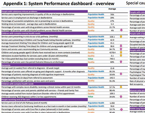
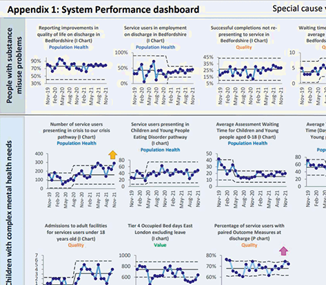
Figure 20 shows an extract from a board report with an overview performance summary (upper panel) based on a multiple statistical process control chart (lower panel).
Our next example shows the use of statistical process control during the COVID-19 pandemic.
3.8 Tracking Deaths during the COVID-19 Pandemic through Shewhart Control Charts
The COVID-19 pandemic, which was declared in March 2020, has posed unprecedented challenges to healthcare systems worldwide. The daily number of deaths was a key metric of interest. Perla et al. developed a novel hybrid Shewhart chart to visualise and learn from daily variations in reported deaths. They note: “We know that the number of reported deaths each day – as with anything we measure – will fluctuate. Without a method to understand if these ‘ups and downs’ simply reflect natural variability, we will struggle to recognize signals of meaningful improvement … in epidemic conditions.”Reference Perla, Provost, Parry, Little and Provost42
Figure 21 shows a chart of daily deaths annotated with sample media headlines. It highlights how headline writers struggled to separate meaningful signals from noise in the context of a pandemic and the risk that the data might provoke ‘hyperreactive responses from policy-makers and public citizens alike’.Reference Perla, Provost, Parry, Little and Provost42
Headlines associated with daily reported deaths in the United Kingdom during the COVID-19 pandemic

Using the hybrid chart, the researchers identified four phases (or ‘epochs’) of the classical infectious disease curve.Reference Perla, Provost, Parry, Little and Provost42, Reference Parry, Provost, Provost, Little and Perla43 The four epochs are shown in Figure 22 and described in Box 6. The researchers used a combination of Shewhart control charts to track the pandemic and help separate signals (of change) from background noise in each phase.
A hypothetical epidemiological curve for events in four epochs

Epoch 1 ‘pre-exponential growth’ begins with the first reported daily event. Daily counts usually remain relatively low and stable with no evidence of exponential growth. Epoch 1 ends when rapid growth in events starts to occur and the chart moves into Epoch 2.
Epoch 2 ‘exponential growth’ is when daily events begin to grow rapidly. This can be alarming for those reading the chart or experiencing the pandemic. Epoch 2 ends when events start to level off (plateau) or decline.
Epoch 3 ‘plateau or descent’ is when daily events stop increasing exponentially. Instead, they start to ‘plateau or descend’. Epoch 3 can end when daily values start to return to pre-exponential growth values. More troublingly, it can also end with a return to exponential growth (Epoch 2) – a sign that the pandemic is taking a turn for the worse again.
Epoch 4 ‘stability after descent’ is similar to Epoch 1 (pre-exponential growth), when a descent in daily events has occurred and daily counts are again low and stable. Epoch 4 can end if further signs of trouble are detected and there is a return to exponential growth (Epoch 2).
Figure 23 shows these epochs using data from different countries; Figure 24 shows the hybrid Shewhart chart for the United Kingdom. Parry et al. state:
Shewhart charts for the four epochs of daily reported COVID-19 deaths in different countries Adapted from Parry et al.Reference Parry, Provost, Provost, Little and Perla43


Hybrid Shewhart control chart for monitoring daily COVID-19 deaths in the United Kingdom

“Shewhart charts should be a standard tool to learn from variation in data during an epidemic. Medical professionals, improvement leaders, health officials and the public could use this chart with reported epidemic measures such as cases, testing rates, hospitalizations, intubations, and deaths to rapidly detect meaningful changes over time.”Reference Parry, Provost, Provost, Little and Perla43
The previous case studies have demonstrated the use of statistical process control methods in healthcare across a wide range of applications. In the next section, we offer a more critical examination of the methodology to identify and address the barriers to successful use in practice.
4 Critiques of Statistical Process Control
Although statistical process control methodology is now widely used to monitor and improve the quality and safety of healthcare, in this section, we consider the strengths, limitations, and future role of the methodology in healthcare.
4.1 The Statistical Process Control Paradox: It’s Easy Yet Not So Easy
As the case studies discussed in Section 3 show, statistical process control is not simply a graphical tool. Rather, it is a way of thinking scientifically about monitoring and improving the quality and safety of care. But while the idea of common versus special cause variation is intuitive, the successful application of statistical process control is not as easy as it might first appear, especially in complex adaptive systems like healthcare.Reference Thor, Lundberg and Ask12 Successfully using statistical process control in healthcare usually depends on several factors, which include engaging the stakeholders; forming a team; defining the aim; selecting the process of interest; defining the metrics of interest; ensuring that data can be reliably measured, collected, fed back, and understood; and establishing baseline performance – all in a culture of continual learning and improvement. Several systematic reviews of the use of statistical process control in healthcare provide critical insights into the benefits, limitations, barriers, and facilitators to successful application.Reference Suman and Prajapati11, Reference Thor, Lundberg and Ask12, Reference Koetsier, van der Veer SN, Jager, Peek and de Keizer44 Some key lessons are shown in Table 2.
| Benefits |
|
| Limitations |
|
| Barriers |
|
| Facilitators |
|
A further challenge is that statistical process control charts are not necessarily easy to build. Even when using a run chart, for example, practitioners face differing advice on how to interpret them. Three sets of run chart rules – the Anhoej, Perla, and Carey rules – have been published, but they differ significantly in their sensitivity and specificity to detecting special causes of variation,Reference Anhøj and Olesen19, Reference Anhøj20 and there is little practical guidance on how to proceed. So perhaps it is not surprising that the literature features multiple examples of technical errors. After examining 64 statistical process control charts, Koetsier et al.Reference Koetsier, van der Veer SN, Jager, Peek and de Keizer44 report that almost half (48.4%) used insufficient data points, 43.7% did not transform skewed data, and 14% did not report the rules for identifying special causes of variation. The authors conclude that many published studies did not follow all methodological criteria and so increased the risk of drawing incorrect conclusions. They call for greater clarity in reporting statistical process control charts along with greater adherence to methodological criteria. All this suggests a need for more training for those constructing charts and greater involvement of statistical process control experts.
4.2 Two Types of Errors When Using Statistical Process Control
Classifying variation into common cause or special cause is the primary focus of statistical process control methodology. In practice, this classification is subject to two types of errorReference Shewhart4, Reference Woodall, Adams, Benneyan, Faltin, Kenett and Ruggeri13, Reference Provost and Murray15, Reference Mohammed, Cheng, Rouse and Bristol28, Reference Deming45 (see Box 7) which can be compared to an imperfect screening test that sometimes shows a patient has disease when in fact the patient is free from disease (false positive), or the patient is free from disease when in fact the patient has disease (false negative).
Error 1: Treating an outcome resulting from a common cause as if it were a special cause and (wrongly) seeking to find a special cause, when in fact the cause is the underlying process.
Error 2: Treating an outcome resulting from a special cause as if it were a common cause and so (wrongly) overlooking the special cause.
Either error can cause losses. If all outcomes were treated as special cause variation, this maximises the losses from error 1. And if all outcomes were treated as common cause variation, this maximises the losses from error 2. Unfortunately, in practice, it is impossible to reduce both errors to zero and so a choice must be made to set the control limit. Shewhart concluded that it was best to make either error rarely and that this mainly depended upon how much it might cost to look for trouble in a stable process unnecessarily.Reference Shewhart4, Reference Deming45 Using mathematical theory, empirical evidence, and pragmatism, he argued that setting control limits to ± three standard deviations from the mean provides a reasonable balance between making either type of error.
The choice of three standard deviations ensures there is a relatively small chance that an investigation of special cause variation will be unfounded because the chances of a false alarm are relatively low. The sensitivity (to special causes) could be increased by lowering the control limits to, say, two standard deviations. Although this will increase sensitivity, it will also increase the chances of false alarms. The extent to which this is acceptable requires decision-makers to balance the total costs (e.g. time, money, human resources, quality, safety, reputation) of investigating (true or false) signals versus the costs of overlooking these signals (and so not investigating). In practice, this is a matter of judgement which varies with context. Nevertheless, in the era of ‘big data’ in healthcare (see Section 4.6) the issue of false alarms needs greater appreciation and attention.
4.3 Using More Than One Statistical Process Control Chart
Although earlier sections have shown some examples of plotting more than one statistical process control chart for the same data, the literature tends to encourage people to identify the most appropriate single control chart. This offers a useful starting point, especially for beginners, but recognition is growing that use of two (or more) charts of the same data can offer useful insights that might not otherwise be noticed.Reference Mohammed and Worthington46, Reference Henderson, Davies and Macdonald47
For example, Figure 25 shows inspection data for the proportion of defective manufactured goods described by Deming.Reference Deming45 The data are charted using two types of statistical process control chart: the p-chart (left panel) and the XmR chart (right panel). Each chart shows a central line and control limits at three standard deviations from the mean. While each chart appears to show common cause variation, marked differences in the width of the control limits across the two charts are evident. This suggests something unusual about these data. As Deming explains, these inspection figures were falsified (a special cause) because the inspector feared the plant would be closed if the proportion of defective goods went beyond 10%.Reference Deming45 So, a systematic special cause has impacted all the data (not just a few data points), and that’s why the limits between the two charts differ. This means that relying only on one chart risks overlooking the existence of this underlying special cause, whereas using two charts side by side provides additional insight.
Two side-by-side statistical process control charts showing daily proportion of defective products. The left panel is a p-chart and the right panel is an XmR-chart. The difference in control limits indicates an underlying special cause even though each chart appears to be consistent with common cause variation when viewed alone

Although decision-makers may not routinely have time and space to review multiple types of statistical control charts, analysts working with data might well seek to consider and explore the use of more than one chart. The additional insight gained could prove useful and requires little extra effort, especially if using software to produce the charts. Henderson et al.Reference Henderson, Davies and Macdonald47 suggest the combined use of run chart and CUSUM plots, and Rogers et al.Reference Rogers, Reeves and Caputo21 and Sherlaw-Johnson et al.Reference Sherlaw-Johnson, Morton, Robinson and Hall48 suggest the use of combined CUSUM-type charts.
4.4 The Risks of Risk-Adjusted Statistical Process Control in Healthcare
A distinctive feature of applying statistical process control in healthcare versus industry is the use of risk adjustment to reflect differences between patients.Reference Woodall, Adams, Benneyan, Faltin, Kenett and Ruggeri13 Typically, this type of control chart relies on a statistical model to estimate the risk of death for a given patient and then compare this with the observed outcome (died or survived). When using risk-adjusted charts, the explanation for a signal of special cause variation might be thought to lie beyond the risk profile of the patient. But this approach is flawed: it fails to recognise that risk adjustment, although widely used in healthcare, is not a panacea and poses its own risks.Reference Lilford, Mohammed, Spiegelhalter and Thomson34, Reference Iezzoni49–Reference Nelson55
For example, a systematic review of studies that examined the relationship between quality of care and risk-adjusted outcomes found counter-intuitive results: an ‘intuitive’ relationship (better care was associated with lower risk-adjusted death rates) was found in around half of the 52 relationships; the remainder showed either no correlation (there was no correlation between quality of care and risk-adjusted death rates) or a ‘paradoxical’ correlation (higher quality of care was associated with higher risk-adjusted death rates). The authors conclude that ‘the link between quality of care and risk-adjusted mortality remains largely unreliable’. Reference Pitches, Mohammed and Lilford51
The consequences of prematurely inferring problems with the quality of care on the basis of casemix-adjusted statistical control charts can be serious (see Box 8).
A renowned specialist hospital received a letter from the Care Quality Commission informing them that a risk-adjusted hospital mortality monitoring scheme had signalled an unacceptably high death rate: 27.8 deaths were expected, but 46 had been observed. In 2017, senior hospital staff wrote in The Lancet:
One might ask, however, what harm is done? After all, it is better to monitor than not and a hospital falsely accused of being a negative outlier can defend itself with robust data and performance monitoring. That is true but, because of this spurious alert, our hospital morale was shaken; management and trust board members were preoccupied with this issue for weeks; and our already stretched audit department expended over 50 person-hours of work reviewing data and formulating a response to satisfy the Care Quality Commission that we are most certainly not a negative outlier, but a unit with cardiac results among the best in the country.Reference Nashef, Powell, Jenkins, Fynn and Hall52
Another example is the use of the Partial Risk Adjustment in Surgery model, which fails to adjust for certain comorbid conditions and underestimates the risk for the highest-risk patients. This reportedly led to a negative impression of performance in one UK centre that was involved in real-time monitoring of risk-adjusted paediatric cardiac surgery outcomes (for procedures carried out during 2010 and 2011) using variable life-adjusted display plots.Reference O’Neill, Wigmore and Harrison53
Another crucial issue with risk-adjustment schemes is that they operate under the assumption of a constant relationship between patient risk factors and the outcome (e.g. between age and mortality). But if this relationship is not constant, then risk adjustment may increase rather than decreaseReference Nicholl50, Reference Mohammed, Deeks and Girling54 the very bias it was designed to overcome.
This misconception – that casemix-adjusted outcomes can be reliably used to blame quality of care – is termed the ‘casemix adjustment fallacy’.Reference Lilford, Mohammed, Spiegelhalter and Thomson34 This bear trap can be avoided by adopting the Pyramid Model of investigation, described in Section 3.6, which underscores the point that casemix adjustment has its own risks, and that care needs to be taken when interpreting casemix-adjusted analyses.Reference Lilford, Mohammed, Spiegelhalter and Thomson34
4.5 Methodological Controversies in Statistical Process Control
Debates between methodologists on the correct way to think about the design and use of statistical process control charts have been a long-standing feature of the technical literature.Reference Woodall40 Our purpose here is not to review these issues, but simply to highlight that these controversies have existed for decades. For example, Nelson first wrote a note addressing five misconceptions relating to Shewhart control charts (these are set out in Box 9) in 1999.Reference Nelson55
1. Shewhart charts are a graphical way of applying a sequential statistical significance test for an out-of-control condition.
2. Control limits are confidence limits on the true process mean.
3. Shewhart charts are based on probabilistic models, subject to or involving chance variation.
4. Normality is required for the correct application of a mean (or x bar) chart.
5. The theoretical basis for the Shewhart control chart has some obscurities that are difficult to teach.
Contrary to what is found in many articles and books, all five of these statements are incorrect.
In a similar vein, Blackstone’s 2004 analysis provided a surgeon’s critique of the methodological issues of using risk-adjusted CUSUM charts to monitor surgical performance.Reference Blackstone56 One feature of CUSUM-based schemes is that they appear to place considerably more emphasis on statistical significance testing than Shewhart control charts. Blackstone notes that while most ‘discussants’ agree that continual testing is ‘in some sense’ subject to the multiple comparisons problem, and one’s interpretation must be affected by how often the data are evaluated, some statisticians maintain that the multiple comparison problem ‘is not applicable to the quality control setting’. Blackstone goes on to say, ‘I am not sure what to believe, frankly, nor do I think this issue will be soon resolved.’ Happily, practitioners can profit from the use of statistical process control methodology without having to address these controversies.Reference Woodall40
4.6 The Future of Statistical Process Control in Healthcare
The use of statistical process control to support efforts to monitor and improve the quality of healthcare is well established, with calls to extend its use. Reference O’Brien, Viney, Doherty and Thomas57–Reference O’Sullivan, Chang, Baker and Shah60 Although it ‘cannot solve all problems and must be applied wisely’,Reference Thor, Lundberg and Ask12 the future for statistical process control in healthcare looks promising, including wider use across clinical and managerial processes. However, the use of statistical process control methodology at scale presents some additional unique challenges.Reference Jensen, Szarka and White61–Reference Suter-Crazzolara63
As an example, consider a hospital with five divisions, each with five wards: a single measure (such as staff absence) plotted on a control chart leads to 25 charts across the wards plus five charts across the divisions and one chart across the organisation (31 charts in total). Rolling out control charts across an entire organisation would require practical ways for staff to easily produce and collate charts (see Box 10).
East London NHS Foundation Trust (ELFT), established in 2000, provides mental health and community health services to a culturally diverse and socio-economically deprived catchment area of approximately 1.5 million people.
In 2014, ELFT launched its trust-wide quality improvement programme, which has adopted the Institute for Healthcare Improvement’s Model for Improvement using tools such as PDSA cycles, driver diagrams, and statistical process control charts. This commitment developed from a desire to shift power in the organisation so that service users, carers, and staff were better able to understand and improve the quality of care being provided.
An important challenge was to capture the learning at team level. Teams recorded their PDSA tests of change locally using paper or local IT systems. This was not reliable, so, the IT team at ELFT developed an online quality improvement platform to make it much easier for teams to log their PDSAs, create driver diagrams, and input and view their data as control charts. The IT system supports the production of statistical process control charts which usually require fixing of baselines, recalculating limits following a successful change and annotations that highlight the changes. Given the scores of charts to choose from, the automation of charts overcomes an important barrier, especially for new users. The Inpatient Mental Health Analytics app has 34,650 statistical process control charts with over 100,000 charts across the organisation.
Where there are thousands of control charts, users also need an effective way to collate them so they can still see the wood for the trees. This is an active area of research, involving proposals based on summary measures shown on a single graph to visualise the many control charts and spot the ones of most concern.Reference Jensen, Szarka and White61–Reference Suter-Crazzolara63
A related issue is the massive proliferation of automatically collected digital data in healthcare.Reference Gopal, Suter-Crazzolara, Toldo and Eberhardt64, Reference Qiu65 It has been estimated that up to 30% of the entire world’s stored data is health related.Reference Qiu65 This so-called big data is characterised by high volume (e.g. a single patient generates up to 80 megabytes of data annually, which is about 40,000 pages), high velocity (e.g. patient movement can be automatically collected every 30 seconds), and high variety (with multiple sources of data which include test results, images, text, movement, etc.). Although several researchersReference Megahed, Jones-Farmer, In: Knoth and Schmid66–Reference Woodall and Faltin68 have suggested that statistical process control charting may be useful to monitor big data over time, a number of methodological challenges need to be addressed, including the cautious choice of the sampling and collection interval.Reference Zwetsloot and Woodall69 For example, if data are available every second, then should these data be charted every second, minute, hour, and so on? Also, as more variables are monitored more often, it becomes increasingly important to keep the number of false alarms at a manageable number. A false alarm is a signal of special cause variation which is false; if there are too many false alarms, then the monitoring scheme becomes ineffective and discredited. The successful use of control charts in the era of big data will require low false-alarm rates.
So, while the future of statistical process control methodology appears promising, paradoxically, its use at scale needs to address some unique challenges.
5 Conclusions
Statistical process control methodology is based on a fundamental intuitive insight – that processes are subject to two sources of variation: common cause versus special cause. As the case studies show, this profound insight enables us to understand, monitor, and improve a wide range of processes, such as a person’s handwritten signatures, a person’s blood pressure, the results from surgery, the performance of hospitals, and the progress of a pandemic. The methodology offers a useful, robust, versatile, statistical, practical, and evidence-based approach, but its successful application requires overcoming technical and non-technical barriers. Numerous studies now demonstrate that such barriers are surmountable. This highlights the remarkable progress of statistical process control methodology from manufacturing industry in the 1920s to present-day healthcare.
6 Further Reading
Constructing Statistical Process Control Charts
Mohammed et al.Reference Mohammed, Worthington and Woodall17 – a step-by-step tutorial paper to show practitioners how to produce commonly used Shewhart control charts.
Provost and MurrayReference Provost and Murray15 – a comprehensive book that focuses on the use of statistical process control in healthcare with worked examples on how to produce a wide range of control charts.
Rogers et al.Reference Rogers, Reeves and Caputo21 – an overview of the use of CUSUM-type plots that are commonly used to monitor outcomes in surgery.
Statistical Process Control Methodology in Healthcare
Thor et al.Reference Thor, Lundberg and Ask12 – a systematic review of the application of statistical process control in healthcare improvement that also highlights the barriers and enablers to successful use of these methods.
Tennant et al.Reference Tennant, Mohammed, Coleman and Martin7 – a systematic review of the use of control charts to monitor individual patients.
Methodological Challenges and Controversies
WoodallReference Woodall40 – discusses some of the key methodological controversies in statistical process control.
Woodall and FaltinReference Woodall and Faltin68 – highlight some of the key challenges of using statistical process control at scale and how they might be overcome.
Conflicts of interest
None.
Acknowledgements
I thank the peer reviewers for their insightful comments and recommendations to improve the Element. A list of peer reviewers is published at www.cambridge.org/IQ-peer-reviewers. I would also like to thank Steve Flood and Claire Dipple for their help in preparing this Element.
Funding
This Element was funded by THIS Institute (The Healthcare Improvement Studies Institute, www.thisinstitute.cam.ac.uk). THIS Institute is strengthening the evidence base for improving the quality and safety of healthcare. THIS Institute is supported by a grant to the University of Cambridge from the Health Foundation – an independent charity committed to bringing about better health and healthcare for people in the United Kingdom.
About the Author
Mohammed Amin Mohammed is Emeritus Professor of Healthcare Quality and Effectiveness at the Faculty of Health Studies, University of Bradford, and Principal Consultant at the Strategy Unit. His main areas of interest are healthcare quality, performance measurement and monitoring, and more generally health services research in primary and secondary care.
Creative Commons License
The online version of this work is published under a Creative Commons licence called CC-BY-NC-ND 4.0 (https://creativecommons.org/licenses/by-nc-nd/4.0). It means that you’re free to reuse this work. In fact, we encourage it. We just ask that you acknowledge THIS Institute as the creator, you don’t distribute a modified version without our permission, and you don’t sell it or use it for any activity that generates revenue without our permission. Ultimately, we want our work to have impact. So if you’ve got a use in mind but you’re not sure it’s allowed, just ask us at enquiries@thisinstitute.cam.ac.uk.
The printed version is subject to statutory exceptions and to the provisions of relevant licensing agreements, so you will need written permission from Cambridge University Press to reproduce any part of it.
All versions of this work may contain content reproduced under licence from third parties. You must obtain permission to reproduce this content from these third parties directly.
Editors-in-Chief
Mary Dixon-Woods
THIS Institute (The Healthcare Improvement Studies Institute)
Mary is Director of THIS Institute and is the Health Foundation Professor of Healthcare Improvement Studies in the Department of Public Health and Primary Care at the University of Cambridge. Mary leads a programme of research focused on healthcare improvement, healthcare ethics, and methodological innovation in studying healthcare.
Graham Martin
THIS Institute (The Healthcare Improvement Studies Institute)
Graham is Director of Research at THIS Institute, leading applied research programmes and contributing to the institute’s strategy and development. His research interests are in the organisation and delivery of healthcare, and particularly the role of professionals, managers, and patients and the public in efforts at organisational change.
Executive Editor
Katrina Brown
THIS Institute (The Healthcare Improvement Studies Institute)
Katrina was Communications Manager at THIS Institute, providing editorial expertise to maximise the impact of THIS Institute’s research findings. She managed the project to produce the series until 2023.
Editorial Team
Sonja Marjanovic
RAND Europe
Sonja is Director of RAND Europe’s healthcare innovation, industry, and policy research. Her work provides decision-makers with evidence and insights to support innovation and improvement in healthcare systems, and to support the translation of innovation into societal benefits for healthcare services and population health.
Tom Ling
RAND Europe
Tom is Head of Evaluation at RAND Europe and President of the European Evaluation Society, leading evaluations and applied research focused on the key challenges facing health services. His current health portfolio includes evaluations of the innovation landscape, quality improvement, communities of practice, patient flow, and service transformation.
Ellen Perry
THIS Institute (The Healthcare Improvement Studies Institute)
Ellen supported the production of the series during 2020–21.
Gemma Petley
THIS Institute (The Healthcare Improvement Studies Institute)
Gemma is Senior Communications and Editorial Manager at THIS Institute, responsible for overseeing the production and maximising the impact of the series.
Claire Dipple
THIS Institute (The Healthcare Improvement Studies Institute)
Claire is Editorial Project Manager at THIS Institute, responsible for editing and project managing the series.
About the Series
The past decade has seen enormous growth in both activity and research on improvement in healthcare. This series offers a comprehensive and authoritative set of overviews of the different improvement approaches available, exploring the thinking behind them, examining evidence for each approach, and identifying areas of debate.


 Open access