


1. Introduction
Stories are a programming language for people. Whether an individual is curled up in an armchair devouring her favorite novel, a group of students scribble notes as they attend an intriguing lecture, the board of a large corporation considers the report of its CEO, or a nation is captivated by the President’s State of the Union address, a narrative is unveiled in each situation that can change the emotional state, opinions, attitudes, and beliefs of its audience. Social psychologist Jonathan Haidt recently captured the idea, observing, “The human mind is a story processor, not a logic processor” (Haidt, Reference Haidt2012), and the public relations industry has long understood the ability of stories to change people’s minds, as well as the inherent connection between narrative and identity embodied in the idea of a strategic narrative (Bonchek, Reference Bonchek2016).
This idea, that stories program people, suggests that narratives can be incredibly powerful. Indeed, historian Yuval Noah Harari notes that,
“Telling effective stories is not easy. The difficulty lies not in telling the story, but in convincing everyone else to believe it. Much of history revolves around this question: how does one convince millions of people to believe particular stories about gods, or nations, or limited liability companies? Yet when it succeeds, it gives Sapiens immense power, because it enables millions of strangers to cooperate and work towards common goals. Just try to imagine how difficult it would have been to create states, or churches, or legal systems if we could speak only about things that really exist, such as rivers, trees and lions.” (Harari, Reference Harari2014)
Simply put, stories are not only entertaining, they are powerful, deserving our most careful attention and finest critical analysis. This paper presents new tools to help in this effort.
Recently, technologies have been employed to both help engineer (Isaak and Hanna, Reference Isaak and Hanna2018) and disseminate (Congress of the United States of America, 2021) narratives designed to manipulate people’s behavior. As such technologies become the norm in our society, we need other technologies to better understand the nature of narrative and how it impacts human behavior. A first step towards such understanding would be software agents capable of culling through the mass of stories available today and automatically gleaning central characteristics of these narratives. These characteristics could then be studied for their impact on human response.
In Franco Moretti’s influential book, Distant Reading (Moretti, Reference Moretti2013), he claims that in order for us to better understand literature as a whole, we should change our focus from reading each story individually to information extraction tools that can aid us in analyzing the content of literature en masse, a stance that has received both support and criticism among the academic community. The reason for such analysis tools is simply that there are more published books than any one person or small group of people could ever read. According to Google’s book search algorithm, there are about 130 million books that have been published as of 2010 (Taycher, Reference Taycher2010). There are many natural language processing (NLP) tools that aid in the evaluation of text, such as dependency parsing (Wang, Huang, and Tu, Reference Wang, Huang and Tu2019; He and Choi, Reference He and Choi2020; Fernández-González and Gómez-Rodríguez, Reference Fernández-González and Gómez-Rodríguez2020; Yang et al., Reference Yang, Jiang, Han and Tu2020), named entity recognition (NER) (Shen et al., Reference Shen, Yun, Lipton, Kronrod and Anandkumar2017; Dernoncourt, Lee, and Szolovits, Reference Dernoncourt, Lee and Szolovits2017; Li et al., Reference Li, Sun, Han and Li2020), coreference resolution (Kantor and Globerson, Reference Kantor and Globerson2019; Joshi et al., Reference Joshi, Levy, Zettlemoyer and Weld2019; Wu et al., Reference Wu, Wang, Yuan, Wu and Li2020), topic modeling (Barde and Bainwad, Reference Barde and Bainwad2017), and sentiment analysis (Soleymani et al., Reference Soleymani, Garcia, Jou, Schuller, Chang and Pantic2017; Zhang et al., Reference Zhang, Wang and Liu2018), but there is a need for readily available tools that analyze or extract document-comprehensive literary elements, such as plot, chronology, and location mapping. This paper focuses on plot-relevant global aspects of narrative, exploring what kinds of information about plot might be automatically or semi-automatically extractable one day.
Plot can be informally described as the causal interaction of key elements and events in a story that move the story from its beginning to its end. (We provide a more complete definition of plot in Section 2.1.) Currently, in order to do any plot analysis of a novel, news story, historical account, or any other form of narrative where plot is present, the text must be read by a human who then performs analyses. For a common-length novel of about 100,000 words and an average reading speed of 200 words a minute, one novel can take over 8 hours to read. Studying plot as an abstraction in general, then, would require analyzing many texts, multiplying this requisite minimum of 8 hours by the number of books that need to be read. One motivation for this research is to drastically reduce this time by automating the extraction of the plot from text where plot exists, such as novels, and output it in a form that is easy to understand visually and usable in other analytical software and machine learning systems. Although we do not yet attain full automation of this process in this research due to the limitations of current NLP technology, our research lays groundwork for when the required technology improves. While this research can be applicable to other media where a narrative exists, such as news stories and historical accounts, fiction offers a flexible medium with both rich and diverse plots as well as a variety of formats, from microfiction to multi-volume epics. Our work here focuses on the detection and extraction of plot-relevant, global features from short stories and scripts, due to the tractability and ability of these story formats to illuminate key concepts. These features include assessment of entity importance, scene segmentation, entity tracking, narrative structures, and more. We then visualize this extracted content to provide at-a-glance insight into these global features of the stories.
In this article, we present two visualizations of the narrative of the story. Following a brief background explanation in Section 2, we introduce The Scatter Plot of Entities in Section 3 which visualizes the introduction of entities (actors, objects, and locations) within the story and displays them on a scatter plot according to their continued appearance in narrative order. We cluster these entities to perform scene segmentation and use trends in the scatter plot to detect which entities may be influential in the story. These entities can then be used as input into the next visualization. In Section 4, we introduce The Narrative Flow Graph which uses the story entities and locations to build a graph structure representing the flow of entities through scenes in the story. Scenes act as vertices of the graph, and the entities become the edges connecting the scenes from the beginning of the story to the end, creating a graph representation of the syuzhet of the story. We finish by discussing applications of this research in Section 5 and future work in Section 6.
2. History and related work
2.1. On plot and narrative
The description of plot we give in the introduction is insufficient for complex analysis and extraction because it does not detail what needs to be extracted. The interacting elements that progress the story from beginning to end must be defined.
Plot and narrative structure are so closely linked that the idea of plot brings to mind almost algorithmic structures or steps that are laid in order. An example of such a structure is as follows: exposition, inciting incident, rising action, climax, falling action, denouement, and resolution. Such a delineation of plot is commonly called Freytag’s Pyramid and is used to describe the narrative structure of classical epics and dramas (Freytag, Reference Freytag1863). However, not all stories follow this structure. In addition to Freytag’s Pyramid, there is the Fichtean Curve, Hero’s Journey, In Media Res, 3-act, Seven Point, and more. If this type of structure labeling is necessary for plot or to be plot itself, there needs to be a universal structure—some way to define a structure that can be applied to all types of plot. Identifying such a structure may be difficult.
Russian Formalist literary researchers and critics sought to understand this structure by breaking down the narrative to smaller thematic elements. Vladimir Propp delved into Russian folktales to investigate the commonalities between them (Propp, Reference Propp1968). His idea was to separate the theory from the specifics and assign labels to the different forms the events and characters in a story can take, resulting in what came to be known as the “Thirty-one Narratemes.” Boris Tomashevsky wrote about the microstructure of a story and how it can be broken down into what are very similar to Propp’s narratemes—thematic sections of the story, or events, that follow specific forms (Tomashevsky et al., Reference Tomashevsky, Shklovsky, Eichenbaum, Lemon and Reis1965). Alexander Veselovsky spoke of the “motif,” or the “simplest narrative unit” of a story, which combines together to create the themes of a tale (Veselovsky, Reference Veselovsky1894/2015).
In an expansion on Propp and Veselovsky and inspired by other folklorists like Antti Aarne, American folklorist Stith Thompson developed the Motif-Index of Folk-Literature, six volumes that include thousands of commonly occurring—and some rarely occurring—event types and story elements in folktales (Thompson, Reference Thompson1989). It is clear to see that as more investigation is done into thematic elements of story, the number of those elements ever increases. Unless the scope is narrowed, identifying every thematic element in a story is a monumental task, so the structure must be broken down further.
In part six of Poetics (Aristotle and Butcher, Reference Aristotle and Butcher335BCE/1961), Aristotle claims that one cannot have plot without action. This notion comes from the Tragedies and other stage plays of the period in which visible action is needed to understand the plot, and the lack of action means the absence of plot. The Aristotelian notion of action-driven story has held for many centuries, but it alone is insufficient to represent the complexities of plot, especially in literature. E. M. Forster theorizes that plot is more than the Aristotelian notion of action-driven story. He states that what is known and not known as well as the emotions that lead to action are just as vital as the actions themselves. In addition, the causal element is at the core of plot. In a famous example, Forster states, “A plot is also a narrative of events, the emphasis falling on causality. ‘The king died and then the queen died’, is a story. ‘The king died, and then the queen died of grief’ is a plot” (Forster, Reference Forster1927). In The Plot of Tom Jones (Crane, Reference Crane1950), R. S. Crane elaborates on Forster’s idea and criticizes Aristotle, defining plot as the synthesis of action, character, and thought that may take on different structures depending on the author’s use and emphasis on any of these three aspects.
Following the theories and discussions of the above literary analysts, we select five elements of narrative that can be detected and extracted and use them for our definition of plot. We analyze the output created by the two extraction methods detailed in this article on how they fulfill our chosen definition of plot.
-
Characters: entities of volition within a story
-
Events: actions taken in the story
-
Information: what is known and how that knowledge spreads between characters
-
Causation: the manner in which one event leads to another
-
Structure: the linking of events from the beginning of the story to the end
Due to the varying definitions of narrative used among modern literary analysts, in this article when narrative is mentioned, we mean how the source text tells the underlying story (the teller’s choice of scenes, ordering, character inclusion and emphasis, and more). With the focus of this research on plot and narrative structure, we define “narrative flow” as how the events and scenes in that narrative progress from one to the next, a representation of the structure of the syuzhet. This definition of narrative flow is different from the flow of how the narrative sounds and feels when read or spoken.
2.2. Content extraction of narrative fiction
Story viewed with an Aristotelian action-driven lens may be insufficient to fully encapsulate the complexity of plot. Even so, physical actions are still a major aspect of plot, and for most novels, it is the dominant element. Given the connection between events and plot, plot extraction can be seen as a form of event extraction modified to fit the definition of plot.
The greatest breadth of event extraction research has not fallen upon the domain of fiction narrative but involves biomedical text (Yakushiji et al., Reference Yakushiji, Tateisi, Miyao and ichi Tsujii2001; Riedel and McCallum, Reference Riedel and McCallum2011; Bjorne and Salakoski, Reference Bjorne and Salakoski2011), news (Vargas-Vera and Celjuska, Reference Vargas-Vera and Celjuska2004; Naughton, Kushmerick, and Carthy, Reference Naughton, Kushmerick and Carthy2006; Wevers, Kostkan, and Nielbo, Reference Wevers, Kostkan and Nielbo2021), and historical text (Chieu and Lee, Reference Chieu and Lee2004; Segers et al., Reference Segers, Van Erp, Van Der Meij, Aroyo, van Ossenbruggen, Schreiber, Wielinga, Oomen and Jacobs2011), to name a few. Each of these genres as well as others require a more topical approach to event extraction where specific trigger or anchor words commonly found in a particular topical domain help identify the events of the text. Such an approach is not as feasible for fiction literature due to the plethora of topics, themes, and genres. Non-topical event extraction has been used in studies like those of Alan Ritter et al., to extract events of general interest from Twitter using machine learning to recognize event structure (Ritter, Etzioni, and Clark, Reference Ritter, Etzioni and Clark2012) and Valenzuela-Escarcega et al., in biomedical text using rule-based algorithms that detect events by locating sentences that have the correct grammatical or semantic representation of the desired event (Valenzuela-Escarcega et al., Reference Valenzuela-Escarcega, Hahn-Powell, Hicks and Surdeanu2015). This non-topical approach removes the need for trigger words and allows event extraction to be applied to an open range of text. However, due to the free-form nature of creative writing, events will usually not follow a set grammatical or semantic rule or structure that can be detected and extracted, making such methods a poor match for creative fiction text.
Despite the emphasis of event extraction in the non-literary domain, event detection and extraction on fiction and other literary narrative is an active field of research that is gaining momentum. In Jan Christoph Meister’s work, Computing Action: A Narratological Approach (Meister, Reference Meister2003), he develops an event markup and parsing system for literary text. The EventParser is software designed to facilitate human annotation of events. The accompanying EpiTest software then links these events into what he calls Episodes that detail the action in the narrative. Nils Reiter in his PhD thesis follows the school of Propp in claiming that “Events happen in a certain order and this order is similar across tales.” (Reiter, Reference Reiter2014, p. 63) The thesis proposes that structural similarity in stories can be detected through the similarity of event archetypes and in the sequential event ordering of those similar events. Graph-based representations of events in the narrative are used as part of the assessment and have seen continual use as interest in this field grows. Adolfo and Ong build a Story World Graph where vertices are both events and characters in the story. Edges connect characters to actions or coreferences and connect the events together in sequential narrative order (Adolfo and Ong, Reference Adolfo and Ong2019). Sims et al. combine the classic use of trigger words with neural networks to automate the identification of verbs that may denote the beginning of events (Sims, Park, and Bamman, Reference Sims, Park and Bamman2019). Vauth et al. detect events through the actions/verbs that define them and then classify those events by their eventfulness to assign scores that can be plotted. The resulting line plots provide a visualization of the eventfulness of the story where peak maxima denote the most eventful parts of the story (Vauth et al., Reference Vauth, Hatzel, Gius and Biemann2021).
As an extension of event extraction, scene segmentation of fiction text has recently grown as a research interest. In a 2021 paper by Zehe et al., that acts as a rallying call to researchers to advance this field, they highlight the difficulties and how available text segmentation and partitioning tools are ill-fit for this task and provide poor baselines: “Additionally, we show that established baselines for text segmentation fail to capture the notion of a narrative scene, necessitating the development of new methods for this task” (Zehe et al., Reference Zehe, Konle, Dümpelmann, Gius, Hotho, Jannidis, Kaufmann, Krug, Puppe, Reiter, Schreiber and Wiedmer2021a, p. 3168). Even widely used language models, such as BERT (Devlin et al., Reference Devlin, Chang, Lee and Toutanova2019), perform rather poorly without extensive research on how it can apply to this unique task. In the Shared Task on Scene Segmentation at KONVENS 2021 (Zehe et al., Reference Zehe, Konle, Guhr, Dumpelmann, Gius, Hotho, Jannidis, Kaufmann, Krug, Puppe, Reiter and Schreiber2021b), five research teams attempt to tackle this novel task. Three of these teams utilize BERT with widely varying success (Hatzel and Biemann, Reference Hatzel and Biemann2021; Gombert, Reference Gombert2021; Kurfalı and Wirén, Reference Kurfalı and Wirén2021). Other teams use feature vectors (Barth and Donicke, Reference Barth and Donicke2021) or detect changes in context (Schneider, Barz, and Denzler, Reference Schneider, Barz and Denzler2021) with similar trouble, showing the immense difficulty of this task.
Although events are a dominant feature of plot, they are not the only extractable feature. Sentiment or valence of text is commonly extracted to provide a visualization of the story through the length of text (Nalisnick and Baird, Reference Nalisnick and Baird2013; Jacobs, Reference Jacobs2019; Somasundaran, Chen, and Flor, Reference Somasundaran, Chen and Flor2020), but creating similarly informative visuals of more complex story content extracted from a fiction text is a far more difficult task. One of the earliest attempts at non-event content extraction applied to the fiction domain is a paper written by Sharon Givon of the University of Edinburgh in which she describes the extraction of central characters and their social relationships (Givon, Reference Givon2006). These social network relationships are often shown using graphs where each character is a vertex of the graph, and where a relationship or social connection is present between two characters, an edge is created between the corresponding vertices. Other research that involves the extraction of characters’ relationships and social network interactions in fiction has followed (Elson, Dames, and McKeown, Reference Elson, Dames and McKeown2010; Agarwal, Kotalwar, and Rambow, Reference Agarwal, Kotalwar and Rambow2013; Dekker, Kuhn, and van Erp, Reference Dekker, Kuhn and van Erp2018). There has also been ontology creation that shows categorical definitions and relationships between concepts in fiction text (Goh et al., Reference Goh, Kiu, Soon and Ranaivo-Malancon2011) and creation of graph structures that map explicit relationships between discussion topics (basic narrative elements) in the United States Congressional Record (Ash, Gauthier, and Widmer, Reference Ash, Gauthier and Widmer2022), but little research has been done pertaining to the automated extraction of fiction plot.
The extraction of plot elements in a story has been attempted by Hajime Murai who researches the behavioral and emotional aspects of characters in microfiction in an attempt to use the characters’ vocabulary and behavior to model the plot structure with the goal of developing an automated plot extractor (Murai, Reference Murai2014, Reference Murai2017). Later he attempts to extract plot from detective comics (Murai, Reference Murai2020). This method of plot extraction is based on theme and is similar to how Vladimir Prop views plot. Murai’s purpose is to find transition patterns from one thematic element to another and display those patterns in a relational graph structure similar to the research done in social network extraction. Goyal et al. in their AESOP system (Goyal, Riloff, and Iii, Reference Goyal, Riloff and Iii2013) detect and isolate positive, negative, and mental statements in the text of a story and relates them by whether the following statements are motivation for, actualization of, or termination of the plot unit following Lehnert’s definition of plot units (Lehnert, Reference Lehnert1981). The statements are represented as vertices and the relations the edges in a graph structure, creating a visualization of the plot unit. AESOP is automated and shows partial success, but the authors state that the problem of plot extraction in fiction remains extremely difficult, and much more research is needed.
3. Narrative as a scatter plot of entities
As stated above in Section 2.2, visualizing a story as a plotting of measured values, such as using the sentiment of the text or in the aforementioned work of Vauth et al. (Reference Vauth, Hatzel, Gius and Biemann2021), is not a new concept. Here we take a novel approach by plotting the appearance of entities in the story to visualize the story content in a scatter plot and then cluster those entities in an attempt to isolate the individual scenes of the narrative.
3.1. Concept: scatter plot of entities explanation
The Scatter Plot of Entities visualizes the location of entities within the story by plotting them on a two-dimensional plane. We refer to the horizontal axis of this plane as the $x$
-axis and the vertical axis as the
$x$
-axis and the vertical axis as the $y$
-axis, with each point in the plane denoted by an ordered pair,
$y$
-axis, with each point in the plane denoted by an ordered pair, $(x,y)$
.
$(x,y)$
.
The values of the $x$
-axis represent the integer location of each token within the story, where a token is a contiguous string of characters between two spaces (or a space and a punctuation mark), mapping the entire text onto the set of tokens
$x$
-axis represent the integer location of each token within the story, where a token is a contiguous string of characters between two spaces (or a space and a punctuation mark), mapping the entire text onto the set of tokens $T=\{0,1,2, \ldots,n\}$
for some integer
$T=\{0,1,2, \ldots,n\}$
for some integer $n$
, the total number of tokens in the text. Similarly, the values on the
$n$
, the total number of tokens in the text. Similarly, the values on the $y$
-axis represent an integer identifier for each unique entity of interest in the order they are introduced in the text. We consider the list of entity identifiers,
$y$
-axis represent an integer identifier for each unique entity of interest in the order they are introduced in the text. We consider the list of entity identifiers, $\Phi = \{0, 1, 2, \ldots, m\}$
, where
$\Phi = \{0, 1, 2, \ldots, m\}$
, where $m$
is the total number of entities of interest in the text, allowing us to plot points of interest as any point (token, entity) that specifies the tokens where each entity appears. Note that only non-negative, integer values are allowed to identify viable token-entity pairs. We discuss which entities are included in
$m$
is the total number of entities of interest in the text, allowing us to plot points of interest as any point (token, entity) that specifies the tokens where each entity appears. Note that only non-negative, integer values are allowed to identify viable token-entity pairs. We discuss which entities are included in $\Phi$
in Section 3.2.
$\Phi$
in Section 3.2.
In this way, each $(x,y)$
coordinate pair represents a single appearance of an entity within the text. Each instance of a same entity has the same
$(x,y)$
coordinate pair represents a single appearance of an entity within the text. Each instance of a same entity has the same $y$
-coordinate but a different
$y$
-coordinate but a different $x$
-coordinate depending on where within the text that specific instance appears, which can be identified by the location of the token representing that entity. For example, if the entity with index 7 of the ordered list
$x$
-coordinate depending on where within the text that specific instance appears, which can be identified by the location of the token representing that entity. For example, if the entity with index 7 of the ordered list $\Phi$
appears in the text as token 42, that creates a point on the Scatter Plot of Entities at the coordinate pair
$\Phi$
appears in the text as token 42, that creates a point on the Scatter Plot of Entities at the coordinate pair $(42,7)$
. If that same entity appears again at token 89, another coordinate pair is created at point
$(42,7)$
. If that same entity appears again at token 89, another coordinate pair is created at point $(89,7)$
. Multi-token entities are handled by replacing the multi-token entity with a single-token label during annotation and coreferencing. All alternative mentions of an entity, such as “Mary Jane Smith” also being called “Dr. Smith” or “Mary Jane,” are similarly coreferenced with the single-token label, for example “MaryJane.” See Sections A.1.1 and A.1.2 for more explanation. Such annotation work ensures that each mention of an entity in the text only creates a single coordinate on the Scatter Plot of Entities.
$(89,7)$
. Multi-token entities are handled by replacing the multi-token entity with a single-token label during annotation and coreferencing. All alternative mentions of an entity, such as “Mary Jane Smith” also being called “Dr. Smith” or “Mary Jane,” are similarly coreferenced with the single-token label, for example “MaryJane.” See Sections A.1.1 and A.1.2 for more explanation. Such annotation work ensures that each mention of an entity in the text only creates a single coordinate on the Scatter Plot of Entities.
Given a list of entities of interest, $\Phi$
, from a specific text, it should be apparent that the resulting Scatter Plot of Entities is unique. In principle, the converse is not true. For example, one could imagine a hypothetical situation in which two stories with the same number of tokens and the same number of entities of interest happen to generate identical scatter plots. Nevertheless, we note that such a situation would be extremely unlikely, and, in practice, the Scatter Plot of Entities does seem to offer a characteristic fingerprint of a given text.
$\Phi$
, from a specific text, it should be apparent that the resulting Scatter Plot of Entities is unique. In principle, the converse is not true. For example, one could imagine a hypothetical situation in which two stories with the same number of tokens and the same number of entities of interest happen to generate identical scatter plots. Nevertheless, we note that such a situation would be extremely unlikely, and, in practice, the Scatter Plot of Entities does seem to offer a characteristic fingerprint of a given text.
3.2. Methods: system outline and explanation
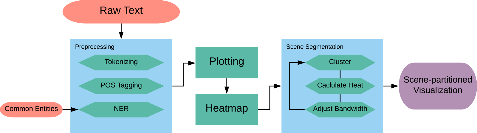
Figure 1 shows the diagram of the Scatter Plot of Entities. The input to the system is a plain-text document of the story. The system can perform without pre-modifications to the document, but for better and more informative results, some data preparation is necessary.
System diagram of the process for extracting the Scatter Plot of Entities.
3.2.1. Data preparation and preprocessing
The purpose of preprocessing is to create two ordered lists, one of all the tokens in the story and another of important entities that we want to detect in the story. These two lists become our $x$
and
$x$
and $y$
axes, respectively. We prepare the data by coreferencing the stories by hand to ensure that any mention of an entity as a pronoun or other moniker is recognized as that same entity within the text. For details on the coreferencing process and why we choose to do this by hand instead of using available NLP toolkits, please refer to Section A.1.2. We do, however, conduct experiments using a coreference resolution library for comparison. An NLP pipeline then handles tokenization, tagging parts of speech, and then running NER which identifies names of people, places, and organizations as well as dates and other text with specific formats. For the purposes of this research, we choose only from the list generated by NER those entity types that correlate to actors, objects, and locations in a text that could potentially have relevance to the plot. We append to this list objects and common pronouns that are missed by NER. A properly coreferenced story replaces most of these pronouns with what they reference, but we include them for situations in which there are entities without proper names or labels that can be coreferenced. The first-person pronouns "I’"and "me" are particularly important in first-person narratives in which the speaker’s name is not given and thus cannot be coreferenced to something recognizable by NER. See Appendix B for the complete description of what types of entities are chosen.
$y$
axes, respectively. We prepare the data by coreferencing the stories by hand to ensure that any mention of an entity as a pronoun or other moniker is recognized as that same entity within the text. For details on the coreferencing process and why we choose to do this by hand instead of using available NLP toolkits, please refer to Section A.1.2. We do, however, conduct experiments using a coreference resolution library for comparison. An NLP pipeline then handles tokenization, tagging parts of speech, and then running NER which identifies names of people, places, and organizations as well as dates and other text with specific formats. For the purposes of this research, we choose only from the list generated by NER those entity types that correlate to actors, objects, and locations in a text that could potentially have relevance to the plot. We append to this list objects and common pronouns that are missed by NER. A properly coreferenced story replaces most of these pronouns with what they reference, but we include them for situations in which there are entities without proper names or labels that can be coreferenced. The first-person pronouns "I’"and "me" are particularly important in first-person narratives in which the speaker’s name is not given and thus cannot be coreferenced to something recognizable by NER. See Appendix B for the complete description of what types of entities are chosen.
3.2.2. Entity plotting and activity
Once the system generates the list of entities, it locates them within the text and gives an $x$
-coordinate corresponding to their narrative order location by token index and provides a
$x$
-coordinate corresponding to their narrative order location by token index and provides a $y$
-coordinate according to the order of that entity’s first appearance within the text. We remove from the list those entities that appear only once or twice within the entirety of the text to reduce clutter and under the assumption that if it appears that infrequently, it is not as important to the narrative. We then plot these
$y$
-coordinate according to the order of that entity’s first appearance within the text. We remove from the list those entities that appear only once or twice within the entirety of the text to reduce clutter and under the assumption that if it appears that infrequently, it is not as important to the narrative. We then plot these $(x,y)$
coordinates on a Cartesian plane. Every
$(x,y)$
coordinates on a Cartesian plane. Every $y$
-coordinate will have three or more points corresponding to how many times the associated entity appears in the text. Every
$y$
-coordinate will have three or more points corresponding to how many times the associated entity appears in the text. Every $x$
-coordinate has either one or no points depending on whether or not that specific token is equivalent to one of the entities in
$x$
-coordinate has either one or no points depending on whether or not that specific token is equivalent to one of the entities in $\Phi$
, creating gaps in the
$\Phi$
, creating gaps in the $x$
-coordinates. Large gaps appear when the text uses wording that does not involve any of the entities we are tracking, enabling a concept of entity density, which we call entity activity, defined as a measure of how often entities appear in a section of the text. High entity activity means that a section of text has many appearances of entities, and low entity activity means there are few entity appearances in that section of text.
$x$
-coordinates. Large gaps appear when the text uses wording that does not involve any of the entities we are tracking, enabling a concept of entity density, which we call entity activity, defined as a measure of how often entities appear in a section of the text. High entity activity means that a section of text has many appearances of entities, and low entity activity means there are few entity appearances in that section of text.
We do not quantify what level of entity activity is considered high or low because it changes depending on the text. For example, a story that naturally has a lot of entity mentions in the text only has high entity activity if there is a spike, meaning that even more entities are present in that section of text than usual. Low entity activity works the same way. A story with naturally many entity mentions may have low entity activity values that are higher than another story with fewer entity mentions overall. Those low entity activity values in the first text are still considered low in relation to that text even if they are higher than the entity activity values of a different story.
We can now create an entity activity line measuring frequency of entity appearance as the story progresses. We create this line by projecting all coordinates onto the $x$
-axis and then generating a Gaussian curve for each entity centered at the
$x$
-axis and then generating a Gaussian curve for each entity centered at the $x$
-coordinate of that entity, creating a distribution overlap of entity positions that are then summed together to create a density curve. The more entities that appear near each other in the text, the more overlap and the higher the value of the curve at that point. The standard deviation, or
$x$
-coordinate of that entity, creating a distribution overlap of entity positions that are then summed together to create a density curve. The more entities that appear near each other in the text, the more overlap and the higher the value of the curve at that point. The standard deviation, or $\sigma$
, of the Gaussian directly affects how smooth or noisy the activity line is. The smaller the
$\sigma$
, of the Gaussian directly affects how smooth or noisy the activity line is. The smaller the $\sigma$
value, the steeper the fluctuations in the line, and thus, the more information that is present. The larger the
$\sigma$
value, the steeper the fluctuations in the line, and thus, the more information that is present. The larger the $\sigma$
value, the smoother the line, and thus the less information that is present. See Figure 2 for an example illustration of the summation of Gaussian curves at different values of
$\sigma$
value, the smoother the line, and thus the less information that is present. See Figure 2 for an example illustration of the summation of Gaussian curves at different values of $\sigma$
. Because this line helps determine which clustering is chosen as the best (explained in Section 3.2.3), we must first determine the best possible
$\sigma$
. Because this line helps determine which clustering is chosen as the best (explained in Section 3.2.3), we must first determine the best possible $\sigma$
value for our needs.
$\sigma$
value for our needs.
Example illustration of the summation of Gaussian curves. Large dots are the entity locations on the horizontal axis. The dotted curves are the individual Gaussian curves centered at the x-coordinates of the entities. The solid line is the summation of the Gaussian Curves. Figure (a) through (c) show increases of the standard deviation, $\sigma$
, and how it affects the smoothness of the curve.
$\sigma$
, and how it affects the smoothness of the curve.

At first, we sought a constant $\sigma$
value that is optimal for all stories, but initial tests showed that stories of different lengths need different
$\sigma$
value that is optimal for all stories, but initial tests showed that stories of different lengths need different $\sigma$
values. To determine what value for
$\sigma$
values. To determine what value for $\sigma$
is best, we test values of
$\sigma$
is best, we test values of $\sigma = n/d$
where
$\sigma = n/d$
where $d \in \{5..2000\}$
is the range of divisors we are testing and
$d \in \{5..2000\}$
is the range of divisors we are testing and $n$
is the number of tokens in the story. Figure 3 shows the activity line for different values of
$n$
is the number of tokens in the story. Figure 3 shows the activity line for different values of $\sigma$
for Leiningen Versus the Ants (Stephenson, Reference Stephenson1972). We also translate the activity line to a heat map that shows entity activity level as a color gradient from blue (low activity) to yellow (high activity) for better human readability. The number in parentheses in the upper left corner of the activity line is the divisor,
$\sigma$
for Leiningen Versus the Ants (Stephenson, Reference Stephenson1972). We also translate the activity line to a heat map that shows entity activity level as a color gradient from blue (low activity) to yellow (high activity) for better human readability. The number in parentheses in the upper left corner of the activity line is the divisor, $d$
. The greater the divisor, the smaller the
$d$
. The greater the divisor, the smaller the $\sigma$
value, and in turn the thinner the Gaussian and noisier the activity line.
$\sigma$
value, and in turn the thinner the Gaussian and noisier the activity line.
Entity activity lines and corresponding heat maps for Leiningen Versus the Ants (Stephenson, Reference Stephenson1972) for six different values of smoothing, from extremely wide (top plot) to very narrow (bottom plot) for the full length of the story (10050 tokens). This smoothing aspect is characterized by the size of the standard deviation of the Gaussian convolution kernel.

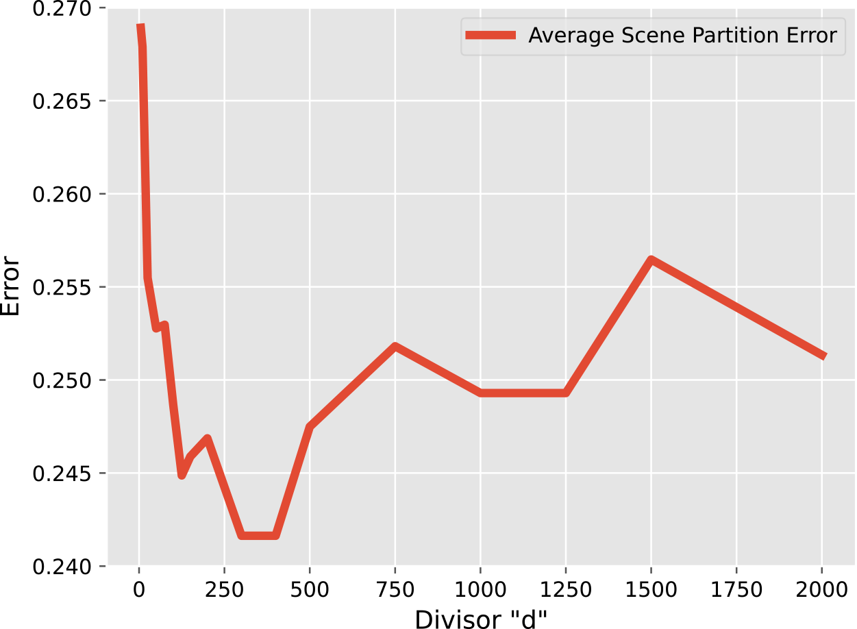
The divisor is simply a hyperparameter that must be chosen prior to computation, and the optimal value may change depending on what stories are used when running the system. We need a value for $d$
that provides sufficient information for the clustering algorithm to make informed decisions while at the same time not providing so much information that the data becomes too noisy to determine which clustering is best. Figure 4 reveals a trend where increasing
$d$
that provides sufficient information for the clustering algorithm to make informed decisions while at the same time not providing so much information that the data becomes too noisy to determine which clustering is best. Figure 4 reveals a trend where increasing $d$
improves the quality of clustering selection (and therefore scene partitioning) up until a point. After reaching this point, the activity line becomes too noisy, and so quality starts to drop, that is the scene partitioning error increases. The
$d$
improves the quality of clustering selection (and therefore scene partitioning) up until a point. After reaching this point, the activity line becomes too noisy, and so quality starts to drop, that is the scene partitioning error increases. The $d$
value which provides the best selection quality (the lowest error) for the stories used in this research resides between the values of 300 and 400. In the end, we select
$d$
value which provides the best selection quality (the lowest error) for the stories used in this research resides between the values of 300 and 400. In the end, we select $d=400$
, making
$d=400$
, making $\sigma = n/400$
with
$\sigma = n/400$
with $n$
being the number of tokens in the story.
$n$
being the number of tokens in the story.
Average error, over all eight stories in the corpus considered for this study, of scene partitioning as the divisor, $d$
, of the variance of the Gaussian convolution kernel increases. Lowest error occurs when this hyperparameter
$d$
, of the variance of the Gaussian convolution kernel increases. Lowest error occurs when this hyperparameter $d$
is between about 300 and 400.
$d$
is between about 300 and 400.
3.2.3. Clustering and scene partitioning
Next, we cluster segments of the text into scenes based around entity activity. We use a single-dimensional mean shift algorithm variant for this purpose. Mean shift uses the density gradient of data coordinates to attract data points together, letting the data points climb the gradient slope to where the points are densest. Those points that converge on the same gradient peak are included in the same cluster. A bandwidth value sets the distance of attraction for the points, determining the number of clusters created. We cluster unidimensionally around the $x$
-coordinate. The assumption motivating this method is that the more entities that are near each other in the text, the more these entities are interacting within the story, and scenes are therefore evident by the presence and interaction of these entities.
$x$
-coordinate. The assumption motivating this method is that the more entities that are near each other in the text, the more these entities are interacting within the story, and scenes are therefore evident by the presence and interaction of these entities.
We use clustering instead of calculating local maxima of the activity line due to the nature of the curve’s creation producing many local maxima and minima, far more than there are scenes in the story. Using a mean shift clustering method, the entities converge into clusters centered on the largest grouping of nearby maxima. We calculate the borders between the clusters at half the distance between the nearest two entities in neighboring clusters, creating a clean division between clusters because they are clustered unidimensionally.
The size of the bandwidth directly affects the number of clusters. Since clusters represent scenes, we iteratively adjust the bandwidth and run our mean shift algorithm, saving every unique clustering that gives us our desired number of scenes. We assume the number of scenes to be known a priori so that we may better assess how informative entity density is about the placement of scene boundaries without conflating the problem with another difficult task of determining scene existence. We must then determine which of these clusters is the best for that story and use the entity activity line for this purpose. We have two hypotheses:
-
1. Since scenes are denoted by entity presence and interaction which results in high entity activity, scene transitions are represented by areas of local minima in the activity graph where entity appearance is not as frequent.
-
2. When scenes transition, the new scene must be set up, explaining to the reader who is involved and the setting of the scene. Involved entities are introduced quickly in the text at these locations, causing a small spike in entity activity, meaning scene transitions are denoted by areas of local maxima in the activity graph.
We test both these hypotheses, saving the best cluster orientation where the $x$
-coordinates of the cluster partitions have the lowest average activity value from the activity line for the first hypothesis, and saving the best cluster orientation where the
$x$
-coordinates of the cluster partitions have the lowest average activity value from the activity line for the first hypothesis, and saving the best cluster orientation where the $x$
-coordinates of the cluster partitions have the highest average activity value for the second hypothesis. This creates two possible scene partitions for the story.
$x$
-coordinates of the cluster partitions have the highest average activity value for the second hypothesis. This creates two possible scene partitions for the story.
3.2.4. Ground truth annotation
To create a ground truth comparison for scene partitioning, two human annotators per source text read and select a token location that can then be matched to an $x$
-coordinate for each scene transition (the division between the scenes). We have two annotators per source text for quality control purposes to ensure the validity of the annotation. See Section A.2.2 for more explanation on the annotation process. We store these
$x$
-coordinate for each scene transition (the division between the scenes). We have two annotators per source text for quality control purposes to ensure the validity of the annotation. See Section A.2.2 for more explanation on the annotation process. We store these $x$
-coordinates in an array that can then be compared with the cluster boundaries to see how well the clustering partitions the source text into scenes.
$x$
-coordinates in an array that can then be compared with the cluster boundaries to see how well the clustering partitions the source text into scenes.
There is no need for ground truth annotation for the scatter plot itself. Correctness for the scatter plot (i.e., the proper location of each individual $(x,y)$
coordinate) is easily measurable by finding a token representing an entity in the text and checking whether there is an associated point in the scatter plot. The accuracy of the scatter plot may seem obvious so long as the system itself plots each entity coordinate correctly. Indeed, when comparing each token in the source text where an entity appears in the output scatter plot, the coordinate matches 100% of the time, so we spend no time in the results discussing the accuracy of plotting the coordinates.
$(x,y)$
coordinate) is easily measurable by finding a token representing an entity in the text and checking whether there is an associated point in the scatter plot. The accuracy of the scatter plot may seem obvious so long as the system itself plots each entity coordinate correctly. Indeed, when comparing each token in the source text where an entity appears in the output scatter plot, the coordinate matches 100% of the time, so we spend no time in the results discussing the accuracy of plotting the coordinates.
3.3. Results
We select eight stories to test the scene partitioning of the Scatter Plot of Entities.
Three professional short stories: Leiningen Versus the Ants (Stephenson, Reference Stephenson1972), A Sound of Thunder (Bradbury, Reference Bradbury1952/2016), and To Build a Fire (London, Reference London1902/2007).
Three amateur short stories: “Falling” (DeBuse, Reference DeBuse2013), “Observer 1: A Warm Home” (DeBuse, Reference DeBuse2012a), and “Observer 4: Legends” (DeBuse, Reference DeBuse2012b).
Two scripts: Hamlet (Shakespeare et al., Reference Shakespeare, Mowat, Werstine, Poston and Niles1600/2022) and The Lion King (Allers and Minkoff, Reference Allers and Minkoff1994). Included in the text for both scripts is the speaker markup (who is saying each line) and scene markup (when a new scene begins) due to these structural components being part of the raw text of the script; however, the Scatter Plot of Entities does not use scene markers to determine scene partitions, and speaker markup is treated just like any other entity mention in the text.
See Table 1 for additional details on each story, such as author, year, length, and genre.
Information on the author, year, genre, and length in tokens for each story.

3.3.1. The output
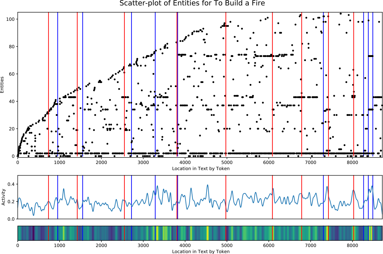
Figure 5 shows the output of the Scatter Plot of Entities for the short story, To Build a Fire (London, Reference London1902/2007). Two visuals are included in the output, with the entity scatter plot on top and the entity activity on bottom. On the scatter plot, the $x$
-axis is the narrative order of tokens in the source text, so it represents the location of each entity in the text. Each tick on the
$x$
-axis is the narrative order of tokens in the source text, so it represents the location of each entity in the text. Each tick on the $y$
-axis represents a unique entity in the order that entity is first introduced in the text. Like the scatter plot, the entity activity’s
$y$
-axis represents a unique entity in the order that entity is first introduced in the text. Like the scatter plot, the entity activity’s $x$
-axis is the location within the text by token. The
$x$
-axis is the location within the text by token. The $y$
-axis is the entity activity determined by the summation of the overlapping Gaussian curves. Included just below the entity activity plot is the corresponding heat map where blue is low entity activity and yellow is high activity. The red lines running vertically through each plot indicate a partition of the tokens into clusters, where the system believes the scene transitions are located. The blue lines are the ground truth transitions or borders between the scenes.
$y$
-axis is the entity activity determined by the summation of the overlapping Gaussian curves. Included just below the entity activity plot is the corresponding heat map where blue is low entity activity and yellow is high activity. The red lines running vertically through each plot indicate a partition of the tokens into clusters, where the system believes the scene transitions are located. The blue lines are the ground truth transitions or borders between the scenes.
Entity scatter plot (top) and corresponding entity activity (bottom) for the short story To Build a Fire (London, Reference London1902/2007). Story entities are plotted as black dots, where the x-value (i.e., along the horizontal axis) is the location in the story, and the y-value (i.e., along the vertical axis) is the order of the entity’s first appearance. Vertical red lines show the cluster partitions. Vertical blue lines show the ground truth scene transitions.
3.3.2. Point-wise dissimilarity evaluation metric
To evaluate the scene partitioning created by the clustering, we need a metric that does not require a foreknown classification matching of which scene partition in the output pairs with which scene partition in the ground truth, since a scene boundary may be missed or a scene in the ground truth may be split into multiple scenes in the output. The metric also cannot require perfect alignment but instead provides a better score the closer in alignment to the ground truth the output is. The F1 score fails to satisfy both requirements. WindowDiff (Pevzner and Hearst, Reference Pevzner and Hearst2002) is an evaluation metric designed for single-category linear tiling of the full continuum, much like our problem, but it requires the setting of a rolling window size $k$
, and an arbitrary hyperparameter. This measure is useful for comparison between different partitions of the same length set or continuum, but it does not allow for equal comparison between partitions of different length data. This led us to create the Point-wise Dissimilarity Evaluation Metric.
$k$
, and an arbitrary hyperparameter. This measure is useful for comparison between different partitions of the same length set or continuum, but it does not allow for equal comparison between partitions of different length data. This led us to create the Point-wise Dissimilarity Evaluation Metric.
Recall that a partition of a set is collectively exhaustive, mutually exclusive subsets of a given set. In our case, the set of interest is the set of tokens, $T$
, which we define back in Section 3.1 as containing the integer indices of all tokens in narrative order from
$T$
, which we define back in Section 3.1 as containing the integer indices of all tokens in narrative order from $0$
to
$0$
to $n$
,
$n$
, $n$
being the last token.
$n$
being the last token.
Here, we are interested in comparing two partitions, $P_O$
and
$P_O$
and $P_G$
where
$P_G$
where $P_O$
is the partition generated by the system output and
$P_O$
is the partition generated by the system output and $P_G$
is the ground truth partition characterizing how the text is actually divided into scenes. Without loss of generality, let
$P_G$
is the ground truth partition characterizing how the text is actually divided into scenes. Without loss of generality, let $X$
be the larger of the two partitions and
$X$
be the larger of the two partitions and $Y$
be the smaller (if they are equal-sized let
$Y$
be the smaller (if they are equal-sized let $X$
represent
$X$
represent $P_G$
). Similarly, let
$P_G$
). Similarly, let $\ell$
be the number of subsets in
$\ell$
be the number of subsets in $X$
(the number of scenes) and
$X$
(the number of scenes) and $s$
be the number of subsets in
$s$
be the number of subsets in $Y$
. Furthermore, for any
$Y$
. Furthermore, for any $i^{th}$
element of
$i^{th}$
element of $X$
,
$X$
, $X_i$
, or
$X_i$
, or $Y$
,
$Y$
, $Y_i$
, let
$Y_i$
, let $\overline{x_i} \;:\!=\; \max{\!(X_i)}$
, and
$\overline{x_i} \;:\!=\; \max{\!(X_i)}$
, and $\overline{y_i} \;:\!=\; \max{\!(Y_i)}$
. Recall that since
$\overline{y_i} \;:\!=\; \max{\!(Y_i)}$
. Recall that since $X$
and
$X$
and $Y$
are partitions of sets of contiguous integers, the
$Y$
are partitions of sets of contiguous integers, the $i^{th}$
element of such a partition is a subset of integers, which always has a maximum value. This maximum value then becomes the value of
$i^{th}$
element of such a partition is a subset of integers, which always has a maximum value. This maximum value then becomes the value of $\overline{x_i}$
or
$\overline{x_i}$
or $\overline{y_i}$
. We can now define the point-wise error as follows:
$\overline{y_i}$
. We can now define the point-wise error as follows:
 \begin{equation} \textit{error}=\frac{1}{n}\sum _{i=1}^{\ell }\min _{j\in \{1,\dots,s\}}\big |\overline{x_i}-\overline{y_j}\big | \end{equation}
This error looks at the boundaries in each element in the partition with most scenes and finds the closest boundary in the other partition, calculates the difference between these two boundaries, aggregates the error over all closest comparisons, and then normalizes over the number of tokens to enable comparison of the error between stories of different lengths. The closer to zero the Point-wise Dissimilarity error is, the more accurate the partitions of $P_O$
are to
$P_O$
are to $P_G$
are. When
$P_G$
are. When $P_O$
and
$P_O$
and $P_G$
have the same number of scene partitions, the worst error we can expect is
$P_G$
have the same number of scene partitions, the worst error we can expect is $1.0$
. If additionally
$1.0$
. If additionally $P_G$
has even-length partitions, and
$P_G$
has even-length partitions, and $P_O$
is initialized with random partition lengths, on average the error will be
$P_O$
is initialized with random partition lengths, on average the error will be $0.5$
, which we see as the worst feasible error for our tests.
$0.5$
, which we see as the worst feasible error for our tests.
3.3.3. Evaluation results
We collect five different error measurements, three as a baseline for comparison and two corresponding to our hypotheses of how entity activity could mark a transition between scenes. We create the first baseline, the even-split partitions, by dividing the text into a number of even-length scenes. We create the second baseline, the randomized partitions, by dividing the text into random-length partitions, and we repeat this 100 times to get an average error. Our purpose in including these two baselines is to reveal fundamental aspects of the nature of the novel task of scene segmentation in narrative. These two baselines can be seen as “bookends” of a spectrum of solution techniques, one end being deterministic and the other being stochastic, using only the information about the expected or desired number of scenes in the story:
-
At one end, we consider a completely deterministic approach of simply partitioning the text into N equally sized scenes, the even-split partition. If this completely naive approach performs well over a large corpus, then presumably the scene segmentation problem is not as difficult as we might have first thought, hinging only on discovering the number of scenes in the story.
-
At the other end of the spectrum, we adopt a completely stochastic approach, randomly choosing N-1 locations in the text to partition it into N scenes. Again, this approach only uses knowledge of the number of scenes, but in an entirely different way than the deterministic approach above.
A corpus that has a high average even-split score will not have a high random partition score, and vice versa. With a high even-split score, scenes within a story are expected to be relatively equal in length, while corpora with high random partition scores will have a wide variety of scene sizes within each story (some large and other small). These two baselines add insight into the nature of the particular scene segmentation problem we address through the Scatter Plot of Entities by providing guardrails from which we can better interpret the performance scores of our solution to this problem. Some stories can approach a solution to the problem by simply chopping the text into equal-sized chunks, but others—even with knowledge of the number of scenes—require more information to get the segmentation right. As one considers the performance of our solution on a particular story, we think they should have insight into the degree to which that story belongs to the one category or the other.
Our third baseline, Texttiling (Hearst, Reference Hearst1997), provides a comparison between a topical approach to story partitioning and our density-based approach which lacks the need to know any topical information about the source text. To match our problem setup, the Texttiling also produces a number of partitions matching the number of scenes so that the comparisons will be equal.
Table 2 shows the error calculations for the partitioning. Bold numbers highlight the lowest error for that story. Low-activity partitions select scene partitions where the partition borders have on average the lowest entity activity. High-activity partitions select scene partitions where borders on average have the highest scene activity. Remember that the number of partitions of the story for each baseline and test is the same. The only way the resulting number of scenes would differ is if there is an output partitioning that includes an empty partition, meaning that the mean shift clustering algorithm created an empty cluster. Averaging over the stories (taking the column average, shown in the bottom row of Table 2), our strongest baseline, even-split, obtains a point-wise dissimilarity error score of 0.261. Low-activity partitions perform near-equivalently at 0.262. High-activity partitions perform best with an average point-wise dissimilarity error score of 0.242. Texttiling’s topical approach produces an error score of 0.293, worse than both even-split and low-activity. To assess the feasibility of fully automating the process of Scatter Plot of Entities creation, we use the best-performing method of high-activity partitions and run additional experiments on each story using AllenNLP’s coreference resolution library (Gardner et al., Reference Gardner, Grus, Neumann, Tafjord, Dasigi, Liu, Peters, Schmitz and Zettlemoyer2018) to see how well it performs in comparison with our hand-coreferencing. The average point-wise dissimilarity score over all stories for high-activity partitions using AllenNLP’s library coreference resolution toolkit is 0.266, worse than our best baseline. In addition to our point-wise dissimilarity score, we also calculated the overall F1 scores, not on the scene boundaries but on the overlap of the matched partitions. Even-split partitioning has an F1 score of 0.603. The Scatter Plot of Entities obtains an F1 score of 0.635 for high-activity partitioning (precision 0.775 and recall 0.549). Using AllenNLP’s coreference resolution toolkit with high-activity partitioning results in a worse F1 score of 0.579 (precision 0.764 and recall 0.475).
Scene partitioning error for the Scatter Plot of entities. Bold numbers highlight the method with lowest error for that story. For the averages over all stories, bold represents the partitioning method that results in overall best scene partitioning according to the point-wise dissimilarity evaluation metric.

3.4. Discussion
The Scatter Plot of Entities provides a visualization of and insight into three important aspects of narrative: a partitioning of the story into scenes, denoting locations in the story of potential plot-importance, and highlighting what characters may have the most influence on the story. We dissect each of these below and discuss how well the Scatter Plot of Entities adheres to our goal, which is to model the underlying plot of a story. Given the initial findings from the results and the resulting qualitative and anecdotal observations we discuss for the seven stories, determining how universal these findings are among multiple stories and genres with the aid of large-scale third-party human judgments is a necessary topic we will address in the future.
3.4.1. Scene partitioning
Our first hypothesis that scene transitions are denoted by locations of low entity activity in the story does not hold up well according to Table 2, whereas our second hypothesis performs the best overall, obtaining the lowest error for all but two stories. The success of the second hypothesis does not mean that our first hypothesis is false. Figure 6 shows the ground truth scene partitions overlayed on the entity activity lines. Of the 140 combined scene transitions for all 8 stories, 83 of them land on or near local maxima, 41 land on or near local minima, and 16 are undecidable (about midway between local a local maxima and minima). These results give supporting evidence that high entity activity hints at scene location and that small spikes in local entity activity are a common marker for scene transitions.
Ground truth scene partitioning for each story, shown on the entity activity lines. The vertical blue bars are the divisions between the scenes.

The two exceptions in Table 2 that have lower partitioning error on tests other than high entity activity are special cases. The first exception, The Lion King, has a much higher percentage of scene transitions at or near local minima (17 out of 29 scene transitions) than the other stories. Given this pattern, we would expect the error for low-activity partitions to be lower than high-activity partitions in the table, but that is not the case. We believe this is because the lowest of the local minima in the activity line is within scenes and far from the ground truth scene transitions. By trying to find clusterings where the partition borders land in these locations, the partitions get further from the ground truth. In the end, even-split partitions have the lowest error, but only by a very small margin ( $0.2334$
for even-split compared to
$0.2334$
for even-split compared to $0.235$
for high-activity).
$0.235$
for high-activity).
The second exception is the most peculiar, A Sound of Thunder. The Texttiling baseline had the lowest out of all the error measurements for any story, and randomized scene partitioning had the next lowest error for the story. Because Texttiling is a topic-based text segmentation algorithm, it performs better on stories that have drastically different thematic topics between scenes. The first and last scenes take place in the present while the long scene in the middle takes place in the ancient past. This makes differentiating between scenes by topic much easier as opposed to To Build A Fire which is topically very monochrome, resulting in almost the same error from Texttiling as randomly partitioning the text. A Sound of Thunder also provides a perfect example of why inconsistent scene lengths are such a great weakness. The beginning and ending scenes, which take place in the present time, are very short, whereas the middle scene, which takes place in the past, takes up nearly 60% of the story. The drastic difference between the scene lengths conflicts with the mean shift clustering algorithm’s bandwidth. As mentioned before, the bandwidth determines the distance of attraction to cluster the entities together, determining the size and number of clusters. If a scene is much larger than the bandwidth, the system forces that scene to split. The Scatter Plot of Entities places the partitions closer to center in this story because the bandwidth can grow only so large to create a partition into three scenes. The scenes end up becoming near equal in length, increasing error. When placing randomized partitions, there is a much higher chance of one being placed close to the two ground truth scene partitions, so when averaging over 100 randomized three-scene partitions, the likelihood of lower error for a large number of them is higher. In general, much of the partitioning error comes from scenes being much longer or shorter than the mean shift clustering bandwidth—a common issue for all stories in our study, not just A Sound of Thunder.
3.4.2. Marking locations of plot-importance
The entity activity line and its corresponding heat map give us a clear visual of locations of high entity activity. The system’s best standard deviation, $\sigma$
, for the Gaussians creates a noisy activity line that is difficult for a human to use to determine general locations of high entity activity. However, if we increase
$\sigma$
, for the Gaussians creates a noisy activity line that is difficult for a human to use to determine general locations of high entity activity. However, if we increase $\sigma$
to smooth out the activity lines, we find a common pattern in that the areas of higher entity activity often correspond to locations of higher plot-importance in our chosen stories.
$\sigma$
to smooth out the activity lines, we find a common pattern in that the areas of higher entity activity often correspond to locations of higher plot-importance in our chosen stories.
Figure 7 shows the corresponding heat maps for three stories where $\sigma$
has been increased. We can see near the end of each story that the climax shows up yellow, which shows they have high entity activity. In addition to climaxes, there are often locations within a story that are similarly plot-important but do not have the finality of a climax. Such moments, which are often called sub-climaxes or crisis points (Gardner, Reference Gardner1991), show up as yellow in the heat map just like climaxes.
$\sigma$
has been increased. We can see near the end of each story that the climax shows up yellow, which shows they have high entity activity. In addition to climaxes, there are often locations within a story that are similarly plot-important but do not have the finality of a climax. Such moments, which are often called sub-climaxes or crisis points (Gardner, Reference Gardner1991), show up as yellow in the heat map just like climaxes.
Heat map for three representative stories. The areas of strongest yellow (high entity activity) tend to be the most plot-important locations in these stories. Independent analysis verifies that the climax of each story corresponds to the rightmost bright yellow region for these examples, although in general, it may correspond to other bright patches.

In “Falling,” the strongest yellow mark in the middle of the story is a crisis point in which the main character shows the dystopian nature of the colony to the secondary main character. The climax, marked in yellow at the end of the story, is an assassination attempt against the main character. Similarly in Leiningen Versus the Ants, the area of high entity activity in the middle of the story is the moment when the ants begin overrunning the plantation. The climax in yellow shows the location where Leiningen must flood his plantation. Lastly in “Observer 4: Legends,” the climactic battle, shown as the only location of high entity activity, appears relatively earlier because the resolution and denouement of this story is longer. Though not all stories follow the pattern of high entity activity equating plot-importance, and it is possible for a story to have a climax with low entity activity, the pattern is common enough to be worthy of highlighting.
3.4.3. Identifying the most influential entities
Although the scatter plot is used for clustering and scene partitioning, on its own it gives us detailed information on the entities of the story. In Figure 8, we see that the introduction of entities follows a nearly logarithmic curve. As the story progresses, fewer and fewer new entities are introduced, and by the one-third to midway mark, most if not all the prominent entities have been introduced. This pattern of entity introduction is a common trend that all eight of our stories follow, although The Lion King does introduce two major characters, Timone and Pumba, a little past the midway point, so there are exceptions.
Scatter Plot of Entities for the short story, “Falling” (DeBuse, Reference DeBuse2013). The most influential entities are entities 0, 10, and 53, visible by the near-solid horizontal dotted lines. Entities 0 and 10 are the male and female leads of the story, and entity 53 is a secondary, supporting character. The output partitions (red vertical lines) and the ground truth partitions (blue vertical lines) show by their proximity that the system also does a fairly good job partitioning this story into scenes.
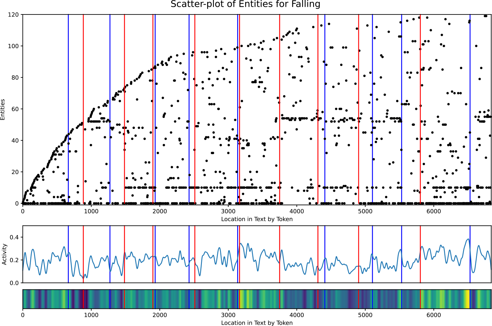
Using the scatter plot, we can also see which entities are the most prominent at a glance, namely those that create near-solid horizontal dotted lines. The densest dotted lines indicate scenes where that entity is actively involved or mentioned, hinting that they may be relevant to the plot in that place in the story. When determining the most influential entities, we must look at more than frequency. Local density is just as important. An entity that appears infrequently in every scene may not hold as much importance as another entity that appears the same number of times overall but is concentrated with high activity in a select few scenes where it appears. Referring back to Figure 8, we can see that entity 0, 10, and 53 are the most prominent and locally frequent in the various scenes where they appear. These entities are the male lead (mentioned only by the first-person pronoun, ‘I’), the female lead, Skyler, and a supporting character, Stonne, respectively. Sure enough, these are the three main characters of “Falling.” This means that the Scatter Plot of Entities can be used to determine the main or most influential characters of a story, assuming that named entity recognition is able to properly detect them. We will see in Section 4 that the ability of the Scatter Plot of Entities to highlight entities of importance in the story enables the curation of the glossary of entities used as input into the Narrative Flow Graph, instructing the system on which plot-important entities to track.
3.4.4. Adherence to the definition of plot
The Scatter Plot of Entities can only very loosely be considered a visualization of the plot of the story. As we defined in Section 2.1, plot requires (1) characters of volition, (2) events involving those characters, (3) representation on how information spreads, (4) causation linking these aspects of plot, and (5) a full structure of those links from the beginning to the end of the story. The only requirements that this visualization addresses are events and very lightly characters and structure.
As a means of partitioning a story into its scenes, we see moderate success in clustering around high entity activity. Those scenes created by the clusters encompass the events of the story. This is the Scatter Plot of Entities’ strongest feature as far as the story’s plot is concerned. Characters are loosely represented by their location in the story, and we see which characters are most influential and which events they are heavily involved in through the more solid of the horizontal dotted lines; however, we do not have any representation of a character’s volition. Structure is also absent, and without some form of linking between scenes, we cannot develop a true plot structure for the story. By partitioning the story into scenes, we show only the narrative ordering of events. This inability to fully represent plot does not mean that the Scatter Plot of entities is without merit. The visual artifacts are informative about the story’s content, and through further research, more can be learned. We can use the Scatter Plot of Entities as a start, utilizing those aspects on which it performs well, to create another visualization that better addresses the aspects of plot where this visualization lacks.
4. Narrative as a graph
The greatest weakness of the Scatter Plot of Entities is its inability to model the underlying structure of the narrative. Given this deficiency, how then can we represent that structure? When we look back to the related works in Section 2.2, graphs are a commonly used method of showing connections or relationships in stories. Here we are interested in the relationships between scenes in which the entities appear. We can envision a graph where each vertex is a scene, and the entities are the links between those scenes. Each entity is an edge, and where there are multiple entities in both the preceding scene and the current scene, there is an edge for each individual entity, creating a directed multi-graph. This way we not only get a structural linking of the scenes in narrative order, but we track individual entities through that structure to see in which scenes they are involved.
If the Scatter Plot of Entities could properly determine the number of scenes in a story, we could use it directly to initially partition the story. As stated earlier, scene partitioning is a complicated task. Another option is to take advantage of the graph structure and use the interaction of entities within the stories—which entities are involved in which events and where those events take place—to try and automate the creation of scenes. In this way, the system can determine for itself how many scenes are in the story. We call this multi-graph structure that visualizes the flow of entities through scenes in the story the Narrative Flow Graph.
Despite the inability of the Scatter Plot of Entities to determine the number of scenes, it can aid us here as a preliminary step in determining which entities to track by choosing only those entities that have high influence in the story—as explained in Section 3.4.3—and creating a glossary of these desired entities. In this way, we only focus on those entities that are most important, resulting in less noise from unimportant entities creating extra edges and reducing the overall complexity of the multi-graph. The optimal setup is to enable the Scatter Plot of Entities to produce this glossary on its own using its own assessment of plot-importance following the notions of overall entity frequency and local density where an entity may not be frequent overall but is in a smaller section of the text. Currently the Scatter Plot of entities is imperfect, and so using these metrics for entity selection and glossary creation is still too noisy for competent analysis, considering not every frequent entity that is detected is plot-important. However, we can meet midway with a human curator that uses the output of the Scatter Plot of Entities to create the glossary without the need to read the source text or have any prior knowledge about the story. Human curation using the output of the Scatter Plot of Entities is still prone to lower scene accuracy, as we will see in the results Section 4.3, so we use a hand-annotated glossary. Hand annotation and curation of the glossary also enables the fine-tuning of the Narrative Flow Graph so that the user may choose what entities they wish to track through the story, should they desire to do so. The main focus of our results will come from the use of this hand-annotated glossary so that we may properly show the capabilities of the Narrative Flow Graphs, but we include and discuss in part the resulting accuracies and Narrative Flow Graphs from the curated glossaries for comparison. We compare the results with a small, hand-annotated ground truth dataset as the gold standard for the stories’ Narrative Flow Graphs so that we can assess how well the automated, or semi-automated, graphs match with human understanding.
First, we define the Narrative Flow Graph mathematically in Section 4.1. Next, we outline the continuation of the system that creates the Scatter Plot of Entities to create the Narrative Flow Graph in Section 4.2. In Section 4.3 we show the results and discuss them in Section 4.4.
4.1. Narrative flow graph definition
We define a narrative flow graph $M$
as
$M$
as $M=(S,E)$
where
$M=(S,E)$
where $S$
is a list of scenes in narrative order and
$S$
is a list of scenes in narrative order and $E$
is a set of all edges of the graph. Let
$E$
is a set of all edges of the graph. Let $\phi$
be an entity within the text and
$\phi$
be an entity within the text and $\Phi$
be the set of plot-important entities as defined by the user glossary. Then
$\Phi$
be the set of plot-important entities as defined by the user glossary. Then $s \in 2^\Phi$
where
$s \in 2^\Phi$
where $s$
is a scene in the story and
$s$
is a scene in the story and $2^\Phi$
is the power set of
$2^\Phi$
is the power set of $\Phi$
. We define a directed edge
$\Phi$
. We define a directed edge $e$
as
$e$
as $e=(s_a,s_b)$
where
$e=(s_a,s_b)$
where $a$
and
$a$
and $b$
are indices into the ordered list of scenes, and each edge has a corresponding
$b$
are indices into the ordered list of scenes, and each edge has a corresponding $\phi _i$
that is the specific entity attributed to that edge.
$\phi _i$
that is the specific entity attributed to that edge.
The restrictions involved in edge creation are what make the graph structure a Narrative Flow Graph. The five restrictions are as follows:
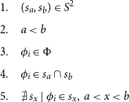 \begin{equation} \begin{aligned} 1.\quad &(s_a,s_b)\in S^2\\[5pt] 2.\quad &a\lt b\\[5pt] 3.\quad &\phi _i \in \Phi \\[5pt] 4.\quad &\phi _i \in s_a \cap s_b\\[5pt] 5.\quad &\nexists \, s_x\; |\; \phi _i \in s_x,\, a\lt x\lt b\\[5pt] \end{aligned} \end{equation}
Restriction (1) states that both scenes $s_a$
and
$s_a$
and $s_b$
are scenes in the story. Restriction (2) forces the graph to be a directed graph moving forward in narrative order, and no vertex can have an edge to itself. Restriction (3) requires the entity
$s_b$
are scenes in the story. Restriction (2) forces the graph to be a directed graph moving forward in narrative order, and no vertex can have an edge to itself. Restriction (3) requires the entity $\phi _i$
to be plot-important as defined by the glossary. Restrictions (4) and (5) are the most important in defining edge creation to create the connections between scenes in the story. With restriction (4), an edge is created if the two scenes
$\phi _i$
to be plot-important as defined by the glossary. Restrictions (4) and (5) are the most important in defining edge creation to create the connections between scenes in the story. With restriction (4), an edge is created if the two scenes $s_a$
and
$s_a$
and $s_b$
share the same entity
$s_b$
share the same entity $\phi _i$
. An edge can be defined only by a single entity, so an edge is created for each entity involved in both scenes. For restriction (5), scene
$\phi _i$
. An edge can be defined only by a single entity, so an edge is created for each entity involved in both scenes. For restriction (5), scene $s_a$
must be the most recent occurrence of
$s_a$
must be the most recent occurrence of $\phi _i$
previous to scene
$\phi _i$
previous to scene $s_b$
. This restriction creates a multi-edge, directed acyclic graph (multi-DAG) that shows what scenes must occur before a following scene as determined by the entities involved in those scenes, their “scene dependencies.” Additionally, due to the narrative ordering of scenes, the adjacency matrix for the Narrative Flow Graph is by nature a strictly upper-triangular matrix without the need for permutation.
$s_b$
. This restriction creates a multi-edge, directed acyclic graph (multi-DAG) that shows what scenes must occur before a following scene as determined by the entities involved in those scenes, their “scene dependencies.” Additionally, due to the narrative ordering of scenes, the adjacency matrix for the Narrative Flow Graph is by nature a strictly upper-triangular matrix without the need for permutation.
4.2. System outline
Our goal is to generate a graph structure following the definitions and restrictions in Section 4.1. Figure 9 shows the diagram of the system. It is divided into three main sections each with its own intermediary output. We explain each process of the system in detail below.
System diagram of the procedure to produce the Narrative Flow Graph.
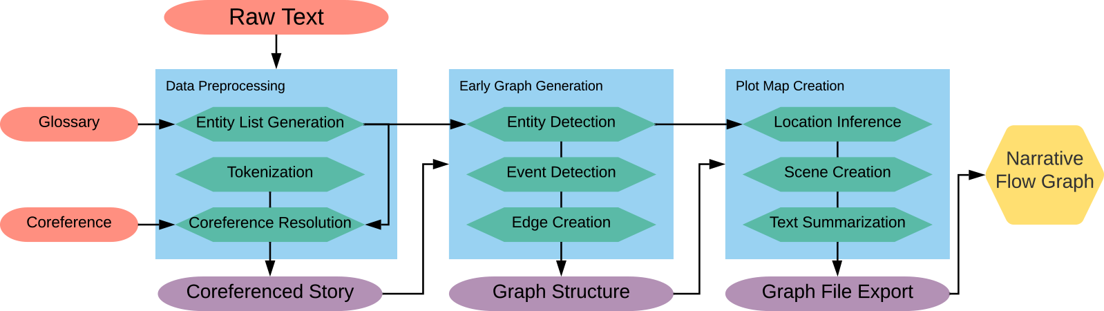
4.2.1. Glossary curation and creation
The glossary XML file details the entities (actors, objects, and locations) that are plot-important so that the Narrative Flow Graph may detect and track them. Actors represent those entities with volition within the story, objects are entities without volition, and locations are where events or scenes take place. See Table 3 for a list of example entities and their classes from To Build a Fire and Appendix A for an detailed explanation of the definitions of actors, objects, and locations as pertaining to this research. To facilitate as much automation as possible, the Scatter Plot of Entities can be used with the aid of a human curator to produce the glossary. The curator is given the scatter plot output, $y$
-axis key, and count of entity appearances. After brief instruction on how entity importance may be detected from the output as detailed back in Section 3.4.3, they can use this data to accept or reject entities without having read or known the story beforehand. Locations where scenes take place are often not as mentioned as the entities involved in those scenes, so in order for the Narrative Flow Graph to have sufficient location information, the curator must select some locations detected by the Scatter Plot of Entities even if they have less locality or appearances than other entities. Locations must be compared only against other locations for relevance or they may be missed in curation. From here, the glossary XML file can be automatically generated. Figure 10 shows an example scatter plot for “Observer 1: A Warm Home” where the entities selected via curation are highlighted in cyan and all other entity points are diminished. We can see that those entities that are most frequent are easily noticeable for selection, and included with them are those entities that are less frequent overall but quite dense locally where they appear in the text. Compare Figure 10 with the Word Cloud in Figure 11 where only two of the characters, Hazel and Alfred, are readily apparent and perhaps two locations, the cottage and cellar. It is difficult without additional information to make any claims on which the other words are potentially influential or plot-important. For this particular example, of the 25 entities identified as plot-important by our human annotators, 15 are correctly selected through curation of the Scatter Plot of Entities output.
$y$
-axis key, and count of entity appearances. After brief instruction on how entity importance may be detected from the output as detailed back in Section 3.4.3, they can use this data to accept or reject entities without having read or known the story beforehand. Locations where scenes take place are often not as mentioned as the entities involved in those scenes, so in order for the Narrative Flow Graph to have sufficient location information, the curator must select some locations detected by the Scatter Plot of Entities even if they have less locality or appearances than other entities. Locations must be compared only against other locations for relevance or they may be missed in curation. From here, the glossary XML file can be automatically generated. Figure 10 shows an example scatter plot for “Observer 1: A Warm Home” where the entities selected via curation are highlighted in cyan and all other entity points are diminished. We can see that those entities that are most frequent are easily noticeable for selection, and included with them are those entities that are less frequent overall but quite dense locally where they appear in the text. Compare Figure 10 with the Word Cloud in Figure 11 where only two of the characters, Hazel and Alfred, are readily apparent and perhaps two locations, the cottage and cellar. It is difficult without additional information to make any claims on which the other words are potentially influential or plot-important. For this particular example, of the 25 entities identified as plot-important by our human annotators, 15 are correctly selected through curation of the Scatter Plot of Entities output.
Example entities from all three entity classification types in the short story To Build a Fire
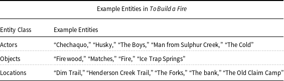
Scatter Plot of Entities with the entities selected via minimal-effort human curation highlighted in cyan. Essentially, the human annotator simply selects entities associated with strong horizontal dotted lines.

Word Cloud of “Observer 1: A Warm Home” to show comparison with Figure 10. The only entities that stand out are Alfred and Hazel, and perhaps the cottage and cellar because locations are needed. Without additional information, it is difficult to know if any of these other common words are important in the text.
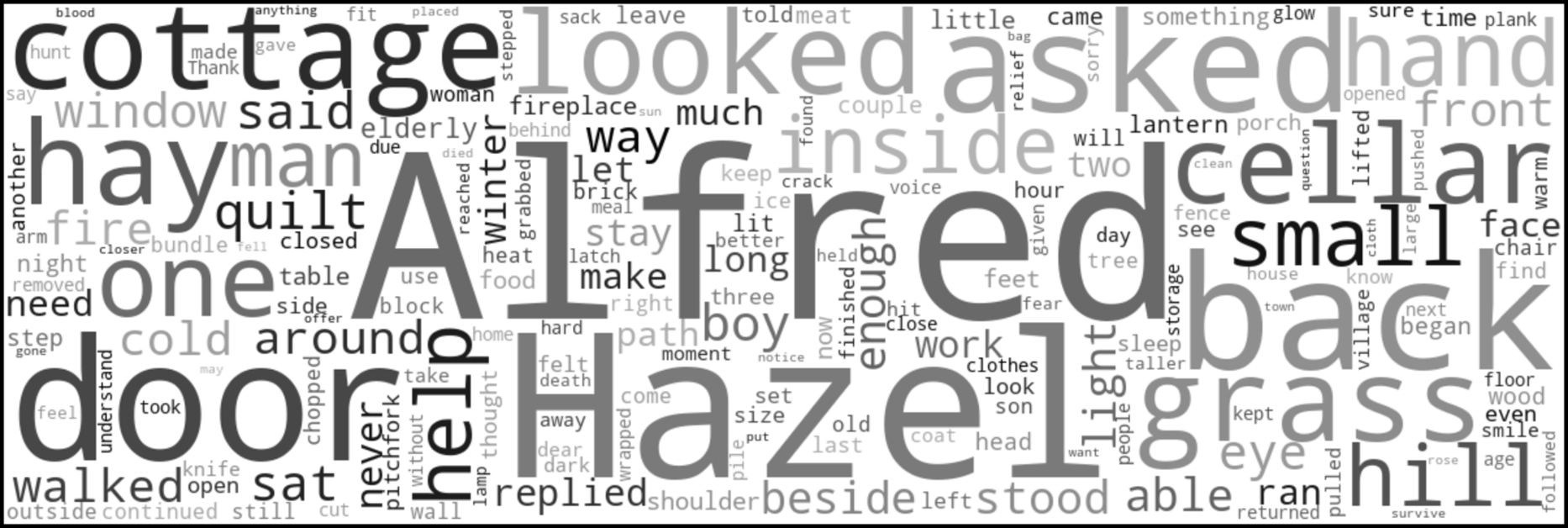
4.2.2. Data preprocessing
Data preprocessing takes as input the plain text file of the story, the glossary XML, and the coreference CSV. Details about the annotation process and format of the glossary XML and coreference CSV can be found in Sections A.1.1 and A.1.2 respectively. We use the glossary to generate a list of entity objects wherein is stored the entity’s unique ID, the entity’s type, and all labels to which the entity is referred in the text. We then tokenize the raw text to isolate the instances of the entity references in the text. Using the entity list and coreference CSV, we replace each instance of an entity with the first label attributed to that entity. The coreferenced story is then outputted to be used in the next step of the system.
4.2.3. Early multi-graph generation
Early multi-graph generation takes as input the coreferenced story and the entity list. Following a simple algorithm, we create an ordered list of vertices and a set of edges.
-
Step 1: Parse the text into sentences and detect which sentences involve entities from the list. These sentences become the events of the story the initial multi-graph is built around.
-
Step 2: Create a vertex for each event storing the sentence number, text, and involved entities. These vertices are added to an ordered list by their narrative order appearance within the text.
-
Step 3: Following the definitions and restrictions in Section 4.1, create edges between each vertex by iterating through the list of vertices, and for each vertex search backwards through the list of vertices for the most recent appearance of every entity within that vertex. Each entity creates an edge to the most recent vertex where the entity last appears unless the current vertex is that entity’s first appearance.
4.2.4. Narrative flow graph creation
The multi-graph at this stage is large and difficult to reason about for long passages of text because it is comprised of event vertices made from individual sentences. Although a graph created with such high fidelity to the source text can be informative, to better notice patterns and features of the narrative, the graph needs to focus on the relationships between scenes. Individual sentences alone do not represent scenes in a story. Scenes in narrative can be described as an unbroken chain of events involving similar entities within the story. We tighten this definition by requiring the location of a scene to be consistent throughout the scene. The definition of a scene in Section 4.1 is sufficient for the Narrative Flow Graph’s structure, but to refine a multi-graph structure of event vertices into a Narrative Flow Graph made of scene vertices, we need further definitions.
We define an entity $\phi$
as
$\phi$
as $\phi =(i,\tau )$
where
$\phi =(i,\tau )$
where $i$
is the ID of the entity according to the user glossary and
$i$
is the ID of the entity according to the user glossary and $\tau$
is the entity type. For an event,
$\tau$
is the entity type. For an event, $\varepsilon$
, we can state
$\varepsilon$
, we can state $\varepsilon \in 2^\Phi$
, because like a scene,
$\varepsilon \in 2^\Phi$
, because like a scene, $s$
, it is comprised of entities.
$s$
, it is comprised of entities. $\mathcal{E}$
is a list of events in narrative order. We define an event graph,
$\mathcal{E}$
is a list of events in narrative order. We define an event graph, $M^*$
, as
$M^*$
, as $M^*=(\mathcal{E},E)$
. We can now define a function
$M^*=(\mathcal{E},E)$
. We can now define a function
 \begin{equation} f\;:\;M^*\to M \end{equation}
performing the following processes:
-
1. Until $\mathcal{E} = \emptyset$
, create consecutive lists
$\mathcal{E}_{n-m}^{'}$
from
$\mathcal{E}$
where
$\mathcal{E}_{n-m}^{'} = \langle \varepsilon _{n}$
to
$\varepsilon _{m} \subseteq \mathcal{E} \; | \; \forall \; \varepsilon \; \exists \; \phi$
where
$\tau \in \phi$
is of type: “location” and
$ \phi _n = \phi _{n+1}$
until
$n=m \rangle$
. The original indices of all
$\varepsilon$
are remembered.
$\mathcal{E} = \emptyset$
, create consecutive lists
$\mathcal{E}_{n-m}^{'}$
from
$\mathcal{E}$
where
$\mathcal{E}_{n-m}^{'} = \langle \varepsilon _{n}$
to
$\varepsilon _{m} \subseteq \mathcal{E} \; | \; \forall \; \varepsilon \; \exists \; \phi$
where
$\tau \in \phi$
is of type: “location” and
$ \phi _n = \phi _{n+1}$
until
$n=m \rangle$
. The original indices of all
$\varepsilon$
are remembered. -
2. Create a scene
$s$
for each consecutive list where
$s = \{\phi \; | \; \phi \in \mathcal{E}^{'}\}$
.
$S$
is the set of all
$s$
. -
3. For all
$e \in E$
and
$e = (\varepsilon _a,\varepsilon _b)$
, if
$a = i$
where
$i$
is the original index of
$\varepsilon \in \mathcal{E}$
, set
$a=j$
where
$j$
is the index of
$s \in S$
. -
4. For all
$e \in E$
and
$e = (\varepsilon _a,\varepsilon _b)$
, if
$b = i$
where
$i$
is the original index of
$\varepsilon \in \mathcal{E}$
, set
$b=j$
where
$j$
is the index of
$s \in S$
. -
5. Remove all
$e$
from
$E$
where
$s_a = s_b$
.


The purpose of function $f$
is to take the single-sentence events and group them together creating scenes by combining those consecutive events that take place in the same location. All entities involved in those events are added to the new scene, and any edges attached to those events are changed to attach to that scene. The main limiting factor of this function is that not all sentences have an explicitly stated location; therefore, not all events will have a location entity within it, complicating step 1 of the function. To overcome this, we perform location inference before scene creation.
$f$
is to take the single-sentence events and group them together creating scenes by combining those consecutive events that take place in the same location. All entities involved in those events are added to the new scene, and any edges attached to those events are changed to attach to that scene. The main limiting factor of this function is that not all sentences have an explicitly stated location; therefore, not all events will have a location entity within it, complicating step 1 of the function. To overcome this, we perform location inference before scene creation.
Location inference is the process of determining the location of events using the last known location found searching backwards through the edges of the graph. We perform a breadth-first search in reverse edge direction for each event vertex without a location entity. Once a location entity is discovered, we apply that entity to the source vertex that began the search. This process is better than simply finding the most recent location stated in the text because those branches of the narrative that have no relation to the current event (there are no entities in common) do not affect the location inference of that event, and it is beneficial for narrative structures where separate event or scene branches are running in parallel.
There remains a single issue with this method of scene creation: when multiple scenes happen at the same location. By strict adherence to the mathematical definition, all those scenes are combined into one. Essentially, the definition assumes that there is a single scene per location. While that may be the case for some stories, it certainly does not hold for all. To address this issue in the output, we do not fully combine the scenes. Instead, we implement as an appendage to Equation (3) a discriminator of entity homogeneity between events that can be adjusted to determine if events at the same location should be combined. While slightly altering scene creation in this manner does increase the complexity of the narrative flow graph—making more vertices and edges the more strict the discriminator—it also makes the graph more informative, essentially finding a middle ground between the $M^*$
and
$M^*$
and $M$
depending on how correlated the entities are within the scenes. If the actions and interactions between entities in the scenes are dissociated, the output graph will be closer to
$M$
depending on how correlated the entities are within the scenes. If the actions and interactions between entities in the scenes are dissociated, the output graph will be closer to $M^*$
. Where they are more unified, the output graph will be closer to
$M^*$
. Where they are more unified, the output graph will be closer to $M$
. For the tests in this paper, only consecutive events where entities are completely homogeneous are combined. In the results, you will see the difference between the output where scenes are more divided and the ground truth Narrative Flow Graphs where all events at a single location are combined into one scene. One negative side effect of this further scene breakdown is that dialogue creates a large number of vertices, often a vertex for a single line someone speaks. For scripts which are almost solely dialogue, the number of vertices is far larger than for short stories even when taking the length of the text into account.
$M$
. For the tests in this paper, only consecutive events where entities are completely homogeneous are combined. In the results, you will see the difference between the output where scenes are more divided and the ground truth Narrative Flow Graphs where all events at a single location are combined into one scene. One negative side effect of this further scene breakdown is that dialogue creates a large number of vertices, often a vertex for a single line someone speaks. For scripts which are almost solely dialogue, the number of vertices is far larger than for short stories even when taking the length of the text into account.
Once we create the scenes and affix the edges to the correct scene vertices, we perform text summarization to create a more informative visualization. We do this through a TF-IDF algorithm. We create a matrix of word comparisons between each sentence in a scene. Those sentences that score the best overall for comparison with all other sentences in that scene are more likely to represent the scene as a whole. This is a simplistic approach, and a neural text summarizer would perform better, but that is a topic for future work.
Finally, we format the multi-graph structure and pertinent information such as edge and vertex labels and scene summaries into a .gv file to be compiled and interpreted by GraphViz’s dot compiler (Ellson et al., Reference Ellson, Gansner, Koutsofios, North and Woodhull2003). We assign edges and vertices colors according to the entities each edge represents or the location the scene takes place. We format the Narrative Flow Graph in a left-to-right orientation with each consecutive scene further right than its predecessor. This prevents any doubling back that would complicate the visual.
4.3. Results
We use the same stories for testing the Narrative Flow Graph as we used for the Scatter Plot of Entities in Section 3.3 with the exception of “Falling” (DeBuse, Reference DeBuse2013) because it is used to tune the system. Similar to the results and discussions presented in Sections 3.3 and 3.4 respectively, the results below include the Narrative Flow Graphs themselves, which are qualitative output, along with quantitative measures comparing these with ground truth. In our discussion and analyses of these results, we make observations that are anecdotal, since our sample size in this study only considers seven short stories, demonstrating a proof of concept for the ideas. Future work should undertake large-scale studies over a rich variety of genres and story types to explore the degree to which the anecdotal observations made here extend broadly in different situations.
Because the resulting Narrative Flow Graphs are typically many pages wide, we provide sections of these graphs to show examples of common artifacts and to compare various graph structures. Due to the restrictions of page size in this article, some of the text is too small to decipher for those images that cover a large section of a graph. In the images below, the relationships between the vertices and edges are the most relevant features. The full output and ground truth graphs can be found and downloaded at https://idealabs.byu.edu/features/narrative_flow/.
4.3.1. Common structures within narrative flow graphs
Each Narrative Flow Graph is distinct in its overall shape and appearance, but within the graphs are common structures that are repeated in many different Narrative Flow Graphs, giving hints to common, recurring narrative patterns. We have selected names for each based on their shape and function: Braids, Parallels, Breaks, Convergent Points, and Ends. Braids and Parallels deal with passages of narrative, Breaks and Convergent Points deal with scene transitions, and Ends deal with the end of a narrative branch.
Figure 12 shows examples of different Braids from different stories. Braids, as the name suggests, involve the interweaving of entities important to a scene or consecutive scenes as all other uninvolved entities pass by to where they come into play later in the story. These show areas where the entities involved in the current events of the narrative are homogeneous. Each Narrative Flow Graph created by the system contains multiple sections of Braids, making them the most common narrative structure.
Examples of Braid structures in output graphs for six different stories. Braids are the most common of all structures in a Narrative Flow Graph, created by the interaction of a subset of entities involved in consecutive scenes. Braids can include a small number of entities as in Simba and Nala’s interaction in The Lion King, or many entities as seen in To Build a Fire.
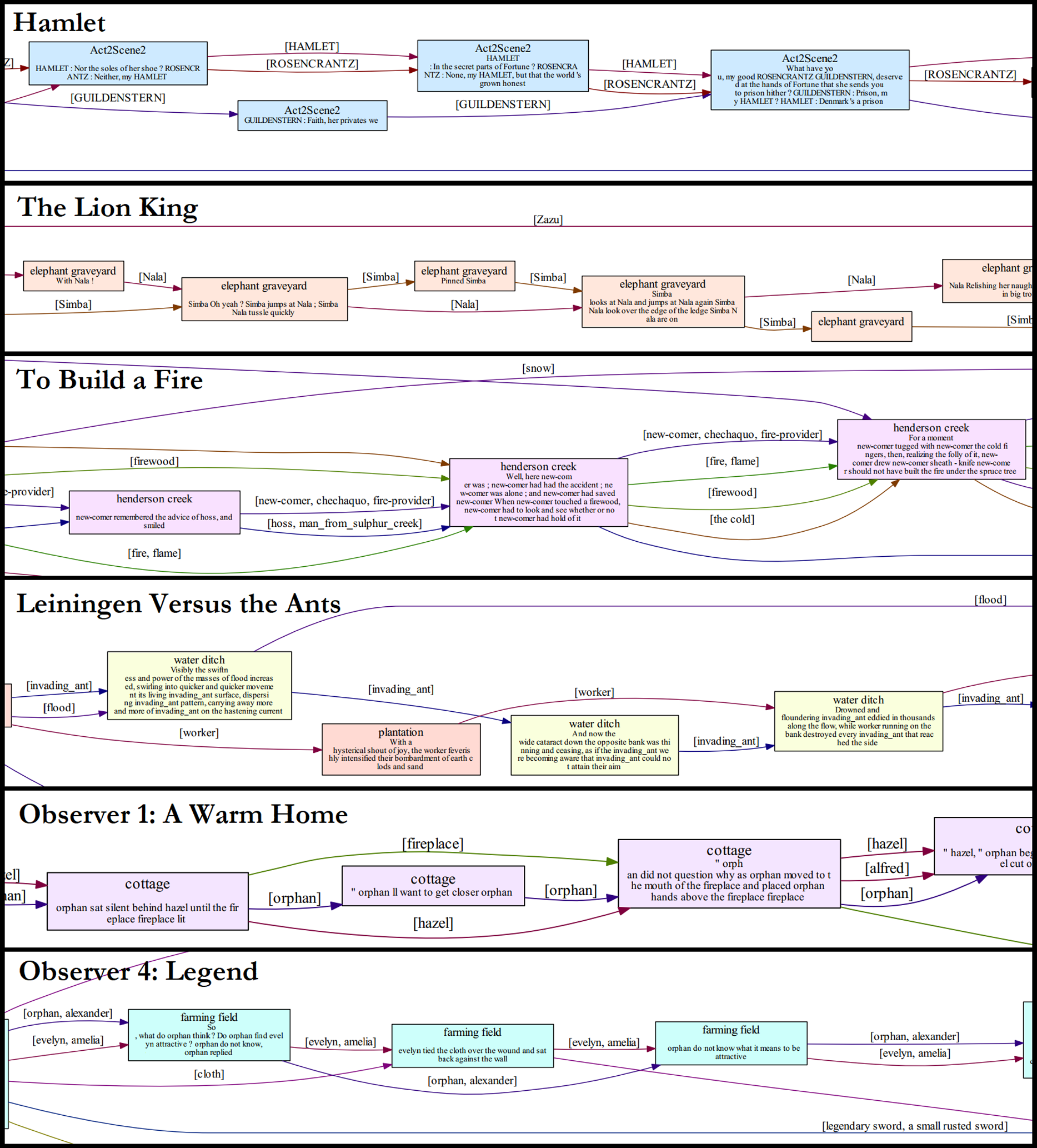
Figure 13 shows an example of a Parallel. Parallels involve alternating scenes where the entities involved in one scene are not involved in another, creating almost a tiered structure within the Narrative Flow Graph. Where Parallels are prevalent, after one part of the Parallel is finished, the next scene often involves entities of the scenes that came before, as seen in The Lion King script where the imprisoned Zazu sings to Scar, and the hyenas report that the lionesses will not hunt. This scene happens in parallel with the scenes of Simba in the jungle with Timon and Pumba. Breaks are the most common scene transitions for Parallel scenes, as a line can almost be drawn between them. For Breaks, there is little to no interaction between entities of the two scenes, so the transition is a breaking of the narrative of one scene giving way to the start or continuation of the narrative of the following scene.
A perfect example of parallel scenes in The Lion King. On the left and right in green are the jungle scenes with Timon, Pumba, and Simba. In the center in yellow is the scene where the imprisoned Zazu sings to Scar. There is no overlap between entities in these scenes, and the locations are different, creating clean scene Breaks. This is beautifully reflected in the Narrative Flow Graph.

Convergent Points, unlike Breaks, are where many entities converge to begin the next scene (high local edge density). As we stated before, the involvement of many entities does not necessarily mean that that scene is more plot-important; however, many crucial scenes in the story often do involve multiple entities. Similar to what we saw in Section 3.4.2 with the Scatter Plot of Entities, the largest example of this is climaxes. In the Narrative Flow Graphs generated by the system, many climaxes are visible at a glance solely by looking for convergence in entities (many edges leading to the same scene or between groups scenes) near the end of the story. In addition, crisis points (intermediary sub-climaxes) are visible the same way. Figure 14 shows examples of Convergent Points at climaxes. In the caption, we give an explanation of the convergence for that story. The local edge density changes, of course, depending on the story. This means that climaxes have high entity activity (entities mentioned frequently in close proximity in the text) and often have many entities involved in the climax scenes.
Top left: Climax of “Observer 4: Legends” where the spirits of the fallen warriors witness Evelyn becoming legend. Top right: Climax of Hamlet where Hamlet, Laertes, and most of the cast have died. Bottom: Climax of “Observer 1: A Warm Home” where the village mob burns the cottage down and pursues the orphan. In each case, the climax is characterized by vertices or groups of vertices with a high degree of edge density.
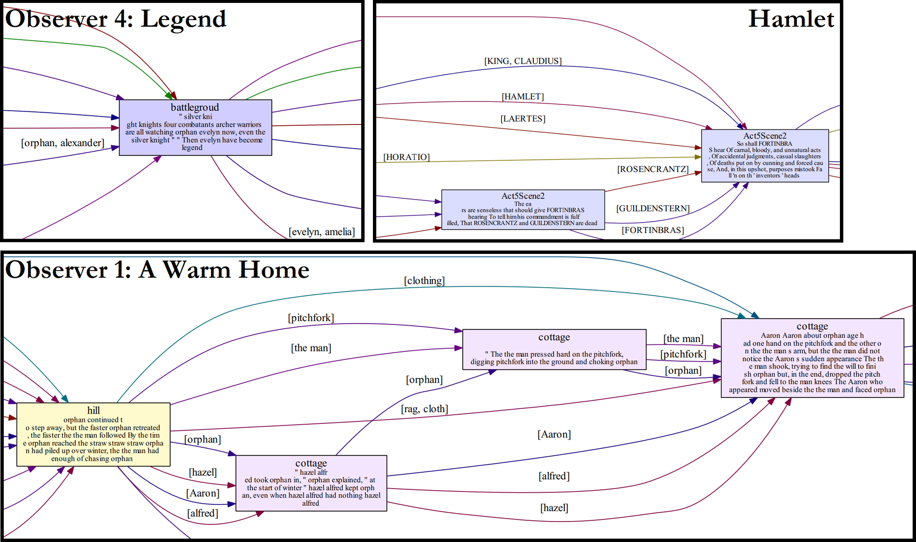
It is interesting to note at the outgoing edge density of the vertices, the buildup of the story to the climax and winding down at the resolution is visible. Figure 15 shows the outgoing edge density of the ground truth Narrative Flow Graph for The Lion King where the climax is the highest spike in outgoing edge density: the fight for Pride Rock. There are some intermediary crisis point midway through the story representing the elephant graveyard scene at vertex 9 and the wildebeest incident leading to Scar telling those back at Pride Rock that Simab and Mufasa died in vertex 13. Incoming edge density can give similar information, but the benefit of recording outgoing edge density is that the Ends are visible as values of zero; in other words, they have no outgoing edge.
The outgoing edge density of the ground truth Narrative Flow Graph of The Lion King showing the steady rising intensity of the story until the climax, and then ending with the resolution. The shape beautifully reflects a Fichtean Curve (Gardner, Reference Gardner1991). The crisis point at vertex 9 is the Elephant Graveyard scene. The crisis point at vertex 13 is the announcement that Simba and Mufasa were killed by a wildebeest stampede. The climax at vertex 27 is the battle for Pride Rock.
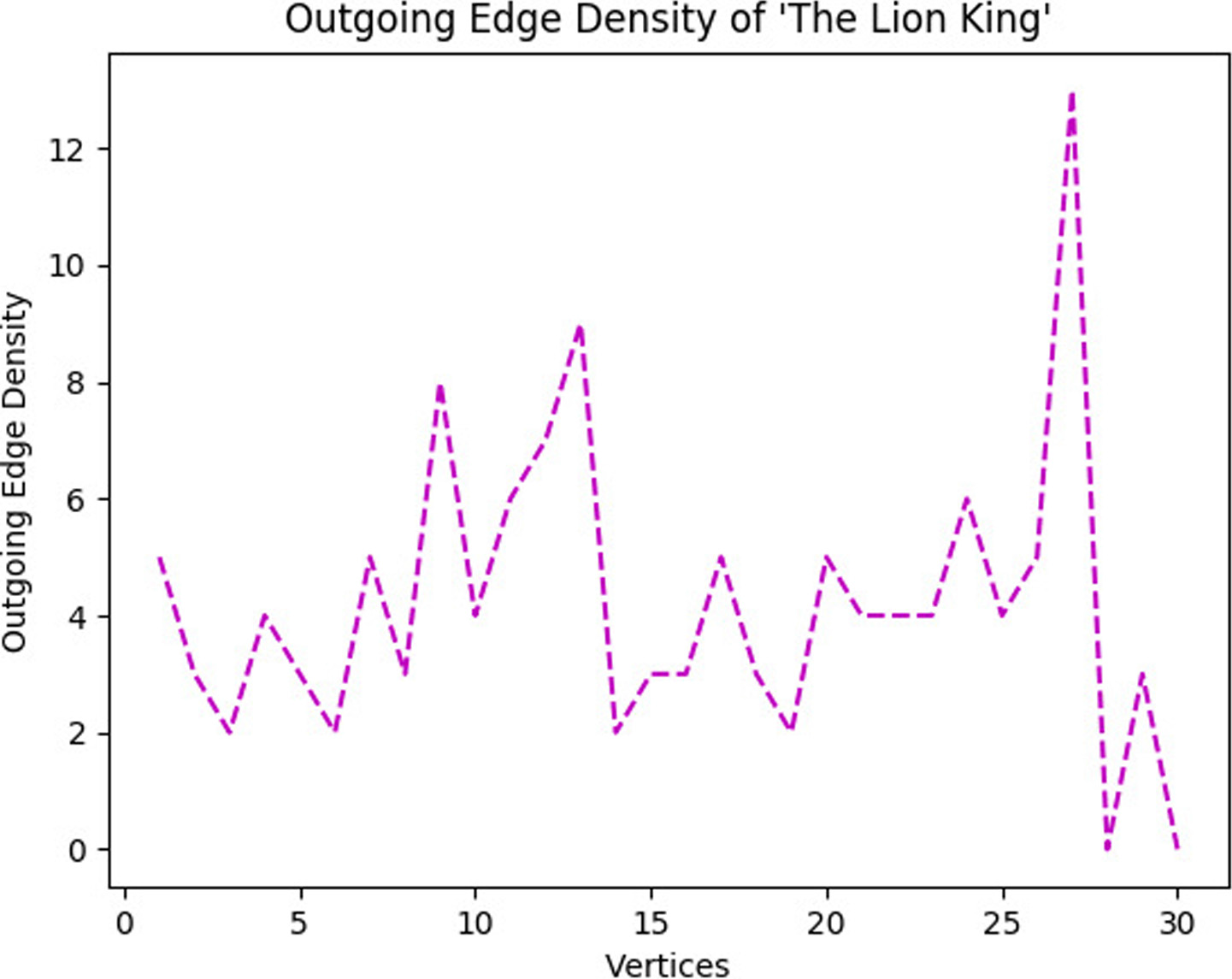
Ends are exactly what they imply, the end to a branch of the narrative. These are sinks in the Narrative Flow Graph. The most common end is the ending of the story, but not all ends have to be the ending of the story. Figure 16 shows the death of Scar in The Lion King script. The entities involved in those events, namely Scar and the hyenas, converge on that end and go no further. Their involvement in the story ends there.
A distant view of the end of The Lion King in the output Narrative Flow Graph showing two end points (highlighted with red boxes). The first near the center is the death of Scar. The entities involved in this, Scar and the hyenas, have no part in the narrative beyond this point, creating a sink in the graph. The second red box on the right is the end of the Narrative Flow Graph, a sink where all other preceding vertices and edges eventually lead.

4.3.2. Ground truth comparisons
By following the annotation explanation in Section A.2.2, we create ground truth Narrative Flow Graphs which demarcate the scenes of their respective stories to show the relationship between events and the entities that connect them according to human understanding of the plot. Figure 17 shows the entire Narrative Flow Graph for The Lion King as an example of the ground truth multi-graphs. They are less complex, and thus shorter, than the multi-graphs output by the system due to all events being fully combined into their respective scenes. This decrease in complexity can be seen in Figure 18 where the parallel scenes from the output in Figure 13 are shown in the red box as single vertices and the end points in Figure 16 are shown in the green box. The shapes of both these structures between the output and ground truth Narrative Flow Graphs of The Lion King are remarkably similar, showing that for this story the system correctly represents the narrative structure at those locations.
A distant view of the entire ground truth Narrative Flow Graph for The Lion King to show the overall structure of vertex and edge relationships.
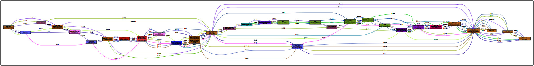
A distant view of the latter half of the ground truth Narrative Flow Graph for The Lion King. The section highlighted in red represents the same Parallel structure shown in Figure 13. The section highlighted in blue is the climax where all entities within the story are involved in the battle for Pride Rock (another example of the convergent points shown in Figure 14). The section highlighted in green shows the same two end points shown in Figure 16. Compare this ground truth shape to those in Figures 13 and 16 to note how well the computed Narrative Flow Graph captures basic features of the ground truth.

Vertex counts and accuracy for the seven stories. The second To Build a Fire calculation (denoted with *) uses simplified location annotation. Notice that the Narrative Flow Graph tends to create many more vertices than ground truth scenes. This is not ideal and represents an opportunity for future improvement to the technique. Also, location accuracy is high for both To Build a Fire* and Hamlet, demonstrating the possibility of the system performing well. Similarly, the automated procedure to obtain scene accuracy works fairly well for Hamlet, where we have a very clear notion of ground truth, since it is a play.

Entity count comparisons, location accuracy, and scene accuracy for Narrative Flow Graphs produced using semi-automated, minimal-effort human-curated glossaries from the Scatter Plot of Entities. This table repeats the calculations shown in Table 4, but with a more automated method for producing the necessary glossary, and, like in Table 4, the second To Build a Fire calculation (denoted with *) uses simplified location annotation. Notice that the location and scene accuracy for “Observer 1: A Warm Home” reported here, using the more automated curated glossary, performs better than those for the same story using the hand-annotated glossary as shown in Table 4. Likewise, the location accuracies for A Sound of Thunder and Leiningen Versus the Ants are better here than in Table 4. Since the curated glossary used here leverages the Scatter Plot of entities to reduce the effort needed to create a glossary, compared with hand annotation used in Table 4, this result shows the possibility that increasingly automated solutions could compute better results, at least in some cases.
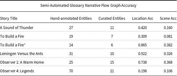
Table 4 shows the accuracy calculations as well as story length in words, the number of scenes in the ground truth Narrative Flow Graphs, and the number of vertices in the output graphs. The number of scenes in a few of the stories has increased in this table because the annotators followed our stricter scene definition, requiring not only for the scene to happen in a single location but for the entities involved to also be homogeneous. Scenes where there is a drastic change in the involved entities mid-scene or when the location changes mid-scene are split into separate scenes. We determine scene accuracy by calculating how well the partitioning of scenes and the participating entities compare with the ground truth. We do this through a simple intersect-over-union (IoU) of the scenes, and for where there is overlap, we perform another IoU for the entities involved in that overlap to weight or reduce the score of that overlap should the entities not match. Using IoU is also important in penalizing an output scene should it include entities that are not present in the ground truth scene. Scene summary is excluded from this calculation. We determine location accuracy by how well the location inference matches the location ground truth, calculated by simple matching percentage.
Table 5 shows the accuracy calculations of the Narrative Flow Graphs produced using glossaries generated through curation of the output of the Scatter Plot of Entities. Included are the number of entities in the hand-annotated glossary and the number of matching entities in the curated glossary. Hamlet and The Lion King are excluded from these results for two reasons. First, both these stories are so well known that this foreknowledge creates biases in the selection of entities during curation which makes for poor comparison against the other stories in this study. Second, the resulting Scatter Plot of Entities has so many points in the scatter plot that determining the most influential entities is much more challenging due to the noise. This difficulty emphasizes the importance of improving the automatic assessment of entity importance in the Scatter Plot of Entities, but that is a topic for future work.
4.4. Discussion
Below, we discuss the output Narrative Flow graph of each story individually and then discuss how well the system adheres to the definition of plot with the inclusion of the Narrative Flow Graph.
4.4.1. Inspection of individual stories
A Sound of Thunder: This story is unique among those chosen in that it contains only three scenes: the present before traveling back in time, the past when the hunt takes place, and the return to the present. The small number of scenes creates a unique challenge for the system. The number of vertices in the output is the second smallest, but it is still many times greater than the number of scenes. In addition, a number of the plot-important objects that show the change from the original present to the changed present at the end of the story are mentioned in the text without any direct connection to actors in the scenes or references to the scene’s location. Because of the lack of connection, these plot-important objects appear in the Narrative Flow Graph without any scene or location labels until a connection is made, drastically reducing the accuracy of the scenes in which these objects first appear. And with only three scenes for the story, the overall accuracy takes a heavy hit. Curation misses every one of the plot-important objects used to show the future had changed, which results in even worse scene accuracy compared to using the hand-annotated glossary. These objects are missed in curation due to a combination of them being common objects and the infrequence of their appearance in the text despite their importance. For location accuracy, the locations chosen by the annotators are the future/present period and the ancient wilderness (or simply “wilderness” in curation). Having only two locations should make inference rather simple if not for the fact that both locations are discussed throughout the story when the characters are both in the present and ancient past. The Narrative Flow Graphs do not have the capability to differentiate between the actors physically being present in the location and a location being discussed in conversation or described in the text. As such, when these locations appear in the text, the system mistakenly thinks in a number of the vertices that that is where this section of the story takes place, decreasing the location accuracy for those vertices. Interestingly, the difference in using “ancient wilderness” in the hand-annotated glossary and just “wilderness” in the curated glossary results in the curated glossary having a slightly higher location accuracy (0.42 vs. 0.39). We selected this story because of its overall simplicity. Even so, perfectly representing it in a Narrative Flow Graph proves to be difficult.
To Build a Fire: We chose this story because assessing location in it is difficult. Much of the story takes place along Henderson Creek, but the events occur at specific locations along and off that creek’s trail. The system correctly assumes that most of the story takes place along Henderson Creek, but it is often incapable of determining the specific locations the ground truth Narrative Flow Graph denotes as the location at which many of the scenes take place. All of these specific locations complicate correctly constructing a Narrative Flow Graph for which location is important for scene creation and description. Difficulty in location assessment is the main reason scene accuracy is the lowest. If we remove the need to know the specific locations along Henderson Creek (as seen in Tables 4 and 5 with To Build a Fire* ), the location accuracy increases to 0.969 (which is expected) and scene accuracy to 0.646 for the hand-annotated glossary, making it the highest location and second-highest scene accuracies. Essentially, we let the entities determine the scene breaks, since the addition of the discriminator mentioned in Section 4.2.4 for Equation (3) prevents all events of the same location from simply merging. For stories with difficult location assessment, simplifying the locations and letting the entities determine scene boundaries may produce better Narrative Flow Graphs.
The difficulty with location inference is also reflected in the curated results. During curation, the annotators do not identify every plot-important location chosen by the annotators who studied the plot of each story. This can either improve or worsen location accuracy depending on if a major or lesser location is missed. If a major location is missed in curation, the location accuracy takes a heavy hit, but should a lesser location be missed, that location will not be inferred in place of a major location should it appear in dialogue or otherwise, thus improving the location accuracy. Improvements in location accuracy from curation due to this reason can be seen in “Observer 1: A Warm Home” and Leiningen Versus the Ants. For To Build a Fire* where the ground truth only includes two locations (the trailhead and Henderson Creek), the curator only identifies Henderson Creek, and so the Narrative Flow Graph cannot identify the location for the brief section along the trail before reaching Henderson Creek in the beginning of the story.
The ground truth Narrative Flow Graph for Leiningen Versus the Ants. The braids in the earlier parts of the story involve fewer entities, but as the story progresses the density of the braids and complexity of their interactions increases. This is a perfect example of buildup in a story as more entities get involved in the conflict.

The outgoing edge density of the ground truth Narrative Flow Graph for Leiningen Versus the Ants. The crisis point at scene 5 is when the ants reach the plantation and countermeasures begin. Scenes 9 and 10 are when the dam fails to keep the ants back, and everyone retreats. The climax at scene 13 where local edge density is highest is where Leiningen has no other choice but to flood his plantation. This is another example of how the Narrative Flow Graph, as a concept, captures the Fichtean Curve nature of the story in the outgoing edge density structure of the graph.
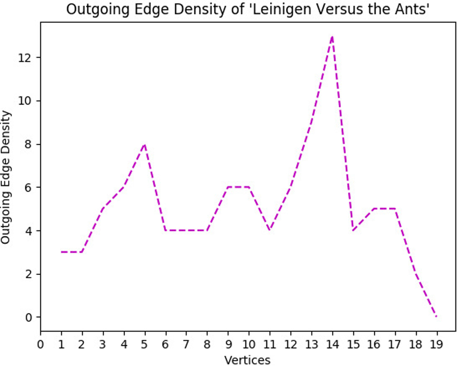
Leiningen Versus the Ants: We selected this short story as a perfect example of buildup within a story, meaning that as the story progresses, the number of entities involved and the frequency of that involvement increases as illustrated in Figure 19. The Braids in the earlier parts of the story involve fewer entities, but as the story progresses, more and more entities, both actors and objects, become involved. The climax at the end is locally very dense in the number of edges connecting the last few nodes before the thinning down at the resolution (another beautiful example of a Fichtean Curve as seen in Figure 20). The system does well for the majority of the story matching both scene and location until the end where it has difficulty ascertaining where the final scenes in both the climax and resolution take place. The majority of the location accuracy comes from the first two-thirds of the output Narrative Flow Graph. Similarly, due to the complexity of the climax, the system struggles to accurately partition the scenes. As mentioned above, the location accuracy for the Narrative Flow Graph generated from the glossary curated from the Scatter Plot of Entities output improves over the hand-annotated glossary by 6.5%, resulting in the second-highest location accuracy over all tests with both glossary types. This increase, again, is attributed to the lesser locations, though still plot-important, being ignored in curation, which in turn reduces mislabeling of scenes that take place at major locations in location inference. The resulting scene accuracy of the Narrative Flow Graph generated from the curated glossary is lower than that of the hand-annotated glossary’s Narrative Flow Graph, but compared to the drop in scene accuracy of most of the other stories, the drop is not significant. As a step towards automation of the process to generate the Narrative Flow Graph with as little human input as possible, curation of the output of the Scatter Plot of Entities as a means to generate the glossary for the Narrative Flow Graph for this story can be seen as a relative success.
“Observer 1”: We chose the two “Observer” short stories because we wanted to see how the system handles a less-professional, less-refined narrative. “Observer 1: A Warm Home” is simple in its locations, all taking place at a single cottage on a hill. Like with To Build a Fire, there are specific locations within locations on the hill and in the cottage where events happen, but they are more explicitly stated, making it easier for the system to detect. The difficulty in this story is that not every event is plot-important. There are scenes that give details about characters, locations, and setting with interactions between characters that do not contribute to the buildup and conclusion of the story. Because of this, there are a number of vertices in the output that do not have a corresponding scene in the ground truth plot map, decreasing the accuracy. This story is the only one where curation improves upon both location and scene accuracy (an increase of 5.7% and 7.6% respectively). This shows the potential of curation for those stories where identifying the most important entities in the output of the Scatter Plot of Entities is easy. Looking back at Figure 10, the most important entities (the ones that have strong local presence shown as sections of dense horizontal points) are quickly identifiable. The exclusion of the lesser plot-important entities that the hand annotators identify does not hurt the scene accuracy, especially considering that the exclusion of lesser locations enables the scenes to form better in the Narrative Flow Graph (recall that entity homogeneity is a requirement to combine event vertices into a single scene). Overall, there is not too great a difference in many sections of the Narrative Flow Graphs produced from the hand-annotated glossary and the curated glossary. An example of this similarity can be seen in Figure 21. The major difference is the reduced number of edges due to multiple entities being missed in curation. Optimally, our goal is to properly identify and detect all plot-important entities whether lesser or major, but the results of the curation for this story show that for some stories, identifying only the major plot-important entities can give a better model of the narrative flow.
Comparison between the Narrative Flow Graphs generated from ground truth (top), hand-annotated (middle), and semi-automated curation (bottom) glossaries for “Observer 1: A Warm Home” starting from the same scene until the end of the story. We see very little difference between the annotated and curated results, demonstrating a situation where semi-automation of the process works well.

“Observer 4”: This story follows the hero’s journey archetype and ends in a large, climactic battle. Locations are varied and change as the story progresses, never returning to a former location until a time-skip in the resolution. This is visible in the resulting Narrative Flow Graph as the color and location labels on the vertices change as the multi-graph progresses from left to right. The system has difficulty getting every single location correct, especially because they are often not explicitly stated as the characters travel. In addition, in the climactic battle at the end, events happen at different locations on the battlefield, and similar to To Build a Fire, the system has difficulty correctly inferring those specific locations. Combining those two challenges, the location accuracy is the worst of all the stories for both hand-annotated and curated glossaries. Scene accuracy is also poor because there is a lot of exposition talking about the past and distant locations. While these parts are plot-important for the story, the system has difficulty knowing when a flashback or exposition ends. It continues those locations into proceeding scenes until something within the text signifies that a new scene has started instead of the continuation of the scene before the flashback or exposition, muddying scene boundaries and making it difficult to tell where many scenes in the output begin or end, drastically decreasing the scene accuracy. Curation results are also poor, mostly due to the number of entities in this story. Due to the journey aspect of the plot, there are many peoples and places, and most of these entities are not easily identifiable in the output of the Scatter Plot of Entities. Of the 70 plot-important entities identified by the annotators, only 21 of them are identified in curation. Many of the missed entities are locations, leading to the worst location accuracy over all the tests with both glossary types. The curation results highlight a limitation of human curation for stories with many entities and emphasize the importance of finding automated means of curating the output of the Scatter Plot of Entities for glossary creation, which is a topic for future work.
Hamlet Script: Play scripts differ greatly from short stories. Very little information is given about place and setting, and actions are either very simply described (such as a character leaving or entering) or otherwise not mentioned at all, leaving performers to determine what actions best fit the scenes. The bulk of the text are lines spoken by the characters, and each line explicitly states who speaks it, making the task of determining what entities are involved in a scene very simple. Likewise, because the script is broken directly into scenes, each scene being its own specific location in the script (where the actual location where events take place in the story is often not mentioned at all), creating scenes that match the ground truth is also very simple. Because of this, the Narrative Flow Graph outputted for the Hamlet script has the second-highest location and highest scene accuracies when compared to its ground truth.
The Lion King Script: This cinema script differs from the play script of Hamlet in that in addition to lines spoken by the characters, the scenes, locations, and actions taken by the actors are explained simply, creating a middle ground between a play script and a short story. Figures 13 and 16 shown earlier illustrate parts of the output for The Lion King script, while Figure 17 earlier shows a distant view of the ground truth Narrative Flow Graph in its entirety. One challenge of this script is the musical compositions. While some of the information in different musical numbers is plot-important, their main purpose is entertainment. As such, not all of the musical numbers are included in the ground truth Narrative Flow Graph; however, they appear in the output, creating differences between the output and ground truth. In addition, while sections of the graph in the center and at the end nearly match the ground truth perfectly as seen back in Figure 18, much of the early story does not, especially when many of the different locations and entities are talked about but are not physically present, such as when Mufasa teaches Simba. Both discussions about locations and the musical compositions heavily decrease the location and scene accuracy for an output that visually is close to the ground truth.
4.4.2. Adherence to the definition of plot
As defined in Section 2.1, plot requires (1) characters of volition, (2) events involving those characters, (3) representation on how information spreads, (4) causation linking these aspects of plot, and (5) a full structure of those links from the beginning to the end of the story.
The most obvious adherence to the definition is that the entities of the Narrative Flow Graph cover the first requirement. All plot-important characters and object are denoted in the user-defined glossary, thanks to our imagined perfect Scatter Plot of Entities, and as such, we track them. Not only are all events involving at least one of those entities included in a scene vertex, but we also track any mention of that entity in conversation or description. A character might not be physically part of a scene, but if that character is discussed or described, then information about that character is affecting that scene. Therefore an edge representing that entity, the one that is discussed or described, connects to that scene showing that inclusion. This sharing of information also means the Narrative Flow Graph covers the third requirement of plot, although there is currently no way to distinguish between a mention of an entity and that entity being physically present.
Similar to satisfying the first requirement, the second is also covered by the detection of entities, but poorly. We include in a scene vertex every physical event of the story involving an entity. The main issue here is that even those events that are not plot-important are also included. If a character sneezes for no apparent reason, that event will be included in a scene vertex because that character was directly referenced in the text. To fully satisfy the second requirement, we should include only those events that are vital to the story progression, which the Narrative Flow Graphs simply cannot do yet.
The fourth requirement of causation is another that the Narrative Flow Graph covers but poorly. The links between scenes of the story are shown through the entities involved in each scene. As mentioned earlier, there is a connection between scenes involving the same entity, meaning that the previous scene in some way may cause the next scene where that entity appears. The multi-DAG’s dependency ordering illustrates these causal relationships. The current implementation lacks the reason for causal connection, so the specific causal connection between scenes remains unknown, only showing that a causal connection might exist. Defining the causal connection is a far more complicated task. Despite lacking in true causal connections, we build a structural model of the story from its beginning to its end, satisfying the fifth and final requirement for plot according to the definition used in this research.
Following the requirements of plot detailed in Section 2.1, the combination of the Scatter Plot of Entities and Narrative Flow Graph can be considered a partial representation of the plot of the story.
5. Applications
The applicability of this work arises in a number of areas. As we mentioned in the introduction, analysis of literature is a time-consuming process, requiring one or more readers to parse through each text. Major breakthroughs have come from the fields of NLP, digital humanities, and computational linguistics, but such analysis remains very resource-heavy depending on the task required. With regard to novels, simple statistical data can be gathered over a large numbers of books, but an in-depth analysis of the narrative structure of the books is currently infeasible with large numbers of books. Due to this time constraint, literary analysis is primarily done on only a small collection of novels at a time for any single project. The two narrative visualizations we present in this article give new visual and data representations of narrative that provide insight into the structure of the narrative visible at a glance without the need to read through the source text.
If there was a way to use NLP to automate the collection of complex information within the text, such as narrative structure and plot, literary analysis on a large scale could become possible. For example, Christopher Booker claims that there are only seven basic types of plot in fiction (Booker, Reference Booker2004). Could the analysis of the plot of tens or hundreds of thousands of novels support or disprove this claim? Could a newly published book be compared to all previously published works to both check for originality in narrative flow and detect potential plagiarism? Given multiple different discourses for a story, could the underlying story be constructed from the discourses? Could inconsistencies between discourses reveal through the narrative structure if one discourse is unreliable? In application, if these visualizations could be improved further, non-biased comparisons of different narrative discourses of the same story could be conducted to see which scenes were excluded from one account and mentioned in another or where scenes differed between accounts. This type of assessment is also useful in news analysis and even crime analysis for testimonies and witness accounts, providing another tool to assist human analyzers.
Machine learning has been used for a variety of tasks, including generating large volumes of text (Guo et al., Reference Guo, Lu, Cai, Zhang, Yu and Wang2017). To train a machine learning system on these types of tasks, corpora of books include the text of the books, possibly with other external data such as authors, publishers, and genres. Corpora that include detailed information on the narrative are created at great cost and are rare and typically smaller than plain-text corpora. In order to use raw text as input to a machine learning system, researchers are often left to parse through the text themselves to find the specific data they need to use in their machine learning system or they must use the entire raw text with the lofty goal of letting the system identify those aspects of the text it needs, often with some human-in-the-loop guidance along the way—a monumental task. Having a method to extract plot and narrative structure from a text enables streamlining the creation of a corpus of plot or narrative structure; our research supports the automatic generation of labeled datasets for machine learning applications. For example, suppose an author is stuck on how to continue the story or bridge two sections of the narrative, could a system trained on narrative structure be developed to provide suggestions on how to continue or structure the narrative going forward? Likewise, text generation could see significant improvements. When generating large volumes of text using existing methods, such as GPT3 (Brown et al., Reference Brown, Mann, Ryder, Subbiah, Kaplan, Dhariwal, Neelakantan, Shyam, Sastry, Askell, Agarwal, Herbert-Voss, Krueger, Henighan, Child, Ramesh, Ziegler, Wu, Winter, Hesse, Chen, Sigler, Litwin, Gray, Chess, Clark, Berner, McCandlish, Radford, Sutskever and Amodei2020), there is no long-range plot structure to the generated text unless it is pre-defined by the user or human-directed through the generation process. The more text that is generated by such a system, the more the narrative goes askew, losing cohesion with what was generated previously. To maintain cohesion in narrative, a human-in-the-loop or other form of guidance is often needed. Some success has come from short text passages (Fan, Lewis, and Dauphin, Reference Fan, Lewis and Dauphin2018), but for longer passages, we often must rely on systems pre-trained on hand-extracted plot graphs (Li et al., Reference Li, Lee-Urban, Johnston and Riedl2013), a process that is extremely time-consuming. If a text generator could also learn how to weave its own plot, could a computationally creative system be developed that writes stories with long and intricate plot, such as novels, completely free of user oversight? Would such texts be just as meaningful or satisfying to the reading audience as texts written by humans? Could machine learning be used to find what types of plot or narrative flow could lead to a best-selling novel by training the system on all the best-selling novels over the past few decades and then either aid a writer in producing such a novel or even generating the novel itself? What insights could such a system teach us about the state of the reading audience at any particular time? All of these applications start to become possible if the extraction of complex aspects of narrative, such as the structure or plot, could be automated.
6. Future work
Both the Scatter Plot of Entities and Narrative Flow Graph have room for growth. The Narrative Flow Graph needs further improvement in location inference to know where each scene is taking place, dialogue (potentially being able to properly understand and model the flow of conversation), and in coreference resolution, which would identify any instance of or reference to a specific entity as that same entity no matter where in the story it appears.
The Narrative Flow Graph has other shortcomings, but those can be improved through an effective Scatter Plot of Entities system. For example, the creation of the Narrative Flow Graph’s glossary can be automated by constructing the Scatter Plot of Entities and noting important entities as discussed in Section 3.4.2. As we see with the results of human curation of a glossary following those guidelines, some success is possible, but there is still much to improve upon. Improvements in scene segmentation on the Scatter Plot of Entities, including determining the correct number of scenes, can streamline the process of scene vertex creation for the Narrative Flow Graph. Likewise, improving the ability to determine what sections of the story are most plot-important using the Scatter Plot of Entities can help the Narrative Flow Graph cut out unimportant scenes to make the multi-graph less cluttered and closer to the true plot of the story.
We must also see how globally applicable our qualitative analyses are when these two visualization methods are applied to multiple stories of different structures and genres. Ultimately, we would like to untangle the telling of a narrative to discover its underlying story, told in chronological order with clear identification of causation. It is in this underlying story where the plot is revealed, and the Scatter Plot of Entities and the Narrative Flow Graph are early steps towards this difficult goal.
7. Conclusion
We have presented two different visualizations of plot and narrative flow. The Scatter Plot of Entities, although unable to fully represent the plot of a story, provides a new method to visualize entities within a story, giving insight into scene partitioning and the detection of influential entities within a story. The addition of the Narrative Flow Graph better represents the plot of a story through its multi-graph structure. It is also able to correctly visualize sections of the narrative flow of a small selection of stories of various formats, including short stories, both professional and amateur, as well as play and movie scripts. While still far from a completely automated plot extraction system, the proof-of-concept tools presented here take significant steps toward modeling the underlying narrative of a story and reducing the overall complexity of studying narrative. Even now, without any improvements, the Scatter Plot of Entities and Narrative Flow Graph can be powerful tools in the hands of researchers today.
Acknowledgments
The authors would like to thank Dr. Mark Burns and Dr. Daryle Lonsdale for their inspiration and guidance through the thicket of ideas surrounding these topics.
Competing interests declaration
The authors declare no competing interests.
Appendix
A. Data preparation and annotation instructions
This section summarizes the annotation instructions given to human annotators for glossary creation, coreference resolution, scene location ground truth, and Narrative Flow Graph ground truth.
A.1. The limitations of existing tools
Much of the reason for annotation by hand for those preprocessing steps that have readily available tools, such as named entity recognition (NER) and coreference resolution, is due to the inaccuracies and failings of those tools for the purposes we need in this research. We recognize that NER and coreference resolution are actively studied and advancing fields of research, and our research presented in this article has highlighted a number of limitations that give possible direction for future research and improvement upon these tools. Below, we give our justifications for why we hand annotate the glossary and coreference the story as well as provide the instructions and formatting of these files.
A.1.1. Entity glossary
In order for the Narrative Flow Graph to be clean and understandable, we need to ignore all unnecessary entities, focusing only on those actors, locations, and objects within the narrative that are plot-important. The definition of entity used in this work differs from NER in that we are not solely looking at named entities (proper names of people, organization, locations, etc,) nor are we looking solely for quantifiable values (dates, times, monetary units, etc.) that are commonly found using NER, although these can very well be included depending on the story. Our definition of entity focuses on plot-importance, or how influential it is to the progression of the story. We previously defined actors, objects, and locations in Section 4.2.1, but we will go into further detail here.
Actors are those with volition in the story. They are the choice makers, action takers, and reactors to the events. This definition includes more than just living characters within the story. For example, in The Fellowship of the Ring (Tolkien, Reference Tolkien1954), the “One Ring” has volition. It is described as taking action for itself and manipulating various other actors in the story despite it being a ring, an inanimate object. An actor in the story may also be intangible or represent a concept. In To Build a Fire, we label the “cold” as an actor in the story. This is a common labeling for the man-versus-nature genre where in this particular story the cold is the antagonist that the protagonist must defeat and to whom he eventually succumbs.
Objects we define as those without volition, those who are used as tools or props but by their existence or presence are vital to the progression of the story. Objects include not only the inanimate, such as a prized painting in a heist story, but also the living, such as the museum guards if the guards themselves do not take action but their presence or lack thereof is used as evidence or motive for actions taken by the actors in the story. Objects can also be immaterial, such as motivations or beliefs. For example, a reference to a past event that is the driving force for a character can be an “object” entity in the story.
Lastly, locations are the easiest to define. They are where the events of the story take place. We make this distinction because the Narrative Flow Graph uses locations to build the scene vertices of the graph. Locations mentioned for world-building or exposition that are not directly relevant to the placement of events of the story are not labeled as a “location.” If such locations are still plot-relevant but are not where any scene in the story takes place, they are essentially props in the story and thus can be labeled as an “object,” or perhaps an “actor” if the location as a singular body takes action within the story. We acknowledge that these definitions are not exhaustive and that there may be cases where a plot-important entity falls into more than one of these classifications, but for the purposes of this study, these definitions are sufficient.
Determining plot-importance computationally is a monumental task that relies on more than NER and entity frequency as mentioned in Section 3.4.3. It involves tasks such as assessing influence, inferring causal relationships between entities or events, and more. Assessment of plot-importance is more than what is possible with current NER methods and is itself a novel classification task deservable of its own research direction.
Due to the difficulty of automatic and accurate detection of plot-important entities, we deem such detection beyond the scope of this current research. The Scatter Plot of Entities is a small step in this direction, but it is also currently insufficient for the task. This is why we use human curation of the Scatter Plot of Entities output to automate the process as much as possible at this stage of the research. For best accuracy, we provide the functionality for the user of the system to create a glossary of entities they would like the system to follow. Generally, the glossary includes all entities that the user decides are plot-important; however, should the user choose to do so, certain entities can be omitted to force the Narrative Flow Graph to follow only those entities the user desires, streamlining or tuning the graph’s focus to the user’s needs.
We code the glossary in XML using the format shown below:

Each entry in the glossary includes an ID number, type, and list of labels.
-
id: unique number assigned to this specific entity.
-
type: either “actor,” “location,” “object,” or “other”
-
− actor: entities of volition within the narrative
-
− location: physical locations where events take place
-
− object: entities without volition
-
− other: entities that do not fall into the above three categories
-
-
label: words by which the entity is uniquely referred in the text. The first entry is used as the label for corresponding edges as well as for replacement within the text when coreferencing. For those entities with overly common words as labels, we create a unique identifier for that label and place it first to ensure the system can differentiate it from other instances of that common word.
Assessment of plot-importance of entities is left to the annotators’ human understanding of the plot. Each annotator is instructed to read their story in full and explore the plot as one would in a college English course, studying out the major entities and how those entities progress the plot. To build initial understanding of plot, we provide the annotators a summary of our studies on narrative and plot that we further summarize in Section 2.1 for the reader. For quality control, each story has two annotators who assess the plot individually and then check each other through discussion and debate to ensure the validity of their annotation. Once in agreement on the plot-importance of each entity, those entities are added to the final glossary. The author of this research then provides one final check of the glossary to ensure annotation and formatting quality.
A.1.2. Coreferencing
We coreference the stories by hand for three reasons. The first is because of the inaccuracy of available coreferenceing tools; the top of the line for both machine/deep learning and rule-based methods at the time of the beginning of this study is little better than 80% in $B^3$
precision but most are only 60 to 70% (Sukthanker et al., Reference Sukthanker, Poria, Cambria and Thirunavukarasu2020). Second, the scope for coreference detection is generally small, meaning that even though a text may be long, available tools still use only local passages within the text to determine the reference. Existing coreference resolution tools are often incapable of knowing that one reference early on in a long story is the same as that same reference near the end of the story, especially if that reference is mentioned by a different label. Third, coreferencing tools frequently coreference noun phrases that could potentially include other entities, pulling them into scenes where those entities are not present or otherwise mentioned in the initial text and artificially inflating entity activity in those locations of the story. The reverse is also possible where a noun phrase is replaced by fewer tokens, potentially deflating entity activity. This also alters the original token count of the story, which creates complications with metrics that depend on story length, such as the variance,
$B^3$
precision but most are only 60 to 70% (Sukthanker et al., Reference Sukthanker, Poria, Cambria and Thirunavukarasu2020). Second, the scope for coreference detection is generally small, meaning that even though a text may be long, available tools still use only local passages within the text to determine the reference. Existing coreference resolution tools are often incapable of knowing that one reference early on in a long story is the same as that same reference near the end of the story, especially if that reference is mentioned by a different label. Third, coreferencing tools frequently coreference noun phrases that could potentially include other entities, pulling them into scenes where those entities are not present or otherwise mentioned in the initial text and artificially inflating entity activity in those locations of the story. The reverse is also possible where a noun phrase is replaced by fewer tokens, potentially deflating entity activity. This also alters the original token count of the story, which creates complications with metrics that depend on story length, such as the variance, $\sigma$
, used to create the activity line in the Scatter Plot of Entities explained in Section 3.2.2. One of our requirements for coreferencing is the ability to maintain the length of the original text as much as possible.
$\sigma$
, used to create the activity line in the Scatter Plot of Entities explained in Section 3.2.2. One of our requirements for coreferencing is the ability to maintain the length of the original text as much as possible.
Preliminary tests on coreference resolution using AllenNLP highlight these exact issues despite being a widely used toolkit. Table A1 shows two brief comparisons between our coreferencing and AllenNLP’s coreferencing to highlight some of the issues we encounter. The first row shows a small passage from “Observer1: A Warm Home.” The first reference to the main character, who is an unnamed orphan, is “My” when he mentions himself in the first sentence. This common possessive pronoun is then propagated throughout the entire text in place of most references to the main character. The mentions of an orphan are missed, so there are two distinct entities referencing the main character. This passage also highlights the issues with use of full noun phrases inflating the length of the source text. The character, Hazel, gets coreferenced as, “an elderly woman thin to an unhealthy extent, her paper skin wrapping tight around the joints of her hand as she held the door.” Not only does this completely remove her name from the text and make her impossible to detect with NER for the Scatter Plot of Entities but it also makes what should be a single-token reference into 25 tokens. The second example in Table A1 keeps the token length nearly the same, but the dog, who is an important character in To Build a Fire, gets coreferences as the possessive pronoun “its.”
Example comparison of passages hand-coreferenced by our annotators and coreferenced by AllenNLP. Bold text represents the coreferenced entities. Other coreference toolkits may have different results. The examples above are simply to highlight some of the issues that coreference toolkits can cause our system, not as examples of faults of toolkits themselves. These issues can be mitigated through human involvement and interpretation of coreference toolkit output, but such work is little different than hand-coreferencing the shorter stories we use in this research, especially considering the need to know details about the story beforehand to make competent interpretations of the toolkit output.
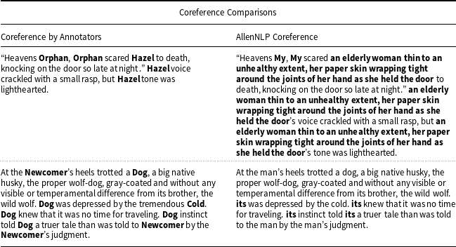
For this system to be accurate and properly locate the desired entities in the story, it must know every individual instance of an entity from the user glossary no matter where, how, or in what manner it is mentioned in the source text, distinct from any other associated entities, and all this without altering the length of the text as much as is possible. The aforementioned issues are not failings of existing corefernce software since each software performs the task for which they were programmed. The problems come in that existing coreference resolution tools lack the functionality needed to perform the task this research requires. We could curate the coreference assignments to choose the label with which the toolkit replaces the reference, but that involves some understanding of the story and does not solve the issue of noun phrase replacement or when assignments are not made to references of the same entity. For the short stories we use at this stage of the research, the time benefit of curating coreference toolkit output is negligible, unlike the curation of scatter plot of Entity output to produce the glossary. Additionally, solving difficult problems by making assumptions that similarly difficult problems earlier in the process are solved in order to obtain later solutions dependent on those unsolved problems is not uncommon in research. As such, we make the decision to perform coreference resolution by hand so that we may best see the capabilities of the system.
We coreference using comma-separated value (CSV) files where the first column contains every token of the story in narrative order, and the second column is for the ID number from the glossary to which that token is referring if applicable. For example, the “he” token in one sentence might not refer to the same entity as the “he” token in another. Similarly, if there are multiple entities referred to by the same words, such as if there are two people by the same name, each entry in the second column would contain the corresponding ID number from the glossary for each separate entity. This way we correctly match each reference in the text to an entity in the glossary by only replacing a single token per reference using the ID numbers in the glossary. The same two annotators who create the glossary for the story also create the coreference CSV, again checking with each other to ensure quality of annotation.
A.2. Ground truth annotation
This section details the annotation processes for location ground truth and Narrative Flow Graph ground truth used as comparison with the output for error calculation.
A.2.1. Location ground truth
As part of the system’s process detailed in Section 4.2, we perform inference of the locations where events take place. To ascertain the accuracy of this inference, we create a CSV file similar in form to what is used for coreferencing. In the first column are the tokens of the story, and in the second column are the ID numbers from the glossary associated with the locations at which the events occur. Being similar in form to the coreference annotation, the annotator pairs complete both the coreference and location annotations simultaneously for their assigned story to allow them to check each other’s work and ensure quality of annotation.
A.2.2. Scene partitioning and narrative flow graph ground truth
Human annotators create ground truth Narrative Flow Graphs according to their understanding of the plot, again aided by a summary of the research of literary analysts that we further summarize in Section 2.1. The annotators include only those scenes that are plot-relevant and partition the story how the annotators believe the scene partitions exist. Assessment of the plot-relevance of scenes as well as where the associated scene bounds exist is done, similarly to assessing the plot-importance of entities, through individual study of the plot and then checked against a second annotator for quality control. No specific instructions are given to annotators on how to determine scene borders other than the description: “a division of the story where events take place without a break in time or location and where the involved entities in the associated events are similar.” The rest is left to their own research and understanding of the plot in order to best match what a reader would understand. Once agreement has been made between the two annotators of the story on what scenes are relevant and where those scene borders exist, the author of this research once again provides a final check for annotation quality.
We then create an XML file following the format shown below with all the necessary information needed to generate a Narrative Flow Graph in the same form as what the system would produce:
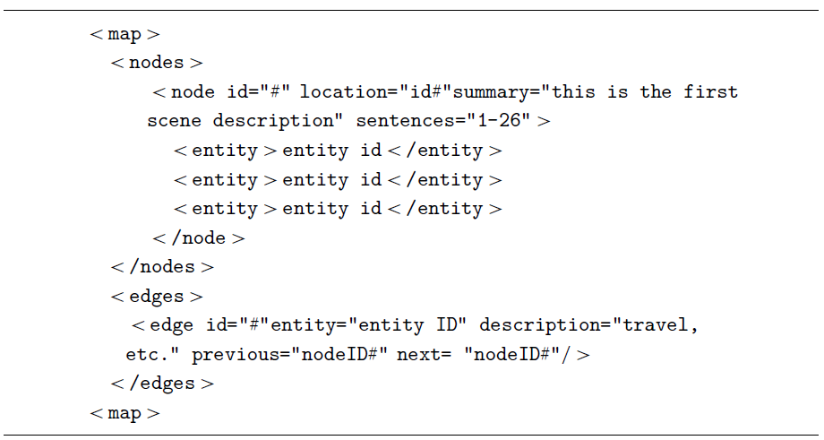
We separate the XML file into two groups: the nodes and edges required to create the graph structure. We included in each the pertinent information on what is stored in those data types and how they connect.
-
node
-
− id: unique integer to differentiate between entrances in the glossary
-
− location: the ID from the glossary of the location the scene represented by the node takes place
-
− summary: a brief summary of the scene represented by the node
-
− sentences: the sentence numbers in the text by narrative order
-
− entity: nested within node, this is a listing of the IDs from the glossary of the entities present or involved in the scene represented by the node
-
-
edge
-
− id: unique integer to differentiate between entrances in the glossary
-
− entity: the ID from the glossary of the entity the edge represents
-
− description: a brief description of the causal relation of the edge linking the scenes
-
− previous: the ID number from this same XML document of the node the edge leaves
-
− next: the ID number from this same XML document of the node the edge connects
-
The system reads the XML file and uses it to produce a Narrative Flow Graph in the same form as if the system had extracted this information from the text. We do this so that the comparison between the system’s output and the ground truth annotation is as clean as possible. For scene partitioning ground truth used in the Scatter Plot of Entities, the token indices representing the scene boundaries are simply stored in an array.
B. The selection of entities for the scatter plot of entities
Table B1 details the types of entities selected from Named Entity Recognition and those we append to that list for the creation of the Scatter Plot of Entities.
Explanation of the NER and IOB labels used in selecting entities for the Scatter Plot of Entities. Included is a short list of common pronouns that are not detected through the first two methods but may be relevant to characters in the text.
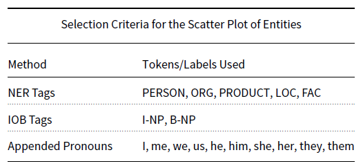


 Open access