


1. INTRODUCTION
Subglacial meltwater has been hypothesized to influence ice velocity in ice sheets and glaciers (e.g. Iken, Reference Iken1981). Recent work has emphasized how the variability in surface meltwater supply to basal drainage networks in the Greenland ice sheet (GrIS) temporally influences the development of subglacial hydrological pathways and thus the spatial and temporal relationship between ice melt and velocity (e.g. Hoffman and others, Reference Hoffman, Catania, Neumann, Andrews and Rumrill2011; Andrews and others, Reference Andrews2014; Banwell and others, Reference Banwell, Hewitt, Willis and Arnold2016). Given the likely expansion of supraglacial meltwater networks under a warming climate (Leeson and others, Reference Leeson2015; Poinar and others, Reference Poinar2015), there has been considerable interest in where surface meltwater reaches the bed through moulins and how much water is supplied to these points of entry (e.g. Smith and others, Reference Smith2015; Yang and Smith, Reference Yang and Smith2016; Koziol and others, Reference Koziol, Arnold, Pope and Colgan2017; Smith and others, Reference Smith2017).
Supraglacial hydrological systems span thousands of square kilometers and are difficult and expensive to study extensively in-situ (although it can and has been done for select catchments, see Andrews and others, Reference Andrews2014; Gleason and others, Reference Gleason2016; Smith and others, Reference Smith2017). Given the importance of moulin hydrology in determining ice response to surface melt, it is important to develop methods of accurately estimating moulin discharge remotely. However, moulin discharge estimates derived from remotely sensed data can be problematic because, for example, large proportions of the hydrological networks are below the spatial resolution of earth observation satellites (e.g. Smith and others, Reference Smith2015) and diurnal variability in melt, stream flow and supraglacial channel geometry occurs over time scales shorter than the return period of these satellites (e.g. Gleason and others, Reference Gleason2016).
Independent replication of moulin discharge estimates can help to highlight limitations in different contemporary approaches. This is essential for concretizing our presumed understanding of these systems which, given the difficulty in accessing them, we may never significantly ground truth. More generally, the need for independent replication of findings is an increasingly articulated concern in the age of computational science (Peng, Reference Peng2011). However, given the rapid pace of data collection, and increases in computational power and analytical sophistication, fully independent replication is rarely undertaken (Leek and Peng, Reference Leek and Peng2015).
To this end, I compare two recent approaches to estimate moulin discharge on the GrIS. Each of these approaches makes use of a different high-resolution data product, and thus provides an interesting opportunity to contrast two independent approaches to estimating moulin discharge. Throughout, I emphasize how insight into the limitations of a remotely sensed data product can be inferred from replication studies.
2. METHODS
The first of the two moulin discharge estimation methods was developed by Smith and others (Reference Smith2015), who combined field measurements of supraglacial hydraulic geometry with satellite remote sensing of supraglacial river widths to extrapolate a dataset of discharges at 523 moulins during peak daily melt (13:53 to 14:09 local time) between 18 and 23 July 2012. River masks were derived from 2 m resolution WorldView-2 (WV2) images using multispectral methods and channel widths were subsequently extracted by spatially averaging measurements every 2 m over 1 km reaches to reduce sensor resolution uncertainty. Empirical hydraulic geometry relationships were developed through in-situ measurements of channel width and discharge at 78 channel cross sections on the GrIS and discharge was inferred from remotely sensed channel widths using the resultant hydraulic geometry relations. This method was applied only to narrow, single thread channels up to 20 m wide. Moulin locations were visually determined, assisted by automated river identification; abrupt channel termination was indicative of moulin location. Instantaneous moulin discharge (m3 s−1) was estimated based on the upstream contributing channel cross section. This dataset of instantaneous discharges from Smith and others (Reference Smith2017) is hereafter referred to as the hydraulic geometry (HG) dataset.
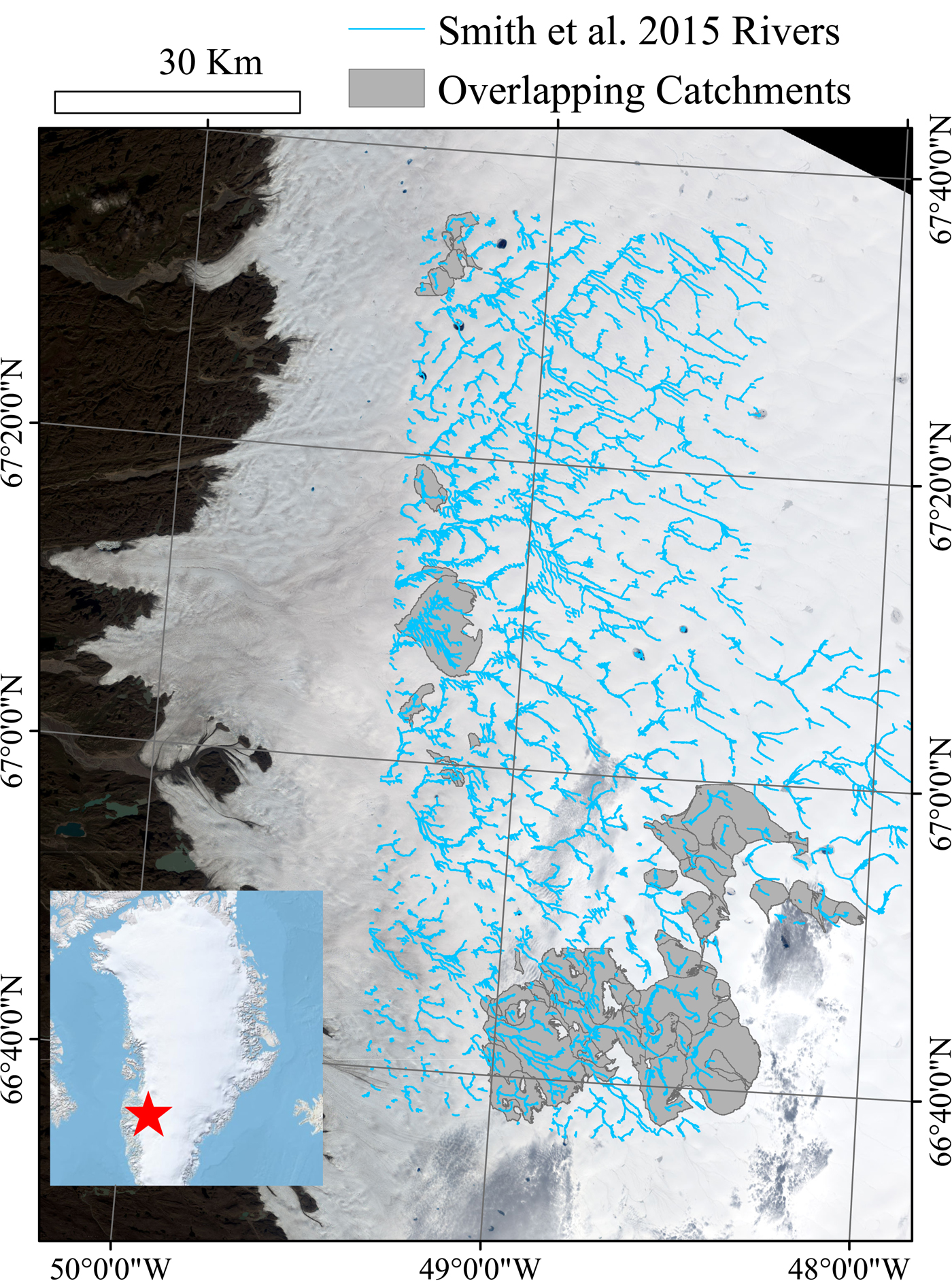
The second method for moulin discharge estimation makes use of the Polar Geospatial Center's 2m resolution DEM which is stereo-photogrammetrically derived from 1m resolution WorldView-1 images (Noh and Howat, Reference Noh and Howat2015). It is therefore fully independent of WV2 imagery used by Smith and others (Reference Smith2015). Catchments were delineated by routing flow over the DEM to moulin locations identified by Smith and others (Reference Smith2015). There was limited overlap between high quality, error-free DEMs from the summer of 2012 and the Smith and others (Reference Smith2015) dataset, constraining the coverage of our dataset to the periphery of the Smith and others (Reference Smith2015) dataset (see Fig. 1). Moulins at locations identified by Smith and others (Reference Smith2015) were identified in the 2012 DEM and preserved as sinks during DEM filling and D8 flow direction calculation, all implemented through ArcHydro Tools (Maidment, Reference Maidment2002) in ArcMap 10.3.1 (ESRI, 2016). Further description of the methods is provided in King and others (Reference King, Hassan, Yang and Flowers2016). Catchment areas for each moulin were thus extracted and, similar to Yang and Smith (Reference Yang and Smith2016) and Karlstrom and Yang (Reference Karlstrom and Yang2016), total daily moulin discharge was calculated by intersecting catchment area with daily runoff production for the corresponding date from which Smith and others (Reference Smith2015)'s dataset was derived (either the 18, 21 or 23 of July), as calculated by the RACMO2.3 climate model (Noël and others, Reference Noël2015).
The main image provides a close up of the study area, which is located at the red star in the inset image of Greenland. Kangerlussuaq is located immediately to the west. Grey polygons represent the supraglacial catchments that overlap between the two datasets compared in this study. Note that because Smith and others (Reference Smith2015) moulin estimates are based on the channel width immediately upstream of the moulin, it was not necessary for the entirety of the Smith and others (Reference Smith2015)-derived channels to overlap with a flow routed catchment for that catchment to be relevant to this analysis. Background imagery is a 2015 Landsat-8 image dated August 25.
These two datasets are not directly comparable. Whereas the RACMO2.3 surface mass balance (SMB) model used provides melt data at daily timescales, HG moulin discharge estimates are instantaneous and were inferred from imagery collected during the peak of the daily melt cycle (1400 h) which is not coincident with the timing of peak discharge. Additionally, it has recently been shown that SMB models such as RACMO2.3 may overestimate runoff production relative to moulin discharges (Smith and others, Reference Smith2017). To compare the two methods herein, the daily SMB-routed catchment discharge was converted to hourly melt hydrographs, using a method proposed by Smith and others (Reference Smith2017). Smith and others (Reference Smith2017)'s contribution highlights two main points. Firstly, SMB overestimates of daily discharge can be empirically scaled such that M = c * M′, where M is SMB modeled melt (in dimensions of length over time), c is an empirically derived adjustment coefficient and M′ is effective (empirically adjusted) melt. Secondly, they propose a synthetic unit hydrograph (SUH) curve whereby, for a given hourly input of melt, the moulin discharge q (hr−1) at time t is equivalent to:
 $$ q(t) = e^m \left[{t} \over {t_{\rm p}}\right]^{m} \left[ e^{-m \textstyle{({{t} \over{t_{\rm p}}})}}\right]h_{\,p} $$
Where m is an empirically derived equation shape factor, t p is the time to peak discharge (hr) and h p is the peak discharge (hr−1). Time to peak discharge is a function of the main stem length (L, in km), the distance between the point on the center flow line closest to the centroid of a given catchment and the catchment's moulin (L c, in km) and an empirically defined coefficient C t such that t p = C t(L c · L)0.3. Similarly, h p is a function of an empirically defined coefficient C p and t p such that h p = C p/t p. Using the above defined SUH, hourly moulin hydrographs can be estimated by convolving hourly time series of melt data with the q curve, such that Q = M′ * q where * is a convolution operator (in this case, the Numpy ‘convolve’ function). The resultant hourly melt rate at the moulin can be converted to volumetric discharge through multiplication with the catchment area.
The findings of Smith and others (Reference Smith2017) are incorporated into this study to derive the 1400 h moulin discharge for each catchment based on SMB-modeled melt. This dataset of daily SMB derived runoff distributed hourly through the use of the SUH approach is henceforth referred to as the SMB/SUH dataset. As hourly melt data is not available for 2012, daily RACMO2.3 run-off is converted into hourly data by fitting it to a Gaussian distribution between 0600 h and 0000 h, peaking at 1400 h. L and L c values and a unique SUH curve (Eqn 1) were derived for each flow-routing derived catchment. M′ was calculated using a c scaling factor of 0.65, based on Smith and others (Reference Smith2017)'s observed difference between RACMO2.3 and in-situ measured discharge for a specific catchment in July 2015. This coefficient is designed to empirically adjust for water retention processes as well as for errors inherent in the RACMO2.3 model. However, both snow and ice conditions as well as RACMO2.3 errors vary temporally, spatially and along an elevation gradient (Noël and others, Reference Noël2015). Therefore, the use of this (and in fact any one) value of c for the entire study area in 2012 is unrealistic. However, it is clear that SMB run-off must be scaled downwards to adjust for water retention processes and given a dearth of field measurements, this value moves us towards better comparability between the datasets. Similarly, although likely not universally appropriate, the empirical values 2.1, 1.36 and 0.49 for m, C t and C p from Smith and others (Reference Smith2017) are used.
Not all Smith and others (Reference Smith2015) moulins could be seen in the DEM layer and there were therefore some differences between the moulins identified in the different datasets. In these cases, only one sink location was preserved and Smith and others (Reference Smith2015) moulin discharges were summed within a given DEM-derived catchment to compare moulin discharge values. Regardless, 82 out of 88 catchments contained only one moulin as identified by either dataset and all catchments were visually inspected to ensure that flow-routing-identified catchment geometries and placement mirrored channel planform as identified by Smith and others (Reference Smith2015) and that their rivers did not cross flow-routing-delineated catchment boundaries.
3. RESULTS
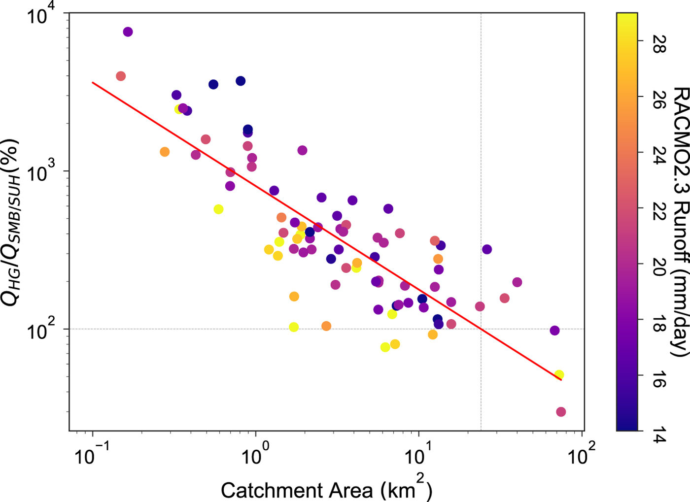
HG-inferred discharges at 1400 h ranged from 0.84 to 11.36 m3 s−1. In contrast, SMB/SUH 1400 h moulin discharges based on RACMO2.3 spanned a similar range of values, ranging from 0.05 to 9.3 m3 s−1. Interestingly, the difference between the datasets was highly scale dependent (Fig. 2) such that the SMB/SUH estimates underestimated discharge relative to the HG dataset in small catchments and the highest agreement between the datasets was observed in larger catchments. This relationship was significant (p-value < 0.001) based on linear regression of log-transformed data (r 2 = 0.69). Regression analysis suggests that the best agreement between datasets was observed in catchments ~19 km2 in area.
Comparison between 1400 h moulin discharges calculated by Smith and others (Reference Smith2015) (HG) and as derived through SUH scaled daily RACMO2.3 data (SMB/SUH). Y-axis is the ratio of the two datasets multiplied by 100 (i.e. in %). The colors of the points are scaled relative to the RACMO2.3 predicted daily total runoff (mm day−1).
To further explore the discrepancy, SMB/SUH discharge estimates in a small catchment were compared with discharge estimates in the HG dataset. The catchment is 0.49 km2 and both datasets largely agree on the geometry and extent of the hydrological system. The HG dataset estimates a 1400 h discharge of 2.69 m3 s−1 for this catchment. RACMO2.3 predicts total daily M′ of 14.2 mm day−1 (an M value of 22.0 mm day−1), translating into a 1400 h SMB/SUH discharge of 0.17 m3 s−1 (Fig. 3), such that SMB/SUH discharge is just 6.32% of HG derived estimates. Peak daily discharge for this catchment from SMB/SUH measurements is 0.21 m3 s−1, still <10% of the HG 1400 h discharge.
Curves refer to the small 0.49 km2 test catchment. The dashed line is the daily melt hyetograph, consisting of a Gaussian curve between 0600 and 0000 h, peaking at 1400 h (dashed vertical line). The solid line shows the moulin hydrograph, whereby peak discharge is delayed relative to peak melt. Both the hyetograph and hydrograph refer to the primary y-axis. The secondary (blue) axis is scaled according to the difference between the SMB/SUH 1400 h predictions and the HG instantaneous observations. For example, the horizontal dashed line corresponds to the HG 1400 h measurement of 2.69 m3 s−1 on the right axis and the inferred SUH/SMB value of 0.17 m3 s−1 on the left axis.

4. DISCUSSION AND CONCLUSION
In this study, an instantaneous 1400 h discharge for catchments on the GrIS is inferred by convolving hourly SMB-modeled melt with catchment-specific SUH curves. These modeled discharges are compared with discharges inferred from HG relations and satellite remote sensing of river widths on one of three different dates in July 2012. The latter method provides a snapshot of discharge in time, whereas the former attempts to broadly simulate discharge throughout the day. With few tools available for the glaciological community to simulate moulin discharge, this letter considers to what extent these methods might be compared and how this comparison informs us of their limitations.
My findings indicate that deriving moulin discharge solely on SMB models produces significantly lower discharge estimates than those based on remote-sensing observation in small basins. The magnitude of the mismatch between the two datasets is substantial, but is difficult to interpret because of empirical assumptions. For example, the difference would change substantially for different values of c (the parameter that scales SMB-modeled melt and a parameter which certainly varies spatially and temporally). Additionally, the SMB model itself does not account for snow and runoff processes (Irvine-Fynn and others, Reference Irvine-Fynn, Hodson, Moorma, Geir, Vatne and Hubbard2011; Smith and others, Reference Smith2017) and may produce runoff values that are lower than observed in the field. Therefore, the scale dependence of the difference is of more interest here than the absolute difference between the datasets. There are two possibilities to explain this scale dependent mismatch. The first is that this SMB/SUH approach underestimates instantaneous discharge in smaller rivers and the second is that the HG/multispectral approach leads to higher estimates of discharge in smaller rivers.
Clearly, supraglacial channels were visible from satellite imagery ~1400 h on the dates of acquisition, suggesting that water was flowing through channels at least several meters wide. The small discharges predicted by SMB/SUH approaches therefore do not seem consistent with the observations of rivers in satellite imagery, suggesting this approach may indeed be underestimating discharge in small rivers. SMB/SUH-based approaches might introduce scale-dependent error in a number of ways. For example, the use of empirical coefficients derived from just one field study for scaling melt and building SUH curves herein is almost certainly unrealistic and substantially more field work will facilitate building empirical datasets for hydrograph response to different catchment properties. The use of non-scale dependent empirical values as well as the Guassian-distributed melt hyetograph may fail to accurately reproduce the daily distribution of the moulin hydrograph. Additionally and importantly, the discharge value is highly dependent on basin area, for which smaller errors in delineation are of more relative importance in smaller basins than in larger ones.
However, given the high melt values that would be needed to produce the discharges reported by Smith and others (Reference Smith2015) in the small sample catchment above, it is reasonable to conclude that some of the discrepancies between datasets arises because a reliance on HG introduces several scale-dependent methodological limitations. Firstly, their HG relation of Q = 0.10 w 1.84, where Q is the discharge and w is the width, is highly sensitive to measurements of width. Given the 2-m resolution WV2 imagery used in their analysis, this uncertainty is higher in smaller channels and may explain the tendency to overestimate discharge in smaller channels, similar to conclusions by Bjerklie and others (Reference Bjerklie, Moller, Smith and Dingman2005).
A second potential scale-dependent limitation in using HG to estimate moulin discharge arises from extrapolation of HG across river sizes. Observations suggest that supraglacial channels are often deeply incised and that the difference in discharge between channels of different widths is not well described by a width/discharge relationship (Marston, Reference Marston1983; Gleason and others, Reference Gleason2016), although Yang and others (Reference Yang2016) observed that width was highly sensitive to discharge on the GrIS. Others have shown that velocity increases rapidly in response to increasing discharge, often leading to little change in width to depth ratios (Knighton, Reference Knighton1981; Gleason and others, Reference Gleason2016). Clearly, there is substantial variability in the nature of HG in supraglacial channels.
If an insensitivity between width and discharge contributes to the discrepancy between estimates observed here, one would expect the discrepancy to be dependent on river discharge. Indeed, Fig. 2 suggests that on lower melt days, HG discharge estimates are higher relative to RACMO2.3 estimates compared with higher melt days. It is possible that RACMO2.3 underestimates melt on those days, (and) or it is possible that the w/Q HG relationship is such that the width of channels does not vary substantially between high and low discharges and best approximates discharge on high melt days.
Finally, the temporal sensitivity of these strongly diurnal systems fundamentally complicates a one to one comparison of modeled run-off and observed instantaneous discharge. A steep hydrograph requires an exceptionally well parameterized SUH to accurately time the delivery of meltwater to a moulin. This is likely particularly true in small basins with shorter peak times. The high instantaneous discharges observed with satellite remote sensing of the river widths suggest that the SUH parameterization used herein does not accurately capture the rapidly rising hydrograph of these smaller systems.
Accurate, scale-independent methods of moulin discharge estimation are crucial for predicting the impacts of surface melt on ice-sheet behavior. Whichever method is employed, issues of temporal and spatial scale dependence are likely to be omnipresent and researchers are advised to consider ways of developing scale-dependent estimates of error and attempting independent replication of their results. Further, researchers should consider the ways in which scale-dependent methodological issues become internalized into the outputs of our research. For example, previous work has shown that catchment characteristics (including size) are non-uniformly distributed on the ice sheet (e.g. Yang and others, Reference Yang2016) and that the spatial distribution of moulins influences sub-glacial channel development (Banwell and others, Reference Banwell, Hewitt, Willis and Arnold2016). Smaller catchments are generally more plentiful and particularly so at lower elevations where seasonal melt begins the earliest (e.g. Yang and others, Reference Yang2016; Yang and Smith, Reference Yang and Smith2016). Over- or under-estimating the volume and timing of their meltwater contributions to basal drainage systems may have significant implications earlier in the season when the link between meltwater and ice velocity is strongest (Andrews and others, Reference Andrews2014).
SMB/SUH-based approaches are promising and practical for deriving moulin discharge estimates across surface catchments. However, given the heavily empirical nature of SUH derivation and its apparent sensitivity to scale in small catchments, substantially more theoretical and field-based work is needed before any approach can be considered to be reliable over large areas with variable catchment geometries, slopes and ice and snow conditions. Meanwhile, as illustrated in this letter, independent replication, although seldom undertaken and institutionally disincentivized (see Nosek and others, Reference Nosek2015), can be an accessible tool for identifying a scale incongruity.
ACKNOWLEDGMENTS
I am grateful to L. Smith for providing the Smith and others (Reference Smith2015) moulin and supraglacial river data, to L. Smith and K. Yang for their reviews and feedback on the manuscript, and to G. Flowers and M. A. Hassan for their input throughout the process. I thank one additional anonymous reviewer for feedback that greatly improved the manuscript. Many thanks to Brice Nöel for providing the RACMO2.3 data.


 Open access