


1. Introduction
Radio astronomy is at a cross-roads. With large survey telescopes like the Australian Square Kilometre Array Pathfinder (ASKAP, Hotan et al. Reference Hotan2021), Murchison Widefield Array (MWA, Tingay et al. Reference Tingay2013), LOw Frequency ARray (LOFAR, van Haarlem et al. Reference van Haarlem2013), and upgrades to the Very Large Array (VLA, Thompson et al. Reference Thompson, Clark, Wade and Napier1980) producing catalogues of up to tens of millions of new radio sources, traditional methods of producing science are struggling to keep up. New methods need to be developed to pick up the shortfall.
One of the most essential pieces of knowledge about an astronomical object is its redshift. From this measurement, the object’s age and distance can be gleaned, and its redshift used in combination with photometric measurements to estimate a myriad of other features.
Traditionally, redshift has been measured spectroscopically. However, even with modern Multi-Object Spectroscopy (MOS) instrumentation, the tens of millions of radio galaxies expected to be discovered in the coming years will by far outstrip the world’s spectroscopic capacity. For example, the 17 ${\mathrm{th}}$
data release of the Sloan Digital Sky Survey (SDSS, Abdurro’uf et al. 2022)Footnote a is currently the largest source of spectroscopic redshifts, with
${\mathrm{th}}$
data release of the Sloan Digital Sky Survey (SDSS, Abdurro’uf et al. 2022)Footnote a is currently the largest source of spectroscopic redshifts, with $\approx$ $4.8$
million redshifts measured—significantly less than the tens of millions of sources the Evolutionary Map of the Universe (EMU, Norris et al. Reference Norris2011), GaLactic and Extragalactic All-sky Murchison Widefield Array survey eXtended (GLEAM-X, Hurley-Walker et al. Reference Hurley-Walker2022), LOFAR Two-metre Sky Survey (LOTSS, Shimwell et al. Reference Shimwell2017), and Very Large Array Sky Survey (VLASS, Murphy & Vlass Survey Science Group Reference Murphy2015) is expected to deliver, even if all redshifts measured were focused exclusively on radio galaxies. Future spectroscopic surveys like the Wide Area Vista Extragalactic Survey (WAVES, Driver et al. Reference Driver2016) are expected to increase the number of spectroscopically known redshifts by another
$4.8$
million redshifts measured—significantly less than the tens of millions of sources the Evolutionary Map of the Universe (EMU, Norris et al. Reference Norris2011), GaLactic and Extragalactic All-sky Murchison Widefield Array survey eXtended (GLEAM-X, Hurley-Walker et al. Reference Hurley-Walker2022), LOFAR Two-metre Sky Survey (LOTSS, Shimwell et al. Reference Shimwell2017), and Very Large Array Sky Survey (VLASS, Murphy & Vlass Survey Science Group Reference Murphy2015) is expected to deliver, even if all redshifts measured were focused exclusively on radio galaxies. Future spectroscopic surveys like the Wide Area Vista Extragalactic Survey (WAVES, Driver et al. Reference Driver2016) are expected to increase the number of spectroscopically known redshifts by another $\sim$
2.5 million sources, but this will still not be enough.
$\sim$
2.5 million sources, but this will still not be enough.
Alternatively, photometric template fitting (Baum Reference Baum1957; Loh & Spillar Reference Loh and Spillar1986) has been highly effective at estimating the redshift of sources for many years and is able to achieve accuracies approaching those of spectroscopically measured redshifts (Ilbert et al. Reference Ilbert2009). However, the breadth and depth of measured photometric bands required for this level of accuracy are unavailable for the majority of sources detected by radio surveys like the EMU, GLEAM-X, LOTSS, and VLASS surveys. Additionally, radio galaxies in particular suffer in the photometric template fitting regimes, partly due to a lack of specialised templates, and partly due to the difficulty of separating out the star formation emission from the black hole emission (Salvato, Ilbert, & Hoyle Reference Salvato, Ilbert and Hoyle2018; Norris et al. Reference Norris2019).
Finally, like most problems, Machine Learning (ML) techniques have been applied to the problem of estimating redshift. From the simple algorithms like the k-Nearest Neighbours (kNN, Cover & Hart Reference Cover and Hart1967) in Ball et al. (Reference Ball2007, Reference Ball2008), Oyaizu et al. (Reference Oyaizu2008), Zhang et al. (Reference Zhang, Ma, Peng, Zhao and Wu2013), Kügler, Polsterer, & Hoecker (Reference Kügler, Polsterer and Hoecker2015), Cavuoti et al. (Reference Cavuoti2017), Luken, Norris, & Park (Reference Luken, Norris and Park2019), and Luken, Padhy, & Wang (Reference Luken, Padhy and Wang2021) and Random Forest (RF, Ho Reference Ho1995; Breiman Reference Breiman2001) in Cavuoti et al. (Reference Cavuoti, Brescia, Longo and Mercurio2012, Reference Cavuoti, Brescia, De Stefano and Longo2015), Hoyle (Reference Hoyle2016), Sadeh, Abdalla, & Lahav (Reference Sadeh, Abdalla and Lahav2016), Cavuoti et al. (Reference Cavuoti2017), Carvajal et al. (Reference Carvajal2021) and Pasquet-Itam & Pasquet (Reference Pasquet-Itam and Pasquet2018), to more complex algorithms like Neural Networks (NNs) in Firth, Lahav, & Somerville (Reference Firth, Lahav and Somerville2003), Tagliaferri et al. (Reference Tagliaferri2003), Collister & Lahav (Reference Collister and Lahav2004), Brodwin et al. (Reference Brodwin2006), Oyaizu et al. (Reference Oyaizu2008), Hoyle (Reference Hoyle2016), Sadeh et al. (Reference Sadeh, Abdalla and Lahav2016), Curran (Reference Curran2020), Curran, Moss, & Perrott (Reference Curran, Moss and Perrott2021), Curran (Reference Curran2022), and Curran, Moss, & Perrott (Reference Curran, Moss and Perrott2022), and Gaussian Processes (GPs) in Duncan et al. (Reference Duncan, Jarvis, Brown and Röttgering2018a,Reference Duncanb), and (Reference Duncan2021), using the GPz software. Some studies—for example Pasquet-Itam & Pasquet (Reference Pasquet-Itam and Pasquet2018) and D’Isanto & Polsterer (Reference D’Isanto and Polsterer2018)—make use of the images themselves, rather than photometry measured from the images. Typically though, ML algorithms are not tested in a manner suitable for large-scale radio surveys—ML algorithms are generally evaluated using data from fields like the COSMic evOlution Survey (COSMOS), where there are many (up to 31) different photometric bands measured for each source—far beyond what is available to all-sky surveys, or on data from the SDSS, where either the Galaxy sample is used, containing millions of galaxies with optical photometry and a spectroscopically measured redshift (but restricted to $z \lesssim 0.8$
), or the Quasi-Stellar Object (QSO) sample is used, containing quasars out to a significantly higher redshift, at the cost of lower source count.
$z \lesssim 0.8$
), or the Quasi-Stellar Object (QSO) sample is used, containing quasars out to a significantly higher redshift, at the cost of lower source count.
As noted by Salvato et al. (Reference Salvato, Ilbert and Hoyle2018), ML-based methods frequently perform better then traditional template fitting methods when the density of observed filters is lacking, or when the sample being estimated contain rarer sub-types like radio or x-ray Active Galactic Nucleus (AGN). The drawback, however, is that ML methods still require a representative sample of these galaxies to be able to model the features well enough to acceptably predict their redshift. One of the biggest issues with any ML algorithm is finding a representative sample to train the model with. For redshift estimation, this generally requires having spectroscopic surveys containing sources to a similar depth as the sources being predicted (or reliably photometrically estimated redshift—see Speagle et al. Reference Speagle2019 for an in-depth investigation).
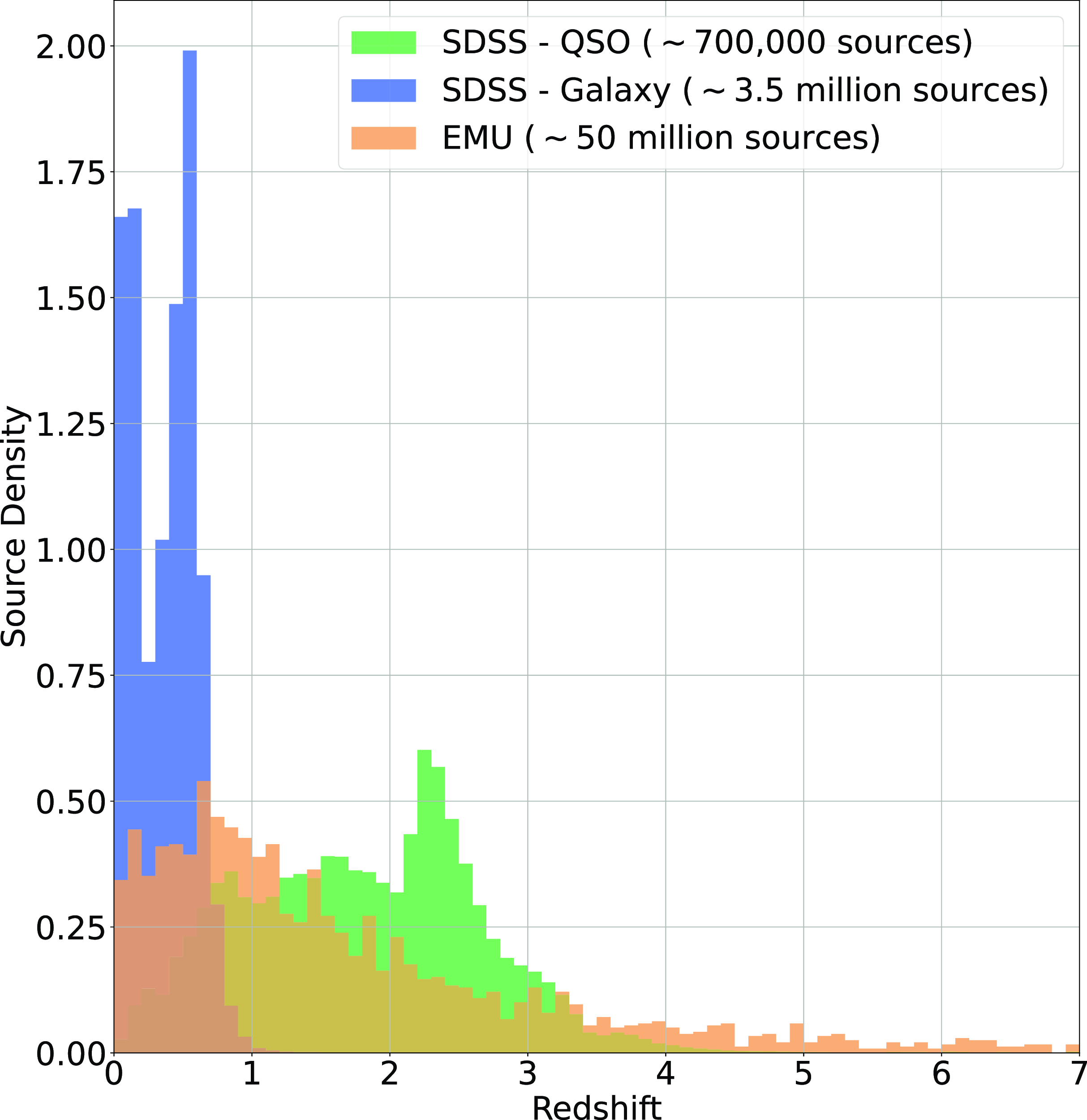
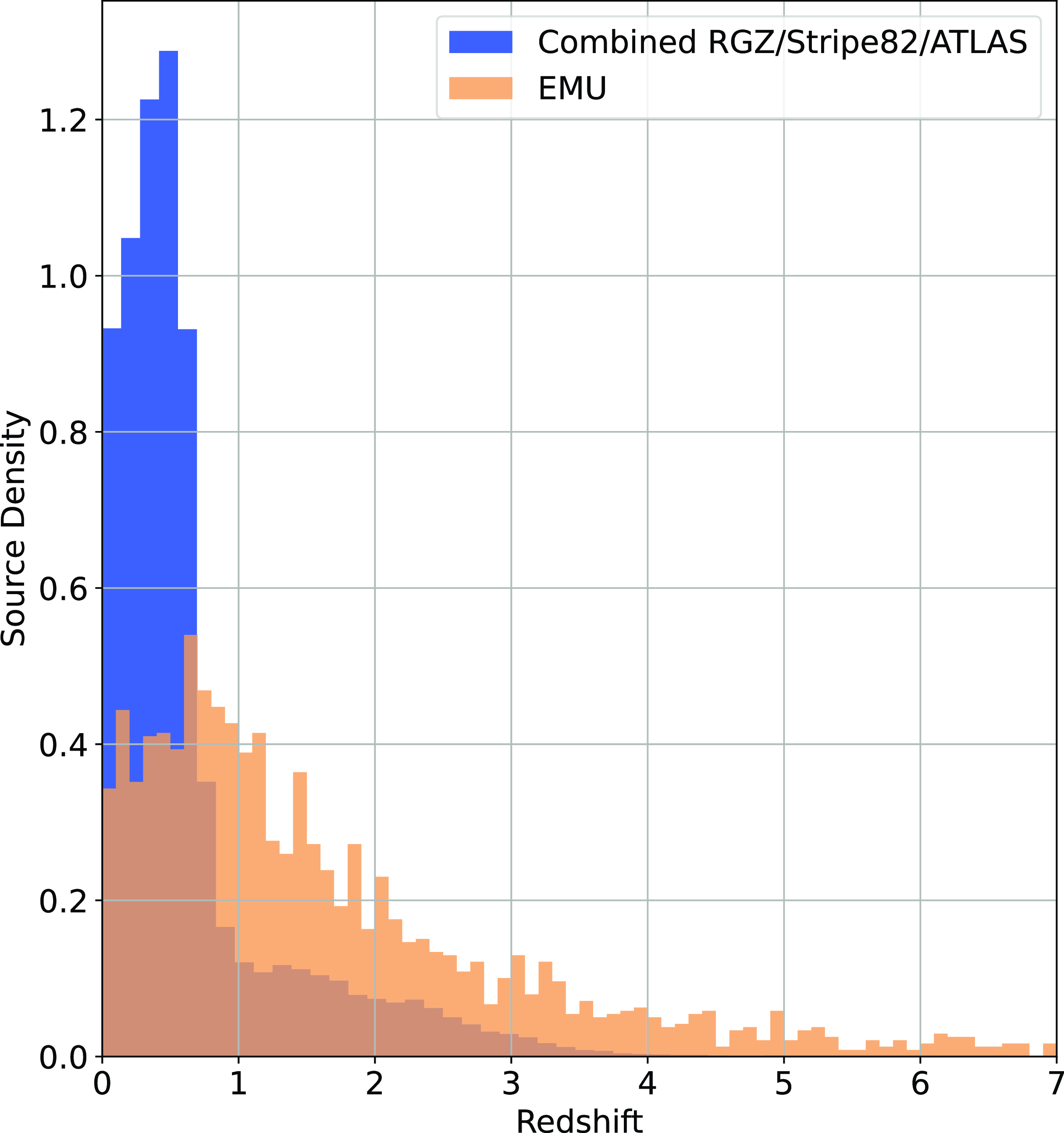
An example of the expected redshift distribution of the EMU survey, compared with the SDSS Galaxy and QSO samples, is presented in Fig. 1, demonstrating the differences in redshift distributions—one reason why radio samples are typically more difficult to estimate than optically selected samples. Training samples are often not entirely representative of the data being predicted.
Histogram showing the density of sources at different redshifts in the SDSS Galaxy Sample (blue), SDSS QSO Sample (green), and the Square Kilometre Array Design Survey (SKADS, Levrier et al. Reference Levrier2009) simulation trimmed to expected EMU depth (Norris et al. Reference Norris2011).
Further, Duncan (Reference Duncan2022) compares their results with Duncan et al. (Reference Duncan2019), showing that for most populations of galaxies, taking the additional step of training a Gaussian Mixture Model (GMM) to split optically selected datasets into more representative samples improves estimates across all measured error metrics. However, Duncan (Reference Duncan2022) notes that redshift estimates for optically luminous QSO have lower error estimates when training exclusively on representative data as in Duncan et al. (Reference Duncan2019), compared with using the GMM prior to estimation. Two reasons are postulated for this—one being the addition of the i and y bands used by Duncan et al. (Reference Duncan2019), with the additional reason being the specific training on the representative sample, rather than a generalised approach.
Finally, when ML models have been trained on radio selected samples, they have typically been focused on achieving the best possible accuracy, with model parameters optimised based on the average accuracy. While this approach is entirely appropriate for other use cases, the preferred parameter to optimise in this work is the Outlier Rate—the percentage of sources where the estimated redshift is determined to have catastrophically failed (further details in Section 3.1).
This subtle change optimises the results for key science goals of surveys such as EMU in which the number of catastrophic outliers is more important than the accuracy of each redshift estimate. For example, constraining non-Gaussianity (Raccanelli et al. Reference Raccanelli2017), or measuring the evolution of the cosmic star formation rate over cosmic time (Hopkins & Beacom Reference Hopkins and Beacom2006), do not require accurate estimates of redshift, but suffer greatly if redshifts are significantly incorrect.
In light of these struggles using optically selected samples to estimate the redshift of radio-selected samples, we create a new radio-selected training sample, taken from the northern hemisphere (selected from the Faint Images of the Radio Sky at Twenty-Centimeters (FIRST) Becker, White, & Helfand Reference Becker, White and Helfand1995 and NRAO VLA Sky Survey (NVSS), Condon et al. Reference Condon1998 using SDSS spectroscopy and photometry, and combining it with southern hemisphere data (selected from the Australia Telescope Large Area Survey (ATLAS, Norris et al. Reference Norris2006; Franzen et al. Reference Franzen2015) and Stripe82 (Hodge et al. Reference Hodge, Becker, White, Richards and Zeimann2011; Prescott et al. Reference Prescott2018), where the ATLAS data contains Dark Energy Survey (DES, Collaboration et al. Reference Collaboration2016) photometry, and the Stripe82 field contains both SDSS and DES photometry. All fields contain AllWISE infrared photometry.
With this large radio-selected dataset, we compare four commonly used ML algorithms and softwares—kNN, RF, GPz, and ANNz. Where possible, we compare these methods using both a regression and classification mode, as discussed in Luken et al. (Reference Luken, Padhy and Wang2021, Reference Luken, Norris, Park, Wang and Filipović2022). In order to better cater to the EMU science goals,Footnote b instead of comparing the overall accuracies of each method, we compare the outlier rates—the percentage of sources that have catastrophically failed.
In this work, we pose the research question: Given the upcoming radio surveys (specifically the EMU survey), which ML algorithm provides the best performance for the estimation of radio galaxy’s redshift, where best performance is measured by the outlier rate.
1.1. Overall contributions of this study
Overall, our contributions for this study include
-
• An in-depth investigation of the DES and SDSS optical photometry, and its compatibility, specifically examining the modifications needed to use both surveys for the estimation of redshift using Machine Learning.
-
• The construction of a representative and homogenous (where possible) training set, available to be used for the estimation of redshift for radio-selected samples.
-
• The comparison of multiple widely used ML algorithms, providing a like-for-like comparison on the same dataset.
-
• The comparison of classification- and regression-based methods where possible.
1.2. Knowledge gap
-
• Current Template Fitting methods require better photometric coverage than is typical for all-sky radio surveys and are based on a set of templates that are not well-matched to those of galaxies that host radio sources.
-
• Current ML techniques are typically trained and tested on wide, shallow surveys, limited to $z<0.7$
, or specific, optically selected samples. Where they are not trained on restricted samples, they are typically optimised for best accuracy, rather than minimising the number of catastrophic failures.
$z<0.7$
, or specific, optically selected samples. Where they are not trained on restricted samples, they are typically optimised for best accuracy, rather than minimising the number of catastrophic failures. -
• We are looking at a combination of datasets in order to better match the expected density of sources, as well as comparing against current methods used in literature in order to best prepare for the next generation of radio surveys.

2. Data
In this section, we outline the photometry used and sources of data (Section 2.1), the steps taken to homogenise the northern sky SDSS and southern sky DES optical photometry (Section 2.2), and the process of binning the data in redshift space in order to test classification modes of the different algorithms (Section 2.3).
2.1. Data description
As noted in Section 1, most ML-based techniques are typically focused on optically selected datasets, primarily based around the SDSS datasets, providing high source counts of stars, galaxies, and QSO with photometry (generally) in u, g, r, i, and z bands, with a spectroscopically measured redshift—generally using the SDSS Galaxy or QSO datasets, shown in Fig. 1. In this work, the data are selected specifically to better represent the data expected from the upcoming EMU Survey (Norris et al. Reference Norris2011) and Evolutionary Map of the Universe–Pilot Survey 1 (EMU-PS, Norris et al. Reference Norris2021). Towards this end, we only accept SDSS objects with a counterpart in the NRAOVLA Sky Survey (NVSS) or Faint Images of the Radio Sky at Twenty-Centimeters (FIRST) radio surveys.
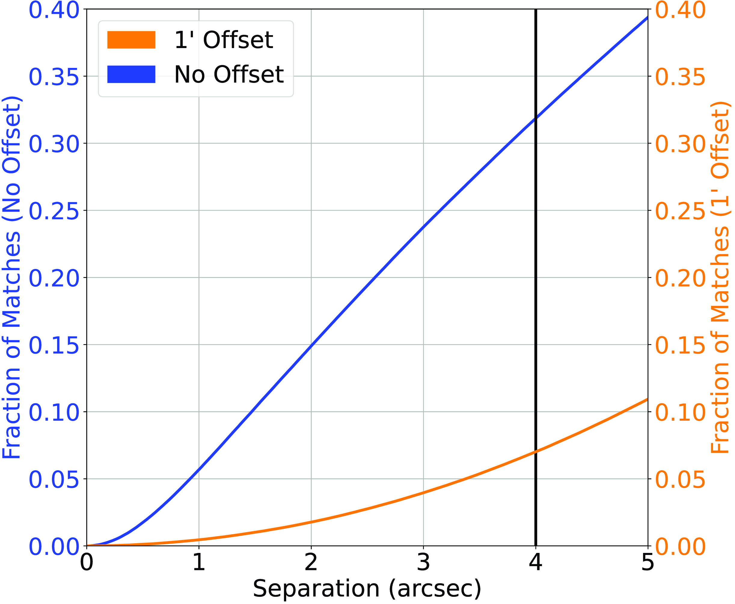
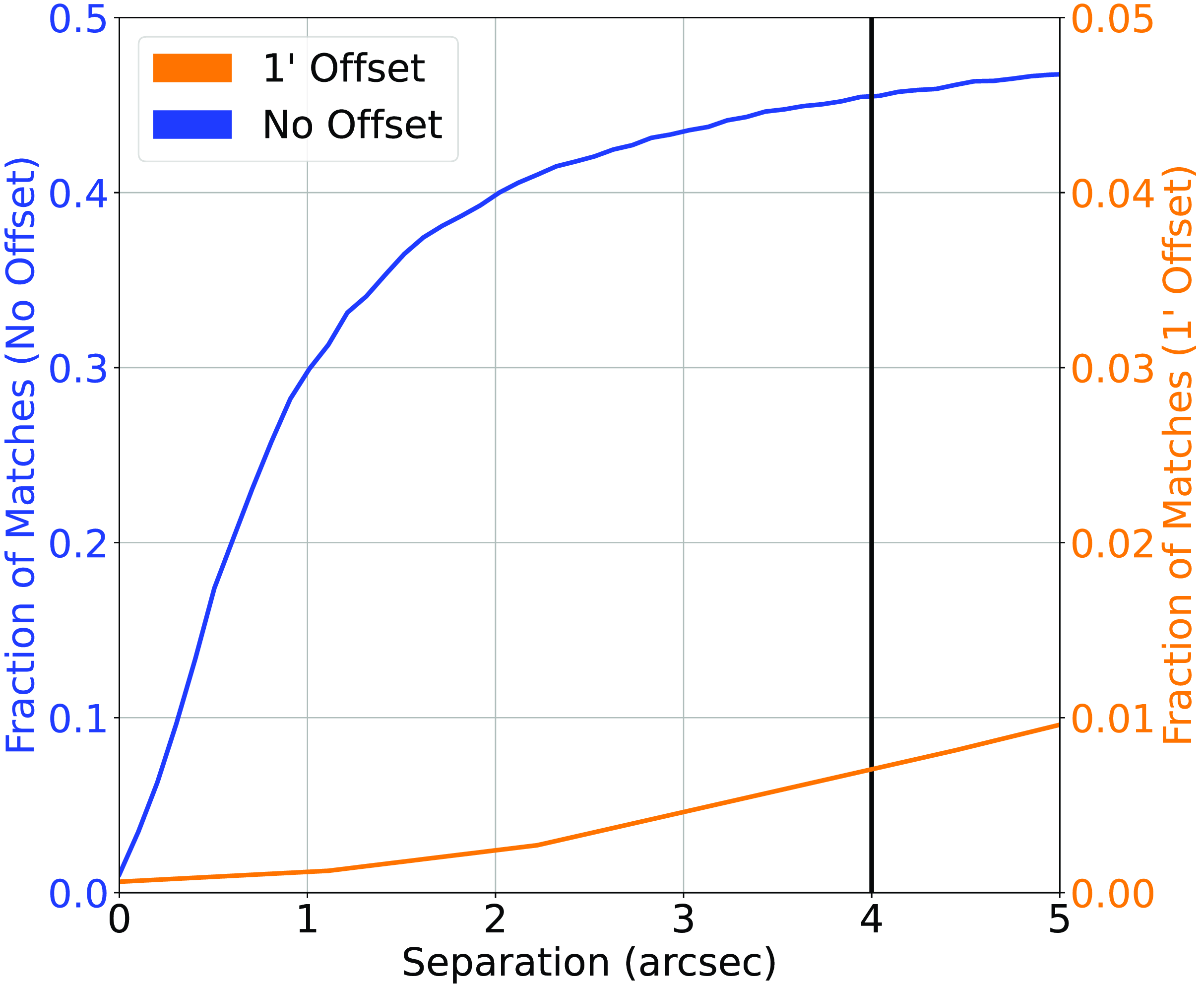
Cross-match completed between the NVSS Radio sample and the AllWISE Infrared sample. The blue line represents the straight nearest-neighbour cross-match between the two datasets, and the orange line represents the nearest-neighbour cross-match where 1 $^{\prime}$
has been added to the declination of every radio source. The vertical black line denotes the chosen cutoff.
$^{\prime}$
has been added to the declination of every radio source. The vertical black line denotes the chosen cutoff.
This work compiles three datasets, each containing multiple features for comparison:
-
1. Northern Sky—Radio Galaxy Zoo (RGZ) and NVSS
-
(a) Our Northern Sky dataset contains two radio samples—the NVSS sample and the RGZ FIRST-based sample (where the RGZ sample has been cross-matched with the AllWISE sample, explained in Banfield et al. Reference Banfield2015 and Wong et al. in preparation).
-
(b) The NVSS sample was cross-matched with AllWISE at 4
$^{\prime\prime}$
, providing 564799 radio sources—approximately 32% of the NVSS sample—with an infrared counterpart. The NVSS/AllWISE cross-match has an estimated 7%—123484 sources—misclassification rate, where the misclassification rate is quantified by shifting the declination of all sources in the NVSS catalogue by 1
$^{\prime}$
and re-cross-matching based on the new declination, following the process described in Norris et al. (Reference Norris2021). Fig. 2 shows the classification/misclassification rates as a function of angular separation and is used to determine the optimum cross-match radius. -
(c) The NVSS and RGZ samples were then combined, removing duplicates based on the AllWISE unique identifier, providing 613551 radio sources with AllWISE detections.
-
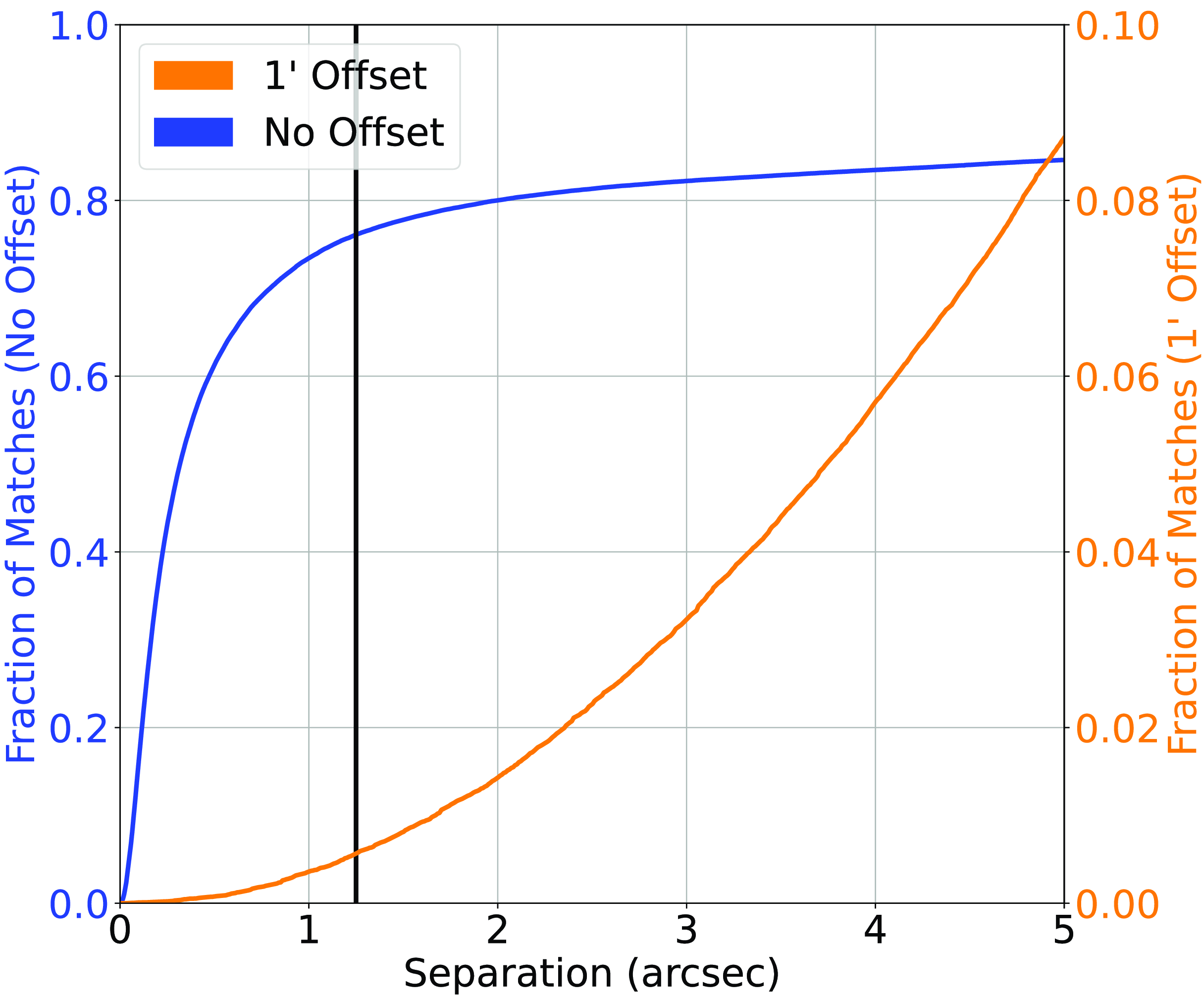
(d) The northern sky radio/infrared catalogue was then cross-matched against the SDSS catalogue (providing both optical photometry and spectroscopic redshifts) based on the infrared source locations—a radio-infrared cross-match tends to be more reliable, when compared with the radio-optical cross-match (Swan Reference Swan2018)—at 4
$^{\prime\prime}$
, providing a classification/misclassification rate of 9.33%/0.06% (55716/348 sources) (Fig. 3). -
(e) Finally, all sources from the Stripe82 Equatorial region were removed (sources with an RA between
$9^{\circ}$
and
$36^{\circ}$
or
$330^{\circ} $
and
$350^{\circ}$
and DEC between
$-1.5^{\circ}$
and
$1.5^{\circ}$
). -
(f) The final Northern Sky Sample contains 55452 radio-selected sources with a spectroscopically measured redshift, SDSS g, r, i, and z magnitudes measured using Model/PSF/Fibre systems, and AllWISE W1, W2, W3, and W4 infrared magnitudes, shown in Table 1.
Table 1.The source count in each sample compiled in Section 2.
Figure 3.Similar to Fig. 2, cross-matching the Northern Sky sample based on the NVSS and RGZ radio catalogues and AllWISE Infrared, with SDSS optical photometry and spectroscopic redshift. Note the different scale of the right-side y-axis.
-
-
2. Southern Sky—ATLAS
-
(a) Beginning with the ATLAS dataset—described in Luken et al. (Reference Luken, Norris, Park, Wang and Filipović2022)—we cross-match the SpitzerWide-Area Infrared Extragalactic Survey (SWIRE) infrared positions with AllWISE in order to gain the same infrared bands as the Northern Sky dataset. Cross-matching at 1
$^{\prime\prime}$
produces a 100%/0.34% classification/misclassification rate (1156/4 sources) (Fig. 4), and a final source count of 1156 sources, all with g, r, i, and z optical magnitudes in Auto, 2
$^{\prime\prime}$
, 3
$^{\prime\prime}$
, 4
$^{\prime\prime}$
, 5
$^{\prime\prime}$
, 6
$^{\prime\prime}$
, and 7
$^{\prime\prime}$
apertures, as well as the W1, W2, W3, and W4 infrared magnitudes.Figure 4.Similar to Fig. 2, cross-matching the southern sky ATLAS sample with the AllWISE catalogue, matching the SWIRE positions with the AllWISE positions.
Figure 5.Similar to Fig. 2, cross-matching the DES optical photometry with the SDSS optical photometry and spectroscopic redshift catalogues.
-
-
3. Equatorial—Stripe82
-
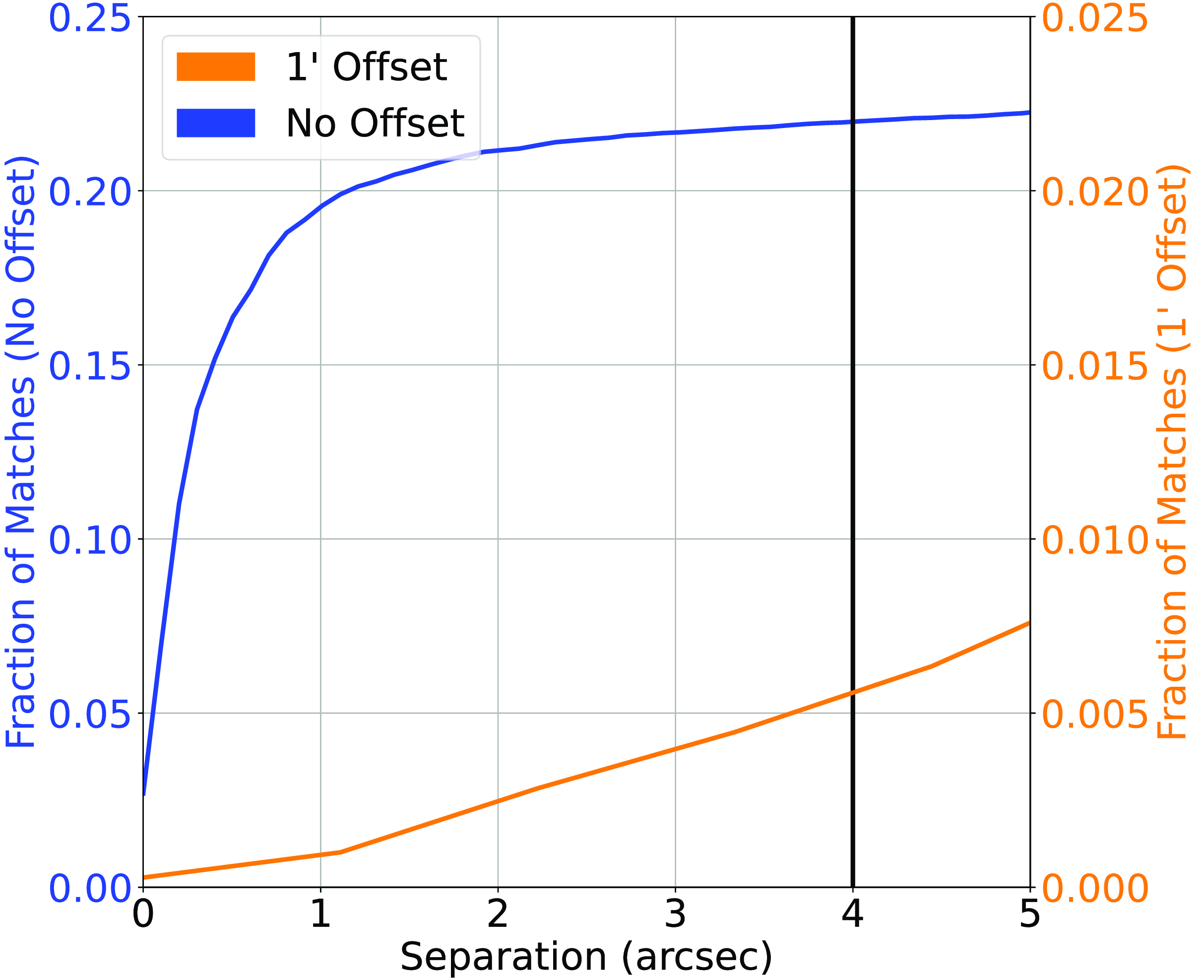
(a) Along the equatorial plane, the Stripe82 field has been extensively studied by both northern- and southern-hemisphere telescopes, providing a field that contains both SDSS, and DES photometry. Cross-matching the DES catalogue with the SDSS catalogue (where both catalogues were restricted to the Stripe82 field) at 1
$^{\prime\prime}$
produces a 98.4%/3.36% (170622/5831 sources) classification/misclassification rate (Fig. 5). -
(b) The optical catalogues were then cross-matched against the AllWISE catalogues at 1.25
$^{\prime\prime}$
producing a 84.09%/ 0.60% (129837/932 sources) classification/ misclassification rate (Fig. 6). -
(c) Finally, cross-matching the AllWISE Infrared catalogue against the Hodge et al. (Reference Hodge, Becker, White, Richards and Zeimann2011) (at 4
$^{\prime\prime}$
; see Fig. 7) and Prescott et al. (Reference Prescott2018) (at 4
$^{\prime\prime}$
; see Fig. 8) gives us a 21.96%/ 0.42% (3946/75 sources) and 45.46%/0.54% (2180/26 sources) classification/misclassification rates, respectively. -
(d) After combination of the Stripe82 Radio datasets with duplicates removed (based on AllWISE ID), we have a final dataset of 3030 radio-selected sources with a spectroscopic redshift, W1, W2, W3, and W4 infrared magnitude, g, r, i, and z optical magnitudes in PSF, Fibre, and Model systems (for SDSS photometry), and Auto, 2
$^{\prime\prime}$
, 3
$^{\prime\prime}$
, 4
$^{\prime\prime}$
, 5
$^{\prime\prime}$
, 6
$^{\prime\prime}$
, and 7
$^{\prime\prime}$
apertures (for DES photometry).
-


To summarise, all datasets are radio-selected, and contain:
Similar to Fig. 2, cross-matching the DES positions with the AllWISE Infrared catalogue. Note the different scale of the right-side y-axis.
Similar to Fig. 2, cross-matching the AllWISE positions with the Hodge et al. (Reference Hodge, Becker, White, Richards and Zeimann2011) Radio catalogue. Note the different scale of the right-side y-axis.
Similar to Fig. 2, cross-matching the AllWISE positions with the Prescott et al. (Reference Prescott2018) Radio catalogue. Note the different scale of the right-side y-axis.
Histogram showing the density of sources at different redshifts in the combined RGZ—North, Stripe82—Equatorial, and ATLAS—South—(blue), and the Square Kilometre Array Design Survey (SKADS, Levrier et al. Reference Levrier2009) simulation trimmed to expected EMU depth (Norris et al. Reference Norris2011).
-
• a spectroscopically measured redshift, taken from either the Australian Dark Energy Survey (OzDES), or SDSS;
-
• g, r, i, and z optical magnitudes, taken from either the DES or SDSS;
-
• W1, W2, W3, and W4 (3.4, 4.6, 12, 24
$,\unicode{x03BC}\mathrm{m}$
, respectively) infrared magnitudes, taken from AllWISE;

with a final redshift distribution shown in Fig. 9. While we are still not matching the expected distribution from the EMU survey, we are ensuring all sources have a radio counterpart (and hence, will be dominated by the difficult-to-estimate AGNs), with the final distribution containing more, higher redshift radio sources than previous works like Luken et al. (Reference Luken, Norris, Park, Wang and Filipović2022).
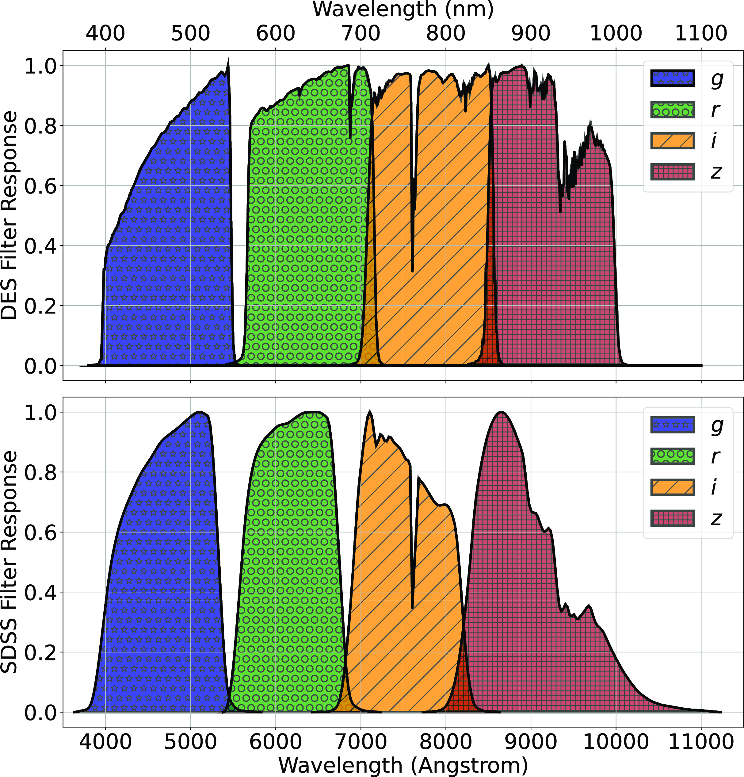
The primary difference between the datasets is the source of the optical photometry. Even though both the DECam on the Blanco Telescope at the Cerro Tololo Inter-American Observatory in Chile and the Sloan Foundation 2.5 m Telescope at the Apache Point Observatory in New Mexico both use g, r, i, and z filters, the filter responses are slightly different (demonstrated in Fig. 10, the DES Collaboration notes that there may be up to 10% difference between the SDSS and DES equivalent filtersFootnote c), with different processing methods producing multiple, significantly different measurements for the same sources. For ML models, a difference of up to 10% is significant and had significant effects on redshift estimations in early tests without correction (sample results with one ML algorithm shown in Appendix A).
A comparison of the g, r, i, and z filter responses, used by the DES (top), and the SDSS (bottom).
For the SDSS, the three measures of magnitude used in this work (Point Spread Function (PSF), Fibre and Model) are all extensively defined by the SDSS.Footnote d Simply put, the PSF magnitude measures the flux within the PSF of the telescope for that pointing, the fibre is a static sized aperture based on a single fibre within the SDSS spectrograph (generally 3 $^{\prime\prime}$
), and the model magnitude tries to fit the source using a variety of models.
$^{\prime\prime}$
), and the model magnitude tries to fit the source using a variety of models.
The DES pipelines produce statically defined apertures from 2 $^{\prime\prime}$
to 12
$^{\prime\prime}$
to 12 $^{\prime\prime}$
, as well as an auto magnitude that is fit by a model.
$^{\prime\prime}$
, as well as an auto magnitude that is fit by a model.
For our purposes in finding DES photometry compatible with SDSS photometry, we only examined the DES auto, and 2–7 $^{\prime\prime}$
measurements, as the larger aperture DES measurements begin to greatly differ from any measured SDSS measurement. We find that the DES auto magnitude is most similar to the SDSS model magnitude, and hence, exclusively use this pairing.
$^{\prime\prime}$
measurements, as the larger aperture DES measurements begin to greatly differ from any measured SDSS measurement. We find that the DES auto magnitude is most similar to the SDSS model magnitude, and hence, exclusively use this pairing.
2.2. Optical photometry homogenisation
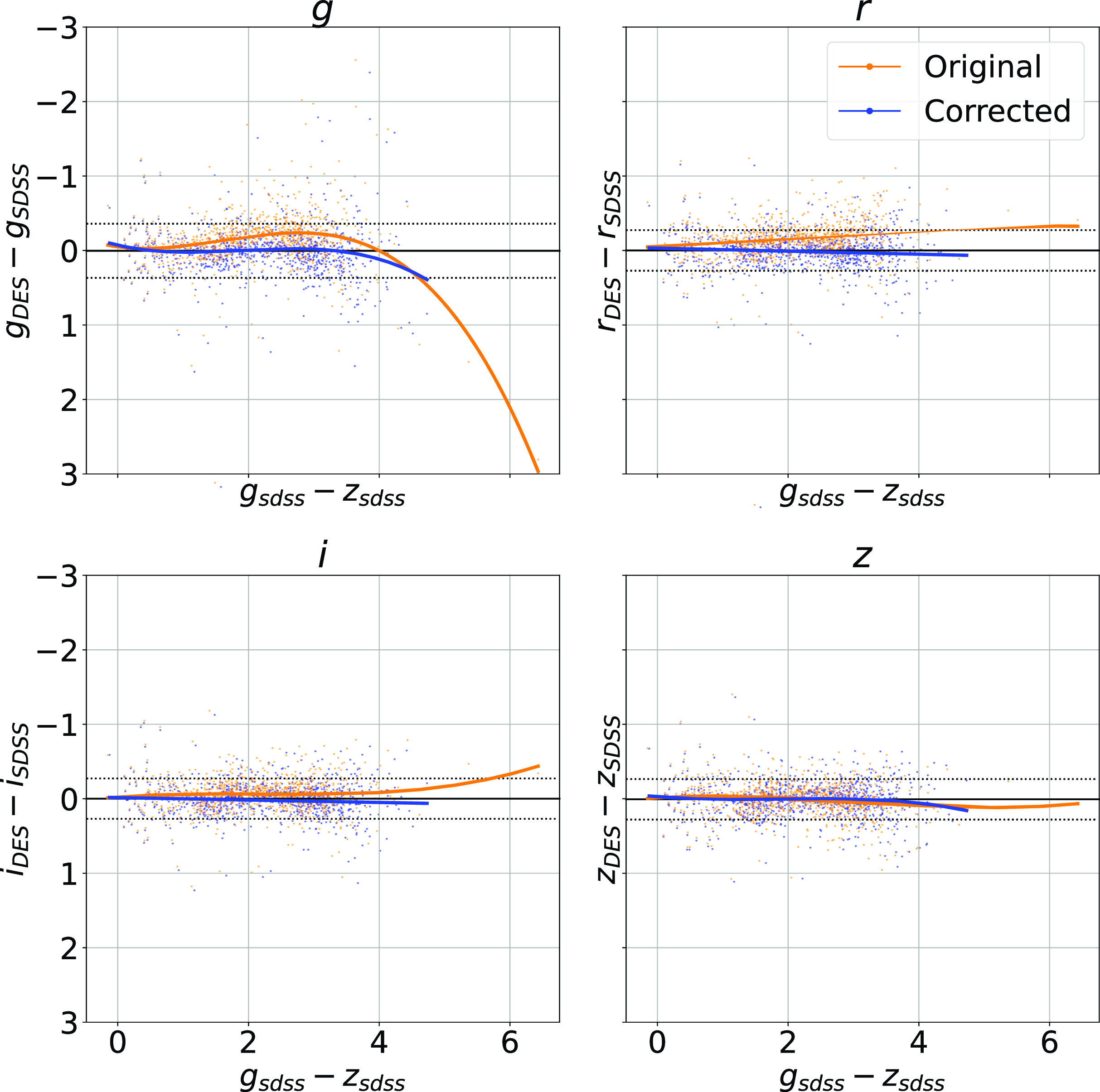
The combined dataset discussed above (Section 2.1) contains optical photometry measured using the SDSS (in the Northern, and Equatorial fields) and the DES (Southern and Equatorial fields). As shown in Fig. 10, while the SDSS and DES g, r, i, and z filters are similar, they are not identical, and hence should not be directly compared without modification before use by typical ML algorithms. As the Stripe82 Equatorial field contains observations with both optical surveys, we can fit a third-order polynomial from the $g - z$
colour, to the difference in the SDSS and DES measured magnitude for each band for each object, and use the fitted model to homogenise the DES photometry to the SDSS photometry for the Southern hemisphere data. Fig. 11 shows four panels—one for each of the g, r, i, and z magnitudes—with the orange points showing the original difference between optical samples against the
$g - z$
colour, to the difference in the SDSS and DES measured magnitude for each band for each object, and use the fitted model to homogenise the DES photometry to the SDSS photometry for the Southern hemisphere data. Fig. 11 shows four panels—one for each of the g, r, i, and z magnitudes—with the orange points showing the original difference between optical samples against the $g - z$
colour, blue points showing the corrected difference, orange line showing the third-order polynomial fitted to the original data, and the blue line showing a third-order polynomial fitted to the corrected data. While this homogenisation does not adjust for the scatter in the differences, it does shift the average difference, dropping from 0.158, 0.149, 0.061, and 0.006 to 0.004, 0.001, 0.001, and 0.007 for the g, r, i, and z mag, respectively. We explore the difference the corrections make to predicting the redshift of sources with SDSS and DES, using the kNN algorithm trained on the opposite optical survey, using corrected, and uncorrected DES photometry in Appendix A.
$g - z$
colour, blue points showing the corrected difference, orange line showing the third-order polynomial fitted to the original data, and the blue line showing a third-order polynomial fitted to the corrected data. While this homogenisation does not adjust for the scatter in the differences, it does shift the average difference, dropping from 0.158, 0.149, 0.061, and 0.006 to 0.004, 0.001, 0.001, and 0.007 for the g, r, i, and z mag, respectively. We explore the difference the corrections make to predicting the redshift of sources with SDSS and DES, using the kNN algorithm trained on the opposite optical survey, using corrected, and uncorrected DES photometry in Appendix A.
Plot showing the effects of homogenisation on the optical photometry. Each panel shows the original difference between the DES and SDSS photometry for a given band (with the band noted in the title of the subplot), as a function of $g - z$
colour. The orange scatterplots are the original data, with the orange line showing a third-order polynomial fit for to the pre-corrected data. The blue scatterplots are the corrected data, with the blue line showing the post-correction fit, highlighting the improvement the corrections bring.
$g - z$
colour. The orange scatterplots are the original data, with the orange line showing a third-order polynomial fit for to the pre-corrected data. The blue scatterplots are the corrected data, with the blue line showing the post-correction fit, highlighting the improvement the corrections bring.
2.3. Regression and classification
The distribution of spectroscopically measured redshifts is highly non-uniform, providing additional difficulties to what is typically a regression problem (a real value—redshift—being estimated based on the attributes—features—of the astronomical object). As demonstrated in Fig. 1, it also does not follow the expected distribution of the EMU survey, partly because the optical source counts of the local universe vastly outnumber those of the high-redshift universe, and partly because high-redshift galaxies are too faint for most optical spectroscopy surveys. The non-uniform distribution means high-redshift sources will be under-represented in training samples and therefore are less likely to be modelled correctly by ML models.
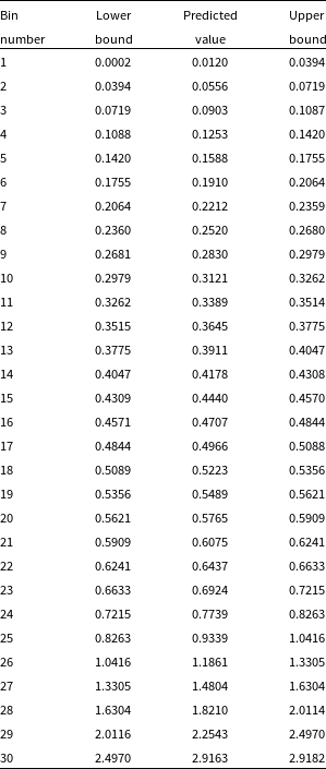
In an attempt to provide a uniform redshift distribution for the ML methods to provide better high-z estimations, we quantise the data into 30 redshift bins with equal numbers of sources in each (where the bin edges, and the expected value of the bin—typically the median redshift of the bin—are shown in Table 2). While binning the data means that it is no longer suitable for regression, it allows us to use the classification modes of the ML methods and test whether treating the redshift estimation problem as a classification problem rather than attempt to estimate the redshift of sources as a continuous value aids in the estimation of sources in the high-redshift regime.
Example redshift bin boundaries used in the classification tests, calculated with the first random seed used. We show the bin index, the upper and lower bounds, and the predicted value for the bin.
3. Machine learning methods
In this section, we outline the error metrics we use to compare the results across different ML algorithms (Section 3.1) and the efforts to explain any random variance across our tests (Section 3.2), before discussing the different algorithms used—the kNN algorithm (using the Mahalanobis distance metric; Section 3.3), the RF algorithm (Section 3.4), the ANNz2 algorithm (Section 3.5), and the GPz algorithm (Section 3.6). Finally, we discuss the training methods used in this work (Section 3.7). In this work, we provide an initial explanation of each algorithm. However, we direct the reader to their original papers for a full discussion.
3.1. Error metrics
As stated in Section 1, this work differs from the typical training methods that attempt to minimise the average accuracy of the model (defined in Equation (4), or Equation (5)). Instead, it is primarily focused on minimising the number of estimates that are incorrect by a catastrophic level—a metric defined as the Outlier Rate:
 \begin{equation} \eta_{0.15} = \frac{1}{N}{\sum_{z\in Z} [\![ |\Delta z| > 0.15(1 + z_{spec}) ]\!]}, \end{equation}
where $\eta_{0.15}$
is the catastrophic outlier rate, Z is the set of sources,
$\eta_{0.15}$
is the catastrophic outlier rate, Z is the set of sources, $|Z| = N$
,
$|Z| = N$
, $[\![ x ]\!]$
is the indicator function (1 if x is true, otherwise it is 0),
$[\![ x ]\!]$
is the indicator function (1 if x is true, otherwise it is 0), $z_{spec}$
is the measured spectroscopic redshift, and
$z_{spec}$
is the measured spectroscopic redshift, and $\Delta z$
is the residual:
$\Delta z$
is the residual:
 \begin{equation} \Delta z = z_{spec} - z_{photo}, \end{equation}
Alternative, we provide the 2- $\sigma$
outlier rate as a more statistically sound comparison:
$\sigma$
outlier rate as a more statistically sound comparison:
 \begin{equation} \eta_{0.15} = \frac{1}{N}{\sum_{z\in Z} [\![ |\Delta z| > 2 \sigma ]\!]}, \end{equation}
where $\eta_{2\sigma}$
is the 2-
$\eta_{2\sigma}$
is the 2- $\sigma$
outlier rate, and
$\sigma$
outlier rate, and $\sigma$
is the residual standard deviation:
$\sigma$
is the residual standard deviation:
 \begin{equation} \sigma = \sqrt{\frac{1}{N} \sum_{i=1}^N(y_i - \hat{y}_i)^2}, \end{equation}
where $\sigma$
is the residual standard deviation,
$\sigma$
is the residual standard deviation, $y_i$
is an individual spectroscopic redshift, and
$y_i$
is an individual spectroscopic redshift, and $\hat{y_i}$
is the corresponding estimate for source i. The residual standard deviation gives an indication of the average accuracy of the estimates.
$\hat{y_i}$
is the corresponding estimate for source i. The residual standard deviation gives an indication of the average accuracy of the estimates.
The Normalised Median Absolute Deviation (NMAD) gives a similar metric to the Residual Standard Deviation, but is more robust to outliers as it relies on the median, rather than the mean of the residuals:
 \begin{equation} \sigma_{\mathrm{NMAD}} = 1.4826 \times (\mathrm{median}(|X_i - \mathrm{median}(X)|), \end{equation} $\sigma_{\mathrm{NMAD}}$
is the NMAD, X is a set of residuals (where the individual values are calculated in Equation (2) as
$\sigma_{\mathrm{NMAD}}$
is the NMAD, X is a set of residuals (where the individual values are calculated in Equation (2) as $\Delta z$
), from which
$\Delta z$
), from which $x_i$
is an individual observation.
$x_i$
is an individual observation.
The Mean Square Error (MSE) is only used in regression-based tests, provides the average squared error of the estimates
 \begin{equation} \operatorname{MSE} =\frac {1}{N} \sum _{i=1}^{N}(y_{i}-\hat {y_{i}})^{2}, \end{equation}
where $\operatorname{MSE}$
is the Mean Square Error,
$\operatorname{MSE}$
is the Mean Square Error, $y_i$
is an individual spectroscopic redshift, and
$y_i$
is an individual spectroscopic redshift, and $\hat {y_{i}}$
is the corresponding estimated redshift for source i.
$\hat {y_{i}}$
is the corresponding estimated redshift for source i.
The accuracy is only used in classification-based tests and provides the percentage of sources predicted in the correct ‘class’, where the class is a particular redshift bin. This metric is provided for completeness only, as the accuracy is only accepting of perfect classifications, whereas the aim of this work is provide redshift estimates that are approximately correct—i.e. we are inherently accepting of classifications in nearby redshift bins, which would be considered incorrect classifications by the accuracy metric.
 \begin{equation} \mathrm{Accuracy}(y, \hat{y}) = \frac{1}{N} \sum_{i=0}^{N-1} [\![ \hat{y}_i = y_i ]\!], \end{equation}
where y is a vector of spectroscopic redshifts, and $\hat{y}$
is the corresponding vector of estimated redshifts.
$\hat{y}$
is the corresponding vector of estimated redshifts.
3.2. Statistical significance
In order to measure the potential random variation within our results, all tests were conducted 100 times, with different random seeds—creating 100 different training/test sets to train and test each algorithm on. All values presented are the average of the results gained, with the associated standard error:
 \begin{equation} \sigma_{\bar{x}} = \frac{\sigma_{x}}{\sqrt{n}},\end{equation}
where $\sigma_{\bar{x}}$
is the standard error of
$\sigma_{\bar{x}}$
is the standard error of $\bar{x}$
which is calculated from the the standard deviation of the 100 repetitions of the experiment using different random seeds (denoted as
$\bar{x}$
which is calculated from the the standard deviation of the 100 repetitions of the experiment using different random seeds (denoted as $\sigma_x$
),
$\sigma_x$
), $\bar{x}$
is the mean classification/regression error, and n is the number of repetitions—100 in this case.
$\bar{x}$
is the mean classification/regression error, and n is the number of repetitions—100 in this case.
We note that the classification bin distribution is calculated for each random initialisation—this means that while each of the 100 random training sets will have roughly the same redshift distribution, there will be slight differences in the bin distributions calculated for classification.
3.3. k-Nearest Neighbours
The kNN algorithm is one of the oldest (Cover & Hart Reference Cover and Hart1967), as well as one of the simplest machine learning algorithms. Using some kind of distance metric—typically Euclidean distance—a similarity matrix is computed between every source in the training set, comparing the observed photometry between sources. The photometry of sources in the test set—sources with ‘unknown’ redshift—can then be compared to the photometry in the training set and find the ‘k’ (hereafter $k_n$
) sources with most similar photometry. The mean or mode (depending on whether regression, or classification is performed respectively) of the most similar sources redshift from the training set is taken as the redshift of the unknown source. Following Luken et al. (Reference Luken, Norris, Park, Wang and Filipović2022) who have shown that Euclidean distance is far from optimal for redshift estimation, here we use the Mahalanobis distance metric (Equation (9); Mahalanobis Reference Mahalanobis1936):
$k_n$
) sources with most similar photometry. The mean or mode (depending on whether regression, or classification is performed respectively) of the most similar sources redshift from the training set is taken as the redshift of the unknown source. Following Luken et al. (Reference Luken, Norris, Park, Wang and Filipović2022) who have shown that Euclidean distance is far from optimal for redshift estimation, here we use the Mahalanobis distance metric (Equation (9); Mahalanobis Reference Mahalanobis1936):
 \begin{equation} d(\vec{p},\vec{q}) = \sqrt{(\vec{p} - \vec{q})^\mathrm{T}S^{-1}(\vec{p} - \vec{q})},\end{equation}
where $d(\vec{p},\vec{q})$
is the Mahalanobis distance between two feature vectors
$d(\vec{p},\vec{q})$
is the Mahalanobis distance between two feature vectors $\vec{p}$
and
$\vec{p}$
and $\vec{q}$
, and S is the covariance matrix.
$\vec{q}$
, and S is the covariance matrix.
The value of $k_n$
is optimised using k-fold cross-validation, a process where the training set is split into k (hereafter
$k_n$
is optimised using k-fold cross-validation, a process where the training set is split into k (hereafter $k_f$
and is assigned a value of 5 for this work) subsets, allowing the parameter being optimised to be trained and tested on the entire training set.
$k_f$
and is assigned a value of 5 for this work) subsets, allowing the parameter being optimised to be trained and tested on the entire training set.
3.4. Random Forest
The RF algorithm is an ensemble ML algorithm, meaning that it combines the results of many other algorithms (in this case Decision Trees (DTs)) to produce a final estimation. DTs to split the data in a tree-like fashion until the algorithm arrives at a single answer (when the tree is fully grown). These decisions are calculated by optimising over the impurity at the proposed split using Equation (10):
 \begin{equation} G(Q_m, \theta) = \frac{n_{left}}{n_m} H(Q_{left}(\theta)) + \frac{n_{right}}{n_m} H(Q_{right}(\theta)) ,\end{equation}
where $Q_m$
is the data at node m,
$Q_m$
is the data at node m, $\theta$
is a subset of data,
$\theta$
is a subset of data, $n_m$
is the number of objects at node m,
$n_m$
is the number of objects at node m, $n_{left}$
and
$n_{left}$
and $n_{right}$
are the numbers of objects on the left and right sides of the split,
$n_{right}$
are the numbers of objects on the left and right sides of the split, $Q_{left}$
and
$Q_{left}$
and $Q_{right}$
are the objects on the left and right sides of the split, and the H function is an impurity function that differs between classification and regression. For Regression, the Mean Square Error is used (defined in Equation (6)), whereas Classification often uses the Gini Impurity (defined in Equation (11)).
$Q_{right}$
are the objects on the left and right sides of the split, and the H function is an impurity function that differs between classification and regression. For Regression, the Mean Square Error is used (defined in Equation (6)), whereas Classification often uses the Gini Impurity (defined in Equation (11)).
 \begin{equation} H(X_m) = \sum_{k \in J} p_{mk} (1 - p_{mk}),\end{equation}
where $p_{mk}$
is the proportion of split m that are class k from the set of classes J, defined formally in Equation (12):
$p_{mk}$
is the proportion of split m that are class k from the set of classes J, defined formally in Equation (12):
 \begin{equation} p_{mk} = \frac{1}{n_m} \sum_{y \in Q_m} [\![ y = k]\!] ,\end{equation}
where $[\![ x ]\!]$
is the indicator function identifying the correct classifications.
$[\![ x ]\!]$
is the indicator function identifying the correct classifications.
3.5. ANNz2
The ANNz2Footnote e software (Sadeh et al. Reference Sadeh, Abdalla and Lahav2016) is is another ensemble method, combining the results of many (in this work we use 100) randomly assigned machine learning models as a weighted average from the pool of NNs and boosted decision trees, using settings noted in Bilicki et al. (Reference Bilicki2018, Reference Bilicki2021). However, whereas Bilicki et al. (Reference Bilicki2021) use the ANNz functionality to weight the training set by the test set feature distributions, here we do not use this option for two reasons. First, this work is designed for larger surveys to be completed, for which we do not know the distributions, so we are unable to effectively weight the training samples towards future samples. Second, when attempted, the final outputs were not significantly different, whether the training sets were weighted or not.
3.6. GMM+GPz
The GPz algorithm is based upon Gaussian Process Regression, a ML algorithm that takes a slightly different track than traditional methods. Whereas most algorithms model an output variable from a set of input features using a single, deterministic function, GP use a series of Gaussians to model a probability density function to map the input features to output variable. The GP algorithm is extended further in the GPz algorithm to handle missing and noisy input data, through the use of sparse GPs and additional basis functions modelling the missing data (Almosallam, Jarvis, & Roberts Reference Almosallam, Jarvis and Roberts2016a; Almosallam et al. Reference Almosallam, Lindsay, Jarvis and Roberts2016b).
Following Duncan (Reference Duncan2022), we first segment the data into separate clusters using a Gaussian Mixture Model before training a GPz model (without providing the redshift to the GMM algorithm) on each cluster, the idea being that if the training data better reflects the test data, a better redshift estimate can be made. We emphasise that no redshift information has been provided to the GMM algorithm, and the clusters determined by the algorithm is solely based on the g – z, and W1-W4 optical and infrared photometry—the same photometry used for the estimation of redshift.
The GMM uses the Expectation-Maximization (EM) algorithm to optimise the centers of each cluster it defines by using an iterative approach, adjusting the parameters of the models being learned in order to maximise the likelihood of the data belonging to the clusters assigned. The EM algorithm does not optimise the number of clusters, which must be balanced between multiple competing interests:
-
• The size of the data—the greater the number of clusters, the more chance the GMM will end up with insufficient source counts in a cluster to adequately train a redshift estimator
-
• The number of distinct source types within the data—If the number of clusters is too small, there will be too few groupings that adequately split the data up into it is latent structure, whereas if it is too high, the GMM will begin splitting coherent clusters
This means that the number of components used by the GMM to model the data is a hyper-parameter to be fine-tuned. Ideally, the number of components chosen should be physically motivated—the number of classes of galaxy we would expect to be within the dataset would be an ideal number, so the ML model is only training on sources of the same type to remove another source of possible error. However, this is not necessarily a good option, as, due to the unsupervised nature of the GMM, we are not providing class labels to the GMM, and hence cannot be sure that the GMM is splitting the data into the clusters we expect. On the other hand, being unsupervised means the GMM is finding its own physically motivated clusters which do not require the additional—often human derived—labels. The lack of labels can be a positive, as human-decided labels may be based less on the actual source properties, and more on a particular science case (see Rudnick Reference Rudnick2021 for further discussion).
In this work, we optimise the number of components hyper-parameter, where the number of components ncomp is drawn from $ \mathrm{n_{comp}} \in \{1, 2, 3, 5, 10, 15, 20, 25, 30\}$
. We emphasise that the number of components chosen is not related to the number of redshift bins used for classification and has an entirely separate purpose. The primary metric being optimised is the Bayesian Information Criteria (BIC, Schwarz Reference Schwarz1978):
$ \mathrm{n_{comp}} \in \{1, 2, 3, 5, 10, 15, 20, 25, 30\}$
. We emphasise that the number of components chosen is not related to the number of redshift bins used for classification and has an entirely separate purpose. The primary metric being optimised is the Bayesian Information Criteria (BIC, Schwarz Reference Schwarz1978):
 \begin{equation} \operatorname{BIC} = -2\log\!(\hat{L}) + \log\!(N)d,\end{equation}
where $\log\!(\hat{L})$
is the log likelihood of seeing a single point drawn from a Gaussian Mixture Model, defined in Equation (14), and d is the number of parameters.
$\log\!(\hat{L})$
is the log likelihood of seeing a single point drawn from a Gaussian Mixture Model, defined in Equation (14), and d is the number of parameters.
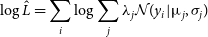 \begin{equation}\log{\hat{L}} = {\sum_i \log{\sum_j \lambda_j \mathcal{N}(y_i|\unicode{x03BC}_j, \sigma_j)}}\end{equation}
where $y_i$
is an individual observation,
$y_i$
is an individual observation, $\mathcal{N}$
is the normal density with parameters
$\mathcal{N}$
is the normal density with parameters $\sigma_j^2$
and
$\sigma_j^2$
and $\unicode{x03BC}_j$
(the sample variance and mean of a single Gaussian component), and
$\unicode{x03BC}_j$
(the sample variance and mean of a single Gaussian component), and $\lambda_j$
is the mixture parameter, drawn from the mixture model.
$\lambda_j$
is the mixture parameter, drawn from the mixture model.
The BIC operates as a weighted likelihood function, penalising higher numbers of parameters. The lower the BIC, the better.
Optimisation of the Bayesian Information Criteria (top), Test Size (middle), and Outlier Rate (bottom) across a range of components.
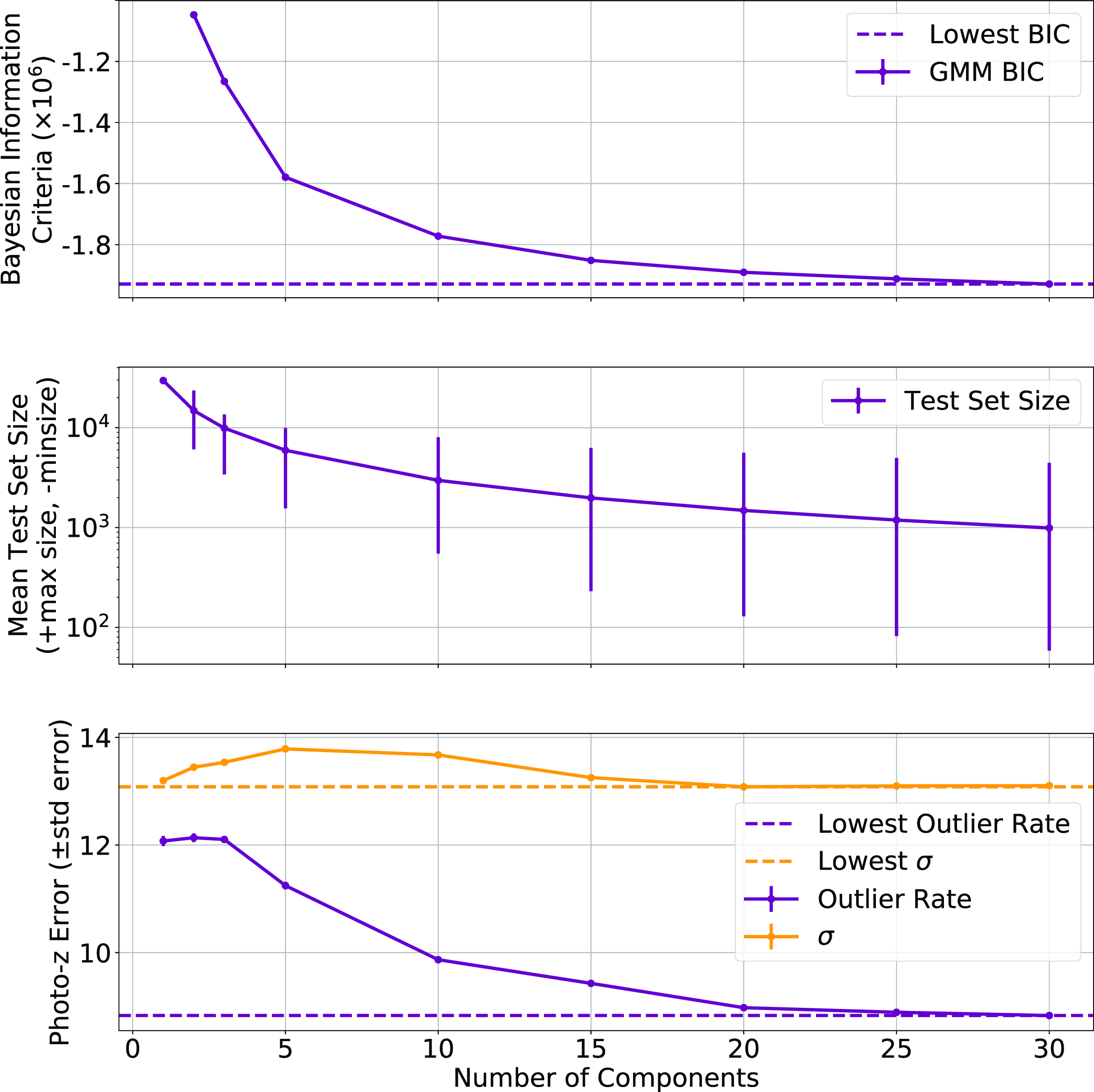
Redshift distribution of the 30 GMM components. In each case the vertical axis shows the count.
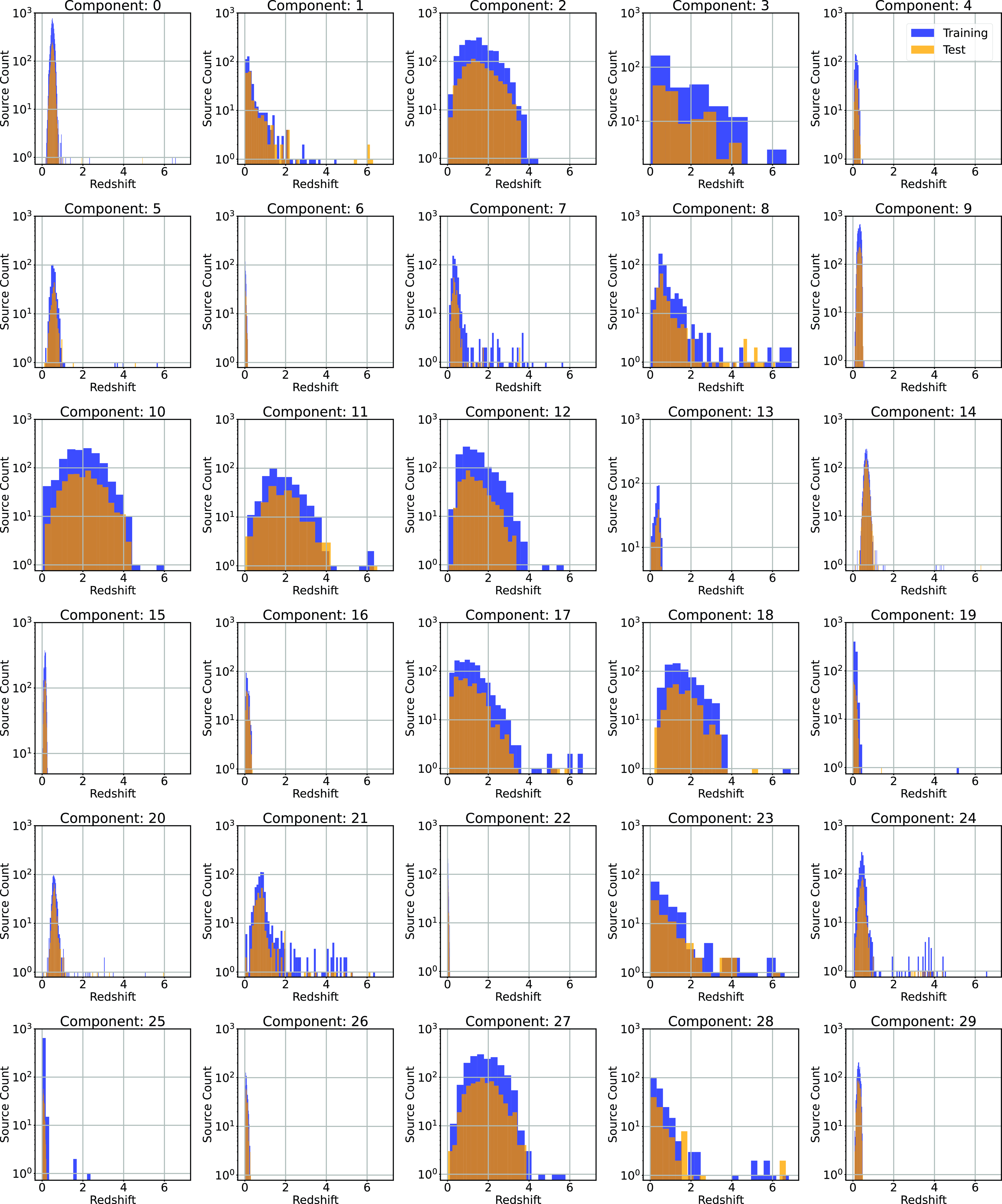
Fig. 12 shows the BIC (Equation (13); top panel) with error bars denoting the standard error of each component, the average test size of each component with the error bars denoting the minimum and maximum test set size for each component (middle), and the photometric error in the form of both the outlier rate (Equation (1)), and the accuracy (Equation (7)), with error bars denoting the standard error (bottom).
Regression results table comparing the different algorithms across the different error metrics (listed in the table footnotes). The best values for each error metric are highlighted in bold.
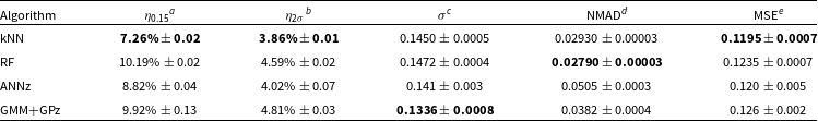

Fig. 12 shows that while the ncomp is being optimised for lowest BIC, this has the additional benefit of lowering the resulting redshift estimation error (Fig. 12; middle and bottom panels)—showing that the clusters being identified by the GMM algorithm are meaningful in the following redshift estimation. A value of 30 is chosen for the ncomp, despite the BIC continuing to decline beyond this point. However, the number of sources in the smaller clusters defined by the GMM becomes too small to adequately train a GPz model.
Once the data are segmented into 30 components (an example from one random seed is shown in Fig. 13), a GPzFootnote f model is trained for each component. The GPz algorithm is based around sparse GPs, which attempt to model the feature space provided using Gaussian components.
3.7. Training method
ML algorithms are typically set up and trained following one of two procedures:
-
1. Training/Validation/Test Splits
-
• The data is split into training, testing, and validation sets (for this work, the data are split into 50%/20%/30% subsets). The ML algorithm is trained on the training set, with model hyperparameters optimised for the validation set. Once optimised, the test set is used to estimate the model’s generalisatibility.
-
• This method is utilised by the ANNz and GMM algorithms
-
-
2. k-Fold Cross-Validation
-
• The dataset is split into two sets (for this work, the data are split into 70%/30% subsets), used as training and test sets. Differing from the first method, this method trains and optimises the ML algorithms on the training set alone, before testing the optimised models on the test set.
-
• The training set is split into
$k_f$
subsets.
$k_f$
models are trained on
$k_f - 1$
subsets, and hyperparameters optimised and validated against the remaining subset. -
• In this work, we use a value of 5 for
$k_f$
, with the k-fold Cross-Validation algorithms used to optimise the hyperparameters of the kNN and RF algorithms.
-


The externally developed software (ANNz and GPz) both operate using training/validation/test split datasets. This is preferable for large, mostly uniform distributions, as it greatly reduces training time. However, for highly non-uniform distributions, the under-represented values are less likely to be involved in all stages of training, validation and testing. Hence, for the kNN and RF algorithms, where we control the training process, we choose the k-fold cross-validation method of training and optimising hyperparameters, to best allow the under-represented high-redshift sources to be present at all stages of training.
3.7.1. Photometry used in training
All algorithms use the same primary photometry—g, r, i, z optical magnitudes and W1, W2, W3, and W4 infrared magnitudes. However, the different algorithms vary in how they treat the uncertainties associated with the photometry. For the simple ML algorithms (kNN and RF), the uncertainties are ignored. ANNz computes their own uncertainties using a method based on the kNN algorithm, outlined in Oyaizu et al. (Reference Oyaizu2008), and GPz uses them directly in the fitting of the Gaussian Process.
Classification results table comparing the different algorithms across the different error metrics (listed in the table footnotes). The best values for each error metric are highlighted in bold.

3.7.2. Using ANNz and GPz for classification
While the Sci-Kit Learn implementations of the kNN and RF algorithms have both regression and classification modes, there is no directly comparable classification mode for the ANNz and GPz algorithms. In order to compare them with the classification modes of the kNN and RF algorithms, we use the ANNz and GPz algorithms to predict the median of the bin, in lieu of a category. The predictions are then re-binned to the same boundaries as the original bins, and the re-binned data compared.
4. Results
For clarity, we break our results up into three sub-sections—Subsection 4.1 reports the results using the regression modes of each ML method, Subsection 4.2 reports the results using the classification modes of each ML method, and Subsection 4.3 reports the comparison between the two modes.
4.1. Regression results
The results using the regression modes of each ML algorithm are summarised in Table 3. Table 3 shows that the kNN algorithm performs best in terms of both $\eta_{0.15}$
and
$\eta_{0.15}$
and $\eta_{2\sigma}$
outlier rates, while also performing similarly across other metrics—although the GMM+GPz algorithm provides the lowest
$\eta_{2\sigma}$
outlier rates, while also performing similarly across other metrics—although the GMM+GPz algorithm provides the lowest $\sigma$
.
$\sigma$
.
Scatter plots (Figs. 14–17) show the results from each ML algorithm where the x-axis of each panel shows the measured spectroscopic redshifts, the y-axis of the top panel shows the redshift predicted by the given ML method and the bottom panel the normalised residuals. The dashed red line shows a perfect prediction, with the dashed blue lines highlighting the boundary set by the outlier rate. All figures use the same random seed, and the same test set.
Comparison of spectroscopic and predicted values using kNN Regression. The x-axis shows the spectroscopic redshift, with the y-axis (Top) showing the redshift estimated by the ML model. The y-axis (Bottom) shows the normalised residual between spectroscopic and predicted values as a function of redshift. The turquoise dash-dotted line shows a perfect correlation, and the blue dashed lines show the boundaries accepted by the $\eta_{0.15}$
outlier rate. The colour bar shows the density of points per coloured point.
$\eta_{0.15}$
outlier rate. The colour bar shows the density of points per coloured point.

Same as Fig. 14 but for RF Regression.
Same as Fig. 14 but for ANNz Regression.
Same as Fig. 14 but for GPz Regression.

As shown in Figs. 14–17, all algorithms suffer from the same issues—overestimating the low-redshift sources ( $z < 1$
), while underestimating the high-redshift sources (
$z < 1$
), while underestimating the high-redshift sources ( $z > 3$
). At the low-redshift end, the large majority of sources are estimated within the
$z > 3$
). At the low-redshift end, the large majority of sources are estimated within the $\eta_{0.15}$
outlier rate by all algorithms, with all algorithms overestimating roughly the same number of sources. At high-redshift, the GPz algorithm performs worst; however, the small number of sources at high-redshift mean this does not significantly impact the error metrics.
$\eta_{0.15}$
outlier rate by all algorithms, with all algorithms overestimating roughly the same number of sources. At high-redshift, the GPz algorithm performs worst; however, the small number of sources at high-redshift mean this does not significantly impact the error metrics.
4.2. Classification results
The results using the classification modes of each ML algorithm are summarised in Table 4. As with the Regression results in Section 4.1, the kNN algorithm produces the lowest $\eta_{0.15}$
rate, with the RF algorithm being second best. All methods (aside from the RF algorithm) have approximately the same
$\eta_{0.15}$
rate, with the RF algorithm being second best. All methods (aside from the RF algorithm) have approximately the same $\sigma$
. However, the RF and GPz algorithms have a marginally lower NMAD.
$\sigma$
. However, the RF and GPz algorithms have a marginally lower NMAD.
Plots showing the results from each ML algorithm (Figs. 18–21) show the scaled classification bins, with the x-axis showing the measured (binned) spectroscopic redshifts, and the y-axis showing the ML classified bin for each source. While a perfect correlation along the diagonal would be ideal, the inherent error built into the $\eta_{0.15}$
error metric means that at low redshift, there might be many adjacent bins that are deemed ‘acceptable’ redshift estimates, whereas at the highest redshift, there is only one possible bin a source can be classified into for it to be an acceptable estimate.
$\eta_{0.15}$
error metric means that at low redshift, there might be many adjacent bins that are deemed ‘acceptable’ redshift estimates, whereas at the highest redshift, there is only one possible bin a source can be classified into for it to be an acceptable estimate.
The kNN algorithm correctly predicts the highest proportion of sources belonging to the highest redshift bin, though it should be noted that all algorithms struggle with assigning this under-represented class. While the width of the final bin means that sources that are not exactly classified are therefore incorrectly classified (unlike sources at the low-redshift end), in all cases, over 70% of the highest redshift sources are placed in the highest two redshift bins. Alternatively, if these bins were to be combined, we would be able to say that the over 70% of sources at $z > 2$
would be correctly classified. Further discussion is presented in Section 5.1.
$z > 2$
would be correctly classified. Further discussion is presented in Section 5.1.
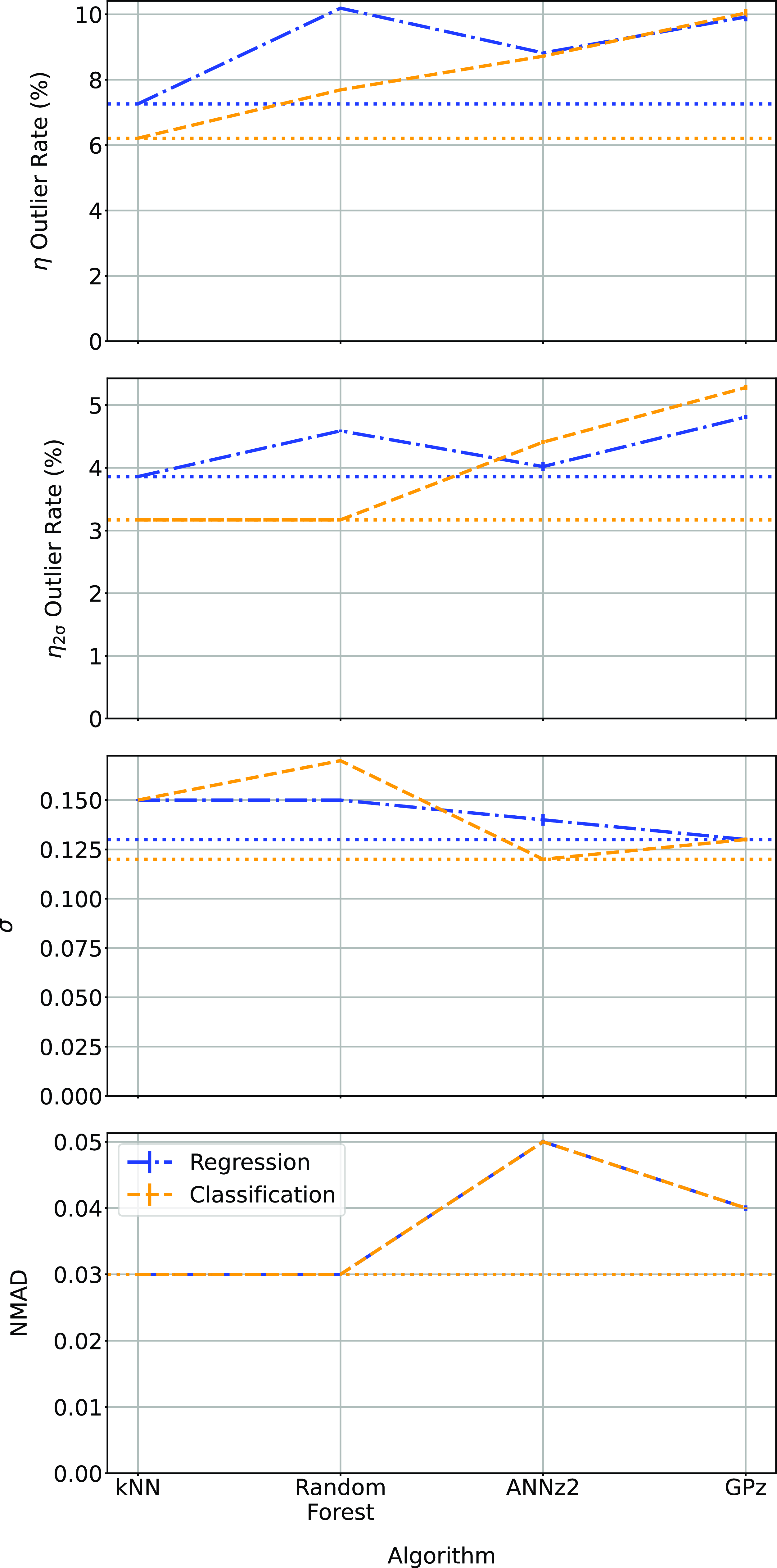
4.3. Regression vs classification
When comparing the results in Tables 3 and 4 (demonstrated in Fig. 22), we find that the binning of redshifts greatly improves the results using the RF algorithm (in terms of $\eta_{0.15}$
outlier rate) while for other algorithms, it does not significantly alter the
$\eta_{0.15}$
outlier rate) while for other algorithms, it does not significantly alter the $\eta_{0.15}$
outlier rate. The classification process does slightly reduce
$\eta_{0.15}$
outlier rate. The classification process does slightly reduce $\sigma$
for kNN and ANNz algorithms, bringing them closer to the results from the GPz algorithm.
$\sigma$
for kNN and ANNz algorithms, bringing them closer to the results from the GPz algorithm.
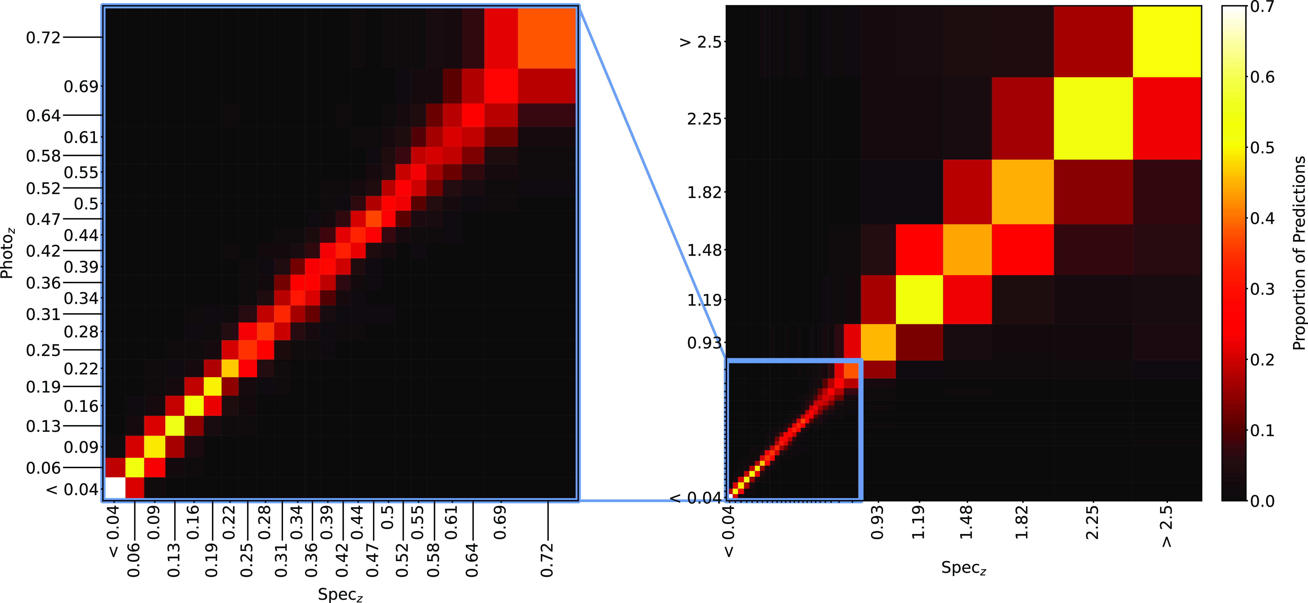
Confusion matrix showing the results using the kNN classification algorithm. The size of the boxes is approximately scaled (with the exception of the final, highest redshift boxes) with the width of the classification bin. The x-axis shows the spectroscopic redshift, and the y-axis shows the predicted redshift. The left panel is an exploded subsection of the overall right panel.
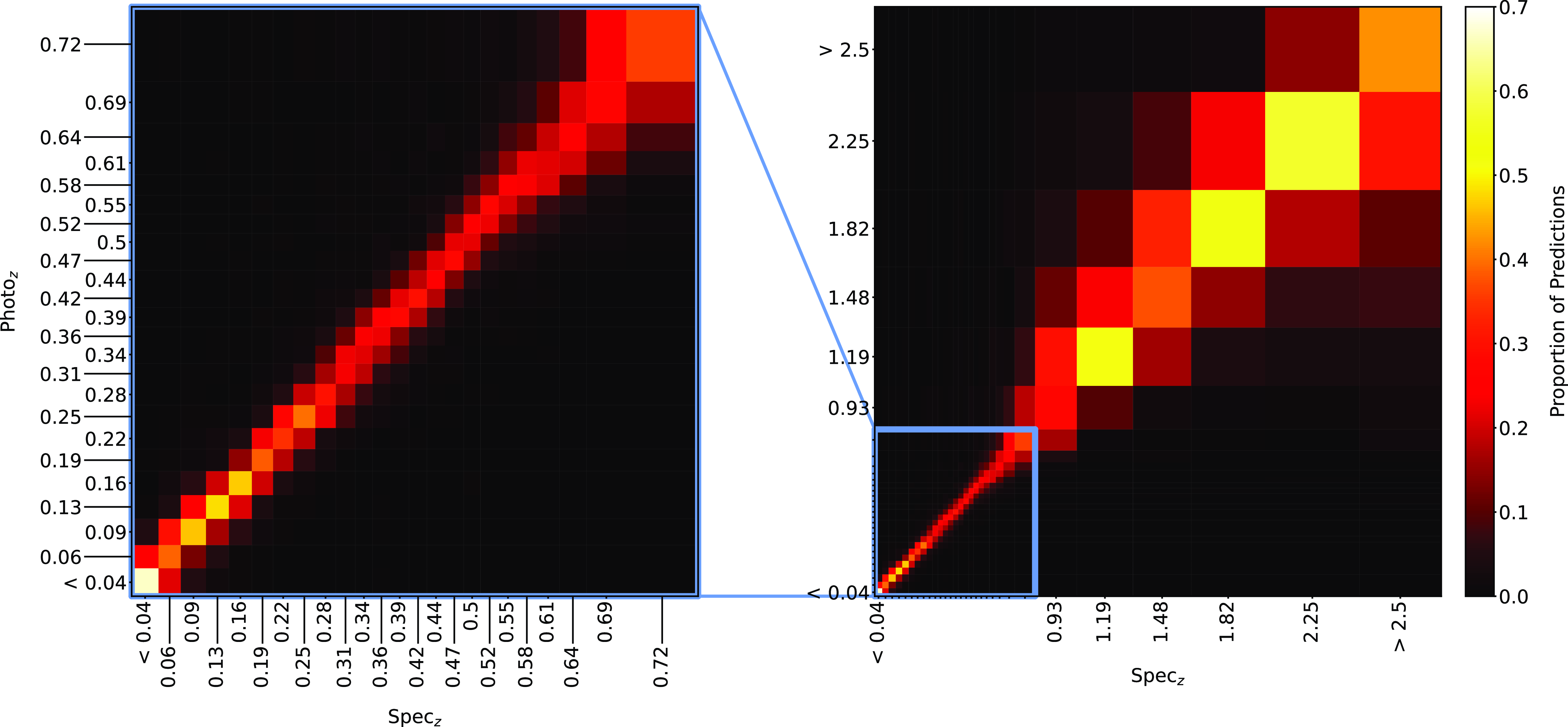
Same as Fig. 18, but for RF Classification.
Same as Fig. 18, but for ANNz Classification.
Same as Fig. 18, but for GPz Classification.

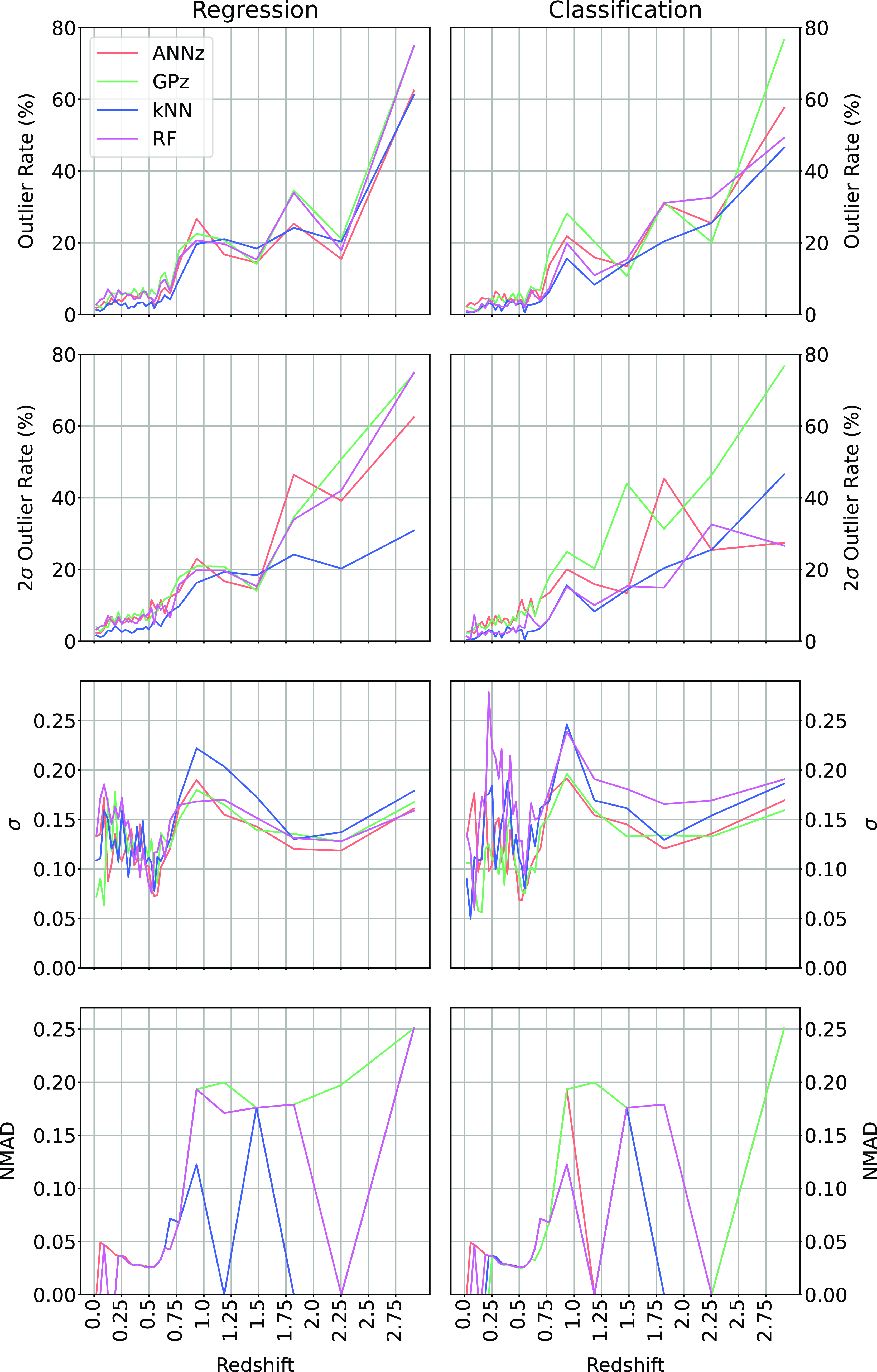
When directly comparing the the algorithms in regression and classification mode across the different redshift bins (Fig. 23; showing the $\eta_{0.15}$
and
$\eta_{0.15}$
and $\eta_{2\sigma}$
outlier rates, the
$\eta_{2\sigma}$
outlier rates, the $\sigma$
, and NMAD as a function of redshift, comparing the Regression modes of each algorithm with the classification modes), we can see that in terms of
$\sigma$
, and NMAD as a function of redshift, comparing the Regression modes of each algorithm with the classification modes), we can see that in terms of $\eta_{0.15}$
outlier rate, the kNN, RF, and ANNz algorithms significantly improve for the highest bin (mostly going from 60–80% to 40–60% outlier rates). The average accuracy (both in terms of
$\eta_{0.15}$
outlier rate, the kNN, RF, and ANNz algorithms significantly improve for the highest bin (mostly going from 60–80% to 40–60% outlier rates). The average accuracy (both in terms of $\sigma$
and NMAD) is comparable between regression and classification modes,
$\sigma$
and NMAD) is comparable between regression and classification modes,
5. Discussion
We have found that all ML algorithms suffer from similar issues when estimating the redshift, regardless of the training data, or algorithm used: the redshifts of low-redshift sources are over-estimated (i.e. they are predicted to have a higher redshift than their measured redshift), and those of high-redshift sources are under-estimated (i.e. they are predicted to be at a lower redshift than their measured redshift suggests).
In this work, we investigate the combination of heterogeneous datasets (with the impact shown in Appendix A), creating a training set with a higher median redshift in order to better sample the high-redshift space, and provide more acceptable redshift estimates to a higher redshift. We combine radio catalogues from the northern hemisphere with SDSS optical photometry and spectroscopic redshifts, with radio catalogues from the southern hemisphere with DES optical photometry and spectroscopic redshifts from the OzDES survey, with the DES photometry mapped to the SDSS photometry using a third-order polynomial. We compare simple ML algorithms in the kNN (when using the more complex Mahalanobis distance metric, instead of the standard Euclidean distance metric) and RF algorithms, with the much more complex ANNz and GPz (with GPz models trained on smaller subsets, modelled using a GMM)—a NN based approach and GP based approach respectively.
We find that the kNN algorithm provides the lowest $\eta_{0.15}$
outlier rates across both the Regression and Classification modes, with outlier rates of
$\eta_{0.15}$
outlier rates across both the Regression and Classification modes, with outlier rates of $7.26\% \pm 0.02$
and
$7.26\% \pm 0.02$
and $6.21\% \pm 0.017,$
respectively, providing acceptable redshift estimates of
$6.21\% \pm 0.017,$
respectively, providing acceptable redshift estimates of $\sim$
93% of radio sources with complete photometry, up to a redshift of
$\sim$
93% of radio sources with complete photometry, up to a redshift of $z\sim3$
.
$z\sim3$
.
Comparison of the different algorithms in their regression and classification modes. In all cases, the lower the value the better, with the lowest value for each metric shown with a horizontal dotted line.
5.1. Rigidity of
$\eta_{0.15}$
outlier rate for classification

The $\eta_{0.15}$
outlier rate is designed to be more accepting of errors as the source’s redshift increases. By binning the data into 30 bins with equal numbers of sources, the classification tests break this acceptance as the predicted values of the higher redshift bins become significantly more spread than at low-redshift, to the point where sources are predicted as being outliers if the source is not classified into the exactly correct bin. There are multiple options to extend the flexibility of the
$\eta_{0.15}$
outlier rate is designed to be more accepting of errors as the source’s redshift increases. By binning the data into 30 bins with equal numbers of sources, the classification tests break this acceptance as the predicted values of the higher redshift bins become significantly more spread than at low-redshift, to the point where sources are predicted as being outliers if the source is not classified into the exactly correct bin. There are multiple options to extend the flexibility of the $\eta_{0.15}$
outlier rate to this training regime, however, all have flaws. One method would be to adjust the outlier rate so that instead of determining catastrophic outliers based on a numeric value (i.e. 0.15 scaling with redshift), it allows a fixed number of predicted bins above and below the actual redshift bin of the source (i.e. a source can be predicted in the exactly correct bin,
$\eta_{0.15}$
outlier rate to this training regime, however, all have flaws. One method would be to adjust the outlier rate so that instead of determining catastrophic outliers based on a numeric value (i.e. 0.15 scaling with redshift), it allows a fixed number of predicted bins above and below the actual redshift bin of the source (i.e. a source can be predicted in the exactly correct bin, $\pm$
some number of bins, and still be considered an acceptable prediction). However, this would mean significant ‘fiddling’ with the bin distribution to ensure that the original intention of the
$\pm$
some number of bins, and still be considered an acceptable prediction). However, this would mean significant ‘fiddling’ with the bin distribution to ensure that the original intention of the $\eta_{0.15}$
outlier rate is maintained (that, a source be incorrect by up to 0.15—scaling with redshift—before it is considered a ‘catastrophic failure’), and would defeat the initial purpose of presenting redshift estimation as a classification task—creating a uniform distribution in order to better predict sources at higher redshift ranges that are under-represented in all training datasets. Another option would be to drop the
$\eta_{0.15}$
outlier rate is maintained (that, a source be incorrect by up to 0.15—scaling with redshift—before it is considered a ‘catastrophic failure’), and would defeat the initial purpose of presenting redshift estimation as a classification task—creating a uniform distribution in order to better predict sources at higher redshift ranges that are under-represented in all training datasets. Another option would be to drop the $\eta_{0.15}$
outlier rate, and label any source that is predicted within an arbitrary number of bins (2-3 perhaps) of the correct bin as an acceptable estimate. However, this would severely penalise the low-redshift end of the distribution that is dense in sources, and would not be comparable across studies, as it would be impossible to ensure the redshift bins (both in distribution, and density) were similar across different datasets. The simplest alternative is to combine the highest two redshift bins, thereby allowing sources in those top two bins to be classified as either, and not be considered a catastrophic failure.
$\eta_{0.15}$
outlier rate, and label any source that is predicted within an arbitrary number of bins (2-3 perhaps) of the correct bin as an acceptable estimate. However, this would severely penalise the low-redshift end of the distribution that is dense in sources, and would not be comparable across studies, as it would be impossible to ensure the redshift bins (both in distribution, and density) were similar across different datasets. The simplest alternative is to combine the highest two redshift bins, thereby allowing sources in those top two bins to be classified as either, and not be considered a catastrophic failure.
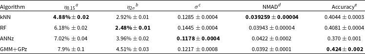
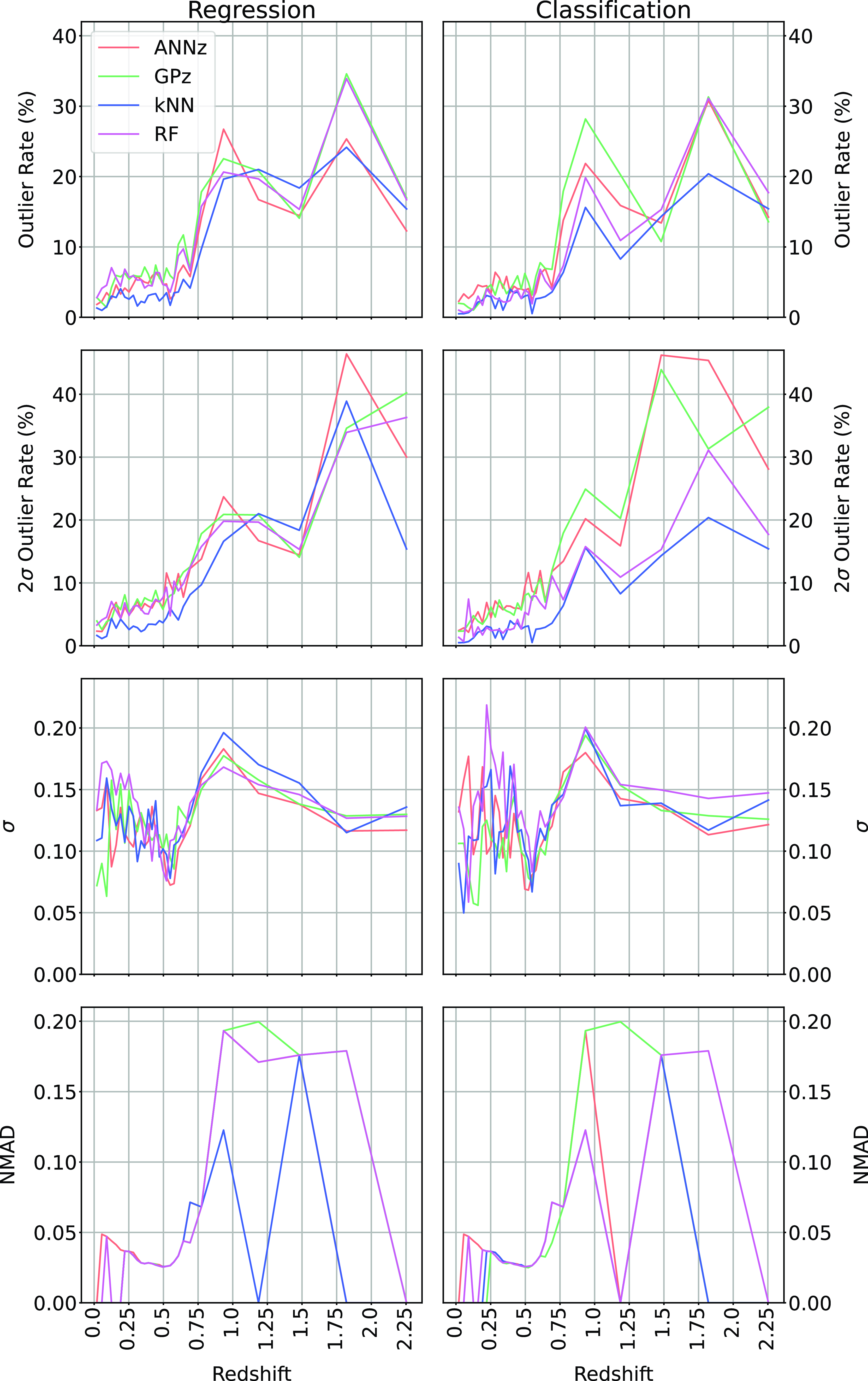
In Table 5 and Fig. 24, we present alternatives to Table 4 and Fig. 23 based on the upper two bins being combined.
The combination of redshift bins significantly decreases the $\eta_{0.15}$
outlier rate for all algorithms, with the kNN algorithm still performing best (and dropping from 6.21% to 4.88%).
$\eta_{0.15}$
outlier rate for all algorithms, with the kNN algorithm still performing best (and dropping from 6.21% to 4.88%).
5.2. Comparison with previous work
Comparison with previous works is difficult, as the selection criteria, such as source type and redshift distribution, can play a significant role in the final error metrics, with most studies aiming for the largest training samples. The motivation of finding the largest possible training set pushes studies into large scale surveys like the SDSS, with millions of sources with spectroscopic redshifts available for use. For the testing of algorithms for the use on similar surveys like the DES and Dark Energy Camera Legacy Survey (DECaLS) surveys, or the Legacy Survey of Space and Time (LSST) being conducted at the Vera Rubin Observatory, this motivation is entirely appropriate. However, this workflow cannot be directly compared with algorithms trained and tested on datasets dominated by a specific subset of sources (for example, radio selected samples, which are typically dominated by difficult-to-estimate AGNs), at a significantly higher redshift. The closest comparison would with Luken et al. (Reference Luken, Norris, Park, Wang and Filipović2022), which contains similar primary algorithms being tested (both this work and Luken et al. (Reference Luken, Norris, Park, Wang and Filipović2022) use the kNN algorithm with a Mahalanobis distance metric, and the RF algorithm, and compare both classification and regression modes), and similar photometry (both use 4 optical, and 4 infrared bands). Both studies are conducted on a radio-selected sample. However, while both are radio-selected, Luken et al. (Reference Luken, Norris, Park, Wang and Filipović2022) is restricted to the ATLAS dataset and the narrower infrared bands of the SWIRE survey, with a significantly smaller dataset and lower median redshift. The combination of the change in infrared photometry to the all-sky, wider-band AllWISE photometry, and the smaller, lower redshift training set used by Luken et al. (Reference Luken, Norris, Park, Wang and Filipović2022) leads to slightly lower $\eta_{0.15}$
outlier rates (
$\eta_{0.15}$
outlier rates ( $\sim$
6% in Luken et al. (Reference Luken, Norris, Park, Wang and Filipović2022), compared to
$\sim$
6% in Luken et al. (Reference Luken, Norris, Park, Wang and Filipović2022), compared to $\sim$
7% in this work when comparing the kNN algorithm using Regression). However, due to the size and redshift distribution of the dataset compiled in this work, models trained are able to estimate the redshift of radio sources to a significantly higher redshift (
$\sim$
7% in this work when comparing the kNN algorithm using Regression). However, due to the size and redshift distribution of the dataset compiled in this work, models trained are able to estimate the redshift of radio sources to a significantly higher redshift ( $z < 3$
, compared with
$z < 3$
, compared with $z < 1$
).
$z < 1$
).
5.3. Algorithm comparison
The best performing algorithm (in terms of $\eta_{0.15}$
outlier rate) is the kNN algorithm, despite the kNN algorithm being significantly less complex than all other approaches tested, with all other methods algorithms combining the results of many models (RF combining many Decision Trees, the ANNz algorithm combining 100 different, randomly initialised tree and NN based models, and GPz including a pre-processing step using the GMM algorithm). This may be due to the difference in the way the different algorithms are trained. While the RF, ANNz and GPz algorithms are all methods training some kind of model to best represent the training set, the kNN algorithm treats the data itself as the model, and is not trying to learn a representation. This subtle difference means that in cases where the test data is well-represented by the training data, and the number of features is small, the kNN algorithm may out-perform more complex algorithms. The kNN algorithm also has the added advantage that it does not need to try and account for the ‘noise’ within astronomical data—as long as the same types of noise present in the test data is also present in the training data, the kNN algorithm does not need to handle it in any particular manner.
$\eta_{0.15}$
outlier rate) is the kNN algorithm, despite the kNN algorithm being significantly less complex than all other approaches tested, with all other methods algorithms combining the results of many models (RF combining many Decision Trees, the ANNz algorithm combining 100 different, randomly initialised tree and NN based models, and GPz including a pre-processing step using the GMM algorithm). This may be due to the difference in the way the different algorithms are trained. While the RF, ANNz and GPz algorithms are all methods training some kind of model to best represent the training set, the kNN algorithm treats the data itself as the model, and is not trying to learn a representation. This subtle difference means that in cases where the test data is well-represented by the training data, and the number of features is small, the kNN algorithm may out-perform more complex algorithms. The kNN algorithm also has the added advantage that it does not need to try and account for the ‘noise’ within astronomical data—as long as the same types of noise present in the test data is also present in the training data, the kNN algorithm does not need to handle it in any particular manner.
However, the kNN algorithm has two major drawbacks. First, the kNN algorithm is making the assumption that the test data follows all the same distributions as the training data. There is no way for the kNN algorithm to extrapolate beyond its training set, whereas more complicated algorithms like GPz are—to a small degree—able to extend beyond the training sample. This means the kNN algorithm is entirely unsuitable when the test set is not drawn from the same distributions as the training set.
Classification results table comparing the different algorithms across the different error metrics (listed in the table footnotes). The best values for each error metric are highlighted in bold. Results following the combination of the highest two redshift bins discussed in Section 5.1.

Comparing Regression with Classification over all methods, and all metrics.
Comparing Regression with Classification over all methods, and all metrics. In this case, the highest redshift bin is combined with the second highest. Results following the combination of the highest two redshift bins discussed in Section 5.1.
Second, like many ML algorithms, there is no simple way to provide errors for estimates made by the kNN algorithm in regression mode (the classification mode is able to produce a probability density function across the classification bins chosen). The ANNz algorithm is able to use the scatter in its ML models predictions as a proxy for the error, and the GPz algorithm is based on the GP algorithm, which inherently provides a probability density function—a significant benefit for some science cases.
The tension between best $\eta_{0.15}$
outlier rate, and ability to quantify errors is not trivial and is best left to the individual science case as to which algorithm is best suited to the chosen purpose.
$\eta_{0.15}$
outlier rate, and ability to quantify errors is not trivial and is best left to the individual science case as to which algorithm is best suited to the chosen purpose.
Finally, it is worth reiterating the differing error metrics being optimised between the different algorithms. The ANNz and GPz algorithms are both optimising error metrics favoured by their developers for their particular science needs. In this case, the different error metrics being optimised (like the $\sigma$
) do not match the science needs of the EMU project, with the
$\sigma$
) do not match the science needs of the EMU project, with the $\eta_{0.15}$
outlier rate preferred. The effect of this means that we are comparing an error metric that is optimised in some algorithms (the kNN and RF algorithms), but not in others (the ANNz and GPz algorithms). This presents an inherent disadvantage to the ANNz and GPz algorithms, and and may contribute to their lower performance.
$\eta_{0.15}$
outlier rate preferred. The effect of this means that we are comparing an error metric that is optimised in some algorithms (the kNN and RF algorithms), but not in others (the ANNz and GPz algorithms). This presents an inherent disadvantage to the ANNz and GPz algorithms, and and may contribute to their lower performance.
5.4. Estimating confidence intervals
Both the ANNz and GPz algorithms explicitly estimate the uncertainty of any prediction made. GPz estimates uncertainties directly as a by-product of the Gaussian fitting in GPz. ANNz estimates its uncertainties as an additional step, where the 100 most similar galaxies from the training set to the test source are found using the kNN algorithm, biases for each estimated redshift calculated, and the $68\mathrm{th}$
percentile taken as the uncertainty of the galaxy (Oyaizu et al. Reference Oyaizu2008; Sadeh et al. Reference Sadeh, Abdalla and Lahav2016).
$68\mathrm{th}$
percentile taken as the uncertainty of the galaxy (Oyaizu et al. Reference Oyaizu2008; Sadeh et al. Reference Sadeh, Abdalla and Lahav2016).
Outlier rates of each error metric using their regression modes, showing the original outlier rate, the outlier rate of the subset of sources deemed ‘certain’, and the outlier rate of the remaining sources.
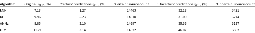
The RF algorithm is next simplest to identify uncertain estimates. Following Wager et al. (Reference Wager, Hastie and Efron2014),Footnote g confidence intervals for RF models can be estimated using the Jackknife method.
Finally, the kNN algorithm does not have a natural way of estimating the uncertainty of predictions. Similar to the method described in Oyaizu et al. (Reference Oyaizu2008) though, we can get an understanding of which estimates are likely to be uncertain by examining the similar galaxies. We can follow the below workflow to estimate the uncertainty of our predictions, noting that they are unlikely to be realistic uncertainties for the estimate, and more an estimate of how uncertain the “model” is of the prediction, given the data:
For every source in the test set:
-
1. Identify the
$k_n$
sources used in the estimation of the redshift. -
2. Use the same model to estimate the redshift of the above
$k_n$
sources. -
3. Calculate the variance of the
$k_n$
sources redshift estimates and take the variance as the uncertainty for the prediction.


We emphasise that this uncertainty is not an estimate of how well the redshift prediction of the test source fits the photometry—it is purely an estimate of how varied the sources were that were used to make the initial estimate, with the implicit understanding being that the more varied the sources used to predict the redshift, the less likely the estimate is to be accurate. Additionally, there are no photometric uncertainties involved, so the uncertainty provided is further unlikely to be scientifically meaningful, beyond helping to identify potentially unreliable estimates.
5.4.1. Removing uncertain predictions
Certainty thresholds for defining acceptable estimates are not, to the best of our knowledge, typically published. Duncan (Reference Duncan2022) suggests Equation (15):
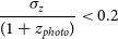 \begin{equation} \frac{\sigma_z}{(1 + z_{photo})} < 0.2\end{equation}
where $\sigma_z$
is the uncertainty estimate from the GPz model, and
$\sigma_z$
is the uncertainty estimate from the GPz model, and $z_{photo}$
is the photometric redshift estimated from the same model. Unfortunately, given the different quantities the different uncertainties are designed to capture, Equation (15) can only be used for the estimates measured using the GPz algorithm.
$z_{photo}$
is the photometric redshift estimated from the same model. Unfortunately, given the different quantities the different uncertainties are designed to capture, Equation (15) can only be used for the estimates measured using the GPz algorithm.
For other algorithms we aim to find a (where possible) statistically sound method of removing the most uncertain estimates, while maintaining approximately the same number of ‘certain’ sources in order to compare outlier rates with the certain GPz estimates.
For the kNN algorithm and uncertainties (defined in Section 5.4), we can define Equation (16):
 \begin{equation} \frac{\sigma_z}{(1 + z_{photo})} < \frac{\sum_i \left(\sigma_{zi} - \bar{\sigma_z}\right)^2}{n-1}\end{equation}
where $\bar{\sigma_z}$
is the average uncertainty.
$\bar{\sigma_z}$
is the average uncertainty.
No statistical method of determining a cutoff for the ANNz and RF produced similar source counts as the GPz algorithm, and hence for this work we choose the following values (Equations (17) and (18) respectively) in order to produce comparable outlier rates:
 \begin{equation} \frac{\sigma_z}{\left(1 + z_{photo}\right)} < 0.1\end{equation}
 \begin{equation} \sigma_z < 2.302\end{equation}
Once these outliers are removed, the residual outlier rates for all methods drop significantly. We show the original outlier rates, the outlier rates of the ‘certain’ predictions, and the outlier rates of the ‘uncertain’ predictions shown in Table 6 for all algorithms. Prediction plots similar to Fig. 14 for each subset and algorithm can be found in Figs. B.1–B.4 in Appendix B.
As demonstrated, the removal of predictions with high uncertainty greatly improves the outlier rates of all algorithms, with the kNN algorithm still performing best, the ANNz and GPz algorithms performing equally well, and the RF algorithm performing worst. We do note, however, that the formal definition of uncertain sources by Duncan (Reference Duncan2022) is combined with very well-defined uncertainties to make GPz estimates more robust and reliable, particularly when spectroscopic redshifts are not available in test fields of sufficient depth and quantity to help quantify reliability.
5.5. Effects of differing radio survey depths
Radio sources are typically more difficult to estimate the redshift of using ML than optically selected sources, as they tend to contain rarer sub-types of galaxies, and hence constructing a representative training sample is problematic. While all of the samples in our training set have been radio-selected, the depth of the radio survey used can play a part in what sub-types of galaxies are represented in the radio sample. As shown by Smolčić et al. (Reference Smolčić2017, Fig. 13; upper right panel) at $\sim$
110
$\sim$
110 $\unicode{x03BC}$
Jy, radio samples stop being dominated by AGN, and begin being dominated by Star Forming Galaxys (SFGs), and hence would require additional SFG samples in the training sample in order to best estimate these sources. While the majority (
$\unicode{x03BC}$
Jy, radio samples stop being dominated by AGN, and begin being dominated by Star Forming Galaxys (SFGs), and hence would require additional SFG samples in the training sample in order to best estimate these sources. While the majority ( $\sim$
90%) of sources used in our training sample come from the RGZ catalogues (drawn from the VLA FIRST survey) which have a sensitivity of
$\sim$
90%) of sources used in our training sample come from the RGZ catalogues (drawn from the VLA FIRST survey) which have a sensitivity of $\sim$
150
$\sim$
150 $\unicode{x03BC}$
Jy, we include sources from the Stripe 82 region (Hodge et al. Reference Hodge, Becker, White, Richards and Zeimann2011; RMS: 52
$\unicode{x03BC}$
Jy, we include sources from the Stripe 82 region (Hodge et al. Reference Hodge, Becker, White, Richards and Zeimann2011; RMS: 52 $\unicode{x03BC}$
Jy, and Prescott et al. Reference Prescott2018; RMS: 82
$\unicode{x03BC}$
Jy, and Prescott et al. Reference Prescott2018; RMS: 82 $\unicode{x03BC}$
Jy), and the ATLAS surveys (Franzen et al. Reference Franzen2015; RMS: 14
$\unicode{x03BC}$
Jy), and the ATLAS surveys (Franzen et al. Reference Franzen2015; RMS: 14 $\unicode{x03BC}$
Jy). These additional sources provide some coverage of the radio-faint parameter space, however, we acknowledge that the comparatively small number is inadequate to completely model the space.
$\unicode{x03BC}$
Jy). These additional sources provide some coverage of the radio-faint parameter space, however, we acknowledge that the comparatively small number is inadequate to completely model the space.
Future work will include more radio selected data from deep fields like COSMOS, and the LOFAR Deep Fields.
6. Conclusion
Machine Learning attempts for estimating the redshift of radio selected galaxies have significant benefits over traditional template fitting methods—they do not require specifically developed templates, nor do they require the disentanglement of the black hole emission from the galaxy emission. However, the major downside is the requirement for a representative training sample—a significant difficulty given the requirement for spectroscopic redshift measurements, and the typically significantly higher median redshift of radio surveys, when compared with optical surveys.
By combining radio-selected data from the northern and southern hemisphere, we have created a larger sample of radio galaxies for training ML algorithms. Once the DES optical data was homogenised with the SDSS optical photometry, current leading ML algorithms were tested. We show that the kNN algorithm—in both regression and classification tests—provides the lowest $\eta_{0.15}$
outlier rate, estimating
$\eta_{0.15}$
outlier rate, estimating $\sim$
92% of radio-selected sources within an acceptable limit. The depth in redshift distribution of the assembled training set allows us to estimate the redshift of sources up to
$\sim$
92% of radio-selected sources within an acceptable limit. The depth in redshift distribution of the assembled training set allows us to estimate the redshift of sources up to $z = 3$
before the results are dominated by random, under-estimated scatter.
$z = 3$
before the results are dominated by random, under-estimated scatter.
We show that we can use the classification modes of the tested ML methods to identify $\sim$
76% of sources at the highest two redshift bins (
$\sim$
76% of sources at the highest two redshift bins ( $z = 2.25$
and
$z = 2.25$
and $z > 2.51$
), providing a way of first identifying the highest redshift sources, before using the regression modes of the provided algorithms to estimate the redshift of the remaining sources more effectively.
$z > 2.51$
), providing a way of first identifying the highest redshift sources, before using the regression modes of the provided algorithms to estimate the redshift of the remaining sources more effectively.
In this work, we show that the kNN algorithm using the Mahalanobis distance metric performs best (i.e. minimises outlier rate) for the estimation of the redshift of radio galaxies.
Acknowledgements
We thank the anonymous referee for their time and thoughtful comments, as well as their prompt response in helping to improve the manuscript.
We also thank Sarah White for her helpful comments.
The Australia Telescope Compact Array is part of the Australia Telescope National Facility which is funded by the Australian Government for operation as a National Facility managed by CSIRO. We acknowledge the Gomeroi people as the traditional owners of the Observatory site.
This scientific work uses data obtained from Inyarrimanha Ilgari Bundara/the Murchison Radio-astronomy Observatory. We acknowledge the Wajarri Yamaji People as the Traditional Owners and native title holders of the Observatory site. CSIRO’s ASKAP radio telescope is part of the Australia Telescope National Facility (https://ror.org/05qajvd42). Operation of ASKAP is funded by the Australian Government with support from the National Collaborative Research Infrastructure Strategy. ASKAP uses the resources of the Pawsey Supercomputing Research Centre. Establishment of ASKAP, Inyarrimanha Ilgari Bundara, the CSIRO Murchison Radio-astronomy Observatory, and the Pawsey Supercomputing Research Centre are initiatives of the Australian Government, with support from the Government of Western Australia and the Science and Industry Endowment Fund.
Based in part on data acquired at the Anglo-Australian Telescope. We acknowledge the traditional owners of the land on which the AAT stands, the Gamilaroi people, and pay our respects to elders past and present.
This project used public archival data from the Dark Energy Survey (DES). Funding for the DES Projects has been provided by the U.S. Department of Energy, the U.S. National Science Foundation, the Ministry of Science and Education of Spain, the Science and Technology FacilitiesCouncil of the United Kingdom, the Higher Education Funding Council for England, the National Center for Supercomputing Applications at the University of Illinois at Urbana-Champaign, the Kavli Institute of Cosmological Physics at the University of Chicago, the Center for Cosmology and Astro-Particle Physics at the Ohio State University, the Mitchell Institute for Fundamental Physics and Astronomy at Texas A&M University, Financiadora de Estudos e Projetos, Fundação Carlos Chagas Filho de Amparo à Pesquisa do Estado do Rio de Janeiro, Conselho Nacional de Desenvolvimento Científico e Tecnológico and the Ministério da Ciência, Tecnologia e Inovação, the Deutsche Forschungsgemeinschaft, and the Collaborating Institutions in the Dark Energy Survey.
The Collaborating Institutions are Argonne National Laboratory, the University of California at Santa Cruz, the University of Cambridge, Centro de Investigaciones Energéticas, Medioambientales y Tecnológicas-Madrid, the University of Chicago, University College London, the DES-Brazil Consortium, the University of Edinburgh, the Eidgenössische Technische Hochschule (ETH) Zürich, Fermi National Accelerator Laboratory, the University of Illinois at Urbana-Champaign, the Institut de Ciències de l’Espai (IEEC/CSIC), the Institut de Física d’Altes Energies, Lawrence Berkeley National Laboratory, the Ludwig-Maximilians Universität München and the associated Excellence Cluster Universe, the University of Michigan, the National Optical Astronomy Observatory, the University of Nottingham, The Ohio State University, the OzDES Membership Consortium, the University of Pennsylvania, the University of Portsmouth, SLAC National Accelerator Laboratory, Stanford University, the University of Sussex, and Texas A&M University.
Based in part on observations at Cerro Tololo Inter-American Observatory, National Optical Astronomy Observatory, which is operated by the Association of Universities for Research in Astronomy (AURA) under a cooperative agreement with the National Science Foundation.
This work was performed on the OzSTAR national facility at Swinburne University of Technology. The OzSTAR program receives funding in part from the Astronomy National Collaborative Research Infrastructure Strategy (NCRIS) allocation provided by the Australian Government.
This publication has been made possible by the participation of more than 12000 volunteers in the Radio Galaxy Zoo project. Their contributions are individually acknowledged at http://rgzauthors.galaxyzoo.org
Funding for the Sloan Digital Sky Survey IV has been provided by the Alfred P. Sloan Foundation, the U.S. Department of Energy Office of Science, and the Participating Institutions.
SDSS-IV acknowledges support and resources from the Center for High Performance Computing at the University of Utah. The SDSS website is www.sdss.org.
SDSS-IV is managed by the Astrophysical Research Consortium for the Participating Institutions of the SDSS Collaboration including the Brazilian Participation Group, the Carnegie Institution for Science, Carnegie Mellon University, Center for Astrophysics | Harvard & Smithsonian, the Chilean Participation Group, the French Participation Group, Instituto de Astrofísica de Canarias, The Johns Hopkins University, Kavli Institute for the Physics and Mathematics of the Universe (IPMU)/University of Tokyo, the Korean Participation Group, Lawrence Berkeley National Laboratory, Leibniz Institut für Astrophysik Potsdam (AIP), Max-Planck-Institut für Astronomie (MPIA Heidelberg), Max-Planck-Institut für Astrophysik (MPA Garching), Max-Planck-Institut für Extraterrestrische Physik (MPE), National Astronomical Observatories of China, New Mexico State University, New York University, University of Notre Dame, Observatário Nacional/MCTI, The Ohio State University, Pennsylvania State University, Shanghai Astronomical Observatory, United Kingdom Participation Group, Universidad Nacional Autónoma de México, University of Arizona, University of Colorado Boulder, University of Oxford, University of Portsmouth, University of Utah, University of Virginia, University of Washington, University of Wisconsin, Vanderbilt University, and Yale University.
Data availability
All code used within this study is available at https://github.com/kluken/PhotoZForHigh-ZRadioSurveysPASA. Data are described and are available at Luken et al. (Reference Luken2023).
Appendix
A. Data Homogenisation
Training on SDSS, Testing on DES, with the same axes and notation as Fig. 14.
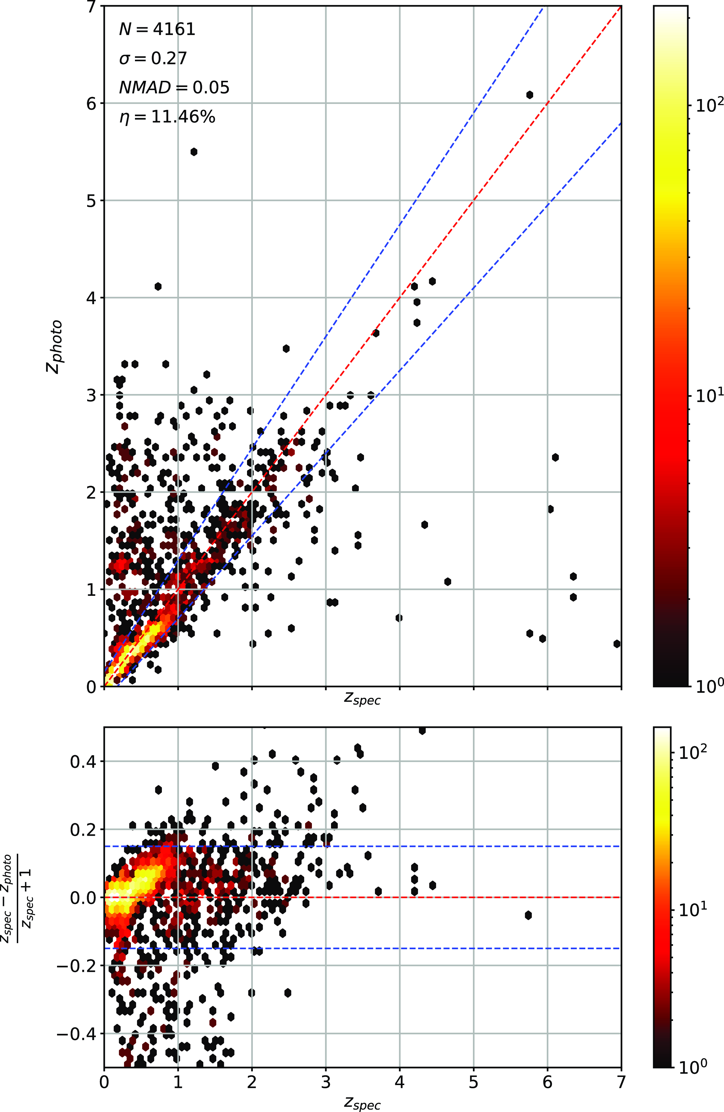
As demonstrated in Fig. 11, the difference in measured photometry can be significant between the Dark Energy Survey (DES) and Sloan Digital Sky Survey (SDSS) catalogues. In order to quantify how much of an impact this difference in photometry has, we present the following results using the k-Nearest Neighbours (kNN) algorithm. Appendix A.1 and subsections show the effect of the data homogenisation discussed in Section 2.2 when training on SDSS photometry and testing on DES photometry. Appendix A.2 and subsections show the effect of the data homogenisation when training on DES photometry and testing on SDSS photometry. Finally, Appendix A.3 directly compares these results.
Training on SDSS, Testing on DES—Corrected,, with the same axes and notation as Fig. 14.
A.1. Training on SDSS Photometry, Testing on DES Photometry
This section is divided into two components—Appendix A.1.1 and Appendix A.1.2. In these subsections, we demonstrate the results of using uncorrected and corrected photometry in regression and classification tests.
A.1.1. Regression
Figs. A.1. and A.2 are of the same style as Fig. 14. Fig. A.1 is the result of training on SDSS photometry and testing on DES photometry. Fig. A.2 is the result of training on SDSS photometry and testing on corrected DES photometry.
A.1.2. Classification
Figs. A.3a and A.3b are of the same style as Fig. 18. Fig. A.3a is the result of training on SDSS photometry,and testing on DES photometry. Fig. A.3b is the result of training on SDSS photometry and testing on corrected DES photometry.
Comparison between predictions using the kNN algorithm, trained on one subset of data (either the northern SDSS photometry or the southern DES photometry) and tested on the other.
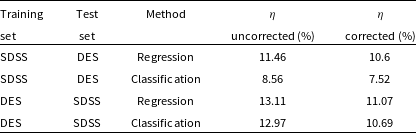
A.2. Training on DES Photometry, Testing on SDSS Photometry
This section is divided into two components—Appendix A.2.1 and Appendix A.2.2. In these subsections, we demonstrate the results of using uncorrected and corrected photometry in regression and classification tests.
A.2.1. Regression
Figs. A.4. and A.5 are of the same style as Fig. 14. Fig. A.4 is the result of training on SDSS photometry and testing on DES photometry. Fig. A.5 is the result of training on SDSS photometry and testing on corrected DES photometry.
A.2.2. Classification
Figs. A.6a and A.6b are of the same style as Fig. 18. Fig. A.6a is the result of training on SDSS photometry and testing on DES photometry. Fig. A.6b is the result of training on SDSS photometry and testing on corrected DES photometry.
A.3. Comparison between Uncorrected and Corrected data
In all tests, homogenising the DES photometry to the SDSS improved the outlier rates. Table A.1 and Fig. A.7 demonstrate that the outlier rate improves by $\sim$
1–2
$\sim$
1–2 $\%$
for all tests.
$\%$
for all tests.
Scaled confusion matrices in similar style to Fig. 18, with the subfigures showing the effect of the photometry correction.
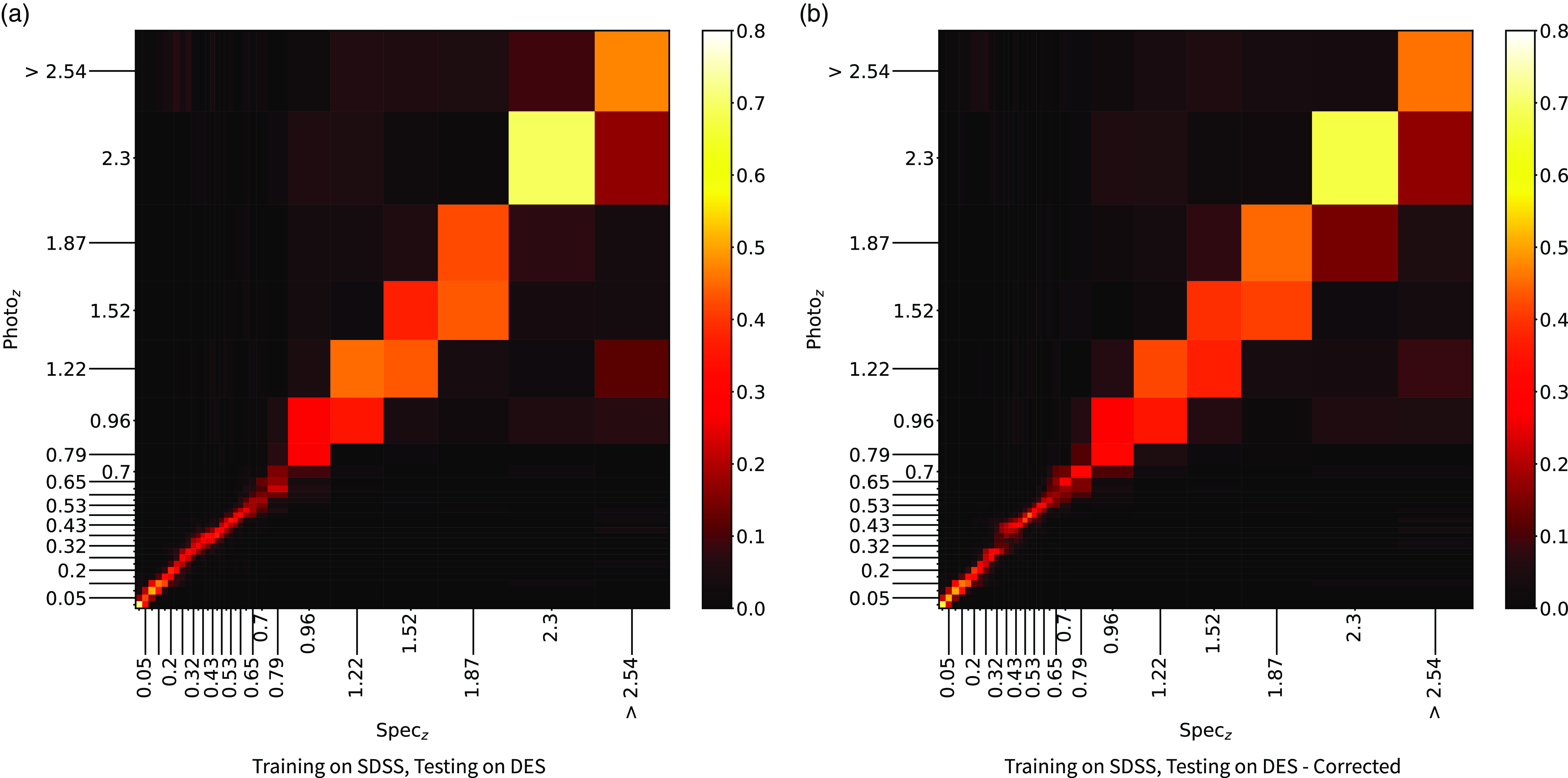
B. Comparing All, with Certain and Uncertain Predictions
Figs. B.1, B.2, B.3, and B.4 show plots similar to the top panel of Fig. 14, allowing for comparisons between all predictions, just those predictions deemed ‘certain’ by the criteria in Section 5.4.1, and those that do not meet the criteria, and are therefore deemed ‘uncertain’. Across all algorithms, much of the scatter between the predicted and measured redshift is removed from the ‘certain’ sample, with all algorithms benefiting across all error metrics. The kNN algorithm retains the lowest outlier rate. However, the majority of its ‘certain’ sources lie between $0 < z < 2.5$
, with few sources beyond
$0 < z < 2.5$
, with few sources beyond $z > 2.5$
. The ANNz and GPz algorithms perform next best in terms of outlier rate, though the GPz algorithm performs better in both
$z > 2.5$
. The ANNz and GPz algorithms perform next best in terms of outlier rate, though the GPz algorithm performs better in both $\sigma$
and Normalised Median Absolute Deviation (NMAD). The GPz algorithm removes most
$\sigma$
and Normalised Median Absolute Deviation (NMAD). The GPz algorithm removes most $z > 3$
sources, with the ANNz algorithm extending up to
$z > 3$
sources, with the ANNz algorithm extending up to $z < 4$
. The RF algorithm performs worst, with predictions capped at
$z < 4$
. The RF algorithm performs worst, with predictions capped at $ z < 3$
.
$ z < 3$
.
Training on DES, testing on SDSS.
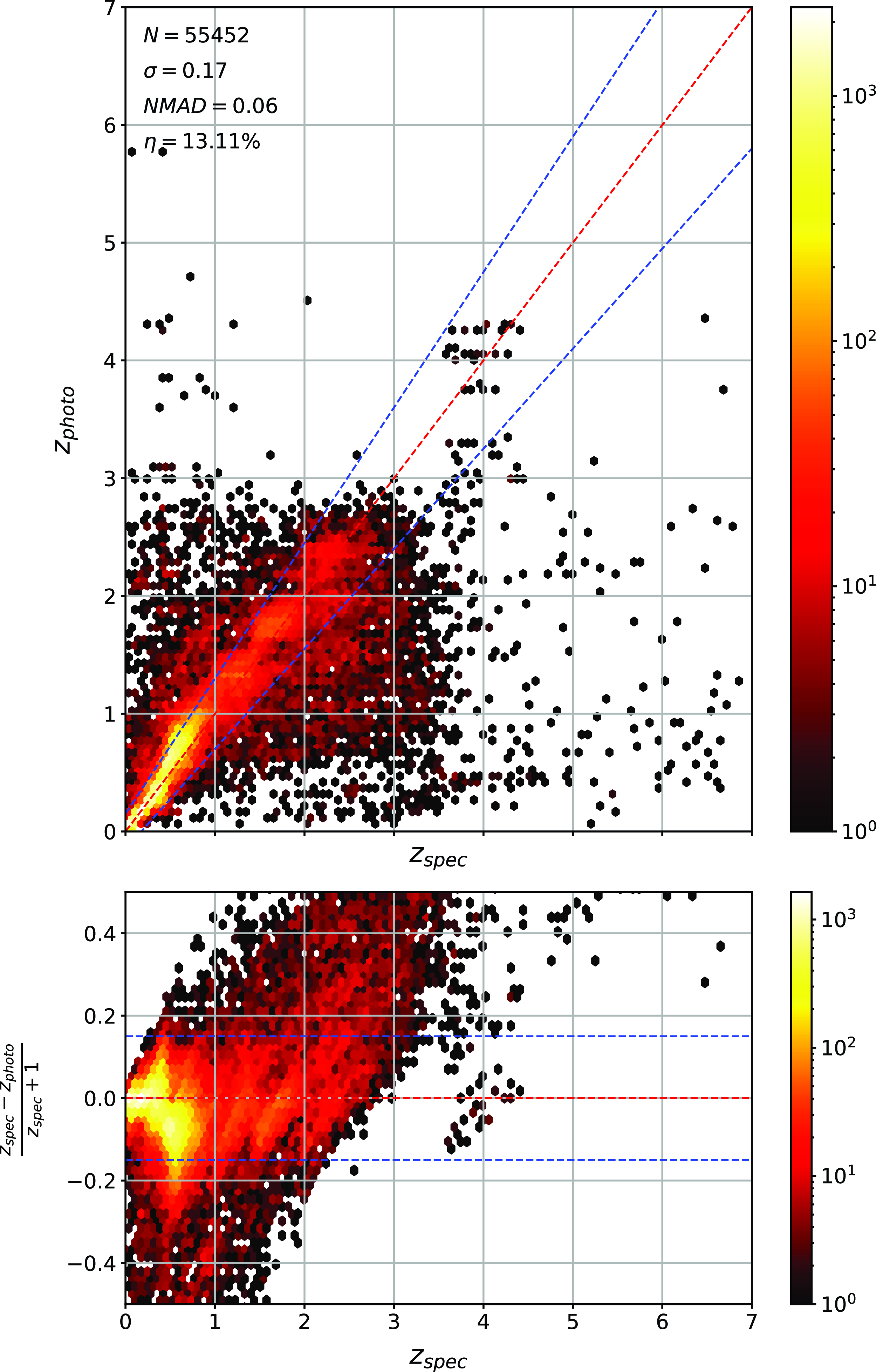
Training on DES, testing on SDSS—corrected.
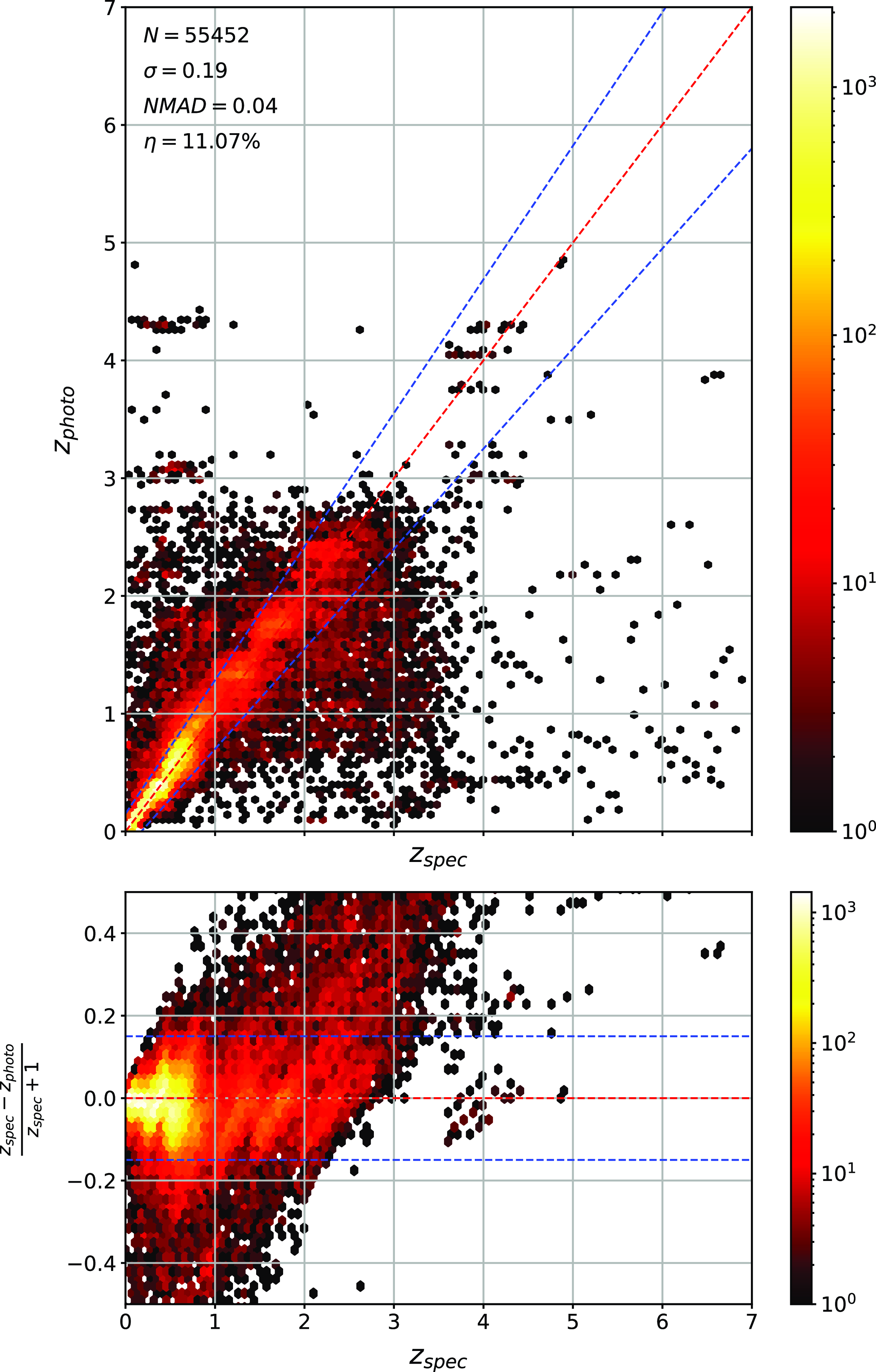
Same as Fig. A.3, showing a different training/test set combination.
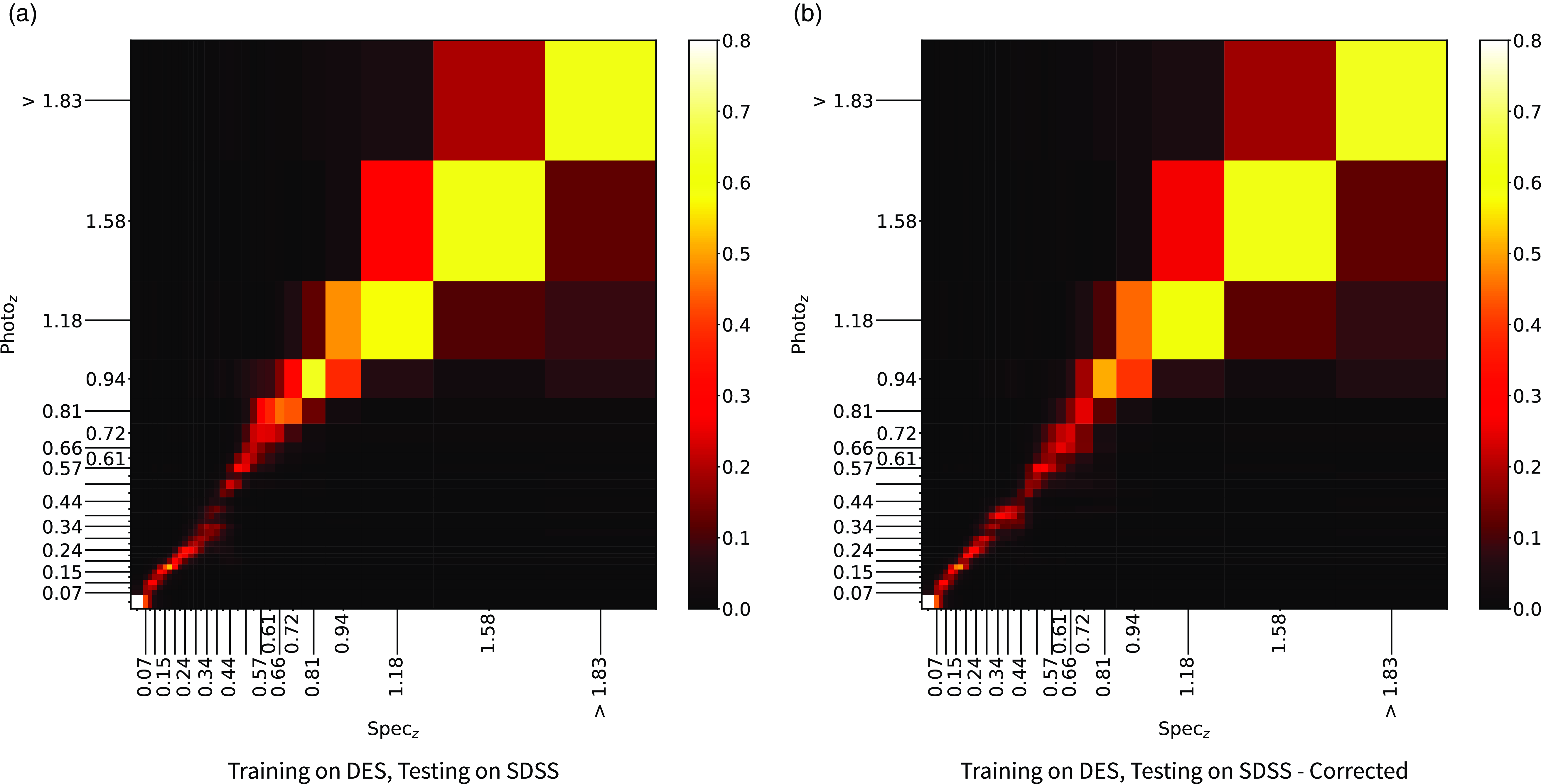
Comparison of the $\eta$
outlier rates when trained on corrected and uncorrect data.
$\eta$
outlier rates when trained on corrected and uncorrect data.
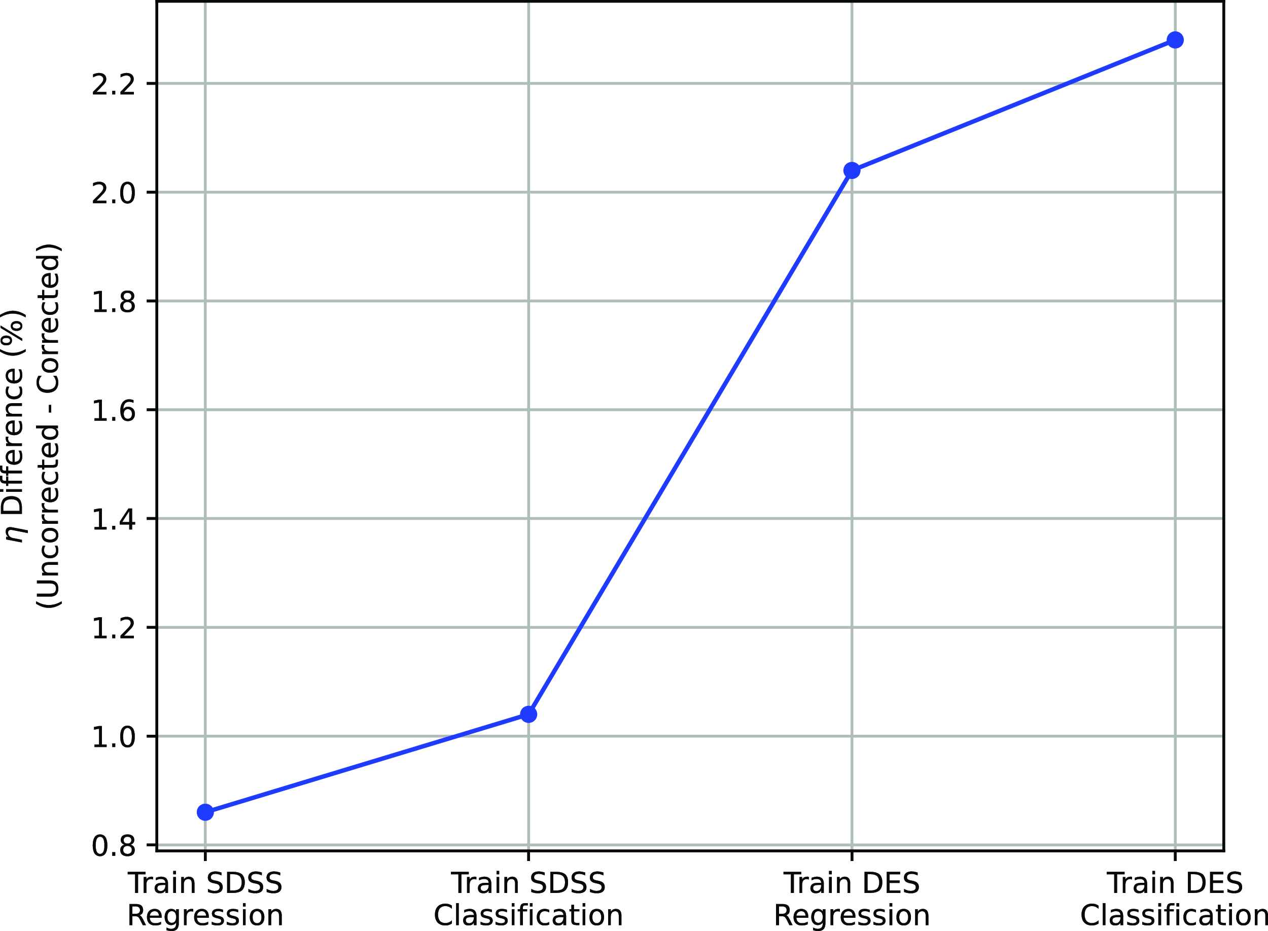
Similar to the top panel of Fig. 14, comparing all of the predictions (left), with the predictions deemed ‘certain’ (middle) and the predictions deemed ‘uncertain’ (right) using the kNN algorithm.

As with Fig. B.1, using the RF algorithm.
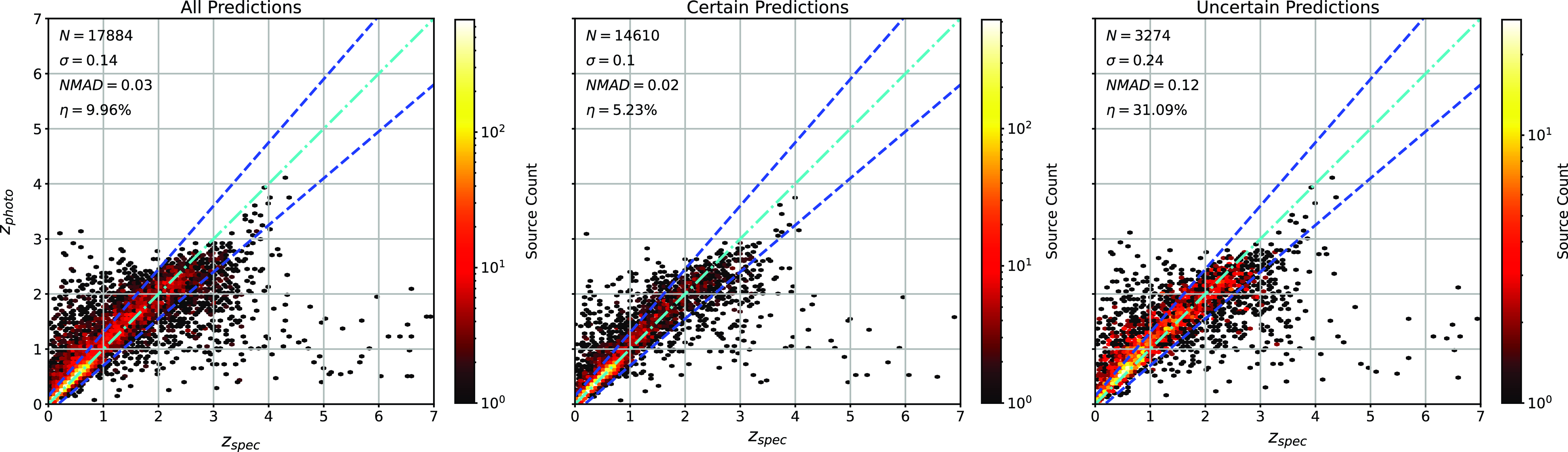
As with Fig. B.1, using the ANNz algorithm.
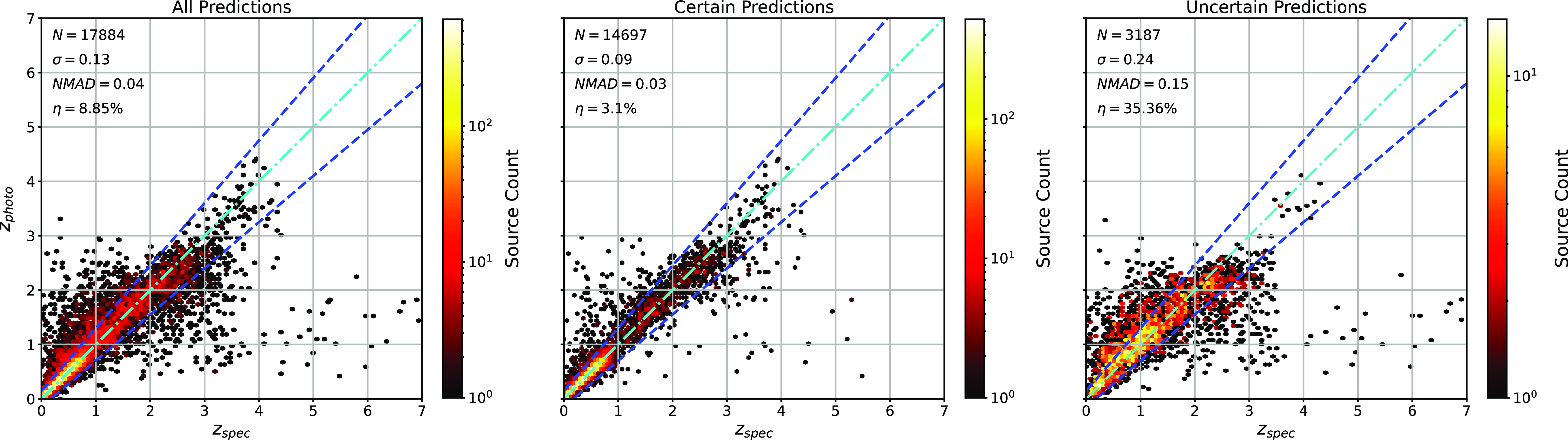
As with Fig. B.1, using the GPz algorithm.

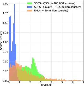
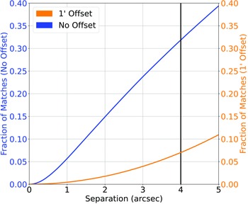

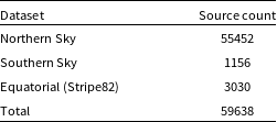
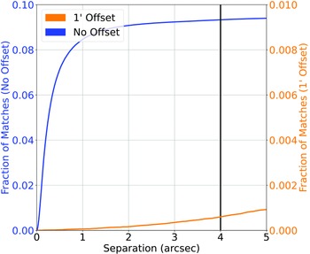
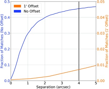

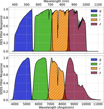
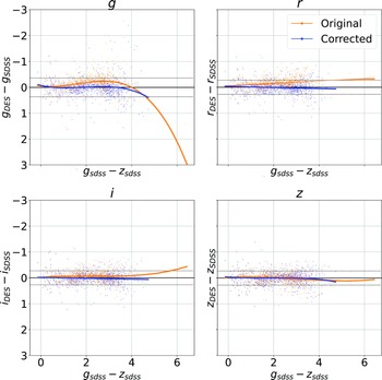


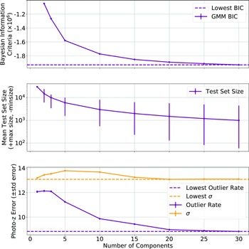
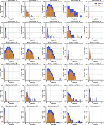


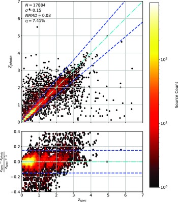


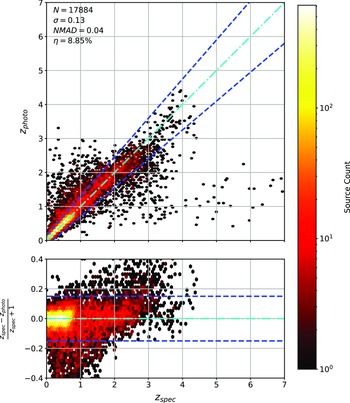
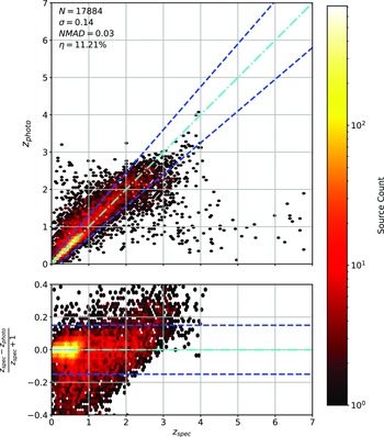
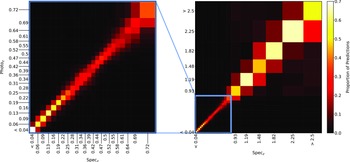
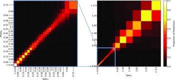
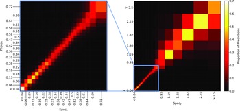

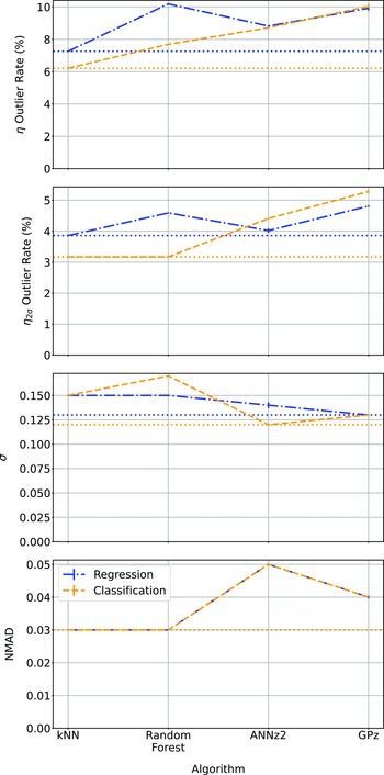

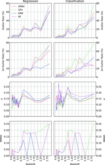
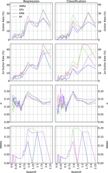


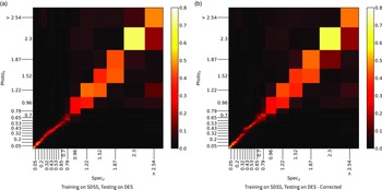
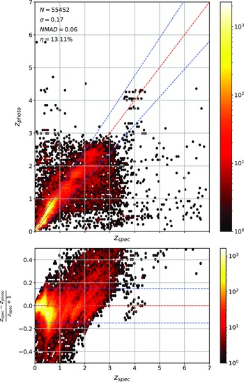


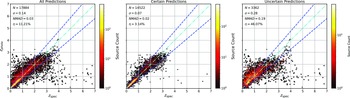

 Open access