
Psychiatrists are often asked to do presentations, of which PowerPoint slides are usually an expected component. Even more frequent is the experience of ‘death by PowerPoint’: sitting in someone else's presentation and simultaneously experiencing intense boredom and cognitive overload. This is such a common experience that Reference SchriverSchriver (1997: p. xxiii) comments that ‘poor documents are so common that deciphering bad writing and bad visual design have become part of the coping skills needed to navigate in the so-called information age’. Badly designed PowerPoint can obfuscate, distract a potential learner (Reference Craig and AmernicCraig 2006; Reference HardenHarden 2008) and add to cognitive load (Reference KjeldsenKjeldsen 2006). But all hope is not lost. The key to learning with PowerPoint seems to be in prioritising presenter/educator reflexivity over design (Reference SteinStein 2006; Reference Kinchin and CabotKinchin 2007). PowerPoint does not necessarily discourage active learning, and can, if used creatively, set up the ‘perfect storm’ for cognitive engagement (Reference WearWear 2009).
PowerPoint presentations can generate heated debate, with different styles of presentation having passionate adherents. These adherents often fall into two broad camps: the ‘just the facts’ group and the design-oriented group. The former group believe that PowerPoint should be judged on its ability to communicate facts. At the extreme end of this spectrum is Edwin Tufte, a notable critic of PowerPoint who has written eloquently on the ‘cognitive fascism’ of PowerPoint – its tendency to reduce its users' powers of critical thinking to a mind-numbing parade of bullet points. (His book is worth reading if only for his polemic on the role of PowerPoint in the Challenger space shuttle disaster.) This group is deeply suspicious of PowerPoint's genesis in a business environment as a marketing tool or an instrument for making sales pitches. They may question its relevance in an educational environment or be critical of the tendency to encourage poorly thought out and irrelevant graphics over hard content. Much of the empirical research on PowerPoint has come from people in this group.
The design-oriented group is exemplifed by Reference ReynoldsReynolds (2010) and Reference DuarteDuarte (2008). Their books and websites emphasise the role of PowerPoint slides as supporting material in a presentation, where the presenter and their relationship with the audience is key. This group differs from the ‘just the facts’ group by identifying engagement and affect as key components of a presentation, and emphasise the use of well-designed graphics to serve this function. The design-oriented group have less research evidence for their arguments, though the principles they espouse are based on a degree of expert consensus from established practice in the graphic design field.
We suggest that neither group has the monopoly. Presentations serve a variety of functions, traditionally divided into appeals to reason, appeals to emotion and appeals to character (Aristotle 2005). We suspect most doctors tend towards the ‘just the facts’ group, neglecting appeals to emotion because of our training to respond to data and evidence. Yet there is nothing worse than a presentation that is a dispassionate ‘data dump’: we suggest that a good presenter should be able to engage both heart and mind, and that PowerPoint (if well used) can aid this process. In addition, learners vary in their learning styles (e.g. Reference FlemingFleming 2001): some learners may be better served by a visually rich presentation, others may prefer to learn aurally or from reading. Ideally, a presentation should give something to all of these groups.
We have illustrated this article with some slides, accompanied with sample text of what a presenter might say in a hypothetical presentation on slide design. The design of the slides is limited by the lack of colour, and we encourage readers to look at the examples linked to in the online supplement.
Before you switch on
Reference TufteTufte (2006) points out that PowerPoint is intrinsically presenter-centred. Making it content-centred (better) or audience-centred (best) requires effort, and the first part of that effort is to plan your presentation away from the computer. If you start too early with PowerPoint, you will probably end up wasting your time and having a message that is less clear.
Reference TufteTufte (2006) recommends answering two questions: (1) what's my point? and (2) why does it matter? Think about these questions from the perspective of your prospective audience and then start to jot down some answers.
As you brainstorm ideas, allow patterns to emerge. Some people prefer to do this on paper by drawing mind maps; others use index cards or post-it notes, which can be rearranged into groups. Throw away all but the best ideas as you begin to whittle down each group to a few key points. These patterns and groups will be the basis of the presentation's structure. A memorable presentation results from a good structure (Box 1) – as Reference AtkinsonAtkinson (2007) says, it leverages the principle of chunking to increase the chances of people remembering your presentation. A good and transparent structure also allows people to lose concentration briefy and then pick up your train of thought. Reference Gross and HarmonGross & Harmon (2009) make this a key principle of design, saying that well-designed slides should be understandable ‘as a single thought, while, at the same time, we grasp their relationship to the narrative or argument in which they are embedded’ (p. 121).
Structure of the presentation
Hierarchical
This is the most important organising principle. Some degree of hierarchical relationship is usually necessary in a presentation, if only in the arrangement of headings and subheadings. More than three levels of headings rarely work.
An inverted pyramid is a way of organising information that puts crucial information first, with less important elaborative information lower down. It can work against narrative methods of organising information as it precludes suspense and surprise, although a well-made summary can draw people into the body of the presentation.
Sequential
-
• Sequential organisations include chronologies and narratives
-
• Simple sequential structures work on binaries such as problem–solution, compare–contrast, cause–effect or advantage–disadvantage
-
• Most complex sequences of organisation are explicitly or implicitly narrative
Arbitrary
There are various other principles by which you can organise information, with varying degrees of arbitrariness. Arbitrary structures include alphabetical or by location.
What you should end up with is a series of main points, each consisting of two to four subpoints or ideas, which you can now begin to transform visually onto your slides. Variants of this process are described in more detail in Reference DuarteDuarte (2010) and Reference AtkinsonAtkinson (2007).
Key principles of slide design
Slide design is largely a matter of aesthetics. It is possible to have ugly but memorable slides, or beautiful but ineffective slides. However, where aesthetic questions and practical research overlap, the research often pulls in the same direction as the aesthetic principles. The basic principles of design are easy to learn and apply.
Less is more
Use fewer slides and put less on each slide. Give less of your presentation from slides and more from yourself. Mayer's principles of multimedia learning (Box 2) (Reference Clark and MayerClark 2007) are good guidelines to apply. Clark & Mayer also suggest that people cannot read and listen simultaneously and that retention is better for what is spoken rather than what is read, so prioritise what you are saying over what is on the screen. Use fewer ‘features’ (animations, transitions, etc.). Use fewer colours (two to four) and typefaces (three maximum).
Mayer's principles of multimedia learning
-
1 Dual channels: people have separate ‘channels’ for processing pictorial and auditory/verbal material
-
2 Limited capacity: people can only process a few pieces of information in each channel at any one time
-
3 Active processing: learning occurs when people engage in active cognitive processing during learning
-
4 Transfer: new knowledge and skills must be retrieved from long-term memory during performance
Within each slide, try to pare away everything that is extraneous to the core message. Reference BradshawBradshaw (2003) found that extraneous elements (fancy fonts, brightly coloured slides – they used pink – and sounds at slide transition) generally (but not consistently) reduced retention of information. Everything in your presentation should be there for a purpose.
A specific example of less being more is to use the slide's empty space (sometimes referred to as negative or white space). Empty space on a slide does not need to be crammed full with information. Slides will often look better if empty areas are left as they are and consolidated into a single area.
However, the rule ‘less is more’ should be broken where appropriate: a complicated graph can sometimes work better using animation to bring in one element at a time. Different transitions can be used between sections and within sections of your presentation to give a subtle additional cue to your audience as to where you have got to in your argument. Some dynamic presenters use many slides per minute, although this is difficult to pull off convincingly and requires a large amount of preparation (see Lawrence Lessig's talk on ‘free culture’ at http://randomfoo.net/oscon/2002/ lessig/free.html or Dick Hardt's well-known presentation ‘Identity 2.0’ at http://www.youtube. com/watch?v=RrpajcAgR1E).
Typeface elements
Style
Serif typefaces (such as Else, which is used for the body of this article) have small lines or spurs added to the ends of strokes. Sans serif typefaces (such as Univers, used for headings in this article) do not have these markings. (For more on the anatomy of type see Reference SquireSquire (2006), Reference WilliamsWilliams (2008) or Reference LuptonLupton (2010).) Often, designers recommend sans serif typefaces such as Gill Sans or Verdana for use in slides. This choice is sometimes justified by noting that screen resolutions are much lower than typical print resolutions, such that the actual serifs are poorly rendered on screen.
Although the opinion that sans serif typefaces are preferable for screen use is often heard, the evidence from readability studies is equivocal. Reference MackiewiczMackiewicz (2006) asked audience members to rate various typefaces on four variables: comfortable to read, professional, interesting and attractive. Gill Sans came out well on all four variables. Reference Hoffman and WhiteHoffman & White (2003) compared differences in subjective preference of various typefaces with the objective difference of time taken to read a passage. Although there were differences between the typefaces they examined in terms of subjective preference, there were minimal differences in the time taken to read the passage. Verdana came out well in his study: this typeface was designed for screen use and one of its distinguishing characteristics is relatively loose letter spacing. Hoffman recommends bearing this in mind when using other typefaces and opening up the letter spacing (‘positive tracking’) slightly for readability when using them on screen (R. Hoffman, personal communication, 2010).
There is some evidence that people's subjective preferences for readability are actually a poor guide to choice of typeface. Reference Reber, Schwarz and WinkielmanReber et al (2004) use the term ‘hedonic fluency hypothesis’ to refer to the general principle that people prefer easily processed stimuli. However, stimuli that are more difficult to process may in some circumstances be preferable if the disfluency leads people to process information more deeply, perhaps because disfluency acts as a cue that one does not have mastery over the material, which in turn (pace Mayer's third principle) leads to more effortful and effective processing. Reference Diemand-Yauman, Oppenheimer and VaughanDiemand-Yauman et al (2011) have shown that this is the case and that in some circumstances a less readable typeface can increase retention of information.
In summary, there is probably no a strong reason for restricting your choice of typeface purely on the basis of audience preference, readability or retention, and (within limits) it is reasonable to choose typefaces according to the mood you wish to portray (for typeface and mood, see Reference ReynoldsReynolds 2010: p. 44). However, Gill Sans is a good default and is supported by the little research there is.
Size
The single most important aspect of typography for presentations is size. The font size drop-down menu in PowerPoint refers to the ‘caps height’, the height of capital letters measured in points (there are 72 points to an inch). It is difficult to give hard and fast rules about what size to set text, as both readability and subjective size vary not just with the size at which the text is set but also with the relative height of the lower case letters in the particular typeface (the ‘x-height’).
A good principle is to ‘design for the back of the room’ – if you find yourself apologising that something is too small to be read by your audience, it has no place on your slide. A tip for checking this at the design stage is to switch to slide sorter view in PowerPoint. If you cannot read the text, people at the back of the room may not be able to either.
Case
For readability, sentence case (where the first word is capitalised and the latter words start with lower case) is generally thought to be preferable to capitals or title case (where all words in the sentence have initial capitals). This is repeated as a truism in many primers on typography and is usually justified that the shape of words is easier to recognise in lower case.
Sentences
Use complete sentences rather than sentence fragments as headlines on your slides where possible, as this improves the audience's retention of information (Reference Alley, Schreiber and RamsdellAlley 2006).
Combining typefaces
Create a typographic hierarchy coordinated with the structure and hierarchical system you have adopted for your presentation. It is rare to need more than two typefaces, and often more effective to use one and vary its weight or colour (e.g. see how this article uses Else for the body text, and Univers for titles and section headings, in two colours). When combining typefaces, use types that are sufficiently different: for example, a sans serif such as Gill Sans for titles with an old-style serif typeface such as Caslon. Mixing similar typefaces (such as Times New Roman with Caslon) will clash and look like a mistake. Avoid using underlining: use a heavier weight of the same typeface instead. In general, the ‘drop shadow’ effect reduces readability.
Colour contrast
As a general rule, aim for high levels of contrast between text and background (Reference BradshawBradshaw 2003). Not all PowerPoint templates promote a high level of contrast between background and text, and some templates are conspicuously ‘noisy’, with the worst also reducing the amount of screen space available for meaningful information with large colourful margins. For this reason, we suggest that you start with a blank white slide, with no layout or background, put the text where you want it, at the size you want it (Reference DuarteDuarte 2008).
How much text should you put on each slide?
This has been a heavily contested question in recent years. Reference TufteTufte (2006) has been particularly caustic about the ‘6 × 6’ rule (6 lines of text, 6 words per line), comparing the results to a ‘first grade reading primer’. Reference Clark and MayerClark & Mayer (2007) suggest that graphics and images should be explained through text on screen or through narration but not both (‘the redundancy principle’), and that words presented as narration have a higher rate of retention (‘the modality principle’), suggesting less text (and more visuals) on screen. Not all research has supported this. Reference Blokzijl and AndewegBlokzijl & Andeweg (2007) found that although text-intensive slides support a lecture as well as visualisations, visualisation is strongly preferred by learners.
We suggest that the choice of how much text to be put on a slide should be made mindfully: there may be times when a visually engaging slide is needed where the amount of text could be usefully reduced. However, slides with relatively large amounts of text on them are sometimes needed and probably do not have a major impact on understanding or retention.
Image and colour
The basic principle in using graphics is to respect Mayer's first principle: people have separate ‘channels’ for processing pictorial and auditory/verbal material (Box 2). More information can be transferred from presenter to audience and subsequently retained if both of these limited-capacity channels are used. The ‘death by PowerPoint’ experience of simultaneous boredom and cognitive overload comes from ignoring one channel (the visual) and overloading the other (text on screen replicated by the spoken presentation). A relevant picture, diagram or graphic should ideally be displayed on the screen as the presenter talks about it. In this way, the visual channel and auditory/verbal channel are both used.
Background colour
The background of the slide should be a single colour or a gentle gradient. Avoid bright, busy or complicated backgrounds and avoid slide templates that take up large amounts of screen space with graphic elements unrelated to your presentation. Text should have a high contrast with the background – again, not all of the templates provided with PowerPoint give this high contrast. The one exception to the high-contrast rule is to avoid relying on a red/green contrast because of the high prevalence of red/green colour blindness.
Use colour deliberately and with care, for example as part of your organisational hierarchy or as emphasis for particular points. Reference FewFew (2004: p. 109) suggests including only ‘visual differences that correspond to actual differences in meaning’. Different colours carry different emotional associations. A presentation in shades of pink will not look as professional as a presentation that uses a palette of desaturated blues. Detailed discussion of colour palettes is beyond the scope of this article: the interested reader is referred to Reference ReynoldsReynolds (2010) and Adobe Systems Incorporated (2012).
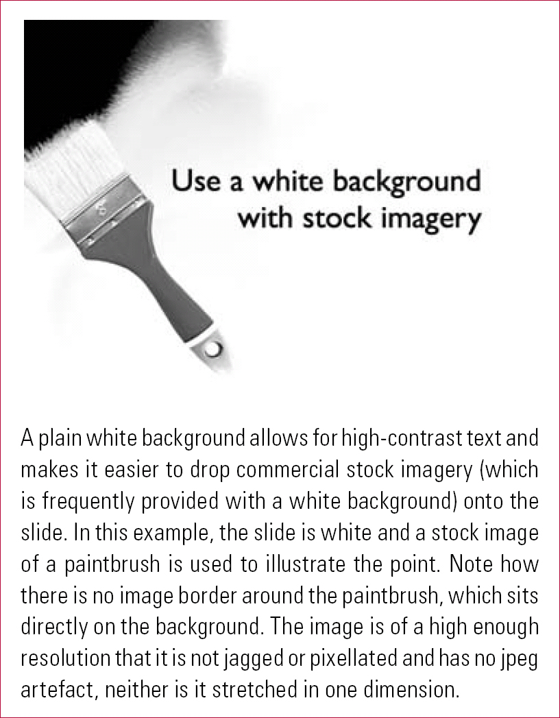
Two background colours, white and black, have particular strengths. A plain white background is useful when adding stock photographs, as many of these will be objects photographed on a plain white background. Placing these image elements on a white background avoids problems with ugly image borders (Fig. 1). Black text on white provides maximum contrast. A plain black background with white text provides similarly maximum contrast, and has the advantage that the presenter will not be silhouetted when standing in front of the screen, permitting better eye contact with the audience.
Using stock imagery.
Pictures and graphics
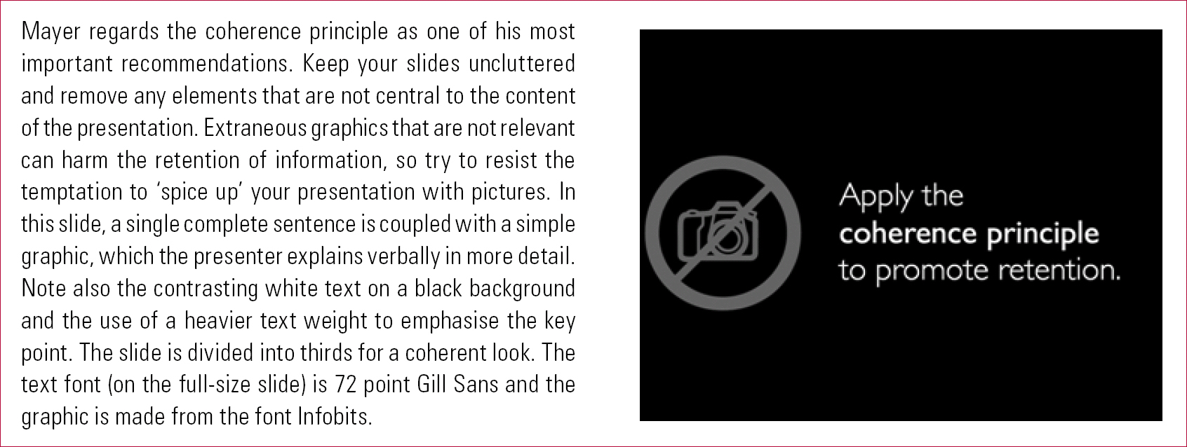
It is important that any picture or graphic is relevant. It is now well established that irrelevant pictures can actually have a negative effect on learning (Reference Bartsch and CobernBartsch 2003), something Mayer (Reference Clark and MayerClark 2007: p. 133) calls the ‘coherence principle’ (Fig. 2). Clark & Mayer regard this as perhaps the single most important recommendation in their book: ‘spicing up’ a presentation by adding pictures, videos, animations or sounds that do not relate to the material at hand reduces learning. This is a good example of how design principles often parallel empirical evidence about PowerPoint. Clark & Mayer encourages us to ‘weed’ our slides for empirically derived, pedagogical reasons. Reference ReynoldsReynolds (2008: p. 104) encourages us to design visuals ‘with an eye towards simplicity’ for aesthetic reasons. It is perhaps also worth noting that the coherence principle is commonly violated by designers of National Health Service corporate PowerPoint templates, who usually place the organisation's logo prominently on every slide.
A notional talk on slide design showing spoken text with an example slide, in this case covering the coherence principle.
When using graphics and text together, align words to the corresponding diagram or element in the graphic. Mayer (Reference Clark and MayerClark 2007: p. 77) refers to this as the contiguity principle – information that belongs together conceptually should be placed together spatially.
The design of graphs and tables is a topic in itself. The classic text is Reference TufteTufte (2001), although Reference FewFew (2004) is often more practical (if the presentation is business rather than science oriented). One of Tufte's contributions is the now well-known concept of ‘data ink’. He rates graphs by the proportion of ‘non-erasable ink’ (the ink used to display the actual information) to the total ink used to print the graphic (the data ink plus all the decoration, such as shading effects or drop shadows). The principle transfers well to PowerPoint (the data–pixel ratio). PowerPoint offers many three-dimensional options for graphs, which reduce the data–pixel ratio and can have a substantial negative impact on the clarity of the data presented.
Reference MackiewiczMackiewicz (2007) lends support to Tufte's recommendations from research that two-dimensional rather than three-dimensional graphs are better understood, and suggests that good contrast between graph and background is also important. Reference FewFew (2004: p. 60) also suggests avoiding three-dimensional graphs of any description (whether the third dimension is decorative or ostensibly informative) and also eschews pie charts as they communicate data poorly.
In using graphics, different approaches may be needed depending on whether the prime function of the slide is engagement or information transfer. Reference ReynoldsReynolds (2010) suggests using a ‘full bleed’, that is, taking the photograph right to the edge of the slide, using empty space in the photograph for text for maximum impact. Reference AlleyAlley (2003) recommends using smaller sized photographs and diagrams and combining them with text on the slide. Both are feasible approaches, and represent different poles along the spectrum of appealing to emotion and appealing to reason.
Layout
The most common cause of untidy looking slides is poor element alignment on the slide (Reference WilliamsWilliams 2008). Every element of the slide should be visually connected to something else. The best way to achieve this is to use a grid for your slides (: p. 202), and the simplest grid is made by dividing the slide into three – vertically and horizontally (Fig. 3). Aim to either place key elements at the intersections of the lines (familiar to photographers as the ‘rule of thirds’), or to divide the slide into consistently used zones (e.g. for picture and text). Other grids may also work if well applied consistently across slides.
Using negative space.
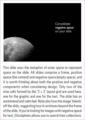
Slides that are crowded with information may be unclear or feel like a visual assault. If you have empty space (negative or ‘white’ space) on slides, aim to consolidate this.
International and cultural considerations
When presenting to international audiences, we suggest modifying some of the principles above. Be mindful of your audience in choosing images: for example, images with predominantly White faces can send a meta-message that the content of the presentation is not relevant to a predominantly Black and minority ethnic audience.
Colour associations can be culture specific: for example, green is a specifically Islamic colour in the Indian subcontinent and parts of Africa (Reference McCandlessMcCandless 2010); and red is associated with good luck in the Chinese diaspora.
We also recommend increasing the amount of text on slides when presenting to an international audience who then have ‘two chances’ at understanding your message, particularly if you have an accent that may be unfamiliar to your audience.
Presentation factors
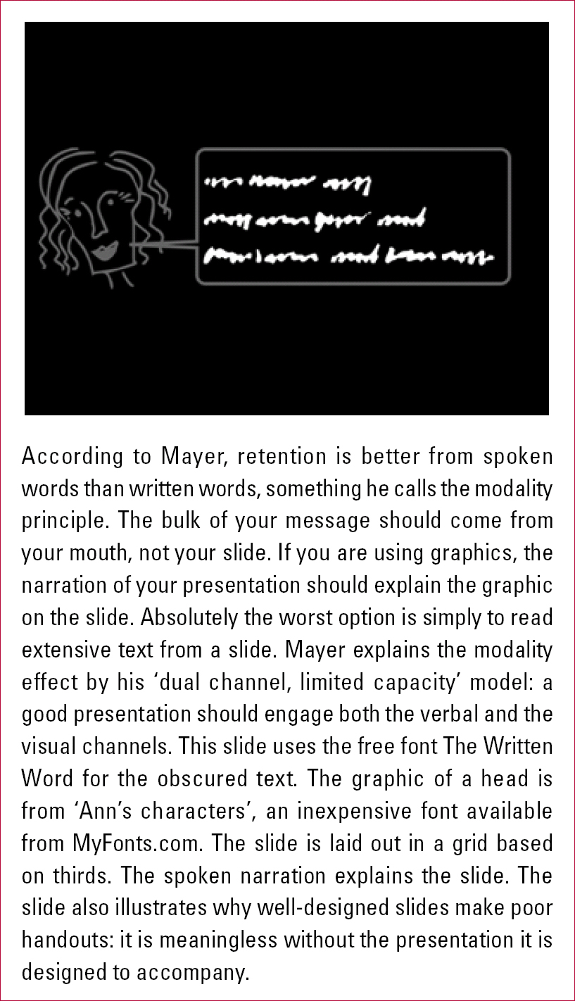
Perhaps the most common mistake to make is to assume that the slides are the presentation: they are not. The slides are a presentation aid. Making your presentation audience-centred means trying to build a relationship with an audience and to have conversational and interactional elements in what you are saying, with slides supporting this process. Our example slides in this article are accompanied by what might be the presenter's spoken text: there is more detail in the ‘spoken’ text than there is on the slide. Reference Clark and MayerClark & Mayer (2007) present evidence that a conversational style improves learning and suggest that this may be because social cues lead people to ‘work harder to understand material when they feel they are in a conversation with a partner rather than simply receiving information’ (pp. 157–180). Come out from behind the podium and talk to the audience (Fig. 4).
Mayer's modality principle.
In building a relationship with your audience, keep the lights on and do not turn to look at the slide on screen: if you need to look at notes, learn how to use the presenter view in PowerPoint, which allows you to look at detailed notes on the screen while your audience sees only the slide.
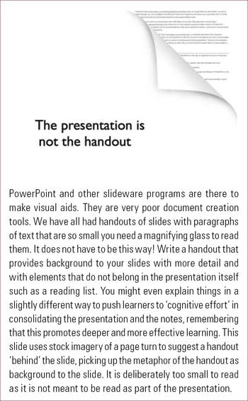
The corollary of the rule that PowerPoint is a presentation aid is that your slides (if well designed) make very little sense outside the context of a presentation. Avoid the temptation to use PowerPoint to make handouts, pseudo-documents that Reference ReynoldsReynolds (2008) disparages as ‘slideuments’. Similarly, even when put under pressure to do so, do not distribute your slides for people who did not make it to your presentation. Despite urging from administrators and conference organisers to provide slides ahead of time to be distributed to participants, try to supply an alternative handout. Although time consuming, a handout that has been prepared with the specific needs of the audience can further support learning (Reference KinchinKinchin 2006) and address cultural and special educational needs of the audience. Write your handouts separately in word processing software and include the level of detail (such as reading lists) that does not make sense on well-designed slides (Fig. 5). So, for example, a handout covering the information in Fig. 3 might include not only a more detailed description of grids, but also key references and a link to iStockphoto, with an explanation of its CopySpace™ search for images with empty space for text.
Making handouts from slides.
The top four reasons to avoid slide handouts (Reference RaceRace 2010) are:
-
• learners are more likely to switch off when they have the slides
-
• many learners never look at the slides again
-
• slides often provide information only – learning happens when information is processed
-
• with slide handouts, the audience may get distressed about ‘missed’ or ‘missing’ slides.
If we consider any presentation as a potential forum for adult learning, all presenters should avoid a ‘just the facts’ approach (Reference Knowles, Holton and SwansonKnowles 2005). Scientists could seek to incorporate some of the ‘artistic stream’ of learning as being ‘led in discussion’ (Reference LindemanLindeman 1926).
The centrality of communication in learning is not new; Confucius expected interaction with his followers rather than blind acceptance of his ideas, and Reference LindemanLindeman (1925) considered adult education cooperative. Today, it is suggested that learning is ‘fundamentally social’ (Reference ConnollyConnolly 2008), with active learners (Reference FinkFink 2003) who are engaging in a ‘dialogue’ with their peers, the material, and even with themselves (Reference Leonard and SwapLeonard 2004).
Most of our presentations are to large groups where there is a temptation to assume that interaction is impossible. Reference RaceRace (2010) proposes that even within a large group, it is possible to challenge and develop learners' thinking by encouraging f'eedback and participation, but without lecturing.
Within medical learning environments, there is evidence that active learning assists recall whether the ‘activity’ is in providing material beforehand (Reference Moravec, Williams and Aguilar-RocaMoravec 2010) or in getting immediate feedback from the audience (Reference CollinsCollins 2004; Reference Moravec, Williams and Aguilar-RocaStahl 2009; Reference Gunderman and McCammackHoyt 2010). In these discussions of active learning, PowerPoint features prominently, but is largely limited to papers suggesting technical ways of accommodating different learner styles through inserting audio and video clips (Reference Mixer, McFarland and McInnisMixer 2008; Reference Myers, Sykes and MyersMyers 2008; Reference Gunderman and McCammackGunderman 2010; Reference HenkelHenkel 2010).
Continuous improvement
Making good visual aids is not difficult, but neither is it something that comes naturally. Very few people who use PowerPoint are trained in it. We hope that this article will encourage the reader to look at their own use of PowerPoint critically and perhaps to read more about what works. In addition to the reference list, there is an online supplement to this article with links to other resources, including good examples of PowerPoint presentations and providers of cheap images.
MCQs
Select the single best option for each question stem
-
1 Tufte considers that PowerPoint:
-
a encourages engagement with the material
-
b should not be used in an educational context
-
c can reduce critical thinking
-
d may lower stress when presenting
-
e improves test scores.
-
-
2 The key typographical issue in slide design is:
-
a using a sans serif font such as Verdana or Gill Sans
-
b understanding your audience's font preference
-
c ensuring that the type can be seen from the back of the room
-
d including a variety of styles and sizes within each slide
-
e following the development and design of new fonts.
-
-
3 Images and graphics should be:
-
a large
-
b bold
-
c animated
-
d relevant
-
e brightly coloured.
-
-
4 An audience-centred presentation means:
-
a the audience has not been coerced into attending
-
b the presenter builds a relationship with the audience
-
c there has been a power cut, so the presenter relies on his or her memory
-
d the presenter reads the text on the slides verbatim
-
e the presenter moves around the room constantly.
-
-
5 A good handout:
-
a is an exact replica of your slides
-
b contains a glossary of all your jargon
-
c includes more detail than your slides
-
d does not require additional preparation
-
e should be made using your presentation.
-
MCQ answers
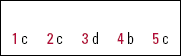
| 1 | c | 2 | c | 3 | d | 4 | b | 5 | c |


eLetters
No eLetters have been published for this article.