


Introduction
The Antarctic Peninsula (AP) has shown a dramatic warming during the second half of the 20th century (Vaughan et al. Reference Vaughan, Marshall, Connolley, Parkinson, Mulvaney, Hodgson, King, Pudsey and Turner2003, Thomas et al. Reference Thomas, Dennis, Bracegirdle and Franzke2009, Ding et al. Reference Ding, Steig, Battisti and Küttel2011, Schneider et al. Reference Schneider, Deser and Okumura2012, Ding & Steig Reference Ding and Steig2013). This warming has been attributed to regional changes in atmospheric circulation, particularly to the enhancing of westerlies as a result of a positive trend of the Southern Annular Mode in response to stratospheric ozone depletion (Marshall Reference Marshall2007, Lubin et al. Reference Lubin, Wittenmyer, Bromwich and Marshall2008), and an increase in northerly winds as a result of the shift in the position and the strength of the Amundsen Sea Low (Hosking et al. Reference Hosking, Orr, Marshall, Turner and Phillips2013, Clem & Fogt Reference Clem and Fogt2015, Raphael et al. Reference Raphael, Marshall, Turner, Fogt, Schneider, Dixon, Hosking, Jones and Hobbs2016).
Nonetheless, in recent years the warming trend on the AP has reversed. In fact, since the late 20th century, temperatures over this region have exhibited a cooling trend (Carrasco Reference Carrasco2013, Oliva et al. Reference Oliva, Navarro, Hrbáček, Hernández, Nývlt, Pereira, Ruiz-Fernandez and Trigo2016, Turner et al. Reference Turner, Hua, White, King, Phillips, Hosking, Bracegirdle, Marshall, Mulvaney and Deb2016). Statistically significant trends found for the last 20-year period (Oliva et al. Reference Oliva, Navarro, Hrbáček, Hernández, Nývlt, Pereira, Ruiz-Fernandez and Trigo2016) may suggest the influence of an external signal of cooling. Nevertheless, Turner et al. (Reference Turner, Hua, White, King, Phillips, Hosking, Bracegirdle, Marshall, Mulvaney and Deb2016) demonstrated that this cooling is a result of an increase in cyclonic conditions over the Weddell Sea, which is consistent with the long-term natural variability (Jones et al. Reference Jones, Gille and Goosse2016, Ludescher et al. Reference Ludescher, Bunde, Franzke and Schellnhuber2016). Large natural variability makes it difficult to assess whether a particular significant trend is attributable to internal variability or not.
For example, in other situations, such as the case of the global surface temperature trends studied by Liebmann et al. (Reference Liebmann, Dole, Jones, Bladé and Allured2010), obtaining statistically significant trends is not enough to claim that they are a response to climate change. It is necessary to assess whether they are robust, for instance by checking that the magnitude and statistical significance of the trends do not exhibit strong variations if the time intervals for which they are estimated are altered slightly.
This article explores the observational temperature time series in the AP in order to analyse whether the recent 20-year cooling trend in the region is robust or not, and if it has been an exceptional circumstance in the past 60 years. To achieve this goal, the sensitivity of the mentioned recent temperature trends to the choice of time interval for which they are estimated is assessed. Assessing the mechanisms that produced this cooling period is beyond the scope of this study, as Turner et al. (Reference Turner, Hua, White, King, Phillips, Hosking, Bracegirdle, Marshall, Mulvaney and Deb2016) previously found an increase in south-easterly winds associated with an increase in cyclonic conditions over the Drake Passage that eventually advected sea ice to the north-eastern coast of the AP. The increase in the extent of sea ice along with a strengthening of the midlatitude jet that advected cold air are believed to be the main contributors to the AP cooling.
Datasets and methodology
Temperature datasets
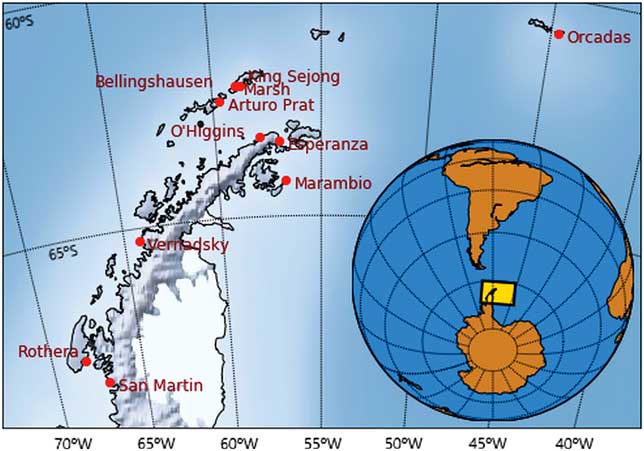
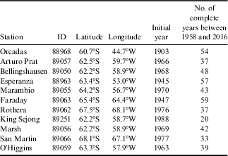
Eleven datasets of AP stations were selected from the Reference Antarctic Data for Environmental Research (READER) project (Turner et al. Reference Turner, Colwell, Marshall, Lachlan-Cope, Carleton, Jones, Lagun, Reid and Iagovkina2004) (https://legacy.bas.ac.uk/met/READER/). These data include time series of quality controlled monthly mean temperatures; their locations are shown in Fig. 1. Annual and seasonal temperatures for each station were calculated averaging monthly means. In order to compare between stations, we subtracted from each dataset the annual or seasonal mean temperature of each station for the baseline period 1971–2000 to obtain temperature anomalies for each station. The AP temperature anomalies were calculated averaging all the stations with data available for each year. It is worth mentioning that each station had a different initial year, and some had missing data (see Table I). For example, at the beginning of the period of study only three stations were available (Orcadas, Esperanza and Faraday), whereas in the latter years most of the 11 stations were available. After performing some sensitivity tests to evaluate how the number of stations used affected the data analysis, it was concluded that the change in the number of stations did not have a significant impact and that the stations located outside the South Shetland Islands drive most of the temperature anomalies.
Locations of the Antarctic stations used to calculate temperature anomalies.
Details of Antarctic research stations from which datasets were used in this study.
Trends and sensitivity methods
Temperature trends were estimated using least-squares linear regression. To evaluate the statistical significance of the linear trend, a Student’s t-distribution of the residuals was used, with an effective sample size calculated following Santer et al. (Reference Santer, Wigley, Boyle, Gaffen, Hnilo, Nychka, Parker and Taylor2000). Mann–Kendall and Monte Carlo tests were also performed, yielding similar results.
Every possible trend was calculated, and they were displayed as a two-dimensional parameter diagram, as Liebmann et al. (Reference Liebmann, Dole, Jones, Bladé and Allured2010) did to evaluate the sensitivity of global temperature trends to the choice of time interval. Using this tool, a broad range of variability (from interannual to interdecadal variability) of temperatures could be studied, and their robustness assessed. The visualization used by Fortuny (Reference Fortuny2015) was chosen, which plots linear changes (defined as the product of the linear trend and the length of the considered time interval) and their statistical significance (calculated as the statistical significance of the associated trend) as a function of the initial and the final year of the period. Using cumulative temperature changes instead of temperature trends, possible sustained long-term trends are emphasized, removing weighting of the short strong trends that are associated with internal variability alone. From now on, this plot will be referred to as a two-dimensional linear change (LC) diagram. Furthermore, LC diagrams facilitate estimation of the sensitivity of the observed changes to the choice of time interval, and assessment of whether a trend for a particular interval is a unique case or has been observed previously. This methodology has been used in other locations, e.g. Spain (Gonzalez-Hidalgo et al. Reference Gonzalez-Hidalgo, Peña-Angulo, Brunetti and Cortesi2016) and France (Dieppois et al. Reference Dieppois, Lawler, Slonosky, Massei, Bigot, Fournier and Durand2016).
Results
Annual trends
Figure 2a shows the time series of annual mean surface temperature anomalies for the AP. For each year, the shading indicates one standard deviation around the mean temperature of all stations available in the region for that year. The trend estimated for different selected time intervals is superimposed: 1958–2016 (in green), 1990–2016 (in yellow), 1970–2000 and 2000–16 (in dark red).
a. Time series of surface temperature anomalies on the Antarctic Peninsula. The blue line indicates the mean annual temperature anomaly, and the grey shaded area represents one standard deviation between the time series of the different stations. The green, yellow and two red lines show the linear fit for the periods 1958–2015, 1990–2015, 1970–2000 and 2000–15, respectively. b. A two-dimensional linear change diagram of annual temperatures in the Antarctic Peninsula. The vertical axis corresponds to the start year and the horizontal axis to the end year of each segment. Diagonals (in green) correspond to segments with the same length (in years), and therefore values on the same diagonal should be interpreted as running temperature changes. Red indicates positive temperature changes (in °C) and blue indicates negative changes. The contour includes statistically significant changes at a 95% confidence level. Coloured circles indicate intervals referred to in the text.
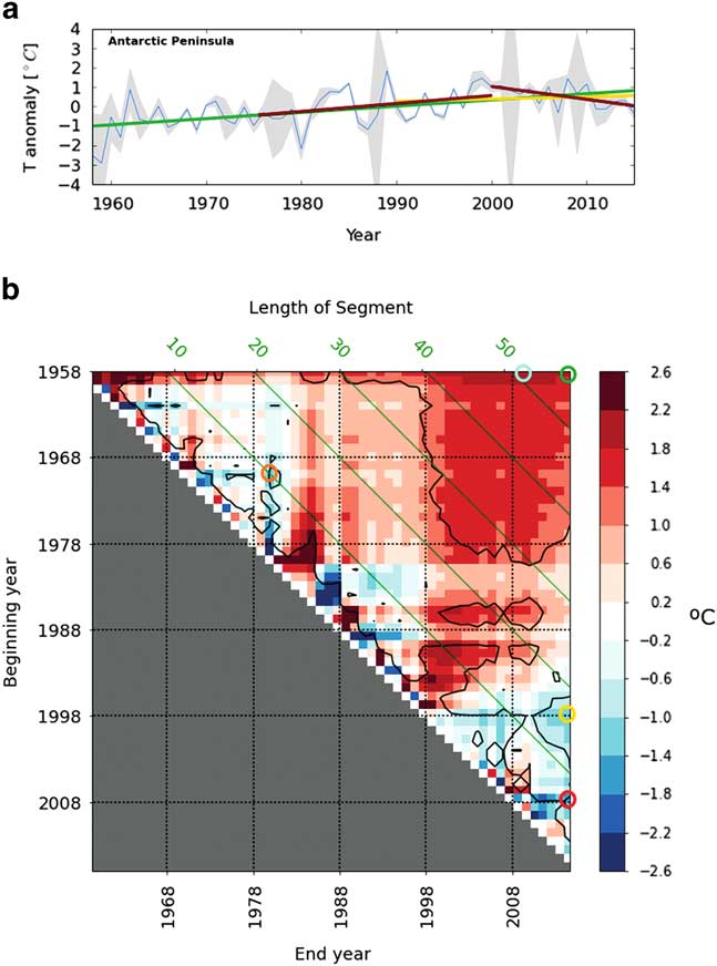
The time series shows the observed warming in the AP, and the magnitude of the linear trend is +0.32°C per decade when estimated using the entire record. The rate of warming is stronger during the last 30 years of the 20th century, with a trend of +0.40°C per decade. Since late 20th century the linear trend has reversed. As an example, the linear trend for the 2000–16 interval was -0.67°C per decade. However, if this last segment is extended back a few years, since 1990, a slight warming trend of +0.12°C per decade is again obtained.
The annual temperature two-dimensional LC diagram for the AP (Fig. 2b) was used to analyse how the warming and cooling periods have changed over time. This plot facilitates comparison of the temperature changes exhibited by the AP region for different segments with different initial year (shifting the row), different final year (shifting the column), or different interval length (shifting the diagonal).
As previously observed, there is clear evidence of significant warming on the AP during the 59-year period 1958–2016, with a linear temperature change of +1.89°C (green circle in Fig. 2b). This is the result of multiplying the +0.32ºC per decade by the 5.9 decades of the interval. Of all the possible linear changes estimated in the 1958–2016 interval for intervals over 10 years in length, regardless of the initial and final years, the maximum change is +2.19°C (blue circle in Fig. 2b), observed between 1958 and 2010. It is also observed that almost every time period starting before 1980 and ending after 2000 exhibits significant warming. Notice that almost all these periods are longer than 30 years; although intervals of 20–30 years still show warming periods, they are generally not statistically significant. Decadal variability dominates in segments shorter than 20 years, with warming and cooling periods alternating.
In recent years, there has been a cooling of -1.19°C for 1998–2016, or -1.63°C for 2008–15 (yellow circle and red circle, respectively, in Fig. 2b). However, similar cooling periods have occurred previously with a slightly lower magnitude, e.g. the period 1970–80 with a change of -1.24°C (orange circle in Fig. 2b), within the overall warming trend.
Seasonal trends
To analyse how annual mean temperature changes in the AP are distributed within the year, the seasonal time-series were examined. The evolution of seasonal temperature anomalies in the AP is shown in Fig. 3, and their associated two-dimensional LC diagrams are shown in Fig. 4.
Time series of surface temperature anomalies on the Antarctic Peninsula for a. December–January–February (DJF), b. March–April–May (MAM), c. June–July–August (JJA), and d. September–October–November (SON). The blue line indicates the mean annual temperature anomaly, and the grey shaded area represents one standard deviation between the time series of the different stations. The green, yellow and two red lines show the linear fit for the periods 1958–2015, 1990–2015, 1970–2000 and 2000–15, respectively.
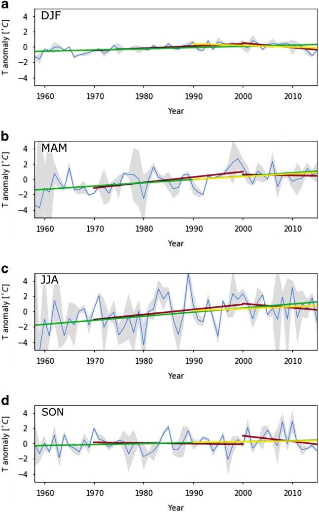
Two-dimensional linear change diagrams of annual temperatures in the Antarctic Peninsula for a. December–January–February (DJF), b. March–April–May (MAM), c. June–July–August (JJA), and d. September–October–November (SON). The vertical axis corresponds to the start year and the horizontal axis to the end year of each segment. Diagonals (in green) correspond to segments with the same length (in years), and therefore values on the same diagonal should be interpreted as running temperature changes. Red indicates positive temperature changes (in °C) and blue indicates negative changes. The contour includes statistically significant changes at a 95% confidence level.
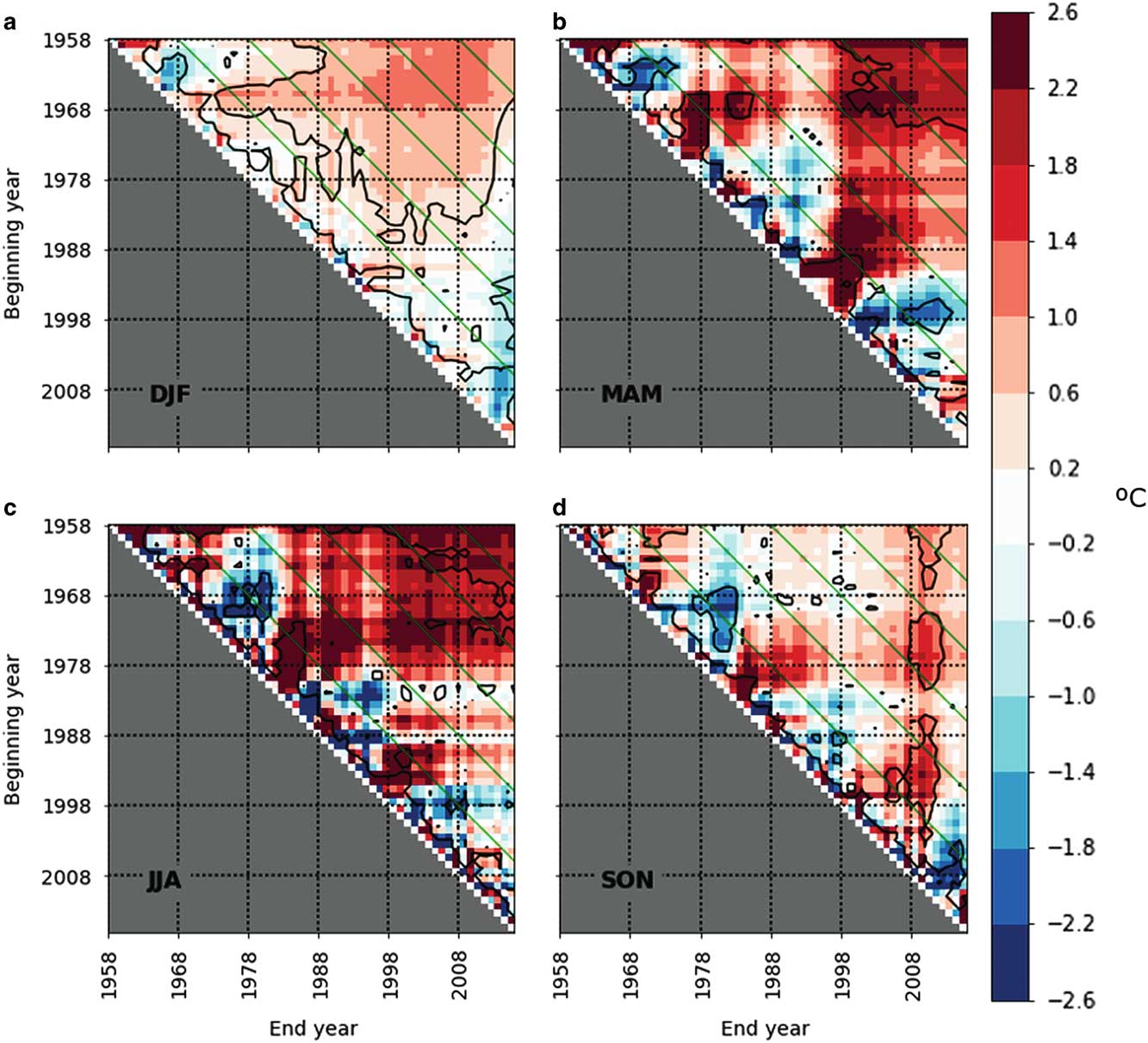
Depending on the season, time series and trends depicted in Fig. 3 present very different behaviours. Summer temperatures show very small annual variability, with a slight long-term increase in the 20th century, followed by a modest decrease during the 21st century. Autumn and winter temperatures show very large annual variability, although they present the greatest signal in most of the trends depicted. Spring temperatures also show a large annual variability, but unlike the other seasons, none of the four trends displayed present a significant signal.
Figure 4 shows statistically significant positive temperature changes for the longest segments in all seasons except spring, particularly large in autumn and winter. In summer, the range of segments that exhibit statistically significant changes is wider than in the other seasons, and includes most periods over 20 years, even though the magnitude of the warming is lower. In contrast with the results obtained for the other seasons, in spring statistically significant warming is evident only in those periods ending c. 2010 in which temperature anomalies were particularly large.
For segments shorter than 10 years, autumn, winter and spring present large variability, with oscillations of positive and negative changes. These oscillations often extend to 20-year segments. In contrast, summer shows the same oscillations for segments shorter than 10 years, with very small linear changes compared with the other seasons. For summer, temperature trends for 10–20-year segments seem to show a long wavelength oscillation, still with small values of linear change; however, the time series length is still too short to be certain.
Discussion
As stated previously, it is well known that temperatures in the AP region are characterized by large variability (King Reference King1994, Comiso Reference Comiso2000) as a result of the numerous climate interconnections that eventually affect the synoptic patterns of the region (Jones et al. Reference Jones, Gille and Goosse2016, Gonzalez et al. Reference Gonzalez, Vasallo, Recio-Blitz, Guijarro and Riesco2018). As exemplified in Fig. 2a, the short- and medium-term variability may produce large differences in trend estimations if the initial or final year of the segment is changed, as pointed out by Liebmann et al. (Reference Liebmann, Dole, Jones, Bladé and Allured2010). LC diagrams offer the possibility to analyse the sensitivity or robustness of the AP temperatures with respect to the choice of the segment interval. Trends of segments with a specific length are considered to be robust if they do not change significantly if the initial or final years are slightly modified. Conversely, trends are considered not to be robust if they are very sensitive to the choice of segment.
The results, based on data spanning back to 1958, suggest that only trends evaluated for at least 30-year segments may be considered robust, as most intervals below this threshold do not show statistically significant trends. This qualitatively agrees with Jones et al. (Reference Jones, Gille and Goosse2016), who previously analysed Antarctic trends using palaeoclimate records, showing that short-length positive temperature trends observed during the satellite era may not be unprecedented in the past two centuries. They also stated that even 40-year intervals may not be sufficiently robust when compared with climate model simulations, but always considering modelling limitations.
Therefore, even though a recent cooling trend for a 20-year segment has the largest magnitude since 1958, it may not be considered robust until there are no significant cooling trends for at least 30 years. The results obtained support those of Turner et al. (Reference Turner, Hua, White, King, Phillips, Hosking, Bracegirdle, Marshall, Mulvaney and Deb2016), who showed that recent cooling is consistent with the internal variability of the region. This cooling period is still short and may be a 20-year persistent period (Ludescher 2016) within the overall warming trend.
At a seasonal scale, overall, greater positive temperature changes at medium and long scales were found to be produced in autumn and winter, in agreement with other studies (Monaghan et al. Reference Monaghan, Bromwich, Chapman and Comiso2008, Nicolas & Bromwich Reference Nicolas and Bromwich2014). It is worth noting that temperatures in summer present only a slight warming, but they also show a weaker decadal variability. This behaviour is probably related to the absence of the seasonal sea ice, in such a way that open sea damps the strong annual temperature changes (Franzke Reference Franzke2013). Spring temperatures instead provide a minimum contribution to the long-term warming.
These results suggest that decadal variability and the long-term signal of the annual temperatures on the AP are mainly produced by variability and signal in autumn and winter, with some contribution of summer warming for long periods. On the other hand, autumn, winter and spring contribute at almost the same magnitude to the short-term variability, whereas summer presents a marginal contribution to the annual temperature variability at short scales.
Conclusion
Two-dimensional LC diagrams are used to contextualize the negative temperature trend observed in the AP since the beginning of the 21st century. This tool facilitates inspection of the robustness of significant trends in the AP, a region with strong variability. The results indicate that the warming observed in the AP since the 1950s is robust, based on the data available, as most time intervals longer than 30 years exhibit strong and statistically significant linear changes. Temperature trends for segments shorter than 30 years, as in the recent cooling, are consistent with internal variability, as linear changes are generally non-significant and do not have a dominant sign.
Analysis of the seasonal distribution of the observed warming in the AP indicates that even though it is present in all seasons, it is particularly strong in autumn and winter, and particularly robust in summer (as most periods over 20 years exhibit a statistically significant linear change). In contrast, linear changes observed in spring are less robust.
The significant negative change observed in the 1995–2015 interval may be concluded to be highly sensitive to the choice of time interval, and therefore cannot be treated as robust evidence of a change of sign in the evolution of the temperature in the AP. This study also highlights the importance of using tools such as two-dimensional LC diagrams to monitor the temperature trends of a region with large variability, such as the AP. Future work will focus on extending this approach to analyse the regional variability and forcing mechanisms at different scales inside the AP.
Acknowledgements
We acknowledge the two anonymous reviewers for their useful reviews, which contributed to improving this manuscript. This work is supported by the Ministry of Economy and Competitiveness (MINECO) through the AEMET Antarctic program and the European Regional Development Fund (FEDER), GrantCTM201679741-R for MICROAIRPOLAR project. Research activities of Sergi Gonzalez are partly supported by the ANTALP (Antarctic, Arctic and Alpine Environments, 2017-SGR-1102) Research Group of the Catalan Government.
Author contributions
SG designed the study, carried out the data analysis and wrote the first draft of the manuscript. DF contributed to the data analysis and interpretation. Both authors edited the final version of the manuscript.
Details of data deposit
Original data were obtained from the Reference Antarctic Data for Environmental Research (READER) project (Turner et al. Reference Turner, Colwell, Marshall, Lachlan-Cope, Carleton, Jones, Lagun, Reid and Iagovkina2004) (https://legacy.bas.ac.uk/met/READER/). The annual and seasonal matrices of linear temperature changes calculated and used to plot two-dimensional diagrams are stored in AEMET public repository (http://hdl.handle.net/20.500.11765/7913).


