


1. Introduction
Design education often alternates between individual and team-based collaborative project components to solve unstructured and wicked problems (Reference Garvey and ChildsGarvey & Childs, 2015; Reference Rittel and WebberRittel & Webber, 1973), with many classes deliberately combining both to simulate professional design practice (Reference BrézillonBrézillon, 2003). Team-based design tasks are not only pedagogical instruments for developing technical competence but also for cultivating students’ ability to communicate, negotiate, and co-create (Reference Kiernan, Ledwith and LynchKiernan et al., 2020; Reference Valkenburg and DorstValkenburg & Dorst, 1998). These skills are essential in contemporary workplaces where projects are rarely executed by a single individual (Reference Adams, Forin, Chua and RadcliffeAdams et al., 2016; Reference EdmondsonA. Edmondson, 2012). Yet dependence on others inevitably introduces uncertainty. When communication or coordination falters, mistrust, misalignment, and interpersonal conflict can arise, undermining creativity and progress (Reference Badke-Schaub, Goldschmidt and MeijerBadke-Schaub et al., 2010; Reference Hinds and MortensenHinds & Mortensen, 2005; Reference Jehn and MannixJehn & Mannix, 2001; Reference Paletz, Chan and SchunnPaletz et al., 2017). Typically, design projects in the academic setting begin with a shared brief or problem statement. Such initial briefs serve as a starting point which is then refined or reframed as teams are exposed to new insights, contextual constraints, and feedback (Reference Paton and DorstPaton & Dorst, 2011). As design problems are inherently complex, no single member possesses all the expertise required to address them effectively (Reference Hight and PerryHight & Perry, 2006; Reference SmithSmith, 1994). Teams therefore rely on collective intelligence through distributed cognition and knowledge sharing that enable emergent problem framing and adaptive collaboration (Reference CrossCross, 2023; Reference JenkinsJenkins, 2009). While such heterogeneity can stimulate creativity through diverse perspectives (Reference Trischler, Kristensson and ScottTrischler et al., 2018), it can also foster perceptual bias (Reference CossCoss, 2003; Reference LiedtkaLiedtka, 2015) and cognitive dissonance (Reference FestingerFestinger, 1962) when viewpoints clash. In many student teams, dominant communicators or technically confident members steer discussions, marginalising quieter voices and creating uneven influence (Reference AmabileAmabile, 2018; Reference Edmondson and HarveyA. C. Edmondson & Harvey, 2018). In such cases, not all opinions of individual members can be heard or considered when it comes to working in a team.
Addressing this gap, the present study proposes a new empirical lens to examine the interaction within design teams. By focusing on the temporal fluctuation of team progress through reflection collection, this research conceptualises collaborative performance as a measurable system of oscillations that reflect communication balance, cognitive alignment, and adaptive regulation. This framework seeks to quantify the invisible dynamics of teamwork and to relate them to educational outcomes such as Total Grade (TG), a proxy for how successfully a project achieves the learning objectives. Through this approach, the study contributes to the growing discourse on team cognition and design pedagogy by bridging qualitative theories of collaboration with quantitative analytics, offering educators a method to observe, interpret, and ultimately enhance collective learning behaviour within design education. This research seeks to identify the repetitive patterns or signatures (Reference Seow, Tiong, Teo, Silva, Wood, Jensen and YangSeow et al., 2018) of what a well-performing design team with effective communication looks like.
2. Methodology
2.1. Prior work
To investigate individual perceptions within team-based projects, we used the Design Progression Dashboard methodology (Reference Chiu, Silva and LimChiu et al., 2022). Each week, individual design team members write a short reflection describing their current understanding of the project. These reflections are collected throughout the semester, yielding 6-12 weeks of data per student. Extracting data from student homework and documentation is not new, but such data often require extensive post-processing (Reference Dong, Hill and AgoginoDong et al., 2004; Reference Ferguson, Cheng, Adolphe, Van de Zande, Wallace and OlechowskiFerguson et al., 2022). To address this, the reflection prompt asked only about three elements: (1) the intervention, (2) the persona, and (3) the design rationale, following the Point-of-View method from IDEO’s Design Thinking process (Reference BrownBrown, 2008). The collected text is processed using Natural Language Processing (NLP) with Word2Vec, then visualised through t-SNE to compress high-dimensional associations into plottable coordinates (Reference Chiu, Lim and SilvaChiu et al., 2023). This allows week-to-week comparison of each student’s cognitive shifts (Figure 1).
Visualisation of obtaining a centroid and centroid displacement with text tokens

Figure 1 Long description
Panel A: A scatter plot titled Cluster Vis tSNE Scaled Data. The horizontal axis ranges from -40 to 80, and the vertical axis ranges from -20 to 20. The plot contains hundreds of data points clustered into five distinct groups, each represented by different colors. Keywords such as focused, uses, levels, relaxed, preparing, reduce, stress, and able are annotated within the clusters. Lines connect these keywords to a central point labeled centroid. Panel B: Another scatter plot titled Cluster Vis tSNE Scaled Data. The horizontal and vertical axes have the same ranges as Panel A. This plot also contains hundreds of data points clustered into five distinct groups, each represented by different colors. Centroids are labeled with numbers from 1 to 8 and are connected by lines, indicating their positions within the clusters.
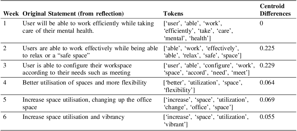
Table 1 shows sample reflections and extracted tokens for one sample student. These tokens are plotted onto a scatterplot created from a specific design corpus (Figure 1). To summarize each week’s tokens, a centroid is calculated using Euclidean distance, essentially a “centre of gravity” for that week’s word position (Reference MartinMartin, 1989). This centroid represents the student’s understanding of the design challenge for that week. Since the scatterplot derives from a domain-specific corpus, it functions as a conceptual “brain space.” Tracing centroids week-by-week maps the changes in the student’s understanding of the design process within their brain, like a “train of thought”. Each week’s centroid is compared to Week 1 as a baseline, obtaining a displacement value that represents this cognitive shift over time (Reference Chiu, Silva and LimChiu et al., 2022). This displacement method has been validated against expert evaluators (Reference Chiu and SilvaChiu & Silva, 2024). The displacement values in Table 1 represent this low-dimensional translation of Word2Vec outputs. These numbers only become meaningful when compared across the diagrams in Figure 2.
Sample data, token & centroid displacement computation

The divergent, spike and synergy Diagram

Figure 2 Long description
Panel A: Divergent Diagram. A line graph showing displacement over time intervals. The graph starts at a single point and diverges into multiple lines, indicating different paths or solutions. Panel B: Spike Diagram. A line graph showing displacement over time intervals for multiple participants (P1 to P5). Each line represents a different participant, with varying spikes indicating different levels of displacement. Panel C: Synergy Diagram. A line graph showing displacement over time intervals with lines representing maximum, median, and minimum values. The lines show how different levels of displacement interact and converge over time.
Plotting these displacements over time produces a Divergent Diagram (Figure 2). This diagram shows one person’s cognitive spikes and falls throughout the design process, similar to the upper half of the Double Diamond model (Design Council, 2025; Reference Chiu, Makany and SilvaChiu et al., 2025). The repeated spike-and-fall pattern across the semester suggests that divergence and convergence happen in continuous loops rather than in a single cycle (Reference Camburn, Auernhammer, Sng, Mignone, Arlitt, Perez, Huang, Basnet, Blessing and WoodCamburn et al., 2017; Reference Wood, Lauff, Yu Hui, Teo, Png, Swee, Collopy and VargasWood et al., 2021). A Spike Diagram is a combination of multiple individual Divergent Diagrams, layering together each team member’s divergence and convergence (Figure 2). For our analysis, we used Synergy Diagrams representing team coherence by extracting the Maximum, Median, and Minimum values from the Spike Diagram. A narrow band within the Synergy Diagram suggests a harmonic teamwork with fewer conflicting viewpoints (i.e., coherence). In contrast, a wider band means that the team explored more divergent ideas before converging on a common solution. We will test both possibilities during this study.
2.2. Measuring the synergy band
To study these patterns systematically, four Bandwidth (BW) measures were developed:
-
• 1. Mean Bandwidth: how much teams diverge on average,
-
• 2. Standard Deviation of Bandwidth: how stable or erratic that divergence is,
-
• 3. Normalised Bandwidth: how/if teams use their potential range of divergence,
-
• 4. Cumulative Bandwidth: how much conceptual ground teams cover over time.
Together, these metrics show how teams move between divergence and convergence.
2.2.1. Mean bandwidth (MBW)
Mean Bandwidth (Equation 1) measures the average amplitude of team fluctuation across T weeks. It quantifies the overall divergence of team ideas and how far apart members’ contributions typically spread from week to week. A lower value suggests tight alignment, and potentially premature convergence, while a higher value indicates expansive ideation and distributed participation.

2.2.2. Standard deviation of bandwidth (SDBW)
The Standard Deviation of Bandwidth (Equation 2) captures how consistent of the band width is over time. While MBW shows how much teams diverge on average, SDBW reveals how consistent that divergence is. A low SDBW reflects steady, well-regulated teamwork. A high value suggests erratic shifts between cohesion and disarray.

2.2.3. Normalised bandwidth (NBW)
The Normalised Bandwidth (Equation 3) expresses the team spread as a proportion of its maximum possible range, enabling comparison across teams with different baselines. It reflects the relative efficiency of exploration and how consistently a team uses its potential range of ideas. Higher NBW suggests balance and sustained participation. Lower NBW may imply limited or uneven engagement.

2.2.4. Cumulative bandwidth (CBW)
The Cumulative Bandwidth (Equation 4) approximates the total area enclosed between the Max and Min curves over time. Since time intervals are equally spaced (ΔT = 1), this discrete summation represents the accumulated exploration throughout the project. Larger CBW suggests broad, sustained exploration. Smaller CBW reflects constrained trajectories.

3. Case studies & discussion
3.1. Case study
This study draws on four years (2022 - 2024) of data from postgraduate design courses at a design university in Singapore. Across seven classes, 48 project teams and 250 students participated. The cohort comprised students from all walks of life, diverse backgrounds, providing a naturally varied sample. In each class, students were randomly assigned into teams of three to six based on their interest, then were tasked to propose and subsequently solve their own design challenge. Each 14-weeks semester included a break at Week 7. From Week 3 onward, students completed weekly reflections describing their current understanding of the team project.
Our analysis investigates whether the tightness of synergy bands relates to team quality, measured by Total Grade (TG). TG reflects cumulative scores across multiple submissions throughout the project. It is essentially a “team strength” indicator as assigned by the instructor. By turning our attention towards the Spike Diagrams, we wish to visualise team coherence through three curves: the Maximum curve (the top points), the Median curve (the in between points), and the Minimum curve (the low points), forming a fluctuating band over the course of the project.
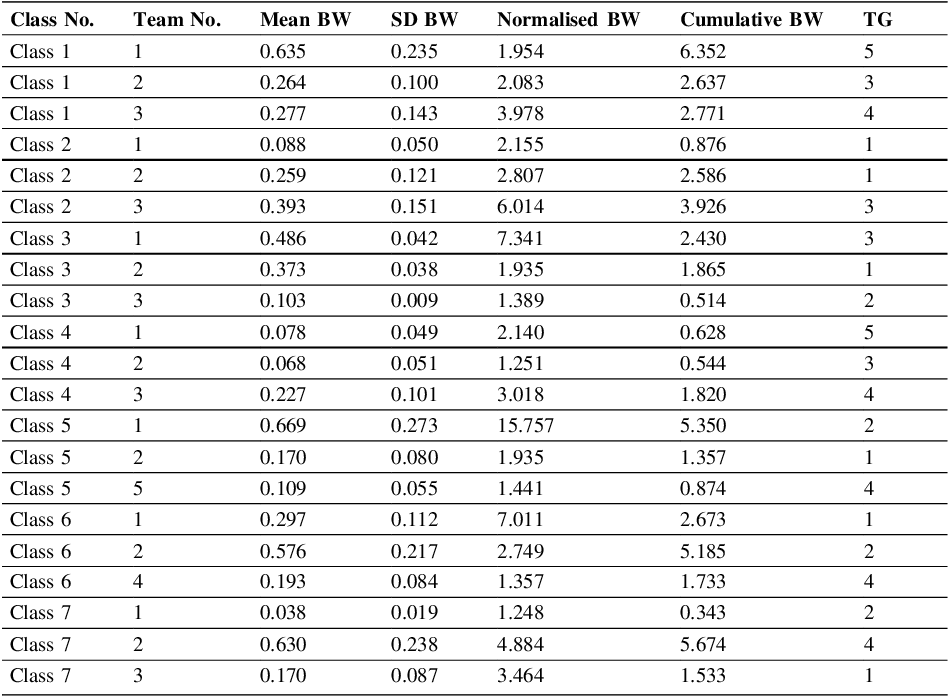
Following the methodology in Section 2, the synergy plots were converted into four bandwidth metrics: MBW, SDBW, NBW and CBW, respectively. Table 2 shows the results of 21 sample teams (3 per class) from the original 48 teams, along with their TGs. This sample size allows identification of cross-cohort behavioural trends. The quantitative framing of the design progress presented here aligns with the design theoretical framework of Reference CrossCross (2006), Reference DorstDorst (2011), and Reference LawsonLawson (2006), who describe expert design practice as an oscillating symphony between divergent exploration and convergent refinement. By translating these design oscillations into measurable patterns, this study bridges design cognition with data-driven analysis.
Overall data of BW analysis showing 3 samples per class

3.2. Meta analysis on bandwidth against TG
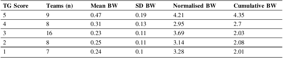
Rather than relying on a single metric, this paper examines all four BW measures against TG. A team-weighted averaging approach was used: all 48 teams were treated as equal units, and BW metrics were averaged within each grade level (TG = 1-5). The course instructor assigned grades at the end of the course without seeing the Synergy Band to ensure fairness. The results (Table 3) show a clear gradient: MBW and CBW rise with higher TGs. Broader, rhythmically stable bands correspond with stronger collaborative dynamics and better design outcomes.
Average metrics by individual team grade (TG) levels

High-performing teams (TG 4–5) show wider MBW and CBW values, indicating richer exploration and stronger adaptation. Crucially, these teams exhibited not just wider but more coherent bands. Team members explored diverse ideas while remaining synchronised.
Mid-level teams (TG 3) display moderate consistency but narrower spread, suggesting procedural discipline with limited conceptual breadth, which is a possible sign of design fixation.
Low-TG teams (1–2) fluctuate unpredictably or show narrow, irregular ranges, indicating limited exploration and inconsistent participation. Such patterns may correspond to lower psychological safety, where members hesitate to voice divergent views (Reference EdmondsonEdmondson, 1999). This leads to fragmented communication and reduced collective learning.
Overall, higher TGs correspond with broader, more stable collaboration. This aligns with Reference Kim, Lee, Lee, Huang and MakanyKim et al.’s (2011) collective intelligence ratio (CI-r): harmonised participation and adaptive collaboration produce stronger team performance. The higher the CI-r, the more balanced the contribution across team members, indicating distributed intelligence.
3.3. Five selected team examples
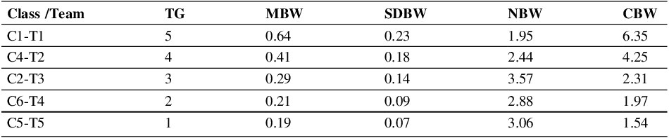
With the preliminary understanding of the relationship between BW and TG, this section examines five teams in detail, one from each TG level (1-5; see Table 4). Selection of these teams followed a two-steps process: metric screening and pattern verification. First, teams were identified quantitatively by bandwidth descriptors (MBW, SDBW, NBW and CBW). High-performing candidates had MBW above 0.4 and CBW above 4.0. Constrained collaboration candidates had MBW below 0.22 and CBW below 2.0.
Second, weekly Max–Med–Min charts were checked. Two teams can have similar averages but very different learning behaviour. One team can have smooth waves (healthy divergence and convergence), while another can have erratic spikes. Visual verification ensured that numerical profiles corresponded to an interpretable collaboration pattern, reducing the risk of misreading outliers as genuine teamwork dynamics.
Data and insights of the 5 selected teams

Week-to-week performance diagram for the 5 selected team

Figure 3 Long description
The image contains five line graphs labeled C1-T1, C4-T2, C2-T3, C6-T4, and C5-T5. Each graph shows the performance trends over weeks for different teams. The x-axis represents the weeks, ranging from 3 to 13, and the y-axis represents the performance metrics, ranging from 0.00 to 1.00. Each graph includes three lines representing Max, Med, and Min performance levels. Panel C1-T1 shows a fluctuating trend with Max performance increasing over time, Med performance showing moderate fluctuations, and Min performance remaining relatively low. Panel C4-T2 displays a gradual increase in Max performance, a steady Med performance, and a low Min performance. Panel C2-T3 shows a steady increase in Max performance, a slight increase in Med performance, and a low Min performance. Panel C6-T4 indicates a steady Max performance, a slightly increasing Med performance, and a low Min performance. Panel C5-T5 shows a relatively flat trend with low variations in Max, Med, and Min performance levels.
3.3.1. The high-performing team (Class1-Team1) TG-5
The Max curve expand rapidly initially, creating a wide band before fluctuating rhythmically. The Med curve follows the same general profile, while the Min curve stays low but not flat. All three curves fluctuate cohesively, indicating constant divergence and convergence through the final week. This pattern suggests psychologically safety (Reference EdmondsonEdmondson, 1999, Reference Edmondson2012), where members feel safe speaking up and exploring ideas throughout the project. The Med curve in the middle suggests balanced team distribution with no outliers. All four metrics remained high, with CBW of 6.35, suggesting that members are not only completing tasks, but learning from each other and iteratively re-entering exploration.
3.3.2. The high but more disciplined team (Class4-Team2) TG-4
This team presents narrower and flatter band than C1-T1, but it is clean and stable. The pattern good coordination habits but slightly less creative risk-taking. The team likely reframed their project once, then stayed within that frame throughout. This shows that high-scoring teams do not always have the widest bands. The results evoke Reference BanathyBanathy’s (1996) concept of dynamic equilibrium of balance without appetite for risk-taking.
3.3.3. The mid-performing team (Class2-Team3) TG-3
This team’s pattern shows an averaging wide band with the Med curve way below the middle line, suggesting cautious exploration. This is what Reference CrossCross (2023) calls surface-level collaboration: team members are coordinating, not co-constructing. Some individuals attempted to diverge more, but they are not influence the others enough. The result is a relatively broad band Max- Min spread with a very flat and low Med curve. This pattern suggests lack of continuous reframing, which results explains the relatively low CBW. The team serves as a middle anchor: procedurally competent but conceptually constrained.
3.3.4. The low engagement team (Class2-Team3) TG-2
This team shows a flat and stagnant profile with a tight band and a low Med curve. After slight fluctuation in Week 4, the curve goes flat. The team produced consistent but unchanging results. This suggests a dominant individual set the direction early, and others followed without trying to reframe. This low SDBW of 0.09 confirms this with little fluctuation throughout the course. This pattern conforms to Reference Edmondson and HarveyEdmondson and Harvey’s (2018) findings of low psychological safety in cross-boundary teams, where members do not challenge the early ideas, leading to design fixation. Graphically, the pattern looks similar to C4-T2 and C2-T3, but the magnitude is smaller. The team seems to be relying on existing schema instead of building new ones (Reference NormanNorman, 2013).
3.3.5. The flatline team (Class5-Team5) TG-1
For this team, all three curves stay low for the whole period, and the negligible divergence. MBW is 0.19 and SDBW is 0.7, showing minimal engagement and exploration. The team could not effectively communicate or cooperate, demonstrating what Reference Paton and DorstPaton and Dorst (2011) call stagnant framing. This is a clear example of an under-performing team. The result of this team also shows why NBW alone is an insufficient indicator. While 3.06 appears reasonable, the activity is not meaningful. The team’s pattern shows either minimum effort or genuine struggle throughout the course.
4. Conclusion
Across four years and seven cohorts, the evidence supports a stable principle of effective design collaboration thriving within controlled fluctuation. By quantifying what was once invisible, this study contributes to both design cognition theory and educational practice. It demonstrates that data-driven analysis can reveal the nuanced rhythms of collaboration that underpin creativity, providing educators with new tools to foster adaptive, inclusive, and self-reflective design learning communities. Teams perform best when they alternate between exploration and consolidation within bounded variability. This aligns with Reference BanathyBanathy’s (1996) systems theory, which frames creativity as order emerging through adaptive feedback, and Reference Paton and DorstPaton and Dorst’s (2011) reframing methodology. The bandwidth metrics serve as quantitative proxies for these dynamics, where width signifies cognitive diversity, and rhythm indicates regulation. High-TG teams display steady oscillatory pattern typical of experienced collaborative designers. In essence, a wide band, continuous clear fluctuations, and a well-centred Median curve seem to be the keys to success in design teams.
The volume of data for this study which spans four academic years, 48 teams, and 250 students lends strong empirical validity to its pedagogical implications. We showed that quantitative feedback can enhance design education in three ways: First, pedagogical efficiency, the adoption of AI-enabled tools such as the Design Progress Dashboard (Reference Chiu, Silva and LimChiu et al., 2022) and related approaches (Reference Cash, Hicks and CulleyCash et al., 2015; Reference Dong, Hill and AgoginoDong et al., 2004; Reference Ferguson, Cheng, Adolphe, Van de Zande, Wallace and OlechowskiFerguson et al., 2022; Reference Silva, Makany and ChiuSilva et al., 2024) provide quantitative insights of the design process, reducing reliance on resource-intensive one-to-one consultations while preserving qualitative understanding. Second, equity of contribution, visualising individual input helps cultivate and promote psychologic safety for team members, ensuring more opinion sharing, instead of deferring to a single dominant frame of thought. Lastly, formative diagnosis, where educators can monitor when team fluctuation becomes too narrow or unstable and intervene early. In design education, there needs to be a mechanism in place that can optimise and overcome logistical constraint and allow struggling students to surface early. Intervening during the midterm and end of term may already be too late for struggling teams.
5. Future works
The longitudinal data across all seven classes confirm a strong relationship between Team Grade (TG) and collaborative bandwidth. High-TG teams sustain wider yet coherent oscillations, mid-TG teams show limited reframing capacity, and low-TG teams reveal instability or stagnation. However, TG is only one outcome proxy. Future work should evaluate other indicators, such as creativity or depth of design work, against the Synergy Diagram and bandwidth metrics. Furthermore, given the large enough dataset, more rigorous statistical analyses would further strengthen causal claims and would increase generalisability of our findings.
Acknowledgement
The authors thank Mr. Sim Wang Lin for supporting the data processing effort. This paper would not have been possible without his kind and generous support.




 Open access