

1. Introduction and motivation
With the global decline in guaranteed pension arrangements, flexible retirement options, such as lifetime pension pools, are expected to gain traction. These pools enable retirees to transform a lump sum into lifelong income. Unlike traditional pension plans, they do not offer fixed or guaranteed payouts. Instead, the income provided depends on the performance of the underlying investments and the shared mortality experience of the pool members.
A wide range of retirement arrangements and products align with the concept of lifetime pension pools discussed in the literature. These include group self-annuitization (GSA) plans (Piggott et al., Reference Piggott, Valdez and Detzel2005; Qiao and Sherris, Reference Qiao and Sherris2013; Hanewald et al., Reference Hanewald, Piggott and Sherris2013; Olivieri et al., Reference Olivieri, Thirurajah and Ziveyi2022), pooled annuity funds (Stamos, Reference Stamos2008; Donnelly et al., Reference Donnelly, Guillén and Nielsen2013), annuity overlay funds (Donnelly et al., Reference Donnelly, Guillén and Nielsen2014; Donnelly, Reference Donnelly2015), retirement tontines (Milevsky and Salisbury, Reference Milevsky and Salisbury2015, Reference Milevsky and Salisbury2016; Chen and Rach, Reference Chen and Rach2019; Iwry et al., Reference Iwry, Haldeman, Gale and John2020; Chen et al., Reference Chen, Guillen and Rach2021a,b), variable payment life annuities (MacDonald et al., Reference MacDonald, Sanders, Strachan and Frazer2021), and variable payout annuities (Horneff et al., Reference Horneff, Maurer, Mitchell and Stamos2010; Boyle et al., Reference Boyle, Hardy, MacKay and Saunders2015). All these designs can be interpreted as implicit or explicit tontines (see Bernhardt and Donnelly, Reference Bernhardt and Donnelly2019, for further details).
Pool operators must make critical decisions that directly influence the pool’s performance. One of the most significant decisions is the pool’s investment policy, which determines its risk–return profile. The operator can typically choose between risky and risk-free assets, each affecting the evolution of future benefits differently. A higher asset allocation to risky assets may lead to greater average benefits, but with increased uncertainty. Conversely, a portfolio heavily weighted toward risk-free assets offers more predictable benefits, albeit typically at a lower level.
Equally important from the pool’s perspective is the assumed interest rate—commonly known as the hurdle rate in this context—which is used as a policy knob to value the pool’s cash flows internally in the pool. Traditionally, this is a fixed rate set at or near the long-term expected returns on the pool’s assets, resulting in a level expected benefit stream over time. Alternatively, a positive (negative) margin can be included by setting the hurdle rate at a level below (above) the expected returns on assets, leading to an increasing (decreasing) expected benefit stream. Selecting an appropriate hurdle rate is crucial: if set too high, current payouts may be overly generous, risking partial depletion if actual returns underperform, and if set too low, benefits might remain too conservative, potentially lagging or missing an opportunity for higher payouts. The hurdle rate therefore explicitly links the benefit to the underlying rule that governs how the pool distributes payments among its members.
It is also important to clarify that the hurdle rate is not modelled as an unconstrained individual consumption choice in this study. Indeed, in a frictionless individual setting, a fully dynamic joint optimization of consumption and investment would generally dominate any framework in which the hurdle rate is fixed. However, lifetime pension pools operate under institutional and governance constraints. In practice, hurdle rates are therefore typically set by plan sponsors or trustees and remain fixed over time.
In both the scholarly and professional literature on lifetime pension pools, only a limited number of studies have examined these two key design parameters:
-
1. Related to asset allocation, most studies relied on elementary investment strategies, such as constant, static allocations, and investment strategies, that only involve risk-free assets. Notable exceptions are Olivieri et al. (Reference Olivieri, Thirurajah and Ziveyi2022), Li et al. (Reference Li, Labit Hardy, Sherris and Villegas2022), and Bégin and Sanders (Reference Bégin and Sanders2024), which proposed volatility-targeting approaches for lifetime pension pools, and Forsyth et al. (Reference Forsyth, Vetzal and Westmacott2024), which investigated a dynamic programming (DP) methodology to maximize total withdrawals and minimize expected shortfall at the end of the retirement horizon.
-
2. The optimal hurdle rate has been systematically overlooked in the literature, with most studies adopting an assumed rate without justification and offering no practical guidance on how to determine it. The only studies addressing the hurdle rate are Bégin and Sanders (Reference Bégin and Sanders2023a) and Fullmer et al. (Reference Fullmer, Garcia Huitron and Winter2025), which examine the impact of an exogenous dynamic hurdle rate and found that it can help reduce uncertainty in benefit adjustments, leading to a more stable payout structure.
This study therefore explores simultaneously the optimal hurdle rate and investment strategies for lifetime pension pools: specifically, it offers an approach to determining the hurdle rate, balancing the immediate cost of joining the pool with the long-term level of benefit payouts, and identifies optimal investment strategies tailored to different levels of risk aversion, market conditions, and member demographics, and that are consistent with the hurdle rate selected.
To address these interconnected decisions, we rely on a combination of DP and static optimization. DP partitions complex, multi-period problems into stage-wise decisions, each reflecting newly realized returns or membership changes. In contrast, static optimization focuses on determining fixed parameters or rules at inception. In our study, the optimization problem can be split into two stages. For asset allocation, we adopt a dynamic framework to adjust policies over time (the so-called inner optimization problem in our setting). For the hurdle rate, which remains fixed across time, we solve an outer problem to find the value that maximizes the expected utility while assuming optimality for the asset allocation. This combination of fixed hurdle rate and dynamically adjusted asset allocation reflects common practice in real-world lifetime pension pools.
The use of dynamic optimization, based mainly on DP, is well established in the retirement literature. In the defined benefit (DB) context, where benefits are prespecified, the main objective is to manage funding risks. Haberman and Sung (Reference Haberman and Sung1994), Chang (Reference Chang1999), Taylor (Reference Taylor2002), Chang et al. (Reference Chang, Tzeng and Miao2003), and Haberman and Sung (Reference Haberman and Sung2005) examined optimal contribution strategies that minimize solvency and contribution risks in various stochastic settings. A related body of work by Josa-Fombellida and Rincón-Zapatero (Reference Josa-Fombellida and Rincón-Zapatero2001, Reference Josa-Fombellida and Rincón-Zapatero2004, Reference Josa-Fombellida and Rincón-Zapatero2010) developed stochastic control frameworks aimed at reducing funding volatility, with further extensions incorporating the utility of terminal surplus in Josa- Fombellida and Rincón-Zapatero (Reference Josa-Fombellida and Rincón-Zapatero2008) and Josa-Fombellida et al. (Reference Josa-Fombellida, López-Casado and Rincón-Zapatero2018). These models typically relied on quadratic or exponential loss functions and emphasized maintaining solvency under uncertainty.
In the defined contribution (DC) and other hybrid contexts, such as collective DC (CDC) schemes and target benefit plans (TBPs), the focus of dynamic optimization typically moves to utility-based frameworks. These approaches aimed to strike a balance between maximizing participant welfare and maintaining long-term fund discipline. For example, Battocchio et al. (Reference Battocchio, Menoncin and Scaillet2007) analyzed asset allocation under a constant relative risk aversion (CRRA) utility, optimizing the surplus of a pension fund while accounting for mortality risk. Cui et al. (Reference Cui, De Jong and Ponds2011) applied DP along with a CRRA utility function to an individual DC benchmark using the endogenous gridpoint technique from Carroll (Reference Carroll2006). Milevsky and Salisbury (Reference Milevsky and Salisbury2015) explored the design of optimal retirement tontines using a CRRA utility and found that a payout function that provides a stable income stream to survivors is optimal. Wang et al. (Reference Wang, Lu and Sanders2018) proposed a continuous-time stochastic control model for Canadian TBPs, jointly optimizing investment and benefit policies for loss-averse participants, whereas Zhao and Wang (Reference Zhao and Wang2022) adopted Cobb–Douglas and Epstein–Zin recursive utilities to better capture intertemporal preferences in a similar TBP context. Baltas et al. (Reference Baltas, Dopierala and Kolodziejczyk2022) extended the traditional DC model by incorporating mortality, inflation-linked bonds, and model uncertainty, optimizing under exponential utility. More recently, Josa-Fombellida and López-Casado (Reference Josa-Fombellida and López-Casado2025) explicitly modelled dynamic benefit and investment paths in a TBP, maximizing the expected discounted utility of both income and terminal wealth.
For simplicity, several studies employ static optimization to design adjustment rules or policy parameters that are fixed at inception. For example, Cui et al. (Reference Cui, De Jong and Ponds2011) evaluated the welfare impact of intergenerational transfers using fixed risk allocation rules under value-based generational accounting for CDC schemes. De Jong (Reference De Jong2008) and Molenaar and Ponds (Reference Molenaar and Ponds2012) explored fixed policy structures within collective pension arrangements, analyzing outcomes under predetermined asset mixes and funding rules. Bégin (Reference Bégin2020) calibrated volatility-adjusted parameters to enable benefit smoothing and cost sharing in CDC plans. Chen et al. (Reference Chen, Kanagawa and Zhang2023) optimized investment strategy and adjustment strength using expected utility maximization with Bayesian methods. In our context, this literature aligns with our treatment of the hurdle rate as a fixed policy parameter that must be carefully selected at the outset.
We address our research question by modelling financial returns, mortality risk, and members’ utility within a framework that integrates the hurdle rate and the asset allocation. Using the hyperbolic absolute risk aversion (HARA) utility, we capture varying levels of risk aversion and minimum consumption thresholds to evaluate how the hurdle rate and investment strategies influence both short- and long-term payouts. This utility function is a simple way to introduce a form of habit formation (Pollak, Reference Pollak1970; MacDonald et al., Reference MacDonald, Jones, Morrison, Brown and Hardy2013; Boyle et al., Reference Boyle, Hardy, MacKay and Saunders2015). We focus on an operator who wishes to maximize the total expected utility of all members of the pool and provide insights into optimizing policy choices under diverse economic and demographic scenarios. This is the first contribution of our study.
The second contribution is applied in nature: we investigate the behaviour of the optimal hurdle rate and asset allocation for different scenarios. Our results indicate that optimal hurdle rates and investment strategies depend significantly on the pool’s risk preferences, longevity expectations, and financial market conditions. In general, higher risk aversion leads to a more conservative benefit adjustment strategy, with lower hurdle rates and reduced allocations to risky assets. Conversely, in low risk-aversion scenarios, the pool adopts a more aggressive stance, targeting higher hurdle rates and allocating a greater proportion to risky assets. Our results illustrate how the minimum threshold parameter impacts the optimal hurdle rate behaviour through the inclusion of a (sometimes significant) margin relative to the average asset return. These insights offer a foundation for designing pools and provide practical guidance on setting an appropriate hurdle rate.
The remainder of the article is organized as follows. Section 2 presents the assumed financial market model and the demographic assumptions used to model financial asset returns and mortality scenarios. The design of the stylized lifetime pension pool under consideration is explained in Section 3. Section 4 describes the process used by the pool operator to obtain the optimal investment policy and the optimal hurdle rate. The implementation of the strategy is assessed in Section 5, and results from robustness tests are given in Section 6. Section 7 concludes, while proofs of the various propositions and additional results are provided in the supplementary material.
2. The assumed financial market model and demographic assumptions
This section presents the data generating process (DGP) used to generate future scenarios, which has two components: one for investment returns and the other for projecting the number of survivors. Specifically, we consider a discrete-time framework on the times $\mathcal{T} = \{0,1,...,T\}$
. The uncertainty is modelled with the probability space
$\mathcal{T} = \{0,1,...,T\}$
. The uncertainty is modelled with the probability space $(\Omega,\mathcal{F},\mathbb{P})$
, where
$(\Omega,\mathcal{F},\mathbb{P})$
, where $\mathbb{P}$
represents the physical measure. This space is endowed with the filtration
$\mathbb{P}$
represents the physical measure. This space is endowed with the filtration $\mathbb{F} = \left\{ \mathcal{F}_t \right\}_{t \in \mathcal{T}}$
that captures uncertainty in both financial and demographic dynamics.
$\mathbb{F} = \left\{ \mathcal{F}_t \right\}_{t \in \mathcal{T}}$
that captures uncertainty in both financial and demographic dynamics.
2.1. The financial market
For simplicity’s sake, we assume that the pension pool can invest in two types of assets: a risk-free asset and a risky asset. The value of the risk-free asset, denoted by $P = \left\{ P_t \right\}_{t \in \mathcal{T}}$
, is given by
$P = \left\{ P_t \right\}_{t \in \mathcal{T}}$
, is given by
 \begin{equation}P_{t+1} = P_{t}\, \exp\left( r \right), \end{equation}
where r represents the constant annualized risk-free rate. We also assume that $P_0 = 1$
for convenience and without loss of generality.
$P_0 = 1$
for convenience and without loss of generality.
We model the risky asset using a lognormal distribution, meaning that the continuously compounded returns (returns hereafter) are normally distributed. While this assumption tends to break down at higher frequencies, it usually provides a reasonable approximation for annual returns. We denote the risky asset price process by $S = \left\{ S_{t} \right\}_{t \in \mathcal{T}}$
, and the continuously compounded return from time t to
$S = \left\{ S_{t} \right\}_{t \in \mathcal{T}}$
, and the continuously compounded return from time t to $t+1$
by
$t+1$
by $\log\left(\frac{S_{t+1}}{S_t}\right)$
. The dynamics of this asset are given by the following equation:
$\log\left(\frac{S_{t+1}}{S_t}\right)$
. The dynamics of this asset are given by the following equation:
 \begin{align}S_{t+1} = S_{t} \, \exp\left({\left(\mu - \frac{\sigma^2}{2}\right) + \sigma \, \varepsilon_{t+1}} \right) , \end{align}
where $\mu$
is the expected return of the asset,
$\mu$
is the expected return of the asset, $\sigma$
is the volatility of the asset’s returns, and
$\sigma$
is the volatility of the asset’s returns, and $\varepsilon=\{\varepsilon_{t+1}\}_{t\in\mathcal{T}\backslash T}$
is a collection of standard normal random variables.
$\varepsilon=\{\varepsilon_{t+1}\}_{t\in\mathcal{T}\backslash T}$
is a collection of standard normal random variables.
2.2. The mortality model
Mortality follows a Gompertz law similar to that used in Chapter 2 of Milevsky (Reference Milevsky2022). The main idea of this model is that the natural logarithm of the adult force of mortality is linear in age, so that the force of mortality of a member aged x is given by
 \begin{equation} \mu_x = \frac{1}{b} \, e^{\frac{x-m}{b}}, \nonumber\end{equation}
where m represents the modal value of the future lifetime distribution, and b represents the dispersion coefficient. Under this modelling framework, the probability of a member aged x surviving t years is
 \begin{equation}{}_{t}p_x = \exp\left( e^{\frac{x-m}{b}} \left( 1 - e^{\frac{t}{b}} \right) \right); \nonumber\end{equation}
see Bowers et al. (Reference Bowers, Gerber, Hickman, Jones and Nesbitt1997) for more details. We further assume that the limiting—ultimate—age is set to $\omega$
, which should be biologically consistent with empirical observations. We assume that the ultimate age is the lowest value of
$\omega$
, which should be biologically consistent with empirical observations. We assume that the ultimate age is the lowest value of $\omega$
such that the probability of a newborn surviving
$\omega$
such that the probability of a newborn surviving $\omega$
years is less than 0.0001, or
$\omega$
years is less than 0.0001, or $\omega = \inf \{ t \in \mathbb{N} \,:\, {}_{t}p_x \lt 0.0001 \}$
.
$\omega = \inf \{ t \in \mathbb{N} \,:\, {}_{t}p_x \lt 0.0001 \}$
.
Once survival probabilities are obtained from the Gompertz law of mortality, we can use them to model pool members’ survival and death in the context of our generating process. Specifically, we model idiosyncratic mortality risk via Bernoulli random variables as typically done in the literature. For an individual alive at age x, we assume that they survive until time t with probability ${}_tp_{x}$
and die with probability
${}_tp_{x}$
and die with probability $1-{}_tp_{x}$
. Consequently, conditional on the number of members still alive at time t,
$1-{}_tp_{x}$
. Consequently, conditional on the number of members still alive at time t, $L_t$
, the number of survivors aged
$L_t$
, the number of survivors aged $x+t+1$
at time
$x+t+1$
at time $t+1$
follows a binomial distribution,
$t+1$
follows a binomial distribution, $L_{t+1} \sim \text{Binomial}(L_t, p_{x+t})$
.
$L_{t+1} \sim \text{Binomial}(L_t, p_{x+t})$
.
3. Lifetime pension pool design
This section describes the stylized design of the lifetime pension pool used in this study and discusses the adjustments of the future benefits by incorporating the investment returns and mortality scenarios.
3.1. Asset value dynamics
We select a simple structure for the dynamics of the lifetime pension pool, similar to that used in Bégin and Sanders (Reference Bégin and Sanders2023b, Reference Bégin and Sanders2024). The operation of the pool shares similarities with the designs proposed in Piggott et al. (Reference Piggott, Valdez and Detzel2005) and Qiao and Sherris (Reference Qiao and Sherris2013) in the context of GSA schemes and is related to other popular designs in the literature, such as pooled annuity funds and retirement tontines. It also bears similarity to the benefit adjustment mechanisms employed by the College Retirement Equities Fund in the United States, the VPLAs of the University of British Columbia Faculty Pension Plan in Canada, and the Lifetime Pension product of the Australian Retirement Trust in Australia.
Each member brings an initial capital amount of K at inception. We use $\mathcal{L}_t$
to represent the set of survivors at time t; that is,
$\mathcal{L}_t$
to represent the set of survivors at time t; that is, $k \in \mathcal{L}_t$
if the
$k \in \mathcal{L}_t$
if the $k{\text{th}}$
member is alive at the beginning of year t. Moreover, we denote the number of pool members at time t by
$k{\text{th}}$
member is alive at the beginning of year t. Moreover, we denote the number of pool members at time t by ${L}_{t}$
such that
${L}_{t}$
such that ${L}_{t} = \mathrm{card}(\mathcal{L}_t)$
and
${L}_{t} = \mathrm{card}(\mathcal{L}_t)$
and $L = \{L_t\}_{t\in \mathcal{T}}$
. The total pool assets amount to
$L = \{L_t\}_{t\in \mathcal{T}}$
. The total pool assets amount to $A_0 = L_0 \, K$
at time 0. For simplicity, we assume that all members joining have the same age x at inception, that they are part of the same population which shares similar mortality, and that no new members join after inception.
$A_0 = L_0 \, K$
at time 0. For simplicity, we assume that all members joining have the same age x at inception, that they are part of the same population which shares similar mortality, and that no new members join after inception.
Over time, the lifetime pension pool assets change based on investment returns and the benefits paid to survivors. The non-guaranteed benefits, which are paid to survivors at the beginning of each period in our framework, are a function of the mortality and investment experience. The total benefit amount paid by the lifetime pension pool at time t is assumed to be
 \begin{equation} B_t = \frac{A_t}{\ddot{a}_{x+t,h}}, \nonumber\end{equation}
where $A_t$
is the pool’s total assets at time t and
$A_t$
is the pool’s total assets at time t and $\ddot{a}_{x+t,h}$
denotes the actuarial value of an annuity-due with annual payments of one dollar for a member aged
$\ddot{a}_{x+t,h}$
denotes the actuarial value of an annuity-due with annual payments of one dollar for a member aged $x+t$
, such that
$x+t$
, such that
 \begin{equation} \ddot{a}_{x+t,h} = \sum_{s=0}^{\infty} {}_{s}p_{x+t} \, e^{-h\, s} , \end{equation}
and h is the (continuously compounded) hurdle rate assumed to compute the annuity price. As mentioned in the introduction, the hurdle rate significantly impacts the annual benefits paid to retirees—a lower hurdle rate reduces the current benefit but increases the likelihood of future benefit increases, and vice versa. Each surviving member’s benefit amount is therefore given by
 \begin{equation}b_t = \frac{B_t}{L_t} \nonumber\end{equation}
at time t as long as the pool size is strictly positive.
After paying the benefits at the beginning of the year, the remaining assets are invested until the next period. The asset value at time $t+1$
, just before the payment of benefits at that time, is
$t+1$
, just before the payment of benefits at that time, is
 \begin{align}A_{t+1} =&\, \left( A_{t} - B_{t} \right) \exp \left( r_{t+1}^{\mathrm{PF}} \right) = B_{t} \left( \ddot{a}_{x+t,h} - 1 \right) \exp \left( r_{t+1}^{\mathrm{PF}} \right) = L_{t} \, b_t \left( \ddot{a}_{x+t,h} - 1 \right) \exp \left( r_{t+1}^{\mathrm{PF}} \right), \end{align}
where $r_{t+1}^{\mathrm{PF}}$
is the continuously compounded rate of return on the portfolio during the period t to
$r_{t+1}^{\mathrm{PF}}$
is the continuously compounded rate of return on the portfolio during the period t to $t+1$
. Equation (3.2) can be further simplified by using a well-known recursive identity for annuity-due prices:
$t+1$
. Equation (3.2) can be further simplified by using a well-known recursive identity for annuity-due prices:
 \begin{align*}\ddot{a}_{x+t,h} = 1 + p_{x+t} \, e^{-h} \, \ddot{a}_{x+t+1,h}. \nonumber \end{align*}
Applying this recursion to $\ddot{a}_{x+t,h}$
in Equation (3.2) gives
$\ddot{a}_{x+t,h}$
in Equation (3.2) gives
 \begin{equation}A_{t+1} = L_t \ b_{t} \,\, \ddot{a}_{x+t+1,h} \,\, p_{x+t} \, \exp \left( r_{t+1}^{\mathrm{PF}} - h \right). \end{equation}
Consistent with Section 2.1, we assume that the pool can invest in the two assets introduced above—the risky asset S and the risk-free asset P. The allocation can be changed through time; specifically, a proportion $\phi_{t}$
is invested in the risky asset and
$\phi_{t}$
is invested in the risky asset and $1-\phi_{t}$
in the risk-free asset at time t until time
$1-\phi_{t}$
in the risk-free asset at time t until time $t+1$
, meaning that the investment return dynamics can be described as follows:
$t+1$
, meaning that the investment return dynamics can be described as follows:
 \begin{equation}r_{t+1}^{\mathrm{PF}} = \log \left( \phi_{t} \, \frac{S_{t+1}}{S_{t}} + \left( 1- \phi_{t}\right) \frac{P_{t+1}}{P_{t}} \right) . \notag\end{equation}
3.2. Benefit adjustments
Equation (3.3) is a roll-forward of the pool’s assets using actual benefit payments as well as investment returns. We can also express the asset value at time $t+1$
in a prospective fashion:
$t+1$
in a prospective fashion:
 \begin{equation} A_{t+1} = L_{t+1}\, b_{t+1} \, \ddot{a}_{x+t+1,h} = L_{t+1}\, \alpha_{t+1} \, b_{t} \, \ddot{a}_{x+t+1,h}, \notag\end{equation}
where $\alpha_{t+1}$
is an adjustment factor informed by the members’ experience, including both mortality and investment performance.
$\alpha_{t+1}$
is an adjustment factor informed by the members’ experience, including both mortality and investment performance.
Equating the retrospective and prospective values for $A_{t+1}$
and assuming the same adjustment is applied to all surviving members’ benefits at time
$A_{t+1}$
and assuming the same adjustment is applied to all surviving members’ benefits at time $t+1$
gives
$t+1$
gives
 \begin{align}b_{t+1} = &\, \left( \frac{A_{t+1}}{L_{t+1} \, b_{t} \, \ddot{a}_{x+t+1,h}}\right) b_{t} \, = \left( \frac{L_t \ b_{t} \, \ddot{a}_{x+t+1,h} \, p_{x+t} \exp \left( r_{t+1}^{\mathrm{PF}} - h \right)}{L_{t+1} \ b_{t} \, \ddot{a}_{x+t+1,h}}\right) b_{t} = \overbrace{ \underbrace{\left( \frac{L_t \ p_{x+t}}{L_{t+1}} \right)}_{\text{MEA}_{t+1}} \, \underbrace{\exp \left( r_{t+1}^{\mathrm{PF}} - h \right) \vphantom{\left( \frac{L_t \ p_{x+t}}{L_{t+1}} \right)}}_{\text{IEA}_{t+1}} }^{\alpha_{t+1}} \, b_{t}, \end{align}
where the adjustment factor $\alpha_{t+1}$
has two components:
$\alpha_{t+1}$
has two components: $\text{MEA}_{t+1}$
is the mortality experience adjustment and
$\text{MEA}_{t+1}$
is the mortality experience adjustment and $\text{IEA}_{t+1}$
is the investment experience adjustment.
$\text{IEA}_{t+1}$
is the investment experience adjustment.
The former component adjusts for the difference between the expected number of survivors and the actual number. If the actual number $L_{t+1}$
is less than the expected number
$L_{t+1}$
is less than the expected number $L_t \ p_{x+t}$
, then
$L_t \ p_{x+t}$
, then $\text{MEA}_{t+1} \gt 1$
, leading to an increase in benefits per surviving member; if more members survive than expected,
$\text{MEA}_{t+1} \gt 1$
, leading to an increase in benefits per surviving member; if more members survive than expected, $\text{MEA}_{t+1} \lt 1$
, reducing the benefits per member to maintain the pool’s financial balance.
$\text{MEA}_{t+1} \lt 1$
, reducing the benefits per member to maintain the pool’s financial balance.
The latter component adjusts for the actual investment performance relative to the hurdle rate h. If the actual return $r_{t+1}^{\mathrm{PF}}$
exceeds the hurdle rate,
$r_{t+1}^{\mathrm{PF}}$
exceeds the hurdle rate, $\text{IEA}_{t+1} \gt 1$
, leading to higher benefits; if the investment return is below the hurdle rate,
$\text{IEA}_{t+1} \gt 1$
, leading to higher benefits; if the investment return is below the hurdle rate, $\text{IEA}_{t+1} \lt 1$
, resulting in lower benefits. This adjustment scheme ensures that the balance of the pool remains self-sustaining by adjusting benefits to reflect the real-time performance of both mortality and investment experiences.
$\text{IEA}_{t+1} \lt 1$
, resulting in lower benefits. This adjustment scheme ensures that the balance of the pool remains self-sustaining by adjusting benefits to reflect the real-time performance of both mortality and investment experiences.
Remark 1. The hurdle rate h should not be interpreted as a market or equilibrium interest rate tied to the term structure of yields. In our framework, it acts as a policy parameter set internally by the pool operator to determine the pattern of benefit adjustments through time. This interpretation aligns with practice in existing lifetime pension pools such as the University of British Columbia Faculty Pension Plan VPLAs and the Australian Retirement Trust Lifetime Pension product, where pool operators specify an assumed investment return or crediting rate.
Remark 2. Because the hurdle rate is a contractual or design choice rather than a tradable yield, it cannot be arbitraged by participants: its role is purely that of a policy knob governing the timing profile of expected benefits. A higher h increases initial benefits but reduces the likelihood of future benefit increases; conversely, a lower h defers consumption today in exchange for a higher expected growth in future payments. Our analysis therefore treats h as a control variable representing a benefit-adjustment rule, not a market rate.
To illustrate this mechanism, Figure 1 shows how different values of h modify the expected benefit trajectory for a representative pool with $\phi_t = 1$
for all
$\phi_t = 1$
for all $t \in \mathcal{T}\backslash T$
. When h is above (below) the expected return on assets, the benefit path is front-loaded (increasing) on average, highlighting the trade-off between earlier and (likely) later consumption.
$t \in \mathcal{T}\backslash T$
. When h is above (below) the expected return on assets, the benefit path is front-loaded (increasing) on average, highlighting the trade-off between earlier and (likely) later consumption.
Expected benefit paths as a function of the hurdle rate.
Notes: The figure shows expected benefits under $h\in\{0.04,\,0.06,\,0.08\}$
for identical investment and mortality assumptions. Higher hurdle rates front-load benefits but reduce future adjustment potential; lower rates defer initial consumption and promote increasing benefit trajectories.
$h\in\{0.04,\,0.06,\,0.08\}$
for identical investment and mortality assumptions. Higher hurdle rates front-load benefits but reduce future adjustment potential; lower rates defer initial consumption and promote increasing benefit trajectories.

4. Optimal hurdle rate and investment policy
This section describes how to find the optimal values for the hurdle rate h and the proportion invested in the risky asset $\phi_t$
for each
$\phi_t$
for each $t \in \mathcal{T}\backslash T$
.
$t \in \mathcal{T}\backslash T$
.
4.1. Problem statement
Let $\mathcal{U}$
represent the utility function that captures the needs and preferences of pension pool members, and let
$\mathcal{U}$
represent the utility function that captures the needs and preferences of pension pool members, and let $\delta$
denote the subjective (continuously compounded) discount rate used by these members to account for the time value of utility. We assume that every member in the pool has the same risk preference, characterized by the same utility function parameters, and has the same benefit payment as already mentioned in Section 3. We also assume that the proportion invested in the risky asset
$\delta$
denote the subjective (continuously compounded) discount rate used by these members to account for the time value of utility. We assume that every member in the pool has the same risk preference, characterized by the same utility function parameters, and has the same benefit payment as already mentioned in Section 3. We also assume that the proportion invested in the risky asset $\phi_t$
can be adjusted every year, and the hurdle rate h remains constant during the whole period as described in Section 3. The horizon T is set to the time of the pool’s last possible payment. Given the assumptions of Section 2, the horizon T is thus equal to the maximum possible age
$\phi_t$
can be adjusted every year, and the hurdle rate h remains constant during the whole period as described in Section 3. The horizon T is set to the time of the pool’s last possible payment. Given the assumptions of Section 2, the horizon T is thus equal to the maximum possible age $\omega$
, minus the members’ age at inception x.
$\omega$
, minus the members’ age at inception x.
To find the optimal values of $\phi_t$
and h, we consider an expected utility objective for the entire pension pool:
$\phi_t$
and h, we consider an expected utility objective for the entire pension pool:
 \begin{align}&\, \max_{h \in \mathbb{R}\vphantom{\boldsymbol{\phi} \in [0,1]^T}}\left[ \,\max_{\boldsymbol{\phi} \in [0,1]^T} \mathbb{E}_0 \left[ \, \sum_{t=0}^{T} e^{-\delta \, t} \, \sum_{k \in \mathcal{L}_{t}}\mathcal{U} \left( b_t \right) \right]\right] = \max_{\vphantom{\boldsymbol{\phi} \in [0,1]^T}h \in \mathbb{R}}\left[ \,\max_{\boldsymbol{\phi} \in [0,1]^T} \mathbb{E}_0 \left[ \, \sum_{t=0}^{T} e^{-\delta \, t} \,\, \mathcal{U} \left( b_t \right) \, L_t \right]\right], \end{align}
where h is fixed through the horizon and $\boldsymbol{\phi} = \{\phi_t\}_{t\in \mathcal{T}\backslash T}$
with
$\boldsymbol{\phi} = \{\phi_t\}_{t\in \mathcal{T}\backslash T}$
with $0 \leq \phi_t \leq 1$
. For simplicity, the objective focuses solely on benefit payments and abstracts from other individual investment decisions and bequest motives; see, for example, Bernhardt and Donnelly (Reference Bernhardt and Donnelly2019) for a framework that explicitly incorporates bequest considerations.
$0 \leq \phi_t \leq 1$
. For simplicity, the objective focuses solely on benefit payments and abstracts from other individual investment decisions and bequest motives; see, for example, Bernhardt and Donnelly (Reference Bernhardt and Donnelly2019) for a framework that explicitly incorporates bequest considerations.
The objective in Equation (4.1) is to maximize the expected utility of the pension pool members by optimizing the asset allocation $\boldsymbol{\phi}$
and the hurdle rate h; that is, find the policy that yields the highest level of satisfaction, considering the associated risks over the investment horizon. This formulation allows us to aggregate the utility across all surviving members at each time period, discounted to the present using a subjective discount factor. It can be broken down into two stages: an inner maximization in which the optimal asset allocation is determined for each time t, and an outer problem that finds the optimal hurdle rate h by maximizing the expected utility while assuming the optimal investment policy.
$\boldsymbol{\phi}$
and the hurdle rate h; that is, find the policy that yields the highest level of satisfaction, considering the associated risks over the investment horizon. This formulation allows us to aggregate the utility across all surviving members at each time period, discounted to the present using a subjective discount factor. It can be broken down into two stages: an inner maximization in which the optimal asset allocation is determined for each time t, and an outer problem that finds the optimal hurdle rate h by maximizing the expected utility while assuming the optimal investment policy.
Remark 3. The objective function in Equation (4.1) could alternatively be normalized on a per-capita basis by dividing the aggregate welfare by the number of survivors $L_t$
at each period. This formulation corresponds to maximizing the expected utility of the last surviving member of the pool. Section SM.B of the Supplementary Material presents the per-capita version of the problem, as well as its implications for the optimal policy.
$L_t$
at each period. This formulation corresponds to maximizing the expected utility of the last surviving member of the pool. Section SM.B of the Supplementary Material presents the per-capita version of the problem, as well as its implications for the optimal policy.
We choose the HARA utility function for the optimization process, similar to the utility used in Boyle et al. (Reference Boyle, Hardy, MacKay and Saunders2015). The HARA utility function is a linear risk tolerance class that encompasses various types of risk-aversion behaviour by suitable adjustment of its parameters. It is very versatile and is defined as
 \begin{equation}\mathcal{U}(b) = \frac{1-\gamma}{\gamma}\left( \frac{a }{1-\gamma} \, \left(b-\eta\right) \right)^{\gamma}, \end{equation}
where $\gamma$
is the risk-aversion parameter, a is a positive scaling parameter, and
$\gamma$
is the risk-aversion parameter, a is a positive scaling parameter, and $\eta$
represents the minimum benefit threshold. All members are assumed to share the same utility function parameters. The assumption of homogeneous preferences is standard in the pension and pooled annuity literature and is empirically reasonable in many sponsored pool settings, where participants typically share similar employment histories and retirement objectives.
$\eta$
represents the minimum benefit threshold. All members are assumed to share the same utility function parameters. The assumption of homogeneous preferences is standard in the pension and pooled annuity literature and is empirically reasonable in many sponsored pool settings, where participants typically share similar employment histories and retirement objectives.
Remark 4. Note that the utility for $b \lt \eta$
is not defined. We therefore assume that the utility of consumption for values of benefit b lower than
$b \lt \eta$
is not defined. We therefore assume that the utility of consumption for values of benefit b lower than $\eta$
is given by
$\eta$
is given by $\frac{1-\gamma}{\gamma} \,\epsilon^{\gamma}$
, where
$\frac{1-\gamma}{\gamma} \,\epsilon^{\gamma}$
, where $\epsilon \gt 0$
is a small constant that is close to zero. This formulation therefore introduces an implicit penalty for violating the minimum benefit level. The severity of this penalty could be adjusted by multiplying
$\epsilon \gt 0$
is a small constant that is close to zero. This formulation therefore introduces an implicit penalty for violating the minimum benefit level. The severity of this penalty could be adjusted by multiplying $\frac{1-\gamma}{\gamma} \,\epsilon^{\gamma}$
by a constant greater than one, thereby assigning higher disutility to benefit realizations below
$\frac{1-\gamma}{\gamma} \,\epsilon^{\gamma}$
by a constant greater than one, thereby assigning higher disutility to benefit realizations below $\eta$
. For simplicity, we do not consider such a penalty.
$\eta$
. For simplicity, we do not consider such a penalty.
The relative risk aversion (RRA) function of the HARA utility is given by
 \begin{equation} \text{RRA}(b) = -\frac{\mathcal{U}^{\prime \prime}(b)}{\mathcal{U}{\prime}(b)}\, b = \frac{1-\gamma}{ b - \eta}\,b. \end{equation}
The sign of the threshold parameter $\eta$
in the HARA utility function influences how the RRA varies with the benefit level. If
$\eta$
in the HARA utility function influences how the RRA varies with the benefit level. If $\eta\lt0$
, RRA increases with the benefit level but approaches the constant
$\eta\lt0$
, RRA increases with the benefit level but approaches the constant $1-\gamma$
as the benefit becomes very large. When
$1-\gamma$
as the benefit becomes very large. When $\eta\gt0$
, there is a critical threshold for the benefit where RRA becomes very high, reflecting extreme risk aversion near this threshold. As the benefit increases beyond this critical level, RRA decreases towards
$\eta\gt0$
, there is a critical threshold for the benefit where RRA becomes very high, reflecting extreme risk aversion near this threshold. As the benefit increases beyond this critical level, RRA decreases towards $1-\gamma$
. A positive threshold parameter could thus be interpreted as a minimum acceptable level of consumption: the HARA utility function then captures aversion to falling below this standard, which is particularly relevant in pension settings.
$1-\gamma$
. A positive threshold parameter could thus be interpreted as a minimum acceptable level of consumption: the HARA utility function then captures aversion to falling below this standard, which is particularly relevant in pension settings.
For $\eta=0$
, RRA is constant at
$\eta=0$
, RRA is constant at $1-\gamma$
, corresponding to the well-known CRRA utility function. Figure 2 shows RRA as a function of
$1-\gamma$
, corresponding to the well-known CRRA utility function. Figure 2 shows RRA as a function of $\eta$
for three values of the adjustment parameter:
$\eta$
for three values of the adjustment parameter: $\eta = -10{,}000$
(left panel),
$\eta = -10{,}000$
(left panel), $\eta = 0$
(middle panel), and
$\eta = 0$
(middle panel), and $\eta=10{,}000$
(right panel).
$\eta=10{,}000$
(right panel).
Relative risk aversion function for different levels of benefits.
Notes: This figure shows the relative risk aversion function of Equation (4.3) for different levels of benefits and three levels of minimum benefit thresholds $\eta =$
−10,000 (left panel), 0 (middle panel), and 10,000 (right panel). For the three panels, we set
$\eta =$
−10,000 (left panel), 0 (middle panel), and 10,000 (right panel). For the three panels, we set $a = 1$
and
$a = 1$
and $\gamma = -4$
.
$\gamma = -4$
.

4.2. Solving for the optimal asset allocation
To determine the optimal investment policy $\boldsymbol{\phi}$
, we reformulate the inner problem using DP, solving it recursively from the last period back to the first. DP breaks down a complex optimization problem into a series of simpler subproblems, solving each one optimally and aggregating the results to find the overall optimal solution. Specifically, we find the optimal investment policy for different fund values
$\boldsymbol{\phi}$
, we reformulate the inner problem using DP, solving it recursively from the last period back to the first. DP breaks down a complex optimization problem into a series of simpler subproblems, solving each one optimally and aggregating the results to find the overall optimal solution. Specifically, we find the optimal investment policy for different fund values $A_t$
and numbers of survivors
$A_t$
and numbers of survivors $L_t$
. This approach is similar to the methodology used in Carroll (Reference Carroll2006) and in Appendix A of Cui et al. (Reference Cui, De Jong and Ponds2011).
$L_t$
. This approach is similar to the methodology used in Carroll (Reference Carroll2006) and in Appendix A of Cui et al. (Reference Cui, De Jong and Ponds2011).
Proposition 1 Conditional on a given asset value $A_t$
, the number of pool members
$A_t$
, the number of pool members $L_t$
, and the hurdle rate h, the optimal time-t asset allocation
$L_t$
, and the hurdle rate h, the optimal time-t asset allocation $\phi_t^*(A_t,L_t)$
is determined as the solution to the optimization problem
$\phi_t^*(A_t,L_t)$
is determined as the solution to the optimization problem
 \begin{align}0 = &\, \mathbb{E}_{t} \left[ \left(\frac{A_t \left( 1 - \frac{1}{\ddot{a}_{x+t,h}} \right) \left( \phi_{t}^* \frac{S_{t+1}}{S_{t}} + \left( 1- \phi_{t}^* \right) \frac{P_{t+1}}{P_{t}} \right)}{{L}_{t+1} \, \ddot{a}_{x+t+1,h}} - \eta \right)^{\gamma-1} \left( \frac{S_{t+1}}{S_{t}} - \frac{P_{t+1}}{P_{t}} \right) \right], \end{align}
as long as $\phi_t^* \in [0,1]$
. If the optimal solution exceeds one,
$\phi_t^* \in [0,1]$
. If the optimal solution exceeds one, $\phi_t^*$
is capped at one; if it falls below zero,
$\phi_t^*$
is capped at one; if it falls below zero, $\phi_t^*$
is set to zero.
$\phi_t^*$
is set to zero.
Proof. See Section SM.A.1 of the Supplementary Material.
Following Carroll (Reference Carroll2006) and Cui et al. (Reference Cui, De Jong and Ponds2011), we build discrete grids of $A_t$
defined over
$A_t$
defined over $\{A_{t,j} \}_{j=1}^J$
and
$\{A_{t,j} \}_{j=1}^J$
and $L_t$
over
$L_t$
over $\{L_{t,k}\}_{k=1}^K$
, which represent possible values of the two state variables, to solve this problem numerically. For each point in the grid, we solve Equation (4.4) to obtain the optimal asset allocation at time t as a function of
$\{L_{t,k}\}_{k=1}^K$
, which represent possible values of the two state variables, to solve this problem numerically. For each point in the grid, we solve Equation (4.4) to obtain the optimal asset allocation at time t as a function of $A_t$
and
$A_t$
and $L_t$
, and for a given hurdle rate h.
$L_t$
, and for a given hurdle rate h.
Equation (4.4) cannot be solved in closed form due to the complexity introduced by the two random variables $S_{t+1}$
and
$S_{t+1}$
and $L_{t+1}$
, and we therefore rely on numerical methods to solve the expectation. More details on the implementation are given in Section 4.5.
$L_{t+1}$
, and we therefore rely on numerical methods to solve the expectation. More details on the implementation are given in Section 4.5.
Remark 5. Although the expected number of survivors is $\mathbb{E}_t[L_{t+1}] = L_t\,p_{x+t}$
, the realized survivor count
$\mathbb{E}_t[L_{t+1}] = L_t\,p_{x+t}$
, the realized survivor count $L_{t+1}$
fluctuates around this mean with variance
$L_{t+1}$
fluctuates around this mean with variance $\operatorname{Var}_t(L_{t+1}) = L_t\,p_{x+t}(1 - p_{x+t})$
. The state variable
$\operatorname{Var}_t(L_{t+1}) = L_t\,p_{x+t}(1 - p_{x+t})$
. The state variable $L_t$
therefore reflects finite-population idiosyncratic mortality risk. For very large or open pools, the law of large numbers implies that
$L_t$
therefore reflects finite-population idiosyncratic mortality risk. For very large or open pools, the law of large numbers implies that $L_t / L_0$
becomes nearly deterministic and this source of uncertainty vanishes. In contrast, for realistic pools—typically comprising only a few hundred to a few thousand members, and declining in size over time in closed cohorts—these mortality fluctuations remain economically relevant and justify retaining
$L_t / L_0$
becomes nearly deterministic and this source of uncertainty vanishes. In contrast, for realistic pools—typically comprising only a few hundred to a few thousand members, and declining in size over time in closed cohorts—these mortality fluctuations remain economically relevant and justify retaining $L_t$
as a state variable.
$L_t$
as a state variable.
4.3. Solving for the optimal hurdle rate
Having determined the optimal investment policy $\boldsymbol{\phi}$
for a given hurdle rate h, we now address the outer problem of finding the optimal h that maximizes the overall expected utility of the pension pool in Equation (4.1). The optimization of h entails a meta-optimization process that leverages Monte Carlo simulation. Monte Carlo simulation is essential in this context because the pool’s benefits are path-dependent, precluding closed-form solutions and making quadrature-based methods impractical. Let Q be the number of Monte Carlo replications where
$\boldsymbol{\phi}$
for a given hurdle rate h, we now address the outer problem of finding the optimal h that maximizes the overall expected utility of the pension pool in Equation (4.1). The optimization of h entails a meta-optimization process that leverages Monte Carlo simulation. Monte Carlo simulation is essential in this context because the pool’s benefits are path-dependent, precluding closed-form solutions and making quadrature-based methods impractical. Let Q be the number of Monte Carlo replications where $q \in\{ 1, 2, ..., Q\}$
. The meta-optimization process is given by the following steps:
$q \in\{ 1, 2, ..., Q\}$
. The meta-optimization process is given by the following steps:
-
1. Initialize hurdle rate. We start by selecting a candidate hurdle rate $h_0$
.
$h_0$
. -
2. Compute optimal asset allocation from the backward step. Using the method described in Section 4.2, we compute the optimal investment policy
$\phi_t^*(A_t,L_t)$
for each time t and state variables
$A_t$
and
$L_t$
, given the selected hurdle rate
$h$
. -
3. Use forward simulation to find the expected utility. We perform forward simulations to evaluate the performance of the pension pool under the computed policies.
-
(i) We start by generating economic and demographic scenarios via scenarios of processes S and L, respectively. Risky asset prices are simulated based on the assumed lognormal distribution, and the binomial distribution is used to generate survivor counts.
-
(ii) Then, we update the asset value after distributing benefits,
$A_{t+1}^{(q)}$
, and the benefit per member,
$b_{t+1}^{(q)}$
, based on paths we generated from the last step: where
\begin{align*} A_{t+1}^{(q)} =&\, \left( A_t^{(q)} - L_t^{(q)} \, b_t^{(q)} \right) \left( \phi_t^{*\,{(q)}} \frac{S_{t+1}^{(q)}}{S_t^{(q)}} + \left( 1 - \phi_t^{*\,{(q)}} \right) \frac{P_{t+1}}{P_t} \right) \\ =&\, A_t^{(q)} \left( 1- \frac{1}{\ddot{a}_{x+t,h}} \right) \left( \phi_t^{*\,{(q)}} \ \frac{S_{t+1}^{(q)}}{S_{t}^{(q)}}+(1-\phi_t^{*\,{(q)}}) \ \frac{P_{t+1}}{P_{t}} \right) , \notag \end{align*}
$\phi_t^{*\,{(q)}}$
is obtained at each time by linearly interpolating in the precomputed grid based on the current
$A_t^{(q)}$
and
$L_t^{(q)}$
for the
$q{\text{th}}$
path. The benefit per member is updated using
\begin{align*} b_{t+1}^{(q)} =&\, \frac{A_{t+1}^{(q)}}{L_{t+1}^{(q)} \, \ddot{a}_{x+t+1,h}}. \end{align*}
-
(iii) Once we have
$b_t^{(q)}$
at each time t and for each path q, we calculate the aggregate discounted utility derived from the benefit stream
$b_t^{(q)}$
along path q over the pool’s horizon as We then calculate the total expected utility by averaging across the different paths:
\begin{align*} \mathrm{U}_{h}^{(q)} =&\, \sum_{t=0}^{T} e^{-\delta \, t} \, \frac{1-\gamma}{\gamma} \, \left(\frac{a }{1-\gamma}\, \left( b_t^{(q)} - \eta\right) \right)^\gamma \, L_t^{(q)} . \end{align*}
$\text{EU}_{h} = \frac{1}{Q} \sum_{q=1}^Q \mathrm{U}^{(q)}_{h}$
.
-
-
4. Optimize the hurdle rate. By repeating Steps 2 and 3 (i) to (iii) for different values of h, we keep other parameters fixed and search for the value of h that maximizes
$\mathrm{EU}_{h}$
. This is done by using the Nelder–Mead simplex method.


Through this process, we determine the optimal hurdle rate $h^*$
that, in conjunction with the optimal asset allocation
$h^*$
that, in conjunction with the optimal asset allocation $\boldsymbol{\phi}^*$
, maximizes the expected utility of the pension pool members of Equation (4.1). This approach ensures that the pension scheme is designed to align with the members’ risk preferences and provides sustainable benefits over time.
$\boldsymbol{\phi}^*$
, maximizes the expected utility of the pension pool members of Equation (4.1). This approach ensures that the pension scheme is designed to align with the members’ risk preferences and provides sustainable benefits over time.
4.4. Constant relative risk aversion as a special case
The CRRA utility function is a special case of the broader HARA class of utility functions. CRRA emerges from this general form when $\eta = 0$
is chosen, resulting in a utility function where the RRA remains constant regardless of the level of consumption or wealth.
$\eta = 0$
is chosen, resulting in a utility function where the RRA remains constant regardless of the level of consumption or wealth.
In the context of the problem under study, setting $\eta = 0$
leads to an asset allocation independent of the fund value
$\eta = 0$
leads to an asset allocation independent of the fund value $A_t$
and the number of pool members
$A_t$
and the number of pool members $L_t$
.
$L_t$
.
Proposition 2 Conditional on a given asset value $A_t$
, the number of pool members
$A_t$
, the number of pool members $L_t$
, and the hurdle rate h, the optimal time-t asset allocation
$L_t$
, and the hurdle rate h, the optimal time-t asset allocation $\phi_t^*(A_t,L_t)$
is determined as the solution to the optimization problem
$\phi_t^*(A_t,L_t)$
is determined as the solution to the optimization problem
 \begin{align}0 = &\, \mathbb{E}_{t} \left[ \left( \phi_{t}^* \frac{S_{t+1}}{S_{t}} + \left( 1- \phi_{t}^* \right) \frac{P_{t+1}}{P_{t}} \right)^{\gamma-1} \left( \frac{S_{t+1}}{S_{t}} - \frac{P_{t+1}}{P_{t}} \right) \right], \end{align}
as long as $\phi_t^* \in [0,1]$
. If the optimal solution exceeds one,
$\phi_t^* \in [0,1]$
. If the optimal solution exceeds one, $\phi_t^*$
is capped at one; if it falls below zero,
$\phi_t^*$
is capped at one; if it falls below zero, $\phi_t^*$
is set to zero.
$\phi_t^*$
is set to zero.
Proof. See Section SM.A.2 of the Supplementary Material.
Based on Proposition 2, we can conclude that the allocation to the risky asset is not only constant in time but also does not depend on the fund value and the number of individuals left in the pool under a CRRA utility. This simplifies the solution of the inner problem of Section 4.2, while the calculations required to solve the outer problem remain the same as those explained in Section 4.3.
Figure 3 reports the asset allocation to the risky asset for the CRRA utility function as a function of the risk-aversion parameter $\gamma$
. The proportion invested in the risky asset is obtained by solving the equation presented in Proposition 2. Overall, the proportion of the portfolio invested in the risky asset increases as we consider a larger
$\gamma$
. The proportion invested in the risky asset is obtained by solving the equation presented in Proposition 2. Overall, the proportion of the portfolio invested in the risky asset increases as we consider a larger $\gamma$
, meaning less risk-averse pools tend to invest more aggressively. This result is consistent with common sense and early work by Merton (Reference Merton1969, Reference Merton1971) and Samuelson (Reference Samuelson1969).
$\gamma$
, meaning less risk-averse pools tend to invest more aggressively. This result is consistent with common sense and early work by Merton (Reference Merton1969, Reference Merton1971) and Samuelson (Reference Samuelson1969).
Allocation to the risky asset for the constant relative risk aversion utility function.
Notes: This figure shows the allocation to the risky asset for various levels of risk aversion parameter $\gamma$
in the context of the CRRA utility function. The allocation is obtained by solving the equation in Proposition 2.
$\gamma$
in the context of the CRRA utility function. The allocation is obtained by solving the equation in Proposition 2.

4.5. Numerical implementation
Equation (4.4) involves two random variables, $S_{t+1}$
and
$S_{t+1}$
and $L_{t+1}$
, as specified by the DGP in Section 2. Unfortunately, the expectation in this equation cannot be evaluated in closed form, and we must therefore rely on a numerical solution. For simplicity, we rewrite Equation (4.4) as
$L_{t+1}$
, as specified by the DGP in Section 2. Unfortunately, the expectation in this equation cannot be evaluated in closed form, and we must therefore rely on a numerical solution. For simplicity, we rewrite Equation (4.4) as
 \begin{align*} 0 = &\, \mathbb{E}_t\left[f_t(S_{t+1},\,L_{t+1})\right] = \mathbb{E}_t\left[f_t\left(S_{t} \, \exp\left({\left(\mu - \frac{\sigma^2}{2}\right) + \sigma \, \varepsilon_{t+1}} \right),\,L_{t+1}\right)\right],\end{align*}
where the function $f_t$
is defined as
$f_t$
is defined as
 \begin{equation}f_t(S,L) = \left( \frac{A_t \left(1-\frac{1}{\ddot{a}_{x+t,h}} \right) \left( \phi_t \frac{S}{S_t} + (1- \phi_t) \frac{P_{t+1}}{P_t}\right) }{L \, \ddot{a}_{x+t+1,h}} - \eta \right)^{\gamma-1} \!\! \left( \frac{S}{S_t} - \frac{P_{t+1}}{P_t}\right) . \nonumber\end{equation}
Thus,
 \begin{align*}0 = &\, \mathbb{E}_t\left[f_t(S_{t+1},\,L_{t+1})\right] \\= &\, \sum_{l=0}^{L_t} \, \left( \int_{-\infty}^{\infty} f_t \left(S_{t} \, \exp\left({\left(\mu - \frac{\sigma^2}{2}\right) + \sigma \, \varepsilon} \right),\,l\right) \, \frac{1}{\sqrt{2\pi}} \, \exp\left(-\frac{\varepsilon^2}{2} \right) \, d\varepsilon \right) \, \binom{L_t}{l} \, p_{x+t}^{l} \, (1-p_{x+t})^{L_t - l}.\end{align*}
To evaluate the integral above, we rely on numerical quadrature methods; this technique allows us to transform a complicated integral into a finite sum, making the problem computationally tractable. Specifically, we use the Gauss–Hermite quadrature, which is used to approximate the value of integrals that have the structure
 \begin{equation}\int_{-\infty}^{\infty} e^{-x^2}f(x) \, dx. \nonumber\end{equation}
By replacing $\varepsilon = \sqrt{2}z$
above, we can approximate the expectation in Equation (4.4) as
$\varepsilon = \sqrt{2}z$
above, we can approximate the expectation in Equation (4.4) as
 \begin{align*}0 = &\, \mathbb{E}_t\left[f_t(S_{t+1},\,L_{t+1})\right] \\\approx &\, \sum_{l=0}^{L_t} \sum_{i=1}^n f_t\left(S_t \, \exp\left( {\left(\mu - \frac{\sigma^2}{2} \right) + \sqrt{2} \sigma \, z_i} \right) ,l\right)\, \frac{1}{\sqrt{\pi}} \, w_i \, \binom{L_t}{l} \, p_{x+t}^{l} \, (1-p_{x+t})^{L_t - l},\end{align*}
where n is the number of integration points or nodes, the points $z_i$
are the roots of the physicists’ version of the Hermite polynomial
$z_i$
are the roots of the physicists’ version of the Hermite polynomial $H_n(z)$
, and the associated weights
$H_n(z)$
, and the associated weights $w_i$
for each point
$w_i$
for each point $z_i$
are given by
$z_i$
are given by
 \begin{equation}w_i = \frac{2^{n-1} \, n! \, \sqrt{\pi}}{n^2 H_{n-1}^2 (z_i)}.\nonumber\end{equation}
By selecting an appropriate number of nodes n, we achieve a balance between computational efficiency and accuracy.
5. Main results
This section presents the main results. We examine nine base cases, each defined by a different combination of the risk-aversion parameter $\gamma$
and the threshold parameter
$\gamma$
and the threshold parameter $\eta$
of the HARA utility function. The objective is to determine the optimal hurdle rate
$\eta$
of the HARA utility function. The objective is to determine the optimal hurdle rate $h^*$
and the corresponding asset allocation
$h^*$
and the corresponding asset allocation $\boldsymbol{\phi}^*$
across these scenarios and illustrate how the risk-aversion and threshold parameters jointly influence the pool dynamics.
$\boldsymbol{\phi}^*$
across these scenarios and illustrate how the risk-aversion and threshold parameters jointly influence the pool dynamics.
5.1. List of base cases
Table 1 summarizes the utility function parameters, demographic and pool characteristics, and asset parameters for the base cases. We run $Q = $
100,000 replications to capture a broad distribution of potential outcomes, and we employ
$Q = $
100,000 replications to capture a broad distribution of potential outcomes, and we employ $n = 20$
quadrature points wherever numerical integration is required.
$n = 20$
quadrature points wherever numerical integration is required.
Parameter settings for the base cases.

Notes: This table lists the parameters for the base case, providing a baseline for our subsequent analysis. We examine nine combinations of $\gamma$
and
$\gamma$
and $\eta$
, keeping all other settings constant.
$\eta$
, keeping all other settings constant.
We select three values for the risk-aversion parameter $\gamma$
to represent different investor profiles. When
$\gamma$
to represent different investor profiles. When $\gamma = -2$
, individuals show low risk aversion and thus a greater willingness to invest in the risky asset. As
$\gamma = -2$
, individuals show low risk aversion and thus a greater willingness to invest in the risky asset. As $\gamma$
moves to
$\gamma$
moves to $-4$
, they become more cautious, lowering the share of assets allocated to volatile investment instruments. In the high risk-aversion case of
$-4$
, they become more cautious, lowering the share of assets allocated to volatile investment instruments. In the high risk-aversion case of $\gamma = -6$
, the pool adopts a highly conservative stance, significantly reducing its exposure to risk. These values of the risk-aversion parameter are consistent with those used in other studies. For instance, Maurer et al. (Reference Maurer, Mitchell, Rogalla and Kartashov2013) and Donnelly et al. (Reference Donnelly, Guillén and Nielsen2013) employed values of
$\gamma = -6$
, the pool adopts a highly conservative stance, significantly reducing its exposure to risk. These values of the risk-aversion parameter are consistent with those used in other studies. For instance, Maurer et al. (Reference Maurer, Mitchell, Rogalla and Kartashov2013) and Donnelly et al. (Reference Donnelly, Guillén and Nielsen2013) employed values of $-4$
, while Milevsky and Young (Reference Milevsky and Young2007) considered multiple values, including
$-4$
, while Milevsky and Young (Reference Milevsky and Young2007) considered multiple values, including $-1$
and
$-1$
and $-4$
.
$-4$
.
The threshold parameter $\eta$
also plays a key role by adjusting how RRA behaves at different benefit levels. Specifically,
$\eta$
also plays a key role by adjusting how RRA behaves at different benefit levels. Specifically, $\eta = -10{,}000$
raises the willingness to take risks at lower benefit levels, allowing for a more aggressive pursuit of returns when the fund dips. A neutral point occurs at
$\eta = -10{,}000$
raises the willingness to take risks at lower benefit levels, allowing for a more aggressive pursuit of returns when the fund dips. A neutral point occurs at $\eta = 0$
, where the utility function has constant RRA, resulting in a steady asset allocation across different wealth levels. This case is equivalent to the CRRA utility function. Finally,
$\eta = 0$
, where the utility function has constant RRA, resulting in a steady asset allocation across different wealth levels. This case is equivalent to the CRRA utility function. Finally, $\eta = 10{,}000$
imposes a conservative outlook when benefits are low, pushing individuals to guard against downside risk as the minimum benefit threshold is approached. Although the literature provides limited empirical guidance on the calibration of
$\eta = 10{,}000$
imposes a conservative outlook when benefits are low, pushing individuals to guard against downside risk as the minimum benefit threshold is approached. Although the literature provides limited empirical guidance on the calibration of $\eta$
, the chosen value is consistent with setting the subsistence level at approximately 20% (i.e., about 10,000) of the initial benefit, in line with typical minimum-benefit assumptions in pension and retirement models (see, e.g. Lusardi et al., Reference Lusardi, Michaud and Mitchell2017).
$\eta$
, the chosen value is consistent with setting the subsistence level at approximately 20% (i.e., about 10,000) of the initial benefit, in line with typical minimum-benefit assumptions in pension and retirement models (see, e.g. Lusardi et al., Reference Lusardi, Michaud and Mitchell2017).
The other parameters define the life expectancy distribution, the initial size of the pool, and the financial market assumptions. First, the Gompertz mortality law uses $m=85$
and
$m=85$
and $b=10$
, yielding an average baseline lifespan of about 83 years with moderate dispersion. The average baseline lifespan of 83 years is consistent with the current life expectancy of Canadians (Statistics Canada, 2024), whereas the dispersion parameter is taken from Milevsky (Reference Milevsky2022). Each member brings
$b=10$
, yielding an average baseline lifespan of about 83 years with moderate dispersion. The average baseline lifespan of 83 years is consistent with the current life expectancy of Canadians (Statistics Canada, 2024), whereas the dispersion parameter is taken from Milevsky (Reference Milevsky2022). Each member brings $K = 1{,}000{,}000$
, so that the asset value at inception is
$K = 1{,}000{,}000$
, so that the asset value at inception is $A_0 = 1{,}000{,}000 \times L_0$
. This total asset is divided between a risk-free asset growing at a rate of
$A_0 = 1{,}000{,}000 \times L_0$
. This total asset is divided between a risk-free asset growing at a rate of $r=0.02$
, aligning closely with the average yield on one-year Canadian treasury bills over the last 30 years (Bank of Canada, 2025), and a risky asset with expected return
$r=0.02$
, aligning closely with the average yield on one-year Canadian treasury bills over the last 30 years (Bank of Canada, 2025), and a risky asset with expected return $\mu=0.06$
and volatility
$\mu=0.06$
and volatility $\sigma=0.15$
, consistent with the historical price returns and volatility of the S&P/TSX Composite Index over the past three decades, respectively (S&P Global, 2025). These financial parameters set a realistic scenario in which the pool seeks to balance stable returns with the potential gains of riskier investments. Finally, the subjective discount rate
$\sigma=0.15$
, consistent with the historical price returns and volatility of the S&P/TSX Composite Index over the past three decades, respectively (S&P Global, 2025). These financial parameters set a realistic scenario in which the pool seeks to balance stable returns with the potential gains of riskier investments. Finally, the subjective discount rate $\delta=0.05$
gives a moderate weighting to future consumption.
$\delta=0.05$
gives a moderate weighting to future consumption.
5.2. Optimal asset allocation surfaces
To gain insight into the optimal investment policy $\boldsymbol{\phi}^*$
, we show the solution grids of
$\boldsymbol{\phi}^*$
, we show the solution grids of $\phi_{20}^*$
, corresponding to the asset allocation in the risky asset at a specific and representative time point. We present three-dimensional surface plots corresponding to different values of the threshold parameter
$\phi_{20}^*$
, corresponding to the asset allocation in the risky asset at a specific and representative time point. We present three-dimensional surface plots corresponding to different values of the threshold parameter $\eta$
(i.e.,
$\eta$
(i.e., $-10{,}000$
, 0, and 10,000), while varying the risk-aversion parameter
$-10{,}000$
, 0, and 10,000), while varying the risk-aversion parameter $\gamma$
from
$\gamma$
from $-2$
to
$-2$
to $-6$
. These surfaces illustrate the relationship between the proportion of assets allocated to the risky asset
$-6$
. These surfaces illustrate the relationship between the proportion of assets allocated to the risky asset $\phi_{20}^*$
as a function of the total asset value
$\phi_{20}^*$
as a function of the total asset value $A_{20}$
and the number of surviving members
$A_{20}$
and the number of surviving members $L_{20}$
.
$L_{20}$
.
Each panel consists of one surface: the top panels use a risk-aversion parameter of $-2$
, the middle panels of
$-2$
, the middle panels of $-4$
, and the bottom panels of
$-4$
, and the bottom panels of $-6$
. Left panels rely on a threshold parameter of
$-6$
. Left panels rely on a threshold parameter of $-10{,}000$
, middle panels of 0, and right panels of 10,000.
$-10{,}000$
, middle panels of 0, and right panels of 10,000.
The middle panels of Figure 4 confirm that when $\eta=0$
, the allocation remains constant for any combination of
$\eta=0$
, the allocation remains constant for any combination of $A_{20}$
and
$A_{20}$
and $L_{20}$
. In the HARA framework, setting
$L_{20}$
. In the HARA framework, setting $\eta=0$
yields a CRRA utility function, meaning the proportion of assets in the risky portfolio does not change with wealth level as explained in Proposition 2. This naturally leads to a flat surface.
$\eta=0$
yields a CRRA utility function, meaning the proportion of assets in the risky portfolio does not change with wealth level as explained in Proposition 2. This naturally leads to a flat surface.
Optimal risky asset allocation at time t = 20 as a function of total asset value and number of members.
Notes: Each surface corresponds to a different base case, each with a different level of risk-aversion and threshold parameter. Top panels use a risk-aversion parameter of −2, middle panels of −4, and bottom panels of −6. Left panels rely on a threshold parameter of −10,000, middle panels of 0, and right panels of 10,000. Darker colours mean lower asset allocations and lighter colours mean higher asset allocations. The optimal values of the hurdle rate used to generate the surfaces are given in Table 2.

When $\eta=-10{,}000$
, the risky asset allocation increases as
$\eta=-10{,}000$
, the risky asset allocation increases as $A_{20}$
decreases, particularly when the asset value falls below 100 million. This result, shown in the left panels of Figure 4, aligns with the properties of the HARA utility function, where a negative
$A_{20}$
decreases, particularly when the asset value falls below 100 million. This result, shown in the left panels of Figure 4, aligns with the properties of the HARA utility function, where a negative $\eta$
leads to a decreasing RRA as the benefit decreases. As a result, when assets are low, the pool exhibits a less risk-averse behaviour, allocating a larger proportion to the risky asset. Also, when assets are low, the allocation exhibits noticeable variation with respect to
$\eta$
leads to a decreasing RRA as the benefit decreases. As a result, when assets are low, the pool exhibits a less risk-averse behaviour, allocating a larger proportion to the risky asset. Also, when assets are low, the allocation exhibits noticeable variation with respect to $L_{20}$
, with increases in the optimal asset allocation as the pool size increases: when the number of survivors decreases, the surface becomes steeper for low asset values, reflecting the fact that it is the proximity of the assets per survivor to the threshold
$L_{20}$
, with increases in the optimal asset allocation as the pool size increases: when the number of survivors decreases, the surface becomes steeper for low asset values, reflecting the fact that it is the proximity of the assets per survivor to the threshold $\eta$
that drives
$\eta$
that drives $\phi_{20}$
. Conversely, as long as
$\phi_{20}$
. Conversely, as long as $A_{20}$
remains high, the change in
$A_{20}$
remains high, the change in $\phi_{20}$
in response to declining membership is gradual and moderate.
$\phi_{20}$
in response to declining membership is gradual and moderate.
In the right panels of Figure 4, we see a more conservative allocation strategy when $\eta=10{,}000$
, particularly for lower asset values. In these settings, the pool becomes highly risk-averse when assets decrease below 100 million, as the negative threshold parameter increases the RRA at low benefit levels. This results in a more cautious approach to investment, reducing exposure to the risky asset in order to avoid potential losses. In this case of low asset values, we also observe decreases in the risky asset allocation as the pool size increases. The pattern of slower change for larger
$\eta=10{,}000$
, particularly for lower asset values. In these settings, the pool becomes highly risk-averse when assets decrease below 100 million, as the negative threshold parameter increases the RRA at low benefit levels. This results in a more cautious approach to investment, reducing exposure to the risky asset in order to avoid potential losses. In this case of low asset values, we also observe decreases in the risky asset allocation as the pool size increases. The pattern of slower change for larger $L_{20}$
and more abrupt shifts near the edges still applies: with few survivors, the allocation may fluctuate sharply to near zero, reflecting a protective retraction.
$L_{20}$
and more abrupt shifts near the edges still applies: with few survivors, the allocation may fluctuate sharply to near zero, reflecting a protective retraction.
All nine surfaces align with the theoretical properties of HARA utility, where changes in $\eta$
shift relative risk aversion at different asset levels. A positive
$\eta$
shift relative risk aversion at different asset levels. A positive $\eta$
promotes risk-taking during low-asset scenarios, while a negative
$\eta$
promotes risk-taking during low-asset scenarios, while a negative $\eta$
encourages a safety-first approach.
$\eta$
encourages a safety-first approach.
5.3. Optimal hurdle rate and asset allocation
The results for the nine base cases, combining different levels of the risk aversion parameter $\gamma$
and the threshold parameter
$\gamma$
and the threshold parameter $\eta$
, are summarized in Table 2. The optimal hurdle rate, the average asset allocation and its standard deviation, the average asset return, and the corresponding certainty-equivalent consumption (CEC) are presented for each combination. Figure 5 complements Table 2 by showing the distribution of the optimal asset allocation (proxied by whisker plots showing first, second, and third quartiles of the asset allocation distribution taken over all times) as a function of the optimal hurdle rate.
$\eta$
, are summarized in Table 2. The optimal hurdle rate, the average asset allocation and its standard deviation, the average asset return, and the corresponding certainty-equivalent consumption (CEC) are presented for each combination. Figure 5 complements Table 2 by showing the distribution of the optimal asset allocation (proxied by whisker plots showing first, second, and third quartiles of the asset allocation distribution taken over all times) as a function of the optimal hurdle rate.
Optimal asset allocation distribution as a function of the optimal hurdle rate for varying levels of risk-aversion parameter $\boldsymbol{\gamma}$
and threshold parameter
$\boldsymbol{\gamma}$
and threshold parameter $\boldsymbol{\eta}$
.
$\boldsymbol{\eta}$
.
Notes: Each whisker plot represents the distribution of the optimal asset allocation (first, second, and third quartiles of the optimal asset allocation across all times) for the nine base cases.

Generally speaking, lower values of either the risk-aversion parameter or the threshold parameter lead to more conservative allocations to the risky asset. The variability of the asset allocation also depends on the level of risk aversion: pools with higher risk aversion tend to adopt more stable, tightly concentrated allocations, whereas those with lower risk aversion exhibit greater variability in their investment strategies.
To complement these average results, Figure 6 presents fan plots of the asset allocation over time for the nine base cases. The inner fan depicts the evolution of the first and third quartiles, while the outer fan captures the $10{\text{th}}$
and
$10{\text{th}}$
and $90{\text{th}}$
percentiles of the asset allocation distribution. The plots show that lower risk aversion allows the pool to generally maintain a higher share in the risky asset over time, becoming more volatile towards the end of the horizon when membership and asset levels are small.
$90{\text{th}}$
percentiles of the asset allocation distribution. The plots show that lower risk aversion allows the pool to generally maintain a higher share in the risky asset over time, becoming more volatile towards the end of the horizon when membership and asset levels are small.
Optimal hurdle rate, asset allocation, and certainty-equivalent consumption for base cases.

Notes: This table summarizes the optimal hurdle rate $h^*$
, the mean and standard deviation (SD) of the optimal asset allocation
$h^*$
, the mean and standard deviation (SD) of the optimal asset allocation $\phi_t^*$
, the average asset return, and certainty-equivalent consumption for different combinations of risk aversion parameter
$\phi_t^*$
, the average asset return, and certainty-equivalent consumption for different combinations of risk aversion parameter $\gamma$
and threshold parameter
$\gamma$
and threshold parameter $\eta$
. The certainty-equivalent consumption is derived from inverting the expected utility values.
$\eta$
. The certainty-equivalent consumption is derived from inverting the expected utility values.
Evolution of asset allocation for the base cases.
Notes: This figure reports the evolution of the optimal allocation to the risky asset for the nine base cases. Each plot represents a unique combination of risk aversion and threshold. The inner fan depicts the evolution of the first and third quartiles, while the outer fan captures the 10th and 90th percentiles of the asset allocation distribution. The mean asset allocation is also reported in black.

As expected, the middle plots are flat—the CRRA utility function leads to a constant allocation with respect to both the level of assets and the number of survivors. The left and right panels of Figure 6 exhibit distinct patterns. Specifically, in the left panels with a negative threshold parameter, the asset allocation shows a slight decrease during the first 30 years, followed by an increase in both level and uncertainty towards the end as the pool shrinks in both membership and assets. This behaviour is expected: the RRA increases as a function of the benefit level, leading to more aggressive allocations when the benefits are potentially very small towards the end of the pool’s life. In contrast, when the threshold parameter is large and positive, the asset allocation to the risky asset initially increases during the first 30 years but then declines over the final ten years. The uncertainty also increases towards the end of the period. This pattern is consistent with the idea that, as the pool assets and number of survivors decrease, the resulting higher volatility in benefits increases the risk of very low payouts. In the case of lower benefits, the RRA is higher, which drives a shift towards more conservative allocations.
We now turn our attention to the behaviour of the optimal hurdle rate. When comparing cases with the same threshold $\eta$
but varying levels of risk aversion
$\eta$
but varying levels of risk aversion $\gamma$
, we observe that a lower risk aversion leads to higher optimal hurdle rates when the threshold is negative or zero. As
$\gamma$
, we observe that a lower risk aversion leads to higher optimal hurdle rates when the threshold is negative or zero. As $\gamma$
decreases from
$\gamma$
decreases from $-2$
to
$-2$
to $-6$
, the pool adopts a more cautious approach, selecting lower hurdle rates and accepting reduced benefit levels. These hurdle rates tend to closely track the average asset return, particularly when
$-6$
, the pool adopts a more cautious approach, selecting lower hurdle rates and accepting reduced benefit levels. These hurdle rates tend to closely track the average asset return, particularly when $\gamma$
is high and
$\gamma$
is high and $\eta$
is low. However, as risk aversion increases, a noticeable divergence emerges: the optimal hurdle rate becomes increasingly conservative, deviating downwards from the average asset return.
$\eta$
is low. However, as risk aversion increases, a noticeable divergence emerges: the optimal hurdle rate becomes increasingly conservative, deviating downwards from the average asset return.
Conversely, when the threshold parameter is positive, the relationship between the risk-aversion parameter and the optimal hurdle rate exhibits an inverted U-shaped pattern: the hurdle rate is lower at both low and high levels of risk aversion, reaching a maximum at intermediate values.
To further investigate this behaviour, we vary $\gamma$
between
$\gamma$
between $-15$
and
$-15$
and $-2$
while keeping the threshold parameter
$-2$
while keeping the threshold parameter $\eta$
fixed at
$\eta$
fixed at $-10{,}000$
, zero, and 10,000 in Figure 7. As the risk-aversion parameter becomes less negative, the pool selects higher hurdle rates when
$-10{,}000$
, zero, and 10,000 in Figure 7. As the risk-aversion parameter becomes less negative, the pool selects higher hurdle rates when $\eta$
is
$\eta$
is $-10{,}000$
and zero, whereas strongly negative values of
$-10{,}000$
and zero, whereas strongly negative values of $\gamma$
lead to more modest hurdle rates. As
$\gamma$
lead to more modest hurdle rates. As $\gamma$
increases, the two curves converge, suggesting that the threshold parameter plays a less significant role in determining the hurdle rate when risk aversion is low and the threshold is negative.
$\gamma$
increases, the two curves converge, suggesting that the threshold parameter plays a less significant role in determining the hurdle rate when risk aversion is low and the threshold is negative.
Optimal hurdle rate as a function of the risk-aversion parameter $\boldsymbol{\gamma}$
for different threshold parameters
$\boldsymbol{\gamma}$
for different threshold parameters $\boldsymbol{\eta}$
.
$\boldsymbol{\eta}$
.
Notes: Each line corresponds to a threshold parameter $\eta$
of −10,000 (dark blue), 0 (light blue), or 10,000 (green), while
$\eta$
of −10,000 (dark blue), 0 (light blue), or 10,000 (green), while $\gamma$
spans a broader range than the base cases from −15 to −2.
$\gamma$
spans a broader range than the base cases from −15 to −2.

When the threshold parameter is 10,000, the pattern changes: the optimal hurdle rate initially increases as $\gamma$
rises, but once risk aversion exceeds
$\gamma$
rises, but once risk aversion exceeds $-4$
, the optimal hurdle rate begins to decline, forming the inverted U-shaped pattern described above. This behaviour can be explained by the interplay between risk preferences and the structure of the utility function. Individuals with low risk aversion are more willing to invest in riskier assets. However, the presence of a threshold in the utility function—requiring benefits to remain above a minimum level in all scenarios—constrains the design. To accommodate both the desire for risky investments and the minimum benefit requirement, the model opts for a lower optimal hurdle rate. This lower rate allows benefits to grow more aggressively over time, thereby satisfying the minimum benefit constraint while enabling risk-tolerant individuals to pursue higher-risk, higher-return strategies. The gap between the average asset return and the optimal hurdle rate is indeed about 4%, pushing benefits to increase over time.
$-4$
, the optimal hurdle rate begins to decline, forming the inverted U-shaped pattern described above. This behaviour can be explained by the interplay between risk preferences and the structure of the utility function. Individuals with low risk aversion are more willing to invest in riskier assets. However, the presence of a threshold in the utility function—requiring benefits to remain above a minimum level in all scenarios—constrains the design. To accommodate both the desire for risky investments and the minimum benefit requirement, the model opts for a lower optimal hurdle rate. This lower rate allows benefits to grow more aggressively over time, thereby satisfying the minimum benefit constraint while enabling risk-tolerant individuals to pursue higher-risk, higher-return strategies. The gap between the average asset return and the optimal hurdle rate is indeed about 4%, pushing benefits to increase over time.
Alternatively, when comparing cases with the same risk-aversion parameter $\gamma$
but varying threshold parameter
$\gamma$
but varying threshold parameter $\eta$
, we observe that a higher threshold consistently leads to a lower optimal hurdle rate. This results in a smaller proportion of assets being allocated to the risky asset, which in turn reduces the average asset return. As the threshold parameter
$\eta$
, we observe that a higher threshold consistently leads to a lower optimal hurdle rate. This results in a smaller proportion of assets being allocated to the risky asset, which in turn reduces the average asset return. As the threshold parameter $\eta$
increases, the gap between the average asset return and the optimal hurdle rate widens. This growing gap ultimately leads to a rising pattern in the average future benefit levels.
$\eta$
increases, the gap between the average asset return and the optimal hurdle rate widens. This growing gap ultimately leads to a rising pattern in the average future benefit levels.
To further illustrate this result, Figure 8 holds $\gamma$
fixed at
$\gamma$
fixed at $-2$
,
$-2$
, $-4$
, and
$-4$
, and $-6$
, while allowing
$-6$
, while allowing $\eta$
to vary from
$\eta$
to vary from $-10{,}000$
to 10,000. All three curves slope downwards, but the curve for
$-10{,}000$
to 10,000. All three curves slope downwards, but the curve for $\gamma = -2$
exhibits the largest changes in the optimal hurdle rate as the threshold varies: for very low threshold levels, low risk aversion leads to a higher optimal hurdle rate, reflecting a more aggressive investment in the risky asset.
$\gamma = -2$
exhibits the largest changes in the optimal hurdle rate as the threshold varies: for very low threshold levels, low risk aversion leads to a higher optimal hurdle rate, reflecting a more aggressive investment in the risky asset.
Optimal hurdle rate as a function of the threshold parameter $\boldsymbol{\eta}$
for different risk-aversion parameters
$\boldsymbol{\eta}$
for different risk-aversion parameters $\boldsymbol{\gamma}$
.
$\boldsymbol{\gamma}$
.
Notes: Each line represents a level of risk aversion $\gamma$
−2 (dark blue), −4 (light blue), or −6 (green), while
$\gamma$
−2 (dark blue), −4 (light blue), or −6 (green), while $\eta$
extends from −10,000 to 10,000.
$\eta$
extends from −10,000 to 10,000.

In contrast, the curves corresponding to $\gamma = -4$
and
$\gamma = -4$
and $\gamma = -6$
show lower hurdle rates for low threshold values and a decreasing relationship between
$\gamma = -6$
show lower hurdle rates for low threshold values and a decreasing relationship between $\eta$
and
$\eta$
and $h^*$
. As the threshold parameter
$h^*$
. As the threshold parameter $\eta$
increases, however, this ordering changes: higher threshold levels lead to the lowest hurdle rates when
$\eta$
increases, however, this ordering changes: higher threshold levels lead to the lowest hurdle rates when $\gamma = -2$
. This result is particularly interesting: as members seek to invest more aggressively in the risky asset due to their low level of risk aversion, they face the potential for large fluctuations in benefits, which could result in very low benefits associated with low utility. To mitigate these outcomes, the hurdle rate is reduced, forcing the benefit pattern to increase. In fact, to invest more aggressively, individuals are willing to accept a lower initial benefit with the prospect of higher future adjustments, thereby creating a safety cushion to prevent benefits from falling below the threshold.
$\gamma = -2$
. This result is particularly interesting: as members seek to invest more aggressively in the risky asset due to their low level of risk aversion, they face the potential for large fluctuations in benefits, which could result in very low benefits associated with low utility. To mitigate these outcomes, the hurdle rate is reduced, forcing the benefit pattern to increase. In fact, to invest more aggressively, individuals are willing to accept a lower initial benefit with the prospect of higher future adjustments, thereby creating a safety cushion to prevent benefits from falling below the threshold.
The CEC measure, as shown in Table 2, offers a risk-adjusted perspective on benefit adequacy over time. It reflects the overall consumption value under risk preferences. Across all cases, the CEC increases with higher risk aversion parameter $\gamma$
and lower benefit threshold
$\gamma$
and lower benefit threshold $\eta$
, highlighting the trade-off between benefit stability and long-term upside. Conservative strategies yield lower CEC but more secure benefits, emphasizing sustainability, while more aggressive approaches offer enhanced long-term consumption at greater volatility.
$\eta$
, highlighting the trade-off between benefit stability and long-term upside. Conservative strategies yield lower CEC but more secure benefits, emphasizing sustainability, while more aggressive approaches offer enhanced long-term consumption at greater volatility.
In summary, as $\gamma$
and
$\gamma$
and $\eta$
vary, the optimal hurdle rate and the asset allocation shift accordingly, governing how aggressive or conservative the pool’s investment and benefit strategies become. The gap between the average asset return and the optimal hurdle rate grows as a larger threshold parameter is considered. For a negative or nil threshold parameter, on the other hand, the hurdle rate is close to the average asset return as long as the risk-aversion level is not too high.
$\eta$
vary, the optimal hurdle rate and the asset allocation shift accordingly, governing how aggressive or conservative the pool’s investment and benefit strategies become. The gap between the average asset return and the optimal hurdle rate grows as a larger threshold parameter is considered. For a negative or nil threshold parameter, on the other hand, the hurdle rate is close to the average asset return as long as the risk-aversion level is not too high.
5.4. Evolution of key variables over time
This subsection examines the evolution of key financial variables in lifetime pension pools under different $\gamma$
and
$\gamma$
and $\eta$
settings: the total asset value
$\eta$
settings: the total asset value $A_t$
and the benefit per member
$A_t$
and the benefit per member $b_t$
. By comparing these variables across the nine base cases, we can see how varying preferences shape the pool and the benefit distribution over time.
$b_t$
. By comparing these variables across the nine base cases, we can see how varying preferences shape the pool and the benefit distribution over time.
Figure 9 reports fan plots for asset values for the nine base cases under study: we show the mean, the first and third quartiles (inner fan), as well as the $10{\text{th}}$
and
$10{\text{th}}$
and $90{\text{th}}$
percentiles (outer fan). Looking from top to bottom, lower risk aversion leads to wider dispersion in total assets. This happens because a less risk-averse pool invests more in the risky asset, exposing itself to greater market fluctuations. As
$90{\text{th}}$
percentiles (outer fan). Looking from top to bottom, lower risk aversion leads to wider dispersion in total assets. This happens because a less risk-averse pool invests more in the risky asset, exposing itself to greater market fluctuations. As $\gamma$
moves to
$\gamma$
moves to $-6$
, the pool becomes increasingly conservative, resulting in a narrower spread among the quantiles. When we examine Figure 9 from left to right, we notice that higher values of
$-6$
, the pool becomes increasingly conservative, resulting in a narrower spread among the quantiles. When we examine Figure 9 from left to right, we notice that higher values of $\eta$
lead to larger asset values in the first years of the pool, consistent with the safety cushion mentioned above.
$\eta$
lead to larger asset values in the first years of the pool, consistent with the safety cushion mentioned above.
Evolution of the asset value for the base cases.
Notes: This figure reports the evolution of the pool’s asset value for the nine base cases. Each plot represents a unique combination of risk aversion and threshold. The inner fan depicts the evolution of the first and third quartiles, while the outer fan captures the 10th and 90th percentiles of the asset distribution. The mean asset over time is also reported in black.

These asset values affect the amount of benefits paid to members, as shown in Figure 10. Similar to Figure 9, we report fan plots showing the mean, the first and third quartiles, as well as the $10{\text{th}}$
and
$10{\text{th}}$
and $90{\text{th}}$
percentiles. The top panels of Figure 10 show that benefits fluctuate more widely over time when
$90{\text{th}}$
percentiles. The top panels of Figure 10 show that benefits fluctuate more widely over time when $\gamma = -2$
, reflecting the aggressive stance toward risky assets. By contrast, as
$\gamma = -2$
, reflecting the aggressive stance toward risky assets. By contrast, as $\gamma$
becomes more negative (
$\gamma$
becomes more negative ( $-4$
in the middle panels and
$-4$
in the middle panels and $-6$
in the bottom panels), the pool prioritizes stability in the early stage but exhibits increasing dispersion later. In all cases, the variability of benefits tends to rise over time, consistent with the accumulation of investment uncertainty and the stochastic nature of portfolio returns. Toward the end of the horizon, benefits generally decline as realized mortality exceeds expectations, prompting downward adjustments to maintain funding balance. This reduction is more pronounced when the minimum benefit threshold
$-6$
in the bottom panels), the pool prioritizes stability in the early stage but exhibits increasing dispersion later. In all cases, the variability of benefits tends to rise over time, consistent with the accumulation of investment uncertainty and the stochastic nature of portfolio returns. Toward the end of the horizon, benefits generally decline as realized mortality exceeds expectations, prompting downward adjustments to maintain funding balance. This reduction is more pronounced when the minimum benefit threshold $\eta$
is higher, since the pool must absorb larger deviations within a closed system with no new entrants.
$\eta$
is higher, since the pool must absorb larger deviations within a closed system with no new entrants.
Evolution of the benefit per member for the base cases.
Notes: This figure reports the evolution of the benefit per member for the nine base cases. Each plot represents a unique combination of risk aversion and threshold. The inner fan depicts the evolution of the first and third quartiles, while the outer fan captures the 10th and 90th percentiles of the benefit distribution. The mean benefit over time is also reported in black.

Regarding the impact of the threshold parameter on benefits, a lower $\eta$
leads to higher benefits early on and promotes more stable increases in later years. This occurs because a negative threshold encourages higher risky asset allocations, leading to larger potential payoffs when markets perform well. Conversely, a positive threshold results in lower initial benefits due to smaller optimal hurdle rates but can still exhibit some late-stage variability if investment returns exceed expectations in a shrinking pool.
$\eta$
leads to higher benefits early on and promotes more stable increases in later years. This occurs because a negative threshold encourages higher risky asset allocations, leading to larger potential payoffs when markets perform well. Conversely, a positive threshold results in lower initial benefits due to smaller optimal hurdle rates but can still exhibit some late-stage variability if investment returns exceed expectations in a shrinking pool.
Connecting these observations with the hurdle rate results in Table 2 and Figure 5, we find that a larger hurdle rate often coincides with higher or more volatile benefits in the early years. This occurs because selecting a higher optimal hurdle rate sets a more ambitious return target, which raises initial benefit levels but also exposes the pool to greater volatility if market performance weakens. Conversely, a lower optimal hurdle rate results in more cautious initial payouts, allowing the fund additional time to grow steadily before increasing benefits in later years.
6. Robustness tests
Section 5 focused on a baseline configuration, assuming a particular pool size, financial market parameters, and mortality model assumptions. However, real-world conditions may deviate from this baseline. This section presents a robustness analysis by varying these key inputs. We also investigate the robustness of the financial market assumptions by using a stationary block bootstrapping resampling method. Additional robustness tests are available in Section SM.C of the Supplementary Material.
6.1. Pool size
We first examine how altering the initial number of members $L_0$
affects model outcomes, comparing the base case of 500 members to:
$L_0$
affects model outcomes, comparing the base case of 500 members to:
-
1. A smaller pool of 100 members.
-
2. A larger pool of 1000 members.
Figure 11 shows that larger pools consistently select higher hurdle rates, while smaller pools adopt more conservative hurdle rates, on average. This is because larger pools benefit from risk diversification, mitigating the impact of idiosyncratic mortality. In contrast, smaller pools face greater demographic uncertainty, leading to more cautious payouts. The base case pool of 500 members lies between the smaller and larger pools analysed in this subsection. Hurdle rates tend to be lower for smaller pools and higher for larger ones—a reflection of the enhanced pooling effects that arise with more participants.
When the threshold parameter $\eta$
is zero, the asset allocation does not depend on the asset level and the number of members—consistent with Proposition 2. For all threshold values that are not nil, on the other hand, the allocation depends on the original pool size. The optimal asset allocation varies much more for the small pool, with some extreme cases with risky asset allocation varying between 0% and 100%. The allocation for the larger pool (right panel of Figure 11) is similar to that of the pool used in the base cases of Figure 5, yielding similar average asset returns across the various cases. This does not mean that it leads to the same benefit payments, however, because the hurdle rate is higher for the larger pool. Indeed, a higher hurdle rate leads to higher initial benefits for participants but sets a higher benchmark for future benefit increases. This is possible because the better mortality diversification of larger pools helps stabilize the MEA, which in turn allows the IEA to absorb more of the downside variation.
$\eta$
is zero, the asset allocation does not depend on the asset level and the number of members—consistent with Proposition 2. For all threshold values that are not nil, on the other hand, the allocation depends on the original pool size. The optimal asset allocation varies much more for the small pool, with some extreme cases with risky asset allocation varying between 0% and 100%. The allocation for the larger pool (right panel of Figure 11) is similar to that of the pool used in the base cases of Figure 5, yielding similar average asset returns across the various cases. This does not mean that it leads to the same benefit payments, however, because the hurdle rate is higher for the larger pool. Indeed, a higher hurdle rate leads to higher initial benefits for participants but sets a higher benchmark for future benefit increases. This is possible because the better mortality diversification of larger pools helps stabilize the MEA, which in turn allows the IEA to absorb more of the downside variation.
Optimal asset allocation distribution as a function of the optimal hurdle rate for different initial pool sizes.
Notes: This figure reports optimal asset allocation distribution as a function of the optimal hurdle rate, similar to Figure 5, but for an initial pool size of 100 (left panel) and 1000 (right panel). Each whisker plot represents the distribution of the optimal asset allocation (first, second, and third quartiles of the optimal asset allocation across all times) for the nine base cases.

6.2. Financial market parameters
Next, we investigate how variations in the expected return $\mu$
and volatility
$\mu$
and volatility $\sigma$
parameters of the risky asset influence model outcomes, capturing a range of financial market conditions. Specifically, we compare our base case characterized by
$\sigma$
parameters of the risky asset influence model outcomes, capturing a range of financial market conditions. Specifically, we compare our base case characterized by $\mu = 0.06$
and
$\mu = 0.06$
and $\sigma = 0.15$
to:
$\sigma = 0.15$
to:
-
1. A high-return scenario with
$\mu = 0.10$
and
$\sigma = 0.15$
. -
2. A low-return scenario with
$\mu = 0.04$
and
$\sigma = 0.15$
. -
3. A high-volatility scenario with
$\mu = 0.06$
and
$\sigma = 0.30$
. -
4. A low-volatility scenario with
$\mu = 0.06$
and
$\sigma = 0.075$
.


As shown in Figure 12, a more favourable market, in terms of higher risky asset returns or lower volatility, leads to a higher hurdle rate, particularly for a low to moderate risk-aversion parameter. In these scenarios, the pool can justify discounting future liabilities at a higher rate, thereby allowing larger immediate benefit payouts. The optimal hurdle rate matches the increase in the average asset return, either due to a higher risky asset average return or a higher allocation due to smaller volatility. Conversely, a weaker average return or higher volatility of the risky asset results in a lower hurdle rate, ensuring more modest present benefits to maintain sustainability under uncertain or less attractive market conditions.
Optimal asset allocation distribution as a function of the optimal hurdle rate for different financial market parameters.
Notes: This figure reports optimal asset allocation distribution as a function of the optimal hurdle rate, similar to Figure 5, but for $\mu =$
0.10 and
$\mu =$
0.10 and $\sigma =$
0.15 (top-left panel),
$\sigma =$
0.15 (top-left panel), $\mu =$
0.04 and
$\mu =$
0.04 and $\sigma =$
0.15 (top-right panel),
$\sigma =$
0.15 (top-right panel), $\mu =$
0.06 and
$\mu =$
0.06 and $\sigma =$
0.30 (bottom-left panel), and
$\sigma =$
0.30 (bottom-left panel), and $\mu =$
0.06 and
$\mu =$
0.06 and $\sigma =$
0.075 (bottom-right panel). Each whisker plot represents the distribution of the optimal asset allocation (first, second, and third quartiles of the optimal asset allocation across all times) for the nine base cases.
$\sigma =$
0.075 (bottom-right panel). Each whisker plot represents the distribution of the optimal asset allocation (first, second, and third quartiles of the optimal asset allocation across all times) for the nine base cases.

A notable finding is that a lower risky asset average return or high volatility results in nearly identical hurdle rates across all parameter settings. The average asset return is also virtually identical across these cases. This similarity can be attributed to their equal Sharpe ratios—measuring return per unit of risk.
Figure 12 also shows how these potential market conditions influence the allocation to the risky asset. Among all scenarios, the low-volatility environment prompts the pool to adopt the highest allocation in risky assets—reaching or remaining near 100%—since reduced uncertainty lowers the perceived downside risk. Higher expected returns yield the second-highest allocation, generally speaking, as the pool seeks to capitalize on potential gains. As the risk-aversion parameter increases from $\gamma=-6$
to
$\gamma=-6$
to $\gamma=-2$
, the risky allocation under the high-return scenario grows more pronounced. Conversely, under the low-return or high-volatility case, the pool maintains a more conservative stance with reduced exposure to risky assets.
$\gamma=-2$
, the risky allocation under the high-return scenario grows more pronounced. Conversely, under the low-return or high-volatility case, the pool maintains a more conservative stance with reduced exposure to risky assets.
These results highlight the role of financial market dynamics. In scenarios featuring low volatility or high risky asset returns, the plan allocates aggressively to risky assets, often resulting in higher or more volatile payouts. Meanwhile, weaker risky asset returns or greater volatility produce more cautious allocations and modest benefit trajectories. These allocation strategies also vary with the hurdle rate—lower hurdle rates are observed in low-return and high-volatility scenarios, while higher hurdle rates arise in high-return and low-volatility scenarios, relative to the base cases shown in Figure 5.
6.3. Mortality model parameters
This subsection examines the impact of different mortality parameter settings on the pool’s optimal hurdle rate and asset allocation. We modify the Gompertz parameters m and b to simulate varying lifespan expectations and mortality distributions, while keeping other assumptions unchanged. Specifically, we compare the base case with $m=85$
and
$m=85$
and $b=10$
, which yields a life expectancy (LE) of 82.8 years, to the following scenarios:
$b=10$
, which yields a life expectancy (LE) of 82.8 years, to the following scenarios:
-
1. A shorter lifespan scenario with
$m=80$
and
$b=10$
(LE of 79.2 years). -
2. A longer lifespan scenario with
$m=90$
and
$b=10$
(LE of 86.8 years). -
3. A greater dispersion scenario with
$m=85$
and
$b=20$
(LE of 86.7 years).


Figure 13 illustrates how different mortality settings influence the optimal hurdle rate. When lifespan is shorter, the pool tends to adopt a lower hurdle rate, particularly under high risk-aversion levels. Although a shorter expected lifespan leads to higher annual payouts for survivors, the overall payment horizon is reduced. In contrast, for lower risk-aversion levels, the hurdle rate deviation from the baseline is minimal, as the pool is more tolerant of volatility in benefits.
Optimal asset allocation distribution as a function of the optimal hurdle rate for different mortality model parameters.
Notes: This figure reports optimal asset allocation distribution as a function of the optimal hurdle rate, similar to Figure 5, but for $m=$
80 and
$m=$
80 and $b=$
10 (top-left panel),
$b=$
10 (top-left panel), $m=$
90 and
$m=$
90 and $b=$
10 (top-right panel), and
$b=$
10 (top-right panel), and $m=$
85 and
$m=$
85 and $b=$
20 (bottom-left panel). Each whisker plot represents the distribution of the optimal asset allocation (first, second, and third quartiles of the optimal asset allocation across all times) for the nine base cases.
$b=$
20 (bottom-left panel). Each whisker plot represents the distribution of the optimal asset allocation (first, second, and third quartiles of the optimal asset allocation across all times) for the nine base cases.

By comparison, longer lifespans or greater mortality dispersion extend or introduce uncertainty into the payout period. These scenarios typically result in higher hurdle rates, especially when the threshold parameter is negative or zero. This effect is more pronounced for high risk-aversion levels.
When the threshold parameter is positive, on the other hand, the hurdle rate falls below the base case level, reflecting a greater conservatism as the MEA volatility increases. Indeed, changes in mortality parameters primarily affect the MEA, which adjusts benefit levels based on deviations between the actual and expected number of survivors. A shorter lifespan accelerates the decline in the number of members, while a longer lifespan or a greater dispersion alters the timing and magnitude of survivor deviations, creating more volatility in most paths.
Interestingly, the mortality scenarios examined in this subsection have only a limited impact on the allocation to the risky asset and thus on the average asset return. Figure 5 and the three panels of Figure 13 show very similar first, second, and third quartiles for the optimal allocation over time. That said, minor differences emerge: the longer lifespan and greater dispersion scenarios result in slightly higher average allocations compared to the base case of Figure 5.
Overall, while mortality model parameters can influence the optimal hurdle rate due to changes in the MEA—particularly when the threshold parameter is positive—they have only a limited effect on the asset allocation.
6.4. Financial market assumptions
We assess the robustness of our results by evaluating the optimal hurdle rate and investment strategy of Section 4 under an alternative DGP for the financial market. In other words, we retain the optimal policy implied by Proposition 1 but use the alternative DGP to evaluate the resulting utility and benefit patterns. Specifically, we apply a stationary block bootstrap approach similar to that applied in Forsyth and Vetzal (Reference Forsyth and Vetzal2019) and Forsyth et al. (Reference Forsyth, Vetzal and Westmacott2024) (see also Appendix C of Bégin and Sanders, Reference Bégin and Sanders2023a, for more details). We use the last 30-years of monthly S&P/TSX Composite Index returns to generate scenarios for S, whereas one-year Canadian Treasury bill yields over the past three decades are used to capture the uncertainty in P. Block lengths are drawn from an exponential distribution with a mean of 24 months. The monthly returns are converted to annual values by compounding over 12-month periods.
Table 3 reports the optimal hurdle rate, the average asset allocation and its standard deviation, the average asset return, and the corresponding CEC under the bootstrap approach, in a format consistent with Table 2. Overall, the results are highly robust to the choice of financial market model: using bootstrapped returns and yields produces outcomes that closely mirror those obtained under the lognormal assumption in Section 5. In fact, most of the CEC values reported in Table 3 are slightly higher than their counterparts in Table 2, suggesting that the additional empirical variability captured by the bootstrapped data marginally enhances long-term welfare without altering the qualitative conclusions of the analysis.
Optimal hurdle rate, asset allocation, and certainty-equivalent consumption for base cases using the stationary block bootstrap approach.

Notes: This table summarizes the optimal hurdle rate $h^*$
, the mean and standard deviation (SD) of the optimal asset allocation
$h^*$
, the mean and standard deviation (SD) of the optimal asset allocation $\phi_t^*$
, the average asset return, and certainty-equivalent consumption for different combinations of risk aversion parameter
$\phi_t^*$
, the average asset return, and certainty-equivalent consumption for different combinations of risk aversion parameter $\gamma$
and threshold parameter
$\gamma$
and threshold parameter $\eta$
using the stationary block bootstrap approach. Specifically, we use monthly S&P/TSX Composite Index returns and one-year Canadian Treasury bill yields over the past three decades. Block lengths are drawn from an exponential distribution with a mean of 24 months. The monthly returns are converted to annual values by compounding over 12-month periods. The certainty-equivalent consumption is derived from inverting the expected utility values.
$\eta$
using the stationary block bootstrap approach. Specifically, we use monthly S&P/TSX Composite Index returns and one-year Canadian Treasury bill yields over the past three decades. Block lengths are drawn from an exponential distribution with a mean of 24 months. The monthly returns are converted to annual values by compounding over 12-month periods. The certainty-equivalent consumption is derived from inverting the expected utility values.
Similar to Figure 10, we report fan plots showing the mean, the first and third quartiles, and the $10{\text{th}}$
and
$10{\text{th}}$
and $90{\text{th}}$
percentiles of the benefit distribution in Figure 14, but now under the bootstrap-based DGP. The overall patterns are consistent with those presented in Section 5, confirming the robustness of our findings. The only notable difference is that the outcomes are slightly more favourable when using the bootstrapped returns and yields, reflecting the empirical persistence and return clustering captured by the resampled data. This suggests that accounting for realistic temporal dependencies in asset returns may marginally enhance long-term performance without altering our analysis’s qualitative conclusions.
$90{\text{th}}$
percentiles of the benefit distribution in Figure 14, but now under the bootstrap-based DGP. The overall patterns are consistent with those presented in Section 5, confirming the robustness of our findings. The only notable difference is that the outcomes are slightly more favourable when using the bootstrapped returns and yields, reflecting the empirical persistence and return clustering captured by the resampled data. This suggests that accounting for realistic temporal dependencies in asset returns may marginally enhance long-term performance without altering our analysis’s qualitative conclusions.
Evolution of the benefit per member for the base cases using the stationary block bootstrap approach.
Notes: This figure reports the evolution of the benefit per member for the nine base cases using the stationary block bootstrap approach. Specifically, we use monthly S&P/TSX Composite Index returns and one-year Canadian Treasury bill yields over the past three decades. Block lengths are drawn from an exponential distribution with a mean of 24 months. The monthly returns are converted to annual values by compounding over 12-month periods. Each plot represents a unique combination of risk aversion and threshold. The inner fan depicts the evolution of the first and third quartiles, while the outer fan captures the 10th and 90th percentiles of the benefit distribution. The mean benefit over time is also reported in black.

7. Concluding remarks and future research
In this study, we applied a DP and static optimization approach to analyse the optimal hurdle rate and asset allocation in lifetime pension pools. The model aimed to maximize the expected discounted utility of benefit payments while accounting for investment risk, mortality dynamics, and members’ risk preferences. Our framework incorporated a two-stage optimization structure: the investment strategy is optimized dynamically over time while the hurdle rate is treated as a fixed policy parameter.
Our base case analysis revealed how the level of risk aversion and the threshold parameter shape the optimal hurdle rate and investment policy. As risk aversion decreases, the pension pool adopts more aggressive investment strategies—allocating a higher proportion of assets to risky investments to pursue higher returns. Conversely, under high risk aversion, the pool becomes more conservative, prioritizing stability over return potential. The hurdle rate also responds accordingly: lower risk aversion corresponds to a higher optimal hurdle rate, which supports larger initial benefit payouts but may face a sharp decline in later years, while higher risk aversion leads to a lower hurdle rate to avoid decreases in benefits. In addition, the threshold parameter controls the level of conservatism built into the hurdle rate (relative to the average asset returns), with higher threshold parameters leading to lower hurdle rates with a significant margin. For pool operators, this means that if members place strong value on minimum benefits, the hurdle rate should be set conservatively—to a lower level—to safeguard against future benefit reductions.
The pool size and financial market conditions primarily impacted the optimal hurdle rate and asset allocation. While other factors, such as mortality assumptions, also influenced the hurdle rate, their effects were more nuanced on the asset allocation.
A limitation of our framework concerns the modelling of mortality: extending the model to incorporate stochastic mortality, while desirable from a realism perspective, would introduce additional state variables, substantially increasing the dimensionality of the optimization problem and rendering the current DP approach computationally impractical. Addressing this challenge would likely require alternative techniques, such as approximate DP or machine-learning-based approaches, which are beyond the scope of this study.
In the future, several other extensions can be considered to improve the applicability of the framework. First, extending the model to accommodate delayed recognition of gains and losses would allow for smoother adjustments and a more gradual transmission of investment performance to members. Such a mechanism could enhance stability and reduce short-term volatility in payouts. However, introducing delayed recognition would also weaken the link between assets and liabilities, potentially creating temporary funding imbalances. Second, investigating open-pool structures would enhance the framework’s relevance to collective and evolving pension systems. In practice, many lifetime pension pools allow ongoing entry of new members, which would reduce idiosyncratic mortality variance. Third, relaxing the fixed hurdle rate assumption by allowing it to adjust dynamically in response to market or demographic changes could yield more adaptive benefit policies. Fourth, the framework could be extended to incorporate heterogeneous preferences or explicit bequest motives. These extensions would offer a more comprehensive framework for evaluating the design of lifetime pension pools, particularly in determining an appropriate hurdle rate. Addressing these important questions is beyond the scope of this article and is left for future research.
Supplementary material
The supplementary material for this article can be found at https://doi.org/10.1017/asb.2026.10090
Acknowledgements
The authors thank An Chen (the Editor), two anonymous referees, Himchan Jeong, Yi Lu, Geoffrey Warren, as well as the participants at the $60{\text{th}}$
Actuarial Research Conference, the
$60{\text{th}}$
Actuarial Research Conference, the $33{\text{rd}}$
Colloquium on Pensions and Retirement Research, and the Centre for Actuarial Studies Seminar Series of the University of Melbourne, for their helpful suggestions and comments. Bégin wishes to acknowledge the financial support of the Natural Sciences and Engineering Research Council of Canada, Simon Fraser University, and the Canadian Institute of Actuaries. Sanders acknowledges the support of the National Institute on Ageing and Simon Fraser University. This research was enabled in part by support provided by the Digital Research Alliance of Canada (www.alliancecan.ca).
$33{\text{rd}}$
Colloquium on Pensions and Retirement Research, and the Centre for Actuarial Studies Seminar Series of the University of Melbourne, for their helpful suggestions and comments. Bégin wishes to acknowledge the financial support of the Natural Sciences and Engineering Research Council of Canada, Simon Fraser University, and the Canadian Institute of Actuaries. Sanders acknowledges the support of the National Institute on Ageing and Simon Fraser University. This research was enabled in part by support provided by the Digital Research Alliance of Canada (www.alliancecan.ca).
Competing interests
The authors declare that they have no known competing financial interests or personal relationships that could be perceived to influence the work reported in this article.

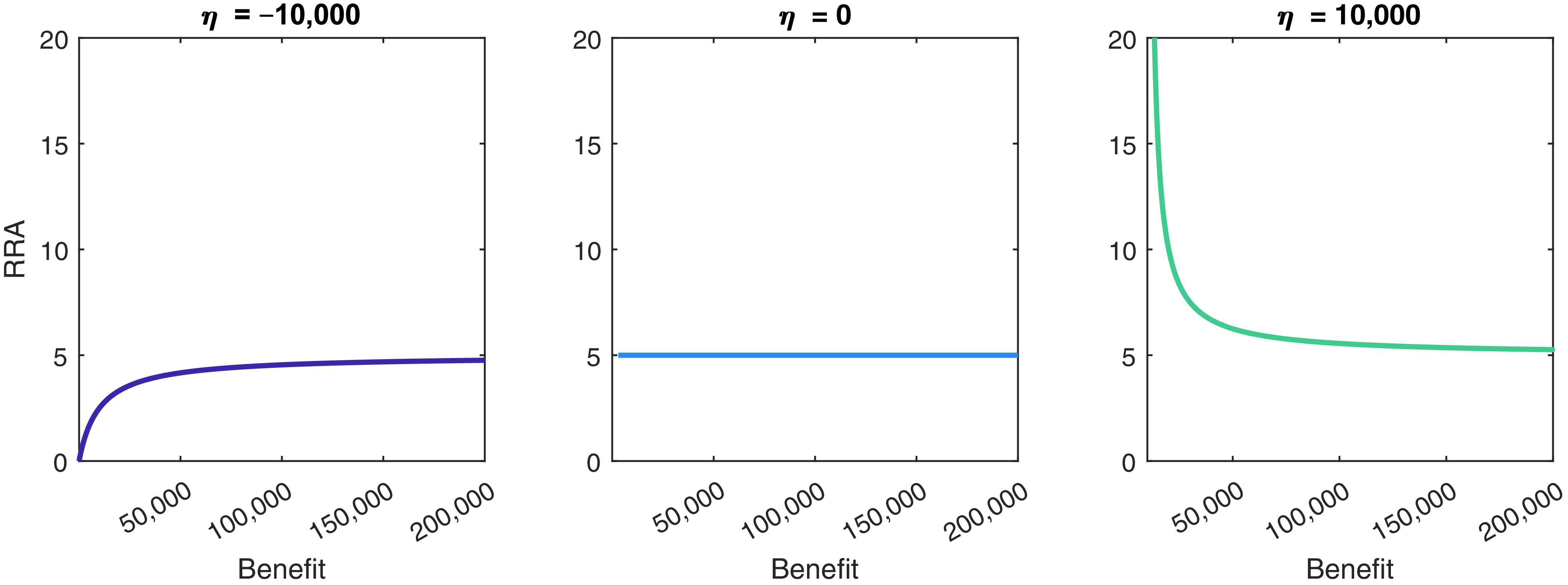


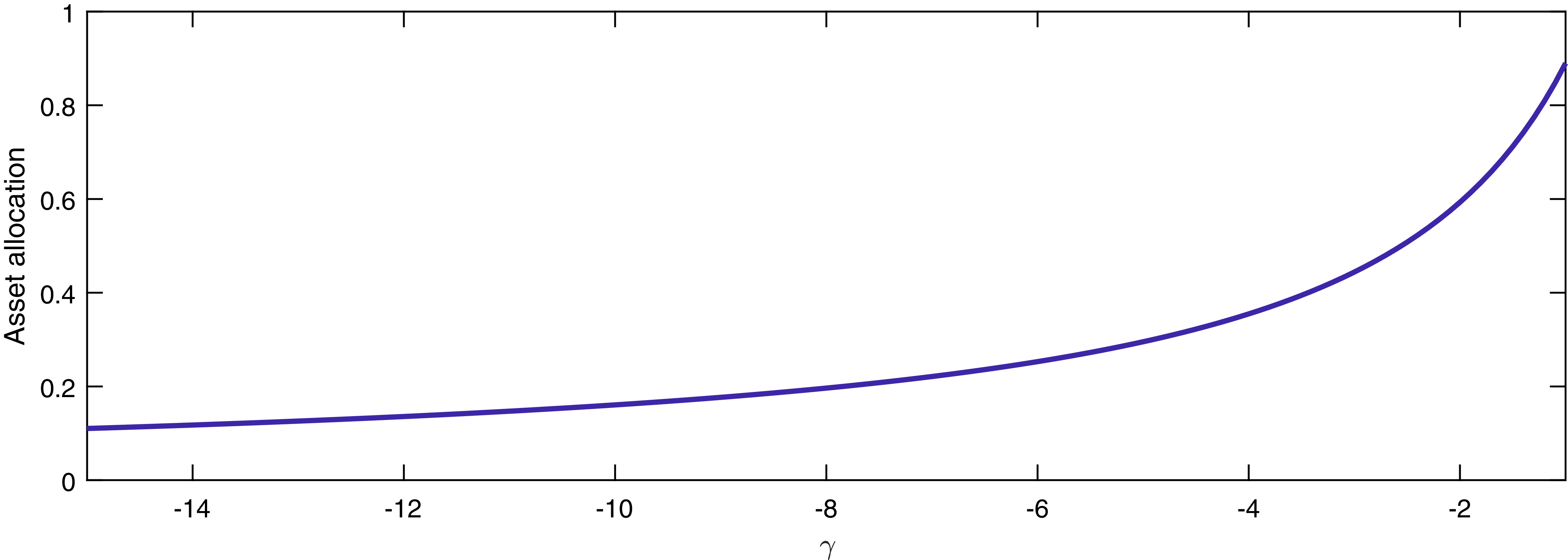

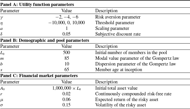


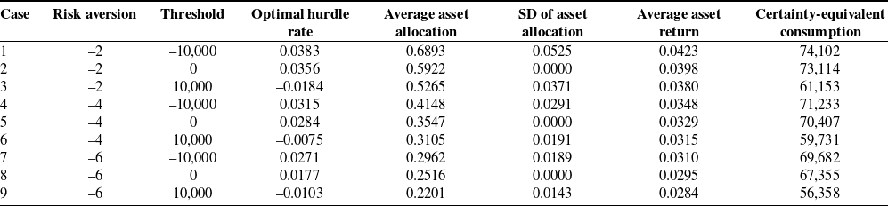

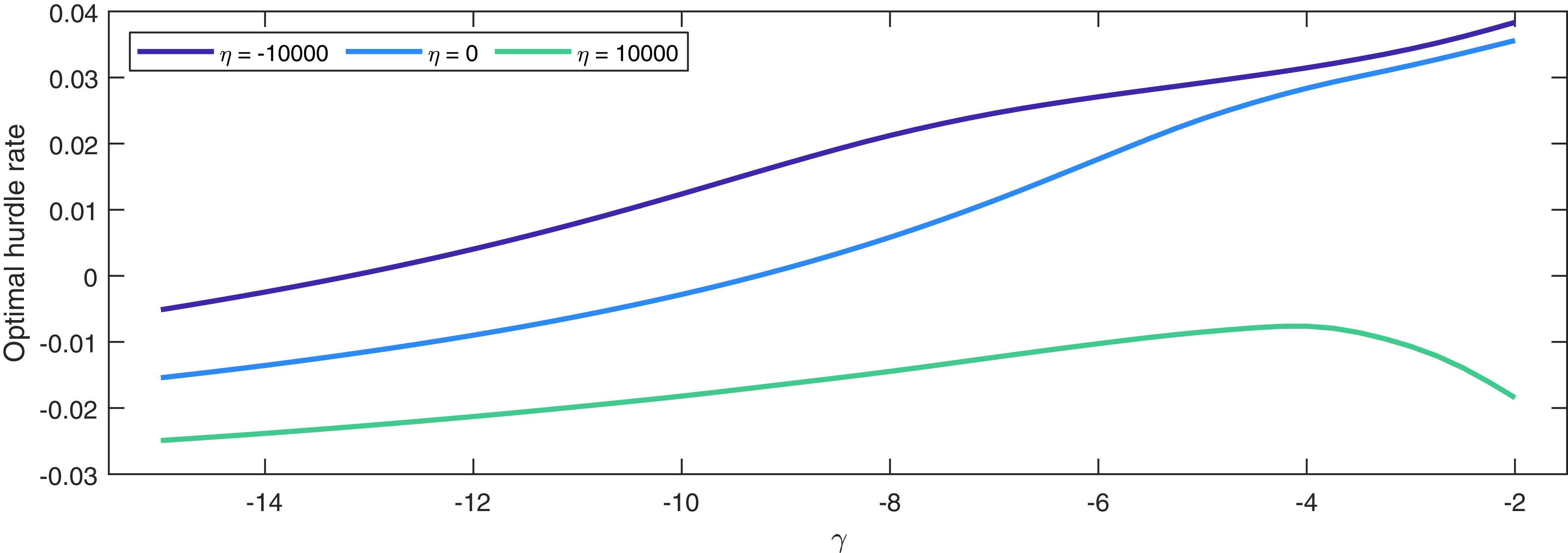


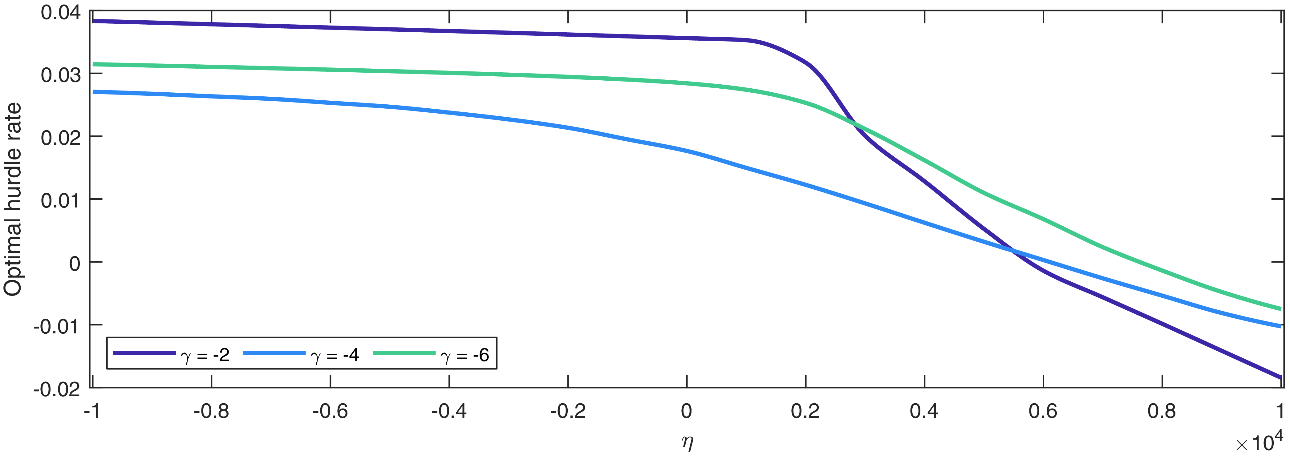


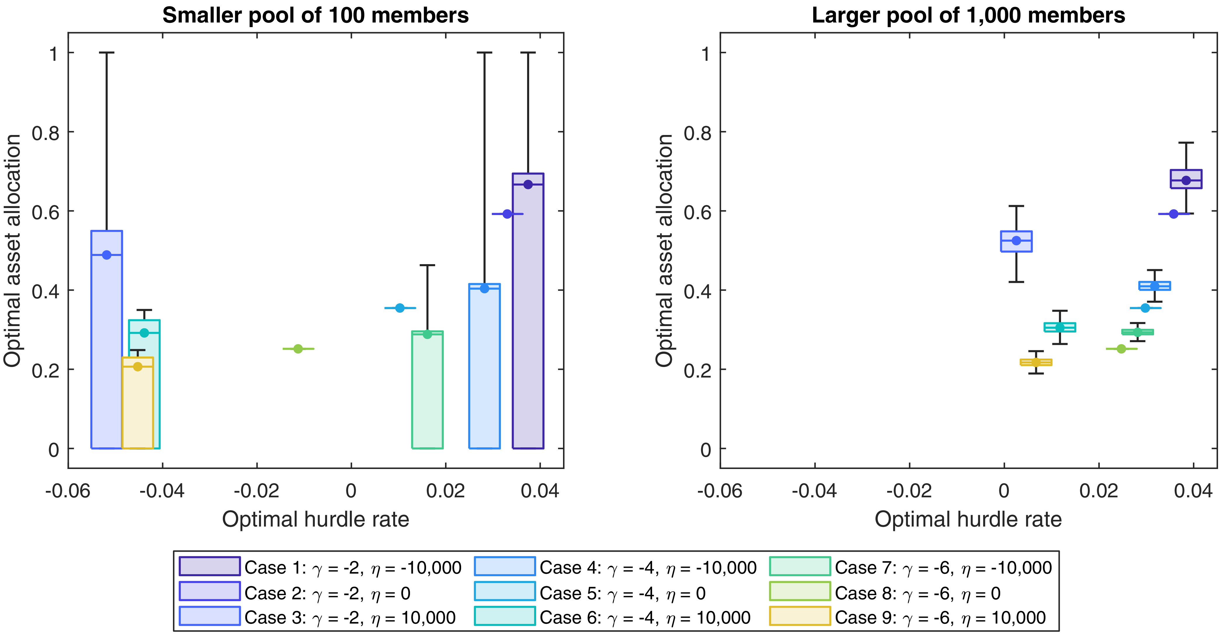


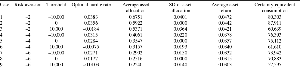


 Open access