


1 Introduction
In the political science literature, there is a long legacy of work on partisan gerrymandering, or the act of drawing political boundary lines to secure extra seats for the party that controls the process. One of the questions attracting the most attention has been to measure the degree of partisan advantage secured by a particular choice of redistricting lines. But to counteract partisan gaming requires a baseline notion of partisan fairness—extra seats compared to what baseline?—that has proved elusive. The family of fairness metrics with perhaps the longest pedigree is called partisan symmetry scores (Gerken et al. Reference Gerken, Katz, King, Sabato and Wang2018; Grofman Reference Grofman1983; Grofman and Gaddie Reference Grofman and Gaddie2019; Grofman and King Reference Grofman and King2007; King and Browning Reference King and Browning1987; King et al. Reference King, Grofman, Gelman and Katz2005), which got a conceptual and empirical overview and a timely renewed endorsement in Katz, King, and Rosenblatt (Reference Katz, King and Rosenblatt2020). The partisan symmetry standard is premised on this intuitively appealing fairness notion: the share of representation awarded to one party with its share of the vote should also be secured by the other party, if the vote shares are exchanged. For instance, if Republicans achieve 40% of the seats with 30% of the vote, then it would be deemed fair for the Democrats to also achieve 40% of the seats with 30% of the vote.
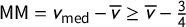
At the heart of the symmetry ideal is a commitment to the principle that half of the votes should secure half of the seats. There are several metrics in the symmetry family that derive their logic from this core axiom. The mean–median metric is vote-denominated: it produces a signed number that is often described as measuring how far short of half of the votes a party can fall while still securing half of the seats. A similar metric, partisan bias, is seat-denominated. Given the same input, it is said to measure how much more than half of the seats will be secured with half of the votes. The ideal value of both of these scores is zero. These are two in a large family of partisan metrics that can be described in terms of geometric symmetry of the “seats–votes curve.”
The focus in the current work is to show that there are serious obstructions to the practical implementation of symmetry standards. This is of pressing current interest at the time of writing: we are in a period of intense public focus on redistricting reform and in the midst of a new round of redistricting. In 2018 alone, voter referenda led four states to pass constitutional amendments (CO, MI, MO, and OH), and another to write reforms into state law (UT) in anticipation of 2021 redistricting.Footnote
1
In Utah, partisan symmetry was adopted as a criterion to be considered by the new independent redistricting commission before plans would be approved.Footnote
2
We sound a note of caution here, showing that the versions of these scores that are realistically useable are eminently gameable by partisan actors and do not have reliable interpretations. To be precise, in each state we studied, the most extreme partisan outcomes for at least one political party are still achievable with a clean bill of health from the full suite of partisan symmetry scores. Furthermore, the signed scores (like mean–median
 $\mathsf {MM }$
and partisan bias
$\mathsf {MM }$
and partisan bias
 $\mathsf {PB }$
) make frequent sign errors in terms of partisan advantage.
$\mathsf {PB }$
) make frequent sign errors in terms of partisan advantage.
Utah itself gives strong evidence of the interpretation problems: with respect to recent voting patterns, a good symmetry score can only be achieved by a plan that secures a Republican congressional sweep; what is more, the popular symmetry scores described above flag all possible plans with any Democratic representation as major Republican gerrymanders.
We argue that there is at present no workable framework to make good on the idea of partisan symmetry. A manageable symmetry standard requires a swing assumption of some kind, because its logic is built on voting counterfactuals (namely, table turning). But this puts the most tenuous election modeling task, vote prediction, at the center of the methodology. And the symmetry framing requires that the metrics be insensitive to the fundamentally spatial nature of redistricting: there are many ways, not one way, for a vote pattern to shift by a given amount.Footnote
3
 $^{,}$
Footnote
4
$^{,}$
Footnote
4
The main contribution of the paper is a Characterization Theorem for partisan symmetry under linear swing that clarifies what is actually measured by the leading symmetry scores. Applying this characterization, we demonstrate that realistic conditions can easily lead to “paradoxes” where one party has an extreme advantage in seats but the other party is flagged as the beneficiary of the gerrymander. We then use recent electoral data from three states to demonstrate the ease of gaming symmetry scores and the prevalence of these paradoxical labelings.
1.1 Literature Review
1.1.1 Building the Seats–Votes Curve with Available Data
We consider an election in a state with k districts and two major parties, Party A and Party B. A standard construction in political science is the “seats–votes curve,” a plot representing the relationship of the vote share for Party A to the seat share for the same party. Observed outcomes generate single points in V–S space—for instance,
 $(.3,.4)$
represents an election where Party A got 30% of the votes and 40% of the seats—but various methods have been used to extend from a scatterplot to a curve, such as by fitting a curve from a given class (linear or cubic, for instance) to observed data points. We will focus on the construction of seats–votes curves that is emphasized in Katz et al. (Reference Katz, King and Rosenblatt2020): linear uniform partisan swing. Beginning with a single data point derived from a districting plan and a vote pattern, the vote share is varied by a uniform shift, so that the district vote shares
$(.3,.4)$
represents an election where Party A got 30% of the votes and 40% of the seats—but various methods have been used to extend from a scatterplot to a curve, such as by fitting a curve from a given class (linear or cubic, for instance) to observed data points. We will focus on the construction of seats–votes curves that is emphasized in Katz et al. (Reference Katz, King and Rosenblatt2020): linear uniform partisan swing. Beginning with a single data point derived from a districting plan and a vote pattern, the vote share is varied by a uniform shift, so that the district vote shares
 $(v_1,\dots ,v_k)$
will shift to
$(v_1,\dots ,v_k)$
will shift to
 $(v_1+t,\dots ,v_k+t)$
. This generates a step function spanning from
$(v_1+t,\dots ,v_k+t)$
. This generates a step function spanning from
 $(0,0)$
to
$(0,0)$
to
 $(1,1)$
in the V–S plot, with a jump in seat share each time a district is pushed past 50% vote share for Party A. (See Figures 1 and 2 for examples.)
$(1,1)$
in the V–S plot, with a jump in seat share each time a district is pushed past 50% vote share for Party A. (See Figures 1 and 2 for examples.)
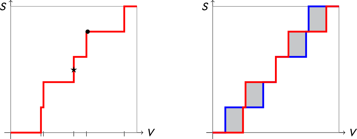
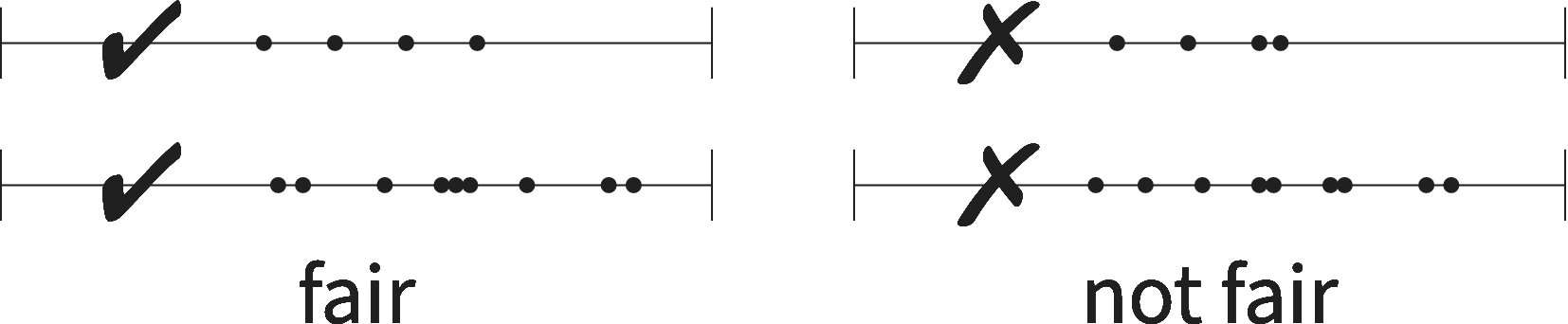
Red: The seats–votes curve
 $\gamma $
generated by vote shares
$\gamma $
generated by vote shares
 $\mathsf {v}=(.21,.51,.61,.85,.87)$
under uniform partisan swing. This gives
$\mathsf {v}=(.21,.51,.61,.85,.87)$
under uniform partisan swing. This gives
 $\overline {v}=.61$
as the average vote share across the districts. The jump points, where an additional seat changes hands, are marked on the V-axis. The blue curve is the reflection of
$\overline {v}=.61$
as the average vote share across the districts. The jump points, where an additional seat changes hands, are marked on the V-axis. The blue curve is the reflection of
 $\gamma $
about the center point
$\gamma $
about the center point
 $\star $
. Since
$\star $
. Since
 $\mathsf {MM }$
is the horizontal displacement from
$\mathsf {MM }$
is the horizontal displacement from
 $\star $
to a point on
$\star $
to a point on
 $\gamma $
, this hypothetical election has a perfect
$\gamma $
, this hypothetical election has a perfect
 $\mathsf {MM }=0$
score, but it is not very symmetric overall, with
$\mathsf {MM }=0$
score, but it is not very symmetric overall, with
 $\mathsf {PG }=.112$
, seen as the area of the shaded region between
$\mathsf {PG }=.112$
, seen as the area of the shaded region between
 $\gamma $
and its reflection. Because the step function jumps at
$\gamma $
and its reflection. Because the step function jumps at
 $V=.5$
, it is not clear how
$V=.5$
, it is not clear how
 $\mathsf {PB }$
is defined in this case.
$\mathsf {PB }$
is defined in this case.
The seats–votes curve
 $\gamma $
generated by the vote share vector
$\gamma $
generated by the vote share vector
 $\mathsf {v}=(.221,.383,.417,.446,.719)$
, which was the observed outcome in the 2016 Congressional races in Oregon from the Republican point of view. This gives a mean of
$\mathsf {v}=(.221,.383,.417,.446,.719)$
, which was the observed outcome in the 2016 Congressional races in Oregon from the Republican point of view. This gives a mean of
 $\overline {v}=0.4372$
, and earned Republicans 1 seat out of 5. The blue curve is the reflection of
$\overline {v}=0.4372$
, and earned Republicans 1 seat out of 5. The blue curve is the reflection of
 $\gamma $
about the center, so it shows seats at each vote share from the Democratic point of view. This could be regarded as a situation with reasonably good symmetry, since the red and blue curves are close. Its scores are
$\gamma $
about the center, so it shows seats at each vote share from the Democratic point of view. This could be regarded as a situation with reasonably good symmetry, since the red and blue curves are close. Its scores are
 $\mathsf {PG }=.05248$
,
$\mathsf {PG }=.05248$
,
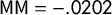 $\mathsf {MM }=-.0202$
, and
$\mathsf {MM }=-.0202$
, and
 $\mathsf {PB }=-.1$
. The sign of the latter two scores is thought to indicate a Democratic advantage.
$\mathsf {PB }=-.1$
. The sign of the latter two scores is thought to indicate a Democratic advantage.

Linear uniform partisan swing is the leading method proposed for use in implementation. Katz–King–Rosenblatt explicitly make it Assumption 3 in their symmetry survey—and use it throughout the paper—noting that the curve-fitting alternative is more suited “for academic study
 $\ldots $
than for practical use” in evaluation of plans. Katz et al. also mention Assumption 4, a stochastic generalization of uniform swing, as a preferred alternative to linear swing “whenever it makes a difference,” and cite Brunell (Reference Brunell1999) and Jackman (Reference Jackman1994) as examples that employ that model. This would add many additional modeling decisions, so would be difficult to carry out authoritatively in a practical setting. Nevertheless, we will identify some differences in shifting to a stochastic swing approach in notes below. In short, neither including low levels of noise nor employing a vote vector obtained by regression from several elections will compromise the main findings here.
$\ldots $
than for practical use” in evaluation of plans. Katz et al. also mention Assumption 4, a stochastic generalization of uniform swing, as a preferred alternative to linear swing “whenever it makes a difference,” and cite Brunell (Reference Brunell1999) and Jackman (Reference Jackman1994) as examples that employ that model. This would add many additional modeling decisions, so would be difficult to carry out authoritatively in a practical setting. Nevertheless, we will identify some differences in shifting to a stochastic swing approach in notes below. In short, neither including low levels of noise nor employing a vote vector obtained by regression from several elections will compromise the main findings here.
In any event, it is simple uniform partisan swing that is prevalent in practical applications. Grofman noted in 1983 that linear swing is preferred in practice to more sophisticated models (Grofman Reference Grofman1983, 14); it is touted as the standard technique in Garand and Parent (Reference Garand and Parent1991); and it has been invoked as recently as 2019 in expert reports and testimony (Mattingly Reference Mattingly2019). Finally, Missouri voters actually wrote linear uniform partisan swing into their state constitution in 2018, requiring that an election index prepared by the state demographer be subjected to a swing of
 $t=-.05,-.04,\dots ,+.05$
to test a plan’s responsiveness.Footnote
5
Because the present analysis is designed to address the prospects for implementation, we therefore focus on the linear swing model.
$t=-.05,-.04,\dots ,+.05$
to test a plan’s responsiveness.Footnote
5
Because the present analysis is designed to address the prospects for implementation, we therefore focus on the linear swing model.
1.1.2 Deriving Symmetry Scores from the Seats–Votes Curve
Given a seats–votes curve, many symmetry scores have been proposed; here, we focus on the mean–median score
 $\mathsf {MM }$
, the partisan bias score
$\mathsf {MM }$
, the partisan bias score
 $\mathsf {PB }$
, and the partisan Gini score
$\mathsf {PB }$
, and the partisan Gini score
 $\mathsf {PG }$
, which have all been considered for at least 35 years. (Definitions are found in the next section.) Grofman’s 1983 survey paper (Grofman Reference Grofman1983) lays out eight possible scores of asymmetry once a seats–votes curve has been set. His Measure 3 is vote-denominated bias, which would equal
$\mathsf {PG }$
, which have all been considered for at least 35 years. (Definitions are found in the next section.) Grofman’s 1983 survey paper (Grofman Reference Grofman1983) lays out eight possible scores of asymmetry once a seats–votes curve has been set. His Measure 3 is vote-denominated bias, which would equal
 $\mathsf {MM }$
under linear uniform partisan swing; similarly, his Measure 4 corresponds to
$\mathsf {MM }$
under linear uniform partisan swing; similarly, his Measure 4 corresponds to
 $\mathsf {PB }$
, and Measure 7 introduces
$\mathsf {PB }$
, and Measure 7 introduces
 $\mathsf {PG }$
.
$\mathsf {PG }$
.
Because the partisan Gini is defined as the area between the seats–votes curve and its reflection over the center (shown in the shaded regions in Figures 1 and 2), it is easily seen to “control” all the other possible symmetry scores: when
 $\mathsf {PG }=0$
, its ideal value, all partisan symmetry metrics also take their ideal values, including
$\mathsf {PG }=0$
, its ideal value, all partisan symmetry metrics also take their ideal values, including
 $\mathsf {MM }$
and
$\mathsf {MM }$
and
 $\mathsf {PB }$
. This agrees with Katz–King–Rosenblatt (Katz et al. Reference Katz, King and Rosenblatt2020, Definition 1), where the coincidence of the curve and its reflection, i.e.,
$\mathsf {PB }$
. This agrees with Katz–King–Rosenblatt (Katz et al. Reference Katz, King and Rosenblatt2020, Definition 1), where the coincidence of the curve and its reflection, i.e.,
 $\mathsf {PG }=0$
, is called the “partisan symmetry standard.” In the current work, our Theorem 3 gives precise necessary and sufficient conditions for the partisan symmetry standard to be satisfied.
$\mathsf {PG }=0$
, is called the “partisan symmetry standard.” In the current work, our Theorem 3 gives precise necessary and sufficient conditions for the partisan symmetry standard to be satisfied.
The literature invoking
 $\mathsf {MM }$
and
$\mathsf {MM }$
and
 $\mathsf {PB }$
as measures of bias is too large to survey comprehensively. We note that the interpretation of median-minus-mean as quantifying (signed) Party A advantage is fairly standard in the journal literature, such as: “The median is 53 and the mean is 55; thus, the bias runs two points against Party A (i.e.,
$\mathsf {PB }$
as measures of bias is too large to survey comprehensively. We note that the interpretation of median-minus-mean as quantifying (signed) Party A advantage is fairly standard in the journal literature, such as: “The median is 53 and the mean is 55; thus, the bias runs two points against Party A (i.e.,
 $53-55=-2$
)” (McDonald and Best Reference McDonald and Best2015). The connection to the seats–votes curve is also standard:
$53-55=-2$
)” (McDonald and Best Reference McDonald and Best2015). The connection to the seats–votes curve is also standard:
 $\mathsf {MM }$
“essentially slices the S/V graph horizontally at the S = 50% level and obtains the deviation of the vote from 50%” (Nagle Reference Nagle2015, 351).Footnote
6
$\mathsf {MM }$
“essentially slices the S/V graph horizontally at the S = 50% level and obtains the deviation of the vote from 50%” (Nagle Reference Nagle2015, 351).Footnote
6
We briefly note the impact of introducing stochasticity on the analysis below, and we note that modifying the seats–votes curve
 $\gamma $
by adding noising terms with mean zero will change the precision of our findings but not the basic structure, replacing exact equalities in the Characterization Theorem with approximate equalities. In particular, this does not impact the prevalence of “paradoxes,” for two reasons. First, when the curve
$\gamma $
by adding noising terms with mean zero will change the precision of our findings but not the basic structure, replacing exact equalities in the Characterization Theorem with approximate equalities. In particular, this does not impact the prevalence of “paradoxes,” for two reasons. First, when the curve
 $\gamma $
passes far from
$\gamma $
passes far from
 $(V,S)=(.5,.5)$
, perturbations to
$(V,S)=(.5,.5)$
, perturbations to
 $\gamma $
will not move it past the center point, which would be needed to change the sign of
$\gamma $
will not move it past the center point, which would be needed to change the sign of
 $\mathsf {MM }$
and
$\mathsf {MM }$
and
 $\mathsf {PB }$
(as explained below in Section 2). Second, the standard mean–median score is simply calculated as the difference of the mean vote share by district and the median (Katz et al. Reference Katz, King and Rosenblatt2020, 173), and thus relies on no swing assumption at all! Abandoning linear swing therefore does not fix the problems with the mean–median score, but only breaks its relationship to the seats–votes curve.
$\mathsf {PB }$
(as explained below in Section 2). Second, the standard mean–median score is simply calculated as the difference of the mean vote share by district and the median (Katz et al. Reference Katz, King and Rosenblatt2020, 173), and thus relies on no swing assumption at all! Abandoning linear swing therefore does not fix the problems with the mean–median score, but only breaks its relationship to the seats–votes curve.
1.1.3 Applying Symmetry Scores in Practice
The current work is designed to evaluate the techniques proposed by leading practitioners for practical use. Political scientists and their collaborators have advanced these scores in amicus briefs spanning from LULAC v. Perry (2006) (King et al. Reference King, Grofman, Gelman and Katz2005) to Whitford v. Gill (2018) (Gerken et al. Reference Gerken, Katz, King, Sabato and Wang2018) to Rucho v. Common Cause (2019) (Grofman and Gaddie Reference Grofman and Gaddie2019). The scores have been claimed to be “reliable and difficult to manipulate,” and authors have argued that while “Symmetry tests should deploy actual election outcomes” (as we do here), they will nonetheless “measure opportunity,” i.e., give information about future performance (Gerken et al. Reference Gerken, Katz, King, Sabato and Wang2018, 17 and 24). That assertion is drawn from an amicus brief in the Whitford case explicitly proposing mean–median as a concrete choice of score for this task. As laid out earlier in the influential LULAC brief,
“Models applying the symmetry standard are by their nature predictive, just as the legislators themselves are predicting the potential impact of the map on partisan representation. The symmetry standard and the resulting measures of partisan bias, however, do not require forecasts of a particular voting outcome. Rather, by examining all the relevant data and the potential seat divisions that would occur for particular vote divisions, it compares the potential scenarios and determines the partisan bias of a map, separating out other potentially confounding factors. Importantly, those drawing the map have access to the same data used to evaluate it, and no data is required other than what is in the public domain” (King et al. Reference King, Grofman, Gelman and Katz2005, 11).
This paper takes up precisely this modeling task in the manner explicitly proposed by its authors.
1.2 Premises and Caveats
1.2.1 What Is Partisan Gerrymandering?
To assess the success of partisan symmetry metrics at their task of identifying partisan gerrymandering, we should be clear about first principles. First, we agree on the definition from Katz et al. (Reference Katz, King and Rosenblatt2020): “Partisan gerrymanderers use their knowledge of voter preferences and their ability to draw favorable redistricting plans to maximize their party’s seat share.” That is, the express intent of a partisan gerrymander is to secure for their party as many seats as possible under the constraints of voter geography and the other rules of redistricting.
This means that a (successful) gerrymander in favor of Party A is a districting plan that obtains an extreme Party A seat share. In the public perception, that will usually be assessed by comparing the seat share to the vote share, undergirded by an intuition that equates fairness with proportionality. But proportionality is not the neutral tendency of redistricting, and in some cases, it may be literally impossible to secure (Duchin et al. Reference Duchin, Gladkova, Henninger-Voss, Klingensmith, Newman and Wheelen2019). For the better part of a century, political scientists have investigated this neutral tendency by appealing to constructions like seats–votes curves and cube laws. This literature has been severely limited by its inattention (with a few notable exceptions) to spatial factors, i.e., to the geography of the vote distribution.Footnote 7 A powerful alternative has recently emerged through so-called ensemble methods: Markov chain algorithms (for example) can now build samples of alternative districting plans, holding a vote distribution fixed. Although we make use of ensembles of alternative plans below, the crux of this paper does not require the reader to commit to this or any particular choice of nongerrymandered baseline. On any common view of the baseline, from proportionality to cube law to outlier analysis from an ensemble, the standard definition of partisan gerrymandering entails views like these:
-
• Circa 2016, the voter preferences in North Carolina were fairly even between Democratic and Republican candidates for statewide office. Both algorithmic techniques and human mapmakers can easily draw plans ranging from 7 to 10 districts with a Republican majority in the 13-member Congressional plan. In this context, a successful Republican gerrymander would secure a 10R-3D outcome, or an even more extreme outcome if possible.
-
• In Utah, voting patterns in this period tend to favor Republican over Democratic candidates by a roughly 70–30 split. This is tilted enough that a 4R-0D Congressional plan is in some sense typical or expected, and need not be viewed as a gerrymander. However, it would be an error to label a 3R-1D outcome as a Republican-favoring gerrymander.
We will treat these as premises in the treatment below.
1.2.2 Ensembles, Not Estimators
In this paper, the algorithmically generated plans are not offered as a statistical experiment and come with no probabilistic claims, but mainly provide existence proofs to illustrate how readily gameable partisan symmetry standards will be for those engaged in redistricting.Footnote 8 The methods also produce many thousands of examples of plans that are paradoxical in the sense developed in this paper, where signed partisan symmetry metrics identify the wrong party as the gerrymanderers.
The algorithm used here (described in Section 4.1) builds a sample of plans that are plausible by the lights of traditional districting principles: they are population-balanced, contiguous, and relatively compact, using whole precincts as the building blocks. There are techniques to layer in other criteria in addition to these in a state-specific way to set up a more thorough outlier analysis, but that is not needed for this application (see, e.g., Becker et al. Reference Becker, Duchin, Gold and Hirsch2021; DeFord and Duchin Reference DeFord and Duchin2019; DeFord, Duchin, and Solomon Reference DeFord, Duchin and Solomon2020). Nothing here, or in the broader logic of ensemble analysis, assumes that line drawers are random agents.
1.2.3 The Competitiveness Caveat
Writing after the LULAC v. Perry decision in 2007, Grofman and King offer this key caveat: “[W]e are not proposing to apply this methodology in every situation, but only in potentially competitive jurisdictions, where the consequences of gerrymandering might be especially onerous in thwarting the will of the majority” (Grofman and King Reference Grofman and King2007; their emphasis). In the following paragraph, they suggest that “reasonably competitive” settings could be those where each party receives 40%–60% of vote share. This is a sizeable limitation on the scope of the symmetry approach: only about half of states have a recent U.S. Senate voting pattern in this range, for example.Footnote 9 Two of the three cases presented below (North Carolina and Texas) are in this reasonably competitive zone; the third is Utah, where a partisan symmetry standard was recently enacted in law. We could not find any record of political scientists speaking out against Utah’s adoption of this measure while it was on the ballot in 2018.
The more recent Katz et al. (Reference Katz, King and Rosenblatt2020) mainly places its competitiveness caveat in Appendices A and B,Footnote 10 although it is obliquely referenced in Assumption 2, which requires that there is a sufficiently large range of “possible values” for vote outcomes. Even there, the caveat is hedged: “Although Assumption 2 is defined in terms of possible electoral outcomes, those that are exceedingly unlikely, such as Washington DC voting overwhelming[ly] Republican, do not violate this assumption but may generate model dependence in estimation.” On our reading, the authors do not rule out the use of partisan symmetry metrics even on states with an extreme partisan lean.
In any case, the analysis presented here, which shows that the partisan symmetry standard devolves to a simple numerical test, extends to competitive as well as uncompetitive situations.
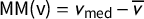
2 A Mathematical Characterization of the Partisan Symmetry Standard
We begin with definitions and notations needed to state Theorem 3, which characterizes when
 $\mathsf {PG }=0$
(the Partisan Symmetry Standard from Katz et al. (Reference Katz, King and Rosenblatt2020)). We describe the vote outcome in the election using an ordered tuple (i.e., a vector) whose coordinates record the Party A share of the two-party vote in each of the k districts as follows:
$\mathsf {PG }=0$
(the Partisan Symmetry Standard from Katz et al. (Reference Katz, King and Rosenblatt2020)). We describe the vote outcome in the election using an ordered tuple (i.e., a vector) whose coordinates record the Party A share of the two-party vote in each of the k districts as follows:
 $\mathsf {v}=(v_1, \dots , v_k),$
where
$\mathsf {v}=(v_1, \dots , v_k),$
where
 $0 \leq v_1 \le \cdots \le v_k \leq 1$
. Let the mean district vote share for Party A be denoted
$0 \leq v_1 \le \cdots \le v_k \leq 1$
. Let the mean district vote share for Party A be denoted
 $\overline {v} = \frac 1k \sum v_i$
and the median district vote share,
$\overline {v} = \frac 1k \sum v_i$
and the median district vote share,
 $v_{\mathrm {med}}$
, be the median of the
$v_{\mathrm {med}}$
, be the median of the
 $\{v_i\}$
, which equals
$\{v_i\}$
, which equals
 $v_{(k+1)/2}$
if k is odd and
$v_{(k+1)/2}$
if k is odd and
 $\frac 12 (v_{k/2}+v_{(k/2)+1})$
if k is even because of the convention that coordinates are in nondecreasing order. We note that
$\frac 12 (v_{k/2}+v_{(k/2)+1})$
if k is even because of the convention that coordinates are in nondecreasing order. We note that
 $\overline {v}$
is not necessarily the same as the statewide share for Party A except in the idealized scenario that the districts have equal numbers of votes cast (i.e., equal turnout).
$\overline {v}$
is not necessarily the same as the statewide share for Party A except in the idealized scenario that the districts have equal numbers of votes cast (i.e., equal turnout).
The number of districts in which Party A has more votes than Party B in an election with vote shares
 $\mathsf {v}$
is the seat outcome,
$\mathsf {v}$
is the seat outcome,
 $\#\{i:v_i>\frac 12\}$
. This induces a seats–votes function
$\#\{i:v_i>\frac 12\}$
. This induces a seats–votes function
 $\gamma =\gamma _{\mathsf {v}}$
defined as
$\gamma =\gamma _{\mathsf {v}}$
defined as
 $\gamma (\overline {v}+t)=\#\{i: v_i+t>\frac 12\}/k$
, which we can interpret as the share of districts won by Party A in the counterfactual that an amount t was added to A’s observed vote share in every district. Varying t to range over the one-parameter family of vote vectors
$\gamma (\overline {v}+t)=\#\{i: v_i+t>\frac 12\}/k$
, which we can interpret as the share of districts won by Party A in the counterfactual that an amount t was added to A’s observed vote share in every district. Varying t to range over the one-parameter family of vote vectors
 $(v_1+t,\dots ,v_k+t)$
is known as (linear) uniform partisan swing. The curve
$(v_1+t,\dots ,v_k+t)$
is known as (linear) uniform partisan swing. The curve
 $\gamma $
, treated as a function
$\gamma $
, treated as a function
 $[0,1]\to [0,1]$
, has been regarded as measuring how a fixed districting plan would behave if the level of vote for Party A were to swing up or down. Below, we will refer to the function and its graph interchangeably, and we will call it the seats–votes curve associated to the vote share vector
$[0,1]\to [0,1]$
, has been regarded as measuring how a fixed districting plan would behave if the level of vote for Party A were to swing up or down. Below, we will refer to the function and its graph interchangeably, and we will call it the seats–votes curve associated to the vote share vector
 $\mathsf {v}$
. We begin with several scores based on
$\mathsf {v}$
. We begin with several scores based on
 $\mathsf {v}$
and
$\mathsf {v}$
and
 $\gamma $
.
$\gamma $
.
Definition 1 Partisan Symmetry Scores
The partisan Gini score
 $\mathsf {PG }(\mathsf {v})$
is the area between the seats–votes curve
$\mathsf {PG }(\mathsf {v})$
is the area between the seats–votes curve
 $\gamma _{\mathsf {v}}$
and its reflection over the center point
$\gamma _{\mathsf {v}}$
and its reflection over the center point
 $\star =(\frac 12, \frac 12)$
.
$\star =(\frac 12, \frac 12)$
.
 $$ \begin{align*}\mathsf{PG }(\mathsf{v})=\int_0^1 \bigl|\gamma(x)-\gamma(1-x)+1\bigr|\ dx.\end{align*} $$
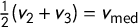
The mean–median score is
 $\mathsf {MM }(\mathsf {v})=v_{\mathrm {med}}-\overline {v}$
. The partisan bias score is
$\mathsf {MM }(\mathsf {v})=v_{\mathrm {med}}-\overline {v}$
. The partisan bias score is
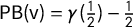 $\mathsf {PB }(\mathsf {v})=\gamma (\frac 12)-\frac 12$
.
$\mathsf {PB }(\mathsf {v})=\gamma (\frac 12)-\frac 12$
.
These scores can all be related to the shape of the seats–votes curve
 $\gamma $
(see Figures 1 and 2). Partisan Gini measures the failure of
$\gamma $
(see Figures 1 and 2). Partisan Gini measures the failure of
 $\gamma $
to be symmetric about the center point
$\gamma $
to be symmetric about the center point
 $\star =(\frac 12,\frac 12)$
, in the sense that it is always nonnegative, and it equals zero if and only if
$\star =(\frac 12,\frac 12)$
, in the sense that it is always nonnegative, and it equals zero if and only if
 $\gamma $
equals its reflection. Mean–median score is the horizontal displacement from
$\gamma $
equals its reflection. Mean–median score is the horizontal displacement from
 $\star $
to a point on
$\star $
to a point on
 $\gamma $
,Footnote
11
which is why it is votes-denominated (vote share being the variable on the x-axis). Similarly, partisan bias is the vertical displacement from
$\gamma $
,Footnote
11
which is why it is votes-denominated (vote share being the variable on the x-axis). Similarly, partisan bias is the vertical displacement from
 $\star $
to a point on
$\star $
to a point on
 $\gamma $
, and is therefore seats-denominated. (We note that
$\gamma $
, and is therefore seats-denominated. (We note that
 $(\frac 12,\gamma (\frac 12))$
is a well-defined point unless there is a jump precisely at
$(\frac 12,\gamma (\frac 12))$
is a well-defined point unless there is a jump precisely at
 $\frac 12$
, which occurs if some
$\frac 12$
, which occurs if some
 $v_i=\overline {v}$
on the nose—this is shown in Figure 1 but should not happen with real-world data.) Below, we will focus on
$v_i=\overline {v}$
on the nose—this is shown in Figure 1 but should not happen with real-world data.) Below, we will focus on
 $\mathsf {MM }$
instead of
$\mathsf {MM }$
instead of
 $\mathsf {PB }$
, but we note that
$\mathsf {PB }$
, but we note that
 $\mathsf {MM }>0\implies \mathsf {PB }\ge 0$
because of the geometric interpretation: if
$\mathsf {MM }>0\implies \mathsf {PB }\ge 0$
because of the geometric interpretation: if
 $\gamma $
passes to the left of
$\gamma $
passes to the left of
 $\star $
and is nondecreasing, then it must pass through or above
$\star $
and is nondecreasing, then it must pass through or above
 $\star $
.
$\star $
.
We can see that the curve
 $\gamma $
, and consequently the partisan Gini score, is exactly characterized by the points at which Party A has added enough vote share to secure the majority in an additional district. For the following analysis, it will be useful to characterize this curve in terms of the
$\gamma $
, and consequently the partisan Gini score, is exactly characterized by the points at which Party A has added enough vote share to secure the majority in an additional district. For the following analysis, it will be useful to characterize this curve in terms of the
 $\mathsf {v}$
data.
$\mathsf {v}$
data.
Definition 2 Gaps and Jumps
The gaps in a vote share vector
 $\mathsf {v}$
can be written in a gap vector
$\mathsf {v}$
can be written in a gap vector
The jump points for vote share vector
 $\mathsf {v}$
are the values of
$\mathsf {v}$
are the values of
 $\overline {v} +t$
such that some
$\overline {v} +t$
such that some
 $v_i+t=\frac 12$
. We have
$v_i+t=\frac 12$
. We have
 $$ \begin{align*}t_1 := \frac{1}{2} - v_k \ , \qquad t_2 := \frac{1}{2} - v_{k-1} \ , \qquad \dots, \qquad t_k := \frac{1}{2} - v_1,\end{align*} $$
as the times corresponding to these jumps, so we can denote the jumps as
 $j_i=\frac 12 + \overline {v} - v_{k+1-i}$
, and the jump vector as
$j_i=\frac 12 + \overline {v} - v_{k+1-i}$
, and the jump vector as
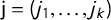 $\mathsf {j}=(j_1,\dots ,j_k)$
.
$\mathsf {j}=(j_1,\dots ,j_k)$
.
By definition of
 $\gamma $
, these jump points
$\gamma $
, these jump points
 $j_i$
, marked in the figures, are exactly the x-axis locations (i.e., the V values) at which
$j_i$
, marked in the figures, are exactly the x-axis locations (i.e., the V values) at which
 $\gamma $
jumps from
$\gamma $
jumps from
 $(i-1)/k$
to
$(i-1)/k$
to
 $i/k$
.Footnote
12
$i/k$
.Footnote
12
With this notation, we can rephrase and relate the various partisan symmetry scores. For instance, the centermost rectangle(s) formed between
 $\gamma $
and its reflection have height
$\gamma $
and its reflection have height
 $2\mathsf {PB }$
and width
$2\mathsf {PB }$
and width
 $2\mathsf {MM }$
, which lets us relate the scores. For small k, these relationships reduce to extremely simple expressions:
$2\mathsf {MM }$
, which lets us relate the scores. For small k, these relationships reduce to extremely simple expressions:
 $\mathsf {PG }=\frac 43 |\mathsf {MM }|$
when
$\mathsf {PG }=\frac 43 |\mathsf {MM }|$
when
 $k=3$
, and
$k=3$
, and
 $\mathsf {PG }=2|\mathsf {MM }|$
when
$\mathsf {PG }=2|\mathsf {MM }|$
when
 $k=4$
(proved in Appendix A).
$k=4$
(proved in Appendix A).
For any number of districts, we obtain a clean characterization of precisely when vote shares by district satisfy the Partisan Symmetry Standard (Katz et al. Reference Katz, King and Rosenblatt2020, Definition 1).
Theorem 3 Partisan Symmetry Characterization
Given k districts with vote shares
 $\mathsf {v}$
, jump vector
$\mathsf {v}$
, jump vector
 $\mathsf {j}$
, and gap vector
$\mathsf {j}$
, and gap vector
![]() , the following are equivalent:
, the following are equivalent:
 $$ \begin{align} &\mathsf{PG }(\mathsf{v}) = 0, \end{align} $$
 $$ \begin{align} &\kern-63pt j_i + j_{k+1-i} - 1 = 0 \qquad \forall i, \end{align} $$
 $$ \begin{align} &\kern-63pt \frac 12 \left(v_i + v_{k+1-i}\right) = \overline{v} \qquad \forall i, \end{align} $$
 $$ \begin{align} &\kern-51pt \frac 12 \left(v_i + v_{k+1-i}\right) = v_{\mathrm{med}} \qquad \forall i, \end{align} $$
 $$ \begin{align} & \kern-83pt \delta_i = \delta_{k-i} \qquad \forall i. \kern12pt\end{align} $$
The proof is included in Appendix A. Note also that the theorem statement makes it clear that
 $\mathsf {PG }=0\implies \mathsf {MM }=0$
by comparing the third equality to the fourth, which fits with the earlier observation that partisan Gini “controls” the other scores.
$\mathsf {PG }=0\implies \mathsf {MM }=0$
by comparing the third equality to the fourth, which fits with the earlier observation that partisan Gini “controls” the other scores.
Theorem 3 asserts that the partisan symmetry standard under linear swing is nothing but the requirement that the vote shares by district are distributed on the number line in a symmetric way.Footnote
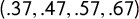
13
In particular, this tells you at a glance that an election with vote shares
 $(.37,.47,.57,.67)$
in its districts rates as perfectly partisan-symmetric, while one with vote shares
$(.37,.47,.57,.67)$
in its districts rates as perfectly partisan-symmetric, while one with vote shares
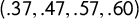 $(.37,.47,.57,.60)$
falls short. This is illustrated in Figure 3.
$(.37,.47,.57,.60)$
falls short. This is illustrated in Figure 3.
Four election outcomes, shown as vote shares by district. On the left-hand side, the
 $v_i$
are symmetric about their center, so all partisan symmetry scores are perfect. On the right-hand side, nonsymmetric outcomes. The partisan symmetry standard can be eyeballed by a glance at the vote shares in the districts.
$v_i$
are symmetric about their center, so all partisan symmetry scores are perfect. On the right-hand side, nonsymmetric outcomes. The partisan symmetry standard can be eyeballed by a glance at the vote shares in the districts.
3 Paradoxes with Signed Symmetry Scores
Recall that mean–median and partisan bias are signed scores that are supposed to identify which party has an advantage and by what amount. A positive score is said to indicate an advantage for Party A (the point-of-view party whose vote shares are reported in
 $\mathsf {v}$
). Let us say that a paradox occurs when the score indicates an advantage for one party even though it has the fewest seats it can possibly earn with its vote share, say.Footnote
14
In other words, a paradox means that the score makes a sign error with respect to the standard definition of partisan gerrymandering.
$\mathsf {v}$
). Let us say that a paradox occurs when the score indicates an advantage for one party even though it has the fewest seats it can possibly earn with its vote share, say.Footnote
14
In other words, a paradox means that the score makes a sign error with respect to the standard definition of partisan gerrymandering.
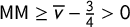
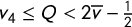
When there is an extremely skewed outcome (with a vote share for one party exceeding 75%), we will show that paradoxes always occur, just as a matter of arithmetic. But even for less skewed elections with a vote share between 62.5% and 75% for the leading party—which frequently occur in practice!—mundane realities of political geography can force these sign paradoxes.
To illustrate these observations, we will begin with the case of
 $k=4$
districts, where the algebra is simpler. The issues are not limited to small k, however: in the empirical section, we will find paradoxes of this kind in
$k=4$
districts, where the algebra is simpler. The issues are not limited to small k, however: in the empirical section, we will find paradoxes of this kind in
 $k=13$
and
$k=13$
and
 $k=36$
cases as well.
$k=36$
cases as well.
Example 4 Paradoxes Forced by Arithmetic
Suppose we have
 $k=4$
districts and an extremely skewed election in favor of Party A, achieving
$k=4$
districts and an extremely skewed election in favor of Party A, achieving
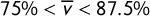 $75\% < \overline {v} < 87.5\%$
. With equal turnout, Party B can get at most one seat. However, every vote vector
$75\% < \overline {v} < 87.5\%$
. With equal turnout, Party B can get at most one seat. However, every vote vector
 $\mathsf {v}$
achieving this outcome (one B seat) yields
$\mathsf {v}$
achieving this outcome (one B seat) yields
 $\mathsf {MM }\ge \overline {v}-\frac 34> 0$
. In particular, such districting plans all have positive
$\mathsf {MM }\ge \overline {v}-\frac 34> 0$
. In particular, such districting plans all have positive
 $\mathsf {MM }$
and
$\mathsf {MM }$
and
 $\mathsf {PB }$
, paradoxically indicating an advantage for Party A in every case where Party B gets representation.
$\mathsf {PB }$
, paradoxically indicating an advantage for Party A in every case where Party B gets representation.
The demonstration is simple arithmetic. Since
 $\frac 12 (v_2+v_3) =v_{\mathrm {med}}$
, we have
$\frac 12 (v_2+v_3) =v_{\mathrm {med}}$
, we have
 $$ \begin{align*}\overline{v}=\frac 14 (v_1+v_2+v_3+v_4) = \frac{v_1+v_4}4 + \frac{v_2+v_3}4 \implies v_{\mathrm{med}} - \overline{v} = \overline{v} - \frac{v_1+v_4}2.\end{align*} $$
Since
 $v_1\le \frac 12$
(for B to win a seat) and
$v_1\le \frac 12$
(for B to win a seat) and
 $v_4\le 1$
, we get
$v_4\le 1$
, we get
 $\mathsf {MM }=v_{\mathrm {med}}-\overline {v} \ge \overline {v}-\frac 34$
, as needed.
$\mathsf {MM }=v_{\mathrm {med}}-\overline {v} \ge \overline {v}-\frac 34$
, as needed.
A stronger statement can be made if one takes political geography into account. It was shown by Duchin–Gladkova–Henninger-Voss–Newman–Wheelen in a study of Massachusetts (Duchin et al. Reference Duchin, Gladkova, Henninger-Voss, Klingensmith, Newman and Wheelen2019) that, if the precincts are treated as atoms that are not to be split in redistricting, then several recent elections have the property that no choice of district lines can create even one district with Republican vote share over
 $\frac 12$
. This is because Republican votes are distributed extremely uniformly across the precincts of the state. While other states are not as uniform as Massachusetts, it is still true that there is some upper bound Q on the vote share that is possible for each party in any district. When this bound satisfies
$\frac 12$
. This is because Republican votes are distributed extremely uniformly across the precincts of the state. While other states are not as uniform as Massachusetts, it is still true that there is some upper bound Q on the vote share that is possible for each party in any district. When this bound satisfies
 $Q<2\overline {v}-\frac 12$
, even moderately skewed elections are forced to exhibit paradoxical symmetry scores. As we will see below, having all
$Q<2\overline {v}-\frac 12$
, even moderately skewed elections are forced to exhibit paradoxical symmetry scores. As we will see below, having all
 $v_i<2\overline {v}-\frac 12$
ensures both that one seat is the best outcome for Party B and that the median vote share is greater than the mean.
$v_i<2\overline {v}-\frac 12$
ensures both that one seat is the best outcome for Party B and that the median vote share is greater than the mean.
Example 5 Paradoxes Forced by Geography
Suppose we have
 $k=4$
districts and a skewed election in favor of Party A, with
$k=4$
districts and a skewed election in favor of Party A, with
 $62.5\%\le \overline {v} < 75\%$
. Suppose the geography of the election has Party A support arranged uniformly enough that districts cannot exceed a share Q of A votes, for some
$62.5\%\le \overline {v} < 75\%$
. Suppose the geography of the election has Party A support arranged uniformly enough that districts cannot exceed a share Q of A votes, for some
 $Q<2\overline {v}-\frac 12$
. Then, with equal turnout, Party B can get at most one seat. However, every vote vector
$Q<2\overline {v}-\frac 12$
. Then, with equal turnout, Party B can get at most one seat. However, every vote vector
 $\mathsf {v}$
achieving this outcome (one B seat) has a positive
$\mathsf {v}$
achieving this outcome (one B seat) has a positive
 $\mathsf {MM }$
and
$\mathsf {MM }$
and
 $\mathsf {PB }$
, paradoxically indicating an advantage for Party A in every case where Party B gets representation.
$\mathsf {PB }$
, paradoxically indicating an advantage for Party A in every case where Party B gets representation.
Proof. First, it is easy to see that Party B cannot achieve two seats: in that case, we would have
 $v_1,v_2\le \frac 12$
. Since we also have
$v_1,v_2\le \frac 12$
. Since we also have
 $v_3,v_4\le Q < 2\overline {v}-\frac 12$
, we can average the
$v_3,v_4\le Q < 2\overline {v}-\frac 12$
, we can average the
 $v_i$
to get the contradiction
$v_i$
to get the contradiction
 $\overline {v}<\overline {v}$
.
$\overline {v}<\overline {v}$
.
To see that
 $\mathsf {MM }>0$
, we write
$\mathsf {MM }>0$
, we write
 $$ \begin{align*}\mathsf{MM } = v_{\mathrm{med}} - \overline{v} = \frac{v_2+v_3}2 - \frac{v_1+v_2+v_3+v_4}4 = \frac{v_1+v_2+v_3+v_4}4 - \frac{v_1+v_4}2 =\overline{v} - \frac{v_1+v_4}2. \end{align*} $$
Since
 $v_1<\frac 12$
and
$v_1<\frac 12$
and
 $v_4\le Q <2\overline {v} - \frac 12$
, we have
$v_4\le Q <2\overline {v} - \frac 12$
, we have
 $\mathsf {MM }>\overline {v} - \frac {2Q+1}4>\overline {v}-\overline {v}=0$
.
$\mathsf {MM }>\overline {v} - \frac {2Q+1}4>\overline {v}-\overline {v}=0$
.
4 Investigations with Observed Vote Data
4.1 Methods
In this section, we illustrate the theoretical issues from above, using naturalistically observed election data together with a Markov chain technique that produces large ensembles of districting plans.Footnote 15 In each case, we have run a recombination (“ReCom”) Markov chain for 100,000 steps—long enough to comfortably achieve heuristic convergence benchmarks in all scores that we measured—while enforcing population balance, contiguity, and compactness.Footnote 16 Note that some Markov chain methods count every attempted move as a step, even though most proposals are rejected, so that each plan is counted with high multiplicity in the ensemble; in our setup, the proposal itself includes the criteria, and repeats are rare. 100,000 steps produces upward of 99,600 distinct districting plans in each ensemble presented here.
We ran trials on multiple elections in our dataset, and all results are available for comparison (VRDI 2020). Below, we highlight the most recent available Senate race from a Presidential election year in each state, to match conditions across cases as closely as possible. The data bottleneck is a precinct shapefile matching geography to voting patterns, which is surprisingly difficult to obtain. A database of shapefiles is available at MGGG (2020). We use the statewide U.S. Senate election rather than an endogenous Congressional voting pattern, because the latter is subject to uncontested races and variable incumbency effects. For instance, Utah’s 2016 Congressional race had all four seats contested, but a Republican vote in District 3 went for hard-right Jason Chaffetz, while on the other side of the invisible line to District 4, the vote went to Mia Love, a Black Republican who is outspoken on racial inequities. When the district lines are moved, it is not clear (for example) that a Love voter stays Republican. The U.S. Senate race had a comparable number of total votes cast to the Congressional race (1,115,608 vs. 1,114,144) and offers a consistent choice of candidates around the state, making it better suited to methods that vary district lines.
4.2 Utah and the “Utah Paradox”
We begin with Utah, where the elections that were available in our dataset all come from 2016.Footnote 17 Utah has only four congressional districts and has a heavily skewed partisan preference, with a statewide Republican vote share of 71.55% in the 2016 Senate race.Footnote 18 Although it is far from clear that table turning between the parties is conceivable in the near future,Footnote 19 Utahns nonetheless recently enacted partisan symmetry consideration into state law.
Figure 4 shows outcomes from our 100,000-step ensemble. The vast majority (
 $94.266\%$
) of Utah plans found in our ensemble have all four R seats, under the Senate 2016 vote pattern with the remaining plans giving 3–1 splits. The chain found 5,734 plans with three Republican and one Democratic seats, and we see that all of these have
$94.266\%$
) of Utah plans found in our ensemble have all four R seats, under the Senate 2016 vote pattern with the remaining plans giving 3–1 splits. The chain found 5,734 plans with three Republican and one Democratic seats, and we see that all of these have
 $\mathsf {PG }$
scores above 0.06. Below, we explore and explain these bounds on seats and scores.
$\mathsf {PG }$
scores above 0.06. Below, we explore and explain these bounds on seats and scores.
Ensemble outputs for 100,000 Utah Congressional plans with respect to SEN16 votes. Republicans received 71.55% of the two-way vote in this election, which is marked in the plots to show the corresponding seat share. There are 5,734 plans in the ensemble in which Democrats get a seat; these are shown in blue in the top row, but they are absent from the next two rows, because a D seat never occurs in plans with good symmetry scores. The last row of the figure shows the
 $\mathsf {MM }$
and
$\mathsf {MM }$
and
 $\mathsf {PG }$
histograms restricted to the plans with a D seat. The empirical data corroborate the prediction that good symmetry scores lock out Democratic representation, and illustrate the “Utah paradox” that a Democratic-won seat always receives the label of a Republican gerrymander.
$\mathsf {PG }$
histograms restricted to the plans with a D seat. The empirical data corroborate the prediction that good symmetry scores lock out Democratic representation, and illustrate the “Utah paradox” that a Democratic-won seat always receives the label of a Republican gerrymander.
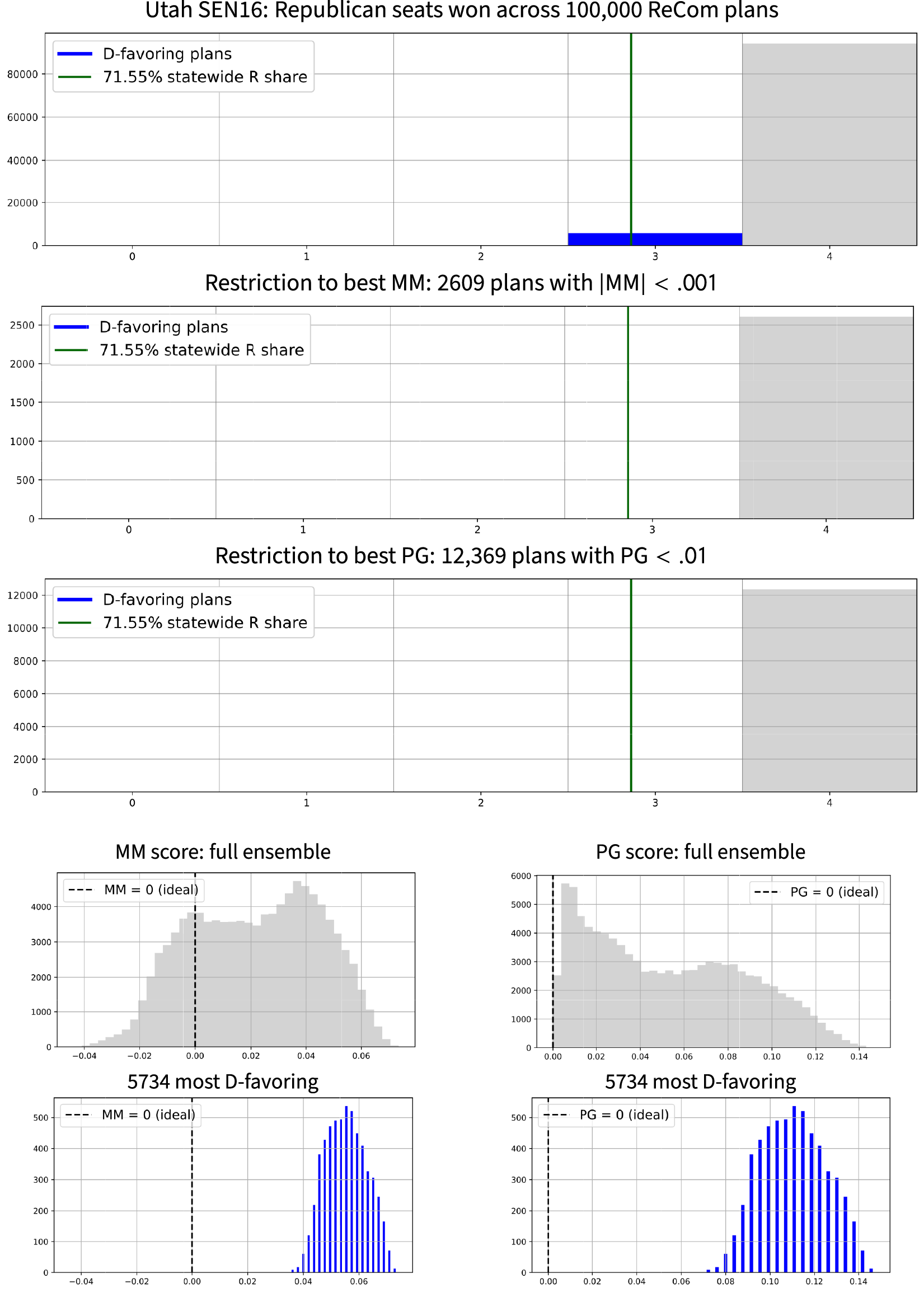
When looking at the full
 $\mathsf {PG }$
histogram, we see a large bulk of plans with nearly ideal
$\mathsf {PG }$
histogram, we see a large bulk of plans with nearly ideal
 $\mathsf {PG }$
scores, all giving a Republican sweep (four out of four R seats). This is surprising enough to deserve a name.
$\mathsf {PG }$
scores, all giving a Republican sweep (four out of four R seats). This is surprising enough to deserve a name.
The Utah Paradox
-
• Partisan symmetry scores near zero are supposed to indicate fairness, and signed symmetry scores are supposed to indicate which party is advantaged.
-
• There are many trillions of valid Congressional plans in Utah, and under reasonable geographical assumptions, every single one of them with
 $\mathsf {PG }$
close to zero is mathematically guaranteed to yield a Republican sweep of the seats. In particular, even constraining symmetry scores to better than the ensemble average (for any reasonably diverse neutral ensemble of alternatives) would deterministically impose a partisan outcome: the one in which Democrats are locked out of representation.
$\mathsf {PG }$
close to zero is mathematically guaranteed to yield a Republican sweep of the seats. In particular, even constraining symmetry scores to better than the ensemble average (for any reasonably diverse neutral ensemble of alternatives) would deterministically impose a partisan outcome: the one in which Democrats are locked out of representation. -
• Furthermore, the signed scores make a sign error: they report all plans with Democratic representation to be significant pro-Republican gerrymanders.

Geographic Assumptions
The UT-SEN16 election has a statewide R share of
 $.7155$
, so this is roughly equal to the district mean
$.7155$
, so this is roughly equal to the district mean
 $\overline {v}$
(or exactly equal in the equal-turnout case). If we can show that the possible Republican share of a district is bounded above by any
$\overline {v}$
(or exactly equal in the equal-turnout case). If we can show that the possible Republican share of a district is bounded above by any
 $Q<.931$
, then the arguments of the last section show that Democrats can secure at most one seat, and that every plan with Democratic representation has the sign error
$Q<.931$
, then the arguments of the last section show that Democrats can secure at most one seat, and that every plan with Democratic representation has the sign error
 $\mathsf {MM }>0$
. We consider the assumption that no district can exceed
$\mathsf {MM }>0$
. We consider the assumption that no district can exceed
 $93\%$
Republican share to be very reasonable. Indeed, even a greedy assemblage of the 608 precincts with the highest Republican share in that race (which is the number needed to reach the ideal population of a Congressional district) only produces a district with R share
$93\%$
Republican share to be very reasonable. Indeed, even a greedy assemblage of the 608 precincts with the highest Republican share in that race (which is the number needed to reach the ideal population of a Congressional district) only produces a district with R share
 $.888$
. And this is even without imposing a requirement that districts be contiguous, which certainly limits the possibilities further and only strengthens the bound. As a further indication, our Markov chain run of contiguous plans never encounters a district with Republican share over
$.888$
. And this is even without imposing a requirement that districts be contiguous, which certainly limits the possibilities further and only strengthens the bound. As a further indication, our Markov chain run of contiguous plans never encounters a district with Republican share over
 $.8595$
.
$.8595$
.
Example 6 The Utah Paradox, Empirical
The UT-SEN16 vote pattern can be divided into 4R-0D seats or 3R-1D seats. However, even though
 $\mathsf {MM }$
,
$\mathsf {MM }$
,
 $\mathsf {PB }$
, and
$\mathsf {PB }$
, and
 $\mathsf {PG }$
scores can all get arbitrarily close to zero, there are no reasonably symmetric plans that secure a Democratic seat. In our algorithmic search, every plan with nonzero Democratic representation has
$\mathsf {PG }$
scores can all get arbitrarily close to zero, there are no reasonably symmetric plans that secure a Democratic seat. In our algorithmic search, every plan with nonzero Democratic representation has
 $\mathsf {PG }>.069$
,
$\mathsf {PG }>.069$
,
 $\mathsf {MM }>.034$
, and
$\mathsf {MM }>.034$
, and
 $\mathsf {PB }\ge .25$
, which is in the worst half of scores observed for each of those scores. Thus, even a mild constraint on partisan symmetry has imposed an empirical Democratic lockout. As predicted by the analytic paradox, all plans with D representation are reported as significant R-favoring gerrymanders.
$\mathsf {PB }\ge .25$
, which is in the worst half of scores observed for each of those scores. Thus, even a mild constraint on partisan symmetry has imposed an empirical Democratic lockout. As predicted by the analytic paradox, all plans with D representation are reported as significant R-favoring gerrymanders.
The basic idea here is extremely simple, and readers can try it for themselves. Choose any four numbers from 0 to 1 whose mean is
 $.7155$
. If one of them is at or below
$.7155$
. If one of them is at or below
 $.5$
(a Democratic-won seat), you will find that the median of the four scores is greater than the mean, so the mean–median score is positive. It is simply false that a median higher than the mean is a flag of advantage for the point-of-view party.
$.5$
(a Democratic-won seat), you will find that the median of the four scores is greater than the mean, so the mean–median score is positive. It is simply false that a median higher than the mean is a flag of advantage for the point-of-view party.
As described in the introduction, Utah recently became the first state to encode partisan symmetry as a districting criterion in statute. This makes the Utah Paradox quite a striking example of the worries raised by using partisan symmetry scores in practice.
4.3 Texas
Next, we turn to Texas, creating a chain of 100,000 steps to explore the ways to divide up the 2012 Senate vote distribution. With 36 Congressional districts, Texas has one of the highest k values of any state (only California has more seats). The 2012 Senate race was won by a Republican with
 $\sim \! 58\%$
of the vote. Figure 5 shows the partisan properties in the ensemble of plans, allowing us to compare extreme symmetry scores (an ostensible indicator of partisan unfairness) to extreme seat shares (the explicit goal of partisan gerrymandering). We find no evidence of correlation or any kind of correspondence.
$\sim \! 58\%$
of the vote. Figure 5 shows the partisan properties in the ensemble of plans, allowing us to compare extreme symmetry scores (an ostensible indicator of partisan unfairness) to extreme seat shares (the explicit goal of partisan gerrymandering). We find no evidence of correlation or any kind of correspondence.
Ensemble outputs for Texas Congressional plans with respect to SEN12 votes. Republicans received 58.15% of the two-way vote in this election, which is marked in the plots to show the corresponding seat share. There are 1,646 plans in the ensemble that are seats outliers for one party or the other; these are shown in red and blue in the top row, and their relative frequency can be observed in the next two rows, which focus on plans with the best symmetry scores. The last row of the figure shows the
 $\mathsf {MM }$
and
$\mathsf {MM }$
and
 $\mathsf {PG }$
histograms restricted to the 1,646 outlier plans flagged above. The scores are shown to be readily gamed: numerous extreme plans are found with near-optimal symmetry scores. In this sample, most extreme Democratic-favoring plans are labeled Republican gerrymanders by the mean–median score, and some extreme Republican-favoring plans are labeled Democratic gerrymanders.
$\mathsf {PG }$
histograms restricted to the 1,646 outlier plans flagged above. The scores are shown to be readily gamed: numerous extreme plans are found with near-optimal symmetry scores. In this sample, most extreme Democratic-favoring plans are labeled Republican gerrymanders by the mean–median score, and some extreme Republican-favoring plans are labeled Democratic gerrymanders.
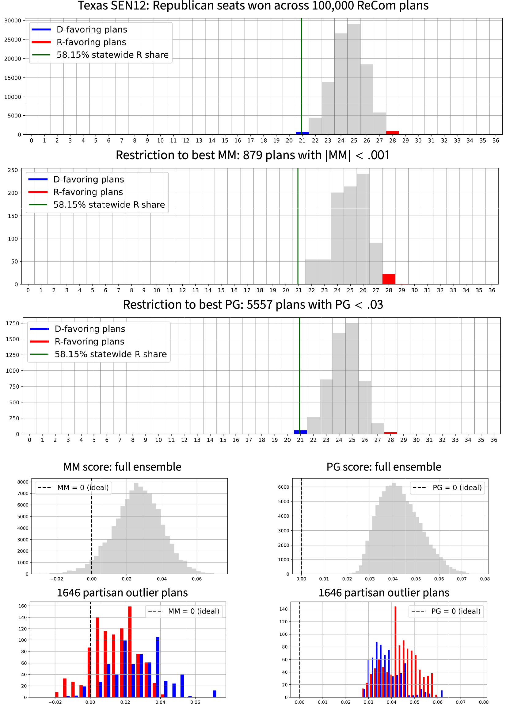
Over 98% of the sampled plans give Republicans 22–27 seats out of 36, seen in gray in the histogram. The red bars mark the outlying plans with the most Republican seats (28 or more R seats), while the blue bars mark the most Democratic plans (21 or fewer R seats). We can then study the histograms formed by the winnowed subsets of the ensemble with the best
 $\mathsf {PG }$
and
$\mathsf {PG }$
and
 $\mathsf {MM }$
scores, which in each case fall in the top 6%. Note that these severely winnowed subsets not only have a shape similar to the full ensemble (indicating a lack of correlation), but that there are still many partisan outlier plans even with strict symmetry standards in place. Plans with the extreme outcome of
$\mathsf {MM }$
scores, which in each case fall in the top 6%. Note that these severely winnowed subsets not only have a shape similar to the full ensemble (indicating a lack of correlation), but that there are still many partisan outlier plans even with strict symmetry standards in place. Plans with the extreme outcome of
 $\ge $
28 R seats actually occur with higher frequency among the
$\ge $
28 R seats actually occur with higher frequency among the
 $\mathsf {MM }\approx 0$
plans than in the full sample—more than twice as often, in fact. This shows rather emphatically that restricting to “good” symmetry scores is no impediment to partisan gerrymandering.
$\mathsf {MM }\approx 0$
plans than in the full sample—more than twice as often, in fact. This shows rather emphatically that restricting to “good” symmetry scores is no impediment to partisan gerrymandering.
For the reverse perspective, we consider how plans with extreme seat counts score on symmetry. The last row in Figure 5 shows only the seat outliers: blue for plans with
 $\le 21$
and red for plans with
$\le 21$
and red for plans with
 $\ge 28$
Republican seats. A significant number of maximally D-favoring plans (which are also close to vote proportionality) paradoxically register as major Republican gerrymanders under the
$\ge 28$
Republican seats. A significant number of maximally D-favoring plans (which are also close to vote proportionality) paradoxically register as major Republican gerrymanders under the
 $\mathsf {MM }$
score, outpacing by a significant margin the most extreme R-favoring plans. The mean–median score utterly fails at identifying partisan advantage even in an election regarded as “reasonably competitive” by the proponents of partisan symmetry. In Texas, as in Utah, it is simply false that a median higher than the mean is a flag of advantage for the point-of-view party.
$\mathsf {MM }$
score, outpacing by a significant margin the most extreme R-favoring plans. The mean–median score utterly fails at identifying partisan advantage even in an election regarded as “reasonably competitive” by the proponents of partisan symmetry. In Texas, as in Utah, it is simply false that a median higher than the mean is a flag of advantage for the point-of-view party.
In terms of the overall symmetry measured by
 $\mathsf {PG }$
, extreme plans for both parties can be found with scores that are as good as nearly anything observed in the ensemble. So from this perspective as well, neither
$\mathsf {PG }$
, extreme plans for both parties can be found with scores that are as good as nearly anything observed in the ensemble. So from this perspective as well, neither
 $\mathsf {MM }$
nor
$\mathsf {MM }$
nor
 $\mathsf {PG }$
signals anything with respect to political outcomes. Even if the proponents of symmetry standards never intended to constrain extreme seat imbalances, this runs counter to the common expectations of anti-gerrymandering reforms in popular discourse, in legal settings, and even in much of the political science literature.
$\mathsf {PG }$
signals anything with respect to political outcomes. Even if the proponents of symmetry standards never intended to constrain extreme seat imbalances, this runs counter to the common expectations of anti-gerrymandering reforms in popular discourse, in legal settings, and even in much of the political science literature.
4.4 North Carolina
Finally, we move to a state with a much closer to even partisan split: North Carolina (
 $k=13$
seats), with respect to the 2016 Senate vote (
$k=13$
seats), with respect to the 2016 Senate vote (
 $\sim \! 53\%$
Republican share). In this case, mean–median does much better than in Texas in terms of distinguishing the seat extremes: Figure 6 shows consistently higher scores for the maps with the most Republican seat share than the ones with the most Democratic outcomes. However, the extreme Republican maps still straddle the “ideal” score of
$\sim \! 53\%$
Republican share). In this case, mean–median does much better than in Texas in terms of distinguishing the seat extremes: Figure 6 shows consistently higher scores for the maps with the most Republican seat share than the ones with the most Democratic outcomes. However, the extreme Republican maps still straddle the “ideal” score of
 $\mathsf {MM }=0$
, and both sides can still find very extreme plans whose
$\mathsf {MM }=0$
, and both sides can still find very extreme plans whose
 $\mathsf {PG }$
scores report that their symmetry is essentially as good as anything in the ensemble.
$\mathsf {PG }$
scores report that their symmetry is essentially as good as anything in the ensemble.
Ensemble outputs for North Carolina Congressional plans with respect to SEN16 votes. Republicans received 53.02% of the two-way vote in this election, which is marked in the plots to show the corresponding seat share. There are 1,202 plans in the ensemble that are seats outliers for one party or the other; these are shown in red and blue in the top row, and their relative frequency can be observed in the next two rows, which focus on plans with the best symmetry scores. The last row of the figure shows the
 $\mathsf {MM }$
and
$\mathsf {MM }$
and
 $\mathsf {PG }$
histograms restricted to the 1,202 outlier plans flagged above. In this setting, symmetry can easily be gamed in favor of Republicans, with thousands of 11–2 plans receiving near-perfect mean–median scores.
$\mathsf {PG }$
histograms restricted to the 1,202 outlier plans flagged above. In this setting, symmetry can easily be gamed in favor of Republicans, with thousands of 11–2 plans receiving near-perfect mean–median scores.
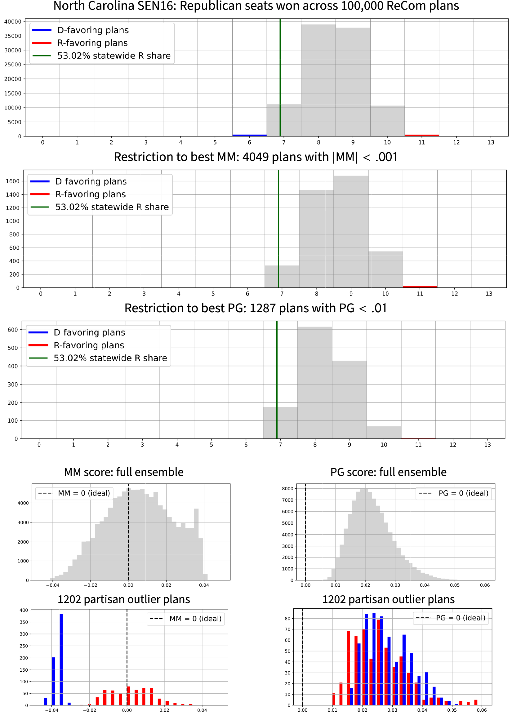
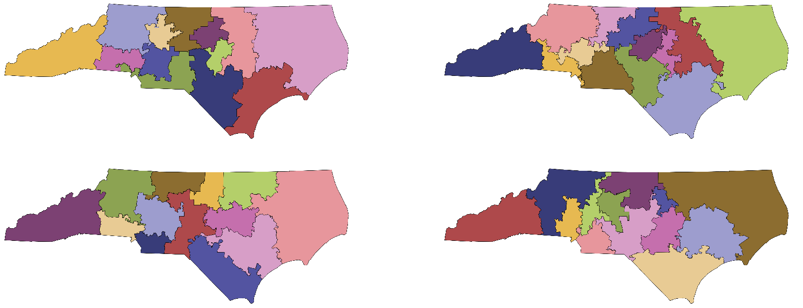
Overall, it is fair to say that partisan symmetry imposes no constraint on partisan gerrymandering in North Carolina, at least for one side: this method easily produces hundreds of maps with 10–3 outcomes (which was clearly reported in the Rucho case to be the most extreme that the legislature thought was possible) while securing nearly perfect symmetry scores, and the gerrymanderer only needs one. Indeed, the ensemble even finds highly partisan-symmetric maps that return an 11–2 outcome for this particular vote pattern. Four of these are shown in Figure 7.
Algorithmic methods are mainly used here for example generation. Each of these 13-district plans comes out 11R–2D with respect to the SEN16 voting data, while having nearly perfect partisan symmetry. These maps have
 $\mathsf {PG }$
scores of 0.0096, 0.0099, 0.0107, and 0.0115, respectively, all in the best 2% of the ensemble. This figure also illustrates the diversity of districting plans achieved by this Markov chain method.
$\mathsf {PG }$
scores of 0.0096, 0.0099, 0.0107, and 0.0115, respectively, all in the best 2% of the ensemble. This figure also illustrates the diversity of districting plans achieved by this Markov chain method.
To sum up, we give a recipe for how to hide your partisan gerrymander from detection by symmetry scores, even in a 53–47 state. To begin, leverage differential turnout. A recent analysis of 2014–2016 Congressional voting showed that several states have voter turnout that is 25% or even 40% higher in the districts won by one party than the other (Veomett Reference Veomett2018). This can easily push the average vote share in the districts two points higher than the statewide share. Now, give your party a 55% majority in many districts, and let the others be landslides, being sure to arrange the vote shares symmetrically around 55%. This secures sterling symmetry scores and a windfall of seats for your side without even risking any close contests.Footnote 20
5 Conclusion
In this piece, we have characterized the partisan symmetry standard from Katz et al. (Reference Katz, King and Rosenblatt2020) mathematically: it turns out to amount simply to a prescription for the arrangement of vote totals across districts (Theorem 3, Partisan Symmetry Characterization).Footnote 21 We follow this with examples of realistic conditions under which the adoption of strict symmetry standards not only (a) fails to prevent extreme partisan outcomes but even (b) can lock in unforeseen consequences on these partisan outcomes. Finally, again under realistic conditions, signed partisan symmetry metrics (c) can plainly mis-identify which party is advantaged by a plan.Footnote 22
None of these findings gives a theoretical reason for rejecting partisan symmetry as a definition of fairness. A believer in symmetry-as-fairness can certainly coherently hold that symmetry standards do not aim to constrain partisan outcomes, but merely to reinforce the legitimacy of district-based democracy by reassuring the voting public that the tables can yet turn in the future. This view casts aside, or holds irrelevant, the standard definition of a partisan gerrymander as a plan designed to maximize the seats for a party. With this reasoning, we should not worry that Democrats in Utah may for now be locked out of Congressional representation by the symmetry standard itself; this is still fair, because Democrats would enjoy a similar advantage of their own if election patterns were to linearly swing by 40 percentage points in their favor.
For those who do want to constrain the most extreme partisan outcomes that line drawing can secure, these investigations should serve as a strong caution regarding the use of partisan symmetry metrics, whether in the plan adoption stage or in plan evaluation after subsequent elections have been conducted.
If symmetry metrics measured something that was obviously of inherent value in the healthy functioning of representative democracy, then we might reasonably choose to live with the consequences of the definition, no matter the partisan outcomes. However, the Characterization Theorem shows that a putatively perfect symmetry score is nothing more and nothing less than a requirement that the vote shares
 $v_i$
in the districts be arranged symmetrically on the number line (see Figure 3). Someone who wishes to assert that partisan symmetry is really about some principle—majority rule, responsiveness, equality of opportunity, etc.—would have to explain why that principle is captured by the simple arithmetic of vote share spacing. With this framing, it is more difficult to argue that symmetry captures any essential ingredient of civic fairness.
$v_i$
in the districts be arranged symmetrically on the number line (see Figure 3). Someone who wishes to assert that partisan symmetry is really about some principle—majority rule, responsiveness, equality of opportunity, etc.—would have to explain why that principle is captured by the simple arithmetic of vote share spacing. With this framing, it is more difficult to argue that symmetry captures any essential ingredient of civic fairness.
Appendix A. Proof of Characterization Theorem
We briefly recall the needed notation from above: vote share vector
 $\mathsf {v}$
with ith coordinate
$\mathsf {v}$
with ith coordinate
 $v_i$
; gap vector
$v_i$
; gap vector
![]() with
with
 $\delta _i=v_{i+1}-v_i$
; and jump vector
$\delta _i=v_{i+1}-v_i$
; and jump vector
 $\mathsf {j}$
with
$\mathsf {j}$
with
 $j_i=\frac 12 + \overline {v} - v_{k+1-i}$
, where
$j_i=\frac 12 + \overline {v} - v_{k+1-i}$
, where
 $\overline {v}$
is the mean of the
$\overline {v}$
is the mean of the
 $v_i$
. These expressions define
$v_i$
. These expressions define
![]() in terms of
in terms of
 $\mathsf {v}$
; neither
$\mathsf {v}$
; neither
 $\mathsf {j}$
nor
$\mathsf {j}$
nor
![]() completely determines
completely determines
 $\mathsf {v}$
, because they are invariant under translation of the entries of
$\mathsf {v}$
, because they are invariant under translation of the entries of
 $\mathsf {v}$
, but one additional datum (such as
$\mathsf {v}$
, but one additional datum (such as
 $v_1$
or
$v_1$
or
 $\overline {v}$
) suffices, with
$\overline {v}$
) suffices, with
 $\mathsf {j}$
or
$\mathsf {j}$
or
![]() , to fix the associated
, to fix the associated
 $\mathsf {v}$
. In this appendix, we begin by expressing
$\mathsf {v}$
. In this appendix, we begin by expressing
 $\mathsf {PG }$
in terms of the jumps
$\mathsf {PG }$
in terms of the jumps
 $\mathsf {j}$
, then giving equivalent conditions for
$\mathsf {j}$
, then giving equivalent conditions for
 $\mathsf {PG }=0$
in terms of
$\mathsf {PG }=0$
in terms of
 $\mathsf {j}$
,
$\mathsf {j}$
,
![]() , or
, or
 $\mathsf {v}$
.
$\mathsf {v}$
.
As outlined above, PG measures the area between the seats–votes curve
 $\gamma $
and its reflection. The shape of the region between those curves depends directly on the points
$\gamma $
and its reflection. The shape of the region between those curves depends directly on the points
 $\mathsf {j}= (j_1, j_2, \dots , j_k)$
, since each
$\mathsf {j}= (j_1, j_2, \dots , j_k)$
, since each
 $j_i$
is the x value of a vertical jump in the curve and the
$j_i$
is the x value of a vertical jump in the curve and the
 $1-j_i$
are the values of the jumps in the reflection. But looking at Figure 1 makes it clear that it is complicated to decompose the integral into vertical rectangles in the style of a Riemann sum, because the
$1-j_i$
are the values of the jumps in the reflection. But looking at Figure 1 makes it clear that it is complicated to decompose the integral into vertical rectangles in the style of a Riemann sum, because the
 $\{j_i\}$
and the
$\{j_i\}$
and the
 $\{1-j_{k-i}\}$
do not always alternate. Fortunately, it is always easy to decompose the picture into horizontal rectangles (analogous to a Lebesgue integral), where it is now clear which red and blue corners to pair as the seat share changes from
$\{1-j_{k-i}\}$
do not always alternate. Fortunately, it is always easy to decompose the picture into horizontal rectangles (analogous to a Lebesgue integral), where it is now clear which red and blue corners to pair as the seat share changes from
 $\frac {i}{k}$
to
$\frac {i}{k}$
to
 $\frac {i+1}{k}$
. The curve contains the points
$\frac {i+1}{k}$
. The curve contains the points
 $(j_i, \frac {i-1}k)$
,
$(j_i, \frac {i-1}k)$
,
 $(j_i,\frac {i}k)$
as well as
$(j_i,\frac {i}k)$
as well as
 $(j_{k+1-i}, \frac {k-i}k)$
,
$(j_{k+1-i}, \frac {k-i}k)$
,
 $(j_{k+1-i}, \frac {k-i+1}k)$
. The rotated curve therefore contains the points
$(j_{k+1-i}, \frac {k-i+1}k)$
. The rotated curve therefore contains the points
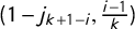 $(1-j_{k+1-i}, \frac {i-1}k)$
and
$(1-j_{k+1-i}, \frac {i-1}k)$
and
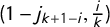 $(1-j_{k+1-i}, \frac ik)$
, which means that the ith rectangle has height
$(1-j_{k+1-i}, \frac ik)$
, which means that the ith rectangle has height
 $\frac {1}{k}$
and width
$\frac {1}{k}$
and width
 $\bigl | j_i+j_{k+1-i}-1 \bigr |$
. Summing over these rectangles gives us the expression
$\bigl | j_i+j_{k+1-i}-1 \bigr |$
. Summing over these rectangles gives us the expression
 $$ \begin{align*}\mathsf{PG } = \frac 1k \sum_{i=1}^k \bigl|j_i + j_{k+1-i} - 1\bigr|.\end{align*} $$
Recall that the set of vote share vectors
 $\mathcal V$
is the cone in the vector space
$\mathcal V$
is the cone in the vector space
 $\mathbb {R}^k$
given by the condition that the
$\mathbb {R}^k$
given by the condition that the
 $v_i$
are in nondecreasing order in
$v_i$
are in nondecreasing order in
 $[0,1]$
. The
$[0,1]$
. The
 $\mathsf {j}$
vector is simply the
$\mathsf {j}$
vector is simply the
 $\mathsf {v}$
vector reversed and recentered at
$\mathsf {v}$
vector reversed and recentered at
 $\frac {1}{2}$
rather than
$\frac {1}{2}$
rather than
 $\overline {v}$
. The only condition on the gap vector
$\overline {v}$
. The only condition on the gap vector
![]() is that its entries are nonnegative and sum to at most one. Putting these observations together, we may define the set of achievable
is that its entries are nonnegative and sum to at most one. Putting these observations together, we may define the set of achievable
![]() , respectively, as
, respectively, as
 $$ \begin{align*}\mathcal V &=\left\{ (v_1,\dots,v_k) : 0\le v_1\le\dots\le v_k\le 1 \right\},\\ \mathcal D &=\left\{(\delta_1,\dots, \delta_{k-1}): \delta_i\ge 0 \ \forall i, \quad \sum \delta_i\le 1 \right\},\\ \mathcal J &=\left\{(j_1,\dots,j_k): 0\le j_1 \le \dots \le j_k \le 1, \quad \sum j_i=\frac k2\right\}.\end{align*} $$
The condition on
 $\mathsf {j}$
is of interest, because it exactly identifies the possible seats–votes curves
$\mathsf {j}$
is of interest, because it exactly identifies the possible seats–votes curves
 $\Gamma = \{\gamma _{\mathsf {v}}:\mathsf {v}\in \mathcal V \}$
. (That is, not just any step function is realizable as a valid
$\Gamma = \{\gamma _{\mathsf {v}}:\mathsf {v}\in \mathcal V \}$
. (That is, not just any step function is realizable as a valid
 $\gamma $
.)
$\gamma $
.)
Now, we can prove the Characterization Theorem.
Theorem 3. Given k districts with vote shares
 $\mathsf {v}$
, jump vector
$\mathsf {v}$
, jump vector
 $\mathsf {j}$
, and gap vector
$\mathsf {j}$
, and gap vector
![]() , the following are equivalent:
, the following are equivalent:
 $$ \begin{align} & \kern-58pt \mathsf{PG }(\mathsf{v}) = 0, \kern20pt\end{align} $$
 $$ \begin{align} &\kern-13pt j_i + j_{k+1-i} - 1 = 0 \qquad \forall i, \end{align} $$
 $$ \begin{align} & \kern-13pt\frac 12 \left(v_i + v_{k+1-i}\right) = \overline{v} \qquad \forall i, \end{align} $$
 $$ \begin{align} &\frac 12 \left(v_i + v_{k+1-i}\right) = v_{\mathrm{med}} \qquad \forall i, \end{align} $$
 $$ \begin{align} &\kern-48pt \delta_i = \delta_{k-i} \qquad \forall i. \end{align} $$
Proof. The condition that
 $\mathsf {PG }(\mathsf {v}) = 0$
has been rewritten in terms of
$\mathsf {PG }(\mathsf {v}) = 0$
has been rewritten in terms of
 $\mathsf {j}$
above, and converting back to the
$\mathsf {j}$
above, and converting back to the
 $v_i$
, we get
$v_i$
, we get
 $$ \begin{align*}\frac{1}{k}\sum_{i=1}^k |j_i + j_{k+1-i} - 1| = \frac 2k \sum_{i=1}^k \left| \frac{v_i+v_{k+1-i}}2 - \overline{v}\right|=0,\end{align*} $$
which immediately gives (1)
 $\iff $
(2)
$\iff $
(2)
 $\iff $
(3), since a sum of nonnegative terms is zero if and only if each term is zero. To see (3)
$\iff $
(3), since a sum of nonnegative terms is zero if and only if each term is zero. To see (3)
 $\iff $
(4), just consider
$\iff $
(4), just consider
 $i=\lceil \frac k2 \rceil $
in (3) to obtain
$i=\lceil \frac k2 \rceil $
in (3) to obtain
 $v_{\mathrm {med}}=\overline {v}$
; in the other direction, average both sides over i in (4) to obtain
$v_{\mathrm {med}}=\overline {v}$
; in the other direction, average both sides over i in (4) to obtain
 $\overline {v}=v_{\mathrm {med}}$
. Finally, the symmetric gaps condition (5) is clearly equivalent to the symmetry of the values of
$\overline {v}=v_{\mathrm {med}}$
. Finally, the symmetric gaps condition (5) is clearly equivalent to the symmetry of the values of
 $\mathsf {v}$
about the center
$\mathsf {v}$
about the center
 $v_{\mathrm {med}}$
, which is (4).
$v_{\mathrm {med}}$
, which is (4).
Appendix B. Bounding Partisan Gini in Terms of Mean–Median
Recall that the mean–median score
 $\mathsf {MM }$
is a signed score that is supposed to identify which party has a structural advantage, and by what amount. On the other hand, the partisan Gini
$\mathsf {MM }$
is a signed score that is supposed to identify which party has a structural advantage, and by what amount. On the other hand, the partisan Gini
 $\mathsf {PG }$
is a nonnegative score that simply quantifies the failure of symmetry, interpreted as a magnitude of unfairness. We easily see that
$\mathsf {PG }$
is a nonnegative score that simply quantifies the failure of symmetry, interpreted as a magnitude of unfairness. We easily see that
 $\mathsf {PG }=0\implies \mathsf {MM }=0$
by comparing (3) and (4) in Theorem 3. In this appendix, we strengthen that to a bound from below that is sharp in low dimension.
$\mathsf {PG }=0\implies \mathsf {MM }=0$
by comparing (3) and (4) in Theorem 3. In this appendix, we strengthen that to a bound from below that is sharp in low dimension.
Let us define
 $\mathop {\mathrm {discrep}}(i)=\frac {v_i+v_{k+1-i}}2- \overline {v}$
, measuring the difference between the average of a pair of vote shares from the average of all the vote shares. This gives
$\mathop {\mathrm {discrep}}(i)=\frac {v_i+v_{k+1-i}}2- \overline {v}$
, measuring the difference between the average of a pair of vote shares from the average of all the vote shares. This gives
 $$ \begin{align*}\mathsf{PG }=\frac 1k \sum_{i=1}^k |2\overline{v} -v_i-v_{k+1-i}|=\frac 2k \sum_{i=1}^k |\mathop{\mathrm{discrep}}(i)|.\end{align*} $$
Note that
 $\mathop{ \mathrm {discrep}}(\lceil \frac k2 \rceil )=\mathsf {MM }$
, as observed above, and that
$\mathop{ \mathrm {discrep}}(\lceil \frac k2 \rceil )=\mathsf {MM }$
, as observed above, and that
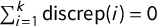 $\sum _{i=1}^k \mathop {\mathrm {discrep}}(i)=0$
by definition of
$\sum _{i=1}^k \mathop {\mathrm {discrep}}(i)=0$
by definition of
 $\overline {v}$
.
$\overline {v}$
.
Theorem 7. The partisan Gini score satisfies
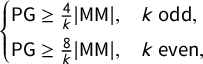 $\begin {cases} \mathsf {PG }\ge \frac 4k |\mathsf {MM }|,& k ~\mathrm {odd},\\ \mathsf {PG }\ge \frac 8k |\mathsf {MM }|,& k ~\mathrm {even}, \end {cases}$
with equality when
$\begin {cases} \mathsf {PG }\ge \frac 4k |\mathsf {MM }|,& k ~\mathrm {odd},\\ \mathsf {PG }\ge \frac 8k |\mathsf {MM }|,& k ~\mathrm {even}, \end {cases}$
with equality when
 $k=3,4$
.
$k=3,4$
.
Proof. First suppose k is odd, say
 $k=2m+1$
. Then,
$k=2m+1$
. Then,
 $\mathop {\mathrm {discrep}}(m)=v_m-\overline {v}=\mathsf {MM }$
, so
$\mathop {\mathrm {discrep}}(m)=v_m-\overline {v}=\mathsf {MM }$
, so
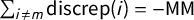 $\sum _{i\neq m}\mathop {\mathrm {discrep}}(i)=-\mathsf {MM }$
. We have
$\sum _{i\neq m}\mathop {\mathrm {discrep}}(i)=-\mathsf {MM }$
. We have
 $$ \begin{align*}\mathsf{PG }=\frac 2k\sum_{i=1}^k |\mathop{\mathrm{discrep}}(i)|= \frac 2k \left(|\mathop{\mathrm{discrep}}(m)|+\sum_{i\neq m} |\mathop{\mathrm{discrep}}(i)|\right)&\ge \frac 2k \left(|\mathop{\mathrm{discrep}}(m)|+\bigl|\sum_{i\neq m} \mathop{\mathrm{discrep}}(i)\bigr|\right)\\ &=\frac 2k\left(|\mathsf{MM }|+|-\mathsf{MM }|\right)=\frac 4k |\mathsf{MM }|. \end{align*} $$
The argument for even
 $k=2m$
is very similar, except that
$k=2m$
is very similar, except that
 $\mathop {\mathrm {discrep}}(m)=\mathop {\mathrm {discrep}}(m+1)= \frac {v_m+v_{m+1}}2-\overline {v}=\mathsf {MM }$
. So, now, those terms contribute
$\mathop {\mathrm {discrep}}(m)=\mathop {\mathrm {discrep}}(m+1)= \frac {v_m+v_{m+1}}2-\overline {v}=\mathsf {MM }$
. So, now, those terms contribute
 $2|\mathsf {MM }|$
to the sum, and the remaining terms contribute at least
$2|\mathsf {MM }|$
to the sum, and the remaining terms contribute at least
 $2|-\mathsf {MM }|$
, for a bound of
$2|-\mathsf {MM }|$
, for a bound of
 $\mathsf {PG }\ge \frac 8k|\mathsf {MM }|$
. That completes the proof of the inequalities.
$\mathsf {PG }\ge \frac 8k|\mathsf {MM }|$
. That completes the proof of the inequalities.
For
 $k=3$
or
$k=3$
or
 $k=4$
, the term
$k=4$
, the term
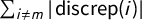 $\sum _{i\neq m} |\mathop {\mathrm {discrep}}(i)|$
is just
$\sum _{i\neq m} |\mathop {\mathrm {discrep}}(i)|$
is just
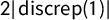 $2|\mathop {\mathrm {discrep}}(1)|$
, making the inequality into an equality.
$2|\mathop {\mathrm {discrep}}(1)|$
, making the inequality into an equality.
By a dimension count, it is easy to see that
 $\mathsf {PG }$
is not simply a function of
$\mathsf {PG }$
is not simply a function of
 $\mathsf {MM }$
for
$\mathsf {MM }$
for
 $k\ge 5$
. A direct calculation confirms this, and shows that
$k\ge 5$
. A direct calculation confirms this, and shows that
 $\mathsf {MM }$
is not simply a function of
$\mathsf {MM }$
is not simply a function of
 $\mathsf {PG }$
either. Let
$\mathsf {PG }$
either. Let
 $$ \begin{align*}\mathsf{v}=(.2,.3,.4,.5,.7), \qquad \mathsf{v}'=(.2,.31,.39,.5,.7), \qquad \mathsf{v}"=(.19,.31,.4,.5,.7),\end{align*} $$
giving
 $\mathsf {PG }(\mathsf {v})=\mathsf {PG }(\mathsf {v}')$
while
$\mathsf {PG }(\mathsf {v})=\mathsf {PG }(\mathsf {v}')$
while
 $\mathsf {MM }(\mathsf {v})\neq \mathsf {MM }(\mathsf {v}')$
. On the other hand,
$\mathsf {MM }(\mathsf {v})\neq \mathsf {MM }(\mathsf {v}')$
. On the other hand,
 $\mathsf {MM }(\mathsf {v})=\mathsf {MM }(\mathsf {v}")$
while
$\mathsf {MM }(\mathsf {v})=\mathsf {MM }(\mathsf {v}")$
while
 $\mathsf {PG }(\mathsf {v})\neq \mathsf {PG }(\mathsf {v}")$
.
$\mathsf {PG }(\mathsf {v})\neq \mathsf {PG }(\mathsf {v}")$
.
Acknowledgments
M.D. is deeply grateful to Gary King for several illuminating in-person conversations about the ideas in this article while it was preparation. All authors would like to thank the other participants of the Voting Rights Data Institute, especially Brian Morris, Michelle Jones, and Cleveland Waddell, for stimulating discussions.
Funding Statement
The 2019 Voting Rights Data Institute was generously supported by the Prof. Amar J. Bose Research Grant at MIT and the Jonathan M. Tisch College of Civic Life at Tufts. M.D. was partially supported by NSF DMS-1255442.
Data Availability Statement
Replication code for this article is available in DeFord et al. (2021) at https://doi.org/10.7910/DVN/MVVLQC. We also make use of the code and data in MGGG 2020 and VRDI 2018 and 2020.

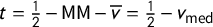


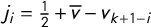


 Open access