


Nomenclature
- CMAPSS
-
Commercial Modular Aero-Propulsion System Simulation
- DL
-
deep learning
- GB
-
gradient boosting
- HI
-
health index
- MAE
-
mean absolute error
- ML
-
machine learning
- MSE
-
mean squared error
- PdM
-
predictive maintenance
- RF
-
random forest
- RMSE
-
root mean square error
- RUL
-
remaining useful life
- ${R^2}$
-
regression score function
- SHAP
-
SHapley Additive exPlanations
- XAI
-
explainable artificial intelligence

1.0 Introduction
In the era of Industry 4.0, predictive maintenance (PdM) has become a cornerstone of modern industrial strategy, aiming to optimise maintenance schedules, reduce operational downtime and enhance system safety [Reference Jardine, Lin and Banjevic1–Reference Tsallis, Papageorgas, Piromalis and Munteanu3]. Unlike traditional preventive maintenance, which relies on fixed time intervals or operating hours and can lead to the premature replacement of healthy components, a key tenet of PdM is condition-based maintenance. It relies on condition monitoring data to inform maintenance decisions only when there are indicators of degradation [Reference Jardine, Lin and Banjevic1]. While this approach can require a higher initial investment in sensorisation and data analysis infrastructure, it promises significant long-term savings and increased operational reliability. At the heart of this paradigm is the ability to accurately predict the remaining useful life (RUL) of critical components, a task that has been a major focus of research for decades [Reference Lei, Li, Guo, Li, Yan and Lin4].
The proliferation of industrial Internet of Things devices and sensor technologies has led to a surge in data-driven approaches for RUL prediction [Reference Wang, Zhao and Addepalli5]. Machine learning (ML) and deep learning (DL) models, such as convolutional neural networks and long short-term memory networks, have demonstrated remarkable success in this area, often outperforming traditional methods [Reference Sateesh Babu, Zhao and Li6–Reference Isbilen, Bektas and Konar8]. These advanced models are frequently validated on benchmark datasets, with the NASA Commercial Modular Aero-Propulsion System Simulation (CMAPSS) dataset being a standard reference for turbofan engine prognostics [Reference Tsallis, Papageorgas, Piromalis and Munteanu3, Reference Saxena, Goebel, Simon and Eklund9, Reference Isbilen, Bektas, Avsar and Konar10].
Despite their high accuracy, the adoption of complex ML and DL models in safety-critical applications is often hampered by their by their inherent opacity, or ‘black box’ nature [Reference Doshi-Velez and Kim11, Reference Hong, Lee, Lee, Ko, Kim and Hur12]. The inability to understand makes a certain prediction creates a barrier to trust and adoption for engineers and operators who are ultimately responsible for high-stakes decisions [Reference Nor, Pedapati and Muhammad13, Reference Cohen, Huan and Ni14]. To address this, the field of eXplainable Artificial Intelligence (XAI) offers two primary paths: creating intrinsically interpretable models from the ground up, or applying post-hoc methods to explain a pre-trained model. An example of the former is the Concept Bottleneck Model (CBM), which explains RUL predictions by first mapping inputs to high-level, human-understandable concepts, such as the degradation state of individual engine components [Reference Forest, Rombach and Fink15].
This challenge has spurred the growth of a new field: explainable artificial intelligence (XAI) [Reference Tsallis, Papageorgas, Piromalis and Munteanu3, Reference Doshi-Velez and Kim11]. Among the most promising XAI techniques is SHAP (SHapley Additive exPlanations), a framework grounded in cooperative game theory’s Shapley values that can explain the output of any ML model [Reference Shapley16, Reference Lundberg and Lee17]. Recent studies have successfully applied SHAP to enhance the explainability of RUL models, with advanced applications using SHAP interaction values to construct feature interaction networks (FINs) that visualise the complex interdependencies between operational parameters [Reference Alomari, Baptista and Andó18]. These tools demonstrate significant potential to make black-box prognostics more transparent [Reference Hong, Lee, Lee, Ko, Kim and Hur12, Reference Huang, Jia, Jiao, Zhang, Bai and Cai19, Reference Nourani, Dehghan, Baghanam and Kantoush20]. Prominent post-hoc methods like local interpretable model-agnostic explanations (LIME) have been used to explain the local and global behaviour of complex recurrent models like gated recurrent units (GRUs), though studies note that the fidelity of these explanations can sometimes be a concern [Reference Baptista, Mishra, Henriques and Prendinger21].
However, a gap remains in the literature regarding a systematic comparison between the post-hoc explanations generated by AI models and the ex-ante feature suitability assessments derived from traditional prognostic metrics. Engineers have long used metrics such as monotonicity, trendability and prognosability to pre-screen sensors and construct health indicators [Reference Lei, Li, Guo, Li, Yan and Lin4]. It is unclear how the insights from these established, domain-grounded metrics align with the feature importance identified by a complex model after training. This study aims to bridge that gap.
The primary contribution of this work is not the application of a new algorithm, but rather the creation of a holistic validation framework. We systematically contrast the findings from traditional prognostic metrics with post-hoc SHAP explanations. This aims to diagnose the model’s reasoning process, uncover hidden dependencies, and identify potential vulnerabilities that are invisible to standard performance metrics like RMSE.
Using data from turbofan engine simulations, we first evaluate sensor data using traditional prognostic metrics. We then train robust ensemble models – random forest (RF) [Reference Breiman22] and gradient boosting (GB) [Reference Friedman23] – to predict RUL and apply the SHAP framework to generate detailed post-hoc explanations [Reference Lundberg, Erion, Chen, DeGrave, Prutkin, Nair, Katz, Himmelfarb, Bansal and Lee24]. By comparing the ex-ante feature rankings with the SHAP-derived feature importance, we investigate whether XAI provides new, counter-intuitive insights, and critically, use it to diagnose the model’s reasoning process, particularly in cases of prediction failure. This comparative approach seeks to create a more holistic and trustworthy framework for developing and validating prognostic models.
1.1 Dataset: CMAPSS FD002
The primary dataset utilised in this research is the widely recognised CMAPSS dataset, provided by NASA [Reference Saxena, Goebel, Simon and Eklund9]. Specifically, this study focuses on the FD002 subset (see Table 1). This subset was deliberately chosen as it is particularly challenging, simulating engine degradation under six complex operating conditions and encompassing multiple fault modes. Its inherent complexity provides a rigorous testbed for evaluating both model robustness and the nuanced insights from XAI techniques.
Dataset parameters

2.0 Methodology
This section details the systematic approach employed to develop and interpret the prognostic models for RUL prediction of turbofan engines. The methodology encompasses four primary stages: (1) data preprocessing to standardise the sensor readings and derive a composite health indicator; (2) evaluation of individual sensor features using established prognostic metrics; (3) development of prognostic models using ensemble ML techniques; and (4) application of an explainable AI framework to interpret the model predictions [Reference Lei, Li, Guo, Li, Yan and Lin4]. The overall workflow is designed to first assess feature suitability through ex-ante metrics and then compare these findings with post-hoc explanations from the trained models.
2.1 Data preprocessing
Due to the largely varying scales of the raw sensor data, as shown in Fig. 1 for a single unit, the NASA CMAPSS dataset [Reference Saxena, Goebel, Simon and Eklund9] requires preprocessing to ensure consistency and to construct a meaningful representation of the degradation of the engine over time. This initial step is crucial for improving the performance and reliability of subsequent ML models. Effective preprocessing ensures the quality and consistency of the input data, directly influencing the model’s ability to generalise and perform accurately. By reducing redundancies and optimising feature representations, preprocessing not only improves computational efficiency but also enhances the interpretability and reliability of the resulting models. This ultimately contributes to more accurate and actionable insights in data-driven applications.
The raw sensor data for the first unit. Different colours represent different sensor data explained in Table 1.

2.1.1 Z-score normalisation
During an initial data survey, it was noted that several sensors (specifically, Sensors 1, 5, 18 and 19) exhibited zero or near-zero variance in the training dataset, indicating they were either constant or non-operational. Also, Sensors 10 and 16 exhibited extremely noisy data. As these sensors provide no prognostic value, they were excluded from all subsequent metric calculations and model training. For the remaining sensors, z-score normalisation was applied to each feature to handle their different scales and units. This is a standard and effective technique in RUL prediction studies to prevent features with larger magnitudes from disproportionately influencing the model [Reference Erdoğan and Mercimek25]. The normalisation is performed using the mean ( $\mu $
) and standard deviation (
$\mu $
) and standard deviation ( $\sigma $
) from the initial, healthy operational cycles of the training data for each engine type. Specifically, these parameters were calculated from the first 30 operational cycles of each engine unit in the training set, under the common assumption that this initial period represents stable and healthy engine operation. For a given sensor reading
$\sigma $
) from the initial, healthy operational cycles of the training data for each engine type. Specifically, these parameters were calculated from the first 30 operational cycles of each engine unit in the training set, under the common assumption that this initial period represents stable and healthy engine operation. For a given sensor reading $x$
, the normalised value
$x$
, the normalised value $z$
is calculated as:
$z$
is calculated as:
 \begin{align*}z = \frac{{x - \mu }}{\sigma }\end{align*}
This process ensures that all features contribute equitably to the model training process, which is a critical prerequisite for both prognostic metric calculation and ML model development [Reference Isbilen, Bektas, Avsar and Konar10].
The result of this process on a single engine unit is illustrated in Fig. 16 in the supplementary material, and the normalised data for all engines shown in Fig. 2. The plots provide a powerful visualisation of the inherent variability and underlying degradation trends across different run-to-failure cycles. These visualisations serve as a qualitative precursor to the quantitative evaluation using prognostic metrics.
Overlay of z-score normalised sensor data for all engines. Sensors 1, 5, 18 and 19 are not shown or appear empty due to zero variance. Sensors 10 and 16 show highly scattered data due to too much sensor noise.

2.1.2 RUL target definition
To establish a ground-truth for model training, a piece-wise linear RUL target was defined, which is a common practice for the CMAPSS dataset. In this approach, the RUL is assumed to be constant at an early-life threshold (e.g. 125 cycles) and then decline linearly to zero at the point of failure. This reflects the reality that significant degradation typically only appears later in an engine’s life. For visualisation purposes only, a health index (HI) was constructed to illustrate this degradation process (seen in Figs. 3 and 4). Following common practice in turbofan engine prognostics [Reference Szrama26], this HI was created by combining several degrading sensors and smoothing the result. However, it is important to note that the HI itself was not used as an input feature for the machine learning models. The models were trained directly on the raw, normalised sensor data to predict the defined RUL target, allowing them to learn the underlying relationships without the intermediate abstraction of a composite HI.
Generation and smoothing of the HI for five sample units.

Final normalised HI for the same five units.

It is critical to note that all preprocessing statistics (e.g. the mean ( $\mu $
) and standard deviation (
$\mu $
) and standard deviation ( $\sigma $
) from the first 30 cycles used for z-score normalisation) were computed solely from the 208-engine training set. These statistics were then saved and applied to the 52-engine test set to prevent any data leakage. Furthermore, HI was generated for visualisation purposes only and was not used as an input feature for any model.
$\sigma $
) from the first 30 cycles used for z-score normalisation) were computed solely from the 208-engine training set. These statistics were then saved and applied to the 52-engine test set to prevent any data leakage. Furthermore, HI was generated for visualisation purposes only and was not used as an input feature for any model.
2.2 Prognostic metrics
Before training the prognostic models, an ex-ante evaluation of each sensor’s suitability for RUL prediction was conducted. This evaluation uses three key metrics to quantify the desirability of a prognostic parameter, as originally proposed in the foundational work on prognostics and now widely adopted in the field [Reference Keizers, Loendersloot and Tinga27]. Proper evaluation using these metrics ensures that the health indicator effectively supports maintenance decision-making and minimises operational risks [Reference Heng, Zhang, Tan and Mathew2].
2.2.1 Monotonicity
Monotonicity assesses how consistently a feature trend increases or decreases over an engine’s lifecycle. An ideal prognostic feature should exhibit a clear, unidirectional trend, and this metric quantifies that behaviour. For a feature time-series $X = \left\{ {{x_1},{x_2}, \ldots ,{x_T}} \right\}$
, the monotonicity is calculated as:
$X = \left\{ {{x_1},{x_2}, \ldots ,{x_T}} \right\}$
, the monotonicity is calculated as:
 \begin{align*}Monotonicity(x) = {1 \over {T - 1}}\left| {\mathop \sum \limits_{t = 1}^{T - 1} sign\!\left( {{x_{t + 1}} - {x_t}} \right)} \right|\end{align*}
The value ranges from 0 to 1, where 1 signifies perfect monotonicity, making the feature a highly reliable indicator of progressive wear.
2.2.2 Trendability
Trendability measures the strength and linearity of the degradation trend within the sensor data, effectively gauging its correlation with time. It helps distinguish genuine degradation signals from operational noise or random fluctuations. High trendability is crucial for building models that can reliably extrapolate into the future. For a feature time-series ${X_i}$
and a corresponding time vector
${X_i}$
and a corresponding time vector ${T_i}$
for engine
${T_i}$
for engine $i$
, the trendability is calculated as the absolute value of the Pearson correlation coefficient:
$i$
, the trendability is calculated as the absolute value of the Pearson correlation coefficient:
 \begin{align*}Trendability\left( {{X_i}} \right) = \left| {corr\! \left( {{X_i},{T_i}} \right)} \right|\end{align*}
The final trendability score for a sensor, reported in this study, is the average of this value across all N engines in the training set.
2.2.3 Prognosability
Prognosability evaluates the consistency of a feature’s value at the end of life across different run-to-failure trajectories. A feature with high prognosability will have a small variance in its failure values across the fleet, making it a more dependable indicator for defining failure thresholds. For a set of $N$
engines, the prognosability of a feature is calculated as:
$N$
engines, the prognosability of a feature is calculated as:
 \begin{align*}Prognosability(X) = {\rm{exp}}\!\left( { - \frac{{std( {{x_f}} )}}{{mean( {\left| {{x_f} - {x_0}} \right|})}}} \right)\end{align*}
where ${x_f}$
is the final value and
${x_f}$
is the final value and ${x_0}$
is the initial value of the feature for each engine. A value approaching 1 indicates excellent prognosability.
${x_0}$
is the initial value of the feature for each engine. A value approaching 1 indicates excellent prognosability.
2.3 Machine learning models
Two powerful and widely utilised ensemble learning algorithms were selected for the RUL prediction task. Their effectiveness on the CMAPSS dataset and similar prognostic challenges has been well-documented in recent literature [Reference Elsayad, Zeghid, Elsayad, Khan, Baareh, Sadig, Mukhtar, Ali and Abd El-kader28, Reference Alfarizi, Tajiani, Vatn and Yin29].
2.3.1 Random forest
Random forest, an ensemble method based on bootstrap aggregating (bagging), constructs a multitude of decision trees during training. For regression, the final RUL prediction is the average of the outputs from all individual trees. By combining many de-correlated trees, RF is highly effective at reducing variance and preventing overfitting, making it a robust choice for the complex, non-linear relationships present in engine degradation data.
2.3.2 Gradient boosting
Gradient boosting is another ensemble technique that builds models in a sequential, stage-wise fashion. It operates by iteratively training new decision trees to correct the residual errors of the preceding models. This sequential learning process allows the model to focus on difficult-to-predict instances, often leading to high predictive accuracy and making it a state-of-the-art method for tabular data.
2.3.3 Model training and hyperparameter tuning
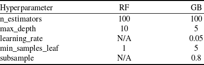
The dataset was partitioned into training and testing sets. To prevent data leakage and ensure a realistic evaluation, this split was performed on a per-engine basis. Eighty percent of the engine units were randomly selected for the training set (N = 208 engines), with the remaining 20% held out for final testing (N = 52 engines). Both the RF and GB models were trained on the training set. Hyperparameter optimisation was performed using a five-fold cross-validated grid search (‘GridSearchCV’) on the training set to minimise the root mean squared error (RMSE). The search space for each hyperparameter was defined based on common practices, and the final optimised values used for model training are presented in Table 2.
Final hyperparameter values for ML models

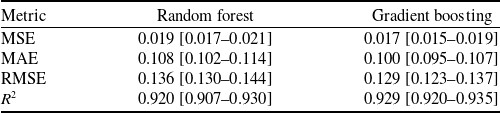
2.4 Machine learning model performance
The performance of the optimised RF and GB models was evaluated on the unseen test set by evaluating the mean squared error (MSE), mean absolute error (MAE), RMSE and regression score function ( ${R^2}$
). The results, summarised in Table 3, show that both models achieve strong predictive performance, with the GB model demonstrating a slight advantage across all metrics.
${R^2}$
). The results, summarised in Table 3, show that both models achieve strong predictive performance, with the GB model demonstrating a slight advantage across all metrics.
Performance metrics on the test set (with 95% bootstrap confidence intervals)

To rigorously assess the performance differential between the two ensemble architectures, a paired bootstrap analysis (N = 1,000) was performed. The 95% confidence interval for the difference in RMSE ( ${\rm{\Delta RMSE}} = {\rm{RMS}}{{\rm{E}}_{RF}} - {\rm{RMS}}{{\rm{E}}_{GB}}$
) was calculated as [0.0054, 0.0087). As this interval is entirely positive and does not encompass zero, the null hypothesis of equal predictive accuracy is rejected. These results provide statistically significant evidence that the GB model achieves superior predictive performance compared to the RF model on the FD002 test set.
${\rm{\Delta RMSE}} = {\rm{RMS}}{{\rm{E}}_{RF}} - {\rm{RMS}}{{\rm{E}}_{GB}}$
) was calculated as [0.0054, 0.0087). As this interval is entirely positive and does not encompass zero, the null hypothesis of equal predictive accuracy is rejected. These results provide statistically significant evidence that the GB model achieves superior predictive performance compared to the RF model on the FD002 test set.
2.5 Explainable AI
To overcome the inherent ‘black box’ nature of ensemble models and provide transparent, actionable insights, a post-hoc explanation framework was applied.
2.5.1 SHapley additive exPlanations
SHAP is a unified approach based in cooperative game theory used to explain the output of any ML model [Reference Kim30]. It computes the contribution of each feature to a specific prediction by assigning it a Shapley value, which represents the feature’s average marginal contribution across all possible feature coalitions [Reference Qin, Zhu, Liu, Zhang and Zhao31]. The application of SHAP to interpret DL and ensemble models in turbofan prognostics has recently gained significant traction, demonstrating its ability to enhance model transparency and trust [Reference Hong, Lee, Lee, Ko, Kim and Hur12]. In this study, SHAP is utilised to generate both global feature importance plots, revealing the model’s overall predictive strategy, and local explanations, which detail the feature contributions for individual RUL predictions. This allows for a direct comparison between the ex-ante insights from prognostic metrics and the post-hoc, model-driven explanations from SHAP.
2.6 Reproducibility
To ensure the full reproducibility of our results, all experiments were conducted using the Python 3.10 programming language. Key libraries include $scikit - learn$
(v1.3.0),
$scikit - learn$
(v1.3.0), $pandas$
(v2.0.3),
$pandas$
(v2.0.3), $matplotlib$
(v3.7.1) and
$matplotlib$
(v3.7.1) and $shap$
(v0.42.1).
$shap$
(v0.42.1).
A fixed random seed ( $random\_state = 42$
) was used for the
$random\_state = 42$
) was used for the $80/20$
train-test split of the 260 engine units. This resulted in 208 engine units for training and 52 for testing. The 52 specific engine unit IDs held out for the test set are: {7, 10, 11, 16, 19, 20, 25, 26, 31, 34, 46, 47, 69, 76, 78, 91, 93, 97, 98, 102, 105, 114, 115, 120, 140, 143, 145, 151, 155, 159, 168, 174, 178, 180, 182, 186, 191, 197, 202, 205, 206, 207, 212, 213, 214, 221, 224, 229, 237, 238, 243, 259}.
$80/20$
train-test split of the 260 engine units. This resulted in 208 engine units for training and 52 for testing. The 52 specific engine unit IDs held out for the test set are: {7, 10, 11, 16, 19, 20, 25, 26, 31, 34, 46, 47, 69, 76, 78, 91, 93, 97, 98, 102, 105, 114, 115, 120, 140, 143, 145, 151, 155, 159, 168, 174, 178, 180, 182, 186, 191, 197, 202, 205, 206, 207, 212, 213, 214, 221, 224, 229, 237, 238, 243, 259}.
The $shap.TreeExplainer$
was used, as it is the computationally efficient, model-specific explainer for the RF and GB models we employed. We retained the key default setting
$shap.TreeExplainer$
was used, as it is the computationally efficient, model-specific explainer for the RF and GB models we employed. We retained the key default setting $feature\_perturbation = {\rm{'}}interventional{\rm{'}}$
, which is the recommended approach for this type of analysis. This method computes feature contributions by simulating interventions that break feature correlations (as opposed to the observational
$feature\_perturbation = {\rm{'}}interventional{\rm{'}}$
, which is the recommended approach for this type of analysis. This method computes feature contributions by simulating interventions that break feature correlations (as opposed to the observational $tree\_path\_dependent$
method), which more closely aligns with understanding a single feature’s isolated impact on the model’s prediction. We also confirmed that the default additivity check passed for all explanations, ensuring that the sum of the feature SHAP values plus the base value correctly equals the model’s output for each prediction. The full code is available at our GitHub repository, and a snapshot has been archived with DOI: 10.5281/zenodo.17588028, 10.5281/zenodo.17588027.
$tree\_path\_dependent$
method), which more closely aligns with understanding a single feature’s isolated impact on the model’s prediction. We also confirmed that the default additivity check passed for all explanations, ensuring that the sum of the feature SHAP values plus the base value correctly equals the model’s output for each prediction. The full code is available at our GitHub repository, and a snapshot has been archived with DOI: 10.5281/zenodo.17588028, 10.5281/zenodo.17588027.
3.0 Results
This section presents the findings from the application of the prognostic metrics and the subsequent explainable AI analysis.
3.1 Prognostic metrics evaluation
The suitability of each sensor for prognostics was first evaluated using the metrics defined in the methodology. By analysing the distribution of these metric scores across the entire training fleet, we can assess not only the average performance of a sensor but also its consistency and reliability.
For the monotonicity evaluation, a higher score indicates a more consistent directional trend. The boxplots in Fig. 5 show the median (line) and mean (star) for each sensor’s monotonicity as well as their variance and outliers. The plots reveal that while several sensors exhibit high median monotonicity, many also show a high variance in their scores and numerous outliers. For instance, sensors like 4 and 9, while strong on average, demonstrate inconsistent monotonic behaviour across different engine failure cycles. This highlights that very few sensors maintain a perfectly consistent trend across the entire fleet.
Monotonicity scores for each sensor with mean, median, interquartile range and outliers.

Trendability measures the consistency of the degradation signal’s shape over time. Figure 6 shows the median (line) and mean (star) for each sensor’s trendability as well as their variance and outliers. The results confirm that sensors such as 4, 11 and 15 have high median trendability, making them strong candidates for prognostic modelling. However, the distributions in Fig. 6 also reveal important nuances. Sensor 14, for example, shows a high median but also a very large number of outliers. This suggests that its trend is excellent for some engines, but poor for others – a ‘hit-or-miss’ characteristic for some engines, but poor for others – a ‘hit-or-miss’ characteristic not visible in a simple average.
Trendability scores for each sensor with mean, median, interquartile range and outliers.

Finally, in the prognosability evaluation, a high score indicates a small variance in the feature’s value at the end of life, making it a reliable failure threshold indicator. Figure 7 shows the median (line) and mean (star) for each sensor’s prognosability as well as their variance and outliers, marking Sensors 9 and 14 as the most prognosable features in the dataset. According to the plot, Sensor 9 has a very large median degradation range, but its interquartile range (IQR) is also high, indicating significant variability across the fleet. This suggests a large signal but with high variability. Also, Sensor 14 shows a high median range but a much smaller IQR compared to Sensor 9, suggesting it provides a more consistent degradation signal across the fleet, which is a key factor for high prognosability.
Degradation range scores for each sensor with mean, median, interquartile range and outliers. This metric is a key component of the prognosability calculation (Section 2.2.3), where a high score is achieved when the variance in this range is small relative to the overall degradation magnitude.

To explore the relationships between these different prognostic qualities, a scatterplot matrix was generated (Fig. 8). Each point in the plots represents the average score for a single sensor. This visualisation allows for a qualitative assessment of the trends between the metrics. The plots suggest a generally positive, albeit scattered, relationship between monotonicity and trendability. In contrast, we observe a distinct non-linear relationship between trendability and prognosability. Sensors with very low trendability (e.g. Sensors 6, 10, 16) also have low prognosability. For the remaining sensors, this relationship appears almost quadratic: prognosability is highest for sensors with mid-to-high trendability (e.g. Sensor 9), but drops off again for sensors with very high trendability (e.g. Sensors 4, 11, 15). This visual exploration underscores that these metrics capture distinct, complementary aspects of a sensor’s prognostic value, and a high score in one area does not necessarily guarantee a high score in another.
Prognostic metric correlations. Points are colour-coded by group. The Outlier sensors are red (Sensors 6, 10, 16), the Top Performer sensors are blue (Sensors 4, 9, 11, 15), and the remaining sensors are grey.

To create a single, unified ranking for an initial feature screening, the arithmetic and geometric means of the three metric scores were calculated for each sensor (Fig. 9). This unweighted approach was deliberately chosen to provide a balanced assessment and avoid making a priori assumptions about the relative importance of each prognostic quality. For this analysis, monotonicity, trendability and prognosability were considered equally desirable characteristics in a candidate sensor. This composite view provides a holistic assessment of prognostic potential, with Sensors 4, 9, 11 and 15 emerging as the most promising overall candidates.
Arithmetic and geometric means of the prognostic metric scores for each sensor. Sensors 10 and 16 have near zero score due to too much sensor noise.

3.2 Model interpretability with SHAP
To understand the inner workings of the trained models and to compare their feature reliance against the prognostic metrics, a post-hoc analysis was conducted using SHAP.
3.2.1 Feature importance with SHAP summary plot
Before presenting the feature rankings, it is important to note a key caveat of SHAP. As we discuss in more detail in Section 4, the presence of highly correlated features (multicollinearity) can cause SHAP to distribute the importance attribution across the correlated group. The rankings should therefore be interpreted as the model’s reliance on a set of related physical signals, not just a single sensor.
The SHAP summary plots, calculated from the testing data sets, rank features by their global importance and illustrate the direction and magnitude of their impact on the model’s output. These visualisations, presented for the RF in Fig. 10 and the GB model in Fig. 11, rank features by their mean SHAP value. The feature importance hierarchy derived from the GB model demonstrates a strong agreement with that of the RF model. This indicates a substantial similarity between the model’s output on the primary drivers of the prediction, with only slight discrepancies in the ordering of less impactful features.
SHAP summary plot for the RF model.

SHAP summary plot for the GB model.

Within the SHAP summary plot, each point corresponds to the Shapley value for a feature attributed to a single prediction instance. The vertical ordering of features reflects their overall importance, calculated as the mean of their absolute SHAP values. Furthermore, the plot encodes the feature’s value through a colour gradient (red = high, blue = low) and its precise influence on the prediction via its position on the horizontal axis. Consequently, the SHAP analysis facilitates a more nuanced understanding of model behaviour, revealing key insights that extend beyond the scope of conventional prognostic metrics.
To quantitatively support the claim of partial alignment, we calculated the Spearman rank correlation between the composite arithmetic mean prognostic scores (Fig. 9) and the mean absolute SHAP values from the GB model (Fig. 11). The correlation was $\rho = 0.6786{\rm{\;}}\left( {p = 0.0054} \right)$
, indicating a statistically significant, strong positive relationship. This confirms that the ex-ante metrics are a useful and effective, though not perfect, predictor of the features the model will ultimately find important. The RF model exhibited a similar degree of alignment, with a correlation of
$\rho = 0.6786{\rm{\;}}\left( {p = 0.0054} \right)$
, indicating a statistically significant, strong positive relationship. This confirms that the ex-ante metrics are a useful and effective, though not perfect, predictor of the features the model will ultimately find important. The RF model exhibited a similar degree of alignment, with a correlation of $\rho = 0.6357\left( {p = 0.0109} \right)$
, indicating a statistically significant and strong positive relationship across both models.
$\rho = 0.6357\left( {p = 0.0109} \right)$
, indicating a statistically significant and strong positive relationship across both models.
Points of Agreement:
There is a strong agreement between the prognostic metrics and the post-hoc SHAP analysis for several key sensors.
-
• Sensors 4, 9, 11 and 15, which were identified as top candidates in the composite prognostic scores (Fig. 9), are all ranked in the top five most impactful features by SHAP.
-
• Specifically, Sensor 4 and 11 scored very high on monotonicity and trendability, and SHAP confirms that the model relies heavily on them. For both sensors, the plot clearly shows that high feature values (red points) push the model to predict a higher RUL (positive SHAP values).
Deeper Insights and Discrepancies:
The true value of the SHAP analysis is revealed in its ability to clarify ambiguities from the prognostic metrics.
-
• The most striking insight is for Sensor 15, which SHAP ranks as the single most important feature. The ex-ante analysis gave a mixed review for this sensor: it had high monotonicity and trendability but very low prognosability. SHAP resolves this ambiguity, demonstrating that despite its inconsistent failure point, the model learned to rely on its strong trend more than any other signal.
-
• A similar finding occurs for Sensor 13, the second-most impactful feature according to SHAP. Its scores on the prognostic metrics were moderate at best, but SHAP reveals its crucial role in the model’s predictions, likely due to its ability to capture complex interactions with other features.
-
• Finally, Sensor 14 has the highest prognosability, moderate monotonicity, low trendability and a strong sixth place SHAP ranking. These varying scores tell us about the importance of this sensor in the different parts of unit’s degradation journey.
3.2.2 Feature interactions with SHAP dependency plot
While the summary plot provides a global ranking, SHAP dependence plots are essential for understanding how the model uses the most important features and how they interact. Using the better-performing GB model results, dependence plots were generated for the top-ranked feature, Sensor 15 (bypass ratio), to explore its relationships with other key sensors.
Interaction with Sensor 11 (static pressure at HPC outlet):
Figure 12 plots the SHAP value for Sensor 15 against its feature value, with points coloured by the corresponding value of Sensor 11. A clear non-linear trend is observable, where the impact of Sensor 15 on the model’s output becomes strongly negative as its value decreases.
SHAP dependence plot for Sensor 15 (BPR, bypass ratio) coloured by the value of Sensor 11 (Ps30, static pressure at HPC outlet, psia).

The plot also suggests a strong dependency between the two sensors. The distinct vertical dispersion of points shows that for any given value of Sensor 15, the corresponding SHAP value is influenced by the value of Sensor 11. However, it is important to interpret this carefully; this visual pattern likely reflects a combination of a true learned interaction and the underlying physical correlation between the bypass ratio and HPC outlet static pressure. This indicates the model has learned that the RUL declines most rapidly when a low bypass ratio occurs in conjunction with high HPC outlet static pressure.
Interaction with Sensor 13 (corrected fan speed):
A similar analysis was performed to examine the interaction between Sensor 15 and the second most important feature, Sensor 13 (Fig. 13). This interaction appears to be even stronger.
SHAP dependence plot for Sensor 15 (BPR, bypass ratio) are coloured by the value of Sensor 13 (NRf, corrected fan speed, rpm).

The plot shows that the most negative SHAP values, indicating the strongest push towards failure prediction, occur when a low value of Sensor 15 is combined with a high value of Sensor 13 (red points). This is physically intuitive, as a low bypass ratio combined with high fan speed suggests a high-stress operating condition for the engine core. The model’s ability to capture this multivariate dependency is a key reason for its predictive accuracy and demonstrates a level of insight beyond what is possible with linear models or individual prognostic metrics.
3.2.3 Local prediction case study with SHAP force plot
To make the model’s decision-making process tangible, the prediction for two different instances from the test set was analysed using a SHAP force plot, as shown in Figs. 14 and 15. Two instances are chosen from units nearing the end of their life-cycles.
SHAP force plot for a single prediction case study.

SHAP force plot for another prediction.

These plots explain how the model arrives at its final output $f(x)$
for a specific instance, starting from the base value (the average prediction over the entire dataset). Features shown in red have positive SHAP values, meaning they push the prediction higher than the average, indicating factors contributing to a longer RUL (a healthier state). Conversely, features shown in blue have negative SHAP values, pushing the prediction lower and indicating factors that signal degradation and a shorter RUL.
$f(x)$
for a specific instance, starting from the base value (the average prediction over the entire dataset). Features shown in red have positive SHAP values, meaning they push the prediction higher than the average, indicating factors contributing to a longer RUL (a healthier state). Conversely, features shown in blue have negative SHAP values, pushing the prediction lower and indicating factors that signal degradation and a shorter RUL.
Figure 14 shows an instance where the model predicts an RUL that is lower than the base value, indicating significant degradation. The prediction is driven down (pushed to the left) primarily by the values of Sensor 11 (Ps30, static pressure at HPC outlet, psia), Sensor 4 (T50, total temperature at LPT outlet, ${{\rm{\;}}^ \circ }{\rm{R}}$
), and Sensor 9 (Nc, physical core speed, rpm), which are all shown in blue. Interestingly, for this specific instance, the value of Sensor 15 (BPR, bypass ratio) has a positive SHAP value (red), pushing the RUL prediction higher and suggesting a healthier condition, contrary to the other important sensors.
${{\rm{\;}}^ \circ }{\rm{R}}$
), and Sensor 9 (Nc, physical core speed, rpm), which are all shown in blue. Interestingly, for this specific instance, the value of Sensor 15 (BPR, bypass ratio) has a positive SHAP value (red), pushing the RUL prediction higher and suggesting a healthier condition, contrary to the other important sensors.
In contrast, Fig. 15 shows another late-life instance where the prediction is also lower than the base value. Here, however, Sensor 15 contributes a large negative SHAP value (blue), aligning with the other sensors in signalling imminent failure. This comparison demonstrates SHAP’s diagnostic power: while Sensor 15 is globally the most important feature, the model has learned to rely on its degradation trend. In the atypical case of Fig. 14, where Sensor 15 did not show a strong degradation signal, the model correctly relied on other sensors to predict a low RUL. This reveals a subtlety in the model’s behaviour that would be impossible to see from performance metrics alone. Table 4 shows the raw sensor data values and the contributions of each sensor’s SHAP value to the predictions of the force plots.
Feature and SHAP value comparison for case study instances

4.0 Discussion
This study compared ex-ante prognostic metrics with post-hoc SHAP explanations to deepen the interpretability of the RUL prediction models. The results reveal that while traditional metrics provide a valuable baseline, they are insufficient for revealing the complex, and sometimes flawed, logic of the trained models.
4.1 Synergies and discrepancies
A partial alignment was found between the two analytical methods. SHAP confirmed the high importance of sensors with strong ex-ante prognostic scores (e.g. Sensors 4 and 11), validating the foundational merit of the metrics. However, SHAP also demonstrated a high reliance on features with ambiguous metric profiles (e.g. Sensors 13 and 15). This proves that post-hoc analysis is essential for uncovering hidden feature interactions and resolving the inherent limitations of pre-calculated, univariate metrics.
The most critical finding was SHAP’s ability to diagnose model behaviour at the local level, revealing potential over-reliance on certain features. This goes beyond simple feature ranking and serves as a crucial diagnostic tool. For example, our analysis of the SHAP force plots (Figs. 14 and 15) identified a case where the model’s prediction was driven by an atypical signal from Sensor 15, which contradicted the degradation trends shown by other key sensors. This highlights a trend shown by other key sensors. This highlights a scenario where the model could be ‘correct for the wrong reasons’ instance-level diagnostics are precisely where XAI provides value beyond traditional metrics, uncovering specific vulnerabilities that would otherwise remain hidden.
4.2 Implications, limitations and future work
These findings argue for the mandatory integration of XAI into the validation pipeline for safety-critical prognostics. Prognostic metrics like the ones used in this article as well as performance metrics like RMSE are incapable of revealing such vulnerabilities.
We acknowledge several limitations in this study. The analysis was conducted solely on the FD002 subset of the CMAPSS dataset. While this subset is highly complex, validating this comparative framework on other subsets (FD001, FD003, FD004) and on different real-world datasets is a critical next step to ensure the generalisability of our findings.
A critical consideration in this analysis is the effect of multicollinearity on SHAP value attribution. As noted by Aas et al. [Reference Aas, Jullum and Løland32], the presence of highly correlated features can lead SHAP to distribute the importance across the correlated group. This is a central and valid challenge, as high physical correlations exist in this dataset (e.g. between Sensors 15, 11 and 7; or Sensors 9 and 14).
If a key feature like Sensor 15 (BPR, bypass ratio) were removed from the training data, its SHAP importance would almost certainly be redistributed to its correlated peers (like Sensor 11, Ps30, static pressure at HPC outlet). We argue, however, that this reinforces our conclusion rather than weakening it. It suggests the model has not learned an arbitrary reliance on Sensor 15, but rather has identified the underlying physical degradation pattern represented by this entire group of sensors. The SHAP analysis correctly identifies the proxy for this pattern (Sensor 15) that the model found most useful. The diagnostic power of the local plots (Figs. 14 and 15) further demonstrates this, as they show the model can pivot within this correlated group when one sensor (like Sensor 15 in Fig. 14) provides an atypical signal, which is a sign of a robust, non-brittle model.
This study’s methodology provides a robust framework for future research, which should include its application to different datasets and model architectures (e.g. LSTMs). Furthermore, the insights gained from SHAP should be used to guide the development of more robust models, for example, through targeted data augmentation of atypical failure cases. Future work should also extend this methodology to other model architectures, such as LSTMs and transformers, which are commonly used in prognostics.
4.3 A practical application for an engineer
For an engineer in a certification or maintenance context, this framework could be applied as a practical checklist:
-
• Screen: Use prognostic metrics (monotonicity, etc.) for initial sensor screening and to establish a baseline physical understanding.
-
• Train: Develop the ML prognostic model.
-
• Validate (global): Use global SHAP plots (e.g. summary plot) to verify that the model relies on sensors that are physically expected to be important.
-
• Diagnose (local): Use local SHAP plots (e.g. force plots) to spot-check high-risk predictions (e.g. an engine predicted to fail sooner than expected) and atypical cases (like Fig. 14) to understand why the model is making its decision.
-
• Trust and refine: Use these insights to build a trust case for the model or to identify model vulnerabilities (e.g. ‘the model over-relies on Sensor X in this condition’) that must be addressed, perhaps with more targeted training data.
5.0 Conclusion
This research demonstrated the value of integrating traditional prognostic metrics with post-hoc XAI explanations for enhancing the interpretability and trustworthiness of RUL prediction models. Our key findings are:
-
• Partial alignment: There is a moderate agreement between traditional prognostic metrics (monotonicity, trendability, prognosability) and SHAP-derived feature importance. Sensors with high prognostic scores (e.g. 4, 9, 11) were also identified as highly impactful by the ML models.
-
• Ambiguity resolution: SHAP resolves ambiguities where prognostic metrics conflict. For Sensor 15, which had high trendability but low prognosability, SHAP revealed it was the single most important feature for the model, showing the model learned to prioritise its strong trend.
-
• Vulnerability detection: Local SHAP explanations (force plots) are essential for diagnosing model behaviour. We identified specific instances where the model’s prediction was driven by an anomalous reading from a key sensor, highlighting a potential failure mode that global performance metrics would miss.
Ultimately, this work argues that while prognostic metrics are useful for initial feature screening, they are insufficient for validating the complex, non-linear behaviour of modern ML models. The integration of XAI tools like SHAP into the validation pipeline is a necessary step toward developing more robust, reliable and trustworthy prognostic systems in safety-critical applications.
Acknowledgements
The author wishes to thank the faculty of Engineering and Natural Sciences at Istanbul Medeniyet University for their support during the development of this research. Special thanks are extended to the reviewers whose constructive feedback helped improve the quality and clarity of this work.
Data and code availability
The Commercial Modular Aero-Propulsion System Simulation (CMAPSS) dataset used in this study was generated by NASA and is publicly available. The specific subset used, FD002, can be accessed through the NASA Prognostics Center of Excellence data repository. The Python code developed for data preprocessing, prognostic metric calculation, machine learning model training and SHAP analysis is available in a https://github.com/ravsar/shap_turbofan/blob/main/Copy_of_SHAP_turbofan.ipynbpublic GitHub repository.
Appendix A. Expected generalisability to other CMAPSS subsets
While this study focused on the complex FD002 subset, the proposed framework is applicable to all other subsets as well.
-
• For FD001 (one fault mode, one operating condition): We would expect a stronger correlation between prognostic metrics and SHAP values. The simpler, cleaner degradation signals should make metrics like monotonicity and trendability highly effective predictors of model importance.
-
• For FD004 (two fault modes, six operating conditions): We would expect results similar to FD002, or perhaps even a weaker correlation. The multiple operating conditions and fault modes would likely make the ex-ante, univariate metrics less reliable, further increasing the need for post-hoc XAI to uncover the complex, conditional logic learned by the model.
Appendix B. Supplementary Figures
Z-score normalized sensor data for a single unit.

Correlation heatmap of the three prognostic metrics.


 Open access