


1. Introduction
The collapse of the Larsen A Ice Shelf in 1995 and the Larsen B Ice Shelf in 2002 removed substantial buttressing forces from their former tributary glaciers on the eastern Antarctic Peninsula (AP), triggering glacier retreat, thinning and accelerated mass loss (Rignot and others, Reference Rignot2004; Shuman and others, Reference Shuman, Berthier and Scambos2011; Shepherd and others, Reference Shepherd, Fricker and Farrell2018). Following the initial period of rapid retreat, former Larsen A tributaries, such as Edgeworth and Drygalski glaciers, re-advanced for nearly two decades (Dryak and Enderlin (Reference Dryak and Enderlin2020), Figs 1a, b). Similarly, several former Larsen B tributary glaciers have re-advanced and continued to flow at accelerated speeds in recent years (Rignot and others, Reference Rignot2004; Berthier and others, Reference Berthier, Scambos and Shuman2012; Dryak and Enderlin, Reference Dryak and Enderlin2020, Figs 1c–e).
Map view of 2014–21 calving front time series for the former Larsen A Ice Shelf tributaries: (a) Edgeworth and (b) Drygalski glaciers, and the former Larsen B Ice Shelf tributaries: (c) Hektoria and Green, (d) Jorum, and (e) Crane glaciers, colored by date. Black arrows indicate flow direction. Background images are from the panchromatic band of Landsat 8 imagery captured on 8 October 2020 (panels a and b) and 2 October 2021 (panels c–e). The regional map (upper left) is the Landsat Image Mosaic of Antarctica with respective glacier locations marked.

The recent advance of many Larsen A and B tributaries no longer buttressed by the ice shelves could be caused by changes in internal dynamics, climate forcing, or a combination of the two. At decadal timescales, western AP glacier acceleration and retreat in response to dynamic frontal thinning (Pritchard and Vaughan, Reference Pritchard and Vaughan2007) is correlated with regional ocean warming (Cook and others, Reference Cook2016). Along the eastern AP, ocean warming may have preconditioned the Larsen ice shelves for catastrophic collapse (Shepherd and others, Reference Shepherd, Wingham, Payne and Skvarca2003) yet there has been no apparent change in submarine melting of the nearby Larsen C Ice Shelf since 2002 (Adusumilli and others, Reference Adusumilli2018). Additionally, Chuter and others (Reference Chuter, Zammit-Mangion, Rougier, Dawson and Bamber2022) found no multi-year trends in surface mass balance (SMB) on the AP between 2003 and 2019. Therefore, it is likely that the recent advance of many of the Larsen A and B tributaries has been driven by long-term geometric adjustment following collapse of the ice shelves rather than changing climate conditions.
A decade-long period of geometric readjustment that is not directly caused by regional climate forcing is not unheard of – the tidewater glacier cycle is characterized by a rapid period of retreat and much longer period of readvance relatively independent of climate. Modeled bed topography from Huss and Farinotti (Reference Huss and Farinotti2014) suggests that many glaciers in the region overly prograde slopes near their termini, but the bed geometry of the region through which the grounding line retreated following shelf collapse is unknown. Because observations of glacier geometry and environmental change are so sparse along the eastern AP, long-term dynamic change following shelf collapse has not been investigated for the former tributary glaciers of the Larsen A and B ice shelves. Numerical modeling of the most data-rich glacier in the region, Crane Glacier, offers a promising approach to assess the influence of climate forcing on tributary glaciers following shelf collapse. While prognostic modeling of a single glacier cannot be used to project regional changes in dynamics, numerical modeling of a single glacier with regionally representative long-term dynamic change can be used to assess the potential for catastrophic dynamic mass loss from former tributary glaciers.
Recognizing the observational requirements of dynamic glacier modeling, we combine state-of-the-art SMB estimates, glacier flow speed and geometry observations, including radar and sonar travel-time measurements of the glacier bed and ocean bathymetry, satellite-derived calving front positions, and iceberg-derived observations of ocean conditions adjacent to the calving front (Dryak and Enderlin, Reference Dryak and Enderlin2020), to reconstruct the dynamic history of Crane Glacier from 1997 to 2018. We then use the flowline model from Enderlin and others (Reference Enderlin, Howat and Vieli2013b) to run a range of potential climate scenarios based on projections from the Fifth Assessment Report of the Intergovernmental Panel on Climate Change (IPCC) (Etourneau and others, Reference Etourneau2019; Barthel and others, Reference Barthel2020) over the course of the 21st century to explore the glacier sensitivity to SMB, hydrofracture-induced calving and submarine melt, parameterized by a fivefold increase in surface meltwater production near sea level and a 1 $^\circ$ C ocean warming. Despite the abundance of data available at Crane, there are still large uncertainties in the bed elevation profile, previous climate forcings, and projected regional climate change. Rather than accurately projecting dynamic mass loss from Crane Glacier over this century, the aim of our analysis is to evaluate how sensitive marine-terminating glaciers are to long-term climate forcing after ice shelf collapse. A better understanding of glacier re-advance on the AP is beneficial to projections of mass loss following ice shelf collapse given the gaps in knowledge regarding the regional controls on ice dynamics as well as the timescale over which glaciers adjust dynamically to ice shelf collapse.
2. Methods
2.1. Flowline model
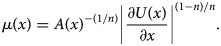
Multidimensional numerical ice flow models have been shown to reproduce continental-scale ice sheet behavior at high-spatial resolution (e.g. Larour and others, Reference Larour, Seroussi, Morlighem and Rignot2012). However, these models require both detailed forcing of the terminus boundary and knowledge of bed topography across the entire model domain. Although the bed topography has been modeled for the AP (Huss and Farinotti, Reference Huss and Farinotti2014; Morlighem, Reference Morlighem2019), the bed models at Crane are not realistic nor in good agreement with bed elevation estimates from NASA Operation IceBridge (OIB) level 1B radar echograms (see Section 2.2). Given the uncertainty in bed elevations and the relatively simple geometry of the glacier (Fig. S1), we employ a width-averaged and depth-integrated numerical ice flow model (i.e. flowline model) for our model simulations (Enderlin and others, Reference Enderlin, Howat and Vieli2013a). The 1-D force balance equation is defined as:

where ρ i is the density of ice [917 kg m−3], g is the gravitational acceleration constant [9.81 m s−2], H(x) is the glacier thickness [m], x is the distance from the inland boundary [m], h(x) is the surface elevation [m], μ(x) is the effective ice viscosity [Pa s], U(x) is the flow speed [m s−1], β(x) is the basal roughness factor [s1/m m1/m], N(x) is the effective pressure of ice [Pa], m is the basal sliding exponent [unitless], W(x) is the glacier width [m], A(x) is the rate factor [Pa−3 s−1] and n is the flow parameter [unitless] in accordance with Glen's flow law (Benn and others, Reference Benn, Hulton and Mottram2007; Nick and others, Reference Nick, Van Der Veen, Vieli and Benn2010). The left-hand side of Eqn. (1) represents the gravitational driving stress, which is balanced on the right-hand side by longitudinal stress gradients (first term), basal resistance (second term) and lateral resistance (third term). The rate factor controls the depth-averaged effective viscosity [Pa s], μ(x), defined as follows:
Flowline models are computationally efficient and can be used to model fast-flowing glaciers with relatively simple geometries and flow regimes (Benn and others, Reference Benn, Hulton and Mottram2007). Flowline models have been used to model the behavior of glaciers in a wide variety of geographic settings including Greenland (Nick and others, Reference Nick, Vieli, Howat and Joughin2009; Vieli and Nick, Reference Vieli and Nick2011; Nick and others, Reference Nick2012), Alaska (Nick and others, Reference Nick, van der Veen and Oerlemans2007b; Colgan and others, Reference Colgan, Pfeffer, Rajaram, Abdalati and Balog2012), Svalbard (Vieli and others, Reference Vieli, Funk and Blatter2001, Reference Vieli, Jania and Kolondra2002), Iceland (Nick and others, Reference Nick, van der Kwast and Oerlemans2007a) and Antarctica (Jamieson and others, Reference Jamieson2012). The flowline model used here was previously used to assess glacier sensitivity to climate change for a range of geometries and viscosities (Enderlin and others, Reference Enderlin, Howat and Vieli2013a, Reference Enderlin, Howat and Vieli2013b). Although Crane has several tributaries that undoubtedly alter the flow regime beyond the assumption of simple unidirectional flow in the flowline model, these tributaries are located kilometers inland of the most-retreated calving front position and should have minimal influence on the model sensitivity tests described herein.
The flowline model is initialized using width-averaged profiles of glacier geometry (surface elevation, bed elevation, and width) and flow speed. At each time step (0.001 years; Table 1), the model simulates the evolution of the width-averaged glacier geometry, flow speed and stress regimes at an average grid spacing of 200 m and tracks the grounding line position as the inland-most point where the effective pressure is zero (i.e. the ice overburden pressure equals the subglacial water pressure). The grounding line position is precisely and continuously tracked using a linear interpolation approach by stretching or contracting the coordinate system such that the grounding line coincides exactly with a gridcell. The geometry and flow speed observations are described in Section 2.2. The implementation of model boundary conditions are described in Section 2.3. Model initialization is described in Section 2.4, hindcasting simulations for 1997–2018 are described in Section 2.5.1, and a range of projections to assess sensitivity to climate forcing are described in Section 2.5.2.
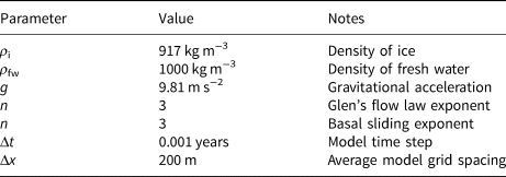
Model constants
2.2. Glacier geometry and flow speed observations
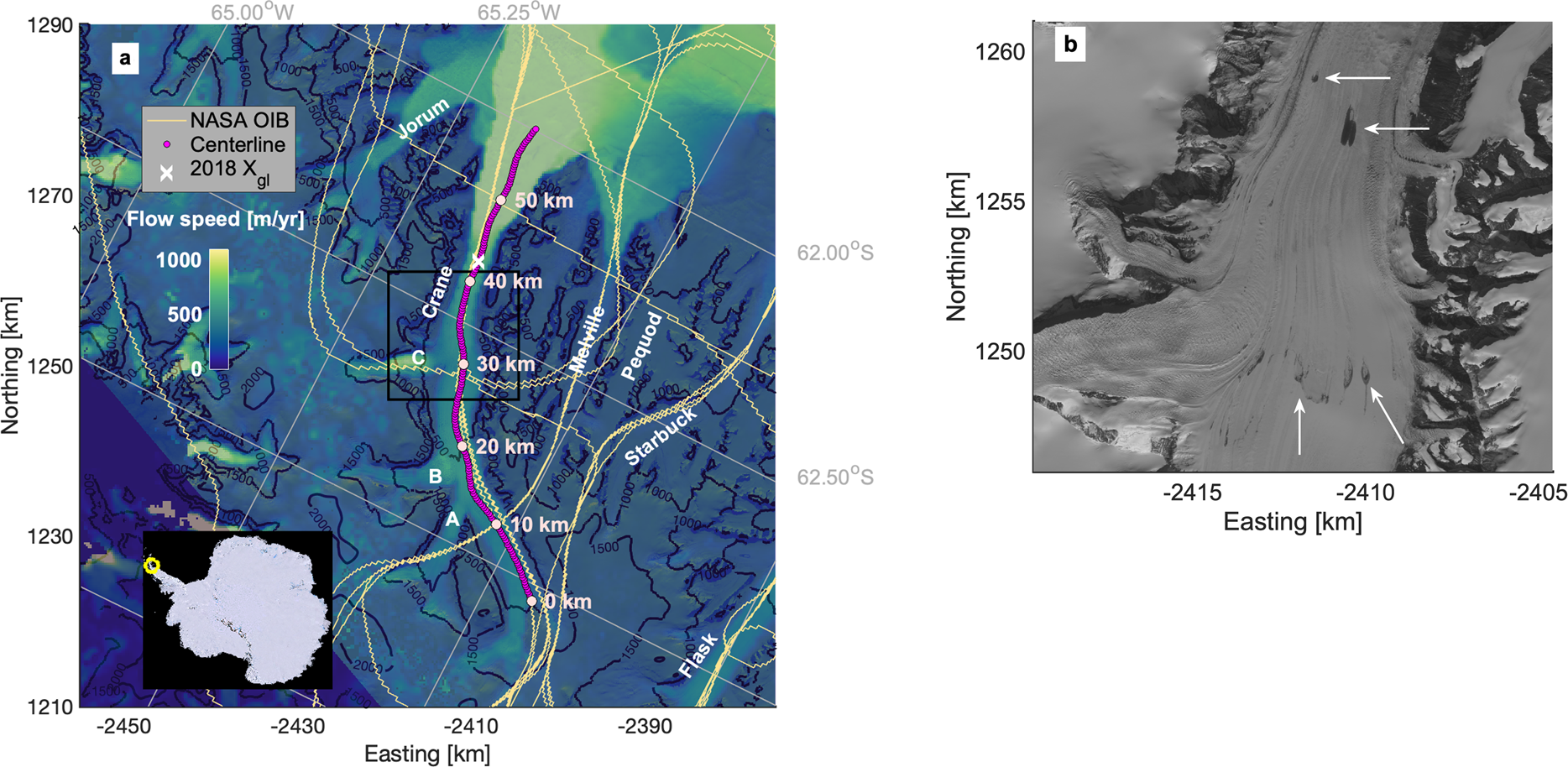
Model initialization and hindcasting simulations require width-averaged surface and bed elevation and flow speed profiles. To extract observational profiles, we first manually delineated the centerline at 200 m increments using flowlines along the main trunk in a panchromatic Landsat 8 image from 15 October 2020, shown in Figure 2. The glacier extent was manually delineated in the same image and line segments perpendicular to each centerline point were automatically clipped to the glacier extent polygon in order to construct transects from which cross-glacier observational data were extracted (Fig. S1). The surface and bed elevations and surface flow speed observations, described below, were averaged for each cross-glacier transect to construct width-averaged profiles used in the model simulations (Fig. 3).
(a) Map of Crane Glacier, eastern AP. Labeled are the glacier centerline, NASA Operation IceBridge (OIB) flight paths used to extract surface and bed elevations (Paden and others, Reference Paden, Li, Leuschen, Rodriguez-Morales and Hale2010), the modeled 2018 grounding line position (X gl), and surface flow speeds from 2017 NASA ITS$\_$ LIVE (Gardner and others, Reference Gardner, Fahnestock and Scambos2020). The 10 km increments of the centerline flow-following reference system for the numerical model are shown. Elevation contours are from the Reference Elevation Model of Antarctica in meters above sea level (Howat and others, Reference Howat, Porter, Smith, Noh and Morin2019). Background image is the panchromatic band of Landsat 8 imagery captured on 10 January 2020. The inset plot is the Landsat Image Mosaic of Antarctica with the study region circled (yellow). Adjacent glaciers and tributaries A, B and C are labeled. The black box denotes the zoomed in region in panel (b). (b) Panchromatic band of the same Landsat image zoomed in to lower elevations. Several visible meltwater features on the glacier surface are marked with white arrows.
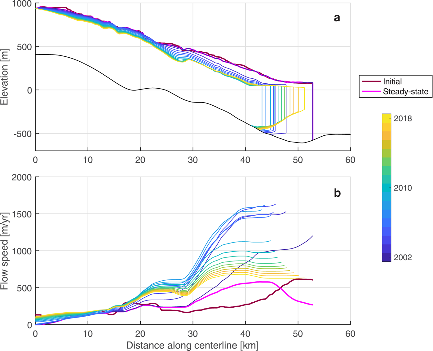
Time series of glacier centerline observations for (a) surface elevations, the NASA OIB-derived bed elevation picks (b center line; dotted gray line), the sonar-derived bed elevation profile from Rebesco and others (Reference Rebesco2014) collected in 2006, the width-averaged bed elevation profile (b width-averaged; solid gray line), the smoothed width-averaged bed elevation profile (bwidth-averaged, smoothed; solid black line), calving front positions from Dryak and Enderlin (Reference Dryak and Enderlin2020) (vertical lines), (b) width-averaged surface flow speeds from NASA ITS$\_$ LIVE, and (c) annual mean modeled SMB statistically downscaled from RACMO using methods described by Noël and others (Reference Noël2016), with the time-averaged SMB for 2009–18 (SMB μ) indicated by the dashed black line and the time-averaged SMB minus the snowmelt-inferred meltwater runoff (RO) indicated by the solid black line. Line colors indicate the date of observation, shown in the color bar (right).

Surface elevations along the glacier centerline were obtained from Advanced Spaceborne Thermal Emission and Reflection Radiometer (ASTER) digital elevation models (DEMs) and NASA OIB airborne observations (Table 2). Surface elevations captured in 2001 and early 2002 prior to the ice shelf collapse were extracted from ASTER DEMs with a spatial resolution of ~30 m and an estimated RMSE of ±7–15 m (Hirano and others, Reference Hirano, Welch and Lang2003). Although ASTER DEMs are corrected for clouds and statistical anomalies, the adjustments are often inaccurate where few cloud-free images are available, so we manually removed unrealistic elevations likely caused by cloud cover (Fig. 3a). Surface elevations from after the ice shelf collapse were extracted from NASA OIB level 2 radar products (Paden and others, Reference Paden, Li, Leuschen, Rodriguez-Morales and Hale2010) for 2009–11 and 2016–18. The airborne OIB data have a 22 m spatial resolution and an accuracy of up to 10 cm (Li and others, Reference Li2013).
Datasets of glacier surface elevation, bed elevation, surface flow speed, modeled surface mass balance, and calving front positions with their respective spatial resolution, temporal coverage, and reported accuracy
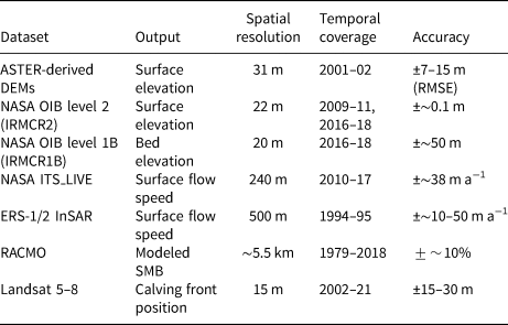
NASA OIB level 1B radar echograms (Paden and others, Reference Paden, Li, Leuschen, Rodriguez-Morales and Hale2014) were used to map the bed topography along the centerline (Fig. 2a) using code adapted from CReSIS (2021). A detailed description of the radar echogram processing workflow and the bed elevation picks are available in the Supplementary material (Fig. S2). Briefly, gain control and contrast adjustment were applied to the radar echograms to enable manual delineation and spatial interpolation of the bed profile. NASA OIB level 2 bed elevations and bathymetry observations from Rebesco and others (Reference Rebesco2014) were used to constrain the bed picks in the glacier interior and the seaward portion of the fjord, respectively. Previous applications estimate a nominal accuracy of ±10 m over the Greenland ice sheet (Gogineni and others, Reference Gogineni2001) for OIB-derived bed elevations potentially due to the choice of velocity model, subjective interpretation and the range resolution of the echograms (20 m; Li and others Reference Li2013). Bamber and others (Reference Bamber2013) estimate bed elevation accuracy of <50 m from radar soundings at the Greenland ice sheet, depending on local variations in topography. We estimate uncertainties of ~50 m here due to regions with abundant noise in all available echograms which we attribute to reflections from the steep sidewalls of the glacier fjord (Farinotti and others, Reference Farinotti, Corr and Gudmundsson2013). Echograms collected across-flow of the glacier were uninterpretable, preventing cross-validation between different flight paths. We discuss the implications of bed topography uncertainties on the model simulations in Section 4.3.1.
Although width-averaged surface elevations could be extracted in some places from the ASTER-derived DEMs, bed elevation observations were only available along the OIB centerline swaths and could not be directly differenced from the surface elevation profiles to create width-averaged thickness profiles. To estimate the width-averaged thickness, we first estimated the thickness along the centerline using the earliest available continuous surface elevation profile (2001) and the bed elevation profile described above. We then computed the cross-sectional area assuming a parabolic geometry with the maximum thickness at the centerline, zero thickness at the glacier margins, and uniform surface elevations across the glacier width. The use of a parabolic geometry is supported by sonar observations from the Crane fjord (Rebesco and others, Reference Rebesco2014). The resulting width-averaged thickness is 66% of the centerline thickness. The width-averaged bed elevation profile was constructed by subtracting the width-averaged thickness from the centerline surface elevation and held constant for all model simulations.
Following preliminary tests of the hindcasting simulation described below, we found that the glacier model evolved with small-scale (1 km) bumps or variations in surface elevation and flow speed that persisted for a wide range of climate forcings, contrasting with observations. To minimize these variations, we applied a moving mean smoothing algorithm to the width-averaged bed and initial thickness profile, similar to the NASA OIB level 1B processing method from Gogineni and others (Reference Gogineni2001). The moving standard deviation with a window of 1 km between the original bed and the smoothed bed profiles is 10.5 m on average, which is reasonable in comparison with the magnitude of uncertainty in the bed picks discussed above, as well as potential flaws in the parabolic bed shape assumption, such as sediment deposition at tributary confluence points and other variations along the bed width.
Pre-ice shelf collapse surface flow speeds were obtained from 500 m resolution ERS-1/2 InSAR observations from 1994 and 1995 (Wuite and others, Reference Wuite2015; Rott and others, Reference Rott2018). Post-ice shelf collapse surface flow speeds were accessed from the 240 m resolution NASA ITS$\_$ LIVE product (Gardner and others, Reference Gardner, Fahnestock and Scambos2020) for 2010–17. Although NASA ITS$\_$
 LIVE velocity maps are available for Antarctica as early as 1994, little to no data exist at Crane prior to 2010. The accuracy of the early SAR-derived speeds is 7–15 m a−1 (Wuite and others, Reference Wuite2015) with a precision of 10–50 m a−1 (Rignot and others, Reference Rignot2004) and the mean accuracy of the ITS$\_$
 LIVE speeds is 22–31 m a−1 (Lei and others, Reference Lei, Gardner and Agram2021). We assumed plug flow conditions, such that surface flow speeds were treated as depth-average speeds in the model simulations. The assumption of plug flow over the area of the model domain of interest in our investigation is supported by flow speeds along the calving front that are nearly 1500 m a−1.
2.3. Boundary conditions
To model the dynamic evolution of a glacier, boundary conditions must be defined for the inland edge and the glacier–ocean, –atmosphere and –bed interfaces of the model domain. The following subsections describe influx from inland ice, iceberg calving, snow accumulation and surface meltwater runoff (i.e. SMB), submarine melting and influx from tributaries.
2.3.1. Inland and seaward boundary conditions
The flow speed, width and thickness at the adjacent model gridcell are used to calculate the interior flux at the inland-most model gridcell. Assuming a zero gradient in flux at the model interior is reasonable given the very small magnitude differences in flow speed (<5 m a−1) and thickness (<5 m) observed across gridcells at this section of the glacier. At the seaward boundary, the longitudinal stress is balanced by the difference between the hydrostatic pressure of the ice and seawater (Nick and others, Reference Nick, Van Der Veen, Vieli and Benn2010). Near marine-terminating calving fronts, the unsupported subaerial cliff creates a generally extensional flow regime (Fig. 3b) often characterized by widespread crevassing. Here we use the crevasse penetration depth calving criterion of Benn and others (Reference Benn, Hulton and Mottram2007) and assume that in a closely spaced field of crevasses, surface crevasses will penetrate to the depth in the ice where the net stress is zero (Nye, Reference Nye1957; Benn and others, Reference Benn, Hulton and Mottram2007). Crevasse depth is estimated as a function of the local along-flow resistive stress, R xx(x), defined as

Given that surface melt-driven changes in crevasse hydrofracture have been implicated as a trigger for the collapse of the Larsen B Ice Shelf that formerly buttressed the glacier (Scambos and others, Reference Scambos, Hulbe, Fahnestock and Bohlander2000; McGrath and others, Reference McGrath2012; Robel and Banwell, Reference Robel and Banwell2019) and impounded meltwater is visible on the surface in recent austral summer satellite images (Fig. 2b), we also assume that surface meltwater acts to open crevasses. Accounting for both resistive stress and hydrofracture-driven crevasse opening, the depth of crevasses, d crev, is calculated as:

where ρ fw is the density of fresh water [1000 kg m−3], and d fw is the depth of fresh water in crevasses [m].
The calving front is identified as the inland-most gridcell in which the surface crevasse depth penetrates to sea level, assuming that the fracture of ice along crevasses is a first-order control of iceberg calving (Benn and others, Reference Benn, Hulton and Mottram2007; Nick and others, Reference Nick, Van Der Veen, Vieli and Benn2010; Enderlin and others, Reference Enderlin, Howat and Vieli2013a). The crevasse penetration depth calving parameterization does not model individual calving events, but has been shown to reproduce interannual patterns in calving front position with high fidelity with respect to other leading calving models for outlet glaciers in Greenland (Choi and others, Reference Choi, Morlighem, Wood and Bondzio2018; Amaral and others, Reference Amaral, Bartholomaus and Enderlin2020). Observed glacier calving front positions along the centerline used to tune the d fw parameter after the ice shelf collapse (described in Section 2.5.) are from all cloud-free Landsat images since 2002 from Dryak and Enderlin (Reference Dryak and Enderlin2020).
There are three tributaries of Crane Glacier: A, B and C, which are located at ~15, 20 and 30 km along the centerline, respectively (Fig. 2a). To estimate the annual mass contributions from each of the tributaries, we extracted surface elevation and flow speed data across a flux gate for each tributary that were manually drawn perpendicular to the flow using Landsat 8 panchromatic imagery from 15 October 2020. Bed elevations are required to convert surface elevation observations to thicknesses, but observations are only available along OIB flow-following flight lines for tributary C (Fig. 2). We constructed the cross-sectional thickness for the tributary C flux gate using the thickness observations at the center of the flux gate and assuming a trapezoidal, parabolic and rectangular bed geometries. The mean of these geometries was used to account for uncertainties in cross-sectional area, which varied by a maximum of 34%. Thickness cross sections for the tributary A and B flux gates were estimated using the width to thickness ratio of tributary C. The product of flow speed, thickness and width for 200 m resolution bins spanning each flux gate was then summed to estimate volume flux. We divided these fluxes by the width of the glacier trunk at the tributary confluence, which resulted in a mean annual width-averaged ice thickness from each tributary to the glacier trunk.
2.3.2. Surface boundary conditions
There are no direct observations of SMB at Crane Glacier, requiring the use of modeled SMB estimates to parameterize the surface boundary fluxes. The ~5.5 km resolution monthly SMB product from RACMO (Van Wessem and others, Reference Van Wessem2016; Lenaerts and others, Reference Lenaerts2018) provides modeled snowfall, snowmelt, runoff and SMB for 1979–2018. We statistically downscaled the modeled SMB to the 200 m resolution centerline surface elevation profile from 2009 using the methods described by Noël and others (Reference Noël2016). Statistical downscaling attempts to minimize systematic biases in SMB estimates associated with spatial averaging of glacier and mountain elevations in the modeled datasets. To reduce the impact of modeled SMB error, which fluctuates by up to $\sim \!50\percnt$ of the observed SMB on the AP according to Lenaerts and others (Reference Lenaerts2018), the time-averaged SMB for 1995–2018 was used to initialize the flowline model. The downscaled annual time series and time-averaged SMB along the centerline are shown in Figure 3c.
RACMO models zero meltwater runoff for the eastern AP in recent years, even after statistical downscaling is applied. However, a significant portion of meltwater is expected to runoff for glaciers on the AP (Vaughan, Reference Vaughan2006). Variations in iceberg melt rates with proximity to Crane's calving front have been attributed to subglacial discharge-driven melt enhancement within plumes (Dryak and Enderlin, Reference Dryak and Enderlin2020) and provide independent support for the existence of runoff. Although RACMO includes a firn model, it likely underestimates firn saturation on the AP given the lack of meltwater runoff predicted. Therefore, we also statistically downscaled the RACMO snowmelt variable to the glacier centerline surface. We assumed firn saturation and implemented the 1995–2018 time-averaged snowmelt variable as a proxy for runoff. The downscaled, adjusted runoff profile varied approximately linearly from 0.14 m a−1 near sea level to 0.04 m a−1 at the inland boundary (~1000 m a.s.l.) which was then subtracted from the SMB profile shown in Figure 3c.
2.3.3. Basal boundary conditions
The basal boundary condition varies along-flow with variations in subglacial water pressure with respect to overburden pressure. The basal roughness factor, β(x), which defines the frictional resistance generated by the glacier moving over the bed, was computed as described in Section 2.4.
Submarine melting was parameterized as a function of distance seaward of the grounding line. In line with melt plume models (Slater and others, Reference Slater, Nienow, Goldberg, Cowton and Sole2017), submarine melt was prescribed as 0 m a−1 at the grounding line. The maximum melt rate was applied at the adjacent gridcell (~200 m further along the centerline), then decreased thereafter. The spatial variations in melt rate are in accordance with Larsen C observed melt rates (Adusumilli and others, Reference Adusumilli, Fricker, Medley, Padman and Siegfried2020) and plume theory (Jenkins, Reference Jenkins2011). We implemented an initial maximum submarine melt rate of 1.5 m a−1 based on the mean melt rate for large icebergs adjacent to Crane's calving front (Dryak and Enderlin, Reference Dryak and Enderlin2020) for 2013–18. No observations of ice tongue melt rates exist for Crane, but the iceberg melt-inferred melt rate is comparable to the 1994–2016 area-averaged basal melt rate of 0.5 ± 1.4 m a−1 (Adusumilli and others, Reference Adusumilli2018) and is less than the average maximum basal melt rate of ~5 m a−1 estimated for the Larsen C Ice Shelf between 2010 and 2018 (Adusumilli and others, Reference Adusumilli, Fricker, Medley, Padman and Siegfried2020).
2.4. Model initialization
To execute the flowline model, the two unknowns in Equation (1) – the basal roughness factor, β(x), and the rate factor, A(x) – must be solved for or otherwise parameterized. Equation (1) can be inverted to solve for the basal boundary condition for grounded ice when A(x) is independently parameterized. Since the rate factor describes the effective viscosity of the ice, it was parameterized as a function of ice temperature using an Arrhenius relationship (Cuffey and Paterson, Reference Cuffey and Paterson2010). Because in situ observations of ice temperature at Crane do not exist, we first used long-term average air temperature from RACMO as a proxy for ice temperature to approximate the rate factor. Then, A(x) was adjusted to account for along-flow strain heating using the normalized cumulative strain (Enderlin and others, Reference Enderlin, Howat and Vieli2013a). Additional details regarding our methods for tuning A(x) can be found in the Supplementary material.
The basal roughness factor, β(x), was first set to 1 everywhere along the centerline, then manually adjusted to minimize the misfit between modeled and observed glacier thickness and flow speed in the pre-ice shelf collapse steady-state model simulation (described in Section 2.5.1). The resulting β(x) increased linearly from 0.5 s1/m m−1/m in the glacier interior to ~1.2 s1/m m −1/m near the calving front (see Fig. S4). This β(x) parameterization, albeit simple, is comparable to those used in previous flowline models (Nick and others, Reference Nick, Van Der Veen, Vieli and Benn2010; Cook and others, Reference Cook2014) which reasonably reproduced observed glacier dynamics. In addition, our analysis focuses on the fast-flowing portion of the glacier that is grounded below sea level and relatively insensitive to the choice of basal roughness since basal resistance is also a function of effective pressure.
To simulate glacier conditions before the Larsen B Ice Shelf collapse, we initialized the model with pre-2002 estimates of glacier geometry, flow speed, A(x), and β(x). Ice shelf buttressing cannot be simulated using a flowline model. Therefore, to model the glacier, the calving front was fixed at its post-ice shelf collapse position in austral summer 2002, located ~6 km inland of the fjord mouth. Buttressing provided by the ice shelf and the portion of the glacier seaward of the prescribed calving front position were simulated through the addition of a back stress, σ b, applied to the longitudinal stress term, R xx, at the calving front:

This additional back stress term has been previously used to simulate the influence of ice melange on modeled calving front position (Nick and others, Reference Nick, Van Der Veen, Vieli and Benn2010). De Rydt and others (Reference De Rydt, Gudmundsson, Rott and Bamber2015) estimated at least 300 kPa of back stress provided by the Larsen B Ice Shelf near the Crane grounding line in 1995. By March 2002, upward of 100 kPa was lost nearly instantaneously at the mouth of the fjord. An additional ~6 km of glacial ice was lost upstream of the fjord mouth in the following weeks, which was not calculated by De Rydt and others (Reference De Rydt, Gudmundsson, Rott and Bamber2015). We estimated an additional ~900 kPa of back stress lost using the lateral stress term in Equation (1) and modeled flow speeds and thicknesses. Therefore, σ b was set to 1000 kPa for model initialization.
2.5. Model experiments
2.5.1. Hindcasting simulation: 1997–2018
The model was initialized with pre-2002 conditions and run until it reached a threshold steady-state criterion, defined as a thickness and flow speed change of <0.01$\percnt$ between consecutive time steps at every gridpoint (Fig. 4). Steady-state was reached after ~5 years or 5000 time steps. Next, we instantaneously removed all back stress (σ b in Eqn. (5)) to simulate the Larsen B Ice Shelf collapse. We then solved for the depth of fresh water impounded in crevasses (d fw ≅ 40 m in Eqn. (4)) so that the modeled calving front position was forced to the 2002 observed position.
Time series of the modeled glacier (a) geometry and (b) flow speed along the centerline at model initialization, steady-state conditions, and for 2002–18, distinguished by line color. The black line in panel (a) is the width-averaged, smoothed bed elevation profile.
We then ran hindcasting simulations for the 2002–18 post-collapse period to simulate glacier response to ice shelf collapse. We modified the calving parameter d fw over time to further tune the model so that the flow speed, thickness and calving front at the end of the hindcasting simulations were comparable to observations. The removal of the ice shelf's back stress resulted in a rapid increase in tensile stress regime near the calving front, necessitating tuning of d fw over time. While the inclusion of d fw in the crevasse penetration depth calving criterion is desirable because crevasse hydrofracture contributed to the collapse of Larsen B, this parameterization is also incredibly sensitive to the prescribed water depth (Cook and others, Reference Cook, Zwinger, Rutt, O'Neel and Murray2012). As tensile stresses increased, crevasses deepened, increasing sensitivity of the calving parameterization to the value of d fw. To account for the increased sensitivity of the calving parameterization as well as the likely increase in crevasse drainage under tension, we lowered d fw from ~40 to ~30 m within the first year of the hindcasting simulation. For the remainder of the hindcasting simulation, d fw was coupled with regional climate forcing: from 2000 to 2014, d fw was lowered by ~1 m a−1 to account for the 0.5–1.0$^\circ$ C total decrease in average annual air temperature over the period as measured at Marambio Base (Turner and others, Reference Turner2016), located ~300 km northwest of the Crane calving front on the eastern AP. The optimized hindcasting simulation was determined based on the model run which best matched the observed magnitude of both calving front retreat and re-advance. Consequently, simulations that better reproduced the observed calving front retreat but not the re-advance, and vice versa, were discarded. Discrepancies between the modeled and observed post-ice shelf collapse conditions are discussed in Section 3.1.
2.5.2. Projected changes in dynamics: 2018–2100
Unperturbed scenario
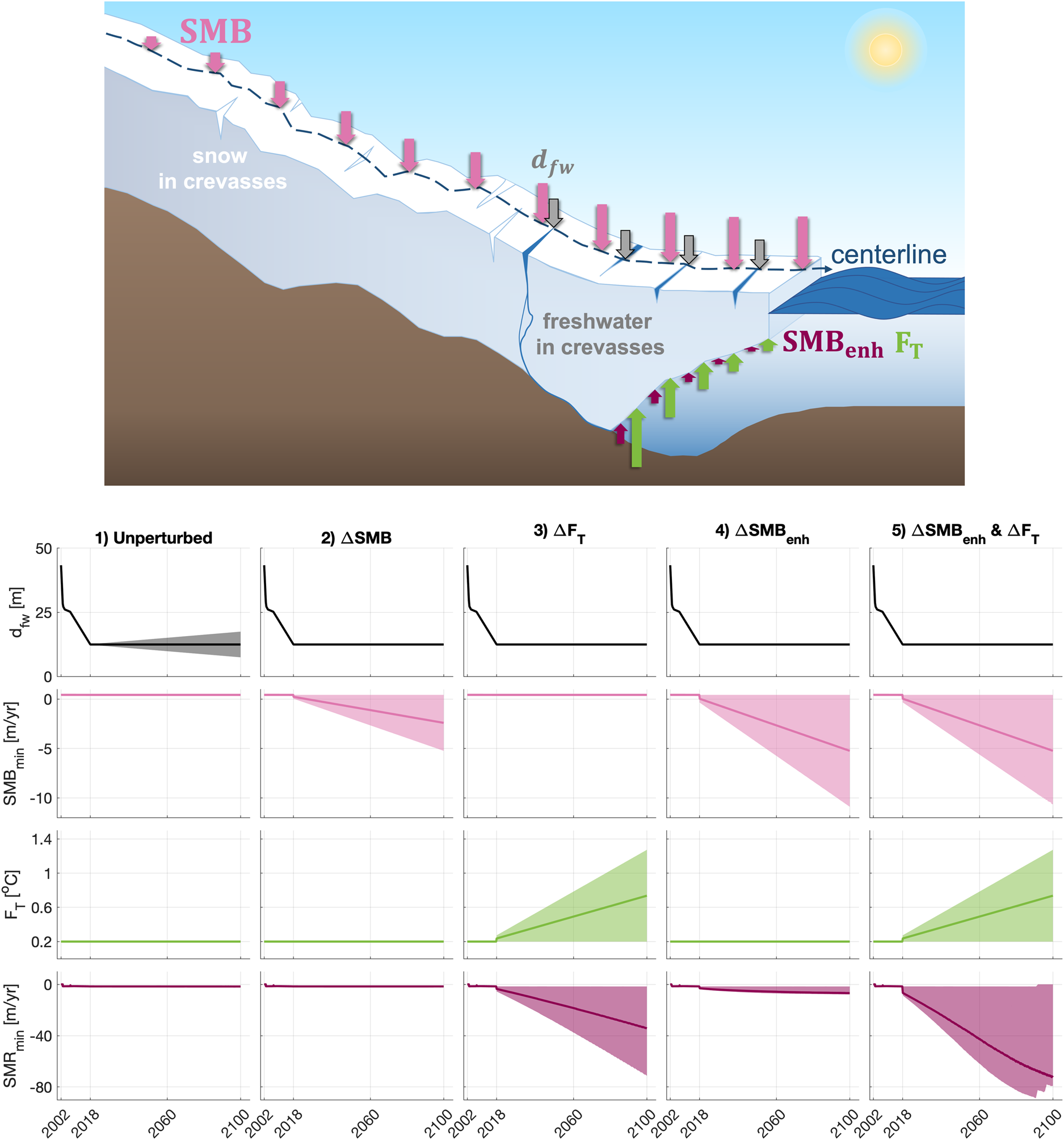
To provide a baseline from which to gauge the glacier's sensitivity to climate change, the model was run forward with constant climate forcings for 2018–2100. Given the sensitivity of the calving criterion to d fw and the lack of observational atmospheric data near the Crane calving front, we ran the model with the optimal d fw solution until 2018, then in 11 model scenarios for the time period 2018–2100, we varied the d fw parameter in 1 m increments for the range −5 to 5 m, where more positive values represent increased freshwater depth in crevasses (Fig. 5). For each scenario, d fw was augmented linearly from the 2018 d fw (~15 m) until reaching the end value in 2100. These model runs provided uncertainty bounds for the unperturbed scenario.
(Top) Schematic demonstrating the implementation of climate perturbations in the model experiments for the freshwater depth in crevasses (d fw), surface mass balance (SMB), ocean thermal forcing (F T), and surface meltwater-enhanced runoff (SMB enh). The length of arrows represents the relative magnitude of melt applied for a given climate perturbation scenario, varying spatially along the glacier centerline for SMB, F T, and SMB enh and uniformly applied for d fw. (Bottom) d fw, F T, the minimum SMB and the minimum submarine melt rate (SMRmin) under each of the climate perturbation scenarios: (1) unperturbed, (2) ΔSMB, (3) ΔF T, (4) ΔSMB enh, and (5) concurrent ΔSMB enh and ΔF T (i.e. a combination of perturbations 3 and 4). Shaded regions show the range in climate parameter magnitudes while the lines show the median value over time.
Climate perturbation scenarios
Projections of atmospheric and ocean temperature on the AP in coming decades vary widely between models and emissions scenarios. Surface air temperature projections from the Fifth Assessment Report of the IPCC range from <1$^\circ$ C for the RCP2.6 emissions scenario to 3.5–4.5$^\circ$
 C for the RCP8.5 emissions scenario by 2100 (Etourneau and others, Reference Etourneau2019). Global climate models project mean annual near-surface air temperatures of 0.5–1.5$^\circ$
 C by 2044 across the entire peninsula under the RCP8.5 scenario (Bozkurt and others, Reference Bozkurt, Bromwich, Carrasco and Rondanelli2021). IPCC projections of subsurface ocean temperatures range from 0.1$^\circ$
 C under the RCP2.6 to 0.3–0.4$^\circ$
 C under the RCP8.5 emission scenario by 2100. While there are no regional subsurface ocean temperature projections for the Weddell Sea, observational data suggest that the Circumpolar Deep Water which lies a few hundred meters beneath the surface (Siegert and others, Reference Siegert2019) has become warmer and shallower in recent decades (Schmidtko and others, Reference Schmidtko, Heywood, Thompson and Aoki2014).
Given the large uncertainties in glacier geometry and climate forcing, and simplifications of the flowline model, our projections of dynamic mass loss are highly uncertain. However, the aim of our analysis is to assess the sensitivity of marine-terminating glaciers to long-term climate forcing after ice shelf collapse, which does not require precise mass loss estimates if compared to a baseline simulation. Additionally, we applied a number of perturbations over the 2018–2100 period that take into account regional effects and uncertainty in climate forcing associated with various emission scenarios. Climate forcing is applied as (1) decreased SMB to simulate increased surface melting and (2) increased ocean thermal forcing. In reality, a combination of these changes may occur in coming decades (Siegert and others, Reference Siegert2019). Therefore, we also modeled the glacier response to (3) increased surface melting and associated enhanced submarine melting driven by plume strengthening, and (4) increased ocean thermal forcing and surface-melt enhanced submarine melt, i.e. a combination of perturbations (2) and (3), each illustrated in Figure 5. For each of the four perturbation types, we apply a range of perturbation magnitudes to account for uncertainties in local climate projections.
For the SMB perturbation simulations, a linear decrease in SMB was applied throughout the time period so that the maximum perturbation magnitude was reached in 2100 (Fig. 5). We tested ten maximum SMB perturbations (ΔSMB) ranging from 0 to −5 m a−1 in increments of −0.5 m a−1, where negative values indicate increased melting or decreased accumulation. The annual surface meltwater production at the Larsen C Ice Shelf, southeast of the Larsen B embayment, is expected to increase two- to threefold by 2100 under varying air temperature warming scenarios (Trusel and others, Reference Trusel2015). The statistically downscaled RACMO snowmelt was ~1 m a−1 at the calving front, such that the maximum surface melt scenario represents an extreme end-member scenario (a fivefold increase in surface melt near sea level by 2100). For each SMB perturbation scenario, SMB was adjusted as a function of elevation with respect to the initial values such that the minimum perturbation was applied to the high elevation interior and the maximum perturbation was applied to the low elevation near-calving front region.
We parameterized changes in submarine melt rate using the following relationship from Rignot and others (Reference Rignot2016):

where $\dot {m}$ is the submarine melt rate [m d−1], d gl is the grounding line depth [m], q is the annual mean subglacial runoff normalized by calving front area [m d−1], F T is the ocean thermal forcing [$^\circ$
 C], B = 3 × 10⁻⁴, α = 0.39, C = 0.15, and γ = 1.18. The constant C expresses that $\dot {m}$
 is non-zero in the absence of subglacial water flux. Attempts to tune both B and C were unsuccessful because iceberg melt rate observations near the Crane calving front are indicative of meltwater plume-enhanced melting (Dryak and Enderlin, Reference Dryak and Enderlin2020), yet RACMO suggests glacier runoff does not occur. Therefore, we employed the constants tuned by Rignot and others (Reference Rignot2016) using melt dynamics observations in Greenland. To simulate future changes in submarine melting driven by ocean temperature warming (ΔF T), we linearly increased F T starting in 2018 until reaching the maximum ocean thermal forcing in 2100. The top three ensembles of the CMIP5 models predict additional subsurface warming in the Weddell Sea between +0.20 and +0.90$^\circ$
 C in the 21st century, with a median of +0.21$^\circ$
 C for all ensembles (Barthel and others, Reference Barthel2020). Model simulations were run for maximum thermal forcing perturbations ranging from $0$
 to +1$^\circ$
 C by 2100 in increments of +0.1$^\circ$
 C for a total of ten simulations in order to represent this range of potential subsurface ocean temperature increases on the eastern AP. The associated melt rate perturbation estimated using Eqn. (7) was added to the initial submarine melt rate of 1.5 m a−1 for each increase in ocean thermal forcing.
Previous research has shown the potential for enhanced calving front ablation related to feedbacks between higher surface meltwater runoff and submarine melting in Greenland (Xu and others, Reference Xu, Rignot, Menemenlis and Koppes2012; Bunce and others, Reference Bunce, Nienow, Sole, Cowton and Davison2021) and Alaska (Motyka and others, Reference Motyka, Dryer, Amundson, Truffer and Fahnestock2013). In order to simulate the glacier response to more complex climate scenarios, we evaluated two additional sets of perturbations: submarine melt enhanced by increased surface meltwater output (SMB enh) with and without the ocean thermal forcing perturbations described above. Equation (7) was used to calculate the submarine melt rate for each scenario using the total surface meltwater runoff (the change in SMB along the centerline plus the initial subglacial runoff, q), and the change in ocean thermal forcing, F T, at each time step.
For each future climate simulation outlined above, we tracked the glacier surface elevation, thickness, flow speed, calving front and grounding line positions, the mass flux discharge across the grounding line, Q gl, and the cumulative back stress at the grounding line (ΣR xy,gl; i.e. effective lateral resistance) through time. Q gl was calculated by multiplying the width-averaged glacier grounding line thickness, flow speed and width, assuming a uniform ice density of 917 kg m−3 (Cuffey and Paterson, Reference Cuffey and Paterson2010). In Section 3, the 2100 grounding line and calving front positions, as well as grounding line flow speed, thickness and discharge for each parameter perturbation scenario are compared to the 2018 conditions and unperturbed scenarios (Fig. 6).
(a) Modeled surface elevation and (b) modeled flow speed. Difference between the 2009–18 modeled (c) surface elevation and (d) flow speed and observations where they exist (i.e. model misfits) from the model hindcasting simulation for 1997–2018. The black vertical line represents the 2018 modeled grounding line position. Years are distinguished by line color, shown in the legend in panel (a).

3. Results
Below, we discuss results for the hindcasting simulation for 1997–2018 (Section 3.1) and divergences in the modeled glacier geometry, flow speed, grounding line discharge ($Q_{\rm {\rm gl}}$ ) and cumulative back stress at the grounding line (ΣR xy,gl) for 2018–2100 under the unperturbed scenario (Section 3.2) and the median change scenario for each parameter perturbation (Section 3.3). Figures 7 and 9 show time series for the calving front position, Q gl, and ΣR xy,gl for each model run in addition to observations from Rignot and others (Reference Rignot2004), Dryak and Enderlin (Reference Dryak and Enderlin2020) and this study. The glacier geometry, flow speed, calving front and grounding line positions in 2100 resulting from the model sensitivity tests are shown in Figures 8 and 10. See Tables S2–S5 in the Supplementary material for the change in glacier length and grounding line position, ice thickness, flow speed and Q gl in 2100 under each scenario with respect to the unperturbed scenario.
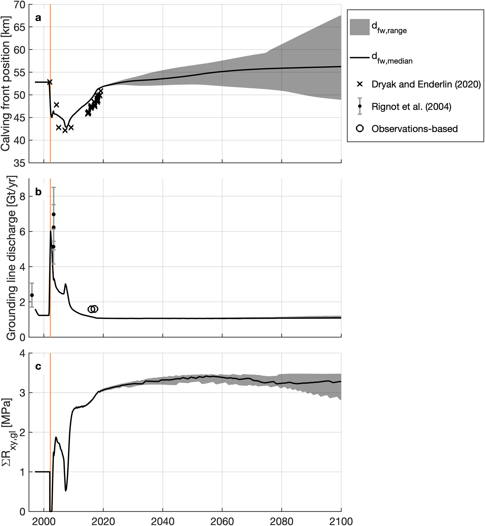
Time series of (a) calving front position, (b) grounding line discharge, and (c) cumulative lateral resistance at the grounding line (ΣR xy,gl) for the median freshwater depth in crevasses (d fw; black line) and the range of d fw values (gray), averaged over 1 year bins. Observed calving front positions are from Dryak and Enderlin (Reference Dryak and Enderlin2020) (±15 m) and observed discharge estimates are from Rignot and others (Reference Rignot2004) and ‘Observations-based’ (±0.08 Gt a−1), calculated where observations exist by multiplying the width-averaged glacier grounding line thickness, flow speed, and width, assuming a uniform ice density of 917 kg m−3. The orange vertical bars represent the Larsen B Ice Shelf collapse from late January to mid-April 2002.
(a) Resulting glacier geometry and (b) flow speed for the unperturbed scenario in 2100 with varying freshwater depth in crevasses (d fw) perturbations from −5 to +5 m with respect to 2018. Warmer colors indicate increased d fw. The dashed black lines indicate modeled 2018 conditions and the solid black line indicates the smoothed, width-averaged bed elevation profile.

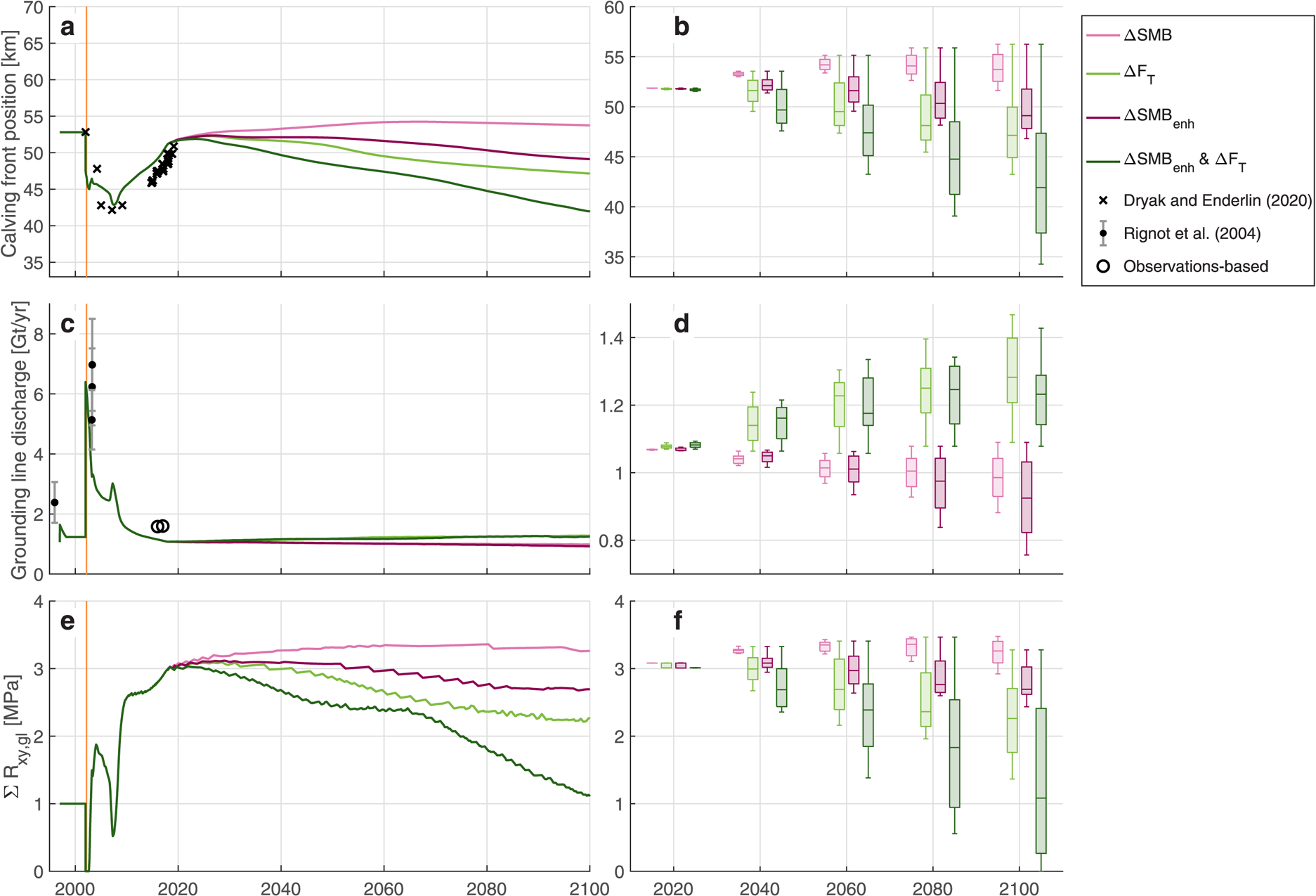
Time series of (a) calving front position, (c) grounding line discharge and (e) cumulative lateral stress at the grounding line for the median perturbation of each parameter, averaged over 1 year bins. Box plots for (b) the calving front position, (d) the grounding line discharge and (f) the cumulative lateral stress at the grounding line for all parameter perturbations every 20 years. Observed calving front positions are from Dryak and Enderlin (Reference Dryak and Enderlin2020) (±15 m) and observed discharge estimates are from Rignot and others (Reference Rignot2004) and ‘Observations-based’ (±0.08 Gt a−1), calculated where observations exist by multiplying the width-averaged glacier grounding line thickness, flow speed, and width, assuming a uniform ice density of 917 kg m−3. The orange vertical bars in panels (a), (c), and (e) represent the Larsen B Ice Shelf collapse from late January to mid-April 2002. Climate perturbation scenarios are distinguished by color according to the legend (upper right).
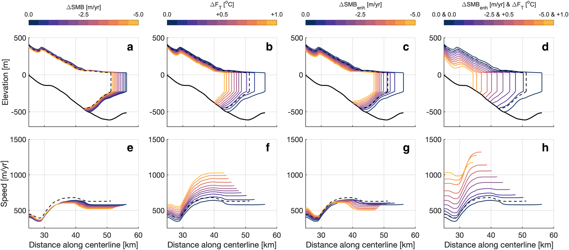
Results for the climate perturbation scenarios in 2100 for SMB, ocean thermal forcing (F T) and surface-melt enhanced submarine melting (SMB enh) both without and with concurrent increasing F T. (a)–(d) show the resulting glacier geometry and (e)–(h) show the resulting flow speeds. Warmer colors indicate increased surface and/or submarine melting. The dashed black lines indicate modeled 2018 conditions and the solid black lines indicate the smoothed, width-averaged bed elevation profile.
3.1. Hindcasting simulation: 1997–2018
In general, the model reasonably reproduces observed trends in discharge (Q gl) and calving front position. At the end of the model initialization period, grounding line discharge is 1.23 Gt a−1, which is 0.5 Gt a−1 less than pre-ice shelf collapse estimates from Rignot and others (Reference Rignot2004) after accounting for observational uncertainties (Fig. 7b). Discharge estimates from Rignot and others (Reference Rignot2004) use a static grounding line and thickness equal to the observed surface elevation minus bed elevations from CESC/NASA where the bed is overdeepened. As a result, Rignot and others (Reference Rignot2004) may overestimate the true pre-collapse discharge. After the ice shelf collapse (when all back stress is removed), the modeled Q gl increases to a maximum of 7.26 Gt a−1 in the first 0.1 years and then decreases to ~1.1 Gt a−1 by 2018, which is within 0.5 Gt a−1 of the Rignot and others (Reference Rignot2004) Q gl estimates over this time period. The modeled calving front location retreats by 10 km in the first 5 years after the ice shelf collapses before advancing by ~0.7 km a−1 until 2018. Despite testing a wide range of d fw values and trends from 2002 to 2018, the calving front both retreated and readvanced slightly quicker than observations (Fig. 7a).
We assessed the model's ability to reproduce the glacier response to ice shelf collapse through comparison of the 2009–18 modeled and observed surface elevations and flow speeds. In Figure 6, there are evident small-scale (<200 m) oscillations in the misfit values for both the surface elevation and flow speed, indicative of the fact that observations may be noisy and that the model gridcells are larger than the spatial resolution of observations. The modeled grounding line thickness and speed are 26 m thinner and 61 m a−1 slower than their respective observations in 2017 and 2018 (Fig. 6). Just inland of the grounding line, the glacier is within 25 m of the observed thickness and within 260 m a−1 of the observed flow speeds for all points along the centerline. We attribute these discrepancies to uncertainties in the bed geometry and the model sensitivity both to bed geometry (Enderlin and others, Reference Enderlin, Howat and Vieli2013a) and the d fw parameter, which prevented the model from precisely capturing the transition to flotation, discussed further in Section 4.3.
3.2. Unperturbed scenario
Uncertainty in d fw, parameterized as a linear change of ±5 m between 2018 and 2100, has an appreciable impact on the calving front position, but little impact on Q gl. In 2100, the calving front is located 68 km along the centerline in the −5 m d fw simulation, 56 km in the unchanged d fw simulation and 49 km in the +5 m d fw simulation (Fig. 7). These results indicate continued calving front advance from 2018 to 2100 under scenarios with unchanged or decreasing d fw. The continued growth of the floating ice tongue results in slightly slower flow speeds near the calving front due to increased resistance past the grounding line such that Q gl decreases to 1.07 Gt a−1 by 2018, then remains nearly constant until 2100 for all simulations. Varying d fw results in a nearly 20 km variation in the position of the calving front, but it has minimal impact on Q gl because the grounding line position is largely unchanged. Thus, we can assume that projections of change in response to climate forcing described below are not dictated by our calving parameterization.
3.3. Climate perturbation scenarios
In 2100, the Q gl ranges from 0.76 to 1.47 Gt a−1 under all future climate perturbation scenarios, which is within 35% of the unperturbed scenario. Linearly increasing the magnitude change in each parameter results in non-linear changes in the grounding line and calving front positions, flow speed, and grounding line thickness for the 2018–2100 time period as shown in the first column of Figure 10.
SMB perturbations cause the most substantial changes in the glacier interior compared to the unperturbed scenario. Increased melting on the glacier surface decreases driving stress by causing widespread thinning, which reduces flow speed and discharge across the grounding line under all SMB perturbations. Given that the SMB perturbation is the only perturbation that directly impacts mass inland of the floating ice tongue, the effects on interior thickness and flow speed are unsurprising. The light pink line in Figure 9 depicts the calving front advancing slightly until 2066 and then retreating by 0.5 km until 2100 for the median SMB perturbation scenario of −2.5 m a−1 at sea level relative to 2018. The 2100 calving front position is 2.5 km retracted in comparison with the unperturbed scenario, but the glacier lengthens in 2100 compared to the 2018 position under all SMB perturbations. In the median SMB perturbation scenario, Q gl falls from 1.07 to 0.99 Gt a−1 between 2018 and 2100, a change of <1%. In 2100, Q gl is 0.1 Gt a−1, or <1$\percnt$ , lower than in the unperturbed scenario.
Perturbations in ocean thermal forcing, F T, have the largest impact on the grounding line discharge of all the perturbation scenarios. Increased submarine melting generally inhibits ice tongue growth, leading to reduced resistive stress at the calving front, which increases flow speeds. The light green line in Figure 9 illustrates calving front advance until 2026 then steady retreat for the median F T perturbation scenario of +0.5$^\circ$ C. The 2100 calving front position for the median F T perturbation scenario is 9 km retracted relative to the unperturbed scenario. Yet, for the smallest ocean temperature perturbation (+0.1$^\circ$
 C F T), the calving front advances by ~2 km relative to the 2018 position. In the median F T perturbation scenario, Q gl increases from 1.07 to 1.28 Gt a−1 by 2100, a change of nearly 20%. In 2100, the Q gl is 0.2 Gt a−1, or 18% higher than the unperturbed scenario.
The SMB enh perturbations – increased surface meltwater runoff and its associated meltwater plume-driven increase in submarine melting – lead to greater melting along the floating ice tongue compared to the SMB perturbations alone, resulting in higher magnitude calving front retreat due to the sudden release of resistance at the terminal boundary. The dark pink line in Figure 9 shows how the calving front advances until 2026, then retreats steadily for the median SMB enh scenario of −2.5 m a−1 at sea level relative to 2018. In contrast to the SMB perturbations which do not include increased submarine melt, the calving front decreases in length for all SMB enh perturbations <−1.0 m a−1 at sea level. For the median SMB enh perturbation scenario, the 2100 calving front position is nearly 7 km retracted compared to the unperturbed scenario and 2 km retracted compared to the modeled 2018 calving front position. Q gl rises from 1.07 Gt a−1 in 2018 to 1.28 Gt a−1 in 2100, a change of 20% over the time period, which is 0.19 Gt a−1 or 17% higher than the unperturbed scenario.
Calving front retreat and flow speed acceleration near the grounding line are greatest when the SMB enh and F T perturbations are applied concurrently – linearly increasing surface melt water runoff with plume-driven increases in submarine melting in addition to linearly increasing ocean thermal forcing – compared to all other scenarios. Although widespread surface thinning associated with decreasing SMB reduces the overall longitudinal driving stress, surface thinning and sudden removal of the buttressing floating ice tongue causes retreat of both the calving front and grounding line under most perturbation scenarios, as shown in Figure 10. In Figure 9a, the dark green line shows calving front advance until 2024, then sustained retreat under the median perturbation scenario of −2.5 m a−1 SMB at sea level and +0.5$^\circ$ C ocean thermal forcing relative to 2018. The calving front position in 2100 under the median perturbation is 9 km retracted from the 2018 position and 14 km retracted compared to the unperturbed scenario. For concurrent perturbations >−2.0 m a−1 for SMB and +0.4$^\circ$
 C for the ocean thermal forcing, the calving front and grounding line retreat further into the fjord than the post-ice shelf collapse response, but the grounding line discharge increases by a much smaller amount than observed after the collapse. Q gl increases steadily from 1.07 Gt a−1 in 2018 to 1.28 Gt a−1 by 2100, 0.18 Gt a−1 or 17% higher than the unperturbed scenario.
4. Discussion
4.1. Glacier response to ice shelf collapse
The results of the modeling experiments suggest that (1) former tributary glaciers can take more than a decade to geometrically adjust to ice shelf collapse and that (2) the growth of a floating ice tongue at the ocean margin allows the grounding line to thicken and to remain relatively stationary or to advance into slightly deeper waters (Figs 8 and 10). Former ice shelf tributaries underwent substantial mass discharge acceleration following the Larsen A Ice Shelf collapse in 1995 (Seehaus and others, Reference Seehaus, Marinsek, Helm, Skvarca and Braun2015) and the Larsen B Ice Shelf collapse in 2002 (Rignot and others, Reference Rignot2004). Our modeling results and observations from Rott and others (Reference Rott2018) suggest that glacier mass loss in the Larsen B embayment decelerated, but persisted through the 2010s. In the unperturbed scenario, Crane Glacier's grounding line discharge (Q gl) decreases rapidly from a maximum of 6.4 Gt a−1 to a new steady value of 1.1 Gt a−1 by 2018, ~15 years after the ice shelf collapse. Because SMB and ocean thermal forcing were held constant in the unperturbed scenario, this continued mass loss was likely driven by ice dynamics rather than climate conditions, as supported by findings from Chuter and others (Reference Chuter, Zammit-Mangion, Rougier, Dawson and Bamber2022).
A prograde bed slope has been shown to generally hinder rapid retreat or advance of the grounding line position, as opposed to a retrograde bed slope, which can decrease stability of the grounding line (Schoof, Reference Schoof2007; Enderlin and others, Reference Enderlin, Howat and Vieli2013a; Catania and others, Reference Catania2018; Morlighem and others, Reference Morlighem2020). In the unperturbed scenario, the glacier grounding line begins a very slow advance down a prograde bed slope in 2008. The growth of a floating ice tongue generates sufficient flow resistance to promote grounding line thickening and gradual re-advance. However, the grounding line never advances to its pre-ice shelf collapse position. Observations suggest that the glacier was grounded across the ~650 m deep over-deepening located 50 km along the glacier centerline (Fig. 4a). Even when a 20 km long floating tongue is present, the grounding line does not advance into water depths $\gtrsim$ 500 m.
Interestingly, glacier advance occurs without the inclusion of a grounding line shoal progradation in our model. Progradation of a marine shoal across a prograde bed strongly controls tidewater glacier advance (Nick and others, Reference Nick, van der Veen and Oerlemans2007b; Brinkerhoff and others, Reference Brinkerhoff, Truffer and Aschwanden2017), in part because it inhibits submarine melting and allows the glacier to advance into deeper water. We did not include sediment progradation in our model because (1) sediment cores acquired from Crane fjord suggest sedimentation rates are relatively small seaward of the grounding line (on the order of m a−1; Rebesco and others, Reference Rebesco2014) and (2) there are no apparent changes in bed elevation in the 2018 near-calving front NASA OIB radar profile. It is possible that the radar observations do not resolve a sediment shoal and that the grounding line will be more stable than modeled. Much like tidewater glaciers, the modeled glacier grounding line cannot advance to its pre-ice shelf collapse position without a shoal present.
4.2. Glacier response to climate perturbations
There are marked differences in calving front and grounding line evolution for the different climate perturbations. Broadly, the sensitivity tests suggest that the timing and magnitude of change in glacier thickness, flow speed, and Q gl for Crane are most sensitive to ocean thermal forcing. These impacts are particularly pronounced in the feedback and concurrent climate perturbation scenarios. Under increased thermal forcing in both the ocean and the atmosphere, the grounding line will increasingly retreat and thin. Yet, Q gl changes by relatively small magnitudes between 2018 and 2100 under all scenarios and by a maximum of 0.4 Gt a−1 under the maximum enhanced SMB and −0.4 Gt a−1 under the maximum ocean thermal forcing scenarios with respect to the 2018 modeled Q gl.
The small range in Q gl under all climate perturbation scenarios suggests that the glacier will be less sensitive to changes in climate and back stress compared to before the Larsen B Ice Shelf collapse. The ice shelf collapse led to a loss of >1 MPa of cumulative back stress at the grounding line in 2002, accounting for the loss of the Larsen B Ice Shelf (at least 0.1 MPa) and the rapid retreat of the calving front (>0.9 MPa). The model hindcasting simulation shows that Q gl increased by 5.2 Gt a−1 immediately after the ice shelf collapse (from 1.2 in 2001 to a peak of 6.4 Gt a−1 in 2002). In the unperturbed scenario, changes to the d fw parameter do not substantially impact the back stress compared to the ice shelf collapse (Fig. 7), resulting in minimal impact on discharge. Although the climate perturbation scenarios lead to a wide range in cumulative back stress at the grounding line (Fig. 9) between 0 and ~3.5 MPa in 2100, the discharge only varies by ~0.7 Gt a−1. Thus, even with potential surface and/or basal thinning or the loss of sea ice or glacier ice at the calving front in coming years, the glacier is unlikely to undergo such a rapid change in discharge as observed following the ice shelf collapse.
4.3. Model limitations and potential biases
4.3.1. Glacier geometry
Although the flowline model averages throughout the glacier width to account for spatial variations in lateral stress, it does not explicitly account for flow field components perpendicular to the centerline. Therefore, the model does not account for changes in flux from tributaries and it may underestimate the lateral stresses at the point where glacial tributaries meet the main trunk. Additionally, the model width is held uniform at ~7 km past the fjord mouth (58 km along the centerline). In reality, the glacier would be wider as it advances past the fjord mouth, presenting uncertainties in the lateral stress at the end of the model domain. The use of a uniform width profile only influences the unperturbed scenarios when d fw decreases in coming decades. We deem these limitations acceptable for this study given our focus on sensitivities near the grounding line, which is a minimum of 10 km seaward of the nearest tributary convergence point (Fig. 2) and inland of the end of the fjord for all model simulations except for the decreased d fw simulations (Figs 8 and 10).
The model results are also likely sensitive to the basal boundary conditions. The model's sensitivity to bed geometry was demonstrated in earlier work by Enderlin and others (Reference Enderlin, Howat and Vieli2013b). Although the NASA OIB level 1B radar echograms provided estimates of the bed geometry, they contain substantial noise. Only the 2018 echogram could be reasonably used to make bed elevation picks, preventing validation with other flow-following and transverse echograms (Fig. 2). Uncertainty in the bed elevations are likely much more important than the basal roughness factor, β, where the bed is below sea level and basal resistance should be very small. Although our bed elevation picks were constrained with sonar observations, which are much more accurate than the radar-derived estimates, we cannot rule out the effects of bed uncertainties on our results. The assumption of plug flow (i.e. no stress gradients with depth) may also influence the stability of the modeled glacier.
4.3.2. Boundary fluxes
Although physically based crevasse depth calving rate criteria have been used in a variety of glacier studies, it has historically been challenging to estimate calving rates in part due to their stochastic nature and the lack of in situ observations of crevasse depth and SMB (Cook and others, Reference Cook, Zwinger, Rutt, O'Neel and Murray2012). The calving criterion used in the flowline model (Benn and others, Reference Benn, Hulton and Mottram2007) presents particular limitations related to (1) the parameterization of surface crevasse depths and (2) the sensitivity of the crevasse depth parameterization to the depth of fresh water in crevasses, d fw (Fig. 8; Cook and others, Reference Cook, Zwinger, Rutt, O'Neel and Murray2012). Consequently, the modeled calving front positions should not be used to project the future calving front position precisely, but may predict average behavior under different scenarios. Nonetheless, the relative insensitivity of the glacier grounding line discharge to uncertainty in d fw (Fig. 7) promotes confidence that the perturbation simulations are not appreciably influenced by d fw.
The glacier sensitivity to climate forcing suggested by the model experiments is dependent on several assumptions: (1) all surface meltwater runs off, (2) basal resistance is independent of surface melt and (3) perturbations in floating ice tongue submarine melt and crevasse hydrofracture are constant and uniform across the glacier width. There are biases associated with the statistical downscaling method (Noël and others, Reference Noël2016), but it should increase the accuracy of melt estimates. Still, runoff will remain underestimated because RACMO informs the firn model used to predict runoff (Ligtenberg and others, Reference Ligtenberg, Helsen and Van Den Broeke2011). Seasonal atmospheric events, such as foehn winds, can also impact meltwater retention in firn for glaciers on the AP (Datta and others, Reference Datta2019; Tuckett and others, Reference Tuckett2019) but are poorly represented in the modeled SMB. Recent findings for glaciers on the eastern AP suggest that subglacial discharge plumes fed by surface meltwater enhance iceberg melting (Dryak and Enderlin, Reference Dryak and Enderlin2020) and potentially affect the rate of glacier submarine melting as well. Although the presence of a subglacial discharge plume at the calving front provides support for the inclusion of meltwater runoff in the unperturbed model simulations, the meltwater plume is localized and melt rates in the vicinity of the plume will exceed the width-averaged melt rates (Slater and others, Reference Slater, Goldberg, Nienow and Cowton2016). Thus, our submarine melt parameterizations may over-estimate this forcing term by an unknown amount. Likewise, the crevasse hydrofracture parameterizations may over-estimate this forcing term because they do not account for spatial variations in meltwater impoundment due to surface melting, firn properties and drainage through moulins. Taken together, we consider our climate perturbations to represent upper bounds on potential forcings.
5. Conclusions
Our model simulations suggest that Crane will become less sensitive to climate conditions in coming years following rapid advance and deceleration since the Larsen B Ice Shelf collapse in 2002. Under all scenarios, the glacier mass discharge rapidly decreases from a maximum of 6.4 Gt a−1 in 2002 to 1.1 Gt a−1 by 2018 and remains nearly unchanging for the decades following, suggesting that tributary glaciers can take more than a decade to geometrically adjust to ice shelf collapse. In the unperturbed future climate scenario, mass discharge is nearly constant between 2018 and 2100. By executing sensitivity tests for surface melt and submarine melt rates between 2018 and 2100, we find that the growth of a floating ice tongue allows the grounding line to remain relatively unchanging when changes in climate forcing are relatively small. Additionally, we find the most severe grounding line retreat under concurrent surface melt rate and submarine melt rate increase, yet discharge changes by a much smaller magnitude relative to the post-ice shelf collapse response despite comparable reductions in back stress at the grounding line.
While the dynamic response to ice shelf collapse will be unique to each glacier, the similar (albeit observationally limited) geometries and trends in calving front positions, surface flow speeds, and dynamic mass loss for former Larsen tributary glaciers suggest that the reduced sensitivity of Crane Glacier to climate forcing following shelf collapse may be regionally representative. To further assess the sensitivity of former tributary glaciers to climate perturbations, we recommend that additional geophysical observations of bed geometry are acquired for all former and present Larsen Ice Shelf tributary glaciers. Improved bed data will enable the use of a multidimensional model, potentially resulting in more robust solutions of glacier stress regimes and projections of mass loss for Crane Glacier, and similar modeling exercises for other former and present tributaries. Given the morphological evidence for subglacial sedimentation at Crane (Rebesco and others, Reference Rebesco2014), we also recommend that future modeling exercises incorporate sediment shoal progradation. While our modeling results for Crane Glacier suggest that dynamic mass loss from former ice shelf tributary glaciers will be far less than immediately following shelf collapse, even for relatively large climate perturbations, these additional observational and modeling efforts will allow for more thorough assessment and predictions of dynamic mass loss from regions formerly abutted by ice shelves.
Supplementary material
The supplementary material for this article can be found at https://doi.org/10.1017/jog.2023.2.
Data
Crane Glacier centerline observations and modeling results are available for download via the U.S. Antarctic Program Data Center (Aberle and others, Reference Aberle, Enderlin, Kopera, Marshall and Meehan2022). All code developed for observations, synthesis and model execution, including all modeling results and figures, is accessible as a GitHub repository at https://github.com/RaineyAbe/CraneGlacier_flowlinemodeling. ASTER-derived DEMs were obtained through the NASA Earthdata portal (https://search.earthdata.nasa.gov/search). NASA OIB and ITS$\_$ LIVE products were obtained through the National Snow and Ice Data Center (https://nsidc.org/data/search). ERS-1/2 products were obtained from Dr Thorsten Seehaus and Dr Jan Wuite. RACMO products were obtained from Dr J. M. van Wessem and Dr Brice Noël.
Acknowledgements
This work was funded by NSF Grant 1933764. We thank Dr Alex Gardner for ITS_LIVE velocities, Dr John Paden for NASA OIB data products and processing resources, Dr Thorsten Seehaus and DrJan Wuite for SAR-derived velocity datasets, Dr Brice Noël and Dr J. M. van Wessem for RACMO products and members of the CryoGARS lab at Boise State University for their time and support throughout the course of this work.


 Open access