

Introduction
The nineteenth century marked a transformative era in the history of Arabic-script printing in the Islamicate world, as advances in typographic technology gradually reconciled the aesthetic demands of writing styles—including naskh and nastaʿlīq—with the mechanical constraints of movable type.Footnote 1 Within the Ottoman empire, the culmination of this process was the development of a highly accomplished naskh type in the 1860s by the Armenian master punch-cutter Oḥannes Mühendisyan (1810–1891) (Figure 1),Footnote 2 in collaboration with the court calligrapher Ḳāżīʿasker Muṣṭafá ʿİzzet Efendi (1801–1876).Footnote 3 This 24-point type—and its smaller iteration in 16-point which Mühendisyan produced later—in the Ottoman flavour of the naskh style, represented a watershed moment in Arabic-script typography. Revered for its calligraphic fidelity, visual harmony, and mechanical sophistication, it set a new standard for Arabic-script typesetting, bringing print closer than ever to the highly evolved visual culture of manuscript production. This type (henceforth MI-24) was, in many ways, the typographic embodiment of Tanẓīmāt-era ideals: a synthesis of tradition and reform, legibility and elegance, technology and refinement (Figure 2).Footnote 4
Portrait of Oḥannes Mühendisyan wearing the medals awarded to him in recognition of his contributions to the arts and printing. He received the Order of the Medjidie (fourth class) and the Ottoman Medal of Fine Arts (Sanāyiʿ-i Nefīse Madalyası). Source: This image was published in a commemorative piece titled ‘Mühendisoġlu’, which appeared shortly after his death, in S̱ervet-i Fünūn 5 (April 1891), 53–55.

Opening pages of Kāfīyah, an Arabic grammatical treatise by ʿUthmān ibn ʿUmar ibn al-Ḥājib (1175–1249), a renowned Kurdish Mālikī jurist and grammarian. This edition is among the earliest works printed by Mühendisyan using the MI-24 type in 1869. Approximate dimensions 21 × 30 cm. Source: Private collection.

Soon after its introduction, the MI-24 type appeared in a modified form in which the elevated letter connections—most notably within the jīm group (ج، چ، ح، خ) in their medial and final positions—were reconfigured. In the original design, these characters often attach to adjacent letters from both above and below, producing a cascading, descending rhythm reminiscent of manuscript models. In the revised MI-24, however, these connections were lowered onto a rectilinear baseline, producing a more uniform and ‘linearised’ composition. This rationalised and visually economical adaptation exemplified Mühendisyan’s technical and aesthetic sensitivity, demonstrating his ability to reconcile the expressive fluidity of Ottoman calligraphic heritage with the functional and modernising imperatives of the Tanẓīmāt era.Footnote 5
Recent scholarship has increasingly recognised the formal lineage of Arabic-script types developed in Ottoman Istanbul—from İbrāhīm Müteferriḳa’s (circa 1674–1745) inaugural naskh in the 1720s, to Boġos ʿArabyan’s (1742–1835)Footnote 6 influential 16-point naskh type of the 1790s, and finally to Mühendisyan’s 24-point refinement of the script (Figure 3). Within this framework, MI-24 has often been positioned as the apex of Ottoman typography.Footnote 7 Yet, despite its celebrated status, the historical study of MI-24 has remained largely bounded by the typographic and bureaucratic context of the imperial capital. While its design is routinely acknowledged for its artistry and influence within state printing offices, much less attention has been paid to its broader circulation across Ottoman and non-Ottoman territories, and to the ways in which it was adapted, modified, and reinterpreted in new settings.
(Top) Specimen of the 16- or 18-point naskh type attributed to İbrāhīm Müteferriḳa; (middle) specimen of the 16-point naskh type crafted by Boġos ʿArabyan; (bottom) specimen of the 24-point naskh type developed collaboratively by Oḥannes Mühendisyan and Muṣṭafá ʿİzzet Efendi (MI-24). The sequence illustrates the progressive refinement of Ottoman naskh typography, from Müteferriḳa’s early efforts to the technical and aesthetic sophistication of the MI-24 type. Dimensions 4 × 12 cm.

This article seeks to address that gap by tracing the transregional life of MI-24 beyond Istanbul. It explores how this Ottoman naskh type was received and reused in diverse cultural and political contexts, including Jesuit missionary presses in Beirut, Arabic and Turkish journals printed abroad in Chicago and London, state and private publishing projects in Cairo, Persian-language publications in Qajar Iran, and early nationalist and educational efforts in Kabul. While a comprehensive inventory of MI-24’s global uses lie beyond the scope of this study, the selected case studies demonstrate the type’s remarkable geographic reach and its adaptability across linguistic, religious, and ideological boundaries.
By reconstructing the trajectory of MI-24, this article advances a broader argument about the typographic modernity of Arabic script. It shows how MI-24 became a template for further innovations—from simplified Arabic typewriter scripts to new printing types developed for scientific and religious publishing—cementing its status as a foundational model for Arabic-script typography in the modern period. It also highlights the multilingual and multiconfessional collaborations that underpinned Arabic typography’s evolution, from Armenian craftsmen to Maronite publishers, Muslim reformers, and European missionaries.
Ultimately, this article repositions MI-24 not merely as the capstone of Ottoman typographic refinement but as a nodal point in a much wider network of textual production. In doing so, it contributes to a growing body of scholarship that locates Arabic-script printing within a global history of media, technology, and visual culture.
Historical foundations of naskh type-making in Istanbul
The adaptation of Arabic script to movable type in the Ottoman empire was a protracted and intermittent process, shaped by technological innovations and careful negotiation with deep-rooted manuscript traditions. Until well into the eighteenth century, Ottoman textual culture was firmly embedded in manuscript production, sustained by firmly established calligraphic practices that posed significant aesthetic and ideological challenges to early typographers.Footnote 8 Nonetheless, Istanbul emerged as a pioneering centre for Arabic-script typography between the early eighteenth and mid nineteenth centuries, notably through the development of three transformative Ottoman-style naskh types, introduced around 1729, 1797, and 1867, respectively.Footnote 9 Although these printing types appeared across a period spanning roughly 140 years—averaging approximately 70 years apart—their collective impact profoundly shaped typographic standards across the Ottoman empire and informed Arabic-script printing throughout the broader Islamicate world.
The first breakthrough came with İbrāhīm Müteferriḳa, a Hungarian-born convert to Islam and polymath, who established the first Muslim-run printing press in the Ottoman empire under Sultan Ahmed III (r. 1703–1730).Footnote 10 In 1729, Müteferriḳa published his first work, Tercüme-i Ṣıhāh-ı Cevherī (also known as Luġat-i Vanqūlī)—an Arabic–Turkish dictionary in two volumes—using a newly cast naskh type (Figure 3).Footnote 11 The type was reportedly developed in collaboration with the Jewish printer Yonah ben Yakob Ashkenazi (d. 1745) and marked the debut of Arabic-script typography produced by a Muslim-operated press in the empire.Footnote 12
Over the next decade, Müteferriḳa produced approximately 17 printed works, covering a wide range of topics from geography and astronomy to political theory and Ottoman history.Footnote 13 While his type represented a significant technical achievement in rendering naskh style in movable type with relative accuracy—a feat that had long posed challenges due to the script’s cursive structure and contextual letterforms—it was perceived as aesthetically inferior when compared to the manuscript tradition. As Uğur Derman notes:
It is undeniable that the aesthetic quality of these letters [Müteferriḳa’s naskh type] was far below the level attained by our calligraphic tradition of the same period. Despite the great labour that went into cutting these letters, it is natural and evident that a script system so rich in form could not mature rapidly. Moreover, the fact that the first 50 years of our printing history were marked by uncertainty likely prevented any significant progress in this area.Footnote 14
The letterforms, while functional, lacked the elegance, proportional harmony, and fluidity that characterised manuscripts penned by master calligraphers. Compounding this aesthetic resistance were economic factors. The high cost of Müteferriḳa’s printed books rendered them less competitive than manuscript copies, which continued to be produced by a network of scribes at lower cost and in familiar visual formats.Footnote 15 Following Müteferriḳa’s death in 1745, the press ceased regular operations. Although there were brief attempts to revive printing in the 1750s, and again in the 1780s and 1790s, these efforts—using the same naskh type—were limited in scope and failed to establish a sustained typographic tradition.Footnote 16
A second milestone occurred in the 1790s, during the reign of Sultan Selim III (r. 1789–1807), when the state re-established Müteferriḳa’s defunct press as the Dārüʾṭ-Ṭıbāʿatüʾl-ʿĀmire (Imperial Printing House).Footnote 17 Central to this revival was the introduction of a significantly improved 16-point naskh type crafted by the Ottoman–Armenian punch-cutter Boġos ʿArabyan.Footnote 18 Likely working in consultation with the celebrated calligrapher Sayyid ʿOs̱mān Efendi (d. 1805), ʿArabyan produced a fount of type (henceforth BA-16) that more faithfully captured the proportional systems and aesthetic conventions of classical Ottoman naskh style (Figure 3).Footnote 19
This new design significantly narrowed the visual gap between printed and handwritten texts. It was adopted swiftly across the capital and used in a wide range of publications—religious, scientific, military, and literary—by the revitalised Imperial Press. Following the edict of the Tanẓīmāt, private newspapers began to emerge—starting with Cerīde-i Ḥavādis̱ (1840) and followed by Tercümān-ı Aḥvāl (1860) and Taṣvīr-i Efkār (1861).Footnote 20 With the rise of private presses, BA-16 extended beyond imperial printing operations to become the typographic default for these publications. Its success helped ease scepticism about printed books, winning over many who had previously favoured manuscripts.Footnote 21 The impact of BA-16 extended beyond Istanbul. When the Būlāq Press was established in Cairo in the 1820s under Muḥammad ʿAlī Pasha (r. 1805–1848), its initial typographic experiments were found insufficient.Footnote 22 As a result, Cairo’s printers turned to Istanbul’s more refined naskh types as models.Footnote 23 BA-16 thus became a visual lingua franca for Arabic-script printing across much of the Islamicate world, from the Ottoman heartlands to Iran, South Asia, and even parts of Europe (Figure 4).Footnote 24
A passage from the Gulistān of Saʿdī printed with ʿArabyan’s BA-16 naskh type (top), alongside the same text printed with the new naskh type of the Būlāq Press (bottom). While exhibiting subtle differences, the two types display striking stylistic and dimensional affinities. This suggests that the Būlāq naskh type was either closely modelled on the Istanbul original or—less plausibly—that the Istanbul type was adapted for use at the Būlāq Press. Dimensions 10 × 8.5 cm. Source: Private collection.

The third and most distinguished development came in the 1860s, in the midst of the Tanẓīmāt reform era. This period saw the creation of what is widely regarded as the most refined Ottoman Arabic-script type: a 24-point naskh type designed by Oḥannes Mühendisyan, a master punch-cutter and engraver at the Imperial Printing House.Footnote 25 Mühendisyan collaborated with Ḳāżīʿasker Muṣṭafá ʿİzzet Efendi, a renowned calligrapher, statesman, poet, and music composer who had refined the Ottoman naskh and thuluth styles in the tradition of masters such as Ḥāfiẓ ʿOs̱mān (d. 1698) and Muṣṭafá Rāḳim (d. 1826).Footnote 26
This new naskh type (MI-24), introduced in 1867, achieved a new level of calligraphic fidelity in metal type. Contemporary accounts credit Mühendisyan with several technical innovations that allowed the delicate nuances of pen-drawn script to be transferred more precisely into typographic form. Its visual configuration and legibility brought Arabic-script printing to a level of refinement that rivalled the finest manuscripts, fully synthesising classical calligraphic aesthetics with industrial typographic processes.
Together, these three Ottoman naskh types—Müteferriḳa’s pioneering type, Boġos ʿArabyan’s improved BA-16, and Mühendisyan’s masterful MI-24—formed a typographic genealogy that defined Ottoman Arabic-script printing for nearly two centuries. By the mid 1870s, MI-24, alongside the earlier BA-16, had emerged as one of the preferred choices for official, scholarly, and literary publications in the Ottoman empire. Each successive type resolved new challenges in aesthetics, legibility, and technological feasibility, and collectively they helped integrate print into a manuscript-dominated culture.
The influence of these types extended well beyond the borders of the empire. From Cairo’s Būlāq Press to provincial centres in the Arab world, Iran, and the Indian subcontinent, Istanbul’s typographic standards became a benchmark for Arabic-script printing. This tradition came to an abrupt end in 1928 with the Turkish Republic’s script reform, which mandated the replacement of the Arabic script with a Latin alphabet.Footnote 27 While this reform brought the Ottoman Arabic typographic tradition to a close, the legacy of its types endures in the broader history of Islamicate print culture.
The genesis of the MI-24 type
Oḥannes Mühendisyan, often hailed as the ‘dean of Armenian printers in the Ottoman capital’, was born on 21 February 1810 in Samatya, a historically Armenian quarter in Istanbul’s Fatih district.Footnote 28 After completing his education at the local district school by the age of 15, he began training as a goldsmith. He reportedly demonstrated such exceptional talent in this craft that his master eventually took him on as a partner.Footnote 29 This early experience in precision metalwork would later inform his typographic excellence, particularly in punch-cutting.
Encouraged by Khachatur Misakyan, Mühendisyan reportedly turned to printing in 1839.Footnote 30 His entry into the field was marked by the creation of an 8-point Armenian lowercase type—described by contemporaries as ‘smooth’, ‘flawless’, and so technically refined that it ‘took their breath away’.Footnote 31 This first foray, shaped by his background in engraving and metallurgy, quickly established his reputation in typographic circles.
Unlike earlier figures in Ottoman Arabic-script typography such as İbrāhīm Müteferriḳa and Boġos ʿArabyan—whose initial engagements centred on producing naskh-style types—Mühendisyan’s first Arabic-script types were in the more ornate nastaʿlīq style. These were created in collaboration with master calligraphers at the Imperial Press more than two decades before he produced his first naskh type (i.e. MI-24). His involvement in nastaʿlīq typography demonstrated his adaptability and familiarity with different script aesthetics, further distinguishing him from his predecessors.Footnote 32
In addition to his achievements in type-making, Mühendisyan was an accomplished engraver. His talents extended to the design of Ottoman banknotes, which were exhibited at the 1862 International Exhibition in London.Footnote 33 He continued to engage in Armenian and lithographic printing alongside his work in Arabic-script typography. However, financial difficulties and shifting market conditions eventually compelled him to undertake a new and ambitious project: the creation of a refined 24-point naskh type (MI-24).Footnote 34
Unlike his earlier commissioned work, the MI-24 project was initiated by Mühendisyan himself—despite having already received a substantial state loan of 150,000 ġurūş (equivalent to 30,000 French francs) in support of his typographic endeavours.Footnote 35 For this project, he partnered with Ḳāżīʿasker Muṣṭafá ʿİzzet Efendi, the empire’s leading calligrapher and a towering figure in the refinement of both naskh and thuluth scripts. MI-24 was explicitly modelled after ʿİzzet Efendi’s naskh penmanship, bridging the artistry of established calligraphy with the mechanical logic of type.Footnote 36
The first known usage of MI-24 was not in a book but in two separate publications from 23 April 1867: a poem by Ṣafvet Efendi (1795–1867) and a personal ʿarżuḥāl (petition) by Mühendisyan himself, both addressed to Sultan ʿAbdülaziz (r. 1861–1876).Footnote 37 These early prints, composed with MI-24, not only demonstrated the type’s visual fidelity to handwritten models but also made direct reference to ʿİzzet Efendi’s calligraphy as its source of inspiration (Figure 5).
Mühendisyan’s ʿarżuḥāl (petition) to Sultan ʿAbdülaziz, printed using the MI-24 naskh type and dated 23 April 1867. Dimensions 39 × 28.5 cm. Source: Courtesy of Thomas Milo.

It would take approximately two more years before the first full-length book printed in MI-24 was issued. By 1286 (1869/70), Mühendisyan’s printing house in Istanbul began producing a series of publications in Arabic, Persian, and Turkish using this newly developed type.Footnote 38 These works showcased the elegance, legibility, and technical finesse of MI-24. However, due to the absence of month-specific colophons in many of these publications, it remains difficult to determine precisely which was the first book printed with the new type.
Of these early MI-24 printings, all but Ḫulāṣatü’l-Iʿtibār include some form of publisher’s note—ranging from brief mentions to elaborate dedications—announcing the debut of the new naskh type (ḥurūfāt-ı cedīde) and highlighting the collaboration between Mühendisyan and ʿİzzet Efendi. These notes serve not only as typographic documentation but also as markers of institutional pride and innovation, signalling to readers the beginning of a new era in Arabic-script printing.
Mühendisyan’s MI-24 arguably marked the highest point of Ottoman Arabic typography in the nineteenth century. Its widespread adoption in both official and commercial print culture reflects not only the technical success of the design but also its symbolic importance in linking modern printing to the venerable canonised calligraphic practices.
The dissemination and reception of the MI-24 type
Following the debut of MI-24 in 1867, its exceptional calligraphic fidelity and technical precision garnered significant attention from publishers in Istanbul and other Ottoman printing centres, notably Beirut and Cairo. Despite widespread acclaim, the type faced criticism for its high cost, which was substantially greater than that of the earlier 16-point naskh type by ʿArabyan.Footnote 39
In an effort to centralise publishing across both nearby and distant Ottoman provinces, the Vilāyet Niẓāmnāmesi (Provincial Reform Law) was promulgated in 1864.Footnote 40 This marked the beginning of a new period during which types originally developed in Istanbul were gradually distributed to initiate publishing activities in the Ottoman provinces. Within this context, the earliest known use of the MI-24 type outside Istanbul appears in the Vilayet Press of Ruse in 1875—without any modifications to its appearance (Figure 6).Footnote 41 However, these provinces were seen as extensions of the imperial state, serving as conduits for the imperial voice. The first instance of MI-24 being used outside Istanbul—specifically in a non-imperial publishing context—can be found in Beirut in 1876, nearly a decade after its creation. That year, the Jesuit Convent Press (Maṭbaʿah al-Mursalīn al-Yasūʿīyīn), better known as Imprimerie Catholique, printed an Arabic version of the Bible using MI-24 (Figure 7).Footnote 42 The Arabic preface of the edition describes the sudden change in plans after the arrival of printed samples from Constantinople:
We had initially decided to print the book with different types and had prepared all the necessary printing materials. However, just as we were about to begin the work, we received printed sheets from Constantinople featuring an exquisite type that was unanimously preferred by typographers over all other types used in Arabic printing until now. When we brought this matter to Father Monnot’s attention, he immediately halted the printing process and sent for the necessary types from Constantinople to ensure the quality of the work. This addition greatly enhanced the beauty of this book and stands as one of the many merits of this esteemed father, whose efforts deserve to be commemorated on these pages with sincere gratitude and praise.Footnote 43
Cover and page 63 of Masʿūd ibn ʿUmar Taftāzānī’s Şerḥ-i ʿAḳāʾid Tercümesi printed at Vilāyet-i Celīle-i Ṭuna in Ruse (Rusçuk) in 1875/1876. The page features Mühendisyan’s MI-24 type for the headings and ʿArabyan’s BA-16 type for the body text. Dimensions 25 × 14.5 cm. Source: Private collection.

Opening page of the Book of Genesis (Sifr al-Takwīn) from the first volume of the Arabic Bible, printed at the Imprimerie Catholique in Beirut in 1876. The fully vocalised text is set in a modified version of Mühendisyan’s MI-24 type, referred to as ‘Type de Constantinople’, cast on a 22-point body (TC-22). Dimensions 19.5 × 12.5 cm. Source: Private collection.

The Latin preface of the same volume further highlights the enthusiastic reception, yet the considerable financial concern, related to MI-24’s procurement:
through the diligence and care of our director, K. P. Ambroise Monnot, it was discovered that ‘there are very beautiful and elegant Arabic types recently composed in Constantinople’. Immediately we were informed of this, but we were terrified by the high price. Then he himself uplifted and reassured us, saying that no expense should be spared to achieve this goal. Therefore, without any delay, it was done.Footnote 44
In fact, criticism regarding MI-24’s high cost emerged soon after its introduction. An anonymous article in the newspaper Muḫbir in 1867 praised the type’s aesthetic qualities but lamented its prohibitive price, noting that its expense limited accessibility for many printers.Footnote 45 A court document from 1872 corroborates these concerns, comparing MI-24’s price to that of BA-16. The document, essentially an assets and liabilities statement, disclosed the 150,000 ġurūş (30,000 francs) loan Mühendisyan had taken from the state. It stated:
Hereby it is stated that there are no obstacles for printers to purchase the type [24-point naskh] made by Mühendisoġlu Oḥannes, who holds the rights for its reproduction and casting. However, since the naskh type [ʿArabyan’s] based on Ḥāfiẓ ʿOs̱mān’s pen is sold for 25 ġurūş (five francs) for one ḳıyye (2.8 lb) and Mühendisyan’s naskh is sold for 100 ġurūş (20 francs) for one ḳıyye (2.8 lb), the type has not attracted the general user’s demand and appreciation.Footnote 46
The document further suggested that Mühendisyan’s loan could be repaid through the sale of his type. However, it criticised the high pricing, stating that despite Mühendisyan’s rights and privileges for casting his type, the exorbitant cost was inappropriate and hindered widespread adoption.
Adaptations of MI-24 at Imprimerie Catholique in Beirut
The Imprimerie Catholique in Beirut did not merely adopt the MI-24 type in its original form; rather, it implemented subtle yet significant modifications. In its 1876 edition of the Arabic Bible, the main text was printed in full vocalisation, reflecting both liturgical requirements and the pedagogical mission of the Jesuits. Alongside the principal type—based on MI-24 design—two smaller companion types were introduced, likely for the first time in this publication. All three types were rendered in visually coherent styles but differed in size and minor design features. The largest was the modified MI-24 derivative labelled ‘Type de Constantinople’ on a 22-point body (henceforth TC-22). This was complemented by a smaller type on an 18-point body, also labelled ‘Type de Constantinople’ (TC-18), and a third, still smaller design on a 14-point body, referred to as ‘Type Égyptien’ (TE-14) (Figure 8).Footnote 47
Pages from the catalogue Spécimen des caractères fondus à l’Imprimerie Catholique des missionnaires de la Compagnie de Jésus à Beyrouth, printed in Beirut around 1877. Dimensions 6 × 12.5 cm. Source: Imprimerie nationale.

A close comparison between MI-24 and the TC-22 impressions in the 1876 Bible reveals that while the overall character set remained largely faithful to Mühendisyan’s original, some characters exhibit distinct modifications. Notably, variations can be observed in the isolated forms of the letters nūn, jīm, and ʿayn (Figure 9). The rationale for these changes remains uncertain and warrants further investigation. Possible explanations include adaptation for full vocalisation, aesthetic adjustments for a specific liturgical or textual purpose, or technical constraints of the Beirut press.
Comparison of the ‘Type de Constantinople’ on a 22-point body (TC-22, top) and the MI-24 type (bottom), highlighting structural differences in the isolated forms of the letters nūn, jīm, and ʿayn (from left to right).

These modifications are significant not only in their immediate typographic context but also in facilitating the tracing of lineage and dissemination of Arabic types across the late Ottoman and post-Ottoman periods. Understanding the changes introduced at the Imprimerie Catholique offers critical insight into how MI-24 was received, reinterpreted, and localised.
One avenue for further comparative analysis lies in the treatment of vocalisation. While fully vocalised Arabic texts are rare in Mühendisyan’s early MI-24 publications, one notable exception is the 1286 (1869/70) edition of ʿAbd al-Raḥmān Jāmī’s Ṣad Kalimah-ʼi Ḥaz̤rat-i ʿAlī (One hundred sayings of ʿAlī), which includes Arabic sections with complete diacritical markings (Figure 10).Footnote 48 This edition could serve as a useful case study for examining whether the vowel mark positioning in the 1876 Bible was modified in relation to MI-24’s original design or preserved intact.
Detail from the opening page of Ṣad Kalimah-ʼi Ḥaz̤rat-i ʿAlī printed by Mühendisyan using the MI-24 type in 1869/1870. From top to bottom: fully vocalised Arabic text, Persian verses, and Turkish verses. Dimensions 8.5 × 15 cm. Source: Private collection.

The TC-18 type used in the 1876 Bible also deserves closer attention. Though related to TC-22, it is not a simple size reduction of the larger type. For instance, characters like ṣād in TC-18 display enlarged counter forms and other optical adjustments necessary for legibility at smaller sizes (Figure 11). These refinements suggest that TC-18 was separately cut rather than mechanically derived—such as through pantographic scaling—from the 22-point version. Nevertheless, it remains possible that some characters were resized using such techniques and then selectively refined.
Note the more open counters of the letter ḍād in its initial form and the letter ṭāʾ in its final form within the Arabic word ḍabṭ, as rendered in the TC-18 type (left), compared to the more closed counters in the TC-22 type (right).

A further distinguishing feature between MI-24 and the Beirut adaptations lies in the treatment of diacritical dots. In certain instances, particularly with single-dot letters in TC-22, the dots appear larger and more prominently placed than those in the original MI-24 cut. This subtle but deliberate adjustment could have been intended to enhance clarity, especially in a heavily vocalised religious text aimed at broad dissemination and liturgical use.
Significantly, the TC-18 predates Mühendisyan’s development of a 16-point naskh type around 1882 (henceforth OM-16), which visually echoes the gestures of MI-24 (Figure 12).Footnote 49 Although a court document dated 1872 hints at Mühendisyan’s intention to cut smaller versions of MI-24, these were not realised until the 1880s.Footnote 50 The Beirut version thus anticipates, or perhaps even encourages, later refinements of the Istanbul style in smaller point sizes.Footnote 51 The production of smaller companion types in Beirut further underscores the flexibility and aesthetic appeal of MI-24 as a typographic model, even in the face of its comparatively high production cost.
From top to bottom: specimens of MI-24, TC-22, TC-18, and OM-16, arranged in chronological order according to their production dates. Dimensions 5.5 × 11.5 cm.

In sum, the Imprimerie Catholique adaptation of MI-24 into TC-22, TC-18, and to a lesser degree TE-14 reflects both the wide influence of Mühendisyan’s type and the active role played by regional presses in shaping its legacy. Through these subtle modifications and localised reinterpretations, Beirut’s Imprimerie Catholique not only elevated the visual standard of Arabic religious printing but also contributed to the broader typographic evolution of Arabic script in the late nineteenth century.
The development of new Istanbul-style Arabic types at Imprimerie Catholique
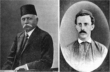
The development of refined Istanbul-style Arabic types at the Imprimerie Catholique in Beirut during the late nineteenth century is primarily attributed to two key figures: Elijah Marie Elias (1840–1901) and Antoun ʿAbdallah (Anṭūn ʿAbd Allāh, 1853–1923) (Figure 13).Footnote 52 Their collaborative efforts laid the groundwork for what would become one of the most ambitious Arabic printing projects of the period: the production of the Arabic Catholic Bible, a publication that not only exemplified typographic excellence but also responded directly to the growing influence of Protestant missionary presses in the Levant.
(Left) Antoun ʿAbdallah (1853–1923); (right) Elijah Marie Elias (1840–1901). Source: (ʿAbdallah) Taken from A. Nūrū, Al-Asṭaranjīlīyah al-Mustaqillah: Taṣmīm Ṭabāʿī Jadīd lil-Ḥurūf al-Suryānī [The independent Estrangelo [style]: a new typographic design for the Syriac script] (Beirut, [196–?]), p. 12; (Elias) Reproduced from H. Charles, Jésuites missionnaires, Syrie, Proche-Orient (Paris, 1929), p. 31.

Elijah Elias, a Muslim convert to Catholicism, played a foundational role in both the technical and institutional growth of the press. Beginning his career there in 1861, Elias was instrumental in training new staff and introducing various typographic innovations. He officially assumed the role of director of personnel and machinery in 1871 and, that same year, was sent to France to study contemporary European printing practices. His initial two-month apprenticeship, however, proved insufficient. Upon returning to Beirut, Elias recognised significant gaps in his knowledge—particularly concerning type casting.Footnote 53
In search of further instruction, he approached the director of the American Press in Beirut, then one of the region’s leading Protestant-run printing houses. Although outwardly cordial, reportedly the director deliberately misled Elias, providing him with faulty techniques, which led to further setbacks before Elias realised the deception. Recognising the need for deeper technical expertise, Elias returned to Paris in 1873.Footnote 54 There, he studied at the Imprimerie Nationale, immersing himself in French innovations in typography and presswork. During this stay, he also encountered a travelling English salesman who introduced him to a new galvanoplasty process that used a wax matrix—considered superior to the prevailing French method—for producing printing plates. Determined to investigate, Elias travelled to London, where he successfully learned the secret technique, under the condition that he would not reveal it in France.Footnote 55
Upon his return to Beirut in mid 1874, Elias was determined to apply these techniques to the press’s most ambitious project yet: the publication of an Arabic Catholic Bible that could rival, and ideally surpass, the Protestant versions circulating in the region. At the time, Arabic typography was hindered by the separation of diacritical marks from the letterforms, a cumbersome system that made typesetting complex and inconsistent. Elias proposed a radical solution: to cast letters and their diacritical marks as single units, significantly improving typographic consistency and simplifying the printing process.Footnote 56
This innovation, however, presented practical challenges. The compositor’s case—which already included 825 compartments to accommodate the vast number of Arabic letterforms and diacritics—would now require 1,369 compartments under Elias’s new system. Nonetheless, the potential gains in clarity and efficiency justified the undertaking.Footnote 57
Initially, Elias intended to use a modified version of the American Arabic type, which was considered one of the most attractive in the region. However, in 1875, he encountered the newly developed MI-24 from Istanbul. Impressed by its superior aesthetic and technical quality, Elias proposed switching to this ‘Stambouli type’ for the Bible project—a proposal that was approved without hesitation. By October 1875, the first pages of the Arabic Catholic Bible, typeset with this elegant and innovative type, began to roll off the press.Footnote 58
The casting and production of these new types were carried out under the joint leadership of Elias and Antoun ʿAbdallah, who would later succeed Elias as director. While the precise division of labour between them remains unclear, ʿAbdallah is widely credited with making significant contributions to the project. A skilled engraver and typographer, ʿAbdallah underwent extensive training in France, visiting major European type foundries and mastering the art of steel punch engraving. Described by contemporaries as ‘highly skilled and ingenious’, ʿAbdallah would go on to develop numerous types in Arabic, Syriac, and other regional scripts.Footnote 59
The first volume of the Arabic Bible, concluding with the Book of Esther, was completed in 1876. It was followed by the New Testament in 1877 and the remaining books of the Old Testament in 1879. Each volume was supplemented with explanatory notes drawn from biblical texts and the writings of the Church Fathers. Despite its relatively high cost, the publication was a commercial and cultural success. By 1885, the New Testament (second volume) had been reprinted four times; by 1890, the first volume had seen five reprintings; and by 1899, the third volume had been reprinted three times—bringing the total distribution across all volumes to 23,345 copies.Footnote 60
A deluxe, two-volume edition of the Bible was presented at the Paris Exposition Universelle of 1878, where it won a gold medal for typographic excellence.Footnote 61 The judges praised the edition for its unparalleled print quality, which surpassed all previously known Arabic-script publications. Curiously, however, the accolade was not awarded to Elias or ʿAbdallah. Instead, it was attributed to Ibrāhīm al-Yāzijī (1847–1906), the main editor of the Bible and a towering intellectual figure of the Arab Nahḍa (the Awakening).Footnote 62 Though his editorial contributions were substantial, the exclusion of Elias and ʿAbdallah from the official commendation reflects broader historical patterns of erasure, especially of technical and artisanal labour in typographic history.
In retrospect, Elias and ʿAbdallah’s work at the Imprimerie Catholique represents one of the most important achievements in nineteenth-century Arabic typography. Their efforts not only brought Istanbul-style types into new regional and religious contexts but also advanced the visual and technical standards of Arabic-script printing in ways that would resonate across the Arabic-speaking world for decades. Their innovations laid the groundwork for a more integrated typographic system—one capable of handling vocalised Arabic with clarity and beauty—and helped usher in a new era of Arabic publishing in both the Levant and the wider Islamicate world.
Al-Yāzijī, Sarkīs, and the Nahḍa’s contribution to Arabic typography
During the 1880s, the MI-24 type—originally developed in Istanbul—inspired further modification and refinement in Beirut, guided by two leading figures of the Arab Nahḍa: Ibrāhīm al-Yāzijī and Khalīl Khaṭṭār Sarkīs (1842–1915) (Figure 14).Footnote 63 Both men played pivotal roles in advancing Arabic typography, publishing, and language reform during a critical phase in the history of print culture in the Arab world.
(Left) Khalīl Khaṭṭār Sarkīs (1842–1915); (right) Ibrāhīm al-Yāzijī (1847–1906). Source: Reproduced from ‘Khalīl Sarkīs’, p. 130, and ‘Al-Shaykh Ibrāhīm al-Yāzijī’, p. 88, in Ṭarrāzī, Tārīkh al-Ṣiḥāfah al-ʿArabīyah.

Al-Yāzijī, often described as a true polymath—philologist, poet, journalist, calligrapher, engraver, and philosopher—was renowned for his mastery of Arabic penmanship.Footnote 64 As noted in Viscount Fīlīb dī Ṭarrāzī (Philippe de Tarrazi) in his Tārīkh al-Ṣiḥāfah al-ʿArabīyah, al-Yāzijī’s precision extended to every aspect of his art, from composition to handwriting:
[Al-Yāzijī’s] meticulousness also extended to his handwriting, which was elegant from a young age and remained so throughout his life. His script followed Persian [nastaʿlīq] calligraphic principles, and anyone who read one of his handwritten letters would be equally captivated by the beauty of the script as by the eloquence of its content. Similarly, his talent for drawing was apparent; he once painted a self-portrait using a mirror—a vivid likeness that hung in his home.Footnote 65
Dī Ṭarrāzī’s account highlights not only al-Yāzijī’s refined aesthetic sensibility but also his technical mastery of the manual arts. His brother, Shaykh Naṣṣār al-Yāzijī, was an accomplished goldsmith, and Ibrāhīm frequently visited his workshop, assisting with drawing, engraving, and related tasks—an early apprenticeship that honed his precision and sense of form.Footnote 66 His aptitude for engraving and design also attracted attention during his visits to the American Press in Beirut, directed by Cornelius Van Dyck (1818–1895).Footnote 67 According to Van Dyck’s son, Edward Van Dyck, al-Yāzijī began by engraving seals as a pastime before progressing to the design of intricate patterns and illustrations. Among his most notable achievements was the creation of the first Arabic wall calendar, an innovative work that combined mechanical precision with artistic elegance. With support from the press’s foreman, Mūsá ʿAṭá, he gained access to specialised tools and materials that enabled him to execute typographic designs of exceptional accuracy. The letters and numerals of his calendar, Edward Van Dyck observed, were ‘remarkable in their precision and beauty’.Footnote 68
At that time, the so-called ‘American Arabic’ types were already circulating in Beirut and other Levantine presses. However, their production remained prohibitively expensive due to their complexity and the large number of character variants and compounds.Footnote 69 Dī Ṭarrāzī contrasts them with the Istanbul-style (Islāmbūlī) types, including MI-24, which, although more economical to cast, he regarded as comparatively less refined. Recognising the need for a type that combined elegance, clarity, and efficiency, al-Yāzijī undertook in 1886 to design a new fount of Arabic type.Footnote 70
This design, cut in multiple sizes and later known as the ‘Sarkīs type’ (ḥarf Sarkīs), was produced at Maṭbaʿah al-Adabīyah (the Literary Press), founded by Khalīl Sarkīs in Beirut in the mid 1870s.Footnote 71 Reports from the early twentieth century indicate that al-Yāzijī not only designed the letterforms but also engraved the steel punches and crafted the copper matrices himself—an indication of his rare holistic combination of artistic and technical mastery.Footnote 72 The Sarkīs type soon found wide circulation, being adopted by presses across Syria and Egypt and later by Arab émigré publishing houses in North America, where it became one of the most recognisable Arabic types of the late nineteenth and early twentieth centuries.Footnote 73
One of al-Yāzijī’s most consequential contributions to Arabic-script typography was the creation of a 20-point version of the Sarkīs type (henceforth IY-20).Footnote 74 According to dī Ṭarrāzī’s account, al-Yāzijī developed this new type following his relocation to Cairo, where it quickly gained traction in the city’s expanding print industry and soon became a standardised type in Egyptian publishing (Figure 15).Footnote 75 Beyond this achievement, he is credited with introducing new diacritical marks—partly inspired by European typographic conventions—to represent non-Arabic phonemes with greater accuracy, an innovation that proved essential for the translation of scientific and technical terminology into Arabic during the Nahḍa.Footnote 76
Specimen of al-Yāzijī’s 20-point naskh type (IY-20)—used for setting prose and poetry verses of the first volume of Dīwān Ashʿar al-Hāshimīyīn by Muḥammad ibn al-Ḥusayn Sharīf al-Raḍī, printed at Maṭbaʿah al-Adabīyah in Beirut in 1890 (pp. 330–331). Dimensions 21 × 26 cm. Source: Private collection.

In 1903, the Egyptian government launched an initiative to design a new ‘simplified’ Arabic type for use at the Būlāq Press, then one of the most prestigious state printing institutions in the Arab world.Footnote 77 Although al-Yāzijī was widely recognised as the most capable and qualified figure for such a task—renowned for both his technical skill and calligraphic expertise—the commission was ultimately awarded to another party.Footnote 78 In retrospect, Jurjī Zaydān lamented that this decision had deprived Arabic typography of a potentially transformative development—one that might have further modernised its graphic structure, enhanced legibility, and improved its adaptability to mechanised printing systems, thereby, as he put it, ‘bearing fruitful results for the Arabic language as a whole’.Footnote 79
Among al-Yāzijī’s most forward-looking contributions was his development of a ‘simplified’ Arabic script, known as al-Ḥarf al-Mukhtaṣar (‘the simplified’ or ‘abbreviated’ script) (Figure 16).Footnote 80 Conceived as a means of adapting Arabic to mechanical reproduction, the project sought to rationalise the script’s structure by drastically reducing the number of individual sorts required for typesetting. Traditional Arabic printing—especially when fully vocalised or using compound-heavy styles—demanded hundreds of distinct pieces of type to accommodate contextual letterforms. By contrast, al-Yāzijī’s streamlined system reduced this number from over 300 to roughly 60, aligning Arabic script typography with the practical limitations of emerging typewriter and mechanical typesetting technologies at the turn of the twentieth century.Footnote 81
Specimen of Ibrāhīm al-Yāzijī’s al-Ḥarf al-Mukhtaṣar (‘the simplified’ or ‘abbreviated’ script), cast on an 11-point body and priced at 5 francs 46 centimes per kilogram, from Specimen de caractères arabes (Beirut, 1908), p. 24. The accompanying Arabic text reads: “al-Ḥarf al-Mukhtaṣar is one of the scripts [types] of the Maṭbaʿah al-Adabīyah in Beirut, which supplies all requested types in a finely crafted manner and prints books distinguished by the beauty, cleanliness, and precision of their printing—all at prices suited to those wishing to purchase type or print publications. Anyone interested in any of these services should contact the proprietor of the press, Khalīl Sarkīs.” Source: Letterform Archive.

The structural logic of al-Ḥarf al-Mukhtaṣar drew heavily on earlier typographic models, most notably the Istanbul-style types. Al-Yāzijī’s designs retained the visual authority and calligraphic equilibrium of these Ottoman precedents while introducing functional adaptations essential for mechanisation. His innovations formed a crucial link between the established calligraphic conventions of manuscript culture and the utilitarian requirements of emerging Arabic typewriting systems. According to ʿIsá Iskandar Maʿlūf, al-Yāzijī’s ‘simplified’ type even enabled Salīm Shiblī Ḥaddād to devise his Arabic typewriter (‘Dactylo Arabe’), whose letterforms were reportedly modelled on al-Yāzijī’s design.Footnote 82
Although the exact date of al-Ḥarf al-Mukhtaṣar’s introduction remains uncertain, contemporary accounts suggest that versions of this script were already in use by the late nineteenth century.Footnote 83 Tragically, most of the physical evidence of this work—including punches, matrices, and printed specimens—was lost in a fire at Maṭbaʿah al-Adabīyah in Beirut in the early twentieth century.Footnote 84 This press had been one of the leading Arabic-language printing establishments in the eastern Mediterranean, serving not only as a platform for al-Yāzijī’s typographic experiments but also as the site where Khalīl Sarkīs launched Lisān al-Ḥāl in 1877.Footnote 85 The semi-weekly newspaper soon became one of the most influential publications in the Arab world, maintaining its prominence for nearly a century.
The emergence of Lisān al-Ḥāl coincided with an era of growing restrictions on freedom of expression and the press within the Ottoman empire.Footnote 86 The intellectual output and perseverance of figures such as al-Yāzijī and Sarkīs appear all the more noteworthy when situated within the context of Sultan ʿAbdülhamid II’s autocratic rule—commonly referred to as the Istibdād (despotism) period.Footnote 87 During this time, state-imposed censorship was rigorously enforced, and typographic production was subject to intense scrutiny, with instances of prohibition and confiscation. A court document dated 1900 underscores the significant obstacles faced by Sarkīs and his contemporaries under these restrictive conditions:
Although the casting of ‘Turkish’ [Arabic] types is prohibited, Khalīl Sarkīs Efendi from the Armenian community and Bedvi Efendi [Khalīl ibn Mīkhāʾīl al-Badawī (1863–1931)], who respectively manage Lisān al-Ḥāl and al-Aḥwāl newspapers, have been reported for casting types. They and the Jesuit and American missionary schools have all been warned and their types have been confiscated.Footnote 88
Despite the oppressive conditions of the Istibdād period and the subsequent loss of much of his material legacy, al-Yāzijī’s contributions remain foundational to the history of Arabic typography. His work must be situated within the broader genealogy of Arabic type-making, much of which was shaped by the introduction and diffusion of MI-24. Istanbul-style types, especially Mühendisyan’s refined naskh types, became the de facto models for subsequent type designs across the Levant, Egypt, and the Ottoman provinces of North Africa. These styles were often collectively referred to as ‘Islāmbūlī types’, a testament to the lasting authority of Ottoman visual standards in defining the aesthetics of Arabic print well into the modern era.
Al-Yāzijī’s legacy thus lies not only in his individual achievements—his refined designs, punch-cutting skills, and technical innovations—but also in his role as a cultural mediator, adapting classical forms for the requirements of modern print culture. Through his collaborations with figures like Khalīl Sarkīs, and his engagement with the most advanced typographic technologies of his time, al-Yāzijī helped articulate a distinctly Arab vision of typographic modernity—one that balanced fidelity to tradition with the imperatives of functionality and reform. His career epitomises the convergence of calligraphic heritage, technological experimentation, and intellectual renewal that defined the Nahḍa. It underscores that the modernisation of Arabic script was not merely a technical enterprise but a deeply cultural and ideological project—one pursued by scholars and craftsmen who viewed typography as a vehicle for linguistic refinement, educational progress, and cultural self-definition in an era of sweeping transformation.
From Istanbul to Cairo to Oxford and London: the transregional journey of Mühendisyan’s naskh types
Armenian type-founder Krikor Rafʾelyan (1846–1911), based in Istanbul, played a pivotal role in the dissemination of Mühendisyan’s naskh types to Cairo during the late nineteenth century. Having collaborated with Mühendisyan between 1882 and 1883, Rafʾelyan earned distinction as a ‘master type-founder’.Footnote 89 A petition submitted by him to the Ottoman court in 1894 attests to his involvement in transporting types from Istanbul to Cairo (Figure 17).
I have yet to receive payment for the 200 ḳıyye (566 lb.) of type previously ordered by Yusuf Asaf Efendi for his Egyptian newspaper, Cerīde al-Maḥākim. Since the shipment was halted by the Ministry of Education, I have been unable to cash the cheque. I respectfully request that the ministry authorise this and future deliveries of type to the gentleman in question.Footnote 90
Portrait of Krikor Rafʾelyan (1846–1911). Source: Tʻēodik, Tip u Taṛ, p. 87.

In addition to overseeing the production and export of types from Istanbul, Rafʾelyan also established and ran a type foundry in Cairo. This is further evidenced by a recently unearthed Arabic type specimen catalogue—featuring a 20-point naskh type—which details his operations in Egypt:Footnote 91
Al-Sharq Type Foundry was the first of its kind, established in 1894 in Egypt by the late Krikor Rafʾelyan, a renowned figure in both Egypt and al-Āstāna [Istanbul]. At that time, Egypt had no foundries other than the Egyptian Foundry, which produced types using handmade moulds. Most major printing presses imported their type and materials from abroad, particularly from al-Astana and other manufacturing hubs. Recognising this gap, Rafʾelyan—an accomplished artisan from Islāmbul [Istanbul]—transported machinery from the foundry he had previously managed in al-Astana to Egypt. This enabled him to meet the demands of local newspapers and printing presses by offering a diverse range of types. His mastery of the craft quickly earned him widespread recognition, as no one else in Egypt matched his skill in this specialised art.
By God’s will, the foundry has remained true to its founding principles and continues to thrive. Today, it stands as Egypt’s premier type foundry, fully equipped to supply a wide selection of Arabic and French types in various styles. These types serve the needs of daily and weekly newspapers, as well as printing presses that produce educational and economic literature (Figure 18, middle).Footnote 92
From left to right: title page, preface, and specimen pages featuring the Isambūlī 24-point and vocalised 20-point naskh types from the type specimen catalogue of Masbak Ḥurūf al-Sharq (Fonderie de Caractères d’Orient), printed at the Sahag-Mesrob Press in Cairo in 1935. Dimensions of each page: 22 × 15 cm. Source: Private collection.

The type specimen catalogue—published in 1935—features three naskh types in body sizes of 20-, 24-, and 36-points (henceforth KR-20, KR-24, and KR-36). The KR-24 type, which reflects Mühendisyan’s original design, is displayed alongside his decorative brackets.Footnote 93 Additionally, the caption ‘al-ḥarf al-naskh al-Islambūlī, bunṭ 24’ (Istanbul naskh type, 24-point) further confirms its origin (Figure 18, right). The KR-20 appears to be a scaled-down, parametric version of the 24-point design and also mirrors the distinctive forms of Mühendisyan’s types.
Unlike the Beirut versions, the Cairene version of Mühendisyan’s types faithfully adheres to the subtleties seen in the original version from Istanbul—particularly the shape of nūn in the 24- and 20-point sizes (Figure 19). One clear distinction between the KR types and the MI types is the inclusion of additional swash characters. KR-20 and KR-24 were widely used by Egyptian publishers in the printing of Arabic and Turkish books. Cairene presses such as Emin Hindiyye Matbaʿası and Teraḳḳī Matbaʿası—which also frequently published Turkish books—adopted and employed KR types at the beginning of the twentieth century in Cairo.
The isolated form of the letter nūn, shown at the same scale in MI-24 on the left and KR-24 on the right.

Among Cairene publishers, Emin Hindiyye emerged as a prominent figure, both as a publisher and printer, who maintained a wide network of connections with international scholars and booksellers in Istanbul. Together with his brother, Necib Hindiyye—a dissident publisher opposing Sultan ʿAbdülhamid II’s regime—he founded Ḫilāfet, a Turkish and Arabic newspaper, in London in 1901. Although the newspaper’s address was listed as London, an investigation conducted by Ottoman imperial officers in 1901 determined that Ḫilāfet was not printed at a British printing house in London, but rather in Egypt by Emin and then smuggled to London, where Necib organised its distribution.Footnote 94 Ḫilāfet made full use of Mühendisyan’s original MI-24 and OM-16 types in their linear format (Figure 20).
Front page of issue no. 68 of the Ḫilāfet newspaper, dated 15 April 1902. The titles are printed using MI-24, while the body text is set in OM-16. Dimensions: 39 × 24.5 cm. Source: Istanbul Metropolitan Municipality Atatürk Library.

Emin Hindiyye’s relationship with the Oxford Arabist David Margoliouth eventually facilitated the export of KR-24, which first appeared in Cairo and was then shipped to Oxford.Footnote 95 This development is documented in the Oriental type specimen catalogue printed by Oxford University Press in 1959. The catalogue—displaying a wide array of types in various scripts—includes a naskh type nearly identical to KR-24. The case layout lists 309 sorts, including the original decorative brackets along with additional isolated and final swash characters. Following the list of sorts, a caption provides technical details and explains how the type was acquired (Figure 21):
A small fount of type (27 lb.) on a 24-pt. Didot body was first procured from M. Emin Hindié of Cairo, in 1909, at Professor Margoliouth’s desire for use on ‘Rylands Library Catalogue of Arabic MSS.’ In the same year, 272 matrices were ordered from R. P. Bannerman. From these, including adaptations, the existing fount was cast at Oxford in 1928 on a 3-line Nonp. body. Use Points of 14-pt. Fount Cast on 6-pt and 2-pt. bodies. Weight of fount December 1956: 1,228 lb.Footnote 96
Recto of page 16 from List of Ancient and Modern Greek and Oriental Founts at the University Press, Oxford (Oxford, 1959), showing the character synopsis of ‘Arabic 3-line Nonp. 1-nk’. The character set of this 24-point naskh type—with added swash characters—not only closely mirrors the letterforms of the MI-24 type but also incorporates Mühendisyan’s distinctive decorative brackets, as seen in sorts numbered 294 and 302. Dimensions 26 × 20 cm. Source: Library of St Bride Foundation.

Mühendisyan’s types saw renewed use in England during the First World War, amid a surge of pro-Ottoman activism. One of the key figures in this movement was Marmaduke Pickthall (1875–1936), an English intellectual, novelist, and later a convert to Islam, who became one of the most prominent Muslim voices in Britain at the time. Deeply sympathetic to the Ottoman empire and critical of British imperial policy in the Muslim world, Pickthall co-founded and actively supported organisations that advocated for the Ottoman cause during the war.
Among these was the Central Islamic Society (CIS), a London-based group that aimed to counter anti-Ottoman narratives and promote solidarity among British Muslims and colonial subjects. The CIS operated a press at 158 Fleet Street—then a hub of publishing activity—and became a key site for the production of pro-Ottoman literature in both English and Turkish.Footnote 97
To effectively reach its multilingual audience, the CIS required Arabic-script types for printing Turkish texts. The press printed its materials utilising original versions of MI-24 and OM-16 types, as well as the 12- and 36-point naskh types cut by Ḥaçik Kevorkyan (henceforth HK-12 and HK-36)—a prolific Armenian type-maker based in Istanbul.Footnote 98 These types were employed in publications such as Müslümān Protestosu (The Muslim protest), a notable example of wartime propaganda aimed at mobilising Muslim opinion in favour of the Ottoman state. The cover page of this publication explicitly stated that they were printed and published (ṭabʿ ve neşr) in London, underscoring the strategic importance of importing and using renowned and celebrated types originating from Istanbul in their communications (Figure 22).
Cover and first page of Müslümān Protestosu, published and printed by The Central Islamic Society in London in 1919. Dimensions of each page: 23 × 15 cm. Source: Private collection.

Sulaymān al-Bustānī and the global circulation of Ottoman typography: Musavver Şikago Sergisi at the 1893 Chicago World’s Fair
In 1893, amid the grandeur of the World’s Columbian Exposition—popularly known as the Chicago World’s Fair—Sulaymān al-Bustānī (1856–1925), a Maronite Catholic intellectual from Bkheshtin (a town in Mount Lebanon) and a scion of a prominent family associated with the Nahḍa, launched an ambitious Ottoman Turkish–language journal titled Musavver Şikago Sergisi (The Chicago Fair illustrated) (Figure 23).Footnote 99 Notably, the publication was printed in Chicago using the MI-24 type, a typographic link connecting Istanbul’s printing innovations to the global stage.
Front page of the first issue of Musavver Şikago Sergisi, printed by J. B. Campbell & Co. and dated 1 June 1893. This issue was set using the MI-24 type alongside a 12-point naskh type cut by Ḥaçik Kevorkyan. Dimensions 37 × 24.5 cm. Source: Bavarian State Library.

Al-Bustānī, already distinguished as a writer, translator, and future Ottoman Minister of Commerce and Agriculture, later recounted his experiences in his 1908 Arabic-language memoir, ʿIbrah wa-Dhikrā, aw, al-Dawlah al-ʿUthmānīyah Qabla al-Dustūr wa-Baʿdahu (A lesson and a memory, or the Ottoman state before and after the constitution). There, he offered a rare first-hand account of the intersection of Ottoman print culture, diplomacy, and exhibitionary nationalism abroad.Footnote 100
In preparation for the exposition, al-Bustānī initially sought permission to publish a Turkish journal that would highlight Ottoman contributions and promote the achievements of science, industry, and invention. However, he hesitated. The financial burden of launching a publication overseas—combined with the political sensitivities of producing content in a foreign land—gave him pause. He feared that even minor deviations from sanctioned discourse might spark controversy upon his return to Istanbul, where the press was under constant surveillance.Footnote 101
Support came from a high-ranking source: İbrāhīm Haḳḳı Paşa (1862–1918), then minister of education and Ottoman commissioner to the Chicago exhibition. Recognising the potential of al-Bustānī’s project to enhance the empire’s global prestige, Haḳḳı Paşa encouraged him to proceed, promising minimal bureaucratic interference. He offered to review and approve proofs before publication and assured al-Bustānī that the state would purchase enough copies to defray the costs. Al-Bustānī, however, requested further assurance in the form of an imperial decree (irāde-i seniyye) granting him the right to publish without fear of reprisal. While Haḳḳı Paşa initially dismissed the request as unnecessary—such decrees were not typically issued for publications abroad—he eventually relented. The document offered al-Bustānī both legal cover and peace of mind.Footnote 102
To bring the journal to life, al-Bustānī turned to his trusted friend and prominent Istanbul publisher Ebużżiyā Meḥmed Tevfīḳ (1849–1913), who supported the project by supplying the MI-24 and OM-16 types, as well as the 12-point naskh type cut by Ḥaçik Kevorkyan around 1890.Footnote 103 Additionally, he sent printing equipment and an experienced assistant, Meḥmed b. ʿAlī Efendi, from his press staff. Ebużżiyā’s contribution extended to the design of the journal’s kufī-style masthead, which bore his signatures (in both the Arabic and Latin scripts) (Figure 23).
The journal’s first issue was printed on 1 June 1893, at the press of J. B. Campbell & Co. in Chicago. Al-Bustānī was joined in editorial duties by Meḥmed ʿUbeydullah Ḫaṭipoġlu (1858–1937), an Ottoman politician whose involvement went uncredited due to his strained relationship with the government. ʿUbeydullah’s participation later caused difficulties for both al-Bustānī and Meḥmed Efendi upon their return to the Ottoman capital.Footnote 104
Following the fair, al-Bustānī recounted an encounter with the Ottoman minister of foreign affairs, who praised the journal’s contribution to the empire’s international reputation. However, the minister also inquired about the whereabouts of the borrowed naskh types.Footnote 105 Al-Bustānī explained that the types had been left with his agent in New York, intended for sale to a Syrian émigré newspaper publisher. The government requested that, if the types were still available, they be handed over to the Ottoman Consul in New York. Al-Bustānī complied, dispatching a telegram at the state’s expense. The consul later confirmed receipt of the type, and payment was made to al-Bustānī, settling the matter amicably.Footnote 106
Despite this smooth resolution, the episode led to a misguided policy response. Ottoman authorities, apparently unnerved by the international circulation of their typographic assets, banned the export of printing types from the empire.Footnote 107 Al-Bustānī criticised the move as short-sighted and ineffective, pointing out that foreign postal services routinely transported parcels globally and that European foundries had no need for Ottoman types.Footnote 108 In his view, such restrictions were ill-suited to an increasingly interconnected, transimperial print economy.
Regardless of these complex circumstances, al-Bustānī’s Musavver Şikago Sergisi serves as a remarkable case study in the global circulation of Ottoman typography, the political entanglements of print culture, and the agency of intellectuals navigating between empire, diaspora, and modernity. His use of Mühendisyan’s naskh types in Chicago illustrates how Ottoman typographic design travelled across continents and media networks, not merely as a visual form but as a cultural and political instrument.
In bridging Istanbul’s typographic legacy with an international platform, al-Bustānī did more than document an exhibition—he redefined the reach of Ottoman print modernity, leaving a legacy as dynamic as the fair itself.
The spread and adoption of Mühendisyan’s naskh in Iran
Arabic-script printing with movable type was introduced to Iran in the early nineteenth century, marking a pivotal shift in the country’s print culture. The earliest known Persian publication printed using movable type was a treatise (Risālah) titled Jahādīyah, authored by ʿĪsá ibn Ḥasan (Mīrzā Buzurg) Qāʾimmaqām Farāhānī (d. 1822). It was printed in 1818 in Tabriz by Muḥammad ʿAlī ibn Ḥājjī Muḥammad Ḥusayn Āshtiyānī, representing one of the earliest documented efforts to apply typographic technology to Persian printing.Footnote 109
Beginning in 1823, movable type printing expanded to Tehran, which quickly emerged as the primary centre for this new craft. During its initial phase in Tabriz, movable type printing remained modest in scale. Between 1818 and 1831, only about ten publications were produced using this method. However, after 1831, Tabriz ceased to use movable type altogether.Footnote 110 With the introduction of lithographic printing in 1834, the city transitioned exclusively to lithography—a format better suited to the visual and stylistic demands of Persian calligraphy and manuscript aesthetics.Footnote 111
In contrast, Tehran experienced a more sustained engagement with movable type. From 1823 to 1859, over 50 publications were printed using this method, reflecting greater institutional and governmental investment in mechanised printing.Footnote 112 The early period of movable type printing in Iran was marked by the design and use of locally produced Persian naskh types, developed by skilled Iranian artisans and calligraphers. These early types adapted the flowing, interconnected nature of Persian manuscript traditions to the rigid constraints of movable metal type—a significant technical and aesthetic achievement.
A notable revival of movable type printing in Tabriz occurred at the turn of the twentieth century, with the founding of the Maṭbaʿah-ʼi Maʿārif in 1900. This press published two landmark works: Risālah-i Bath al-Shakwā (Treatise on the expression of complaint) and Tarbīyat-i Nisvān (Education of women).Footnote 113 These were the first known Iranian publications to utilise the Ottoman naskh types produced by Mühendisyan. The adoption of these Ottoman types in Iranian presses marked a turning point in the visual identity of Persian print (Figure 24).
The opening pages of the Persian translation of Qasim Amin’s Taḥrīr al-Marʾah, rendered into Persian by Mīrzā Yūsuf Khān Mustawfī (Iʿtiṣāmī) under the title Tarbīyat-i Nisvān. This volume was printed at the Maʿārif Press in Tabriz in 1900 using Mühendisyan’s OM-16 type. Dimensions of each page 16.5 × 10.5 cm. Source: Majles Library in Tehran.

Following this, Tehran’s Imperial Printing Press (Maṭbaʿah-ʼi Mubārakah-ʼi Shāhanshāhī) adopted Mühendisyan’s naskh types in 1901 for the publication of Safarnāmah-ʼi Mubārakah-ʼi Shāhanshāhī (The blessed Imperial travelogue), the first travelogue of Muẓaffar al-Dīn Shāh Qājār to Europe.Footnote 114 This high-profile publication signalled the official endorsement of Mühendisyan’s types in state printing, further facilitating their diffusion across Iran’s expanding print landscape (Figure 25).
Preface of the first travelogue of Muẓaffar al-Dīn Shāh Qājār to Europe (Safarnāmah-ʼi Mubārakah-ʼi Shāhanshāhī), printed using Mühendisyan’s OM-16 type at the Imperial Printing Press in Tehran in 1901. Dimensions 30.5 × 19 cm. Source: Private collection.

In the decades that followed, Mühendisyan’s types became increasingly prominent in Iranian typographic practices. Their visual elegance, mechanical precision, and adaptability to both Persian and Arabic content made them highly desirable, particularly for government and educational publications. The introduction of these Ottoman types into Iran not only elevated the aesthetic quality of Persian printed materials but also linked Iranian typographic standards to broader transregional developments in Arabic-script printing across the Ottoman empire and beyond.
Mühendisyan’s naskh types and Afghan print culture
The introduction of printing technology to Afghanistan occurred relatively late, emerging towards the end of the nineteenth century. The earliest printing efforts were carried out using lithographic presses, a method more compatible with the aesthetic demands of Arabic and Persian script. However, it was not until 1912 that movable type printing made its debut in the country.Footnote 115
This pivotal transition took place at the Administration Office and Printing Press of the Royal Workshop (Idārah-khānah va Maṭbaʿah-ʼi Māshīn-khānah-ʼi Dār al-Salṭanah) in Kabul, which established the country’s first typographic press. The occasion was the publication of the second volume of Sirāj al-Akhbār, one of Afghanistan’s most influential early twentieth-century journals. The issue, released on 27 September 1912, marked a watershed moment in Afghan print history: it was the first known publication in the country to be produced using movable metal type, replacing the earlier lithographic editions.
Significantly, this inaugural venture into typographic printing made use of Mühendisyan’s naskh types (MI-24 and OM-16) (Figure 26). The adoption of this refined Ottoman naskh type in Kabul not only elevated the visual and technical quality of Afghan print but also linked the country’s print culture to broader transregional typographic developments in the Ottoman and Islamicate worlds.
Second page of issue no. 1, year 2 of Sirāj al-Akhbār—the first issue printed with movable type—published in Kabul and dated 27 September 1912. This issue was typeset using MI-24, along with Mühendisyan’s smaller OM-16 type. Dimensions 31 × 20 cm. Source: Bonn University and State Library.

This 1912 publication thus represents another remarkable moment in the history of Mühendisyan’s naskh types, signalling the beginning of typographic modernity in another region. The introduction of movable type printing opened new possibilities for government publications, educational texts, and journalistic output, setting the stage for the expansion of Afghanistan’s print and publishing infrastructure in the decades that followed.
Conclusion: tracing a typographic legacy beyond the imperial core
The MI-24 naskh type designed by Oḥannes Mühendisyan in collaboration with Ḳāżīʿasker Muṣṭafá ʿİzzet Efendi represents more than a technical refinement in the history of Arabic-script typography—it embodies a transregional moment in the visual standardisation of Arabic script across a shifting landscape of imperial decline, technological change, and linguistic reform. While Istanbul served as the crucible for its creation, the significance of MI-24 lies equally in its circulation, adoption, and adaptation in centres far beyond the Ottoman capital. From its deployment in Beirut’s Imprimerie Catholique and Sarkīs presses to its imprint on Persian publications in Tabriz and Tehran, and its pivotal role in Afghanistan’s first experiments with movable type printing, MI-24 became a typographic lingua franca for Arabic-script print across an expansive cultural and geographic sphere.
What makes this history especially compelling is how MI-24 was not merely reproduced but reinterpreted. Printers and type-founders in Beirut and Cairo introduced modifications to accommodate local aesthetic and linguistic needs, while Iranian printers adopted the type to serve Persian textual conventions. These regional transformations illuminate how printing types, though born of particular artistic and political contexts, remain fluid artefacts—reshaped by the demands of new publics, technologies, and ideologies. The typeset page, in this light, was never a static replication of Ottoman standards but a dynamic space of negotiation where visual form, legibility, and cultural authority converged.
This study has also aimed to reposition Arabic-script typography not as a peripheral or belated response to European typographic modernity but as a complex and internally generative process. The design logic behind MI-24 was not imposed from abroad but was crafted within an Ottoman intellectual and artistic milieu that understood the technological challenges of Arabic script and responded with aesthetic ingenuity and technical innovation. The collaboration between Mühendisyan and ʿİzzet Efendi demonstrates how typographic reform could emerge through dialogue between industrial craftsmanship and calligraphic mastery.
Equally important is the way MI-24 became embedded in the infrastructural and bureaucratic machinery of the late nineteenth- and early twentieth-century Islamicate world. It appeared in educational materials, state decrees, religious publications, and newspapers, visually shaping how knowledge, law, and belief were transmitted in print. This diffusion played a formative role in producing a typographic modernity that was recognisable, legible, and authoritative to readers across diverse linguistic and regional contexts.
The fall of the Ottoman empire and the Turkish script reform of 1928 signalled the end of MI-24’s official use in its city of origin. Yet the type’s visual language survived, not only in the presses of Beirut, Cairo, and Tehran but also in the genealogies of Arabic types developed throughout the twentieth century for various typesetting technologies. MI-24 thus stands as both a culmination of Ottoman typographic achievement and a foundational model for Arabic-script type design in the post-Ottoman world. Its enduring legacy invites us to think more expansively about the role of typography in shaping the aesthetics, infrastructures, and politics of the printed word across the Islamicate world.
Typographic timeline of key naskh types (circa 1797–1911)
BA-16—circa 1797 (Istanbul)
Produced by Boġos ʿArabyan in collaboration with or inspired by Sayyid ʿOs̱mān Efendi (commonly known as Deli Efendi). A 16-point naskh type.
MI-24—circa 1867 (Istanbul)
Produced by Oḥannes Mühendisyan in collaboration with Ḳāżīʿasker Muṣṭafá ʿİzzet Efendi. A 24-point naskh type.
TC-22—circa 1876 (Beirut)
Known as ‘Type de Constantinople’, this 22-point naskh type was developed at the Imprimerie Catholique by Elijah Marie Elias and Antoun ʿAbdallah. It is a modified version of the MI-24, adapted for local printing contexts.
TC-18—circa 1876 (Beirut)
Another ‘Type de Constantinople’ issued by the Imprimerie Catholique, this 18-point original design drew inspiration from the MI-24 but featured distinct formal adjustments.
TE-14—circa 1876 (Beirut)
Marketed as ‘Type Égyptien’ on a 14-point body, this was another original naskh design by Elias and ʿAbdallāh at the Imprimerie Catholique, also inspired by the MI-24’s visual characteristics.
OM-16—circa 1882 (Istanbul)
A refined 16-point naskh type produced by Mühendisyan, likely with continued reference to the calligraphic models of Ḳāżīʿasker Muṣṭafá ʿİzzet Efendi.
HK-12—circa 1892 (Istanbul)
A 12-point naskh type produced by Ḥaçik Kevorkian closely echoed both of Mühendisyan’s naskh types, while evoking the calligraphic style of Ḳāżīʿasker Muṣṭafá ʿİzzet Efendi.
KR-20—circa 1894 (Istanbul)
A parametric, scaled-down 20-point adaptation of the MI-24 model. Possibly developed by Krikor Rafʾelyan as part of an effort to create a coordinated type family.
KR-24—circa 1894 (Istanbul)
A modified version of the MI-24 type featured in Rafʾelyan’s type specimen catalogue.
HK-36—circa 1894 (Istanbul)
A 36-point naskh type recorded in Rafʾelyan’s type specimen catalogue. Originally designed by Ḥaçik Kevorkian.
IY (al-Ḥarf al-Mukhtaṣar)—circa 1892 (Beirut?)
A simplified 11-point naskh type designed by Ibrāhīm al-Yāzijī.
IY-20—circa 1880s–1890s (Cairo?)
A 20-point naskh type produced by Ibrāhīm al-Yāzijī.
Supplementary material
The supplementary material for this article can be found at https://doi.org/10.1017/S1356186326101473.
Acknowledgements
The authors express their sincere appreciation to the two anonymous reviewers for their valuable and constructive feedback, and to the editor of the JRAS for guiding the article to publication. They also acknowledge with gratitude the international archives and institutions referenced in this study for enabling access to their resources. Special thanks are due to Thomas Milo for introducing us to the world of Mühendisyan many years ago. This article employs the Library of Congress transliteration system for Arabic, Armenian, Persian, and Turkish; unless otherwise specified, all transliterations are provided by the authors.
Conflicts of interest
None.


 Open access