

Introduction and Motivation
Numerous studies indicate that Earth’s cryosphere has been reacting to increased temperatures over the past century (e.g. Reference Box, Fettweis, Stroeve, Tedesco, Hall and SteffenBox and others, 2012; Reference StroeveStroeve and others, 2012; Reference Vaughan and StockerVaughan and others, 2013). This includes mass loss for the Greenland ice sheet and for most of the world’s mountain glaciers. Accurate determination of ice-sheet and glacier runoff is fundamental to provide estimates of ice-sheet mass balance and glacier response to climate change. Rising surface air temperatures over glaciers and ice sheets are strongly correlated to ablation rates, but in reality melt extent is a result of the net energy supplied to the glacier surface. The governing physics are well understood, but precise calculation of ablation rates over glacier surfaces requires computation of all the components of the surface energy budget: net radiation, sensible and latent heat flux, and subsurface energy flux.
Although these energy fluxes are simple to calculate, the accuracy of the final melt calculation is dependent on the combined uncertainty arising from numerous input parameters (e.g. wind speed, humidity, cloud conditions, albedo, surface roughness), all of which vary significantly over the course of a melt season. Measurements of wind, temperature and humidity are available from automatic weather stations (AWSs), but this is restricted to point data covering a small fraction of glaciers and ice sheets. It is therefore necessary to rely on climate models or interpolation/downscaling strategies to estimate spatially-distributed meteorological fields.
The final calculation of the surface energy budget also relies partly on assumptions concerning the surface terrain, boundary layer structure and stability, which govern the magnitude of sensible and latent heat fluxes in the energy budget. For Greenland, sensible heat can contribute up to 50% of the energy for melting (Reference Van den Broeke, Smeets and Van De WalVan den Broeke and others, 2011). Surface roughness varies by several orders of magnitude over snow and ice surfaces; combined with wind, humidity and temperature conditions in the glacier boundary layer, these are crucial but difficult factors to represent accurately in climate models.
An analysis of the performance of the Regional Atmospheric Climate Model version 2 (RACMO2) in Antarctica by Reference Sanz Rodrigo, Buchlin, Van Beeck, Lenaerts and Van den BroekeSanz Rodrigo and others (2013) demonstrated that although RACMO2 provides a satisfactory, independent representation of the near-surface (10 m) wind characteristics, normalized mean absolute errors (NMAE) in 10m wind speed of 48 ± 35% (2σ) still exist in simulations of the present-day climate. NMAE in wind speed are also exaggerated at low-level sites, where wind-tunnelling processes over complex terrain are not easily modelled. For Greenland, Reference Gorter, Van Angelen, Lenaerts and Van den BroekeGorter and others (2014) report that RACMO2 provides a root-meansquare error (RMSE) of ∼2 m s−1 for 10 m wind speeds at stations on the western Greenland ice sheet (K-Transect) for the period 2004–09.
Although accurate measurements of wind, temperature and humidity are available from AWSs, the final calculation of the surface energy budget relies partly on assumptions governing the surface terrain that dictate the proportion of sensible and latent heat fluxes in the energy budget. For Greenland, sensible heat can contribute up to 50% of the energy for melting (Reference Van den Broeke, Smeets and Van De WalVan den Broeke and others, 2011). As surface roughness varies by several orders of magnitude over snow and ice surfaces, this, combined with wind and temperature, is a crucial factor to model accurately in climate models.
Accurate representation of surface mass balance over ice sheets requires that these meteorological fields be resolved at relatively high resolution (e.g. <5 km). Previously, regional climate models (e.g. MAR (Reference FettweisFettweis and others, 2013), Polar MM5 (Reference BoxBox 2006), RACMO (Reference Van MeijgaardVan Meijgarrd and others, 2008)) with a complete treatment of surface energy balance operated at resolutions of 11–25 km. However, regional atmospheric models with spatial resolution between 2 and 5.5 km have recently been used to simulate climate over the Svalbard (Reference ClaremarClaremar and others, 2012) and Patagonian ice fields (Reference LenaertsLenaerts and others, 2014). In Reference ClaremarClaremar and others (2012), although surface temperatures were reproduced consistently at all resolutions between 2.7 and 24 km, summer temperature reconstruction at two sites produced mean absolute errors of ∼2°C. Mean absolute errors in wind speed of 2.2–3.1 ms−1 also compound the accurate calculation of turbulent heat fluxes. Reference ClaremarClaremar and others (2012) demonstrated that increased resolution of mesoscale climate models does not necessarily provide improved surface reconstructions of climate variables and that, for the sites in question, spatial resolution of 8 km is still not sufficient to model climate fields. The necessity of highly resolved climate fields is again demonstrated by Reference LenaertsLenaerts and others (2014) where resolutions of <50 km are necessary to faithfully represent climate fields across southern Patagonia.
Regional climate models also require initial and boundary conditions, typically provided by climate reanalyses, which are generally unavailable or poorly constrained outside the historical period. In addition to the computational intensity, this makes it difficult to apply a full energy balance in simulations of the paleo- (e.g. Quaternary) or future evolution of the Greenland ice sheet. Regional climate models can be applied over all timescales, although, as Reference VernonVernon and others (2012) demonstrate, differences of 20– 50Gt a−1 still exist between reconstructions of long-term average annual surface mass balance for six drainage basins in Greenland, even when more complex energy-balance methods are employed. In a similar model-intercomparison, Reference HannaHanna and others (2011) demonstrated that relative changes in Greenland ice-sheet surface mass balance (SMB) over the period 1990–2008 calculated using the runoff–retention algorithm of Reference Janssens and HuybrechtsJanssens and Huybrechts (2000) compare well to the independent RACMO2.1 model output, where melt energy is calculated using a surface energy-balance procedure (Reference Van den BroekeVan den Broeke and others, 2009). The skill of the positive degree-day algorithm described in the next section, compared to energy-balance methods, is demonstrated by the agreement in melt prediction over the period 1961–90 where RACMO2.1 and Hanna’s SMB1 and SMB2 melt averages lie within 1σ (Reference HannaHanna and others, 2011).
The Positive Degree-Day (PDD) Method
A simpler, more computationally efficient method of melt prediction widely used in glaciology is known as the positive degree-day (PDD) method, where observed melt is correlated to the PDD sum (defined as the cumulative temperature above the melting point of 0°C over a given period) via a constant of proportionality: the degree-day factor, henceforth denoted f (Reference Braithwaite, Olesen and OerlemansBraithwaite and Olesen, 1989). Reference Braithwaite and OlesenBraithwaite and Olesen (1985, Reference Braithwaite, Olesen and Oerlemans1989) documented relationships between the PDD total and melt amount in areas in West Greenland, which form the basis for the methodology currently employed in ice-sheet models. Reference OhmuraOhmura (2001) argues that PDD models work relatively well for monthly or seasonal melt because a large fraction of the energy available for melt is dictated by the incoming longwave radiation and sensible heat flux, both of which increase with air temperature. This provides support for the use of PDD models in ice-sheet-wide applications. The method is appealing because the only meteorological input field required is air temperature. This is used to calculate the PDD sum for a given time period, ΣPDD, and surface melt, M, is then estimated by multiplying ΣPDD by a constant of proportionality, the degree-day factor for snow (f s) or ice (f i):
While this relationship is robust over long periods (e.g. monthly melt totals), if locally calibrated, a methodology is often required for calculating the total PDD sum with only daily, monthly or mean annual temperature as input.
An additional, important element of the PDD method, which we do not attempt to analyse in this study, is the application of fixed degree-day factors. Typically two melt factors are used in ice-sheet modelling studies, one for snow (f s ∼ 3 mm °C d−1) and one for ice (f i ∼ 8 mm °C d−1). The degree-day factor may be thought of as the susceptibility of the glacier surface to melting. The degree-day factor for snow is smaller than the degree-day factor for ice due to their contrasting surface albedos. Ice has an albedo of 0.1– 0.6, which is dependent on the age, crystal size, concentration of impurities, surface water content and the formation of superimposed ice (Reference Cuffey and PatersonCuffey and Paterson, 2010). Fresh, dry snow can have an albedo as high as 0.9, and thus reflects most of the incoming shortwave radiation, leading to less energy available for melt.
Measured values of f sand f i vary significantly (Reference BraithwaiteBraithwaite, 1995; Reference HockHock, 2003) and not in a stepwise fashion as applied in modelling studies. Measurements of f s on the Greenland ice sheet are sparse. Reference Jóhannesson, Sigurdsson, Laumann and KennettJóhannesson and others (1995) report a value of 2.8 mm °C d−1 for snow using observations over an elevation range of 370–1410 m. Compared to other glaciated sites, primarily alpine glaciers, this value is low; from a literature compilation, Reference HockHock (2003) reports values of f s from 2.7 to 11.6 mm °C d−1 and f i varies from 5.5 to 20 mm °C d−1. Over ice, the value f i = 8 mm °C d−1 has observational support in Greenland (Reference ReehReeh, 1991; Reference BraithwaiteBraithwaite, 1995), but local values much higher than this (∼15–40 mm °C d−1) have been reported (Reference Lefebre, Gallée, Van Ypersele and HuybrechtsLefebre and others, 2002; Reference Van den Broeke, Bus, Ettema and SmeetsVan den Broeke and others, 2010).
Variations in local melt rate depend on the magnitude and interaction of the net radiation and turbulent heat fluxes (Reference HockHock, 2003). Constant melt factors crudely represent differences between snow and ice, but the conventional PDD method does not accommodate spatial and temporal variations in heat transfer processes. Albedo is probably the most important variable, but variations in surface roughness and meteorological conditions (e.g. wind, humidity, cloud cover) also influence melt rate. Due to the uncertainty attached to the use of an appropriate degree-day factor, it is often used as a tuning parameter in large-scale modelling applications (e.g. Reference Simpson, Milne, Huybrechts and LongSimpson and others, 2009).
Here we focus on estimates of monthly positive degree-day totals, PDDM. Temperature fluctuations about the mean monthly temperature arise due to seasonal insolation variations, diurnal temperature cycles, transient weather systems, and changes in surface conditions. Reference ReehReeh (1991) suggests that monthly PDD totals can be modelled by a Gaussian distribution centred on the mean monthly temperature (T M) with a standard deviation (σ M) representing the ‘spread’ of temperatures over the space of a month:

From Eqn (2), one can calculate the probability that a temperature, T, will fall in a given interval between T = 0°C and T = ∞, and then integrate this over the time interval, t, of 1 month. σ M is generally set to 2–5°C, with a value of 4–5°C commonly adopted in Greenland ice sheet modelling (Reference Huybrechts, Letréguilly and ReehHuybrechts and others, 1991; Reference Simpson, Milne, Huybrechts and LongSimpson and others, 2009; Reference Wake, Huybrechts, Box, Hanna, Janssens and MilneWake and others, 2009; Reference HannaHanna and others, 2011). A value of 4–5°C may be a good representation of temperature variability in winter months and in the interior of the ice sheet, where T < 0°C (Reference Marshall and SharpMarshall and Sharp, 2009). However, where the ice-sheet surface is at the melting point (summer months in the ablation zone), glacierized environments exhibit less temperature variation than this.
This is critical for estimates of ice-sheet melt. Reference Lefebre, Gallée, Van Ypersele and HuybrechtsLefebre and others (2002) note that PDDM is highly influenced by σ M, and an increase from 4.2°C to 5°C can result in a monthly degree-day (and therefore melt) total that is 10% higher. We illustrate this sensitivity in Figure 1, which plots PDDM as a function of mean monthly temperature for σ M∊ [2,6]°C, based on Eqn (2). Monthly melt is linearly proportional to PDDMin PDD melt models (Eqn (1)); for instance, with fi = 8 mm °C d−1 and PDDM = 100°C d, monthly melt equals 800 mm. Hence, a 10% error in PDDM maps to a 10% error in the melt, which is compounded further by uncertainties in f i. The choice of σ M is particularly sensitive for mean monthly temperatures in the range −2 to 0°C, where melt potential varies by a factor of about five between the cases σ M = 2°C and σ M = 6°C.
Monthly PDD total as a function of average monthly temperature, for a m∊[2, 6]°C.

Here we focus on improved estimation of PDDM using a single input variable of monthly temperature, T M. We have the following specific objectives:
-
1. To extend the work of Reference Fausto, Ahlstrøm, Van As and SteffenFausto and others (2011) by further demonstrating the validity of a variable standard deviation and Gaussian distribution for monthly temperatures when calculating PDDM in Greenland. This is achieved through statistical analysis of the distribution of hourly temperatures on a monthly basis, using data downloaded from the GC-Net network of AWSs (Reference Steffen, Box and AbdalatiSteffen and others, 1996).
-
2. To develop a new parameterization of standard deviation in PDD models, working with the hypothesis that temporally varying values will yield improved estimates of σ M (hence, PDDM). This will be tested in two ways, using parameterizations of σ M and distribution descriptors (skew and kurtosis) as a function of surface temperature.
-
3. To test our revised parameterization of PDDM with an independent dataset of hourly temperatures from sites on the Greenland ice sheet, Antarctica and low- to high-latitude glaciers. This enables assessment of the spatial flexibility of the revised algorithm to calculate PDDM in a wide variety of glaciological settings.
Methods (I)
We use statistical methods to assess the validity of some of the assumptions associated with the PDD method. Using hourly observations of 2 m near-surface temperatures from 22 GC-Net stations on the Greenland ice sheet (Reference Steffen, Box and AbdalatiSteffen and others, 1996), average monthly temperature (T M), standard deviation (σ M) and distribution characteristics are calculated from datasets of hourly resolution for each GC-Net station (Fig. 2a; Supplementary Table S1 (http://www.igsoc.org/hyperlink/14j116/tab_s1.docx)). Only datasets with 100% coverage are used. This equates to 672–744 temperature observations per month. The variation of σ M is presented as a function of time (Fig. 3). We use the Jarque–Bera (Reference Jarque and BeraJarque and Bera, 1987) test to confirm whether a sample, in this case the hourly temperature values from each station in the GC-Net network, forms a ‘normal’ distribution over monthly time frames, a key assumption made when calculating PDDM (Eqn (2)).
(a) Map of the Greenland ice sheet showing positions of AWSs from the GC-Net and PROMICE networks. Details of station positions and elevations are provided in Supplementary Table S1 (http://www.igsoc.org/hyperlink/14j116/tab_s1.docx). Elevation is contoured at 500 m intervals with 1000 m (solid), 1500 m (dot-dash) and 2000 m (dotted) elevation contours. Ice-sheet extent and geometry are taken from Reference BamberBamber and others (2013). (b) Map of Antarctica showing positions of AWSs. Station information, including data providers, is provided in Supplementary Table S2 (http://www.igsoc.org/hyperlink/14j116/tab_s2.docx). Elevation is contoured at 1000m intervals, with 1000m (solid), 2000m (dot-dash) and 3000m (dotted) shown on map. Surface elevation and ice extent are plotted using BEDMAP2 data (Reference FretwellFretwell and others, 2013). Detailed maps of boxed area in (a) (West Greenland) and (b) (Ross Sea region) can be found in Supplementary Figure S1 (http://www.igsoc.org/hyperlink/14j116/fig_s1.docx)). (c, d) Positions of AWSs on glaciers in Norway (c) and Canada (d). Station information, including data providers, is provided in Supplementary Table S3 (http://www.igsoc.org/hyperlink/14j116/tab_s3.docx). Topography taken from ETOPO1 (Reference Amante and EakinsAmante and Eakins, 2009).

Box plot showing variation of monthly standard deviation across the Greenland ice sheet for the period 1996–2009, as a function of month. Black line in the centre of each box plot denotes the median standard deviation for that month. Dashed lines denote the region in which 95% of the data points fall. Anomalies are denoted as crosses outside these regions. Asterisks denote mean standard deviation. This plot was generated using hourly temperature data from GC-Net stations (Supplementary Table S1 (http://www.igsoc.org/hyperlink/14j116/tab_s1.docx)).

The normality of a sample is easily quantified as a function of its skewness, S, and kurtosis, K. Nonzero values of S indicate that a sample possesses a distribution that is asymmetric with respect to the normal distribution. Positive skew represents a distribution with a long ‘right’ tail. In the context of temperature observations, a positively skewed distribution (S > 0) possesses a higher number of observations that are lower than the sample mean. The opposite is true for negatively skewed distributions (S < 0). For kurtosis, when K<3, the distribution is broad and flat, with shorter, narrower tails compared to a normal distribution (K = 3). For K>3, the central peak is sharper than that of normal distributions with longer, broader tails. With respect to a temperature distribution, leptokurtic distributions (K > 3) and normal distributions may have identical means, but the frequency of occurrence of the mean is higher when K > 3 (leptokurtic) and lower when K<3 (platykurtic). The Jarque – Bera test and measures of normality (skew, kurtosis) along with determination of mean and standard deviation are calculated using MATLAB® (version 8.1.0.604) software. The results are presented in Figure 4.
Variation of (a) skewness, S, (b) kurtosis, K, and (c) standard deviation, σ M, of monthly temperature distributions as a function of the mean (T M). This plot was generated using hourly temperature data from GC-Net stations (Supplementary Table S1 (http://www.igsoc.org/hyperlink/14j116/tab_s1.docx)). (d) The geometry of temperature distributions as a function of monthly temperature using Eqns (3–5).

Methods (II)
The second part of the analysis is concerned with testing the robustness and applicability of the methods of PDDM determination using the distribution characteristics presented in Figure 4. In order to compare the accuracy of the assumed normal distribution when predicting monthly PDD totals, observed monthly PDD totals are calculated for each station in the PROMICE (Programme for Monitoring the Greenland Ice Sheet) network (Reference AhlstrømAhlstrøm and others, 2008; Fig. 2a), thus providing an independent test of our methods for the same ice sheet (Supplementary Table S1 (http://www.igsoc.org/hyperlink/14j116/tab_s1.docx); Fig. 5). In addition to calculating PDDM using the common threshold temperature, T LIM, of 0°C, we follow the methodology of Reference Van den Broeke, Bus, Ettema and SmeetsVan den Broeke and others (2010) and calculate PDDM using a lower threshold of −5°C. Reference Van den Broeke, Bus, Ettema and SmeetsVan den Broeke and others (2010) argued that the main advantage of using −5°C, rather than 0°C, as a temperature threshold is to introduce spatial uniformity of degree-day factors.
Greenland. Modelled minus observed monthly PDD as a function of T M using four methods of parameterization of standard deviation: M1 (a, c); M2 (e, g); M3 (i, k); and M4 (m, o). Accompanying histograms show the frequency, f, of the deviation of modelled PDDM values from observed PDD (PDDOBS) for each method, with a bin size of 5°Cd. Bin centres are marked on the x-axis. The figure is split into two panels, each representing the performance of each method when PDD totals are calculated using a threshold temperature ( T LIM) of 0°C and −5°C. Performance indicators MAE (mean absolute error), MD (mean absolute deviation) and RMSE (root-mean-square error) are noted in Tables 1 and 2 (°Cd).

We use the MATLAB® function pearsrnd to generate random numbers forming a distribution with a prescribed T M, σ M, skew (S) and kurtosis (K) – the latter three variables parameterized as a function of T M. These distributions, consisting of 0.672−0.744 × 10⁶ individual values, represent synthetic samples constructed of observations corresponding to temperature measurements at 3 s intervals over the duration of one calendar month. Because the pearsrnd function generates a random sample of temperatures prescribed by input values of T M, σ M, S and K, the function is called repeatedly until the output synthetic values of S and K are within 0.01 of their prescribed values and output synthetic T M and σ M are within 0.01°C.
The applicability of current methods of PDDM calculation to the Antarctic ice sheet is also scrutinized. A wide range of sites is included in this analysis (Fig. 2b; Supplementary Table S2 (http://www.igsoc.org/hyperlink/14j116/tab_s2.docx)). As well as observations from the ice sheet, the dataset consists of PDD totals collected on ice shelves (e.g. A10, A12, A14), on land (e.g. A4, A5, A18) and on an iceberg (A21). Site A22 provides 19 data points on Brown Glacier, located on Heard Island, southern Indian Ocean. The extent of the ablation zone in Antarctica is small, so most of the AWS data originate from low-elevation sites, particularly from the Ross Sea/Ross Ice Shelf area (Fig. 1b; Supplementary Fig. S1b (http://www.igsoc.org/hyperlink/14j116/fig_s1.docx)). We repeat the tests and methodology outlined in the previous paragraph to generate predicted PDDM to compare with observed PDDM gathered from a variety of data sources (Supplementary Table S2 (http://www.igsoc.org/hyperlink/14j116/tab_s2.docx)) providing measurements of hourly surface temperature. Data from each AWS are categorized by surface type in order to detect differences in the performance of the method resulting from changes in surface properties (Figs 6 and 7).
Antarctica. Modelled minus observed monthly PDD as a function of TMusing three methods of parameterization of standard deviation: M1 (a, c, e, g), M2 (i, k, m, o) and M4 (q, s, u, w). Accompanying histograms show the frequency, f, of the deviation of modelled PDDM values from observed PDDM (PDDOBS) for each method, with a bin size of 10°Cd. Bin centres are marked on the x-axis. The experiments are subdivided by their surface characteristics (Sheet, Shelf, Land and Other; see Supplementary Table S2 (http://www.igsoc.org/hyperlink/14j116/tab_s2.docx)). The analysis presented represents PDD totals calculated with respect to T LIM = 0°C. Performance indicators MAE, MD and RMSE are noted in Tables 1 and 2 (°Cd).

Antarctica. Modelled minus observed monthly PDD as a function of TMusing three methods of parameterization of standard deviation: M1 (a, c, e, g), M2 (i, k, m, o) and M4 (q, s, u, w). Accompanying histograms show the frequency, f, of the deviation of modelled PDDM values from observed PDDM (PDDOBS) for each method, with a bin size of 5°Cd. Bin centres are marked on the x-axis. The experiments are subdivided by their surface characteristics (Sheet, Shelf, Land and Other; see Supplementary Table S2 (http://www.igsoc.org/hyperlink/14j116/tab_s2.docx)). The analysis presented represents PDD totals calculated with respect to T LIM = −5°C. Performance indicators MAE, MD and RMSE are noted in Tables 1 and 2 (°Cd).

Observational PDDM values from five mid- to high-latitude glacier sites in the Northern Hemisphere are also included in the analysis. Hourly temperature data from Midtdalsbreen (Reference Giesen, Van den Broeke, Oerlemans and AndreassenGiesen and others, 2008), Langfjordjøkelen (Reference Giesen, Andreassen, Oerlemans and Van den BroekeGiesen and others, 2014) and Storbreen (Reference Andreassen, Van den Broeke, Giesen and OerlemansAndreassen and others, 2008) in Norway (Fig. 2c; Supplementary Table S3 (http://www.igsoc.org/hyperlink/14j116/tab_s3.docx)) and Haig (Reference MarshallMarshall, 2014) and Kwadacha (Reference SchafferSchaffer, 2009) Glaciers in Canada (Fig. 2d; Supplementary Table S3 (http://www.igsoc.org/hyperlink/14j116/tab_s3.docx)) are analysed. Monthly PDD totals are calculated with respect to threshold temperatures, T LIM, of −5°C and 0°C.
We test four methods of PDDM generation (M1–M4) for Greenland. Since method M3 (Reference Fausto, Ahlstrøm, Van As and SteffenFausto and others, 2011) was generated primarily for use in Greenland we test only M1, M2 and M4 for Antarctica and mid- and high-latitude glaciers. The performance of each method for each site is assessed by computing the mean absolute error (MAE) of modelled versus observed PDDM, the mean deviation (MD) and the RMSE. Appropriate statistical tests are applied to determine significant differences in performance. Finally, we comment on the impact made on melt estimates when these new PDD parameterizations are introduced.
Results (I): The Stability of σ M
Figure 3 presents a subset of the data used by Reference Fausto, Ahlstrøm, Van As and SteffenFausto and others (2011) and an ice-sheet-wide summary of the annual variation of σ M. The station-based estimates of σ M in figure 1 of Reference Fausto, Ahlstrøm, Van As and SteffenFausto and others (2011) lie within the range defined here. However, the majority of observed σ M values lie outside the range, 4–5°C, assumed in modelling studies and display significant variability. Only 36% of summer σ M values lie within this range, which will result in inaccuracies in melt prediction. Over the space of a year, standard deviation of monthly temperature follows a sinusoidal variation, with the lowest values occurring during the summer months (σ M < 4.5°C). Values of σ M greater than 6°C are common outside the summer months. This generally reflects the relationship noted by Reference Fausto, Ahlstrøm, Van As and SteffenFausto and others (2011). Further investigation reveals that the samples used to calculate monthly σ M are dominated by observations of temperature collected at stations above 2000m elevation (60% of the observations), whereas most of the ablation occurs below this altitude. Of all σ M values contained in Figure 3, only 26% fall in the range 2–5°C, and 57% of these are in the summer melt season (June–August). In light of these observations, it is difficult to recommend an ice-sheet-wide average value for σ M for each month.
Figure 4 plots temperature distribution characteristics (skewness, kurtosis and standard deviation) as a function of mean monthly temperature. Results from the Jarque–Bera test (Reference Jarque and BeraJarque and Bera, 1987) show that 93% of the data used in Figure 4a–c do not originate from a normal distribution, at significance level p < 0.05. In addition, we find that the skew of the distribution remains generally below zero for temperatures above –30°C and becomes increasingly negative for higher average monthly temperatures (Fig. 4a). The linear relation between skewness and temperature is statistically significant and is given by
There is a small positive trend in kurtosis associated with increases in the mean monthly temperature, reflecting a more leptokurtic distribution at higher temperatures (Fig. 4b). This, however, is not statistically significant.
Standard deviations vary more strongly with temperature (Fig. 4c). Far from a uniform value, the variability of temperature decreases with increasing temperature. This has been noted in previous studies (Reference GardnerGardner and others 2009; Reference Marshall and SharpMarshall and Sharp, 2009; Reference Fausto, Ahlstrøm, Van As and SteffenFausto and others, 2011) but has not, until recently, been parameterized as a function of temperature (Reference Seguinot and RogozhinaSeguinot and Rogozhina, 2014). In contrast to Reference Seguinot and RogozhinaSeguinot and Rogozhina (2014), this analysis shows that monthly standard deviation may be predicted using the quadratic relationship
where T M is mean monthly temperature.
Low variability is observed for temperatures close to the melting point due to thermal heat buffering above a melting surface, which promotes a stable boundary layer and suppresses turbulence and temperature fluctuations. Considerable scatter remains at lower temperatures. The quadratic relationship accounts for 64% of the variation in the data. This R 2 value (coefficient of determination) does not improve with higher-order polynomial fits but decreases to 58% with simple linear regression, suggesting that a quadratic expression is most appropriate to describe the relationship.
Commonly assumed values for standard deviation in the range 4–5°C are only applicable to average monthly temperatures from −9 to −5°C. Reduced standard deviation at higher temperatures means that the temperature is less variable and PDDM values estimated from monthly distributions will be reduced. Data points for T M>5°C are few in number, so we cannot make recommendations on σ M above this level. For illustrative purposes, in Figure 4d we show synthetic distributions of monthly temperatures generated from Eqns (3–5) for T M = [−40, −20, −10, −5, 5]°C.
Results (II): Application
Greenland
We use the relationships governed by Eqns (3–5) to generate new calculations of monthly PDD totals and compare them to an independent dataset of Greenland monthly temperature and monthly PDD totals assembled from the PROMICE Greenland AWS network (Reference AhlstrømAhlstrøm and others, 2008). The time periods of the PROMICE meteorological records do not significantly overlap those of GC-Net, so this serves as an additional test as to where the formulation may be transferable on a temporal, as well as spatial, scale. The resulting test dataset is composed of 457 months of data, with monthly mean temperature in the range −25 to 9°C (Supplementary Table S1 (http://www.igsoc.org/hyperlink/14j116/tab_s1.docx)). We compare four methodologies of PDDM parameterization, as follows:
-
M1: Monthly PDD totals are predicted using the conventional methodology, assuming a Gaussian distribution of monthly temperatures with σ M = 4.5°C, S = 0 and K = 3.
-
M2: Monthly PDD totals are predicted assuming a distribution with variable σ M (Fig. 2), skewness (S) and kurtosis (K) parameterized as a function of average monthly temperature (Eqns (3–5)).
-
M3: Monthly PDD totals are predicted using a Gaussian distribution with σ M described as a function of latitude, longitude, elevation and time of year (Reference Fausto, Ahlstrøm, Van As and SteffenFausto and others, 2011) with S = 0and K = 3 and where M is month number:
(6)
-
M4: Monthly PDD totals are predicted using a Gaussian distribution (S = 0, K = 3) with σ M described as a linear function of temperature, derived from European Centre for Medium-Range Weather Forecasts (ERA-40) reanalyses of Greenland ice sheet temperature fields (Reference Seguinot and RogozhinaSeguinot and Rogozhina, 2014):
(7)

Figure 5 is a graphical summary of the residual error of each method in predicting PDDM across Greenland using a threshold temperature ( T LIM) of 0°C (left panel) and −5°C (right panel). We first discuss results when T LIM = 0°C. In most cases, M2 outperforms the classical methodology of assuming a symmetrical normal distribution with σ M = 4.5°C (M1). M2 produces a lower RMSE (6.9°C d) compared to M1 (9.9°C d) (Table 1). The choice of PDD parameterization does not matter at low temperatures, below about −5°C, but the M2 methodology predicts monthly PDD totals more accurately for average monthly temperatures in the range −5 to 5°C, with 19% of the predicted PDD values lying within 10% of observations, in comparison to 7% when using M1. Similar improvements are reported using M3 (15%) and M4 (13%). This is mainly due to the introduction of a lower standard deviation to account for suppression of variability at higher temperatures. Figure 5b reflects the positive bias of M1 when predicting PDDM from our dataset. Errors exceeding +20°Cd are common. M2 exhibits a negative bias by under-predicting PDDM (Fig. 5e and f), whereas the M3 deviations produce a more ‘normal’ distribution (Fig. 5j). Method M4 has the largest bias (−5.1 °C d; Fig. 5m and n) indicating that this method, for this particular dataset, consistently underestimates PDDM.
Performance indicators for PDDM replication using T LIM = 0°C for each method across a range of glaciological sites. M3 is not tested on data from outside Greenland. MAE is mean absolute error, MD is mean deviation and RMSE is root-mean-square error of modelled PDD against observed PDD. The optimum methods for each site are indicated in bold text. In cases when statistical tests can be used to demonstrate preference for one model, significant results (p <0.05) are highlighted in italics. Where more than one method is optimal, this is highlighted by values in boxes

For M1, ∼51% of the data points lie within ±5°C d of their actual totals. By adopting a temperature- (M2, M4) or temporally and spatially evolving (M3) formulation of σ M this increases to 76%, 70% and 65% respectively. For a degree-day factor for ice of 8 mm °C d−1, a residual of ±5°C d translates to an error of ±40 mm in monthly melt total. The systematic inaccuracy of M1, especially in the temperature range −3 to +3°C, raises concerns that methods with time- and space-invariant σ M will significantly overestimate PDDM.
Since the distribution of the MAE generated from each of the methodologies is non-normal, the non-parametric Wilcoxon rank-sum test (Reference Wilcoxon, Katti and WilcoxWilcoxon and others, 1970) is applied as an alternative to the two-sample t-test to discriminate which model provides the best fit to the PROMICE PDD dataset through comparison of median absolute errors of modelled PDDM to the observed values. These values are noted next to the MAE values in Tables 1 and 2. However, the two-sample t-test is appropriate to compare the mean deviation (MD) of each method due to the pseudo-normality of the distribution of MDs (e.g. Fig. 5b, d, f, h, j, l, n and p).
As Table 1, for T LIM = −5°C
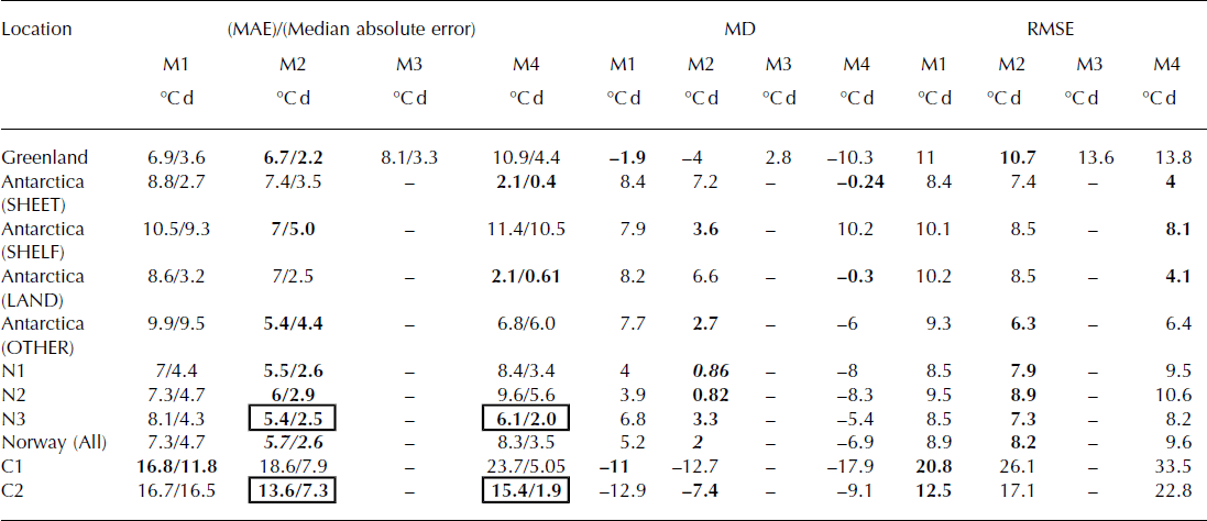
To a significance level of p < 0.05, the optimal misfit to this dataset is achieved when M2 is applied, with MD = −2.3°Cd. However, the non-parametric test does not distinguish the performances of M2 and M4. M1 and M3 produce average positive deviations in obtaining the dataset, whereas M2 and M4, in general, underestimate PDDM (Fig. 5, left panel). In summary, for a threshold temperature of T = 0°C, M1 is outperformed by all methods that introduce either temporally or spatially evolving σ M (Table 1). These parameterizations are based on Greenland data, but are calibrated from a different source (GC-Net) to that which we tested against PROMICE.
For a threshold temperature of −5°C, all methods except M1 perform significantly worse compared to the choice of 0°C as a limiting temperature (p < 0.05). The MAE for M1 is smaller using T LIM = −5°C, but not significantly so. In all cases the MD of the modelled values is less positive, suggesting that moving to a threshold temperature of −5°C will cause underestimation of melt for M1, M2 and M4 (Table 2; Fig. 5c, g and o). The t-test reveals that M1 produces the lowest MD, but median absolute errors are not significantly different against the other three models.
Histograms in Figure 5d, h and p reflect the increasingly negative bias of some of the models for T LIM = −5°C compared to when T LI = 0°C (Fig. 5b, f and n). Although M1 and M3 produce high RMSE and MAE, the normality of the distributions (Fig. 5d and f) suggests that, over time, errors in PDDM for a time series will even out to be close to zero. Temperature-parameterized σ M produces an underestimation of PDDM implying that larger values of σ M are more appropriate to capture the temperature distribution between −5°C and 0°C. In the following subsections, methods M1, M2 and M4 are tested for PDDM data collected in Antarctica, Norway and Canada.
Computation of the Pearson’s linear correlation coefficient, r, shows that PDDM residuals are significantly correlated with the monthly North Atlantic Oscillation (NAO) index at some sites in the PROMICE network (p < 0.05). For method M3, anticorrelations (−0.55 < r < −0.34) are observed at stations in western (G25, G30, G32), southern (G33) and eastern (G35, G36) Greenland. M1 records similar but insignificant correlations at these stations. This suggests that as the NAO reaches a more negative state, methods M1 and M3 increasingly overestimate PDDM. It is likely that this correlation is linked to the NAO via the observed anticorrelation of temperature and NAO state (Reference Hanna and CappelenHanna and Capellen, 2003; Reference BoxBox, 2006).
For M2, significant correlations are also noted, but at only three stations: r = −0.54, −0.64 and −0.52 at sites G30, G35 and G36 respectively. This suggests that although M3 accounts for sinusoidal variations in σ M, which are also reflected in the annual temperature cycle, M2 provides a slightly better forecast of PDDM by accounting for synoptic variations in temperature such as those associated with the NAO. M4 produces significant correlations (0.39, −0.54, −0.49, 0.86, 0.85) at five sites (G23, G31, G35, G39, G40; see Fig. 2a and Supplementary Fig. S1a (http://www.igsoc.org/hyperlink/14j116/fig_s1.docx)), suggesting that the variability in σ M introduced by M4 may not fully capture NAO-linked temperature oscillations. These correlations are valid for the case T LIM = 0°C; when T LIM = −5°C is applied, fewer significant correlations are detected across each method.
Antarctica
The applicability and transferability of our methods to the Antarctic ice sheet is tested in this subsection. We split the Antarctic dataset according to locality: Ice Sheet, Ice Shelf, Land and ‘Other’ (Fig. 6; Tables 1 and 2). The category ‘Other’ encompasses data collected on a sub-Antarctic glacier (Brown Glacier, Heard Island) and on an iceberg (B9B) (Supplementary Table S2 (http://www.igsoc.org/hyperlink/14j116/tab_s1.docx)). First, the results relating to the use of T LIM = 0°C are discussed (Fig. 6).
For the Antarctic ice sheet dataset (Fig. 6a, b, i, j, q and r), it is clear that the use of σ M = 4.5°C cannot accurately represent PDDM. Consistent overestimation of PDDM occurs using M1 (Fig. 6a and b), with PDD totals overestimated by ∼20–30°Cd when T M = −4 to 0°C. Positive bias also occurs using M2, suggesting that σ M is also too large to accurately reconstruct PDDM (Fig. 6c and d). Using the Wilcoxon rank sum and t-tests, the median absolute error and MD produced by M4 are significantly different to those of the other methods, indicating that M4 is more appropriate for PDDM computation over the Antarctic ice sheet (Fig. 6i and j; Table 1).
Increasing overestimation of PDDM as a function of T M is also a feature of methods M1 and M2 over land and ice shelves in Antarctica. When M2 is used to predict PDDM over ice shelves, a higher frequency of modelled PDDM values fall within ±2.5°Cd of the observed values (Fig. 6l), compared with M1 and M4 (Fig. 6d and t, respectively). Over land surfaces, M4 performs significantly better than M1 and M2, producing the lowest MD of the three methods (Table 1). The dataset of PDDM gathered from stations on Brown Glacier and B9B (‘Other’; see Supplementary Table S2 (http://www.igsoc.org/hyperlink/14j116/tab_s2.docx) for locations) is best reconstructed using M2, producing the lowest MD of −1.6°C (p < 0.05) and lowest median absolute error of the dataset. Figure 6r, t, v and x show that, as with Greenland data, M4 underestimates PDDM over all surfaces.
Lowering the threshold temperature for PDDM calculation to T LIM = −5°C increases the RMSE produced by all methods over all surfaces (Fig. 7; Table 2). For all sites, M1 produces RMSE in the range 8.4–10.2°Cd (Fig. 7a, c, e and g) and M2 in the range 6.3–8.5°Cd (Fig. 7i, k, m and o). The performance of M4 is more variable, with RMSE in the range 4–8.1 °C d (Fig. 7q, s, u and w).
Methods M2 and M4 produce significantly better representations of the Antarctic dataset as a whole (p < 0.05), reinforcing the suggestion that a formulation that produces lower σ M may be more appropriate for the Antarctic ice sheet. This inference is supported by Reference Seguinot and RogozhinaSeguinot and Rogozhina (2014) who reported long-term January values of σ M for Antarctica that were lower than those for Greenland by ∼1 °C in the range −5°C < T M < 0°C. The preference for M4 is further supported by investigation of a subset of Antarctic data (not shown) which demonstrates that observed σ M is generally 1– 2°C lower than that predicted using M2 for −10°C < T M < 0°C. Over ice shelves, for the sparse data available, M2 is the more appropriate formulation as with sites outside Antarctica. The ‘Shelf’ and ‘Other’ categorizations contain fewer observations, so although the statistical tests demonstrate significant differences between the performance of the top two methods (Tables 1 and 2), further observations are required to determine whether the T M–MD relationship is consistent over all surface types.
Northern Hemisphere glaciers
Finally, we reconstruct observational PDDM from five mid-to high-latitude glacier sites in the Northern Hemisphere. Data from Norwegian sites are grouped together and presented as a single dataset, as we find no significant difference between the performances of each method on a site-by-site basis (Fig. 8b, g and j and d, h and l). As with Greenland and Antarctica, a similar pattern continues at these sites for T LIM = 0°C. M1 overestimates the observed PDDM totals, with a peak overestimation of ∼20°C d for −2.5°C < T M <2.5°C (Fig. 8a and b), and M2 generally provides an underestimation of PDDM (Fig. 8e and f). Table 1 shows that M2 reproduces PDDM to greater accuracy compared to M1 at these sites. Langfjordjøkelen (site N2, Fig. 2c) may be categorized as a maritime, subpolar glacier (Reference Giesen, Andreassen, Oerlemans and Van den BroekeGiesen and others, 2014) and therefore assumed to be subjected to significantly different meteorological regimes than the observations used to generate the M2 parameterization. However, M2 reproduces 83% of PDDM totals at this site to within ±5°Cd of the observations. This level of performance falls to 72% at Midtdalsbreen and 70% at Storbreen. M4 causes significant underestimation of the dataset if reflected in Figure 8i and j.
Norway. Modelled minus observed monthly PDD as a function of T M using three methods of parameterization of standard deviation: M1 (a, c), M2 (e, g) and M4 (i, k). Accompanying histograms show the frequency, f, of the deviation of modelled PDDM values from observed PDDM (PDDOBS) for each method, with a bin size of 5°Cd. Bin centres are marked on the x-axis. The histograms delineate the performance of each method at each site (N1–N3). The figure is split into two panels, each representing the performance of each method when a threshold temperature ( T LIM) of 0°C and −5°C is used to calculate PDD. Performance indicators MAE, MD and RMSE are noted in Tables 1 and 2 (°C d).

When the threshold temperature is lowered to −5°C, all RMSE values increase for the combined Norway dataset. For M1 and M2, the distribution of errors is more Gaussian-like (Fig. 8d and h) compared to the right and left skews of the distributions in Figure 8b and f respectively. However, M4 still underestimates PDDM (Fig. 8k and l), suggesting that standard deviations produced by the method are too low to capture monthly temperature variability at Norwegian sites.
Performance is mixed for the mid-latitude glaciers in western Canada (Fig. 9). At Haig Glacier (C1), all methodologies produce large RMSE (Tables 1 and 2), and M2 and M4 consistently underestimate PDDM using both threshold temperatures (compare Fig. 9e, g, i and k). Also, the magnitude of the absolute errors for M2 and M4 is largest for Haig compared to any other site in this study; this is the only site considered in this paper in which M1 is favoured (Tables 1 and 2). Method M2 produces the smallest overall average MAE at Kwadacha Glacier (C2), but only 11 data points are available for this site and it would be unwise to discriminate between methods using such a small dataset. Based on our test of differences between population median absolute errors, we are unable to advocate for either M2 or M4 at Kwadacha.
We are not sure what underlies the poor performance of M2 and M4 at Canadian glacier sites. Both Kwadacha and Haig are continental glaciers, with large diurnal temperature cycles. Haig is at a lower latitude than other sites in our study, and the glacier boundary layer is warm through the summer melt season, with mean daily temperatures of up to 10°C. Under these conditions, the revised methodology for estimating monthly PDD totals appears to break down, instead preferring a higher value of σ M as demonstrated by Figure 9a and c. The strong daytime warming, warm winds and large diurnal cycles may combine to give a higher temperature variance than experienced at higher latitudes.
Canada. Modelled minus observed monthly PDD (deviation) as a function of T M using three methods of parameterization of standard deviation: M1 (a, c), M2 (e, g) and M4 (i, k). Accompanying histograms show the frequency, f, of the deviation of modelled PDDM values from observed PDDM (PDDOBS) for each method, with a bin size of 10°Cd. Bin centres are marked on the x-axis. The histograms delineate the performance of each method at each site (C1 and C2). The figure is split into two panels, each representing the performance of each method when a threshold temperature( T LIM) of 0°C and −5°C is used to calculate PDD. Performance indicators MAE, MD and RMSE are noted in Tables 1 and 2 (°Cd).

Contribution to melt error
A feature of all scatter plots in Figures 5–9 is the peak (or trough) in the modelled minus observed PDDM around the point where T M = T LIM. For both thresholds (i.e. T LIM = [−5°C, 0°C]), maximum error in PDDM will occur when T M approaches T LIM if σ M is incorrectly specified with respect to the observed values (σ o). The reason behind this is explained in Figure 10. Consider three scenarios where PDDM is calculated with respect to T LIM = 0°C when T M = T LIM (Fig. 10a), T M = T LIM − 3 (Fig. 10b) and T M = T LIM + 3 (Fig. 10c). The cumulative distribution function (CDF) is produced in each scenario for σ M = σo (e.g. the parameterized standard deviation is equal to the observed value (σo which is set to 2°C in this example)), σ M = 2σ o and σ M = 0.5σ o. We consider the following cases:
-
1. For T LIM = T M, when σ M = σ o, σ M = 0.5σ o and σ M = 2σo , 50% of temperatures in the sample are greater than T LIM in each case. However, when σ M = 2σo , there is a greater spread of temperatures above this limit, hence a higher PDD total is produced. The opposite is true when σ M = 0.5σo (Fig. 10a).
-
2. For T LIM > T M (Fig. 10b) or T LIM < T M (Fig. 10c), the differences in the ranges of temperatures produced between T LIM and ∞ are partly compensated by the difference in the number of values falling between these limits. For example, for Figure 10a, when σ M = 2σo 50% of the values fall between 0°C and 17.2°C. For σ M = σo and σ M = 0.5σo this is 0–6.9°C and 0–3.7°C respectively. In the case of T LIM > T M (Fig. 10b) the differences between the ranges of temperatures above T LIMare reduced: 0–0.5°C for σ M = 0.5σo ; 0–4.15°C for σ M = σo ; and 0–6.9 for σ M = 2σo . Resulting PDD totals from each method display a smaller range in Figure 10b and c than in Figure 10a.
Cumulative distribution functions (solid lines, left y-axis) and associated cumulative PDDM (dot-dashed lines, right y-axis) as a function of temperature for a sample where (a) T M = T LIM, (b) T M < T LIM and (c) T M > T LIM. In each plot, σ M = σ o (dark grey), σ M = 2σ o (black) and σ M = 0.5σ o (light grey). For (a) T LIM = 0°C, (b) T LIM= −3°C and (c) T LIM = 3°C. T LIM is set at 0°C, whereas σ o = 2°C.

These cases present an interesting problem if melt calculation is reliant on the use of the PDD method. We have demonstrated that when mean monthly temperature approaches the threshold temperature applied in the PDD algorithm, maximum error in forecasted PDD occurs if σ M is incorrectly prescribed compared to observed values.
It is important to place the improvement in PDD prediction into context with the overall effect the improvement causes on final predicted melt total (Eqn (1)). Equation (8) reflects the fractional error in melt originating from a given PDD computation method. The associated error/uncertainty on the final melt estimate (ΔMn ) using a given method of parameterization of σ M (n = 1,4) is expressed as

We define Δf
s,i as the ‘uncertainty’ attached to the use of the degree-day factor for snow (s) or ice (i). To assess this uncertainty we use the values of Reference HockHock (2003), with f
s varying between 2.5 and 11.6 mm °C d−1 and f
i between 5.4 and 20 mm °C d−1 . Using this database, fi = 8.7 ± 7.4 mm °C d−1 and fs
= 5.1 ± 4.5 mm °C d−1 (±2σ). Therefore, the term ![]() is assigned a value of 0.88, i.e. the maximum fractional uncertainty associated with snow surfaces. PDDOBS is defined as the observed PDD total for a given data point, i.e. the ‘correct’ value. ΔPDDMn is defined as the modelled minus observed PDD total.
is assigned a value of 0.88, i.e. the maximum fractional uncertainty associated with snow surfaces. PDDOBS is defined as the observed PDD total for a given data point, i.e. the ‘correct’ value. ΔPDDMn is defined as the modelled minus observed PDD total.
Since this paper focuses on improving the forecasting of PDDM, we only comment on the relative success of each method in producing the lowest fractional uncertainties in melt. Figure 11a and b illustrate the frequency at which each method produces the lowest fractional error in melt for the PROMICE dataset used in Figure 5. In Figure 11a and b, M0 signifies occasions where no single method provides the best melt estimate (grey bars) and when an improvement in fractional melt error of at least 5% compared to the next best method does not occur (black bars). Method M1 produces the lowest error in ![]() for 18% of the dataset (grey bars). M2 performs better than M1, with M2 generating the smallest errors in melt in a higher frequency of instances (24%), followed by M3. The magnitude of improvement is less significant, however. In ∼70% of the cases, the best method (denoted by the black bars in Fig. 11a) offers no greater than a 5% improvement in fractional melt error. Greater than 5% improvement in fractional melt error occurs in only very low frequencies for each method, the highest of which is for M1 (∼10%; Fig. 11a). For T
LIM = −5°C (Fig. 11 b), the performance is similar across the methods, with M2 providing the lowest overall melt error in most cases (23%).
for 18% of the dataset (grey bars). M2 performs better than M1, with M2 generating the smallest errors in melt in a higher frequency of instances (24%), followed by M3. The magnitude of improvement is less significant, however. In ∼70% of the cases, the best method (denoted by the black bars in Fig. 11a) offers no greater than a 5% improvement in fractional melt error. Greater than 5% improvement in fractional melt error occurs in only very low frequencies for each method, the highest of which is for M1 (∼10%; Fig. 11a). For T
LIM = −5°C (Fig. 11 b), the performance is similar across the methods, with M2 providing the lowest overall melt error in most cases (23%).
Histograms (grey bars) showing frequency at which each method of PDD calculation (M1–M4) produces the lowest fractional error in melt (Eqn (7)) for data months in the PROMICE dataset using a threshold temperature of T LIM = 0°C (a) and T LIM = −5°C (b). Frequency of occurrence of M0 signifies when more than one method provides an optimal solution. Black bars on each histogram indicate which method produces a >5% improvement in fractional melt error compared to the next best method. In this case, M0 represents a <5% difference in fractional melt error between the top two performing methods. (c, d) Comparison of the logarithm of fractional errors in melt for the two methodologies parameterizing σ M as a function of T M (M2 and M4) when T LIM = 0°C (c) and when T LIM = −5°C (d). (e, f) Enlarged versions of (b, c), where the logarithm of fractional melt error lies between −0.2 and 0.2.
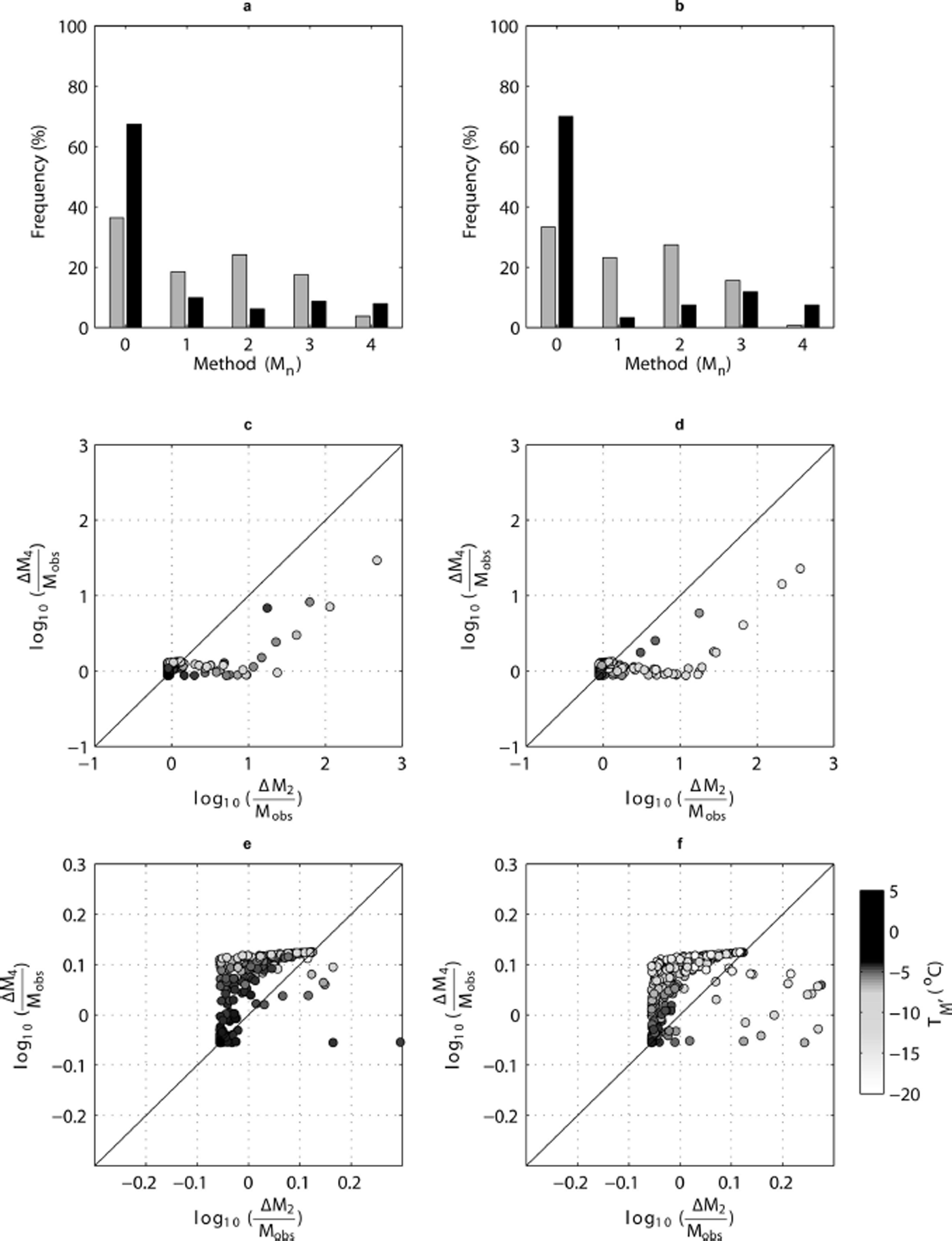
When comparing the performance of the two methods which parameterize σ M as a function of temperature, Figure 11c and d demonstrate that, in some cases, fractional melt error can be up to one or two orders of magnitude higher when using M2 compared to M4; however, this is generally at lower temperatures (hence low PDDM) when fractional errors in PDDM are inflated and where M2 predicts larger σ M (e.g. 5°C when T M = −10°C; Fig. 4c) than M4 (3.2°C when T M = −10°C). At higher temperatures (Fig. 11e), fractional errors in melt lie between 0.89 and 1.25, with M4 producing the larger errors. A similar pattern is noted in Figure 11f. In Figure 11e and f when the value on the axes approaches −0.05, this indicates that the error associated with PDD forecasting is close to zero and that the error in melt is mainly a function of f. When the value on the x- or y-axis is close to or larger than 0.1, the error in PDDM dominates the final melt error. As expected, the smallest errors are generated for higher temperatures (Fig. 11e and f). For T LIM = 0°C, the use of M2 causes errors in monthly melt totals that are largely a function of the error or uncertainty in applied degree-day factor when T M >−5°C, clearly demonstrating a need to focus on constraining degree-day factors in order to provide robust estimates of ice-sheet ablation if the PDD method is to be applied in future studies.
Conclusions
The value of σ M is central to providing accurate predictions of ice-sheet and glacier mass balance. Used previously as a tuning parameter, the value selected in various studies for σ M generally ranges between 4 and 5°C. The work carried out in this study shows unequivocally that the current assumption of a stationary σ M is not in line with observations from AWSs on the Greenland ice sheet, as first shown by Reference Fausto, Ahlstrøm, Van As and SteffenFausto and others (2011), nor elsewhere in the cryosphere. Using hourly temperature data from the GC-Net network (Reference Steffen, Box and AbdalatiSteffen and others, 1996), it is clear that although the distribution of temperature is partly forced by the diurnal cycle, there is a relationship with monthly temperature itself due to the annual cycle, and the limiting effect of a melting surface on temperature fluctuations. Our results reinforce and help to explain the findings of Reference SeguinotSeguinot (2013), Reference Seguinot and RogozhinaSeguinot and Rogozhina (2014) and Reference Rogozhina and RauRogozhina and Rau (2014), which are based on reanalysed data from climate models. Our analysis of temperature data from a broad array of glacier and ice-sheet locations demonstrates a systematic spatial variation in temperature distribution characteristics and PDD values, largely explicable as a function of mean monthly temperature. The spatial and seasonal variations identified in earlier work are also an expression of temperature conditions (Reference Seguinot and RogozhinaSeguinot and Rogozhina, 2014), which we attribute to contrasting latent energy effects over melting vs sub-freezing snow and ice.
For a monthly temperature of 0°C, previous methodology (M1) assumes a standard deviation of 4–5°C, whereas the work presented in this paper suggests this value should be ∼2.6°C. This results in a monthly PDD total that is 40% lower than in previous methodologies, a substantial difference in the energy assumed to be available for melt. We show that degree-day melt factors need to be revisited to accommodate this difference, as these are presumably tuned to be too low in current ice-sheet models. Additionally as more of the ice sheet enters the critical temperature band (e.g. between –5°C and 0°C), the importance of accurate σ M will be noticeable. We also evaluated the assumption of normality of temperature distributions using datasets of hourly surface air temperature over the Greenland ice sheet and found that also there is a weak relationship with temperature, partly explained by decreasing σ Mat higher temperatures.
Although this paper does not provide an exhaustive assessment of the predictive power of M2, it is possible to firmly state that a temperature, rather than spatio-temporal, parameterization of σ m based on Greenland ice sheet AWS observations provides greater flexibility of application to other glacierized regions. The future of ice-sheet models may be leaning towards increased complexity with respect to the consideration of all components of the energy budget, but the favourable performance of the PDD method lends this technique to wider usage. We have demonstrated the applicability of this method not only in Greenland, for which the method was derived originally, but also for many areas on the Antarctic ice sheet and other areas of the cryosphere, where favourable results are predicted. Further testing is needed to evaluate the best PDD methodology at low to mid-latitudes.
Finally, use of the PDD method includes selection of appropriate degree-day factors with which to calculate melt. As shown in Figures 10 and 11, the onus now lies with providing constrained degree-day factors to produce accurate melt forecasts. This paper demonstrates conclusively that, as a first step, temperature-evolving values for σ M should be applied in all future ice-sheet mass-balance studies that employ the PDD method.
Acknowledgements
For Antarctic data, we appreciate the support of the University of Wisconsin–Madison Automatic Weather Station Program for the dataset, data display and information (US National Science Foundation grant Nos. ANT-0944018 and ANT-f663; Antarctic Meteorological Research Center, ftp://amrc.ssec.wisc.edu/pub/aws/). We thank the Australian Antarctic Division and Paulo Grigoni at ENEA for providing hourly temperature records from Australian and Italian Antarctic sites respectively. The manuscript was strengthened by the inclusion of glacier observations from Norway, gratefully received from Rianne Giesen (Institute for Marine and Atmospheric research Utrecht, Utrecht University, The Netherlands). NAO data were accessed from the National Climate Prediction Center, US National Oceanic and Atmospheric Administration (http://www.cpc.ncep.noaa.gov/data/teledoc/nao.shtml). Thanks also to the Canadian Institute for Advanced Research for postdoctoral fellowship support to L.M.W. Finally, comments received from Irina Rogozhina and an anonymous reviewer greatly improved the manuscript.


