

1 Introduction
Political scientists regularly rely (either implicitly or explicitly) on a selection-on-observables assumption to justify causal inferences. Informally, this assumption (which is also referred to as unconfoundedness or conditional ignorability of treatment assignment) states that (a) the potential outcomes are conditionally independent of treatment status given observed covariates and (b) every unit has non-zero probability of being assigned to each treatment condition. Estimation approaches as seemingly different as regression Hainmueller and Hangartner (Reference Hainmueller and Hangartner2013), matching (Ichino and Nathan Reference Ichino and Nathan2013), inverse propensity score weighting (Burgess and Tyburski Reference Burgess and Tyburski2020), and balancing weights methods (Grier et al. Reference Grier, Grier and Moncrieff2024; Truex Reference Truex2014) are all justified by an appeal to selection on observables.Footnote 1
These estimation methods rely on very different modeling assumptions which we distinguish from the causal identification assumptions that they share. For instance, regression approaches explicitly model the outcome variable (often with fairly strong functional form assumptions) while not explicitly modeling the treatment assignment process. On the other hand, propensity score weighting methods explicitly model the treatment assignment process (often with fairly strong functional form assumptions) but do not explicitly model the outcome variable.
A problem for the applied researcher arises because it is difficult to know which estimation approach, using which set of modeling assumptions, is at least approximately correct within a particular application. Diagnostic checks are of some use here. However, while numerous diagnostics have been proposed over the years, for the most part the proposed diagnostics have not been general in the sense of being available for essentially all estimation methods that are justified by a selection-on-observables assumption.
Recent work in statistics has begun to change this situation.Footnote 2 In this paper, we build on these ideas, especially the work of Li, Morgan, and Zaslavsky (Reference Li, Morgan and Zaslavsky2018) and Chattopadhyay and Zubizarreta (Reference Chattopadhyay and Zubizarreta2023), to clarify to political scientists (a) how estimators as seemingly different as linear regression, propensity score weighting, 1:M matching with replacement, coarsened exact matching (CEM), and entropy balancing are all special cases of a general weighting estimator and (b) how this commonality allows for a range of diagnostics that can be computed for all of these estimation approaches and meaningfully compared across approaches. We hope this helps applied researchers understand the consequences of their modeling assumptions when using different approaches. By reporting their results more openly and honestly, readers can better see how much the results depend on the models used.
Before proceeding, we want to be clear that it is not our goal in this paper to interrogate the credibility of the selection on observables assumption in particular applications or contexts. Such an enterprise is, in our opinion, best done by subject-matter experts on a case-by-case basis. Instead, we provide useful diagnostic tools along with guidance for using those tools that will be helpful to applied researchers in political science who may not be aware of related work in other fields.
2 Putting Estimation Methods that Assume Selection on Observables on a Common Footing
The basic idea of this article is simple: To compare results across different estimation methods, those different estimation methods must be put on a common footing. Once this common footing is found, we can examine the results to better understand the particular (dis)advantages of each approach. A focus on weighting estimators of Weighted Average Treatment Effects (WATEs; see Hirano, Imbens, and Ridder Reference Hirano, Imbens and Ridder2003; Li et al. Reference Li, Morgan and Zaslavsky2018) allows us to make these comparisons.
Here estimation entails reweighting the sample units to make them representative of the target population—just as survey researchers do when they weight their respondents. Importantly, most commonly used estimators of causal effects can be viewed as weighting the observations in this way. This reweighting also serves to balance the covariates between treated and control groups.
In what follows, we provide a brief non-technical introduction to these ideas for researchers in political science who may be unfamiliar with the relevant work in economics and statistics. We begin with a description of the general WATE estimand and then note that many common estimands such as ATE and ATT (as well as many others) are particular examples of WATEs. We then summarize existing results on how weighting estimators—similar to those from survey sampling—can be used to consistently estimate WATE estimands under standard assumptions. This section concludes by pulling together results from disciplines outside political science that show how estimators as seemingly different as regression estimators, matching estimators, balancing weights estimators, and inverse propensity score weighting estimators can all be seen as special cases of a particular type of weighting estimator. This last observation is what allows us, in Section 3, to compare seemingly very different estimation approaches using common diagnostic tools. Readers who have a strong grasp of Li et al. (Reference Li, Morgan and Zaslavsky2018), Chattopadhyay and Zubizarreta (Reference Chattopadhyay and Zubizarreta2023), and related work may wish to skip ahead to Section 3.
2.1 The General WATE Estimand
Our discussion of the WATE estimand closely follows Li et al. (Reference Li, Morgan and Zaslavsky2018) who in turn build on work by Hirano et al. (Reference Hirano, Imbens and Ridder2003). We refer interested readers to these articles for more detailed discussion.
Consider a random sample of size n composed of independent and identically distributed draws from an infinite super-population:
 $$ \begin{align*}\left\{ Y_i(0), Y_i(1), Z_i, X_i \right\}_{i=1}^n. \end{align*} $$
Here $Y_i(0)$
and
$Y_i(0)$
and $Y_i(1)$
are the potential outcomes for unit i under control and active treatment respectively,
$Y_i(1)$
are the potential outcomes for unit i under control and active treatment respectively, $Z_i$
is a binary treatment indicator with the convention that
$Z_i$
is a binary treatment indicator with the convention that $Z_i=1$
indicates that unit i was exposed to active treatment and
$Z_i=1$
indicates that unit i was exposed to active treatment and $Z_i=0$
indicates that unit i was exposed to the control condition, and
$Z_i=0$
indicates that unit i was exposed to the control condition, and $X_i = (X_{i1}, \ldots , X_{ik})$
are measured covariates specific to unit i. The observed outcome
$X_i = (X_{i1}, \ldots , X_{ik})$
are measured covariates specific to unit i. The observed outcome $Y_i$
is given by
$Y_i$
is given by $Y_i = Z_i Y_i(1) + (1 - Z_i) Y_i(0)$
. See Imbens and Rubin (Reference Imbens and Rubin2015, Chapter 3) (2015). Finally, let
$Y_i = Z_i Y_i(1) + (1 - Z_i) Y_i(0)$
. See Imbens and Rubin (Reference Imbens and Rubin2015, Chapter 3) (2015). Finally, let $n^{(1)}$
and
$n^{(1)}$
and $n^{(0)}$
denote the number of treated and control units respectively.
$n^{(0)}$
denote the number of treated and control units respectively.
The average treatment effect conditional on x is defined as:
 $$ \begin{align*}\tau(x) \equiv \mathbb{E}\left[Y(1) - Y(0) | X=x \right]. \end{align*} $$
This is the average unit-specific causal effect among units with $X=x$
.
$X=x$
.
Although such conditional effects may be of direct interest in particular applications, the focus here is on weighted averages of these effects in the super-population. Assume that the density of X, $f_X(x)$
, exists.Footnote
3
Following Li et al. (Reference Li, Morgan and Zaslavsky2018, 392) and Hirano et al. (Reference Hirano, Imbens and Ridder2003,1163), define
$f_X(x)$
, exists.Footnote
3
Following Li et al. (Reference Li, Morgan and Zaslavsky2018, 392) and Hirano et al. (Reference Hirano, Imbens and Ridder2003,1163), define
 $$ \begin{align} \tau_h \equiv \frac{\int \tau(x) f_X(x) h(x) dx}{\int f_X(x) h(x) dx} \end{align} $$
to be the WATE. Here $h(x)$
is a weight function that defines the target population (i.e., the target population distribution is the super-population distribution weighted by
$h(x)$
is a weight function that defines the target population (i.e., the target population distribution is the super-population distribution weighted by $h(x)$
) and the estimand.
$h(x)$
) and the estimand. $\tau _h$
is simply a weighted average of covariate-specific conditional effects.
$\tau _h$
is simply a weighted average of covariate-specific conditional effects.
A wide range of commonly used causal estimands can be written as a WATE; the only difference is in the choice of the weight function $h(x)$
(Li et al. Reference Li, Morgan and Zaslavsky2018, 392). In this paper, we focus on ATE and ATT as they are the estimands most commonly used in political science. The ATE estimand corresponds to a situation where
$h(x)$
(Li et al. Reference Li, Morgan and Zaslavsky2018, 392). In this paper, we focus on ATE and ATT as they are the estimands most commonly used in political science. The ATE estimand corresponds to a situation where $h(x) = 1$
for all x and the ATT estimand corresponds to a situation where
$h(x) = 1$
for all x and the ATT estimand corresponds to a situation where $h(x)$
is equal to the propensity score function, i.e.,
$h(x)$
is equal to the propensity score function, i.e., $h(x) = e(x) = \Pr (Z=1 | X=x)$
. That said, the ideas and diagnostics in this paper apply much more broadly.
$h(x) = e(x) = \Pr (Z=1 | X=x)$
. That said, the ideas and diagnostics in this paper apply much more broadly.
2.2 A Hájek-Type Estimator of WATE
In this section, we describe a Hájek-type estimator of the WATE estimand and then note that many commonly used estimators of causal effects can be viewed as special cases of this weighting estimator. This provides the basis for comparing these estimators using the diagnostics discussed in Section 3.
The particular estimator that we focus on is the following:
 $$ \begin{align} \hat{\tau}_h = \frac{\sum_{i=1}^n w^{(1)}_{h}(x_i) Z_i Y_i}{\sum_{i=1}^n w^{(1)}_{h}(x_i) Z_i} - \frac{\sum_{i=1}^n w^{(0)}_{h}(x_i) (1-Z_i) Y_i}{\sum_{i=1}^n w^{(0)}_{h}(x_i) (1-Z_i)}, \end{align} $$
where $w^{(1)}_{h}(x)$
and
$w^{(1)}_{h}(x)$
and $w^{(0)}_{h}(x)$
are weight functions for treated and control units respectively. This is based on the estimator proposed by Hájek (Reference Hájek, Godambe and Sprott1971) within the context of survey sampling. Accordingly, we refer to this as a Hájek-type estimator. This estimator goes by other names in the causal inference literature—most commonly stabilized IPW estimator (Aronow and Miller Reference Aronow and Miller2019, 228, 266).
$w^{(0)}_{h}(x)$
are weight functions for treated and control units respectively. This is based on the estimator proposed by Hájek (Reference Hájek, Godambe and Sprott1971) within the context of survey sampling. Accordingly, we refer to this as a Hájek-type estimator. This estimator goes by other names in the causal inference literature—most commonly stabilized IPW estimator (Aronow and Miller Reference Aronow and Miller2019, 228, 266).
Li et al. (Reference Li, Morgan and Zaslavsky2018) show that $\hat {\tau }_h$
is a consistent estimator of
$\hat {\tau }_h$
is a consistent estimator of $\tau _h$
under the following conditions. Treatment assignment is conditionally ignorable given X, SUTVA holds,Footnote
4
and the weights are given by:
$\tau _h$
under the following conditions. Treatment assignment is conditionally ignorable given X, SUTVA holds,Footnote
4
and the weights are given by:
 $$ \begin{align} w^{(1)}_{h}(x) \propto \frac{f_X(x)h(x)}{f_X(x)e(x)} = \frac{h(x)}{e(x)}, \end{align} $$
and
 $$ \begin{align} w^{(0)}_{h}(x) \propto \frac{f_X(x)h(x)}{f_X(x)(1-e(x))} = \frac{h(x)}{1-e(x)}, \end{align} $$
where $e(x) = \Pr (Z=1 | X=x)$
is the propensity score function. As Li et al. (Reference Li, Morgan and Zaslavsky2018) also show, these weights have the property of balancing the covariates between treated and control groups such that these weighted conditional distributions are equal to each other and also equal to
$e(x) = \Pr (Z=1 | X=x)$
is the propensity score function. As Li et al. (Reference Li, Morgan and Zaslavsky2018) also show, these weights have the property of balancing the covariates between treated and control groups such that these weighted conditional distributions are equal to each other and also equal to $f_X(x) h(x)$
(the covariate distribution of the target population):
$f_X(x) h(x)$
(the covariate distribution of the target population):
 $$ \begin{align} f_{X|Z}(x|1) w^{(1)}_{h}(x) = f_{X|Z}(x|0) w^{(0)}_{h}(x) = f_X(x) h(x). \end{align} $$
While we have written the weights $w^{(1)}_{h}(x)$
and
$w^{(1)}_{h}(x)$
and $w^{(0)}_{h}(x)$
as explicit functions of x, it will often be more notationally convenient to simply write them as values indexed by the units (
$w^{(0)}_{h}(x)$
as explicit functions of x, it will often be more notationally convenient to simply write them as values indexed by the units ( $i=1,\ldots ,n$
). For example, as
$i=1,\ldots ,n$
). For example, as $w^{(1)}_{hi}$
and
$w^{(1)}_{hi}$
and $w^{(0)}_{hi}$
or, when the estimand is clear by context, simply
$w^{(0)}_{hi}$
or, when the estimand is clear by context, simply $w^{(1)}_{i}$
and
$w^{(1)}_{i}$
and $w^{(0)}_{i}$
.
$w^{(0)}_{i}$
.
2.3 Common Estimators are Equivalent to Hájek-Type Estimators
In this section, we briefly discuss the equivalences between a variety of estimators of ATE and ATT and the Hájek-type estimator discussed in the previous section. In some cases—for instance propensity score weighting methods and methods using balancing weights—these equivalences are obvious and well known within political science. In other cases—such as regression estimators of ATE and ATT—these equivalences have been proven in other fields but are not well known within political science. It is important to note that these are exact equivalences, not approximations.
2.3.1 Propensity Score Weighting Estimators
The group of estimators that can most obviously be written in the form of Equation (2) are those that directly estimateFootnote
5
the propensity score function $e(x)$
and then substitute that estimate,
$e(x)$
and then substitute that estimate, $\hat {e}(x)$
, into Equations (3) and (4). The general form of the resulting estimator is
$\hat {e}(x)$
, into Equations (3) and (4). The general form of the resulting estimator is
 $$ \begin{align} \hat{\tau}^{\text{ps}}_h = \frac{\sum_{i=1}^n \hat{w}^{(1)}_{hi} Z_i Y_i}{\sum_{i=1}^n \hat{w}^{(1)}_{hi} Z_i} - \frac{\sum_{i=1}^n \hat{w}^{(0)}_{hi} (1-Z_i) Y_i}{\sum_{i=1}^n \hat{w}^{(0)}_{hi} (1-Z_i)}, \end{align} $$
where
 $$ \begin{align*}\hat{w}^{(1)}_{hi} = \frac{h(x_i)}{\hat{e}(x_i)}, \end{align*} $$
 $$ \begin{align*}\hat{w}^{(0)}_{hi} = \frac{h(x_i)}{1-\hat{e}(x_i)}. \end{align*} $$
When $h(x)$
for the estimand in question depends on
$h(x)$
for the estimand in question depends on $e(x)$
, the estimate
$e(x)$
, the estimate $\hat {e}(x)$
is substituted into the expression for
$\hat {e}(x)$
is substituted into the expression for $h(x)$
as well. Both ATE and ATT can be consistently estimated with this approach. As noted above, the ATE estimand has
$h(x)$
as well. Both ATE and ATT can be consistently estimated with this approach. As noted above, the ATE estimand has $h(x) = 1$
for all x. For the ATT estimand,
$h(x) = 1$
for all x. For the ATT estimand, $h(x) = e(x)$
so we set
$h(x) = e(x)$
so we set $\hat {h}(x) = \hat {e}(x)$
. This produces the following weights:
$\hat {h}(x) = \hat {e}(x)$
. This produces the following weights:
 $$ \begin{align*}\hat{w}^{(1)}_{hi} =\frac{\hat{h}(x_i)}{\hat{e}(x_i)} = \frac{\hat{e}(x_i)}{\hat{e}(x_i)} = 1, \end{align*} $$
and
 $$ \begin{align*}\hat{w}^{(0)}_{hi} = \frac{\hat{h}(x_i)}{1-\hat{e}(x_i)} = \frac{\hat{e}(x_i)}{1-\hat{e}(x_i)}. \end{align*} $$
2.3.2 Methods Using Balancing Weights
Another group of estimators approach the selection of weights for Equation (2) as an explicit constrained optimization problem. We refer to these estimators as balancing weights estimators (for examples of such estimators, see Hainmueller Reference Hainmueller2012; Hazlett Reference Hazlett2020; Wang and Zubizarreta Reference Wang and Zubizarreta2020; Zubizarreta Reference Zubizarreta2015). The approaches differ in how they define the optimization problem, but in general they attempt to find weights that create (at least) approximate balance between treated and control groups subject to constraints. That is, the weights they find equate the weighted covariate distribution among the treated units with the weighted covariate distribution among the control units as in Equation (5).
These approaches are most often used to estimate the ATT, which is typically written as:
 $$ \begin{align*}\hat{\tau}^{\text{bw}}_{ATT} = \frac{1}{n^{(1)}} \sum_{i=1}^n Z_i Y_i - \frac{\sum_{i=1}^n w^{(0)}_i (1 - Z_i) Y_i}{ \sum_{i=1}^n w^{(0)}_i (1 - Z_i) }, \end{align*} $$
where $n^{(1)} = \sum _{i=1}^n Z_i$
and
$n^{(1)} = \sum _{i=1}^n Z_i$
and $w^{(0)}_i \ \ i=1,\ldots ,n$
are weights chosen to maximize balance between the treated and control groups subject to constraints. It is obvious that this expression for
$w^{(0)}_i \ \ i=1,\ldots ,n$
are weights chosen to maximize balance between the treated and control groups subject to constraints. It is obvious that this expression for $\hat {\tau }^{\text {bw}}_{ATT}$
is a special case of the WATE estimator in Equation (2).Footnote
6
$\hat {\tau }^{\text {bw}}_{ATT}$
is a special case of the WATE estimator in Equation (2).Footnote
6
2.3.3 Regression Estimators
In an important recent work, Chattopadhyay and Zubizarreta (Reference Chattopadhyay and Zubizarreta2023) have shown that regression estimators of ATE and ATT are also equivalent to the Hájek-type estimator in Equation (2).Footnote 7 This important fact is not widely known within political science.
The Multi-Regression Imputation (MRI) Estimator. To begin, consider the following regression estimator for ATE:
 $$ \begin{align} \hat{\tau}^{\text{reg}}_{ATE} = \frac{1}{n} \sum_{i=1}^n \left(\hat{m}_1(x_i) - \hat{m}_0(x_i)\right) \end{align} $$
where $\hat {m}_1(x)$
is the ordinary least squares (OLS) regression estimator of
$\hat {m}_1(x)$
is the ordinary least squares (OLS) regression estimator of $\mathbb {E}[Y | X=x, Z=1]$
constructed by subsetting the data to the
$\mathbb {E}[Y | X=x, Z=1]$
constructed by subsetting the data to the $Z=1$
units and fitting an OLS regression of Y on X to those data and
$Z=1$
units and fitting an OLS regression of Y on X to those data and $\hat {m}_0(x)$
is the OLS regression estimator of
$\hat {m}_0(x)$
is the OLS regression estimator of $\mathbb {E}[Y | X=x, Z=0]$
constructed by subsetting the data to the
$\mathbb {E}[Y | X=x, Z=0]$
constructed by subsetting the data to the $Z=0$
units and fitting an OLS regression of Y on X to those data. Chattopadhyay and Zubizarreta (Reference Chattopadhyay and Zubizarreta2023) refer to this as the MRI estimator of ATE.Footnote
8
$Z=0$
units and fitting an OLS regression of Y on X to those data. Chattopadhyay and Zubizarreta (Reference Chattopadhyay and Zubizarreta2023) refer to this as the MRI estimator of ATE.Footnote
8
Let $\mathbf {X}$
denote the
$\mathbf {X}$
denote the $n \times (k+1)$
matrix of covariates including a constant. Similarly, let
$n \times (k+1)$
matrix of covariates including a constant. Similarly, let $\mathbf {X}_1$
and
$\mathbf {X}_1$
and $\mathbf {X}_0$
denote the submatrices that correspond to the portions of
$\mathbf {X}_0$
denote the submatrices that correspond to the portions of $\mathbf {X}$
from the treated and control units respectively. The treatment indicator, Z, is not included in
$\mathbf {X}$
from the treated and control units respectively. The treatment indicator, Z, is not included in $\mathbf {X}$
,
$\mathbf {X}$
, $\mathbf {X}_0$
, or
$\mathbf {X}_0$
, or $\mathbf {X}_1$
. Relatedly, let
$\mathbf {X}_1$
. Relatedly, let $\mathbf {y}$
denote the
$\mathbf {y}$
denote the $n \times 1$
vector of outcomes for the full sample and
$n \times 1$
vector of outcomes for the full sample and $\mathbf {y}_1$
and
$\mathbf {y}_1$
and $\mathbf {y}_0$
be the observed outcomes for the treated and control units respectively.
$\mathbf {y}_0$
be the observed outcomes for the treated and control units respectively.
The regression estimator in Equation (7) is equivalent to the Hájek-type estimator in Equation (2) where the weights applied to the treated units are $\mathbf {w}^{(1)'} = \mathbf {1}^{\prime }_n \mathbf {X} \left ( \mathbf {X}_1^{\prime } \mathbf {X}_1\right )^{-1} \mathbf {X}_1^{\prime } $
and the weights applied to the control units are
$\mathbf {w}^{(1)'} = \mathbf {1}^{\prime }_n \mathbf {X} \left ( \mathbf {X}_1^{\prime } \mathbf {X}_1\right )^{-1} \mathbf {X}_1^{\prime } $
and the weights applied to the control units are $\mathbf {w}^{(0)'} = \mathbf {1}_n^{\prime } \mathbf {X} \left ( \mathbf {X}_0^{\prime } \mathbf {X}_0\right )^{-1} \mathbf {X}_0^{\prime } $
(Chattopadhyay and Zubizarreta Reference Chattopadhyay and Zubizarreta2023).Footnote
9
Here
$\mathbf {w}^{(0)'} = \mathbf {1}_n^{\prime } \mathbf {X} \left ( \mathbf {X}_0^{\prime } \mathbf {X}_0\right )^{-1} \mathbf {X}_0^{\prime } $
(Chattopadhyay and Zubizarreta Reference Chattopadhyay and Zubizarreta2023).Footnote
9
Here $\mathbf {1}_n$
is an n-vector of ones. Note that these weights can be negative.Footnote
10
To get some intuition about these weights, note that the imputed treated outcomes are given by
$\mathbf {1}_n$
is an n-vector of ones. Note that these weights can be negative.Footnote
10
To get some intuition about these weights, note that the imputed treated outcomes are given by
 $$ \begin{align*}\hat{\mathbf{m}}_1(\mathbf{X}) = \mathbf{X} \hat{\boldsymbol{\beta}}_1 = \mathbf{X} (\mathbf{X}_1^{\prime}\mathbf{X}_1)^{-1}\mathbf{X}_1^{\prime}\mathbf{y}_1 \end{align*} $$
which is a weighted average of the outcomes for the treated units. The imputed control outcomes are constructed similarly.
Closely related arguments to those above for ATE can be used to express the following MRI estimator of ATT:
 $$ \begin{align*}\hat{\tau}^{\text{reg}}_{ATT} = \frac{1}{n^{(1)}} \sum_{i:Z_i=1} \left(y_i - \hat{m}_0(x_i)\right) \end{align*} $$
in the form of Equation (2) (Chattopadhyay and Zubizarreta Reference Chattopadhyay and Zubizarreta2023).Footnote 11
The Uni-Regression Imputation (URI) Estimator One may also attempt to estimate an average treatment effect with a single regression. Let $\mathbf {z}$
be the
$\mathbf {z}$
be the $n \times 1$
vector of treatment indicators. Then, as shown by Chattopadhyay and Zubizarreta (Reference Chattopadhyay and Zubizarreta2023), the commonly used OLS estimator of
$n \times 1$
vector of treatment indicators. Then, as shown by Chattopadhyay and Zubizarreta (Reference Chattopadhyay and Zubizarreta2023), the commonly used OLS estimator of $\tau $
in the regression
$\tau $
in the regression $\mathbf {y} = \mathbf {X} \boldsymbol {\beta } + \mathbf {z} \tau + \boldsymbol {\epsilon }$
(what Chattopadhyay and Zubizarreta (Reference Chattopadhyay and Zubizarreta2023) refer to as the URI estimator) is equivalent to the Hájek-type estimator of Equation (2) with a particular choice of weights (Chattopadhyay and Zubizarreta Reference Chattopadhyay and Zubizarreta2023). See also Section B of the Supplementary Material for an alternative derivation of these weights and discussion of their properties.Footnote
12
See Hazlett and Shinkre (Reference Hazlett and Shinkre2024) for a discussion of the URI estimator and its drawbacks compared to other estimators (including the MRI estimator).
$\mathbf {y} = \mathbf {X} \boldsymbol {\beta } + \mathbf {z} \tau + \boldsymbol {\epsilon }$
(what Chattopadhyay and Zubizarreta (Reference Chattopadhyay and Zubizarreta2023) refer to as the URI estimator) is equivalent to the Hájek-type estimator of Equation (2) with a particular choice of weights (Chattopadhyay and Zubizarreta Reference Chattopadhyay and Zubizarreta2023). See also Section B of the Supplementary Material for an alternative derivation of these weights and discussion of their properties.Footnote
12
See Hazlett and Shinkre (Reference Hazlett and Shinkre2024) for a discussion of the URI estimator and its drawbacks compared to other estimators (including the MRI estimator).
Bivariate Weighted Least Squares (WLS) on the Treatment Indicator. A third approach using regression is primarily of interest to us because it underlies our DFBETA diagnostic of Section 3.2. As Imbens (Reference Imbens2004) notes, the Hájek-type estimator of $\hat {\tau }_h$
in Equation (2) is equivalent to the WLS estimator of
$\hat {\tau }_h$
in Equation (2) is equivalent to the WLS estimator of $\tau _h$
in the following bivariate regression of the observed outcomes on the treatment indicator:
$\tau _h$
in the following bivariate regression of the observed outcomes on the treatment indicator:
 $$ \begin{align} Y_i = \beta_0 + Z_i \tau_h + \epsilon_i, \ \ \ \ i=1,\ldots,n \end{align} $$
with the ith regression weight equal to:
 $$ \begin{align*}\omega_i = Z_i w^{(1)}_{h}(x_i) + (1-Z_i) w^{(0)}_{h}(x_i). \end{align*} $$
As Section 3.2 shows, this equivalence enables us to use standard regression diagnostics to understand the influence of particular observations on any Hájek-type estimate of a WATE—even those that do not explicitly model the outcome via regression (e.g., entropy balancing estimates).Footnote 13
2.3.4 Matching Estimators: 1:M and CEM
Matching methods attempt to obtain balance between treated and control groups by matching treated units to control units so that the matched sample is balanced on relevant measured pre-treatment covariates (X). Numerous variants of matching exist, and there are also many ways to estimate causal effects once the matched sample has been constructed. In this subsection, we look at two broad classes of matching methods that are commonly used in political science. For each, we consider estimators of causal effects that can be written as weighted differences of means or equivalently a WLS regression of the outcomes on the treatment indicator.
1:M Matching with Replacement. As demonstrated in Section C of the Supplementary Material, the 1:M matching with replacement estimator of ATT that is written as a difference of means (see Abadie and Imbens, Reference Abadie and Imbens2006, 241, 2006, p. 241) is equivalent to the Hájek-type estimator in Equation (2) where the weights given to the treated and control units are: $w^{(1)}_i = 1$
and
$w^{(1)}_i = 1$
and $w^{(0)}_i = \frac {K_i}{M}$
, respectively. Here
$w^{(0)}_i = \frac {K_i}{M}$
, respectively. Here $K_i = \sum _{l=1}^n \mathbb {I}(i \in \mathcal {J}_l) $
and
$K_i = \sum _{l=1}^n \mathbb {I}(i \in \mathcal {J}_l) $
and $\mathcal {J}_l$
is the set of M unit indices of the units matched to unit i.Footnote
14
$\mathcal {J}_l$
is the set of M unit indices of the units matched to unit i.Footnote
14
CEM. CEM (Iacus, King, and Porro Reference Iacus, King and Porro2011, Reference Iacus, King and Porro2012) is a matching method that coarsens the covariate space into a finite number of strata and then exact matches treated and control units within each stratum.Footnote 15 CEM produces unit-specific weights that can be used for post-matching estimation of causal effects. The estimand of interest is initially ATT although the actual estimand will diverge from ATT if unmatched treated units are discarded.
The most straightforward way to estimate the ATT using CEM is to fit the WLS regression in Equation (8) above with weights equal to the weights produced by the CEM procedure (Iacus et al. Reference Iacus, King and Porro2012, 5). It follows that this estimator can be rewritten as the Hájek-type estimator in Equation (2) with the weights equal to the CEM weights.
3 Diagnostic Tools for Hájek-Type Estimators of Causal Effects
We now turn to diagnostics applicable to any estimator that can be written in the form of Equation (2). At the outset, we want to be clear that these diagnostic tools do not take the place of careful thinking about, and evaluation of, the modeling / specification decisions that are required for a particular approach to be a consistent estimator of an effect of interest.Footnote 16 The diagnostics we propose are most useful when applied to credible estimators, where this credibility is based on the plausibility of the needed identification and modeling assumptions.
These diagnostic tools are designed to help researchers and their readers: (1) understand the effective sample size of various estimators, (2) discover the influence a given sample point exerts on a causal estimate and how that influence varies across estimators, (3) examine the extent to which an estimator extrapolates outside the range of observed data, and (4) assess mean balance as well as distributional balance between treated and control groups. Upon publication, we will make these diagnostic tools available in an R package.
3.1 Effective Sample Size & Effective Sample Size Ratio
In the survey sampling literature, it is common place to calculate and report the “effective sample size” of a weighted estimator (Kish Reference Kish1965). The basic idea is to note the variance of the unweighted sample mean, $\bar {Y}$
, of Y is
$\bar {Y}$
, of Y is $\mathbb {V}[\bar {Y}] = \mathbb {V}[Y]/n$
where n is the sample size. If the variance of a weighted estimator can be written as
$\mathbb {V}[\bar {Y}] = \mathbb {V}[Y]/n$
where n is the sample size. If the variance of a weighted estimator can be written as $ \mathbb {V}[Y]/c$
for some constant c, then the effective sample size is c. While
$ \mathbb {V}[Y]/c$
for some constant c, then the effective sample size is c. While $\mathbb {V}[Y]$
appears in this motivation, the effective sample size can be calculated before outcome data is collected. We return to this point at the end of this subsection.
$\mathbb {V}[Y]$
appears in this motivation, the effective sample size can be calculated before outcome data is collected. We return to this point at the end of this subsection.
The Hájek-type estimator in Equation (2) depends on the weights $w_{hi}^{(1)}$
and
$w_{hi}^{(1)}$
and $w_{hi}^{(0)}$
. Thus the effective sample size of this estimator will also depend on these weights. To acknowledge that, we use the notation
$w_{hi}^{(0)}$
. Thus the effective sample size of this estimator will also depend on these weights. To acknowledge that, we use the notation $n_{\text {eff}_w} $
to denote the effective sample size of this estimator.
$n_{\text {eff}_w} $
to denote the effective sample size of this estimator.
Under the assumption that $\mathbb {V}[Y|Z=1] = \mathbb {V}[Y|Z=0] = \mathbb {V}[Y]$
, some simple variance calculations and algebraic manipulations give us the following expression for
$\mathbb {V}[Y|Z=1] = \mathbb {V}[Y|Z=0] = \mathbb {V}[Y]$
, some simple variance calculations and algebraic manipulations give us the following expression for $n_{\text {eff}_w} $
(see Section D of the Supplementary Material)Footnote
17
:
$n_{\text {eff}_w} $
(see Section D of the Supplementary Material)Footnote
17
:
 $$ \begin{align*}n_{\text{eff}_w} = \frac {n^{(1)}_{\text{eff}} n^{(0)}_{\text{eff}}}{ n^{(0)}_{\text{eff}} + n^{(1)}_{\text{eff}}}, \end{align*} $$
where
 $$ \begin{align*}n^{(0)}_{\text{eff}} = \frac {\left(\sum\limits_{i:Z_i=0}w^{(0)}_{hi}\right)^2}{\sum\limits_{i:Z_i=0}(w^{(0)}_{hi})^2} \end{align*} $$
and
 $$ \begin{align*}n^{(1)}_{\text{eff}} = \frac {\left(\sum\limits_{i:Z_i=1}w^{(1)}_{hi}\right)^2}{\sum\limits_{i:Z_i=1}(w^{(1)}_{hi})^2}. \end{align*} $$
If the weights are estimated, these estimated weights can be inserted into the above formulas in place of $w_{hi}^{(1)}$
and
$w_{hi}^{(1)}$
and $w_{hi}^{(0)}$
. If at least one
$w_{hi}^{(0)}$
. If at least one $w_{hi}^{(1)}$
value is non-zero and one
$w_{hi}^{(1)}$
value is non-zero and one $w_{hi}^{(0)}$
value is non-zero, then
$w_{hi}^{(0)}$
value is non-zero, then
 $$ \begin{align*} 0 < n^{(0)}_{\text{eff}} \le n^{(0)} \end{align*} $$
 $$ \begin{align*} 0 < n^{(1)}_{\text{eff}} \le n^{(1)} \end{align*} $$
and
 $$ \begin{align*} 0 < n_{\text{eff}_w} \le \frac{n^{(1)} n^{(0)}}{n^{(0)} + n^{(1)}} \le n/4. \end{align*} $$
Full details are presented in Section D of the Supplementary Material.
The effective sample size is most useful when comparing two or more estimators. It is also useful to express the effective sample size as a fraction of the maximum possible effective sample size, $\frac {n^{(1)} n^{(0)}}{n^{(0)} + n^{(1)}}$
, or what we term the effective sample size ratio. The applications in Section 4 provide examples.
$\frac {n^{(1)} n^{(0)}}{n^{(0)} + n^{(1)}}$
, or what we term the effective sample size ratio. The applications in Section 4 provide examples.
Since the weights for all of the estimators considered in this paper do not depend on the outcome data, the effective sample size can be calculated prior to observing or recording any outcome data. This is especially relevant in situations where researchers may want to adjust model specifications based on diagnostic information. Making such adjustments prior to observing outcome information minimizes the chance of bias from researcher degrees of freedom (Rubin Reference Rubin2008).
3.2 Influential Data Points
Understanding the extent to which some observations may exert a great deal of influence over one’s estimates is an important part of any data analysis. Conceptually, one can gauge the influence of observation i by examining the difference between an estimate calculated with the full dataset and an estimate calculated with observation i removed. Ideally, one would like a closed form expression for this measure of influence, as repeatedly deleting observations and re-estimating the quantity of interest can be extremely time-consuming with large datasets and sophisticated estimation methods.
Chattopadhyay and Zubizarreta (Reference Chattopadhyay and Zubizarreta2023) have made progress on this goal for the MRI and URI estimators discussed above. What they term the sample influence curve for observation i (denoted $\text {SIC}_i$
) is proportional to this difference in estimates with and without observation i.Footnote
18
While this provides an exact measure of influence for URI and MRI estimates of ATE, it is not directly useful for non-regression estimates of ATE.
$\text {SIC}_i$
) is proportional to this difference in estimates with and without observation i.Footnote
18
While this provides an exact measure of influence for URI and MRI estimates of ATE, it is not directly useful for non-regression estimates of ATE.
We provide a measure of influence that works for any estimator that can be written as the Hájek-type estimator of Equation (2).
Recall from Section 2.3.3 that any Hájek-type estimator of the form given in Equation (2) is equivalent to a bivariate WLS regression of the outcome on the treatment indicator. Since the coefficient on the treatment indicator in this bivariate WLS regression is the causal effect of interest, a measure of how much this coefficient changes after deleting observation i is a measure of influence that will work for any Hájek-type estimator. In the literature on regression diagnostics, this change in a coefficient vector after deleting observation i is referred to as DFBETA $_i$
(Belsley, Kuh, and Welsch Reference Belsley, Kuh and Welsch1980) and is closely related to the approach of Chattopadhyay and Zubizarreta (Reference Chattopadhyay and Zubizarreta2023) for URI and MRI estimators.
$_i$
(Belsley, Kuh, and Welsch Reference Belsley, Kuh and Welsch1980) and is closely related to the approach of Chattopadhyay and Zubizarreta (Reference Chattopadhyay and Zubizarreta2023) for URI and MRI estimators.
Directly relevant to our goal of finding a closed form expression for DFBETA $_i$
for WLS regression is the work of Li and Valliant (Reference Li and Valliant2011) who studied the analogous problem of calculating DFBETA
$_i$
for WLS regression is the work of Li and Valliant (Reference Li and Valliant2011) who studied the analogous problem of calculating DFBETA $_i$
in regressions with survey weights. Their work provides a closed form expression for DFBETA
$_i$
in regressions with survey weights. Their work provides a closed form expression for DFBETA $_i$
for WLS regression. We use this to assess the influence of each observation on the Hájek-type estimator in Equation (2).Footnote
19
Note that we are interested in the second element of DFBETA
$_i$
for WLS regression. We use this to assess the influence of each observation on the Hájek-type estimator in Equation (2).Footnote
19
Note that we are interested in the second element of DFBETA $_i$
from the bivariate WLS regression as it reveals how much the causal effect estimate would change if observation i were deleted. Full details of how DFBETA
$_i$
from the bivariate WLS regression as it reveals how much the causal effect estimate would change if observation i were deleted. Full details of how DFBETA $_i$
can be calculated for any Hájek-type estimator are presented is Section E of the Supplementary Material.
$_i$
can be calculated for any Hájek-type estimator are presented is Section E of the Supplementary Material.
3.3 Extrapolation
A key question to ask when using either a URI or MRI estimator to estimate a causal effect is “Are any of the elements of $\mathbf {w}^{(1)}$
or
$\mathbf {w}^{(1)}$
or $\mathbf {w}^{(0)}$
negative?”Footnote
20
If all of the weights are non-negative, then each of the two weighted averages on the right-hand side of Equation (2) will be a convex combination of the observed treated and control outcomes respectively. In other words, the estimator is interpolating the observed data. If some of the weights are negative, then the estimator is extrapolating outside the range of the observed data.Footnote
21
,
Footnote
22
$\mathbf {w}^{(0)}$
negative?”Footnote
20
If all of the weights are non-negative, then each of the two weighted averages on the right-hand side of Equation (2) will be a convex combination of the observed treated and control outcomes respectively. In other words, the estimator is interpolating the observed data. If some of the weights are negative, then the estimator is extrapolating outside the range of the observed data.Footnote
21
,
Footnote
22
Although researchers should be concerned about any amount of extrapolation, the dangers of extrapolation vary with the extremity of the extrapolation. A simple measure of the amount of extrapolation in the estimation of the mean of $Y(0)$
is
$Y(0)$
is
 $$ \begin{align*}\text{EXTRAP}^{(0)} = \frac{\sum_{i=1}^n |w_i^{(0)}|\mathbb{I}(w_i^{(0)} < 0) (1 - z_i)}{\sum_{i=1}^n w_i^{(0)} \mathbb{I}(w_i^{(0)} \ge 0) (1 - z_i)}, \end{align*} $$
where $\mathbb {I}(\cdot )$
is the indicator function and
$\mathbb {I}(\cdot )$
is the indicator function and $|\cdot |$
is the absolute value function. EXTRAP
$|\cdot |$
is the absolute value function. EXTRAP $^{(0)}$
is the ratio of the sum negative control group weights to the sum of the positive control group weights. The amount of extrapolation in the estimation of the mean of
$^{(0)}$
is the ratio of the sum negative control group weights to the sum of the positive control group weights. The amount of extrapolation in the estimation of the mean of $Y(1)$
is defined analogously as:
$Y(1)$
is defined analogously as:
 $$ \begin{align*}\text{EXTRAP}^{(1)} = \frac{\sum_{i=1}^n |w_i^{(1)}|\mathbb{I}(w_i^{(1)} < 0) z_i}{\sum_{i=1}^n w_i^{(1)} \mathbb{I}(w_i^{(1)} \ge 0) z_i}. \end{align*} $$
For the regression estimators discussed in Section 2.3.3 EXTRAP $^{(0)}$
and EXTRAP
$^{(0)}$
and EXTRAP $^{(1)}$
take values between 0 and 1.Footnote
23
See Section B.2 of the Supplementary Material for details.
$^{(1)}$
take values between 0 and 1.Footnote
23
See Section B.2 of the Supplementary Material for details.
3.4 Balance
We can assess balance between the treated and control groups by weighting the covariate distributions within the treated and control groups by $w_h^{(1)}(x)$
and
$w_h^{(1)}(x)$
and $w_h^{(0)}(x)$
respectively and checking to see whether Equation (5) holds in the sample.Footnote
24
There are two broad approaches to this. The first checks whether the weighted means of the distributions in Equation (5) are equal. The second attempts to assess the overall equality of these distributions.Footnote
25
$w_h^{(0)}(x)$
respectively and checking to see whether Equation (5) holds in the sample.Footnote
24
There are two broad approaches to this. The first checks whether the weighted means of the distributions in Equation (5) are equal. The second attempts to assess the overall equality of these distributions.Footnote
25
3.4.1 Weighted Mean Balance
A standard measure of balance is the absolute standardized mean difference (ASMD). Following Chattopadhyay et al. (Reference Chattopadhyay, Hase and Zubizarreta2020) this is defined for a particular covariate x as:
 $$ \begin{align*}\text{ASMD}(x) = \frac{\left| \bar{x}_w^{(1)} - \bar{x}_w^{(0)} \right|}{\sqrt{ ( s^{2(1)} + s^{2(0)} ) / 2} }, \end{align*} $$
where
 $$ \begin{align*}\bar{x}_w^{(z)} = \frac{\sum_i^n w_i^{(z)} \mathbb{I}(z_i = z) x_i }{ \sum_i^n w_i^{(z)} \mathbb{I}(z_i = z)} \end{align*} $$
is the weighted mean of covariate x within treatment group z with weights given by $\mathbf {w}^{(z)}$
and
$\mathbf {w}^{(z)}$
and $s^{2(z)}$
is the sample variance of x within treatment group z. See also Imbens and Rubin (Reference Imbens and Rubin2015, 310, 311) (2015, pp. 310–311) who propose using the standardized mean difference to check balance.
$s^{2(z)}$
is the sample variance of x within treatment group z. See also Imbens and Rubin (Reference Imbens and Rubin2015, 310, 311) (2015, pp. 310–311) who propose using the standardized mean difference to check balance.
Chattopadhyay et al. (Reference Chattopadhyay, Hase and Zubizarreta2020) also propose using the target ASMD (TASMD) as a measure of balance. For a particular covariate x within treatment group z (denoted $x^{(z)}$
), this is defined as:
$x^{(z)}$
), this is defined as:
 $$ \begin{align*}\text{TASMD}(x^{(z)}) = \frac{\left| \bar{x}_w^{(z)} - \bar{x}^{*} \right|}{s^{(z)}}, \end{align*} $$
where $ \bar {x}_w^{(z)}$
is as above (the weighted mean of
$ \bar {x}_w^{(z)}$
is as above (the weighted mean of $x^{(z)}$
with weights given by
$x^{(z)}$
with weights given by $\mathbf {w}^{(z)}$
),
$\mathbf {w}^{(z)}$
), $\bar {x}^{*}$
is the sample mean of x within the target population, and
$\bar {x}^{*}$
is the sample mean of x within the target population, and $s^{(z)}$
is the unweighted sample standard deviation of x within treatment group z. The target population is simply the population that defines the estimand. For instance, if the estimand is ATE, then the target population weights each observation in the sample equally and
$s^{(z)}$
is the unweighted sample standard deviation of x within treatment group z. The target population is simply the population that defines the estimand. For instance, if the estimand is ATE, then the target population weights each observation in the sample equally and $\bar {x}^{*}$
is the simple sample mean of x. If the estimand is ATT, then
$\bar {x}^{*}$
is the simple sample mean of x. If the estimand is ATT, then $\bar {x}^{*}$
is the simple sample mean of x within the treated units. With binary treatment, one would calculate TASMD
$\bar {x}^{*}$
is the simple sample mean of x within the treated units. With binary treatment, one would calculate TASMD $(x^{(0)})$
and TASMD
$(x^{(0)})$
and TASMD $(x^{(1)})$
unless one of these quantities is trivially equal to 0 as with ATT.
$(x^{(1)})$
unless one of these quantities is trivially equal to 0 as with ATT.
Recall the balance condition from Equation (5):
 $$ \begin{align*}f_{X|Z}(x|1) w^{(1)}_{h}(x) = f_{X|Z}(x|0) w^{(0)}_{h}(x) = f_X(x) h(x). \end{align*} $$
ASMD assesses the first equality, $f_{X|Z}(x|1) w^{(1)}_{h}(x) = f_{X|Z}(x|0) w^{(0)}_{h}(x)$
, whereas TASMD assesses
$f_{X|Z}(x|1) w^{(1)}_{h}(x) = f_{X|Z}(x|0) w^{(0)}_{h}(x)$
, whereas TASMD assesses $ f_{X|Z}(x|1) w^{(1)}_{h}(x) = f_X(x) h(x) $
and
$ f_{X|Z}(x|1) w^{(1)}_{h}(x) = f_X(x) h(x) $
and $ f_{X|Z}(x|0) w^{(0)}_{h}(x) = f_X(x) h(x) $
.
$ f_{X|Z}(x|0) w^{(0)}_{h}(x) = f_X(x) h(x) $
.
It is common to use an arbitrary threshold to assess weighted mean covariate balance. For instance, values of ASMD and/or TASMD below 0.1 or 0.2 are often viewed as indicating adequate covariate balance (Chattopadhyay et al. Reference Chattopadhyay, Hase and Zubizarreta2020, 15). Rather than using these arbitrary thresholds, Chattopadhyay et al. Reference Chattopadhyay, Hase and Zubizarreta2020 recommend using an asymptotically informed threshold of $\min (0.1, k^{- \frac {1}{2}} )$
, where k is the number of covariates (including functions of covariates such as squared terms) that one is attempting to balance (p. 15).
$\min (0.1, k^{- \frac {1}{2}} )$
, where k is the number of covariates (including functions of covariates such as squared terms) that one is attempting to balance (p. 15).
A major advantage of ASMD and TASMD is that they are not affected by sample size as a z-statistic or t-statistic would be (Imai, King, and Stuart Reference Imai, King and Stuart2008; Imbens and Rubin Reference Imbens and Rubin2015). A disadvantage is that they only assess mean balance and situations can exist where mean balance is achieved but confounding still exists because of imbalance on higher moments of the covariate distribution.
As proven by Chattopadhyay and Zubizarreta (Reference Chattopadhyay and Zubizarreta2023), the MRI estimators of ATE and ATT and the URI estimator of ATE will, by construction, always produce perfect weighted mean balance (both in terms of of ASMD and TASMD) on covariates included in the regression model(s)(Chattopadhyay and Zubizarreta Reference Chattopadhyay and Zubizarreta2023, Proposition 3). As they note, this implies that it is important to check balance on covariates—and transformations of covariates—that were not included in the model(s).Footnote 26 Another way to view the fact that the MRI and URI estimators produce perfect weighted mean balance is that either weighted mean balance is less important than commonly thought or that regression estimators of ATE and ATT are better than commonly thought.
We agree, and we encourage practitioners to go even further to assess more general distributional balance rather than just weighted mean balance. In the next subsection we discuss two approaches can be used to assess more general distributional equality of covariates, beyond simple mean balance, across treated and control groups.
3.4.2 Distributional Balance
The balance conditions in Equation (5) are statements about the equality of distributions—not just the equality of the means of those distributions. Accordingly, one may well want to look beyond ASMD and TASMD when checking balance.
For a particular covariate, a measure of the discrepancy between the weighted distribution of the covariate for treated units and the weighted distribution for control units is a Kolmogorov–Smirnov (KS) test statistic for weighted data.Footnote
27
Equation (5) suggests two variants of this KS diagnostic. One compares the weighted distribution of $x^{(1)}$
to the weighted distribution of
$x^{(1)}$
to the weighted distribution of $x^{(0)}$
. The other involves two KS statistics, one from a comparison of the weighted distribution of
$x^{(0)}$
. The other involves two KS statistics, one from a comparison of the weighted distribution of $x^{(1)}$
to the target distribution of x and the other from a comparison of the weighted distribution of
$x^{(1)}$
to the target distribution of x and the other from a comparison of the weighted distribution of $x^{(0)}$
to the target distribution of x. Larger values of the KS statistic indicate greater covariate imbalance.
$x^{(0)}$
to the target distribution of x. Larger values of the KS statistic indicate greater covariate imbalance.
A graphical approach to inspecting distributional balance of the weighted univariate covariate distributions that is arguably easier to interpret than the KS diagnostic is a weighted QQ-plot. This is constructed much like a standard QQ-plot except that the various sample quantiles are constructed from the weighted covariate distributions formed by weighting $x^{(z)}$
with weights proportional to
$x^{(z)}$
with weights proportional to $\mathbf {w}^{(z)}$
for
$\mathbf {w}^{(z)}$
for $z=0,1$
. Based on Equation (5), two variations on this ideas are possible.
$z=0,1$
. Based on Equation (5), two variations on this ideas are possible.
One version plots the quantiles of the weighted $x^{(1)}$
on the quantiles of the weighted
$x^{(1)}$
on the quantiles of the weighted $x^{(0)}$
. The other variant consistes of two plots, one of which plots the quantiles of the weighted
$x^{(0)}$
. The other variant consistes of two plots, one of which plots the quantiles of the weighted $x^{(1)}$
on the quantiles of the target distribution of x and the other which plots quantiles of the weighted
$x^{(1)}$
on the quantiles of the target distribution of x and the other which plots quantiles of the weighted $x^{(0)}$
on the quantiles of the target distribution of x. A departures away from the 45-degree line indicate a discrepancy between the two distributions.
$x^{(0)}$
on the quantiles of the target distribution of x. A departures away from the 45-degree line indicate a discrepancy between the two distributions.
Both the KS and QQ-plot diagnostics require the weights for treated and control units to be non-negative. They are thus always available for matching and explicit weighting approaches (such as inverse propensity score weighting and balancing-weight methods). When there is no extrapolation (no negative weights) they can also be useful for assessing the balance produced by MRI and URI approaches.
4 Applying the Diagnostic Tools
The diagnostic tools discussed above are just that—diagnostic tools. They are diagnostic in that they provide clues about potential problems with a particular estimation method applied to a particular dataset. They are tools in that they require skill and judgment to be used appropriately.
With that in mind, we encourage practitioners to use these diagnostic tools in the following way when estimating a causal effect under a selection on observables assumption.
-
1. Choose an estimand that is appropriate for the research question of interest.
-
2. Collect data and decide on model specifications for which the selection on observables and SUTVA assumptions are plausible or at least defensible.
-
3. Using multiple estimators, calculate and evaluate the diagnostics discussed above.
-
4. Optionally adjust model specifications to address problems revealed by the diagnostics.Footnote 28 For example, if a lack of balance is observed for the square of a covariate, include the squared covariate in the model(s).
-
5. If the diagnostics reveal serious problems for all estimators and model specifications, conclude that these results do not allow you to reliably estimate the causal effect of interest.
-
6. If the diagnostics reveal no serious problems for at least some estimators and model specifications, report the results from all estimators and model specifications along with the associated diagnostics. Providing estimates and diagnostics for all estimators and specifications helps readers judge the credibility of the reported results.
To illustrate the use and value of the diagnostics above, we turn to two real-world examples—the effect of judicial vacancies on judicial votes (Black and Owens Reference Black and Owens2016) and the effect of winning office on wealth (Eggers and Hainmueller Reference Eggers and Hainmueller2009).
4.1 Promotion-Seeking Judges
Black and Owens (Reference Black and Owens2016) ask whether U.S. lower-court judges are more likely to cast votes in favor of the president when a vacancy exists on the U.S. Supreme Court.Footnote 29 The researchers hypothesize that judges with a chance of promotion to the U.S. Supreme Court (“contenders”) are more likely to favor the president when a vacancy exists than when a vacancy does not exist. “Non-contenders” (judges with no chance of promotion) are not expected to adjust their votes in response to a vacancy. In other words, Black and Owens (Reference Black and Owens2016) frame their main research question as a causal question: What is the causal effect of a Supreme Court vacancy on pro-president votes cast by judges who are contenders and by judges who are not contenders?
Black and Owens’s approach to answering this question is typical of much applied work. They calculate and report a single estimate of a single causal estimand (in their case, an estimate of ATT produced by CEM).Footnote 30 And that estimate supports their hypothesis: the treatment (a vacancy) causes contender judges to vote differently—such that when a vacancy exists, contenders are more likely to vote for the president to improve their promotion prospects, while non-contenders do not change their behavior.
We re-analyze the Black and Owens data using multiple estimators of ATT and report the results in Table 1.
Re-analysis of Black and Owens (Reference Black and Owens2016) with multiple approaches to estimating the ATT.

Note: The Regression (MRI) rows correspond to the MRI estimator of ATT. The Regression (URI) rows correspond to the URI estimator which is also an estimate of ATE under the constant effects assumption. The Propensity Score Weighting rows correspond to the propensity score weighting estimator of ATT in which the propensity scores are estimated via logistic regression. The Entropy Balancing rows correspond to the entropy balancing estimator of ATT as implemented in the WeightIt R package. The Nearest-Neighbor Matching rows correspond to 1:1 nearest neighbor propensity score matching using the Match function in the Matching R package and the same estimated propensity scores as above. The Coarsened Exact Matching rows correspond to the coarsened exact matching estimator of ATT as implemented in the cem R package. The minimum and maximum DFBETA values actually correspond to votes by particular judges on particular cases (the units in the study). The listed judge names are the names of the judges from those influential judge-case combinations. Judge names were not reported in the non-contender dataset.
Looking at the ATT estimates and associated standard errors in the CEM rows of Table 1, we see support for Black and Owens hypotheses. The ATT estimate for contenders is positive (0.075) and significant at conventional levels ( $z= 0.075/0.024 = 3.125$
), while the ATT estimate for non-contenders is not significantly different from 0 at conventional levels (
$z= 0.075/0.024 = 3.125$
), while the ATT estimate for non-contenders is not significantly different from 0 at conventional levels ( $z = 0.021 / 0.014 = 1.5$
). Taken at face value, these results suggest that contenders change their voting behavior in the expected pro-president direction when a Supreme Court vacancy arises, but non-contenders do not change their behavior in these circumstances.
$z = 0.021 / 0.014 = 1.5$
). Taken at face value, these results suggest that contenders change their voting behavior in the expected pro-president direction when a Supreme Court vacancy arises, but non-contenders do not change their behavior in these circumstances.
Then again, questions about the credibility of this result emerge if one follows our guidance and examines the diagnostics for several estimators of ATT.
We begin by examing the diagnostics for Black and Owens’ preferred CEM estimator. Although Black and Owens (Reference Black and Owens2016, 36) report a sample size of 11,787 contender-judge observations,Footnote 31 note that the effective sample size for the contender analysis is 53.1 and the effective sample size ratio is 0.021—meaning that their CEM analysis discards approximately 98% of the possible data for the contenders. The CEM analysis of the non-contender judges also discards a fair amount of data but the effective sample size ratio is not as low as it is for contender judges.
In addition, the DFBETA values for the CEM analysis of the contender judges reveal that some judge-votes exert a very large influence on the estimated effect. The negative DFBETA with the largest magnitude belongs to a vote by Judge J. Harvie Wilkinson III and is equal to $-0.038$
. Dropping this vote by Judge Wilkinson would have increased the estimate of ATT by approximately 50%.Footnote
32
The largest positive DFBETA is equal to 0.025 and is from a vote by Judge Emilio Garza. The inclusion of this vote by Judge Garza produces approximately one third of the total estimated effect.Footnote
33
$-0.038$
. Dropping this vote by Judge Wilkinson would have increased the estimate of ATT by approximately 50%.Footnote
32
The largest positive DFBETA is equal to 0.025 and is from a vote by Judge Emilio Garza. The inclusion of this vote by Judge Garza produces approximately one third of the total estimated effect.Footnote
33
Taken on their own, these diagnostics applied to the CEM analysis provide cause for questioning whether the data support Black and Owens’s hypotheses about contender judges. Even more red flags go up when we examine the diagnostics for the other methods of estimating ATT (all of which are based on the same causal identification assumptions of SUTVA and conditional ignorability of treatment assignment given the same covariates).
Looking at Table 1 we see that the other estimation methods all have much larger effective sample sizes, and smaller DFBETA values for contender judges than does CEM. The regression methods do result in some extrapolation for the contender judges, which would be a reason to prefer another estimation method.
We also investigate the covariate balance produced by all of these estimation methods. Figure 1 presents diagnostic plots for contender judges.Footnote
34
Specifically, Figure 1a plots the TASMD values and Figure 1b the weighted KS statistics, both for control units. Recall that for a particular estimation method and covariate, the TASMD value and for the controls is the standardized absolute difference between the weighted mean of the covariate within the control observations (with weights given by $w_h^{(0)}(x)$
) and the mean of that covariate in the target distribution. Because the estimand in this example is the ATT, the covariate means under the target distribution are just the sample means of the covariates within the set of all treated units.
$w_h^{(0)}(x)$
) and the mean of that covariate in the target distribution. Because the estimand in this example is the ATT, the covariate means under the target distribution are just the sample means of the covariates within the set of all treated units.
Weighted mean covariate balance (assessed by TASMD) and KS test statistic for control units using multiple ATT estimation methods in the re-analysis of Black and Owens (Reference Black and Owens2016).
Note: In the TASMD plot, each symbol shows the standardized difference between the weighted mean of the control and treated data for each covariate and method. The gray vertical line marks where the TASMD value is 0.1. In the KS statistic plot, each symbol shows the maximum absolute difference in the ECDFs of the control and treated groups, using both raw and weighted control data. The gray vertical line marks KS statistics at 0. SC med is the JCS score of the median Supreme Court justice; Panel JCS is the ideological distance between a judge and the remaining panelists; JCS score is each judge’s JCS score; Ideo. Distance is the ideological distance between the judge and the president; Court reversal is whether the circuit court reversed the lower court; Circuit med is the JCS score of the median judge on the circuit; and Case pub. is whether the case was published.

Looking at Figure 1a, we see that the non-CEM methods, with the exception of the URI estimator, all produce good to very good balance as evidenced by TASMD values below 0.2 and in most cases below 0.1. The MRI estimator of ATT, the propensity score weighting estimator of ATT, and the entropy balancing estimator of ATT produce especially good balance—although it is important to note that the MRI estimator achieves this balance with negative weights, i.e., via extrapolation.Footnote 35
Similarly, the weighted KS test statistics compare the weighted distribution of control units to the target distribution, which is the treated group in this case. KS statistics indicate the maximum absolute difference between the empirical cumulative distribution functions (ECDFs) of the two distributions. As a normalized measure, the distance ranges from 0 (identical distributions) to 1 (completely different distributions). Figure 1b plots the KS test statistics for the covariates, comparing raw and weighted control units and treated groups. As we see, almost all methods reduce the KS statistics compared to the raw data, thereby improving distributional balance.
The comparison in Figure 1 clarifies how different methods handle data at hand and provides guidance for examining specific covariate of interest. For example, Ideo. Distance measures ideological distance between the judge and the president, is an important confounder given the research question. Figure 1 shows the unweighted control and the treated group exhibit poor mean and distributional balance. Among all methods, entropy balancing performs the best in achieving both mean and distributional balance.Footnote 36
Looking at the various weighted QQ-plots for these covariates helps to clarify how balance is being improved. Given space limitations, we present a single weighted QQ-plot for the Ideo. Distance covariate among contender judges in Figure 2. Here we see that in the raw data, Ideo. Distance is quite different among treated and control units. Entropy-balancing weights help to shrink this difference. That said, differences on this covariate between treated and control units remain after applying the entropy-balancing weights. While one might favor the entropy balancing results over the other results, one might also wonder whether any of the estimation approaches provide sufficient control of confounding.
Quantile-quantile plot for Ideo. Distance with raw and entropy-balancing-weighted data for contender judges.
Note: The X-axis depicts weighted quantiles of ideological distance between the judge and the president for the control units, while the Y-axis shows depicts weighted quantiles of ideological distance for the treated group, which is the target distribution in this case. A point on the 45-degree line indicates equality of the quantiles represented by that point.

Given these diagnostics, it seems that the estimation approaches with the fewest obvious problems (as revealed by the diagnostics) are propensity score weighting and entropy balancing. If these approaches produced results that were consistent with Black and Owens’ hypothesis of promotion-seeking behavior among judges, then we might conclude that the overall takeaway from Black and Owens (Reference Black and Owens2016) is correct, even if the estimation method they preferred in that paper doesn’t work well in that application. Going back to Table 1, we see that this is not the case. Neither the propensity score weighting nor the entropy balancing estimates show that contenders respond differently to a vacancy than do non-contenders. If anything, the point estimates from propensity score weighting and entropy balancing (as well as nearest-neighbor matching) are actually larger for the non-contenders than for the contenders (though none of the differences are statistically significant).
To conclude, based on Table 1 and Figure 1, when it comes to estimating ATT for contender judges, propensity score weighting and entropy balancing are better choices than the default application of CEMFootnote 37 for this application. At the least, these approaches use the data more efficiently, do not generate extreme influential data points, do not extrapolate, and produce good covariate balance. Unfortunately, though, neither propensity score weighting nor entropy balancing produces results that support the authors’ hypotheses. For the contenders, the causal effect of a vacancy on voting is not statistically different from 0 based on the propensity score weighting estimator and substantively fairly trivial based on the entropy balancing estimate. As for the non-contenders, there is evidence that a vacancy exerts a small, significant effect on voting behavior—against the authors’ expectation.
4.2 Wealth-Maximizing Politicians
In our second applied example, we turn to a study by Eggers and Hainmueller (Reference Eggers and Hainmueller2009). They ask whether members of the British parliament, relative to losing parliamentary candidates, accumulate greater wealth. Or, more succinctly: What is the causal effect of serving in parliament on wealth accumulation? The authors provide theoretical reasons to think that the effect of office on wealth accumulation differs for Conservative MPs compared to Labour MPs and so condition their analysis on party.
In contrast to Black and Owens (Reference Black and Owens2016), Eggers and Hainmueller (Reference Eggers and Hainmueller2009) report estimates of three different causal estimands (ATE, ATT, and the local average effect from a regression discontinuity design); and they also make use of three different estimation methods (OLS regression, difference of means after 1:1 genetic matching with replacement, and local regression for the regression discontinuity estimates). Although small differences emerge across these various methods, the main substantive point is remarkably consistent: Holding office has a substantial, positive effect on the wealth of Conservative MPs, whereas “no discernible financial benefits [accrue] for Labour MPs” (Eggers and Hainmueller Reference Eggers and Hainmueller2009, 513).
Considering the stability of Eggers and Hainmueller’s results, it would seem that our proposed diagnostics would add little value to their work. And, in fact, our tools supply no cause to question Eggers and Hainmueller’s general substantive conclusions. But they do clarify how various methods use the data at hand and which observations (MPs) exert substantial influence on the reported results. So even in this application, which is close to current “best practices,” our diagnostics may still aid researchers and their readers by shedding new light on the analyses and aiding proper interpretation of the findings.
For purposes of illustrating the diagnostics discussed above, we focus, in Table 2, on the ATT and ATE for Conservative Party politicians (see also Section G of the Supplementary Material). Looking at this table we see that the two regression approaches (MRI and URI) tend to have relatively large effective sample sizes and the most influential observations under these methods exert no more influence on the results than the most influential observations under other methods. These regression methods do extrapolate to some extent which could be a reason to prefer other methods. That said, the amount of extrapolation is relatively small.
Re-analysis of Eggers and Hainmueller (Reference Eggers and Hainmueller2009) with multiple estimation methods.

Note: The Regression (MRI) rows correspond to the MRI estimator of either ATT or ATE. The Regression (URI) rows correspond to the URI estimator which is an estimate of both ATT and ATE under the constant effects assumption. The Propensity Score Weighting rows correspond to the propensity score weighting estimator of either ATT or ATE in which the propensity scores are estimated via logistic regression. The Entropy Balancing rows correspond to the entropy balancing estimator of either ATT or ATE as implemented in the WeightIt R package. The Genetic Matching rows correspond to 1:1 matching on all X variables using the GenMatch function in the Matching R package. The Coarsened Exact Matching row corresponds to the coarsened exact matching estimator of ATT as implemented in the CEM R package. Note that the genetic matching results are slightly different from what is reported in Eggers and Hainmueller (Reference Eggers and Hainmueller2009). This appears to be due to the stochastic nature of the matching procedure. These slight differences do not affect the conclusions reached in Eggers and Hainmueller (Reference Eggers and Hainmueller2009).
As judged by our diagnostics, propensity score weighting and entropy balancing exhibit no serious problems. They have relatively large effective sample sizes, only moderately influential observations, and (by construction) they do not extrapolate.
Genetic matching results in a slightly lower effective sample size than the methods above and, when estimating ATT among Conservative Party members, it gives a good deal of influence to one observation (William How). Dropping just this one politician reduces the genetic matching ATT estimate from 1.107 to 0.723 and the ATE estimate drops from 0.621 to 0.361. Put another way, William How is responsible for roughly 38% of the estimated effect size.
In contrast to the other approaches, use of CEM with default settings results in an effective sample size of just two politicians which corresponds to an effective sample size ratio of just 0.036. In other words, CEM is discarding approximately 96% of the available data. This alone suggests that this application of CEM to this dataset should be questioned.
Figure 3 presents diagnostic plots for covariateFootnote 38 balance in ATT estimation for Conservative MPs.Footnote 39 The TASMD results in Figure 3a suggests that MRI, propensity score, entropy balancing, and genetic matching achieve mean balance for most covariates below the threshold. In contrast, CEM and, to a lesser extent, URI weighted data fail to balance many covariates and sometimes perform worse than the unweighted data. The KS statistics results in Figure 3b show that almost all methods contribute to reducing distributional imbalance. The test statistics also have less dispersion, partly because many covariates are binary variables.
Weighted mean covariate balance (assessed by TASMD) and KS test statistics for control units using multiple ATT estimation methods in the re-analysis of Eggers and Hainmueller (Reference Eggers and Hainmueller2009).
Note: In the TASMD plot, each symbol represents the standardized difference between the weighted mean of the control data and the mean of the target data (i.e., the sample mean of that covariate among all treated units in the sample). The gray vertical line marks where the TASMD value is 0.1. In KS statistic plot, each symbol shows the maximum absolute difference in the ECDFs of the control and treated groups, using both raw and weighted control data. The gray vertical line marks KS statistics at 0.

Figure 3 suggests that genetic matching, the preferred method in the original paper, produces the best covariate balance without extrapolation. Examining weighted QQ-plots provides additional information on covariate balance. Again, for reasons of space, we limit attention to how genetic matching adjusts the distribution for the two continuous variables, Birth Year and Death Year among Conservative politicians. Figure 4 compares the distributional balance for these two covariates between control units and treated units. For both the Birth year and Death Year, the raw data already display good distributional balance. Genetic matching weights brings control units even closer to the target distribution, further improving balance on these covariates.
Quantile-quantile plot for Birth Year and Death Year with raw data and genetic matching weighted data for ATT estimation among conservative politicians.
Note: The X-axes show the weighted birth and death year quantiles for the control units, while the Y-axes shows the corresponding quantiles for the treated group, which is the target distribution in this case. Points on the 45-degree line correspond to equality of the quantiles represented by that point.

While there are reasons to think that that the propensity score weighting and entropy balancing results might be the most credible, the particular choice of estimation method matters relatively little as all approaches (with the exception of CEM) produce results that are qualitatively similar and in line with the authors’ hypothesis.
5 Discussion
If one believes that selection on observables and SUTVA hold for a particular application, then a very large number of estimation methods can, in principle, be used to consistently estimate the causal effect of interest. How should an applied researcher decide which method(s) to use and which result(s) to report?
In this paper, we have attempted to provide some guidance. First, we recommend that the applied researcher consider many estimation methods and all model specifications for which the selection on observables and SUTVA assumptions are plausible. Second, we encourage researchers to calculate, examine, and report the diagnostics discussed in this paper. Such open and honest reporting would do much to help readers understand how model-dependent the reported results are.
We reiterate that the diagnostic tools discussed in this paper require skill and judgment to be used appropriately. While they can provide clues about potential problems with a particular estimation method applied to a particular dataset, they do not provide guarantees about the accuracy of any given estimate. But our hope is that this paper will help researchers produce more credible results when making selection-on-observables assumptions.
Supplementary Material
For supplementary material accompanying this paper, please visit https://doi.org/10.1017/pan.2025.10003.
Data Availability Statement
Replication materials for this article are available at Quinn et al. (Reference Quinn, Liu, Epstein and Martin2025). A preservation copy of the same code and data can also be accessed via Dataverse at https://doi.org/10.7910/DVN/69RUAD.


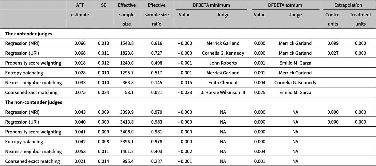
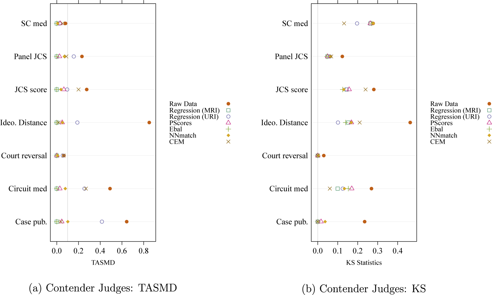
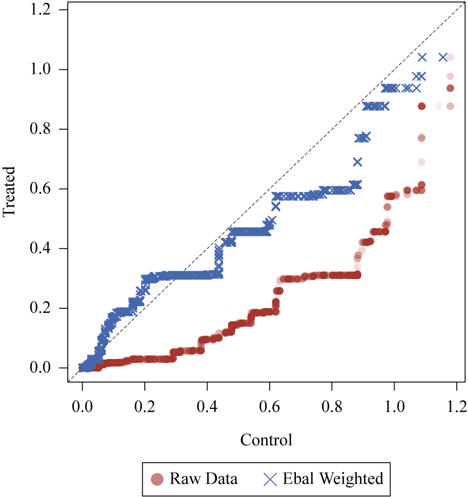
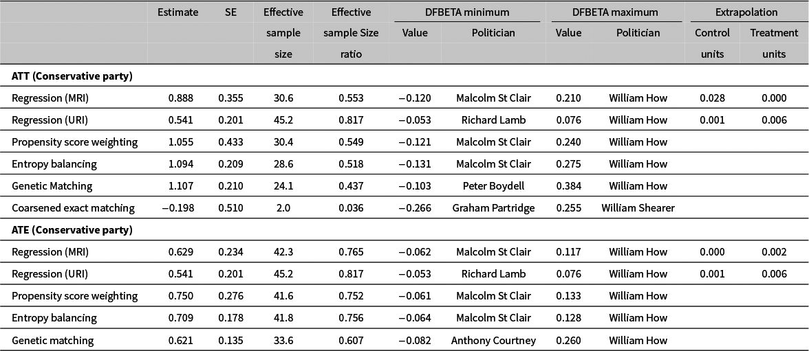
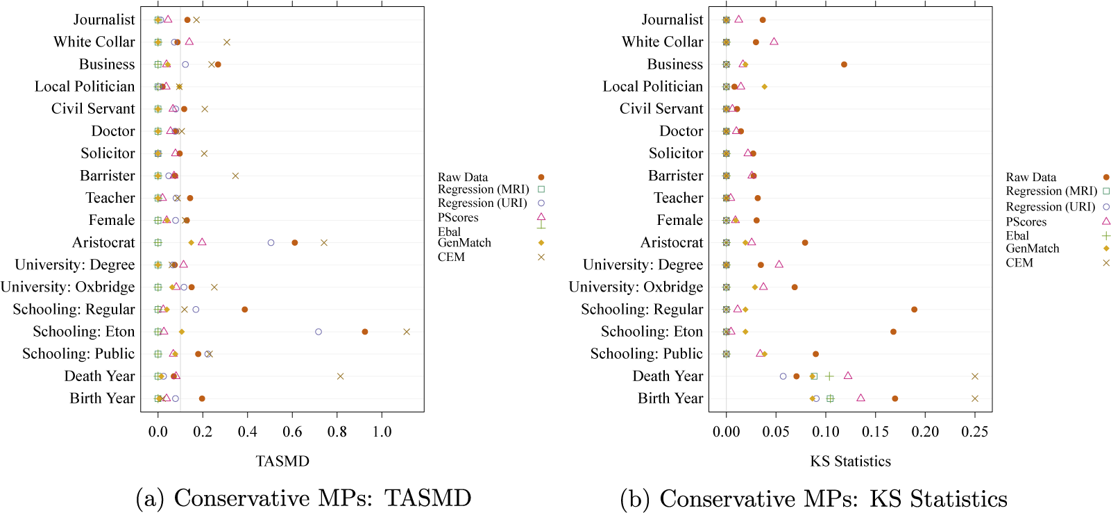
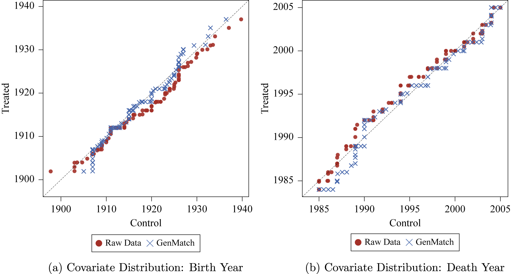


 Open access