
I. Claiming credit for improvements
In 2006, legendary investor Warren Buffett announced the largest charitable gift of all time. He pledged to give away the bulk of his fortune – then worth about USD 44 billion (cf. Loomis, Reference Loomis2006) – to the Bill and Melinda Gates Foundation.
Ten years later, with nearly USD 20 billion already transferred,Footnote 1 Buffett wrote a letter to the Gates couple asking them to reflect on what they had done with his gift, on what had gone particularly well or poorly, what they had learned and what they hoped would be achieved in the future:
‘I'm not the only one who'd like to read it. There are many who want to know where you've come from, where you're heading and why. I also believe it's important that people better understand why success in philanthropy is measured differently from success in business or government. Your letter might explain how the two of you measure yourselves and how you would like the final score card to read. Your foundation will always be in the spotlight. It's important, therefore, that it be well understood. And there is no better way to this understanding than personal and direct communication from the two whose names are on the door.’Footnote 2
Though entitled ‘Warren Buffett's best investment’, the Gates couple's 6,000-word response is remarkably inadequate to Buffett's modest request. Instead of providing information about the work of their foundation and justifying the decisions they had made against the background of alternative priorities, they provide some choice statistics about how the world has become better in recent years and how people are often unaware of how much progress there has been: ‘122 million children under age five have been saved over the past 25 years’; ‘the number of childhood deaths per year has been cut in half since 1990.’ ‘Coverage for the basic package of childhood vaccines is now the highest it's ever been, at 86 percent’ vs. 77 per cent in 1990. The number of women in developing countries using modern methods of contraception has increased from 200 to 300 million in thirteen years, while it took decades to reach 200 million. New polio cases have decreased from 350,000 in 1988 to thirty-seven in 2016.
With regard to poverty, the Gates couple refers to a Glocalities global survey of 26,492 people from twenty-four countries. This survey found that 70 per cent of respondents believe that global poverty has increased by a quarter or more since 1990, 18 per cent believe it has stayed about the same, 12 per cent believe it has declined by a quarter and only 1 per cent believe it has been cut in half. According to Glocalities, the last answer is correct: ‘1 billion people have risen out of extreme poverty since 1990.’Footnote 3 The Gates letter puts the matter differently: ‘In a recent survey, just 1 percent knew we had cut extreme poverty in half, and 99 percent underestimated the progress.’
While Glocalities (relying on the World Bank) merely claims that this poverty reduction happened, the Gates letter adds a claim about its causes – ‘we’ made it happen – and thereby suggests an answer to the question Warren Buffet had posed: the question, namely, what the Gates Foundation had achieved with his gigantic donation. On reflection, however, the suggested answer is deeply problematic.
For one thing, the Gates Foundation is not the only philanthropic organisation dedicated to fighting poverty and poverty-related deprivations – though it does outspend its peers by a wide margin.Footnote 4 A solid answer to Buffett's question would involve a comparative study of these organisations to estimate how much each of them has actually accomplished, and at what cost.
Moreover, the same battle against poverty is also fought by the governments of affluent countries (through their official development assistanceFootnote 5 ), by supranational organisations such as the World Bank, the Global Fund and the UN Food and Agriculture Organization (FAO) as well as by the poorer countries’ governments and non-governmental organisations (NGOs). Just like the Gates Foundation, all these many agencies have a vested interest in seeing and presenting themselves as successful in their work. It is not surprising then that, if you add up the successes they report in terms of lives saved and people lifted out of poverty, you end up with astronomical figures that far exceed any progress that might conceivably have occurred in the real world.
II. Three main factors affecting the evolution of poverty
This brings us to a third point. Clearly, the credit we give to all those poverty-fighting organisations and agencies is subject to the constraint that we must not assign credit for more poverty reduction than has actually occurred. But do those poverty fighters collectively deserve credit for the entire decline in global poverty? This assumption is questionable in view of economic growth. Recent centuries have seen each generation invest part of its income towards expanding the capital base: machinery, technology, know-how and the like. As a consequence – barring catastrophes such as epidemics or major wars – productivity is continuously rising, and with it the average income per capita. In the absence of political oppression and other forms of severe injustice, this growth-induced rise in the average income ‘lifts all boats’, with incomes in all percentiles of the population rising roughly in proportion with the average income.
To illustrate. In 1955, a large proportion of South Korea's population lived in severe poverty. Fifty years later, this proportion had greatly declined. I will not deny that various anti-poverty efforts played some role in this decline. But surely the vast majority of it did not come about through efforts to lift people out of poverty, but through economic growth distributed by the ordinary operation of familiar market forces. As South Korea's capital stock increased through investment, labour became more productive and employers could therefore sustainably pay higher wages. And employers did indeed raise wages roughly in line with rising productivity because they were competing with one another over a limited labour supply. Rising wages constitute progress against poverty; but they need not manifest the success of any anti-poverty efforts.
One might think, on the contrary, that South Korea's governments during the relevant period deserve credit for the substantial poverty reduction. But, as shown by the very small gaps between South Korea's pre-tax and post-tax Gini coefficients (Kang, Reference Kang2001, p. 31, Table 17), these successive governments’ policies were only minimally redistributive: pursuing economic growth, not poverty reduction. To be sure, the relevant South Korean governments deserve credit for achieving (with considerable help from the US) high rates of economic growth. And it is also true that this growth would not have produced substantial poverty reductions as a side effect had these governments maintained blatantly unjust social institutions, such as slavery and serfdom, under which a rich minority could have appropriated the gains from national economic growth to itself. By avoiding such injustices and facilitating a competitive labour market, successive governments allowed South Korea's poor to participate proportionately in national economic growth.Footnote 6 But it would be a stretch to say that they ‘lifted people out of poverty’. Avoiding discredit for causing additional poverty by unjustly constraining the poor is distinct from deserving credit for successful anti-poverty efforts. On the economic front, the relevant South Korean governments deserve neither blame for maintaining structural injustices that would have caused the poor to be left behind nor credit for pro-poor initiatives that would have allowed the poor to catch up.
Reflection on the case of South Korea suggests that the evolution of poverty is driven by three main factors: growth, distributive social institutions and anti-poverty initiatives. Economic growth (or contraction), tracked by the evolution of the average income, tends to raise (lower) incomes at all percentiles and thereby to increase (decrease) the share of the population living below any particular absolute poverty line. Institutional injustice can prevent the poorer percentiles from participating proportionately in economic growth and thereby delay the eradication of poverty; conversely, structural reforms of unjust social institutions can temporarily produce super-proportional income growth in the poorer percentiles with accelerated poverty reduction. Anti-poverty initiatives by governmental, inter-governmental or non-governmental organisations can reduce poverty and thereby, in particular, mitigate some of the adverse effects of structural injustice. The distinction of these three factors can be applied at the global level as well as at the level of national societies.
When the Gates couple answer Warren Buffett's question about the global impact of their foundation by simply citing choice statistics about the falling prevalence of various deprivations, they are then not merely failing to disentangle the impact of their foundation's work from the impact of all the many other anti-poverty efforts, but they are also failing to disentangle the aggregate impact of all these efforts (the third factor) from the effects of economic growth (Factor 1) and from the effects of how distributive social institutions have been structured and revised (Factor 2).
Let me illustrate with another statistic cited in the Gates response: ‘122 million children under age five have been saved over the past 25 years. These are children who would have died if mortality rates had stayed where they were in 1990.’ Apply this to the world's most populous country. China's under-five mortality rate reportedly was 5.38 per cent in 1990 and 1.07 per cent in 2015.Footnote 7 Given 16.5 million births in 2015,Footnote 8 we thus have saved about 711,000 Chinese children in 2015 and nearly 11 million over the 1990–2015 period. Should this claim strike you as overly modest, you can easily inflate it by replacing Gates's arbitrarily chosen baseline year with an earlier one to produce even larger numbers. You might, for instance, choose 1969, when China's under-five mortality rate was 11.91 per cent, and then use the Gates method to calculate that we have saved 1.8 million Chinese children in 2015, 40 million since 1990 and 160 million since 1969. Needless to say, such claims are absurd.
III. Against what baseline should we measure ourselves?
The deeply flawed use of deprivation indicators in the Gates letter is by no means a unique event. It also infects the largest concerted use of indicators in the history of humankind: the Sustainable Development Goals (SDGs), as well as their predecessors, the Millennium Development Goals (MDGs). The flagship target of the MDGs was the promise to halve the prevalence of extreme poverty in the developing world between 1990 and 2015 – a promise adorned with beautiful words: ‘We will spare no effort to free our fellow men, women and children from the abject and dehumanising conditions of extreme poverty, to which more than a billion of them are currently subjected.’Footnote 9 The suggestion here was that the world's governments adopting the Millennium Declaration were going to make a large concerted effort sufficient to free 23.5 per cent of the population of the developing world from extreme poverty (UN, 2015, p. 14). By counting the effects of ordinary economic growth towards their objective, governments ensured, however, that the actual anti-poverty effort required of them would be much smaller, if not zero. Just consider the fact that, at the time the promise was made in the year 2000, half of the promised poverty reduction had already occurred.Footnote 10 Governments could readily predict that the economic growth expected over the next fifteen years would get the percentage down to the target without any special anti-poverty efforts on their part. While pompously declaring that they would spare no effort to reduce extreme poverty, our governments in fact formulated their goal so that they would need to make no such effort.
I have not argued that the World Bank's headcount measure is an illegitimate indicator of the extent of poverty in the world – I will do so in the next section – but that it is an illegitimate indicator to use for gauging the success of anti-poverty efforts. The indicator can decline substantially even in the absence of any anti-poverty effort. That this is close to what actually happened is supported by data on global inequality – expressed either in terms of market exchange rates or in terms of purchasing power parities. These data suggest that, during the 1990–2015 MDG period, the world's poor did not do particularly well: while some large developing countries – notably China and India – achieved substantially higher rates of per capita economic growth than the more affluent OECD countries, they also saw sharply rising inequality. In fact, income inequality has increased in a large majority of countries (see e.g. UNU-WIDER, 2015). And many developing countries, especially many poorer ones, saw per capita income growth below the world average.Footnote 11 Overall, as Branko Milanovic's famous elephant chart shows (cf. Thompson, Reference Thompson2014), there was no significant narrowing of the gigantic gap between the income of humanity's poorest percentiles and the average income in the era of the much-touted MDG initiative.
The foregoing discussion may suggest that our success in the fight against poverty should be measured while controlling for economic growth. One might do this by tracking the difference between the actually observed poverty reduction and the hypothetical poverty reduction that would occur if the lower percentiles of the income distribution were participating proportionately in economic growth. Or one might do it by tracking the ratio between the average income of the poorest percentiles and the average income of the entire population.
Such indicators are more fit for purpose, to be sure. But their use is still problematic by unduly rewarding us for the sins of the past: the worse previous generations have done in avoiding poverty, the more credit we get for the condition of the poor today. This feature, encouraged by the official language of goals and their ‘progressive realisation’, does not fit with the understanding – more prominent before the propagation of development goals – of freedom from poverty as a human right. Unfulfilled human rights are decidedly not rendered morally more acceptable by the fact that, like deprivations, they were even more common and severe in the past. To appreciate this point, consider the example of slavery in the US ante-bellum South. Imagine a defender of slavery in 1845 describing all the ways in which slavery had become less cruel during the preceding twenty years: slaves were not worked as hard as had been customary in 1820, floggings and rapes of slaves had become less brutal and less frequent, and it had also become less common for slave families to be split apart through sales to different buyers. Would all this progress justify or excuse, in any way, the continuation of the practice of slavery? Evidently, it would not. The fact that slavery had been even worse in earlier times is morally irrelevant. The morally relevant comparison is not with what had been actual twenty-five years earlier, but with what was possible right then, in 1845. If it was possible to abolish slavery in 1845, then slavery ought to have been abolished then.
We should make the analogous response to the persistence of widespread deprivation: insofar as severe poverty is now avoidable, with our presently available economic, technological and administrative capacities, we must eradicate it from our world as quickly and thoroughly as is humanly possible. The fact that such poverty was even worse, perhaps much worse, in earlier years should not be allowed to detract from this moral imperative. In both cases, the morally relevant comparison is not the diachronic one with an earlier state of the world, but the hypothetical one with what is presently possible. The abolition of slavery was possible in 1845, and so it should have been abolished then. Insofar as the eradication of severe poverty worldwide is possible today, we must eradicate it now, as fast as we possibly can.
Once this point is recognised, we might construct a different indicator for historical comparisons, exhibiting how much of the severe poverty extant in different periods of human history was avoidable at those times, and at what level of sacrifice. Unlike the historical comparison that the MDGs and SDGs seek to encourage, this historical comparison is likely to be unflattering to our present generation. Never in human history has so much severe poverty been as easily and as completely eradicable as in the present period. That we continue to perpetuate it manifests a great moral failing of our generation, of governments and citizens alike.
IV. The World Bank's poverty headcount ratio
Let us now turn to discussing the legitimacy of the leading poverty indicators themselves, apart from the uses to which they have been put. The most prominent deprivation measure today is the headcount ratio maintained by the World Bank. It reports on what percentage of the population of the developing countries is living in extreme poverty: below some rigid level of daily-consumption expenditure, most recently defined in terms of the purchasing power that USD 1.90 had in the US in 2011. We have already seen how such a measure is misleading by registering progress even when the world's poor participate only subproportionately in the rise of the global average income and are thus falling ever farther behind. The measure has various other flaws that are worth highlighting as well.
The World Bank's headcount measure focuses on the living and ignores those who die prematurely from deprivation. This can lead to perverse results, such as a severe famine resulting in measured progress. Suppose, for instance, that, before a famine, 24 per cent of the population was living below the extreme-poverty line. The famine then kills 5 per cent of the population, all from among the poorest. After the famine, the bank would report progress: thanks to the famine, its poverty headcount ratio has improved from 0.24 to 0.20 (= 19/95). This reported improvement occurs because the famine's death toll produces a larger relative decline in the number of poor (numerator) than in the population at large (denominator).
The same exclusive focus on the living also provides perverse incentives to policy-makers aiming for credited poverty reduction. Because the headcount ratio improves as the poorest die early from deprivation, a policy-maker may be tempted to do nothing for the poorest people, or even to worsen their situation, rather than undertake the more arduous task of improving their condition all the way above the poverty threshold.Footnote 12
Moreover, by counting the number of people living below a rigid poverty line, the measure takes no notice of how far below (depth of poverty) or above the line people fall.Footnote 13 This neglect gives policy-makers aiming for credited poverty reduction a perverse incentive to focus their efforts on people living just below the poverty line because it is easier and cheaper to bring them above the threshold than their poorer peers.
The World Bank's headcount ratio measure also makes the result of the monitoring excessively dependent on the level at which the poverty line is set. Great progress can be expected when the poverty line is fixed right above a major population bulge, so that impending economic growth will lift large numbers of people over the threshold. We can appreciate the problem empirically by looking at what poverty reductions the World Bank reports for various alternative international poverty lines for the 1990–2013 reporting period. We find that, generally, the lower a poverty line is chosen, the more progress appears. For its own chosen poverty line of USD 1.90 (2011), the bank reports that the number of people living below it has declined by 58.4 per cent (from 1,840.47 to 766.01 million) in these twenty-three years and that, in relative terms, poverty has fallen by 70 per cent (from 42.01 per cent to 12.55 per cent). For a less frugal daily poverty line, moored to the purchasing power that USD 6.10 had in the US in 2011, the bank reports that – in the same 1990–2013 period – the number of poor people has increased (from 3,673.49 to 3,693.34 million) and, in relative terms, poverty has fallen by only 28 per cent (from 83.85 per cent to 60.51 per cent of the six regions counted).Footnote 14 So the rather arbitrary choice of a poverty cutoff – wholly irrelevant to the world's poor – makes an enormous difference to how much progress is recorded.
Further serious problems arise from the need to convert the consumption expenditures of poor households into a common currency: lately, international dollars of the year 2011. The World Bank effects this conversion in two steps. First, using the consumer price index (CPI) of the relevant country, the bank converts amounts of local currency units (LCUs) of the year of measurement into LCU amounts of the base year, 2011. Second, using international purchasing power parities (PPPs) of 2011, the bank then converts the resulting LCU amounts into USD of the year 2011.
Both of these conversions are deeply problematic for the simple reason that the consumption pattern of the poor is very different from both the national and international consumption pattern of households in general. For example, a country's CPI may be heavily influenced by falling prices for air tickets and electronics, and it may then seem like the country's residents are becoming better off as their incomes are rising faster than inflation. In truth, however, the falling prices of air tickets and electronics cannot, for poor people, compensate for the rising prices of foodstuffs on which they – but not consumers in general – do and must spend nearly all their incomes.
PPPs involve analogous distortions. Poor-country currency amounts are typically deemed to have several times more purchasing power than official exchange rates suggest. This is due to the fact that some commodities are vastly cheaper in poor countries. These are commodities – like land and personal services – that are difficult or impossible to trade across national borders. With commodities that are easily tradable, price differentials are much smaller (kept low, of course, by arbitrageurs). Because foodstuffs are tradable, they are not as much cheaper in poor countries as PPPs suggest. In fact, a USD amount buys more food in the US than its PPP equivalent buys in any poor country – about 50 per cent more food on average.Footnote 15
A further problem with the World Bank's method is that it focuses on households: a person is counted as poor just in case the household s/he belongs to is living on less than the calculated equivalent of USD 1.90 (2011) per person per day. This focus on households is problematic because it ignores the intra-household distribution by simply assuming that all household members participate equally in the household's consumption. We know that this is false, that women and girls, in particular, are often disadvantaged within their households in terms of access to food, education and much else. Any adequate monitoring of deprivation must be sensitive to such disparities – must be open to the possibility that some members of a household are more deprived than others.
Yet another serious problem with the World Bank's method is that it attends solely on what can be measured in monetary terms: on consumption expenditure. The inadequacy of this exclusive focus is most easily appreciated when one considers what persons must do to earn whatever money they spend. Two persons may have equal income, one by freelancing for a few hours per week, the other by working eighty hours per week in a stressful and unhealthy environment, such as a mine or high-pressure garment factory. The bank's method counts these two persons as equally poor; but the former is really much better off, especially if she can use some of her much greater leisure time to double her income at will.
Climate is another non-money factor that seems relevant to measuring a person's poverty or degree of deprivation: other things equal, a person is poorer when her income is earned in a harsh climate where she faces exceptional clothing and heating requirements, for example. Analogously, a person at some given expenditure level can be considered poorer if she has special needs such as, for instance, a physical or mental disability requiring extra expenditures. A further relevant factor is the availability of public goods: other things equal, a person is less poor when she lives in a community in which she can rely on free or subsidised food, clean water, medical services, education or public transportation.
V. The Individual Deprivation Measure
Let us next examine a very different way of monitoring deprivation: the Individual Deprivation Measure (IDM), developed by a research team in Australia which I was privileged to be part of.Footnote 16 We conceived this measure with the goal of avoiding the perceived weaknesses of the World Bank approach, leaning in particular towards the following six features.
First, the IDM should measure the deprivation of individuals rather than of households, leaving room for the realistic possibility that members of the same household are at different levels of deprivation.Footnote 17
Second, the IDM should be multidimensional – that is, sensitive to deprivations of various kinds rather than merely to lack of money.
Third, the IDM should recognise gradations of deprivation overall and in each of its dimensions rather than work with a simple binary distinction that throws together all people above some cutoff as well as all people below.
Fourth, the IDM should be sensitive to persons’ social and natural environments insofar as this context affects either their needs (e.g. climate) or their capacity to meet their needs (e.g. access to clean water or health services).
Fifth, the IDM should also be sensitive to persons’ own special characteristics (e.g. mental and physical disabilities) insofar as these relevantly affect their needs or their capacity to meet these needs.
Sixth, the IDM should be gender-sensitive: be designed to reveal gender disparities, in part by taking care to register deprivations predominantly faced by women and girls.
Perhaps the most significant innovation of our work was its participatory approach: our effort to develop the content of the IDM through a process of public reason that engaged some of those people who, living in severe poverty, have genuine experience of the phenomenon to be measured and also most at stake in how such monitoring is done. Through this participatory approach, we hoped to generate a better, more legitimate measure by including more relevant information and by gaining reflective approval from the people whose condition we were seeking to assess.
Employing experienced local research teams, we conducted two rounds of participatory research across six countries in Asia, Africa and the Pacific: Angola, Fiji, Indonesia, Malawi, Mozambique and the Philippines, exploring with community members how poverty should best be conceived and measured. Within each country, we selected three research sites, one urban community, one rural community and one marginalised community exposed to systematic exploitation or disadvantage.Footnote 18 The first round of research began with key informant interviews. Working with leaders and knowledgeable insiders from local communities, researchers sought to orient (or in most cases reorient) themselves to the particular community, its recent history and other relevant context-specific information. Next came group exercises using four distinct methods: guided group discussions, collaborative construction of poverty ladders that allow individuals to discuss different levels or categories of poverty, a collaborative exercise of ranking different dimensions of poverty, and a household mapping exercise to discuss how poverty may vary within the household as well as by age and by gender. The first round concluded with a set of in-depth individual interviews exploring central points from the group exercises in greater depth.
The results of the first round supported the features we had initially thought an adequate measure of deprivation should have. Nearly all participants conceived of poverty as multidimensional and supported the inclusion of several dimensions that were not primarily material. Most also distinguished various levels of deprivation in preference to a simple binary threshold and endorsed context- and agent-relative ways of assessing degrees of deprivation. The first round also gave us a large number of suggested dimensions of deprivation – including the familiar ones of food, water, shelter, clothing, sanitation, health and education, but also including some more unusual dimensions such as access to social support, control over decision-making and freedom from violence.
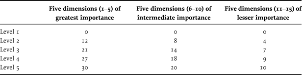
After some consolidation – including the elimination of overlap and of dimensions not deemed important by most of our informants – we went back to our eighteen sites for the second round of research with a list of twenty-five candidate dimensions in order to discuss with them which of these dimensions should finally be selected for the IDM, how gradations in each of these dimensions should be defined, and what weights should be assigned to the dimensions and to the various levels within them. Some further consolidation resulted from these discussions, and we ended up with a rather neat measure involving fifteen dimensions. Each of these dimensions features five levels ranging from a top level 5 of basic adequacy – not being deprived – to a bottom level 1 of being extremely deprived, with intermediate levels of being somewhat deprived, being deprived and being very deprived. Separately in each dimension, the five levels were given detailed specific definitions with the background idea that the gaps between levels would vary in importance, with the gap between levels 1 and 2 being of greatest importance (Weight 4), followed by the gaps between levels 2 and 3 (Weight 3), levels 3 and 4 (Weight 2) and levels 4 and 5 (Weight 1).
Using assessment of the full gap between levels 1 and 5 as a guide, the various dimensions were also assigned differential importance, with the five most important ones receiving a weight of 3, the next five a weight of 2 and the five least important ones a weight of 1. Combining intra- and interdimensional weighting, we thus ended up with the scheme of weighted scoring shown in Table 1.
IDM dimensions and increments
Adapted from Pogge and Wisor (Reference Pogge, Wisor, Adler and Fleurbaey2016, p. 664).
The IDM thus assigns each person a raw score from 0 to 300, where 0 means that the person is extremely deprived in all fifteen dimensions, while 300 means that the person achieves basic adequacy in all fifteen dimensions and is not deprived in any.
Table 2 shows the fifteen dimensions that emerged from the second round.
The fifteen dimensions of the IDM
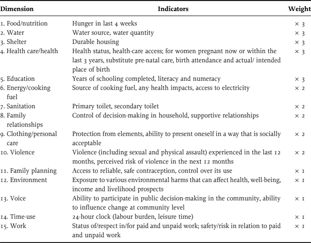
Adapted from Pogge and Wisor (Reference Pogge, Wisor, Adler and Fleurbaey2016, p. 664).
There is no denying that the selection and specification of dimensions and levels as well as the assignment of inter- and intra-dimensional weights might have turned out somewhat differently if we had worked with different participants perhaps at different sites or in different countries.Footnote 19 Despite these unavoidable contingencies in our procedure, the resulting measure for monitoring deprivation is a vast improvement over the dominant World Bank method. I have already given some support for this judgment by sketching some serious flaws of the World Bank method and by motivating the six central features of the IDM. Let me stress two further advantages in addition.
While the World Bank's method can inform policy-makers and NGOs about which households and larger groups (defined e.g. by geography, ethnicity, religion, household composition or political affiliation) are especially vulnerable to deprivation, the IDM can convey a much more nuanced picture that reveals in detail which deprivations specific individuals and groups are exposed to and to what extent. The IDM is therefore much more useful as a guide for remedial action: for finding and then removing or counteracting special causes of vulnerability, and for designing and providing targeted support. The whole point of all the monitoring, after all, is to help us build a world free of poverty just as soon as we can.
It may seem obvious that the price of a more nuanced picture is that the data collection must be more time-consuming and expensive. In fact, the opposite is true. To accurately assess a household's consumption expenditure, the World Bank must conduct an extensive survey to develop a detailed accounting of the flow of goods and services this household consumes, including commodities purchased as well as goods and services received by gift or barter. The bank must distinguish a large variety of different goods and services, differentiated by kind and quality, trying to determine for each an appropriate recall period that yields the most accurate representation of the consumption flow.Footnote 20 All this makes the World Bank's household surveys very complex and time-consuming. By contrast, trying the IDM in the Philippines with 1,806 respondents, we found the average survey time to be forty-five minutes per respondent – an acceptable demand on their time even when two or more adults must be separately interviewed in a given household (for further discussion of the procedure and results, see Pogge and Wisor (Reference Pogge, Wisor, Adler and Fleurbaey2016, pp. 667–671)). In short, the IDM is less costly to administer in terms of time and money, while also yielding vastly more useful data than the World Bank exercise. IDM data convey the sometimes starkly disparate situations of different members of the same household, and they also provide a rich and nuanced picture of the respects in which, and degrees to which, specific individuals and social groups are deprived.
A useful next step would be, in collaboration with the World Bank, to run a dual survey in a few select locations: administering both surveys to the same households in a few diverse locations and then subjecting the survey costs and resulting data to a detailed comparative analysis. I am hopeful that such a dual survey can be conducted in the near future.
VI. Comparing the IDM to the Human Development Index (HDI) and Multidimensional Poverty Index (MPI)
Preceding the IDM, there have been two other prominent efforts to complement the World Bank's method of tracking progress against poverty. Both of these were loosely inspired by Amartya Sen's capability approach. As our work on the IDM is indebted to these earlier efforts, it is worth explaining briefly how the IDM seeks to improve upon them.
The HDI was introduced by Mahbub ul Haq in 1990 and has since been used in the annual Human Development Reports published by the UN Development Agency (UNDP). Its main innovation is to abandon the World Bank's exclusive focus on the monetary value of consumption by proposing a three-dimensional metric that takes account also of health and education. The HDI was slightly revised in 2010, and I will here present this later version.Footnote 21
The HDI of a population, typically of a country, is calculated as the geometric mean of three components, each normalised to a scale of 0–1. These components are the population's life expectancy at birth (L), its education measured in terms of years of schooling (E) and its gross national income per capita (P). Each country (C) receives a score between 0 and 1 in each of these dimensions, and its overall HDI score is then the geometric mean of these three scores – that is, the cube root of their product, in a simple equation:
 $${\rm HDI}_{\rm C} = (L_{C} \, ^{\ast} E_{C} \, ^{\ast} P_{C}){\,}^ \wedge \,{(1/3)}.$$
While the HDI is an advance by looking beyond the monetary value of consumption, it is also a step backward by being distribution-insensitive in all three of its dimensions. Thus, two countries with the same gross national income per capita – Hungary and Equatorial Guinea, say – earn the same P-score even though severe monetary poverty is suffered by only a few in Hungary and by a large majority in Equatorial Guinea (whose oil wealth is appropriated by a small elite). When the objective is to monitor development or the reduction of poverty, then it is evidently highly implausible to ignore how income is distributed and, in particular, what shares of a population's income are flowing to its poorest percentiles. It is similarly implausible to assign the same L-score to countries with the same overall life expectancy, thereby ignoring how life expectancy is distributed over social classes, for instance, or ethnic groups. Two countries may have the same national life expectancy even while they differ dramatically in regard to the life expectancy in the poorest quarter of their respective populations.Footnote 22 And the same problem recurs for education, where once again the average may or may not hide large discrepancies in how many years of schooling are available to the most disadvantaged segments of the population.Footnote 23
The MPI has been developed by Sabina Alkire and James Foster. It uses the same three equally weighted dimensions as the HDI but then correctly reverses the order of aggregation. Instead of aggregating first within each dimension and then across dimensions, the MPI aggregates first across dimensions within a single household and then across households. This order of aggregation is required to identify the households that are most disadvantaged overall and therefore ought to be of greatest concern from the standpoint of development or deprivation avoidance.
The MPI draws on a richer informational base than the HDI insofar as it focuses on individual households and includes a wider set of subdimensions. Yet it also contracts the informational base by distinguishing, within each subdimension, only two states: any household is either deprived or not deprived in that dimension. In the health dimension, the MPI replaces life expectancy with two equally weighted subdimensions: child mortality (a/no child within the household has died) and undernourishment (a/no household member is undernourished).Footnote 24 In the education dimension, the MPI features two equally weighted subdimensions: years of schooling (a/no household member has completed five years of schooling) and child enrolment (a/no school-aged child is out of school in Years 1 to 8). In the consumption dimension, the MPI features six equally weighted subdimensions: electricity (the household has/lacks electricity), drinking water (the household has/lacks access to clean drinking water within a thirty-minute radius), sanitation (the household has/lacks its own improved sanitation), flooring (the household is deprived just in case its floor consists of dirt, sand or dung), cooking fuel (the household is deprived just in case it has only wood, charcoal or dung to cook with), assets (the household is deprived just in case it owns no more than one of: radio, TV, telephone, bicycle, motorbike, car or tractor).
Once a household has been assessed, in a binary way, in each of these ten subdimensions, the information gathered is further contracted into one single binary assessment: if the household is deprived in more than five out of eighteen of the weighted subdimensions, then it is deprived overall. If it is deprived in fewer than six out of eighteen of the weighted subdimensions, then it is not deprived overall.Footnote 25
This double reduction to binary scores within each dimension and across dimensions discards much useful information about the depth of poverty and then gives rise to implausible comparative judgments: a household that is just barely deprived in six out of eighteen of the weighted subdimensions counts as deprived overall, while a household severely deprived in five out of eighteen of the weighted subdimensions counts as not deprived.
The IDM consciously avoids the problems of the HDI and the MPI. It looks at individuals rather than households and takes account of the depth of deprivation a person suffers in each of its fifteen dimensions. It therefore produces a far more plausible ranking of individuals as well as a rich and nuanced reflection of what the unmet needs of each person are. Additional to these advantages in content legitimacy, the IDM also has unique process legitimacy by being based on extensive interactions with poor people who, after all, have most closely experienced poverty and also the most at stake in how poverty is understood, measured and fought.
VII. Conclusion
Let us conclude by circling back to the opening thoughts about the role of deprivation monitoring. I have argued that the World Bank, affiliated governments and the Gates couple make illegitimate use of the World Bank's poverty indicator by using it to paint an overly rosy picture of heroic effort and achievement. By defining poverty in terms of a rigid threshold,Footnote 26 the bank makes all but certain that a growing global average income will result in reported progress against poverty. The IDM, by contrast, is non-rigid in two ways. It includes context relativity in some of its dimensions – for example in the ninth (being able to dress in a socially acceptable way), in the thirteenth (being able to influence change at the community level) and in the fifteenth (doing work that is socially respected). Moreover, the IDM invites adjustment of many of the dimension-specific definitions of levels as a society becomes more affluent. Thus, what counts as basically adequate from the perspective of the poorest in the dimensions of food, housing, health care, education and sanitation is likely to shift upward with development and is likely to be more minimal in very poor countries like Malawi and Niger than in less poor ones like Ghana, Nicaragua and the Philippines, where it may be appropriate to define levels in somewhat less frugal terms.
Although the IDM is context-relative in these two ways, it is not a relative measure like one that would single out as deprived the most disadvantaged quarter of a national population, say. It is entirely possible to conceive – and to achieve – a society and even a future planet Earth in which all human beings attain basic adequacy in all IDM dimensions. This would truly be a world without poverty – a world leaving no one behind. The World Bank, by contrast, uses these same celebrated phrases to aspire to a world in which no more than 3 per cent of all human beings – 255 million in the year 2030 – live in households below its international poverty line.Footnote 27
We see here once more how the dominant approach to poverty – exemplified by the World Bank and the MDGs/SDGs – is antagonistic to understanding freedom from poverty as a human right. This dominant approach thinks in terms of aggregates: if 97 per cent of humanity have escaped extreme poverty, we can ignore the 3 per cent who have not. And the dominant approach thinks in terms of progressive realisation: so long as the percentage below some rigid poverty line is shrinking, we can take pride in an improving world.
From a human rights perspective, both these attitudes are questionable. One single human being avoidably living in deprivation is morally unacceptable – the commitment to leaving no one behind is taken literally. Our goal must be that all human beings reach freedom from severe deprivation just as soon as possible. Taking this imperative seriously, our assessment of ourselves and the comparison of ourselves with earlier generations take account not merely of the state of the world's poor, but also of our own capacities. While there may well be less severe poverty today than there was in 1990 or 1960, what severe poverty persists is far more easily avoidable than in earlier times – as suggested by the fact that, at official exchange rates, the poorer half of humanity has today only 0.17 per cent of global private wealthFootnote 28 and 4.4 per cent of global incomeFootnote 29 – and therefore morally more problematic.


