


1. Introduction and background
Product attributes serve as the fundamental building blocks of design, encompassing the specific features that define an object and dictate user perception, affective response, and purchase decision. Understanding how users perceive and respond to product attributes is therefore a central concern in both design research and practice (Reference Benaissa and KobayashiBenaissa & Kobayashi, 2023). Traditionally, product attributes have been described in terms of aesthetic qualities (such as colour, shape, and texture), functionality (the effectiveness with which a product fulfils its intended purpose), and symbolism (the values or associations it conveys to users) (Reference EisenmanEisenman, 2013; Reference Homburg, Schwemmle and KuehnlHomburg et al., 2015). Additional categories include structural attributes (the arrangement or composition of components), parameters (e.g., size, weight), and quality-related features (such as durability or performance) (Reference Zhang, Chen, Xie, Jiang, Zhou and SunZhang et al., 2024). Crucially, the impact of product attributes on users’ perception is not merely cumulative; they interact to produce effects beyond their individual roles (Reference Crilly, Moultrie and ClarksonCrilly et al., 2004). Successful design thus requires a nuanced understanding of how these attributes combine to guide user experience and user interpretation of products (Reference Homburg, Schwemmle and KuehnlHomburg et al., 2015).
The interpretation of product attributes is closely linked to the concept of affordances, which serve as the bridge between a product’s physical design and its intended use (Reference Sareh and LoudonSareh & Loudon, 2024). When affordances are strong—meaning that physical features and symbols clearly communicate possible actions—user behaviour is guided intuitively and without confusion (Reference You and ChenYou & Chen, 2007; Reference Breitschaft and CarbonBreitschaft & Carbon, 2021). This clarity aligns with consumer expectations and contributes positively to the perceived quality of the product (Reference El Amri and AkroutEl Amri & Akrout, 2020). Conversely, when design elements lack clarity, morphological ambiguity arises. While such ambiguity may sometimes spark curiosity and brand excitement (Reference SchnurrSchnurr, 2017), it can just as easily lead to cognitive challenges, particularly for users who are less comfortable with uncertainty (Reference Lee and SukLee & Suk, 2010; Reference Van Rompay, Pruyn and TiekeVan Rompay et al., 2009). Central to this interpretative process is the notion of “semantic completion”—the extent to which a product’s visual and material cues successfully convey the meanings intended by the designer (Reference Khalaj and PedgleyKhalaj & Pedgley, 2014). Achieving semantic completion is crucial, as mismatches between intended and perceived meanings signal a failure in communication, diminishing both the product appeal and usability (Reference Crilly, Moultrie and ClarksonCrilly et al., 2004). This challenge is especially pronounced for innovative or creative products, which are often perceived as less intuitive; their acceptance relies heavily on users recognising clear benefits and emotional value (Reference Jeong and SelfJeong & Self, 2017).
However, these cognitive and emotional evaluations do not occur in a vacuum; rather, they are fundamentally shaped by the environment and circumstances in which the interaction takes place. This psychological complexity suggests that users interpret products through a broader context of use (Reference Berni and BorgianniBerni & Borgianni, 2021, Reference Berni and Borgianni2025), which encompasses attributes, sensory and social cues, emotional associations, and situational factors such as mood, familiarity, or prior experience (Reference Kim, Yoon and KimKim et al., 2019; Reference Millet, Abi Akle and LegardeurMillet et al., 2020; Reference Berni, Borgianni, Basso and CarbonBerni et al., 2023). Despite extensive research into product attributes, sensory cues, and the established importance of context in shaping user experience (Reference Harvey, Stanton, Pickering, McDonald and ZhengHarvey et al., 2011; Reference Van der Bijl-Brouwer and Van der VoortVan der Bijl-Brouwer & Van der Voort, 2014), a significant gap remains in understanding how users (mis)interpret contexts of use (Reference Hu, Casakin and GeorgievHu et al., 2023) based on product attributes. This aspect has important implications for the interpretation of product functions and benefits (Reference Xu, Wei, Wu and PanXu et al., 2023). When a product is introduced without a clearly defined situational frame, users must rely on its attributes to reconstruct its intended purpose. If these attributes are misinterpreted, the resulting contextual mismatch can lead to user frustration or product rejection.
Consequently, the primary objective of this research is to systematically examine both accurate and inaccurate user interpretations of product function. By focusing on identifying which specific features facilitate correct understanding versus those that cause confusion, this study aims to provide critical insights into product communication, ultimately supporting greater user acceptance of innovative designs.
2. Methodology
This study is part of a broader research work described in Reference Berni and BorgianniBerni and Borgianni (2025). Here, only the aspects directly pertinent to this investigation are presented. Participants in an experiment were shown three unfamiliar physical products and asked to determine their intended function and context of use. Open-ended responses were qualitatively analysed for interpretation patterns and misinterpretations. Details follow in the next subsections.
2.1. Sample of participants
Seventy-one volunteers aged 20 to 75 were recruited through word of mouth, flyers, and the authors’ networks. Materials, instructions, and consent forms were provided in English, Italian, or Spanish as preferred by each participant. No personal details possibly leading to participants’ identification were collected.
2.2. Materials
The three products to be evaluated are briefly described below and shown in Figure 1. The products were selected for their low familiarity, verified with a separate group (Reference Berni and BorgianniBerni & Borgianni, 2025), to reduce the influence of previous knowledge on context interpretation.
-
• Shoe hanger: a lightweight, moulded plastic hanger in light blue, designed for drying, airing, or organizing shoes. It features a double-hook top for hanging on rods or clotheslines, two inverted U-shaped loops that securely hold shoes by the heel, and a horizontal base for stability. The hanger elevates shoes for drying, allows them to air out, and keeps footwear organized off the floor or on a wardrobe shelf.
-
• Tube squeezer: manual device made from translucent blue plastic, featuring an oval shape and rounded edges. It has a central slot with two ribbed rollers for gripping and flattening tubes, which maximizes extraction and reduces waste, especially with toothpaste. The design includes a wide insertion point for easy tube feeding and a circular cutout for convenient hanging.
-
• Bottle stand: this product is made from a single piece of natural light-coloured wood, such as oak, featuring smooth finish. It consists of a prismatic block with flat surfaces and a drilled hole close to a short edge. Using a counterweight principle, it balances a standard wine bottle at an upward angle when the neck is inserted, creating a striking, gravity-defying effect.
The three unfamiliar products used in the study

2.3. Task and data collection
Data was collected through open-ended questions asking participants to identify each product’s function and context of use. The questions read as follows:
“Identify the product’s function and write it in the adjacent cell (even if you think you do not know it)” —function detection—. “Write the context where the products can be used (even if you think you do not know it)” —context detection— Responses were entered directly into a bespoke spreadsheet file, ensuring anonymity. Participants examined each product individually and answered both questions before moving on to the next item. The study concluded after all three products were evaluated. In a few cases, answers were skipped by participants.
3. Analysis and results
For each product, around 70 responses about context of use were given and further analysed. In some instances, participants described a product’s function when asked about context, and vice versa, so both types of answers were used to assess the correctness of the context of use, as described in Section 3.1.
3.1. Data categories and classification
Two researchers independently performed an initial coding of all responses. Discrepancies were discussed and resolved through consensus. Although this approach improves consistency, no quantitative inter-rater reliability metric (e.g., Cohen’s K) was collected. The answers were classified in terms of categories of context and focus. This led to the definition of macro-categories (General Context of Use) and corresponding subcategories (Specific Environment/Contextualization). The formulated categories and subcategories are listed and described in Table 1. Since the authors did not identify a standard and suitable list of contexts in the literature, bespoke categories and classifications were developed. Furthermore, responses not classified as “uncertain” were classified by their focus elements as follows:
-
• Place: Explicitly mentions a specific or general place/environment.
-
• Function: Mostly describes how the product works.
-
• Situation: Mentions environment, function, and other details referring to a certain situation (e.g., with kids).
-
• Guess: includes question marks or expressions of doubt (e.g., “maybe,” “probably”).
Categorization criteria for both the macro categorization “general context of use” and “specific environment/contextualization”

3.2. Data analysis
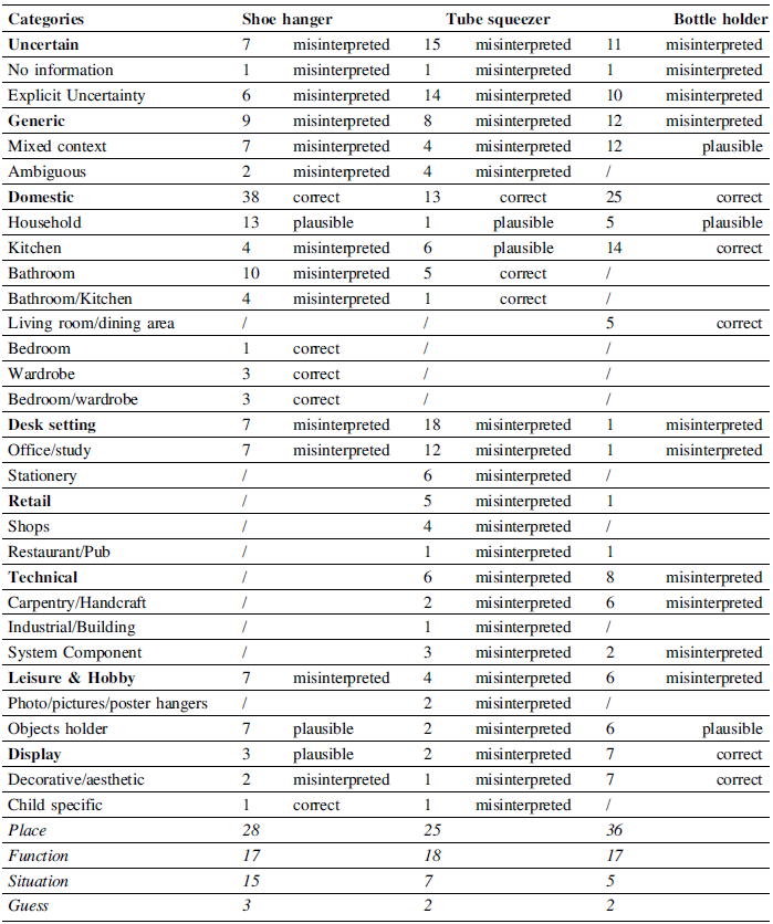
Responses were evaluated for contextual accuracy —whether correct, overly general, or misinterpreted— using the categories and sub-categories shown in Table 2. Both the main categories (in bold) and sub-categories were assessed, along with their descriptive focus. Table 2 also shows the number of responses for each category and sub-category, along with the corresponding correctness of contexts derived from the classification.
Participants’ interpretations of the context of the three analyzed products across different categories

The results reveal how visual cues, material semantics, and contextual imagination interact in product understanding. Across the three products, participants’ interpretations reveal distinct patterns in contextual reasoning, semantic precision, visual and cognitive associations and focus of description.
3.2.1. Shoe hanger
The shoe hanger was most accurately identified in domestic contexts, with 38 correct mentions (household (13), bathroom (10), wardrobe/bedroom (7)), likely thanks to its double-hook shape suggesting hanging functions. Some participants, however, were misled by its simple design and colour, leading to uncertain (7) or generic (9) guesses, as well as associations with desks (7) and hobbies (7). Descriptions focused primarily on place (28), then function (17) and situation (15), showing that visual cues—especially form and colour—play a key role in contextual recognition.
-
• Contextual reasoning: The correct context interpretation arose when participants demonstrated lexical specificity by precisely identifying the object as a “shoe hanger” and associating its function—hanging—with the appropriate item (shoes) and location (bedroom/wardrobe). In contrast, in the wrong context interpretation, participants interpreted the hooked shape as resembling familiar objects like cup holders or soap/sponge racks, leading them to map the item onto bathroom or kitchen scenarios instead. When uncertain, participants tended to use more generic terms such as “object” or “support” and neutral verbs like “hang” or “support/hold,” indicating only a partial understanding of the product’s intended use.
-
• Semantic precision: Participants who correctly identified the shoe hanger tended to use a combination of object, function, and place in their descriptions, effectively linking the item’s form to its intended purpose and location. In contrast, incorrect interpretations were often anchored spatially—such as placing the object in a bathroom—or relied solely on describing its function with generic verbs. These misinterpretations largely resulted from form-based reasoning, where the double-hook structure prompted associations with familiar non-footwear hanging tools rather than its actual use.
-
• Visual and Cognitive Associations: Table 3 shows that the shoe hanger’s visual features—such as double hooks and symmetry—prompted part of participants to associate it an “hanging” action, correctly situating it in domestic spaces like bedroom and/or wardrobes. However, its light blue plastic material led many participants to link it with cleanliness and water, resulting in mistaken placement in bathrooms or kitchens. Curved bars were interpreted as stands or supports, further causing misidentification as a desk accessory. These patterns demonstrate how form and colour cues influence users’ assumptions, driving both accurate and incorrect contextual understandings by projecting functions based on visible affordances and material cues.
Interpretation mechanism of the shoe hanger: functional projection based on physical affordance, moderated by colour-induced domestic contextualization

3.2.2. Tube squeezer
The tube squeezer led to the most misinterpretations, with high numbers in uncertain (15) and desk setting (18) categories, and only a few correct domestic references (13)—including kitchen (6) and bathroom (5). Many placed it in office/study (12) and stationery (6) contexts, likely due to its compact, symmetrical, plastic design resembling office tools. Appearance-based analogies influenced these errors. Participants focused slightly more on “function” (18) than “place” (25) or “situation” (7), showing a tendency for mechanical rather than contextual reasoning.
-
• Contextual reasoning: Participants frequently misinterpreted the object as a desk or office tool due to its horizontal slit and flat design, which reminded them of paper dispensers, tape holders, or card cutters. Others associated its symmetrical, rigid plastic construction with mechanical clamps, categorizing it as a technical tool. However, those who correctly identified its purpose described actions such as squeezing, pushing, or releasing contents, and referenced items like toothpaste or tubes.
-
• Semantic Precision: Many errors in interpretation stemmed from participants making analogies based on the tube squeezer’s physical form—specifically, the presence of a slot led them to associate it with “cutting” or “dispensing” functions, similar to office tools like paper cutters or dispensers. In contrast, those who correctly identified its purpose relied on reasoning about material affordance, recognizing that the object is designed to act upon a soft, tubular container such as a toothpaste tube.
-
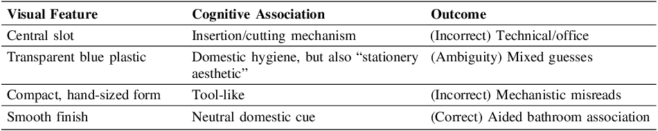
• Visual and Cognitive Associations: The interpretation of the tube squeezer was shaped by various visual features that triggered specific cognitive associations, leading to both correct and incorrect outcomes (Table 4). The tube squeezer design—featuring a central slot and transparent blue plastic—led many participants to misinterpret it as an office or technical tool, reminiscent of paper dispensers or mechanical clamps. Its compact, hand-sized shape reinforced this confusion, encouraging interpretations of desk or stationery use. While the smooth finish and translucency offered a subtle domestic cue, the overall ambiguity of its appearance, especially when not paired with a toothpaste tube, resulted in overgeneralisation of its possible functions. These visual features triggered both accurate and inaccurate associations, making it difficult for users to identify the object’s intended purpose.
Interpretation mechanism of the tube squeezer: affordance overgeneralization due to ambiguous form lacking reference to its paired object (the tube)

3.2.3. Bottle stand
The bottle holder received largely correct interpretations, with correct domestic associations (25) mainly in kitchen (14) and living/dining areas (5), matching its intended display or dining role. There were also uncertain (11), general (12), technical (8), and leisure & hobby (6) responses, reflecting that its minimal wooden design and lack of clear functional features led many to see it as a decorative item. All display category responses (7) were correct, showing that participants understood its aesthetic purpose, even if the exact function was unclear. Most focused on “place” (36), followed by “function” (17) and “situation” (5), highlighting a reliance on material and environment over ergonomic cues.
-
• Contextual reasoning: Most participants classified the object as a decorative bottle holder, tabletop accessory, or wine display piece. However, a few participants misidentified it as workshop instruments such as a woodworking base or calibrator, likely due to its geometric simplicity. Additionally, there were several uncertain responses, where participants described it as a “support for objects” or “base for something”, thereby acknowledging its structural function as a stand without specifying its intended application.
-
• Semantic precision: Correct identifications typically connected the use of wood as a material with familiar domestic and decorative contexts, such as dining or home décor, reflecting an understanding of the object as both functional and aesthetically pleasing. In contrast, incorrect interpretations were largely influenced by the geometric aspects of the design, such as the presence of a hole or an unconventional angled base, leading to misclassify the item as a technical tool or a component rather than a display accessory. This suggests that material cues effectively guided participants toward the intended domestic association, while ambiguous geometric features sometimes prompted technical misreadings.
-
• Visual and Cognitive Associations: Participants’ interpretations of the bottle holder were shaped by a series of visual and cognitive associations (Table 5). The natural wood and visible grain made people think of home décor and crafts, helping them correctly identify the item as a decorative display for the home. The circular hole present in the design prompted participants to consider that something was meant to be inserted, creating ambiguity between viewing the object as a holder or as a technical tool. The simple shape suggested it might be a support, which caused a few to misinterpret it as a technical device. The warm colour also supported its decorative use. In summary, most recognised its decorative purpose thanks to its material and appearance, though its shape led to some misunderstandings.
Interpretation mechanism of the bottle stand: material semantics and aesthetic familiarity facilitated correct identification; abstraction led to mechanical misreads

3.2.4. Cross-product comparison and focus of description
Across all three products, appearance and material semantics played a decisive role in context identification. The shoe hanger, with its explicit hooks and domestic plastic form, was recognized correctly thanks to strong ergonomic and typological cues. The tube squeezer, conversely, suffered from perceptual ambiguity due to its symmetry, colour, and lack of scale cues, leading to misattribution to office or technical contexts. The interpretation of the bottle holder was partially successful; participants sensed its decorative and domestic relevance, but its abstract, minimalist form fostered aesthetic rather than functional associations. The data further reveal cognitive strategies in interpretation:
-
• “Place” dominated across all products, showing that participants grounded their reasoning spatially.
-
• “Function” appeared stronger in ambiguous cases (tube squeezer, bottle holder), where participants compensated for contextual uncertainty by speculating about use.
-
• “Situation” and “Guess” were low in general, confirming that participants preferred object-based inference over imaginative scenarios when cues were weak.
4. Discussion
The findings suggest that people interpret unfamiliar objects through a combination of visual analogy, material symbolism, and semantic completion, where the contextual and functional interpretation depends on the clear convergence of these cues. Interpretation was consistently guided by an object’s form and perceived affordance, even when this information was incomplete or misleading. The Shoe hanger demonstrated the power of a single, strong affordance cue. Its double-hook shape clearly suggested “hanging”, leading to a large share of correct domestic classifications. However, the absence of object-specificity (i.e., no shoe-related cues) and the semantic signal of the light blue plastic as hygiene/water, caused interpretations to drift from the intended wardrobe function to generic bathroom or kitchen use. This pattern illustrates that while strong yet generic affordances may prompt broad and sometimes inaccurate classifications, the absence of specific semantic cues can exacerbate this effect. Such observations are consistent with the literature, which emphasises the importance of affordance specificity in guiding user interpretation (Reference Sareh and LoudonSareh & Loudon, 2024). In contrast, the Tube squeezer presented a case of morphological ambiguity; its flat, slotted design failed to provide distinct ergonomic or contextual signals, resulting in the highest rate of misclassification. This finding aligns with previous research on form ambiguity and the challenges it poses to correct contextual identification (Reference Crilly, Moultrie and ClarksonCrilly et al., 2004). Participants tended to rely on shape analogy, associating the central slot with mechanical or dispensing functions commonly found in office or technical settings, rather than recognising it as a domestic object—a tendency noted in studies on analogical reasoning and misattribution (Reference You and ChenYou & Chen, 2007; Reference Breitschaft and CarbonBreitschaft & Carbon, 2021). Accurate identification was only achieved through semantic completion, where participants actively combined a specific action verb (such as “to squeeze”) with the operated material (for example, “toothpaste” or “tube”), a cognitive strategy similarly described in the literature (Reference Crilly, Moultrie and ClarksonCrilly et al., 2004). Material and aesthetic qualities served as strong environmental anchors, with the Bottle stand’s wooden texture and warm colour providing clear decorative signals that led to accurate identification. These features activated strong material semantics associated with décor, craftsmanship, and furniture, providing clear aesthetic cues. Consequently, aesthetic signals helped participants accurately identify the Bottle Stand’s domestic/display context, but misinterpretation occurred when geometric features (the hole and the angle of the base) were emphasised over material cues. This demonstrates that emotional resonance and material symbolism often guide recognition more than analytical reasoning. Overall, the findings largely confirm existing literature, underscoring the importance of affordance, clear form, and semantic cues in how users interpret unfamiliar products.
5. Conclusions
This research explored the relationship between the interpretation of the context of use and users’ understanding of unfamiliar products, thus highlighting possible causes of designer-user mismatch. Markedly, the main aim was to examine how design attributes affect users’ perceptions of a product’s intended context of use. Ultimately, it considered whether these user perceptions help reduce or increase mismatches, depending on how accurately the products are interpreted.
From a methodological point of view, the authors assessed participants’ (n=71) ability to determine the context of use for three unfamiliar products, each distinguished by a unique blend of aesthetic, functional, and structural attributes. Data was categorized using a three-level structure (general context, environment, and response focus—place/situation/function/guess). The results revealed both accurate and inaccurate context interpretations of the three products, shedding light on key cognitive mechanisms that drive user interpretation when explicit external contextual cues are absent.
-
1. Contextual Alignment is Key to Acceptance: Classification accuracy is a direct function of the alignment between form affordance, material semantics, and contextual imagination. Correct contextualization emerges when the product’s visual, material, and functional signals converge clearly, allowing participants to simultaneously perceive where, how, and with what an object acts. Design efforts should be directed towards an alignment and harmonization between visual, material and functional signals, prioritizing contextual alignment. Designers must ensure that no single feature contradicts the intended use environment.
-
2. Material and Colour as Environmental Anchors: The study highlights the powerful role of material symbolism and colour association as contextual cues. Designers should strategically leverage material symbolism and colour association to tactically guide user interpretation. For instance, the Tube Squeezer’s plastic and the Bottle Stand’s wood successfully directed users toward contrasting technical/hygiene versus aesthetic/domestic schemas, respectively. Material selection is therefore a crucial step in defining the product’s environmental narrative.
-
3. Mitigating Analogical Misinterpretation: Misinterpretation arises from partial cue activation and analogical reasoning, where users default to projecting familiar schemes onto ambiguous forms. This mechanism directly causes the user-designer mismatch for unfamiliar products. Thus, to prevent semantic drift and cross-domain misinterpretation, designers must avoid forms that trigger strong, incorrect analogies (e.g., the slotted form of the Tube Squeezer resembling an office dispenser). Furthermore, when presenting products without explicit context, designers must ensure object-specificity is integrated into the form itself, preventing users from defaulting to generic terms like “support” or “holder.”
In summary, product evaluation is a complex cognitive process. Users perceive products not only through their appearance, function, and structure, but also by interpreting contextual information and drawing upon prior knowledge.
This study has several limitations that should be acknowledged. First, the number and type of products included were limited to simple, single-component items without moving or assembled parts. As a result, the findings may not generalize to more complex products. Second, all objects were presented in isolation and without contextual cues. While this provided greater experimental control, it may have reduced ecological validity, since products in real-world settings are usually accompanied by supporting cues or placed in familiar environments. Third, the classification framework used in this study was created specifically for this research and carries a degree of subjectivity. Although the authors reached consensus during classification, no formal measurement of inter-rater reliability (e.g., Cohen’s K) was conducted—an important methodological aspect that future research should address.
Future research should address these limitations by extending the investigation to more complex, multi-component, or dynamic products that may elicit different user responses. Studies could also incorporate contextual cues or related objects to better reflect real-world conditions and enhance ecological validity. Additionally, exploring practical strategies—such as visual aids, icons, simple instructions, or variations in material texture and appearance—may clarify how design elements guide user interpretation. Finally, developing more objective classification frameworks could improve the reliability and generalisability of future findings. Overall, these findings highlight the importance of clear design and communication strategies that enhance users’ comprehension of products. Ensuring that visual, material, and functional cues operate cohesively can help users intuitively recognise a product’s purpose, thereby minimising confusion and increasing acceptance of novel or unconventional designs.





 Open access