


1. Introduction
Over the second half of the last century, the Antarctic Peninsula (AP) has witnessed pronounced regional warming (2.5–3 K) (Vaughan and others, Reference Vaughan2003; Turner and others, Reference Turner2005), which is one of the largest warming rates on earth (Oliva and others, Reference Oliva2017; Costi and others, Reference Costi2018). Since 1999, several studies indicate that regional cooling (−0.47 K decade−1) has occurred on the AP (Turner and others, Reference Turner2016; Oliva and others, Reference Oliva2017). As a consequence, the regional cooling trend has impacted on the natural systems of the AP, including (1) decreases in summer snowmelt and meltwater production (van Wessem and others, Reference van Wessem2015; Bevan and others, Reference Bevan2018; Datta and others, Reference Datta2018; Zheng and others, Reference Zheng, Zhou and Liang2019), (2) decelerating recession of glaciers (Oliva and others, Reference Oliva2017), (3) thinning of permafrost active layer (Hrbáček and others, Reference Hrbáček, Láska and Engel2016; Sancho and others, Reference Sancho2017) and (4) reduction in sea-level contribution by peripheral glaciers (Hock and others, Reference Hock, de Woul, Radić and Dyurgerov2009; Gardner and others, Reference Gardner2013; Oliva and others, Reference Oliva2017). However, the long-term trend of surface-air temperature of the AP for more than 60 years is one of warming (Bromwich and Nicolas, Reference Bromwich and Nicolas2014). Argentina's Esperanza research station, on the very northern tip of the AP, reached a record high surface-air temperature of 18.3°C in 2020 (Dwyer, Reference Dwyer2020). Moreover, enhanced winter snowmelt has endangered the ice shelves on the AP (Zheng and others, Reference Zheng, Zhou and Wang2020). With the background of changing climate, little is known concerning the changes in the higher parts of glacial systems over the past two decades.
The evolution of glacial zones is closely related to the variations in climatic variables. Glacial zones primarily comprise the dry-snow zone (DSZ), frozen percolation zone, wet-snow zone and bare ice zone (Benson, Reference Benson1961; Paterson, Reference Paterson1994). The DSZ is restricted to the uppermost part of glaciers and does not melt for a whole year (Rau and others, Reference Rau, Braun, Friedrich, Weber and Goßmann2000b; Arigony-Neto and others, Reference Arigony-Neto2009; Huang and others, Reference Huang, Li, Tian, Chen and Zhou2013). Subjected to freeze–thaw cycles, the frozen percolation zone skirting the DSZ is characterised by large grain sizes and numerous subsurface ice bodies (Rau and others, Reference Rau, Braun, Friedrich, Weber and Goßmann2000b). In the wet-snow zone, melt events lead to the increase of liquid water content in the snowpack. The bare ice zone is situated on the lowest areas of glaciers where the entire annual accumulation of snow melts, exposing bare ice at the surface (Huang and others, Reference Huang, Li, Tian, Chen and Zhou2013). The lower boundary of the DSZ is referred to as the dry-snow line (DSL), which is the upper bound of the summer snowmelt and separates the DSZ and the frozen percolation zone. The DSL in the high parts of glacial systems can be an indicator of climate change due to its high sensitivity to local and regional climatic variables (Rau and others, Reference Rau, Braun, Friedrich, Weber and Goßmann2000b). In situ measurements are hampered by steep mountainous terrain and severe weather conditions, and remote-sensing data thus provide an impactful tool to monitor changes in high altitudes and latitudes with a variety of spatial and temporal resolutions. In polar regions, spaceborne synthetic aperture radar (SAR) is particularly helpful because of its advantage of insensitivity to solar illumination and atmospheric conditions. Several studies have demonstrated the suitability of SAR images for mapping glacier zones in glacial areas (Rau and others, Reference Rau, Braun, Friedrich, Weber and Goßmann2000b; Huang and others, Reference Huang2011; Zhou and Zheng, Reference Zhou and Zheng2017).
Radar backscatter from snow cover and glacier surfaces depend on the liquid water content, grain size, snow density, stratigraphy and surface roughness in SAR images (Benson, Reference Benson1961; Rau, Reference Rau2002). Due to the fine grain size and low liquid water content, even dry snowpacks with a thickness of several meters appear transparent in SAR images, and the high penetration depth and predominant volume scattering lead to the presence of dark signatures in the DSZ (low backscatter values) in SAR images (Ulaby and others, Reference Ulaby, Moore, Fung and Rasool1983; Rau and others, Reference Rau2000a). By comparison, snowpacks in the frozen percolation zone at the end of the summer, which are characterised by coarse grain and cluster sizes, abundant ice layers and pipes and high densities, show bright signatures (high backscatter values) in SAR images (Rau and others, Reference Rau, Braun, Friedrich, Weber and Goßmann2000b). The wet-snow zone presents dark signatures similar to DSZ because of the strong absorption of radar signals and scattering on smooth surfaces (Rau and others, Reference Rau, Braun, Friedrich, Weber and Goßmann2000b). Surface scattering in the bare ice zone causes relatively high backscatter values when compared with that of the wet-snow zone. Therefore, SAR images of glaciers show a typical sequence of alternating dark and bright signatures. The DSL can be extracted from SAR images on the basis of differences in glacial zones by using various methods, such as the thresholding method (Rau, Reference Rau2002), decision tree (Arigony-Neto and others, Reference Arigony-Neto2006; Zhou and Zheng, Reference Zhou and Zheng2017) and support vector machines (Huang and others, Reference Huang2011).
Quantitative analysis of dry-snow line altitude (DSLA) changes and the response of DSLA to climate change is important. The position of the DSL is generally stable, and only severe snowmelt caused by rising temperatures can shift it upward. Conversely, a downward shift indicates the continuous accumulation of fine snow without melting metamorphism (Rau and others, Reference Rau, Braun, Friedrich, Weber and Goßmann2000b; Rau, Reference Rau2002; Rau and Braun, Reference Rau and Braun2002). Accordingly, the change of the DSLA is a reflection of climate change at the high parts of glacial systems. Several studies have focused on the time series variations in the DSLA on the AP. Rau (Reference Rau2002) revealed the increase in the DSLA on the eastern AP between 65°S and 68°S during 1991–2000. Rau and Braun (Reference Rau and Braun2002) followed with interest the DSLA on the AP north of 70°S using ERS-1/2 SAR images between 1992 and 2000. Arigony-Neto and others (Reference Arigony-Neto2007) utilised a ‘centreline approach’ on the basis of ERS-1/2 SAR and Envisat ASAR data to explore the variations in the DSLA on the Detroit Plateau and Marguerite Bay of the AP. Arigony-Neto and others (Reference Arigony-Neto2009) subsequently investigated time series changes (1992–2005) in DSLA on the AP north of 70°S. However, these studies focused on regional changes in the DSLA (Rau, Reference Rau2002; Arigony-Neto and others, Reference Arigony-Neto2007) on the AP north of 70°S (Rau and Braun, Reference Rau and Braun2002; Arigony-Neto and others, Reference Arigony-Neto2009) but no information was provided on the AP south of 70°S. Although the ‘centreline approach’ method used in the time series analysis can simplify the detection of the DSL (Arigony-Neto and others, Reference Arigony-Neto2006, Reference Arigony-Neto2007, Reference Arigony-Neto2009), it fails to reflect the status of the whole glacier. The altitude of the change point on the axis of the glacier is sometimes inconsistent with the mean DSLA because the DSL is curved (Huang and others, Reference Huang, Li, Tian, Chen and Zhou2012). Furthermore, previous studies only qualitatively analysed the relationship between meteorological conditions and DSLA and research on quantitative relationships between them are limited.
Adequate remote-sensing and auxiliary data facilitate time series analyses of DSLA changes. We analysed spatiotemporal variations in the DSLA on the AP based on multisensor C-band SAR data (Envisat, RADARSAT-2 and Sentinel-1A/B) to monitor the response of DSLA to the shifting climate and fill the gaps in the study of DSLA changes from 2005 to 2020. Correlation analyses between climatic variables and the DSLA were conducted. The remainder of this paper is organised as follows. The study area and dataset are introduced in Section 2. Data processing and analytical methods are presented in Section 3. Annual changes and trends in the DSLA are given in Section 4, followed by a discussion in Section 5. Lastly, the conclusions of this study are drawn in Section 6.
2. Data set
2.1 SAR images
Time series of C-band SAR images from Envisat, RADARSAT-2 and Sentinel-1A/B covering the period of 2005–2020 were adopted in this study. SAR data consisting of 355 images of HH polarisation acquired in descending or ascending orbit (Table 1) were used to derive the DSL. SAR data for extracting DSL are best obtained after the ablation season to minimise the impact of ongoing snowmelt on DSL. Furthermore, to capture the continuous melt seasons to facilitate the correlation analyses between the climatic variables and DSLA, the majority of the SAR data used in this study were collected in early austral winter when snow accumulation has little effect on DSL. The period from May of the previous year to April of the next year was regarded as the balance year. The DSL derived from the SAR data reflects the condition of the whole balance year. Filenames of SAR data are listed in Table S1 of Supplementary Materials.
Specifications of SAR sensors used in this study

The main steps of data preprocessing conducted with the Sentinel Application Platform (SNAP) from the European Space Agency (ESA) include radiometric calibration, range-Doppler terrain correction, speckle filtering and SAR mosaicking. Radiometric calibration can provide images in which pixel values can be directly related to the radar backscatter of the scene. Terrain corrections were applied using the Reference Elevation Model of Antarctica digital surface model (REMA DSM) at a resolution of 200 m to compensate for the distortions caused by topographical variations and oblique satellite sensors. To reduce the speckle effect, a 7 × 7 Lee filter was applied. A cosine radiometric correction (Mladenova and others, Reference Mladenova, Jackson, Bindlish and Hensley2013; Topouzelis and Singha, Reference Topouzelis and Singha2016) was then used to compensate for σ⁰ range variations caused by the changing incidence angle with distance according to:

where ${\rm \sigma }_{{\rm nor}}^0$ is the normalised backscatter value, θ is the local incidence angle, ${\rm \sigma }_{\rm \theta }^ 0$
 represents the original backscatter value and θnor indicates the normalised angle, which was set to 30° in this study. Lastly, overlapping images were mosaicked as a composite image.
2.2 Regional atmospheric climate model
The regional atmospheric climate model RACMO2.3 combines the dynamics package of the High Resolution Limited Area Model (HIRLAM) (Undén and others, Reference Undén2002) with the physics package of the European Centre for Medium-range Weather Forecasts (ECMWF) Integrated Forecast System (IFS) (Ecmwf, 2009). The RACMO2.3p2 Antarctic Peninsula model (hereafter, ‘RACMO’) has a horizontal resolution of 5.5 km in terms of the surface mass balance (SMB) and its components (e.g. precipitation, snowmelt and sublimation) for 1979–2019 (van Wessem and others, Reference van Wessem2016, Reference van Wessem2018). We utilised the RACMO model to analyse the correlation between DSLA changes and simulated climatic variables on the AP from the balance year 2004/05 to 2018/19.
3. Methods
The DSZ can be distinguished from other zones due to the difference in backscattering characteristics and altitude. A thresholding method was adopted in this study to map the DSZ and extract the DSL. On the basis of the MEMLS3&a (an extension of the Microwave Emission Model of Layered Snowpacks) (Proksch and others, Reference Proksch2015), Zhou and Zheng (Reference Zhou and Zheng2017) simulated C-band σ⁰ changes in transitions from dry to wet snow regimes. When the incidence angle was set to 30° in the simulation, Zhou and Zheng (Reference Zhou and Zheng2017) found that σ⁰ of coarse-grained snowpacks increases above −6.5 dB rapidly while maintaining it below −6.5 dB in fine-grained snowpacks with the increase of the snow depth. Fine- and coarse-grained snowpacks correspond to the frozen percolation zone and DSZ after the ablation season, respectively, while changes in density only contribute to a minor degree of backscatter values (Rau and others, Reference Rau, Braun, Friedrich, Weber and Goßmann2000b). The frozen percolation zone that experiences melting events in summer leads to backscatter values increasing rapidly above −6.5 dB in winter, while σ⁰ remains below −6.5 dB in the DSZ. It is noteworthy that although accumulation of fine snow over areas of the frozen percolation can decrease backscatter values, it is not significant. Therefore, it is a reasonable threshold to differentiate between the frozen percolation zone (σ⁰ ≥ −6.5 dB) and DSZ (σ⁰ < −6.5 dB) after the ablation season when using C-band SAR images normalised to an incidence angle of 30°. Zhou and Zheng (Reference Zhou and Zheng2017) applied this threshold successfully and the DSZ detected by σ⁰ < −6.5 dB is consistent with on-melt areas derived from microwave radiometers.
Altitude is also an important condition for differentiating glacial zones. The DSZ is restricted to the uppermost part of glaciers and the DSL is considered coincident with the −11°C isotherm of the mean annual air temperature (Peel, Reference Peel and Morris1992), while the wet-snow zone is lower than the isotherm of −11°C. An altitude lower than 500 m is deemed to be bare ice (Rau, Reference Rau2002; Arigony-Neto and others, Reference Arigony-Neto2007).To distinguish the DSZ from the wet-snow zone and bare ice zone with analogous backscattering characteristics, altitude is thereby the other threshold considered for extracting DSL. Arigony-Neto and others (Reference Arigony-Neto2009) reported that the DSL occurs only above 1200 m (in areas north of 67.5°S) and 800 m (in areas between 67.5°S and 72°S) on the AP. Considering that surface air temperature decreases with increasing latitude, 800 m is no longer applicable to approximate the −11°C isotherm in areas south of 72°S, and 500 m is chosen as a suitable value. Consequently, a restraining threshold of 1200, 800 and 500 m was adopted in areas north of 67.5°S, between 67.5°S and 72°S and south of 72°S, respectively. Altitude information was derived from the REMA DSM at a resolution of 200 m (https://www.pgc.umn.edu/data/rema/) (Howat and others, Reference Howat, Porter, Smith, Noh and Morin2019). The flowchart for SAR image preprocessing, DSZ detection and DSL extraction is shown in Figure 1.
Flowchart for DSL extraction with SAR images.

Majority analysis can change spurious pixels to the class that the majority of the pixels in a n × n kernel has. To reduce misclassification, a majority analysis of 5 × 5 windows was conducted using Environment for Visualising Images (ENVI) after detecting the DSZ. Lastly, the DSL was extracted via the raster-to-vector operation.
Geometric and inherent distortions (e.g. layover and foreshortening) are severe in SAR images due to the complex topography of the AP. To reduce classification mistakes caused by geometric distortions, we chose glaciers with widths larger than 1000 m, analysed the part of glacial surfaces far from steep ridges instead of entire glacial surfaces. As shown in Figure 2, we limited the study area between glacier edge lines. In this way, the section where the lower boundary of the DSZ intersects two edge lines was considered the DSL of the glacier (Fig. 2c). The mean altitude of the DSL was treated as the DSLA of the glacier. The mean DSLA for different sectors divided by latitude was obtained by the width weighted average of the mean DSLA of all glaciers in the sector.
DSL detection of the Breitfuss Glacier (66.97°S, 64.87°W). (a) Subset of the Landsat Image Mosaic of Antarctica (LIMA; link: https://lima.usgs.gov/access.php) (Bindschadler and others, Reference Bindschadler2008). (b) Subset of the Sentinel-1B SAR images acquired on 2 May 2019. (c) DSZ classification. The blue line denotes the edge line of the glacier that flows from A to B. White and grey areas in (c) represent DSZ and other zones, respectively. The red line in (c) represents the DSL of the Breitfuss Glacier.

The total annual precipitation, snowmelt and SMB, calculated as the summation of the corresponding variable in a mass-balance year within a given sector, were analysed to assess changes of simulated climate. Precipitation and snowmelt anomalies were computed as the ratio of departures of total annual values to mean total annual values in a given sector from 2004/05 to 2018/19 and expressed as a percentage. All statistics based on RACMO were only in the Graham Land and Palmer Land on the AP, while the ice shelves were masked.
4. Results
4.1 Spatial extent of the DSL
The spatial extent of the DSZ on the AP (excluding Alexander Island) was identified (Fig. 3). The DSL derived from different SAR sensors indicates that the threshold method is suitable for mapping the DSL on the AP because it consistently demarcates dark areas (low backscatter values) in mountainous regions of the AP. Abnormal intense winter snowmelt was observed in 2015/2016 on the AP (Zheng and others, Reference Zheng, Zhou and Wang2020), and the adoption of an altitude threshold appropriately distinguishes DSZ and the wet-snow zone with analogous backscattering characteristics (Fig. 3b).
Mapping of the DSL. Spatial distribution of the DSL on the AP in the balance year of (a) 2017/18 derived from Sentinel-1 A/B, (b) 2015/16 from Sentinel-1 A/B, (c) 2006/07 from Envisat and (d) 2012/13 from Radarsat-2.

The glacier edge-line method was used to investigate 227 glaciers, with 104 glaciers located on the east side and 123 glaciers situated on the west side of the AP. The spatial distribution of the mean DSLA detected for the balance year 2017/18 is presented in Figure 4a. Mean values of DSLA on the west and east side are 1037 ± 324 and 929 ± 200 m, respectively. Moreover, on both sides of the AP, mean DSLA of each sector decreases from north to south due to the reduction in snowmelt as controlled by the decrease of temperature from low to high latitudes. A histogram of the mean DSLA distribution (Fig. 4b) shows that the mean DSLA on the east side of the AP is distributed at 800–1900 m, while the mean DSLA on the west side is distributed at 500–1900 m. Compared to those on the west side, more glaciers with DSLA higher than 1500 m are located on the east side. Furthermore, 81 out of 104 glaciers on the east side show a mean DSLA higher than 1200 m, while the mean DSLA of 92 out of 123 glaciers on the west side is between 1100 and 1600 m. The mean DSLA and distribution curves show that DSLA on the east side is generally higher than that on the west side.
Spatial distribution of mean values of DSLA. (a) Mean DSLA (in m) for different sectors divided by latitude on the AP for 2017/18. (b) Altitude histogram of glaciers in 2017/18. Red line in (a) shows the boundaries of the sectors used for analysis. Red and blue lines in (b) represent distribution curves of the west and east sides of the AP, respectively. Numbers in (b) indicate the number of glaciers for each range.

4.2 DSLA interannual variations
Interannual variations in the DSLA were identified on both sides of the AP from 2004/05 to 2019/20 (Figs 5, 6), and precipitation and snowmelt anomalies were computed in each sector from 2004/05 to 2018/19 (the sector north of 64°S refers to the region between 63.75°S and 64°S as the DSL in the areas north of 63.75°S is not present). Annual changes in DSLA show various regional patterns. On the east side of the AP, similar variations of DSLA in regions north of 69°S typically decreased from 2004/05 to 2010/11 (Figs 5a, c–e), increased and then decreased again to a local low in 2018/19, followed by an upward variation in 2019/20. DSLA in the south-eastern AP generally remained stable from 2004/05 to 2009/10 (Figs 5g, j–k), reached a minimum in 2010/11 or 2011/12 (Figs 5g–j) and then showed an increasing trend (Figs 5g–i).
Annual changes in the DSLA, precipitation anomalies and snowmelt anomalies in sectors along the east side of the AP. Numbers indicate the sample size of glaciers for each period. Error bars represent standard errors of the DSLA, which are calculated by dividing the std dev. by the sample size of glaciers.

Annual changes in the DSLA, precipitation anomalies and snowmelt anomalies in sectors along the west side of the AP. Numbers indicate the sample size of glaciers for each period. Error bars represent standard errors of the DSLA, which are calculated by dividing the std dev. by the sample size of glaciers.

DSLA is determined by snowmelt and precipitation. Severe snowmelt caused by rising temperatures can shift DSL upwards, whereas a downward shift indicates continuous accumulation of fine snow without the melting metamorphism (Rau and others, Reference Rau, Braun, Friedrich, Weber and Goßmann2000b; Rau, Reference Rau2002; Rau and Braun, Reference Rau and Braun2002). The DSLA in many sectors experienced increases relative to the previous year during the balance year of intense snowmelt in 2005/06 (Figs 5a, b, g–j). Additional details are provided when the annual snowmelt is mapped (Fig. S1). Although the total annual snowmelt in 2005/06 is higher than that in 2004/05, large-scale melting in 2004/05 even reached central plateaus of the AP (Fig. S1a). Large snowmelt anomalies in 2012/13 also caused some increasing events (Figs 5g–j). Moreover, the declining DSLA in 2010/11 can be attributed to positive precipitation anomalies (Figs 5a–b, d–g, i, j) without high positive snowmelt anomalies. Additional details are presented in Figure S2g, and nearly all sectors experienced an increase in precipitation in 2010/11.
DSLA remained steady between 64°S and 69°S (Figs 6b–f), while sectors south of 69°S showed a clear downward trend (Figs 6g–k) on the west side of the AP. The DSLA is high (Figs 6a–b) in balance years 2004/05 and 2005/06 when the snowmelt is intense (Figs S1a, b), and changes in DSLA were similar to those of snowmelt (Figs 6a–d, g–i). Similar to the east side, low DSLA in some sectors occurred in 2010/11 (Figs 6h–j). The DSLA showed a decreasing trend (Figs 6a–g, i–k) when melting decreases significantly from 2006/07 to 2007/08, and this pattern would have been more pronounced if it had been accompanied by an increase in precipitation. However, intense melting was accompanied by high precipitation anomalies in the balance year 2016/17, and changes in DSLA relative to the previous year were uncertain (Figs 6b–k).
The RACMO model between 2004/05 and 2018/19 indicates that the total annual snowmelt is relatively similar over both the west and east sides of the AP (Tables 2, 3). However, the total annual precipitation on the west side of the AP is significantly higher than that on the east side (Tables 2, 3). The total annual snowmelt shows negative trends in the grounded ice sheet of the AP, and precipitation exhibits positive trends in nearly all sectors on both sides (Tables 2, 3). DSLA manifests a downtrend in most sectors, especially in the southern part of AP (Tables 2, 3), due to the decreased snowmelt and increased precipitation. DSLA shows an increasing trend in these sectors at 64°S/65°S, 67°S/68°S and 68°S/69°S on the west side (Table 2) and 64°S/65°S and 67°S/68°S on the east side (Table 3). Among them, the DSL in sector 64°S/65°S on the west side of AP has experienced the most significant upward migration (Table 2).
Total annual precipitation, total annual snowmelt (in mm w.e. (snow water equivalent)) and changes in DSLA on the east side of the AP from 2004/05 to 2018/19
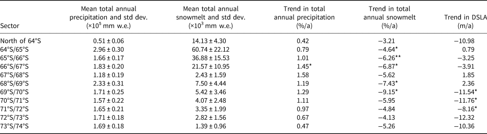
* and ** indicate the trend that is statistically significant at the 95 and 99% level, respectively.
Total annual precipitation, total annual snowmelt and changes in DSLA on the west side of the AP from 2004/05 to 2018/19

* and ** indicate the trend that is statistically significant at the 95 and 99% level, respectively.
4.3 Responses of DSLA to climate variables
Correlation analyses between simulated climatic variables and the DSLA were conducted (Figs 7, 8). The correlation between the total annual precipitation is insignificant while the logarithmic relationship between the total annual snowmelt and DSLA is fitted and the goodness of fit R 2 reaches 0.67 on the east side of the AP (Fig. 7). Similar to the east side, the logarithmic total annual snowmelt–DSLA relationship is fitted on the west side (Fig. 8a). The relationship between total annual precipitation and DSLA is complex (Fig. 8b). With the increase of total annual precipitation, DSLA shows a decreasing trend at the beginning, but when it reaches ~5 × 10⁵ mm w.e., DSLA begins to increase and then remains stable after the total annual precipitation is >10 × 10⁵ mm w.e. (Fig. 8b). The correlation analyses demonstrate that the DSLA responds to climate and can therefore be used as an indicator of climate change.
Relationship between DSLA and total annual snowmelt on the east side of the AP. The solid line denotes the fitting curve. R 2 indicates the goodness of fit.

Relationships between DSLA and (a) total annual snowmelt and (b) total annual precipitation on the west side of the AP. Solid line in (a) denotes the fitting curve. R 2 indicates the goodness of fit.

5. Discussion
5.1 Different DSLA patterns on the west and east sides
DSLA shows remarkable differences on both sides of the AP. The mean DSLA in nearly all sectors at the same latitude is higher on the east side (Fig. 4a), and more glaciers with DSLA higher than 1500 m are located on the east side when compared with those of the west side (Fig. 4b). This result is different from that found by Arigony-Neto and others (Reference Arigony-Neto2009), who concluded that the DSLA is higher on the west side because the temperature is lower on the east side at the same latitudes. However, the RACMO model between 2004/05 and 2018/19 indicated that the average snowmelt is relatively similar on both the west and east sides of the AP (Fig. S3a), but the average precipitation on the west side of the AP is significantly higher than the east side (Fig. S3b). Precipitation is over 3000 mm w.e. on the west coast and <500 mm w.e. on the east coast (van Wessem and others, Reference van Wessem2016). On the east side of the AP, the amount of snowmelt often exceeds the amount of precipitation (van Wessem and others, Reference van Wessem2016). The total annual SMB demonstrates that the net accumulation on the west side is much higher than that of the other side (Fig. 9), which supports our result.
Total annual precipitation, snowmelt and SMB on both sides of the AP in the balance year 2017/18.

Responses of DSLA to climate show different patterns on both sides of the AP. Snowmelt becomes the main factor that dominates DSLA variations on the east side where precipitation is low. Changes in DSLA on the east side between 64°S and 69°S are consistent with variability in snowmelt from 2013/14 to 2018/19 (Figs 5b–f). This logarithmic total annual snowmelt–DSLA relationship provides an important link between total annual snowmelt and DSLA. As the total annual snowmelt rises, DSLA rises rapidly, and then the rate of increase slows down because of the low temperature limitation at high altitudes. DSLA is more influenced by the combination of precipitation and snowmelt on the west side; hence, R 2 of the total annual snowmelt–DSLA fit on the west side is less than the east side. Interestingly, higher total annual precipitation does not lead to the lower DSLA. DSLA begins to rise when the total annual precipitation exceeds ~5 × 10⁵ mm w.e., which can be explained by the atmosphere being warm and wet in areas with increased precipitation (mainly in the northwestern region of AP) and therefore accompanied by increased snowmelt. Snowmelt plays an important role in changes of the DSLA, with precipitation not fluctuating to a large extent between 2004/05 and 2018/2019. Intense melting will likely increase the DSLA, while only the continuous accumulation of fine snow without melting metamorphism can migrate the DSL downwards. Therefore, the relationship between the DSLA and climate on the west side is more complicated than that on the east side.
5.2 Outlook and limitations
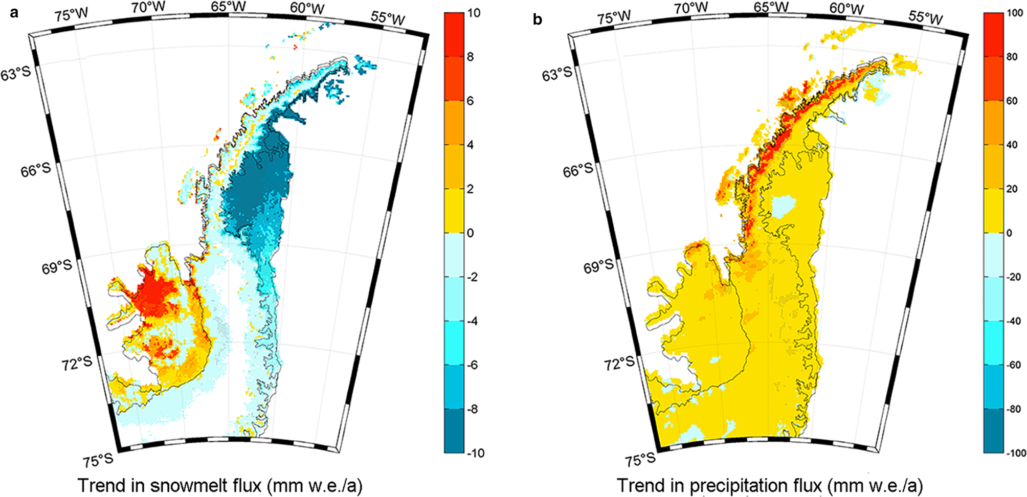
Climatic variables simulated by RACMO reveal increasing precipitation and decreasing snowmelt in most areas of the Graham Land and Palmer Land (Fig. 10). In response, DSLA in most sectors shows declining trends, especially on the southern AP. However, DSLA in sectors 68°S/69°S on the west side, and 64°S/65°S and 67°S/68°S on both sides show increasing trends. We speculate this is caused by increased snowmelt at high altitudes between 64°S and 69°S (Fig. 10a). Enhanced winter snowmelt on the AP may also be a factor in the increased DSLA (Zheng and others, Reference Zheng, Zhou and Wang2020). However, the DSL in sectors 65°S/66°S and 66°S/67°S migrate downwards in the same climatic context as several of the regions mentioned above. Due to the lack of in situ measurements on the high parts of glaciers and the complex relationship between snowfall and snowmelt interactions, the quantitative relationship between DSLA and multivariate variables precipitation and snowmelt need to be further studied.
Trends in the RACMO-based (a) snowmelt flux and (b) precipitation flux at each location on the AP between 2004/05 and 2018/2019. Shaded regions indicate the areas significant at 95% confidence level.
Previous studies established a precedent for classifying glacier zones from SAR images (Rau and others, Reference Rau2000a; Rau, Reference Rau2002; Rau and Braun, Reference Rau and Braun2002) and analysed the annual changes in some areas of the AP (Arigony-Neto and others, Reference Arigony-Neto2007, Reference Arigony-Neto2009). Compared with these studies, our analysis investigated the variations in the DSL on a larger scale based on a long time series.
Several limitations exist in our study. A constant backscattering threshold is unsuitable for all snowpacks on the AP given the different snowpack structures (e.g. snow depth, snow density and stratigraphy) in various areas of the AP. Moreover, SAR images orthorectified by the DEM with a low resolution lead to some uncertainties due to the complex terrain on the AP. A high-resolution DEM is necessary to improve the results, and dynamic thresholds applied to different sectors should be investigated further. Nevertheless, a quantitative analysis was conducted between DSLA and climatic variables rather than change monitoring alone. We also demonstrate that changes in DSLA can be used as a proxy of local climate and have the potential to validate reanalysis or climate model output in high-altitude areas with no in situ meteorological observations (Arigony-Neto and others, Reference Arigony-Neto2009).
6. Conclusions
Multitemporal C-band SAR images were analysed to explore spatiotemporal changes in the DSLA on the AP. The DSLA on the east side of the AP is generally higher than that on the west side, and the simulated SMB supports our result, showing higher net accumulation on the west side compared to the east side. The AP was reported to be the only area of Antarctica where widespread surface melt occurred (Abram and others, Reference Abram, Mulvaney and Arrowsmith2011). Extreme snowmelt has even impacted the central plateaus on the AP. The upward migration of the DSL in 2004/05, 2005/06 and 2012/13 is attributed to extreme snowmelt. Decreases in the DSLA in 2010/11 are the response to high positive precipitation anomalies and the absence of extreme snowmelt.
DSLA in most sectors shows declining trends, especially in the southern regions of the AP. This phenomenon can be interpreted as being caused by a decrease in snowmelt due to regional cooling (van Wessem and others, Reference van Wessem2016; Zheng and others, Reference Zheng, Zhou and Liang2019) and an increase in precipitation in recent years. A rise in the DSLA in northern sectors of AP is explained by an increase in snowmelt at high altitudes. Furthermore, the correlation between DSLA changes and simulated climatic variables on the AP was analysed. It demonstrates that the satellite-derived DSL can be an indicator of the local climate in the AP. With the increase in available SAR data and the support of a high-resolution DEM, DSLA could be used as an input to climate models to constrain the upper boundary of snowmelt.
Supplementary material
The supplementary material for this article can be found at https://doi.org/10.1017/jog.2021.72
Acknowledgements
The authors declare that they have no known competing financial interests or personal relationships that could have appeared to influence the work reported in this paper. The Reference Elevation Model of Antarctica digital surface model is available from the University of Minnesota (https://www.pgc.umn.edu/data/rema/). We acknowledge Dr J. M. van Wessem for providing the RACMO2.3 Antarctic Peninsula simulations. This work was supported by the National Natural Science Foundation of China (Grant Nos. 41776200, 41941010 and 41531069), and the Funds for the Distinguished Young Scientists of Hubei Province (China) (2019CFA057).


 Open access