


1. Introduction
The French regulator, Autorité de contrôle prudentiel et de résolution (ACPR), proposed that French insurance companies conduct a climate stress test in 2023 to assess the resilience of the sector to global warming (Clerc et al., Reference Clerc, Cambou, Kaissoumi, Fonteny, Gosset, Pegoraro, Rabate, Scrive, Boullot and Graciano2023). This exercise had two new main objectives compared to the 2020 version of the climate stress test: first, to better account for physical risk, and second, to consider short-term scenarios. This exercise shows how insurance organizations can integrate climate risk. For life insurance companies, climate risks can affect both their assets and liabilities. The impacts on liabilities materialize in particular through the impact on mortality. For almost a century, the link between extreme heat and mortality has been identified and studied. Gover (Reference Gover1938) reports that mortality during weeks of exceptionally high temperatures can reach “as much as four times the expected mortality for that season of the year.” Since the first assessment report by the Intergovernmental Panel on Climate Change (IPCC) in 1992, scientists have warned that “a greater number of heat waves could increase the risk of excess mortality” (IPCC, 1990). Kalkstein and Greene (Reference Kalkstein and Greene1997) link mortality and air mass data and show that a warm, humid tropical air mass and a dry tropical air mass are highly risky and are associated with excess mortality. A temperature-mortality relationship was established in China for elderly people during the period 1981–1991 in Pan et al. (Reference Pan, Li and Tsai1995). In their review, Basu and Samet (Reference Basu and Samet2002) identified 49 studies published between 1970 and 2002 and showed why heat-related mortality is a major concern for public health. Hajat and Kosatky (Reference Hajat and Kosatky2010) confirmed the link between mortality and heat with a more recent analysis. The heterogeneity in heat risk is shown to be explained by population density, GDP, and age distribution. More recently, Zhao et al. (Reference Zhao, Li, Ye, Wu, Gasparrini, Tong, Urban, Vicedo-Cabrera, Tobias, Armstrong, Royé, Lavigne, de’Donato, Sera, Kan, Schwartz, Pascal, Ryti and Goodman2024) quantified the impact of heat waves on global mortality at a local scale (resolution 0.5 $^\circ$ $\times$
0.5
$\times$
0.5 $^\circ$
), and analyzed temporal changes from 1990 to 2019. According to their article, excess deaths related to heat waves accounted for 0.94% of global deaths. The article also showed that in the long term, a relative adaptation has been observed. In fact, although annual heat waves increased from 13.4 to 13.7 days, the global heat wave-related excess death rate declined by 7.2% per decade compared to the 30-year average. Their study also highlights that Europe is one of the clusters with high excess deaths. In France, since 2003, Santé Publique France has been monitoring and studying the impact of heat waves on health by examining changes in the number of emergency department visits, the number of consultations with emergency doctors, and mortality. In 2003, France experienced a particularly hot summer. According to a report by a public medical research organization, the cumulative excess number of deaths compared to previous years was approximately 14,800 on August 20, an increase of 55% over the usual mortality rate (Hémon & Jougla, Reference Hémon and Jougla2004).
$^\circ$
), and analyzed temporal changes from 1990 to 2019. According to their article, excess deaths related to heat waves accounted for 0.94% of global deaths. The article also showed that in the long term, a relative adaptation has been observed. In fact, although annual heat waves increased from 13.4 to 13.7 days, the global heat wave-related excess death rate declined by 7.2% per decade compared to the 30-year average. Their study also highlights that Europe is one of the clusters with high excess deaths. In France, since 2003, Santé Publique France has been monitoring and studying the impact of heat waves on health by examining changes in the number of emergency department visits, the number of consultations with emergency doctors, and mortality. In 2003, France experienced a particularly hot summer. According to a report by a public medical research organization, the cumulative excess number of deaths compared to previous years was approximately 14,800 on August 20, an increase of 55% over the usual mortality rate (Hémon & Jougla, Reference Hémon and Jougla2004).
Since the first Assessment Report of the IPCC, the scientific community has widely recognized that emissions from human activities have substantially increased atmospheric concentrations of greenhouse gases, leading, on average, to additional global warming. This warming is accompanied by climate extremes, including temperature extremes. In the sixth Assessment Report, it is assessed as virtually certain that the frequency and intensity of hot extremes, including heat waves, have already increased and will continue to do so (IPCC, 2023a). Working Group II, which focuses on impacts, adaptation, and vulnerability, states that climate change has already harmed human physical and mental health and will continue to do so. According to this Working Group, “increasing temperatures and heat waves have increased mortality and morbidity (very high confidence).” A significant proportion of heat-related mortality in the warm season in temperate regions is attributed to the observed anthropogenic climate change (IPCC, 2023c). According to the IPCC, mortality and morbidity linked to heat exposure, together with ecosystem disruptions, are among the four key risks identified for Europe. The number of deaths and individuals exposed to heat stress will increase two- to threefold under 3 $^\circ$
C of global warming compared with 1.5
$^\circ$
C of global warming compared with 1.5 $^\circ$
C (IPCC, 2023b). The World Health Organization (WHO) estimates that between 2030 and 2050, climate change is expected to cause approximately 250,000 additional deaths annually (WHO, 2014). Zhou et al. (Reference Zhou, Vilar‐Zanón, Garrido and Heras‐Martínez2024) recently reviewed the literature on the link between heat and mortality. Climate-related mortality is shaped not only by gradual trends, but also by specific climatic phenomena such as El Niño, which has been shown to exert persistent negative effects on mortality improvement and life expectancy across affected regions (Xu et al., Reference Xu, Zhu, Horton and Samanta2026).
$^\circ$
C (IPCC, 2023b). The World Health Organization (WHO) estimates that between 2030 and 2050, climate change is expected to cause approximately 250,000 additional deaths annually (WHO, 2014). Zhou et al. (Reference Zhou, Vilar‐Zanón, Garrido and Heras‐Martínez2024) recently reviewed the literature on the link between heat and mortality. Climate-related mortality is shaped not only by gradual trends, but also by specific climatic phenomena such as El Niño, which has been shown to exert persistent negative effects on mortality improvement and life expectancy across affected regions (Xu et al., Reference Xu, Zhu, Horton and Samanta2026).
Modeling mortality is a core activity in actuarial science. In 1825, Gompertz published his famous law of mortality (Gompertz, Reference Gompertz1825). Since then, many models have been developed for mortality risk management. Plat (Reference Plat2009) conducted an extensive review of the literature in 2009. Since then, the main classes of models have remained largely unchanged. The principal models include: the Lee-Carter model (Lee and Carter (Reference Lee and Carter1992)), the Renshaw-Haberman model with a cohort effect (Renshaw and Haberman (Reference Renshaw and Haberman2006)), the Cairns, Black and Dowd model (CBD) with two factors (Cairns et al. (Reference Cairns, Blake and Dowd2006)), and the Currie model with p-splines (Currie (Reference Currie2006)). Cairns et al. (Reference Cairns, Blake and Dowd2008) provided a valuable review of mortality modeling and related risk management techniques. Conventional mortality modeling techniques only take into account exposure and death data, and distinguish the population by age and sex. In a stable environment, past data can be used as a reliable basis for estimating future outcomes. However, the climate crisis is causing significant changes in living conditions and is already affecting mortality rates. A study on excess mortality published by the French Institut national de la Statistique et des Etudes Economiques (INSEE) in June 2023 revealed that there were 53,800 excess deaths in 2022 (Blanpain, Reference Blanpain2023). The number of excess deaths has increased steadily since 2021. The report states that the observed number of deaths has exceeded the expected number, even when accounting for the ongoing impact of the global pandemic and other unusual events such as influenza epidemics or periods of hot weather. It is, therefore, imperative that climatic and environmental conditions are taken into account and incorporated into mortality models in order to reflect the changes in living conditions, and hence mortality patterns, associated with the climate upheaval that is currently underway.
The investigation of the impact of environmental variables on mortality remains a relatively unexplored area within the actuarial literature on mortality modeling, despite the risk being clearly identified. Pioneering work was carried out by Seklecka et al. (Reference Seklecka, Pantelous and O‘Hare2017). The authors studied the relationship between mortality trends, using the time-dependent factor of the Lee–Carter model, and temperature trends, represented by the logarithm of the average temperature. They also proposed a new stochastic mortality model that includes an additional temperature-related factor. In 2022, Li and Tang (Reference Li and Tang2022) studied the joint extremes of temperature and mortality with a bivariate peak-over-threshold approach. Dong et al. (Reference Dong, Bruhn, Shang and Hui2024) used climate stress tests related to mortality and assessed the impact on two hypothetical life insurers in Australia. More recently, four articles attempted to model the link between mortality and temperature. In Garrido et al. (Reference Garrido, Milhaud, Olympio and Popp2024), the authors extended the parametric model of Seklecka et al. (Reference Seklecka, Pantelous and O‘Hare2017) and added a term to incorporate the magnitude of heat during the summer. They projected mortality along climate trajectories to 2040. Robben et al. (Reference Robben, Antonio and Kleinow2025) used not only temperature, but also other environmental variables such as humidity, precipitation, wind speed, and pollution levels. They applied a machine learning technique to model the relationship between these environmental variables and observed excess mortality relative to baseline weekly mortality. Guibert et al. (Reference Guibert, Pincemin and Planchet2025) modeled daily temperature-related deaths using a distributed lag nonlinear model. An age–period–cohort framework with seasonal and temperature-based components was proposed and applied to Quebec mortality data in Bégin et al. (Reference Bégin, Boudreault and Landry2025). The authors assessed the future impacts of heat and cold waves on mortality under various climate scenarios. Robben et al. (Reference Robben, Barigou and Kleinow2025) introduced a granular three-state regime-switching framework that models mortality deviations from seasonal baselines by explicitly accounting for temperature-related shocks and respiratory disease outbreaks such as influenza and COVID-19. Sifre-Armengol et al. (Reference Sifre-Armengol, Pavía and Lledó Benito2025), temperatures were not used directly but were used to construct the six climate zones that divide Spain: the authors constructed life tables and mortality forecasts for Spain using detailed microdata, including the census section of residence of the deceased, and allowing mortality estimates stratified by climate zone, income level, and habitat size. The impact on winter mortality from cold weather was also recently studied in Titon et al. (Reference Titon, Talbi and Bessiere2024). And in Zhou et al. (Reference Zhou, Vilar‐Zanón, Garrido and Heras‐Martínez2024), the authors argue that climate risks, including mortality risk, can be assessed from an actuarial perspective using actuarial climate indices such as those developed in Zhou et al. (Reference Zhou, Vilar-Zanón, Garrido and Martınez2023) or in Garrido et al. (Reference Garrido, Milhaud and Olympio2023).
As a result, actuarial research on the relationship between environmental variables and mortality has recently increased. Actuaries and insurance professionals have also intensified their work on the subject. This activity is mainly driven by exercises set by supervisory authorities and by new regulatory requirements. For example, Article 29 of the French Energy and Climate Law (LEC) of 2019 requires financial institutions to provide extra-financial reporting. In particular, they are required to disclose the general process for identifying, assessing, prioritizing, and managing environmental risks, including physical climate risk. As the risk posed by heat waves to mortality was clearly identified, life insurers therefore need to justify how they assess this risk. This is further illustrated in the ACPR’s most recent climate stress test exercise (Clerc et al. (Reference Clerc, Cambou, Kaissoumi, Fonteny, Gosset, Pegoraro, Rabate, Scrive, Boullot and Graciano2023)). In the short-term scenario, an upward mortality shock from heat waves was applied.
The main objective of this article is to propose a reproducible methodology to construct a short-term climate stress test focused on the impact of an extremely hot summer on mortality. We model the link between heat and mortality based on intra-annual data from open datasets. As noted by Boudreault et al. (Reference Boudreault, Clacher, Li, Pigott and Zhou2023) in their editorial for the special issue of Annals of Actuarial Science, “A changing climate for actuarial science”:
A promising avenue for future research is the development of intra-annual mortality models which will facilitate the incorporation of climate change’s impact in mortality modeling – such integration is difficult with current time-series-based mortality models.
The methodology developed here involves the construction of geographical clusters based on variables related to the environmental vulnerability of municipalities in mainland France. Geographical clusters have previously been created to form coherent groups sharing the same climate profile.Footnote 1 This idea is extended here by incorporating a larger number of environmental variables. Doing so makes it possible to integrate the information relating to these variables without excessively increasing the dimensionality of the problem of linking environmental and mortality data. This work is based on in situ observation data, unlike the most closely related article, where the authors use reanalysis data (Robben et al., Reference Robben, Antonio and Kleinow2025). The second innovation consists of incorporating the latest climatological knowledge to construct extreme summers within the current climate and embedding this information into an actuarial risk management process. The present study departs from the use of rudimentary climate projections, a practice that prevails in the actuarial literature, and employs sophisticated tools and techniques to calculate maximum temperature thresholds or stochastic scenario generators. This approach enables the determination of the potential characteristics of extreme summers in the current climate, which can have more intense and longer heat waves than any experienced so far. It can be regarded as the first step in building local and country-level adaptation strategies, as it captures both local and cumulative effects. The proposed methodology could also be used to assess the impact of mitigation strategies (greening urban heat islands (UHIs) with vegetation, improving resilience of local medical infrastructures, etc.). As a methodology to construct a short-term climate shock, this article is therefore also part of the literature on mortality shocks, such as those linked to COVID-19 (see Dacorogna et al. (Reference Dacorogna, Feng, Li and Olivieri2022) and references therein).
Section 2 details the scope of the study and describes the territorial division used to calculate the mortality rates. The section shows how data on climate, pollution, land use, and vegetation are used to construct homogeneous regions that share common environmental vulnerabilities to heat waves. Section 3 explains the calculation of excess mortality, which is modeled as a function of meteorological variables. These excess deaths correspond to the deviation from a mortality baseline model that incorporates both a trend (3.1) and seasonality (3.2). The section concludes with a discussion of the choice to model the impact of weather-dependent parameters on mortality using a Poisson model. Section 4 provides a detailed description of the practical modeling of mortality as a function of weather data using machine learning. Before model estimation, the procedure involves grouping data over 5-day time periods, selecting parameters that ensure effective model training, and incorporating both lag and harvesting effects (4.1). Three different models were trained, optimized, and compared. Following model estimation, the model outputs are analyzed using Shapley values (4.3). Section 5 develops extreme but possible scenarios of climatic data over the duration of a summer to calculate mortality shock as part of a climate stress test incorporating heat wave risk. The results of each projection methodology are then compared. The conclusion summarizes the results and discusses potential methodological improvements.
2. Scope, data, and notation
2.1 Scope and scale of the study
The scope of the study covers mainland France from January 1, 2010, to December 31, 2019. The study of the relationship between mortality and environmental variables faces an inherent trade-off between bias and variance. This trade-off reflects the discretization required by the analysis. On the one hand, the finer the spatial and geographical scale of the study, the more the environmental data reflect the reality locally experienced. Spatial or temporal averages smooth out extreme values. On the other hand, if the scale is too small, the number of deaths observed becomes too small, and the statistical robustness is lost. A 5-day interval was chosen, at a small regional scale between cities and departments. The construction of these areas is described below in Section 2.2. This spatial grid differs from those used in the two most closely related studies. In Robben et al. (Reference Robben, Antonio and Kleinow2025), the spatial resolution is departments (corresponding to the Nomenclature of Territorial Units for Statistics (NUTS) of level 3), and in Guibert et al. (Reference Guibert, Pincemin and Planchet2025), temperatures are averaged for all mainland France. This territorial division seems to be too large. Indeed, choosing to average temperatures over France eliminates the extremes that can occur very locally, for example, on August 27, 2015, 34 $^\circ$
C was measured in Dax and 14
$^\circ$
C was measured in Dax and 14 $^\circ$
C in Chartres. The average temperature was 24
$^\circ$
C in Chartres. The average temperature was 24 $^\circ$
C, while the south-west experienced scorching temperatures. Moreover, both territorial divisions make it difficult to take into account the UHI effect. Due to the modification of land surfaces and the waste heat generated by energy usage, temperatures in urban areas can be much higher than in surrounding rural areas, particularly at night. This effect has a significant impact on mortality (Wong et al. (Reference Wong, Paddon and Jimenez2013), Yadav et al. (Reference Yadav, Rajendra, Awasthi, Singh and Bhushan2023), among others) and must therefore be taken into account. The time scale also affects the results and must therefore be chosen in conjunction with the spatial scale. An appropriate temporal scale must be sufficiently fine, applicable in the same way whatever the year, and take into account the effects on mortality associated with the day of the week. Three scales appear to be particularly relevant: daily, as in Guibert et al. (Reference Guibert, Pincemin and Planchet2025), weekly, as in Robben et al. (Reference Robben, Antonio and Kleinow2025), and the 5-day scale. Given the fine spatial grid adopted, a daily time step was not feasible. A particular feature of mortality is its dependence on the day of the week. A slightly higher proportion of deaths is reported on Mondays and Tuesdays. Yet the effect is very small. Indeed, in the study data, 14.5% of deaths occur on Tuesdays and 13.9% on Sundays. When considering rolling 5-day periods, the maximum difference between the maximum number of deaths in a period and the minimum number is 0.8%: 71.9% of deaths occurred from Monday to Friday, compared with 71.2% from Wednesday to Sunday. Therefore, considering 5-day periods introduces a negligible bias. The advantage is that 5 divides a 365-day year into equal parts. February 29 in leap years has not been considered. This event only occurs twice out of the 3,652 days considered in the study, which introduces a negligible bias. Deaths are treated according to sex and age. Ages are grouped in 5-year increments, from 40 to 99.
$^\circ$
C, while the south-west experienced scorching temperatures. Moreover, both territorial divisions make it difficult to take into account the UHI effect. Due to the modification of land surfaces and the waste heat generated by energy usage, temperatures in urban areas can be much higher than in surrounding rural areas, particularly at night. This effect has a significant impact on mortality (Wong et al. (Reference Wong, Paddon and Jimenez2013), Yadav et al. (Reference Yadav, Rajendra, Awasthi, Singh and Bhushan2023), among others) and must therefore be taken into account. The time scale also affects the results and must therefore be chosen in conjunction with the spatial scale. An appropriate temporal scale must be sufficiently fine, applicable in the same way whatever the year, and take into account the effects on mortality associated with the day of the week. Three scales appear to be particularly relevant: daily, as in Guibert et al. (Reference Guibert, Pincemin and Planchet2025), weekly, as in Robben et al. (Reference Robben, Antonio and Kleinow2025), and the 5-day scale. Given the fine spatial grid adopted, a daily time step was not feasible. A particular feature of mortality is its dependence on the day of the week. A slightly higher proportion of deaths is reported on Mondays and Tuesdays. Yet the effect is very small. Indeed, in the study data, 14.5% of deaths occur on Tuesdays and 13.9% on Sundays. When considering rolling 5-day periods, the maximum difference between the maximum number of deaths in a period and the minimum number is 0.8%: 71.9% of deaths occurred from Monday to Friday, compared with 71.2% from Wednesday to Sunday. Therefore, considering 5-day periods introduces a negligible bias. The advantage is that 5 divides a 365-day year into equal parts. February 29 in leap years has not been considered. This event only occurs twice out of the 3,652 days considered in the study, which introduces a negligible bias. Deaths are treated according to sex and age. Ages are grouped in 5-year increments, from 40 to 99.
2.2 Data
Deaths data. The mortality data come from the official death register maintained by INSEE. Since 1970, INSEE has compiled individual-level information on all deaths reported by French municipalities as part of their public service obligations. For each deceased individual, the dataset records sex, exact dates of birth and death, and the place of birth and death, identified by the official commune codes. The level of detail is therefore highly granular: ages are available on a continuous scale (not in intervals), places can be traced to the commune-level, and no aggregation is applied at the source. Monthly files are released and subsequently concatenated into annual and decennial compilations, which are the “ten-year files” used in this study. These files are not sample-based but exhaustive and cover the entire French population, including deaths occurring abroad among French nationals. For our analysis, we restricted the scope to deaths occurring in mainland France, excluding overseas territories.
Climatic data selected from Météo France for the study

Figure F.1 Long description
The scatter plot compares observed and predicted mortality ratios for training and testing sets. The x-axis represents the observed over baseline realization, and the y-axis represents the predicted over baseline expectation. Small semi-transparent points represent individual 5-day period realizations, reflecting high variance in death counts. Large bordered circles represent binned means for 50 quantiles, showing the model’s expected value against the average realization. Color-coding indicates mean temperature in degrees Celsius. The dashed diagonal line represents ideal calibration where the model expectation perfectly matches the observed mean. The plot shows a comparison between observed and predicted mortality ratios, with clusters and patterns indicating the model’s performance. All values are approximated.
Exposure data. Population exposures are obtained from official INSEE files that report resident population by single year of age, sex, and commune (excluding Mayotte) from 2006 onwards, with additional subdivisions for the districts of Paris, Lyon, and Marseille. These files provide annual cross-sections of the population as of January 1 of each year. To construct exposures at finer temporal resolutions, we follow standard actuarial practice and assume that the population evolves linearly between successive annual counts. The calculation is described by Equation 3.
Climate data. Since the beginning of 2024, Météo France has provided online access to a vast amount of weather and climate data. Specifically, it provides comprehensive climatological data from all the stations in metropolitan France and overseas from the beginning of the recording period for all the available parameters. Climatological checks have been carried out on these data. Two types of data are available for this type of study: on the one hand, in situ data, corresponding to measured and observed data. On the other hand, reanalysis data obtained by combining past observations with models to generate consistent time series of multiple climate variables. In the case of a small number of observations, reanalysis data are highly advantageous, especially as it has been shown that reanalysis data can give good results in constructing a relationship between temperature and mortality (de Schrijver et al., Reference de Schrijver, Folly, Schneider, Royé, Franco, Gasparrini and Vicedo‐Cabrera2021). In the present case, a large and sufficient amount of in situ high-quality data was available as illustrated in Figure A.1 in Appendix A, which shows the very fine spatial grid of the weather stations with open-source data selected for this study. Of all existing weather stations in the data, 501 were finally selected, based on the percentage of missing values in the main weather variables. In total, the Météo France data consists of 66 fields. However, many of these fields are incomplete. We have selected a limited number of climate variables for each weather station. Data are described in Table 1. Of these stations, only 0.65% of values are missing. The variable with the most missing data is the wind speed, with an occurrence of 1.50%. Missing values are replaced by linear interpolations of data from the nearest days for the same station.
Meteorological data were linked to other environmental covariates, specifically those pertaining to air pollution and vegetation. Adélaide et al. (Reference Adélaïde, Hough, Seyve, Kloog, Fifre, Launoy, Launay, Pascal and Lepeule2024) previously analyzed the correlation between heat exposure, air pollution, lack of vegetation, and social deprivation from a public health perspective. Accordingly, pollution and vegetation are regarded here as contributing factors that interact with climatic stressors to influence mortality outcomes. Consequently, our study incorporates data on pollution and vegetation.
Pollution data. Air pollution is a well-established determinant of mortality. Pascal et al. (Reference Pascal, Falq, Wagner, Chatignoux, Corso, Blanchard, Host, Pascal and Larrieu2014) demonstrated the relationship between mortality and particulate matter (PM) in France. Furthermore, high ozone concentrations are positively correlated with excess mortality in both the short (Vicedo-Cabrera et al., Reference Vicedo-Cabrera, Sera, Liu, Armstrong, Milojevic, Guo, Tong, Lavigne, Kyselý, Urban, Orru, Indermitte, Pascal, Huber, Schneider, Katsouyanni, Samoli, Stafoggia, Scortichini and Gasparrini2020) and long term (Atkinson et al., Reference Atkinson, Butland, Dimitroulopoulou, Heal, Stedman, Carslaw, Jarvis, Heaviside, Vardoulakis, Walton and Anderson2016). The data for this study were sourced from the French Institut national de l’environnement industriel et des risques (Ineris). These data are available at municipal and annual resolutions and were subsequently averaged to the regional and temporal scales of this study. The dataset comprises several variables, with those selected for analysis described in Table 2.
Land use and vegetation data. The CORINE Land Cover (CLC) is a biophysical inventory of land cover, produced through the visual interpretation of satellite images in accordance with a specific nomenclature. Data can be accessed through the website of the French Ministry of Environmental Transition, which collects statistics and data pertaining to sustainable development. The 15-level land cover dataset for mainland France, produced in 2018, was selected. The fifteen are the following: urban fabric; industrial, commercial, and transport units; mine, dump, and construction sites; artificial, nonagricultural vegetated areas; arable land; permanent crops; pastures; heterogeneous agricultural areas; forests; scrub and/or herbaceous vegetation associations; open spaces with little or no vegetation; inland wetlands; coastal wetlands; inland waters; marine waters. The data are available at the municipality level. For each municipality, the surface area of each of these categories is available. Data on the geographical scale of the study were aggregated and then normalized so that the sum for a geographical area is 1.
Climate type data. France’s distinctive geographical location and topography result in a diverse range of climatic conditions within a relatively confined geographical area. France is bordered by two seas and an ocean and is characterized by the presence of several mountainous areas. Joly et al. (Reference Joly, Brossard, Cardot, Cavailhes, Hilal and Wavresky2010) proposed a typology of climate together with a statistical method for its construction. A multivariate analysis of the climatic variables was employed. The resulting classification identifies a subdivision of France into eight types.
Construction of geographical scale of the study. The available data permit mortality studies at various geographical scales, ranging from the commune-level (34,935 communes as of January 1, 2024) to the national level. We selected an intermediate scale: the catchment area (bassin de vie), as defined by INSEE. These areas represent the smallest territories in which residents have access to the most common facilities and services. To ensure compatibility with our study period, we utilized the 2012 definition, which comprises 1,666 catchment areas. As many of these areas are too sparsely populated for robust mortality analysis, we constructed larger zones that are both environmentally homogeneous and statistically significant.
Pollution data from Ineris selected for the study

Table 2. Long description
The table presents pollution data variables and their descriptions used in a study on air pollution in France. It includes six rows and two columns. The first column lists variable symbols such as Mean_NO2, Mean_O3, Mean_somo35, Mean_AOT40, Mean_PM10, and Mean_PM2_5. The second column provides descriptions of these variables, detailing what each represents, such as average concentrations of NO2, O3, PM10, and PM2.5 over specific periods and conditions. The table helps in understanding the different pollution metrics analyzed in the study.
To maintain geographical coherence, we constructed path-connected clusters using agglomerative hierarchical clustering. In this approach, each observation begins in its own cluster, and pairs are progressively merged. We employed the Agglomerative Clustering implementation from the Python library scikit-learn. Each catchment area is described by a feature vector $x \in \mathbb{R}^{34}$
comprising: population size (1 variable), geographical descriptors (latitude, longitude, altitude: 3 variables), pollution indicators (6 variables, see Table 2), land use shares (15 variables), and climate type dummies (9 variables). All variables were standardized prior to clustering to ensure each dimension contributed equally to the distance measure. We applied Ward’s minimum-variance criterion with Euclidean distance while enforcing spatial contiguity through a Queen contiguity matrix
$x \in \mathbb{R}^{34}$
comprising: population size (1 variable), geographical descriptors (latitude, longitude, altitude: 3 variables), pollution indicators (6 variables, see Table 2), land use shares (15 variables), and climate type dummies (9 variables). All variables were standardized prior to clustering to ensure each dimension contributed equally to the distance measure. We applied Ward’s minimum-variance criterion with Euclidean distance while enforcing spatial contiguity through a Queen contiguity matrix $W$
, which restricts merges to adjacent catchment areas. Ward’s method minimizes the total within-cluster variance; at each step, the algorithm merges the pair of clusters that results in the minimum increase in total within-cluster variance (WCV). Formally, the algorithm merges clusters A and B that minimize:
$W$
, which restricts merges to adjacent catchment areas. Ward’s method minimizes the total within-cluster variance; at each step, the algorithm merges the pair of clusters that results in the minimum increase in total within-cluster variance (WCV). Formally, the algorithm merges clusters A and B that minimize:
 \begin{equation} \min _{A,B} \sum _{x\in A\cup B} \lVert x - \mu _{A\cup B} \rVert ^2 - \sum _{x\in A} \lVert x - \mu _{A} \rVert ^2 - \sum _{x\in B} \lVert x - \mu _{B} \rVert ^2 \end{equation}
where $\mu _X$
denotes the centroid of cluster
$\mu _X$
denotes the centroid of cluster $X$
. This procedure yielded an initial partition of 150 clusters.
$X$
. This procedure yielded an initial partition of 150 clusters.
A pruning step was subsequently applied to address small residual clusters with fewer than 100,000 inhabitants. Any such cluster $r$
was reassigned to the most similar neighboring cluster j based on Euclidean distance in the feature space:
$r$
was reassigned to the most similar neighboring cluster j based on Euclidean distance in the feature space:
 \begin{equation} j^* = \arg \min _{j \in \mathcal{N}(r)} \lVert \mu _r - \mu _j \rVert , \end{equation}
where $\mathcal{N}(r)$
is the set of adjacent clusters. The final partition consists of 89 geographically coherent and environmentally homogeneous zones. These are more suitable for mortality analysis than standard administrative divisions as they effectively capture key ecological and climatic factors. Large-area clusters typically correspond to rural zones, whereas small-area clusters represent dense urban environments. Figure 1 shows the clustering methodology: Step 1 shows the 150 clusters obtained after the initial algorithm; Step 2 identifies the “residual” clusters (those below the population threshold) designated for pruning; Step 3 displays the final 89 clusters used in the analysis.
$\mathcal{N}(r)$
is the set of adjacent clusters. The final partition consists of 89 geographically coherent and environmentally homogeneous zones. These are more suitable for mortality analysis than standard administrative divisions as they effectively capture key ecological and climatic factors. Large-area clusters typically correspond to rural zones, whereas small-area clusters represent dense urban environments. Figure 1 shows the clustering methodology: Step 1 shows the 150 clusters obtained after the initial algorithm; Step 2 identifies the “residual” clusters (those below the population threshold) designated for pruning; Step 3 displays the final 89 clusters used in the analysis.
Step 1 shows the 150 clusters of mainland France. Step 2 illustrates the smallest clusters with a number of inhabitants lower than 100.000. Step 3 represents the final 89 clusters of mainland France.

Figure 1 Long description
The image consists of three maps of mainland France. Step 1 shows the initial division of France into 150 clusters. Step 2 highlights the smallest clusters, each with fewer than 100,000 inhabitants. Step 3 presents the final division, resulting in 89 clusters. Each step is visually distinct, with different color coding to represent the clusters.
2.3 Main notation
We adopt the notation used by Robben et al. (Reference Robben, Antonio and Kleinow2025). To simplify the notation, we omit an index for sex; however, the analysis was disaggregated by sex, and the subsequent results reflect this distinction. Let $d_{x,t,p}^{(r)}$
be the observed death count in region
$d_{x,t,p}^{(r)}$
be the observed death count in region $r$
at age group
$r$
at age group $x$
during the 5-day period
$x$
during the 5-day period $p$
in year
$p$
in year $t$
,
$t$
, $p \in \mathcal{P} = \{0, 1, \ldots 72\}$
,
$p \in \mathcal{P} = \{0, 1, \ldots 72\}$
, $t \in \mathcal{T} = \{2010, \ldots , 2019\}$
,
$t \in \mathcal{T} = \{2010, \ldots , 2019\}$
, $x \in \mathcal{X} = \{40, 45, 50, \ldots , 90, 95\}$
(we recall that we decided to consider age groups of 5 years),
$x \in \mathcal{X} = \{40, 45, 50, \ldots , 90, 95\}$
(we recall that we decided to consider age groups of 5 years), $r \in \mathcal{R} = \{1, 2, \ldots , R\}$
with
$r \in \mathcal{R} = \{1, 2, \ldots , R\}$
with $R=89$
the number or regions. Let
$R=89$
the number or regions. Let $E_{x,t,p}^{(r)}$
denote the exposure, defined as the number of individuals alive, in region
$E_{x,t,p}^{(r)}$
denote the exposure, defined as the number of individuals alive, in region $r$
for age group
$r$
for age group $x$
during the 5-day period
$x$
during the 5-day period $p$
in year
$p$
in year $t$
.
$t$
.
The exposure data described in Section 2.2 provide annual population counts $N_{x,t}^{(r)}$
for each age group and region. These counts were obtained by aggregating ages into five-year classes and municipalities into the regions defined via the clustering procedure described previously. Exposure for a given time step
$N_{x,t}^{(r)}$
for each age group and region. These counts were obtained by aggregating ages into five-year classes and municipalities into the regions defined via the clustering procedure described previously. Exposure for a given time step $p$
is calculated by assuming a linear evolution between successive annual counts:
$p$
is calculated by assuming a linear evolution between successive annual counts:
 \begin{equation} E_{x,t,p}^{(r)} = \frac {(72 - p) \times N_{x,t}^{(r)} + p \times N_{x,t+1}^{(r)}}{72} \end{equation}
reflecting the 73 five-day periods that constitute a year, numbered from 0 to 72.
The crude central mortality rate, $m_{x,t,p}^{(r)}$
is defined as the ratio of observed deaths to the population exposure:
$m_{x,t,p}^{(r)}$
is defined as the ratio of observed deaths to the population exposure:
 \begin{equation*} m_{x,t,p}^{(r)} = \dfrac {d_{x,t,p}^{(r)}}{E_{x,t,p}^{(r)}}. \end{equation*}
Following standard actuarial practice, we assume the force of mortality remains constant within each five-day interval. Under this piecewise constant assumption and the standard assumption that deaths follow a Poisson distribution (given the exposure), the Maximum Likelihood Estimate (MLE) of the force of mortality, $\hat {\mu }_{x,t,p}^{(r)}$
, is mathematically identical to the crude central mortality rate,
$\hat {\mu }_{x,t,p}^{(r)}$
, is mathematically identical to the crude central mortality rate, $m_{x,t,p}^{(r)}$
(Pitacco et al., Reference Pitacco, Denuit, Haberman and Olivieri2009).
$m_{x,t,p}^{(r)}$
(Pitacco et al., Reference Pitacco, Denuit, Haberman and Olivieri2009).
The probability that an individual in region $r$
and age group
$r$
and age group $x$
, alive at the start of period
$x$
, alive at the start of period $p$
in year
$p$
in year $t$
, will die within the subsequent five-day interval is denoted by
$t$
, will die within the subsequent five-day interval is denoted by $q_{x,t,p}^{(r)}$
, and its estimate
$q_{x,t,p}^{(r)}$
, and its estimate $\hat {q}_{x,t,p}^{(r)}$
. Given the aforementioned assumption of a piecewise constant force of mortality, the estimate is derived from the functional relationship between the hazard and the survival probability:
$\hat {q}_{x,t,p}^{(r)}$
. Given the aforementioned assumption of a piecewise constant force of mortality, the estimate is derived from the functional relationship between the hazard and the survival probability:
 \begin{equation*} {\hat {q}_{x,t,p}^{(r)}} \approx 1 - \exp \left (-\hat {\mu }_{x,t,p}^{(r)}\right )\!, \end{equation*}
for all $x\in \mathcal{X}$
,
$x\in \mathcal{X}$
, $t\in \mathcal{T}$
,
$t\in \mathcal{T}$
, $p \in \mathcal{P}$
and
$p \in \mathcal{P}$
and $r \in \mathcal{R}$
.
$r \in \mathcal{R}$
.
For any variable $x^{(r)}$
, x(r), the superscript
$x^{(r)}$
, x(r), the superscript $N$
(i.e.
$N$
(i.e. $x^{N}$
) denotes national-level values. Further-more, where the period index
$x^{N}$
) denotes national-level values. Further-more, where the period index $p$
is omitted, the notation refers to the annualized value.
$p$
is omitted, the notation refers to the annualized value.
3. A regional 3-step mortality model
The objective is to model the observed number of deaths, denoted $d_{x,t,p}^{(r)}$
, for a given region
$d_{x,t,p}^{(r)}$
, for a given region $r$
, age group
$r$
, age group $x$
, year
$x$
, year $t$
, and time period
$t$
, and time period $p$
. The following three sections outline the stepwise methodology employed to get to the required spatio-temporal grid. Initially, a Lee-Carter model is applied to the regional annual data (Section 3.1); subsequently, the modeling is refined by time period for each region to incorporate seasonality (Section 3.2). This procedure yields a baseline mortality figure for the set
$p$
. The following three sections outline the stepwise methodology employed to get to the required spatio-temporal grid. Initially, a Lee-Carter model is applied to the regional annual data (Section 3.1); subsequently, the modeling is refined by time period for each region to incorporate seasonality (Section 3.2). This procedure yields a baseline mortality figure for the set $\{x,t,p,r\}$
. Finally, Section 3.3 formalizes the modeled relationship between this baseline term and the observed mortality.
$\{x,t,p,r\}$
. Finally, Section 3.3 formalizes the modeled relationship between this baseline term and the observed mortality.
3.1 Regional models for the annual baseline
We initially applied the standard Lee–Carter model (Lee & Carter, Reference Lee and Carter1992) at the national level. This model assumes that the logarithm of the central death rate $m_{x,t}$
for age
$m_{x,t}$
for age $x$
in year
$x$
in year $t$
is given by:
$t$
is given by:
 \begin{equation} \ln\!(m_{x,t}) = \alpha _x + \beta _x \kappa _t + \epsilon _{x,t}, \end{equation}
where $\alpha _x$
represents the average age profile of mortality,
$\alpha _x$
represents the average age profile of mortality, $\kappa _t$
captures the time trend common to all ages, and
$\kappa _t$
captures the time trend common to all ages, and $\beta _x$
reflects the sensitivity of mortality at age
$\beta _x$
reflects the sensitivity of mortality at age $x$
to changes in
$x$
to changes in $\kappa ^{(r)}_t$
. The error term
$\kappa ^{(r)}_t$
. The error term $\epsilon _{x,t}$
accounts for idiosyncratic variation. Parameters were estimated following the classical approach: first, we computed the logarithm of the central death rates, and subsequently applied singular value decomposition (SVD) to isolate the age and time components. We then evaluated the relative difference between observed deaths and those predicted by the national Lee–Carter mortality curve when applied uniformly to each region, as illustrated in Figure 2. The expected deaths for age group x and year t are calculated as
$\epsilon _{x,t}$
accounts for idiosyncratic variation. Parameters were estimated following the classical approach: first, we computed the logarithm of the central death rates, and subsequently applied singular value decomposition (SVD) to isolate the age and time components. We then evaluated the relative difference between observed deaths and those predicted by the national Lee–Carter mortality curve when applied uniformly to each region, as illustrated in Figure 2. The expected deaths for age group x and year t are calculated as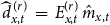 $\widehat {d}^{\,(r)}_{x,t} \;=\; E^{(r)}_{x,t}\, \hat {m}_{x,t}$
. Figure 2 displays the relative deviation for each region
$\widehat {d}^{\,(r)}_{x,t} \;=\; E^{(r)}_{x,t}\, \hat {m}_{x,t}$
. Figure 2 displays the relative deviation for each region $r$
:
$r$
:
 \begin{equation} \left (\sum _{x,t}\widehat {d}^{\,(r)}_{x,t} - \sum _{x,t}d^{(r)}_{x,t} \right )\quad \Big/ \quad \sum _{x,t}d^{(r)}_{x,t} \end{equation}
The results highlight that mortality levels vary substantially across the territory. Furthermore, the analysis identifies systematic discrepancies between rural and urban regions, confirming the necessity of incorporating regional heterogeneity when constructing baseline mortality models.
Relative difference between the number of deaths observed and the number of deaths predicted by the national mortality curve obtained using the Lee-Carter method.

Figure 2 Long description
A heat map of France displays the relative difference between the number of deaths observed and the number of deaths predicted by the national mortality curve using the Lee-Carter method. The map uses a color scale ranging from dark purple to yellow, where darker colors represent lower deviations and lighter colors indicate higher deviations. The map shows that most regions of France have relatively low deviations, with a few areas in the north and central parts showing higher deviations. The color scale on the right side of the map ranges from 0.6 to 1.8, indicating the magnitude of the deviations. The map highlights regions with significant excess mortality due to heat waves, particularly in the central and northern parts of the country.
To address this, we estimated separate regional mortality tables and computed the parameters $\alpha ^{(r)}_x$
,
$\alpha ^{(r)}_x$
, $\kappa ^{(r)}_t$
,
$\kappa ^{(r)}_t$
, $\beta ^{(r)}_x$
independently for each region
$\beta ^{(r)}_x$
independently for each region $r \in \mathcal{R}$
. These regional parameters define the annual baseline hazard
$r \in \mathcal{R}$
. These regional parameters define the annual baseline hazard $\hat {\mu }^{(r)}_{x,t}$
, which serves as the foundation for the higher-resolution temporal model described in the following sections.
$\hat {\mu }^{(r)}_{x,t}$
, which serves as the foundation for the higher-resolution temporal model described in the following sections.
 \begin{equation} \hat {\mu }^{(r)}_{x,t} = \hat {m}^{(r)}_{x,t} = \exp \left ( \alpha _x^{(r)} + \beta _x^{(r)} \kappa _t^{(r)} \right ) \end{equation}
3.2 Specification of the seasonal component using a Fourier decomposition
Mortality data in France exhibit a pronounced seasonal pattern, with higher mortality rates observed during winter months. This phenomenon is primarily attributable to winter-related pathologies, such as influenza and pneumonia (Rau et al., Reference Rau, Bohk-Ewald, Muszynska and Vaupel2018).
The seasonality $s^{(climate\_type)}_{.,.,p}$
represented as a function of the time period
$s^{(climate\_type)}_{.,.,p}$
represented as a function of the time period $p$
.
$p$
.

Figure 3 Long description
The line graph displays seasonality as a function of time period for eight different climate types across various regions. The x-axis represents the 5-day period ranging from 0 to 72, while the y-axis indicates the seasonality values ranging from 0.85 to 1.20. Each line represents a different climate type, with distinct colors for each. The lines show fluctuations in seasonality over time, with notable peaks and troughs. All values are approximated.
The seasonality $s^{N}_{x,.,p}$
represented as a function of the time period
$s^{N}_{x,.,p}$
represented as a function of the time period $p$
.
$p$
.

Figure 4 Long description
The line graph displays seasonality as a function of the time period for various age groups. The x-axis represents the 5-day period ranging from 0 to 72, while the y-axis indicates seasonality values. The graph includes six distinct lines, each representing a different age group: 40 to 44, 50 to 54, 60 to 64, 70 to 74, 80 to 84, and 90 to 94. The lines show fluctuations in seasonality over time, with each age group exhibiting unique patterns. The seasonality values range from approximately 0.9 to 1.3. The lines intersect and diverge at various points, illustrating the varying impacts of seasonality across different age groups over the specified time periods. All values are approximated.
To calculate excess mortality at specific points throughout the year, seasonality must be formally accounted for. We define the expected number of deaths, $\widehat {d}^{\,(r)}_{x,t,p}$
, based on the exposure
$\widehat {d}^{\,(r)}_{x,t,p}$
, based on the exposure $E^{(r)}_{x,t,p}$
and the mortality rates
$E^{(r)}_{x,t,p}$
and the mortality rates $\hat {m}^{(r)}_{x, t}$
derived from the baseline model in Section 3.1:
$\hat {m}^{(r)}_{x, t}$
derived from the baseline model in Section 3.1:
 \begin{equation} \widehat {d}^{\,(r)}_{x,t,p} = E^{(r)}_{x,t,p} \left ( \frac {p \times \hat {m}^{(r)}_{x,t+1} + (72-p) \times \hat {m}^{(r)}_{x,t}}{72} \right ). \end{equation}
The empirical seasonality, $s^{(r)}_{x,.,p}$
is defined as the mean ratio of observed to expected deaths for each period p across the ten-year study period:
$s^{(r)}_{x,.,p}$
is defined as the mean ratio of observed to expected deaths for each period p across the ten-year study period:
 \begin{equation} s^{(r)}_{x,.,p} = \frac {1}{\#\mathcal{T}} \sum _{t\in \mathcal{T}} \frac {d^{(r)}_{x,t,p}}{\widehat {d}^{\,(r)}_{x,t,p}} \end{equation}
The seasonal index $s$
thus depends on three parameters: age group
$s$
thus depends on three parameters: age group $x$
, region
$x$
, region $r$
, and time period
$r$
, and time period $p$
. We examined these dependencies across regions and ages. First, seasonality was calculated for each of the eight climate types defined by Joly et al. (Reference Joly, Brossard, Cardot, Cavailhes, Hilal and Wavresky2010). As shown in Figure 3 (already mentioned in Section 2.2), seasonal patterns are remarkably consistent across all climate types. Second, seasonality was calculated by age group at the national level, denoted
$p$
. We examined these dependencies across regions and ages. First, seasonality was calculated for each of the eight climate types defined by Joly et al. (Reference Joly, Brossard, Cardot, Cavailhes, Hilal and Wavresky2010). As shown in Figure 3 (already mentioned in Section 2.2), seasonal patterns are remarkably consistent across all climate types. Second, seasonality was calculated by age group at the national level, denoted $s^N_{x,.,p}$
, as illustrated in Figure 4. The highest age groups have mortality rates that are more strongly dependent on seasonality. We can deduce from these two graphs that it is possible to construct a seasonality term based solely on age group and time step, and not on the region, calculated as:
$s^N_{x,.,p}$
, as illustrated in Figure 4. The highest age groups have mortality rates that are more strongly dependent on seasonality. We can deduce from these two graphs that it is possible to construct a seasonality term based solely on age group and time step, and not on the region, calculated as:
 \begin{equation} s^{N}_{x,.,p} = \frac {1}{\#\mathcal{T}} \sum _{t\in \mathcal{T}} \frac {\sum _{r\in \mathcal{R}}d^{(r)}_{x,t,p}}{\sum _{r\in \mathcal{R}}\widehat {d}^{\,(r)}_{x,t,p}} \end{equation}
Following Robben et al. (Reference Robben, Antonio and Kleinow2025) and Schöley (Reference Schöley2021), we modeled the seasonality $s^{N}_{x,.,p}$
using a Fourier decomposition. The modeled seasonality is denoted
$s^{N}_{x,.,p}$
using a Fourier decomposition. The modeled seasonality is denoted $\tilde {s}^{N}_{x,.,p}$
. Our analysis indicates that while using only the first two harmonics is common, it is insufficiently complex for this dataset. Incorporating a third harmonic represents a statistically significant improvement in goodness of fit; however, the addition of a fourth or subsequent terms yields diminishing returns. Further details are provided in Appendix B. Consequently, we adopted a three-term Fourier series model, with coefficients calculated independently for each age group. By combining the annual regional trend with this seasonal component, we obtain the comprehensive baseline mortality term:
$\tilde {s}^{N}_{x,.,p}$
. Our analysis indicates that while using only the first two harmonics is common, it is insufficiently complex for this dataset. Incorporating a third harmonic represents a statistically significant improvement in goodness of fit; however, the addition of a fourth or subsequent terms yields diminishing returns. Further details are provided in Appendix B. Consequently, we adopted a three-term Fourier series model, with coefficients calculated independently for each age group. By combining the annual regional trend with this seasonal component, we obtain the comprehensive baseline mortality term:
 \begin{equation} \hat {b}^{(r)}_{x,t,p} = \widehat {d}^{\,(r)}_{x,t,p} \times \tilde {s}^{N}_{x,.,p}. \end{equation}
This term $\hat {b}^{(r)}_{x,t,p}$
represents the expected death count under normal environmental conditions and is utilized as the offset in the integrated weather-mortality model (Section 3.3).
$\hat {b}^{(r)}_{x,t,p}$
represents the expected death count under normal environmental conditions and is utilized as the offset in the integrated weather-mortality model (Section 3.3).
3.3 Modeling observed mortality with weather data
Justification for the incorporation of weather data: The mortality model is constructed in three sequential stages: the long-term trend (Section 3.1), the seasonal component (Section 3.2), and the weather-driven deviation from baseline.
To motivate the inclusion of meteorological covariates, we examine the standardized mortality ratio (SMR), which represents the relative deviation of observed deaths from the established baseline:
 \begin{equation} SMR_{x,t,p}^{(r)}\,:\!=\, \frac {d_{x,t,p}^{(r)}}{\hat {b}_{x,t,p}^{(r)}} \end{equation}
where $d_{x,t,p}^{(r)}$
denotes the observed number of deaths and
$d_{x,t,p}^{(r)}$
denotes the observed number of deaths and $\hat {b}_{x,t,p}^{(r)}$
is the expected baseline mortality.
$\hat {b}_{x,t,p}^{(r)}$
is the expected baseline mortality.
As illustrated in Figure 5, these ratios exhibit a clear dependency on temperature and humidity. The left-hand plot demonstrates that mortality remains relatively stable and close to the baseline ( $SMR\approx 1$
) for temperatures between 12
$SMR\approx 1$
) for temperatures between 12 $^\circ$
C and 19
$^\circ$
C and 19 $^\circ$
C. However, above 20
$^\circ$
C. However, above 20 $^\circ$
C, the ratio begins to rise, transitioning into an exponential increase once temperatures exceed 26
$^\circ$
C, the ratio begins to rise, transitioning into an exponential increase once temperatures exceed 26 $^\circ$
C. The right-hand plot indicates that, outside of the extremes (below 45% and above 93% relative humidity), the SMR is a decreasing function of humidity, characterized by a relatively stable, slightly negative slope.
$^\circ$
C. The right-hand plot indicates that, outside of the extremes (below 45% and above 93% relative humidity), the SMR is a decreasing function of humidity, characterized by a relatively stable, slightly negative slope.
Illustration of the relationship between the SMR and the weather data. Temperature and the left-hand side, and humidity on the right-hand side. This corresponds to the average of SMR relative to baseline $d^{(r)}_{x,t,p} / \hat {b}^{(r)}_{x,t,p}$
for every half of a degree celsius or for every percentage point of relative humidity.
$d^{(r)}_{x,t,p} / \hat {b}^{(r)}_{x,t,p}$
for every half of a degree celsius or for every percentage point of relative humidity.

Figure 5 Long description
A scatter plot with two panels. The left panel shows the relationship between the standardized mortality ratio and average mean temperatures over five-day intervals. The x-axis represents the average of the mean temperatures in degrees Celsius, ranging from negative ten to thirty. The y-axis represents the standardized mortality ratio relative to baseline, ranging from zero point seven to one point four. The right panel shows the relationship between the standardized mortality ratio and average mean humidity over five-day intervals. The x-axis represents the average of the mean humidity in percentage, ranging from thirty to one hundred. The y-axis represents the standardized mortality ratio relative to baseline, ranging from zero point seven to one point four. Each panel contains dozens of data points, showing varying trends and patterns. The left panel indicates a positive correlation between temperature and mortality ratio, while the right panel shows a less clear relationship between humidity and mortality ratio. All values are approximated.
Model specification: We assume that the observed death counts in region $r$
, for period
$r$
, for period $p$
and age group
$p$
and age group $x$
, are realizations of a Poisson-distributed random variable
$x$
, are realizations of a Poisson-distributed random variable $D_{x,t,p}^{(r)}$
:
$D_{x,t,p}^{(r)}$
:
 \begin{align} D_{x,t,p}^{(r)} \sim \text{Poisson}\left ( \lambda _{x,t,p}^{(r)} \right ), \end{align}
where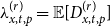 $\lambda _{x,t,p}^{(r)} = \mathbb{E}[D_{x,t,p}^{(r)}]$
denotes the expected number of deaths.
$\lambda _{x,t,p}^{(r)} = \mathbb{E}[D_{x,t,p}^{(r)}]$
denotes the expected number of deaths.
The objective is to account for the deviations between the baseline number of deaths, $\hat {b}^{(r)}_{x,t,p}$
, and the observed counts,
$\hat {b}^{(r)}_{x,t,p}$
, and the observed counts, $d_{x,t,p}^{(r)}$
, by incorporating the exogenous covariates defined in Table C.1. We assume a functional relationship where the baseline acts as an offset, such that:
$d_{x,t,p}^{(r)}$
, by incorporating the exogenous covariates defined in Table C.1. We assume a functional relationship where the baseline acts as an offset, such that:
 \begin{equation} \log \left ( \lambda _{x,t,p}^{(r)} \right ) = \log \left ( \hat {b}_{x,t,p}^{(r)} \right ) + h \left (W_{t,p}^{(r)}\right ) \end{equation}
where $W_{t,p}^{(r)}$
represents the vector of explanatory variables (including meteorological data) for region
$W_{t,p}^{(r)}$
represents the vector of explanatory variables (including meteorological data) for region $r$
during period
$r$
during period $p$
of year
$p$
of year $t$
. Under this specification, the expected death counts are given by
$t$
. Under this specification, the expected death counts are given by $\hat {\lambda }_{x,t,p}^{(r)} = \hat {b}_{x,t,p}^{(r)} \times \exp \left (\hat {h}(W_{t,p}^{(r)})\right )$
, where the multiplicative effect
$\hat {\lambda }_{x,t,p}^{(r)} = \hat {b}_{x,t,p}^{(r)} \times \exp \left (\hat {h}(W_{t,p}^{(r)})\right )$
, where the multiplicative effect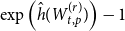 $\exp \left (\hat {h}(W_{t,p}^{(r)})\right ) - 1$
represents the percentage change in mortality attributable to external conditions. We estimate the unknown function
$\exp \left (\hat {h}(W_{t,p}^{(r)})\right ) - 1$
represents the percentage change in mortality attributable to external conditions. We estimate the unknown function $h({\cdot})$
using a machine learning framework.
$h({\cdot})$
using a machine learning framework.
The covariate vector $W_{t,p}^{(r)}$
encompasses a wide range of meteorological and pollution data. Our analysis is not restricted to temperature; consistent with previous literature (Kalkstein and Greene (Reference Kalkstein and Greene1997), Barreca (Reference Barreca2012)), we recognize that mortality is statistically dependent on broader climatic factors, such as humidity. However, to maintain model parsimony and predictive accuracy, we ultimately select a subset of variables focused on temperature and humidity. As discussed in Section 4.2, the inclusion of the exhaustive set of environmental indicators (listed in Appendix C) was found to degrade the performance of the machine learning algorithm due to increased noise and over-fitting.
$W_{t,p}^{(r)}$
encompasses a wide range of meteorological and pollution data. Our analysis is not restricted to temperature; consistent with previous literature (Kalkstein and Greene (Reference Kalkstein and Greene1997), Barreca (Reference Barreca2012)), we recognize that mortality is statistically dependent on broader climatic factors, such as humidity. However, to maintain model parsimony and predictive accuracy, we ultimately select a subset of variables focused on temperature and humidity. As discussed in Section 4.2, the inclusion of the exhaustive set of environmental indicators (listed in Appendix C) was found to degrade the performance of the machine learning algorithm due to increased noise and over-fitting.
4. Practical implementation and quantitative results
4.1 Construction of the dataset for the machine learning process
Initial results, as illustrated in Figure 5, indicate complex, nonlinear relationships between meteorological variables and mortality rates. Furthermore, the inclusion of multiple weather indicators for each five-day period significantly increases the dimensionality of the covariate space. Consequently, we employ machine learning algorithms to capture these high-dimensional dependencies. Within our supervised learning framework, the target variable $y$
represents the observed death counts (
$y$
represents the observed death counts ( $y = d^{(r)}_{x,t,t}$
), and the baseline mortality count (
$y = d^{(r)}_{x,t,t}$
), and the baseline mortality count ( $\hat {b}^{(r)}_{x,t,t}$
) is used as an offset. In constructing the feature matrix
$\hat {b}^{(r)}_{x,t,t}$
) is used as an offset. In constructing the feature matrix $X$
, three primary considerations, detailed below, are addressed. The machine learning algorithm will estimate
$X$
, three primary considerations, detailed below, are addressed. The machine learning algorithm will estimate $\hat {y} = \hat {\lambda }^{(r)}_{x,t,p}$
.
$\hat {y} = \hat {\lambda }^{(r)}_{x,t,p}$
.
Aggregation of daily data into five-d ay intervals . As the meteorological data are recorded daily, whereas the model operates on a five-day grid, temporal aggregation is required. For minimum and maximum temperatures, we retain the absolute maximum, minimum, and mean values over each five-day period. This approach identifies the full range of temperature fluctuations within each interval. Mean temperature and humidity indicators are aggregated using their arithmetic means. Given the relatively marginal impact of precipitation and wind on mortality rates reported in the literature, we include only two summary indicators for each of these variables. Additionally, we incorporate the wet bulb temperature (WBT), defined as the temperature of a parcel of air cooled to saturation (100% relative humidity) through the evaporation of water into it, with the latent heat supplied by the parcel itself (Dunlop (Reference Dunlop2008)). The full specification of these indicators is provided in Table C.1.
Lagged effects. To capture the delayed impact of weather on mortality during period $p$
of year
$p$
of year $t$
, we include meteorological data from both the concurrent period and the immediately preceding period. This specification accounts for a window of up to ten days without excessively increasing the number of features. This choice is informed by research across 18 French cities, which suggests that the impact of heat is most acute within 0–3 days of exposure but can persist for up to 10 days (Pascal et al. (Reference Pascal, Wagner, Corso, Laaidi, Ung and Beaudeau2018)).
$t$
, we include meteorological data from both the concurrent period and the immediately preceding period. This specification accounts for a window of up to ten days without excessively increasing the number of features. This choice is informed by research across 18 French cities, which suggests that the impact of heat is most acute within 0–3 days of exposure but can persist for up to 10 days (Pascal et al. (Reference Pascal, Wagner, Corso, Laaidi, Ung and Beaudeau2018)).
Harvesting effect. The “harvesting effect,” or mortality displacement, refers to a phenomenon where a temporary increase in death rates is followed by a period of lower-than-average mortality. This occurs when a severe event (such as a heat wave) primarily affects individuals who are already frail or nearing the end of their life. These individuals die earlier than they otherwise would have, causing a spike in deaths during period $p$
and a corresponding deficit in period
$p$
and a corresponding deficit in period $p+1$
. Accounting for this displacement is essential to ensure that the model does not overestimate the long-term impact of extreme weather events.
$p+1$
. Accounting for this displacement is essential to ensure that the model does not overestimate the long-term impact of extreme weather events.
4.2 Machine learning for the observed deaths count modeling
As discussed previously, the relationship between weather variables and mortality is complex and inherently nonlinear. We, therefore, model the observed mortality using machine learning methods that can flexibly capture such relationships. In particular, the models incorporate both contemporaneous weather indicators and lagged indicators to account for delayed mortality effects. In addition, we explicitly include the SMR of the previous period $SMR^{(r)}_{x,t,p-1}$
as a predictor of
$SMR^{(r)}_{x,t,p-1}$
as a predictor of $d^{(r)}_{x,t,p}$
, to capture the so-called “harvesting effect.”
$d^{(r)}_{x,t,p}$
, to capture the so-called “harvesting effect.”
Choice of models. We considered three types of models that can incorporate a Poisson specification to estimate $h$
with a function
$h$
with a function $\hat {h}$
of Equation 13:
$\hat {h}$
of Equation 13:
-
• a Poisson Generalized Linear Model (GLM),
-
• XGBoost (Chen & Guestrin, Reference Chen and Guestrin2016), and
-
• CatBoost (Prokhorenkova et al., Reference Prokhorenkova, Gusev, Vorobev, Dorogush and Gulin2018).
The GLM provides a transparent linear benchmark, while XGBoost and CatBoost are gradient boosting methods that allow for nonlinearities and interactions between predictors.
For the GLM, the statsmodel library (Seabold and Perktold (Reference Seabold and Perktold2010)) allows one to directly set the offset as a parameter of the GLM. The logarithms of the baseline death counts are used as an offset. Indeed, a Poisson GLM models the log of the expected count $\mu$
as a linear combination of predictors:
$\mu$
as a linear combination of predictors:
 \begin{equation*} log(\mu )=X\beta + log(\textrm {offset})\end{equation*}
For both boosting algorithms, we adopted a log-link function, so that the logarithm of the expected mortality counts is modeled as the sum of the predictors and the log-offset derived from the baseline mortality. This ensures that the predictors act multiplicatively on the mean mortality count, which is essential for two reasons. First, scale invariance: the relative effect of predictors (e.g., a 10% increase in risk due to a heat wave) remains consistent regardless of whether the baseline mortality is low or high. Second, positivity: by construction, the exponential of the linear predictor guarantees that the expected counts are strictly positive, avoiding the theoretical issue of negative death counts that could arise in an additive formulation. In practice, this corresponds to specifying ‘objective’: ‘count:poisson’ and ‘eval_metric’: ‘poisson-nloglik’ for XGBoost, and ‘loss_function’: ‘Poisson’, ‘eval_metric’: ‘Poisson’ for CatBoost.
Hyperparameter tuning and validation. Model performance and generalization were evaluated using both in-sample (training) and out-of-sample (test) datasets. To determine the optimal hyperparameters for the machine learning framework, we employed a 5-fold cross-validation procedure on the training set using the Optuna optimization framework (Akiba et al. (Reference Akiba, Sano, Yanase, Ohta and Koyama2019)). Specifically, we utilized the tree-structured Parzen Estimator (TPE) (Watanabe (Reference Watanabe2025)), a Bayesian optimization approach, to minimize the average negative Poisson log-likelihood (PLL) across the validation folds. The search space included a broad range of parameters – such as the learning rate, tree depth, and various regularization terms, the details of which are provided in Appendix D. We adopted a “search before exploit” strategy by using the first thirty trials as exploration only. We also introduced a median pruner to terminate unpromising trials early, allowing for a deeper exploration of high-performing parameter combinations. Finally, the predictive accuracy of the models was compared against the benchmark baseline using three primary evaluation metrics: Mean Squared Error (MSE), PPLL, and Mean Poisson Deviance (MPD). The Normalized PLL (NPLL, PLL divided by the number of rows) was also computed to evaluate overfitting.
Variable s. Although gradient boosting methods are, in principle, capable of automatic feature selection, initial experiments with the full set of weather variables led to overfitting and degraded out-of-sample performance, even under intensive hyperparameter optimization with wide search ranges and large numbers of trials. This behavior is likely due to the strong collinearity among meteorological variables. We therefore adopted an iterative procedure in which features were added step by step and retained only if they improved performance consistently across folds. The final feature set comprised demographic variables (“age_group,” “sex”), temporal variables (“time_period”), geographical location (“latitude,” “longitude”), weather variables (“TM_mean,” “TM_mean_pm1,” “UM_mean,” “UM_mean_pm1”), and the harvesting effect proxy (“ecart_dc_tp”). All lagged features with the suffix “_pm1” refer to the values in the previous 5-day period. We restricted the main analysis to the summer period ( $p \in [30,54]$
), when weather-related mortality effects are expected to be strongest. Weather data are detailed in C.
$p \in [30,54]$
), when weather-related mortality effects are expected to be strongest. Weather data are detailed in C.
Comparative performance of the baseline (Offset) and machine learning models. Performance is evaluated using mean squared error (MSE), poisson log-likelihood (PLL), Normalized PLL (NPLL), and mean poisson deviance (MPD). The parameters used to obtain these results are detailed in D

Table 3. Long description
The table presents a comparative performance analysis of the baseline (Offset) and three machine learning models: GLM Poisson, XGBoost, and CatBoost. The performance metrics used are mean squared error (MSE), poisson log-likelihood (PLL), Normalized PLL (NPLL), and mean poisson deviance (MPD). The table is divided into two main sections: Training set and Test set, each containing five columns: MSE, PLL, NPLL, and MPD. There are four rows, each representing a different model. For the Offset model, the Training set shows MSE of 4.243, PLL of negative 563,119, NPLL of negative 1.778, and MPD of 1.087. The Test set for Offset shows MSE of 4.268, PLL of negative 140,716, NPLL of negative 1.777, and MPD of 1.088. For the GLM Poisson model, the Training set shows MSE of 4.174, PLL of negative 562,008, NPLL of negative 1.774, and MPD of 1.080. The Test set for GLM Poisson shows MSE of 4.196, PLL of negative 140,443, NPLL of negative 1.773, and MPD of 1.082. For the XGBoost model, the Training set shows MSE of 3.990, PLL of negative 559,310, NPLL of negative 1.765, and MPD of 1.063. The Test set for XGBoost shows MSE of 4.150, PLL of negative 140,302, NPLL of negative 1.771, and MPD of 1.078. For the CatBoost model, the Training set shows MSE of 4.137, PLL of negative 561,575, NPLL of negative 1.773, and MPD of 1.077. The Test set for CatBoost shows MSE of 4.174, PLL of negative 140,356, NPLL of negative 1.772, and MPD of 1.079. Notable trends include XGBoost showing the lowest MSE and NPLL in both training and test sets, indicating better performance compared to other models.
Comparative analysis of predicted and observed mortality. Predicted mortality (blue), observed mortality (orange), and the baseline mortality rate (green) are displayed alongside mean temperature (red, dotted). Data are aggregated across sex and all age groups, and for a specified region $(r=37)$
and year
$(r=37)$
and year $(t=2015)$
.
$(t=2015)$
.

Figure 6 Long description
The line graph presents a comparative analysis of predicted, observed, and baseline mortality rates over a specified time period. The x axis represents the time period, ranging from 30 to 55. The y axis on the left indicates the number of deaths, ranging from 600 to 1050. The y axis on the right shows the mean temperature in degrees Celsius, ranging from 12 to 28. The blue line represents the predicted number of deaths, the orange line shows the observed number of deaths, and the green line indicates the baseline number of deaths. Additionally, a red dotted line represents the mean temperature. The graph illustrates fluctuations in mortality rates and temperature trends over the given time period. All values are approximated.
4.3 Results and interpretation of the machine learning process
Table 3 summarizes the predictive performance of the baseline and machine learning models following hyperparameter optimization. The results indicate that XGBoost emerges as the most robust model, outperforming the alternative specifications across all evaluated metrics. Specifically, it achieves both the minimum MSE and the maximum PLL on both the training and test datasets. As evidenced by the results, the gradient boosting architectures (XGBoost and CatBoost) demonstrate superior predictive power compared to the GLM Poisson. While these complex models are often susceptible to overfitting, the narrow performance gap between our training and test sets suggests that the implemented regularization strategies were effective. To ensure strong generalization and mitigate the risk of over-fitting, we employed a rigorous Bayesian optimization framework for hyperparameter tuning, incorporating constraints on tree depth and $L1$
and
$L1$
and $L2$
regularization alongside 5-fold cross-validation. Figure 6 demonstrates the sensitivity of the algorithm to temperature fluctuations. The significant spike in “TM_mean at period 36 directly correlates with the peaks in both observed and predicted deaths, highlighting the model’s capacity to capture extreme weather effects. The trajectories of temperature, observed mortality, and predicted deaths remain closely aligned throughout the remainder of the series, suggesting the model effectively captures the temperature fluctuations and their impact on mortality. Additional results regarding the model’s calibration relative to the baseline are presented in F for both the training and test sets.
$L2$
regularization alongside 5-fold cross-validation. Figure 6 demonstrates the sensitivity of the algorithm to temperature fluctuations. The significant spike in “TM_mean at period 36 directly correlates with the peaks in both observed and predicted deaths, highlighting the model’s capacity to capture extreme weather effects. The trajectories of temperature, observed mortality, and predicted deaths remain closely aligned throughout the remainder of the series, suggesting the model effectively captures the temperature fluctuations and their impact on mortality. Additional results regarding the model’s calibration relative to the baseline are presented in F for both the training and test sets.
Feature importance chart showing how much impact each feature has on the model output.

Figure 7 Long description
A scatter plot displays the impact of various features on a model’s output using SHAP values. The x-axis represents SHAP values, indicating the impact on the model output, while the y-axis lists the features. The features include sex, TM_mean, age_group, TM_mean_pm1, time_period, ecart_dc_tp, longitude, latitude, and UM_mean. Each feature is represented by a series of points, with colors ranging from blue to red indicating low to high feature values. The plot shows how each feature’s value influences the model’s predictions, with some features having a more significant impact than others. The data points are distributed along the x-axis, showing varying degrees of influence. The plot helps in understanding which features are most important in the model’s decision-making process. All values are approximated.
Shapley values given the values of the main weather conditions.

Figure 8 Long description
A scatter plot with two subplots labeled a and b. Subplot a shows the relationship between temperature mean in degrees Celsius and SHAP value for temperature mean. The x-axis represents temperature mean ranging from 5 to 30 degrees Celsius, and the y-axis represents SHAP value for temperature mean ranging from negative 0.05 to 0.15. The data points form a positive correlation, indicating that as the temperature mean increases, the SHAP value for temperature mean also increases. Subplot b shows the relationship between urbanization mean in percentage and SHAP value for urbanization mean. The x-axis represents urbanization mean ranging from 40 to 100 percent, and the y-axis represents SHAP value for urbanization mean ranging from negative 0.03 to 0.03. The data points form a less clear pattern with some clustering around certain urbanization mean values. All values are approximated.
Cross-effect of age (a) and latitude (b) with the mean temperature on the model, illustrated with the Shapley values.

Figure 9 Long description
A scatter plot illustrates the relationship between mean temperature in degrees Celsius and Shapley values, with age group and latitude as variables. The x-axis represents the mean temperature in degrees Celsius, ranging from 5 to 30 degrees. The y-axis represents Shapley values for the mean temperature, ranging from negative 0.05 to 0.15. The data points are color-coded, with red representing higher age groups and blue representing lower age groups. The left plot shows the cross-effect of age group on the model, while the right plot shows the cross-effect of latitude. Both plots exhibit a positive correlation between mean temperature and Shapley values. The data points form clusters and show a general upward trend as the mean temperature increases. All values are approximated.
The marginal contributions of each feature to the model’s output were quantified using Shapley values, implemented via the SHAP library (Lundberg and Lee (Reference Lundberg and Lee2017)). Derived from cooperative game theory, these values provide a mathematically rigorous framework for attributing the contribution of individual “players” (features) to the final result. Analysis of the feature importance hierarchy (Figure 7) reveals that gender is the primary discriminating variable, exhibiting a distinct separation between male (blue) and female (red) cohorts. This observation aligns with existing literature regarding sex-based physiological sensitivities to thermal stress (Folkerts et al. (Reference Folkerts, Bröde, Botzen, Martinius, Gerrett, Harmsen and Daanen2022)). The influence of temperature on mortality is characterized by two distinct phases. Below a 15 $^\circ$
C threshold, the SHAP values remain stable, indicating a negligible impact on excess mortality. Conversely, above 15
$^\circ$
C threshold, the SHAP values remain stable, indicating a negligible impact on excess mortality. Conversely, above 15 $^\circ$
C, the values become a strictly increasing function of temperature, demonstrating an accelerating, almost exponential, effect on mortality risk (Figure 8).
$^\circ$
C, the values become a strictly increasing function of temperature, demonstrating an accelerating, almost exponential, effect on mortality risk (Figure 8).
While the SHAP summary plot provides a global overview, it can be laterally reductive. For instance, Figure 8 might erroneously suggest that younger individuals are more vulnerable, as the “age group” summary depicts red dots to the left of blue dots. This discrepancy arises because summary plots aggregate average marginal contributions and often obscure complex interaction effects. To resolve this, dependence plots were employed to isolate cross-effects (Figure 9). These plots confirm that age acts as a significant force multiplier; at elevated temperatures, the risk is concentrated among older individuals (represented by the vertical divergence of red dots in Figure 9 a). A similar interaction is observed with latitude (Figure 9 b), where higher latitudes correlate with increased excess mortality during heat events. This suggests a lack of thermal resilience compared to populations in Southern France, who benefit from more frequent acclimatization.
Finally, the interaction between temperature and humidity (Figure 10) underscores the detrimental nature of humid heat. While France’s temperate climate typically precludes the simultaneous occurrence of extreme heat and high humidity, the Mediterranean sub-analysis (Figure 10 b) reveals a cluster of high-humidity, high-temperature points corresponding to the highest observed Shapley values. These findings necessitate targeted public health interventions in Mediterranean regions, where the synergistic effect of humidity and heat poses the most acute mortality risk.
Cross-effects of temperature and humidity in France (a) compared with the area around the Mediterranean see (b).

Figure 10 Long description
A scatter plot showing the relationship between temperature and humidity in France and the Mediterranean region. The plot consists of hundreds of data points, with the x-axis representing the mean temperature in degrees Celsius and the y-axis representing the mean humidity percentage. The data points are color-coded, with blue and pink dots indicating different datasets or conditions. The left plot focuses on France, with temperature values ranging from 5 to 30 degrees Celsius and humidity values ranging from 55 to 85 percentage. The right plot focuses on the Mediterranean region, with temperature values ranging from 12.5 to 30 degrees Celsius and humidity values ranging from 55 to 75 percentage. Both plots show a positive correlation between temperature and humidity, with data points clustering more densely as temperature increases. The scatter plots highlight the cross-effects of temperature and humidity in these regions, providing insights into how these environmental factors interact. All values are approximated.
5. Projection of death counts under an extreme hot short-term scenario with climate tools
This section demonstrates a methodology for projecting expected mortality under extreme, short-term thermal stress scenarios. In accordance with prudential risk management standards, insurers are mandated to conduct an Own Risk and Solvency Assessment (ORSA). Under the European Solvency II Directive, these internal processes must be aligned with a firm’s specific organizational structure and risk profile while accounting for the nature, scale, and complexity of inherent risks. Unlike the prescriptive 99.5% value-at-risk (VaR) threshold mandated under Pillar 1, the ORSA does not impose a specific quantile for the assessment of overall solvency requirements. However, it necessitates the development of sufficiently adverse scenarios. To date, standard mortality shocks have largely failed to incorporate the systemic risks posed by the climate crisis, particularly the increased frequency of extreme heat waves. A pertinent initial benchmark, adapted to contemporary climatic conditions, is the mortality shock within the ACPR’s 2023 climate stress test (Clerc et al. (Reference Clerc, Cambou, Kaissoumi, Fonteny, Gosset, Pegoraro, Rabate, Scrive, Boullot and Graciano2023)).
Every tenth of a degree of warming changes the dynamics of the global climate, and the degree of global warming has changed very rapidly in recent years. There is a trade-off between looking at climate variables over a sufficient historical range to characterize the climate, which requires several decades, and looking only at years relative to the climate, we are trying to characterize. For this purpose, a 15-year window seems to be a good compromise. This window may be too narrow in terms of the statistics used in insurance to include extreme risks. Consequently, it is possible to use the tools and knowledge of current climate research to try to predict what an extreme heat wave with a return time of 200 years would look like in today’s climate. Three different methods have been used in this article, as further described in the following paragraphs. The study of heat wave simulation is not new to climatology (Honner (Reference Honner1999), Huth et al. (Reference Huth, Kyselý and Pokorná2000), Hunt (Reference Hunt2007), among others), but little use has been made of this knowledge in actuarial research. The present study bridges this gap, enabling the simulation of summers characterized by higher intensity, greater frequency, and increased duration of heat, three characteristics amplified by anthropogenic global warming.
5.1 Method 1: Worst scenario using lots of climate projections
The first methodology employs an ensemble of regional climate projections. Specifically, twelve scenarios corresponding to the RCP 8.5 pathway were obtained from the DRIAS website.Footnote 2 Developed by Météo-France in collaboration with the French climate science community (including IPSL, CERFACS, and CNRM), DRIAS provides high-resolution, regionalized climate data tailored for adaptation strategies within France.
By combining 15 years of historical data with these twelve projections, a synthetic pool of 180 distinct summer seasons was generated. From this ensemble, the summer exhibiting the highest mean temperature was isolated for further analysis. This extreme case is derived from a projection utilizing the HadGEM2 global circulation model (Collins et al. (Reference Collins, Bellouin, Doutriaux-Boucher, Gedney, Hinton, Jones, Liddicoat, Martin, O’Connor and Rae2008)), with downscaling performed via the CCLM4-8-17 regional model.
The primary advantage of utilizing these raw climate scenarios lies in the inherent physical consistency between variables. Because these projections are underpinned by fundamental geophysical equations and rigorous statistical regionalization, they ensure that the simulated extreme events, while statistically unlikely, remain meteorologically plausible. Consequently, the direct application of these scenarios provides a robust guarantee of physical coherence across the model features.
5.2 Method 2: Worst scenario using the most extreme possible temperatures
To simulate summers with extreme temperatures, the extreme values theory can be useful (Coles et al., Reference Coles, Bawa, Trenner and Dorazio2001). In fact, historical data are not numerous enough and climate models have difficulties in representing the tails of the distributions (Van Oldenborgh et al. (Reference Van Oldenborgh, Wehner, Vautard, Otto, Seneviratne, Stott, Hegerl, Philip and Kew2022), Vautard et al. (Reference Vautard, Cattiaux, Happé, Singh, Bonnet, Cassou, Coumou, D’Andrea, Faranda, Fischer, Ribes, Sippel and Yiou2023)). Extreme value theory has been used to simulate extreme temperatures (Wehner et al. (Reference Wehner, Stone, Shiogama, Wolski, Ciavarella, Christidis and Krishnan2018), Auld et al. (Reference Auld, Hegerl and Papastathopoulos2023), Van Oldenborgh et al. (Reference Van Oldenborgh, Wehner, Vautard, Otto, Seneviratne, Stott, Hegerl, Philip and Kew2022)). However, simply applying it in a classical framework is not adequate. In the context of temperatures, the extreme value theory has indeed many shortcomings:
-
• Using the Block-Maxima approach (BM) requires many years of historical data, mixing data from different climates, but the distribution is not stationary and changes with global warming. The smoothed global mean surface temperature (GMST) is often used to account for non-stationarity (Wehner et al. (Reference Wehner, Stone, Shiogama, Wolski, Ciavarella, Christidis and Krishnan2018), Philip et al. (Reference Philip, Kew, van Oldenborgh, Otto, Vautard, van der Wiel, King, Lott, Arrighi, Singh and van Aalst2020)). The location parameter of the generalized extreme value distribution (GEV) is then written:
(14)The scale and shape parameters are often assumed constant. \begin{equation} \mu = \mu _0 + \mu _1 * GMST \end{equation}
-
• Using the Peak-Over-Threshold method (PoT) gives uncertain results. In general, there are no clear thresholds that emerge from the analysis of the mean residual life and the stability of the parameters, as illustrated in Figure 11. In the mean residual plot 11 c), the uncertainty around the estimation is important since the first threshold. In the stability plot of parameters 11 a) the shape parameter
$\xi$
oscillates very slightly around 0, which greatly changes the obtained distribution. And the shape parameter
$\sigma$
, which must be negative, tends toward 0 as it can be seen in Figure 11 b). -
• Once the data to fit the GEV have been chosen by the PoT or BM approach, the shape parameter of the GEV distribution is almost always found to be negative in heat-wave analyses. This means that the resulting distribution has an upper bound. But, as written in Noyelle et al. (Reference Noyelle, Robin, Naveau, Yiou and Faranda2024): “Recent intense heat waves […] have nonetheless challenged the reliability of the estimation of the statistical upper bound by breaking it sometimes by a large margin.” To alleviate this shortcoming, Zhang and Boos (Reference Zhang and Boos2023), Noyelle et al. (Reference Noyelle, Zhang, Yiou and Faranda2023), and Noyelle et al. (Reference Noyelle, Robin, Naveau, Yiou and Faranda2024) have studied the physics of heat waves and incorporated it into the GEV model. We use their work to generate data that is specifically aligned with our research objectives.


Study of the threshold for the POT method on historical data measured at the Paris Montsouris station with the pyextreme library. It shows both the estimation (red line) and the confidence interval at 95%.

Figure 11 Long description
The line graph presents the study of the threshold for the POT method on historical data measured at the Paris Montsouris station using the pyextreme library. The x axis represents the threshold values ranging from 26 to 38. The y axis in the first graph represents the shape values ranging from negative 2 to 4, and in the second graph, it represents the modified scale values ranging from negative 100 to 100. The third graph shows the mean excess values ranging from 0.5 to 3. The red line indicates the estimation, and the blue shaded area represents the confidence interval at 95%. All values are approximated.
In Zhang and Boos (Reference Zhang and Boos2023), the authors highlighted that high temperatures are physically limited by the moist convective instability of the air column. The convective instability triggers precipitation when the temperature reaches this limitation, and the temperature falls down due to precipitation. This physical limit defines a relevant upper bound for surface temperatures. This was observed in July 2019 in the Paris region, for example. The temperature gradually rose from July 21 to July 25 until it reached more than 40 $^\circ$
C on July 25. The following day, it began to rain and the maximum temperature dropped by 10
$^\circ$
C on July 25. The following day, it began to rain and the maximum temperature dropped by 10 $^\circ$
C. Noyelle et al. (Reference Noyelle, Robin, Naveau, Yiou and Faranda2024) propose to estimate statistical GEV models on time series of yearly maxima where the upper bound of the distribution is imposed by the physical knowledge of the system. The physical upper bound can be calculated using the equation:
$^\circ$
C. Noyelle et al. (Reference Noyelle, Robin, Naveau, Yiou and Faranda2024) propose to estimate statistical GEV models on time series of yearly maxima where the upper bound of the distribution is imposed by the physical knowledge of the system. The physical upper bound can be calculated using the equation:
 \begin{equation} T_{s, max} = T_{500} + \frac {L_v}{c_p} ( Q_{sat}(T_{500}) - Q_s) + \frac {g}{c_p}(Z_{500} - Z_s) \end{equation}
where $T_{s, max}$
is the maximal reachable temperature at the surface(
$T_{s, max}$
is the maximal reachable temperature at the surface( $s$
),
$s$
), $T_{500}$
is the air temperature at 500 hPa,
$T_{500}$
is the air temperature at 500 hPa, $L_v$
is the latent heat of vaporization,
$L_v$
is the latent heat of vaporization, $c_p$
is the specific heat of air at constant pressure,
$c_p$
is the specific heat of air at constant pressure, $Q_{sat}(T_{500})$
the saturation specific humidity at
$Q_{sat}(T_{500})$
the saturation specific humidity at $T_{500}$
,
$T_{500}$
, $Q_s$
the surface specific humidity,
$Q_s$
the surface specific humidity, $g$
the gravitational constant,
$g$
the gravitational constant, $Z_{500}$
the geopotential height at 500 hPa and finally
$Z_{500}$
the geopotential height at 500 hPa and finally $Z_s$
the elevation of the surface. The data used to compute
$Z_s$
the elevation of the surface. The data used to compute $T_{s, max}$
come from Copernicus European Regional ReAnalysis (CERRA) datasets, more specifically the sub-daily reanalysis data for Europe on pressure levels from 1984 to present.Footnote
3
As there was no open source available data for projections that could be easily be founded including these variables, we use the reanalysis data from 2010 to 2019 to compute the upper bounds. The physical upper bound was calculated for each day, and we retain the maximum of these bounds as
$T_{s, max}$
come from Copernicus European Regional ReAnalysis (CERRA) datasets, more specifically the sub-daily reanalysis data for Europe on pressure levels from 1984 to present.Footnote
3
As there was no open source available data for projections that could be easily be founded including these variables, we use the reanalysis data from 2010 to 2019 to compute the upper bounds. The physical upper bound was calculated for each day, and we retain the maximum of these bounds as $T_{s, max}$
. The results are shown in Figure 12. 50
$T_{s, max}$
. The results are shown in Figure 12. 50 $^\circ$
C may be reached at various locations in France, mainly in the south of the country. The Paris region could see peaks of 46
$^\circ$
C may be reached at various locations in France, mainly in the south of the country. The Paris region could see peaks of 46 $^\circ$
C. These are maximums calculated in the current climate. With global warming, these upper limits could rise further.
$^\circ$
C. These are maximums calculated in the current climate. With global warming, these upper limits could rise further. $T_{s, max}$
for each cluster computed on the reanalysis data.
$T_{s, max}$
for each cluster computed on the reanalysis data.

Figure 12 Long description
A heat map of France showing temperature distribution with a color scale ranging from 35 to 55 degrees Celsius. The map uses a gradient color scheme where lighter colors represent lower temperatures and darker colors represent higher temperatures. The highest temperatures, indicated by dark red and maroon colors, are concentrated in the southern and central regions of France. The northern and western regions exhibit cooler temperatures, shown in lighter yellow and orange shades. The map provides a visual representation of temperature variations across different regions of France, highlighting areas with significantly higher or lower temperatures. $T_{s, max}$
correspond to the upper bound for
$T_{s, max}$
correspond to the upper bound for $TX\_max$
(cf. Appendix C for the notations) within the framework of our study. But the model finally uses only
$TX\_max$
(cf. Appendix C for the notations) within the framework of our study. But the model finally uses only $TM\_mean$
,
$TM\_mean$
, $TM\_mean\_pm1$
, and
$TM\_mean\_pm1$
, and $UM\_mean$
as weather data. We calculated the difference between
$UM\_mean$
as weather data. We calculated the difference between $TX\_max$
and
$TX\_max$
and $TM\_mean$
for each of the clusters for the hottest 5% of days during the summer period. This difference allowed us to recalculate the
$TM\_mean$
for each of the clusters for the hottest 5% of days during the summer period. This difference allowed us to recalculate the $TM\_mean$
values for the
$TM\_mean$
values for the $T_{s, max}$
values. The method involves replacing the hottest 5-day period of the summer with newly calculated data from
$T_{s, max}$
values. The method involves replacing the hottest 5-day period of the summer with newly calculated data from $T_{s, max}$
. This applies to all projection data.
$T_{s, max}$
. This applies to all projection data.
5.3 Method 3: Stochastic weather generator for extreme heat wave
The third method consists of projections with longer-lasting heat. In Yiou et al. (Reference Yiou, Cadiou, Faranda, Jézéquel, Malhomme, Miloshevich, Noyelle, Pons, Robin and Vrac2023), the authors try to anticipate the worst heat wave that could have occurred during the Paris 2024 Olympics. They use the method described in Yiou and Jézéquel (Reference Yiou and Jézéquel2020). An importance sampling method is employed to adapt a stochastic weather generator for the projection of particularly long-lasting heat waves. A stochastic weather generator is a statistical model that produces realistic physical characteristics while requiring minimal computational resources (Ailliot et al., Reference Ailliot, Allard, Monbet and Naveau2015). Heat waves are characterized by persistent episodes of high temperatures that are associated with persistent anticyclonic atmospheric patterns. The objective is to construct coherent atmospheric circulation scenarios that give rise to these persistent anticyclonic characteristics. This corresponds to a Markov chain of temperature, with latent states of the atmospheric circulation. We used the temperature $T$
and the geopotential height at 500 hPa (
$T$
and the geopotential height at 500 hPa ( $Z_{500}$
). A data set
$Z_{500}$
). A data set $\mathcal{E} = (\mathcal{Z}, \mathcal{T})$
was created from several models over several years where:
$\mathcal{E} = (\mathcal{Z}, \mathcal{T})$
was created from several models over several years where:
-
•
$\mathcal{Z}$
is the set of
$Z_{500}^{t,m}$
data.
$Z_{500}^{t,m} = \{Z_{500,\text{lat},\text{lon}}^{t,m}\}$
, we consider the surface of all points for all latitudes
$lat$
and longitudes
$lon$
of the geographical perimeter illustrated in Figure 13. -
•
$\mathcal{T}$
the set of temperatures
$T^{t,m}$
for time
$t$
for the data issued by model
$m$
.
$T^{t,m}$
are the spatial averages of the mean daily temperature over hexagonal France.





Example of the field of the $Z_{500}^{t,m} = \{Z_{500,\text{lat},\text{lon}}^{t,m}\}$
for July 1, 2026, in the scenario from the IPSL-IPSL-CM5A-MR model.
$Z_{500}^{t,m} = \{Z_{500,\text{lat},\text{lon}}^{t,m}\}$
for July 1, 2026, in the scenario from the IPSL-IPSL-CM5A-MR model.

Figure 13 Long description
A heat map titled ’Map of Z_500 values’ displays the distribution of Z_500 values across Europe and surrounding regions. The map uses a color gradient ranging from purple to yellow, indicating values from 5400 to 5900. The x-axis and y-axis are not explicitly labeled but represent geographical coordinates. Higher values are shown in yellow, while lower values are depicted in purple. The map highlights a gradient where the northern regions, particularly Scandinavia, exhibit lower values in purple, transitioning to higher values in green and yellow in central and southern Europe. The heat map provides a visual representation of atmospheric conditions, with notable variations across different regions.
The procedure adapted to our specific case is described in pseudocode in the algorithm in Figure 14. The projection for July is given as an example. One projection was made per month from June to September. The parameter that controls the weights toward high temperatures is $\alpha$
. An increase in
$\alpha$
. An increase in $\alpha$
value is indicative of a greater significance being attributed to elevated temperatures.
$\alpha$
value is indicative of a greater significance being attributed to elevated temperatures.
Algorithm used for the synthetic weather generator.

Figure 14 Long description
The equation presents a synthetic weather generator with specific inputs and initialization steps. The decay rate alpha is set to 0.5, and the number of analogues Z 500 fields K is 20. The initialization involves calculating S K using an exponential function with alpha and K, followed by determining the normalization constant A. Weights are then calculated using A and an exponential function with alpha and a set of integers from 1 to K. The number of days in July, T, is set to 31, and a starting day in July is randomly selected. The main loop involves selecting the K closest analogues based on Euclidean distance, ranking them by temperature, sampling the next day using the weights, and updating the current day.
This method makes it possible to generate permanently high-temperature projections while maintaining consistency in atmospheric circulation.
5.4 Number of deaths under each of the extreme projection
The future meteorological trajectories generated by the three projection methodologies (illustrated in Figures 15 and 16) were employed as inputs for the model described in Section 4. These were used to quantify the excess mortality associated with each projection for the study population.
Comparison of the average TM_mean over the whole period ( $p\in [30;54]$
), between the historical year for which this average is highest (2018) and the averages obtained by the projection methods (5.1 and 5.3).
$p\in [30;54]$
), between the historical year for which this average is highest (2018) and the averages obtained by the projection methods (5.1 and 5.3).

Figure 15 Long description
A heat map compares the average TM_mean values across France for the historical year 2018 and two projection methods. The map is divided into three sections: Historical data (2018), Method 1, and Method 3. Each section shows a color gradient representing the average TM_mean values, with a scale ranging from 10 to 40. The historical data section shows predominantly lighter colors, indicating lower average values. Method 1 shows a mix of light to medium colors, suggesting a moderate increase in values. Method 3 displays predominantly darker colors, indicating higher average values. The color intensity increases from left to right, reflecting higher TM_mean values in the projection methods compared to the historical data.
Comparison of the maximum TM_mean over the whole period ( $p\in [30;54]$
), between the historical year for which this maximum is highest (2019) and the maximums obtained by the projection methods (5.1, 5.2, and 5.3).
$p\in [30;54]$
), between the historical year for which this maximum is highest (2019) and the maximums obtained by the projection methods (5.1, 5.2, and 5.3).

Figure 16 Long description
The heat map consists of four panels, each representing a different dataset. The top left panel shows historical data from 2019, with a color scale ranging from 10 to 40. The top right, bottom left, and bottom right panels display projections from Method 1, Method 2, and Method 3, respectively. Each panel uses a similar color scale to indicate the intensity of the TM_mean values across different regions of France. The color gradient moves from lighter shades, indicating lower values, to darker shades, indicating higher values. The historical data shows a varied distribution of TM_mean values, with some regions exhibiting higher intensities. The projection methods show different patterns of intensity distribution, with Method 1 and Method 2 displaying more concentrated areas of high values, while Method 3 shows a more dispersed pattern. The heat map provides a visual comparison of how the TM_mean values are projected to change over the period, highlighting regions with significant variations.
As demonstrated in Figure 15, mean temperatures under Method 1 exceed historical observations, with Method 3 yielding even higher elevations. Specifically, the national average for France was 19.5 $^\circ$
C in 2018, compared to 22.5
$^\circ$
C in 2018, compared to 22.5 $^\circ$
C under Method 1 and 25.5
$^\circ$
C under Method 1 and 25.5 $^\circ$
C under Method 3. These variances, while seemingly modest, are highly significant given the nonlinear relationship between temperature and mortality previously identified in Figure 8. Results for Method 2 are omitted from Figure 15 as they are restricted to a specific five-day window.
$^\circ$
C under Method 3. These variances, while seemingly modest, are highly significant given the nonlinear relationship between temperature and mortality previously identified in Figure 8. Results for Method 2 are omitted from Figure 15 as they are restricted to a specific five-day window.
Conversely, Figure 16 shows that the highest peak temperatures are, as anticipated, attained via Method 2, which represents the maximum theoretical thresholds. Methods 1 and 3 approach these limits, with all three methodologies simulating unprecedented temperature maxima. This underscores the methodological advantage of incorporating synthetic climate projections rather than relying solely on historical datasets. The observed congruence between Methods 1 and 3 is consistent with expectations; although derived from different datasets, both are produced by the same class of climate model, with Method 3 representing a specific stochastic draw from the climate model ensemble.
Mortality shocks in each scenario based on the three methods to generate hot summers

Table 4. Long description
The table presents data on mortality shocks under different scenarios based on three methods to generate hot summers. It includes two key metrics: heat-related excess mortality on the scope of the study and annualized heat-related excess mortality on the whole population. The table has four columns: Stress test ACPR, Method 1, Method 3, and Method 2 + 3. Row 1: Heat-related excess mortality (on the scope of the study), Stress test ACPR, 4.01 percentage, Method 1, 8.67 percentage, Method 3, 8.69 percentage, Method 2 + 3. Row 2: Annualized heat-related excess mortality on the whole population, Stress test ACPR, 0.43 percentage, Method 1, 1.02 percentage, Method 3, 2.20 percentage, Method 2 + 3, 2.21 percentage.
The sensitivity tests were executed using the newly generated synthetic meteorological datasets, maintaining the geographic and demographic distributions observed in 2019. Four distinct simulations were conducted.
In the primary validation test, meteorological data for each period $p$
were derived by averaging observations across the historical horizon (2010–2019). This resulted in a negligible deviation of 0.1% from the baseline mortality, providing further empirical validation of the model’s stability. Subsequently, excess mortality was projected for three scenarios: Method 1, Method 3, and a hybrid approach combining Methods 2 and 3. In this latter configuration, the highest-temperature week within the Method 3 series was substituted with the extreme values derived from Method 2.
$p$
were derived by averaging observations across the historical horizon (2010–2019). This resulted in a negligible deviation of 0.1% from the baseline mortality, providing further empirical validation of the model’s stability. Subsequently, excess mortality was projected for three scenarios: Method 1, Method 3, and a hybrid approach combining Methods 2 and 3. In this latter configuration, the highest-temperature week within the Method 3 series was substituted with the extreme values derived from Method 2.
Excess mortality relative to the baseline was calculated across all defined age cohorts and time periods. To facilitate a comparison with the shock proposed in the ACPR 2023 climate stress test, these results were annualized against the general population.
The findings, summarized in Table 4, indicate that the projected shocks are significantly more severe than those currently proposed by regulatory authorities. Indeed, the modeled shocks are up to five times greater than the ACPR’s projected levels. Analysis suggests that the sustained periods of elevated temperature projected in Method 3 exert the most profound influence on mortality rates. Conversely, the integration of Method 2 yielded a marginal impact (0.01%), likely due to the limited five-day window in which the temperatures were adjusted upwards.
The ACPR’s projections are predicated on the observed consequences of the 2022 heat waves, under the implicit assumption that future climatic events will not exceed the severity of those already recorded. In the context of accelerating anthropogenic climate change, such an assumption remains questionable. Furthermore, the shock proposed by the ACPR appears notably conservative when compared to findings from Santé Publique France (Pascal et al. (Reference Pascal, Wagner and Lagarrigue2023)). Their research indicates that between June 1 and September 15, 2022, 4.1% of all-cause mortality was attributable to heat, a 1.91% increase relative to the 2014–2021 average. When annualized, this increase corresponds to a mortality shock of approximately 0.48%, which is 12% higher than the benchmark proposed by the ACPR. By simulating unprecedented meteorological conditions through the diverse projection methodologies employed in this study, we are able to construct more prudent scenarios. Such an approach is arguably better suited to quantifying the tail-risk probabilities and the upper extreme of the mortality risk distribution, providing a more robust framework for solvency requirements.
6. Model risk analysis and model limitations
As part of a risk management process, the model risk associated with the proposed model should be studied. According to the Supervisory Guidance on Model Risk Management (SR 11-07), the model risk arises when
-
• Models may produce errors due to design flaws, input inaccuracies, poor quality data, or oversimplifications, leading to unreliable output.
-
• Misuse or application outside their intended scope further increases risks, as models rely on assumptions and are limited to specific conditions. Assumptions, approximations, and uncertainties are part of the model limitations.
The main model risk inputs of the list from Tamraparani (Reference Tamraparani2019) were retained in order to take a critical look at our modeling process and discuss its limitations.
-
• Data: The mortality data employed in this study are recorded by place of death. However, according to INSEE, 59% of deaths in 2016 occurred within healthcare facilities. Since these establishments are disproportionately concentrated in major conurbations, this may introduce a spatial bias, or an artificial differential, between rural and urban areas, particularly among the elderly. While mortality data by place of residence were unavailable at the granularity required for this research, it is worth noting that individuals are often mobile. Consequently, they may be exposed to UHI effects, varying levels of air conditioning, or micro-climatic and pollution conditions that deviate from those captured in the datasets. Furthermore, the criteria for cluster construction could be expanded to incorporate socioeconomic vulnerability. INSEE data for the period 2012–2016 reveal a 13-year disparity in life expectancy between the highest and lowest 5% income brackets (Blanpain (Reference Blanpain2018)). The synergistic impact of environmental and social inequalities is further explored by Adélaide et al. (Reference Adélaïde, Hough, Seyve, Kloog, Fifre, Launoy, Launay, Pascal and Lepeule2024). Future research should, therefore, aim to determine the appropriate weighting for environmental versus socioeconomic variables when defining clusters for mortality risk measurement.
-
• Methodology: The methodologies employed to model excess mortality and simulate extreme summer seasons are subject to several methodological caveats. Regarding the estimation of “baseline” mortality, defining a “normal” rate remains inherently complex, and alternative demographic segmentations may yield marginally different results. While adopting residuals from a model incorporating standard trend and seasonality components is a well-established convention in actuarial literature, alternative frameworks for capturing these dynamics could be explored (see Brockett and Zhang (Reference Brockett, Zhang and Sriraman2020) for a comprehensive review of mortality modeling). Furthermore, restricting the analysis to the summer season (
$p\in [30,54]$
) and accounting for the “harvesting effect (mortality displacement) based solely on the preceding period limits the model’s capacity to capture long-term compensatory dynamics. A highly lethal summer could result in a winter with reduced mortality; however, evidence from the 2003 heat wave suggests this is not necessarily the case. According to Hémon and Jougla (Reference Hémon and Jougla2004), mortality in mainland France returned to baseline levels by 19 August and remained stable in the subsequent months and years, suggesting no significant displacement occurred. A further constraint concerns extrapolation beyond the historical thermal range. Tree-based ensemble methods, such as XGBoost and CatBoost, are not inherently designed for linear extrapolation outside their training domain; consequently, predictions for temperatures exceeding historical maxima tend to exhibit asymptotic behavior or “plateau.” This was confirmed via Shapley value analysis (Figure E.1 in Appendix E), which indicates that the contribution of “TM_mean” flattens at approximately 30
$^\circ$
C, the maximum observed in the calibration set. While this suggests our projections are conservative at unprecedented temperatures (Table 4), the majority of scenario days remain within or only marginally above the historical distribution (e.g., only 7.5% of Method 3 data exceed the historical maximum). Thus, the primary drivers of increased mortality in our synthetic scenarios are the extended duration and higher frequency of heat waves, rather than absolute temperature extremes. We acknowledge that principled extrapolation techniques, such as hybrid parametric, ML models, monotonic constraints, or extreme value theory (EVT) approaches, represent an important pathway for future enquiry. We therefore view our current findings as a conservative lower bound for mortality impacts under escalating climate stress. -
• Parameters and assumptions: The hyperparametrization of the learning model was a key stage in the development of the model. The model had similar results with relatively different sets of hyperparameters. The function to be optimized in the space of hyperparameters must therefore have a very complex form, and the minimum found is certainly not a global minimum. The fundamental assumption of this model, which involves the calibration of a Poisson-type function to estimate excess mortality, albeit a conventional approach, does not fully encapsulate the complexity inherent in the data and the correlation between meteorological data and mortality data.
-
• Misuse: The calculation of the impact of an extreme situation can be a beneficial exercise in prudential risk management. The strategic decisions that an insurer can make (e.g., reserving, overall solvency needs) cannot only be made on the basis of this information. Incorporating long-term average risk trends, as has been previously studied in other articles (e.g., Guibert et al. (Reference Guibert, Pincemin and Planchet2025)), is also recommended. Phenomena recommended by Loisel et al. (Reference Loisel, Stephan and Vigneron2025) for climate change stress tests, such as combined effects (arising, for example, from power outages or medical infrastructure failure), peaks of heat waves in UHIs, and prevention efforts (increasing UHIs vegetation, for example), are not taken into account in this first study and would be interesting to include in the scenarios. Furthermore, the incorporation of uncertainties surrounding valuation using learning models is advised.


7. Conclusions
This paper presents an operational and reproducible methodological framework for the integration of climatological research into robust enterprise risk management (ERM) processes. By focusing specifically on the tail of the mortality risk distribution, our analysis quantifies the profound impact of severe thermal stress, projecting an increase of over 2% in annual all-age mortality rates. Through a granular machine learning approach, utilizing both high-frequency temporal data (5-day periods) and bespoke geographic clustering, we explain the fluctuations in mortality as a function of meteorological variables.
The relationship between temperature, humidity, and mortality is underscored through three primary methodological contributions: first, the synthesis of environmental data to construct homogenous and meteorologically coherent geographic zones; second, a rigorous decomposition of feature importance via Shapley value analysis; and finally, the implementation of an extreme-scenario projection framework aligned with contemporary climate science. This approach has been made possible by using original data that have not yet been fully explored in the actuarial literature. The findings of this study can inform the ability of the actuarial science community to apply shocks that are tailored to the specific characteristics of their portfolios. While this study focuses on short-term horizons and does not explicitly model long-term acclimatization, we acknowledge that adaptation remains a pivotal factor in multi-decadal mortality projections (Wu et al. (Reference Wu, Wen, Gasparrini, Armstrong, Sera, Lavigne, Li, Guo, Overcenco, Urban, Schneider, Entezari, Vicedo-Cabrera, Zanobetti, Analitis, Zeka, Tobias, Nunes, Alahmad and Guo2024)). Indeed, since the implementation of the French “plan canicule” following the 2003 heat wave, mortality excess has remained below 2003 levels despite comparable temperature peaks.
Furthermore, risk management frameworks must evolve to account for systemic disruptions and cascading failures in health infrastructure during extreme events. A “worst-case” projection should consider the concurrency of risks, such as the synchronized materialization of cyber-attacks on hospital infrastructure alongside a surge in heat-related emergency admissions. Beyond vegetation and pollution, further investigation into broader environmental determinants, similar to the climate-risk factor analysis conducted by Deschamps et al. (Reference Deschamps, Boudreault and Gachon2025) for flood risk, would enhance our understanding of mortality drivers. Finally, as our findings remain contingent upon the underlying climate models, continuous recalibration is essential as new projections emerge. Recent evidence suggests that observed heat waves, particularly in Europe, are already exceeding the thresholds predicted by current climate models (Kornhuber et al. (Reference Kornhuber, Bartusek, Seager, Schellnhuber and Ting2024)). Maintaining vigilance and monitoring climatological advancements is, therefore, imperative for ensuring the robustness and resilience of climate risk governance. Our open-source, reproducible methodology serves as a foundation for monitoring these evolving risks, and while developed within a French context, it remains adaptable to other developed economies, subject to regional data availability and vulnerability profiles.
Acknowledgements
R.E. thanks Robin Noyelle for the insightful discussion and his thoughtful comments, which greatly helped me to better understand the methodology presented in Noyelle et al. (Reference Noyelle, Zhang, Yiou and Faranda2023) and in Yiou and Jézéquel (Reference Yiou and Jézéquel2020). R.E. and L.S. thank the reviewers for their valuable and constructive comments, which have helped to improve the clarity and quality of this manuscript.
Data availability statement
The data used in the study are open source. In Appendix A provides data access links. The code is written in Python. The code that supports the findings of this study is available on request from the corresponding author, R.E.
Funding statement
R.E. acknowledges being employed by Galea & Associés, a private consulting company. L.S thanks research ACTIONS, research initiative Sustainable Actuarial Science, JRI AXA Nivetal and ANR Dreames research project for partial support.
Author contributions
Conceptualization: R.E; L.S. Methodology: R.E; L.S. Data curation: R.E. Data Visualization: R.E. Writing original draft: R.E; L.S. All authors approved the final submitted draft.
Ethical standards
The research meets all ethical guidelines, including the adherence to the legal requirements of the study country. Artificial intelligence tools were used solely to assist with translation and language reformulation; all scientific content, interpretation, and analysis were performed by the authors.
Competing interests
R.E. acknowledges being employed by Galea & Associés, a private consulting company.
Appendix A. Data
Exposure data from INSEE are stored on the web page “Population et lieu de résidence antérieure en AAAA” with AAAA being the year. The names are the files are “POP1B – Population par sexe et âge.” The study focus on data from 2010 to 2019:
Geolocations of the Météo France network stations whose data is used for the study.

Figure A.1 Long description
The dot plot displays the geolocations of Mto France network stations used for climate data studies. The map of France, including overseas regions, is shown with numerous red dots representing the stations. The dots are distributed across the entire country, with a higher concentration in some areas. The x-axis ranges from -4 to 10 degrees longitude, and the y-axis ranges from 42 to 50 degrees latitude. Each red dot signifies a station providing high-quality in situ climate data. The plot illustrates the extensive coverage of the Mto France network, ensuring a comprehensive dataset for climatological studies. All values are approximated.
-
• 2010: https://www.insee.fr/fr/statistiques/2053581?sommaire=2118618
-
• 2011: https://www.insee.fr/fr/statistiques/2050369?sommaire=2404802
-
• 2012: https://www.insee.fr/fr/statistiques/2046655?sommaire=2118088
-
• 2013: https://www.insee.fr/fr/statistiques/2045005?sommaire=2117002
-
• 2014: https://www.insee.fr/fr/statistiques/2863610?sommaire=2867849
-
• 2015: https://www.insee.fr/fr/statistiques/3561090?sommaire=3561107
-
• 2016: https://www.insee.fr/fr/statistiques/4171341?sommaire=4171351
-
• 2017: https://www.insee.fr/fr/statistiques/4515539?sommaire=4516122
-
• 2018: https://www.insee.fr/fr/statistiques/5395878?sommaire=5395927
-
• 2019: https://www.insee.fr/fr/statistiques/6456157?sommaire=6456166
Deaths data from INSEE are stored on the web page: https://www.insee.fr/fr/information/4769950
Weather data comes from: https://meteo.data.gouv.fr/
For pollution data: https://ineris.shinyapps.io/CartesQualiteAir/ Select ‘Annual average by administrative area’ as indicator and then download the data to retrieve the data used in the study.
Land Use and Vegetation data comes from: https://www.statistiques.developpement-durable.gouv.fr/corine-land-cover-0
Websites last consulted on 02/28/2025
Appendix B. Fourier decomposition of the seasonality component
Let $P$
denote the number of periods within a year (here
$P$
denote the number of periods within a year (here $P=73$
since we use 5-day periods). The Fourier approximation of
$P=73$
since we use 5-day periods). The Fourier approximation of $s^{N}_{x,.,p}$
is given by:
$s^{N}_{x,.,p}$
is given by:
 \begin{equation} \tilde {s}^{N}_{x,.,p} \;=\; a^{(x)}_0 + \sum _{k=1}^{K} \left [ a^{(x)}_k \cos \!\left (\frac {2\pi k p}{P}\right ) + b^{(x)}_k \sin \!\left (\frac {2\pi k p}{P}\right ) \right ], \end{equation}
where $K$
is the number of harmonics retained. The coefficients
$K$
is the number of harmonics retained. The coefficients $\{a^{(x)}_k, b^{(x)}_k\}$
are estimated by least squares regression of
$\{a^{(x)}_k, b^{(x)}_k\}$
are estimated by least squares regression of $s^{N}_{x,.,p}$
on the trigonometric basis functions.
$s^{N}_{x,.,p}$
on the trigonometric basis functions.
The evolution of the Mean Squared Error (MSE) and the Mean Absolute Error (MAE) between the original seasonality for the age group (90,94) and the smooth modeled seasonality depending on the number of terms kept from the Fourier decomposition.

Figure B.1 Long description
A line graph presents the evolution of Mean Squared Error (MSE) and Mean Absolute Error (MAE) between the original seasonality for the age group (90,94) and the smooth modeled seasonality. The x-axis represents the number of terms in the Fourier series, ranging from 1 to 9. The y-axis represents the score based on 100. Two lines are plotted: one for mean squared error in blue and another for mean absolute error in orange. Both errors decrease as the number of terms increases, with the mean squared error showing a more pronounced decline. All values are approximated.
In the empirical analysis, we found that $K=3$
provides the best compromise:
$K=3$
provides the best compromise:
-
• with
$K=2$
, the model is too restrictive and underfits seasonal peaks; -
• with
$K=3$
, the MSE decreases substantially; -
• for
$K \geq 4$
, improvements are negligible (see Figure B.1).


Hence, all results in the main text are based on a 3-term Fourier decomposition.
The mortality force can then be written as
 \begin{equation} \hat {\mu }^{(r)}_{x,t,p} = \tilde {s}^{N}_{x,.,p} \times \hat {m}^{(r)}_{x,t,p} \end{equation}
where
 \begin{equation} \hat {m}^{(r)}_{x,t,p} = \frac {p \, \hat {m}^{(r)}_{x,t+1} + (72-p) \, \hat {m}^{(r)}_{x,t}}{72} \end{equation}
The expressions for the baseline rate a gives the following fully explicit formula as a function of all the estimated parameters:
 \begin{align} \hat {\mu }^{(r)}_{x,t,p} &= \Bigg (a^{(x)}_0 + \sum _{k=1}^{3} \Big [ a^{(x)}_k \cos \Big (\frac {2\pi k p}{P}\Big ) + b^{(x)}_k \sin \Big (\frac {2\pi k p}{P}\Big ) \Big ] \Bigg )\nonumber\\ &\quad\times \frac {p \, e^{\alpha ^{(r)}_x + \beta ^{(r)}_x \kappa ^{(r)}_{t+1}} + (72-p) \, e^{\alpha ^{(r)}_x + \beta ^{(r)}_x \kappa ^{(r)}_{t}}}{72} \end{align}
Appendix C. Weather data tested for mortality modeling
The WBT was calculated using the approximation formula of (Stull, Reference Stull2011):
Weather indicators constructed over the 5 days period

Table C.1 Long description
The table presents a comparison of various meteorological and humidity indicators over a specified period. It includes columns for minimum, maximum, and mean values of daily minimum and maximum temperatures, as well as humidity indicators. The table has 12 rows and 4 columns. Each row provides a specific meteorological or humidity indicator, such as the minimum over the period of the daily minimum temperature, the maximum over the period of the daily maximum temperature, and the average over the period of the daily mean temperature. Additionally, it includes indicators for the total amount of precipitation, the number of days with rain, and the number of days with wind. The table also specifies the average speed of the wind and the wet bulb temperature computed with specific mean values. The indicators are measured in various units, including degrees Celsius for temperature and millimeters for precipitation.
 \begin{align} TWB = T * atan(0.151977 * (RH+8.313659)* 1/2) + atan(T+RH) - atan(RH - 1.676331) \nonumber \\ + 0.00391838 * (RH)**(3/2) * atan(0.023101 * RH) - 4.686035 \end{align}
With $T$
the temperature in
$T$
the temperature in $^\circ$
C and RH the relative humidity in
$^\circ$
C and RH the relative humidity in $\%$
.
$\%$
.
Appendix D. Machine learning hyperparameters of machine learning models
This appendix provides details of the hyperparameters that were tuned for each model class considered in Section 4.2. The final values of the hyperparameters are given in Table D.1.
XGBoost
The XGBoost models were calibrated using a Poisson regression objective (‘count:poisson’) and evaluated via the negative log-likelihood (‘poisson-nloglik’). The baseline mortality was incorporated as an offset by setting the base_margin to the logarithm of the expected deaths. The following hyperparameter space was explored:
-
• Learning and Complexity:
-
−
$\eta$
(Learning rate):
$[0.01, 0.5]$
, log-uniform distribution. -
− max_depth:
$\{5, 6, \ldots , 12\}$
. -
− num_boost_round: Fixed at 200 (with early stopping).
-
-
• Regulari z ation:
-
−
$\alpha$
(L1 regularization):
$[0, 10]$
, uniform distribution. -
−
$\lambda$
(L2 regularization):
$[10^{-3}, 10]$
, log-uniform distribution. -
−
$\gamma$
(Minimum split loss):
$[0, 5]$
, uniform distribution. -
− min_child_weight:
$[1, 100]$
, log-uniform distribution.
-
-
• Sampling and Numerical Stability:
-
− subsample:
$[0.5, 1.0]$
, uniform distribution. -
− colsample_bytree:
$[0.5, 1.0]$
, uniform distribution. -
− max_delta_step:
$\{0, 1, \ldots , 10\}$
, to ensure stability in Poisson updates.
-
-
• Computational Efficiency:
-
− tree_method: Set to ‘hist’ for accelerated histogram-based splitting.
-
− max_bin:
$\{128, 192, \ldots , 512\}$
(step=
$64$
), to control the granularity of feature binning.
-




Models hyperparameters

Table D.1. Long description
A table comparing hyperparameters of XGBoost 2.1.3 and CatBoost 1.2.7 models. The table has two columns and twelve rows. The first column lists hyperparameters for XGBoost 2.1.3, and the second column lists hyperparameters for CatBoost 1.2.7. Row 1: eta, 0.022284; learning_rate, 0.030792. Row 2: max_depth, 10; depth, 5. Row 3: alpha, 5.070607; l2_leaf_reg, 4.434069. Row 4: lambda, 0.027894; subsample, 0.873054. Row 5: gamma, 3.966093; random_strength, 7.625476. Row 6: min_child_weight, 11.5169; rsm, 0.785826. Row 7: subsample, 0.715883; border_count, 372. Row 8: colsample_bytree, 0.651594; min_data_in_leaf, 505. Row 9: max_delta_step, 0; max_bin, 128.
CatBoost
The CatBoost models were similarly calibrated using a Poisson loss function (loss_function=’Poisson’) and evaluated via the corresponding Poisson metric. A key distinction in the CatBoost implementation is the use of the Pool object, which integrates the baseline mortality as a log-transformed offset (baseline) directly into the training data structure. The following hyperparameter space was explored:
-
• Learning and Tree Architecture:
-
− learning_rate:
$[0.01, 0.5]$
, log-uniform distribution. -
− depth:
$\{4, 5, \ldots , 10\}$
, reflecting CatBoost’s use of symmetric trees. -
− min_data_in_leaf:
$[1, 100]$
, uniform distribution.
-
-
• Regularization and Randomization:
-
− l2_leaf_reg (
$L_2$
regularization):
$[10^{-2}, 10]$
, log-uniform distribution. -
− random_strength:
$[10^{-9}, 10]$
, log-uniform distribution, to control the amount of randomness injected into the scoring of splits.
-
-
• Sampling and Stochasticity:
-
− subsample:
$[0.5, 1.0]$
, uniform distribution (utilizing the Bernoulli bootstrap type). -
− rsm (Random Subspace Method):
$[0.5, 1.0]$
, uniform distribution, representing the proportion of features considered at each split.
-
-
• Quanti z ation:
-
− border_count:
$[128, 512]$
, to determine the number of splits for numerical features, analogous to the histogram binning in XGBoost.
-


Validation procedure
Hyperparameters were optimized with the Optuna library (Akiba et al. (Reference Akiba, Sano, Yanase, Ohta and Koyama2019)) for both XGBoost and CatBoost. To optimize the model architecture, a Bayesian hyperparameter search was conducted using the Optuna framework with a Tree-structured Parzen Estimator (TPESampler) and a MedianPruner to terminate unpromising trials. The optimization process involved 80 trials, each utilizing 5-fold cross-validation with early stopping (50 rounds) to prevent over-fitting. In each trial, models were trained on four folds and validated on the remaining fold, cycling through all five folds. The log of the baseline number of deaths was provided as the offset (i.e., base_margin in XGBoost and baseline in CatBoost). Evaluation metrics were averaged across folds, and the set of Pareto-optimal hyperparameters (minimizing both MSE and PLL) was retained. The hyperparameters used to obtain the results of Table 3 are listed in D.1.
Appendix E. Shap values for method 3 data
Shape values for TM_mean in method 3 projections data.

Figure E.1 Long description
A scatter plot showing the relationship between TM_mean and SHAP values for TM_mean. The plot contains hundreds of data points. The x-axis represents TM_mean values ranging from 15 to 35, while the y-axis represents SHAP values for TM_mean ranging from -0.025 to 0.15. The data points form a dense cluster that generally increases from left to right, indicating a positive correlation between TM_mean and SHAP values. The plot shows a clear upward trend, with SHAP values increasing as TM_mean values increase. There are no significant outliers or gaps in the data. All values are approximated.
SHAP dependence plot for mean daily temperature (“TM_mean”). The results show a clear positive association between “TM_mean” and excess mortality within the observed historical range: SHAP values increase steadily up to around 30 $^\circ$
C, which corresponds to the maximum temperature in the training data. Beyond this point, the curve flattens, reflecting the inability of the tree-based model to extrapolate linearly outside its calibration range. This plateau indicates that the model provides a conservative estimate of mortality risk under unprecedented heat, while still capturing well the effect of prolonged and more frequent hot periods within the historical envelope.
$^\circ$
C, which corresponds to the maximum temperature in the training data. Beyond this point, the curve flattens, reflecting the inability of the tree-based model to extrapolate linearly outside its calibration range. This plateau indicates that the model provides a conservative estimate of mortality risk under unprecedented heat, while still capturing well the effect of prolonged and more frequent hot periods within the historical envelope.
Appendix F. Illustration of the model calibration
To evaluate the model’s predictive performance relative to the baseline, we analyze the relationship between the “expectation ratio” defined as the number of predicted number of deaths divided by the baseline number of deaths ( $\hat {\lambda }_{x,t,p}^{(r)} / \hat {b}_{x,t,p}^{(r)}$
), and the “realisation ration” defined as the number of predicted observed deaths divided by the baseline number of deaths (
$\hat {\lambda }_{x,t,p}^{(r)} / \hat {b}_{x,t,p}^{(r)}$
), and the “realisation ration” defined as the number of predicted observed deaths divided by the baseline number of deaths ( $d_{x,t,p}^{(r)} / \hat {b}_{x,t,p}^{(r)}$
). While observed death counts
$d_{x,t,p}^{(r)} / \hat {b}_{x,t,p}^{(r)}$
). While observed death counts $d_{x,t,p}^{(r)}$
are realizations of a random variable and thus inherently noisy, the XGBoost model estimates
$d_{x,t,p}^{(r)}$
are realizations of a random variable and thus inherently noisy, the XGBoost model estimates $\hat {\lambda }_{x,t,p}^{(r)}$
represent conditional expectations. To visualize this ’learned’ expectation, Figure F.1 presents both the individual raw data points and a binned calibration assessment. Small, semi-transparent points depict the individual realisations, with each point corresponding to a specific
$\hat {\lambda }_{x,t,p}^{(r)}$
represent conditional expectations. To visualize this ’learned’ expectation, Figure F.1 presents both the individual raw data points and a binned calibration assessment. Small, semi-transparent points depict the individual realisations, with each point corresponding to a specific $(x,t, p,r)$
. tuple. For the binned calibration approach, observations are grouped into 50 quantiles based on their predicted ratios, and the mean observed ratio is calculated for each bin. It corresponds to the large bordered circles. This procedure effectively averages out the stochastic noise associated with individual realisations, thereby revealing the underlying calibration of the model. Furthermore, to demonstrate the model’s capacity to capture temperature-driven risks, all points are color-coded according to the mean temperature ’TM_mean’. We observe that the points located above the y-axis (y=1), for which the model predicts excess mortality compared to the baseline, are predominantly red, indicating high temperatures. Conversely, the points located below the y-axis (y=1), for which the model predicts lower mortality compared to the baseline, are points with lower temperatures. We also observe very similar graphs between the training and test datasets, illustrating that the model was able to generalize its learning to the new data.
$(x,t, p,r)$
. tuple. For the binned calibration approach, observations are grouped into 50 quantiles based on their predicted ratios, and the mean observed ratio is calculated for each bin. It corresponds to the large bordered circles. This procedure effectively averages out the stochastic noise associated with individual realisations, thereby revealing the underlying calibration of the model. Furthermore, to demonstrate the model’s capacity to capture temperature-driven risks, all points are color-coded according to the mean temperature ’TM_mean’. We observe that the points located above the y-axis (y=1), for which the model predicts excess mortality compared to the baseline, are predominantly red, indicating high temperatures. Conversely, the points located below the y-axis (y=1), for which the model predicts lower mortality compared to the baseline, are points with lower temperatures. We also observe very similar graphs between the training and test datasets, illustrating that the model was able to generalize its learning to the new data.
Notably, for the highest expectation ratios (the uppermost binned circles), the points on the train set plot deviate to the right of the dashed diagonal line representing ideal calibration. This indicates that during the most severe extreme heat events, the model slightly underestimates the true mortality ratio. Indeed it corresponds to the reddest points. This phenomenon can be attributed to the heavy-tailed nature of mortality distributions during severe climate shocks. Assuming the underlying data generation process is modeled with a Poisson objective, the model may struggle to fully capture the overdispersion present at extreme temperatures, where empirical variance often exceeds the mean. Furthermore, as a tree-based algorithm, XGBoost predicts by averaging observations within terminal leaves; thus, the most extreme, rare realisations are smoothed, leading to an intrinsic underestimation of the absolute peaks. This effect is marginally more pronounced in the training set, which likely contains the most severe historical outliers that the model has appropriately smoothed to prevent over-fitting.
Model calibration: realization versus Expectation (Relative to baseline): comparison between observed and predicted mortality ratios for the training (left) and testing (right) sets. Small semi-transparent points represent individual 5-day period realizations, reflecting the high variance of the underlying death counts. Large bordered circles represent binned means (50 quantiles), showing the model’s expected value against the average realization. color-coding indicates mean temperature ( $^\circ$
C). The dashed diagonal line represents ideal calibration where the model expectation perfectly matches the observed mean.
$^\circ$
C). The dashed diagonal line represents ideal calibration where the model expectation perfectly matches the observed mean.

Figure F.1 Long description
The scatter plot compares observed and predicted mortality ratios for training and testing sets. The x-axis represents the observed over baseline realization, and the y-axis represents the predicted over baseline expectation. Small semi-transparent points represent individual 5-day period realizations, reflecting high variance in death counts. Large bordered circles represent binned means for 50 quantiles, showing the model’s expected value against the average realization. Color-coding indicates mean temperature in degrees Celsius. The dashed diagonal line represents ideal calibration where the model expectation perfectly matches the observed mean. The plot shows a comparison between observed and predicted mortality ratios, with clusters and patterns indicating the model’s performance. All values are approximated.


 s.,.,p(climate_type)
 p
p
 sx,.,pN
 p
p
 dx,t,p(r)/b^x,t,p(r)

 (r=37)
 (t=2015)


 Ts,max
 Z500t,m={Z500,lat,lont,m}

 p∈[30;54]
 p∈[30;54]


 ∘
∘
 Open access