

Highlights
What is already known?
-
• Assessing consistency in network meta-analysis is a key diagnostic step aimed at evaluating the agreement between the observed direct evidence and the evidence indirectly estimated via the network. Typical graphical methods to assess consistency include forest plots and heat maps, although these do not always clearly present key information otherwise available in a tabular format such as the direct-indirect difference, its significance, and its confidence interval (CI).
What is new?
-
• We present a new graphical approach to assess consistency in a more comprehensive and yet straightforward way than other typical methods. Our method graphically presents simultaneously the direct and indirect evidence, how big their difference is, its CI, and its statistical significance. We show the relationship between the geometry of the CI and hypothesis testing.
Potential impact for RSM readers
-
• Information that is typically only available in a tabular format is projected simultaneously onto a Cartesian plane allowing for a more immediate and clear graphical reading of the information resulting from a test of local inconsistency.
-
• We show an application of the approach to a large network demonstrating the graphical advantage over conventional visualization methods.
1 Introduction
In classical meta-analysis (MA), the aim is to pool the evidence of several clinical trials to estimate the treatment effect difference between a treatment “A” and a treatment “B.” To do this, each trial must have compared treatments “A” and “B” directly head-to-head so that a direct estimate of the treatment effect difference can be obtained for each trial. Quantitatively, the pooled estimate from an MA is the weighted average of these individual trial estimates, where the weights are each trial’s estimate’s squared standard error (a common-effect model). The validity of this approach depends on the trials being comparable in terms of the patient populations and the experimental conditions. This assumption can be relaxed by letting the weights include an additional between-study variance in a random effects model. A small between-study heterogeneity is reflected in a small Cochrane Q statistic.
The limitation of classical MA is that only the treatment effect difference between two treatments that have been compared directly head-to-head can be estimated.
Network MA (NMA) extends classical MA by allowing the pooled treatment effect differences between several treatments (including those that have not been compared directly head-to-head) to be estimated. While MA can establish the best treatment in a head-to-head comparison, NMA can find the best treatment available among many.
For example, without a loss of generality, let us consider treatments “A,” “B,” and “C,” and let us assume that we have trials available that compare “A” and “C” (AC) and “B” and “C” (BC), but not “A” and “B” (AB). Through the common comparator of treatment “C,” it is possible to indirectly estimate the treatment effect difference AB. This is the so-called consistency equation, AB = AC − BC, where AC and BC are the direct evidence from independent trials, and their difference is the indirect evidence about AB. In this scenario, it is therefore clear that NMA offers an advantage over classical MA because it allows for comparisons to be made between treatments that have not been compared directly head-to-head.
Furthermore, in more complicated networks where both direct and indirect evidence is available for a particular treatment comparison, it is possible to combine both types of evidence to produce a weighted average akin to that in classical MA. In this scenario, NMA again offers an advantage over classical MA due to its ability to use this indirect evidence to ideally produce more accurate estimates.
However, in both scenarios, the inclusion of indirect evidence in NMA requires the consistency equation to be true to ensure the validity of the results. This is typically referred to as the consistency assumption, and this is in addition to the usual assumption in classical MA of between-study homogeneity within the same head-to-head comparison.
In NMA, the consistency assumption translates into a generalization of the Cochrane Q statistics into the sum of two sources of heterogeneity: the within- and between-design Q.Reference Freeman, Fisher, White, Auperin and Carpenter 1 The within-design Q is akin to the usual test for between-study heterogeneity as in classical MA, whereas the between-design Q is a global test for inconsistency. In NMA terminology, “design” here refers to the unique combination of treatments within a particular study. It was recently highlighted that if the between-study heterogeneity (or quantitative heterogeneity) is large enough, then this can also cause network inconsistency.Reference Ades, Welton, Dias, Phillippa and Caldwell 2
Using our example above, the consistency equation is only plausible if the AC and BC trials shared the same experimental setting or the same distribution of treatment effect modifiers. That is, we assume that the trials missed the AB comparison at random. Hypothetically, if both trials had included the AB comparison, and if the experimental conditions had also been the same, then the estimate of the AB comparison from both scenarios should agree. This is difficult to test in practice.
Nevertheless, consistency can be assessed locally by comparing the direct and indirect effect estimates for a particular treatment comparison provided by the studies in a closed loop (subnetworks).Reference Rouse, Chaimani and Li 3 – Reference Higgins, Jackson, Barrett, Lu, Ades and White 5 A well-connected network formed by many closed loops provides more direct evidence and allows for a more thorough comparison. Poor agreement between the direct and indirect evidence for a particular treatment comparison is a sign of local inconsistency, and identifying any such cases is a key diagnostic step in NMA.
There are several techniques to assess inconsistency.Reference Donegan, Williamson, D’Alessandro and Tudur Smith 6 – Reference Chung and Lumley 8 Here, we mainly focus on the so-called loop inconsistencyReference Higgins, Jackson, Barrett, Lu, Ades and White 5 that is more often assessed using back-calculation (BC) or node-splitting (NS).Reference Freeman, Fisher, White, Auperin and Carpenter 1 , Reference Dias, Welton, Caldwell and Ades 4 Another popular concept is the so-called design inconsistency,Reference Higgins, Jackson, Barrett, Lu, Ades and White 5 which is often measured via generalized Q statistics. Often, a net heat map (NHM) is used to assess design inconsistency.Reference Krahn, Binder and König 9 While the two types of inconsistency should agree with each other, the underlying calculations and outputs are very different. Our proposed method focuses on visualizing loop inconsistency, so we only touch upon methods for design inconsistency as these are not directly comparable.
BC is a generalization of the Bucher loop inconsistency. It is suitable for arm- or study-level data, and the calculations are straightforward. BC and NS are basically equivalent.Reference Freeman, Fisher, White, Auperin and Carpenter 1 Both separate the direct evidence (d) from the indirect evidence (i), calculate the difference d − i, its statistical testReference Dias, Welton, Caldwell and Ades 4 , Reference König, Krahn and Binder 10 and confidence interval (CI), and the proportion contribution of d on the totality of the evidence formed by pooling d and i.
A popular graphical approach to show loop inconsistency is through forest plotting (FP).Reference Harrer, Cuijpers, Furukawa and Ebert 11 – Reference Chaimani, Higgins, Mavridis, Spyridonos and Salanti 13 Here, for each comparison in a closed loop, a forest plot of d, i, and their weighted average is shown, along with text information on the side (e.g., the numerical values and p-value of the difference). These forest plots are then stacked vertically (Figure 3).
Reading a forest plot involves comparing the direct effect estimates to the indirect effect estimates and separately looking at the CI and p-value of the difference. Previously, Song et al.Reference Song, Altman, Glenny and Deeks 14 emphasized that the inconsistency testReference Dias, Welton, Caldwell and Ades 4 , Reference König, Krahn and Binder 10 of BC and NS can be underpowered. Accordingly, the Cochrane Handbook recommends looking at both the test significance and the CI of the difference.Reference Chaimani, Caldwell, Li, Higgins and Salanti 15 However, FP alone does not contain all this information. Also, depending on the number of closed loops and network treatments, FP can be very long and difficult to read. FP is used in both Bayesian and Frequentist analyses, but we focus only on Frequentist applications.
NHM, which is used to assess design inconsistency, is based on a different approach akin to a leave-one-out (LOO) recalculation of the between-design Q statistic (BDQS) which recursively removes one design at a time from the network. The difference between the LOO BDQS and the full BDQS quantifies the influence of the removed design, and this is graphically reflected as red spots in a heat matrix to highlight positive differences (detected inconsistencies) (Figure 4). As the size of the network increases, the NHM can also become difficult to read, and there is some concern about bias from this method.Reference Freeman, Fisher, White, Auperin and Carpenter 1 We consider NHM here because it is used frequently to assess inconsistency; however, FP is more directly comparable to our proposed method.
We propose a new visualization method for more concisely assessing NMA loop inconsistency. This method is based on plotting the relevant information into a Cartesian plane rather than into a stacked forest plot or into a matrix like an NHM. Our method displays the direct effect estimates, the indirect effect estimates, the CIs for the differences, and the statistical significance of the differences simultaneously. We outline the mathematical background and provide some applied examples to guide interpretation.
2 Methods
Our methodology applies to the output of a BC or NS inconsistency analysis. The typical tabular output of an inconsistency BC is the direct (d) and indirect (i) estimates of a head-to-head comparison, their difference, a Z-test (null hypothesis of no difference), CI, and the proportion of direct evidence contributing to the pooled estimate. Any NMA model capable of producing such output post hoc is considered here, but for simplicity, let us consider the Frequentist common-effect meta-regression model of Rücker,Reference Rücker 16
 $$\begin{align*}\mathbf{d}=\boldsymbol{\unicode{x3b4}} +\boldsymbol{\varepsilon},\end{align*}$$
where d is the vector of direct evidence, δ = X θ is the vector of NMA estimates that pools direct and indirect evidence, and ε is a Normally distributed vector of residual errors. The contrast-based design matrix, X, encodes the between-node network relationship, and θ is the vector of basic parameters, that is, all the network’s nodes minus a common reference. The reduced dimension of θ and the usage of X itself reflect the consistency assumption. A least-square-like estimate of δ can be obtained via a pseudoinverse and a weight matrix.Reference Rücker 16 The model can accommodate for a random effect (random effects model) whose variance, τ2, can be estimated using a method of moments and be added to the variance of δ.
In a typical network, the BC output is obtained from the above fitted model. Roughly speaking, the indirect evidence i is “back-calculated” by subtracting the direct evidence d’s contribution from the NMA estimate δ. That is, for each comparison with direct evidence d, the i’s contribution is obtained as the difference δ − d weighted by the respective term’s variance.Reference Dias, Welton, Caldwell and Ades 4 , Reference König, Krahn and Binder 10 The variance of i is similarly obtained from 1/[VAR(δ) − VAR(d)]. The Wald-type test, (d − i)/SE(d − i), is distributed as a Z variable under the hypothesis of no difference where the standard error, SE(d − i), is equal to the sum of the respective terms’ SE. A 95% CI is built as (d − i) ± 1.96 × SE(d − i), and the proportion contribution of the direct evidence is obtained as the ratio of d’s variance to the total NMA variance.Reference Dias, Welton, Caldwell and Ades 4 This data provides the basis for the new inconsistency visualization that we will now describe.
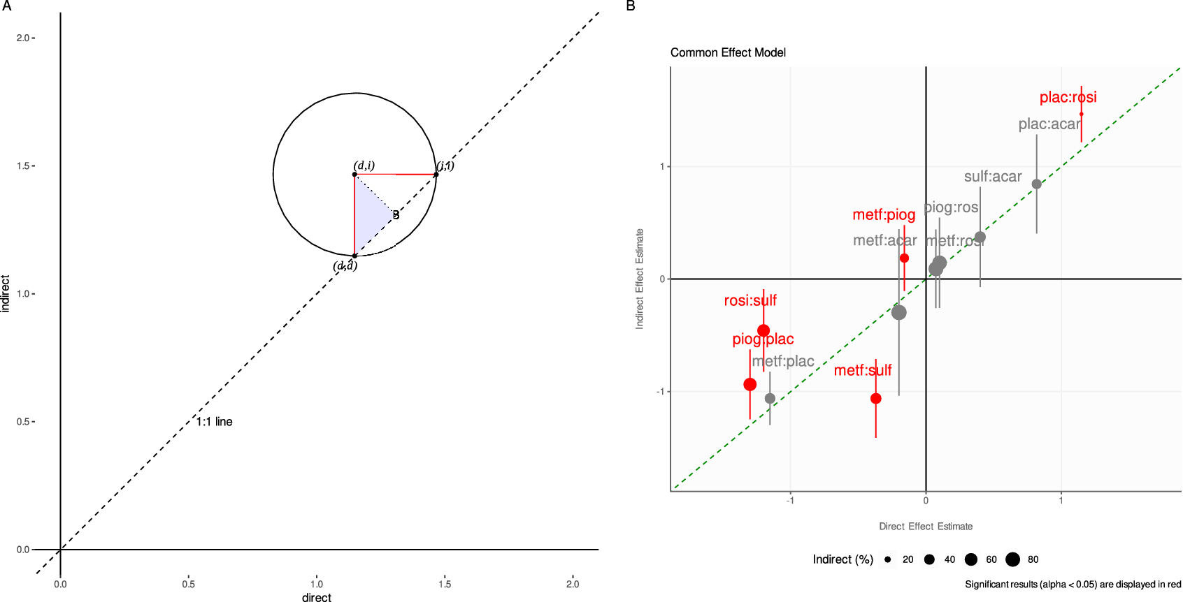
The mathematics behind our proposed visualization method is straightforward, although we are not aware of such an approach ever being used before. If we plot the d versus i estimates on a Cartesian plane (respectively, on the x and y axes), we have the following geometrical features (see Figure 1a). The 1:1 dashed line cutting through the Cartesian plane coincides with equality between the direct and indirect estimates (d = i). The point (d, i) is the center of a circle intersecting the 1:1 line at two points. By connecting these points, we build a right-angled triangle with its hypotenuse on the 1:1 line, and its square angle at the center of the circle.
The adjacent (or opposite) side of the right-angled triangle is the radius connecting the circle’s center with the point lying on the circle’s circumference and the 1:1 line. As a first key result, we show that the radius has length d − i, that is, the difference between d and i (see the Appendix). This holds for both sides of the right-angled triangle contained in the circle. Let us henceforth focus only on the radius intersecting vertically with the 1:1 line.
The closer the (d, i) point is to the 1:1 line, the shorter the circle’s radius is to the 1:1 line, and the smaller the difference d − i becomes. If the (d, i) point is on the 1:1 line, then we have d − i = 0, and the direct estimate is equal to the indirect one. It thus follows that decreasing distance between the point and the 1:1 line indicates increasing agreement between the direct and indirect estimates. We stress such agreement must be assessed pointwise. Moreover, the location of the point in the Cartesian plane also offers information: a point lying in the bottom-left or top-right quadrants indicates that the signs of the direct and indirect estimates are the same (whether a treatment is beneficial or harmful relative to its comparator); a point lying in the bottom-right or top-left quadrants indicates opposite signs.
But what about the uncertainty linked to the d − i difference? We now include the lower and upper bounds of the 95% CI of the d − i difference in the visualization. Let us consider only symmetrical CIs. We show that the CIs can be plotted horizontally to the x-axis as a segment with endpoints i + L and i + U, where L and U are the lower and upper CI bounds for the difference (d − i). Equally, we can plot the CIs vertically to the x-axis using the endpoints d − U and d − L (see the Appendix).
Hence, the CI is the diameter of a circle centered at (d, i) and formed by the adjacent (or opposite) side of the right-angled triangle with its hypotenuse parallel to the 1:1 line. If the diameter intersects the 1:1 line, then the CI contains the zero difference, and d − i is not significant. On the contrary, if the diameter never intersects the 1:1 line, then the CI does not contain the zero difference, and d is significantly different from i. In the visualization, color can be used to highlight the significance of the inconsistency Z-tests, and point size can be used to graphically highlight the proportion contribution of the direct (or indirect) evidence to the total. In the Appendix, we clarify the connection between this geometrical representation of the CI and the hypothesis testing.
3 Applied examples
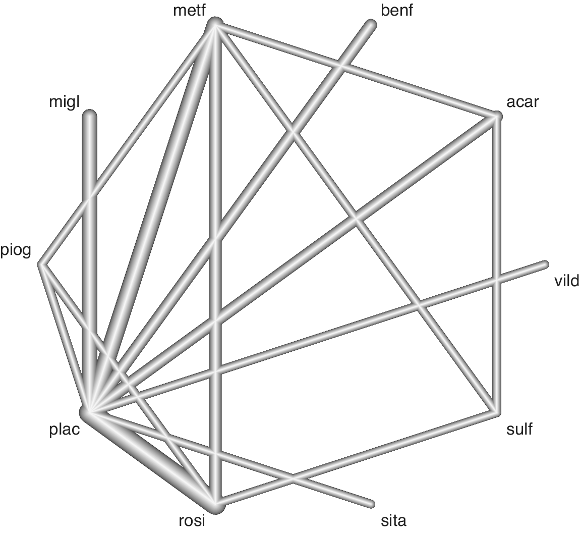
First, we present an application of the visualization method to the Senn dataset,Reference Senn, Gavini, Magrez and Scheen 17 which consists of 26 diabetes trials from which we can build a network of 10 antidiabetic treatments with 28 head-to-head direct comparisons (one study had >2 arms). The endpoint for this NMA is the reduction of glycosylated hemoglobin (HbA1c) levels as assessed by the mean difference in HbA1c. This is a medium-sized network with extremities (nodes) representing individual treatments and connections (edges) between nodes representing the observed head-to-head comparisons (Figure 2).
(a) Geometrical explanation of the proposed methodology. Key to the method is recognition that (1) either radius (in red) of the circle centered on (d, i), shortly “di-circle,” has length |d − i|, (2) another circle also centered on (d, i) but having radius CI/2 (not shown) can contain (be contained by) the di-circle which has implication for hypothesis testing on d − i. For ease of interpretation, only the top right quadrant is shown but the approach includes all four quadrants with implication for the reading of the sign of the d − i difference (see main text). The dashed line is the 1:1 line. Note that the side connecting points (d, i) and B perpendicular to the 1:1 line is not of interest, because it has only length (d − i)(√2)/2. (b) Application of the method to the Senn dataset. On the x and y axes are plotted, respectively, the direct and indirect effect estimate, calculated using the back-calculation method to split evidence in the network (common-effect model). The 95% confidence interval (CI) of the direct-indirect difference is plotted after finding the new coordinates on the graph (see the Appendix). Differences for which the local inconsistency Z-test is significant (p < 0.05) are colored in red. If the CI crosses the 1:1 line, then the CI contains the zero difference, and the difference is not significant. On the contrary, if the CI never crosses the 1:1 line, the CI does not contain the zero difference, which alerts on issues of local inconsistency. Point size increases with the proportion of contributing indirect evidence estimated. Abbreviations: acar, Acarbose; benf, Benfluorex; metf, Metformin; migl, Miglitol; piog, Pioglitazone; rosi, Rosiglitazone; sita, Sitagliptin; sulf, Sulfonylurea; vild, Vildagliptin; plac, Placebo.

Network of evidence from the Senn dataset. Edge thickness is proportional to the number of studies contributing to the head-to-head comparison. See Figure 1 for treatment abbreviations.

Forest plot based on a common-effect model for checking NMA inconsistency in the Senn dataset. I2 is the usual heterogeneity statistics (variance percentage due between-study heterogeneity). MD, mean difference. See Figure 1 for abbreviations of the comparisons.

We ran a common-effect NMA with Placebo as the common comparator. In the NMA, Rosiglitazone was ranked as the best treatment for the reduction of HbA1c (not shown).
We first diagnose NMA inconsistency by splitting the direct and indirect evidence using BC and then use FP to visualize the results (Figure 3). FP suggests inconsistencies for the comparisons metf:sulf and rosi:sulf as there are no overlaps between the CIs of the direct and indirect estimates for these. There is also some doubt for the metf:piog, piog:plac, and plac:rosi comparisons as there are only partial overlaps for these. For the metf:piog comparison, the direct and indirect estimates have opposite signs. Apart from the plac:rosi comparison, a considerable portion of the evidence is indirectly estimated for the other treatment comparisons. FP presents the information clearly, but its tabular nature does not make it very visually intuitive even for a medium-sized dataset.
Next, the NHM shows the designs (columns) and NMA estimates (rows) that contribute to inconsistency (Figure 4). Diagonal hot spots suggest design inconsistency for the metf:sulf, rosi:sulf, and piog:plac comparisons. Off-diagonal hot spots suggest estimate inconsistencies for the metf:sulf, rosi:sulf, plac:rosi, and metf:piog comparisons after relaxing the consistency assumption for the effect of one design in the column. The remaining cool spots imply NMA consistency for the rest of the treatment comparisons. The visually intuitive nature of the NHM makes it easy to see these simple observations; however, the graph does not provide enough granularity for deeper interpretations to be made even for a medium-sized dataset. Neither FP nor NHM really allow for a practical and precise assessment of the statistical significance of inconsistency.
Heat Map based on a common-effect model for checking NMA inconsistency in the Senn dataset. The size of the gray square increases with the proportion of contributing direct evidence estimated. See Figure 1 for abbreviations of the comparisons.

Finally, we visualize inconsistency using our novel approach (Figure 1b). The information is laid onto a Cartesian plane making the quantitative reading more natural. For instance, the location of a point within each quadrant displays whether the direct and indirect estimates have the same or opposite signs, that is, whether the direct and indirect evidence agree that a treatment is relatively beneficial (top-right) or relatively harmful (bottom-left) to its comparator, or if these two sources of evidence disagree on the treatment effect direction (top-left or bottom-right) relative to its comparator.
The 1:1 line runs through the quadrants’ intersection. The size of each (d,i) point increases with the proportion of indirectly estimated evidence to clearly flag treatment comparisons requiring more careful assessment.
Statistical significance of the inconsistency Z-test is found for the comparisons piog:plac, rosi:sulf, metf:sulf, metf:piog and plac:rosi, and these are colored red in the visualization. Accordingly, their respective CIs never intersect the 1:1 line and by a large margin for the rosi:sulf and metf:sulf comparisons. Of note again is the metf:piog comparison which lies in the top-left quadrant indicating opposite signs for its direct and indirect estimates, and its CI crosses into the bottom-left quadrant. Hence, the CI includes values of agreeing sign.
While the overall inconsistency assessment agrees with FP and NHM, further clarity is shed on the inconsistency significance of the metf:piog, piog:plac, and plac:rosi comparisons which were more unclear with the other methods. The medium size of the Senn dataset is easily contained by the Cartesian system. All the typical output of a BC is presented here in a clear, quantitatively precise, and compact fashion.
After running a random effects model on the same dataset, FP shows overlap for all estimates but only partly for the metf:sulf and rosi:sulf comparisons. Similarly, NHM shows no hot spots but some pale spots for the metf:sulf and rosi:sulf comparisons. Our novel approach clarifies the lack of significant inconsistency for all comparisons, even though the points for metf:sulf and rosi:sulf lie further away from the 1:1 line (see Supplementary Section 1). Note that the estimated between-study heterogeneity, τ2, is added to SE(d − i), and this typically increases the CI widths. Hence, accounting for the between-study heterogeneity in the random effects model can result in some significant differences detected in the common-effect model becoming nonsignificant, and this should be taken into account along with the typical low power of the inconsistency test.
To conclude, we have signs of inconsistency in the Senn dataset using a common-effect model with a considerable amount of indirect evidence contributing to the NMA estimates that could negatively affect the reliability of the results. In response to this, we may want to closer inspect the possible effect modifiers reported in the respective studies or perform appropriate sensitivity analyses. Applying a random effects model on the same dataset resulted in all the inconsistency tests becoming nonsignificant when accounting for the extra between-study heterogeneity.
In the second example, we apply the visualization method to a much larger dataset. The Cipriani dataset collates evidence on 21 antidepressants (Figure 5).Reference Cipriani, Furukawa and Salanti 18 , Reference Cipriani 19 The outcome is the number of patients with a depression score reduction of at least 50%. There are 611 head-to-head comparisons (6 ± 8 studies per comparison on average) from 473 trials (44% multiarm, with mostly three arms) and a total of 111, 367 patients.
Cipriani dataset. Edge thickness is proportional to the number of studies contributing to the head-to-head comparison.

Novel approach applied to the Cipriani et al. dataset. Green line = 1:1 line. (a) All comparisons; Point size is constant for graphical improvement. The CI of the rightmost point spanned over −2 and 2 and was removed to improve resolution. (b) Subset of statistically significant results only. Point size increases with the proportion of contributing indirect evidence estimated.

We ran a common-effect NMA with Placebo as the common comparator. The results shown here are only meant to demonstrate our visualization method, and they provide no new clinical findings. All 21 antidepressants were significantly better than Placebo by increasing the odds ratio for the reduction of depressive symptoms. Amitriptyline was the best treatment on a surface under the cumulative ranking curve scale (not shown).
BC was performed to assess inconsistency. It was difficult to visualize the results via FP due to the network’s large size. Even by creating smaller subsets, the plot spans over several pages (not shown). Visualizing via an NHM suggests some design inconsistency, but interpretation is difficult due to the map’s size, and subsetting is not simple with this methodology (see Supplementary Figure S4).
Inconsistency is visualized with our novel approach (Figure 6a). Recall the ideal situation is for all points to lie on the 1:1 line running through the bottom-left to the top-right quadrants. Here, this is rarely the case. Most comparisons are not significantly inconsistent because of sparse evidence in the network and wide CIs. For instance, the CI of the rightmost point spans −2 to 2 and is removed from the plot to improve resolution.
A cluster of points around the quadrants’ intersection (d = 0, i = 0) and in the top-right quadrant indicate good agreement between the direct and indirect evidence. More concerning are the clusters in the top-left and bottom-right quadrants which indicate estimates with opposite signs.
Given the sparseness of the evidence and the large uncertainty around the treatment comparison estimates, it could be sensible to question the power of the inconsistency tests and consider the likelihood of type II errors. For instance, the comparison Fluvoxamine versus Milnacipran is significant (first from left, colored red), but the next comparison to its right is not by only a small margin.
Nevertheless, many comparisons have sufficient precision, and we can filter the results by significance for a better inspection (Figure 6b). Here, we can also assess the contribution of indirect evidence by changing the point size accordingly. Alternatively, we could also filter by the amount of uncertainty by setting a CI-length threshold (not shown). This and other graphical manipulations are natural to implement in a Cartesian system and can be used to improve the visualization.
A random effects model generally agrees with its common-effect counterpart, except it usually introduces more uncertainty into the estimates. Accordingly, when we apply a random effects model to the Cipriani dataset, comparisons such as Fluvoxamine versus Milnacipran are no longer significant (see Supplementary Figure S5).
Cipriani et al. report a side-splitting table in the supplementary documentation which spans over one page after removing all Placebo-controlled trials (see their Supplementary Section 7.4.2.2). No graphical solution for inconsistency is presented in their main paper, but they report a so-called league-matrix from which consistency can be partly deduced by the agreement between direct and NMA estimates in the upper- and lower-triangles, respectively.
In our application, we showed BC inconsistency only for computational convenience, but the method can also use node-splitting (separate indirect from direct design evidence, SIDDE). All analyses were performed using R 4.2.2, 20 netmeta,Reference Balduzzi, Rücker and Nikolakopoulou 21 and netsplit.Reference Balduzzi, Rücker and Nikolakopoulou 21 The Senn dataset is freely available from the R package “netmeta.”Reference Balduzzi, Rücker and Nikolakopoulou 21 The Cipriani dataset is freely available at: https://data.mendeley.com/datasets/83rthbp8ys/2.
4 Discussion and conclusion
As discussed earlier, proper assessment of the consistency assumption is a crucial step in NMA to ensure the validity of the results, and this is best addressed a priori as post hoc assessments can be potentially underpowered.Reference Ades, Welton, Dias, Phillippa and Caldwell 2
In this article, we showed the simple mathematics behind a novel visualization to represent loop inconsistency based on BC in NMA. This visualization simultaneously displays the direct and indirect estimates, the CI and significance of their difference, and the proportional contribution of the direct (or indirect) evidence to the total. We could describe this visualization as a “scatter-forest plot” since it has features of both of a scatter and a forest plot.
We applied this visualization method to both medium and large treatment networks, the Senn and Cipriani datasets. In both examples, we showed that this visualization method could compress all of the relevant information in less space than the other established methods of FP and NHM without losing too much clarity. The advantage was clearer to see in the larger Cipriani network where both FP and NHM were unsatisfactory for visualization purposes. For the larger network, it was only practical to use FP by separating the graph into smaller subsections (function “forest.netmeta”Reference Balduzzi, Rücker and Nikolakopoulou 21 ), but even this required the subsections to span over multiple pages, making them difficult to read. For NHM, there is no functionality to separate the graph using the function “netheat”Reference Balduzzi, Rücker and Nikolakopoulou 21 in R, although, manually zooming in on the relevant subsections could be a workaround at the cost of graphical resolution.
One question is whether our visualization method is more suitable for a common-effect or a random effects model for assessing inconsistency. It is difficult to offer a general recommendation. A random effects model generally agrees with its common-effect counterpart, but it typically introduces more uncertainty into the model for the between-study heterogeneity. This typically causes a widening of the CIs, and so in the context of our proposed visualization, the lines representing the CIs of the differences between the direct and indirect estimates for each treatment comparison would generally be longer. The main impact of this would be in the borderline cases where the CI from the common-effect model does not contain the zero difference (a significant inconsistency), but the corresponding CI from the random effects model does due to the additional uncertainty. In our visualization, this would show as no intersection between the lines representing the CI with the 1:1 line for the common-effect model, whereas there would be an intersection for the random effects model for that same treatment comparison. It thus follows that if the between-study heterogeneity is of greater concern than possible local inconsistencies, then it might be more sensible to use a random effects model to highlight the between-study heterogeneity rather than using a common-effect model.
However, we agree with the general view of Ades et al.Reference Ades, Welton, Dias, Phillippa and Caldwell 2 that it can be difficult to disentangle the between-study heterogeneity and general network inconsistency. Moreover, even in a truly consistent network of evidence, if the between-study heterogeneity is large enough, then inconsistency can result regardless. From this angle, the common-effect model could be recommended as a first step to detect any possible local inconsistencies, followed by an evaluation of the between-study heterogeneity through a random effects model. This approach has clear advantages: if the between-study heterogeneity is negligible in the random effects model, then any local inconsistencies detected from the common-effect model are likely to be genuine; alternatively, if the between-study heterogeneity is substantial in the random effects model, then this might imply that the network is simply too inconsistent for any meaningful results to be inferred, even from the common-effect model. Therefore, it is perhaps advisable that both common and random effects models are applied and visualized with the proposed method for a thorough assessment of the network.
Following this logic, it is clear that only applying a random effects model could make it difficult to identify true local inconsistencies due to the additional uncertainty introduced from the random effect, and this is related to the typical low power of the inconsistency test. Here, the risk of a false-negative result (a type II error) from failing to detect a true local inconsistency is a constant concern. Therefore, using our proposed visualization to compare the results from a common-effect and a random effects model can help to contextualize the borderline cases that are particularly impacted by this model choice. These are the results that are barely significant in the common-effect model and which become nonsignificant in the random effects model in light of the extra between-study heterogeneity.
For example, consider the hypothetical scenario where a common-effect model has been applied, and for a particular treatment comparison, the direct and indirect effect estimates have opposite signs. In our proposed visualization, the point for this treatment comparison would lie in either the top-left or the bottom-right quadrant. Further, suppose that the 95% CI for the difference between the direct and indirect estimates only barely includes the zero difference (indicating a nonsignificant inconsistency despite the direct and indirect estimates having opposite signs). In our visualization, the line representing the 95% CI would intersect the 1:1 line. Is this result alone proof of consistent evidence for this treatment comparison? If this result was actually a false-negative, then it would have been more difficult to identify using a random effects model as the CI would have been wider.
In this example, we would be conservative in our judgment and would interpret this result as a likely false-negative, that is, as evidence of a local inconsistency despite the nonsignificance suggested from the common-effect model. To this end, however, it beggars the question of how much extra heterogeneity is too much so that any contextualization into a false-negative result becomes pointless? For instance, we could a priori establish a threshold after which any extra width into the CI makes assessing a comparison’s inconsistency too difficult in a random effects model. In the context of our visualization method, such comparisons could be filtered out to make the plot slimmer and to better focus on the comparisons that matter.
Our visualization method inherits the general limitations of testing loop inconsistency post hoc, such as low power, although it attempts to make such an assessment more comprehensive visually. There might also be other limitations. For small to medium networks, some users might still prefer the level of graphical and textual detail given by FP, or the detailed breakdown of evidence contribution given by an NHM.
While our new visualization method is also not immune to the difficulty of visualizing a large number of comparisons, we believe that it provides an improvement against existing methods and enables a more visually concise and yet comprehensive examination of the consistency assumption in NMA.
Supplementary material
To view supplementary material for this article, please visit http://doi.org/10.1017/rsm.2026.10082.
Competing interest statement
The authors were employed as statisticians in a contract research organization (Veramed Ltd London, Twickenham, United Kingdom; Veramed GmbH, Frankfurt am Main, Germany) at the time of writing the initial draft. Any opinions expressed within the article belong to the authors only and do not necessarily express the views of their affiliated companies. A.S. is currently employed by Boehringer Ingelheim, and F.B. is currently employed by Cytel.
Acknowledgments
The ideas in this article were presented in an abbreviated form at the 2023 ISPOR Conference in Boston, United States.
Author contributions
Conceptualization: H.W., F.B.; Data curation: A.S.; Formal analysis: A.S., F.B.; Investigation: H.W., A.S., F.B.; Methodology: H.W., A.S., F.B.; Project administration: A.S., F.B.; Software: H.W., A.S., F.B.; Supervision: A.S., F.B.; Validation: S.R., F.B.; Visualization: H.W., F.B.; Writing—original draft: H.W., A.S., F.B.; Writing—review and editing: S.R.
Data availability statement
The code to reproduce all figures and results is available at: https://github.com/bonorico/inconsistency_plot and on Zenodo at DOI: https://doi.org/10.5281/zenodo.18724989.
Funding statement
The authors declare that no specific funding has been received for this article.
Appendix
For a treatment effect comparison, A versus B, we have a direct effect estimate $d$
and an indirect effect estimate
$d$
and an indirect effect estimate $i$
. We can plot the direct estimate on the
$i$
. We can plot the direct estimate on the $x$
-axis and the indirect estimate on the
$x$
-axis and the indirect estimate on the $y$
-axis which produces a point
$y$
-axis which produces a point $\left(d,i\right)$
on the Cartesian plane (see Figure 1a). If there is no difference between the direct and indirect effect, then we have
$\left(d,i\right)$
on the Cartesian plane (see Figure 1a). If there is no difference between the direct and indirect effect, then we have
 $$\begin{align*}d=i\end{align*}$$
and the point lies on the y = x line (the 1:1 line).
The distance between (d, d) and (d, i) is
 $$\begin{align*}r=\sqrt{{\left(d-i\right)}^2},\end{align*}$$
that is, the radius of the circle centered at (d, i) in Figure 1a, or the hypotenuse of the blue-shaded triangle (d, i), (d, d), B. Likewise, we can draw the horizontal radius from the triangle (d, i), (i, i), B.
How can we draw the 95% CI of the difference d − i on the graph, and what correspondence does this have to hypothesis testing?
Let us denote the original values of the lower and upper CI, respectively, as L and U, for example, CI = (d − i) ± 1.96 × SE(d − i). This CI is based on a Z-testReference Dias, Welton, Caldwell and Ades 4 , Reference König, Krahn and Binder 10 where 1.96 is the value of the Normal standard quantile at 1 − α/2, α = 0.05 and SE(d − i) is the standard error of d − i.
For any point y on the i-axis, we have the following relationship between the difference d − y and its CI:
 $$\begin{align*}L<d-y<U.\end{align*}$$
Rearranging we have
 $$\begin{align*}d-U<y<d-L.\end{align*}$$
Solving for y, we find that the vertical CI is a segment with coordinates ( ${x}_1$
,
${x}_1$
, ${y}_1$
) and (
${y}_1$
) and ( ${x}_2$
,
${x}_2$
, ${y}_2$
) where
${y}_2$
) where ${x}_1=d,{y}_1$
= d − L, and
${x}_1=d,{y}_1$
= d − L, and ${x}_2=d,{y}_2$
= d − U. Following the same logic and solving for x, the horizontal CI is a segment with coordinates (i + L, i) and (i + U, i). Using such coordinates, we verify that the CI has length
${x}_2=d,{y}_2$
= d − U. Following the same logic and solving for x, the horizontal CI is a segment with coordinates (i + L, i) and (i + U, i). Using such coordinates, we verify that the CI has length $\sqrt{{\left(U-L\right)}^2}$
regardless of the orientation.
$\sqrt{{\left(U-L\right)}^2}$
regardless of the orientation.
That is, for a type I error of 5%,
 $$\begin{align*}U-L=2\times 1.96\times \mathrm{SE}\left(d-i\right)\end{align*}$$
is the diameter of a circle centered on (d, i), shortly “CI-circle” which contains (or is contained by) the circle with same center but radius = |d − i|, shortly “di-circle.”
The radius (U − L)/2 of the CI-circle can be less or greater-equal than the radius |d − i| of the di-circle. We thus have the following decision rules. If the CI-circle is contained into the di-circle, then
 $$\begin{align*}\left(U-L\right)/2<\mid d-i\mid \to\end{align*}$$
 $$\begin{align*}1.96\times \mathrm{SE}\left(d-i\right)<\mid d-i\mid \to\end{align*}$$
 $$\begin{align*}1.96<\mid d-i\mid /\mathrm{SE}\left(d-i\right),\end{align*}$$
which holds only if |z| ≥ 1.96 because the right-end side of the last term is a Z-test which implies rejection of the null hypothesis d = i at a critical α-value of 5%. In Figure 1b, this corresponds to the case when the CI does not cross the 1:1 line. On the contrary, if the CI-circle contains the di-circle, then (U − L)/2 ≥ |d − i| and |z| < 1.96 which implies acceptance of the null. In Figure 1b, this corresponds to the case when the CI does touch or cross the 1:1 line.
This demonstrates the correspondence between hypothesis testing and our geometrical representation of the CIs. As clear from the above presentation, inconsistency is only statistically assessed pointwise and not “globally.” As a final note, if the di-circle is centered on the 1:1 line (d = i), then its radius has length zero which implies acceptance of the null hypothesis given that SE(d − i) > 0 for the Wald test to be nonsingular.


 Open access