


1. Introduction
Glacier mass loss is a major contributor to sea level rise and has a strong influence on local water resources (Arias and others, Reference Arias and Masson-Delmotte2021). Global glacier mass balance has rapidly decreased over the last two decades (Rignot and others, Reference Rignot, Velicogna, van den Broeke, Monaghan and Lenaerts2011; Gardner and others, Reference Gardner2013; Zemp and others, Reference Zemp2019), with accelerating mass loss from nearly all glacierized regions (Hugonnet and others, Reference Hugonnet2021). Mass loss rates from the peripheral glaciers in southeast Greenland that are weakly connected or not connected to the Greenland Ice Sheet (GrIS), however, have decreased throughout the last two decades (Hugonnet and others, Reference Hugonnet2021). Although the decreasing mass loss rate signal is pervasive across the North Atlantic, it is in contrast with the stable and increasing rates of mass loss observed for the peripheral glaciers in northern and western Greenland, respectively (Hugonnet and others, Reference Hugonnet2021). Greenland's peripheral glaciers and ice caps (GICs; Fig. 1) occupy only ~5% of Greenland's area but contributed ~20% (~38 Gt a−1) of mass loss from Greenland's terrestrial ice masses between 2000 and 2008 (Bolch and others, Reference Bolch2013; Gardner and others, Reference Gardner2013; Hugonnet and others, Reference Hugonnet2021). Therefore, it is imperative that mass loss from Greenland's peripheral GICs is well-quantified and understood.
(a) The marine-terminating peripheral glaciers are scattered across the five regions used for this analysis (basemap from Moon and others, Reference Moon, Joughin, Smith and Howat2021). Each glacier is represented by a circle where the size of the circle indicates the average speed (m a−1) from 1985 to 2018 and the color represents the glacier discharge anomaly (Gt a−1) relative to the 1985–98 period, with red indicating a positive anomaly (increased discharge) and blue indicating a negative anomaly (decreased discharge). Insets show Landsat 8 panchromatic imagery from (b) western Greenland (glacier RGI50-05.07736) and (c) southeast Greenland (glaciers RGI50-05.04276, RGI50-05.04304 and RGI50-05.04280) illustrating the RGI glacier outline (black) and the manual terminus delineations from ~1985 (cyan), 2000 (orange) and 2015 (red).

Glacier mass balance is controlled by surface accumulation and meltwater runoff and, for marine-terminating glaciers, iceberg discharge. The portion of Greenland GIC mass loss due to the imbalance between surface accumulation and meltwater runoff, called surface mass balance (SMB), is estimated to have steadily increased for GICs from 11.3 Gt a−1 in 1997 to 36.2 Gt a−1 in 2015 (Noël and others, Reference Noël2017). Changes in iceberg discharge due to perturbations in the glacier stress balance and associated variations in ice flow (i.e., dynamic mass change) are expected to contribute mass loss on the order of gigatons per year based on the difference between total mass loss and SMB. However, the large uncertainty in SMB (~15.7 Gt a−1) for GICs prevents confident partitioning of mass loss. Accurate mass loss partitioning for marine-terminating glaciers is necessary to understand the somewhat disparate mass loss signals from land- and marine-terminating glaciers and their regional variability around Greenland's periphery (Hugonnet and others, Reference Hugonnet2021).
Here, we quantify ice discharge from Greenland's 585 marine-terminating peripheral glaciers (Fig. 1a) using the fluxgate method (Enderlin and others, Reference Enderlin2014; King and others, Reference King2018; Mankoff and others, Reference Mankoff2020). We use remotely-sensed glacier speed time series and empirically-estimated ice thickness to construct discharge time series from 1985 to 2018, and we estimate potential errors associated with surface accumulation and meltwater runoff between flux gates and termini as well as temporal changes in ice thickness at the flux gates. We compare the discharge time series to terminus position observation from 1985, 2000, and 2015 and the winter North Atlantic Oscillation (NAO) index to investigate potential forcing mechanisms for dynamic change.
2. Data and methods
2.1. Glacier identification and flux gate mapping
Greenland's marine-terminating peripheral glaciers were identified using the Randolph Glacier Inventory (RGI; RGI Consortium, 2017). Greenland glacier outlines are compiled as part of the Global Land Ice Mapping from Space program (GLIMS). The outlines were overlain on the earliest cloud-free summer Landsat 5 TM (1985–98) and Landsat 7 ETM+ (1999–2002) images for each glacier, as well as cloud-free summer Landsat 8 OLI images from 2015 to 2016, and manually inspected to determine whether the glaciers were marine-terminating for the duration of the record. Image years are shown in Figure 2. Images were preferentially selected from July/August, if possible, to minimize potential biases in image interpretation due to shadow (which increases in extent throughout the summer) and sea ice (which decreases in extent throughout the summer). Terminus positions were then manually traced in the Landsat images for all glaciers that were identified as marine-terminating in order to characterize long-term terminus position change. The image years were selected based on the launch dates for each of the Landsat missions, the temporal extent of the velocity dataset used for discharge estimation described below and the observations of fairly stable terminus positions for GrIS outlet glaciers prior to 2000 (Howat and Eddy, Reference Howat and Eddy2011). The 30 m-resolution band 3 (red) images from Landsat 5 and 15 m-resolution band 8 (panchromatic) images from Landsat 7 and 8 were used for terminus mapping. As with previous studies, we assume an uncertainty in terminus position on the order of one pixel for the terminus delineations (Carr and others, Reference Carr, Vieli and Stokes2013; Moon and others, Reference Moon, Joughin and Smith2015; Liu and others, Reference Liu, Enderlin, Marshall and Khalil2021). A total of 641 peripheral marine-terminating glaciers were identified and mapped using this approach. These glaciers were filtered to exclude ice-sheet outlet glaciers for which Mankoff and others (Reference Mankoff2020) calculated ice discharge. Although numerous GrIS discharge datasets are available, we used the Mankoff and others (Reference Mankoff2020) dataset for filtering because it is updated regularly. There were 56 overlapping glaciers, which were excluded from further analysis, resulting in 585 glaciers identified as weakly connected or entirely not connected to the GrIS (Rastner and others, Reference Rastner2012) in our dataset.
The distribution of image years used for manual terminus delineations from Landsat 5 (purple), 7 (grey) and 8 (green). Terminus positions for ~1985, 2000, and 2015 were delineated using Landsat 5 imagery from 1985 to 1998, Landsat 7 imagery from 1999 to 2002, and Landsat 8 imagery from 2015 to 2016, respectively.

To quantify discharge, we manually delineated a ‘flux gate’ perpendicular to ice flow inland of the glacier's terminus. Using this method, discharge is estimated as the mass of ice that flows across a flux gate at the grounding line for glaciers with floating termini or, ideally, immediately inland of the most retracted terminus position for grounded termini (Enderlin and others, Reference Enderlin2014; King and others, Reference King2018). Although the flux gate position can be assigned algorithmically using a velocity mosaic and robust digital bed elevation models (Mankoff and others, Reference Mankoff2020), there are very few bed elevation estimates for the peripheral glaciers. Therefore, we used the ArcticDEM digital elevation model (DEM; Porter and others, Reference Porter2018) to identify floating termini as an observably distinct break in surface slope at elevations below 50 m (Enderlin and Howat, Reference Enderlin and Howat2013), under the assumption that the majority of the relatively narrow and slow-flowing glaciers around Greenland's periphery will not be thicker than 500 m at their grounding lines. Only eight glaciers were identified with potential floating termini, and the flux gates at those glaciers were set at the surface slope break. In the absence of floating ice, we positioned the flux gate within ~2 km of the most retracted terminus position. For all glaciers, the flux gate was manually delineated approximately perpendicular to flow using the 250 m-resolution MEaSUREs velocity mosaic for Greenland (Joughin and others, Reference Joughin, Smith, Howat and Scambos2016; https://nsidc.org/data/NSIDC-0670/versions/1).
2.2. Discharge
The mass flux across each gate was calculated as the volume flux (i.e., product of the surface speed perpendicular to the gate, thickness and width) multiplied by the depth-averaged density. The ice velocity observations and thickness datasets used for the discharge estimates are described in detail below.
Velocities were obtained from the NASA MEaSUREs ITS_LIVE project (Gardner and others, Reference Gardner, Fahnestock and Scambos2019), which provides annual mean surface velocities derived from Landsat 4, 5, 7 and 8 imagery using the auto-RIFT feature tracking processing chain described in Gardner and others (Reference Gardner2018). These 240 m-resolution annual velocity maps have nearly complete spatial coverage since the 1999 launch of Landsat 7, with patchier spatial coverage for 1985 through 1998, but are the most comprehensive speed dataset available for Greenland GICs. To account for cross-glacier variations in speed and irregular flux gate geometries, each flux gate was divided into discrete bins corresponding to velocity raster cells. The speed perpendicular to each bin was used in the discharge calculations described below. When and where speed observations were not available for the entire flux gate, the speed data were omitted from the discharge time series. Temporal gap-filling of the discharge time series is described below.
Thickness data for Greenland's peripheral glaciers are incredibly sparse, so we constructed an empirical scaling relationship to estimate glacier thickness at each bin across the fluxgate. The NASA Operation Ice Bridge (OIB) mission conducted annual airborne-radar surveys across Greenland from 2009 to 2018 but focused primarily on data acquisition for the ice sheet itself. There are only a handful of ice thickness observations within a few kilometers of peripheral glacier termini that can be used to constrain cross-sectional geometries of Greenland's peripheral glaciers. Therefore, we used the MCoRDS L2 Ice Thickness Version 1 with 4.5 m vertical resolution, ~25 m along-track resolution and ~14 m sample spacing (Paden and others, Reference Paden, Li, Leuschen, Rodriguez-Morales and Hale2010) to devise an empirical scaling relationship with which to estimate ice thickness from width and/or speed observations (Enderlin and others, Reference Enderlin2014; Fig. 3). Only four of the 585 peripheral glaciers have cross-sectional OIB thickness observations at the terminus, and these glaciers are scattered between the west, southeast and central-east regions. Therefore, we included near-terminus centerline OIB observations for ten other peripheral glaciers and the overlapping glaciers in the Mankoff and others (Reference Mankoff2020) ice-sheet discharge dataset in order to encompass a range of flow conditions and geometries representative of all peripheral glaciers. The thickness data were compared to speed, width, the product of speed and width, the quotient of speed and width and the quotient of width and speed through the analysis of goodness of fit metrics for best-fit linear, quadratic and cubic polynomials to identify the surface observations with the strongest predictive relationship for thickness.
(a) The empirical scaling function used to estimate thickness from speed, where the logarithmic increase in thickness at lower speeds is augmented by a linear polynomial function to capture the gradual increase in thickness with higher speeds. Gray shading denotes the uncertainty envelope of thickness estimates. (b) Flux gate speed histogram for all glaciers included in the study. The flux gate bin count is displayed using a log scale to facilitate visualization of the exponential decrease in count with speed.

We found that although there was a large spread in thickness for individual observations as well as glacier-averaged observations, the rapid increase in thickness with speed up to ~50 m a−1 was well approximated using a logarithmic function and the more gradual increase in thickness with speed for faster flow conditions was well captured by augmenting the logarithmic function with a linear polynomial. This function was fit using a non-linear least squares, bisquared weighting approach applied to the glacier-averaged speed and thickness observations. Rather than to use the automatically-computed confidence intervals, which failed to capture the majority of the variability in the speed–thickness relationship due to the bisquared weighting, the function was fit to thicknesses <100 and >200 m to compute the lower and upper bounds for the empirical scaling relationship, respectively. Although these thickness thresholds were somewhat arbitrarily determined, the confidence interval shown as gray shading in Figure 3 captures the majority of the variability in the observed speed–thickness relationship. Using these curves, thickness uncertainty for the typical flux gate speeds (<20 m a−1; Fig. 3b) is <50 m. For each flux gate bin, the best-estimate and uncertainty in thickness were estimated by solving the best-fit and bounding empirical scaling relationships using the 1985–2018 median ITS_LIVE speed. Although steady-state velocities should be used to calculate ice thickness, we used the median velocities over the entire time period to minimize temporal sampling bias introduced by the use of sparse velocity estimates over the Landsat 5 era and quantify potential biases associated with thickness change over time using observations of surface elevation change. The influence of constant thickness estimates on discharge changes over time (i.e., dynamic mass loss) is described in the next section.
The sum of the product of the estimated bin thickness, observed speed and width was used to construct time series of volume flux. Volume flux uncertainties were estimated using standard error propagation techniques (i.e., summed in quadrature), accounting for the covariance between the empirical thickness estimates and speed. Uncertainties in speed were extracted from the ITS_LIVE data product. Uncertainties in width were assumed to be one 15 m-resolution Landsat pixel at each gate end. Uncertainties in our ice thickness estimates were estimated as the difference between the best-fit and the bounding empirical thickness estimates. Volume fluxes and their estimated uncertainties were multiplied by the density of ice (917 kg m−3) to estimate the mass flux across each flux gate.
2.3. Dynamic mass loss
In line with the analyses of GrIS mass loss and peripheral glacier SMB change, we refer to the 1985–1998 period as ‘steady state’ and compute dynamic mass loss as the discharge anomaly relative to the 1985–98 time period (e.g., van den Broeke and others, Reference van den Broeke2016; Noël and others, Reference Noël2017). The data are clustered by region based on the boundaries of Mouginot and others (Reference Mouginot2019) for the ice sheet, with the northwest, central-west and southwest regions merged into one western region since there are only 62 marine-terminating peripheral glaciers along Greenland's west coast.
The use of a constant thickness cross-section for all flux calculations potentially biases the flux time series for each glacier. DEM time series from 2011 to 2019 from the Polar Geospatial Center ArcticDEM project were used to assess the potential influence of time-varying thickness on the flux estimates. The DEMs had highly variable temporal coverage, preventing their direct use to constrain changes in ice thickness over the 1985–2018 time period. The number of DEMs per glacier ranged from 1 to 61 (average = 11), covering an average time span of 4.3 years. Therefore, we fit linear polynomials to the width-averaged surface elevation, speed and SMB time series from the flux gate in an effort to identify a predictive relationship to extrapolate thickness changes over time. Annual SMB was extracted from the nearest gridcell(s) from the 1 km-resolution Regional Atmospheric Climate Model (RACMO) for Greenland (Noël and others, Reference Noël2016).
The use of inland fluxes to approximate terminus discharge also introduces uncertainty into our dynamic mass loss estimates. The procedure to estimate the mass loss between the flux gate and terminus for each time step for all glaciers is as follows. First, the travel time (Δt) between the gate and terminus was calculated as

In Eqn (1), d gate and d terminus are the centerline distance from the most-advanced terminus position (m) and U is the annual ITS_LIVE centerline speed at the flux gate (m a−1). Given the sparse observational time series for terminus position, the distance between the flux gate and the terminus was estimated using the mean of the 1985 and 2000 terminus positions for flux estimates from 2000 and earlier, the mean of the 2000 and 2015 terminus positions for flux estimates from 2001 to 2014 and the 2015 terminus position for 2015–18. Next, SMB data were extracted from the RACMO gridcell nearest to the center of the flux gate for the years corresponding to the speed observation year (t 0) through the projected calving year (t 0 + Δt). Then, the cumulative SMB (m.w.e.) over the travel time period was converted to an ice thickness change estimate. Finally, the thickness change estimate was multiplied by the speed and width of each bin and summed across the flux gate to obtain an estimate of flux change between the gate and terminus. These flux adjustment estimates are rough approximations and, therefore, are not applied as corrections to our discharge estimates.
Our assumptions that surface speeds are equal to the depth-averaged speeds and that the glacier density is equal to bubble-free ice may also introduce bias into our flux estimates. However, we expect that the errors introduced by these assumptions will remain relatively constant over time and should have minimal influence on dynamic mass loss estimates.
3. Results
3.1. Discharge time series
Discharge from Greenland GICs increased abruptly in 1999. Since discharge is not normally distributed, the median ± median absolute deviation prior to and following the step change is reported as metrics of discharge unless otherwise noted. When discharge estimates are only computed using observed annual velocities (i.e., no gap-filling), we estimate that GIC discharge increased from 2.49 ± 0.31 Gt a−1 from 1985 to 1998 to 5.10 ± 0.21 Gt a−1 from 1999 to 2018 (Fig. 4a, black line; Table 1). However, the 1999 step change in discharge corresponds with a step increase in spatial coverage of speed observations (Fig. 4b). Both the number of glaciers with data coverage and the cumulative flux gate width increased by ~40% in 1999 with the launch of Landsat 7. There were 54 glaciers with no speed data for the entire study period, such that only 531 of the 585 GICs are included in our discharge estimates.
(a) Annual discharge from the marine-terminating GICs from 1985 to 2018 using all available observations (black), with each glacier's time gaps filled for 1985–98 and 1999–2018 with the median from the respective period (dark purple), with time gaps filled and the median relative change used to calculate 1985–98 glacier discharge if no early observations are available (light purple), for only glaciers with complete data coverage across the time series (light green), and for only glaciers with average annual discharge >0.05 Gt a−1 (dark green). (b) Cumulative (left axis) width and (right axis) percent glacier coverage for the complete annual discharge time series.

Regional sum of time-averaged annual glacier discharge from 1985 to 1998 (‘steady-state’) and 1999 to 2018, and the sum of the time-averaged mass change between the flux gate and terminus

For the 531 glaciers with speed data over the 1985–2018 period, only 272 have complete annual time series. Of the remaining 259 glaciers, 128 have speed observations for at least a portion of both the 1985–98 and 1999–2018 periods and 131 lack any speed observations prior to 1999. For the 272 glaciers with complete time series, the step increase in discharge was only 0.54 Gt a−1 (1.80 ± 0.18 to 2.34 ± 0.13 Gt a−1; Fig. 4a, light green line). For each glacier with incomplete time series, temporal gaps were then filled with the median steady-state discharge if within the 1985–98 period or the median from 1999 to 2018 if within this later period. Gap-filling increased the number of glaciers with complete time series to 400 and total GIC discharge increased to 2.94 ± 0.23 Gt a−1 from 1985 to 1998 and 5.10 ± 0.21 Gt a−1 from 1999 to 2018 (Fig. 4a, dark purple line; Table 1, gap-filled). Although small temporal gaps can be filled with this approach, the lack of data from the 131 glaciers without discharge estimates from 1985 to 1998 may bias the inferred dynamic mass loss anomaly. These glaciers account for 25% of the glaciers in this study and make up 21.6% of the total flux gate width and 25% of the discharge on average over the 1999–2018 period. To estimate steady-state discharge for these glaciers, we assumed that the distribution of relative change in discharge between 1985–98 and 1999–2018 was the same for the glaciers with and without speed data from the earlier time period. Application of the median relative discharge increase of 16.9% to the glaciers without steady-state observations increased GIC discharge from 1985 to 1998 by 1.07 Gt a−1, to 4.03 ± 0.23 Gt a−1 (Fig. 4a, light purple line; Table 1, gap-filled and uniform change). We consider these gap-filled time series (Fig 4a, purple lines) as upper and lower bounds for GIC discharge, resulting in best estimates of GIC dynamic mass loss of ~1–2 Gt a−1 since 1999. This flux gate-derived dynamic mass loss estimate is in good agreement with the ~2 Gt a−1 of dynamic mass loss estimated as the difference between total mass loss of ~38 ± 7 Gt a−1 (Bolch and others, Reference Bolch2013; Gardner and others, Reference Gardner2013; Hugonnet and others, Reference Hugonnet2021) and surface mass loss of 36.2 ± 15.7 Gt a−1 from 1997 to 2015 (Noël and others, Reference Noël2017). This ~1–2 Gt a−1 dynamic mass loss estimate is also in good agreement with the 0.69 ± 0.49 Gt a−1 estimate produced using the Open Global Glacier Model (OGGM) when calibrated with RACMO SMB estimates (Recinos and others, Reference Recinos, Maussion, Noël, Möller and Marzeion2021).
Unlike discharge change from the GrIS, which has largely been driven by accelerated flow and dynamic mass loss from the largest <10% of glaciers (Enderlin and others, Reference Enderlin2014; Mankoff and others, Reference Mankoff2020), we find that the largest glaciers do not dominate the abrupt increase in discharge from Greenland GICs (Fig. 4a, dark green line). For the 15 glaciers (3% of GICs) that discharge >0.05 Gt a−1 (Fig. S1), discharge increased by 0.67 Gt a−1 from 1985–98 to 1999–2018. Discharge from these 15 glaciers was 1.20 ± 0.18 Gt a−1 (28–40% of 1985–98 GIC best estimates) during the steady-state period and 1.87 ± 0.07 Gt a−1 (36% of 1999–2018 GIC best estimate) after 1999.
At the regional scale, discharge change varies considerably around the Greenland periphery (Fig. 5). Hereafter, regional discharge estimates are presented using the gap-filled dataset. Thirty-nine percent of the GICs are located in the southeast, yet the pronounced step change in discharge from 0.85 ± 0.10 Gt a−1 from 1985 to 1998 to 2.54 ± 0.20 Gt a−1 from 1999 to 2018 accounted for 65% of the total discharge change (Fig. 5a; red). A coincident but much smaller step change in discharge, from 0.06 ± 0.01 to 0.12 ± 0.03 Gt a−1 also occurred in the north, but the sparse observational coverage limits any interpretation of this signal (Figs 5a, b; dark blue). Observational coverage for the west is sparse prior to the 1990s (Fig. 5b; orange). Despite variations in observational coverage between years, discharge remained ~0.5 Gt a−1 from 1992 to 2002, then abruptly increased to 0.74 ± 0.02 Gt a−1 from 2003 to 2018 (Figs 5a, b; orange). The central east and northeast regions had complete observational coverage for nearly the entire record (Fig. 5b; yellow and light blue, respectively). For both regions, discharge increased by ~15% in 1999 (Fig. 5a). Discharge from the northeast gradually declined after its 1999 peak, similar to the southeast. In contrast, discharge from the central east remained relatively stable from 1999 to 2016, then increased abruptly from ~1.25 to ~1.6 Gt a−1 (28% increase).
Regional time series of (a) annual ice discharge and (b) speed data coverage, (c -d) terminus position change histograms for ~1985 -2000 and 2000 -15 and (e -i) normalized speed box plot time series. The same regional color scheme is used for all panels (see legend in panel a). Regional boundaries are identified in Figure 1. The number of glaciers in each region is indicated in panels e-i). In the box plots, the colored bars define the 25th -75th percentiles, the horizontal black lines indicate the annual median, the dashed vertical lines extend to all non-outliers and the circles indicate outliers.

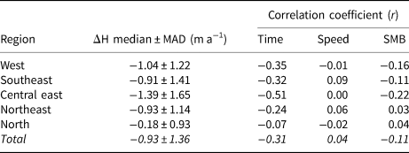
3.2. Thickness change
Given the time-varying coverage of speed, surface elevation and terminus position datasets, we do not formally adjust our discharge time series to account for temporal variations in thickness at the flux gate and SMB between the flux gate and terminus. However, the analysis of DEM time series from 2011 to 2019 indicates that thinning was prevalent in the later portion of the discharge time series. The median rate of thickness change for all GICs was −0.93 ± 1.36 m a−1 (Table 2). The regional median rate of thickness change ranged from −0.18 ± 0.93 m a−1 in the north to −1.39 ± 1.65 m a−1 in the central east (Table 2). The near-zero but highly variable thinning rate in the north region indicates that although thinning dominates in this region, thickening is fairly common as well. Variations in thickness change cannot be explained by simple linear relationships with time (r = −0.31), speed (r = −0.04) or SMB (r = −0.11) for Greenland GICs (Table 2). For all but the north region, change in thickness is best, although weakly, approximated as a linear function of time. For the north, changes in thickness over time are most strongly correlated with changes in SMB.
Regional thickness change statistics. Time-averaged thickness change rate and variability (MAD) and correlation coefficients for linear polynomials used to describe thickness change as a function of time, speed and SMB
The sum of mass change between the flux gates and termini of all GICs is −0.53 ± 0.04 Gt a−1 from 1985 to 1998 and −0.29 ± 0.02 Gt a−1 during the 1999–2018 period (Table 1). In other words, our Greenland GIC discharge estimates should be lowered by ~0.41 Gt a−1 to account for mass loss between the flux gates and glacier termini. These losses are equivalent to 14% of the discharge before 1998 and 8% after 1999. The decrease in mass loss over time is primarily driven by the widespread retreat of glacier termini from ~1985 to 2015 (Fig. 5c) and its influence on travel time between the flux gate and terminus, as surface meltwater runoff has increased dramatically since the 1990s (Noël and others, Reference Noël2017).
4. Discussion
4.1. Speed, thickness and discharge variability
Discharge varies spatially with glacier geometry and speed. Given that a glacier's geometry strongly controls its stress balance, speed is strongly influenced by geometry; thick glaciers that occupy deep troughs should flow the fastest since these conditions require fast speeds in order to maintain a balance of driving and resistive stresses (Cuffey and Paterson, Reference Cuffey and Paterson2010). Here we make use of the expected, and observed (Fig. 3a), relationship between glacier geometry and speed to estimate ice thickness. A geometry-dependent scaling relationship was similarly used by Enderlin and others (Reference Enderlin2014) for GrIS outlet glaciers, with small discharge estimates relative to those estimated with mass-conserving bed elevation datasets (e.g., Mankoff and others, Reference Mankoff2020). The majority of the speeds extracted for the Greenland GIC flux gates are less than the minimum speed for glaciers with thickness observations (~20 m a−1) but the estimated thickness of ~100 m for the slow-flowing ice is reasonable for such slow speeds.
Since thickness is estimated as a non-linear function of speed, and discharge is the product of speed, thickness and width, spatial variations in discharge are similar to patterns in speed but not identical (Fig. 1a). However, discharge anomalies are entirely dictated by changes in speed over time (Figs 1a, 5). Given the highly skewed distribution of speeds for the GICs (Fig. 3b), Figures 5e–i contain regional box plot time series of normalized speeds rather than observed speeds. The speed time series in Figure 5 include all annual speed observations, with equivalent time series for glaciers with complete time series in Figure S2. For all regions, speeds reached a minimum around 1990, increased slightly throughout the 1990s, then peaked around 1999. The 1999 acceleration was abrupt for all regions and was accompanied by a secondary peak in 2002/03 for all regions except the west. As a result of this widespread acceleration, we obtain positive discharge anomalies for ~62% of glaciers for 1999–2018 relative to the steady-state period (Fig. 1a). Interestingly, the regional median speed gradually decreased after ~2002, but the discharge remained relatively constant or increased for both the west and central east regions (Fig. 5a). This discrepancy in temporal patterns between regional discharge and median speed can be explained by the differences in the relative importance of the largest, fastest-flowing glaciers in these metrics. The median speed is insensitive to changes in speed for the fastest-flowing glaciers since they are outliers (see Fig. 3b). However, these glaciers constitute ~36% of GIC discharge, such that their near-constant discharge from 1999 to 2018 counter-acts the decrease in discharge for the more abundant but slower-flowing glaciers (Figs 1a, 3).
Thinning was prevalent across all regions but at highly variable rates within and between regions (Table 2). Change in thickness across the GICs most strongly varied as a negative function of time (r = −0.31, Table 2). However, the principle of mass conservation requires that changes in thickness over time are caused by changes in mass balance, speed or both. We attribute the overall poor correlations between thickness change and speed and SMB (Table 2) to the sparse data coverage and lack of temporal synchronicity between these datasets. Further, the relative importance of these thickness drivers varies widely between glaciers based on their local climate and geometry, so linear extrapolation may be too simple. For example, Moon and others (Reference Moon, Joughin, Smith and Howat2012) found regional variability in speed at GrIS outlet glaciers and a variable and complex response to regional and local forcing. Given our inability to confidently extrapolate changes in thickness beyond the sparse observational records for each glacier, we do not attempt to correct our discharge estimates for temporal variations in ice thickness. The median change in thickness is −13% of glacier thickness observed during the 2011–19 period. Assuming that the observed thinning rates can be reasonably extrapolated over the entire 1999–2018 post-acceleration time period, then our discharge estimates could be ~10–20% higher immediately following the 1999 acceleration and gradually decreasing to ~10–20% lower by 2018. However, there is no observational thickness data concurrent with the 1999 acceleration, when we would expect the largest dynamic changes in thickness to occur.
4.2. Potential drivers of dynamic mass loss
Atmospheric and oceanic forcing have been shown to drive mass loss at GrIS outlet glaciers. GrIS outlet glacier discharge was steady for ~30 years prior to 2000 (~430 Gt a−1), before it increased to >500 Gt a−1 between 2000 and 2005 then at least temporarily stabilized at ~500 Gt a−1 through present (Mankoff and others, Reference Mankoff2020). Terminus positions were also fairly steady until the late 1990s, and retreat has been widespread throughout the 2000s (Howat and Eddy, Reference Howat and Eddy2011). This widespread terminus retreat has been implicated as the primary driver of the recent period of dynamic mass loss (King and others, Reference King2020). The onset of outlet glacier retreat coincided with both increased mean coastal air temperatures (e.g., Moon and Joughin, Reference Moon and Joughin2008) and subsurface ocean temperatures (e.g., Holland and others, Reference Holland, Thomas, De Young, Ribergaard and Lyberth2008; Murray and others, Reference Murray2010), and it is likely that both atmospheric and ocean warming enhanced submarine melting and iceberg calving (Catania and others, Reference Catania, Stearns, Moon, Enderlin and Jackson2020).
We find that terminus retreat was ubiquitous over the ~1985–2000 and 2000–15 time periods (Figs 5c–d; Fig. 6). As shown in Figure 6, where terminus position change was measured along the glacier centerline, retreat dominated advance in both magnitude and abundance in all regions. Between 1985 and 2000, the median change in length was −48 m, and from 2000 to 2015 the median change in length was −163 m. Similarly, the median rate of length change was −3.8 m a−1 from 1985 to 2000 and −10.9 m a−1 from 2000 to 2015. Although retreat rates from Kochtitzky and Copland (Reference Kochtitzky and Copland2022) are for a slightly smaller subset of Greenland's peripheral marine-terminating glaciers and cannot be directly compared to our estimates, they suggest that retreat rates were faster from 2000 to 2010 than 2010 to 2020. While these decadal-scale patterns in retreat rates are generally in good agreement with the timing of speed change, there is no consistent relationship between the magnitudes or rates of terminus position and speed change at the regional or GIC-wide scale.
Centerline terminus position change from ~1985 to 2000 and 2000 to 2015. Termini were manually delineated in Landsat imagery. Histograms of image dates are included in Figure 2. Bubble size indicates the magnitude of change in glacier length (a–b) or rate of change (c–d) at each glacier, while blue indicates positive change (advance) and red indicates negative change (retreat).

There are likely several reasons why we do not observe a consistent relationship between terminus retreat and acceleration similar to that observed for the ice sheet. Both our speed and terminus change time series are temporally sparse as a result of the limited spatial coverage of Landsat imagery prior to the launch of Landsat 7 in 1999. Although the majority of the Landsat 5 terminus delineations were obtained using 1985 imagery, the dates extend through 1998 due to imagery availability (Fig. 2). There is progressively less spread in image acquisition years for 2000 terminus positions from Landsat 7 (1999–2002) and 2015 terminus positions from Landsat 8 (2015–16), but given that speeds can vary with terminus position change over a wide range of time scales, the lack of synchronous observations inhibits our ability to extract insights regarding terminus stability as a trigger for the observed dynamic change.
The relationship between terminus position change and speed change is also quite complex. Terminus change can drive dynamic acceleration and mass loss, as has been observed for GrIS outlet glaciers (e.g., King and others, Reference King2020), but terminus change can also occur as a result of speed change. The increase in speed and discharge that occurs during a glacier surge can cause terminus advance, and surge-type behavior has been observed for a number of peripheral glaciers in central west and east regions (Jiskoot and others, Reference Jiskoot, Murray and Luckman2003, Reference Jiskoot, Juhlin, St Pierre and Citterio2012; Sevestre and Benn, Reference Sevestre and Benn2015). The number of surge-type glaciers in these regions is not well constrained (Jiskoot and others, Reference Jiskoot, Murray and Luckman2003), but the 100-fold increase in speed and >5 km advance during the 1992–95 surge of Sortebræ in the central east region (Jiskoot and others, Reference Jiskoot, Pedersen and Murray2001) suggests that surges can strongly influence regional speed, discharge and terminus change intercomparisons. Over the same inter-annual to decadal time scales of surges, changes in environmental conditions can also drive changes in speed, discharge and terminus position. For example, Bjørk and others (Reference Bjørk2018) found that decadal-scale changes in the length of peripheral glaciers in central west and east Greenland are strongly correlated with the winter NAO. The NAO has been shown to influence the SMB in a number of ways across Greenland (van Angelen and others, Reference van Angelen, van den Broeke, Wouters and Lenaerts2014; Bevis and others, Reference Bevis2019), and Bjørk and others (Reference Bjørk2018) attribute glacier advance in central east Greenland to a positive relationship between winter NAO and surface accumulation in this region. Although not explicitly stated in Bjørk and others (Reference Bjørk2018), the advance of glacier termini during periods of enhanced surface accumulation occurs as the result of increased mass flux toward the glacier terminus. Interestingly, as shown in Figure 7, we find moderate negative correlation between the winter NAO index averaged over the 5 preceding years and the annual median normalized speeds for each region with sufficient speed observations. The winter NAO generally decreased in the late 1990s, remained close to or below zero throughout the early 2000s, then began to increase after 2010 (Fig. 7). As described above, regional normalized speeds peaked in the early 2000s and generally decreased thereafter, suggesting that changes in GIC speed are in part driven by changes in winter SMB.
Annual time series of (left axis) regional median normalized speed and (right axis) winter North Atlantic Oscillation (NAO) index. Regions are distinguished by color, as in Figure 5. The annual winter NAO and average of the annual winter NAO for the 5 preceding years are plotted as the black solid and dashed lines, respectively. The correlation coefficient between the 5-year average winter NAO and annual median normalized speed for each region is provided in the legend.

The peaks in regional speed between 1999 and 2003 and GIC discharge in 1999 also coincide with a tipping point for GIC SMB. Noël and others (Reference Noël2017) found that the capacity of the GICs firn to refreeze meltwater rapidly deteriorated in 1997 ± 5 years. An increase in meltwater percolation to the glacier base could potentially trigger the widespread acceleration and increased discharge observed here, although the response of glaciers to changes in meltwater is highly variable (Moon and others, Reference Moon, Joughin, Smith and Howat2012, Reference Moon2014).
Without sub-seasonal observations of speed change and annual or better observations of terminus position, which cannot be obtained from the sparse Landsat 5 record from 1985 to 1998, we cannot confidently attribute changes in discharge to either surface accumulation- or melt-driven flow acceleration. However, temporal patterns in regional discharge are qualitatively similar to thinning and total mass loss patterns for Greenland's land- and marine-terminating GICs in Hugonnet and others (Reference Hugonnet2021) – thinning, discharge and total mass loss from the west increased since ~2013, remained relatively stable in the north and northeast, and decreased in the central east and southeast – supporting an atmospheric driver of the observed GIC speed and discharge change. Additionally, the marine termini of the peripheral GICs are likely too thin to penetrate into the warm subsurface ocean currents that have been implicated as the trigger for modern changes in GrIS outlet glacier dynamics (Fig. 3; Murray and others, Reference Murray2010; Wood and others, Reference Wood2021), minimizing the influence of ocean thermal forcing on dynamic mass loss.
Based on the available data, we determine that the majority of the ~1–2 Gt a−1 step-increase in discharge in 1999 is the result of NAO-driven changes in atmospheric forcing of glacier dynamics. We cannot entirely rule-out a potential over-estimation of the step change in discharge associated with an increase in speed data coverage, but the step change is evident in the gap-filled and (to a lesser extent) the complete record-derived discharge estimates. The onset of a sustained ~1–2 Gt a−1 dynamic mass anomaly is also consistent with independent mass loss estimates and is coincident with a change in atmospheric forcing. In order to fully explore the controls on the observed mass loss, annual or better time series of terminus position change must be analyzed in conjunction with surface speed, SMB and subsurface thermal forcing estimates.
5. Conclusions
Although GICs only cover 5% of Greenland's area, they play a substantial role in Greenland's contributions to sea level rise and fresh water flux which impact communities globally as well as marine ecosystems and circulation. The median discharge from Greenland's 585 marine-terminating GICs that are weakly or not connected to the ice sheet increased from ~3–4 Gt a−1 (2.94 ± 0.23 to 4.03 ± 0.23 depending on time-gap filling) from 1985 to 1998 to 5.10 ± 0.21 Gt a−1 from 1999 to 2018. These discharge estimates omit discharge from 54 glaciers from the far north that lack speed estimates, but result in a dynamic mass loss estimate of ~1–2 Gt a−1 that is in good agreement with the ~1–2 Gt a−1 estimates from independent observations. This mass loss is driven by synchronous and widespread acceleration across the GICs, particularly in the southeast. The observed changes in speed are moderately negatively correlated with the winter NAO and the onset of acceleration is coincident with saturation of the glaciers' firn aquifers, indicating that mass loss from GICs is likely driven by atmospheric forcing of the glacier stress balance.
Supplementary material
The supplementary material for this article can be found at https://doi.org/10.1017/jog.2022.52.
Data
Flux gates coordinates and discharge time series for Greenland's peripheral glaciers are publicly available in Bollen and others (Reference Bollen, Enderlin and Muhlheim2021) and Enderlin and others (Reference Enderlin, Bollen and Muhlheim2021), respectively. All essential codes used for our analysis can be downloaded from https://doi.org/10.5281/zenodo.6612452.
Acknowledgements
We thank Brice Noël for sharing his downscaled RACMO data, Ken Mankoff for sharing his peripheral glacier flux gate locations and flux calculations, and Jeremie Mouginot for the regional boundaries. We received insightful feedback from the reviewers which strengthened the manuscript, and we are grateful for their careful review and time. These are the native lands of the Inughuit Nunaat, Tunumiit Nunaat and Kalaallit Nunaat.
Author contributions
K.B. and R.M. compiled and analyzed data. K.B., R.M. and E.E. wrote code and created figures. K.B. and E.E. co-authored the manuscript.
Financial support
This research is funded by NASA award 80NSSC18K1228. DEMs are provided by the Polar Geospatial Center under NSF-OPP awards 1043681, 1559691 and 1542736.


 Open access