


1. Introduction
The use of telematics is widespread in modern society. Shipping and logistics companies use telematics data for fleet optimisation. Delivery companies use telematics to provide their customers with accurate estimates of intervals for delivery. Car rental companies use telematics for cases of vehicle fraud prevention and theft recovery. Telematics has even reached the auto insurance industry, in the form of “Pay-As-You-Drive” (PAYD) and “Pay-How-You-Drive” (PHYD) schemes, which are often grouped together under the term “usage-based insurance” (UBI). The literature on telematics-based insurance has seen a sharp increase over the last decade but is still in its infancy, as the total number of published works is low compared to other approaches (Chauhan & Yadav, Reference Chauhan and Yadav2024). The proliferation of telematics information creates new challenges for insurers, with the main task being to identify which features are predictive and how they can be incorporated into an interpretable model. This paper showcases how telematics data can be used to cluster insureds into groups with similar driving profiles. By identifying homogeneous groups, insurance companies can offer differential pricing based on actual driving behaviour and tendencies, rather than relying solely on traditional proxies like age.
Premiums under a PAYD policy are calculated based on distance driven, while premiums under a PHYD policy incorporate driver behaviour – for example, acceleration, cornering, and braking habits – as well as road type, time of day, and day of the week the vehicle is used on. The concept of UBI was first proposed by Vickrey (Reference Vickrey1968). This innovative idea differed from traditional insurance, which relies solely on a priori information, in that UBI premiums are dynamic, changing with how, when, and where a person drives. However, in the 1960s, it was not possible to monitor drivers in the way we can now via GPS and accelerometers. Using such data, we aim to deepen our understanding of the relationship between driving behaviour and the occurrence of claims.
Traditional insurance has relied on data from questionnaires and previous driver history. Premiums have typically varied depending on factors such as gender, age, experience, profession, marital status, vehicle type, credit rating, and local crime rates. However, some of these factors are protected in certain regions. For instance, a European Union ruling came into effect in 2012, banning the use of gender in premium calculation, to ensure non-discrimination between women and men. Telematics data have been shown to make gender a redundant factor by Verbelen et al. (Reference Verbelen, Antonio and Claeskens2018) and Ayuso et al. (Reference Ayuso, Guillen and Pérez-Marín2016a). To incorporate the distance driven, insurers have previously had to rely on estimations provided by the insured. However, drivers are more likely to underestimate their annual mileage, as it can result in cheaper car insurance and because it is difficult to forecast accurately. Furthermore, the addition of telematics data to claim frequency modelling has shown that there is a non-linear relationship between claims and annual mileage, contradicting common practice in the industry (Paefgen et al., Reference Paefgen, Staake and Fleisch2014). Guillen et al. (Reference Guillen, Nielsen, Ayuso and Pérez-Marín2019) and Chan et al. (Reference Chan, Tseung, Badescu and Lin2024) found evidence of a “learning effect” for drivers, suggesting that, in general, longer driving should result in higher premiums, but there should be a discount for drivers who accumulate longer distances persistently over time due to the increased proportion of zero claims for such drivers. We also note that Boucher et al. (Reference Boucher, Côté and Guillen2017) found a “learning effect”, but this was subsequently rejected by Boucher and Turcotte (Reference Boucher and Turcotte2020). In the latter paper, they derived an approximate linear relationship between distance driven and claim frequency by capturing residual heterogeneity through a Poisson fixed effects model.
UBI premiums are calculated using telematics data from a variety of sources. In the early days of UBI, one such source was the odometer, which records the distance travelled by a vehicle. As cars have become more technologically advanced, this data frequently comes from devices installed in the vehicle via the on-board diagnostics port (Meng et al., Reference Meng, Gao and Huang2022) or from mobile phone applications installed on the driver’s phone (Carlos et al., Reference Carlos, González, Wahlström, Ramírez, Martínez and Runger2019). Vehicle diagnostics can be used in premium calculations, as they could be used to assess the condition of a vehicle, with Li et al. (Reference Li, Luo, Zhang, Jiang and Huang2023) incorporating tyre pressure, fuel consumption, and abnormal vehicle status information into their models to propose risk mitigation strategies for drivers. Data from accelerometers can also be used in premium calculations. Accelerometer data have shown that harsh acceleration, braking, and cornering (Henckaerts & Antonio, Reference Henckaerts and Antonio2022; Ma et al., Reference Ma, Zhu, Hu and Chiu2018; Guillen et al., Reference Guillen, Nielsen, Pérez-Marín and Elpidorou2020; Guillen et al., Reference Guillen, Nielsen and Pérez-Marín2021) are associated with claims or near-miss events. GPS data can also provide the same information as an accelerometer, and this has been extensively modelled in the literature by Wüthrich (Reference Wüthrich2017), Weidner et al. (Reference Weidner, Transchel and Weidner2017), Gao and Wüthrich (Reference Gao and Wüthrich2018), Gao et al. (Reference Gao, Meng and Wüthrich2019a), Gao et al. (Reference Gao, Wüthrich and Yang2019b), Gao et al. (Reference Gao, Meng and Wüthrich2022), and Sun et al. (Reference Sun, Bi, Guillen and Pérez-Marín2020). Zhu and Wüthrich (Reference Zhu and Wüthrich2021), in particular, used GPS data for clustering drivers with similar driving profiles via the $K$
-means algorithm. Our clustering analysis differs not only in the features used but also in the methodology, as we use Gaussian Mixture Models to cluster policyholders. The Gaussian mixture model offers increased flexibility in the shape of the clusters.
$K$
-means algorithm. Our clustering analysis differs not only in the features used but also in the methodology, as we use Gaussian Mixture Models to cluster policyholders. The Gaussian mixture model offers increased flexibility in the shape of the clusters.
The benefits of UBI include incentivising safer driving habits, as the dynamic pricing system can act as a feedback loop to the insured (Stevenson et al., Reference Stevenson, Harris, Wijnands and Mortimer2021). For example, a driver would see an increase in their premium from excessive speeding. Safer driving practices lead to a reduction in accidents and, hence, claims. The feedback also offers a quantification of risk to drivers that is not currently available. Progressive Insurance advises policyholders in their UBI programme, Snapshot, that they will be penalised for late-night driving, as it can be more dangerous. This conclusion was also found in the literature by Verbelen et al. (Reference Verbelen, Antonio and Claeskens2018), Henckaerts and Antonio (Reference Henckaerts and Antonio2022), and Ayuso et al. (Reference Ayuso, Guillen and Pérez-Marín2016b). The ability to associate a tangible amount of money with this activity may influence drivers to postpone non-essential journeys to safer times when possible.
The variable rate that can be offered on some UBI policies deters unnecessary driving, which in turn reduces congestion and carbon emissions (Ferreira Jr. & Minikel, Reference Ferreira and Minikel2012). For example, on short-distance journeys, policyholders may opt to cycle or walk. As UBI can offer savings relative to traditional insurance, it can reduce the number of uninsured currently driving and can also reach historically underserved communities. For low-mileage and low-risk drivers, it reduces their premiums. Cheng et al. (Reference Cheng, Feng and Zeng2022) considered maximising the utility of a policyholder, as a function of usage and wealth. They found that UBI insurance has a greater impact on auto usage than fuel price does for low-mileage drivers. They also derived a cut-off mileage value below which a policyholder with traditional insurance will switch to UBI insurance.
The benefits discussed so far pertain to the insured, the wider society, and the environment, but there are also benefits to insurers. UBI mitigates adverse selection as it shares driving risk factors that were previously only known by the insured, such as where, when and how someone was driving (Ma et al., Reference Ma, Zhu, Hu and Chiu2018). Similarly, UBI eliminates moral hazard, as the insured pays a higher cost for increasing their risk (Jin & Vasserman, Reference Jin and Vasserman2021). The information ascertained from UBI programmes also improves actuarial accuracy as telematics data have been shown to increase the predictive power of claim frequency models by Gao et al. (Reference Gao, Meng and Wüthrich2019), Meng et al. (Reference Meng, Gao and Huang2022), and Maillart (Reference Maillart2021). Henckaerts and Antonio (Reference Henckaerts and Antonio2022) similarly found that the use of telematics data increases the expected profits and retention rates for insurers. Although research on this topic is limited, it can be argued that UBI may help reduce instances of fraud. Telematics data can be used to verify the legitimacy of claims, potentially exposing “crash-for-cash” scams. Ghost accidents – accidents that never occurred – can easily be disputed since the data to support them will not exist. Induced accidents, which target innocent drivers to be the party at fault, can also be contested since the data will show the deliberate behaviour of the fraudulent claimant. Additionally, cars with telematics devices are more likely to be fitted with cameras that can record accidents. Staged accidents, where both parties are guilty of fraud, can be disproven in a similar fashion.
With clear benefits to the insured and the insurer, and technology now capable of recording, transmitting, and storing large amounts of telematics information, the main challenge now lies in analysing it. The first question is how to approach such a task. Baecke and Bocca (Reference Baecke and Bocca2017) suggest that 3 months of driving behaviour data is already sufficient to make the most accurate predictions. We use a two-step approach: first, clustering policyholders and then fitting cluster-specific regression models to predict auto insurance claims. This approach is similar to a “mixture of experts” method, as we divide the problem of risk assessment into two. First, we identify homogeneous groups, and then we build distinct claim prediction models for each group.
The remainder of this paper is organised as follows. In section 2, we introduce the telematics data set, detailing the processes of cleaning, standardising, and splitting the data, along with some exploratory data analysis. In section 3, we discuss our methodology, which includes Gaussian mixture models, principal component analysis (PCA), regression, and our model selection procedure. In section 4, we identify the optimal number of components for clustering, as well as the features and link function for the regression. We also discuss the driving profiles that emerge from the clustering solutions. Concluding remarks are then provided in section 5.
2. Data
The data set used in this paper was emulated from a real insurance data set, collected by a Canadian-owned insurance co-operative under a UBI programme between 2013 and 2016, as described by So et al. (Reference So, Boucher and Valdez2021b). In total, over 70,000 policies were observed, from which 100,000 policies were then simulated. The telematics information acquired was subsequently pre-engineered or summarised for use in modelling, such as the number of sudden accelerations at 6 mph/s per 1,000 miles. The exact method used to synthesise the data is detailed in the aforementioned paper. The prevalence of claims in the synthetic data set is relatively low (approximately 4.27%). Information is also available on the exact number of claims for each policyholder. There were 4,061 policyholders with one claim, 200 policyholders with two claims, and 11 policyholders with three claims. These claims occurred during the duration of the policy. As the number of policyholders making more than one claim is so small, we focused on modelling claim probability rather than claim frequency. The synthetic data set contains 52 variables, which can be categorised as traditional auto insurance variables, telematics variables, or response variables. There are 11 variables traditionally used in pricing auto insurance, such as age. There are 39 telematic features, such as the total distance driven in miles. There are two response variables, describing the number of claims made by each policyholder and the aggregated cost of the claims.
2.1. Data Cleaning
Minor adjustments were made to some of the variables in the data set. The variables Pct_drive_rush_am and Pct_drive_rush_pm are compositional in nature, so they were added together to create Pct_drive_rush, which is the percentage of driving that occurs during rush hour. Annual_pct_driven, which is the annualised percentage of time on the road, was multiplied by 365 to make it discrete and named Total_days_driven. The variable Avgdays_week, which is the mean number of days driven per week, was dropped as it provided similar information to Total_days_driven.
We dropped some variables from the analysis because the information they provided was available through other variables. For example, Pct_drive_wkend and Pct_drive_wkday sum to 1, so only Pct_drive_wkday was retained. The information provided by this variable also allowed us to ignore Pct_drive_mon, Pct_drive_tue, Pct_drive_wed, Pct_drive_thr, Pct_drive_fri, Pct_drive_sat, and Pct_drive_sun. We also ignored Annual_miles_drive, which is the annual miles expected to be driven as declared by the driver, as it is highly correlated with Total_miles_driven. Territory, which is a nominal variable with 55 unique levels describing the location code of the vehicle, was also dropped as the number of levels resulted in a data sparsity problem.
Some variables are also bounded below by other variables. For example, Accel_06miles is greater than or equal to Accel_08miles. This is because Accel_06miles represents the number of sudden accelerations of at least 6 mph/s per 1,000 miles, whereas Accel_08miles represents the number of sudden accelerations of at least 8 mph/s per 1,000 miles. PCA was performed on variables that captured the percentage of time driving over a certain number of hours, the number of sudden accelerations and brakes, and the number of cornerings (left-turn intensity and right-turn intensity). The variables were all retained in their original form for use in a separate analysis, but PCA was used to address potential issues of multicollinearity.
A list of the variables used in the modelling can be found in Table 1.
Variables used with their meaning and type (either a response variable, a telematics variable, or a traditional variable used in auto insurance)

2.2. Exploratory Data Analysis
Population demographics play a key role in assessing the risk of an insurance product. The synthetic data set, which was designed to mimic the intricacies and characteristics of real data, may not represent the population as a whole. This may be due to the fact that the data set was emulated from a UBI programme, which may suffer from biases such as self-selection. We perform exploratory data analysis in this section to understand how such a bias may present itself. We note that the data have already been pre-engineered. Thus, we do not possess data from each journey made by a policyholder but rather a summary (often in the form of a sum or a percentage) of their journeys made throughout the duration of the policy.
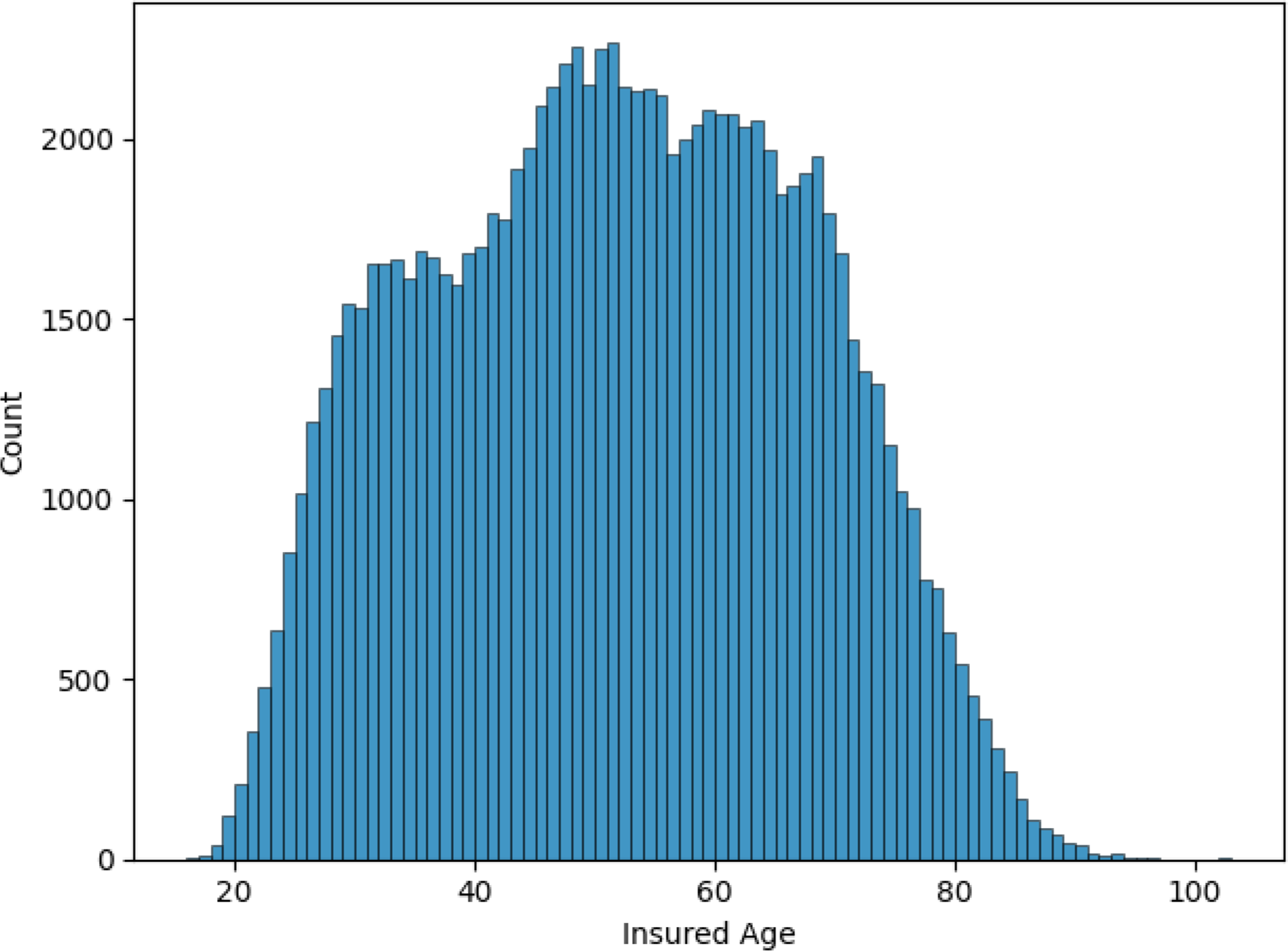
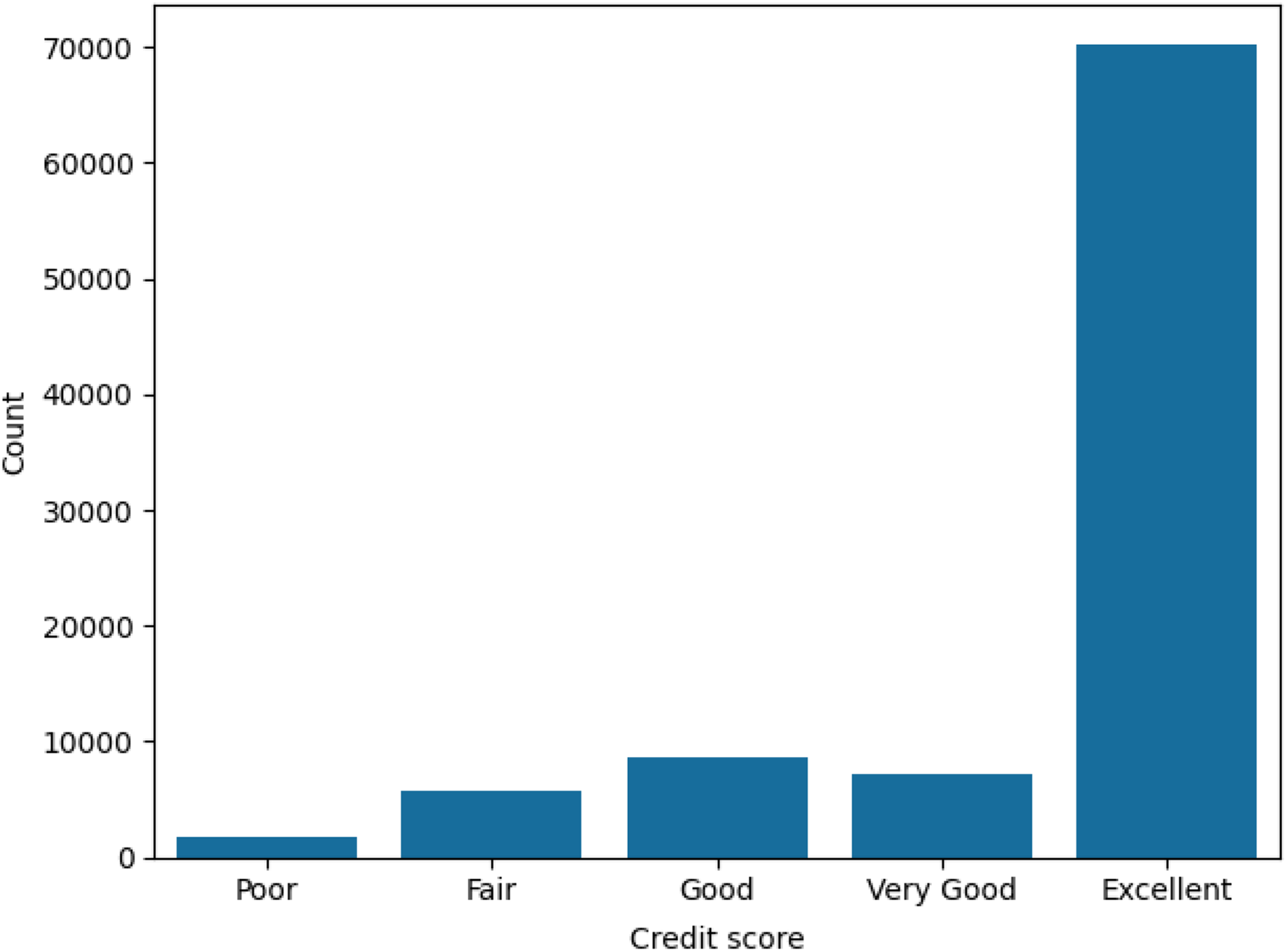
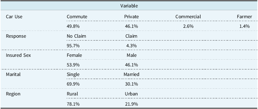
The majority of policyholders (53.9%) were male, with the remainder being female. Figure 1 shows the distribution of the age of the insured on each policy. Age ranges from 16 to 103, with an average of 51 years. Married policyholders comprised 69.9% of the total. We also find that 78.1% of policyholders live in an urban environment rather than a rural one. These policyholders use their vehicles for commuting (49.8%), private (46.1%), commercial (2.6%), and farming (1.4%) purposes. The credit scores of policyholders are heavily skewed towards the excellent range, as shown in Figure 2. If we consider some telematic features, we find that, on average, policyholders spend 23.5% of their driving time in rush hour and 75% of their driving time on weekdays. A statistical summary for every variable used in the data set is available in Appendix A, in Tables A1, A2, and A3.
Histogram of the ages of the insured on each policy.
Bar plot of the credit scores of the insured on each policy.
2.3. Standardisation and Splitting
We randomly divided the data set into a training, validation, and test set. The splits were 60%, 20%, and 20%, respectively. The numeric variables in the training set were then standardised by subtracting their mean and dividing by their standard deviation. The validation and test sets were standardised using the means and standard deviations of the training set before making predictions in the clustering and regression steps.
3. Methodology
The Methodology section provides the basic formulation of a Gaussian mixture model, as well as a brief history with examples of its applications and the motivation for its use in insurance modelling. We describe the Expectation-Maximisation (EM) algorithm used to compute the model parameters, which include the mixture probabilities, as well as the mean and covariance, for the multivariate Gaussian distributions. We reference PCA as a way to address multicollinearity in the telematics data and regression modelling as a way to predict claims. The final subsection details the model selection process.
3.1. Gaussian Mixture Modelling
Some of the earliest analyses involving Gaussian mixture models date back to the work of Pearson (Reference Pearson1894) in modelling the breadth of crab foreheads as a mixture of two Gaussian probability density functions and using the method of moments to solve for the model parameters. The method of maximum likelihood for a similar problem was examined by Rao (Reference Rao1948), who modelled the height of two different plants grown on the same plot. The use of Gaussian mixture models has increased in popularity over the last few decades, due in large part to the EM algorithm and its convergence properties (Dempster et al., Reference Dempster, Laird and Rubin1977). Gaussian mixture models have been successfully applied to various fields and industries, including agriculture, finance, medicine, and psychology. Applications include building a probabilistic model for the underlying sounds of people’s voices (Reynolds & Rose, Reference Reynolds and Rose1995) and for feature classification and segmentation in images (Permuter et al., Reference Permuter, Francos and Jermyn2006). Gaussian mixture models have also been shown to successfully identify drivers by Jafarnejad et al. (Reference Jafarnejad, Castignani and Engel2018), although the features used differ from those available in our data set.
Gaussian mixture models offer a flexible probabilistic approach that can represent the presence of sub-populations within the overall population. Individuals in the population can then be clustered together based on the likelihood that they belong to each component. Even when the data follows an unknown or complex distribution that may not be normally distributed, Gaussian mixture models can provide a good approximation to the underlying structure. This framework suits insurance modelling as certain characteristics may make some groups of people riskier to insure than others. Age is known to be a major factor in auto insurance premium pricing, with younger drivers quoted higher premiums due to their lack of experience and propensity for accidents relative to older drivers. Individuals in the same cluster are deemed similar by the Gaussian mixture model, meaning they may possess a similar risk profile for auto insurance. Fitting separate regression models to each cluster allows for different relationships between the response and the predictor variables.
Under a mixture model with $G$
components, it is assumed that the
$G$
components, it is assumed that the $p$
-dimensional random vector
$p$
-dimensional random vector $x$
takes the form,
$x$
takes the form,
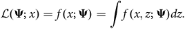
 $$f\left( {x;{\bf{\Psi }}} \right) = \mathop \sum \nolimits_{g = 1}^G {\pi _g}{f_g}\left( {x;{{\bf\theta} _g}} \right),$$
where ${\bf{\Psi }} = \left\{ {{\pi _1}, \ldots, {\pi _G},{{\bf{\theta }}_1}, \ldots, {{\bf{\theta }}_G}} \right\}$
denotes the model parameters and
${\bf{\Psi }} = \left\{ {{\pi _1}, \ldots, {\pi _G},{{\bf{\theta }}_1}, \ldots, {{\bf{\theta }}_G}} \right\}$
denotes the model parameters and ${f_g}\left( {x;{{\bf{\theta }}_g}} \right)$
is the
${f_g}\left( {x;{{\bf{\theta }}_g}} \right)$
is the ${g^{{\rm{th}}}}$
mixture density. The mixing probabilities
${g^{{\rm{th}}}}$
mixture density. The mixing probabilities ${\pi _g}$
are subject to two conditions:
${\pi _g}$
are subject to two conditions: ${\pi _g} \gt 0$
for all
${\pi _g} \gt 0$
for all $g$
, and
$g$
, and $\mathop \sum \nolimits_{g = 1}^G {\pi _g} = 1$
. A further assumption that the components follow a (multivariate) Gaussian distribution means that
$\mathop \sum \nolimits_{g = 1}^G {\pi _g} = 1$
. A further assumption that the components follow a (multivariate) Gaussian distribution means that ${f_g}\left( {x,{\rm{\;}}{{\bf{\theta }}_g}} \right)\sim {\cal N}\left( {{{\bf{\mu }}_g},{{\bf{\Sigma }}_g}} \right)$
. This produces clusters that are ellipsoidal and centred at the
${f_g}\left( {x,{\rm{\;}}{{\bf{\theta }}_g}} \right)\sim {\cal N}\left( {{{\bf{\mu }}_g},{{\bf{\Sigma }}_g}} \right)$
. This produces clusters that are ellipsoidal and centred at the $p$
-dimensional mean vector
$p$
-dimensional mean vector ${\rm{****}}\;{\mu _g}$
. Using eigen-decomposition, the
${\rm{****}}\;{\mu _g}$
. Using eigen-decomposition, the $p \times p$
matrix
$p \times p$
matrix ${{\bf{\Sigma }}_g}$
can be expressed as
${{\bf{\Sigma }}_g}$
can be expressed as ${{\bf{\Sigma }}_g} = {\lambda _g}{{\boldsymbol D}_g}{{\boldsymbol A}_g}{\boldsymbol D}_g^{\rm{T}}$
. The
${{\bf{\Sigma }}_g} = {\lambda _g}{{\boldsymbol D}_g}{{\boldsymbol A}_g}{\boldsymbol D}_g^{\rm{T}}$
. The $\lambda $
term determines the cluster volume, the orthogonal matrix
$\lambda $
term determines the cluster volume, the orthogonal matrix ${\bf{D}}$
determines the cluster orientation, and the diagonal matrix
${\bf{D}}$
determines the cluster orientation, and the diagonal matrix $\boldsymbol A$
with
$\boldsymbol A$
with $\left| {\boldsymbol A} \right| = 1$
determines the cluster shape. All three components can be fixed or vary across mixtures.
$\left| {\boldsymbol A} \right| = 1$
determines the cluster shape. All three components can be fixed or vary across mixtures.
Our analysis was performed using the scikit-learn package (Pedregosa et al., Reference Pedregosa, Varoquaux, Gramfort, Michel, Thirion, Grisel, Blondel, Prettenhofer, Weiss, Dubourg, Vanderplas, Passos, Cournapeau, Brucher, Perrot and Duchesnay2011) in Python. This package allows four types of Gaussian mixture models to be fitted. The simplest model is “spherical”, which has ${{\rm{\Sigma }}_g} = {\lambda _g}{\boldsymbol I}$
, where
${{\rm{\Sigma }}_g} = {\lambda _g}{\boldsymbol I}$
, where ${\boldsymbol I}$
is the identity matrix. This means that
${\boldsymbol I}$
is the identity matrix. This means that ${{\boldsymbol D}_g} = {{\boldsymbol A}_g} = {\boldsymbol I}$
. This model produces clusters that are spherical, can vary in volume, and are equal in shape. The covariance matrix has
${{\boldsymbol D}_g} = {{\boldsymbol A}_g} = {\boldsymbol I}$
. This model produces clusters that are spherical, can vary in volume, and are equal in shape. The covariance matrix has $G$
free parameters. The next model is “diag”, which has
$G$
free parameters. The next model is “diag”, which has ${{\rm{\Sigma }}_g} = {\lambda _g}{{\boldsymbol{A}}_g}$
, so
${{\rm{\Sigma }}_g} = {\lambda _g}{{\boldsymbol{A}}_g}$
, so ${\boldsymbol D} = {\boldsymbol I}$
. This model produces mixtures that are diagonal, variable in volume and in shape, and oriented along the coordinate axes. The covariance matrix for these models has
${\boldsymbol D} = {\boldsymbol I}$
. This model produces mixtures that are diagonal, variable in volume and in shape, and oriented along the coordinate axes. The covariance matrix for these models has $G \times p$
parameters. The third model available is “tied”, which has covariance matrix
$G \times p$
parameters. The third model available is “tied”, which has covariance matrix ${\rm \Sigma }_g = \lambda {\boldsymbol DAD}^{\rm{T}}$
. This produces mixtures that are ellipsoidal, and equal in volume, shape, and orientation. The covariance matrix has
${\rm \Sigma }_g = \lambda {\boldsymbol DAD}^{\rm{T}}$
. This produces mixtures that are ellipsoidal, and equal in volume, shape, and orientation. The covariance matrix has ${{p\left( {1 + p} \right)} \over 2}$
free parameters. The most complex model is “full” and has covariance matrix
${{p\left( {1 + p} \right)} \over 2}$
free parameters. The most complex model is “full” and has covariance matrix ${{\rm{\Sigma }}_g} = \lambda {{\boldsymbol D}_g}{{\boldsymbol A}_g}{\boldsymbol D}_g^{\rm{T}}$
. This model produces mixtures that are ellipsoidal and vary in volume, shape, and orientation. It has the highest number of covariance parameters, with
${{\rm{\Sigma }}_g} = \lambda {{\boldsymbol D}_g}{{\boldsymbol A}_g}{\boldsymbol D}_g^{\rm{T}}$
. This model produces mixtures that are ellipsoidal and vary in volume, shape, and orientation. It has the highest number of covariance parameters, with ${{Gp\left( {p + 1} \right)} \over 2}$
. The total number of parameters for every model is the number of covariance parameters added to
${{Gp\left( {p + 1} \right)} \over 2}$
. The total number of parameters for every model is the number of covariance parameters added to $Gp + G - 1$
(the number of component mean parameters plus the number of component probability parameters).
$Gp + G - 1$
(the number of component mean parameters plus the number of component probability parameters).
3.1.1. Expectation-Maximisation (EM) algorithm
Under the Gaussian mixture model, each observation arises from one component of the mixture distribution. If observation $i$
belongs to component
$i$
belongs to component $g$
, we let
$g$
, we let ${z_{ig}} = 1$
; otherwise, we let
${z_{ig}} = 1$
; otherwise, we let ${z_{ig}} = 0$
. It is assumed that
${z_{ig}} = 0$
. It is assumed that $z$
follows a multinomial distribution,
$z$
follows a multinomial distribution, $z\sim {\rm{Mul}}{{\rm{t}}_G}\left( {1,\pi } \right)$
where
$z\sim {\rm{Mul}}{{\rm{t}}_G}\left( {1,\pi } \right)$
where $\pi = \left\{ {{\pi _1}, \ldots, {\pi _G}} \right\}$
. To estimate the unknown parameters, we maximise the marginal likelihood of the observed data,
$\pi = \left\{ {{\pi _1}, \ldots, {\pi _G}} \right\}$
. To estimate the unknown parameters, we maximise the marginal likelihood of the observed data,
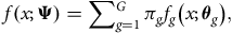
 $${\cal L}\left( {{\bf{\Psi }};x} \right) = f\left( {x;{\bf{\Psi }}} \right) = \int f\left( {x,z;{\bf{\Psi }}} \right)dz.$$
This quantity is intractable since the component membership for each observation is unobserved.
The E-step computes the expectation of the conditional probability that observation $i$
belongs to component
$i$
belongs to component $g$
given the current parameter estimates. Denote this quantity by
$g$
given the current parameter estimates. Denote this quantity by $Q$
at iteration
$Q$
at iteration $t + 1$
:
$t + 1$
:
 $$Q\left( {{\bf{\Psi }};{{\bf{\Psi }}^{\left( t \right)}}} \right) = {{\mathbb E}_{z|x,{{\bf{\Psi }}^{\left( t \right)}}}}\left[ {{\rm{log}}\;{\cal L}\left( {{\bf{\Psi }};x,z} \right)} \right].$$
The M-step computes the maximum likelihood estimate for the model parameters. Thus, at iteration $t + 1$
,
$t + 1$
, ${\bf{\Psi }}$
is given by
${\bf{\Psi }}$
is given by
 $${{\bf{\Psi }}^{\left( {t + 1} \right)}} = \arg \mathop {{\rm{max}}}\limits_{\bf{\Psi }} Q\left( {{\bf{\Psi }};{{\bf{\Psi }}^{\left( t \right)}}} \right).$$
The algorithm iterates between these two steps until convergence. In practice, the algorithm stops when the lower-bound average gain falls below a predefined threshold, for example, 0.001.
3.1.2. Variables used
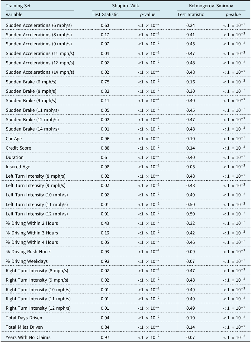
Gaussian mixture modelling is better suited to continuous variables than to categorical variables, such as the sex of the insured, the use of the car, the marital status of the insured, and the insured’s place of residence. For this reason, these variables were not included in the clustering step. However, they were considered during variable selection for the regression model, and some of them feature in the final models. This left 34 variables for use in clustering, which are listed in Table 5. We performed univariate normality tests, such as the Shapiro–Wilk test (Shapiro & Wilk, Reference Shapiro and Wilk1965) and the Kolmogorov–Smirnov test (Massey Jr., Reference Massey1951), as well as some multivariate normality tests, such as the Henze–Zirkler test (Henze & Zirkler, Reference Henze and Zirkler1990) and the Mardia test (Mardia, Reference Mardia1970). The conclusion was to reject the null hypothesis of a normally distributed data set. This result is not surprising, given that many of the continuous variables had ranges that differed from the real line. For example, the percentage of time driven on weekdays can only range from 0% to 100%. However, as previously mentioned, clustering may still provide an approximation of the group structure that may exist.
3.2. Principal Component Analysis (PCA)
PCA is a useful tool that is often used to reduce dimensionality. PCA constructs a set of linear combinations of the variables in the data subject to the constraint that each component is a unit vector in the direction of the line of best fit that is orthogonal to the preceding vectors. This results in a new set of variables that maximise the amount of information preserved while being uncorrelated with each other. Often, a few components contain the majority of information in the data set. Therefore, it is possible to discard the other components and reconstruct the data set using the first $k$
components.
$k$
components.
We compute the principal components using singular value decomposition. Let ${\boldsymbol X}$
be the
${\boldsymbol X}$
be the $ n\times p$
matrix. Then,
$ n\times p$
matrix. Then,
 $${\boldsymbol X} = {\boldsymbol U}{\bf{\Sigma }}{{\boldsymbol W}^{\rm{T}}}$$
where ${\boldsymbol U}$
contains the left singular vectors of
${\boldsymbol U}$
contains the left singular vectors of ${\boldsymbol X}$
,
${\boldsymbol X}$
, ${\bf{\Sigma }}$
is a diagonal matrix of the singular values of
${\bf{\Sigma }}$
is a diagonal matrix of the singular values of ${\boldsymbol X}$
and
${\boldsymbol X}$
and ${\boldsymbol W}$
contains the right singular vectors of
${\boldsymbol W}$
contains the right singular vectors of ${\boldsymbol X}$
. If we define the score matrix as
${\boldsymbol X}$
. If we define the score matrix as ${\boldsymbol T} = \boldsymbol XW$
and retain only the largest
${\boldsymbol T} = \boldsymbol XW$
and retain only the largest $k$
singular values and their singular vectors,
$k$
singular values and their singular vectors, ${{\boldsymbol T}_k} = {\boldsymbol XW}_k$
, then the total squared reconstruction error,
${{\boldsymbol T}_k} = {\boldsymbol XW}_k$
, then the total squared reconstruction error,
 $$|| {{\boldsymbol TW}^{\rm{T}}} - {{\boldsymbol T}_k}{{\boldsymbol W}_k} ||_2^2 = || {{\boldsymbol X} - {{\boldsymbol X}_k}} ||_2^2$$
is minimised by construction.
We performed PCA on the variables related to acceleration, braking, turning intensity, and percentage of time spent driving within a certain number of hours in the training set. This equated to 25 variables. We chose these variables as they are highly correlated and violate the assumption of independence for generalised linear models. Figure 3 shows the explained variance ratio and the cumulative explained variance ratio for the principal components. We use the first three principal components, as they account for approximately 73% of the variance in the data set.
PCA explained variance ratio and cumulative PCA explained variance ratio versus number of principal components. The first three principal components were ultimately chosen to be used for modelling.
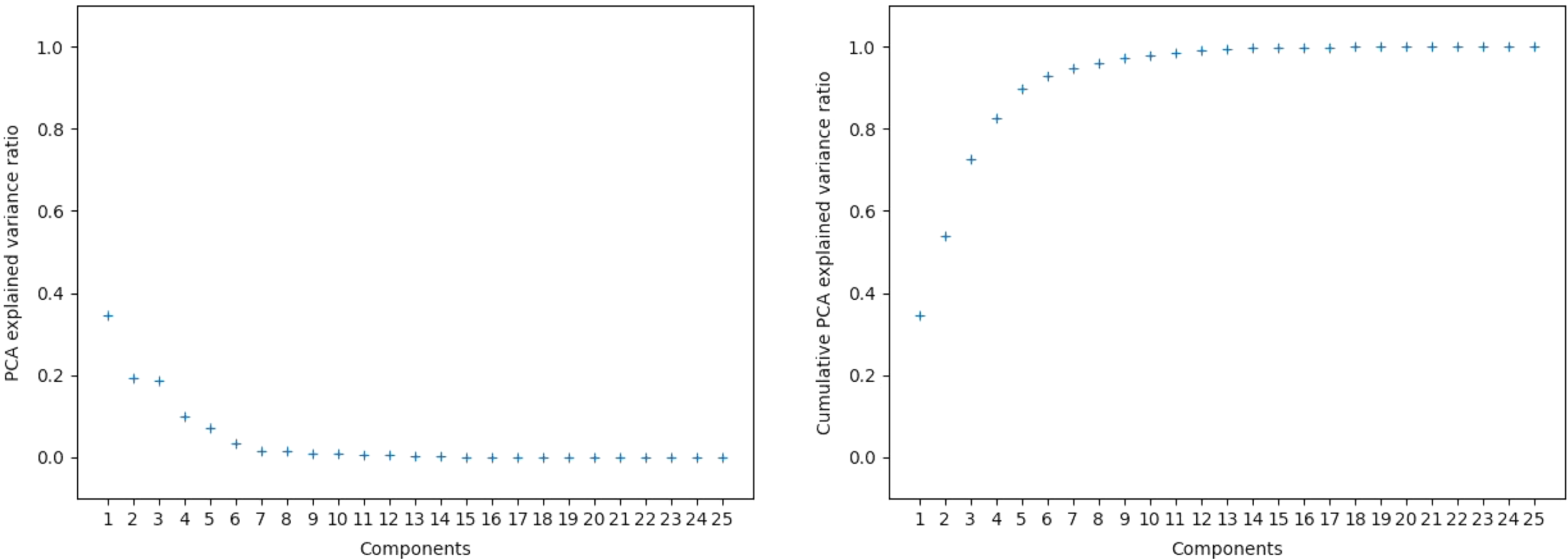
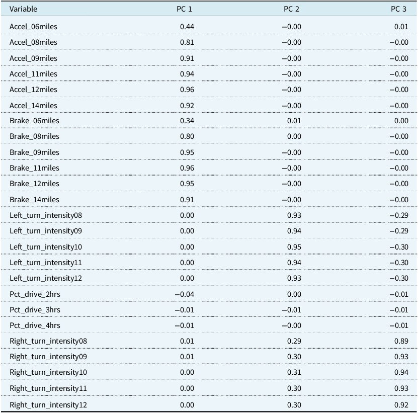
Table 2 shows the loading matrix for the three principal components. The loading matrix is given by ${\boldsymbol W}\sqrt {\bf{\Sigma }} $
and is interpreted as the weights applied to each original variable when calculating the principal component values. We see that the first principal component measures the effect of accelerating and braking because larger values of this principal component are associated with higher numbers of sudden accelerations and brakes at speeds of at least 6, 8, 9, 11, 12, and 14 mph/s per 1,000 miles. However, the lowest recorded speed, 6 mph/s, has the smallest relative weight. The second and third principal components are influenced by the left and right turn intensity variables. Larger numbers of left and right turns at intensities of 8, 9, 10, 11, and 12 mph/s per 1,000 miles result in larger values of the second component. However, in the third component, we observe that larger left-turn intensities correspond to negative principal component values. The sign of this component may indicate a propensity to make left or right turns at higher speeds. The fourth principal component comprises the percentage of time driven under 2, 3, or 4 hours, although we did not include it in our regression analysis as there is a drop-off between the third and fourth principal components.
${\boldsymbol W}\sqrt {\bf{\Sigma }} $
and is interpreted as the weights applied to each original variable when calculating the principal component values. We see that the first principal component measures the effect of accelerating and braking because larger values of this principal component are associated with higher numbers of sudden accelerations and brakes at speeds of at least 6, 8, 9, 11, 12, and 14 mph/s per 1,000 miles. However, the lowest recorded speed, 6 mph/s, has the smallest relative weight. The second and third principal components are influenced by the left and right turn intensity variables. Larger numbers of left and right turns at intensities of 8, 9, 10, 11, and 12 mph/s per 1,000 miles result in larger values of the second component. However, in the third component, we observe that larger left-turn intensities correspond to negative principal component values. The sign of this component may indicate a propensity to make left or right turns at higher speeds. The fourth principal component comprises the percentage of time driven under 2, 3, or 4 hours, although we did not include it in our regression analysis as there is a drop-off between the third and fourth principal components.
Loading matrix for the first three principal components. pca was performed on the telematics variables, which are listed in the variable column
3.3. Regression of Binary Outcomes
The challenge with this data set is to estimate the probability that a driver makes a claim over the duration of their policy. The claim frequency on car insurance policies is generally quite low, for example, 4.27% in this data set. The data set consists of $n = 100,000$
observations of auto insurance policies. We are interested in modelling the dependent variable,
$n = 100,000$
observations of auto insurance policies. We are interested in modelling the dependent variable, $Y$
, which is a binary outcome for whether the policyholder filed a claim during the duration of the policy,
$Y$
, which is a binary outcome for whether the policyholder filed a claim during the duration of the policy,
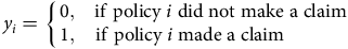 $${y_i} = \left\{ {\matrix{{0,} & {{\rm{if}}\;{\rm{policy}}\;i\;{\rm{did}}\;{\rm{not}}\;{\rm{make}}\;{\rm{a}}\;{\rm{claim}}} \cr {1,} & \hskip-31pt{{\rm{if}}\;{\rm{policy}}\;i\;{\rm{made}}\;{\rm{a}}\;{\rm{claim}}} \cr } } \right.$$
Under the generalised linear model, it is assumed that each ${Y_i}$
follows a Bernoulli distribution with probability
${Y_i}$
follows a Bernoulli distribution with probability ${p_i}$
of a claim being made, that is,
${p_i}$
of a claim being made, that is, ${Y_i}\sim {\rm{Bern}}\left( {{p_i}} \right)$
.
${Y_i}\sim {\rm{Bern}}\left( {{p_i}} \right)$
.
We analyse all link functions that are available and respect the domain of the Binomial family in the statsmodels package (Seabold & Perktold, Reference Seabold and Perktold2010). These include the logit, probit, log-log, complementary log-log, and Cauchy link functions. Figure 4 shows a plot of these link functions for comparison. The logit is the canonical link function for the Binomial distribution. The probit link is the inverse of a standard normal cumulative distribution function and produces thinner tails than the logit. The log-log and complementary log-log link functions differ from the others in that they are both asymmetric, that is, $g\left( x \right) \ne - \!g\left( {1 - x} \right)$
. In the context of this paper, for the log-log link, the probability of a claim remains very small for low values of the linear predictor but increases sharply for higher values. The opposite can be inferred for the complementary log-log link function. The Cauchy link function produces the heaviest tails of all the functions. The probabilities approach 0 and 1 very slowly for linear predictor values that are large in magnitude.
$g\left( x \right) \ne - \!g\left( {1 - x} \right)$
. In the context of this paper, for the log-log link, the probability of a claim remains very small for low values of the linear predictor but increases sharply for higher values. The opposite can be inferred for the complementary log-log link function. The Cauchy link function produces the heaviest tails of all the functions. The probabilities approach 0 and 1 very slowly for linear predictor values that are large in magnitude.
Plot of logit, probit, log-log, complementary log-log, and Cauchy link functions.
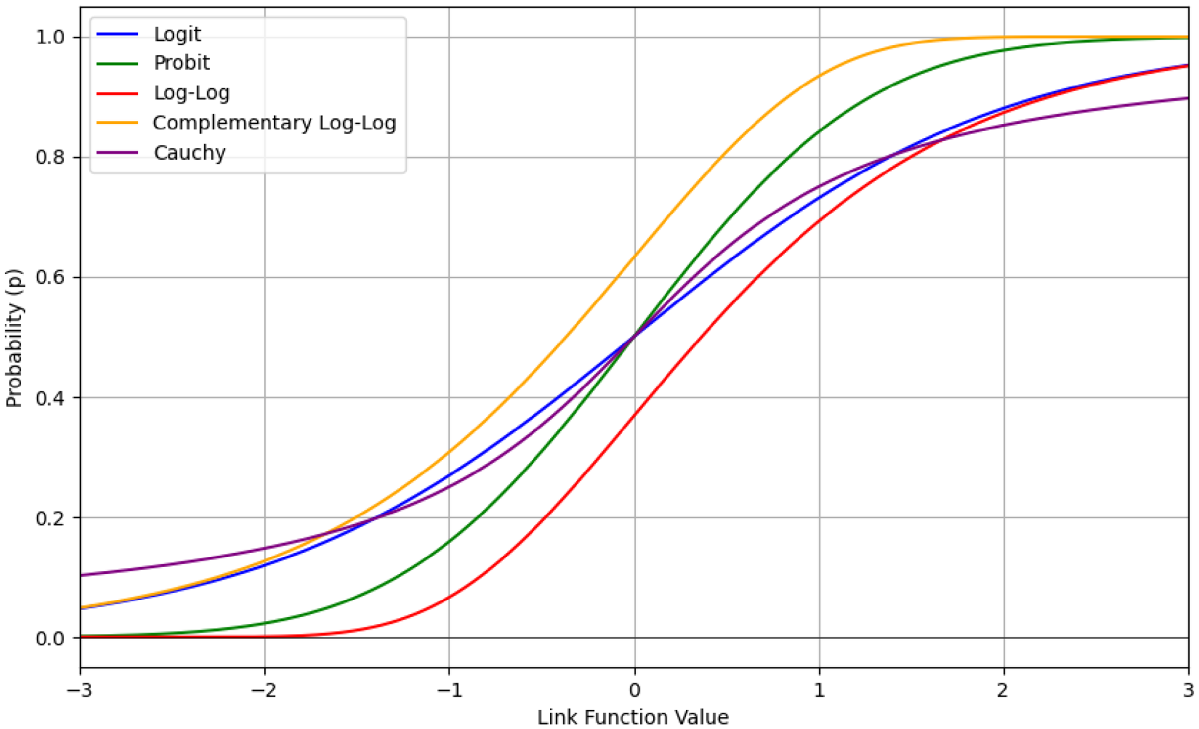
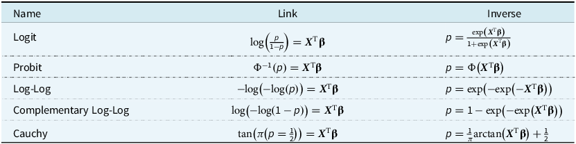
Table 3 shows the respective link functions and their inverses. Note that ${{\boldsymbol X}^{\rm{T}}}$
is the
${{\boldsymbol X}^{\rm{T}}}$
is the $n \times p$
design matrix and
$n \times p$
design matrix and $\bf{\beta} $
is a
$\bf{\beta} $
is a $p \times 1$
vector of regression coefficients. The regression coefficients are estimated using maximum likelihood estimation. A closed-form expression does not exist, so they are instead calculated using an iteratively reweighted least squares algorithm. Full details can be found in McCullagh (Reference McCullagh2019).
$p \times 1$
vector of regression coefficients. The regression coefficients are estimated using maximum likelihood estimation. A closed-form expression does not exist, so they are instead calculated using an iteratively reweighted least squares algorithm. Full details can be found in McCullagh (Reference McCullagh2019).
Link functions and their inverses that are available in the statsmodels package
3.4. Model Selection
Model selection is a two-step process. First, we perform clustering, and then we fit the regression models. The Gaussian mixture model requires an initial number of components and a covariance structure, so the optimal number of components and the optimal covariance structure must be identified. Similarly, for the regression models, we must determine which features to include.
3.4.1. Choosing the number of components
The Gaussian mixture model was fitted using the training set. We varied the number of components between 1 and 12. We selected 12 as the maximum because there were 12 numerical variables when using the PCA-incorporated data set. Note that there are 34 numerical variables when PCA is not used. For the covariance type, there were four options: “spherical”, “diag”, “tied” and “full”. To select the optimal combination, we relied on the Bayesian information criterion (BIC) score (Schwarz, Reference Schwarz1978) on the validation set,
 $${\rm{BIC}} = k{\rm{ln}}\left( n \right) - 2{\rm{ln}}\left( {\hat L} \right)$$
where $k$
is the number of parameters in the model,
$k$
is the number of parameters in the model, $n$
is the number of observations, and
$n$
is the number of observations, and $\hat L$
is the maximised likelihood of the model. A model that produces the lowest BIC is considered the optimal choice. Parameters were initialised using the k-means algorithm across 10 initialisations, selecting the best results based on BIC.
$\hat L$
is the maximised likelihood of the model. A model that produces the lowest BIC is considered the optimal choice. Parameters were initialised using the k-means algorithm across 10 initialisations, selecting the best results based on BIC.
3.4.2. Feature selection
For the regression models, we used a stepwise approach with the geometric average of the recall, or MAvG, as the performance metric. This metric was used by So et al. (Reference So, Boucher and Valdez2021a) in their analysis of the data set from which our data were emulated. It originates from the work of Fowlkes and Mallows (Reference Fowlkes and Mallows1983). If we let ${R_i}$
be the recall (or sensitivity) for class
${R_i}$
be the recall (or sensitivity) for class $i$
, then MAvG is given by
$i$
, then MAvG is given by
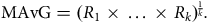 $${\rm{MAvG}} = {({R_1} \times \ldots \times {R_k})^{{1 \over k}}}.$$
The recall is the number of correctly predicted instances divided by the total number of relevant instances. In our data set, we have two classes, with observations either having made a claim or not. Thus, the formula reduces to the square root of the true positive rate $\left( {{{TP} \over P}} \right)$
times the true negative rate
$\left( {{{TP} \over P}} \right)$
times the true negative rate $\left( {{{TN} \over N}} \right)$
,
$\left( {{{TN} \over N}} \right)$
,
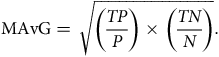 $${\rm{MAvG}} = \sqrt {\left( {{{TP} \over P}} \right) \times \left( {{{TN} \over N}} \right)} .$$
In our setting, $TP$
is the number of correctly predicted claims by the model,
$TP$
is the number of correctly predicted claims by the model, $P$
is the number of claims in the data set,
$P$
is the number of claims in the data set, $TN$
is the number of correctly predicted no claims by the model, and
$TN$
is the number of correctly predicted no claims by the model, and $N$
is the number of no claims in the data set. A regression model that maximises this value will produce the optimal classifier, as it penalises models that perform poorly in one of the classes. In our case, we have an imbalanced data set with over 95% of the observations never having made a claim. More basic metrics, such as classification accuracy, will favour models that perform well in predicting the majority class (no claims).
$N$
is the number of no claims in the data set. A regression model that maximises this value will produce the optimal classifier, as it penalises models that perform poorly in one of the classes. In our case, we have an imbalanced data set with over 95% of the observations never having made a claim. More basic metrics, such as classification accuracy, will favour models that perform well in predicting the majority class (no claims).
We used forward selection, adding a variable to the model if it increased the MAvG on the validation set and had the greatest impact among all candidate variables. The number of candidate variables was larger for the regression step than the clustering step as we included four categorical variables (insured_sex, marital, region, and car_use) and allowed quadratic and cubic polynomials for the numerical variables. For the non-PCA data set, this meant there were 106 candidate variables to select from, while for the PCA-incorporated data set, there were 34 candidate variables. We also allowed the link functions to vary, with five to choose from, as previously listed in Table 3.
3.4.3. Claim prediction
We classify an observation as a claim if the predicted claim probability exceeds a certain threshold. Using 0.5 as a threshold often results in the majority of cases being predicted as no claim. Therefore, we select an optimal cut-off point based on the receiver operating characteristic (ROC) curve (Bradley, Reference Bradley1997). Using the validation set, we select the cut-off point that maximises the difference between the recall $\left( {{{TP} \over P}} \right)$
and the false positive rate (FPR), which is the number of incorrectly predicted claims divided by the total number of actual no claims,
$\left( {{{TP} \over P}} \right)$
and the false positive rate (FPR), which is the number of incorrectly predicted claims divided by the total number of actual no claims,
 $$FPR = {{FP} \over N}.$$
4. Results
4.1. Optimal Number of Components
Figure 5 shows the BIC scores for the Gaussian mixture models on the validation set, using both the data set without PCA and the data set with PCA. Using the full covariance structure results in the lowest BIC score, so we deduce that this is the optimal covariance structure to use. To decide on the number of components, we could employ the common heuristic of searching for the BIC elbow. However, we see a gradual decrease from two to twelve components. Therefore, additional analysis of the clustering solutions and their silhouette plots (Rousseeuw, Reference Rousseeuw1987) is required.
BIC scores for Gaussian mixture models with number of components ranging from 1 to 12. Data used in the left subplot include continuous and discrete variables, while the right subplot includes continuous, discrete, and principal components.
Figure 6 shows the average silhouette scores for the Gaussian mixture models on the validation set using the data set without PCA and with PCA. The silhouette score for an observation $i$
is defined as
$i$
is defined as
 $$s\left( i \right) = {{b\left( i \right) - a\left( i \right)} \over {{\rm{max}}\left[ {a\left( i \right),b\left( i \right)} \right]}}$$
where $a\left( i \right) = {1 \over {\left| {{C_I}} \right| - 1}}\mathop \sum \nolimits_{j \in {C_I},i \ne j} d\left( {i,j} \right)$
,
$a\left( i \right) = {1 \over {\left| {{C_I}} \right| - 1}}\mathop \sum \nolimits_{j \in {C_I},i \ne j} d\left( {i,j} \right)$
, $b\left( i \right) = {\rm{mi}}{{\rm{n}}_{J \!\ne I}}\mathop \sum \nolimits_{j \in {C_J}} d\left( {i,j} \right)$
,
$b\left( i \right) = {\rm{mi}}{{\rm{n}}_{J \!\ne I}}\mathop \sum \nolimits_{j \in {C_J}} d\left( {i,j} \right)$
, $d\left( { \cdot, \cdot } \right)$
is the Euclidean distance between the observations, and
$d\left( { \cdot, \cdot } \right)$
is the Euclidean distance between the observations, and $\left| {{C_I}} \right|$
is the number of points belonging to cluster
$\left| {{C_I}} \right|$
is the number of points belonging to cluster $I$
. The silhouette score is a measure of how similar an observation is to its own cluster compared to observations from other clusters. The values range from −1 (worst) to +1 (best). Across all covariance types, using both data sets (using continuous and discrete variables, or continuous, discrete, and principal components), we see the largest average silhouette score when the number of components is equal to two. However, when we analyse the individual silhouette scores for every observation, we see that the majority cluster has large positive silhouette scores, whereas the minority cluster has large negative silhouette scores. This suggests that the data is better clustered in a single cluster rather than two. We also note from Figure 6 that in most cases, the average silhouette score converges to the same value for all clustering solutions with three or more components. Once again, by examining the individual silhouette scores for every observation, we can explain this result: there are three large clusters with every subsequent cluster containing a small number of observations. Having a small number of observations in a cluster is problematic for the regression step, as we have 34 features to select from. We therefore conclude that the best clustering solution generated comes from a Gaussian mixture model with three components and a full covariance structure.
$I$
. The silhouette score is a measure of how similar an observation is to its own cluster compared to observations from other clusters. The values range from −1 (worst) to +1 (best). Across all covariance types, using both data sets (using continuous and discrete variables, or continuous, discrete, and principal components), we see the largest average silhouette score when the number of components is equal to two. However, when we analyse the individual silhouette scores for every observation, we see that the majority cluster has large positive silhouette scores, whereas the minority cluster has large negative silhouette scores. This suggests that the data is better clustered in a single cluster rather than two. We also note from Figure 6 that in most cases, the average silhouette score converges to the same value for all clustering solutions with three or more components. Once again, by examining the individual silhouette scores for every observation, we can explain this result: there are three large clusters with every subsequent cluster containing a small number of observations. Having a small number of observations in a cluster is problematic for the regression step, as we have 34 features to select from. We therefore conclude that the best clustering solution generated comes from a Gaussian mixture model with three components and a full covariance structure.
Average silhouette score for Gaussian mixture models with number of components ranging from 1 to 12. Data used in the left subplot include continuous and discrete variables, while the right subplot includes continuous, discrete, and principal components.
The cluster proportions are similar for the model with and without the PCA variables, so we next investigate how alike the clustering results are. Table 4 shows the confusion matrix for the clustering results on the validation data. Cluster 0 and Cluster 2 from the model with PCA are most similar to Cluster 2 and Cluster 1 from the model without PCA. However, the clustering results have an adjusted Rand index (Hubert & Arabie, Reference Hubert and Arabie1985) of 0.0777. The adjusted Rand index is a measure of similarity between clustering solutions that has been corrected for chance. It takes a maximum value of 1 for perfect labelling, while random labelling is expected to produce a score of 0. The adjusted Rand index can also produce negative scores.
Confusion matrix comparing the clustering results for the model incorporating the principal components and the model without the principal components on the validation data set. Adjusted Rand Index = 0.0777
4.2. Driving Profiles without PCA
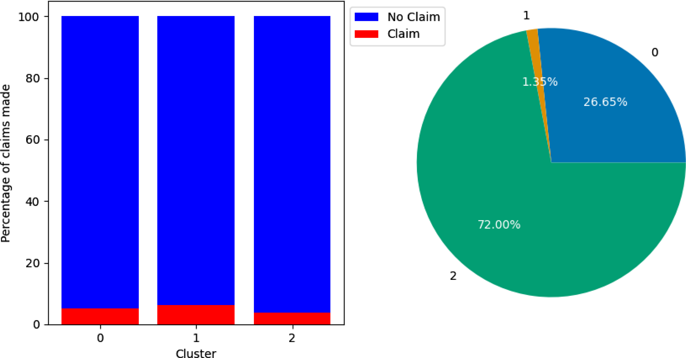
By analysing the claim rates and variable means of the observations in each cluster, we can start to paint a picture of the type of drivers present in them. Figure 7 shows the percentage of claims by cluster and the proportion of policyholders in each cluster in the training set without PCA. Cluster 2 is the least risky portfolio, with 3.76% of the policyholders making a claim. Cluster 1 is the most risky, with a claim rate of 6.20%, while Cluster 0 had a claim rate of 5.28%. For reference, the entire training set had a claim rate of 4.195%. We can refer to Cluster 0, Cluster 1, and Cluster 2 as medium-risk, higher-risk, and lower-risk groups, respectively. Cluster 2 is the largest cluster, containing 72.00% of policyholders, followed by Cluster 0 with 26.65% of policyholders, while Cluster 1 is the smallest cluster, with just 1.35%.
Bar chart showing percentage of claims made by cluster (left) and pie chart showing percentage of training set that belongs to each cluster (right). Clusterings performed using the data set without PCA. Cluster 0 had a claim percentage of 5.28%, Cluster 1 had a claim percentage of 6.20%, and Cluster 2 had a claim percentage of 3.76%.
Cluster means for Gaussian mixture model fitted on the data set without PCA
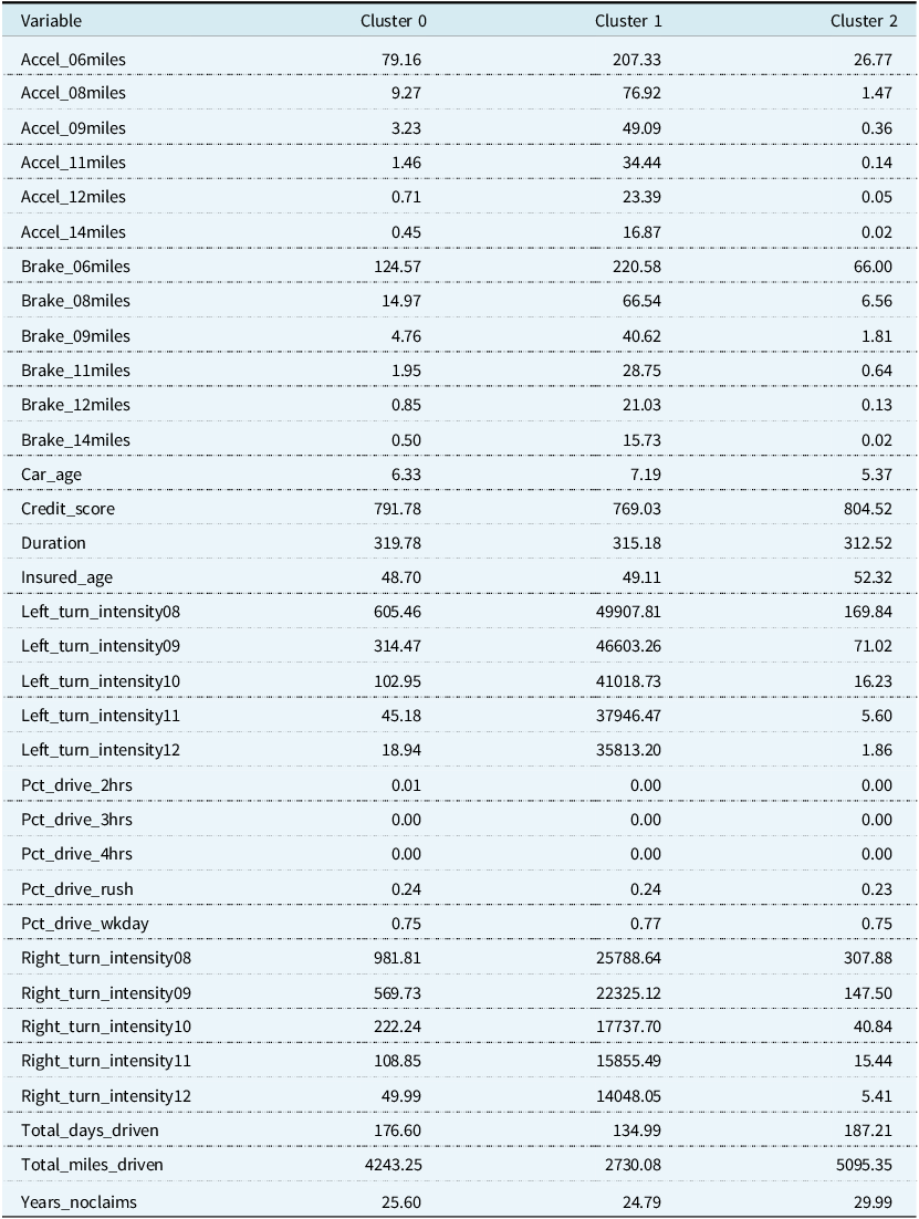
The cluster means are in Table 5. Cluster 2, the lower-risk group, has policyholders who have the smallest number of sudden accelerations, sudden brakes, and left and right cornerings per 1,000 miles at all intensities. Policyholders in this cluster are also older, have higher credit scores, newer cars, and have more years without a claim on average than policyholders in the other clusters. The length of their policy is also closer to half a year than a full year. Despite being the lower-risk group, the policyholders, on average, have the most days driven and the most total miles driven. Cluster 1 is the least populated category and contains higher-risk policyholders with a large number of sudden accelerations, sudden brakes, and left and right cornerings per 1,000 miles at all intensities. This is despite accruing the lowest average amount of miles and days driven. Policyholders in Cluster 1 have the fewest years without a claim, though this value is quite close to that of Cluster 0. They also have the oldest cars and lowest credit scores. Finally, Cluster 0, the medium-risk group, contains the youngest drivers, although their average age is close to that of Cluster 1. Whereas the higher-risk group and lower-risk groups are the largest or smallest in certain categories, such as the number of sudden accelerations, sudden brakes, left and right cornerings, car age, and the number of years with no claim. The medium-risk group falls between them on average. We note there is very little difference, on average, between the policyholders’ time spent driving in rush hour and on weekdays.
4.3. Driving Profiles with PCA
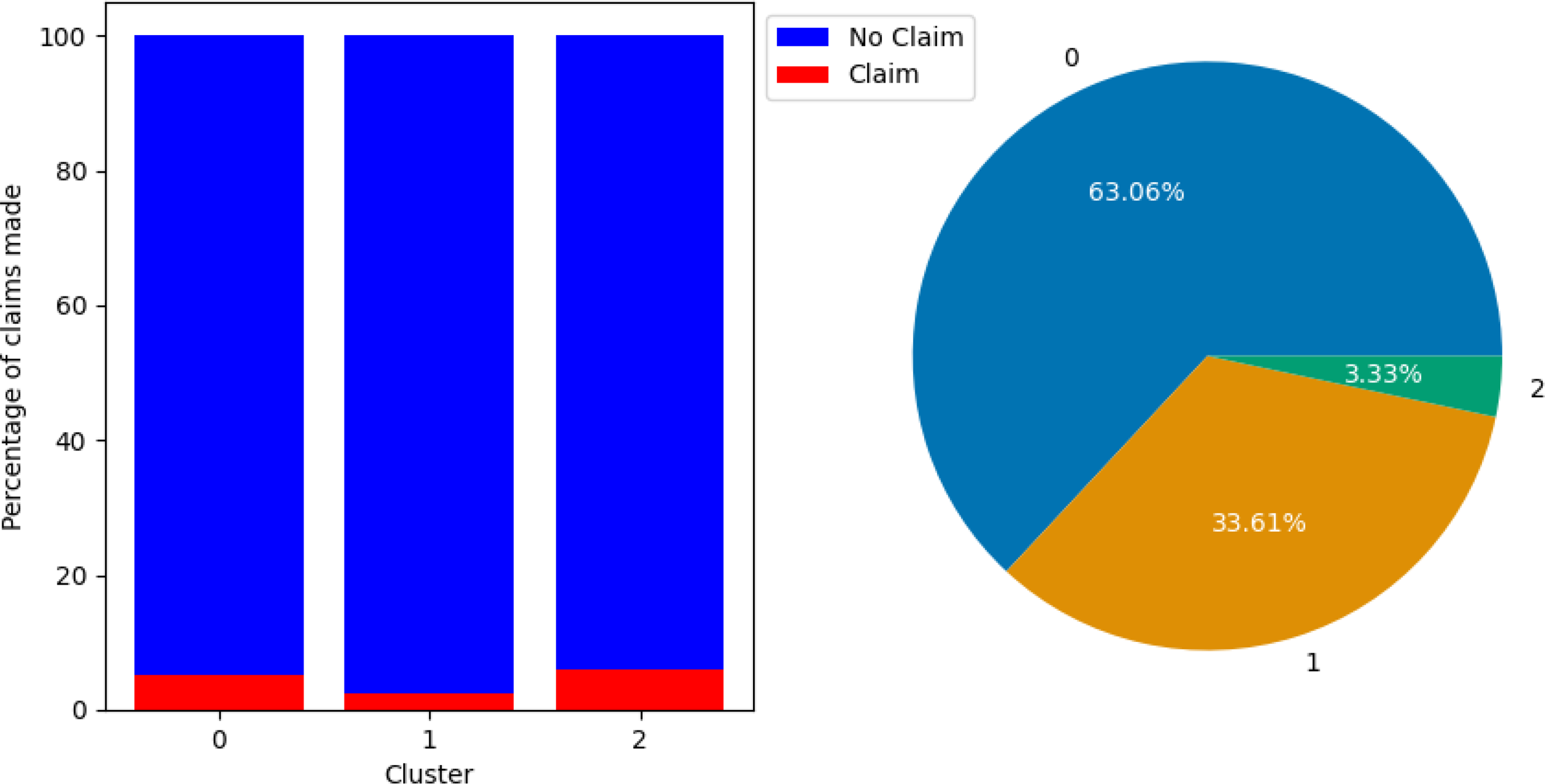
Figure 8 shows the percentage of claims by cluster and the proportion of policyholders in each cluster for the training set with PCA. Cluster 0 and Cluster 2 have similar claim rates of 5.05% and 5.86%, respectively. Cluster 0 is the largest cluster, containing 63.06% of observations, while Cluster 2 is the smallest, with 3.33%. Cluster 1 is the lowest risk group, with a claim rate of only 2.43%, accounting for the remaining 33.61% of the data.
Bar chart showing percentage of claims made by cluster (left) and pie chart showing percentage of training set that belongs to each cluster (right). Clusterings performed using the data set with PCA. Cluster 0 had a claim percentage of 5.05%, Cluster 1 had a claim percentage of 2.43%, and Cluster 2 had a claim percentage of 5.86%.
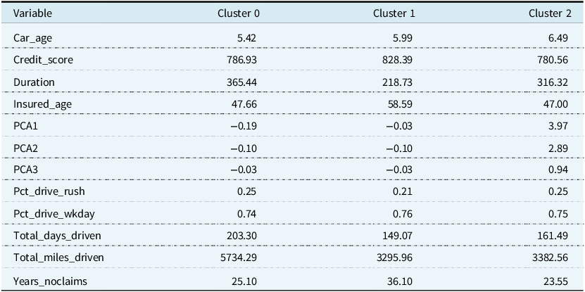
The cluster means are in Table 6. Cluster 2 has the largest values for all three principal components, which implies a large number of sudden accelerations, sudden brakes, and left and right cornerings at high intensity. Policyholders in this cluster also have the oldest cars and lowest credit scores on average. The average principal components are similar for Cluster 0 and Cluster 1; however, they differ in more traditional variables. For example, Cluster 1 has the oldest drivers, the most years without a claim, the lowest miles and days driven, and a policy duration that is much closer to half a year on average than the other clusters. Cluster 0 has, on average, the most miles driven.
Cluster means for Gaussian mixture model fitted on the data set with PCA
4.4. Optimal Feature and Link Function
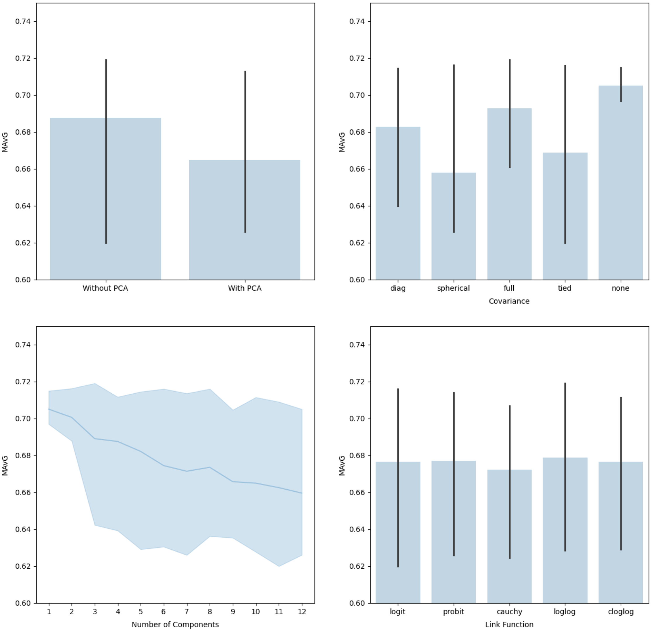
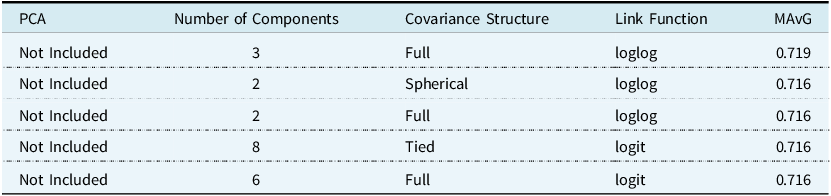
In the stepwise approach to finding the optimal model, we allowed the clustering solution to vary based on covariance structure and number of components, as well as assessing performance on the PCA-incorporated data and non-PCA data set. This required performing the stepwise approach on 450 different clustering solutions. Figure 9 shows the MAvG averaged across the different variations. We observe some trends, such as the non-PCA data set producing a higher MAvG on average. We note that, on average, performing no clustering leads to a higher MAvG, but the maximum MAvG is obtained using the full covariance structure in the clustering model. The same can be said for the number of components: without clustering, we have a higher average, but the maximum is obtained when the number of components is three. Finally, on average, the log-log link function produces the highest MAvG. Table 7 shows the top five models based on MAvG. We see that the optimal model does not incorporate PCA variables, the number of components equals three, the covariance structure is full, and the log-log link function is used.
The average MAvG of models based on the test data set with or without PCA (top left), for different covariance structures (top right), for different number of components (bottom left), and for different link functions (bottom right). Error bars represent the minimum and maximum values.
MAvG of the test set for the top 5 models
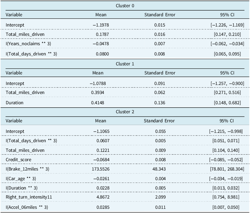
Since our selection procedure so far does not consider the significance of the coefficient values, we perform some additional fine-tuning of the models to remove variables with coefficient values that were not statistically different from zero. For Cluster 0’s regression model, we removed the number of sudden brakes with intensity 11 mph/s per 1,000 miles, cubed. For Cluster 1’s regression model, we removed the age of the insured, the duration of the policy cubed, and the number of left turns per 1,000 miles with intensity 9 mph/s, cubed. For Cluster 2’s regression model, we removed the number of right turns per 1,000 miles with intensity 8 mph/s, the percentage of time spent driving in rush hour cubed, and the percentage of time spent driving on weekdays cubed. The final model output can be seen in Table 8. Since the numerical variables have been standardised, we interpret the coefficients based on changes in a standard deviation rather than a unit change. This model tuning produces an MAvG of 0.717, which is slightly lower than before but still represents the optimal model compared to others tested. Table 9 shows the cut-off points to decide whether a policy will produce a claim or not.
Mean, standard error, and 95% confidence intervals for variables in the optimal regression models. All variables are statistically significant at the 5% level
Cut-off points for the optimal regression model. Optimal cut-off points based on the ROC curve so that it maximises the difference between the recall and the false positive rate

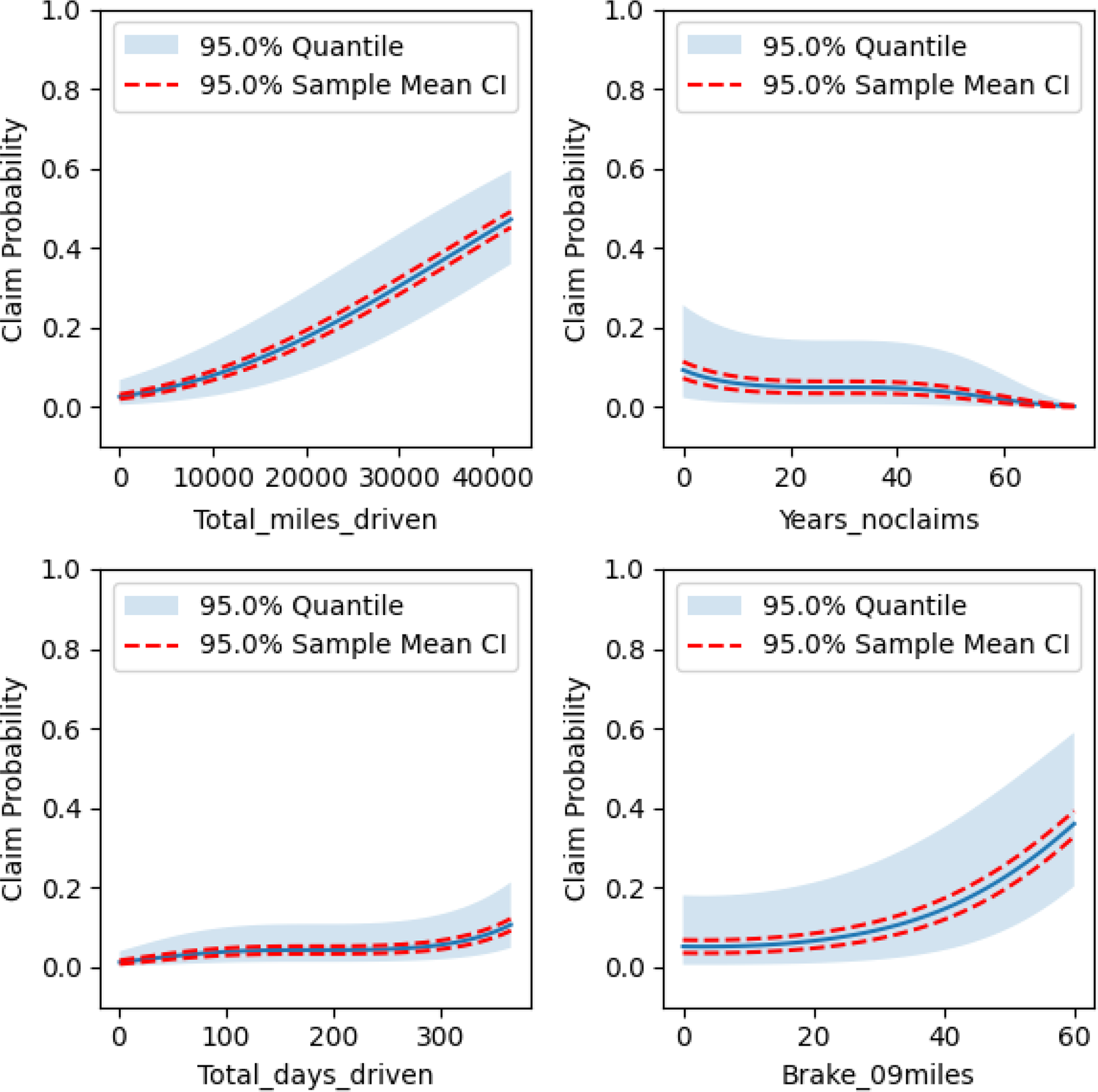
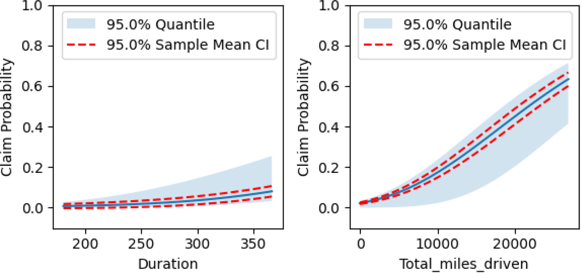
To better understand the relationship between the covariates and the response variable, we produced partial dependence plots in Figures 10, 11, and 12 for the respective clusters. The claim probability for Cluster 0 depends on total miles driven, number of years with no claim, total days driven, and the number of sudden brakes at 9 mph/s per 1,000 miles. It can be said that policyholders that have similar driving profiles and get assigned to this cluster can expect their claim probability to increase with the total miles they drive, the total days they drive, and the number of sudden brakes they make, while it will decrease with the number of years they have without a claim.
Partial dependence plots for Cluster 0’s regression model.
Partial dependence plots for Cluster 1’s regression model.
Partial dependence plots for Cluster 2’s regression model.
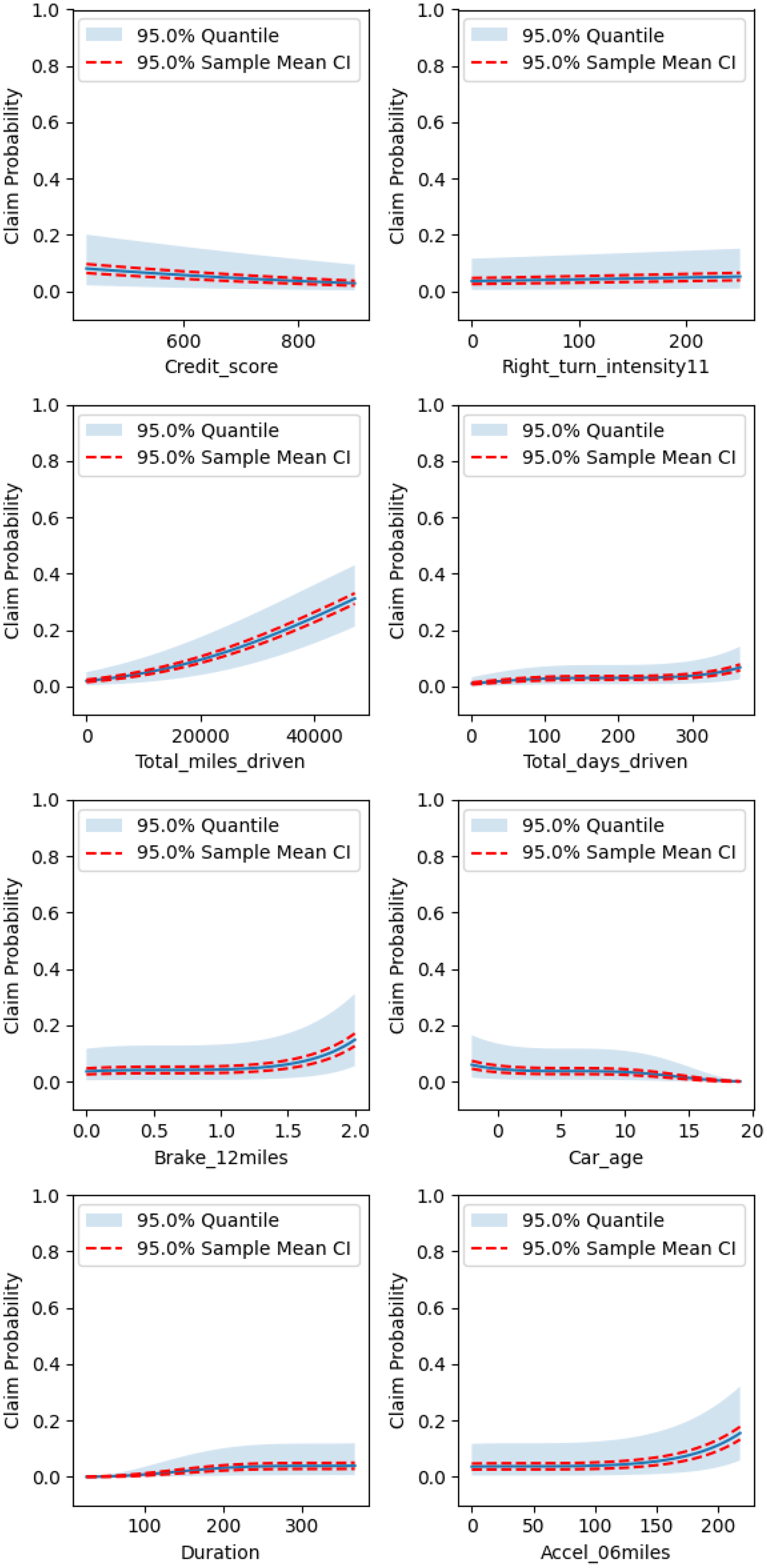
The claim probability for policyholders in Cluster 1 depends only on the total miles they have driven and the duration of their policy. We recall that this cluster had the highest claim rate, although it was close to that of Cluster 0. While claim probability in this cluster also increases with total miles driven, it does so at a much steeper rate than in Cluster 0. We also note that this cluster had the fewest policyholders and the smallest average number of miles driven compared to the other clusters.
Finally, the largest cluster, Cluster 2, also produces the most complex regression model. The claim probability increases with total miles driven, total days driven, policy duration, sudden accelerations, sudden brakes, and the number of right turns at larger intensities, while it decreases with credit score and car age.
4.5. Calibration
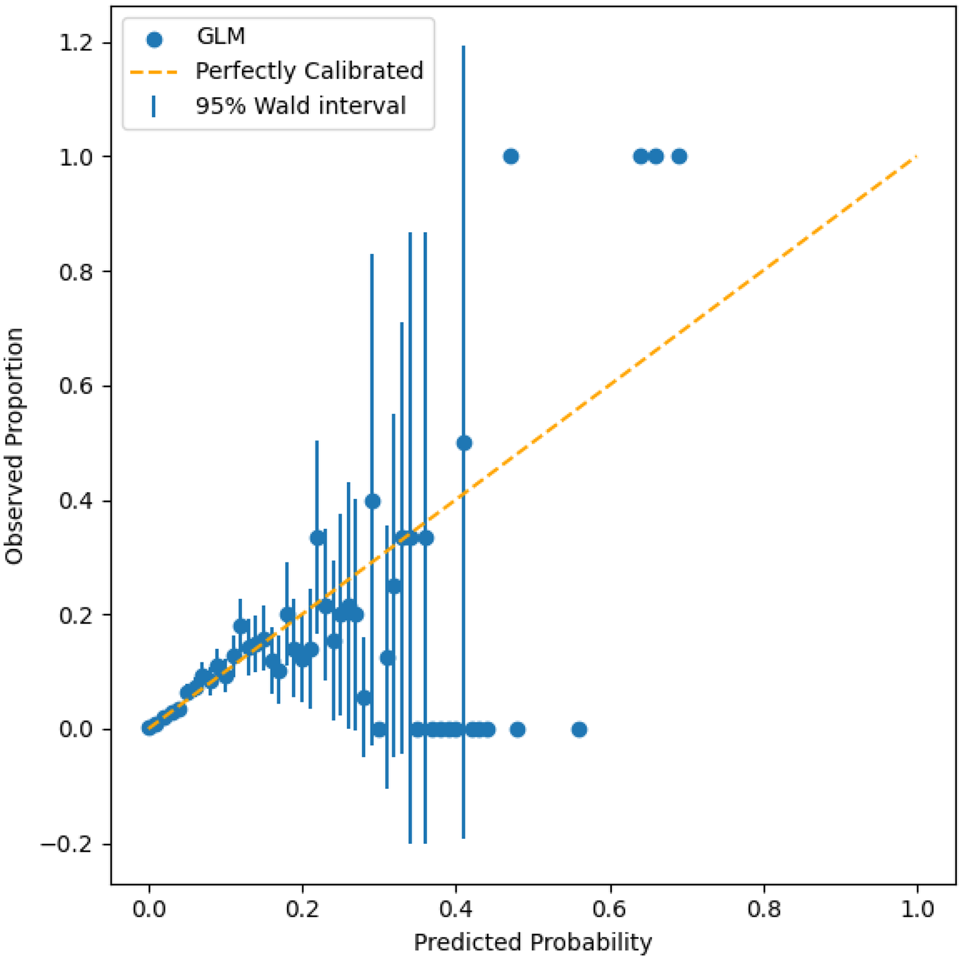
To inspect how well-calibrated the regression model is, we examine the predicted probabilities in the context of the observed proportions. We divided the probabilities output from the regression models into 100 bins. For example, if an observation is assessed as having a 5.5% chance of making a claim then it is placed into the bin with other observations that range from 5% to 6% probability. To calculate the observed proportions for each bin, we sum the number of claims of the observations within each bin and divide by the total number of observations in that bin. Figure 13 shows this plot. A perfectly calibrated model produces a plot that tracks the dashed line. For example, observations with a predicted claim probability between 5% and 6% would have an observed proportion of 5.5%. We removed instances with fewer than two observations in a bin as observed proportions of 0, 0.5, or 1.0 are not informative due to the small sample size.
Calibration plot for regression probabilities in the test set for the optimal model.
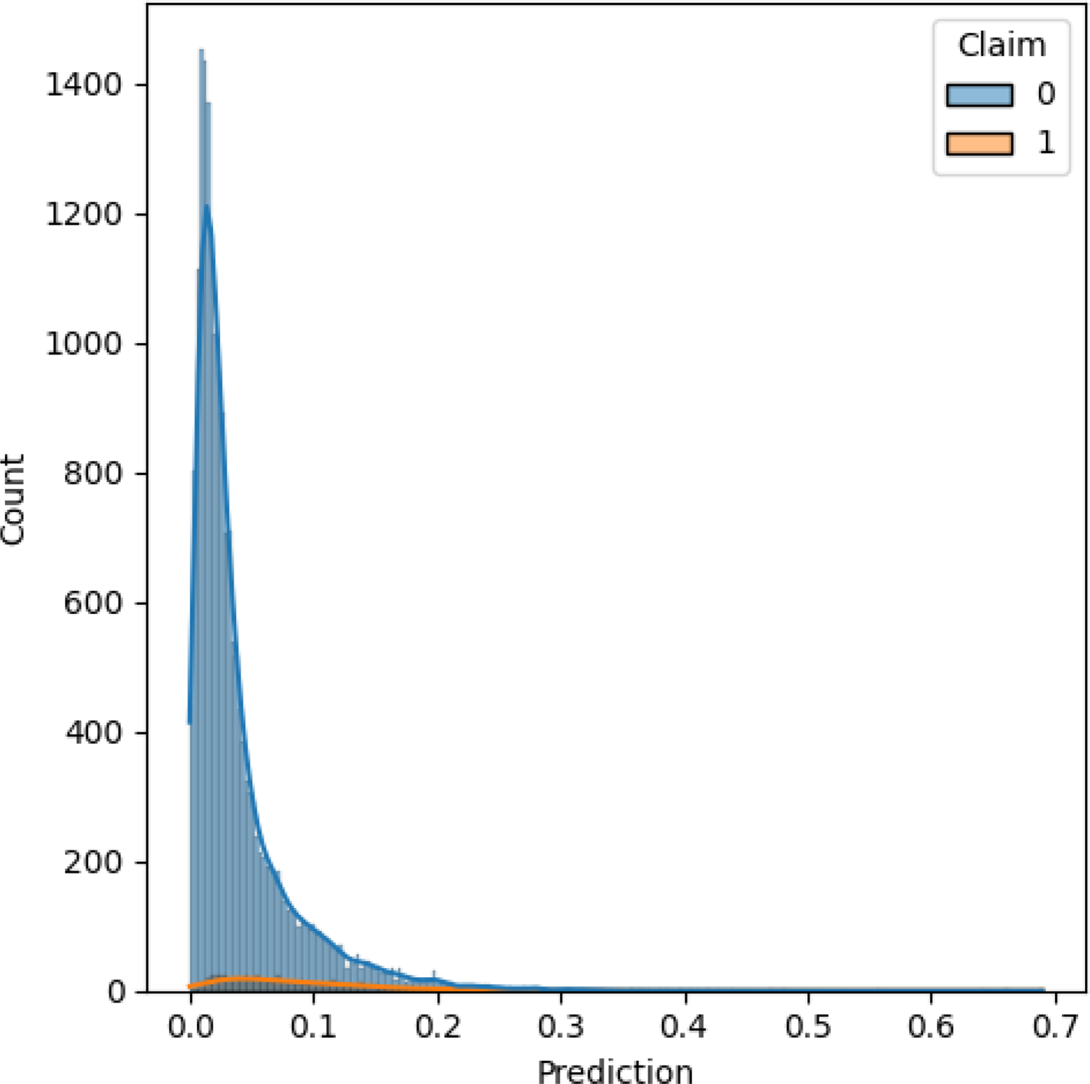
We also included a histogram with kernel density estimation of the test set, with observations grouped by claim or no claim. In Figure 14, over 98% of observations are assigned probabilities below 0.20. Referring back to the calibration plot, if we focus on the predicted probabilities between 0.0 and 0.20, which account for the majority of observations, we see that the models perform close to the perfectly calibrated line. Outside this region, there is a lot of variation in the observed proportions, but this is based on a small sample.
Histogram with kernel density estimation for claims (1) and no claims (0) in the test set based on predictions from the optimal model.
In addition to inspecting the results visually, we used the Hosmer–Lemeshow statistic (Hosmer & Lemesbow, Reference Hosmer and Lemesbow1980) to measure the goodness-of-fit of the probabilities. Under the null hypothesis, which states that the observed and expected proportions are the same, the Hosmer–Lemeshow statistic follows a ${\it\chi} _{{g_i} - 2}^2$
distribution where
${\it\chi} _{{g_i} - 2}^2$
distribution where ${g_i}$
is the number of groups that the probabilities of cluster
${g_i}$
is the number of groups that the probabilities of cluster $i$
are divided into. The statistic is given by
$i$
are divided into. The statistic is given by
 $$C\,*\! = \mathop \sum \nolimits_{j = 1}^{{g_i}} {{{{({o_j} - {n_j}{{\overline \pi }_j})}^2}} \over {{n_j}{{\overline \pi }_j}\left( {1 - {{\overline \pi }_j}} \right)}},$$
where ${o_j}$
is the number of observed claims in group
${o_j}$
is the number of observed claims in group $j$
,
$j$
, ${n_j}$
is the number of observations in group
${n_j}$
is the number of observations in group $j$
and
$j$
and ${\overline \pi _j}$
is the average predicted claim probability in group
${\overline \pi _j}$
is the average predicted claim probability in group $j$
. As recommended by Paul et al. (Reference Paul, Pennell and Lemeshow2013), we set
$j$
. As recommended by Paul et al. (Reference Paul, Pennell and Lemeshow2013), we set ${g_i} = 10$
for samples smaller than 1,000. For samples between 1,000 and 25,000, we let
${g_i} = 10$
for samples smaller than 1,000. For samples between 1,000 and 25,000, we let
 $${g_i} = {\rm max}\left( 10,{\rm min}\left( {{O \over 2},{{N - O} \over 2},2 + 8{{\left ( {{N \over {1000}}}\right)^2}}} \right) \right),$$
where $N$
is the number of samples in cluster
$N$
is the number of samples in cluster $i$
and
$i$
and $O$
is the number of observed claims in cluster
$O$
is the number of observed claims in cluster $i$
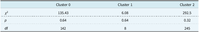
. This is a method of standardising the power of the Hosmer–Lemeshow test so that the results are comparable across clusters of different sizes. The results in Table 10 show that all clusters produce test statistics that are not statistically significant at the 5% level, meaning we fail to reject the null hypothesis that the observed and expected probabilities are the same.
$i$
. This is a method of standardising the power of the Hosmer–Lemeshow test so that the results are comparable across clusters of different sizes. The results in Table 10 show that all clusters produce test statistics that are not statistically significant at the 5% level, meaning we fail to reject the null hypothesis that the observed and expected probabilities are the same.
Hosmer–Lemeshow statistics, p-values, and degrees of freedom for the optimal regression model on the test set
5. Conclusion
In this article, we examine how clustering can be used to segment policyholders into different risk bands. Clustering accounts for the heterogeneous nature of the data and effectively builds driving profiles. Rather than dividing policyholders based on conditional statements, we can divide them in a more sophisticated statistically robust manner. While clustering assignments are more complex, they consider all variables simultaneously. This differs from a more traditional practice of grouping policyholders based on isolated variables such as demographic information, primarily age. With clustering, we can also incorporate telematics data, which is more informative about a policyholder’s driving ability and characteristics. The premiums, which are a function of claim risk, offered using telematics information are inherently fairer than traditional methods, as they are based on factors policyholders can control. Drivers may not be able to alter some of their decisions, such as the percentage of time spent driving on the weekend, but they can alter the number of sudden accelerations or sudden brakes. It also directly incentivises safer driving practices.
The two-stage approach allows differential pricing by letting rates vary for customers despite them having the same value for an underlying variable. For example, we found a different relationship between claim probability and total miles driven between clusters. Despite Cluster 0 and Cluster 1 having similar claim rates, claim probability increased at a much steeper rate with total miles driven for Cluster 1. The effects of the coefficient showed that drivers in Cluster 1 who had accrued the same number of miles as drivers in Cluster 0 were at greater risk of making a claim. The modelling that was performed offers explainable results and probabilistic estimates in terms of both clustering assignments and claim risk.
Further investigation on using telematics information for insurance pricing and risk assessment could focus on implementing real-time updates. The work completed so far takes a year’s worth of data from a policyholder to estimate their probability of making a claim. This allows insurers to produce better estimates of claim frequency and claim severity, provided they have historical telematics data or estimates for the features in the following year. A future topic of research could therefore be incorporating a Bayesian framework to make predictions for new policyholders that do not have historical telematics data, or for making adjustments to current policyholders’ estimates when they alter their driving habits and tendencies significantly during the duration of the policy.
Data availability
Codes and data for reproducing the analysis in this paper are available at https://github.com/JamesHannon97/statistical-models-for-improving-insurance-risk-assessment-using-telematics.
Funding statement
This publication has emanated from research jointly funded by Taighde Éireann – Research Ireland under grant numbers 18/CRT/6049 and 12/RC/2289_P2. For the purpose of Open Access, the author has applied a CC BY public copyright licence to any Author Accepted Manuscript version arising from this submission.
Competing interests
None.
Appendix A
Appendix A.1. Descriptive Statistics
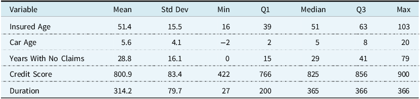
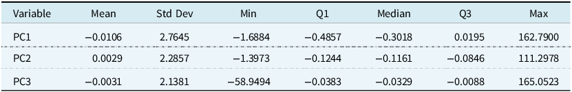
This appendix contains tables with descriptive statistics for the variables used in this paper. Table A1 shows the mean, standard deviation, minimum, ${1^{{\rm{st}}}}$
quartile, median,
${1^{{\rm{st}}}}$
quartile, median, ${3^{{\rm{rd}}}}$
quartile, and maximum of the telematics variables. The same summary statistics are shown in Table A2 for the traditional auto insurance variables that are numerical, while a breakdown of the categorical variables can be seen in Table A3. Table A4 shows the summary statistics for the principal components used in this paper.
${3^{{\rm{rd}}}}$
quartile, and maximum of the telematics variables. The same summary statistics are shown in Table A2 for the traditional auto insurance variables that are numerical, while a breakdown of the categorical variables can be seen in Table A3. Table A4 shows the summary statistics for the principal components used in this paper.
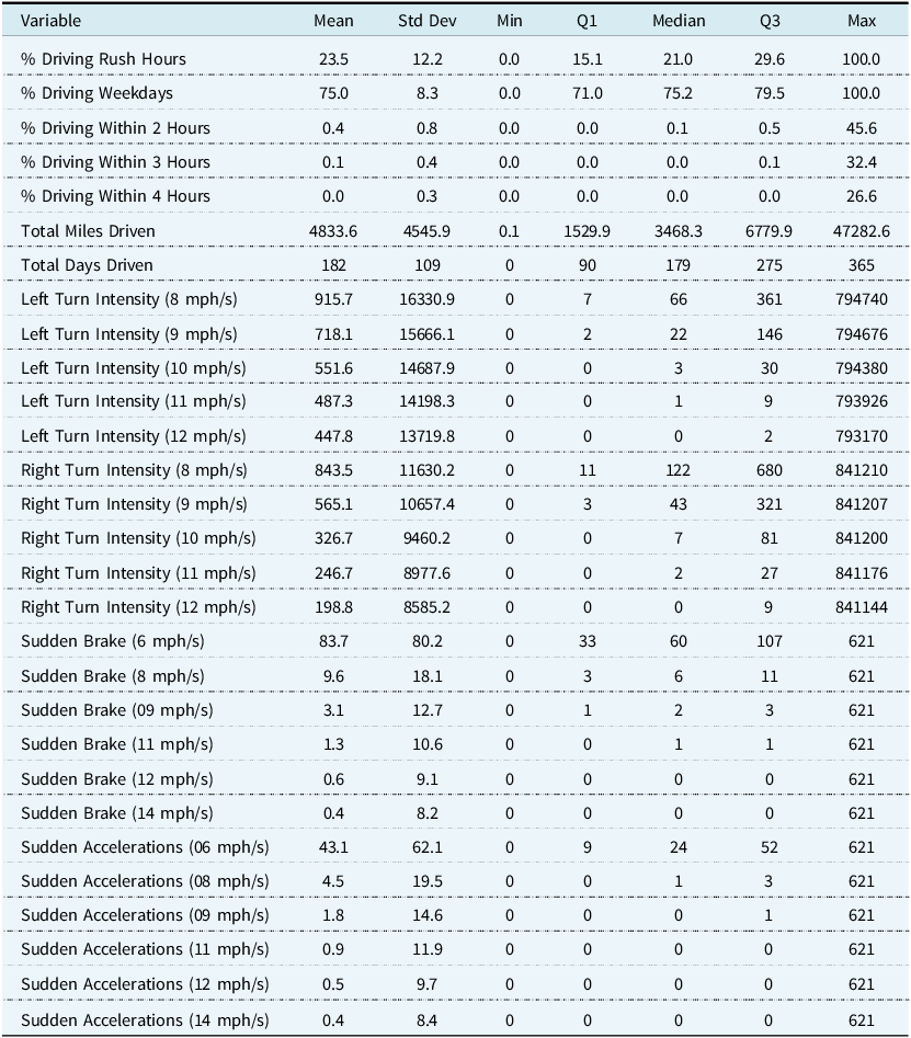
Descriptive statistics for telematics variables used in this paper
Descriptive statistics for traditional numerical auto insurance variables used in this paper
Breakdown of traditional categorical auto insurance variables used in this paper
Descriptive statistics for principal components used in this paper
Appendix A.2. Univariate Normality Tests
The following univariate normality tests are used in the paper:
-
The Shapiro–Wilk test is a test of normality. The null hypothesis is that the sample, ${x_1}, \ldots, {x_n}$
comes from a normally distributed population. The test statistic is given by(A1)where
$$W = {{{{(\mathop \sum \nolimits_{i = 1}^n {a_i}{x_{\left( i \right)}})}^2}} \over {\mathop \sum \nolimits_{i = 1}^n {{({x_i} - \overline x)}^2}}}$$
${x_{\left( i \right)}}$
is the
${i^{{\rm{th}}}}$
order statistic and
$\overline x$
is the sample mean. The coefficients,
${a_i}$
, are given by
${{{m^T}{V^{ - 1}}} \over C}$
, where
$C$
is vector norm,
$C = {({m^T}{V^{ - 1}}{V^{ - 1}}m)^{{1 \over 2}}}$
,
$m$
is a vector comprised of the expected values of the order statistics of independent and identically distributed random variables sampled from a normal distribution, and
$V$
is the covariance matrix of the normal order statistics. The cut-off values for
$W$
are calculated through a Monte Carlo simulation. Additional investigation of the effect size is recommended, for example, via Q–Q plots.
${x_1}, \ldots, {x_n}$
comes from a normally distributed population. The test statistic is given by(A1)where
$$W = {{{{(\mathop \sum \nolimits_{i = 1}^n {a_i}{x_{\left( i \right)}})}^2}} \over {\mathop \sum \nolimits_{i = 1}^n {{({x_i} - \overline x)}^2}}}$$
${x_{\left( i \right)}}$
is the
${i^{{\rm{th}}}}$
order statistic and
$\overline x$
is the sample mean. The coefficients,
${a_i}$
, are given by
${{{m^T}{V^{ - 1}}} \over C}$
, where
$C$
is vector norm,
$C = {({m^T}{V^{ - 1}}{V^{ - 1}}m)^{{1 \over 2}}}$
,
$m$
is a vector comprised of the expected values of the order statistics of independent and identically distributed random variables sampled from a normal distribution, and
$V$
is the covariance matrix of the normal order statistics. The cut-off values for
$W$
are calculated through a Monte Carlo simulation. Additional investigation of the effect size is recommended, for example, via Q–Q plots.
-
The Kolmogorov–Smirnov test is a nonparametric test of the equality of continuous one-dimensional probability distributions that can be used to test whether a sample came from a given reference probability distribution. The empirical distribution function
${F_n}$
for
$n$
independent and identically distributed ordered observations
${X_i}$
is defined as(A2)where
$${F_n}\left( x \right) = {1 \over n}\mathop \sum \nolimits_{i = 1}^n {1_{\left( { - \infty, x} \right]}}\left( {{X_i}} \right)$$
${1_{\left( { - \infty, x} \right]}}\left( {{X_i}} \right)$
is an indicator function, equal to 1 if
${X_i} \le x$
, and 0 otherwise. The test statistic for a given cumulative distribution function
$F\left( x \right)$
is(A3)where
$${D_n} = \mathop {{\rm{sup}}}\limits_X \left| {{F_n}\left( x \right) - F\left( x \right)} \right|$$
${\rm{su}}{{\rm{p}}_X}$
is the supremum of the set of distances.


Univariate tests of normality for clustering variables in the training data set
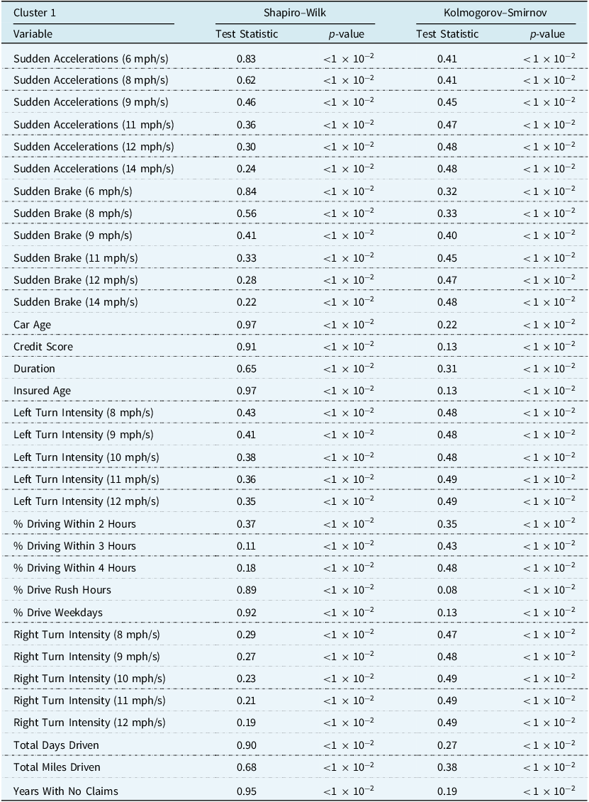
Univariate tests of normality for clustering variables in the training set, using only observations assigned to cluster 0

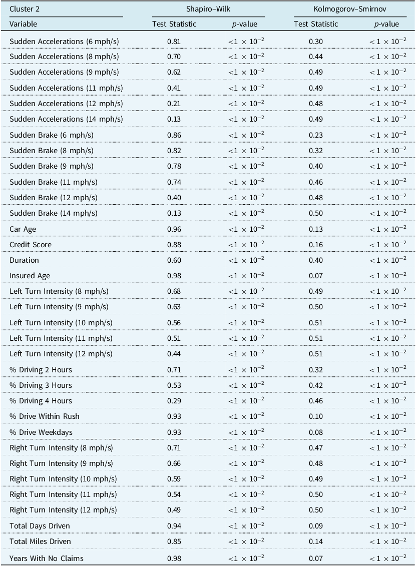
Univariate tests of normality for clustering variables in the training set, using only observations assigned to cluster 1
Univariate tests of normality for clustering variables in the training set, using only observations assigned to cluster 2
Appendix A.3. Multivariate Normality Tests
The following multivariate normality tests are used in the paper:
-
The Henze–Zirkler test is a multivariate test for normality. Let
${X_1}, \ldots, {X_n}$
be independent identically distributed random vectors in
${{\mathbb R}^d}$
,
$d \ge 1$
, with sample mean
$\overline X$
and sample covariance matrix
$S$
. The test statistic is given by,(A4)where
$$H{Z_\beta } = \left\{ \matrix{ {4n},\hfill & {{\rm if}\;S\;{\rm is\;singular}} \cr {{D_{n,\beta }}}, & {{\rm otherwise} }\hfill }\right. $$
${D_{n,\beta }} = {1 \over n}\mathop \sum \nolimits_{j,k = 1}^n {\rm{exp}}( - {{{\beta ^2}} \over 2}|| {{Y_j} - {Y_k}} |{|^2}) + n{(1 + 2{\beta ^2})^{ - {d \over 2}}} - {2 \over {{{(1 + {\beta ^2})}^{{d \over 2}}}}}\mathop \sum \nolimits_{j = 1}^n {\rm{exp}}\left( {{{ - {\beta ^2}|| {{Y_j}} \|{|^2}} \over {2\left( {1 + {\beta ^2}} \right)}}} \right)$
,


 $| {{Y_j} - {Y_k}} |{|^2} = {({x_j} - {x_k})^T}S\left( {{x_j} - {x_k}} \right)$
and
$| {{Y_j} - {Y_k}} |{|^2} = {({x_j} - {x_k})^T}S\left( {{x_j} - {x_k}} \right)$
and $\beta = {1 \over {\sqrt 2 }}{({{n\left( {2d + 1} \right)} \over 4})^{{1 \over {d + 4}}}}$
. The null hypothesis is rejected when
$\beta = {1 \over {\sqrt 2 }}{({{n\left( {2d + 1} \right)} \over 4})^{{1 \over {d + 4}}}}$
. The null hypothesis is rejected when $H{Z_\beta }$
is too large, or when
$H{Z_\beta }$
is too large, or when $S$
is singular.
$S$
is singular.
-
The Mardia test investigates whether the skewness and kurtosis are consistent with a multivariate normal distribution. Let
${X_1}, \ldots, {X_n}$
be independent identically distributed random vectors in
${{\mathbb R}^d}$
,
$d \ge 1$
, with sample mean
$\overline X$
and sample covariance matrix
$S$
. Then(A5)
$${\rm{skew}} = {1 \over {{n^2}}}\mathop \sum \nolimits_{i = 1}^n \mathop \sum \nolimits_{j = 1}^n {({({X_i} - \overline X)^T}{S^{ - 1}}( {{X_j} - \overline X} ))^3}$$
(A6)where
$${\rm{kurt}} = {1 \over n}\mathop \sum \nolimits_{i = 1}^n \mathop \sum \nolimits_{j = 1}^n {({({X_i} - \overline X)^T}{S^{ - 1}}( {{X_j} - \overline X} ))^2}$$
$S = {1 \over n}\mathop \sum \nolimits_{j = 1}^n \left( {{X_j} - \overline X} \right){({X_j} - \overline X)^T}$
. For the skewness test, under the null hypothesis that the sample comes from a multivariate normal distribution, we would expect
${n \over 6}{\rm{skew}}\sim{\chi ^2}\left( {df} \right)$
where
$df = {{d\left( {d + 1} \right)\left( {d + 2} \right)} \over 6}$
. For the kurtosis test, under the null hypothesis that the sample comes from a multivariate normal distribution, we would expect
$\left( {{\rm{kurt}} - d\left( {d + 2} \right)} \right)\sqrt {{n \over {8d\left( {d + 2} \right)}}} \sim N\left( {0,1} \right)$
.


Multivariate tests of normality for clustering variables in the training set. note that $n = 60,000$
and
$n = 60,000$
and $d = 34$
Multivariate tests of normality for clustering variables in the training set, using only observations assigned to cluster 0. Note that $n = 15,990$
and
$n = 15,990$
and $d = 34$
Multivariate tests of normality for clustering variables in the training set, using only observations assigned to cluster 1. Note that $n = 807$
and
$n = 807$
and $d = 34$
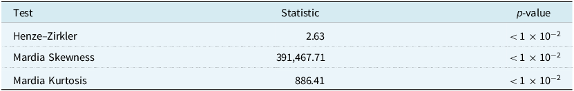
Multivariate tests of normality for clustering variables in the training set, using only observations assigned to cluster 2. Note that $n = 43,203$
and
$n = 43,203$
and $d = 34$
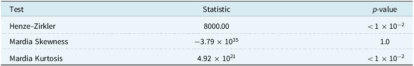
Appendix A.4. Clustering
Table A13 shows the average silhouette scores for each clustering solution, with and without PCA, where we allowed the covariance structure and number of components to vary. Figures A1 and A2 show the silhouette scores for each observation when we have a full covariance structure and 3 components, with and without PCA. In both figures, the large negative values for Cluster 1 show that the observations may be clustered better in a different cluster. Figures A3 and A4 show the adjusted Rand index for the aforementioned clustering solutions. We ran the clustering algorithm 10 times with different initialisations to see how closely the final solutions were to our chosen one. An adjusted Rand index close to 1 indicates that the algorithm arrives at similar results, despite different initialisations. This indicates stability in the clustering algorithm. We also show the standard deviation of the adjusted Rand index, with smaller values preferred. If we recorded the same adjusted Rand index 10 times, then there was no standard deviation to record, which explains why there is a standard deviation of 0 in some cases.
Table of the average silhouette scores for the clustering solutions
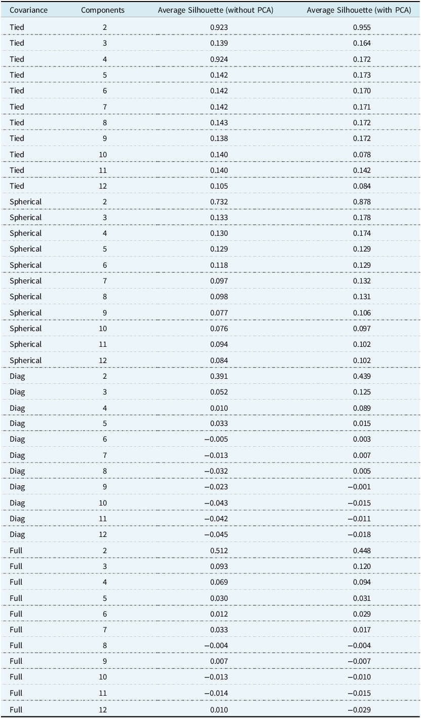
The silhouette plot for the three clusters using the full covariance structure on the data set without PCA. The red dashed line represents the average silhouette score across all observations.
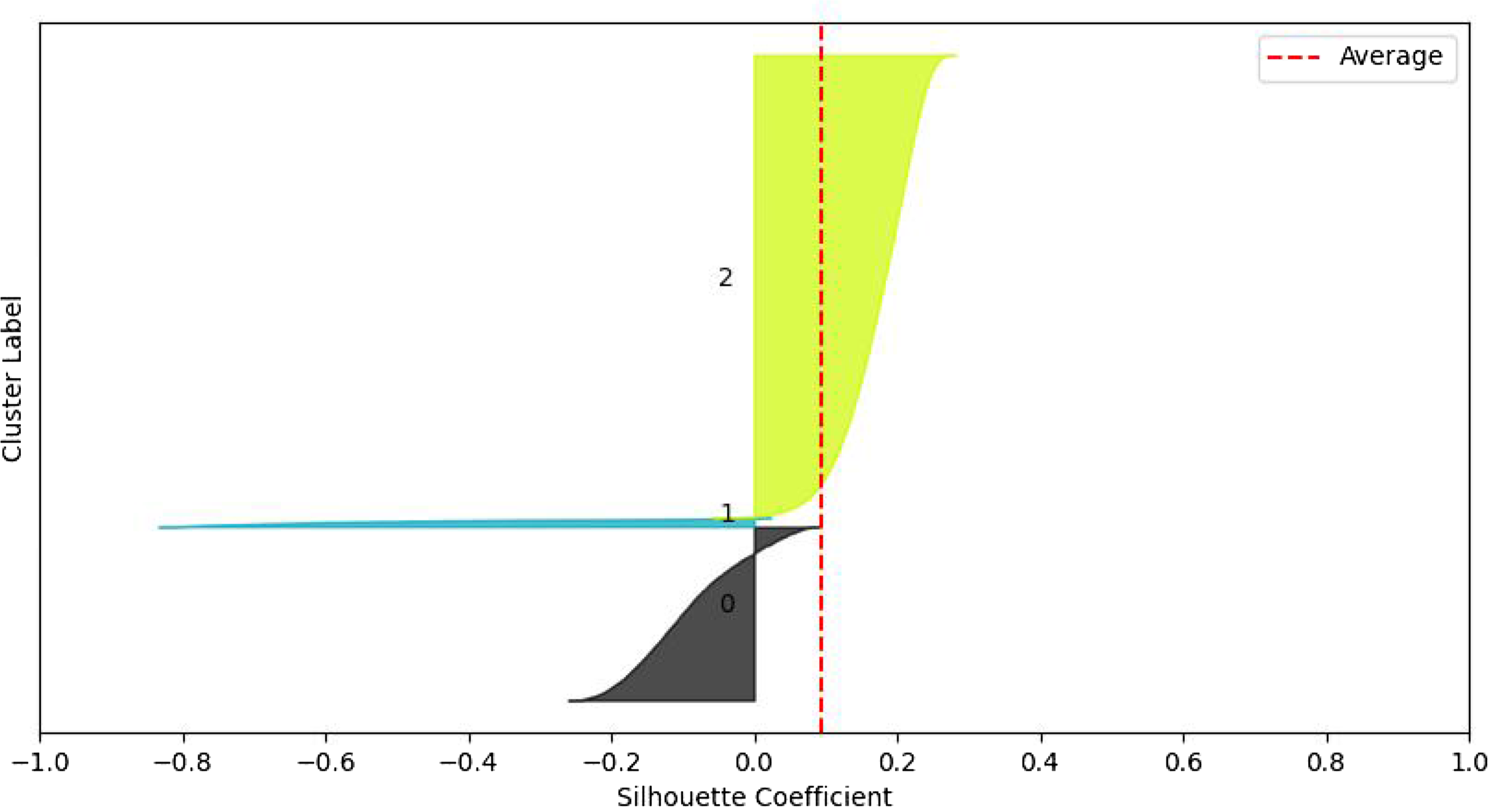
The silhouette plot for the three clusters using the full covariance structure on the data set with PCA. The red dashed line represents the average silhouette score across all observations.
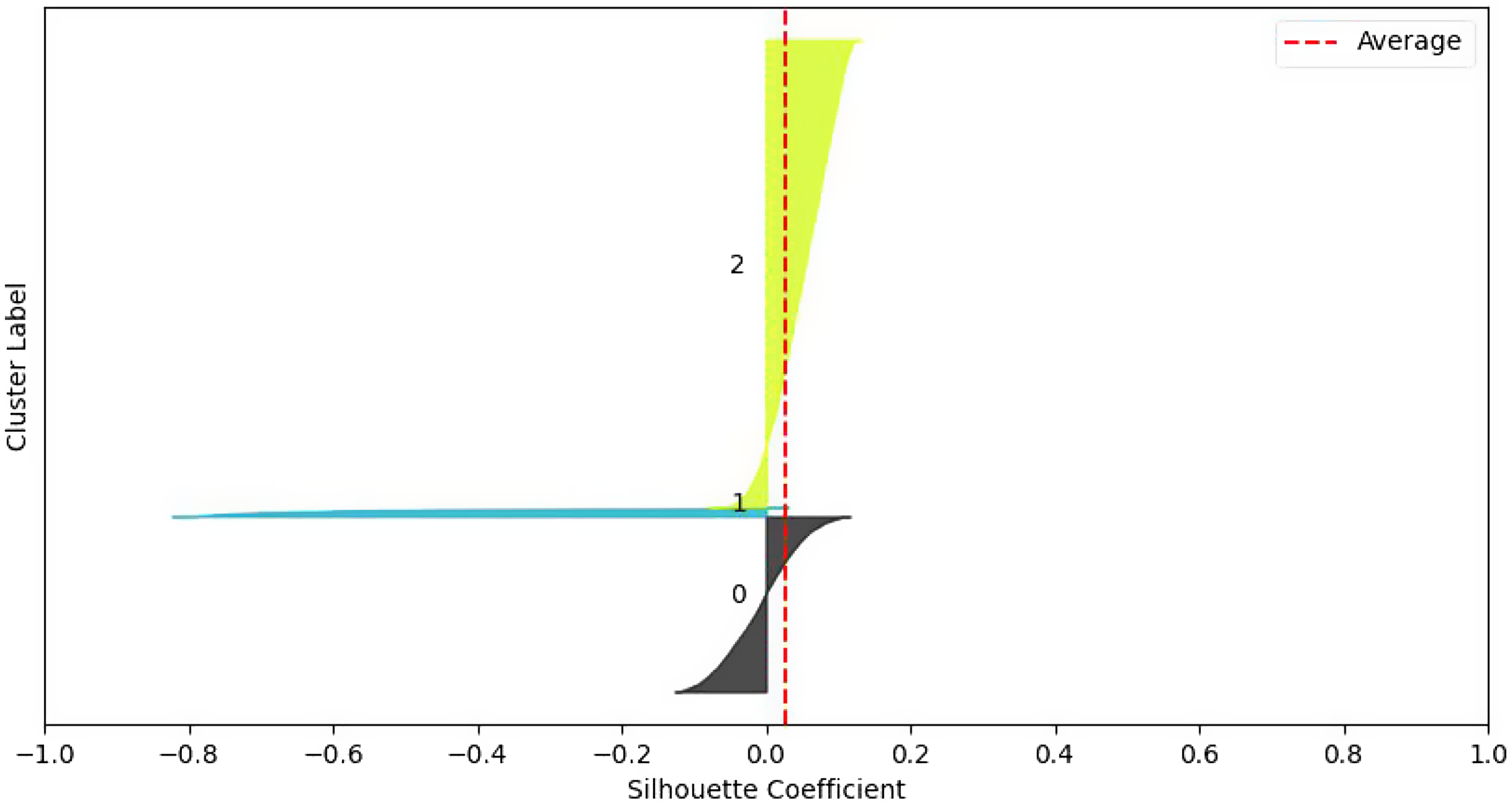
The adjusted Rand index for the three clusters using the full covariance structure on the data set without PCA. Ten initialisations were used to assess the stability of the clustering solution. The line plot represents the average, while the bars represent the standard deviation.
The adjusted Rand index for the three clusters using the full covariance structure on the data set with PCA. Ten initialisations were used to assess the stability of the clustering solution. The line plot represents the average, while the bars represent the standard deviation.


 Open access