

The visualization of dates for large assemblages of objects represents a common issue for all scientists dealing with artifacts and their chronological assessment. When speaking of heterogeneous date ranges or time spans, we mean the simple enough circumstance that object A may be dated between 350 and 250 BC, and object B between 300 and 150 BC. The date range is the combination of a lower (minimum) and upper (maximum) dating. In the case of two or even 200 objects dated to those exact same date ranges, the visualization is easy to produce and comprehend. But let us imagine that this fictional assemblage encompasses an additional 50 objects dated to 300–225 BC, another three to exactly 333 BC, and so forth. This obviously complicates the task of visualization. In reality, the date ranges represented in an assemblage can be very heterogeneous. In other words, the data are usually combined from different sources using varying standards of recording, and they may encompass differing phase boundaries and nomenclature as well as time spans in absolute formats. Single objects are often dated to various phases and combinations thereof as well, as Figure 1 illustrates.
Chronological distribution of the languages in the inscriptions of Bithynia by phases (bar chart).

Combining heterogeneous date ranges of a large body of objects into a short and visually coherent format is a task that, as far as we can tell in our field, researchers tend to struggle with. Given that both authors of this article have a background in the field of classical archaeology, the following text relies on examples relevant to our discipline, and the figures are based on the inscriptions of Bithynia dataset further analyzed here in the framework of a case study. The method we propose is nonetheless suitable for any research encountering this issue. Examining the common practice throughout the disciplines, the visualization of such data is often resolved with the use of bar charts or histograms. With bar charts (Figure 1), the assemblage is represented by its division into bars on a discrete but ideally chronologically ordered x- or y-axis, with the number of objects in each bar represented by its length. A histogram, as illustrated in Figure 2, is a specific form of bar chart meant to display the distribution of a continuous variable rather than a discrete one. The values of the variables are divided into intervals represented by the bars, which are in this case called “bins.” The bins are spread in equidistant intervals, with their length also representing the number of objects (Baxter and Beardah Reference Baxter and Beardah1996; Shennan Reference Shennan1997:21–26). In this way, both visualizations aim to illustrate the quantitative changes in an assemblage over the course of time, although histograms are more accurate in that regard. In order to actually use a histogram, one needs to know the number of objects to be placed in each bin—that is, one needs to have a single continuous variable that could be separated into such intervals. Dividing an assemblage in arbitrary intervals and counting the maximum number of objects in each interval is a feasible solution, but—as can be easily discerned from Figure 2—it will also lead to the reader greatly overestimating the actual count of objects (Johnson Reference Johnson2004:449–450). As has been stated above, using a truly representative histogram is often impossible when using archaeological time data, which is why so many publications resort to the use of bar charts.
Maximum number of inscriptions in Bithynia, by single years and language, with bins of 25 years, thereby greatly exaggerating the true object counts (histogram).

Figure 1 presents a typical bar chart. Here, the dating of the inscriptions of Bithynia has been divided into five arbitrary phases from two historical periods. The figure illustrates some common difficulties. First, the bars indicating these chronological phases are not equidistant on a time scale, which they would be in a histogram (Figure 2). Second, although the development over the assigned phases is somewhat decipherable, it is not without effort, and one cannot be sure how the changes present themselves over the actual course of time. Third, many objects have to be placed in (at least) two phases, given that they do not allow for a more precise assignment, producing several redundancies, which significantly reduce the readability of the graph. These are generally widely recognized issues (Johnson Reference Johnson2004:449; Roberts et al. Reference Roberts, Mills, Clark, Randall Haas, Huntley and Trowbridge2012:1513). For objects dated to multiple phases, it is common practice to either create combined bars spanning several of these phases (as seen in Figure 1) or to individually choose to which of the possible bars, bins, or phases each object will be assigned. One might expect that the dating had already been provided in a more precise way if such an informed decision was possible. Even if archaeologically feasible, further narrowing down into which phase an object should be placed cannot be automated because it relies on the expertise of the scholar evaluating it. In large datasets, this process would take up a considerable amount of time and might still not solve all dating conflicts, which is why most datasets have such heterogeneous phase placements in the first place. Apart from this, only arbitrary methods of distributing the objects to the phases come to mind. Those methods, however, do not sufficiently represent the data the actual record could provide us with, and they pose a danger of skewing the trends that will be detected due to the placement in the wrong phase. Consequently, they may critically affect the outcome of any analysis. Translating those phases to their known boundaries in terms of numbers yields more possibilities of easily graspable visualization, such as the duplication of each object that has been presented in Figure 2. A histogram resulting from this duplication, however, informs us of neither the true object counts nor the actual distribution of the assemblage's chronology, given that an object dated precisely to one single year is represented in only one bin, but an object dated to the whole of the Roman Imperial period would be assigned to a range of bins spanning 426 years (around 17 bins, when bins of 25 years are used). In this article, we propose a method of preparing archaeological data for the visualization of longue durée trends and changes in object assemblages that respects the fuzziness of archaeologically determined date ranges and their varying degrees of (un)certainty.
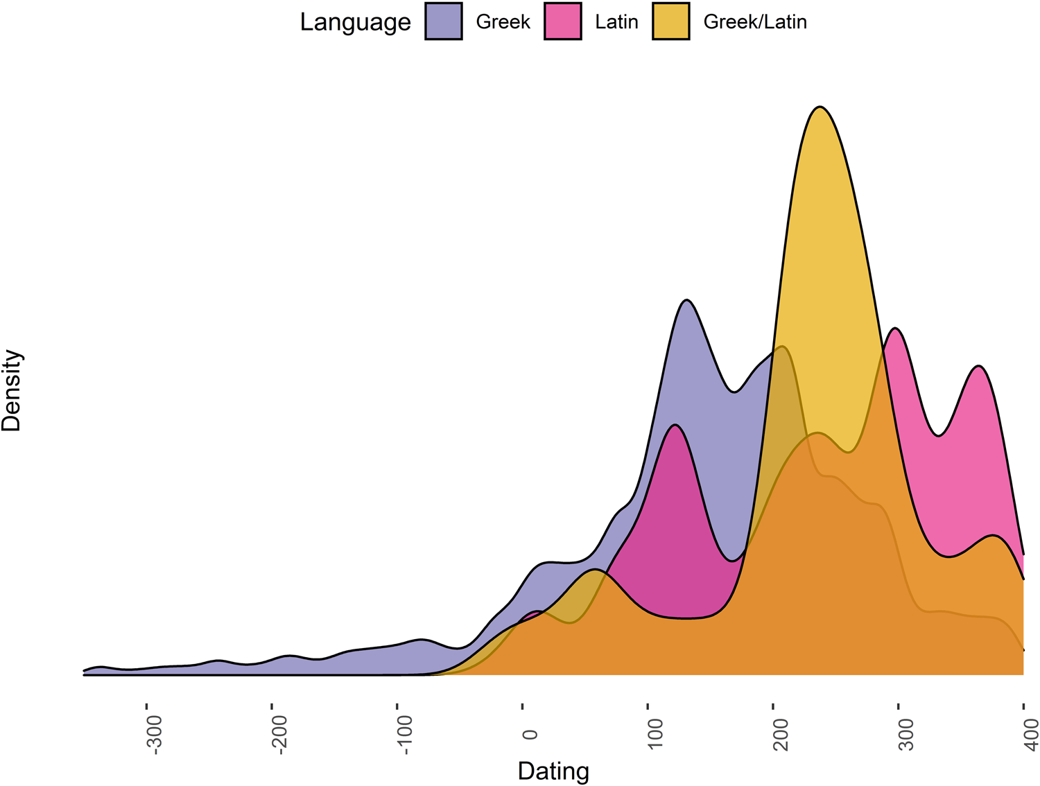
One visualization that more accurately captures the reality of objects’ dating (i.e., their strong probability to have been produced within a certain time range) is that of a density graph, as shown in Figure 3. The obvious disadvantage of this format is that the actual object count can no longer be gathered from the graph, as is also the case with the histogram of duplicates (Figure 2). One strong advantage, however, is that it shows the smooth distribution of objects over the course of time, which makes changes in the variables assigned to each object much more apparent and understandable. The data that Figures 1–3 are based on are the same, yet in Figure 3, the dating of each language used in the Bithynian inscriptions is more readily apparent. What the density distribution obscures, however, is the significantly lower absolute number of inscriptions in Latin. To counteract this effect, we suggest adding a histogram of the distribution, as seen in Figure 2. The histogram cannot show the probability of dating, and likewise the density graph has no relation to the quantity of objects, but their combination is powerful. The implication of the density graph is not that during the Roman Imperial period there would be more Latin inscriptions. Instead, it informs us that inscriptions that are written in Latin most probably date to the Imperial period. Baxter and Beardah (Reference Baxter and Beardah1996) discuss the use of kernel density estimation (KDE) in comparison with histograms for a variety of measurements in greater detail.
Results of datplot: chronological distribution of the languages in the inscriptions of Bithynia as a density graph.
Datplot relies on the concept known as “aoristic analysis,” and this has received some attention in archaeological research in the past (Crema et al. Reference Crema, Bevan and Lake2010; Johnson Reference Johnson2004; Mischka Reference Mischka2004; Orton et al. Reference Orton, Morris and Pipe2017:3–5). The idea of aoristic analysis “is to define relatively narrow chronological bins of uniform width, and then build up an overall distribution by summing the probability of each individual entity falling within each bin” (Orton et al. Reference Orton, Morris and Pipe2017:3). This has already been adapted by archaeologists, namely in the R packages aoristAAR, archSeries, tabula (Frerebeau Reference Frerebeau2019), and rtfact. To date, the method seems not to have found its way into the world of classical archaeology, and the use of KDE for visualization of aoristic analysis is generally not considered. Crema and others (Reference Crema, Bevan and Lake2010:1123) briefly mention KDE as a possible approach. Baxter and Cool (Reference Baxter and Cool2016:125–126), although illustrating it, do not further elaborate on its use. Although we wholeheartedly encourage making use of the mentioned packages, which all provide different ways of calculation, we aim to provide a simpler approach that can be easily adapted by scholars without extensive experience in statistical analysis or programming languages. We have developed an R package that is capable of transforming any table of (numerically) dated objects into a format suitable for the visualization of data as smoothed curves on time scales. The package also contains the inscriptions of Bithynia dataset and a detailed workflow demonstrating how to transform data as it is regularly encountered by classical archaeologists into the format needed for aoristic analysis of any kind. Using the format provided by our package, a graph of the distribution can easily be produced by kernel density estimation (see Figure 3), which is available in a variety of R's plot methods. The intention of the proposed package and the method is to offer help to scholars who struggle with the visualization of changes in object assemblages in the longue durée, as well as the dating of variables observed in the material record. We introduce our approach and explain the functionality of the R package datplot (version 1.0.0), available on CRAN (in R: install.packages(“datplot”); see https://cran.r-project.org/package=datplot).
KERNEL DENSITY ESTIMATION AND ITS PREVIOUS USES IN ARCHAEOLOGY
Kernel density estimation (KDE) has a long history of application in archaeology, most commonly in assessing spatial distributions (Baxter Reference Baxter2017; Baxter and Beardah Reference Baxter and Beardah1996; Baxter et al. Reference Baxter, Beardah and Wright1997; Beardah Reference Beardah1999; Beardah and Baxter Reference Baxter2017). Its application in GIS and spatial statistics has become familiar to many archaeologists. For a general description of KDE and its utilization in archaeology, see Wheatley and Gillings (Reference Wheatley and Gillings2002:166). For recent studies, see Herzog (Reference Herzog2013:237–248), Herzog and Yépez (Reference Herzog and Yépez2013), Baxter (Reference Baxter2017:10–13), McLaughlin (Reference McLaughlin2019), and Bonnier and colleagues (Reference Bonnier, Finné and Weiberg2019). In general terms, KDE is a statistical method designed to estimate the smooth distribution of a population over a continuous variable—that is, approximating the underlying distribution using a set of observations (Baxter Reference Baxter2017:1; Shennan Reference Shennan1997:29–30). This is achieved by treating each observation as a so-called kernel. The kernel is an even probability density function centered around the value of each observation. The spread of each kernel's probability function is referred to as the bandwidth. The density estimate is produced by adding all the kernels and dividing the result by the number of observations. The resulting probability function consequently displays the kernel functions’ overlaps, and it shows higher values and peaks where the greatest agglomeration of kernels is situated. If the bandwidth is set too small, the curve will appear jagged depending on the intervals that are present in the data. Likewise, a large bandwidth will yield a very smooth curve that evens out smaller changes in the probability function. Examples, along with some further discussion of implications, are provided in Supplemental Text 1. Adjustments may be needed to achieve better visibility when looking at larger or smaller overall time spans.
KDE is a very useful tool for the interpretation and visualization of trends and changes in the data because it aims to estimate the underlying distribution of the population from which the data were gathered. It seems especially fitting as a method of visualizing aoristic analysis, which aims at detecting the most probable point in time of an event (Johnson Reference Johnson2004:449; Mischka Reference Mischka2004:235). Various functions and packages for the calculation and visualization of density estimates are available for R (Deng and Wickham Reference Deng and Wickham2014). In this article, we rely on the algorithms used by the base-r function density() and the visualization package ggplot2.
THE FUNCTIONALITY OF THE R PACKAGE DATPLOT
The main problem encountered when trying to produce a density graph for the dating of large object assemblages is that each object cannot be attributed to a single point in time—that is, one date (e.g., 453 BC). Instead, it is usually attributed to a time span (e.g., 475–425 BC). This means that the objects actually have a certain probability to date to each of the years in this time span (Ratcliffe Reference Ratcliffe2000:670). Our approach is to transform each individual object to a number of observations, each with its own probability, that can be then processed by kernel density estimation, using this probability as a weight to estimate the probability density of the overall population. Calculating and plotting the kernel density function for our example of inscriptions in Bithynia processed with datplot produces the distributions that can be seen in Figure 3, informing us of the chronological probability distribution of the two languages that are used in the inscriptions.
The main functionality of the R package datplot is to process a list of dated objects so that each object is assigned to each possible point on the time scale as delimited by the object's date range. Due to this, the scale is not truly continuous, which is why we prefer to speak of a time- or pseudo-continuous scale rather than a continuous one. This technicality, however, does not influence the results. Instead of single years, each object can be attributed to a set of multiple points partitioned by a previously determined interval on the time scale, once again delimited by the object's dating range. The central function of datplot multiplies each object into a number of observations dependent on the object's dating range, with each observation representing the object's possibility to be dated to a certain point in time. This is referred to as a dating “step.” In approaches to aoristic analysis in archaeology, intervals between one year and a century have often been employed (e.g., Crema Reference Crema2012:446–447; Crema et al. Reference Crema, Bevan and Lake2010:1120–1121; Johnson Reference Johnson2004:450; Mischka Reference Mischka2004).
When looking at longue durée developments, the size of time intervals or dating steps should not be significant from an archaeological viewpoint, although the division into single years may always be preferable in terms of the reliability of the resulting distribution.
It is apparent that this approach, similar to histograms, produces a bias toward objects that have been dated more loosely because they appear more often in the data used to generate the density estimates as is the case in Figure 2 (Johnson Reference Johnson2004:449–450). To bypass this problem, each observation is assigned a weight, which is also a common variable in kernel density estimates. The weight aims at expressing the probability of an object being dated to this particular year—that is, the probability of this particular observation being correct. As the name suggests, this variable is used to determine the degree to which the subobject is considered for the density estimation. The measure of weight that we employ is the number one divided by the number of years to which the object is dated (e.g., 50 in the example above, resulting in 1/50 or 0.02; Crema et al. Reference Crema, Bevan and Lake2010:1120–1121; Ratcliffe Reference Ratcliffe2000:671–672, Figure 1). Johnson (Reference Johnson2004:450) employs a similar measure, where the aoristic weight is determined by dividing the size of the interval (in Johnson's case, 100 years) by the time span to which an object is dated. As the closest possible dating for any object in any archaeological record is assumed to be 1 (i.e., a single year), we proceed with this measure. In the case of an ideally dated object, the weight would equal 1 as 1/1 = 1.

Objects that have the same value as their minimum and maximum dating receive a weight of 1 without further calculation. In this way, objects that are dated with greater uncertainty contribute less to the resulting distribution, whereas objects that can be dated with higher precision—that is, to a shorter time span—contribute more to the same distribution. As Johnson (Reference Johnson2004:450–451) notes, this uniform calculation favors objects from periods where a higher resolution of dating (i.e., smaller time spans) can be achieved (see also Crema et al. Reference Crema, Bevan and Lake2010:1121–1122). The same argument could be made if incorporating different types of artifacts in the same analysis (Crema et al. Reference Crema, Bevan and Lake2010:1120), given that coins, for example, can be dated with greater precision than pottery styles. We currently employ no method of “period correction” in the datplot package because this would require a basis of periods relevant to the material analyzed and a measure of dating accuracy that could be achieved within the respective periods (such as in Mischka Reference Mischka2004:240–241 or Roberts et al. Reference Roberts, Mills, Clark, Randall Haas, Huntley and Trowbridge2012:1514; the R package aoristAAR encompasses a method of period correction). It is worth noting that not employing such a correction represents the data more accurately in the sense that the greater uncertainty of dating is reflected during the periods in which the close dating of objects is not permissible.
The case study and Supplemental Text 1 in this article demonstrate a feasible way of utilizing aoristic analysis in classical archaeology and employ datplot as well as various possibilities of visualization for datplot's output. Although the use of computational methods has become more frequent in classical archaeology in the last years, we still see the need to address classicists especially and demonstrate the value of such methods in our field of study, given that their implementation is still far from commonplace. Many researchers face problems that have long been solved in other archaeological disciplines, but adapting those methods is still a desideratum in many areas. Nonetheless, datplot and the results of this case study can be relevant to other disciplines—archaeological or not—as well.
CASE STUDY: EPIGRAPHIC EVIDENCE FROM BITHYNIA AS OF 2016
The case study demonstrates how an assemblage of heterogeneously dated archaeological objects can be processed and which advantages the utilization of the R package datplot and aoristic analysis, in general, brings. The study analyzes the published epigraphic evidence for the territory of Bithynia (northwest Turkey) until 2016 (Figure 4). The evidence was collected, digitized, and analyzed in the framework of a doctoral thesis (Weissova Reference Weissova2019a, Reference Weissova2019b). The research goal of the project was to elucidate the development of the economic situation, because the occurrence of epigraphic evidence might be considered a measure of economic prosperity (McLean Reference McLean2002:13–14). The relevance of using epigraphic evidence as an economic proxy is an often-debated topic, given that an increase in the number of inscriptions in the second century AD might also be ascribed to the peaking competition in the expression of the status between the inhabitants (Meyer Reference Meyer1990:89). It is out of the scope of this article, however, to examine and discuss the epigraphic habit as a cultural phenomenon versus economic proxy. For this debate, see MacMullen (Reference MacMullen1982:239) and Meyer (Reference Meyer2013:453–505). The aim is to demonstrate the applicability of the new R package when analyzing a large bulk of data that is, for the most part, only roughly dated and collected from diverse sources (i.e., using varying terminology when describing the chronology). The automated procedure and results when using the R package are compared to the manual way of assigning values and plotting the data as done in the thesis.
Map of Bithynia with spatial distribution of the quantified dated epigraphic evidence.

The analyzed assemblage consists of 2,878 inscriptions in total. The inscriptions come mostly from individual corpora, focused on one center (city) and its hinterland. Because the corpora do not encompass all the published evidence, mainly because the odd evidence postdates the publication date of the particular corpus, the assemblage is supplemented with inscriptions published elsewhere. The complete inventory of inscriptions with their sources was published in the form of a catalog (Weissova Reference Weissova2019b:51–124), and it is now included in the datplot package as a data object ready to be loaded into R. As the location and the chronology represent crucial information for the query, only located and dated inscriptions are suitable for the analysis. Out of the total of 2,878 inscriptions, 21 could not be ascribed to a more precise location than the entire territory of Bithynia, which left us with 2,857 inscriptions. Out of the spatially assigned 2,857 inscriptions, a mere 1,498 were dated. This means that the assemblage suitable for the analysis was almost halved.
Examining the allocation, each of the inscriptions falls within one of the administrative centers of the cities (with the numbers of the dated inscriptions in brackets), including Nicaea (604), Prusa ad Olympum (279), Nicomedia (108), Hadrianopolis (87), Apamea (77), Chalcedon (69), Prusias ad Hypium (65), Prusias ad Mare (56), Claudiopolis (54), Heraclea Pontica (42), Tium (15), Strobilos (10), Dascyleion (8), Cretia-Flaviopolis (7), Caesarea Germanica (4), Apollonia ad Rhyndacum (4), Iuliopolis (7), and Pylae (2). For their spatial distribution in the territory of Bithynia, see Figure 4.
Not only did the chronology cover relatively broad time spans, including several centuries, but the vocabulary describing the intervals frequently differed, even if it concerned the same dates. It was therefore necessary to express the chronology in a unified manner. Within the thesis, each inscription and its dating was considered individually, and the dating was expressed in a table with the time scale divided into centuries. Using a binary numeral system, ones stood for “possible” and zeros for “excluded centuries.” This format is generally referred to as “one-hot encoding,” where one nominal variable is split into a binary presence/absence notation. The analyzed time span stretched between the fourth century BC and the eighth century AD, and the table included 12 columns representing the particular centuries, as demonstrated in Table 1.
The Way of Manually Assessing the Chronology of Each Analyzed Inscription.

Note: Data from Weissova Reference Weissova2019a:103.
The procedure of manually assessing the chronology was tedious and the rate of errors increased gradually with each new dated inscription. And, more importantly, the control over the errors was basically impossible because it required going through each of the 1,498 inscriptions and checking the binary expressions of the chronology within the relatively long table. The recheck appeared to be rather counterproductive, given that browsing through the unlocked zeros and ones could easily have caused a new error. The fear of data loss or unwanted changes led to numerous backups of the table, which finally caused confusion about the most recent version. The whole table became a black box with a bunch of data producing, to some extent, uncontrollable results rather than the clean, flexible, and representative dataset it was meant to be in the first place.
Aside from the above-mentioned issues, it is necessary to point out three more considerations that are characteristic for this type of procedure. First, although the binary system was evaluated as the best applicable, it caused a relative increase of the number of inscriptions. Essentially, this is the same problem already discussed for the histogram in Figure 2, but with a smaller resolution. As seen in the example (Table 1), the inscription is dated to the time span of four centuries—it basically represents four inscriptions in the analysis. It is only a relative increase, given that all the inscriptions were treated in the same way, but it is essential to keep this in mind when reading the results. Using this system, the number of inscriptions within each century represent the maximum possible quantity.
Second—and a direct consequence of the first point—the results are not weighted. This approach clearly favors the loosely dated inscriptions, as they are represented as a “full record” in each of the possible centuries. Conversely, the inscriptions with precise chronology get rather lost.
Third, the division of the chronology into centuries caused a type of boundary effect, which had an impact on the final results. Specifically, the Early Imperial period dates back to 31 BC, which means that the chronology divided into centuries should include the first century BC. Putting the entire first century BC into the Roman Imperial period, however, felt very wrong from an archaeological point of view, and in the end, it was not considered, as demonstrated in Table 1. In the case study below and in Supplemental Text 1, we examine this issue more closely on a microregional scale.
Visualizing the Inscriptions of Nicaea with datplot in R
In order to demonstrate the functionality of the presented R package, we took the same raw dataset of inscriptions that was analyzed in the thesis and processed it using R to visualize the spatiotemporal distribution. To bring the utmost clarity into the data processing and to make it easy to use the package, we added a vignette to the package's documentation, which introduces the procedures we undertook with the dataset in R step by step: the streamlining and cleaning of the raw data, the usage of datplot and, finally, the possibilities of the data visualization. Instructions on how to view this vignette are given in Supplemental Text 1. The detailed vignette might seem unnecessary to frequent R users, but given that our aim is to address a broad range of researchers, we do not want to anticipate a solid background of knowledge in the R programming language. Consequently, we offer solutions for several typical problems that appear during the preparation of historic or archaeological datasets, and we wish to demonstrate that, although sometimes laborious, such data cleaning can be and should be done. In the following paragraphs, we summarize our findings from the case study using the possibilities of visualization after the data treatment with datplot and compare the results with the previous study (Weissova Reference Weissova2019a).
Nicaea (modern Iznik) belonged to one of the most powerful ancient cities in Bithynia. It is situated on the eastern shore of Iznik Lake, surrounded by fertile flatland and protected by mountainous ridges. The inscriptions from the territory of Nicaea were chosen for a detailed examination of the possibilities of their visualization implementing the datplot R package for two main reasons: (1) the territory revealed the largest assemblage of dated inscriptions in Bithynia, represented by 604 out of 761 in total; and (2) the precision of the chronology varies between exactly one year and the time span of 426 years (the Roman Imperial period) for one inscription, allowing us to fully examine and question the functionality of the package.
The results of the method of manually ascribing the binary values to the represented centuries (Table 1) are visualized in Figure 5. The first line graph strictly follows the chronological delimitations of the Roman Imperial period. Consequently, it includes the first century BC. The second graph treats the Roman Imperial period as a time span between the first and fourth centuries AD. As the first graph demonstrates, the presentation of the data as a line graph is in this case rather skewed. The inclusion of the first century BC causes an abrupt increase of the evidence already at the beginning of the first century BC, which is largely misleading when speaking about the Roman Imperial period. As a result, the first century BC was excluded from the primary analyses (Table 1; Figure 5). However, this approach is also not ideal because it omitted the first 31 years of the Roman Imperial period entirely. This way of data processing was used in the thesis and led to the following description of the results:
The earliest [inscriptions] are dated to the 4th century BC. A dramatic increase in their number occurs in the 1st century AD and it is even amplified during the 2nd century AD. This is followed by a gradual decline in the total number of the dated evidence—most notably in the 5th century AD. The 6th century AD onward reveals a small amount of epigraphic evidence, dated to the extensive time span of several centuries [Weissova Reference Weissova2019a:111].
Using datplot and kernel density estimation, we produced two more visualizations of the very same evidence (Figure 6). Both graphs employ the real time span of the Roman Imperial period (31 BC—AD 395) and use the datsteps()-function with stepsize and bandwidth of 25 years. We decided to choose the value of 25 years as the most reasonable one in case of the evidence from Nicaea after we considered the overall precision of the available chronology. Various other approaches can be seen in Supplemental Text 1. The results of the manually ascribed values as used in the previous study do not significantly differ from the unweighted output produced by datplot (Figures 5 and 6). At first glance, however, the weighted graph reveals a different and much more elucidating picture concerning the chronology of the available evidence. Unlike the unweighted evidence, this graph shows three distinctive peaks. The first—and also the largest—falls within the first half of the second century AD, the second is apparent in the middle of the third century AD, and the last one is in the middle of the fourth century AD. Although the two later peaks are smaller, they are clearly identifiable, unlike in the unweighted visualization, which simply declines in steps. They are partly due to the used stepsize of 25, but they actually do highlight an accumulation of inscriptions that could be further explained and examined through qualitative methods, given that there are 29 inscriptions from the third century AD and 21 inscriptions from the fourth century AD that can be dated to a time span of less than 50 years. Consequently, the visualization provides us with a valuable incentive for more specific inquiries about this development. Supplemental Text 1 presents and discusses several more examples and approaches to visualization of the very same data—most notably, the implication of changing bandwidth and stepsize.
Inscription in Nicaea (Bithynia): (a) time scale divided into centuries, with the beginning of the Roman Imperial period as the first century BC; (b) time scale divided into centuries, with the beginning of the Roman Imperial period as the first century AD.

Inscriptions in Nicaea (Bithynia) beginning the Roman Imperial period at 31 BC: (a) unweighted output of datsteps() with stepsize/bandwidth = 25; (b) weighted output of datsteps() with stepsize/bandwidth = 25.

The y-axis of a density graph, as shown in Figure 6, does not represent any archaeologically meaningful measure, and it does not allow for any estimate of the numbers of finds. To bypass this disadvantage, the graph can be displayed alongside either the original data or a histogram (see Baxter and Cool Reference Baxter and Cool2016:125, Figure 3). The latter is experimentally demonstrated in Figure 7. The values in the histogram refer to the count of dating steps returned by datplot. These frequencies are not a real measure, because they show the maximum number of finds within each of the calculated steps (see Orton et al. Reference Orton, Morris and Pipe2017:5). In other words, in the event that one of them were true, all the others would drop immensely. With this fact in mind, the values give at least an idea of the relative development of the numbers of objects, which were entirely omitted in the first visualization.
Distribution of dated inscription in Nicaea using the weighted output of datsteps with stepsize set to 25 for the data generation, and binwidth and bandwidth respectively also set to 25 for the visualization.

The results demonstrate the added value of the visualizations achieved with datplot. They allow us to detect not only the main peak of the evidence in the second century AD—in this particular case, rather expected and often explained as a direct result of the epigraphic habit in general, discussions of which have been briefly summarized above—but also other peaks that can be seen as indicators of economic development within the territory of each center (Weissova Reference Weissova2019a:123–127). The peaks offer new insights into the developmental tendencies and require further examination—first, of the evidence in order to define the main factors causing the peaks; and second, of historic, political, economic, and other events that might have caused the accumulation of closely datable evidence in certain time spans. In other words, the visualization made possible with datplot and proposed in this article points out feasible events in time that would otherwise not have been detectable and that might have entirely escaped our attention, as well as further examination.
CONCLUDING WORDS
Estimating the age of examined objects plays a decisive role especially in archaeological research. It allows us to not only locate the objects in a previously established chronology but also understand the rates and nature of changes appearing throughout time. The number of objects of a specific kind and date can, for instance, mirror the population estimates or economic situation in a given territory. Aside from the human dimension, chronology also allows us to link environmental and archaeological records on a global scale.
The importance of regional chronology is an indisputable fact, mentioned in every introductory textbook on archaeological studies. Its visualization, however, is not as straightforward as it might seem at first, and it may cause losses or even wrong interpretations during the analysis of large amounts of data. Especially affected are visualizations of objects dated to heterogeneous time spans, as we commonly encounter them. The R package datplot presented in this article offers a feasible solution for this problem. A combination of different methods of visualization has been employed to present the benefits and downsides of each approach and to demonstrate the respective changes in interpretation of the archaeological record. We can conclude that our method of preparing and visualizing data is able to expose previously unnoticed developments in the chronological record but that any method should always go hand in hand with a qualitative approach to the objects themselves.
We encourage readers to contribute to datplot on Git Hub and either work on the package or propose changes. This article refers to version 1.0.0, which has been published on CRAN. Further updates will be tracked in the linked repository (https://doi.org/10.5281/zenodo.4285911). As we have not tested the package on many different kinds of data yet, we are curious about other possible applications and other researchers' experiences with the kinds of issues we have discussed and presented here.
Acknowledgments
We would like to express our gratitude to all the reviewers for their effort and great work in helping us improve the original script. Many thanks go to Juan Pablo Maldonado Lopez for translating the abstract to Spanish.
Data Availability Statement
No original data have been presented in this article. The data that are referenced in the article are available at http://dx.doi.org/10.17169/refubium-1517 (B. Weissova, Regional Economy, Settlement Patterns and the Road System in Bithynia [4th century BC–6th century AD]), in the package repository on CRAN (https://CRAN.R-project.org/package=datplot), or on Zenodo (https://doi.org/10.5281/zenodo.4285911), along with a script detailing data preparation and usage of datplot.
Supplemental Materials
To view supplemental material for this article, please visit https://doi.org/10.1017/aap.2021.8.
Supplemental Text 1. Inscriptions of Bithynia: A Case Study on Nicaea, and Workflow with datplot v.1.0.0.


 Open access