


1. Introduction
As the world becomes more integrated, current and expected international commodity supply and demand fundamentals play a significant role in setting domestic commodity prices (Rapsomanikis, Hallam, and Conforti, Reference Rapsomanikis, Hallam, Conforti, Sarris and Hallam2006). Over the last few decades, agricultural markets have experienced significant changes in trading volumes, market structures, and market participants (Irwin and Sanders, Reference Irwin and Sanders2012). Anecdotally, shifting production and trading patterns for several major agricultural commodities have affected the degree to which U.S. developments inform global prices, as well as the impact international production and demands shocks have on prices paid to farmers domestically.
Most studies that focus on market integration and cross-border price transmission apply error-correction models (ECMs) to high-frequency price data. These models often assume that under integration, prices across borders follow a single, long-term linear relationship. Thus, these models may miss important price discovery dynamics (Yan and Zivot, Reference Yan and Zivot2010; Yang, Bessler, and Leatham, Reference Yang, Bessler and Leatham2001). Moreover, if a structural break occurs, models with fixed parameters yield flawed results (Vacha et al., Reference Vacha, Janda, Kristoufek and Zilberman2013). Nevertheless, some researchers have identified cointegration (Bessler, Yang, and Wongcharupan, Reference Bessler, Yang and Wongcharupan2003; Boyd and Brorsen, Reference Boyd and Brorsen1986; Goodwin and Schroeder, Reference Goodwin and Schroeder1991), whereas others have not (Mohanty, Meyers, and Smith, Reference Mohanty, Meyers and Smith1999).
More recent work has applied nonlinear approaches, including nonparametric price transmission (Nazlioglu, Reference Nazlioglu2011). Perhaps cross-border prices are better characterized by repeated short-run price relationships that vary through time, rather than the existence of a single long-run cointegrating equation. Global agricultural markets are evolving, sometimes in response to significant public policy shocks, such as the global trade friction, U.S. ethanol policy, and Argentina’s taxation of exports, so flexibility in modeling is attractive for analyzing commodity markets (Beckman, Dyck, and Heerman, Reference Beckman, Dyck and Heerman2017).
Wavelet analysis avoids many of the limitations of cointegration models and is a good candidate to study periodic phenomena in time series (Ramsey, Reference Ramsey2002; Rösch and Schmidbauer Reference Rösch and Schmidbauer2017; Vacha and Barunik, Reference Vacha and Barunik2012). Wavelets are flexible to the presence of structural change and often offer a more realistic portrait for the interaction of global prices; they can uncover structural changes in agricultural price relationships because of factors like shifting production and trade patterns (Ramsey, Reference Ramsey1999). Instead of fitting the data into, say, a single long-run relationship, wavelet analysis permits commodity prices to exhibit relationships over a range of frequencies and time. In addition, it offers the ability to assign directionality to the relationship between two series.
By decomposing two time series into the time-frequency domain, wavelet analysis permits the study of an evolving relationship between them, over a continuous range of frequencies (running from short, to medium, to long term).Footnote 1 A model-free approach to time series analysis offers important advantages over traditional models that study price dynamics (Chang and Lee, Reference Chang and Lee2015). Avoiding the linear restrictions imposed by cointegration-based models affords wavelets more flexibility in modeling heterogeneity in financial and economic time series data and studying price comovement (Joseph, Sisodia, and, Tiwari, Reference Joseph, Sisodia and Tiwari2015).
Wavelet tools are relatively new to applied economics and the study of financial data.Footnote 2 Some of the first economic applications include studying macroeconomic variables (Aguiar-Conraria, Azevedo, and Soares, Reference Aguiar-Conraria, Azevedo and Soares2008), measuring the business cycle (Yogo, Reference Yogo2008), and understanding comovements in stock market returns (Rua and Nunes, Reference Rua and Nunes2009) and energy prices (Vacha and Barunik, Reference Vacha and Barunik2012; Vacha et al., Reference Vacha, Janda, Kristoufek and Zilberman2013). Wavelet analysis has also been used to study price discovery in oil markets (Chang and Lee, Reference Chang and Lee2015); bullion, energy, metals, and agriculture in Indian markets (Joseph, Sisodia, and Tiwari, Reference Joseph, Sisodia and Tiwari2015); and the relationships between ethanol and feedstock markets in Brazil and the United States (Kristoufek, Janda, and Zilberman, Reference Kristoufek, Janda and Zilberman2016).
In this article, we assess the integration between the United States and major international markets for three commodities (corn, soybeans, and cotton) to identify structural changes in these relationships over time and to search for evidence of changes in the direction of the transmission of shocks. Our wavelet results indicate that the relationships between the U.S. and international agricultural prices are in many cases not stable and characterized by structural breaks. Short-run price fluctuations are not highly correlated, while medium- and long-term price relationships shift regularly. Even among those pairs of prices that exhibit stronger relative long-run relationships, we find evidence of structural breaks, pointing to the fluid nature of the way shocks are transmitted in international agricultural markets.
2. Data
We obtain daily closing U.S. and international futures prices for corn, soybeans, and cotton from futures markets in each country for that particular commodity. Commodity futures markets, where they exist, are generally strong and effective facilitators of the price discovery process (Adjemian et al., Reference Adjemian, Garcia, Irwin and Smith2013, Arnade and Hoffman, Reference Arnade and Hoffman2015; Carter and Mohapatra, Reference Carter and Mohapatra2008; Figuerola-Ferretti and Gonzalo, Reference Figuerola-Ferretti and Gonzalo2010; Schwarz and Szakmary, Reference Schwarz and Szakmary1994). Futures markets have a comparative advantage in incorporating new fundamental information (Yan and Zivot, Reference Yan and Zivot2010). This follows from the fact that well-functioning futures markets have higher liquidity, are more transparent, and have lower transaction costs than most spot markets so that they can react more quickly to new information (Adämmer, Bohl, and Gross, Reference Adämmer, Bohl and Gross2016; Xu, Reference Xu2018).
We draw U.S. data from the Chicago Mercantile Exchange (CME) for corn and soybeans and Intercontinental Exchange (ICE) for cotton; the Dalian Commodity Exchange for Chinese corn and soybeans (“No. 1” contract) and the Zhengzhou Commodity Exchange for Chinese cotton; the Tokyo Commodity Exchange for Japanese corn and soybeans; the National Commodity and Derivatives Exchange for Indian soybeans and the Multi Commodity Exchange for Indian cotton; and the South African Commodity Exchange for that country’s soybean prices. Because trading volumes in Brazil’s Bolsa Balcão S.A. markets are very low, we use daily cash price indices as reported by the Center for Advanced Studies on Applied Economics. Before analyzing market integration characteristics, we convert all prices into U.S. dollars using the daily exchange rate archived by the St. Louis Federal Reserve (FRED, 2018). Like Hernandez, Ibarra, and Trupkin (Reference Hernandez, Ibarra and Trupkin2013), standardizing these prices in U.S. dollars helps us to control for the effects of the exchange rate. Figure 1 plots nominal prices for U.S. and international commodity markets in dollars per metric ton.
U.S. and international corn, soybean, and cotton prices in dollars per metric ton.
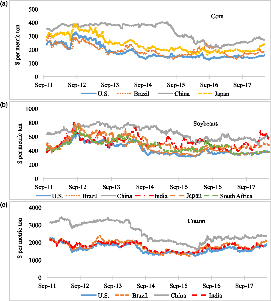
Because futures prices across markets represent different delivery dates, we use the nearest-to-deliver contract in all cases.Footnote 3 In some cases, trading hours for these markets only partially overlap, and when applicable, contracts are rolled over at the beginning of the expiration month. We use the log of end-of-day prices for the period covering from October 2011 to May 2018—where the data are available.Footnote 4 Most of the commodity prices presented in Figure 1 follow similar patterns visually—for example, they decline significantly from the highs experienced during the 2011/2012 food price crisis to the beginning of 2015, before ticking up recently. However, Chinese market prices stand out for their dissimilarity: they are relatively less variable over the entire period and exceed other international prices by a substantial margin.
3. Methods
We use two distinct methods to study price relationships over the entire period: traditional and wavelets approach. We then compare results obtained under each approach and verify that breaks discovered under wavelet analysis match those produced under subsequent partial-period cointegration analysis. An advantage of wavelets compared with traditional statistical break tests, like Bai and Perron (Reference Bai and Perron1998), is their ability to offer a more detailed portrait of price relationships as they change over time.
3.1. Error correction models
To test stationarity conditions, we apply Augmented Dickey-Fuller (ADF) tests (Dickey and Fuller, Reference Dickey and Fuller1979) to all price series and their first differences against the null hypothesis of the presence of a unit root. As shown in Table 1, ADF tests fail to reject the null hypothesis for all series in the levels but reject those hypotheses for all first differences. So, all series are I (1).
Augmented Dickey-Fuller (ADF) unit root tests for prices and their first differences

Notes: The null hypothesis is that the price series, p (in log form), has a unit root. ADF specification, $\Delta {p_t} = {\alpha _o} + {\alpha _1}t + {\beta _i}\sum\nolimits_{i = 1}^l {\Delta {p_{t - i}}},$
, has a time trend (α
1) and drift (α
o, intercept), where l (number in parentheses) is the lag order selected on the basis of the Akaike information criterion, with maximum lag = 8. Asterisks (***) denote rejection of the null hypothesis at the 0.01 level.
$\Delta {p_t} = {\alpha _o} + {\alpha _1}t + {\beta _i}\sum\nolimits_{i = 1}^l {\Delta {p_{t - i}}},$
, has a time trend (α
1) and drift (α
o, intercept), where l (number in parentheses) is the lag order selected on the basis of the Akaike information criterion, with maximum lag = 8. Asterisks (***) denote rejection of the null hypothesis at the 0.01 level.
Next, we test whether a linear combination of each price pair, United States and international, is cointegrated using Johansen’s cointegration test (Johansen, Reference Johansen1995) and present the results in Table 2. If the series are cointegrated, the price pair follows a common long-run trend, and their prices are shown to exhibit a long-term relationship. Using these tests, we find that U.S. corn price is not cointegrated with either the corn price in Brazil, a major corn producer and exporter, or the corn price in China, the second major corn producer after the United States, although not a global trader. This is consistent with China’s domestic corn policy through early 2016, which instituted minimum purchase prices for corn that were typically higher than those on the international market (Wu and Zhang, Reference Wu and Zhang2016). U.S. corn and soybean prices are cointegrated with those in Japan, which is consistent with the fact that the United States is one of the major corn and soybeans suppliers to the Japanese market. Johansen tests reveal that soybean prices in the United States are also cointegrated with those realized in Brazil, the other major producer and exporter of soybean products. On the other hand, soybean prices for the major global soybean importer, China, are not cointegrated with soybean prices for the United States, one of the major global exporters. We find that U.S. cotton prices are linearly cointegrated with those observed in Brazil and India, major cotton exporters, but not cointegrated with Chines prices, even though China is a major global cotton importer, as shown in Table 3.
Johansen’s cointegration test for U.S. and trading partner commodity prices
Notes: Asterisks (** and ***) denote rejection of the null hypothesis at the 0.05 and 0.01 level, respectively, based on the Mackinnon, Haug, and Michelis (Reference MacKinnon, Haug and Michelis1999) test. The cointegration test includes a linear deterministic trend (the level data have linear trends, but the cointegrating equations have only intercepts) specified as $\Delta {p_t} = \alpha \left( {\beta {p_{t - 1}} + c} \right) + \sum\nolimits_{i = 1}^l {{\pi _i}} \Delta {p_{t - i}} + \gamma + {\varepsilon _t},$
where Δp
t
is daily change in commodity prices, α is adjustment rate, β is a cointegrating parameter,π
i
represents a number of short-run dynamic parameters, γ is a drift, and ε
t
is white noise.
$\Delta {p_t} = \alpha \left( {\beta {p_{t - 1}} + c} \right) + \sum\nolimits_{i = 1}^l {{\pi _i}} \Delta {p_{t - i}} + \gamma + {\varepsilon _t},$
where Δp
t
is daily change in commodity prices, α is adjustment rate, β is a cointegrating parameter,π
i
represents a number of short-run dynamic parameters, γ is a drift, and ε
t
is white noise.
Global corn, soybean, and cotton production; net export; global export; and import share, 2011–2017

Source: U.S. Department of Agriculture, Foreign Agricultural Service (2018b).
Note: Asterisk indicates countries included in this study.
Our tests indicate the existence of a single cointegrating vector, r = 1, between U.S. prices, P usa , and the price series observed for several countries, P j , meaning that a linear combination of the series has a stable mean and variance. Engle and Granger (Reference Engle and Granger1987) proved that under a cointegration condition, the relationship between two prices can be specified using an ECM:
 $$\Delta P_t^{usa} = {\alpha ^{usa}}{\rm{}}\left( {P_{t - 1}^{usa}{\rm{}}-{\rm{}}\beta P_{t - 1}^{\,j} + c{\rm{}}} \right) + \mathop \sum \nolimits_{i = 1}^k \pi _{11}^{usa}{\rm{}}\Delta P_{t - i}^{usa} + {\rm{}}\mathop \sum \nolimits_{i = 1}^k \pi _{12}^{\,j}\Delta P\;_{t - i}^j + {\gamma ^{usa}} + \varepsilon _t^{usa}\hskip-23pt\\\Delta P_t^{\,j} = {\rm{}}{\alpha ^j}{\rm{}}\left( {P_{t - 1}^{usa}{\rm{}}-{\rm{}}\beta P_{t - 1}^{\,j} + c{\rm{}}} \right) + {\rm{}}\sum\nolimits_{i = 1}^k {\pi _{21}^{usa}} {\rm{}}\Delta P_{t - i}^{usa}{\rm{}} + {\rm{}}\sum\nolimits_{i = 1}^k {\pi _{22}^{\,j}} {\rm{}}\Delta P_{t - i}^{\,j} + {\gamma \;^j} + {\rm{}}\varepsilon _t^{\,j},$$
(1)
$$\Delta P_t^{usa} = {\alpha ^{usa}}{\rm{}}\left( {P_{t - 1}^{usa}{\rm{}}-{\rm{}}\beta P_{t - 1}^{\,j} + c{\rm{}}} \right) + \mathop \sum \nolimits_{i = 1}^k \pi _{11}^{usa}{\rm{}}\Delta P_{t - i}^{usa} + {\rm{}}\mathop \sum \nolimits_{i = 1}^k \pi _{12}^{\,j}\Delta P\;_{t - i}^j + {\gamma ^{usa}} + \varepsilon _t^{usa}\hskip-23pt\\\Delta P_t^{\,j} = {\rm{}}{\alpha ^j}{\rm{}}\left( {P_{t - 1}^{usa}{\rm{}}-{\rm{}}\beta P_{t - 1}^{\,j} + c{\rm{}}} \right) + {\rm{}}\sum\nolimits_{i = 1}^k {\pi _{21}^{usa}} {\rm{}}\Delta P_{t - i}^{usa}{\rm{}} + {\rm{}}\sum\nolimits_{i = 1}^k {\pi _{22}^{\,j}} {\rm{}}\Delta P_{t - i}^{\,j} + {\gamma \;^j} + {\rm{}}\varepsilon _t^{\,j},$$
(1)
where $\Delta P_t^{usa}$
and
$\Delta P_t^{usa}$
and $\Delta P_t{^j}$
represent the daily change in the U.S. and country j’s commodity prices, respectively;
$\Delta P_t{^j}$
represent the daily change in the U.S. and country j’s commodity prices, respectively; $\varepsilon _t^{usa}$
and
$\varepsilon _t^{usa}$
and $\varepsilon _t^j$
are white noise error terms, which may be correlated; and constant terms are represented by γ
usa
and γ
j
. The long-term relationship between U.S. and country j’s commodity prices are captured by the expression
$\varepsilon _t^j$
are white noise error terms, which may be correlated; and constant terms are represented by γ
usa
and γ
j
. The long-term relationship between U.S. and country j’s commodity prices are captured by the expression $\left{( {P_{t - 1}^{usa}-\beta P_{t - 1}^{\,j} + c} \right)}$
, where the cointegrating parameter is represented by coefficient β. The coefficients in the expression, α
usa
and α
j
, represent the U.S. and country j’s adjustment rates, respectively, measuring the speed of the adjustment toward the long-term equilibrium in response to a short-term deviation of the system (Theissen, Reference Theissen2002). If, for instance, α
j
is statistically different from zero, but α
usa
is not, the results are supportive of a leading role of the U.S. market in the price transmission process, because only the prices in country j adjust to shocks. For example, if the price series are cointegrated and α
usa
= 0 or is otherwise close to zero, price leadership occurs entirely or substantially in the U.S. market; the market whose price does not adjust, or adjusts the least, is the leader. These adjustment rates can be used to estimate price discovery weights, which are also known as factor weights (Gonzalo and Granger, Reference Gonzalo and Granger1995). The absolute value of the price discovery weight for the United States, ω
usa
, can be calculated using
$\left{( {P_{t - 1}^{usa}-\beta P_{t - 1}^{\,j} + c} \right)}$
, where the cointegrating parameter is represented by coefficient β. The coefficients in the expression, α
usa
and α
j
, represent the U.S. and country j’s adjustment rates, respectively, measuring the speed of the adjustment toward the long-term equilibrium in response to a short-term deviation of the system (Theissen, Reference Theissen2002). If, for instance, α
j
is statistically different from zero, but α
usa
is not, the results are supportive of a leading role of the U.S. market in the price transmission process, because only the prices in country j adjust to shocks. For example, if the price series are cointegrated and α
usa
= 0 or is otherwise close to zero, price leadership occurs entirely or substantially in the U.S. market; the market whose price does not adjust, or adjusts the least, is the leader. These adjustment rates can be used to estimate price discovery weights, which are also known as factor weights (Gonzalo and Granger, Reference Gonzalo and Granger1995). The absolute value of the price discovery weight for the United States, ω
usa
, can be calculated using ${\omega ^{usa}} = |{{{\alpha ^j}} \over {{\alpha ^j} - {\alpha ^{usa}}}}|$
. A country with the larger price discovery weight is the leader in the system; its prices adjust least to departures from the long-run equilibrium.
${\omega ^{usa}} = |{{{\alpha ^j}} \over {{\alpha ^j} - {\alpha ^{usa}}}}|$
. A country with the larger price discovery weight is the leader in the system; its prices adjust least to departures from the long-run equilibrium.
3.2. Wavelet framework
For a time series x(t), wavelets ψ(t) are continuous, real- or complex-valued square integrable functions that are composed of scale, s, which controls the frequency or width of the wavelets and time parameter τ, a proxy for the location across time of wavelets (Rösch and Schmidbauer Reference Rösch and Schmidbauer2017; Rua and Nunes, Reference Rua and Nunes2009; Vacha and Barunik, Reference Vacha and Barunik2012; Vacha et al., Reference Vacha, Janda, Kristoufek and Zilberman2013). Mathematically, wavelets are specified as
 $${\psi _{\tau ,s}}\left( t \right) = {\rm{}}{{\psi \left( {{{t - \tau } \over s}} \right)} \over {\sqrt s }}.$$
(2)
$${\psi _{\tau ,s}}\left( t \right) = {\rm{}}{{\psi \left( {{{t - \tau } \over s}} \right)} \over {\sqrt s }}.$$
(2)
Once the assumptions about the mother wavelet function are met,Footnote 5 continuous Morlet wavelet transformations, consisting of a complex sine wave within a Gaussian envelope (Rua, Reference Rua2010), can be represented using a function of two variables as
 $${W_x}\left( {\tau ,s} \right) = {\rm{}}\mathop \int \limits_{ - \infty }^\infty x\left( t \right){1 \over {\sqrt {\left| s \right|} }}{\psi ^{\rm{*}}}\left( {{{t - \tau } \over s}} \right)dt,$$
(3)
$${W_x}\left( {\tau ,s} \right) = {\rm{}}\mathop \int \limits_{ - \infty }^\infty x\left( t \right){1 \over {\sqrt {\left| s \right|} }}{\psi ^{\rm{*}}}\left( {{{t - \tau } \over s}} \right)dt,$$
(3)
with the asterisk (*) marking the complex conjugate operator so that there is no loss of information through the transformation procedure (Torrence and Webster, Reference Torrence and Webster1999). The Morlet method dates back to the early 1980s when it was introduced to decompose a signal into its frequency and phase contents as time evolves. Unlike the Fourier transformation, which does not allow the frequency content of the signal to change over time (Rua, Reference Rua2010), the Morlet wavelet provides a good balance between time and frequency localization (Kristoufek, Janda, and Zilberman, Reference Kristoufek, Janda and Zilberman2016).Footnote 6
The scale parameter, s, controls how the wavelets are stretched or compressed. For instance, if the scale is small, the wavelets are compressed, and therefore, they detect high frequencies and vice versa. We obtain the wavelet coefficients by first performing a continuous transformation on the time series data of finite length, T, where t = 1,…,T using the Morlet method. This approach helps to preserve the basic information of the series. Then, we obtain a matrix of wavelet coefficients with τ = 1,…, N rows, and s = 1,…, K columns, where N and K are a maximum number of locations across time and scale used for wavelet decomposition, respectively. Each wavelet coefficient, W x (τ, s), represents local variance at a specific scale s and position τ.
3.2.1. Wavelet coherence
To study the relationship between U.S. and international prices, we use a bivariate framework called wavelet coherence that requires cross-wavelet transformation. Wavelet coherence provides appropriate tools for comparing the frequency contents of two time series, x(t) and y(t), the former representing the U.S. (P usa ) and the latter representing the international P j futures price series, respectively. Their cross-wavelet transformation is defined as
 $${W_{xy}}\left( {\tau ,s} \right) = {\rm{}}{W_x}\left( {\tau ,s} \right){W_y}^{\rm{*}}\left( {\tau ,s} \right),$$
(4)
$${W_{xy}}\left( {\tau ,s} \right) = {\rm{}}{W_x}\left( {\tau ,s} \right){W_y}^{\rm{*}}\left( {\tau ,s} \right),$$
(4)
where W x (τ, s) and W y (τ, s) are continuous wavelet transformations of the series x(t) and y(t), respectively, and again, the asterisk (*) indicates the complex conjugate operator. Wavelet coherence can detect regions in the time-frequency space where the time series comove.Footnote 7 On the other hand, the cross-wavelet transformation may detect a situation where the two series do not necessarily have a common power. That is, the transformation does not represent local covariance between the time series at each scale (Vacha and Barunik, Reference Vacha and Barunik2012). To overcome this challenge, we follow the approach of Torrence and Webster (Reference Torrence and Webster1999) and define the squared wavelet coherence coefficient as
 $${R^2}\left( {\tau ,s} \right) = {\rm{}}{{{{\left| {S\left( {{s^{ - 1}}{W_{xy}}\left( {\tau ,s} \right)} \right){\rm{}}} \right|}^2}} \over {S({s^{ - 1}}|{W_x}\left( {\tau ,s} \right){|^2}){\rm{}}\;S\;({s^{ - 1}}|{W_y}\left( {\tau ,s} \right){|^2})}},$$
(5)
$${R^2}\left( {\tau ,s} \right) = {\rm{}}{{{{\left| {S\left( {{s^{ - 1}}{W_{xy}}\left( {\tau ,s} \right)} \right){\rm{}}} \right|}^2}} \over {S({s^{ - 1}}|{W_x}\left( {\tau ,s} \right){|^2}){\rm{}}\;S\;({s^{ - 1}}|{W_y}\left( {\tau ,s} \right){|^2})}},$$
(5)
where S is a smoothing operator. The coefficient of the squared wavelet coherence is in the range of 0 ≤ R 2 ≤ 1. Similar to the squared correlation coefficient in linear regression, the squared wavelet coherence coefficient measures the local correlation between two price levels at each scale and can be efficiently represented in time-frequency space by a graphical color map. Coefficient values close to zero indicate weak correlations and are represented by cooler (e.g., blue) colors in the map, whereas strong correlations are represented by warmer (e.g., red) colors. The frequency, or the “run” of a relationship, is depicted in the map along the vertical axis—lower locations in the map equate to a low frequency, or long run; higher locations in the map represent the relationship between short-run fluctuations. The horizontal axis of the map indicates the time for which relationships are represented. Thus, correlations that hold for longer periods of time stretched further across the horizontal axis. We use Monte Carlo simulation methods to test the coefficients against the null hypothesis of autoregressive, AR(1) noise at the 5% level; statistically significant relationships are shown in the map as areas bordered by a thick black contour (Torrence and Webster, Reference Torrence and Webster1999).Footnote 8 Because wavelet analysis is sensitive to boundary conditions, estimates at the beginning and end of the period of interest are less reliable (particularly at low frequencies). Therefore, we overlay the chart with a “cone of influence” to distinguish between reliable (bright) and less reliable (pale) regions (Kristoufek, Janda, and Zilberman, Reference Kristoufek, Janda and Zilberman2016).
3.2.2. Phase difference
The square coherence shown in equation (5) loses complex information about direction of price comovement. To recover this information, we apply a wavelet coherence phase difference using the following specification:
 $${\phi _{xy}}\left( {\tau ,s} \right) = {\rm{}}ta{n^{ - 1}}\left( {{{\Im \left\{ {S\left[ {{s^{ - 1}}{W_{xy}}\left( {\tau ,s} \right)} \right]} \right\}} \over {\Re \left\{ {S\left[ {{s^{ - 1}}{W_{xy}}\left( {\tau ,s} \right)} \right]} \right\}}}} \right){\phi _{xy}}{\rm{}} \in \left[ { - \pi ,{\rm{}}\pi } \right],$$
(6)
$${\phi _{xy}}\left( {\tau ,s} \right) = {\rm{}}ta{n^{ - 1}}\left( {{{\Im \left\{ {S\left[ {{s^{ - 1}}{W_{xy}}\left( {\tau ,s} \right)} \right]} \right\}} \over {\Re \left\{ {S\left[ {{s^{ - 1}}{W_{xy}}\left( {\tau ,s} \right)} \right]} \right\}}}} \right){\phi _{xy}}{\rm{}} \in \left[ { - \pi ,{\rm{}}\pi } \right],$$
(6)
where ℑ an imaginary and ℜ a real part operator (Torrence and Webster, Reference Torrence and Webster1999). The phase, which refers to the location of a specific frequency within the calendar year, is represented by arrows on the wavelet coherence plots. Phase coherence means two time series with the same frequency peak at the same observation. If one cycle is located slightly ahead of another in time, it is a leader. A zero phase difference means that the examined time series move together. The arrows in the map point to the right (left) when times series are positively (negatively) correlated with no series as a leader. In addition, arrows pointing down mean that the first time series leads the second one, whereas arrows pointing up represent the opposite. Combinations of these effects are depicted by arrow rotation: for instance, an arrow pointing up and to the right means the two series are positively correlated with the first time series following the second one.
4. Results and discussion
4.1. Error correction models
According to our ECM results shown in Table 4, the U.S. and Japanese corn prices are cointegrated, and their adjustment rates indicate that Japanese prices adjust more quickly to disequilibrium than the U.S. prices. The U.S. corn price is responsible for 77% of the price discovery weight, so it is considered as a leader in that price relationship. This finding is consistent with Japan being the second-largest export market for U.S. corn, on average purchasing 11 million metric tons—24% of U.S. exports—from 2013 to 2017 (U.S. Department of Agriculture, Foreign Agricultural Service (USDA-FAS), 2018a). Because U.S. and Brazilian, and U.S. and Chinese corn prices are not found to be cointegrated in Table 2, we perform no ECM on those price pairs.
Error-correction models (ECM) results
Notes: Standard errors are given in parentheses. Asterisks (*, **, and ***) indicate significance at 10%, 5%, and 1% levels, respectively. The number of lags, l = 2 in our case, is determined using the Akaike information criterion. The numbers within slashes (“//”) are the percent of price discovery weights or common factor weights for the U.S. commodity, ${\omega ^{usa}} = \left| {{{{\alpha ^j}} \over {{\alpha ^j} - {\alpha ^{usa}}}}} \right|$
. The j’s country commodity weight is 1 – ω
usa
. The ECM theoretical formulation is based on the assumption that the adjustment rates, α, move in opposite directions. So, one rate is always positive, and the other is negative (Arnade and Hoffman Reference Arnade and Hoffman2015). The value of the weight is always presented in absolute value.
${\omega ^{usa}} = \left| {{{{\alpha ^j}} \over {{\alpha ^j} - {\alpha ^{usa}}}}} \right|$
. The j’s country commodity weight is 1 – ω
usa
. The ECM theoretical formulation is based on the assumption that the adjustment rates, α, move in opposite directions. So, one rate is always positive, and the other is negative (Arnade and Hoffman Reference Arnade and Hoffman2015). The value of the weight is always presented in absolute value.
Cointegration parameters for soybean prices in the United States and Japan are also statistically significant, supporting the cointegration test shown in Table 2. Japanese prices bear the burden of adjustment, and the U.S. soybean price discovery weight exceeds 80%. Our adjustment rate findings indicate that the U.S. soybean prices do not respond to price shocks in Japan. On average, Japan imported 4%, or 2.1 million metric tons, of U.S. soybean exports from 2013 to 2017 (USDA-FAS, 2018a).
According to our ECM findings in Table 4, the soybean markets in the United States and Brazil are highly integrated; both are major global competitors, as documented in Table 3. Over the period under study, our linear results indicate that the U.S. soybean prices contributed to more than 90% of the price discovery weight. As a result, it is likely that price signals from the U.S. market influence planting and marketing decisions made by Brazilian soybean producers.
The cointegration parameters for the U.S. and Brazilian, and the U.S. and Indian cotton prices pairs are likewise statistically significant and match the results of cointegration tests shown in Table 2. Adjustment rates presented in Table 4 indicate that when the U.S. cotton price is too high, it falls back to Brazilian prices, but that cotton prices in India adjust toward the U.S. price levels. The U.S. cotton prices represent about 36% and 93% of the price discovery weight compared with Brazilian and Indian cotton prices, respectively, indicating that the U.S. cotton prices are marginal leaders in Brazil but significant leaders in India. Brazil and India are important competitors of the United States in Asian and European cotton markets (Kiawu, Valdes, and MacDonald, Reference Kiawu, Valdes and MacDonald2011). As shown in Table 3, while the United States averaged 31% of global cotton exports from 2011 to 2017, average export shares for India and Brazil were 17% and 9% over the same period, respectively. India’s average annual cotton production during that period was 29 million 480-pound bales, compared with 16 million 480-pound bales in the United States and 7 million in Brazil. India’s cotton sector is characterized by a larger volume of domestic use, about 23 million 480-pound bales, and smaller volume of net exports, 6 million 480-pound bales, than the United States.
4.2. Wavelet analysis
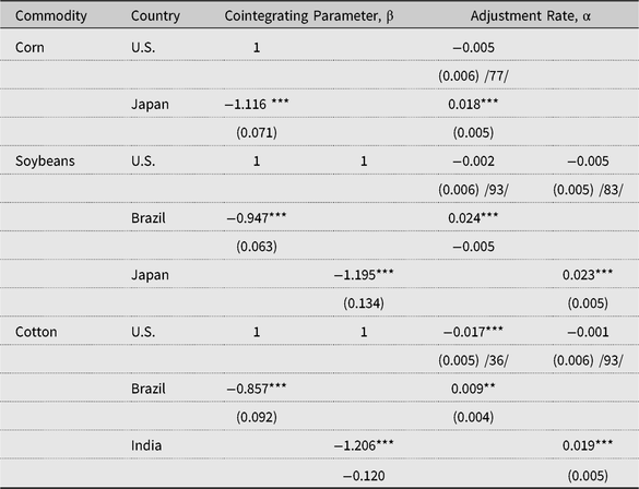
Figures 2, 3, and 4 show bivariate wavelet coherence between daily U.S. and international corn, soybean, and cotton prices, respectively.Footnote 9 The most striking finding from these results is that the relationships between U.S. and international prices are, in many cases, not stable. Quite distinct from the findings in the previous section—which force the U.S. and international prices into a linear relationship—wavelet coherence shows that the U.S. and international agricultural markets often appear to alternate between periods of integration and nonintegration. Short-term fluctuations (lasting less than 1 month, or about 20 trading days) in U.S. and international prices generally bear no consistent, significant relationship for any commodity we studied. Medium-term movements, at the frequency of about one to two seasons, appear and disappear regularly. Long-horizon fluctuations (lasting a year or more), though, do reveal some clearer correlations.
Wavelet results for U.S. and international corn market integration, 2011–2018.
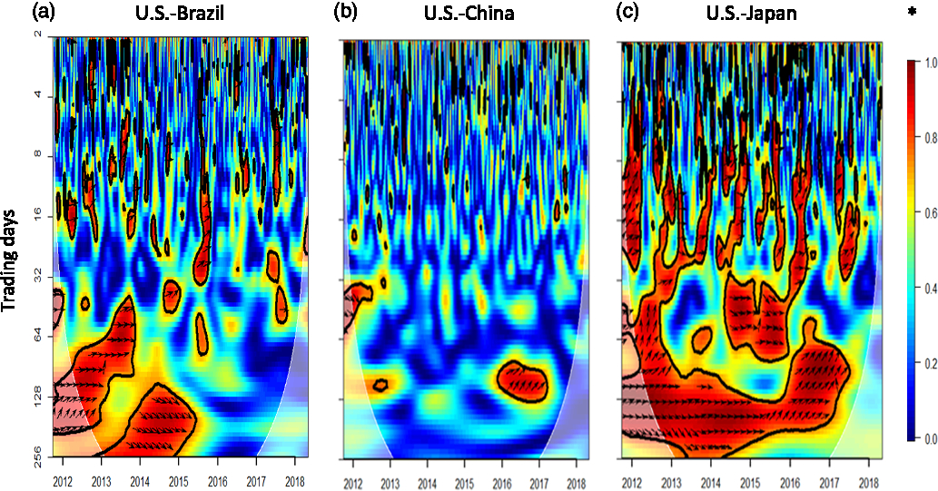
Wavelet results for U.S. and international soybean market integration, 2011–2018.
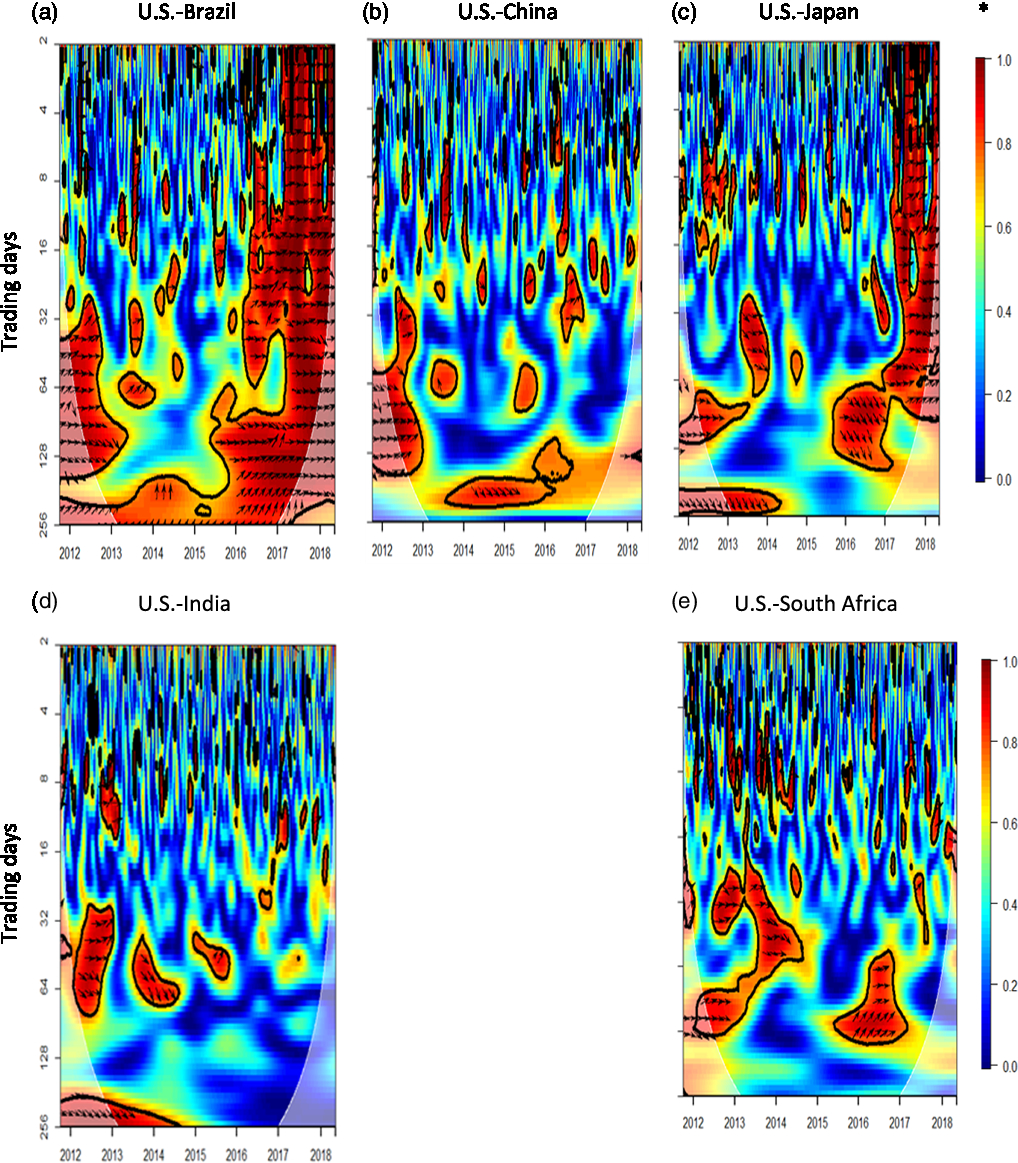
Wavelet results for U.S. and international cotton market integration, 2011–2018.
Figure 2a explores the relationship between U.S. and Brazilian prices directly and offers insights into structural changes experienced by the world’s dominant corn exporters during the period. The United States and Brazil accounted for more than half of global corn exports from 2011 to 2017, and the United States exported more in every year besides 2012/2013 (USDA-FAS, 2018b). As the share of Brazilian corn supply to the global market increased and U.S. corn production fell because of the 2012 drought, Figure 2a identifies Brazilian corn prices as the leader in the price pair, at the medium- to long-run frequency. Yet as the U.S. export share increased in 2014/2015, our wavelet results indicate that its corn prices led at the long-run frequency through most of 2015. Figure 2a shows no significant medium- or long-term integration between U.S. and Brazilian corn prices since 2016. Several factors contribute to these observed changes, including increased use of corn for ethanol feedstocks in the United States and declining corn exports following the 2012/2013 drought in the U.S. Corn Belt. These factors help raise Brazil’s share of world corn exports, especially in the September to January period—months traditionally dominated by the United States and other Northern Hemisphere exporters (Canada and the European Union). Since 2016, the Brazilian real (its unit of currency) has weakened relative to the U.S. dollar, and transportation costs have declined substantially because of lower global energy prices, boosting Brazil’s ability to compete with the United States across export markets (Allen and Valdes, Reference Allen and Valdes2016).
Figure 2b shows that corn prices in the United States and China have no consistent relationship during the study period. This is unsurprising given the divergence between their price series displayed in Figure 1. In 1995, the government of China adopted a policy of 95% self-sufficiency for grains, and it developed commodity support programs to provide income to farmers and influence their production decisions by altering their relative economic incentives (Lee et al., Reference Lee, Tran, Hansen and Ash2016). For instance, between 2008 and 2012, China increased its price supports for corn producers by 54%. Hence, Chinese corn trade policy bears little relationship to the country’s production, making China’s corn exports and imports difficult to predict (U.S. Department of Agriculture, Economic Research Service, 2018).
The U.S. and Japanese corn prices in Figure 2c exhibit the strongest medium- and long-term relationships out of the price pairs that we studied. Significant long-run fluctuations, at the frequency of about a year (>200 trading days), are shared over virtually the entire period of observation. Price changes in the medium run (lasting 3–6 months, or about one to two seasons) also exhibit significant integration between 2012 and 2017, with the Japanese corn price displaying a leading role both following the U.S. drought of 2012 and after mid-2015. This latter shift occurs around the same time that Brazil becomes the top U.S. competitor for the Japanese corn market. Short-run price fluctuations, at the 1–2 week frequency (between 4 and 8 trading days), alternate between correlation and noncorrelation over the entire period.
The wavelet coherence in Figure 3a demonstrates that U.S. and Brazilian soybean prices had a consistent long-term relationship over the period of interest, with Brazil generally leading the relationship, from 2013 on. As shown in Table 3, Brazil is the world’s largest soybean exporter, followed by the United States, and both countries account for more than 80% of global soybean exports (Lee et al., Reference Lee, Tran, Hansen and Ash2016). After the Brazilian real weakened starting in 2016, the U.S. and Brazilian soybean prices exhibit significant comovement at long-, medium-, and short-term frequencies. The recent trade dispute between the United States and China, the world’s largest soybean purchaser, has offered Brazil an even stronger position in the world export market, particularly the Chinese market that accounts for 60% of the global trade (Gale, Valdes, and Ash, Reference Gale, Valdes and Ash2019). For instance, in response to the 25% Chinese tariff on U.S. soybeans, Muhammad and Smith (Reference Muhammad and Smith2018) estimated a $4.5-billion decline in U.S. soybean exports to China and a $4.4-billion increase in Brazilian exports.
The U.S. and Chinese soybean price pair in Figure 3b displays some evidence of medium- to long-term relationship but does not amount to a consistent, strong coherence over the entire period.Footnote 10 This finding is consistent with the price data in Figure 1, which show that Chinese soybean prices were significantly higher than those in the rest of the countries we studied and that although their general trends matched up at times, there were periods of notable departure. Chinese retaliatory tariffs on U.S. soybeans since 2018 have affected American soybean prices and prevented U.S. producers from taking advantage of high prices in China (Adjemian et al., Reference Adjemian, Smith, Arita and He2019). Indeed, the volume of U.S. soybean exports to China has declined, while the latter increased its soybean imports from U.S. competitors Brazil and Argentina (Hopkinson, Reference Hopkinson2018).
Figure 3c and d displays long-term relationships between U.S. and Japanese, and U.S. and Indian soybean prices between 2011 and 2014, respectively. U.S. prices lead foreign prices in these commodity markets. Phase arrows in Figure 3e tend to point upward, indicating periods of intermittent short- to medium-term South African price leadership relative to U.S. soybean prices. In 2015, South African farmers planted soybeans on a record number of acres and became a net exporter of the commodity (Mokhema, Reference Mokhema2015).
The U.S. and Brazil, and the U.S. and India cotton prices are found to exhibit significant medium- and long-term relationships, with subsequent alternating periods of lead-lag relationships, as shown in Figure 4a and c, respectively. India is becoming an important cotton export competitor after extensively adopting the Bt cotton variety for more than 90% of the area it plants to the crop (USDA-FAS, 2018b). On the other hand, Figure 4b shows no consistent long-term relationship between U.S. and Chinese cotton prices, although China is among the largest export market for U.S. cotton, on average importing 913,000 metric tons of cotton and cotton products from 2011 to 2015 out of 2,611,000 metric tons of U.S. exports—a 35% share (USDA-FAS, 2018a). Medium-term relations appear periodically, indicating that the United States leads the price determination process at certain times.
4.3. Robustness checks
Using our wavelet results as a guide to identifying structural breaks in the price series under study, we display Johansen trace test results in Table 5 for the periods identified in the wavelet analysis as bearing no relationship between price pairs. According to Table 5, during those periods with no wavelet coherence, the commodity price series in our study are also not cointegrated. Even though original Johansen statistics identified the U.S. and Japanese soybean prices as cointegrated for the whole period, the same tests rejected cointegration once the wavelet coherence analysis identified no relationship for the period between 2017 and 2018. These findings demonstrate the flexibility of wavelets to structural breaks and their usefulness in identifying them.
Johansen’s cointegration test for no-relationship periods identified by wavelet coherences

Notes: The cointegration test includes a linear deterministic trend, and the 0.05 and 0.01 critical values for rejecting the null hypothesis of no cointegration are 15.41 and 20.04, respectively. “N/A” indicates that wavelet analysis failed to identify a period of no significant relationship between the two prices over the period of observation.
In addition, Table 6 reaffirms that wavelet results between the U.S. and each trading partner’s commodity prices can also be verified using cointegration tests. For instance, even though the U.S. and Brazilian corn prices do not have a long-term correlation for the entire period according to Table 2, they do for the period 2013–2015 (found to be significantly related according to our wavelet analysis), which reveals a strong cointegration in Table 6. These two countries are the leading global producers and exporters of corn, and the ECM estimated in Table 6 finds that both countries are responsible for half of the price discovery weight for that period, beginning around the time of the 2012 U.S. drought and subsequent stocks drawdown.
Johansen’s cointegration test for relationship periods identified by wavelet coherences

Notes: Asterisks (*, **, and ***) denote rejection of the null hypothesis at the 0.1, 0.05, and 0.01 level, respectively (MacKinnon Haug, and Michelis, Reference MacKinnon, Haug and Michelis1999). The cointegration test includes a linear deterministic trend.
5. Conclusions
Global agricultural markets are evolving, with new roles for emerging exporters (like Brazil for corn) and large buyers (such as China), so flexibility in modeling is attractive for analyzing commodity prices. Wavelet methods have some advantages over traditional linear cointegration methods—especially when it comes to the identification of structural changes— they can communicate more richness in price relationships by offering a literal portrait of correlation at a range of frequencies over time.
In this study, we identify structural changes in the integration of several international commodity markets. Daily shocks to the U.S. and many international prices generally bear no significant relationship over the period of interest: short-term dynamics are not highly correlated, while temporary medium-term relationships appear and disappear periodically. Long-term relationships are present in the data in some cases, but not in others.
Both our wavelet and cointegration models indicate that the U.S. soybean prices lead those in Japan, where the United States is the major supplier of the Japanese feed imports. Consistent long-term relationships emerge between the United States and Brazil, the two largest producers and exporters of soybeans, with some indications that Brazilian shocks lead at times. We also find that that Chinese agricultural commodity markets are not well integrated with those in the United States, providing evidence that Chinese domestic commodity policies successfully insulated its prices (and increased them substantially) from international shocks.
Our findings reveal numerous structural breaks in price relationships, which calls into question the common practice of testing cointegration across long periods of time. Wavelet analysis provides a better tool to assess short-term but informative market integration, price transmission, or price discovery. In the meantime, a number of factors affect whether long-term relationships in commodity prices exist among major exporters and importers. From the U.S. perspective, ongoing trade arguments and negotiations, unfavorable exchange rates, declining international transportation costs, foreign government subsidies and other protections, and new and stronger export competitors in agricultural production can act to reduce U.S. export market share and make the U.S. commodity markets less influential in setting international commodity prices (Allen and Valdes, Reference Allen and Valdes2016; Cooke et al., Reference Cooke, Nigatu, Heerman, Landes and Seeley2016). Although we have established the changing nature of price relationship and identified the presence of structural changes in several markets, in future research we intend to explore the role of these other factors in influencing shifting international price relationships.
Disclaimer
The findings and conclusions in article are those of the authors and should not be construed to represent any official U.S. Department of Agriculture or U.S. government determination or policy. This article was supported by the U.S. Department of Agriculture, Economic Research Service.
Acknowledgments
This paper was greatly improved by comments and suggestions from the editor and three anonymous reviewers.
Financial support
This research work was supported in part by the U.S. Department of Agriculture, Economic Research Service.
Conflict of interest
None.


 Open access