
WHAT ARE MUSEUM APPS?
About a decade has passed since early museum apps popped up online (Grobart Reference Grobart2011). Developments in the sector have been driven by aspirations to enhance visitor experiences in exhibitions, including personalizing the visit and offering digital augmentations. Museum mobile apps, even though various in design, tend to possess several core properties that make them amenable to comparative critical analysis. Such properties include information about the institution the app has been developed for, exhibition-related content, and location aids. Museum apps can be commercial or noncommercial, and they may also contain games, audio guides, 3D models of objects, and AR or other gadgets. Their variety in design stretches far; however, their scope is necessarily conditioned by concept and certainly by available budget (cf. Kansa Reference Kansa, Averett, Jody and Counts2016:467).
WHY REVIEW MUSEUM APPS?
Surprisingly, museum apps have escaped much critical reflection in academic and professional scholarship. The literature that does exist tends to be project specific and highly theoretical in nature, often authored by the app developers to convince readers of the app's innovation (Alvermann Reference Alvermann and Lukowicz2016; Czifra et al. Reference Czifra, Palinkas, Markus, Szkalicki, Veres and Weisz2019; Jankowska et al. Reference Jankowska, Szarkowska, Krejtz, Fidyka, Kowalski and Wichrowski2017). Retrospective academic reviews on museum apps are scarce (Roussou and Katifori Reference Roussou and Katifori2018) and are often only critical in relation to the content of the app (Yoo Reference Yoo2013:273), leaving out aspects of functionality such as technical efficiency (running an app without errors) and user-friendliness. This lack of criticality deprives museum app developers the opportunity to impactfully evolve the products beyond technical infancy so that they can effectively enchant the user (Perry Reference Perry2019).
In this article, I review My Visit to the LouvreFootnote 1 and the British Museum Guide apps to contribute to the critical narrative about mobile applications for museums. My review assesses the functionality of both apps by testing their main components—notably, their technical efficiency, utility, and user experience. Through this review, I hope to offer readers and app developers perspective on the disenchantment that is created by underdeveloped museum apps.
MY VISIT TO THE LOUVRE
Published in 2016, My Visit to the Louvre is a museum app developed by the Louvre's media department. The app can be downloaded through the Apple and Google Play stores, and it is described as a tool to enable the user to “be your own guide!” The app store description states the app's purpose is to assist in finding exhibited objects and accessing associated information through a map, object descriptions, and audio guides. Once downloaded and opened, the app displays its home page with basic information on museum hours and admittance prices (Figure 1a). Its interface consists of a bottom tab with several functions—home, map, explore, and visitor profile—and a collapsed menu tab in the upper-left corner containing further information on the museum and its surroundings (shops, restaurants, cafés, etc.). Of main interest for this review is the map function (Figure 1b), which is supposed to allow the user to search for objects in the app's database, be directed to them through a GPS function, and retrieve any related written or audio content.
My Visit to the Louvre's (a) home screen, offering basic information on museum hours and prices, and (b) the map function, providing a confusing array of overlapping object images.

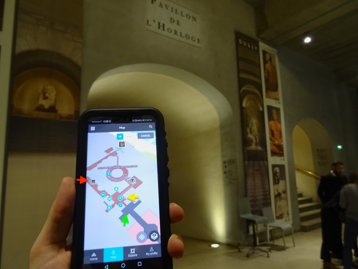
The map offers us a plan of the Louvre's permanent exhibitions in a 3D aesthetic. It contains locations of exhibited objects that are linked with images, as well as the user's location. Tapping an object image opens a window through which the user can either activate a GPS route to the requested object or retrieve a description. Choosing the former will instantly draw the shortest route from the user's location to the object. But when I tested the app, the route, my GPS location, and my actual location were not synchronized, making the GPS function useless (Figure 2).
A view of the locational functionality of the My Visit to the Louvre app. The red arrow denotes the app's GPS location for me, while the yellow arrow indicates the starting point for the shortest route. In contrast, the green arrow marks my actual location (seen in photograph).
Arriving at the desired object, I could access an audio guide, which entails an exclusive commentary on a thematic section of the museum's permanent exhibition (e.g., Egyptian antiquities or Near Eastern antiquities) as an in-app purchase of €1.99. Unfortunately, but perhaps predictably in light of some of the Google Play Store reviews, an error occurred, and I could not download the audio guide (Figure 3a). As suggested by some users, I reinstalled the app and restarted my phone, but the audio guide was still inaccessible. Hence, I cannot speak for the quality of the guide but only for my own frustration, which swelled across 30 minutes of wrangling with a moody GPS system, sluggish loading screens, and the absence of any meaningful textual description (Figure 3b) or audio guide.
My Visit to the Louvre's view of (a) an error in downloading the audio guide and (b) a poor description of an exhibit offering no meaningful interpretation of the objects on display.

Apart from the map functionality, many of the other potentials of the app do not seem to have been realized. For instance, the explore function offers a deposit of thousands of objects that are thematically ordered, but the user cannot view them alphabetically or chronologically. Thus, to find something, the user must scroll through thousands of pictures. The only way to pinpoint an exhibit is to type its exact name or an app-specific number attached to it into the map mode. Why the developers did not use the actual inventory numbers of the objects is perplexing. All in all, the app leaves the user exhausted, annoyed, and frustrated.
THE BRITISH MUSEUM GUIDE
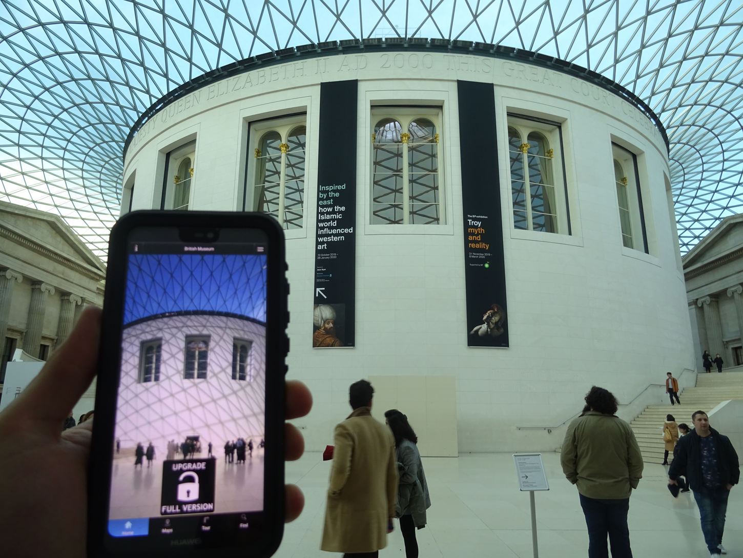
The British Museum Guide is a museum app developed in 2016 by the independent company Museum Ltd. The app can be downloaded from the Google Play or Apple stores. The developer states in the description on the Google Play store: “It will keep you well informed and help you navigate through the myriad of rooms with relative ease . . . [and] doubles up as an audio guide” (Google Play Store 2020). Once opened, a home screen appears through which one can upgrade the app (as the initial download contains only limited content access) or use its main functions; namely, its maps, tour, and find capabilities (Figure 4). Note that the find function is, in its design and use, almost identical to the explore function of the Louvre's app.
Entering the British Museum with the British Museum Guide, with the home screen displayed.
The maps function offers a 2D view of all rooms (Figure 5a). The rooms can be tapped to see a flashcard of an exhibit, entailing an elaborate object description and the option to listen to an audio version of the description (Figure 5b). The audio is an auto-generated computer voice that reads the description extremely fast.
The British Museum Guide's (a) 2D map, (b) flashcard object description and audio option, and (c) the one-hour tour's main screen.

The tour function offers three options based on how much time a visitor wants to spend at the museum. I chose the one-hour tour (Figure 5c). I was led in a serpentine fashion through some of the main exhibits of the museum (e.g., Rosetta Stone, Parthenon Marbles, Lewis Chessmen).
My digital tour went poorly, and a GPS function was not provided. Navigating through the map was unpleasant due to the relatively small buttons (Figure 6) and the app's slow response to my interactions. I also had to restart the tour every time I wished to return to an object that I'd previously viewed, as there was no return button. Finally, after about an hour of being subjected to the app's confusing navigation and absolutely unfriendly user functionality, I arrived at my destination and was happier to have finished this tour than to have participated in it at all.
The consecutive stages of the one-hour tour and its guiding map.

As with the Louvre app, the technical sloppiness of the British Museum Guide made it challenging to remain engaged. Because the app lacked even basic information about how to use its functions, the map feature confused me rather than guiding me, while the computer-generated audio guide's unnatural voice and extremely fast reading left me disenchanted with the exhibits. Trying to emotionally connect with an exhibit and its story read by a Google translator-esque voice was impossible for me. The tour function could have been useful if its maps had contained routes and clear entrance and exit locations. Instead, some rooms on the map did not even exist on the actual museum floor (Figure 7).
The failure in map design as evidenced by the floor plan. The green arrow indicates my location, while the yellow question mark denotes room 67 according to the map.

CONCLUSION
The British Museum Guide and My Visit to the Louvre apps appear highly unsatisfactory in terms of technical efficiency (i.e., the apps do not run properly), practical utility (i.e., their features do not enhance the experience), and user experience. To see that neither of the hosting institutions (the British Museum and the Louvre) have intervened is alarming and raises questions concerning their assessment of and concern for visitor experience. At a minimum, the apps could have been removed from the stores for maintenance and further testing.
In all cases, it is the museum that is likely to be held accountable by the disappointed user, who may be paying for the app and, as a result, could experience total frustration. The consequence is that the user may lose trust in the institution and its (digital) competence. As of November 2019, My Visit to the Louvre had generated more than 100,000 downloads and almost 800 reviews (the last of which seems to have been registered in late September 2019), with a total rating of only 2.1 stars out of 5 on Google Play (2019). I originally intended to suggest that the Louvre, as responsible developer of the app, address users through the museum website, app store pages, or in the app itself, announcing effective technical improvements in the near future or even asking for help from its user community. I felt that such a response by the Louvre might temporarily decrease the number of negative reviews and give the museum a chance to develop a useful app for its visitors. I note, however, that now (April 2020), the app is offline and no longer available for download. Perhaps the Louvre came to its own comparable conclusions about the app's inefficacy.
Similarly with the British Museum Guide, which has more than 50,000 downloads, more than 300 reviews, and a rating of 2.2 stars of 5 on Google Play, rebooting the app might be the developer's only viable option. It is unclear how far or even if the British Museum is involved with the independent developer of the app. Questions concerning regulations arise: What recourse is available when app developers capitalize on museum collections while possibly damaging the institution's reputation? How are royalties distributed between the developer and the museum (if at all)? Where have we seen successful examples of a museum obliging a developer to take down their app? In any case, the British Museum should seek ways to communicate to its users about the app and, if nothing else, distance itself from the developers.
Given the described cases, it can be said that museum apps have not brought the impact so often promised to visiting audiences. While adding a shallow “cool” factor (Stobiecka Reference Stobiecka2018:2) to a museum's marketing repertoire, they fail to effectively live up to the expectations of the user. Professional expertise in information technology and data analysis seem still to pose a huge challenge for museums, as evidenced by the technical issues of the discussed apps and the lack of proper assessment of their user experiences. Museums, it appears, still need to invest further in information technology personnel and experience analysis to produce satisfying and enchanting experiences for their visitors.


