





1. Introduction
Rapid and deliberate transformations in systems such as energy and transport are essential to meet global climate and sustainability targets (IEA, 2024). As greenhouse gas emissions continue to rise and progress towards the Sustainable Development Goals lags behind expectations (Malekpour et al., Reference Malekpour, Allen, Sagar, Scholz, Persson, Miranda, Bennich, Dube, Kanie and Madise2023), understanding how to accelerate such transformations has become a key research and policy priority (Allen et al., Reference Allen, Malekpour, Persson and Bennich2025; Köhler et al., Reference Köhler, Geels, Kern, Markard, Onsongo, Wieczorek, Alkemade, Avelino, Bergek and Boons2019; Roberts & Geels, Reference Roberts and Geels2019; Rosenbloom & Meadowcroft, Reference Rosenbloom and Meadowcroft2022; Sovacool et al., Reference Sovacool, Geels, Andersen, Grubb, Jordan, Kern, Kivimaa, Lockwood, Markard and Meadowcroft2025; Victor et al., Reference Victor, Geels and Sharpe2019). Drawing on empirical evidence from domains such as renewable energy and electric vehicles, studies are beginning to identify mechanisms, feedbacks, and tipping points associated with accelerated transitions, offering insights for actors pursuing ambitious targets (Alkemade et al., Reference Alkemade, de Bruin, El-Feiaz, Pasimeni, Niamir and Wade2024; Ayoub & Geels, Reference Ayoub and Geels2024; Otto et al., Reference Otto, Donges, Cremades, Bhowmik, Hewitt, Lucht, Rockström, Allerberger, McCaffrey and Doe2020; Sharpe & Lenton, Reference Sharpe and Lenton2021).
In the literature, acceleration has traditionally been understood as a phase in which transitions shift from incremental emergence to rapid diffusion of new ideas, practices, and innovations (Köhler et al., Reference Köhler, Geels, Kern, Markard, Onsongo, Wieczorek, Alkemade, Avelino, Bergek and Boons2019; Markard et al., Reference Markard, Geels and Raven2020). More recent interpretations define it as a sustained increase in the pace of change in socio-technical systems over a significant period, leading to widespread improvements (Sovacool et al., Reference Sovacool, Geels, Andersen, Grubb, Jordan, Kern, Kivimaa, Lockwood, Markard and Meadowcroft2025).
Research highlights the importance of positive or reinforcing techno-economic feedbacks in acceleration, for example, increasing returns to adoption and economies of scale that have propelled the deployment of solar and wind energy (Sharpe & Lenton, Reference Sharpe and Lenton2021; Strauch, Reference Strauch2020; SystemIQ, 2023). Once certain thresholds or ‘positive tipping points’ are crossed, such feedbacks can produce rapid, often irreversible change (T. Lenton et al., Reference Lenton, Benson, Smith, Ewer, Lanel, Petykowski, Powell, Abrams, Blomsma and Sharpe2021; T. M. Lenton et al., Reference Lenton, Mckay, Loriani, Abrams, Lade, Donges, Buxton, Milkoreit, Powell and Smith2023). A broader socio-technical perspective also recognises that reinforcing socio-political feedbacks play a decisive role (Fesenfeld et al., Reference Fesenfeld, Schmid, Finger, Mathys and Schmidt2022; Geels & Ayoub, Reference Geels and Ayoub2023; Mey et al., Reference Mey, Mangalagiu and Lilliestam2024), for example, when supportive coalitions or favourable public discourse influence policymakers to expand support for new technologies (Ayoub & Geels, Reference Ayoub and Geels2024). Conversely, negative or balancing socio-political feedbacks can decelerate transitions even after techno-economic tipping points are reached (Ayoub & Geels, Reference Ayoub and Geels2024), for example, where economic competition from rapidly diffusing technologies triggers lobbying by incumbent firms to curtail policy support (Alkemade et al., Reference Alkemade, de Bruin, El-Feiaz, Pasimeni, Niamir and Wade2024; Ayoub & Geels, Reference Ayoub and Geels2024). Transitions, therefore, depend on interacting changes across techno-economic, social, and political domains, and crossing tipping points in one domain alone may be insufficient to drive rapid and irreversible change (Mey et al., Reference Mey, Mangalagiu and Lilliestam2024; Sovacool et al., Reference Sovacool, Geels, Andersen, Grubb, Jordan, Kern, Kivimaa, Lockwood, Markard and Meadowcroft2025).
A comprehensive analysis of acceleration should thus consider both the reinforcing dynamics that propel emerging technologies and the balancing feedbacks that stabilise incumbent systems (Allen & Malekpour, Reference Allen and Malekpour2023; Lenton et al., Reference Lenton, Mckay, Loriani, Abrams, Lade, Donges, Buxton, Milkoreit, Powell and Smith2023). The sequencing, relative strength, and combined effects of these feedbacks can produce complex ‘tipping dynamics’ characterised by alternating periods of acceleration and deceleration in innovation diffusion (Ayoub & Geels, Reference Ayoub and Geels2024). Greater empirical understanding of these feedback mechanisms across contexts is urgently needed to inform evidence-based strategies for policymakers and advocates seeking to accelerate sustainability transitions.
Although socio-technical transitions research has long recognised the interplay between techno-economic and socio-political developments, less research has examined the mechanisms underlying acceleration (Köhler et al., Reference Köhler, Geels, Kern, Markard, Onsongo, Wieczorek, Alkemade, Avelino, Bergek and Boons2019). Recent empirical studies of feedbacks and tipping dynamics in the rapid diffusion of solar photovoltaic (PV) and electric vehicles in countries such as the United Kingdom and Germany (Ayoub & Geels, Reference Ayoub and Geels2024; Geels & Ayoub, Reference Geels and Ayoub2023) point to the need for deeper investigation into their timing, sequencing, cumulative effects, and relative importance. Research to date has also focused on tipping points linked to emerging innovations rather than on the destabilisation and decline of incumbent systems, which can likewise experience tipping behaviour (Allen & Malekpour, Reference Allen and Malekpour2023; Ayoub & Geels, Reference Ayoub and Geels2024). Broader work on ‘positive’ or ‘social’ tipping points has generated valuable insights, particularly for low-carbon transitions, but has been criticised for underplaying actors and agency, relying on abstract feedbacks (e.g. contagion effects), and overlooking deceleration risks (Kopp et al., Reference Kopp, Gilmore, Shwom, Adams, Adler, Oppenheimer, Patwardhan, Russill, Schmidt and York2025; Smith et al., Reference Smith, Christie and Willis2020; Sovacool et al., Reference Sovacool, Geels, Andersen, Grubb, Jordan, Kern, Kivimaa, Lockwood, Markard and Meadowcroft2025). Deeper integration of methods from system dynamics and socio-technical transitions research has been called for in the study of tipping points (Alkemade & de Coninck, Reference Alkemade and de Coninck2021), providing a way to systematically and explicitly map interacting feedback mechanisms underlying tipping dynamics and guide efforts by actors seeking to accelerate transitions (Alkemade et al., Reference Alkemade, de Bruin, El-Feiaz, Pasimeni, Niamir and Wade2024; Eker et al., Reference Eker, Wilson, Höhne, McCaffrey, Monasterolo, Niamir and Zimm2024).
This study addresses these gaps through an empirical analysis of Australia’s accelerating electricity transition, where renewable generation reached nearly 40% of total supply in 2024 – driven largely by growth in wind and solar PV power (30%) (DCCEEW, 2025b). Achieving the federal government’s 2030 target of 82% renewable electricity will require further acceleration in the coming years (AEMO, 2024).
The study integrates methods from research on socio-technical transitions (including the multi-level perspective [MLP], multiphase approach, and the X-curve framework) (Geels, Reference Geels2019; Geels & Turnheim, Reference Geels and Turnheim2022), positive tipping points (Ayoub & Geels, Reference Ayoub and Geels2024; Geels & Ayoub, Reference Geels and Ayoub2023; Mey et al., Reference Mey, Mangalagiu and Lilliestam2024), and system dynamics in energy transitions (Alkemade et al., Reference Alkemade, de Bruin, El-Feiaz, Pasimeni, Niamir and Wade2024; Eker & Wilson, Reference Eker and Wilson2022; Eker et al., Reference Eker, Wilson, Höhne, McCaffrey, Monasterolo, Niamir and Zimm2024) to investigate important techno-economic and socio-political feedback mechanisms that are shaping the pace of Australia’s renewable energy transition. We analyse three main sets of feedback mechanisms informed by recent literature: (i) reinforcing feedbacks driving niche momentum and the acceleration of wind and solar renewable energy technologies, (ii) reinforcing feedbacks accelerating the decline of the coal-fired generation regime, and (iii) balancing feedbacks that stabilise the regime and decelerate the transition to renewables (see Section 2. Methods). This extends earlier research by examining not only the rise of niche innovations but also the destabilisation and decline of existing socio-technical regimes.
The analysis draws on two decades of socio-technical developments in Australia’s electricity system, focusing on electricity generation and its linkages to transmission, distribution, and consumption. We examine solar PV and wind technologies alongside material system elements (e.g. infrastructure and complementary technologies) and immaterial ones (e.g. policies, actor orientations, and actions). Section 2 outlines the study’s approach, drawing on recent socio-technical transitions and tipping point literature, followed by the case study research design. Section 3 presents findings including tipping dynamics and feedback mechanisms related to niche acceleration, regime decline, and niche deceleration. We include summary tables identifying observed feedbacks, time plots illustrating their sequencing, and Causal Loop Diagrams (CLDs) mapping feedback structures and interconnections. Section 4 then discusses key insights in relation to the knowledge gaps identified earlier, including on the sequencing of feedbacks and tipping points, dominant and cumulative feedback effects, and ongoing challenges and deceleration risks.
2. Methods
2.1. Study approach
The conceptual proposition used to guide the analysis and the categorisation of feedback mechanisms takes a socio-technical transitions perspective, building on the MLP (Geels, Reference Geels2019; Geels & Turnheim, Reference Geels and Turnheim2022), multiphase approach (Markard & Rosenbloom, Reference Markard and Rosenbloom2022; Rotmans et al., Reference Rotmans, Kemp and Van Asselt2001), and X-curve framework (Allen & Malekpour, Reference Allen and Malekpour2023; Hebinck et al., Reference Hebinck, Diercks, von Wirth, Beers, Barsties, Buchel, Greer, van Steenbergen and Loorbach2022) (Fig. 1). Given the study’s focus on feedback mechanisms, we integrate insights from emerging research on acceleration of transitions (Allen & Malekpour, Reference Allen and Malekpour2023; Sovacool et al., Reference Sovacool, Geels, Andersen, Grubb, Jordan, Kern, Kivimaa, Lockwood, Markard and Meadowcroft2025), positive tipping points (Ayoub & Geels, Reference Ayoub and Geels2024; Geels & Ayoub, Reference Geels and Ayoub2023; Mey et al., Reference Mey, Mangalagiu and Lilliestam2024), and system dynamics in energy transitions (Alkemade et al., Reference Alkemade, de Bruin, El-Feiaz, Pasimeni, Niamir and Wade2024; Eker & Wilson, Reference Eker and Wilson2022; Eker et al., Reference Eker, Wilson, Höhne, McCaffrey, Monasterolo, Niamir and Zimm2024). The analysis centres on techno-economic and socio-political feedbacks, excluding biophysical factors such as resource availability.
Framework for the study – feedback mechanisms in the net-zero transition of the electricity system. Notes: Low-carbon transition in the electricity system (X-curve) involving the rise of new low-carbon technologies (dark grey S-curve) and the decline of incumbent fossil-fuel technologies (blue inverse S-curve). The system transition is depicted as including the reconfiguration of three sub-systems (lighter grey S-curves for electricity generation, transmission, and demand). The long-term socio-technical transition involves developments and interactions across three levels of the MLP (y-axis; niche, regime, landscape), three phases (x-axis; emergence, acceleration, stabilisation), and three interrelated analytical dimensions (colours; technoeconomic [green], policy and governance [purple], and social actors and actions [yellow]). Interactions across these levels and dimensions as the transition proceeds include a range of reinforcing and balancing feedbacks which drive non-linear dynamics relating to niche momentum and acceleration, regime decline, and niche deceleration. A list of specific feedback mechanisms identified from the literature is in Supplementary Table 1.

Figure 1 Long description
The diagram illustrates a socio-technical transition in the electricity system, showing three phases: emergence, acceleration and stabilization along the x-axis labeled 'Phases'. The y-axis labeled 'Socio-Technical Levels' includes niche developments, regime developments and landscape developments. S-curves represent the electricity system as a whole as well as electiricty generation, transmission and demand sub-systems. Analytical dimensions are categorized as techno-economic elements, policy and governance and social actors and actions. Feedback mechanisms include reinforcing feedbacks for niche acceleration and regime decline and balancing feedbacks for niche deceleration. The extent of low carbon reconfiguration is indicated at the top right.
Our empirical focus is the low-carbon transition of Australia’s electricity system, delineated into three interdependent sub-systems to support more detailed analysis of socio-technical developments: generation, transmission, and consumption/demand (Geels & Turnheim, Reference Geels and Turnheim2022; Rogge et al., Reference Rogge, Friedrichsen and Scholmann2015). The electricity transition can thus be understood as a cumulative assemblage of interconnected transitions across these sub-systems (Markard & Rosenbloom, Reference Markard and Rosenbloom2022) (Fig. 1, main panel). Each involves multiple innovations that interact internally and with adjacent sub-systems. Within generation, solar PV and wind energy are central technologies whose diffusion is shaped by internal developments and by developments in other sub-systems. While the rise of low-carbon technologies follows an indicative S-curve trajectory, incumbent technologies also decline along an inverse S-curve, represented by the X-curve (Fig. 1) (Allen & Malekpour, Reference Allen and Malekpour2023).
The MLP (Geels, Reference Geels2019; Geels & Turnheim, Reference Geels and Turnheim2022) conceptualises transitions as outcomes of interactions across niche, regime, and landscape levels (Fig. 1, y-axis). Transitions unfold as niche innovations gain momentum, landscape pressures destabilise regimes, and openings emerge for niche breakthroughs (Geels & Schot, Reference Geels, Schot, Grin, Rotmans and Schot2010). Recent studies on tipping dynamics have emphasised endogenous niche–regime interactions, treating landscape changes as exogenous (Ayoub & Geels, Reference Ayoub and Geels2024; Geels & Ayoub, Reference Geels and Ayoub2023; Mey et al., Reference Mey, Mangalagiu and Lilliestam2024).
Transitions also evolve through distinct phases typically categorised into three (or four) phases (Geels, Reference Geels2019; Schot & Kanger, Reference Schot and Kanger2018) (Fig. 1, x-axis): (i) an emergence phase (or two phases of predevelopment and up-scaling) where innovations develop and gain momentum, (ii) an acceleration or rapid diffusion phase, and (iii) a stabilisation phase as a new equilibrium is reached. This study focuses on the non-linear acceleration phase, noting that recent literature further defines acceleration as a sustained increase in the rate of change (Sovacool et al., Reference Sovacool, Geels, Andersen, Grubb, Jordan, Kern, Kivimaa, Lockwood, Markard and Meadowcroft2025).
In addition to the levels and phases, research on the reconfiguration of socio-technical systems as change accelerates has utilised three interrelated analytical dimensions (Geels & Turnheim, Reference Geels and Turnheim2022; Köhler et al., Reference Köhler, Geels, Kern, Markard, Onsongo, Wieczorek, Alkemade, Avelino, Bergek and Boons2019; Mey et al., Reference Mey, Mangalagiu and Lilliestam2024). These dimensions incorporate tangible techno-economic elements, social actors and actions, and policy and governance (Geels & Turnheim, Reference Geels and Turnheim2022; Mey et al., Reference Mey, Mangalagiu and Lilliestam2024) (Fig. 1, analytical dimensions).
Research on acceleration highlights feedback mechanisms as the drivers of non-linear dynamics resulting from the combined effect of reinforcing and balancing feedbacks (Allen & Malekpour, Reference Allen and Malekpour2023; Sovacool et al., Reference Sovacool, Geels, Andersen, Grubb, Jordan, Kern, Kivimaa, Lockwood, Markard and Meadowcroft2025) (Fig. 1, feedback mechanisms). Reinforcing feedbacks occur when an increase in one variable leads to a causal chain that results in a further increase in the same variable. Balancing feedbacks occur when an increase in one variable leads to a decrease in the same variable. The type of feedback is determined by its overall polarity based on the number of positive or negative arrows or links between variables. If the loop contains zero or an even number of negative links, it is a reinforcing (positive) loop. If the loop contains an odd number of negative links, it is a balancing (negative) loop. Key dynamics generated by feedbacks include reinforcing the rise of niches (i.e. niche momentum/acceleration), reinforcing the decline of the regime, and decelerating niches (and stabilising the regime) (Fig. 1, feedback mechanisms).
To support our analysis, we compiled an inventory of feedbacks from recent studies on acceleration and tipping dynamics (Supplementary Table 1). We use a taxonomy to categorise feedbacks informed by the literature (see below) – i.e. feedbacks are categorised by type (reinforcing or balancing), the transition dynamic they promote (niche acceleration, regime decline, or niche deceleration), and their dominant dimensions (techno-economic, social actors and actions, or policy and governance). In Supplementary Table 1, each feedback is described with supporting citations and linked to the variables that are used to identify feedbacks in our empirical analysis.
Research on positive tipping points (Alkemade et al., Reference Alkemade, de Bruin, El-Feiaz, Pasimeni, Niamir and Wade2024; Eker et al., Reference Eker, Wilson, Höhne, McCaffrey, Monasterolo, Niamir and Zimm2024; Geels & Ayoub, Reference Geels and Ayoub2023; T. Lenton et al., Reference Lenton, Benson, Smith, Ewer, Lanel, Petykowski, Powell, Abrams, Blomsma and Sharpe2021; Otto et al., Reference Otto, Donges, Cremades, Bhowmik, Hewitt, Lucht, Rockström, Allerberger, McCaffrey and Doe2020; Sharpe & Lenton, Reference Sharpe and Lenton2021; Tàbara et al., Reference Tàbara, Frantzeskaki, Hölscher, Pedde, Kok, Lamperti, Christensen, Jäger and Berry2018) shows that once critical inflection points (e.g. in S-curve diffusion) are crossed, reinforcing feedbacks such as scale economies, learning-by-using, technology reinforcement, network externalities, and informational returns can drive irreversible change (Fig. 1,  ). While this literature focuses on techno-economic feedbacks, broader studies on social tipping points (Nyborg et al., Reference Nyborg, Anderies, Dannenberg, Lindahl, Schill, Schlüter, Adger, Arrow, Barrett and Carpenter2016; Otto et al., Reference Otto, Donges, Cremades, Bhowmik, Hewitt, Lucht, Rockström, Allerberger, McCaffrey and Doe2020; Tàbara et al., Reference Tàbara, Frantzeskaki, Hölscher, Pedde, Kok, Lamperti, Christensen, Jäger and Berry2018; Winkelmann et al., Reference Winkelmann, Donges, Smith, Milkoreit, Eder, Heitzig, Katsanidou, Wiedermann, Wunderling and Lenton2022) add reinforcing feedbacks associated with contagion effects, information cascades, and critical-mass dynamics that accelerate shifts in norms and behaviours. Socio-technical perspectives on tipping dynamics (Geels & Ayoub, Reference Geels and Ayoub2023; Stadelmann-Steffen et al., Reference Stadelmann-Steffen, Eder, Harring, Spilker and Katsanidou2021) identify additional reinforcing feedbacks such as firm investment growth, expanding political influence, stronger policy support, increased visibility of innovations, rising legitimacy, and positive public debates.
Recent research also draws attention to the role of balancing feedbacks, which may decelerate diffusion even after reinforcing techno-economic tipping points are crossed (Fig. 1,  ) (Allen & Malekpour, Reference Allen and Malekpour2023; Ayoub & Geels, Reference Ayoub and Geels2024; Fesenfeld et al., Reference Fesenfeld, Schmid, Finger, Mathys and Schmidt2022). For example, increased adoption can lead to price volatility and reliability concerns, incumbent resistance and lobbying, or negative public debates and backlash which exert pressure on policymakers to downscale or remove policy supports (Ayoub & Geels, Reference Ayoub and Geels2024; Edmondson et al., Reference Edmondson, Kern and Rogge2019; Jacobs & Weaver, Reference Jacobs and Weaver2015; Oberlander & Weaver, Reference Oberlander and Weaver2015; Patashnik & Zelizer, Reference Patashnik and Zelizer2009; Roberts, Reference Roberts2017; Roberts & Geels, Reference Roberts and Geels2018; Rosenbloom, Reference Rosenbloom2018; Sharpe et al., Reference Sharpe, Collett, Barbrook-Johnson, Rosenow and Grubb2025). Although such feedbacks can weaken over time, their effects may persist into the acceleration phase, producing backlash or deceleration (Ayoub & Geels, Reference Ayoub and Geels2024).
Scholars also highlight the importance of considering tipping points for both emerging innovations and declining incumbents (Fig. 1,  ) (Allen & Malekpour, Reference Allen and Malekpour2023; Lenton et al., Reference Lenton, Mckay, Loriani, Abrams, Lade, Donges, Buxton, Milkoreit, Powell and Smith2023). The latter involve feedbacks that reinforce and accelerate regime decline and phase out, such as deteriorating performance, falling demand and profitability, capital flight, negative discourses, declining legitimacy, loss of lobbying power, and strategic diversification by incumbents towards new technologies (Bond & Butler-Sloss, Reference Bond and Butler-Sloss2021; Geels & Turnheim, Reference Geels and Turnheim2022; Penna & Geels, Reference Penna and Geels2015; Roberts, Reference Roberts2017; Sharpe et al., Reference Sharpe, Collett, Barbrook-Johnson, Rosenow and Grubb2025; Turnheim & Geels, Reference Turnheim and Geels2013).
2.2. Research design
The research design employs an in-depth case study of Australia’s electricity transition, focusing on rooftop and large-scale solar PV and onshore wind (there is currently no offshore wind operating in Australia). As per our framework (Fig. 1), our analysis encompasses Australia’s electricity system as a whole and delineates into interdependent sub-systems of generation, transmission, and demand to support a more detailed analysis of socio-technical developments. This draws on methods from recent studies of whole-system reconfiguration (Geels & Turnheim, Reference Geels and Turnheim2022; McMeekin et al., Reference McMeekin, Geels and Hodson2019), which recognise the importance of explicitly considering the entire electricity system, including production, distribution, and consumption. As such, while the study focuses on the acceleration of solar PV and wind technologies in the generation sub-system, the analysis also addresses interactions with the transmission and demand/consumption sub-systems, particularly where they influence the pace of change.
Australia’s national electricity system provides an appropriate setting, as it has exhibited clear signs of acceleration over the past decade, allowing detailed examination of feedback mechanisms underpinning non-linear diffusion dynamics. The case study approach is well-suited for tracing both quantitative (e.g. technology diffusion) and qualitative (e.g. policies, actor orientations) change and for analysing complex causal interactions and process tracing (Falleti, Reference Falleti2016; Geels & Turnheim, Reference Geels and Turnheim2022; Mayntz, Reference Mayntz2004). The national scale is selected because techno-economic developments, public debates, and policy frameworks have important national dimensions (Geels & Ayoub, Reference Geels and Ayoub2023; Geels & Turnheim, Reference Geels and Turnheim2022) and for practical reasons of data availability and consistency (ABS, 2024; AER, 2024; DCCEEW, 2025b; Lowy Institute, 2025). The analysis also recognises the division between the eastern National Electricity Market (NEM), which supplies around 90% of demand, and the smaller Western Electricity Market (Clarke & Graham, Reference Clarke and Graham2022).
The systematic analysis proceeded in four main steps.
Step 1. Longitudinal analysis: We conducted a longitudinal examination of Australia’s electricity transition as a whole, including generation, transmission, and demand, using process tracing (Falleti, Reference Falleti2016; Geels & Turnheim, Reference Geels and Turnheim2022; Mayntz, Reference Mayntz2004) to reconstruct sequences of events, cumulative trends, and evolving contexts. The analysis begins in 2000, coinciding with major market reforms and the initial integration of climate policy considerations (Clarke & Graham, Reference Clarke and Graham2022), and emphasises developments since 2010 during which wind and solar PV generation began to rise rapidly (DCCEEW, 2025b). Central to the analysis was an assessment of niche momentum of solar PV and wind energy, and regime developments such as landscape pressures, policy changes, and actor reorientations (see Supplementary Information for further details). The approach was informed by previous MLP studies of electricity systems (Geels et al., Reference Geels, McMeekin and Pfluger2020; Geels & Turnheim, Reference Geels and Turnheim2022; K. S. Rogge et al., Reference Rogge, Pfluger and Geels2020; Yang & Schot, Reference Yang and Schot2025) as well as our study framework (Fig. 1).
In brief, the analysis of niche momentum included: (i) innovation and market trajectories (e.g. diffusion curves, market shares, investment, price/performance improvements, techno-economic tipping points); (ii) niche actors and orientations (e.g. important actors, lobbies, beliefs, actions, strategies); and (iii) policies and governance (e.g. degree and continuity of policy supports). Our assessment of regime stability and tensions included: (i) the main landscape developments relevant for the electricity regime; (ii) regime developments relating to the industry (energy utilities, network operators, retailers), government (regulators, policy, governance), and broader publics (e.g. public opinion, social movements, etc.); and (iii) important stabilising forces (lock-ins) and destabilising forces (cracks, tensions, problems) at the landscape and regime level. Following earlier studies (Ayoub & Geels, Reference Ayoub and Geels2024; Geels & Ayoub, Reference Geels and Ayoub2023; Geels & Turnheim, Reference Geels and Turnheim2022), key actor groups are simplified as firms, policymakers, users, and wider publics. The output was a mixed quantitative–qualitative narrative description of Australia’s renewable electricity transition with a focus on recent acceleration (see Supplementary Information).
Step 2. Systematic identification of tipping points: We used both quantitative and qualitative information to identify tipping points across key dimensions, guided by methods from recent socio-technical studies (Ayoub & Geels, Reference Ayoub and Geels2024; Geels & Ayoub, Reference Geels and Ayoub2023; Mey et al., Reference Mey, Mangalagiu and Lilliestam2024). For technology deployment, we use solar and wind diffusion data (i.e. cumulative capacity and annual additions) to identify technology tipping points as the observed inflection point in diffusion curves where deployment markedly accelerates (as with S-curve diffusion). We complement this by calculating annual growth rates in which inflection points are also evidenced by a spike in the annual growth rate, which persists across multiple years. Tipping points in social actors and policy dimensions were identified through significant shifts or reorientations in firm strategies, public sentiment, user adoption, or policy direction.
Step 3. Identification of feedback mechanisms: Using theory-guided causal reconstruction (Mayntz, Reference Mayntz2004), we identified important feedback mechanisms explaining observed tipping dynamics. We categorised feedbacks using the taxonomy from Figure 1 (i.e. as corresponding to niche acceleration, regime decline, or niche deceleration, and to different techno-economic, policy, and social actor dimensions). We focused on periods immediately before and after observed diffusion tipping points to reveal important causal processes and feedback mechanisms leading to acceleration, and the mix of feedbacks influential in any observed deceleration and prolonged tipping dynamics (Ayoub & Geels, Reference Ayoub and Geels2024). The identification of feedbacks was informed by (but not limited to) our feedback inventory (Supplementary Table 1). During this step, we also mapped the causal structure of feedback mechanisms using CLDs (i.e. as closed chains of cause-and-effect variables) and developed illustrative time plots to summarise the sequencing of key developments and feedbacks. This approach did not limit our analysis to a single point in time; rather, we observed multiple periods of acceleration and deceleration in our data over almost two decades, enabling us to illustrate how the influence of different feedbacks changes over time. This provided an explicit visualisation of both the interconnected structure of feedbacks and their sequencing, which explained observed dynamics. However, qualitative representations of feedbacks in CLDs do not measure the strength of interactions or the quantitative impact of one variable upon another.
Step 4. Synthesis: Finally, we examined the overall sequencing of important techno-economic, policy, and social actor developments, tipping points, and cumulative feedback effects contributing to the acceleration and reconfiguration of Australia’s electricity system and identified ongoing deceleration risks. We also returned to key knowledge gaps identified in the literature for which our results yielded new empirical insights. Given that we analyse a ‘transition in the making’, our evaluation is open-ended, recognising that system developments are ongoing and are marked by significant uncertainties.
The analysis draws on diverse sources, including longitudinal quantitative data and qualitative analyses obtained from government reports, datasets, academic literature, and expert studies identified through targeted searches of Google Scholar (academic and grey literature), Web of Science (academic literature), Google, and government or industry websites (e.g. government and industry reports, plans, policies, datasets, etc.) (see Supplementary Information). For techno-economic and public opinion developments, our analysis includes national and global quantitative time series data on technology costs, adoption/diffusion, sector size, investment trends, public surveys and polls, etc. For other social actor groups and policies and governance, we rely primarily on secondary literature, including government reports, policy documents, technical reports, industry reports, and academic literature, including analyses of socio-technical developments in Australia.
3. Results
A summary of the longitudinal socio-technical analysis of Australia’s electricity transition is provided in Supplementary Information. Here, we focus on key developments in techno-economic elements, policies and governance, and actor strategies and reorientations relating to the electricity generation sub-system and important interactions with developments in the adjacent network and consumption sub-systems. Given our primary interest in acceleration, tipping dynamics, and associated feedbacks, we structure our results around three main categories of feedback mechanisms identified in our study framework (Fig. 1): 1. Reinforcing feedbacks of niche acceleration; 2. Reinforcing feedbacks of regime decline; and 3. Stabilising feedbacks of niche deceleration (and regime stabilisation).
3.1. Reinforcing feedbacks of niche acceleration
Renewable electricity accounted for about 40% of Australia’s generation in 2024, with wind and solar PV contributing over 30% (Fig. 2a). These technologies have entered commercial maturity with renewables increasingly assuming regime-like characteristics as fossil-fuel generation declines (Fig. 2b). For example, renewable energy technologies now have the upper hand in competition for investment in new capacity compared with fossil-fuel generation, and the share of renewables continues to increase while fossil-fuel generation is in steady decline.
Renewable electricity generation and installed capacity. Notes: (a) Total electricity generation from wind, large-scale solar PV, and small-scale solar PV (GWh) (DCCEEW, 2025b); (b) total electricity generation from renewables and fossil fuels (TWh) (DCCEEW, 2025b); (c) annual capacity additions (GW) (CER, 2025a, 2025b); and (d) cumulative installed capacity (GW) (CER, 2025a, 2025b).
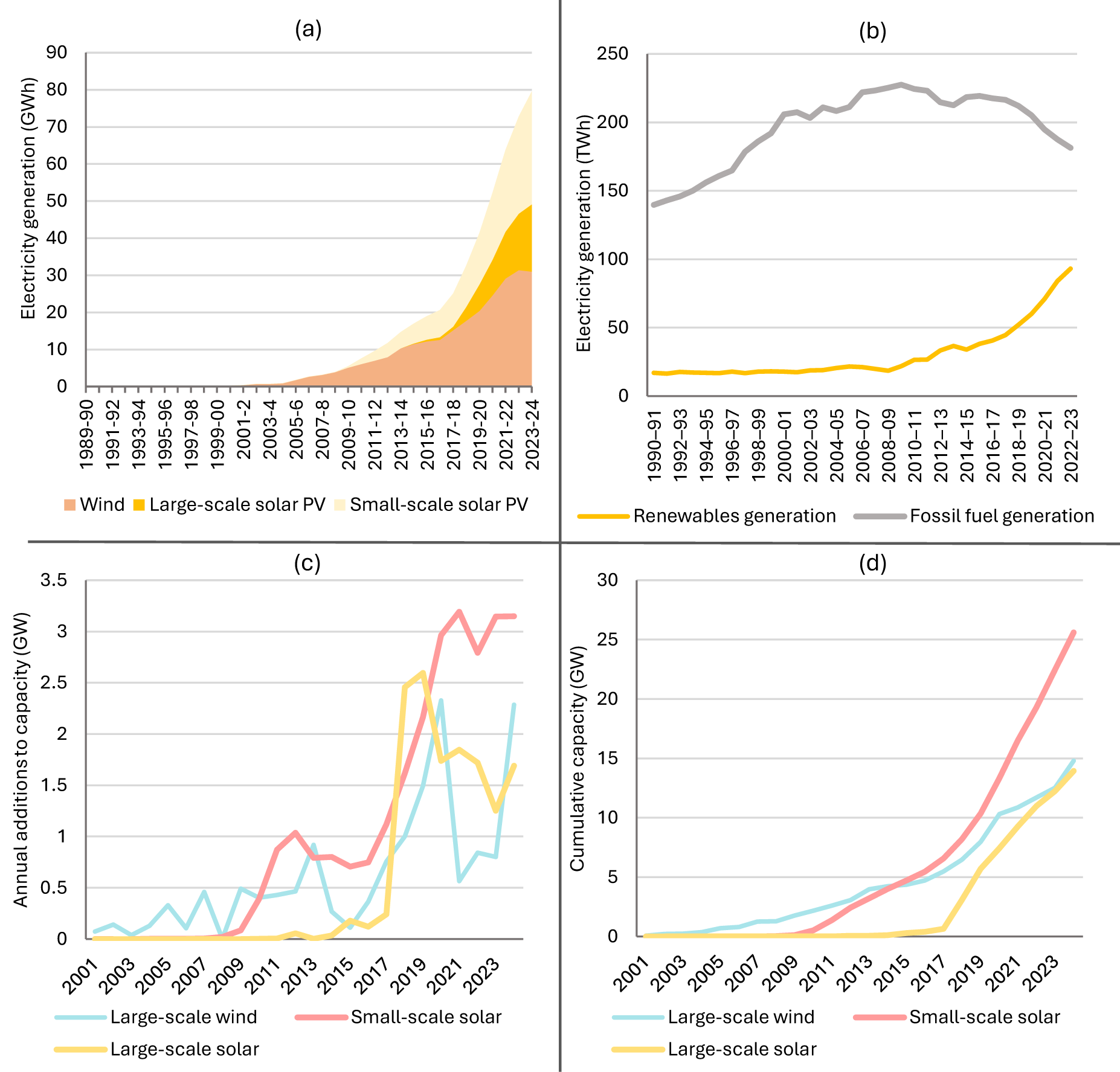
Figure 2 Long description
The image contains four graphs. (a) A stacked area graph showing electricity generation in gigawatt hours from wind, large-scale solar PV and small-scale solar PV from 1989 to 2024. Wind and solar PV show significant growth, especially after 2010. (b) A line graph showing electricity generation in terawatt hours from renewables and fossil fuels from 1990 to 2023. Renewables show a steady increase, while fossil fuels decline after peaking around 2010. (c) A line graph showing annual capacity additions in gigawatts for large-scale wind, large-scale solar and small-scale solar from 2001 to 2023. Small-scale solar shows the most significant increase. (d) A line graph showing cumulative capacity in gigawatts for large-scale wind, large-scale solar and small-scale solar from 2001 to 2023. Small-scale solar leads in cumulative capacity growth.
Wind energy began diffusing after the introduction of the Renewable Energy Target (RET) in 2000, which required electricity retailers and large users to purchase renewable energy certificates (AER, 2024). The initial target of raising renewables from 10% to 12% by 2010 was expanded in 2009 to 20% by 2020. Wind capacity grew gradually from 2001 with variability across years (Fig. 2c) (CER, 2025a). The trend in cumulative capacity reveals both acceleration and deceleration over the past two decades, and a clearer inflection point after 2016 (Fig. 2d). While output plateaued in 2023–24 (Fig. 2a), this reflected poor wind conditions rather than reduced installations (AER, 2024). Periods of slower growth are evident in 2014–16 and 2021–23, explored further in Section 3.3.
Rooftop and large-scale solar PV followed distinct diffusion paths. A defining feature of Australia’s energy transition is the world-leading uptake of rooftop solar PV, which has expanded exponentially over the past decade. This growth was driven by national and state policies, including the Small-scale Renewable Energy Scheme (SRES) introduced in 2011 under the RET, and state feed-in-tariff schemes introduced from 2008, with tariff rates peaking in 2010–12 before being reduced (Bloch, Reference Bloch2025; Deng et al., Reference Deng, Poletti, Hazledine, Tao and Sbai2024; Poruschi et al., Reference Poruschi, Ambrey and Smart2018). An initial tipping point in installations occurred from 2009 (subsidy-driven), and a second, sharper acceleration after 2017, following steep cost declines (Fig. 2c and d). Installations peaked in 2012 as households sought to secure generous state subsidies before reductions (Clarke & Graham, Reference Clarke and Graham2022; Poruschi et al., Reference Poruschi, Ambrey and Smart2018). By mid-2025, about 4.1 million households (38% nationally) had rooftop systems (CEC, 2025a). The SRES continues to provide declining rebates.
Large-scale solar PV deployment accelerated only after 2017 (Fig. 2c), supported by incentives under the Large-scale RET and financing from the Australian Renewable Energy Agency and the Clean Energy Finance Corporation (AER, 2024). Falling costs and the 2020 RET compliance deadline spurred record annual additions from 2017 onward, with a clear tipping point in cumulative capacity after that year (Fig. 2d). By 2022, total capacity had reached parity with wind (Fig. 2d).
Across these technologies, the analysis identifies multiple reinforcing feedbacks driving acceleration, often influenced by (or influencing the adoption of) key policies such as the RET. Table 1 summarises explanatory reinforcing feedback mechanisms identified from the socio-technical analysis, with further details in Supplementary Table 2. Fig. 3 presents these feedbacks mapped as a combined CLD (Fig. 3a) and in a sequential time plot summary (Fig. 3b). Each feedback includes an identification number (RN#), which is used in the summary below to connect the analysis with the table/figures.
Summary of reinforcing feedback mechanisms of niche acceleration identified in the analysis for solar PV and wind. Notes: (a) CLD of interlinked reinforcing feedback mechanisms of niche acceleration; and (b) time plot with estimated sequencing of key developments (lines) and feedbacks (circles at bottom). In the CLD, blue arrows represent a positive relationship whereby an increase in variable x results in an increase in the subsequent variable y. For example, starting with the central variable, increasing ‘Adoption of solar PV and wind’ results in an increase in ‘production volume’, which increases ‘performance and affordability’ and in turn increases ‘Adoption of solar PV and wind’. Each reinforcing feedback loop is thus a closed causal chain that has a unique reference number (i.e. RN#) which corresponds to the description for each feedback provided in Table 1. Shading and colours used in both figures represent the different dimensions of feedbacks: Green = technoeconomic; purple = policy; and yellow = actors. See Supplementary Table 2 for more details on key developments.
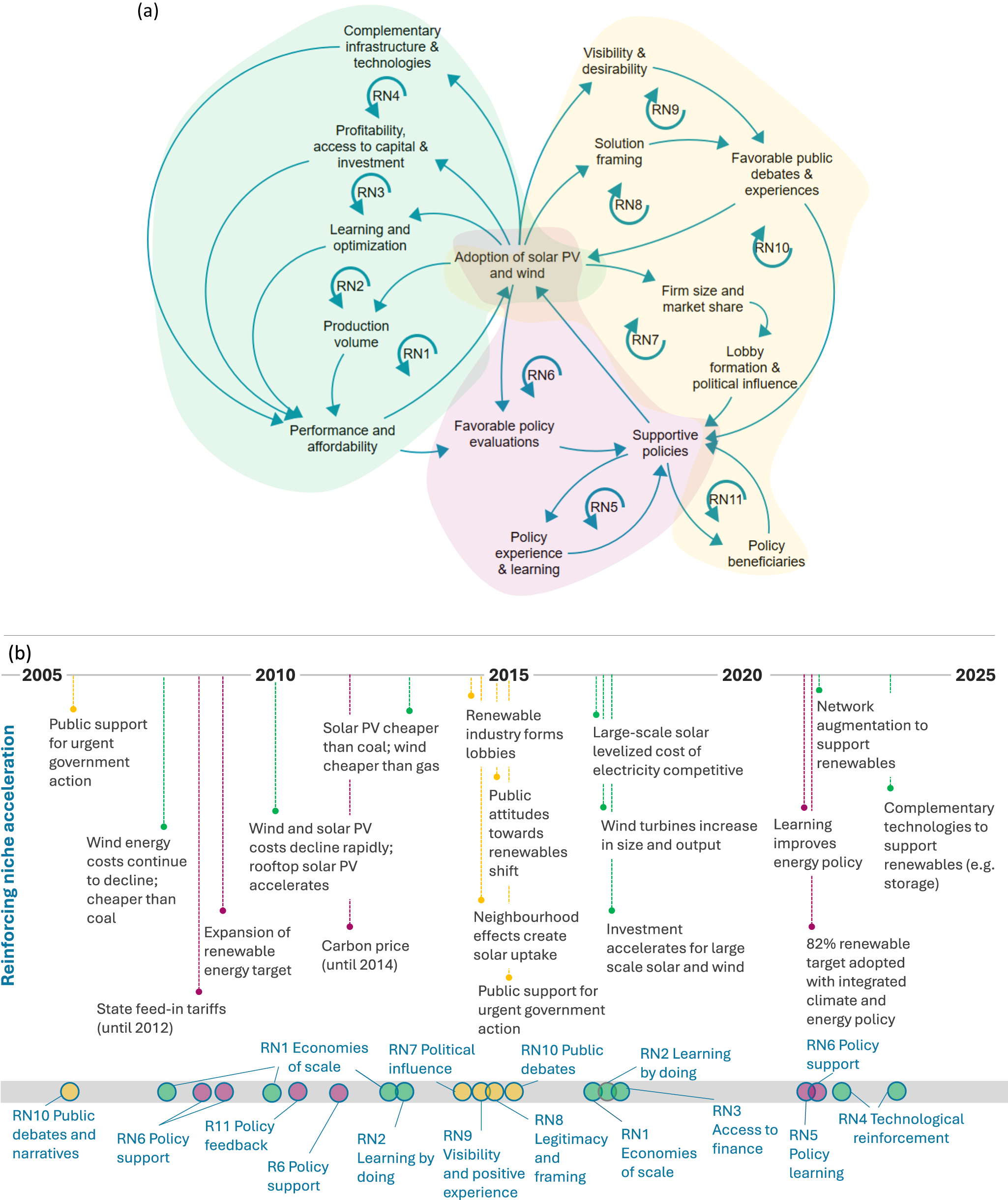
Figure 3 Long description
The image consists of two parts: (a) a causal loop diagram and (b) a timeline. (a) The causal loop diagram illustrates interlinked reinforcing feedback mechanisms for the adoption of solar PV and wind. Central to the diagram is 'Adoption of solar PV and wind,' with arrows indicating positive relationships. Each reinforcing feedback loop has a unique reference number (i.e. RN#) which corresponds to the description for each feedback provided in Table 1. (b) The timeline spans from 2005 to 2025, highlighting key developments in niche acceleration. The timeline is marked at the bottom with circles representing feedback mechanisms as described in Table 1.
Description of reinforcing feedbacks associated with niche momentum observed in the analysis. Additional details on key developments and tipping points are provided in Supplementary Table 2
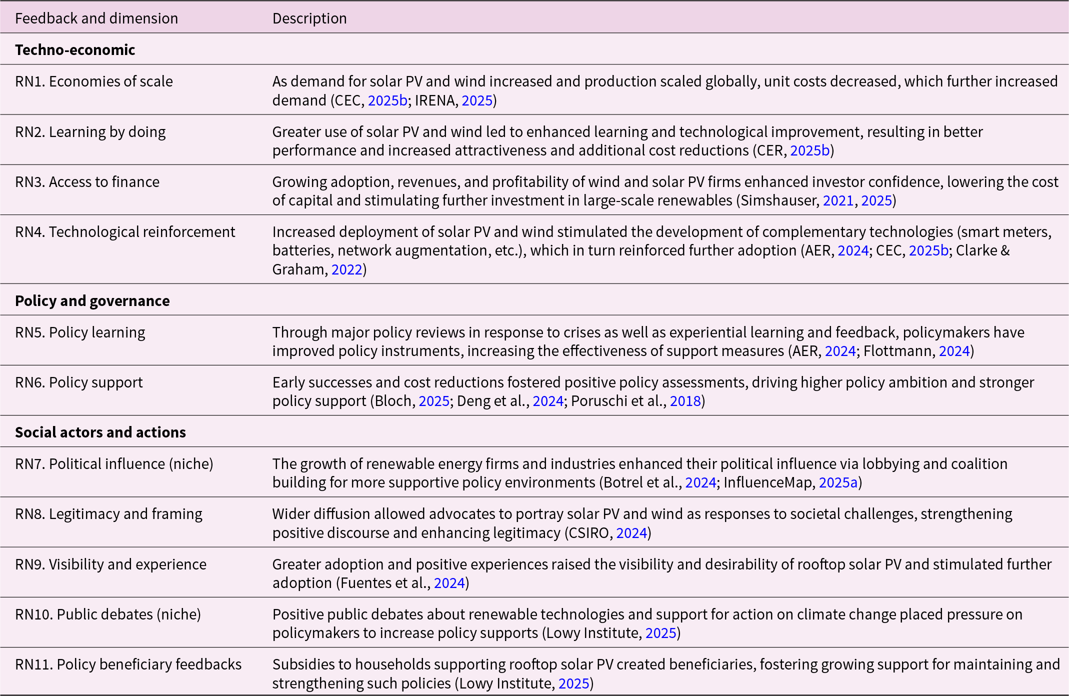
Table 1 Long description
The table describes various reinforcing feedbacks associated with the momentum of renewable energy niches, specifically solar PV and wind. It categorizes these feedbacks into techno-economic, policy and governance, and social actors and actions dimensions. Key points include economies of scale and learning by doing, which reduce costs and enhance technology performance. Policy learning and support have improved through experiential feedback, while social factors like political influence and public debates have increased the legitimacy and visibility of renewables. These feedbacks collectively contribute to the growing adoption and investment in renewable technologies, creating a cycle of reinforcement and further development.
3.1.1. Techno-economic feedbacks (RN1–4)
Rapidly falling global costs have been a key driver of solar PV and wind diffusion. Between 2010–23, global levelised costs of electricity declined by over 90% for solar PV and 70% for onshore wind (IRENA, 2025), reflecting economies of scale and learning by doing feedbacks enabled by market-creating policies and the replicable nature of these technologies (SystemIQ, 2023) (RN1, RN2; Table 1 and Fig. 3). Fossil-fuel generation costs have remained relatively stable. Wind has been Australia’s lowest-cost source of new capacity since 2015, while solar PV reached price parity with coal in 2013 and gas in 2016, achieving parity with wind by 2020 (Fig. 4a). Including integration costs for transmission and storage, solar PV and wind are comparable with coal (2024) but expected to be clearly cheapest by 2030 (CSIRO, 2025). Efficiency gains and larger system sizes have reinforced these trends (RN2). For example, the average small-scale solar system size increased tenfold from about 1 kW in 2010 to nearly 11 kW in 2024, reflecting advances in performance and module efficiency (CER, 2025b). Here, we note that while the underlying mechanisms in RN1 and RN2 are different and that there is evidence of both in our analysis, their actual effects on reducing costs and promoting further adoption are similar and difficult to differentiate.
Technology costs and investment in renewables and infrastructure. Notes: (a) Levelised cost of electricity (LCOE) for Australia (USD/kWh) (CSIRO, 2025) (CCGT = combined cycle gas turbine; and OCGT = open-cycle gas turbine). (b) Total investment in renewables and other electricity infrastructure ($m) (ABS, 2024). (c) Total network investment in grid infrastructure in the NEM, by state ($bn) (AER, 2024).
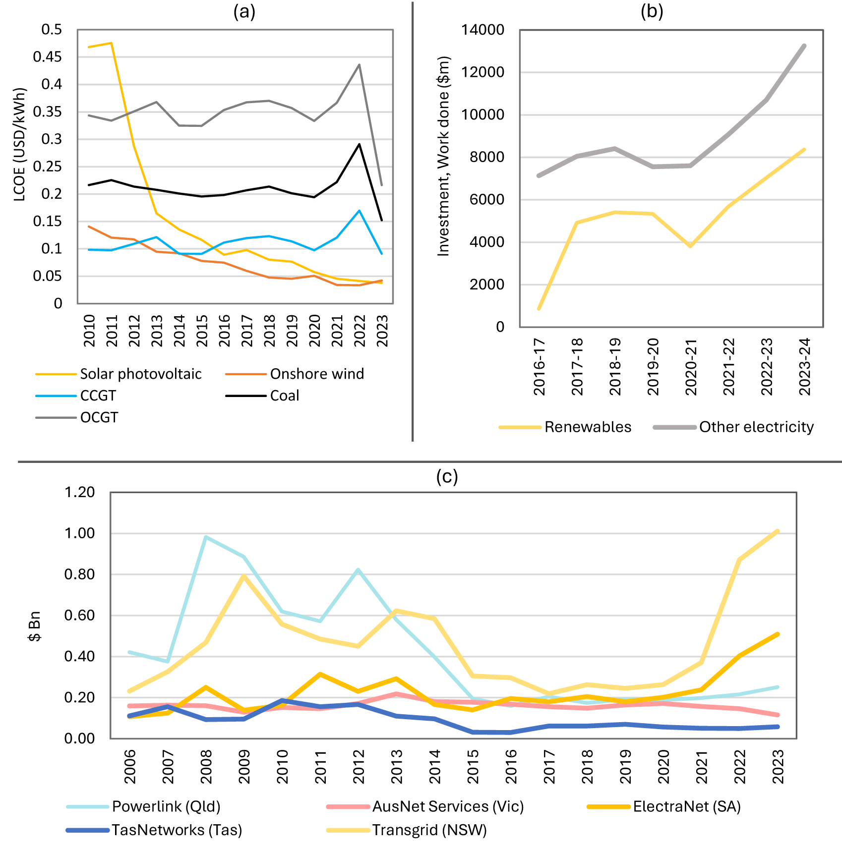
Figure 4 Long description
The image contains three graphs. The first graph (a) shows the levelized cost of electricity (LCOE) in USD per kWh from 2010 to 2023 for solar photovoltaic, onshore wind, CCGT, OCGT and coal. The second graph (b) displays investment in renewables and other electricity from 2016-17 to 2023-24 in million dollars. The third graph (c) illustrates network investment in grid infrastructure by state from 2006 to 2023 in billion dollars.
Rising investor confidence has further accelerated deployment (RN3) (de Atholia et al., Reference de Atholia, Flannigan and Lai2020). Large-scale wind and solar experienced an ‘investment supercycle’ from 2017 (Simshauser, Reference Simshauser2021, Reference Simshauser2025) (Fig. 4b), supported by the Large-scale RET of 20% by 2020 (Flottmann, Reference Flottmann2024). Despite a brief slowdown in 2021, investment reached record levels in 2023–24 as capital costs fell and confidence strengthened (ABS, 2024; IGCC, 2024). Long-term power purchase agreements and financing from agencies such as the Clean Energy Finance Corporation further enhanced project bankability (de Atholia et al., Reference de Atholia, Flannigan and Lai2020).
Recent network augmentation has also reinforced deployment (RN4). Australian networks operate as natural monopolies with government and private ownership (AER, 2024) and are regulated by an incentive-based (RPI-X) model (Littlechild, Reference Littlechild1983). Poor decisions drove overinvestment (‘gold plating’) in power networks (2006–15) (Wood et al., Reference Wood, Blowers and Griffiths2018), followed by restrained investment until 2021. Since 2022, major transmission upgrades (especially in New South Wales and South Australia) have advanced to connect Renewable Energy Zones (Fig. 4b and c). The 2024 Integrated System Plan outlines 10,000 km ($16 billion) of new transmission by 2050, with 2,500 km already underway (AEMO, 2024). Distribution systems have also been upgraded to support two-way flows as rooftop solar expands (AER, 2024).
Renewable growth has stimulated complementary innovations, including batteries and smart meters (Clarke & Graham, Reference Clarke and Graham2022), further reinforcing diffusion (RN4). Falling battery costs have triggered rapid investment in both utility-scale and household storage, particularly since 2021–22 (CEC, 2025b). New government incentives launched in 2025 added 55,000 home batteries within two months; if sustained, installations could surpass 1 million before 2030 (DCCEEW, 2025a).
3.1.2. Policy and governance feedbacks (RN5–6)
Policy reviews have been a recurrent feature of Australia’s energy governance, gradually reshaping its institutional framework (RN5). Following a 2001 review, the National Electricity Law (2005) established governance arrangements focused on price, reliability, and security, but omitting recommended emissions objectives (Clarke & Graham, Reference Clarke and Graham2022). After the 2016 South Australian blackout, the 2017 Finkel Review again urged integrating climate goals into energy policy (AER, 2024), but reform only occurred in 2023 when emissions reduction was formally embedded in energy market regulations (AER, 2024). As solar and wind became increasingly competitive, government support evolved from economic incentives to the Capacity Investment Scheme, a Contracts-for-Difference model underwriting renewable investments through centralised auctions (Simshauser, Reference Simshauser2025). A notable feature of major energy policy reforms in Australia is that they have been triggered by crisis events, including energy price spikes and blackouts (AER, 2024; Flottmann, Reference Flottmann2024). More experiential and adaptive policy learning has also been facilitated through mechanisms such as the Integrated System Plan for the NEM, which is updated biannually to adapt to changing challenges and feedback (AEMO, 2024).
Despite two decades of policy discontinuity (Simshauser & Tiernan, Reference Simshauser and Tiernan2019), falling technology costs and rising adoption have reinforced rising policy ambition (RN6). The RET legislated in 2000 remains the most enduring instrument, and its early success prompted the expansion in 2009 to a 20% target by 2020 (Simshauser, Reference Simshauser2019). The short-lived carbon price (2012–14) (Lowy Institute, 2025) reflected persistent political volatility, though state-level policies continued to fill gaps in national leadership (Clarke & Graham, Reference Clarke and Graham2022; Poruschi et al., Reference Poruschi, Ambrey and Smart2018; Simshauser, Reference Simshauser2019).
Since 2022, national policy has reoriented decisively towards renewables (Leviston et al., Reference Leviston, Stanley and Walker2024), notably after diffusion tipping points for solar PV and wind were reached. The Climate Change Act 2022 legislated a 43% emissions reduction target by 2030 and net zero by 2050 (recently updated to 62–70% by 2035) (DCCEEW, 2025a). The government also adopted an 82% renewable electricity target by 2030 and an economy-wide Net Zero Plan (2024) (DCCEEW, 2025a). National energy objectives, market rules, and the Integrated System Plan for the NEM were aligned with these goals from 2023 (AEMO, 2024; AER, 2024), with policy attention now shifting to systemic enablers such as transmission, demand management, and complementary technologies (AEMO, 2024).
3.1.3. Social actor feedbacks (RN7–11)
Renewables now dominate new electricity capacity in Australia, accounting for 95% of additions since 2013, almost evenly split between solar (46.7%) and wind (47.6%), with a small investment in gas (5.7%) (AER, 2024). A diverse mix of domestic and international firms leads large-scale projects (Parkinson, Reference Parkinson2025a). As the sector expanded, renewable industries formed lobbies and advocacy networks to counter fossil-fuel interests and shape policy narratives (RN7) (Botrel et al., Reference Botrel, Rekker, Wade and Wilson2024; InfluenceMap, 2025b). The Clean Energy Council, established in 2007, has gained influence alongside the sector’s growth, while groups such as the Smart Energy Council and Australian Photovoltaic Institute directly engage policymakers (Botrel et al., Reference Botrel, Rekker, Wade and Wilson2024; InfluenceMap, 2025b). Broader alliances among businesses, NGOs, unions, and industry associations have further isolated fossil-fuel lobbies and built constituencies for decarbonisation (Da Rimini et al., Reference Da Rimini, Goodman, Swarnakar and Ylä‐Anttila2021).
Falling costs, technological advances, and expanding actor networks have enhanced renewable legitimacy, allowing advocates to frame them as essential for climate action and the nation’s energy future (RN8) (Botrel et al., Reference Botrel, Rekker, Wade and Wilson2024). Public engagement with clean energy has risen sharply (Botica, Reference Botica2024), and surveys in 2023–24 confirm strong, sustained support (CSIRO, 2024; KPMG, 2024).
Neighbourhood visibility has reinforced rooftop solar diffusion (RN9). Around 18% of new installations stem from ‘neighbourhood effects’, where visible adoption by peers motivates uptake (Fuentes et al., Reference Fuentes, Khalilpour and Voinov2024). Rooftop solar and batteries have lowered household energy bills, boosting credibility and public endorsement (AER, 2024; Clarke & Graham, Reference Clarke and Graham2022).
Positive user experiences and widespread diffusion since 2016 have generated supportive public debates and strengthened political support (RN10) (Lowy Institute, 2025). Public backing for urgent climate action rose above 50% from 2016, peaking at 61% during the 2019 bushfires, and remains high despite affordability concerns (Fig. 5) (Lowy Institute, 2025). In 2024, 82% of Australians were willing to live near renewable energy infrastructure (CSIRO, 2024), reflecting continued public support.
Public sentiment towards action on climate change (Lowy Institute, 2025). Notes: Question: There is a controversy over what the countries of the world, including Australia, should do about the problem of global warming. Please indicate which of the following three statements comes closest to your own point of view.
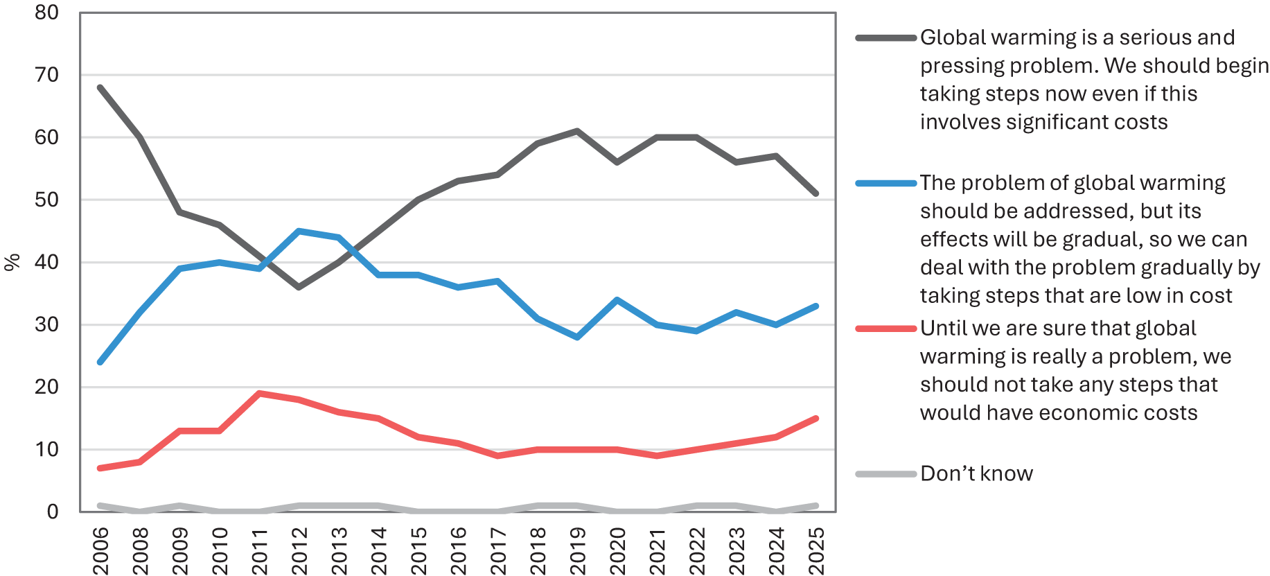
Figure 5 Long description
The graph shows public sentiment towards action on global warming from 2006 to 2025, with four perspectives. The y-axis represents percentage and the x-axis shows years from 2006 to 2025. The first perspective, represented by a gray line, indicates that global warming is a serious problem requiring immediate action. The second perspective, shown by a blue line, suggests addressing global warming gradually with low-cost steps,. The third perspective, depicted by a red line, reflects skepticism about taking steps with economic costs. The fourth perspective, represented by a thin gray line, shows uncertainty.
Government incentives for rooftop solar PV (and recently for batteries) have created beneficiaries, reinforcing support for their continuation (RN11) (AER, 2024; Lowy Institute, 2025). In 2025, 82% of Australians supported renewable energy subsidies (Lowy Institute, 2025), slightly below the 2021 peak of 91% but still indicating durable endorsement.
3.2. Reinforcing regime decline
The rapid influx of renewable generation has placed mounting pressure on Australia’s electricity regime (spanning generation, transmission, and demand) as it shifts from a centralised, baseload system dominated by a few large utilities to a more decentralised, diverse group of existing and new entrants (Clarke & Graham, Reference Clarke and Graham2022). In 2000, coal accounted for around 83% of national electricity generation, with hydro and gas each contributing about 8% (Fig. 6a) (DCCEEW, 2025b). A downward inflection in fossil-fuel generation occurred after 2017–18 as solar and wind accelerated (Fig. 2b). By 2024, coal’s share had fallen to roughly 45%, while gas declined from 22% in 2013–14 to 17% by 2023–24 (DCCEEW, 2025b). Within the NEM, rising renewable capacity has coincided with successive closures of brown and black coal power plants (Fig. 6b) (AER, 2024). New wind and solar additions have been strong since 2017, though growth slowed slightly in 2023–24, while battery investment has increased sharply since 2021–22 (Fig. 6b).
Electricity generation and capacity additions/withdrawals. Notes: (a) Electricity generation by fuel type (TWh) (DCCEEW, 2025b). (b) New generation and plant withdrawal in the NEM (MW) (AER, 2024).

Figure 6 Long description
The first graph (a) displays electricity generation by fuel type from 2000 to 2023, measured in terawatt hours. The graph shows a decline in coal usage over time, with an increase in renewable sources like wind and solar. The second graph (b) illustrates generation capacity changes from 2013 to 2024, measured in megawatts. The graph highlights significant growth in solar and wind capacity, alongside closures of coal plants, particularly brown coal and past gas closures. Battery capacity has increased notably since 2021.
Multiple exogenous landscape pressures have further destabilised the coal regime. These include international expectations for climate action under the Paris Agreement (Clarke & Graham, Reference Clarke and Graham2022), a polycentric governance system in which states have advanced renewable policies amid federal inaction (IEA, 2023), global supply disruptions that raised energy prices (AER, 2024), and compulsory voting along with persistent public support for climate action reinforced by extreme weather events (Holmes et al., Reference Holmes, Garas and Richardson2022; Lowy Institute, 2025).
Our analysis identifies a series of techno-economic, policy, and actor feedback mechanisms that have reinforced and accelerated the decline of coal power, particularly over the past five years (Table 2). Each feedback mechanism is coded with a unique identifier (RR#) and summarised below alongside key developments and tipping points signalling observable shifts in quantitative data or actor and policy reorientations. Fig. 7 presents these feedbacks mapped as a combined CLD (Fig. 7a) and in a sequential time plot summary (Fig. 7b).
Summary of reinforcing feedback mechanisms of regime decline identified in the analysis for solar PV and wind. Notes: (a) CLD of interlinked reinforcing feedback mechanisms of regime decline; and (b) time plot with sequencing of key developments (lines) and feedbacks (circles at bottom). In the CLD, blue arrows represent a positive relationship whereby an increase in variable x results in an increase in the subsequent variable y, while red arrows represent a negative relationship where an increase in variable x results in a decrease in the subsequent variable y. For example, starting with ‘Decline of fossil fuel generation’, trace any of the loops in the diagram until it returns to ‘Decline of fossil fuel generation’. Each reinforcing feedback loop is labelled in its centre with a unique reference number (i.e. RR#) which corresponds to the description for each feedback provided in Table 2. Shading and colours used in both figures represent the different dimensions of feedbacks: Green = technoeconomic; purple = policy; and yellow = actors. Additional details on key developments and tipping points are provided in Supplementary Table 3.
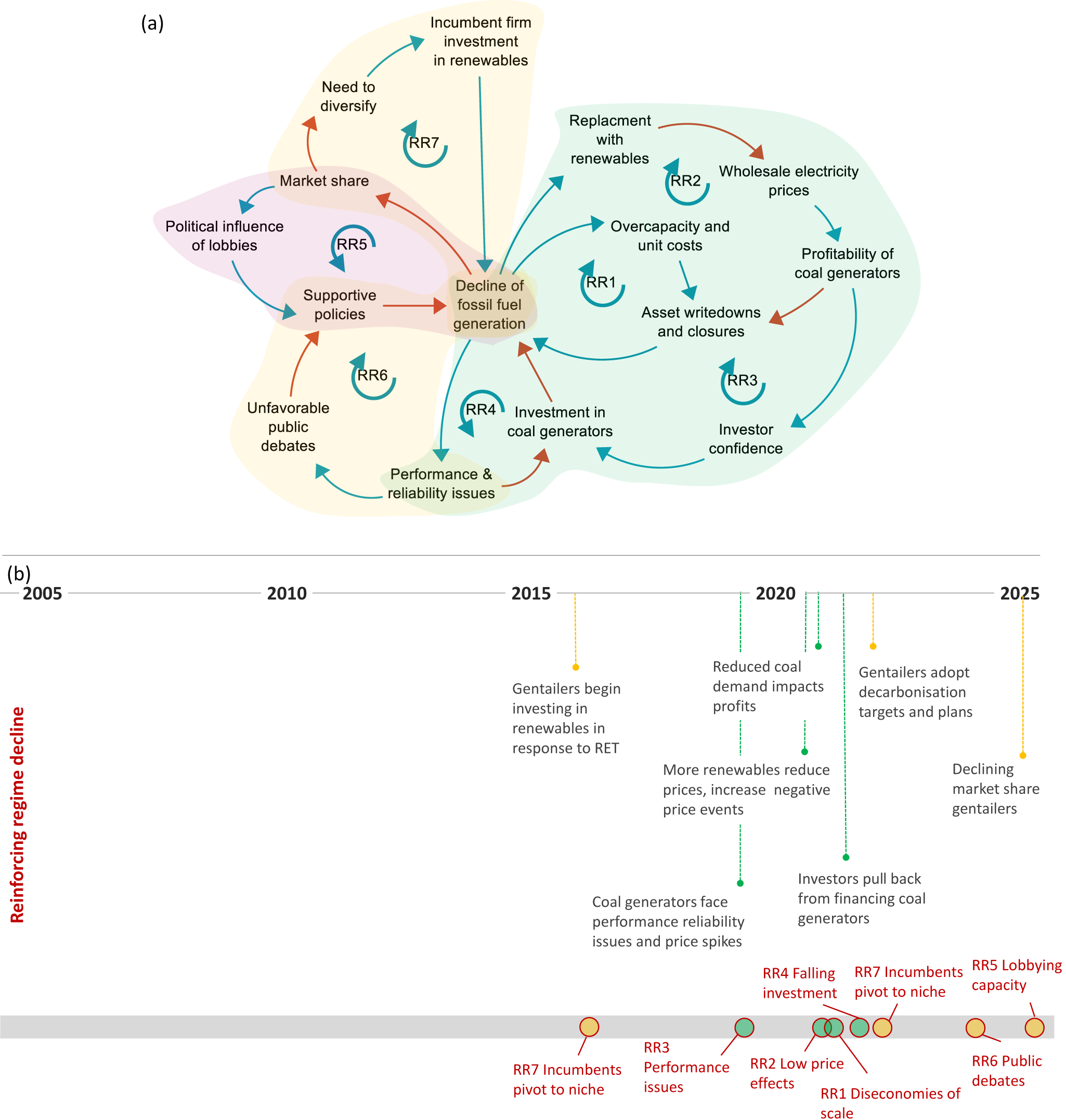
Figure 7 Long description
Diagram (a) presents a causal loop diagram illustrating the decline of fossil fuel generation. It includes various feedback mechanisms with a unique reference number (i.e. RR#) which corresponds to the description for each feedback provided in Table 2. Arrows indicate positive (blue) and negative (red) relationships. Diagram (b) is a timeline from 2005 to 2025, labeled 'Reinforcing regime decline.' It highlights key developments such as gentailers investing in renewables in response to RET in 2015, reduced coal demand impacting profits in 2020 and gentailers adopting decarbonisation targets by 2025. Feedback mechanisms like incumbents pivoting to niche, performance issues, low price effects, diseconomies of scale, falling investment, lobbying capacity and public debates are marked along the timeline.
Description of reinforcing feedbacks associated with regime decline observed in the analysis. Additional details on key developments and tipping points are provided in Supplementary Table 3
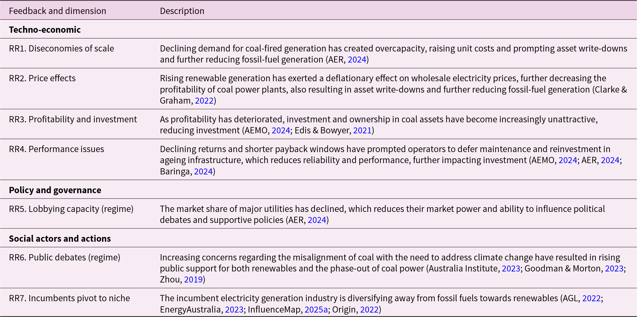
Table 2 Long description
The table describes seven reinforcing feedbacks associated with the decline of coal-fired power generation across techno-economic, policy and social dimensions.
3.2.1. Techno-economic feedbacks (RR1–4)
Declining demand for coal-fired generation has created overcapacity, raising unit costs and prompting asset write-downs (RR1). From 2021, major utilities (including Origin, AGL, Stanwell, and Delta) began devaluing coal assets, cancelling upgrade plans, and announcing closures (AER, 2024). Since 2000, 13 coal stations have closed in the NEM, with closure plans announced for 13 of the 15 remaining stations; half are expected to retire by 2035, with the next being Eraring (2,880 MW) in 2027 (AER, 2024).
Rising renewable generation has exerted a deflationary effect on wholesale electricity prices since around 2019, decreasing the profitability of coal power plants (RR2) (Clarke & Graham, Reference Clarke and Graham2022) (Fig. 8a). On high-output, low-demand days, renewables with minimal operating costs have underbid fossil generators, producing frequent negative-price events since 2021 (Fig. 8a and b) (AER, 2024). Coal plants thus face reduced volumes and lower average prices, compounding revenue losses. Recent closures have temporarily increased price volatility, which peaked in 2022 and triggered market intervention from the system operator (Fig. 8a) (AER, 2024); however, this has not reversed the long-term decline in coal profitability.
Wholesale price and negative price events in the NEM. Notes: (a) Quarterly wholesale prices in the NEM ($/MWh; volume weighted average) (AER, 2024). (b) Quarterly negative price events in the NEM (count of 5-minute prices below $0/MWh) (AER, 2024).

Figure 8 Long description
The first graph (a) shows quarterly wholesale electricity prices in dollars per megawatt-hour for five regions: Queensland, New South Wales, Victoria, South Australia and Tasmania, from 2019 to 2024. Notable peaks in prices occur in 2022 across all regions. The second graph (b) displays the count of negative price events in the National Electricity Market from 2019 to 2024. The graph indicates an increase in negative price events starting in 2021, with peaks in 2022 and 2023.
As profitability has deteriorated, investment and ownership in coal assets have become increasingly unattractive (RR3) (AEMO, 2024; Edis & Bowyer, Reference Edis and Bowyer2021). Falling wholesale earnings and repeated asset write-downs (e.g. AGL’s $2.7 billion write-down) reflect this erosion (Edis & Bowyer, Reference Edis and Bowyer2021). Financing conditions have tightened sharply as banks and investors are increasingly reluctant to finance plant refurbishment and extension projects (Clarke & Graham, Reference Clarke and Graham2022; IEEFA, 2025). All major banks have announced complete withdrawal from coal financing by between 2030 and 2035, with Australia’s largest bank ceasing new coal lending in 2024 (Market Forces, 2024). The sector now faces escalating financial constraints and possible early closures (Clarke & Graham, Reference Clarke and Graham2022; IEEFA, 2025).
Shrinking returns and shorter payback windows have prompted operators to defer maintenance and reinvestment in ageing infrastructure, further degrading performance (RR4) (AEMO, 2024). Over 60% of remaining coal capacity is more than 40 years old (Baringa, 2024), with increasing unplanned outages and reliability issues since 2019, including the 2021 Callide power station explosion (AER, 2024; Baringa, 2024). Coal availability has declined markedly during periods of peak risk, amplifying system instability (AEMO, 2024; AER, 2024; Baringa, 2024).
3.3. Policy and actor feedbacks (RR5–7)
The market share of the three largest gentailers (AGL, Origin, and EnergyAustralia) has declined slowly since 2017–18 (Fig. 9a) (AER, 2024), somewhat reducing their market power and influence over policy debates (RR5). Nevertheless, they continue to serve about 60% of electricity and 80–90% of gas customers, retaining substantial leverage (AER, 2024). The fossil-fuel lobby also remains politically influential due to the sector’s economic and regional significance, including for exports and local livelihoods (Hudson, Reference Hudson2020; Lucas, Reference Lucas2021). In 2024, coal and gas mining together contributed 7.5% of national Gross Value Added (GVA) (Fig. 9b) (ABS, 2025). However, this share has been falling since 2020, highlighting that the sector’s relative economic importance is declining. Still, while this feedback is strengthening, there is not yet sufficient evidence that it has tipped.
Economic power of incumbents. Notes: (a) NEM retail market share of ‘big three’ gentailers (AGL, Origin, and EnergyAustralia) (AER, 2024). (b) Share of mining and electricity in Australia’s total GVA, % (ABS, 2025).

Figure 9 Long description
The image contains two line graphs. Graph (a) displays the percentage of customers categorized as residential, large customers and small business from 2017-18 to 2023-24, all of which decline somewhat over time. . Graph (b) illustrates the share of Gross Value Added (GVA) for coal mining, electricity and oil and gas from 1990 to 2023. Electricity starts at close to 2 percent in 1990 and declines slowly over time to around 1 percent by 2023. .
Growing concern over coal’s incompatibility with climate objectives has reinforced support for renewables while eroding social legitimacy for coal generation and mining (RR6). Public discourse has turned increasingly negative towards coal over the past decades, amplified by environmental campaigns such as Walk Against Warming (mid-2000s) and the Stop Adani coalition (2016) (Goodman & Morton, Reference Goodman and Morton2023; Zhou, Reference Zhou2019). Survey results from 2023 show that 74% of Australians support government plans for the orderly closure of coal plants and their replacement with clean energy (Australia Institute, 2023). Rising public pressure has encouraged policymakers to pursue stricter phase-out mechanisms and planning, including through the Integrated System Plan and a new orderly exit mechanism (AEMO, 2024; AER, 2024).
Incumbent generators are also diversifying away from fossil fuels towards renewables (RR7). Government targets and financing mechanisms such as the Large-scale RET, Clean Energy Finance Corporation, Capacity Investment Scheme, and National Reconstruction Fund have supported reorientation across the sector (InfluenceMap, 2025a). From 2016, major utilities began investing in large-scale solar and wind projects, with AGL establishing Tilt Renewables to develop clean energy projects and Origin signing long-term renewable supply contracts and adopting a science-based emissions target in 2017 (AGL, 2022; Origin, 2022). All three major gentailers released climate transition plans in 2022–23 outlining accelerated investment in renewables and storage, though implementation varies across firms, and other generators have been slow to act (AGL, 2022; EnergyAustralia, 2023; Origin, 2022).
3.4. Balancing feedbacks of niche deceleration and regime stabilisation
Several persistent external landscape pressures have also stabilised Australia’s electricity regime and slowed the renewable transition. These include the continued economic importance of the resource and mining sectors and the political influence of a powerful fossil-fuel lobby that has consistently opposed climate policy (Clarke & Graham, Reference Clarke and Graham2022; Hudson, Reference Hudson2020), a highly concentrated conservative media landscape that has produced biased or misleading coverage of climate issues (Bacon, Reference Bacon2013; Hudson, Reference Hudson2020; Tiffen, Reference Tiffen2015), and global disruptions that have heightened public concern about energy prices (e.g. the global financial crisis, COVID-19, and recent geopolitical conflicts) (AER, 2024; Lowy Institute, 2025). Political ‘climate wars’ have entrenched policy lock-ins and eroded investor confidence (Clarke & Graham, Reference Clarke and Graham2022; Simshauser & Tiernan, Reference Simshauser and Tiernan2019). Although these lock-ins have weakened in recent years, they have contributed to intermittent slowdowns in renewable deployment and continue to pose risks to sustained acceleration.
Annual wind and solar PV installation data (Fig. 2c) show significant volatility over the past two decades. Wind capacity expanded rapidly from 2013 but slowed between 2014 and 2016 before rebounding (Fig. 2d) (CER, 2025a, 2025b). Rooftop solar installations surged in 2009 under generous feed-in tariffs, plateaued from 2012 to 2016, and then accelerated again (Fig. 2c). After the 2016 investment supercycle, large-scale wind and solar additions slowed markedly between 2020 and 2023 (Fig. 2c). Early periods of deceleration coincided with adjustments or withdrawal of key policy supports (e.g. feed-in tariffs, RET). However, even with ambitious targets and policies in place, recent data for early 2025 showed subdued investment in large-scale generation, with no new onshore wind commitments (CEC, 2025b). This suggests the persistence of structural constraints.
Our socio-technical analysis identifies a range of balancing feedbacks underlying these deceleration dynamics, which may continue to constrain Australia’s electricity transition if not addressed (Table 3). Each feedback mechanism is coded with a unique identifier (BR#) and summarised below alongside key developments and tipping points signalling observable shifts in quantitative data or actor and policy reorientations. Fig. 10 presents these feedbacks mapped as a combined CLD (Fig. 10a) and in a sequential time plot summary (Fig. 10b).
Summary of balancing feedback mechanisms of niche deceleration identified in the analysis for solar PV and wind. Notes: (a) CLD of interlinked balancing feedback mechanisms of niche deceleration; and (b) time plot with sequencing of key developments (lines) and feedbacks (circles at bottom). In the CLD, blue arrows represent a positive relationship whereby an increase in variable x results in an increase in the subsequent variable y, while red arrows represent a negative relationship where an increase in variable x results in a decrease in the subsequent variable y. Each feedback loop has a unique reference number (i.e. BR#) which corresponds to the description for each feedback provided in Table 3. Shading and colours used in both figures represent the different dimensions of feedbacks: Green = technoeconomic; purple = policy; and yellow = actors. Additional details on key developments and tipping points are provided in Supplementary Table 4.

Figure 10 Long description
The image consists of two parts. The first part (a) is a causal loop diagram illustrating the interlinked balancing feedback mechanisms influencing deceleration in the diffusion of wind and solar photovoltaic technologies. Each feedback loop has a unique reference number (i.e. BR#) which corresponds to the descriptions provided in Table 3.. The second part (b) is a timeline from 2005 to 2025, highlighting key developments and feedbacks that have declerated the diffusion of wind and solar technologies including infrastructure and policy lock-ins, supply chain constraints, incumbent resistance and social backlash.
Description of balancing feedbacks associated with niche deceleration observed in the analysis. Additional details on key developments and tipping points are provided in Supplementary Table 4
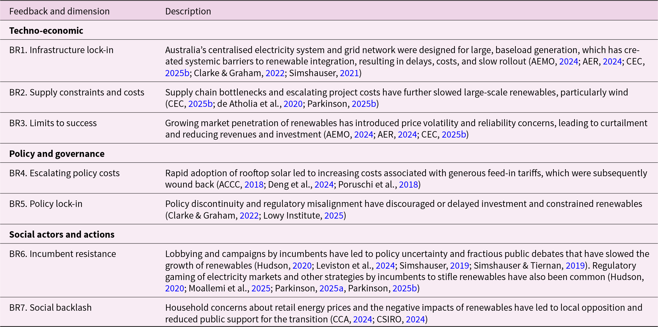
Table 3 Long description
The table describes seven balancing feedbacks associated with stabilisation of the fossil fuel generation regime and deceleration of renewable energy difffusion.
3.4.1. Techno-economic feedbacks
Australia’s centralised electricity system was designed for large baseload generation, creating systemic barriers to renewable integration (BR1). These constraints became evident in the early 2010s as rooftop solar PV and wind expanded (Clarke & Graham, Reference Clarke and Graham2022). By 2013, transmission congestion and connection delays were raising project costs (CEC, 2025b). The 2016 South Australian blackout heightened concerns over system security, prompting the Australian Energy Market Operator to require new projects to fund system-strength upgrades and to embed transmission planning in its Integrated System Plan (AEMO, 2024). Although this plan identifies 10,000 km of new transmission by 2050 (AEMO, 2024), investment remains insufficient and progress slow (AER, 2024; Simshauser, Reference Simshauser2021). Many large projects depend on new lines to access more remote resource zones, while higher renewable shares necessitate infrastructure such as storage and synchronous condensers (CSIRO, 2025). Even in regions with community support, earlier underinvestment has delayed developments (CEC, 2025b), and generators in weak grid areas face reduced marginal loss factors and revenues (de Atholia et al., Reference de Atholia, Flannigan and Lai2020).
Supply chain bottlenecks and escalating costs have further slowed large-scale renewables, particularly wind (BR2). Global technology cost reductions have been offset by rising domestic land and installation costs, limited skilled labour, and larger construction costs as projects move into remote areas (Parkinson, Reference Parkinson2025b). Onshore wind capital costs rose 8% in 2023–24 and another 6% in 2024–25 (Fig. 4a), with construction timelines roughly doubling (CEC, 2025b). Solar PV, by contrast, continues to fall in cost due to manufacturing scale and technological progress (CEC, 2025b). Stricter grid-connection standards have added compliance costs and delays, heightening risk for developers (de Atholia et al., Reference de Atholia, Flannigan and Lai2020).
As renewable penetration grows, curtailment and system security issues have become major constraints on revenues, profitability, and investment (BR3) (AEMO, 2024; AER, 2024; CEC, 2025b). Excess generation and grid congestion have required the Australian Energy Market Operator to impose output limits since 2019–20, particularly on large solar PV farms (ARENA, 2022). Rooftop solar PV is also curtailed during low-demand, high-output periods (AER, 2024), while economic offloading occurs when market prices turn zero or negative (AEMO, 2024; AER, 2024; CEC, 2025b). In 2024, over half of grid-scale wind and solar PV projects experienced curtailment, especially large-scale solar PV (AEMO, 2025).
3.4.2. Policy and actor feedbacks
Escalating policy costs led to adjustments that temporarily slowed rooftop solar PV adoption after 2012 (BR4). State feed-in tariffs introduced from 2008 paid well above market value for exported electricity, driving rapid uptake but becoming fiscally unsustainable (ACCC, 2018; Deng et al., Reference Deng, Poletti, Hazledine, Tao and Sbai2024; Poruschi et al., Reference Poruschi, Ambrey and Smart2018). Tariff rates peaked at 20–60 c/kWh during 2010–12 (Deng et al., Reference Deng, Poletti, Hazledine, Tao and Sbai2024; Poruschi et al., Reference Poruschi, Ambrey and Smart2018), with installations surging before major cuts in 2011–12 (Australian PV Institute, 2025) (Fig. 2c). After transitioning to lower tariffs (≤10 c/kWh) (Deng et al., Reference Deng, Poletti, Hazledine, Tao and Sbai2024; Kitchen & Wang, Reference Kitchen and Wang2022), installations fell but recovered after 2016 as solar costs dropped and market forces took over (Deng et al., Reference Deng, Poletti, Hazledine, Tao and Sbai2024; Poruschi et al., Reference Poruschi, Ambrey and Smart2018). Federal incentives under the SRES of the RET were also phased down between 2011 and 2013 (Australian PV Institute, 2025).
Policy discontinuity, institutional lock-in, and regulatory misalignment have repeatedly constrained Australia’s renewable transition (BR5). Before 2023, climate objectives were largely absent from energy policy, leaving the RET as the sole enduring mechanism (Clarke & Graham, Reference Clarke and Graham2022). Following strong public support (Lowy Institute, 2025), the RET was expanded in 2009 and briefly complemented by a carbon price (2012–14). Wind installations accelerated from 2013 but decelerated after the carbon price was repealed (2014) and the RET reduction (in 2015 from 41,000 to 33,000 GWh) (Fig. 2) (Clarke & Graham, Reference Clarke and Graham2022). Although reforms since 2023 have integrated emissions objectives into energy regulations and set an ambitious 82% renewables target (AER, 2024; Simshauser, Reference Simshauser2021), policy challenges persist. The Capacity Investment Scheme has struggled to attract investment (Parkinson, Reference Parkinson2025a), while pre-election (CEC, 2025a, 2025b), slow approvals (CSIRO, 2025), outdated regulations (Bluprint Institute, & McKell Institute, 2025), and contradictory state interventions (e.g. coal plant extensions and renewable project cancellations) (Simshauser, Reference Simshauser2025) continue to hinder progress.
Lobbying by fossil-fuel incumbents has long shaped policy discontinuities and fractious debates that slowed the growth of the renewable energy industry (Leviston et al., Reference Leviston, Stanley and Walker2024; Simshauser & Tiernan, Reference Simshauser and Tiernan2019) (BR6). Regulatory gaming of electricity markets to stifle renewables has been common (Hudson, Reference Hudson2020). Industry media campaigns (in 2009, 2011, and 2014) shaped public opinion against the carbon price (Hudson, Reference Hudson2020; Simshauser, Reference Simshauser2019), and lobbying by major utilities in 2014 sought to scale back the RET (BCA, 2014). While resistance has weakened since 2022 as utilities align with climate targets, peak bodies still advocate for gas inclusion in the Capacity Investment Scheme and defend baseload capacity (InfluenceMap, 2025b). Broader fossil fuel and mining interests remain active opponents of emissions reduction policies (InfluenceMap, 2025b).
Utilities have also pursued strategies to reduce losses, buy time, preserve market power, and delay the transition (BR6). A 2025 ‘buyers’ strike’ saw major firms defer new wind and solar commitments despite closure plans for coal plants (Parkinson, Reference Parkinson2025a). Instead, they are investing heavily in battery storage to retain control over dispatchable capacity and wholesale market influence (Parkinson, Reference Parkinson2025a, Reference Parkinson2025b).
Rising retail energy prices paid by households and local opposition to renewable projects have also constrained momentum (BR7) (CCA, 2024; CSIRO, 2024). Periods of high electricity costs, including during the global financial crisis, correlated with sharp declines in public support for climate policy, falling below 50% (2009–14) (Lowy Institute, 2025) (Fig. 5). Higher retail energy prices have been influenced by increased network costs for infrastructure investment for renewable integration and debt financing, retail market volatility and operational costs, and periodic spikes in wholesale costs. Partisan framing of the 2011 Clean Energy Act as a ‘carbon tax’ also reinforced affordability concerns (Lowy Institute, 2025). Although public support for climate action remains high, it has softened: in 2025, 51% prioritised urgent action (down from 61% in 2019) (Lowy Institute, 2025), and energy affordability now outweighs emissions reduction as a public concern (Lowy Institute, 2025). Community resistance to new transmission and large-scale renewable projects is increasing (CCA, 2024; Davis, Reference Davis2021; McNaughton & Martin, Reference McNaughton and Martin2022), with the Integrated System Plan identifying social licence as a key challenge (AEMO, 2024).
4. Discussion
The analysis yields new empirical insights that address key knowledge gaps in the transitions literature. Methodologically, the study extends earlier research by examining both techno-economic and socio-political developments, tipping points, and the feedback mechanisms that drive them across socio-technical levels encompassing niche acceleration, regime decline, and niche deceleration. Through longitudinal analysis and process tracing, we identified 25 feedback mechanisms shaping the pace of Australia’s electricity transition. Time plots and CLDs clarify the sequencing and causal structure of these mechanisms and reveal how technological, policy, and social dynamics interact to explain observed periods of acceleration and deceleration.
The 25 feedbacks identified closely align with our initial feedback inventory, however, with some differences. For example, new feedbacks identified for Australia include the deflationary effect of renewables on wholesale prices, which reinforces regime decline (RR2), as well as the constraining effects of supply chain bottlenecks and costs, which have slowed investment in large-scale renewables (BR1). The results confirm the important role of techno-economic feedbacks in accelerating solar PV and wind adoption, notably economies of scale (R1) and learning-by-doing (R2), which have driven major cost reductions largely through global developments. Early wind diffusion was catalysed by the 2009 RET expansion, while rooftop solar PV initially accelerated through state feed-in tariffs before continued growth was driven by falling costs and national support. The 2017 investment boom in both technologies reflected the combined reinforcing effects of declining costs, policy incentives, and the 2020 RET deadline.
The study also highlights a complex interplay of socio-political feedbacks that are less visible in diffusion data but crucial for understanding transition dynamics. Volatility in annual installations (especially for wind) shows that acceleration and deceleration occurred cyclically. The slowdown in rooftop solar after tariff reductions and in large-scale renewables following the RET’s expiry illustrates that acceleration phases are contingent and reversible. This challenges conceptions of acceleration as a smooth S-curve and underscores transitions as dynamic, feedback-driven processes.
A sequential synthesis of developments and tipping points (Fig. 11) offers several insights. High public support consistently preceded major policy shifts, such as the 2009 RET expansion and state feed-in tariffs. Tipping points for large-scale solar and wind followed later, around 2016–17, as the RET approached compliance deadlines. The national policy reorientation towards renewables and emissions reduction in 2022–23 occurred only after technological and social tipping points were reached, suggesting cumulative public and niche pressure can transform policy and governance regimes. Network augmentation and battery storage since 2022 have further reinforced acceleration.
Summary diagram of sequential key events, inflection points, and feedback mechanisms in Australia’s renewable energy transition. Notes: Underlying image is time series data on the share of electricity generation from renewables and fossil fuels (%) from 2001 until 2024, after which an indicative trajectory continues to 2030 to reach the government’s target. Overlaid are important developments, inflection points, and feedback mechanisms. Colours and feedback symbols correspond to those used in Figure 1 (technoeconomic [green], policy [purple], and actors [yellow]). Feedback identifiers correspond to the three types of feedbacks and numbering used in the summary of Tables 1–3: reinforcing niche acceleration (RN#), reinforcing regime decline (RR#), and balancing/stabilising the regime (BR#). RET = renewable energy target; and TP = tipping point. Additional details on key developments and tipping points are provided in Supplementary Tables 2–4.

Figure 11 Long description
A line graph showing the percentage of electricity generation from renewables and fossil fuels in Australia from 2001 to 2030. The graph includes two main lines: one for renewables and one for fossil fuels. Sequential key events and feedback mechanisms are marked along the timeline, such as 'High public support for climate policy' in 2007, 'Carbon Price' in 2012 to 2014 and 'RE Target 82 percent by 2030'. Feedback identifiers like 'RN1', 'RR1' and 'BR1' are used to denote different types of feedbacks. The chart shows the the dynamic interplay between reinforcing and balancing feedbacks that have shifted in dominance over time and together shaped Australia’s electricity transition
For the fossil-fuel regime (Fig. 11, top line), early balancing feedbacks, including lobbying, policy lock-ins, and media campaigns on the costs of climate action (BR5–7), stabilised incumbents through the 2000s–2010s and delayed renewables, contributing to policy reversals such as the repeal of the carbon price (2014) and RET reduction (2015). Growing renewable industry coalitions from 2015 helped maintain partial policy continuity. Reinforcing feedbacks driving regime decline, including falling demand, profitability, and financing (RR1–4), became prominent only after 2021–22, once solar PV and wind reached around 20% of generation, indicating such feedbacks strengthen when niches gain sufficient market share.
Ongoing balancing feedbacks now pose deceleration risks to achieving the 82% renewable electricity target by 2030. Techno-economic constraints, including grid congestion, curtailment, and slow transmission rollout (BR1–3), have emerged since 2020. While investments in network upgrades and storage (RN4) are helping, supply-chain bottlenecks and rising costs, particularly for wind, remain barriers. While policy lock-ins have weakened considerably since 2023, policy misalignment and uncertainty persist. For example, the Capacity Investment Scheme has struggled to attract investment, compounded by slow approvals and shifting political signals ahead of the 2025 election (BR5). Incumbent utilities are employing new strategies to preserve market power, such as delaying renewable energy projects and prioritising storage (BR6).
Declining public support for climate action in 2025 (BR7), linked to energy prices and community resistance to new infrastructure, highlights the growing challenge of social licence. Public support has been a leading indicator of policy change in favour (or against) renewables in the past.
Overall, the findings reveal the dynamic interplay between reinforcing and balancing feedbacks that have shifted in dominance over time and together shape Australia’s electricity transition. Acceleration is not linear but the product of competing forces, including technological learning and cost decline, evolving institutional and policy support, infrastructure expansion, and the reorientation of firms, policymakers, consumers, and publics. Understanding of underlying feedbacks can inform strategic interventions and well-sequenced policy mixes that both enable acceleration dynamics while also overcoming deceleration risks as they evolve.
One of the benefits of our approach, which draws on both positivist and interpretivist approaches, is that we not only identify feedbacks and their effects but also analyse their structure. This highlights that, for example, feedbacks associated with public debates can support niches (RN10), undermine regimes (BR7), or decelerate niches (RR5), and their comparative influence changes over time and generates different transition dynamics. This highlights that feedbacks with an apparently similar mechanism (i.e. positive or negative public debates) can shift over time and exert different effects. Our analysis helps to differentiate these effects by linking them to important transition dynamics as per our feedback typology and explicitly mapping their causal structure of interlinked variables. As a result, each feedback has a unique causal structure that could be used to inform future analyses.
5. Conclusions
Given slow progress on global sustainability goals, accelerating transitions has become a crucial research priority. Recent work on positive tipping points, socio-technical dynamics, and feedback mechanisms has deepened understanding of how change accelerates. This study contributes new empirical evidence through an analysis of Australia’s electricity transition, revealing how interacting feedbacks and tipping dynamics have shaped its trajectory.
Consistent with recent research, the study unpacks and explains the influence of both techno-economic and socio-political feedbacks in driving acceleration and deceleration. Using a theory-informed taxonomy, longitudinal process tracing, and qualitative system dynamics, we identified, categorised, and mapped 25 feedback mechanisms shaping wind and solar PV diffusion. Integrating reinforcing feedbacks of regime decline alongside niche acceleration provides a more complete picture of transition dynamics, including destabilisation. Sequential time plots and CLDs reveal causal feedback structures, their evolution over time, and the interplay between technological, policy, and actor mechanisms.
Empirically, we see that early public support preceded key policies such as the RET and state feed-in tariffs, which in turn accelerated early adoption. Cost declines and sustained policy support drove later acceleration, while major policy and incumbent reorientations (2022–23) followed rather than initiated these tipping points. The findings show how public support, household demand, policy feedbacks, and technological advances interacted to generate cumulative momentum.
Practically, the study shows that understanding acceleration mechanisms can inform strategies for sustaining momentum. In Australia, temporary but well-designed policies overcame resistance and stimulated rapid adoption. As renewables expand, governments must anticipate evolving deceleration risks, from technical (grid integration) to institutional (regulatory misalignment) and social (public backlash).
Future research should extend this analysis through cross-sectoral and cross-country comparisons to examine the timing, sequencing, and interaction of feedbacks under different contexts. This could also test the utility and completeness of our feedback taxonomy and the list of feedbacks derived from the literature and empirical analysis. Methodological advances are also needed to pinpoint socio-political tipping points and model the cumulative influence of feedback mechanisms using dynamic systems approaches.
Supplementary material
The supplementary material for this article can be found at https://doi.org/10.1017/sus.2026.10064.
Acknowledgements
NA.
Author contributions
C.A., E.A.M., R.R., and D.S. designed the study; C.A. collected and analysed the qualitative and quantitative data; C.A. wrote the article, with inputs from E.A.M., R.R., and D.S.
Funding statement
C.A. is the recipient of an Australian Research Council Discovery Early Career Award (DE250100833) funded by the Australian Government.
Competing interests
The authors declare no conflicts of interest.
Research transparency and reproducibility
NA.
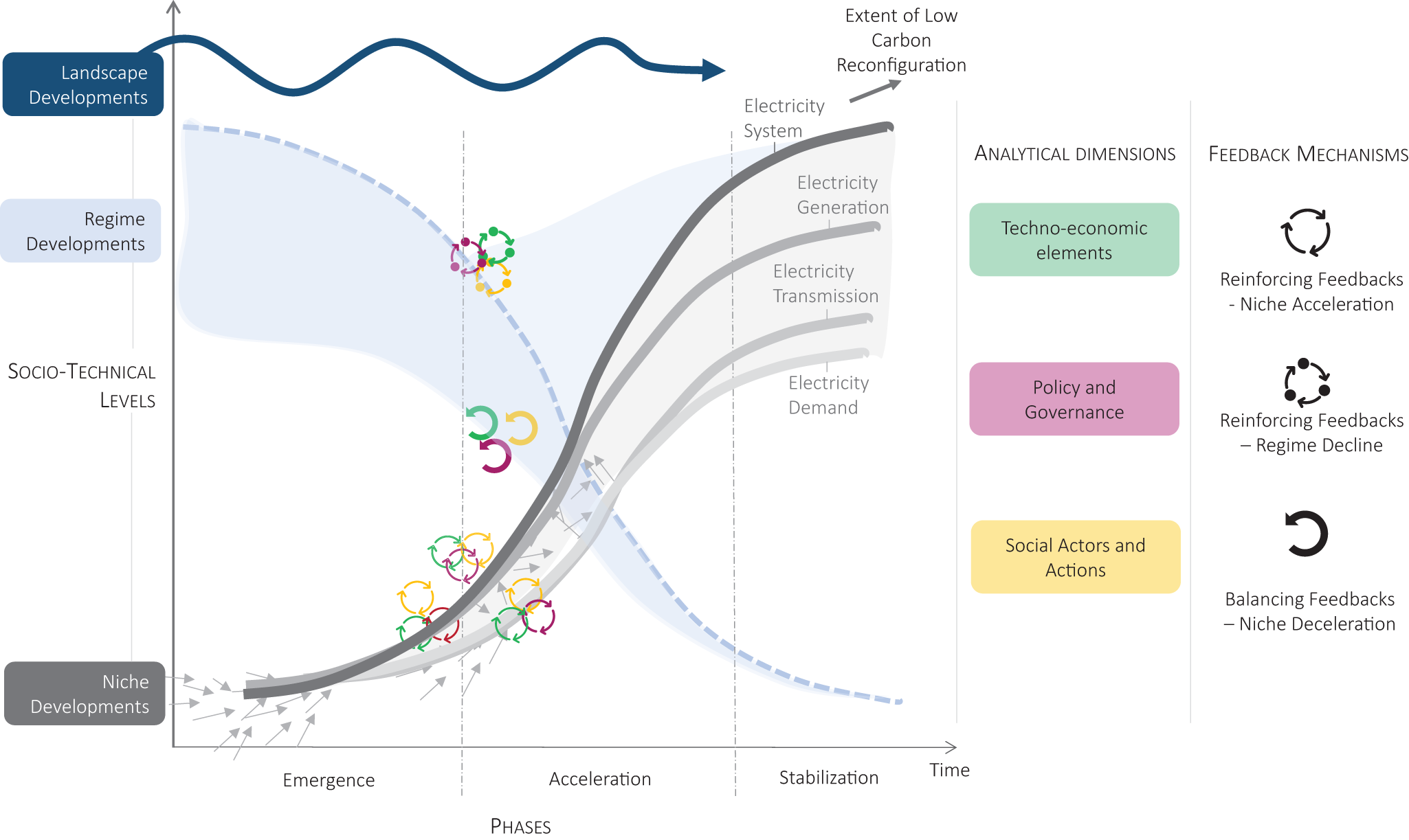
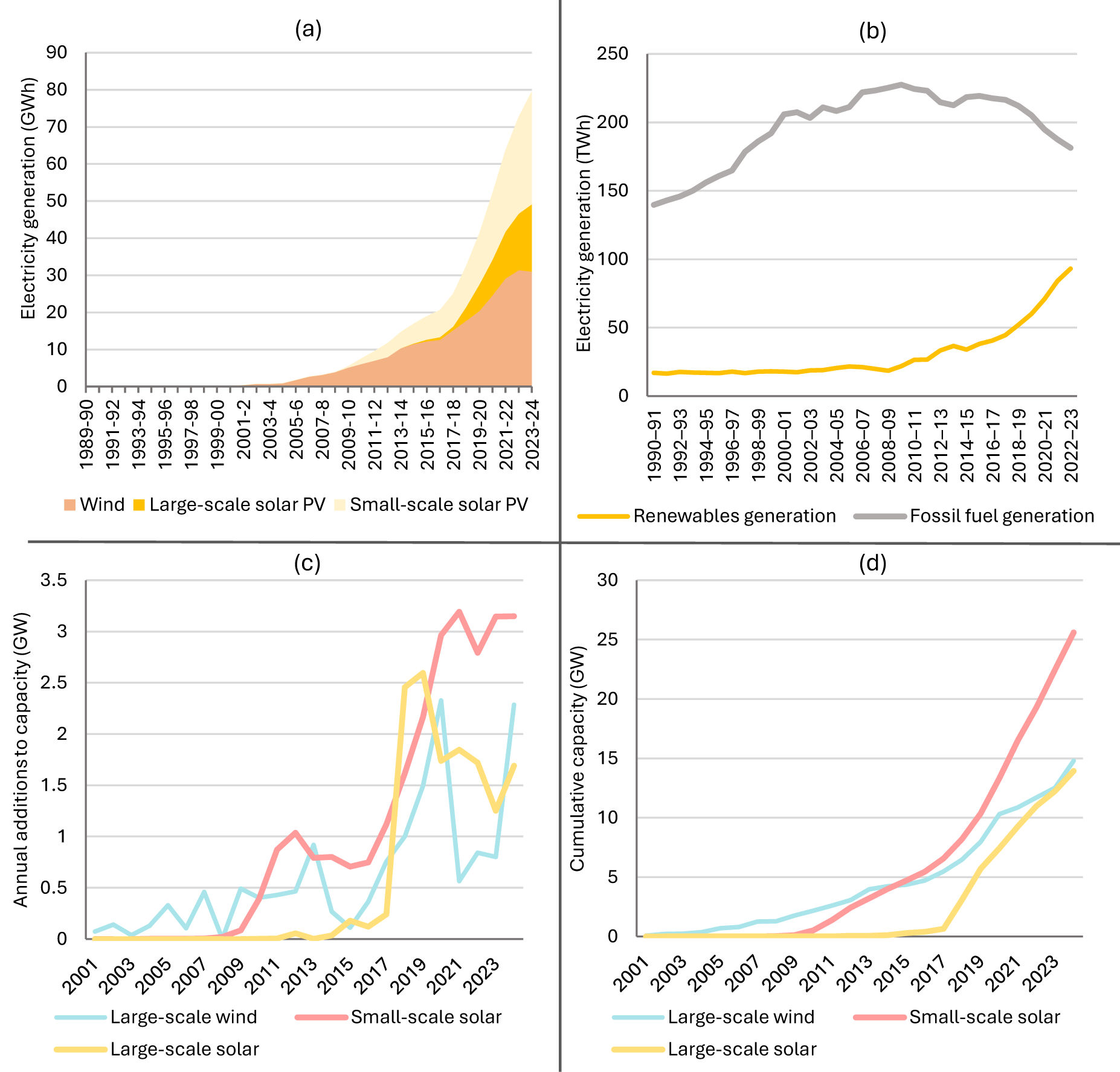
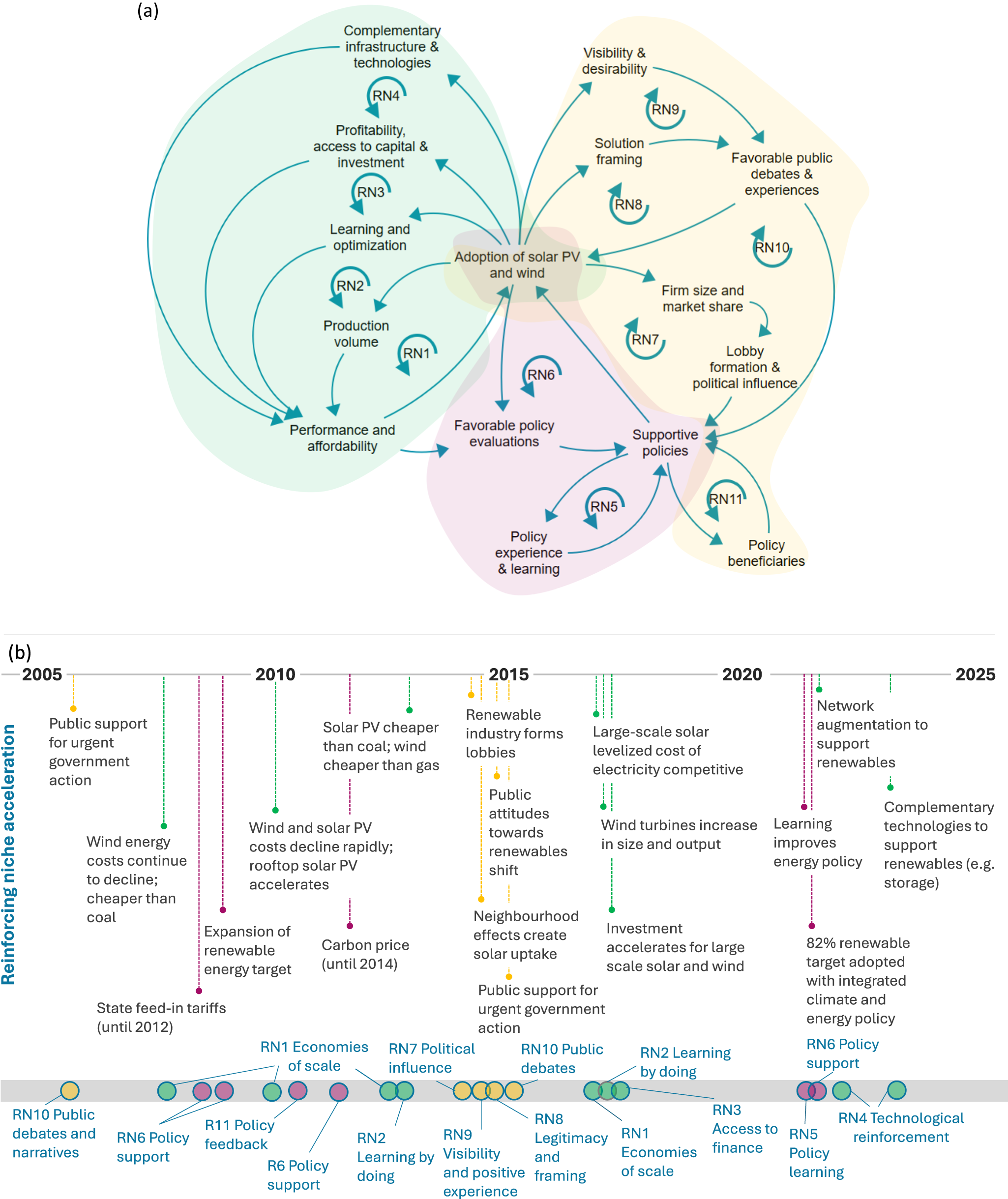
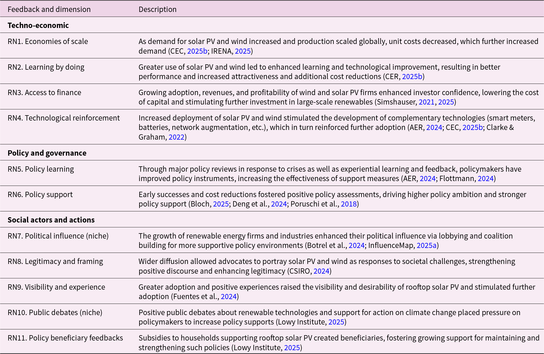
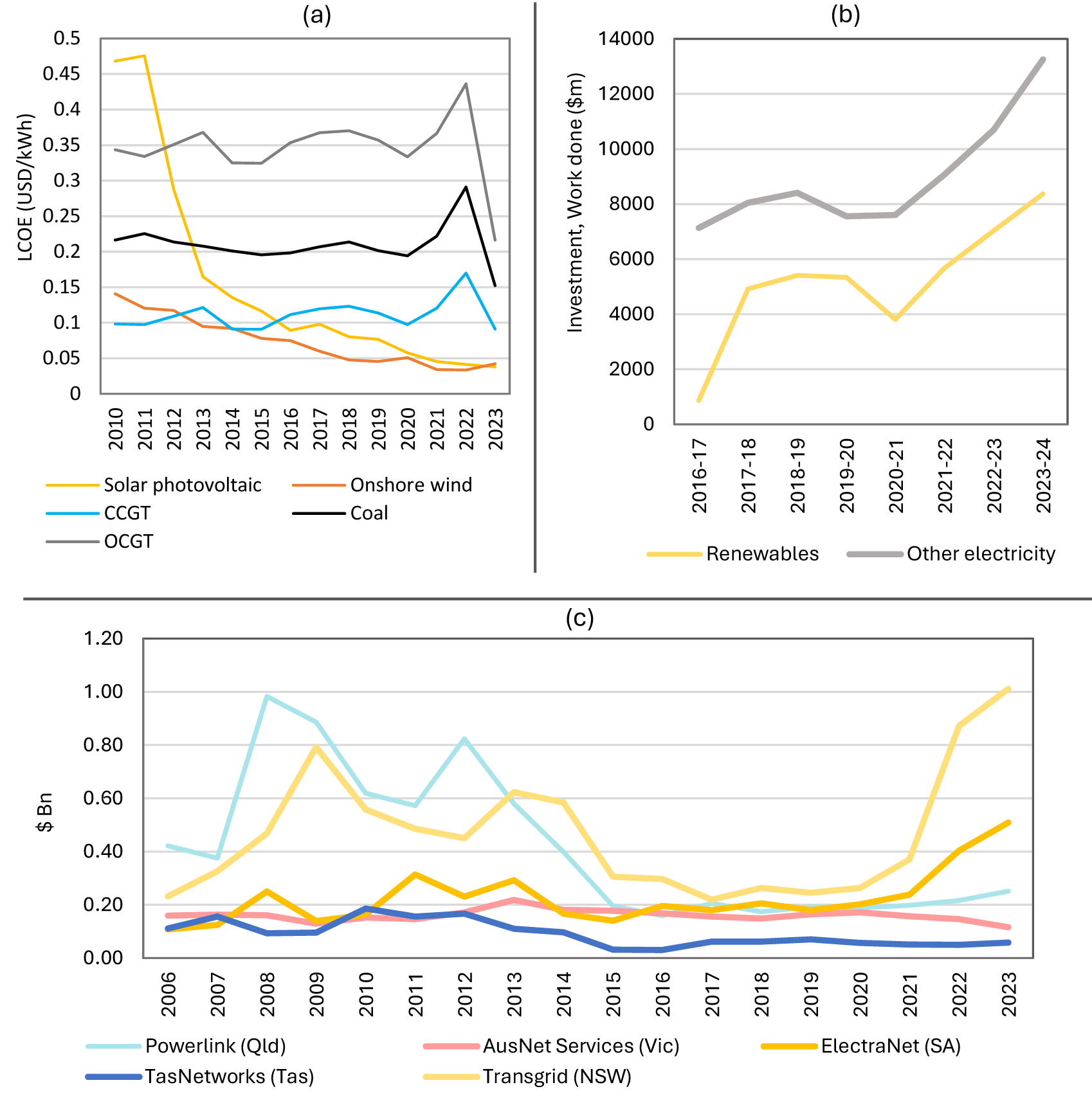
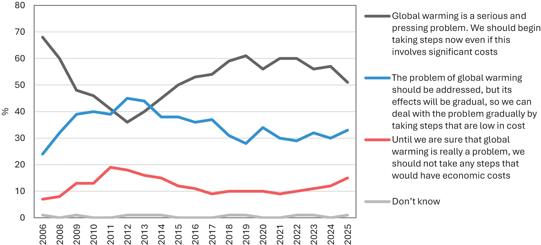
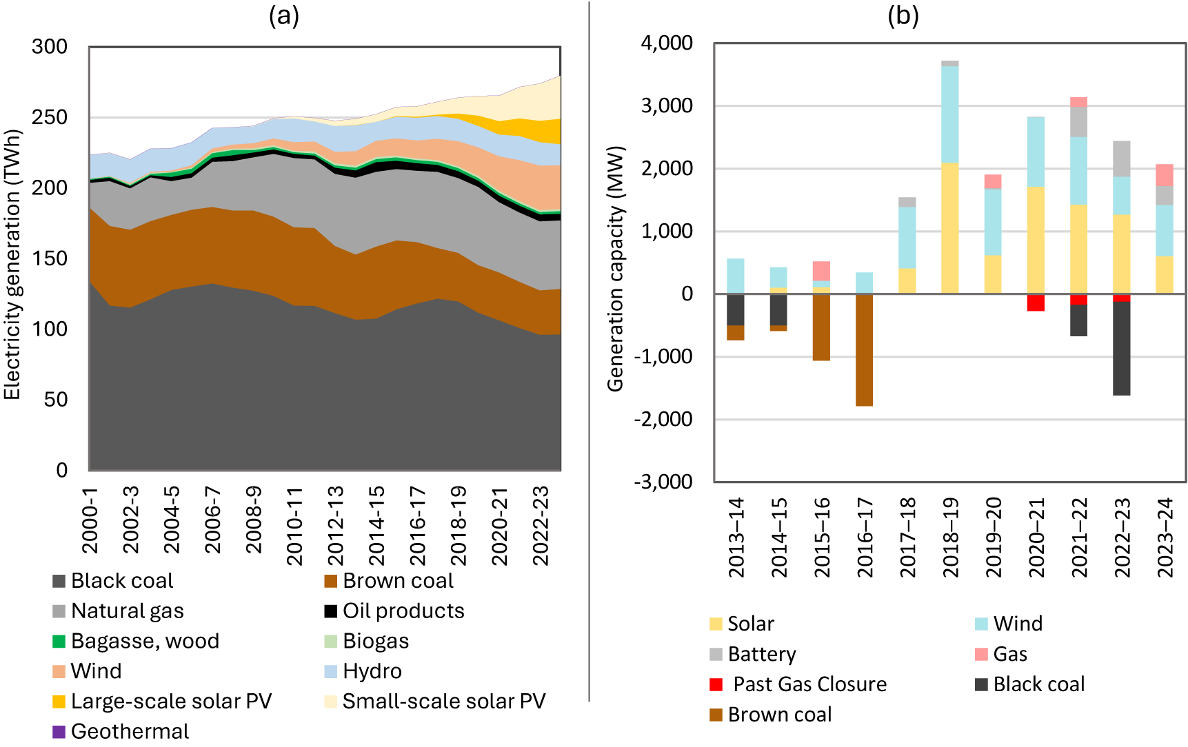
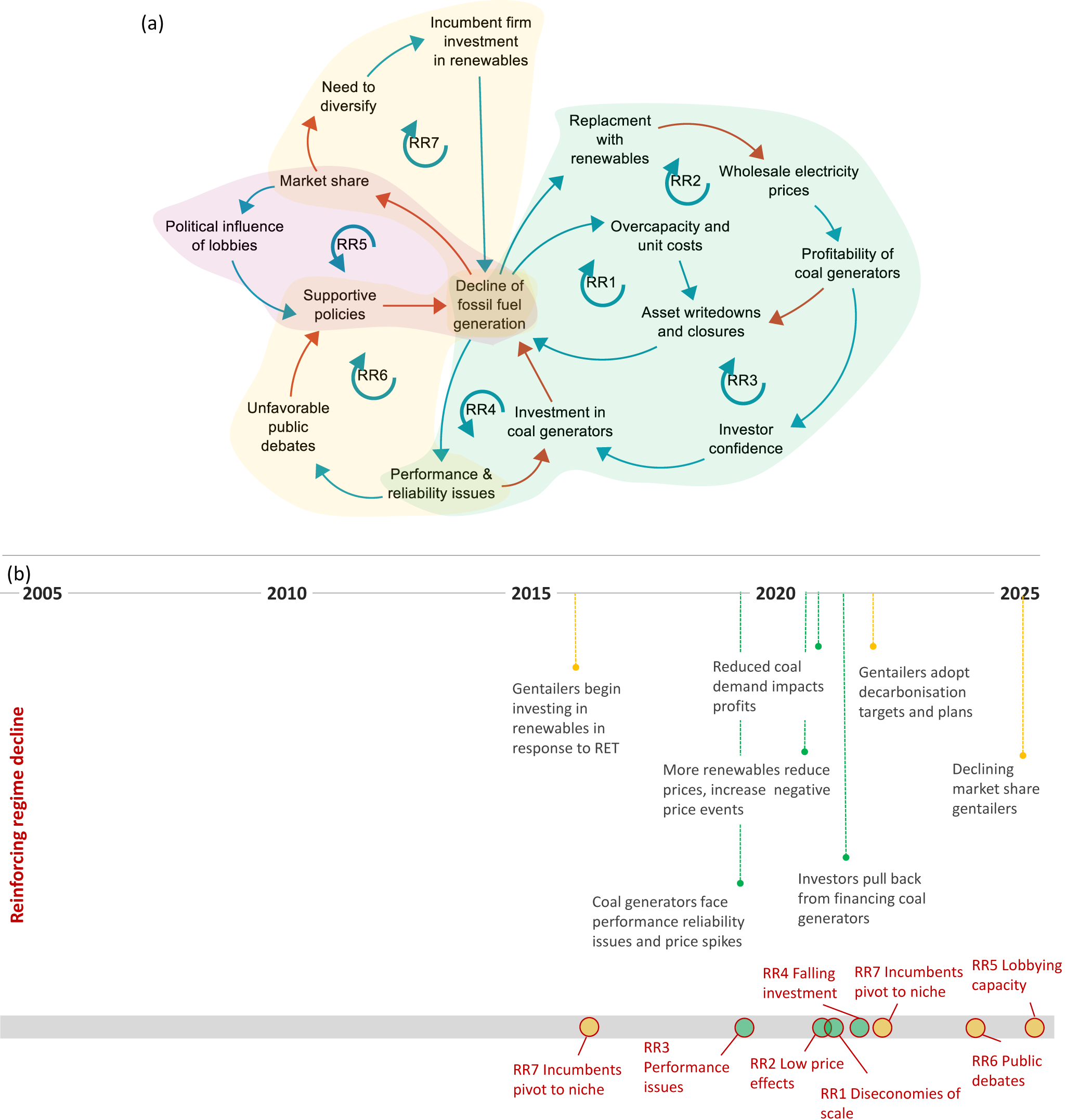
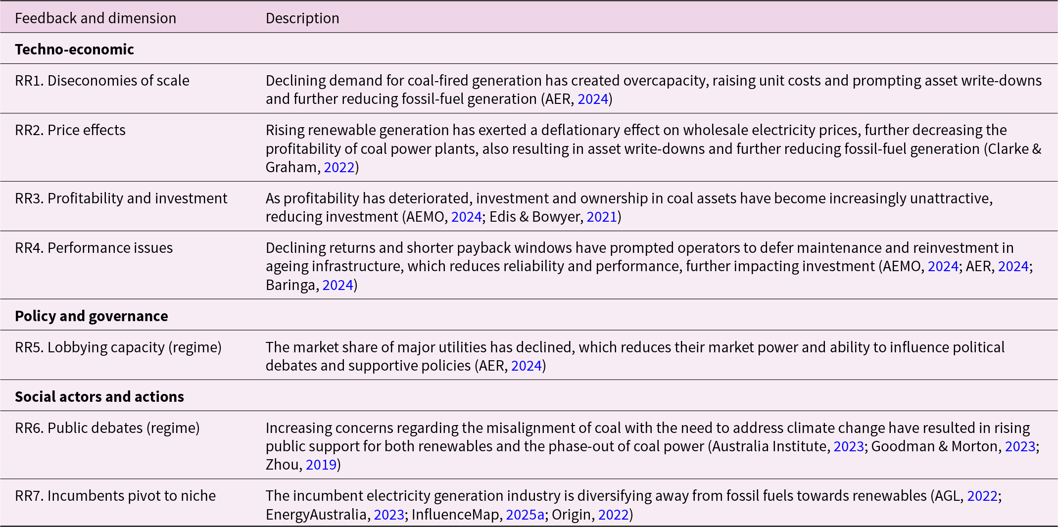
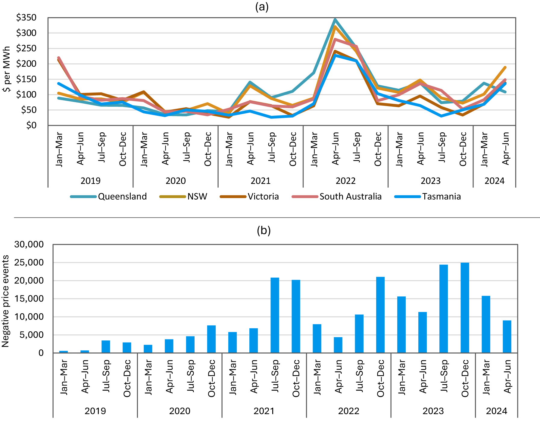
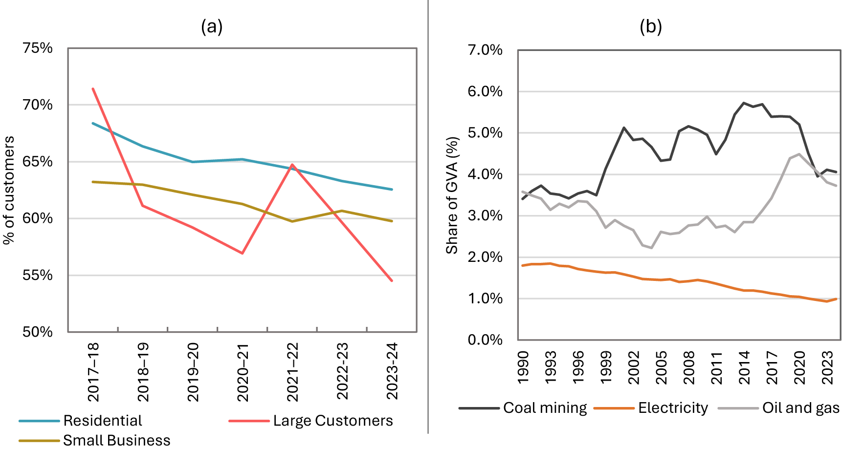
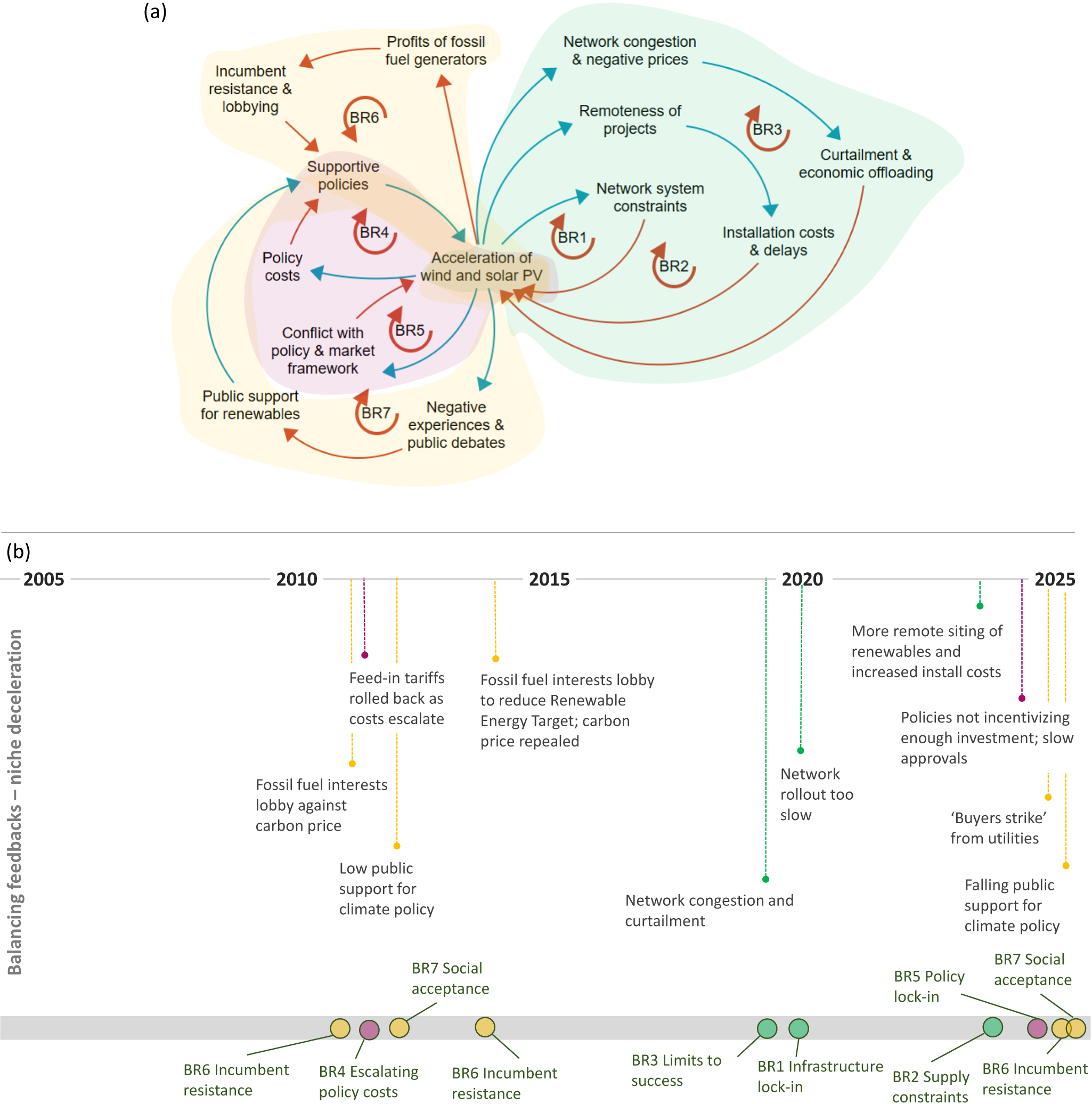
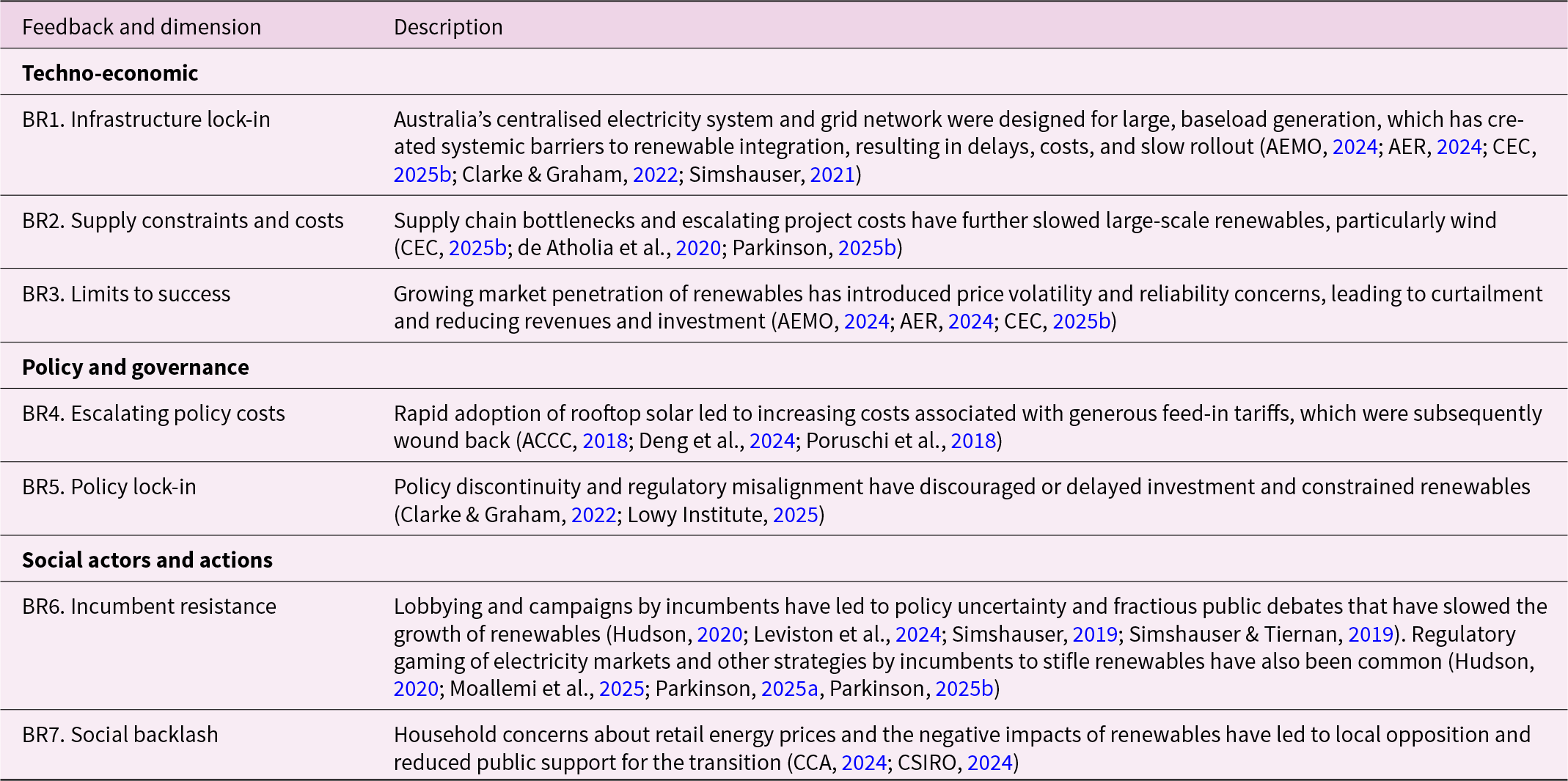
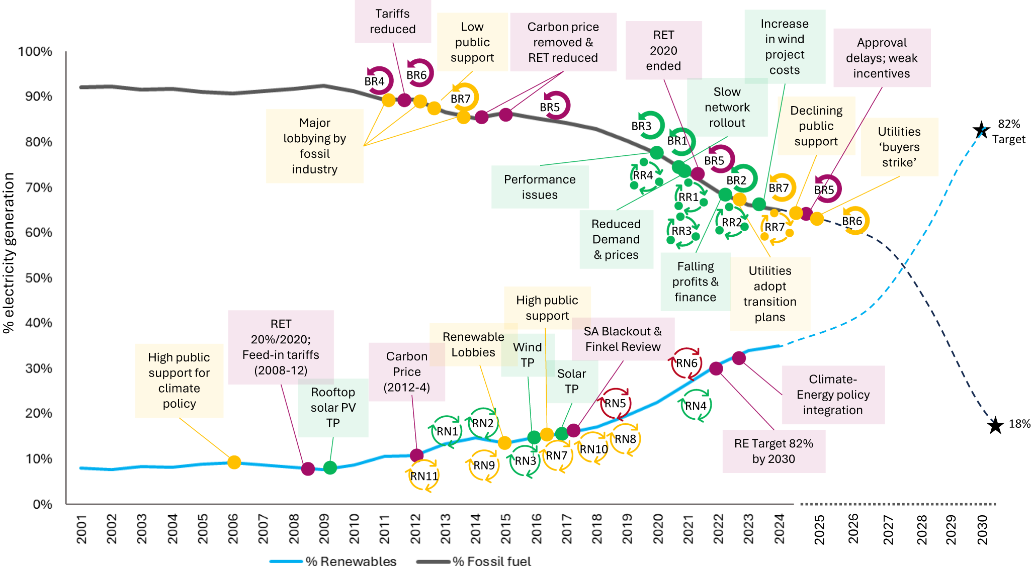


 Open access