

INTRODUCTION
As seen in the 2009 H1N1 influenza pandemic, public health officials may need to forecast the subsequent course of an epidemic based on its initial and emerging characteristics. Previous influenza pandemics have shown that an outbreak can consist of multiple waves with intervening periods of relatively lower disease activity. The 1918 pandemic began with an initial smaller herald outbreak in spring 1918 mostly affecting the USA and Europe, subsiding in summer 1918. A second much larger global wave occurred in autumn 1918, affecting both Northern and Southern hemispheres. After disease activity appeared to decline in January 1919, a third wave followed in late winter 1919 and early spring 1919 [Reference Nicholls1, Reference Taubenberger and Morens2].
Viral pathogen characteristics and behaviour are not necessarily static but can change during an epidemic, which may lead to the appearance of multiple waves. Mutations and environmental factors can affect viral transmission dynamics, virulence, and population and individual host susceptibility and, in turn, alter the course of the epidemic. Various infectious pathogens including influenza, measles, chickenpox, and pertussis have exhibited seasonality in their outbreak and epidemic patterns [Reference Altizer3–Reference Pascual and Dobson10]. Transmission of seasonal influenza tends to substantially increase from November to February in the Northern hemisphere and from May to August in the Southern hemisphere. Studies have postulated a number of possible causes of influenza seasonality, including changes in human mixing patterns, fluctuations in human immunity, and most recently environmental humidity [Reference Shaman and Kohn11, Reference Lowen12]. The influenza virus can also mutate, resulting in either incremental changes (antigenic drift) or more substantial changes (antigenic shift).
Understanding potential changes in transmission dynamics and subsequent effects on the course of an epidemic can be important for public health preparedness. The 2009 H1N1 influenza pandemic emerged in spring 2009, prompting public health officials to forecast what would happen in autumn 2009 and winter 2009–2010. When disease activity increased in September and October 2009, decision-makers wondered whether another (i.e. third) wave might occur during the winter. Public health officials have tried to determine potential response strategies and surge capacity needed on the basis of observed transmission characteristics during the spring outbreak. They also have endeavoured to determine the type of data that should be collected during the early stages of the epidemic to assist forecasting. Computer simulation models can help public health officials make such plans. Mills et al. [Reference Mills13] noted the risk of multiple waves in a pandemic and emphasized the importance of preparedness. Handel et al. [Reference Handel, Longini and Antia14] investigated the optimal intervention strategies for multiple outbreaks under the constraint of limited resources. Existing pandemic simulation models have considered a single wave but did not explicitly model the possibility of multiple waves throughout the pandemic course or transmission characteristics that may lead to multiple waves [Reference Wu15–Reference Germann18]. Some studies have used differential equation models to analyse seasonality and viral mutation in seasonal influenza [Reference Casagrandi19] and measles [Reference Ferrari20] but did not utilize spatial, temporally explicit simulation models; Casagrandi et al. [Reference Casagrandi19] primarily focused on characteristics of annual disease outbreaks.
We constructed a computer simulation model to explore how seasonal changes in transmission dynamics and viral mutation may affect the course of an influenza pandemic. The study aimed to determine what combinations of characteristics would lead to one, two, and three separate epidemic waves and examined the characteristics of the subsequent waves.
METHODS
We developed a spatially and temporally explicit agent-based simulation model and tested it with data from the state of Georgia. The agent-based model is comprised of a population of computer agents, with each agent representing an individual programmed with characteristics and behaviours. Each person (in a total population of 9 071 756) with corresponding relevant socio-demographic characteristics was represented by a computer agent and assigned to a household (∼3 500 000 households in total) according to 2000 U.S. Census Data [21]. Each day, agents moved back and forth between households and workplaces (∼300 000 work groups in total) or schools (∼130 700 classrooms in total) as determined by data from the Georgia Accrediting Commission [22]. Agents interacted with each other in homes, workplaces, schools, and in the community [Reference Ferguson16, Reference Longini17].
At initialization, all persons were susceptible to disease. The disease progression within a person is described by a standard SEIR (Susceptible–Exposed–Infected–Recovered) model [Reference Wu15]. Calibration of the disease and contact model was based on previously published methods [Reference Wu15, Reference Ferguson16]. Additional details are available in the Technical Appendix (available online).
Representation of seasonality
To represent seasonality, we expressed the reproductive rate (R 0) value as a sinusoidal function of time t [Reference Casagrandi19, Reference Stone, Olinky and Huppert23]:
This allowed us to vary R 0 during the course of the epidemic. R 0* is the baseline reproductive rate, and ε (0<ε<1) characterizes the degree of seasonality (see Fig. 1). More temperate regions tend to have a higher ε and lower R 0*; more tropical regions tend to have lower ε but higher R 0* [Reference Casagrandi19]. We directly set the R 0 value (rather than the transmission rate β) as a function of time t; this process closely estimated the changing pattern of β with time in a manner used in previous studies [Reference Colizza6, Reference Grais8, Reference Casagrandi19, Reference Stone, Olinky and Huppert23].
Plot of R 0 value as function of time. The figure shows the baseline reproductive rate R 0*=1·5, degree of seasonality ε=0·07, 0·18, and 0·30. The four intervals represent four different times (January, April, July, October) when the initial seed case appears. Within different intervals, the variation patterns of R 0 are different (e.g. in the first interval, the value of R 0 first decreases then increases; in the third interval, the value of R 0 first increases then decreases).

For computational efficiency, we used linear interpolation to convert the continuous function in equation (1) into a step function with 12 discrete monthly R 0 values (Table 1). The discretization approximated the continuous function with sufficient accuracy [Reference Colizza6, Reference Grais8].
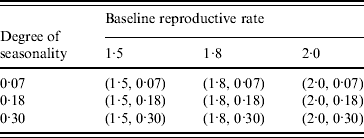
The reproductive rate (R0) value in every month after discretizing the sinusoidal function for seasonality with nine sets of variables' values

† Baseline reproductive rate.
‡ Degree of seasonality.
Representation of viral mutation
To model viral mutation, we introduced a new strain at time t* (i.e. the number of days after the appearance of the initial seed) in the simulation. After the introduction of the new strain at time t*, each day a fraction δ (0<δ<1) of the resistant population lost their immunity (i.e. reverted to being susceptible). This mutation model assumed that the new dominant mutant strain had the same R 0 value as the original strain. Hence, our simulation runs tracked disease spread in the population without distinguishing the infections caused by the original strain from those caused by the new strain, an assumption employed by Ferguson et al. [Reference Ferguson24].
Combination of seasonality and viral mutation
In order to study the joint effect of seasonality and viral mutation on an influenza pandemic, we combined the seasonality and mutation models for some experiments. This combined model assumed that the R 0 value of the circulating strain (either the original or the mutant strain) will change over time in the same manner described by equation (1) and employed the resulting discrete monthly R 0 values for computational efficiency, as described above.
Simulation runs and sensitivity analysis
Table 2 and Figure 1 show the combinations of values for R 0* and ε and different times (January, April, July, October) of the initial seed case (where t 0 denotes the time). Considering the time of emergence of the H1N1 pandemic influenza, we tested three more months in spring for the initial seed case (February, March, May) with the combinations of R 0* and ε as shown in Table 2. This resulted in a total of 63 different experimental seasonality scenarios, and we ran 10 replications of the simulation for each scenario. The time horizon for each replication was 365 days.
Combination of (baseline reproductive rate, degree of seasonality) values in the seasonality experiments
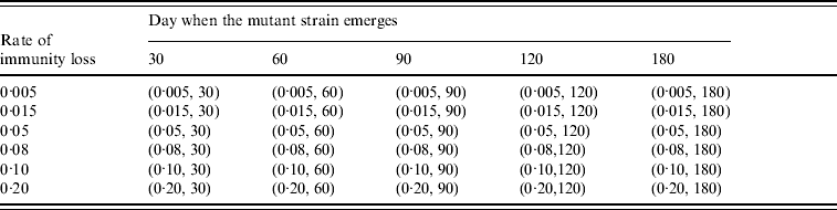
To study the viral mutation, we tested three R 0 values: 1·5, 1·8, and 2·1. These values are consistent with the estimates for R 0 in relevant studies [Reference Wu15–Reference Longini17]. We also explored the effects of using six different values for δ (0·5%, 1·5%, 5%, 8%, 10%, 20%) derived from previous studies [Reference Casagrandi19, Reference Finkenstadt, Morton and Rand25]. Using rough estimates, an antigenic drift occurs on average every 2–8 years, and the antigenic shift occurs approximately three times every 100 years [Reference Carrat and Flahault26]. We considered an epidemic that starts from an antigenic shift (i.e. the population has low immunity to the virus), and tested five values for t* (30, 60, 90, 120, 180) to ensure a comprehensive experimental setting for the antigenic drift. If t* is larger than 180 our simulation showed that it can be considered to be a new epidemic with a smaller susceptible population. The combinations of the (δ, t*) variables are listed in Table 3. The total number of experimental mutation scenarios was 120 with 10 replications for each scenario. The time horizon for each replication was 365 days.
Combination of (rate of immunity loss, day when the mutant strain emerges) values in the mutation experiments
Different specific scenarios with both seasonality and viral mutations were also considered in order to explore the combinations of factors that may lead to a third wave (e.g. simulated time horizon of 500 days and 10 replications with parameters R 0*=1·5, ε=0·3, δ=0·5%, 1·5%, 5%, t*=150, 180, 250, 275, and the pandemic starting in April).
RESULTS
Seasonality scenarios
Figure 2 shows the resulting epidemic curves (i.e. daily prevalence of infected persons) for different combinations of (R 0*, ε, t 0) from the seasonality scenarios. As Figure 2 demonstrates, a pandemic that begins in April can result in two waves (the first in spring and the second in the subsequent autumn/winter), whereas pandemics beginning in January, July, and October did not result in additional waves for the set of variables that we tested. Our simulation also shows that a pandemic starting in March can result in two waves (the first in spring and the second in the subsequent autumn), and no additional waves appear if the pandemic begins in February or May.
Epidemic curves (daily prevalence of infection) for seasonality scenarios. Nine curves in each panel correspond to nine pairs of (R 0*, ε) values. The x axis (northeast horizontal) represents the simulation day, the y axis (southeast horizontal) represents the degree of seasonality (ε), and the z axis (vertical) represents the daily prevalence of infectious cases (the number of symptomatic and asymptomatic persons over the total population). The epidemic starts in four different months: (a) January, (b) April, (c) July, (d) October.

As shown in Figure 2, with ε (the degree of seasonality) held constant, the peak prevalence day for the first wave of the epidemic occurs earlier for higher values of R 0* (baseline value of R 0). In situations where a second epidemic wave occurs, the second wave's peak prevalence day occurs later and the peak value is smaller for lower values of R 0*.
Holding the baseline value R 0* constant, a pandemic that starts in January or October has an earlier peak prevalence day and a higher peak prevalence for higher degrees of seasonality (ε). An epidemic that starts in April or July has a later peak prevalence day and a smaller peak prevalence for higher degrees of seasonality.
Viral mutation scenarios
Figure 3 shows the resulting epidemic curves for different combinations of (R 0, δ, t*) values. The simulation runs suggest that 10 days after the initial wave's peak prevalence may be a critical threshold. Viral mutations introduced before this time did not result in a second wave but increased the initial wave's peak prevalence and delayed the peak prevalence day. However, a viral mutation introduced after this time could result in a second wave. Moreover, after this time threshold, the later the viral mutation emerged, then the later the peak prevalence of the second wave came, if it occurred.
Epidemic curves (daily prevalence of infection) for mutation scenarios. Each panel contains six curves corresponding to six pairs of (δ, t*) values (δ=0·05 and 0·10, t*=60, 90, and 180). The x axis represents the simulation day, and the y axis represents the daily prevalence of infectious cases (the number of symptomatic and asymptomatic persons over the total population). The subfigures show different reproductive rates (a) R 0=1·5, (b) R 0=1·8, (c) R 0=2·1.

Not all viral mutations introduced after the time threshold resulted in a second wave. A loss of immunity rate (δ) smaller than 1% daily seemed to prevent the appearance of a second wave. Second waves appeared only when δ was above 1%. Additionally, a higher δ resulted in an earlier peak prevalence day and a higher peak prevalence for the second wave, if one exists.
Figure 4 shows that when R 0=1·5 and δ=0·05, the peak prevalence of the second wave increases as t* increases from 90 to 180. However, when δ increases to 0·10, the peak prevalence of the second wave decreases as t* increases from 90 to 180. Table 4 and Figure 5 depict the effects of varying δ, t*, and R 0.
Percentage of susceptible population (number of the daily susceptible persons over the total population) and the daily prevalence of infection. R 0=1·5 and the loss immunity rate δ=0·05 and 0·10. The curves are plotted with different scaling. The upper curves, which correspond to the susceptible population, use the scale on the left y axis; the lower curves, which correspond to the prevalence of infection, use the scale on the right y axis.

Plot of the peak prevalence value as a function of t*. The value of the peak prevalence (maximum number of daily symptomatic and asymptomatic persons over the total population) in the second wave is plotted as a function of t*, the day when the mutant strain emerges. The subfigures show different reproductive rates (a) R 0=1·5, (b) R 0=2·1, and each panel contains two curves corresponding to two values of the loss immunity rate δ (δ=0·05 and 0·10).

The peak prevalence value in the second wave varies as the mutant strain emerges later
+ The value of the peak prevalence is higher if the mutant strain emerges later.
− The value of the peak prevalence is lower if the mutant strain emerges later.
Seasonality and viral mutation scenarios
Certain combinations of seasonality and mutation variables (e.g. R 0*=1·5, a degree of seasonality ε=0·3, and a loss of immunity rate δ=0·015) were able to reproduce three-wave epidemic curves similar to those seen in the 1918 pandemic (Fig. 6 a). The first case was introduced in April and the mutant strain emerged 275 days after the initial seed infection. The simulated time horizon spanned 500 days to include the third wave. Applying a constant mortality rate [Reference Wu15] reproduced the shapes of the observed 1918 pandemic mortality curves very closely (see figures in [Reference Nicholls1, Reference Taubenberger and Morens2]). Similarly, we were able to reproduce the epidemic curves for 1957 [Reference Hall27] using one mutation scenario (R 0=1·5 and the loss of immunity rate δ=0·05). The epidemic began in August and the mutant strain emerged at day 90 (Fig. 6 b). Applying a constant mortality rate reproduced the shape of the observed 1957 pandemic mortality curves [Reference Hall27]. For the pandemic in 1968 [Reference Viboud28], setting R 0=1·5, consistent with estimates from the literature [Reference Hall27], and simulating without seasonality or viral mutation reproduced the epidemic curves observed (Fig. 6 c).
Reproduced epidemic curves for the 1918, 1957 and 1968 pandemics. The x axis represents the simulation day, and the y axis represents the daily prevalence of infectious cases (the number of symptomatic and asymptomatic persons over the total population). (a) Three prevalence peaks can occur with a baseline reproductive rate R 0*=1·5, degree of seasonality ε=0·30, loss of immunity rate δ=0·015. The epidemic starts in April and the mutant strain emerges at day 275. (b) Simulating a mutation scenario with R 0=1·5 and loss of immunity rate δ=0·05. The epidemic starts in August and the mutant strain emerges at day 90 (November). (c) Simulating with R 0=1·5 (without mutation or seasonality). The epidemic starts in October.

As described earlier, without seasonality, a second wave would not appear if the loss of immunity rate was below 0·01 or the virus mutated before 10 days after the initial wave's peak. However, with seasonality added, we found scenarios where a third wave could occur if the loss of immunity rate was greater than 0·005, a viral mutation emerged after 180 days from the initial seed case, and the degree of seasonality was equal to 0·18. (In these cases, the first two waves reflected seasonal effects, and the third wave resulted from the viral mutation.)
DISCUSSION
Our study shows how changing variables designed to represent seasonality and influenza virus mutation can substantially alter the course of an influenza pandemic. When representing pandemic seasonality with a sinusoidal function, we demonstrated how varying a seasonality factor can transform the epidemic curve and result in one or two additional waves. Additionally, the month that a pandemic first appears could help determine whether a second wave may occur.
Specifically, an epidemic starting in January (in the Northern hemisphere) with a high reproductive rate (R 0) may infect too many susceptibles (in turn, producing too many immune persons) to allow for a second wave to occur [Reference Handel, Longini and Antia14, Reference Anderson and May29–Reference Hill and Longini31]. An influenza epidemic that begins in April has only a short time-frame to infect susceptibles before summer before the R 0 value decreases. As a result, the first wave is relatively mild, leaving a large population of susceptibles remaining to be infected in autumn, when the R 0 value rises again. This situation provides a fertile ground for a second wave. Epidemics that start in July may not have a large enough R 0 to generate an epidemic curve until autumn. Similar to those starting in January, an epidemic starting in October rapidly affects a large number of persons (leaving relatively fewer susceptible persons) so that a second wave may not be possible.
The time in which a viral mutation emerges may also affect the peak prevalence, the timing of the peak, and whether a second wave occurs. Viral mutations that emerged more than 10 days after the peak prevalence day accompanied by a loss of immunity rate of more than 1% of the recovered population can lead to a second wave.
When a viral mutation leads to a second wave, the characteristics of the second wave depend on the value of R 0, the emergence time of the mutant strain (t*) and the loss of immunity rate (δ). The variations in the value of the peak prevalence in the second wave (Fig. 5) are related to the force of infection, which is the rate at which susceptible persons are infected by the virus; this rate is higher if there are more infectious persons. The prevalence of infections depends on the current value of the force of infection as well as the number of susceptible persons. Holding other parameters fixed, if the mutation begins earlier, then the value of the force of infection is higher because the first wave has not completely disappeared and the number of infectious persons is higher; if the mutation begins later, the number of susceptible persons is higher because the recovered pool is larger (Fig. 4). According to the simulation (Fig. 4, Table 4), when R 0=1·5 with a loss of immunity rate δ=0·10, the first factor dominates, although the second factor dominates when rate δ=0·05.
Furthermore, we found certain variable combinations that can lead to three epidemic waves (e.g. the initial case appears in April followed by a viral mutation and seasonality effects). A three-wave epidemic curve similar to the 1918 pandemic [Reference Nicholls1, Reference Taubenberger and Morens2] takes place when R 0*=1·5, the degree of seasonality ε=0·3, the loss immunity rate δ=0·015, and the mutant strain emerges 275 days after the initial seed case.
Implications for public health
As the 2009 influenza epidemic (H1N1) has demonstrated, public health officials and other decision-makers must plan and execute strategies not only before an epidemic emerges but also throughout its course. Within a limited time window, they also must determine what data needs to be collected to facilitate forecasting and planning. Early characterization of the ambient circumstances and the emerging viral characteristics may help predict the behaviour of the epidemic and the corresponding intervention requirements. When an epidemic emerges in spring, for example, a noteworthy concern is whether the epidemic will re-emerge with greater or less severity in the following autumn. Our simulation suggests that decision-makers may want to watch for certain characteristics such as the month the epidemic started and the rate at which recovered patients are being re-infected to aid their forecasts. If a second wave is possible, then decision-makers can plan medical supplies, personnel staffing, and education of the public accordingly, and the time gained for planning may even allow for a vaccine to be developed.
Additionally, our simulation study confirms the importance of active surveillance and virus typing during the course of an epidemic. A viral mutation that emerges during the downward slope of an initial wave may take public health officials by surprise. It is valuable to closely monitor patients who have already been infected and detect new strains as soon as they emerge. Without this additional information, the gross epidemiological behaviour of an initial wave can be very deceptive.
Finally, re-creating a three-wave epidemic may help shed additional light on the 1918 pandemic, which has been the source of much of the scientific and preparedness communities' understanding of influenza epidemics. Our simulation offers a profile of conditions that may have been present in 1918.
Limitations
Computer models and simulations by definition are simplifications of real life. They include a number of assumptions and cannot fully capture every possible factor or effect. Computer simulations can help delineate possible relationships and understand the importance of various questions and characteristics. Caution should be used when attempting to make definitive forecasts. The current results may not be generalizable to all locations and conditions.
Conclusions and future directions
Our study demonstrated how different seasonal effects and the timing and degree of viral mutation can substantially alter the course of a pandemic. Early characterization of the ambient circumstances and the emerging viral characteristics may help public health officials and other decision-makers predict the subsequent behaviour of an epidemic and the corresponding intervention requirements. Further, the advance notice of potential subsequent waves can help improve planning decisions. Future studies may look at the effectiveness of different public health interventions [Reference Wu15–Reference Germann18] in many of our simulated scenarios.
NOTE
Supplementary material accompanies this paper on the Journal's website (http://journals.cambridge.org/hyg).
ACKNOWLEDGEMENTS
The authors thank Ali Ekici for sharing his C++ code for the spatial-temporal agent-based disease spread model and Joseph T. Wu for sharing his C++ code for the basic disease spread model. This work was supported by grants from the Harold R. and Mary Anne Nash Junior Faculty Endowment Fund (P.S., P.K., J.L.S.); the Focused Research Program in Humanitarian Response in the College of Engineering at Georgia Tech (P.S., P.K., J.L.S.); the National Institutes of Health (NIH) National Institute of General Medical Sciences (NIGMS) Models of Infectious Disease Agent Study (MIDAS); and the National Library of Medicine (NLM) (B.Y.L.). The funders had no role in study design, data collection and analysis, decision to publish, or preparation of the manuscript.
DECLARATION OF INTEREST
None.


