

Introduction
Methods to map alleles responsible for variation in a particular trait rely on detecting linkage between known marker alleles and the trait (Sax, Reference Sax1923; Thoday, Reference Thoday1961). In experimental crosses, linkage is inferred from statistical correlations between marker and phenotype in the progeny of a cross between two inbred lines that differ in trait value (Broman, Reference Broman2001). In order to achieve reasonable power in detecting linkage, large numbers of cross progeny need to be genotyped and phenotyped. Consequently, this procedure can be very time consuming and expensive. Selective genotyping (Lander & Botstein, Reference Lander and Botstein1989; Darvasi & Soller, Reference Darvasi and Soller1992) reduces time and costs by only analysing cross progeny with extreme phenotype, as these individuals provide the most linkage information. When analysing only the extreme progeny, one can use changes in marker allele frequency in the selected group to infer linkage (Lebowitz et al., Reference Lebowitz, Soller and Beckmann1987). Markers that are linked to alleles that influence the trait should change in frequency in the selected group, whereas the frequency of unlinked markers should remain unchanged.
This strategy of using change in marker allele frequency to detect linkage is usually employed when DNA pooling is used. Rather than individually genotyping each progeny in the selected group, DNA is pooled from all individuals in the group and marker frequencies are estimated from the intensities of marker bands (or similar signals) in the pooled DNA. This further reduces time and costs. This method is often referred to as bulk segregant analysis (Michelmore et al., Reference Michelmore, Paran and Kesseli1991) or selective DNA pooling (Darvasi & Soller, Reference Darvasi and Soller1994).
The other main occasion when marker frequencies are used to detect linkage is in artificial selection experiments, where two lines are divergently selected (Keightley & Bulfield, Reference Keightley and Bulfield1993; Nuzhdin et al., Reference Nuzhdin, Keightley, Pasyukova and Morozova1998, Reference Nuzhdin, Harshman, Zhou and Harmon2007). This strategy is used for quantitative traits, where the aim is to have many generations of sexual reproduction and selection, so that much greater phenotypic variation is produced than is present in an F2 or backcross population. The more extreme phenotypes generated result in larger differences in marker allele frequencies between the two lines, making it easier to detect linkage. Furthermore, an added advantage of this method is that the increased number of recombination events (due to the several generations of sexual reproduction) may result in greater mapping resolution.
In all these methods that use change in allele frequency to detect linkage, one must measure the phenotype of the progeny in the F2/backcross population or in each generation in an artificial selection experiment to pick out the tails of the phenotypic distribution. In most studies, the cross progeny are sexual and the phenotype is measured in standard ways. However, when the cross progeny are asexual one can use selection to measure the phenotype. Artificially selecting the asexual cross progeny over many generations is equivalent to picking out the tail of the phenotypic distribution of sexual progeny in a single generation. The longer one selects the asexual progeny (and the larger the initial population), the more extreme the tail of the phenotypic distribution that is selected. This method has recently been used in gene mapping studies in microbes.
One such method is array-assisted bulk segregant analysis (Brauer et al., Reference Brauer, Christianson, Pai and Dunham2006), which has been used to map traits in yeast. Here, yeast strains differing in genetic background and trait value are crossed. The resulting asexual progenies are individually measured by selecting for the trait over a number of generations. A group of the selected individuals is then pooled to detect linkage. In this particular method, the allele frequencies are estimated by hybridizing the pooled DNA to a microarray.
When using this strategy in asexual cross progeny, one could also measure the phenotype directly within a pool of recombinant progeny. That is, rather than individually selecting each asexual recombinant and then pooling, one could pool the cross progeny together at the start and then select for the trait directly on this pooled progeny. The selected pool is then used to detect linkage. An example of this strategy is Linkage Group Selection (Culleton et al., Reference Culleton, Martinelli, Hunt and Carter2005; Martinelli et al., Reference Martinelli, Cheesman, Hunt, Culleton, Raza, Mackinnon and Carter2005), which has been used to map genes in malaria parasites. Here, once again malaria parasites with differing genetic background and trait value are crossed. The resulting asexual cross progenies are pooled and selected for the trait for many generations. Linkage is then determined by estimating changes in marker allele frequency from the selected pool. Similar strategies have been used in studies of yeast (Segre et al., Reference Segre, Murray and Leu2006; Ehrenreich et al., Reference Ehrenreich, Torabi, Jia, Kent, Martis, Shapiro, Gresham, Caudy and Kruglyak2010).
When using this method in asexual progeny, it is important to ensure that the changes in marker allele frequency in the selected pool are due to linkage to a selected allele and not just a result of random drift. Previous models (Lebowitz et al., Reference Lebowitz, Soller and Beckmann1987; Kim & Stephan, Reference Kim and Stephan1999) that have dealt with changes in marker allele frequency in gene mapping experiments, have focused on artificial selection experiments in sexual progeny and examined changes in marker frequency as a result of several generations of sexual reproduction and selection. In this paper, however, we provide the basic theoretical framework for the strategy of picking out the extreme individuals in pooled asexual progeny by selecting for the trait over many generations. We concentrate on Mendelian traits and derive the distribution of marker frequency in a selected pool as a result of selection at just a single major locus. We show from this how large the initial population size should be in order to avoid spurious changes in marker allele frequency.
Theory
Model
A cross is made between two haploid lines that differ in trait value. This cross results in N haploid recombinant progenies each containing a random assortment of marker alleles from the parental lines, with each marker having an expected frequency of 0·5. We will concentrate on the simplest situation of a binary trait where the variation in phenotype between the two lines is due to just one major locus. A fitness advantage is assigned to the recombinants that contain the positive allele (i.e. the allele that increases the value of the trait), and so the initial population consists of two fitness classes. This recombinant population is then selected for the trait over many generations. As this population is asexual, no further recombination takes place during this multi-generation selection phase. It is assumed that selection is applied for long enough so that only recombinants originating from the fitter class remain in the final population. Therefore, the positive allele should be fixed in the selected population, and because there is only one round of recombination, markers in a large region around the selected locus should also be at a higher frequency. The frequencies of markers in all other regions of the genome are expected to remain unchanged. So, from this model, we are interested in analysing the frequency of all markers in the selected population, and the stochasticity that arises in this frequency due to finite population size.
Deterministic expectation
If selection is continued until the fitter class of recombinants fix in the population, then the selected allele will be at frequency 1. The expected frequency of all other markers in the selected population would be equal to the probability that the marker in question was on the same genotype as the selected allele in the initial population. For the positive markers (fitter parental markers), this probability would simply be 1−r, and for the negative markers (less fit parental markers) it would be just r, where r is the probability of recombination between the selected allele and the marker in question.
Stochastic distribution
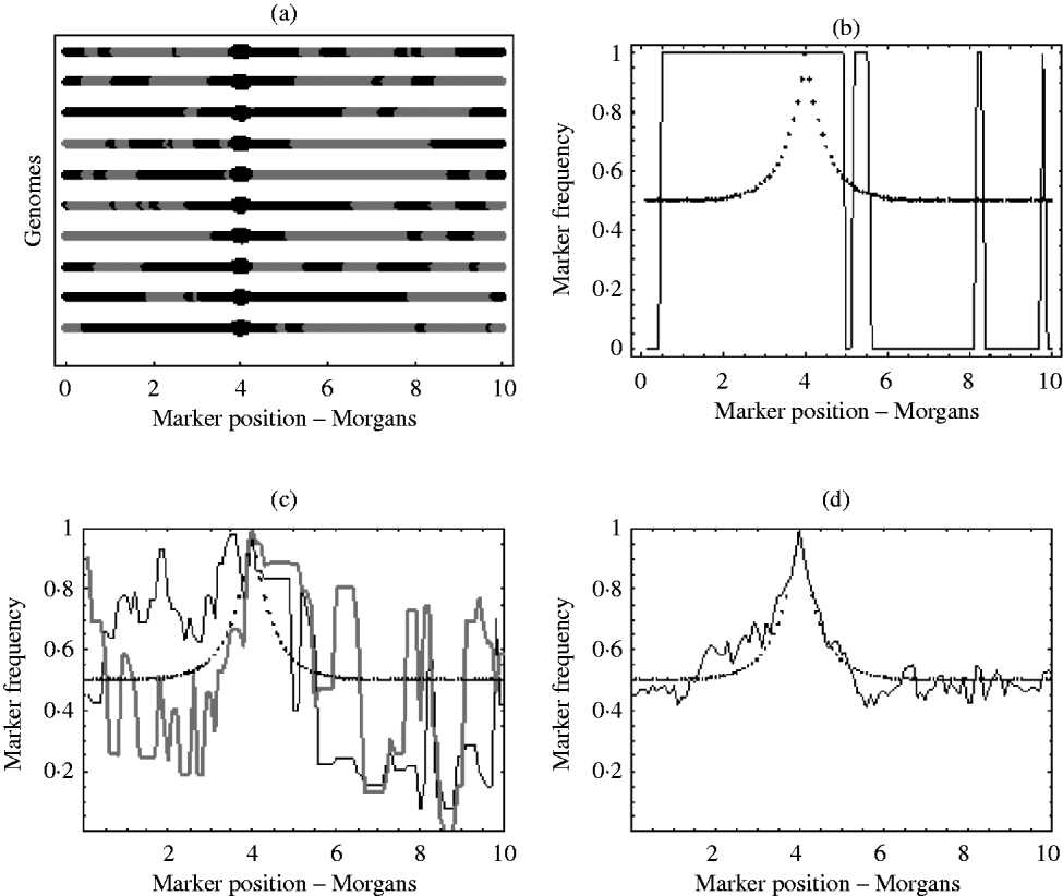
With an infinite number of recombinants, the marker frequency will approach the deterministic expectation, but finite numbers will lead to variation around this expectation. In the extreme, suppose there was just one recombinant with the positive allele in the initial population. The typical marker composition of this recombinant will look like one of those given in Fig. 1 a. As this single recombinant is the fittest in the initial population, selection (if applied for long enough) will pick out only its descendants. Therefore, all recombinants in the selected population will have exactly the same marker composition. Hence, the final marker frequencies will look like those in Fig. 1 b, where a marker is either fixed or not present at all. With more than one initial recombinant with the positive allele present in the initial population, there will be initially much more diversity in the marker composition, but this diversity may not be reflected in the final population. For example, suppose there were 10 initial recombinants with the positive allele, each with a different marker composition. Again, selection will pick out only the descendants originating from these 10 initial recombinants. However, the number of descendants that each recombinant actually leaves may be highly random. One may leave no descendants in the final population, while another may leave hundreds. Consequently, some markers will be over represented in the selected population, which can be seen from Fig. 1 c results in a very random pattern of marker frequency. This randomness is reduced by increasing the number of recombinants with the positive allele in the initial population. This results in a more balanced representation of all markers in the selected population. It can be seen from Fig. 1 d that with this increase in the number of recombinants with the positive allele in the initial population, the marker frequencies approach the deterministic expectation, enabling much easier identification of the selected locus.
(a) Each line represents the typical marker composition of a single recombinant with a selected allele at position 4 on the genome represented by a circle. The black parts represent the fitter parental markers (positive markers) and the grey parts represent the less fit parental markers (negative markers). (b) Plot of the positive marker frequency in the selected population when there is just a single recombinant (the first genome in (a)) in the initial population. (c) The black and grey curves show two replicates of the positive marker frequencies in the selected population when all ten recombinants from the first graph are present in the initial population. It can be seen that the two replicates do not give the same frequencies. This reflects the random number of descendants each recombinant left in each replicate. (d) This shows the frequency of the positive markers in the selected population when there are 100 recombinants with the positive allele in the initial population. In (b), (c) and (d) the dotted curve represents the deterministic expectation for the positive marker frequency, which is 1−r, where r is calculated from the Haldane map function r=1/2 (1−e−2x), and x is the map distance between the marker and selected locus.
So, in order to evaluate how much stochasticity in the marker frequency would be expected for a certain initial population size, we will next derive the distribution of the marker frequency in the selected population. From this, it is possible to calculate how large the initial population size needs to be in order to avoid spurious changes in marker frequency, and also work out the probability of getting false positives when we do have large stochasticity in frequency.
Branching process
To derive the distribution of marker frequency, the distribution of the number of descendants originating from a single recombinant needs to be obtained. This can be modelled as a branching process. That is, at each generation each selected recombinant leaves a number of offspring ξ, with mean μ and variance σ2. This process can be modelled by the probability generating function ![]() , where Pk
is the probability that ξ=k. This represents the offspring distribution of a single recombinant for a single generation. This can be extended to get the offspring distribution after t generations by t iterations of f(z). That is, ft
(z)=f(f( …(f(z)) …)). So, if we let X denote the number of descendants originating from a single recombinant after t generations, we have that X has distribution ft
(z). Obtaining probabilities from ft
(z), however, can be computationally intensive, so instead just the moments of X will be outlined. From the properties of generating functions we have that the mean E(X) and variance Var(X) of the number of descendants originating from a single recombinant after t generations is given by (1) and (2) (Jagers, Reference Jagers1975):
, where Pk
is the probability that ξ=k. This represents the offspring distribution of a single recombinant for a single generation. This can be extended to get the offspring distribution after t generations by t iterations of f(z). That is, ft
(z)=f(f( …(f(z)) …)). So, if we let X denote the number of descendants originating from a single recombinant after t generations, we have that X has distribution ft
(z). Obtaining probabilities from ft
(z), however, can be computationally intensive, so instead just the moments of X will be outlined. From the properties of generating functions we have that the mean E(X) and variance Var(X) of the number of descendants originating from a single recombinant after t generations is given by (1) and (2) (Jagers, Reference Jagers1975):
Moments
Using (1) and (2) it is possible to obtain the mean, variance and covariance of the number of copies of each marker in the selected population. Consider an initial population of size N and a single marker m. Let Sm
be the number of copies of that marker in the selected population. We have that ![]() , where n is a random variable representing the initial number of recombinants that had marker m. Expressions for the moments of Sm
are derived in the Appendix. Now, let Fm
=Sm/St
be the frequency of marker m, where St
is the total number of recombinants in the selected population. Obtaining exact expressions for the moments of Fm
in the selected population is mathematically difficult, so approximations will be used instead. These approximations are given by (3)–(5). They are derived from the moments of Sm
and St
(derivation detailed in the Appendix). In (3) and (4), Pm
is the probability that marker m is on the fittest genotype (Pm
=r if m is a negative marker and Pm
=1−r if m is a positive marker). In (5), Cov (
, where n is a random variable representing the initial number of recombinants that had marker m. Expressions for the moments of Sm
are derived in the Appendix. Now, let Fm
=Sm/St
be the frequency of marker m, where St
is the total number of recombinants in the selected population. Obtaining exact expressions for the moments of Fm
in the selected population is mathematically difficult, so approximations will be used instead. These approximations are given by (3)–(5). They are derived from the moments of Sm
and St
(derivation detailed in the Appendix). In (3) and (4), Pm
is the probability that marker m is on the fittest genotype (Pm
=r if m is a negative marker and Pm
=1−r if m is a positive marker). In (5), Cov (![]() ) refers to the covariance in frequency between two markers m 1 and m 2, and
) refers to the covariance in frequency between two markers m 1 and m 2, and ![]() is the probability that both markers m 1 and m 2 are on the fittest genotype.
is the probability that both markers m 1 and m 2 are on the fittest genotype.
Diffusion approximation
Although expressions for the moments of the number of copies of a marker and moments for the frequency of a marker have been obtained, in order to obtain a tractable expression for the distribution of these, we need to use a diffusion approximation. Diffusion theory predicts (Feller, Reference Feller1951) that starting with n 0 recombinants, after a long time, given that they survive, the numbers will increase as n 0xest , where 0<x<∞ is a measure of the acceleration relative to the expectation n 0est , and its distribution is given by
where I 1(x) is the modified Bessel function and s=log(μ). For small n 0s, eqn (6) approximates to an exponential distribution. So, as an approximation we can try and use an exponential distribution for the distribution of numbers from a single recombinant. The expected value λ− 1 for the exponential distribution would be the expected x of a single recombinant given that its descendants have survived in the selected population. We have that the probability of survival PS =1–ft (0), and thus λ− 1=PS −1. So, therefore we get (7) as an approximation for the distribution of x
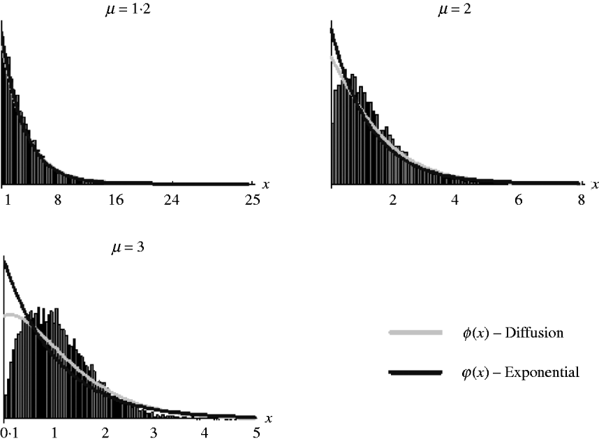
It should be noted, however, that as (7) is an approximation derived from the diffusion result, which itself is an approximation of the general branching process, it is not expected that it will work well in all situations. Figure 2 shows the goodness of fit of (6) and (7) for simulated data. It can be seen that both work well for weak selection but decline in goodness of fit for strong selection. So, in the following section, we will use (7) to derive the distribution of marker frequency for situations when fitness is not too high, but as we shall show later, for large fitness we can in most cases use a normal approximation for the distribution of frequency using the moment calculations (3)–(5).
Distribution of the relative numbers from a single recombinant given that its descendants have survived in the selected population. The diffusion curve represents (6) with parameters n 0=1 and s=log(μ), and the exponential curve represents (7). The number of generations of growth were t={20, 10, 10} for μ={1·2, 2, 3}. The offspring distribution per generation was Poisson.
Distribution of marker frequency
We will assume that the distribution of the number of descendants from a single recombinant, given that its descendants have survived in the selected population, is an exponential distribution with expectation E(X)PS−
1. Now consider an initial population of size N and a single positive marker m + a recombination rate r away from the selected locus. We have that the number of copies of m + in the selected population is given by ![]() , where each Xi
is exponentially distributed and n 1 is a binomially distributed random variable with expectation
, where each Xi
is exponentially distributed and n 1 is a binomially distributed random variable with expectation ![]() . Thus, Sm
+ is distributed as Γ(n 1, E(X)PS−1
), where Γ represents a Gamma distribution (i.e. a sum of exponential distributions). So, the frequency of m + in the selected population would be defined as Sm
+/(Sm−
+Sm
+), where Sm−
is the number of negative markers at that locus in the selected population, which has distribution Γ (n 2, E(X)PS−
1), where
. Thus, Sm
+ is distributed as Γ(n 1, E(X)PS−1
), where Γ represents a Gamma distribution (i.e. a sum of exponential distributions). So, the frequency of m + in the selected population would be defined as Sm
+/(Sm−
+Sm
+), where Sm−
is the number of negative markers at that locus in the selected population, which has distribution Γ (n 2, E(X)PS−
1), where ![]() . Hence, the distribution of marker frequency is a Beta distribution B(n 1, n 2). Averaging over n 1 and n 2, we get (8) as the probability density function for a positive marker frequency u, where
. Hence, the distribution of marker frequency is a Beta distribution B(n 1, n 2). Averaging over n 1 and n 2, we get (8) as the probability density function for a positive marker frequency u, where ![]() and
and ![]() .
.

It should be noted that as the Beta distribution is only defined for n 1,n 2>0, f(u) does not take into account the case where there are zero copies of a particular marker at the locus (i.e. n 1=0 or n 2=0). This results in the density function f(u) excluding the probability that a marker is fixed or lost in the selected population. Therefore, the true density function is given by f(u)+P(u=0)+P(u=1), where P(u=0) is the probability that the marker is lost, and P(u=1) is the probability that the marker is fixed. If we again focus on a positive marker m +, we have that P(u=1)=(1−(1−p 1)N )(1−p 2)N , where (1−(1−p 1)N ) is the probability that at least one recombinant with marker m + survives in the selected population, and (1−p 2)N is the probability that no recombinants with the negative marker at that locus survives in the selected population. Similarly, P(u=0)=(1−(1−p 2)N )(1−p 1)N . It should be noted that the inclusion of these two probabilities is only really needed in the cases where the initial population size is very small or when a marker is extremely close to the selected locus, as the probability of a marker being fixed or lost in other situations is negligible.
Figure 3 illustrates the goodness of fit of this approximation for various different parameters. We see, as expected, eqn (8) works well for small fitness but goodness of fit declines as fitness gets larger. For large fitness, however, assuming N is not too small, we can approximate the distribution of frequency by using a normal distribution with mean and variance given by (3) and (4). It can be seen from Fig. 3 c, d that the normal distribution provides a good approximation when the initial population is not too small.
Distribution of frequency for unlinked markers for a small initial population size of N=15 and a larger initial population size of N=100. For each of the initial population sizes, the distribution of frequency is plotted for small fitness μ=1·2 and large fitness μ=3. The black curve represents (8), while the grey curve in (c) and (d) is a normal approximation using (3) and (4). The number of generations of selection was 20 for small fitness and 10 for large fitness. The offspring distribution was Poisson.

Effective initial population size
Using the moment calculations it is possible to work out how large the initial population size N should be in order to avoid spurious changes in marker frequency. As seen in Fig. 1 the larger N is, the less is the variation in frequency in the selected population. However, it can also be seen from Fig. 3 that even though the same initial population size can be present in two experiments, the distribution of marker frequency can be very different. In Fig. 3 a, b, both simulations show large variation in frequency due to having only a small initial population size of N=15. Figure 3 a, however, shows far more variation than Fig. 3 b. This discrepancy is due to the variation in the number of descendants each initial recombinant leaves in the selected population. The majority of this variation in the number of descendants can be attributed towards the differences in the probability of survival of the initial recombinants in the two examples. That is, not all of the 15 recombinants in the initial population have survived and left descendants in the selected population. Only a certain portion of the initial population has actually contributed towards the final frequency. This subset of the initial population that actually leaves descendants in the selected population is what we will refer to as the effective initial population size N*. Since, it is assumed in this model that only the fittest genotype remains in the selected population, this effective initial population size N* can be defined as the initial proportion of recombinants within this fitter class that leave descendants in the selected population. As a result, N* is a binomially distributed random variable with E(N*)=0·5NPS .
The larger N* is, the less the variation in marker frequency. For instance, in Fig. 3 a, the probability of survival PS =0·32, and hence E(N*)=2·38, while in Fig. 3 b PS =0·94 and E(N*)=7·05. So, although both examples started off with 15 unique recombinant genotypes, on average only about two unique genotypes are represented in the selected population in one example, whereas on average seven unique genotypes are represented in the selected population in the other. So, this reduction in the effective initial population size led to a lot more variation in frequency in the example in Fig. 3 a. The same explanation is responsible for the differences in marker distribution in Fig. 3 c, d. Hence, when determining how large the initial population size N should be, one needs to take into account the probability of survival. In general, when the mean offspring per generation is small, the probability of survival would be quite low and a much larger N would be needed to ensure enough genotypes survive in the selected population. This can be seen in Fig. 4. It plots the variance in frequency in the selected population (using (4)) against N for various different fitnesses. It can be seen that, as expected, for small N there is a lot more variation, and for small fitness the variance is even larger due to the smaller N*. It can also be seen that having an initial population size at least in the mid hundreds ensures only small variation in marker frequency in the selected population.
The variance in frequency in the selected population for unlinked markers. The variance was calculated from 2 Pm (1−Pm )(μ2+σ2−μ) (N (μ−1) μ)−1 (i.e. limit of (4) as t→∞), where Pm =0·5 and μ={1·2, 1·5, 3}. The offspring distribution used was a Poisson distribution and thus σ2=μ.

False positives
To get an idea of how this variation in marker frequency affects the mapping ability, we can calculate the number of false positives we would get, when we try to identify markers linked to the selected locus. For instance, suppose we wanted to do an initial genome scan to see which chromosome the selected allele lies on. The deterministic expectation predicts that the closer a particular marker is to the selected locus the more extreme the frequency of that marker becomes. Hence, identifying the marker with the highest (positive markers) or lowest (negative markers) frequency should reveal, at a minimum, which chromosome the selected allele lies on. Finite population sizes, however, may lead to more extreme marker frequency on other chromosomes. So, for various initial population sizes, what is the probability that the most extreme marker frequency is the marker that is linked to the selected locus?
If we look at the positive markers we are interested in finding the maximum marker frequency. In this case, we can define a false positive as a marker in unlinked regions that has a frequency greater than the marker that is closest to the selected locus. Hence, we need to evaluate P(u null<u linked), where u null is the maximum frequency in unlinked (or null) regions, and u linked is the frequency of the marker closest to the selected locus. To evaluate this probability, we will assume that we have c chromosomes of equal length l Morgans, and assume each chromosome has a total of τ markers at equally spaced intervals d=l/(τ−1). For simplicity, we will also assume that the selected allele is positioned in the middle of two markers resulting in the distance between the closest marker and the selected allele being d/2. Now, in order to evaluate the distributions for u null and u linked, we will use the normal approximations using moment calculations (3)–(5). So, let fN (u linked) be the normal approximation for the probability density of u linked, and let P(u linked=1) be the probability that u linked is fixed in the selected population. For u null, the distribution of the maximum frequency from the set of markers in unlinked regions is needed. We need to use a multivariate normal distribution for this probability as the frequencies of markers on the same chromosome can be correlated. So, for any given value of u linked, say u linked*, an approximate probability that the maximum frequency in unlinked regions is less than u linked*, is given by P(u null<u linked*)=F CMVN(u)c− 1, where F CMVN(u) is the cumulative multivariate normal distribution, and u is a vector of length τ with all elements equal to u linked*. Integrating over all possible values of u linked, we get (9) as an approximation for the probability of not getting a false positive.

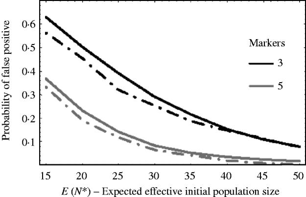
Figure 5 shows how well (9) works against simulation results. The solid curves are the theoretical results using (9) and the dashed curves are the corresponding results from simulations. The curves plot the probability of getting a false positive for increasing effective initial population size. In the example, there are c=20 chromosomes each of length l=1 Morgan. The false-positive probabilities were calculated when there were τ=3 and τ=5 markers per chromosome. It can be seen that the approximation (9) slightly overestimates the number of false positives. This is mainly due to the normal approximation for u linked. That is, the closer a marker is to the selected locus, the less it follows a normal distribution. As a result, the false-positive rate is overestimated. For extremely small initial population sizes, eqn (9) would not provide a good approximation for the number of false positives, as the marker frequencies can no longer be approximated by a normal distribution. In general, however, we see from Fig. 5, that the false-positive rate is reduced, as expected, when the variation in marker frequency is reduced with the increase in the effective initial population size. With the smaller effective initial population sizes, an increase in the marker density is needed to reduce the number of false positives. It should also be noted that with extremely small initial population sizes (i.e. effective initial population size less than 15), the probability of fixation of an unlinked marker is greater than zero, and as a result the false rate may always remain high no matter how densely the markers are spaced.
The probability of getting a false positive plotted against the expected effective initial population size E(N*). The solid curves are the theoretical predictions using (9) (i.e. 1−P(u null<u linked)) and the two dashed curves are simulation results. The parameters that were used was c=20 chromosomes each of length l=1 Morgan. The number of markers τ on each chromosome was τ=3 and 5. The black curves are results when τ=3 and the grey curves are the results when τ=5. The number of generations of selection was 10 and overall fitness of selected allele was 3.
Discussion
Mendelian traits
The aim is to locate alleles that influence a trait by examining changes in marker allele frequency in pools of asexual selected cross progeny. The extreme progeny are selected by multiple generations of asexual reproduction and selection. It was shown that the ability to identify markers linked to a causative allele depends on the variance in marker frequency in the selected population. The larger the variation in marker frequency, the more chance there is of spurious peaks and valleys in frequency in unlinked regions. The amount of variation in frequency in unlinked regions will be determined by the number of unique recombinant genotypes present in the selected population. The more unique recombinant genotypes present in the selected population, the more balanced the representation of markers is in the selected population, and the more likely that the marker frequency will approach the deterministic expectation, making identification of causative loci much easier. The amount of unique recombinant genotypes present in the selected population will be determined by the size of the initial population. From Fig. 4, it was shown that having an initial population size in the mid hundreds should ensure that there is small probability of spurious changes in marker frequency in unlinked regions.
However, the ease of detection will also depend on the marker density. A simple way to identify the general location of the selected locus would be to identify the marker with the most extreme frequency. In this case, having a very dense map of markers will ensure that a marker is close enough to the selected locus, so that its frequency is the most extreme in the genome, making identification of the location of the selected locus easier. How dense the markers need to be to achieve this will mainly be determined by the effective initial population size, and also by the length and number of chromosomes. From the example in Fig. 5, it was shown that relatively few markers are needed per chromosome to achieve a low false-positive rate, as long as the effective initial population size is not too small.
Maximum likelihood estimator
A more statistical approach to identify the location of selected loci may also be employed using the model developed in this paper. For example, a maximum likelihood approach using a standard interval mapping technique (Lander & Botstein, Reference Lander and Botstein1989) can be used to identify markers linked to selected alleles that have been fixed in the population. That is, similar to interval mapping, two markers at a time would be analysed on each chromosome. For each pair of markers that are analysed, a log likelihood ratio λ=log (L 0/L A)=log (L 0)−log (L A) would be calculated. L A is the likelihood under the hypotheses that a single selected allele is fixed somewhere between the two markers, and L 0 is likelihood under the null hypothesis that no selected allele exists between the two markers. Assuming that the effective initial population size is not extremely small, a bivariate normal distribution using moments (3)–(5) can be used for the likelihood functions for both L 0 and L A. Apart from the location parameter of the fixed selected allele (which is embedded in the recombination probabilities in (3)–(5)), there is one unknown parameter in both L 0 and L A whose value needs to be estimated from the data. This is the constant ![]() from the moments (4) and (5). A maximum likelihood estimator for V,
from the moments (4) and (5). A maximum likelihood estimator for V, ![]() , can be obtained by solving dlog(L 0
/
A)/dV=0 for V. Once
, can be obtained by solving dlog(L 0
/
A)/dV=0 for V. Once ![]() has been obtained the log likelihood ratio λ can be calculated at various positions along a chromosome. Significance levels for these log likelihood ratios can be obtained by permutation analysis (Churchill & Doerge, Reference Churchill and Doerge1994) by using simulated data from a multivariate normal with parameter
has been obtained the log likelihood ratio λ can be calculated at various positions along a chromosome. Significance levels for these log likelihood ratios can be obtained by permutation analysis (Churchill & Doerge, Reference Churchill and Doerge1994) by using simulated data from a multivariate normal with parameter ![]() . Figure 6 shows a simple example of this. Figure 6 a plots the negative marker frequency in a single replicate where there is a selected allele fixed at position 1 and the effective initial population size N*=20. Figure 6 b plots the corresponding log likelihood ratios and significance level. It can be seen that the likelihood model correctly identifies the general location of the selected allele.
. Figure 6 shows a simple example of this. Figure 6 a plots the negative marker frequency in a single replicate where there is a selected allele fixed at position 1 and the effective initial population size N*=20. Figure 6 b plots the corresponding log likelihood ratios and significance level. It can be seen that the likelihood model correctly identifies the general location of the selected allele.
(a) Plot of the negative marker frequency (marker every 5 cM) in a single replicate where there is a selected allele fixed at position 1, and the effective initial population size N*=20. (b) The grey curve is a plot of the corresponding log likelihood ratios and the black line is the significance level. To calculate the log likelihood ratios, the genome was split into overlapping intervals of 10 cM, where the overlap was 5 cM. For each interval, the log likelihood ratio was calculated using the two markers that define the interval. The unknown parameter V in the log likelihood functions was estimated by using all markers and assuming they are all unlinked, and then solving dlog (L)/dV=0 for V. The significance levels were obtained by permutation analysis of simulated data from a null region. The simulated data were obtained by directly simulating frequencies from a multivariate normal with parameter ![]() .
.

Quantitative traits
So, overall it can be seen that this selection technique in asexual cross progeny is a relatively efficient method for mapping simple Mendelian traits. However, for more complex traits, the situation is not as straightforward. If we apply the current technique to quantitative traits, we see firstly that the current strategy of letting the experiment run until a genotype fixes would not be the most efficient. This is because the longer one selects, the more stochasticity we would see in marker frequency in unlinked regions. For example, suppose η loci influence the trait. There now could be a possible 2η genotypes in the initial haploid population. As selection is applied, the less fit genotypes are lost, and the genotypic composition of the population becomes increasingly biased towards the upper tail of the fitness distribution. However, if η is large, these genotypes in the upper tail may only have been at small numbers in the initial population. As a result, the effective initial population size may become very small as selection is applied, leading to large stochasticity in marker frequency in unlinked regions.
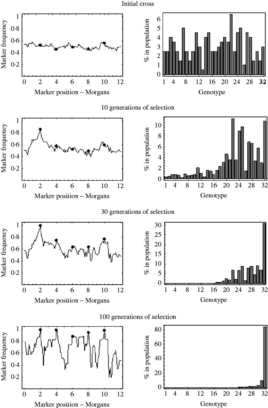
An example of this is shown in Fig. 7. It shows the marker frequencies at various generations of selection, when there are five unlinked selected loci, one large effect locus and four small effect loci, and a relatively large initial population size of 200. The bar charts in Fig. 7 represent the genotypic composition of the population at that particular generation. With five unlinked selected loci, there are 25=32 possible genotypes, with each genotype having a probability 2− 5=0·03125 of being produced at meiosis. So, in the bar charts in Fig. 7, each bar represents one of these 32 genotypes, with bar number 1 representing the least fit genotype and bar number 32 representing the fittest possible genotype. In the initial cross, it can be seen that most genotypes are equally represented in the population and markers frequencies are, as expected, around 0·5. After 10 generations of selection, it can be seen that most genotypes are still present in the population, but the frequency of the genotypes in the upper half of the fitness distribution have increased. These genotypes in the upper half of the fitness distribution all have the large effect allele, and consequently it can be seen that the frequencies of markers around the large effect locus have increased. The frequencies of all other markers remain roughly the same. After 30 generations of selection it can be seen that the fitter genotypes are now starting to establish in the population, which results in an increase in frequency of the smaller effect alleles. It can also be seen that a lot of the genotypes in the lower half of the fitness distribution are at insignificant numbers or no longer present in the population. This results in a decrease in the effective initial population size. That is, after 30 generations of selection, the number of unique recombinant genotypes in the population has been reduced from 200 to 92. This results in slightly more variation in frequency in unlinked regions. After 100 generations of selection, there are only six fitness classes present in the population, with the fittest (genotype 32) being the only one in substantial numbers, which results in the frequency of all the selected alleles nearing fixation. However, with so few fitness classes remaining in the population, the effective initial population size has become very small. There are now only 27 unique recombinant genotypes in the population, with the vast majority of the population originating from just six unique recombinant genotypes. Consequently, many markers in unlinked regions are also at very low or high frequency.
The marker frequencies and the genotypic composition of the population at various generations of selection when there are multiple selected loci are shown. There are a total of five selected alleles at positions {2, 4, 6, 8, 10} (shown by the filled circles) with selection coefficients {0·2, 0·05, 0·01, 0·03, 0·04}. With five selected alleles there are 32 possible genotypes. The bar charts show the proportion of each of these 32 genotypes in the population at that particular generation. Genotype number 1 refers to the least fit genotype (relative fitness of 1) and genotype 32 refers to the fittest possible genotype (relative fitness of 1·36). The initial population size was 200.
So, we see that, in any one replicate, if selection is continued on for a very long time, it may be very difficult to identify which of these peaks and valleys in marker frequency are truly selected alleles and which are null regions, due to the very low effective initial population size. In order to avoid this, much larger initial population sizes would be needed so that enough numbers of the fitter genotypes are produced at meiosis. However, as η gets larger the population sizes that are needed may become prohibitively large. Also, with large η the fitness differences between the various genotypes will become quite small, and thus letting the experiment run until a genotype fixes would most likely be infeasible, as it would take an extremely long time for any one genotype to fix. Hence, both these reasons suggest that for quantitative traits, finding an optimal time to run the experiment in order to get the maximum amount of information from the changes in marker frequency is necessary.
We thank two anonymous reviewers for helpful comments and suggestions. This work was funded as part of the GENACT Project, funded by the Marie Curie Host Fellowships for Early Stage Research Training, as part of the 6th Framework Programme of the European Commission.
Appendix
Moments of the number of copies of a marker m in the selected population
Consider an initial population of size N and a single marker m. Let Sm
be the number of copies of that marker in the selected population. We have that ![]() , where n is a random variable representing the initial number of recombinants that had marker m. As we are assuming in the model that only the fitter class of recombinants survive in the selected population, we have that n is a binomially distributed random variable with expectation E(n)=0·5NPm
, where Pm
is the probability that marker m is on the fittest genotype (Pm
=r if m is a negative marker and Pm
=1−r if m is a positive marker). Therefore, we have that the expected number of copies of a marker m, E(Sm
), and variance Var(Sm
) in the selected population is given by (A.1) and (A.2).
, where n is a random variable representing the initial number of recombinants that had marker m. As we are assuming in the model that only the fitter class of recombinants survive in the selected population, we have that n is a binomially distributed random variable with expectation E(n)=0·5NPm
, where Pm
is the probability that marker m is on the fittest genotype (Pm
=r if m is a negative marker and Pm
=1−r if m is a positive marker). Therefore, we have that the expected number of copies of a marker m, E(Sm
), and variance Var(Sm
) in the selected population is given by (A.1) and (A.2).

Given two markers m1
and m2
, the covariance, Cov(![]() ), between the number of copies of each marker in the selected population is given by (A.3), where
), between the number of copies of each marker in the selected population is given by (A.3), where ![]() is the probability that both markers m1
and m2
are on the fittest genotype.
is the probability that both markers m1
and m2
are on the fittest genotype.

Moments of the frequency of a marker m in the selected population
Obtaining exact expressions for the moments of marker frequency in the selected population is mathematically difficult, so approximations will be used instead. Let Fm
=Sm/St
be the frequency of marker m, where St
is the total number of recombinants in the selected population. If we expand Fm
as a Taylor series, we get (A.4) and (A.5) as an approximation for the mean and variance in marker frequency in the selected population. To derive the covariance in frequency, ![]() , we expand
, we expand ![]() as a Taylor series and get (A.6) as an approximation for the covariance in frequency between markers m 1 and m 2.
as a Taylor series and get (A.6) as an approximation for the covariance in frequency between markers m 1 and m 2.


Since we are assuming in our model that only recombinants from the fittest class survive in the selected population, we can make some simplifications to the above calculations. Given only one fitness class survives we have that E(Sm )=PmE(St ) and Cov(Sm,St )=Pm Var(St ), where E(St ) and Var(St ) can be calculated using (A.1) and (A.2), where n now is a binomial random variable with expectation 0·5N. Substituting these into (A.4), (A.5) and (A.6) we get (A.7) as the expectation of frequency, which is just the same as the deterministic expectation, and (A.8) and (A.9) as the variance and covariance in frequency.


