


1 Introduction
On April 19, 2021, the coronavirus disease 2019 (COVID-19) vaccine became available to all adult US residents. That month alone, nearly 20,000 people in the United States died from the pandemic (CDC 2023). The vaccine was effective (Watson et al. Reference Watson, Barnsley, Toor, Hogan, Winskill and Ghani2022), and demand for it was high: People waited in line for hours (Slotnik Reference Slotnik2021), and anecdotal evidence suggests some lied about underlying health conditions to get their vaccine early (Maloy Reference Maloy2021, 20). News websites tracked the vaccine rollout using graphs that showed doses administered each day (The New York Times 2020). They also showed projections of how many doses would be administered each week into the future—these plots were ubiquitous (Darmanjian Reference Darmanjian2021; for examples, see Figure 1).
Example of vaccine rates from the media. Graph shows the number of doses administered per day in 2021 (Statista Daily Data 2021). For additional examples, see Appendix D of the Supplementary Material.

Despite this rush to get vaccinated, we find that many people preferred graphs depicting a slow vaccine rollout. In a survey fielded during this period, we asked people to look at rollout plots of “weekly doses administered” and tell us which projections they liked best. Overwhelmingly, people liked plots with upward trends, which correspond to slow rollouts initially and increasing doses administered in the future. When we asked the very same individuals a direct verbal question about their preferred rollout speed, they wanted as many shots in arms as quickly as possible, more closely reflecting the behavior of the public. What happened? Why did people’s evaluations of graphs differ so markedly from their stated preferences and the observed rush to get vaccinated?
People have what we refer to as graphical preferences: preferences for graphical properties of informational displays that are not reducible to the individual pieces of information. In the case of COVID-19 vaccines, people were drawn to increasing trends. It has been robustly demonstrated in other domains that people are biased toward sequences that improve over time (Bechtel, Scheve, and van Lieshout Reference Bechtel, Scheve and van Lieshout2020; Loewenstein and Prelec Reference Loewenstein and Prelec1993; Prior and Andrews Reference Prior and Andrews2025; Ross and Simonson Reference Ross and Simonson1991; Varey and Kahneman Reference Varey and Kahneman1992; Zauberman, Diehl, and Ariely Reference Zauberman, Diehl and Ariely2006). When it comes to COVID-19 vaccine distribution, this draw to rising sequences is not welfare enhancing because slow rollout of a safe vaccine risks more infections, hospitalizations, and deaths (Cuschieri et al. Reference Cuschieri, Agius, Souness, Brincat and Grech2021; Swan et al. Reference Swan, Bracis, Janes, Moore, Matrajt and Reeves2021) and does not reflect people’s stated preference for a fast rollout.
1.1 Measuring Graphical Preferences
People regularly encounter visual, nontextual political relevant information across domains not limited to vaccine rollouts. Graphs and images shape political preferences (e.g., Allen and Ahlstrom-Vij Reference Allen and Ahlstrom-Vij2024; Bandola-Gill, Grek, and Ronzani Reference Bandola-Gill, Grek and Ronzani2021), but survey measurement is challenging for concepts that cannot be represented textually or numerically. Spurred in part by advancements in machine learning, research measuring visual political information has begun to appear in top political science outlets (e.g., Boussalis et al. Reference Boussalis, Coan, Holman and Müller2021; Torres Reference Torres2024; Torres and Cantú Reference Torres and Cantú2022; Wojcik and Mullenax Reference Wojcik and Mullenax2024), underscoring the need for tools to identify the impact of the visuals on political attitudes. In this research, we present a method to precisely calibrate respondents’ graphical preferences in a time-efficient manner. In our illustration of the method, we measure graphical preferences for slopes in plotted time series. Our method allows us to assess not only if the slope affects people’s evaluation of the time series, but by how much.
Our measurement tool, the plot staircase, precisely gauges preferences for properties of graphed data. We apply this adaptive approach to a graph’s slope as past research has established that people prefer increasing trends of benefits and decreasing trends of costs, holding constant the total value presented in the sequence. For example, people hold higher evaluations of increasing trends of athletic ability (Chapman Reference Chapman2000), air quality (Guyse, Keller, and Eppel Reference Guyse, Keller and Eppel2002), lifetime earnings, and lottery winnings (Guyse et al. Reference Guyse, Keller and Eppel2002; Hsee, Abelson, and Salovey Reference Hsee, Abelson and Salovey1991; Read and Powell Reference Read and Powell2002). They also hold higher evaluation of decreasing trends of headaches (Chapman Reference Chapman2000) and the price of carbon taxes (Bechtel et al. Reference Bechtel, Scheve and van Lieshout2020). In our plot staircase, respondents repeatedly choose between a flat and a rising sequence of the same outcome plotted in the same graph. Depending on which sequence a respondent prefers, the next graph increases or decreases the flat sequence. In only a few iterations, the plot staircase pinpoints how many extra units the flat sequence must contain for participants to be indifferent between the flat and the rising sequence.
While a slope can be characterized numerically, the conceptually most pertinent characteristic of a slope is visual: It goes up or it goes down. That is, respondents are not necessarily swayed by the underlying data but by the more visible and accessible trend of the sequence. However, it is inherently challenging for survey research to measure reactions to visual representations in a systematic and concise fashion. Previous studies have primarily relied on what we refer to as a “rating approach.” In this method, respondents are shown graphs of sequences and asked to indicate how much they like or dislike the outcome illustrated in each sequence. Usually, respondents are presented with as few as one or two sequences that increase, decrease, or have a flat or ambiguous trend (e.g., Bechtel et al. Reference Bechtel, Scheve and van Lieshout2020; Guyse et al. Reference Guyse, Keller and Eppel2002; Hsee et al. Reference Hsee, Abelson and Salovey1991). As people only evaluate one sequence at a time, this approach assumes that people remember pertinent characteristics of the graph, such as the range of the two axes, and use the rating scale in the same way across graphs. The plot staircase removes this burden, allowing people to compare sequences plotted in the same graph without having to hold information in memory.Footnote 1
Our goal here is to calibrate how much overall welfare (the total desirable outcome over the full time period) a respondent is willing to sacrifice in exchange for an increasing trend. In the case of COVID-19 specifically, we can identify how many total doses a respondent is willing to sacrifice for an increasing trend. The rating approach would require substantial survey space to precisely calibrate this quantity. Respondents would have to evaluate a large set of sequences that systematically varies the plot characteristic of interest. As a consequence, the previous literature has identified that people prefer increasing to decreasing trends of the same overall outcome but has not assessed how much overall welfare respondents are willing to sacrifice for an increasing trend.
We demonstrate the plot staircase in the domains of COVID-19 vaccine rollout, economic growth, and job creation. Using this new tool, we can examine if a preference for an increasing trend is a preference for a graphical plot characteristic rather than a preference for the information presented in the plot. In particular, in the case of vaccine rollout, the plot staircase uncovers that increasing slopes of vaccine administration are most popular among both respondents who prefer to delay the rollout (which would indeed yield an increasing slope in a graph of newly administered vaccines) and respondents who indicate in a verbal question that they prefer vaccinating as many people as quickly as possible (which amounts to a sequence that starts high and, if anything, slopes down as more of the population is already vaccinated). Verbally stated rollout preference is not the same thing as preference for graphed rollout scenarios.
To demonstrate the construct validity of the plot staircase, we show that the preferences it captures are related to preferences for increasing trends measured using the ratings approach. We then examine individual predictors of trend preferences to understand how much they depend on cognitive skills (numeracy, education) and political context (partisanship). Finally, we present an alternative plot staircase, illustrating the flexibility of the design to capture preferences for other graphical properties.
The plot staircase can be adopted for use with other visual objects that vary ordinally or continuously. Graphical presentations of time series data are a common display that combines underlying information with a particular visual representation of the information. Forecasts and projections are regularly illustrated by media organizations, policymakers, and health officials (Pentzold, Brantner, and Fölsche Reference Pentzold, Brantner and Fölsche2018; Rebich-Hespanha et al. Reference Rebich-Hespanha, Rice, Montello, Retzloff, Tien and Hespanha2015; Santos Reference Santos2016). Various characteristics of graphical presentations of time series data may affect evaluations of the data. For example, people prefer sequences that on average produce better outcomes (Ariely and Carmon Reference Ariely and Carmon2000; Healy and Lenz Reference Healy and Lenz2014). Evaluations are also swayed by the value of the final item in the sequence (Ariely and Carmon Reference Ariely and Carmon2000; Baumgartner, Sujan, and Padgett Reference Baumgartner, Sujan and Padgett1997; Cohen Reference Cohen1983; Healy and Lenz Reference Healy and Lenz2014). How people evaluate visual sequences seems to diverge substantially from how they evaluate similar sequences of outcomes presented numerically or verbally (see also Frederick and Loewenstein Reference Frederick and Loewenstein2008).
The central goal of this work is to offer a tool that can be applied to a plethora of visual objects to concisely estimate individual-level preferences for visual objects. Visual cues such as benchmarks in graphs (Allen and Ahlstrom-Vij Reference Allen and Ahlstrom-Vij2024) or facial expressions of emotions by candidates in debates (Boussalis et al. Reference Boussalis, Coan, Holman and Müller2021; Boussalis and Coan Reference Boussalis and Coan2021) affect political preferences. Advancements in machine learning and other unsupervised learning techniques have improved the field’s ability to analyze politically relevant visual material (e.g., Bauer and Carpinella Reference Bauer and Carpinella2018; Boussalis et al. Reference Boussalis, Coan, Holman and Müller2021; Torres Reference Torres2024). Our dynamic approach can be adopted to precisely quantify the impact of these visual objects on public opinion in a time-efficient manner in surveys. Doing so allows researchers to better understand the effects of visuals on public opinion formation and provides insights into designing graphical displays to more effectively and accurately communicate underlying data to observers.
2 Methods
2.1 The Plot Staircase
The plot staircase identifies how much overall benefit an individual is willing to sacrifice in favor of an increasing trend in benefits. Respondents are asked to choose between a flat sequence and a rising sequence. Next, respondents are shown another plot that adjusts the flat sequence depending on their previous choice and asked to pick again between the same increasing slope sequence and the adjusted flat sequence. The plots in Figure 2 illustrate this adaptive design in the domain of US income growth. After each plot, respondents were “asked to select which of the two trends you believe to be the better economy.” Those who picked “A” in the first question saw the upper-right plot second; those who picked “B” saw the lower-right plot. The full task instructions are available in Appendix A of the Supplementary Material.
Plot staircase adaptive design, example plots (Survey 3, Income growth). Respondents’ choice of A or B in the left graph determines which of the right-hand graphs they see next: A → upper-right plot; B → lower-right plot.
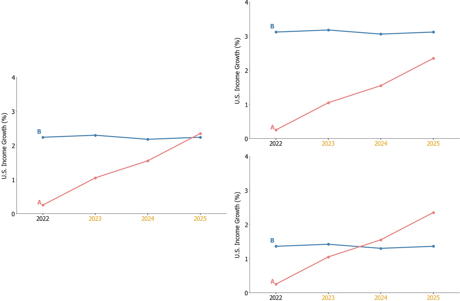
If a respondent selects the rising sequence, we increase the average of the flat sequence. We decrease the average of the flat sequence if a respondent selected the flat sequence. In other words, the plot staircase makes the flat sequence more appealing for respondents who previously preferred the rising sequence. It makes the flat sequence less appealing if respondents already preferred the flat sequence. The size of the adjustment halves with each adaptive step. This design uses a small number of stimuli to pin down a threshold value or a point of subjective equality by dynamically approaching it from above and below (Cornsweet Reference Cornsweet1962). This method of pinpointing that bounds around an individual’s preference has been used extensively with standard verbal questions, for example for the elicitation of economic preferences such as patience and risk preferences (Andersen et al. Reference Andersen, Harrison, Lau and Rutström2006; Falk et al. Reference Falk, Becker, Dohmen, Huffman and Sunde2023; Hardisty et al. Reference Hardisty, Thompson, Krantz and Weber2013).
More formally, we can denote the initial average of the flat sequence in the first node (n = 1) as F 1 and the adjustment factor that is implemented in the second node as A 2, which gets halved in each subsequent node such that A n > 2 = 0.5 × A n − 1. Depending on the decision in the first node, the flat sequence average in the second node becomes either more or less attractive: F 2 = F 1 + A 2 or F 2 = F 1 − A 2. Analogously, the average of the flat sequence in subsequent nodes follow the same logic and adjust depending on the previous decision: Fn = F n − 1 + An or Fn = F n − 1 − An . This dynamic procedure involved only five choices in total for Survey 1 (and four choices for Surveys 2 and 3), with each choice being presented on a separate screen. Figure 3 provides a tree-plot example from survey 3 that demonstrates how the plot staircase procedure operated. There are 16 unique paths along the 4-node plot staircase, each leading to a unique interval that contains the indifference point.
Tree for plot staircase (Survey 3, Income growth).

We use the plot staircase to identify the flat average equivalent (FAE): The average of the flat sequence that makes respondents indifferent between the two sequences. The FAE is expressed in the units of the charted outcome. We then standardize the FAE in terms of the visible amounts of the outcome that make respondents indifferent between the two sequences. We thus divide the visible outcome units presented by the flat sequence (area under the curve) by the visible outcome units in the increasing sequence. When the y-axis begins at 0, the resulting value is the ratio of the benefits offered in the flat sequence compared to the rising sequence that makes respondents indifferent between the two. When the y-axis is censored, such that it begins above 0, then the ratio only includes benefits visible in the graphical space. All results discussed use the standardized FAE.Footnote 2
When standardized FAE is equal to 1, participants are indifferent between the flat and the increasing sequences with the same total outcome visible in the graphed region. When the standardized FAE exceeds (is below) 1, participants exhibit a preference for increasing (decreasing) trends. This standardized measure can be used to compare the degree of trend preference across domains, quantifying the ratio of benefits in the visual space respondents need to be indifferent between the two sequences.
As a participant progresses through the staircase, the FAE becomes more precisely estimated. The staircase generates an interval bounding the indifference point, not a point estimate. For each respondent who does not always select the same answer, the staircase is designed so that the last response is right above or below where the respondent switches between the flat and rising sequences. We take the midpoint of the ‘switching’ interval as the indifference point and use it to indicate the FAE. Respondents who always select the same answer have an unknown indifference point outside of our preselected range. We score them at the minimum (maximum) FAE, one scale step below (above) the lowest (highest) indifference point.
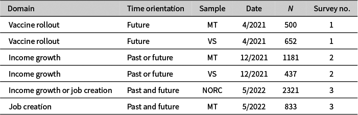
To demonstrate the efficacy of the plot staircase, we implemented it across multiple domains and samples summarized in Table 1. Respondents were asked to complete the plot staircase for the COVID-19 vaccine rollout, US income growth, or temporary job creation. Graphs spanned 7 weeks for vaccines and 4 years for the two economic outcomes (see Appendix A of the Supplementary Material for sample plots in each domain). Some respondents evaluated past sequences, others evaluated projections, and some evaluated both. The staircase implementation was adapted from the procedure designed by Holzmeister (Reference Holzmeister2017) to measure risk preference and was programed using oTree (Chen, Schonger, and Wickens Reference Chen, Schonger and Wickens2016). Surveys were conducted on three samples: Amazon’s Mechanical Turk (MTurk; Krupnikov, Nam, and Style Reference Krupnikov, Nam, Style, Druckman and Green2021; Berinsky, Huber, and Lenz Reference Berinsky, Huber and Lenz2012), Volunteer Science (VS),Footnote 3 and a national probability sample recruited via NORC. Sample characteristics are available in Appendix B of the Supplementary Material.
Summary of surveys and samples.

Note: N is the number of observations. MT, Amazon Mechanical Turk; VS, Volunteer Science; NORC, National Opinion Research Center.
2.2 Plot Staircase Design Parameters
Implementing the plot staircase requires choosing several design parameters. The most critical feature, based on the research question of interest, determines which sequence is dynamic and which sequence remains fixed across each decision. Here, we ask: How much do you have to offer respondents in a flat sequence to make them indifferent between a flat and a rising sequence? This question requires fixing the rising sequence and varying the flat sequence to find the indifference point. The plot staircase is not limited to varying the flat sequence—researchers could choose to systematically vary any other dimension of a sequence as relevant to their research question. Below, we illustrate this with an alternative design where the flat sequence remains fixed, and the slope of the rising sequence changes based on respondents’ choices.
The next choices are the minimum and maximum standardized FAE, and then mapping those values onto the quantities of interest displayed in the graphs. In Study 1, given the literature suggesting the average person exhibits a preference for increasing trends, we set the standardized FAE such that it could vary between .425 to 1.975 rather than centering the range around 1. In Study 2, we implemented a similar range of the possible FAE from .38 to 1.8. (Minor differences arise so we could translate the standardized FAE into intuitive units for the domain presented in the graph.) Many respondents were clustered the highest possible value (MTurk: 32%, VS: 20%). In Study 3, we therefore expanded the range to extend from .45 to 3. We encourage others using the plot staircase to pilot initial designs to avoid similar ceiling or floor effects.
To map the standardized FAE onto real units presented in each graph, we selected values within a substantively plausible range. For example, to design the fixed increasing sequence in Study 1, values reflect the actual projected COVID-19 vaccine rollout at the time of the study that foresaw an increase in weekly vaccinations of about 4 million over the 7-week period following the survey. To make the slope of the increasing trend more prominent, we censored the y-axis such that it ranges from 15 to 27 million doses administered per week. This then anchored the range of possible values the average sequence could take to construct each step of the plot staircase following the design principles described above. The slopes of the rising income growth and job creation sequences were 2.1 percentages points and 393,000 jobs over 4 years, respectively.
The next design decision is the number of adaptive steps to identify the lower and upper bounds of respondent preferences. Including more choices allows for more precise estimation of these bounds but takes up more survey space. At a certain point, changes in the flat sequence become so small as to not be clearly visible to respondents. In Survey 1, respondents made five choices. In subsequent surveys, we reduced the number of adaptive steps to four given the difficulty in noticing differences between the last and second-to-last choice.
In designing each sequence, researchers must balance ecological validity against the threat of introducing other gestalt characteristics that might sway sequence preferences (Ariely and Carmon Reference Ariely and Carmon2000). To increase the ecological validity, we added noise to the charts without violating monotonicity. When presented with data about the real world, people are unlikely to see figures with perfectly smooth trajectories. To add noise, we use the following approach to introduce noise to the sequences: First, we did not add noise to the first or final value in either the increasing or flat sequence. Second, for every adjacent pair of inner datapoints in a sequence (i.e., not involving the first and final datapoints), we randomly drew a number between .3 and .45, multiplied it by the distance between the two datapoints, and added the result to one datapoint while subtracting it from the other to ensure that the average in each sequence remained the same. Restricting the range of the random numbers in this way ensures noise without violating monotonicity (as such violations have been shown to affect sequence preferences; Ariely and Carmon Reference Ariely and Carmon2000).
Researchers applying this method to other visual characteristics beyond the slope of a sequence must make similar decisions about design parameters. The staircase approach can be applied to identify the effect of any ordinal or continuous visual characteristic. To do so, in any domain researchers must decide on (1) the upper and lower bound on the characteristic of interest, (2) the size and number of the adaptive steps, and (3) the degree of noise added to the visual characteristic to maximize ecological validity without sacrificing internal validity.
3 Results
Consistent with the previous literature, many people exhibit a preference for increasing sequences. Figure 4 shows the distributions of FAE estimates derived from the plot staircase, illustrating the precise calibration of how many more outcome units are needed in a flat sequence for respondents to prefer it to a specific increasing sequence. In each domain and sample, mean FAE is significantly greater than 1, indicating the average respondent is only indifferent between a flat and increasing sequence when the flat sequence offers a greater total benefit (see test statistics below each panel).
Distribution of standardized FAE. Graphs plot distributions of the flat average equivalent (FAE). Vertical lines indicate the average of the fixed sequence without an evident slope. Means (μ) and medians (M) are scaled as standardized FAE. Tests of equality cluster at respondent level to account for repeated observations. NORC data apply sampling and poststratification weights.

Panel 3D plots show results for the design example illustrated in Figures 1 and 2 that measures the FAE for income growth, in our highest-quality, probability-based sample. The mean FAE is 1.8, so the average US resident requires 80% additional income growth in the flat sequence to not prefer the increasing sequences with lower overall income growth. A full 20% of respondents are at the highest level of FAE, requiring at least three times as much income growth in the flat sequence to be indifferent between the flat and rising sequence. Panel 3D compares results for income growth to those for job creation, assessed in the same sample for another random subset of respondents. FAE is slightly lower for job creation than income growth, but still emphatically above 1 on average and with 15% of people at the maximum.
The MTurk sample that we fielded at the same time as the NORC sample asked everyone about job creation. Panel 3C compares those results across samples. In our only clean juxtaposition between a probability sample and a convenience sample, FAE is significantly higher among MTurkers. Panel 3B also shows MTurk respondents to have a higher FAE than VS participants, but this sample difference does not replicate for the vaccine rollout case in Survey 1 (Panel 3A).
3.1 Convergent Validity
To demonstrate the convergent validity of the staircase approach, participants in Study 1 also completed a sequence evaluation task that followed the ratings approach used in much of the literature. Respondents were presented with four additional projections of vaccine dose administration.Footnote 4 These graphs were nearly identical to the plot staircase, with two exceptions. First, each plot contained only one sequence. Second, rather than choosing between projections, respondents were asked to evaluate each sequence: “How would you rate the vaccine rollout during this future period? Please answer on a scale from 0 to 10, where 0 means very poor and 10 means very good.” All four plots showed an average of 21 million doses administered each week and either had an increasing or decreasing trend. Plots and full task instructions are available in Appendix E of the Supplementary Material.
If the plot staircase captures the same underlying preference for increasing trends as identified in previous research, then respondents with a higher FAE should rate increasing sequences more highly in the ratings approach. Figure 5 shows the relationship between FAE and plot ratings, separately for increasing and decreasing sequence. The interaction with sequence slope is statistically significant (see Appendix E of the Supplementary Material for the full results), thus validating the plot staircases against previously used measures.
Relationship of FAE and ratings approach, vaccine rollout (Survey 1). Graph shows predicted values and confidence intervals from a multilevel model with individual random effects and random coefficients for the trend (increasing or decreasing). The vertical line indicates the standardized FAE is equal to 1. Each point is a raw observation: Purple triangles are evaluations of increasing trends and yellow circles are evaluations of decreasing trends. See Appendix E of the Supplementary Material for full results.

There is variation in people’s preferences for increasing trends, and both the ratings approach and plot staircase pick up this same underlying preference. Those who rate increasing trends more favorably, and decreasing trends less favorably, also have a higher FAE. The plot staircase is a more precise approach, allowing for the identification of just how much more each respondent likes increasing trends compared to flat sequences, and with little survey space.
3.2 How Fast a Vaccine Rollout Did People Want?
Plot staircase measurement of the FAE does not in and of itself distinguish between a preference for a visual characteristic (a line pointing up) and a preference for the information underlying the graph (an improvement in conditions). The context of Study 1 presented us with an opportunity to address this question because a more rapid rollout of the COVID-19 vaccine amounted to a decreasing trend, all else equal, reflecting many vaccinations administered as soon as possible and eventually fewer in the future as the population approaches herd immunity. In addition to measuring their FAE in the domain of vaccine administration, we directly asked respondents about their preferences for the pace of the vaccine rollout.
The survey was fielded in April of 2021, right as the COVID-19 vaccine became more widely available. We asked respondents, “Regardless of your own vaccination status, how fast would you prefer the vaccine rollout to occur in the country as a whole? Would you prefer everyone who wants to be vaccinated to receive the COVID-19 vaccine…right away, by the end of May, by the end of June, by the end of summer, and by the end of the year?” Just over half of each sample (54% in MT, 53% in VS) selected “right away” and about another sixth (13% in MT, 19% VS) marked “by the end of May.”
To more precisely measure vaccine rollout preferences, the survey provided respondents with information about the vaccine rollout to date: “Last week, about 10 million Americans became fully vaccinated against COVID-19 (by receiving their second shot of the Moderna or Pfizer-BioNTech vaccines, or the single-shot Johnson & Johnson vaccine). By some estimates, about 70% of the US population will be fully vaccinated by the Fourth of July holiday. Vaccine rollout scenarios differ in their estimate of how many doses are available early on.” (This information appeared after the plot staircase and was consistent with vaccination rates and projections at the time.) Next, respondents were asked how many additional vaccinations they would like to see administered “next week.” This measure was again an adaptive design, although with no graphs or other visual characteristics involved.
Respondents were randomly assigned to one of two sets of adaptive questions about the pace of the vaccine rollout. In the first, respondents choose between a series of pairwise options that involved no tradeoff between immediate vaccinations and total vaccination by July 4th. The first choice in this half of the sample was between “A: 27 million more Americans fully vaccinated next week and a total of 232m Americans fully vaccinated by July 4th” and “B: 11 million more Americans fully vaccinated next week and a total of 232m Americans fully vaccinated by July 4th.” If respondents selected A, the next question raised the numbers of vaccinations “next week” in both options; if respondents selected B, the next question lowered it.Footnote 5 That is, 232m Americans were always fully vaccinated by the 4th in both A and B, but the full adaptive design specified respondent preferences from as few as 3.5 million doses to as many as 34.5 million new vaccinations “next week.” Large majorities (81% in MT, 63% in VS) showed a preference for the largest number of new vaccines in the following week. This measurement technique reveals a more calibrated preference and confirms the purely verbal reports: Roughly two-thirds of respondents wanted the fastest possible vaccine rollout and maximized the doses delivered “next week.”Footnote 6
Preferences for rollout speed were structured by partisanship. More Democrats (59% in MT, 61% in VS; including leaners) than Republicans (47% in MT, 38% in VS; including leaners) wanted everyone in the country to be vaccinated “right away.” The same difference occurs for the adaptive measure: More Democrats (85% in MT, 69% in VS) than Republicans (77% in MT, 54% in VS) select the maximum number of new vaccinations “next week.” There are also partisan differences in respondents’ own reported vaccination status: Very few Democrats intend to never get the vaccine (4% in MT, 2% in VS) or wait at least a year (4% in MT, 1% in VS). Among Republicans, these intentions are much more common, with a full 28% of MTurk Republicans saying they will not get vaccinated (15% of VS respondents say the same) and also more who want to wait at least a year (15% in MT, 4% in VS). Intention to delay getting vaccinated and preference for a fast rollout on the adaptive measure are strongly negatively corelated.
When graphs are not involved, in the adaptive design most respondents want as many people as possible vaccinated quickly. This sentiment can veer into impatience, where the desire for immediate benefits is so strong that it comes at the expense of the long-run benefit. In the second half of our sample, we tweaked the adaptive measure to create a tradeoff between total vaccines by July and vaccines administered “next week.” Respondents were again asked to choose between Option A and B. Option B remained the same, initially offering “11 million more Americans fully vaccinated next week and a total of 232m Americans fully vaccinated by July 4th.” Option A again offered more doses “next week,” but only a total of 219m fully vaccinated by July 4th. So, Option A had more doses sooner, whereas Option B had more doses overall. This adaptive design identifies the smallest number of immediate doses (if any) that make respondents willing to accept fewer total vaccinations by July 4th.
Did respondents want a fast vaccine rollout even at the expense of fewer total vaccinations by July 4th? About half of them did: Only 54% of MTurker and 38% of the VS sample always selected the option with the larger total (Option B). The remainder of respondents were willing to sacrifice overall vaccines for more vaccines sooner.Footnote 7
In sum, the respondents in our two samples mostly wanted a fast vaccine rollout, judging by several measurement approaches that do not include any sort of visual display. This preference for a fast rollout is not reflexive: When a tradeoff with fewer overall vaccinations is involved, fewer respondents—but still about half!—want more vaccinations quickly. Either way, these preferences strongly contradict the view we get from people’s evaluations of rollout graphs. So far, these contradictions are demonstrated by comparing of sample averages for measurements with and without graphs. The next section examines the link between plot evaluations and verbally stated preferences at the individual level.
3.3 Individual-Level Analysis
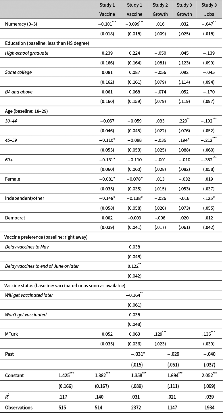
The plot staircase identifies the FAE for each respondent, allowing us to examine the relationship between preferences for increasing trends and other individual characteristics. To rule out that our measurement approach imposed unreasonable cognitive burden on respondents with low numerical skills, we measured numeracy in all surveys by asking respondents to answer three math questions (see Schwartz et al. Reference Schwartz, Woloshin, Black and Welch1997). Education serves a similar function in our analysis. We also control for age and gender. To probe whether political motivation affected plot preferences, we measured partisan identification. The final datapoint in the plots of annual economic outcomes is 2025, the year after the next presidential election. Republicans might prefer delayed economic performance to deny the Democratic incumbent credit—which might lead them to exhibit a higher FAE. Table 2 regresses the FAE on these variables (see Appendix C of the Supplementary Material for question wording) and design features of the staircase (e.g., sample provider, past data versus future projections).
Correlates of standardized FAE.
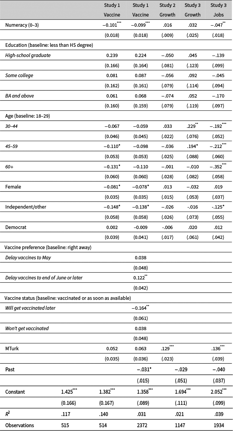
Note: Results are from linear regression models, with standardized FAE as dependent variable. Robust standard errors appear in parentheses, to account for repeated observations in Studies 2 and 3 where respondents completed both past and future plot staircases. Independent variables are binary indicators unless otherwise noted. * p < 0.05, ** p < 0.01, *** p < 0.001.
Preferences for increasing trends do not simply reflect difficulty in understanding the measurement task: Less educated respondents do not have systematically different FAEs. Respondents with greater numerical skills do have statistically lower FAEs in two of four tests, but the relationship is in the opposite direction for the other two tests, and even the most skilled respondents have FAEs above 1 (decisively so in columns 2–4). There are no consistent relationships between FAE and age or gender.
The FAE of Democrats and Republicans is indistinguishable for every model. (Pure independents have statistically lower FAE in two of four tests.) For economic growth and job creation, partisans might agree in seeing these as valence outcomes that are best when getting better over time. This argument does not work for vaccine rollout, however. As documented in the previous section, Republicans had a more skeptical view of COVID vaccines and their fast rollout, which would suggest a higher FAE. Nonetheless, appreciation of upward trends in administered vaccines was thoroughly bipartisan.
The second column of Table 2 adds the verbal measures of rollout preference and vaccination status. Those who prefer a slower vaccine rollout indeed have a significantly higher FAE. However, as indicated by the intercept coefficient, even those who indicate on the verbal question that they want to vaccinate as many people as soon as possible still have an average FAE greater than 1: They prefer visual sequences that depict a slow rollout. (Neither version of our adaptive measure of rollout speed is related to FAE; we omit these variables because they would split the sample in half.)
Intention not to get vaccinated is negatively related to FAE. One might speculate that a rising trend is less appealing when the outcome in question is not seen as appealing, but vaccine hesitancy did not necessarily mean opposition to others getting the vaccine.
In sum, a preference for increasing trends cannot be reduced either to misunderstandings of the measurement task or to a genuine preference for an increase in the underlying data. Even many highly educated and numerically skilled individuals need to be compensated with more of the underlying outcome to accept a flat sequence. And in the case of COVID-19, even people with a stated preference for a fast rollout preferred pictures of a slow rollout. Democrats and Republicans differed in the views about vaccines and rollout—but not in their fondness of graphs showing rising numbers of weekly vaccinations. If people really do have preferences over graphical displays that are different from preferences over the graphed information, measurements tools such as the plot staircase are necessary to distinguish both sentiments.
3.4 Alternative Applications
The plot staircase can be flexibly used to measure much more than just the preference for slopes. For a demonstration of this flexibility, we implemented an alternative version of the staircase in Survey 1. The design was identical to the plot staircase presented above, except rather than adjusting the average based on respondents’ previous choices, we adjusted the slope. In the first decision, respondents chose between a flat sequence offering an average of 22 million doses administered per week and an increasing slope offering an average of 21 million doses per week. If respondents selected the flat sequence, we made the slope steeper, holding constant the number of doses administered. If respondents selected the rising sequence, we made the slope flatter. The instructions and full decision tree are available in Appendix F of the Supplementary Material.
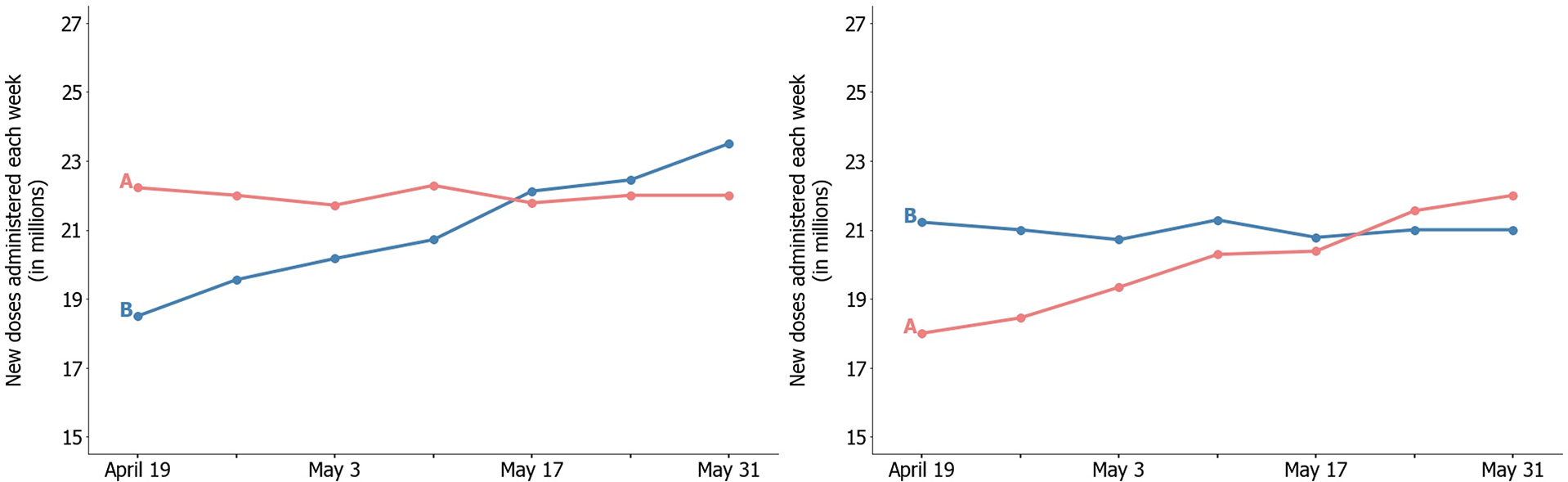
The original plot staircase measures how many more units in a flat sequence make respondents indifferent between a flat and rising sequence. The alternative application gauges how steep a slope must be for respondents to be indifferent between the increasing sequences and a (fixed) flat sequence that offers a higher overall benefit. Even though the distribution of individual indifference points (see Appendix F of the Supplementary Material) is not directly comparable between the two measures, the two methods converge on a similar graphical preference. Figure 6 illustrates the upper bound of the indifference point from each plot staircase, and they are very similar. The fixed average for the alternative design, which we chose ex ante at 22m, is slightly above the indifference point elicited by the original (adjust average) design—and hence the indifference point estimated by the alternative design is a slightly steeper slope than the one we picked for the original design. The more general point of the alternative plot staircase design is to showcase the versatility of the tool that allows researchers to easily adapt the approach for their own measurement of graphical preferences.
Indifference points in adjusting slopes (left) and adjusting average plot staircase (right), Survey 1. Left panel is the upper bound at which the average MTurk respondent is indifferent between lines A and B from the adjusting slopes plot staircase. Right panel is the upper bound at which the average MTurk respondent is indifferent between lines A and B from the adjusting average plot staircase.

4 Conclusion
One in ten articles in national newspapers, including the New York Times and Washington Post, visualize information using charts (Pentzold et al. Reference Pentzold, Brantner and Fölsche2018). Graphical displays are commonly used to illustrate projections of important future outcomes closely related to politics, such as global warming (Rebich-Hespanha et al. Reference Rebich-Hespanha, Rice, Montello, Retzloff, Tien and Hespanha2015) or local crime (Santos Reference Santos2016). They are also used to show sequences of past conditions. For example, in the run up to US elections, media outlets often present graphs of economic performance over the previous term. Political scientists have placed a growing emphasis on including graphical results in peer-reviewed publications, rather than relying on tables (e.g., Kastellec and Leoni Reference Kastellec and Leoni2007; Monogan Reference Monogan and Monogan2015; Traunmüller Reference Traun müller2020). Individuals’ evaluations of these graphs likely do not reflect only an evaluation of the underlying data: People are swayed by visual characteristics such as the slope. In the case of the COVID-19 pandemic, for example, this may lead people to express preferences that are neither welfare enhancing nor consistent with their preferences when presented with nongraphical data. If people internalize these (ill-considered) evaluations, or the evaluations bias their behavior, the significance of these distortions extends to affecting preferences and behavior directly. Designers of graphs should take into account the heuristics people bring to visual presentations of over-time data, and identifying the impact of graphical preferences is the first step in doing so.
The plot staircase allows for the measurement of preferences that cannot be ascertained with verbal questions. In this case, verbal questions fall short first because they would be burdensome or conceptually challenging to participants. In theory, we could ask respondents how much more of a benefit they would need in a flat sequence to be indifferent between a flat and rising sequence, but respondents would likely struggle to do this calculus in their heads. Verbal questions also fall short because the preference of interest is inherently tied to the visual of the sequence. The adaptive plot staircase advances the ratings approach by measuring individual-level preferences, as well as precisely estimating the impact of visual characteristics with only a few questions.
The plot staircase offers an advancement over the ratings approach used in previous research because it can identify the precise relative importance of a graph characteristic compared to a baseline. To design and implement the plot staircase effectively, researchers must vary only the characteristic of interest between each adaptive step. As a consequence, the results are necessarily tied to the plot features that remain fixed. For example, in the applications above, we measure how much of the overall benefit shown by a flat sequence respondents are willing to sacrifice for a rising sequence. While the flat sequence is dynamic across questions, the rising sequence is not. Calibration of sequence preferences is thus conditional on a specific, fixed rising sequence. Choosing the fixed characteristics of the plot staircase and the degree of variation in the dynamic characteristic are critical design decisions for researchers implementing this measure. Researchers concerned about comparisons to a single fixed sequence can implement the plot staircase multiple times in a survey to ensure results generalize to different fixed sequences. The ratings approach used in previous research, on the other hand, can only identify whether there is a correlation between a graphical characteristic and evaluations of the graph. However, in domains where researchers are especially concerned about generalizing beyond comparisons to a single, fixed sequence, the ratings approach may be more appropriate.
While our introduction of the plot staircase has focused on the impact of slopes in monotonic sequences, the method is not limited to this sequence characteristic or even to this type of visual displays. The plot staircase can be adapted to precisely quantify the impact of other relevant sequence characteristics, such as the final point of a sequence or violations of monotonicity (Healy and Lenz Reference Healy and Lenz2014; Langer, Sarin, and Weber Reference Langer, Sarin and Weber2005). It could also be used to pinpoint preferences for entirely different types of visual information. Methodological advancements are making it possible for researchers to better quantify visual characteristics of the political world (e.g., Bauer and Carpinella Reference Bauer and Carpinella2018; Boussalis et al. Reference Boussalis, Coan, Holman and Müller2021; Torres Reference Torres2024), and the plot staircase allows researchers to more precisely estimate the impact of these characteristics on public opinion.
Acknowledgments
We thank Abdelaziz Alsharawy and Alan van Beek for feedback on previous versions of this article.
Funding Statement
This work was partially funded by Princeton University’s Initiative for Data-Driven Social Science (DDSS).
Data Availability Statement
Replication code for this article is available at Andrews, Curl, and Prior (Reference Andrews, Curl and Prior2025). A preservation copy of the same code and data can also be accessed via Dataverse at: https://doi.org/10.7910/DVN/VLFHHR.
Competing Interests
The authors declare they have no competing interests.
Ethical Standards
The research involving human subjects was reviewed and approved by the Princeton University Institutional Review Board.
Supplementary material
To view supplementary material for this article, please visit http://doi.org/10.1017/pan.2025.10015.






 Open access