




Introduction
The three brush-tailed penguin species (Pygoscelis spp.) are widespread and highly visible members of the Antarctic Peninsula’s avian community. These central-place foragers are heavily dependent on krill (Euphausia superba) and are easily accessible indicator species for monitoring the Southern Ocean ecosystem by virtue of their philopatry and colonial nesting behaviour along Antarctica’s rocky coastline. Accordingly, the Adélie penguin (Pygoscelis adeliae), chinstrap penguin (Pygoscelis antarcticus) and gentoo penguin (Pygoscelis papua) are all listed as priority species for scientific monitoring by the Commission for the Conservation of Antarctic Marine Living Resources (CCAMLR) Ecosystem Monitoring Program (CEMP; CCAMLR 2014). CEMP metrics include adult weight upon arrival at the colony, length of the first incubation shift, the number of breeding pairs in a population, age-specific recruitment and survival, length of foraging trips, reproductive success, weight of fledglings, chick diet and breeding chronology. Of these, the number of breeding pairs is one of the most readily accessible and is also the most direct measure of population trends.
The CEMP Standard Methods require that counts of active nests are timed precisely at the peak of nesting (after most penguins have settled on nests but before nests are lost to predation or abandonment), and counts of chicks are to be conducted on the same date every year when most of the chicks have reached the creche stage (CCAMLR 2014). Because the timing of these events varies across populations and seasons, capturing these events requires intensive daily monitoring of chronology, which is only logistically feasible near research stations. As a result, only ∼3% of populations on the Antarctic Peninsula and Scotia Arc are surveyed using the CEMP Standard Methods (Che-Castaldo et al. Reference Che-Castaldo, Humphries and Lynch2023). Of all ground census counts collected since 2000 in CCAMLR Area 48.1, ~13% resulted from surveys following the CEMP Standard Methods, while the remaining 87% were largely collected by research teams working on ships. Ship-based surveys are almost always opportunistic, and thus the timing of these surveys may miss the peak of nesting or chick creching.
Opportunistic surveys of penguin populations during the breeding season have expanded our understanding of population trends because they allow for many more sites to be surveyed. Despite the additional uncertainty that follows from their unavoidably off-peak timing, these data have uncovered significant trends that are both species- and population-specific and have contributed to our understanding of how penguins are responding to climate change and other threats (e.g. Borowicz et al. Reference Borowicz, McDowall, Youngflesh, Sayre-McCord, Clucas and Herman2018, Herman et al. Reference Herman, Borowicz, Lynch, Trathan, Hart and Lynch2020, Talis et al. Reference Talis, Che-Castaldo, Hart, McRae and Lynch2023b, Wethington et al. Reference Wethington, Flynn, Borowicz and Lynch2023).
Given the limited capacity for field surveys, here we step back and evaluate the efficacy of our current system (sustained investment at a few sites and opportunistic surveys at a much larger number of sites) with respect to the estimation of regional trends in abundance. Using simulated time series that are then subjected to a suite of different survey schedules, we ask whether there is another scheme that would provide more precise estimates of trend and regional abundance. Our simulation study can also identify strategies that are more efficient in terms of total survey effort.
Methods
To address these questions, we designed a suite of potential census survey patterns and evaluated their abilities to yield accurate estimates of regional trends and total abundances. First, we simulated time series of population abundances to serve as a ‘pseudo-truth’ for the purposes of our analysis. We then simulated datasets assuming that these populations were surveyed according to some survey scheme (so each dataset was a sub-sample of the full simulated time series), and we estimated population trends using these data to infer year-specific abundance for each population. We then repeated this estimation process assuming a suite of other potential survey schemes to understand which survey scheme yielded a dataset from which regional abundances and trends, measured as the log-linear slope of abundance over time, could be successfully recovered.
Population dynamics model
Data on Pygoscelis nest and chick censuses for this study came from the Mapping Application for Penguin Populations and Projected Dynamics (MAPPPD; Che-Castaldo et al. Reference Che-Castaldo, Humphries and Lynch2023). We followed the MAPPPD delineation of penguin populations as proximate groups of penguin nests that are, in most cases, accessible from a single landing spot for surveys. Because the population is defined by its use of a particular breeding site, the terms ‘population’ and ‘site’ are functionally interchangeable. Here we use ‘population’ when referring to the penguins themselves and ‘site’ in reference to a survey’s geographical location. We used data from the 1970–1971 summer (hereafter referred to as the 1970 season) to the 2024 season. Because no population had a complete time series within this time period, we estimated the time series of abundances using a hierarchical Bayesian population model initially published by Che-Castaldo et al. (Reference Che-Castaldo, Jenouvrier, Youngflesh, Shoemaker, Humphries and McDowall2017) and modified for other analyses by Iles et al. (Reference Iles, Lynch, Ji, Barbraud, Delord and Jenouvrier2020), Şen et al. (Reference Şen, Che-Castaldo, Krumhardt, Landrum, Holland and LaRue2023) and Talis et al. (Reference Talis, Che-Castaldo, Hart, McRae and Lynch2023b). Che-Castaldo et al. (Reference Che-Castaldo, Jenouvrier, Youngflesh, Shoemaker, Humphries and McDowall2017) found that year effects had far greater predictive power than any environmental predictors, so for simplicity we use a version of the model without environmental covariates. Because the model incorporates both process and observation error, the model estimates are provided as statistical distributions representing our uncertainty regarding the true breeding population in each year.
One of the statistics that we were interested in was the total number of breeding pairs across the region, as there are applications such as the determination of fishing quotas in which the total abundance (rather than just trend) is a key metric. Because we modelled abundance as a log-normal distribution, considerable care was required when summing abundances across multiple populations, as discussed at length in Talis et al. (Reference Talis, Che-Castaldo and Lynch2023a). Two points are worth emphasizing here. Firstly, because the distribution of uncertainty is strongly right-skewed, we used the median rather than the mean as the statistic that best represented predicted abundance for a single population. We used the 0.025 and 0.975 quantiles as the lower and upper bounds, respectively, of this estimate. Secondly, the median of the sum of several log-normal distributions is not the same as the sum of the medians of the individual log-normal distributions (Talis et al. Reference Talis, Che-Castaldo and Lynch2023a). The median of summed log-normal distributions is inflated relative to the sum of the medians of the individual log-normal distributions, and this inflation can be remarkably large if any of the constituent distributions are highly uncertain. We therefore subtracted the variance (σ2) divided by 2 from the mean (μ) of each log-normal distribution to shift them following Equation 1:

We then summed the shifted distributions to create a distribution of total abundance of the region (Talis et al. Reference Talis, Che-Castaldo and Lynch2023a). We reported the mean of the resulting distribution as the estimated number of nests in the region for each season, as explained by Talis et al. (Reference Talis, Che-Castaldo and Lynch2023a), and we described the uncertainty by reporting the 0.025 and 0.975 quantiles.
We created pseudo-truths by simulating time series for each population from the Bayesian model fit to the actual observed data in order to compare the results of each monitoring scheme in a context in which the true answer was known. For each year (for each population), we could have simply taken the median of the modelled distribution as the true value, but this would have under-represented the inter-annual variance, especially for populations with few actual census counts in which long stretches of the time series were given by model estimates that were smoothly interpolating between observed values. Instead, we generated correlated multivariate normal deviates in which the correlations across time steps decayed exponentially with distance (in years) following Equation 2:

The deviates drawn from this multivariate distribution were scaled to be between 0 and 1 and used as quantiles to produce a count from each year’s log-normal distribution. This correlated approach ensured reasonable levels of interannual variance and resulted in a time series used as the ‘pseudo-truth’. The pseudo-truth for each year was used as the μ (i.e. the median) for the log-normal draw of what was observed if a census count was conducted in our simulation. The σ parameter (which reflects observation error during the simulated census) was set to correspond to an N1 observer error (≤ 5%; Croxall & Kirkwood Reference Croxall and Kirkwood1979, Che-Castaldo et al. Reference Che-Castaldo, Jenouvrier, Youngflesh, Shoemaker, Humphries and McDowall2017, supplement 1). If a population was ‘censused’ in a given year of a monitoring scheme, the draw from this log-normal distribution was used as the N1 census count for that year.
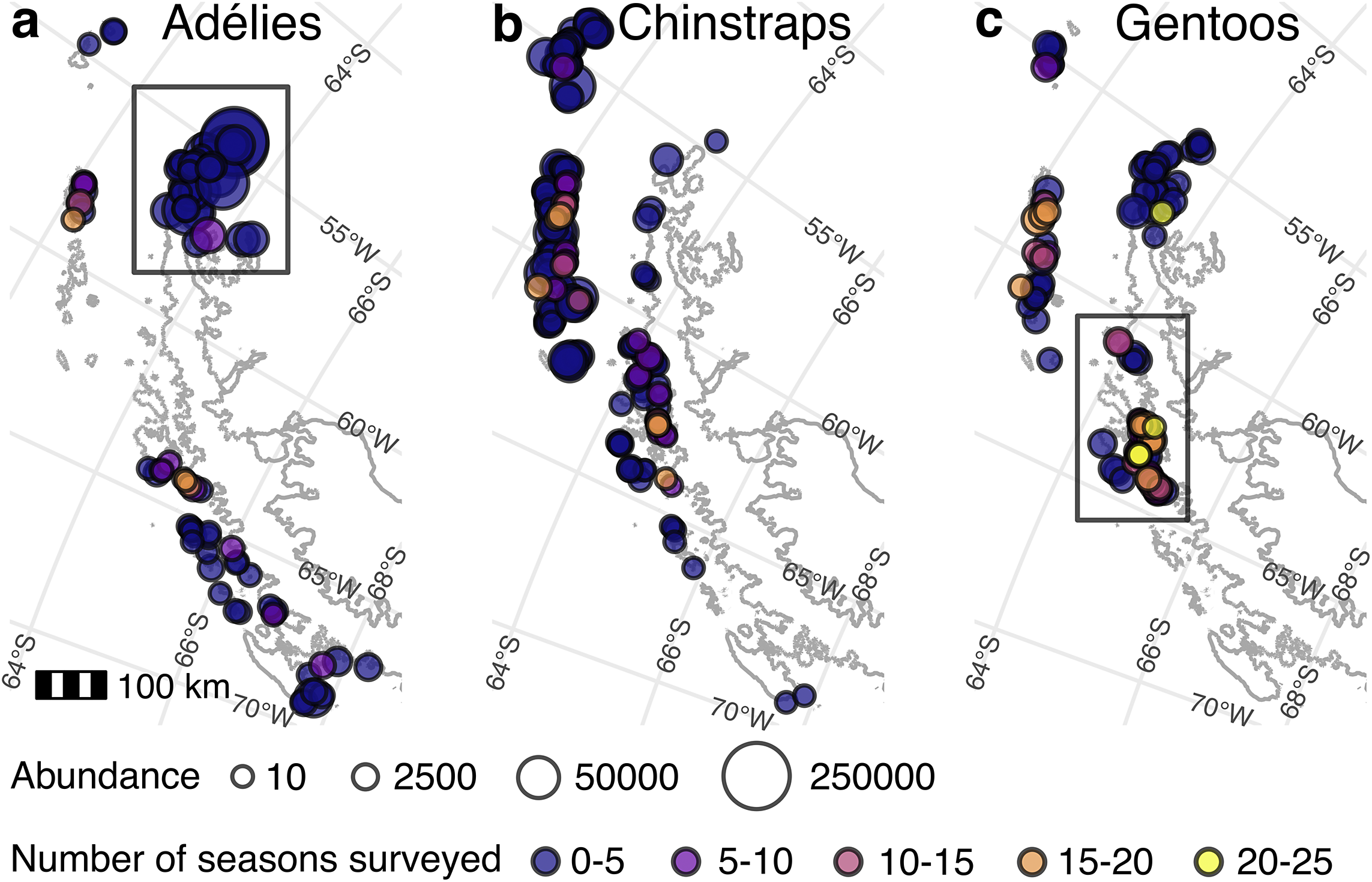
We assumed a hypothetical scenario in which we implemented survey schemes (described in the ‘Monitoring schemes’ section) starting in 2000 and then tested the ability of these schemes to provide data from which regional abundances and overall trends can be successfully recovered. Our tested survey schemes vary in the sequencing in which surveys are conducted across the populations in the region and in the total survey effort (i.e. sites surveyed each season). In addition, because penguin populations vary greatly in size (more so for Adélie and chinstrap penguins than gentoo penguins; Fig. 1), we also evaluated the impact of inter-population variation in size (‘low variance’ vs ‘high variance’) on the efficacy of different survey schemes, which is theorized to affect the power to infer regional trends (Urquhart et al. Reference Urquhart, Paulsen and Larsen1998). We used the central-west Antarctic Peninsula (CWAP) gentoo penguin populations to represent a well-surveyed region with low inter-population variation in size. There are 36 gentoo penguin populations in this region that were surveyed at least once prior to 2000 and at least once between 2000 and 2024, and they range in size from 83 to 9087 nests at the end of the time period studied. These are the 36 sites that we use for our simulation study of low-variance regions. In this region, a median (mean) of 16 (14) populations were surveyed per season from 2000 to 2024 (Fig. S1).
Study region map. Maps of Pygoscelis penguin populations on the Antarctic Peninsula and South Shetland Islands where the points represent populations of a. Adélie penguins, b. chinstrap penguins and c. gentoo penguins. The size of the point corresponds to the number of nests in the population (based on the abundance in 2024 as estimated by the Bayesian model), and the colour corresponds to the number of years from 2000 to 2024 in which the population was surveyed. The bounding boxes designate a. the north-east Antarctic Peninsula and c. the central-west Antarctic Peninsula. The scale applies to all panels. Map layers are from Gerrish et al. (Reference Gerrish, Ireland, Fretwell and Cooper2024), and population locations are from Che-Castaldo et al. (Reference Che-Castaldo, Humphries and Lynch2023).

Figure 1 Long description
From left to right, the first panel labeled ‘Adélies’ displays colony locations as circles on the Antarctic Peninsula and South Shetland Islands. Circle size increases with estimated nest abundance, ranging from small (10 nests) to very large (250,000 nests). Circle color transitions from dark blue (0-5 seasons surveyed) through purple, pink, orange, to yellow (20-25 seasons surveyed). Most Adélie colonies are concentrated in the northeast, highlighted by a rectangular bounding box. The second panel, ‘Chinstraps,’ shows chinstrap penguin colonies distributed mainly along the western and northern coasts, with similar circle size and color coding. The third panel, ‘Gentoos,’ presents gentoo penguin colonies, with a bounding box around the central-west region. Gentoo colonies show more yellow and orange circles, indicating more frequent surveys in that region. All panels share a 100 km scale bar and identical abundance and survey frequency legends at the bottom. Map layers are sourced from Gerrish et al. 2024, and population locations from Che-Castaldo et al. 2023.
The north-east Antarctic Peninsula (NAP) Adélie penguin populations represent a poorly surveyed region with high inter-population variation in size, with populations as small as 19 nests and as large as 261 257 nests. From 2000 to 2024, a median (mean) of 2 (4) of the 37 populations in the region were censused per year (Fig. S2). To make the most direct comparison between a low-variance and high-variance scenario with all else held constant, we scaled the gentoo penguin CWAP population sizes to match the sizes of the Adélie penguin NAP populations. In other words, we wanted to explore the high-variance scenario typical of Adélie penguin populations while holding the strength of the signal constant, so we kept the underlying dynamics from our gentoo penguin model but manipulated the population sizes so that they matched the distribution of Adélie penguin populations in the NAP region. We did this by first extracting the modelled 2024 population sizes for both species, then sorting the populations in descending order by size. We matched the gentoo and Adélie penguin populations by their rank in these sorted lists and calculated a scaling multiplier for each pair by dividing the Adélie penguin population size by the corresponding gentoo penguin size (dropping the smallest Adélie penguin population so that there were 36 populations in each region). We then applied these multipliers to the simulated gentoo penguin time series, effectively scaling each gentoo penguin population to match the size of its Adélie penguin counterpart. We then tested the ability of each monitoring scheme to successfully recover the true trend and abundance of this high-variance region.
We explored scenarios in which k surveys were conducted each season for each region, with k = 16, 8 and 4. In reality, it is often the case that fewer than four Adélie penguin populations in the NAP are censused in a given year, but we did not simulate a scenario involving only two surveys per season because doing so would result in revisit cycles longer than the 25 year period considered here.
Monitoring schemes
We created and tested six monitoring schemes:
-
1) Random (k) - each season, a random selection of k sites were censused.
-
2) Cycling (k) - each season, k sites were censused on an equal, regular interval.
-
3) Most Visited (k) - only the k most-censused (in the actual historical record) sites were censused every season.
-
4) Largest (k) - the k most-populous (in 1999) sites were censused every season.
-
5) Most Visited (k/2)/Cycling (k/2) - a total of k sites were surveyed each year, with half of the survey effort going towards the most-visited sites every season and half going towards cycling through the remaining sites.
-
6) Largest (k/2)/Cycling (k/2) - a total of k sites were surveyed each year, with half of the survey efforts going towards the most-populous (in 1999) sites every season and half going towards cycling through the remaining sites.
It is important to note that these surveys are not adaptive as populations change in abundance after 1999, so a population is defined as one of the largest based strictly on its relative abundance at the implementation of the monitoring scheme. Similarly, gentoo penguin populations colonized or discovered after 1999 are not included in the schemes. These six monitoring schemes are visualized in the Supplementary Materials (Fig. S3).
As a benchmark against which all experimental survey designs were compared, we used the actual pattern of visits through time of CWAP gentoo penguin populations (Fig. S1) and NAP Adélie penguin populations (Fig. S2) for the low- and high-variance scenarios, respectively, with the simulated time series. This allowed us to compare whether any pattern of visits or any change in survey effort improved or degraded our capacity to retrieve the abundances and trends relative to what was done from 2000 to 2024 (i.e. business as usual).
Large Pygoscelis penguin populations are difficult to survey with high precision and are increasingly being surveyed by satellite imagery rather than by direct ground counts (e.g. Lynch & LaRue Reference Lynch and LaRue2014, Strycker et al. Reference Strycker, Wethington, Borowicz, Forrest, Witharana, Hart and Lynch2020). Therefore, we also asked whether our inference of the optimal survey scheme was sensitive to the precision of the surveys. To assess the sensitivity of our results to survey precision, we used the Largest/Cycling monitoring scheme under the high-variance scenario typical of Adélie penguin populations and varied the precision of the surveys for the largest populations while keeping the smaller population surveys at high precision (N1). In this experiment, we considered situations in which the largest populations were surveyed with ≤ 10% observer error (N2 counts), ≤ 15% (N3 counts), ≤ 50% (N4 counts) and ‘within an order of magnitude’ (N5 counts; see supplement 1 to Che-Castaldo et al. Reference Che-Castaldo, Jenouvrier, Youngflesh, Shoemaker, Humphries and McDowall2017). We note that all satellite-based surveys are currently considered N5 counts.
In total, we assessed 50 different time series resulting from sub-sampling the simulated ‘truth’ in 50 different ways according to different sampling schemes: one actual survey pattern of gentoo penguins from the CWAP (1); one actual survey pattern of Adélie penguins from the NAP (1); the six monitoring schemes for the low-variance scenario when k = 16, 8 and 4 (18 total); the six monitoring schemes for the high-variance scenario when k = 16, 8 and 4 (18 total); and the Largest/Cycling scheme for the high-variance scenario with four additional levels of observer error for the largest populations when k = 16, 8 and 4 (12 total). Because the pseudo-truths and many of the sampling schemes involve elements of stochasticity, the pseudo-truths and the 50 time series were each replicated five times to minimize the potential for stochastic draws to impact the results, yielding 250 different datasets.
Assessing the monitoring schemes
We used the hierarchical Bayesian population model to estimate the true abundance at each population × year combination using the 250 datasets constructed as described in the ‘Monitoring schemes’ section, and we then summed the abundances as described in the ‘Population dynamics model’ section to generate a time series of abundance at the regional scale.
We calculated three different summary statistics for how regional abundance differed from the pseudo-truth over the period from 2000 to 2024 when the experimental survey schemes were applied. We calculated our summary statistics for each of the five replicates and averaged them for each tested scenario.
The first summary statistic was the mean absolute percentage error (MAPE), calculated from Equation 3:

In this equation, 25 is the number of seasons in the experimental period, At is the actual (pseudo-true) abundance for each season t and Ft is the forecasted (simulated) abundance in season t. The second summary statistic, ∆Trend, is the difference between the slope of a linear trend fit to the log of the pseudo-true time series and the log abundance from each dataset. The third summary statistic, Spread, was the difference between the 0.975 and 0.025 quantiles of the distribution of the tested scenario in season 2024. We created a composite summary statistic (termed Similarity) by normalizing (μ = 0, σ = 1) the results of each of the three summary statistics and summing them. A lower Similarity value indicated a scenario whose simulated time series more closely resembled the pseudo-true time series. The Similarity value of the actual monitoring scheme for each region was then subtracted from each scenario’s Similarity value to assess the relative performance of each scheme compared to business as usual.
Results
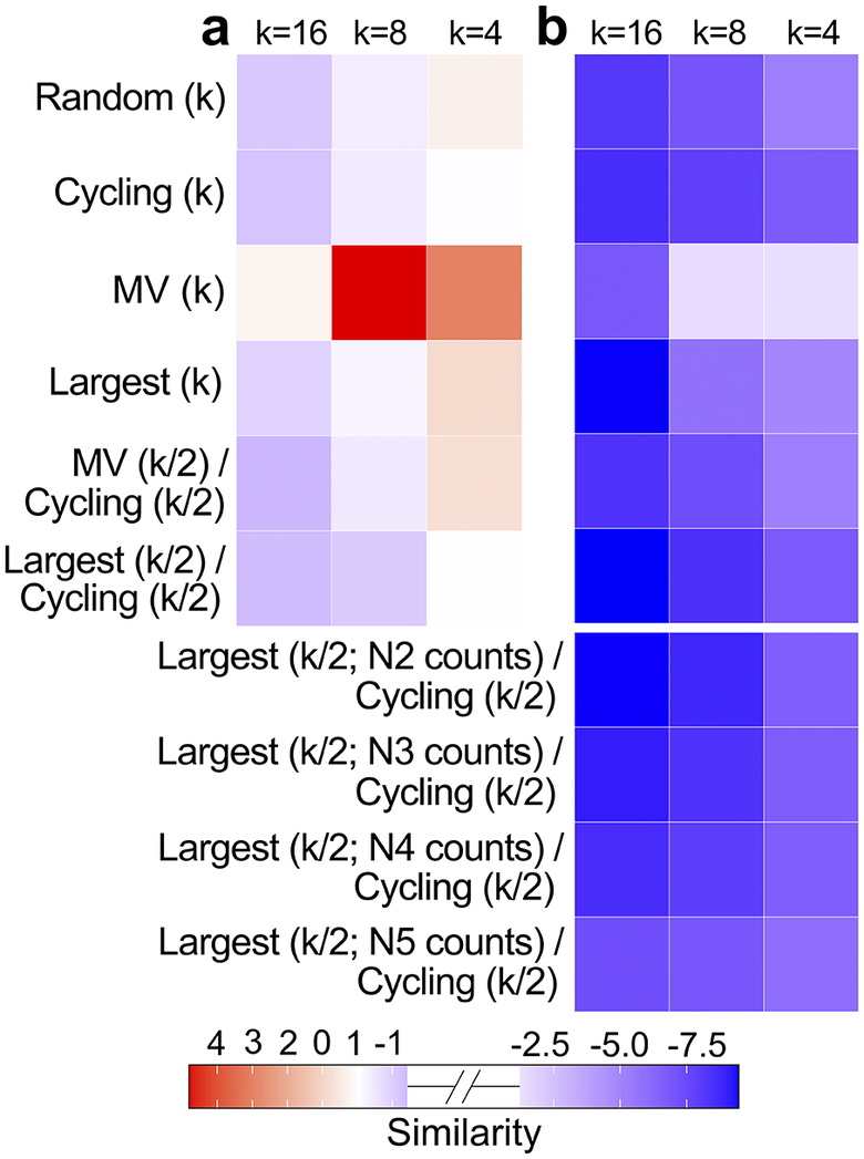
Of the 18 monitoring schemes modelled in the low-variance scenario (Random (k), Cycling (k), Most Visited (k), Largest (k), Most Visited (k/2)/Cycling (k/2), Largest (k/2)/Cycling (k/2), with k = 16, 8 or 4), 12 produced statistics that were closer to the truth than the actual survey pattern of gentoo penguins in the CWAP (Fig. 2a). In the high-variance scenario, all 18 of the schemes using N1 counts produced statistics closer to the truth than the actual survey pattern of Adélie penguins in the NAP (Fig. 2b), but this is to be expected given that our lowest-survey-effort scheme (k = 4) was still higher than the median number of annual surveys conducted in actuality (2).
Model performance. Each square shows the difference between the Similarity score of its corresponding monitoring scheme (MV = Most Visited) and the Similarity score of the actual monitoring scheme for each region. Negative (blue) similarity scores represent better model performances than the actual scenario, and positive (red) similarity scores represent worse performances. Panel a. shows the monitoring scheme’s performances in the low-variance scenario compared to the performance of the actual gentoo penguin central-west Antarctic Peninsula monitoring pattern. Panel b. shows the monitoring scheme’s performances in the high-variance scenario compared to the performance of the actual Adélie penguin north-east Antarctic Peninsula monitoring pattern, including Largest/Cycling scenarios with increased observer error. All monitoring schemes collected N1 count data unless otherwise noted.

Figure 2 Long description
There are two panels, labeled a and b, each with a 10-row by 3-column heatmap. Columns in both panels are labeled at the top as k equals 16, k equals 8, and k equals 4. Rows on the left are labeled from top to bottom as Random open parenthesis k close parenthesis, Cycling open parenthesis k close parenthesis, M V open parenthesis k close parenthesis, Largest open parenthesis k close parenthesis, M V open parenthesis k divided by 2 close parenthesis forward slash Cycling open parenthesis k divided by 2 close parenthesis, Largest open parenthesis k divided by 2 close parenthesis forward slash Cycling open parenthesis k divided by 2 close parenthesis, Largest open parenthesis k divided by 2 semicolon N 2 counts close parenthesis forward slash Cycling open parenthesis k divided by 2 close parenthesis, Largest open parenthesis k divided by 2 semicolon N 3 counts close parenthesis forward slash Cycling open parenthesis k divided by 2 close parenthesis, Largest open parenthesis k divided by 2 semicolon N 4 counts close parenthesis forward slash Cycling open parenthesis k divided by 2 close parenthesis, and Largest open parenthesis k divided by 2 semicolon N 5 counts close parenthesis forward slash Cycling open parenthesis k divided by 2 close parenthesis. In panel a, the M V open parenthesis k close parenthesis row shows the most intense red at k equals 8, indicating the highest positive similarity score, with lighter red at k equals 4 and lighter shades elsewhere. Other rows show mostly pale blue or near white. In panel b, all cells are blue, with the darkest blue in the Largest open parenthesis k divided by 2 semicolon N 2 counts close parenthesis forward slash Cycling open parenthesis k divided by 2 close parenthesis row at k equals 16, indicating the lowest similarity score. The color bar below both panels ranges from red at 4, through white at 0, to blue at negative 7.5, labeled as Similarity.
Censusing k = 16 populations a year using the Most Visited/Cycling monitoring scheme in the low-variance scenario produced the best raw Similarity score of all simulations (before being compared to the Similarity value of the actual survey schemes). The planned monitoring scheme with the worst raw Similarity score was the k = 4 Most Visited scheme in the high-variance scenario, although it outperformed the actual monitoring scheme of the high-variance region. (It is worth noting that the overall poor Similarity for the k = 4 Most Visited scheme in the high-variance scenario represented an average of poor fit for MAPE and Spread but a good fit for ∆Trend; see Supplementary Materials, Tables S1 & S2, for all statistics for all scenarios.)
Within the low-variance scenario, the k = 16 Most Visited/Cycling scheme was best able to recover the true abundance and trend statistics, whereas in the high-variance scenario it was the k = 16 Largest/Cycling scheme that was optimal. When schemes involving surveys of varying precision were compared, model performance decreased as observer error increased. However, it is notable that even when the large populations were surveyed using the lowest (N5) precision, the Largest/Cycling monitoring scheme when k = 4 outperformed the actual monitoring scheme (Fig. 2b). Expressed differently, it was possible to achieve better overall performance (than the business-as-usual scenario) using the lowest-precision surveys for the largest populations if the sample was done using the most optimal scheduling scheme. These results are the averages from the five replicates, although most of the reported results are also true for each replicate in isolation. The variation across replicates, which represents our uncertainty, is displayed in Fig. S4.
Discussion
As expected, we find that survey schemes involving greater effort (i.e. more surveys) outperform survey schemes involving less effort in terms of accurately describing abundance patterns (with one exception discussed below). For this reason, our actual survey pattern over the last 25 years has allowed for more precise inferences on gentoo penguins in the CWAP, where survey effort has been greater and the populations are less heterogeneous in size, than on Adélie penguins in the NAP, where surveys were rarer and the populations vary tremendously in size.
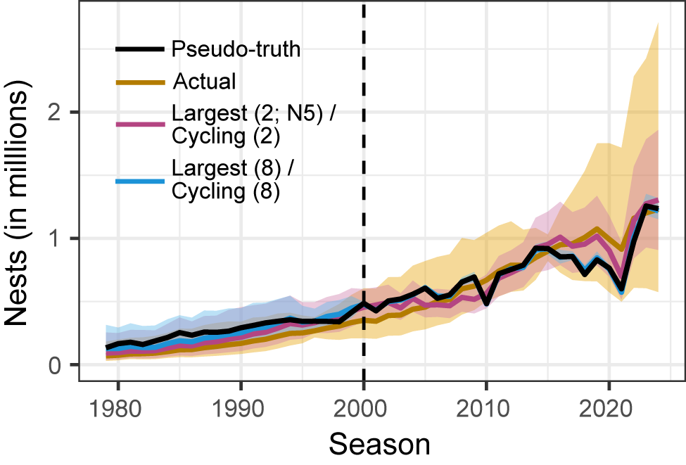
Select simulation results. The simulated number of nests in a region over time for one replicate of the high-variance scenario. The solid black line is the ‘pseudo-true’ regional time series (resulting from central-west Antarctic Peninsula gentoo penguin trends but north-east Antarctic Peninsula Adélie penguin population sizes). The yellow line is the result of the actual survey pattern of Adélie penguins in the north-east Antarctic Peninsula. The pink line is the result of the Largest/Cycling scheme when k = 4 and the largest populations have N5 counts. The blue line is from the Largest/Cycling scheme when k = 16. The corresponding ribbons are the 95% credible intervals for each simulation. The vertical dashed line at season 2000 represents when the simulated monitoring schemes were enacted.

Figure 3 Long description
The x-axis is labeled Season, spanning from 1980 to 2025. The y-axis is labeled Nests in millions, ranging from 0 to above 2. Four lines are plotted: a solid black line for Pseudo-truth, a yellow line for Actual, a pink line for Largest (2; N2) or Cycling (2), and a blue line for Largest (8) or Cycling (8). Each line is surrounded by a shaded ribbon representing the 95 percent credible interval. All lines start near zero and rise gradually until about 2000, where a vertical dashed line marks the start of simulated monitoring schemes. After 2000, all lines increase, with the yellow Actual line showing the largest rise and widest uncertainty, peaking above 2 million nests by 2025. The black, pink, and blue lines track closely together, with smaller credible intervals, and all show a sharp increase after 2020. The legend in the top left matches line colors to scheme names.
Even within a given total survey effort, our ability to extract the correct abundance and trend for a region was highly sensitive to how that effort was distributed through space and time. In both low-variance well-surveyed regions such as CWAP gentoo penguins and high-variance poorly-surveyed regions such as NAP Adélie penguins, we created monitoring schemes that outperformed the actual survey patterns. In the CWAP, we even found survey schemes that would have outperformed the actual survey pattern while requiring considerably fewer surveys. Approximately 16 of the 36 CWAP gentoo penguin sites used in this study are surveyed a year in actuality, but our simulations show that only surveying four sites a year in this low-variance situation using a scheme that cycles through all sites on a regular schedule would be as successful as our current efforts at accurately assessing regional trends and abundances. Importantly, a focus on a smaller number of surveys in the CWAP each season would probably allow for surveys to be aligned more carefully with the peak of nesting, reducing error deriving from phenological mismatches. In theory, a smaller number of surveys in the CWAP could also allow for greater effort in areas where surveys remain limited (e.g. the NAP), although it can often be access to sites rather than personnel that constrains survey efforts in more remote locations.
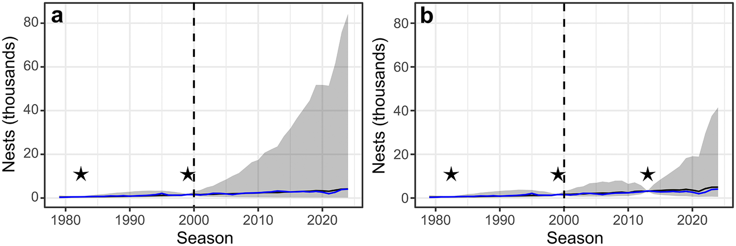
Example population time series. One replicate of the Pléneau Island gentoo penguin population a. under a scheme in which it was never censused after 1999 and b. under a scheme in which it was censused in 2013. In each panel, the blue line is the pseudo-true time series, the black line is the median estimated time series of nests from that sampling scenario and the grey ribbon is the 95% credible interval around the estimated time series of nests. The vertical dashed lines at season 2000 represent when the monitoring schemes were enacted, and the stars denote seasons with census counts.

Figure 4 Long description
Panel a on the left has the y-axis labeled Nests (thousands) from 0 to 80 and the x-axis labeled Season from 1980 to 2025. The blue line near the bottom represents the pseudo-true time series. The black line, closely following the blue, is the median estimated time series. A wide grey ribbon surrounds the black line, indicating the 95 percent credible interval, which expands dramatically after 2000. Two black stars are placed at approximately 1982 and 1999, marking census years. A vertical dashed line at season 2000 indicates the start of the monitoring scheme. After 2000, the credible interval widens and the upper bound rises steeply, peaking near 80 thousand nests by 2025, while the median estimate remains low. Panel b on the right has the same axes. The blue and black lines again track closely near the bottom. The grey ribbon is narrower than in panel a after 2013. Three black stars are at approximately 1982, 1999, and 2013, marking census years. The vertical dashed line at 2000 is present. After 2013, the credible interval remains narrower and the upper bound increases less sharply, peaking near 40 thousand nests by 2025. The median estimate remains low throughout.
In the high-variance NAP, a survey pattern that splits efforts between censusing the largest populations every year (which are considerably larger than the smaller populations) and cycling through the remaining sites at a regular interval is the optimal method regardless of survey effort. Our simulations suggest that surveying even four populations per year with this Largest/Cycling scheme provides more accurate inferences on abundances and trends than the business-as-usual survey pattern in the NAP (Fig. 3, yellow line). Remarkably, this remains true even if the two largest populations are only surveyed by satellites as N5 counts (Fig. 3, pink line). This means that we could improve our understanding of the NAP region with just two high-precision (N1) surveys per year (the current median number of surveys conducted in the NAP) if we were able to 1) obtain satellite-based estimates annually from the two largest populations and 2) arrange on-the-ground visits to the remaining sites on a strict cycling schedule.
In most cases, the worst survey patterns were the ones that only ever censused the same selection of populations every year, which is consistent with the conclusions of Urquhart et al. (Reference Urquhart, Paulsen and Larsen1998) that monitoring multiple sites alone is not an effective way to infer regional trend. When only a selection of sites are monitored, information on regional trend comes from those populations alone, regardless of how representative they actually are of the region. For example, in the CWAP, the fifth and sixth most-visited sites had much higher growth rates than the rest of the region (Almirante Brown and Biscoe Point, respectively). As a result, the Most Visited scheme performed worse when eight sites were surveyed per year than four (Fig. 2a); the two unrepresentative sites influenced the model into predicting high growth rates for all populations when k = 8, but they were not in the top four most-visited sites and thus did not elevate the growth rate when k = 4.
Our conclusion that all populations should be monitored is also due to our inability to incorporate density dependence (i.e. the modulation of population growth rate from population size) into the models and our use of log-normal distributions for modelling abundance. Without density dependence, model uncertainty grows quickly for every year that a population goes unsurveyed. This increased variance has two impacts on our model: 1) the variances of unsurveyed populations compound and increase regional uncertainty in abundance and 2) the expected value of the log-normal distribution increases as the variance increases since it involves both μ and σ parameters, even if the median remains fixed. As a result, these unsurveyed populations can quickly come to dominate the regional abundance and uncertainty in our model because the model does not contain any new information to confirm that the populations have not been growing exponentially. Although the population model is not mechanistically an age-structured demographic model, it implicitly allows for immigration because the range of growth rates it considers is wider than is biologically likely to be driven by recruitment and mortality alone. The resulting inferences on total abundances and trends become poorer reflections of the underlying truth through time because of the compounding uncertainties. When these sites are resurveyed, the model is forced to accommodate these new data, which constrain the uncertainty even for the intervening periods (e.g. Fig. 4). Data gaps that are ‘closed’ by a resurvey are far less detrimental than gaps that persist until the end of the time series, so schemes that minimize this ‘time since last survey’ generally perform the best. Schemes that cycle through sites on a regular schedule will minimize the maximum time since last survey.
The Bayesian model used in this study (developed by Che-Castaldo et al. Reference Che-Castaldo, Jenouvrier, Youngflesh, Shoemaker, Humphries and McDowall2017) does not incorporate density dependence for both ecological and statistical reasons. Ecologically, prior studies provide conflicting evidence for density dependence in Pygoscelis penguins. Che-Castaldo et al. (Reference Che-Castaldo, Jenouvrier, Youngflesh, Shoemaker, Humphries and McDowall2017, supplement 5) found that some of the largest Adélie penguin populations show evidence of negative density dependence, whereas Şen et al. (Reference Şen, Che-Castaldo, Krumhardt, Landrum, Holland and LaRue2023, appendix A2) found that population size does not meaningfully improve model predictions of population growth. This may be because penguins often compete for food with individuals from other neighbouring populations, violating the assumption of closed populations of classic density dependence models. Even more seriously, there are statistical difficulties with estimating density dependence using these data. Terrestrial factors probably play a major role in the determination of a population’s carrying capacity, and we would need to estimate population-specific carrying capacity using only the time series from each population in isolation. Even for the few populations where the amount of available data is sufficient to attempt to fit density-dependent population models, many seem to be fluctuating below their carrying capacities and thus provide little information on what that carrying capacity might be. Adopting age-structured demographic models may be a more realistic way to curtail biologically unrealistic uncertainties between surveys. Demographic models are becoming more prevalent in Pygoscelis population modelling (e.g. Hinke et al. Reference Hinke, Trivelpiece and Trivelpiece2017, Herman & Lynch Reference Herman and Lynch2022, Morandini et al. Reference Morandini, Dugger, Schmidt, Varsani, Lescroël and Ballard2024, Flynn et al. Reference Flynn, Juárez-Martínez, Hart and Lynch2026), although banding limitations and uncertainties surrounding the prevalence of immigration present challenges to their widespread implementation.
The methods used in this study mirror the structure of observing system simulation experiments (OSSEs) widely used in meteorology (e.g. Errico et al. Reference Errico, Yang, Privé, Tai, Todling, Sienkiewicz and Guo2013, Hoffman & Atlas Reference Hoffman and Atlas2016). In meteorological OSSEs, a model of reality is treated as the ‘true’ state of the atmosphere, synthetic observations are generated according to hypothetical survey plans and the performance of each plan is assessed by how well it can be used to recover the known truth. In this sense, our approach is an ecological parallel of OSSEs that space agencies use to inform decisions regarding the location, timing and quality of measurements. Our simulations similarly provide some concrete guidance for optimal survey designs, but these designs would require coordinated action by the stakeholders involved. However, it is worth noting that satellite imagery provides a cost-effective way of obtaining abundance estimates annually for the largest Adélie penguin populations if funding is provided to allow for annual image acquisition and annotation. Although the abundance estimates from satellites are less precise than direct ground surveys, even N5 counts are sufficient to greatly improve our inferences at the regional scale if they are combined with a modest but structured ground survey schema.
Finally, it is worth cautioning that while ad hoc vessel-based surveys are inefficient from the perspective of capturing regional trends and abundance, they are more likely to capture the establishment of new (or undocumented) populations than a systematic survey pattern that traverses the same route each year. Gentoo penguin expansion on the Antarctic Peninsula is well documented (Herman et al. Reference Herman, Borowicz, Lynch, Trathan, Hart and Lynch2020), and vessel-based surveys have allowed us to track the geographical distribution and timing of these events. Combined with genetics, these data have provided a much richer understanding of penguin biogeography than would be possible if surveys had been constrained to a set of known breeding locations in 2000. Ultimately, choices between a systematic survey scheme and more opportunistic exploration of the region hinge on management and scientific priorities. Here we provide a methodological tool that can aid in the cost-benefit analysis for making those decisions in the future.
CRediT authorship statement
CMF: conceptualization, methodology, software, formal analysis, data curation, writing - original draft preparation, writing - reviewing and editing, visualization; HJL: conceptualization, methodology, formal analysis, data curation, writing - original draft preparation, writing - reviewing and editing, visualization, supervision, project administration, funding acquisition.
Supplementary material
To view supplementary material for this article, please visit http://doi.org/10.1017/S0954102026100753.
Acknowledgements
We gratefully acknowledge Noah Dean for his input into the development of this project, and Lesley Thorne and Resit Akçakaya for their helpful feedback.
Financial support
We acknowledge funding from the Pew Charitable Trust in support of this research.
Competing interests
The authors declare none.


 Open access