
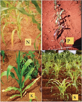
Fig. 12.1 Maize deficiency symptoms of the four main limiting macronutrients in the tropics. Nitrogen (N) deficiency in southern Malawi; phosphorus (P) deficiency in western Kenya; potassium (K) deficiency in Nigeria; and sulfur (S) deficiency in northern Malawi.
Soil fertility is the capacity of soils to supply essential nutrients to plants. Currently, we recognize 17 elements as essential plant nutrients, three of which, carbon (C), oxygen (O) and hydrogen (H), are taken up from the air and soil pores, and the remaining 14 from the soil. Essential means that without them plants, microbes or animals would not be able to complete their life cycles (Barker Reference Barker2010). Essential elements are not fungible; it is not possible to substitute one for another, all are equally essential. Table 12.1 lists them in order of their typical concentration in plants, indicating the main ionic or molecular species that plants take up, and their main functions in plant physiology.
Table 12.1 The essential nutrient elements, in order of typical concentration in plants. Adapted from Barker (Reference Barker2010) and Muñiz (Reference Muñiz2008).
In addition, there are other elements that are considered beneficial but not essential – silicon (Si), iodine (I), selenium (Se), chromium (Cr), vanadium (V), arsenic (As), sodium (Na), and cobalt (Co) being the main ones. Silicon imparts strength to plants to stand up straight and deters some chewing insects, but high contents can damage milling machinery. Some grasses (rice, sugar cane) respond to silicon in Oxisols and Histosols that have very low levels of layer-silicate clays or weatherable minerals. Iodine is an essential element for humans to develop intelligence early in life, and is treated as one of the five “micronutrients” in human nutrition (Chapter 2). Selenium is very important in animals and is commonly a component of salt licks that are used in livestock production. It is also important in wheat growth (Ivan Ortiz-Monasterio, personal communication, 2016). Chromium, vanadium and arsenic are also considered essential elements for animals (Muñiz Reference Muñiz2008). Sodium is everywhere in fluids of living beings, but its essentiality has not been proven. However, sodium is believed to be required for nitrogen fixation.
While this list seems overwhelming, nature takes care of most of these plant requirements with little help from humans, who focus on managing nutrients that are deficient, or in some cases those that can reach toxic levels (iron, manganese, boron, sodium), as well as occasional interactions between calcium, magnesium and potassium. Note that aluminum (Al) is not a nutrient, but often reaches toxic levels in acid soils. Environmentally, carbon (CO2, CH4), nitrogen (NO3–, N2O, NO) and phosphorus (H2PO4–, HPO42–) can harm the environment, causing global warming or eutrophication.
There are three main principles of soil fertility: the law of the minimum, synchrony and nutrient cycling.
12.1 The Law of the Minimum
Justus von Liebig (Reference Sanchez, Palm, Szott, Cuevas, Lal, Coleman, Oades and Uehara1840) established the law of the minimum, which states that plant growth will be limited by the essential element that it is most deficient in. So, if it is nitrogen – as is mostly the case – plants will respond to nitrogen applications until a plateau is reached. Then if phosphorus is the second most limiting nutrient, additional growth will take place with phosphorus fertilization until a yield plateau is reached, and so on. If the limiting factor is physical, such as soil compaction, plants will not respond adequately until that constraint is largely overcome. Even if levels of all 14 nutrients are adequate, growth may be limited by water, the genetic potential of the crop’s cultivar, management and, ultimately, by temperature and solar radiation. The law of the minimum is shown in Fig. 12.2, and is the first principle of soil fertility.
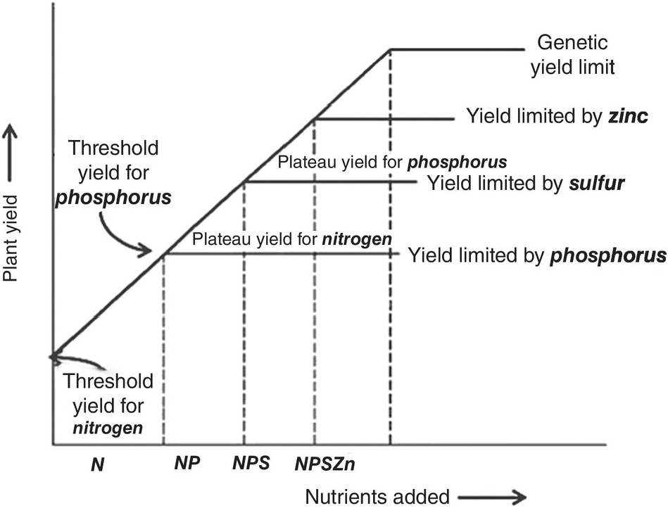
Fig. 12.2 Illustration of the law of the minimum.
12.2 Synchrony
Unlike the law of the minimum, which shows a linear response with plateaus, the time course of plant nutrient uptake (nutrient accumulation) is a parabolic curve. It is very flat at the beginning, mostly because the seedling is using seed reserves, then shows a slow growth while plants build up their root system, then a “grand” period of rapid growth, then a slowing down as plants switch to their reproductive stage, which is followed by a plateau and, in certain cases, a decrease, as physiological maturity approaches (Fig. 12.3).
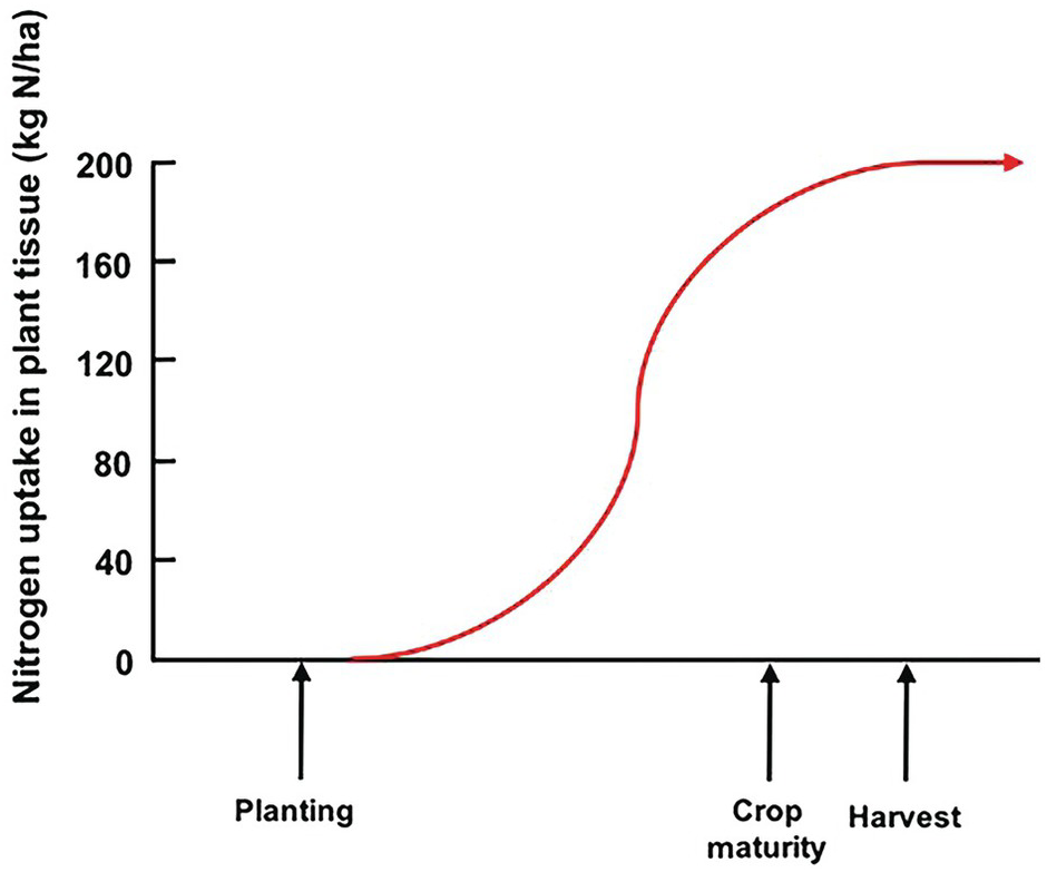
Fig. 12.3 A typical nutrient-uptake curve.
The ideal way is to synchronize nutrient additions with the plant’s nutrient requirements as it grows. This is the “synchrony principle,” developed under the leadership of ecologist Mike Swift (Swift Reference Swift1985), and is the second principle of soil fertility; one which represents the agronomist’s dream, and is seldom, if ever, realized.
The difficulties in synchronization are caused by two main reasons. First, there is the total asynchrony between the germinating seedling and basal fertilizer applications before or at planting. The seedling, as mentioned before, draws nutrients from its seed reserves and is incapable of using any basal fertilizer, which is vulnerable to leaching until the root system develops. In the case of nitrogen, basal applications are also vulnerable to denitrification and nitrous oxide (N2O) emissions to the atmosphere, and to ammonia (NH3) volatilization in soils with high pH. The second reason is the pulse effect of soluble fertilizer applications, as soluble mineral fertilizers, when exposed to soil moisture, drastically increase the ionic content in the soil solution of the nutrient in question. This lack of synchrony is shown in Fig. 12.4. This figure shows the crux of the nutrient efficiency issues, a central challenge of soil management, and one now recognized to be a major player in global warming due to N2O emissions to the atmosphere.
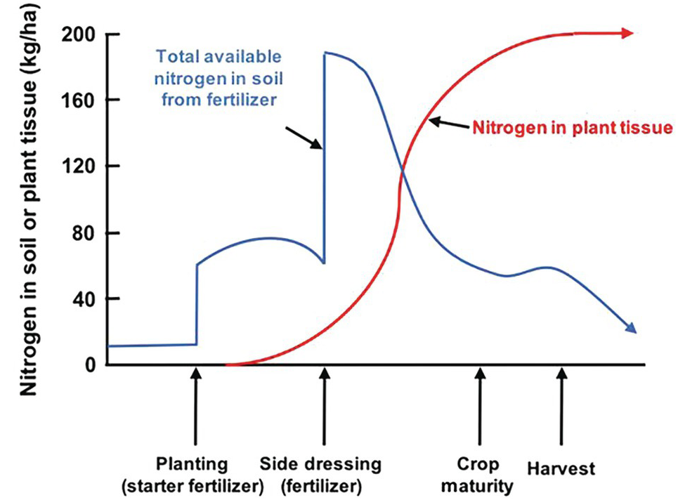
Fig. 12.4 Synchrony between a crop nutrient uptake pattern and fertilizer application is very difficult to achieve, especially at the early stages of growth.
12.3 Nutrient Cycling
Nutrient cycling is the third fundamental principle of soil fertility. Vitousek et al. (Reference Vitousek, Hättenschwiller, Olander and Allison2002) noted the following salient point: cycles of soil nutrient elements are different, varying in speed depending on the types of bonds the elements have with carbon, and on their stoichiometry (element ratios). Organic nitrogen (N) forms covalent bonds with organic carbon (C) (–C–N–), while organic phosphorus (P) and organic sulfur (S) form ester bonds (–C–O–P or –C–O–S), and most other nutrient elements (potassium [K], calcium [Ca], magnesium [Mg], iron [Fe], manganese [Mn], zinc [Zn], etc.) are either bonded ionically or are in loose associations with soil organic carbon (SOC).
The covalent bonding of N with C results in a series of soil organic nitrogen (SON) compounds that are chemically recalcitrant or physically protected in the slow and passive SON pools. Phosphorus and sulfur compounds have a high negative charge, which is believed to prevent them from being entrapped in the slow and passive SOC pools, confining them to the “active” SOC and the structural and metabolic carbon organic input pools. The ester links between organic phosphorus and organic sulfur are readily split by extracellular enzymes, such as phosphatase and sulfatase, which are produced by roots, mycorrhizae and soil microorganisms. Organic phosphorus and sulfur mineralization proceeds rapidly, once the extracellular enzymes break the ester bonds. The resulting phosphorus and sulfur anions react with soil minerals in ways that nitrogen does not.
This makes nitrogen mineralization slower and more costly in terms of energy (supplied by carbon) than the mineralization of phosphorus and sulfur. In terms of stoichiometry, plants have C:N ratios of 100 and above, while soil bacteria have low C:N ratios, about 6, which means that bacteria require more nitrogen relative to the energy available, and in fact they are usually nitrogen-starved. Phosphorus and sulfur cycles are more flexible than the nitrogen cycle (Vitousek et al. Reference Vitousek, Hättenschwiller, Olander and Allison2002).
Also, nutrient cycles vary in how closed or “tight” they are because of different loss pathways. The nitrogen cycle is very “leaky” because of gaseous and leaching losses. The phosphorus cycle is “tight,” but the potassium cycle is also leaky. The question of how to loosen or tighten nutrient cycles in agricultural systems is a priority for soil scientists.
12.4 Nutrient Uptake by Crops and Cycling
The demand side of soil fertility is best represented by the nutrient uptake at harvest. Tables 12.2 and 12.3 give useful information on crops at different yield levels and their nutrient uptake. For industrial and fruit crops, only the nutrients actually removed from the field are indicated (Table 12.4).
Table 12.2 Nutrients accumulated by major cereals, in yields of cereals on a dry weight basis (12–14 percent water). Typical values.
| Crop | Plant part | Yields | Nutrient uptake at harvest (kg/ha) | ||||
|---|---|---|---|---|---|---|---|
| (t/ha) | N | P | K | Ca | Mg | ||
| Maize | Grain | 1.0 | 25 | 6 | 15 | 3.0 | 2.0 |
| Stover | 1.5 | 15 | 3 | 18 | 4.5 | 3.0 | |
| Total | 2.5 | 40 | 9 | 33 | 7.5 | 5.0 | |
| Grain | 4.0 | 63 | 12 | 30 | 8.0 | 6.0 | |
| Stover | 4.0 | 37 | 6 | 38 | 10.0 | 8.0 | |
| Total | 8.0 | 100 | 18 | 68 | 18.0 | 14.0 | |
| Grain | 7.0 | 128 | 20 | 37 | 14.0 | 11.0 | |
| Stover | 7.0 | 72 | 14 | 93 | 17.0 | 13.0 | |
| Total | 14.0 | 200 | 34 | 130 | 31.0 | 24.0 | |
| Rice | Grain | 1.5 | 35 | 7 | 10 | 1.4 | 0.3 |
| Straw | 1.5 | 7 | 1 | 18 | 2.6 | 2.2 | |
| Total | 3.0 | 42 | 8 | 28 | 4.0 | 2.5 | |
| Grain | 8.0 | 106 | 32 | 20 | 4.0 | 1.0 | |
| Straw | 8.0 | 35 | 5 | 70 | 24.0 | 13.0 | |
| Total | 16.0 | 141 | 37 | 90 | 28.0 | 14.0 | |
| Wheat | Grain | 0.6 | 12 | 2.4 | 3 | 0.3 | 1.0 |
| Straw | 1.0 | 3 | 0.8 | 14 | 2.0 | 2.0 | |
| Total | 1.6 | 15 | 3.2 | 17 | 2.3 | 3.0 | |
Table 12.3 Nutrients accumulated by root and grain legume crops and forage grasses. Root crops are in fresh weight, grain legume in grain yields, as for cereals in Table 12.2, grasses in above-ground dry mass. Typical values.
Table 12.4 Nutrients removed by major industrial and fruit crops. Typical values. From first edition.
In nutrient cycling, there are major differences in how much of the nutrients tropical ecosystems take up and return to the soil. Table 12.5, complied by a team of ecologists and agronomists (Sanchez et al. Reference Sanchez, Gavidia, Ramirez, Vergara and Minguillo1989), illustrates several key points. Tropical rainforests, both on acid and fertile soils, produce more than twice (~4 t C/ha per year) the above-ground litter than tropical savannas. Only high-input wetland rice and a maize–maize–soybean system produced similar annual amounts. But the champion of them all was the white potato in the Andes, which produced almost 7 t C/ha of tops in only 4 months. The lowest value was ~0.4 t C/ha of sorghum stover in the Sahel.
Table 12.5 Biomass and nutrient uptake of above-ground organic resources that are recycled back to the soil in tropical natural systems and agroecosystems, assuming total residue return, but the economic parts were harvested. Representative values. Adapted from Sanchez et al. (Reference Sanchez, Gavidia, Ramirez, Vergara and Minguillo1989).
| System description and duration (in parenthesis) | Economic yield (t/ha) | Yield: residue ratio | Input | Dry biomass (t/ha) | Nutrients returned to soil (kg/ha) | ||||
|---|---|---|---|---|---|---|---|---|---|
| Ca | N | P | K | Ca | |||||
| Natural systems (1 year): | |||||||||
| Tropical rainforest, acid soilsb | – | – | Litter fall | 8.8 | 3960 | 108 | 3 | 22 | 53 |
| Tropical rainforest, fertile soilsc | – | – | Litter fall | 10.5 | 4725 | 162 | 9 | 41 | 171 |
| Tropical savannad | – | – | Litter fall | 3.8 | 1719 | 25 | 5 | 31 | 11 |
| Short-cycle tropical food cropsc: | |||||||||
| Rice (4 months)e | 2.2 | 0.8 | Straw | 2.8 | 1260 | 15 | 2 | 37 | 11 |
| Maize (4 months)f | 1.3 | 0.7 | Stover | 2 | 900 | 18 | 3 | 19 | 7 |
| Sorghum (5 months)f | 0.7 | 0.8 | Stover | 0.9 | 405 | 8 | 1 | 10 | 4 |
| Potato (4 months)f | 10.7 | 0.7 | Tops | 15.1 | 6975 | 17 | 1 | 43 | 14 |
| Soybean (3 months)g | 1.7 | 0.7 | Stover | 2.4 | 1080 | 27 | 2 | 24 | 22 |
| High-input tropical agroecosystems: | |||||||||
| Wetland rice, two crops per year (1 year)e | 11 | 1 | Straw | 11 | 4950 | 59 | 9 | 151 | – |
| Maize–maize–soybean, three crops per year (1 year)h | 8.7 | – | Stover | 9.3 | 4185 | 139 | 15 | 98 | – |
| Soybeans, Cerrado (4 months)g | 2.3 | 0.7 | Stover | 3.5 | 1575 | 86 | 8 | 43 | – |
| Cocoa/Erythrina agroforestry, Brazil (1 year)i | 1 | 0.2 | Leaf litter | 6 | 2700 | 81 | 14 | 71 | – |
| Low-input tropical agroecosystems: | |||||||||
| Upland rice–rice–cowpea, Peru (1 year)i | 4.7 | – | Straw/ stover | 6 | 2700 | 77 | 12 | 188 | – |
| Brachiaria humidicola/Desmodium ovalifolium grazed pasture, Colombia (1 year)j | – | – | Leaf litter | 7 | 3153 | 60 | 5 | 12 | – |
| Alley cropping, Inga edulis (1 year)k | – | – | Tree prunings | 6 | 2700 | 137 | 10 | 52 | – |
| Cocoa/Erythrina agroforestry, Brazil (1 year)i | 1 | 0.2 | Leaf litter | 6 | 2700 | 81 | 14 | 71 | – |
a Vitousek and Sanford (Reference Vitousek and Sanford1986).
b Sarmiento (Reference Sarmiento1984).
c Nutrient contents from DeDatta (Reference DeDatta1981).
d Yields for the tropics from the FAOSTAT statistics database (fao.org/faostat), data for 1985, accessed in 1989.
e Nutrient content from first edition.
f Yields from Goedert (Reference 325Goedert1986), nutrient content from Henderson and Kamprath (Reference Henderson and Kamprath1970).
g First edition; Sanchez et al. Reference Sanchez, Villachica and Bandy1983; TropSoils (Reference Caudle and McCants1987).
h CEPLAC (1989).
i Sanchez and Benites (Reference Sanchez and Benites1987).
j CIAT (1985).
k Szott (Reference Szott1987).
High-input agroecosystems generally add similar nutrient inputs to the soils as the natural systems. For example, residues returned to the soil by an annual maize–maize–soybean rotation in the Peruvian Amazon provided more nitrogen, phosphorus, potassium and similar levels of calcium and magnesium than litter fall from a tropical rainforest in similar soils. Residue return in intensive wetland rice production exceeded nutrient litter fall, particularly for potassium, compared to a tropical rainforest on fertile soils. Fertilizer and liming applications in these high-input systems is a principal reason for this.
As expected, this did not happen in low-input systems, but when aluminum-tolerant cultivars were used in acid soils, some systems came surprisingly close to the natural ones. The upland rice–cowpea rotation, after burning a secondary forest, recycles less carbon and nitrogen, but more phosphorus and much more potassium than the rainforest in similarly acid soils. The aluminum-tolerant Brachiaria humidicola/Desmodium ovalifolium grazed pasture in the Colombian Llanos returned more carbon, nitrogen and calcium, similar levels of phosphorus and magnesium, but less potassium, than the natural tropical savanna systems (Sanchez et al. Reference Sanchez, Gavidia, Ramirez, Vergara and Minguillo1989). This indicates that well-managed, fertilized agricultural systems can recycle nutrients back to the soil similarly to the appropriate natural system, even though the economic product, principally grains, have been taken away. The trick is to ensure that crop residues are returned to the soil.
12.5 Determining Fertilizer Needs
The three soil fertility principles are used as the basis for determining mineral and organic fertilizer needs – one of the major agronomic challenges, not only for increasing food production, but also to reduce leaching and greenhouse gas emissions.
The previous section dealt with the demand side, or the amounts of nutrients needed by plants, as well as the nutrients returned to the soil by cycling. Now we turn to the supply side, determining how much mineral fertilizer is needed (organic fertilizers are discussed in Chapters 11 and 13). The main steps to determine fertilizer needs are soil sampling, tackling variability, laboratory analyses, soil test correlations, modeling and developing fertilizer recommendations.
12.5.1 Soil Sampling
Taking a representative soil sample is both the first step and the largest source of error in soil fertility evaluation, because of the magnitude of extrapolation of the analytical results. When a 5-g subsample taken from a 500-g composite sample of a 2.5-ha field at 15-cm depth is used for phosphorus determination, it represents one-billionth (10–9) of the total soil volume for which the analysis is made (Perur et al. Reference Perur, Subramanian, Muhr and Ray1974).
Soil scientists assume that the distribution of printed instructions and diagrams on how to take soil samples is sufficient to be assured of representative specimens. Unfortunately, this is not always the case. A representative soil sample is a composite of 10–20 samples of the root zone of a field with no major variation in slope, drainage, color or past fertilizer history. For deep-rooted plants, I recommend taking a 0–20-cm and 20–50-cm sample, and for the deepest rooted ones, a 50–100-cm and 100–300-cm sample. Non-representative areas, such as fence rows, termite mounds, those where straw has been burned and manure piles must be avoided. Appropriate information is also needed, including the name and address of the farmer, georeference, previous crop, and fertilizer practices. This is best provided with a web-based questionnaire in the local language that can be sent electronically to a central laboratory. An example for maize-growing in Mindanao, Philippines, has been successfully developed by the International Rice Research Institute (IRRI 2011).
For established pastures or permanent crops where fertilizers are not likely to be incorporated, sampling the top 20 cm is usually sufficient. For nitrate analysis, the 20–50-cm subsoil is usually sampled, and nitrate sampling tools and procedures exist. Subsoil samples, to at least 50 cm and beyond, are important in oxidic subsoils for estimates of anion exchange capacity, gypsum requirements and deep SOC.
Another important question is where to sample when phosphorus has been applied in bands. The answer is between the bands, if their locations are known. The same is true for conservation tillage. A third consideration is the time of the year. Soil samples should be taken a long time before planting so that the results will be available when the decision is made as to how much fertilizer is to be applied. In ustic soil moisture regimes, this means sampling during the dry season, when upward ion movement takes place. This may change some of the soil test results, principally in regard to potassium.
How often a field should be sampled depends on the intensity of fertilizer use and the economic value of the crop. For average management intensity, once every 3 years has been recommended by the International Fertilizer Evaluation and Improvement Program (ISFEIP; 1967–1974), while for very intensively managed areas, annual sampling is necessary. In my opinion, deep soil sampling in oxidic soils should be carried out once every 5 years, or at a changing point in a rotation. Deep sampling and related shallower sampling can estimate changes in soil carbon at that time.
As soil testing is a service program, the time between soil sampling and its analysis should be minimized. As emphasized in the first edition, delays in shipping, power failures and the absence of some reagents in many tropical laboratories are unfortunately very common. Several studies have been made on the effect of time in storage and drying on analytical results. This is still valid, four decades later, in much of the tropics.
After arrival at the laboratory, the soil sample is dried, then ground, either by pounding or by electric-powered grinders, passed through a 2-mm sieve, and assigned a laboratory number or stored until ready for analysis. Bouldin et al. (Reference Bouldin, Greweling and Lui1971) studied the effect of drying versus keeping several Oxisols and Ultisols moist for a period of months. Drying decreased the exchangeable aluminum ion (Al3+) content by 20 percent and increased the exchangeable ammonium (NH4+) content when both were extracted by 1 M KCl. No changes in pH, available phosphorus, calcium or magnesium were observed.
12.5.2 Tackling Soil Variability
Spatial variability in soil properties is always an issue because soil is far from a homogeneous system and bears the footprints of generations of farmers who add temporal variability. The question is how wide-ranging is the variability. I have seen thousands of hectares of very uniform soils that follow a predictable pattern due to landscape position in Oxisols of South America, where large-scale farming is practiced. The uniformity of these soils results from the deep, weathered sediments that they are derived from; variability of these soils is minimal, and is found mainly along slopes. Local extension workers recommend sampling every tens or hundreds of hectares, every few years.
The mixing and leveling of flooded and puddled rice soils for decades or centuries in Asia acts essentially like the blender we use in our kitchens, making a pretty uniform slurry. Variability is thus minimized. At the other extreme, in smallholder farms in Africa, the human footprint is enormous. Lots of natural spatial variability exists in a mosaic of soils due to the topography and because the soils are derived from different kinds of rock, and also from management, as illustrated in Fig. 12.5. When people farm 1 or 2 hectares, they get to know their fields very well, and such knowledge helps in determining where to sample.
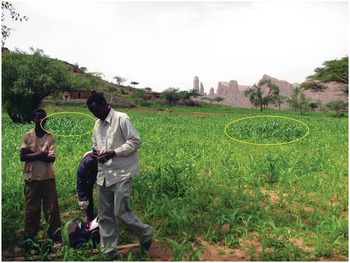
Fig. 12.5 In-field variability in a maize field in Koraro, Ethiopia.
Fields close to the household (infields) are usually more fertile than those farther away (outfields) because smallholder households dump garbage and kitchens ashes, and their domestic animals often urinate and defecate in these nearby fields. This results in a fertility gradient, illustrated in Fig. 12.6, using a portable pH meter.
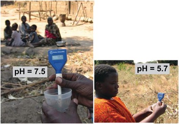
Fig. 12.6 Home garden soils are almost always much more fertile than soils in the larger fields away from home. Mbola, Central Tanzania.
12.5.3 Laboratory Analysis
The most widely used way to assess the status of a nutrient in a soil is by an extraction in a wet chemistry laboratory. Soils are shaken with an extractant, which is supposed to indicate in a few minutes the amount of a nutrient a typical crop would take up from the soil over its lifetime. These values are variously known as available phosphorus, potassium, etc., usually including the name of the procedure’s author (Olsen, for example). Water is also used as an extractant, and resin, to capture ions in a soil slurry. All these extracted products are artifacts (like humic or fulvic acids), which makes them difficult to relate to reflectance spectrometry on the whole soil, but when they correlate with plant growth, they become useful metrics. Because of its mobility in soils, there are no similar soil tests for nitrate nitrogen (nitrate-N).
The wet chemistry laboratory is the backbone of a soil testing program. Unlike research laboratories, service laboratories must be geared to handle large numbers of samples, rapidly and accurately. A complete system of semi-automated apparatus was developed by the ISFEIP for tropical laboratories in the 1970s and 1980s. This system is summarized below, abstracted from the first edition of this book, when ISFEIP was being rapidly scaled up in Latin America and India. Other models are now in place.
Soil samples are measured volumetrically, eliminating the time-consuming weighing process, and then placed in multiple-unit trays, where the extracting and diluting solutions are added or transferred by specially designed diluter-dispensers. Other apparatus transfers the aliquots to spectrophotometers and pH-measuring units automatically. Shaking, stirring and cleaning apparatus are also semiautomatic and capable of handling 30 units at a time. A single technician can run 100 soil samples a day, measuring 10 determinations per sample. The pieces of apparatus are based on manual operation and use a minimum of electrical power. Expensive electronic equipment, such as atomic absorption spectrophotometers, is used only during the last stages. An additional advantage is that the same units can be used for plant tissue as for soil analysis.
The bulk of the work is done with two extractants: the dilute double acid (Mehlich) or the modified Olsen extractant for determining available phosphorus, potassium, calcium, magnesium, sodium, iron, manganese, zinc and copper; and the 1 M KCl extraction for aluminum. Routine tests for nitrogen, boron, sulfur and molybdenum could not be adapted to the system.
12.5.4 Soil Test Correlation
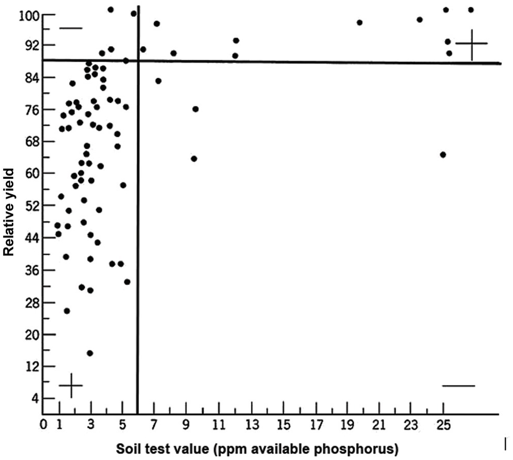
A soil test value per se is worthless; it is an empirical number that may or may not indirectly reflect nutrient availability, and as mentioned before, what is measured is an artifact of the extraction procedure. Soil test values become useful only when they are correlated with crop responses. Such correlations are usually conducted at two levels: an exploratory one in the greenhouse with a large number of widely diverse soils, and a more definite one in the field with fewer, but carefully selected, soils. Correlations can be done in many ways, using fairly complicated formulas, but in my view the simplest and most practical one is to plot relative yields versus the soil test levels as a scatter diagram. Then simply use a transparent overlay with a cross, placing it where the number of points in the upper left quadrant and in the lower right quadrant are at the minimum. This Cate–Nelson method (Cate and Nelson Reference Cate and Nelson1971) gives the soil critical level, as illustrated in Fig. 12.7. (I am sure a software program has been developed to do the same.)

Fig. 12.7 The Cate–Nelson method for determining the critical soil test level. In this case the critical level is 6 ppm available phosphorus by the Bray 1 method, for sugar cane, in the State of Pernambuco, Brazil. Each dot represents a field plot
This concept of a “critical value” for a given soil and farming system has important practical implications for efficient phosphorus use. Maintaining the soil at or close to the critical value has important benefits to the farmer (in terms of economic return) and to the environment, in terms of reducing the risk of phosphorus transfers to surface waters (Syers et al. Reference Syers, Johnston and Curtin2008).
The Cate–Nelson method also tells us the points with a high probability of a phosphorus response (the lower left quadrant), and those with a low probabiliy of phosphorus response (in the upper right quadrant). It does not tell you how much fertilizer to add, but it tells you whether you need it or not. This could be improved with better estimates of uncertainty.
If the soil in question is above the critical level, the decision is clearly not to apply that particular nutrient element to that crop. If the soil is below the critical level, then the decision becomes how much to apply. This requires yield response field trials. There are two main types of models to express yield response curves: the classic curvilinear model and the simpler linear reponse and plateau model.
12.5.5 Curvilinear Models
These classic models are based on the law of diminishing returns, where curvilinear functions (quadratic, square-root, logarithmic, Mitscherlich, etc.) are fitted to the yield response data. Statistical techniques determine which function fits the data best by providing the highest coefficient of determination (R2). The optimum fertilizer rate is determined at that point where marginal revenue equals the marginal cost (i.e. the point where the price of the last yield increment equals the cost of the last increment of fertilizer). The point can be determined mathematically or graphically by drawing a price:cost ratio line, expressed in the agronomic equivalents in the yield response diagram. The optimum yield is then determined at the point where a tangent of the price:cost ratio line intersects the response curve. When more than one element is deficient, regression models take this into account, as well as the interactions between these elements. The recommended rates are determined by solving simultaneous equations.
Curvilinear models are also used in a different manner to produce one function that takes into account soil test levels as variables, as well as other variables related to soil, climate and management properties, in an attempt to account for the uncontrolled variables. A yield equation relating potato yields in Peru needed 27 variables (Ryan and Perrin Reference Ryan and Perrin1973). Optimum fertilizer levels are calculated on the basis of levels of crop prices, fertilizer costs, expected rainfall and soil properties.
Such complex models are effective when there is adequate information about the variables involved and when prices are stable. They fail in the tropics where there are insufficient data to quantify all variables. The use of complex models in tropical regions is limited to after-the-fact analysis in areas with detailed information; they do not serve successfully as predictive tools. In addition, Anderson and Nelson (Reference Anderson and Nelson1975) found that quadratic models are biased when there is a marked response to the first fertilizer increment, followed by little or no response at higher rates. In such cases, optimum fertilizer recommendations became unrealistically high.
12.5.6 The Linear Response and Plateau Model
A series of studies conducted in England by Boyd (Reference Boyd1970) and in the United States by Bartholomew (Reference Bartholomew1972) summarized many fertilizer response functions over the world and concluded separately that in most instances fertilizer response curves can be characterized by a sharp linear increase followed by a flat horizontal line. Bob Cate and Larry Nelson in North Carolina then developed the Linear Response and Plateau model (LRP), which is also based on Liebig’s law of the minimum, and is a logical extension of the Cate–Nelson correlation model (Waugh et al. Reference Waugh, Cate, Nelson, Manzano, Bornemisza and Alvarado1975). Fertilizer response from a field, or a group of fields, is represented in this model by two straight lines for each nutrient. The first line represents the relatively steep response of an added nutrient until it ceases to be a major limiting factor. This is followed by a line showing a flat plateau, where further additions no longer increase yields. The fertilizer response curve so constructed consists of two main points. The “threshold yield” is the yield at the zero level of the nutrient in question, but not of all nutrients. The “plateau yield” is the yield at the point where the nutrient ceases to be a limiting factor; it is not the maximum yield because other factors may still limit yields. The fertilizer rate needed to reach the plateau yield is the recommended rate for the particular nutrient.
The comparison between the two approaches is shown in Fig. 12.8 for the same data set. The dotted lines indicate how the fertilizer recommendations are arrived at. The LRP model has only one optimum point, independent of cost and prices. The curvilinear model shows an optimum point based on the particular price:cost ratio at the time the experiments were conducted.

Fig. 12.8 Comparison between the LRP model and the quadratic model using the same field data from potatoes in Peru. The recommended rate is much lower using the first model.
It is very important to note the wide differences in recommended rates between the two methods. The LRP model recommended a lower fertilizer rate (75 kg N/ha) to reach a yield plateau of about 19 t/ha of potatoes. This rate in effect provides nearly maximum yields, while preserving an efficient return per unit of fertilizer, because it is still along the increasing slope. The quadratic model in this case more than doubles the recommendation (160 kg N/ha) in order to obtain only an additional 1 t/ha of yield. This is in the relatively flat part of the curve, where variability is quite high. Small changes in yields result in large changes in recommended rates. In other comparisons, however, the difference in recommended rates might not be as large as in this example.
Which approach is right? I tried it myself with a set of field trials on the response to sulfur-coated urea by wetland rice in the Coast of Peru, where I used the quadratic method (Sanchez et al. Reference Waugh, Cate and Nelson1973). By using the graphic technique, plateau yields and recommended rates were computed. The average nitrogen recommendation in this very high-yielding environment was 224 kg N/ha according to the quadratic model, and 170 kg N/ha with the LRP model. The average gross return for fertilization at the recommended rates was not statistically significant between the two models. The net return per dollar invested in fertilizer was superior with the LRP model.
The LRP model is much simpler, and focuses on the range that provides the most bang for the buck, the linear portion at the threshold yield point. The quadratic models, in their search for the optimum value along the flat part of the response curve, are the least cost-effective. While the science is correct in their case (fertilizer response curves are indeed curves), the practicalities are not, because there is wide variability in the actual results under field conditions. As Bob Cate famously said “If you want to go (from North Carolina) to Tokyo you go via the Great Circle route, but if you want to go from this building to the next, you go in a straight line.” So let’s be as simple and practical as we can.
It is heartening to know that the LRP model is now widely used in US agriculture (Beegle Reference Beegle, Sims and Sharpley2005).
12.6 Early Twenty-First-Century Paradigm Shifts
Building on the advances of the last century, particularly the last quarter of it, three new tools have changed our approach to soil fertility. These are near-infrared spectroscopy, digital soil mapping and bringing the laboratory to the field in scientifically rigorous ways. Together they represent a paradigm shift, not of the science itself, but in how soil science is applied. I am happy to note that the contribution of tropical soil scientists is major in all of the three cases.
12.6.1 Spectrometry
The analysis of wavelengths of light is one of the simplest in physics, and not until the start of this century has it been applied to soil science at scale. Spectrometry has for decades been used as a standard in various industries, such as pharmaceuticals and paints. The near- and mid-infrared wavelengths can be correlated with many, but not all soil properties. In the tropics, the seminal papers by Keith Shepherd and Markus Walsh (Shepherd and Walsh Reference Shepherd and Walsh2002, Reference Shepherd and Walsh2007) showed the value of then near-infrared rudimentary spectrometers that can estimate many soil properties, just by passing light though a soil sample and making the necessary correlations (Fig. 12.9). The main properties that can be determined at present are: sand, silt, clay, organic carbon, exchangeable bases, cation exchange capacity, phosphorus retention and some soil minerals. Where spectrometry does not (yet) work is available phosphorus, potassium and sulfur, very critical soil fertility parameters. Spectrometry is also helpful in determining organic input quality and carbon mineralization rate (Shepherd et al. Reference Shepherd, Vanlauwe, Gachengo and Palm2005).
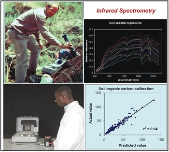
Fig. 12.9 Keith Shepherd (top left) using a portable spectrometer in the field in Kenya, and a technician using it in his Nairobi laboratory (bottom left). The resulting soil spectral signature (top right), and the close correlation between the predicted value by spectroscopy and the “actual” value of SOC from a wet chemistry laboratory (bottom right).
12.6.2 Digital Soil Mapping
Traditional soil maps are composed of polygons (mapping units) and their legends, showing mostly soil classification terms that are of very limited information value to anyone other than a pedologist. Such maps are static and tell you nothing about soil properties. Polygon maps assume that soils are uniform within the mapping unit, which is seldom the case. Interpretations made from them in terms of soil properties and agronomy are of course no better than the map.
To address some of these limitations, a digital soil-mapping working group of the International Union of Soil Sciences (IUSS) started work in 2006, and has since produced valuable information that can be found in books arising from their conferences (Lagacherie et al. Reference Lagacherie, McBratney and Voltz2007, Hartemink et al. Reference Hartemink, McBratney and Mendonça-Santos2008, Boettinger et al. Reference Boettinger, Howell, Moore, Hartemink and Kienast-Brown2010). In 2008, a group of soil scientists, agronomists and ecologists decided to produce a digital map of soil properties and soil functions of the world (Sanchez et al. Reference Sanchez, Ahamed, Carré, Hartemink, Hempel, Huising, Lagacherie, McBratney, McKenzie, Ml, Minasny, Montanarella, Okoth, Palm, Sachs, Shepherd, Vågen, Vanlauwe, Walsh, Winowiecki and Zhang2009, Fisher Reference Fisher2012), and the African portion of that is in progress.
Soil properties are estimated quantitatively with a statistical inference system using spatial (kriging, co-kriging) or non-spatial (regressions, neural networks) techniques, or both, and expressed as their probability of occurrence with uncertainty estimates. They are derived using quantitative relationships between the punctual soil measurements and the spatially continuous soil covariates. This results in maps of soil properties such as the ones selected by the Global Soil Map Consortium as their minimum data set, i.e. clay, organic carbon, bulk density, pH, effective cation exchange capacity, electrical conductivity and bulk density – bulk density is needed to express carbon and nutrients on a mass basis (t/ha) for biogeochemical modeling (Sanchez et al. Reference Sanchez, Ahamed, Carré, Hartemink, Hempel, Huising, Lagacherie, McBratney, McKenzie, Ml, Minasny, Montanarella, Okoth, Palm, Sachs, Shepherd, Vågen, Vanlauwe, Walsh, Winowiecki and Zhang2009). These are the first two actions in the process for developing the digital soil map, as shown in Fig. 12.10. Such properties are mapped on a pixel basis with a resolution as small as 30 × 30 m, which is great for smallholder farms.
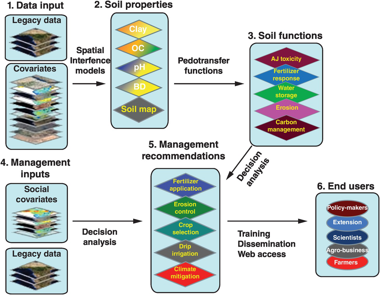
Fig. 12.10 Conceptual flow of the soil digital map process.
The spatially inferred soil properties are then used to predict more difficult-to-measure soil functions (action 3, Fig. 12.10), such as available soil water storage, carbon density and phosphorus fixation, using pedotransfer functions. Rather than calibrating only individual soil properties to infrared spectra, multivariate associations are used to identify soil functions. The overall uncertainty of the prediction is assessed by combining the uncertainties of the input data with the uncertainties of the spatial inference and those of the soil functions, using global sensitivity analysis.
The key is to connect all these soil functions with fertilizer response or other georeferenced field data from well-conducted agronomic experiments (legacy data) as well as with digital maps of population density, roads, distance to markets, internet access and other socioeconomic digital maps (action 4, Fig. 12.10). Analyses of decisions need to be made, connecting the maps with actual on-the-ground experience. Then the final two actions (management recommendations and reaching the end user) can be achieved. Web-based digital soil maps can be made interactive. This is very much work in progress.
12.6.3 Bringing the Laboratory to the Field
Although soil nutrient replenishment in sub-Saharan Africa is widely recognized as a critical biophysical entry point to an agricultural transformation, the actual application of soil science is still minimal, and frustratingly so, in large part because of the delay in obtaining the necessary information from soils sampled in farmers’ fields and sent to a wet-chemistry, conventional laboratory. The data often take a year to come back (if at all) and the paper-based process is prone to errors of recording and transcribing, as well as delays in transmission, interpretation and visualization. Worse still, the data are usually hard to interpret, largely irrelevant and often of questionable quality. The poor infrastructure of Africa and the budget limitations of national institutions are the main reasons used to rationalize this useless exercise. This is not a problem in the more advanced tropical countries, but it is also a problem in many areas outside Africa as well.
The way to get around this is to get the data in situ and send it electronically to the central laboratory where senior people or algorithms make the recommendations and send it back electronically to the extension agent or farmer. The problem is that, up until recently, field soil test kits have proven to be highly inaccurate and not sufficiently precise (Vanlauwe Reference Vanlauwe2008). Weil (Reference Weil2011) of the University of Maryland and Columbia University has been developing a wet-chemistry “SoilDoc,” which has been proven to work well and is highly correlated with central wet-chemistry laboratories (Fig. 12.11). It enables extension workers to make on-the-spot diagnoses of soil constraints, allowing targeted recommendations to advise farmers in real time (Sanchez et al. Reference Sanchez, Weil and Rose2013).
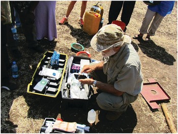
Fig. 12.11 SoilDoc, a “lab-in-the-box” field test kit. Ray Weil is entering the data in a smart phone that transmits it to the cloud or to a central location. Arusha, Tanzania, September 2012.
This tool uses state-of-the-art battery-powered miniaturized instruments, originally created for other purposes such as the beer and swimming-pool testing industries. The soil fertility parameters analyzed include soil pH, electrical conductivity (indicative of general fertility levels as well as salinity issues), biologically active organic carbon, and 0.01 M calcium chloride (CaCl2)-extractable nitrate-N, sulfate-S, phosphate-P, and potassium using specific sensors. Additionally, the kit includes tools to measure soil physical properties such as surface sealing strength, plow pans and volumetric soil water content. Soil texture is estimated by feel. SoilDoc essentially measures what a conventional wet-chemistry laboratory does at a similar level of accuracy (Fig. 12.12) plus biologically active SOC and several physical properties (Weil Reference Weil2011, Sanchez et al. Reference Sanchez, Weil and Rose2013). Like digital soil mapping, this too is very much work in progress.
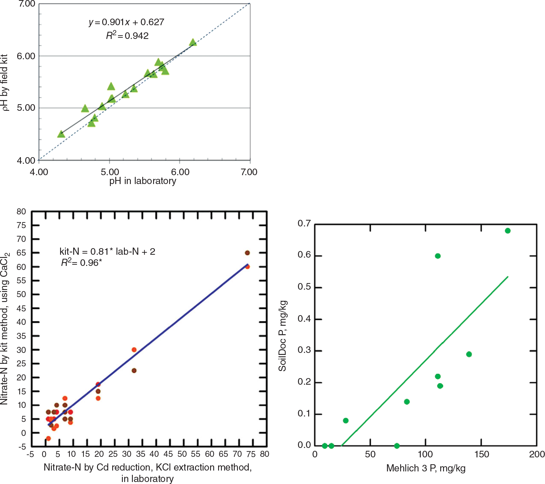
Fig. 12.12 Correlations for pH (top), nitrate-N (middle), and available phosphorus (bottom), determinations by the SoilDoc kit and a wet-chemistry laboratory.
At the time of this writing, we need to use the field-based wet chemistry of SoilDoc and similar systems in conjunction with near-infrared spectrometers, because spectrometry cannot determine available soil test levels since they are artifacts of the extractants used. Wavelength data cannot detect something that does not exist in the soil. To repeat, both approaches are works in progress and their combined use could result in positive synergies.
The combination of these approaches, as well as the rapidly developing soil scanning by satellites, shows tremendous potential for faster and more effective ways of evaluating soil fertility.
12.7 Summary and Conclusions
Soil fertility is the capacity of soils to supply essential elements to plants. Currently we recognize 17 elements as essential plant nutrients. Essential means that without them plants, microbes or animals would not be able to complete their life cycles.
There are three main principles of soil fertility: the law of the minimum, synchrony and nutrient cycling.
The law of the minimum states that plant growth will be limited by the essential element that it is most deficient in.
The ideal is to synchronize nutrient additions with the plant’s nutrient requirements as it grows. This is the “synchrony principle,” which represents the agronomist’s dream, and is seldom, if ever, realized.
Nutrient cycling is the third fundamental principle of soil fertility. Cycles of soil nutrient elements are different, varying in speed, depending on the types of bonds the elements have with carbon.
Organic nitrogen forms covalent bonds with organic carbon, while organic phosphorus and sulfur form ester bonds. Most other nutrient elements are either bonded ionically or are in loose associations with soil organic carbon (SOC).
The covalent bonding of nitrogen with carbon results in a series of compounds that are chemically recalcitrant or physically protected in the slow and passive SOC pools.
Phosphorus and sulfur compounds have a high negative charge which may prevent them from being entrapped in the slow and passive SOC pools. Organic phosphorus and sulfur mineralization proceeds rapidly once the extracellular enzymes break the ester bonds.
This makes nitrogen mineralization slower and more costly in terms of energy (fuelled by soil carbon) than the mineralization of phosphorus and sulfur. In terms of stoichiometry, plants have C:N ratios of 20 and above, while soil bacteria have low C:N ratios, about 6, which means that they require more nitrogen relative to the energy available, and in fact they are usually nitrogen-starved.
It is a priority for soil scientists to accelerate and tighten nutrient cycles in agricultural systems.
The demand side of soil fertility is best expressed as the nutrient uptake at harvest. Different crops exhibit varying yield levels and nutrient uptake.
The high-input agroecosystems generally add similar nutrient inputs to the soils as the natural systems. For example, residues returned to the soil by an annual maize–maize–soybean rotation in the Peruvian Amazon provided more nitrogen, phosphorus and potassium and similar levels of calcium and magnesium than litter fall from a tropical rainforest in similarly acid soils.
As expected, this did not happen in low-input systems, but when aluminum-tolerant cultivars were used in acid soils, some systems came surprisingly close to the natural ones. The trick is to ensure that crop residues are returned to the soil.
Taking a representative soil sample is both the first step and the largest source of error in soil fertility evaluation because it normally represents one-billionth (10–9) of the total soil volume for which an analysis is made.
Spatial variability in soil properties is always an issue because soil is far from a homogeneous system and bears the footprints of generations of farmers who add to it temporal variability.
Fields close to the household (infields) are usually more fertile than those farther away (outfields) because smallholder households dump a lot of garbage and kitchens ashes, and their domestic animals often urinate and defecate in these nearby fields.
The most widely used way to assess the status of a nutrient in a soil is by an extraction in a wet-chemistry laboratory. In modern laboratories, a single technician can run 100 soil samples a day, measuring 10 determinations per sample. The bulk of the work is done with two extractants: the dilute double acid (Mehlich 1) or the modified Olsen extractant for determining available phosphorus, potassium, calcium, magnesium, sodium, iron, manganese, zinc and copper; and the 1 M KCl extraction for aluminum.
Soil test values become useful only when they are correlated with crop yield responses. Correlations can be done in many ways, using fairly complicated formulas. In my view, the simplest and most practical one is the Cate–Nelson method, which plots relative yields versus the soil test levels as a scatter diagram. This method also determines which soils have a high probability of a nutrient response as opposed to those that do not.
There are two main methods to determine the recommended fertilizer rates based on yield response field trials. The first is the traditional curvilinear method, where a quadratic or other function is fit and the point where marginal revenue equals marginal cost represents the recommended rate. The other is the Linear Response and Plateau (LRP) model where yields are represented by two straight lines for each nutrient in the model. The first line represents the relatively steep response of an added nutrient until it ceases to be a major limiting factor. This is followed by a line showing a flat plateau, where further additions no longer increase yields.
The LRP model recommends a lower fertilizer rate, providing nearly maximum yields, while preserving an efficient return per unit of fertilizer, because it is still along the increasing slope. The LRP model is much simpler, and focuses on the range that provides the most bang for the buck. It saves on fertilizer at little yield cost and thus reduces the emission of nitrogen gases and leaching losses, providing a superior net return per dollar invested in fertilizer.
The application of near- and mid-infrared spectrometry can provide accurate estimates of sand, silt, clay, organic carbon, exchangeable bases, cation exchange capacity, phosphorus sorption and some soil minerals. Where spectrometry does not (yet) work is in estimating available phosphorus, potassium, sulfur or nitrogen.
Digital soil mapping is superior to the traditional polygon maps. Digital soil maps, with a resolution of 100-m pixels, can describe soil properties obtained by spectrometry or wet chemistry. The spatially inferred soil properties are then used to predict more difficult-to-measure soil functions, such as available soil water storage, carbon density and phosphorus fixation, using pedotransfer functions. Web-based digital soil maps can be made interactive.
A new generation of field test kits, such as “SoilDoc,” can measure many soil properties using miniaturized wet-chemistry sensors at a similar level of accuracy as large laboratories, eliminating the need to send soil samples to the laboratory, a major obstacle in Africa and other less-developed countries in the tropics. The SoilDoc kit is connected electronically to a central laboratory, sending data in a web-based form, and the recommendations, via algorithms or expert opinion, are returned to the extension agents in real time.
Nitrogen (N) is the element that most frequently limits food production in the tropics as well as in the temperate region. With the exception of some recently cleared land, most cultivated soils are deficient in this element. Most natural systems in the temperate region are nitrogen-limited, but not so in the tropics with older Oxisols, Ultisols and some sandy soils where they are more phosphorus-limited. The nitrogen cycle is being drastically disrupted. The purpose of this chapter is to describe the basic soil nitrogen dynamics (Fig. 13.1), the four main sources of reactive nitrogen – atmospheric deposition, biological nitrogen-fixation, fertilizer nitrogen and soil organic nitrogen (SON) mineralization – and the management of all four in relation to tropical agriculture and the environment. Given the popular concerns about nitrogen pollution and mineral fertilizers in general, the environmental dimensions of nitrogen form an important component of this chapter.
13.1 The Nitrogen Cycle
Nitrogen is the most abundant element in the Earth’s atmosphere, accounting for about 78 percent of the air anywhere in the world, presumably including air in the soil pores. We face the paradox that while most of our air is nitrogen, most of our crops suffer from nitrogen deficiency. This is because virtually all the nitrogen in our atmosphere is inert nitrogen (N2). The bond between the two nitrogen atoms is very strong and requires much energy (941 kJ/mol) to break it down into reactive nitrogen (Nr).
Reactive nitrogen consists of two main reduced forms, ammonium (NH4+) and ammonia (NH3); several oxidized forms such as nitrate (NO3–), nitrite (NO2–), nitrous oxide (N2O), nitric oxide (NO) and nitrogen dioxide (NO2); and some organic forms like urea and amines. NO and NO2 are generally added as NOx. Plants take up nitrogen as nitrate or ammonium ions and convert them to amino acids, proteins and DNA. Plants are consumed by animals, and both plants and animals by humans, where these nitrogen compounds are an essential part of our nutrition.
Figure 13.2 shows the clear correlation between world population and Nr creation, mainly fertilizer production by the Haber–Bosch process. This has resulted in major changes in the nitrogen cycle, second only to those in the carbon cycle. In many ways, nitrogen is the new carbon, in terms of the changes in element cycling and what it means to human and ecosystem health. 1 teragram (Tg) of Nr equals 1012 grams or 1 million tons.
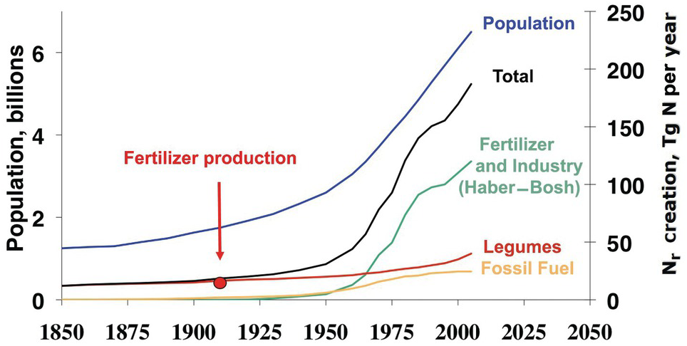
Fig. 13.2 Global Nr creation by human activity, 1850 to 2050. In 2005, ~190 Tg Nr was created annually by humans, in comparison to ~15 Tg Nr in 1850. The start of nitrogen fertilizer production is indicated. Legumes denote biological nitrogen fixation, and fossil fuel denotes N2O and NOx emissions.
Several characteristics are not shared with other major elemental cycles including carbon (C) (Chapter 11), phosphorus (P) (Chapter 14) and sulfur (S) (Chapter 15). The nitrogen cycle has major cascade effects, is very “leaky,” and the bacteria responsible for most of the organic nitrogen mineralization are almost always nitrogen-starved (Vitousek et al. Reference Vitousek, Haettenschweiler, Olander and Allison2002). The nitrogen cascade means that a single atom can produce a sequence of effects in different stocks and flows (Fig. 13.1). One nitrogen atom can, in sequence, increase tropospheric ozone, increase fine particulate matter in the atmosphere, alter plant productivity, promote eutrophication and produce global warming (Galloway et al. Reference Galloway, Dentener, Capone, Boyer, Howarth, Seitzinger, Asner, Cleveland, Green, Holland, Karl, Michaels, Porter, Townsend and Vorosmarty2004).
The leakiness is due to reactive nitrogen inputs that leak out as NH3, N2O, NOx and N2 gases to the atmosphere, and are leached as NO3–, NH4+ and dissolved organic nitrogen below the soil and into water bodies (Fig. 13.3). This lowers the efficiency of nitrogen utilization by plants (Galloway et al. Reference Galloway, Aber, Erisman, Seitzinger, Howarth, Cowling and Jackcosby2003, International Nitrogen Initiative 2007). Leakiness is most marked in crop systems, and decreases when a tree–soil nutrient cycle is established in natural fallows and agroforestry systems. Leakiness is minimal in the nearly closed nutrient cycle of mature tropical forests.
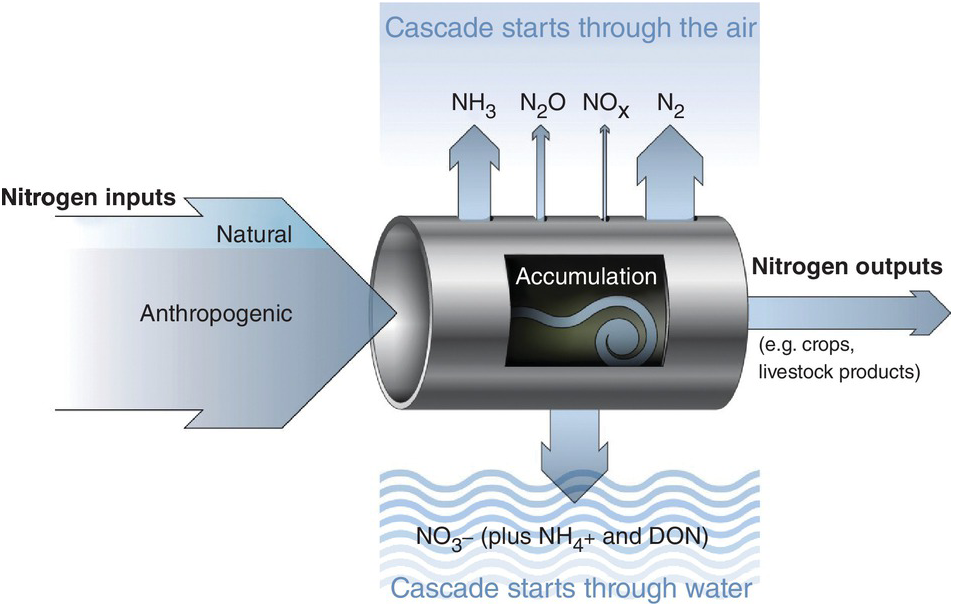
Fig. 13.3 Leakiness is illustrated by the holes-in-the-pipe concept.
Table 13.1 shows the different fluxes in the nitrogen cycle. The Nr creation is estimated to be almost twice in 2050 what it was in 1960. This is a much faster rate than the increase in carbon dioxide (CO2) in our atmosphere.
Table 13.1 Global Nr creation and distribution flows. Adapted from Galloway et al. Reference Galloway, Dentener, Capone, Boyer, Howarth, Seitzinger, Asner, Cleveland, Green, Holland, Karl, Michaels, Porter, Townsend and Vorosmarty2004.
The exponential increase of Nr has major positive and negative effects. The main positive consequence is the dramatic increase in per-capita food production, while still keeping up with population growth, 40–50 percent of which is directly attributed to nitrogen fertilizers (Smil Reference Smil2004). The other positive effect is the additional Nr deposition in natural and managed ecosystems, which provides nitrogen fertilization to accompany CO2 fertilization due to climate change.
The negative consequences are on the environment and on human health. Ladha et al. (Reference Ladha, Pathak, Krupnik, Six and van Kessel2005) and the International Nitrogen Initiative (2007) list the following major environmental damages: groundwater contamination; eutrophication of waterways and coastal areas, inducing hypoxia and “dead zones”; photochemical smog; fine-particulate air pollution; stratospheric ozone depletion; acid rain; ammonia redeposition; toxic algal blooms; and global warming. The International Nitrogen Initiative also lists the following detrimental effects on human health: respiratory diseases caused by tropospheric ozone and fine-particulate aerosols; increased allergenic pollen production; and possible nitrate toxicity in drinking water. These negatives should be balanced with the tremendous increases in protein consumption in poor regions of the world.
The consequences can be grouped in two: too much or too little nitrogen in agriculture, depending on the overall Nr balance, as shown in Table 13.2. The problems are totally different, and both take place in the tropics.
Table 13.2 Agricultural Nr balances differ by region, with temperate northern China showing “too much,” western Kenya “too little,” and midwestern United States roughly in balance. Adapted from Vitousek et al. (Reference Vitousek, Naylor, Crews, David, Drinkwater, Holland, Johnes, Katzenberger, Martinelli, Matson, Nziguheba, Ojima, Palm, Robertson, Sanchez, Townsend and Zhang2009).
| Northern China | Midwestern United States | Western Kenya | |
|---|---|---|---|
| (kg N/ha per year) | |||
| Nitrogen inputs to crops | 588 | 155 | 7 |
| Nitrogen outputs from harvest | 361 | 145 | 59 |
| Balance | +227 | +10 | −52 |
Progress has taken place on the “too much” side in rich countries. Townsend et al. (Reference Townsend, Vitousek and Houlton2012) noted that in the last few decades US crop yields have continued to rise while fertilizer rates have remained steady, indicating that the efficiency of nitrogen and phosphorus utilization has increased. Maize research in Nebraska that I saw in 2009 is aiming at doubling maize yields, while using one-quarter less nitrogen, one-quarter less water and one-quarter less fossil fuels. The small imbalance in the midwestern United States in the above table represents major progress compared with what it was a couple of decades ago (Vitousek et al. Reference Vitousek, Naylor, Crews, David, Drinkwater, Holland, Johnes, Katzenberger, Martinelli, Matson, Nziguheba, Ojima, Palm, Robertson, Sanchez, Townsend and Zhang2009). The negative balance in the “too little” countries is one of the main reasons for food insecurity in the tropics.
13.2 Nitrogen Pools and Fractions
A modified Century model (Fig. 13.4) shows SON pools similar to those of carbon shown in Chapter 11. The three SON pools, active, slow and passive, have similar turnover times as the soil organic carbon (SOC) pools. The big difference from the carbon model is the presence of additional nitrogen input pools: nitrogen fertilizers, atmospheric deposition and biological nitrogen fixation. Biomass and manure additions are included in the organic input pool. Other big differences are the mineral nitrogen pool and the loss fluxes (crop harvest removal, leaching, denitrification, runoff and erosion). But the key is two opposite sets of fluxes: mineralization versus immobilization and nitrification versus denitrification. These additional pools (atmospheric deposition, biological nitrogen fixation, nitrogen fertilizers, mineral nitrogen, plant nitrogen and nitrogen losses) are really fractions that can be measured, unlike the SON pools.
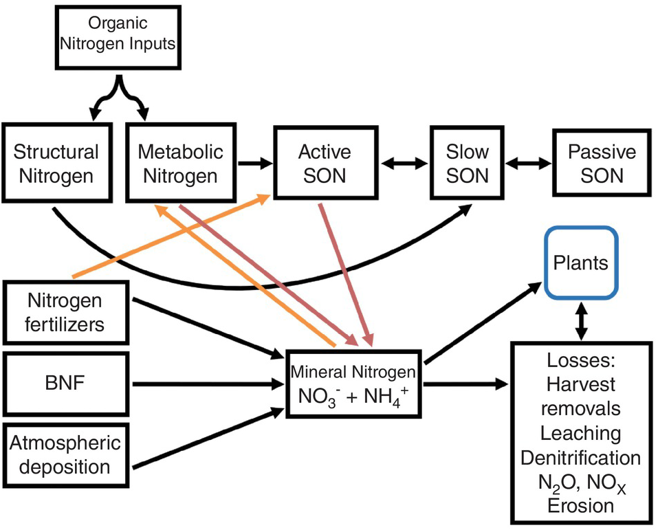
Fig. 13.4 Modified Century model for nitrogen. Red arrows are mineralization and orange arrows are immobilization. The active SON pool includes various fractions, most importantly microbial biomass, but also DON, labile SON and particulate SON.
As indicated in Chapter 11, the active SOC pool is the most important source of nitrogen mineralization and thus the pool contributing the most to soil fertility. Dissolved organic nitrogen, like dissolved organic carbon, is part of the active SON pool and interacts with microbial biomass, which is also part of the pool. It may also be an important way to transfer nitrogen to lower depths in the soil profile.
The annual additions of SON are larger in tropical forests and savannas than in temperate forests and prairies. The reasons are similar to those that account for the differences in SOC content, described in Chapter 11. The range in total nitrogen and in C:N ratios among tropical soils are similar to those found under temperate conditions.
The four main kinds of nitrogen inputs that feed the mineral pool (NH4+ and NO3–) are addressed below: atmospheric deposition, biological nitrogen fixation, mineral fertilizers and organic nitrogen mineralization.
13.3 Atmospheric Deposition
Deposition of Nr in the atmosphere comes from the emission of several gas sources (Table 13.1) and nitrogen oxides produced by lightning. These gases are transported by wind and deposited on land and water, mostly as rain in the tropics. Galloway et al. (Reference Galloway, Townsend, Erisman, Bekunda, Cai, Freney, Martinelli, Seitzinger and Sutton2008) noted that local deposition rates in natural systems were ~ 0.5 kg N/ha per year in the late twentieth century, but they are now more commonly 10 kg N/ha per year and may reach as high as 60 kg N/ha per year. This will accelerate the nitrogen cycle. The tropical hotspots are in Colombia; Venezuela; southern Brazil; Ethiopia; Uganda; Nigeria; the Indian subcontinent; Southeast Asia and China, mostly around urban and industrial areas; and where natural gas is flared in the process of oil extraction.
Lightning production of Nr occurs due to the high energy produced, which breaks the N2 bond into nitrogen oxides that react with water vapor to form nitric acid. Lightning activity is probably highest over tropical land where convective rainfall activity is highest (Galloway et al. Reference Galloway, Dentener, Capone, Boyer, Howarth, Seitzinger, Asner, Cleveland, Green, Holland, Karl, Michaels, Porter, Townsend and Vorosmarty2004), but it is consequential in temperate regions in areas like the eastern United States, where summer thunderstorms are frequent. Volcanic eruptions, dust storms and floods contribute additional nitrogen deposition episodically.
Dust storms from the Sahara contribute small amounts of nitrogen to the sub-Saharan countries because the dust is mainly composed of quartz and kaolinite particles, although dust arising from the Sahel and other vegetated areas does contain above-ground litter particles. Calculations from data by Ramsperger et al. (Reference Ramsperger, Herrmann and Stahr1998) suggest a range of 2–5 kg N/ha per year. Slash-and-burn agriculture is also an important source of gaseous Nr, and will be discussed in Chapter 16.
Atmospheric deposition in terrestrial systems was ~60 Tg Nr per year in the 1990s and is probably around 100 Tg Nr per year now. Assuming that 40 percent of the land is in various forms of agriculture (crops, livestock, forestry and aquaculture), the global contribution of atmospheric deposition to agriculture is ~ 40 Tg Nr per year.
13.4 Biological Nitrogen Fixation
Biological nitrogen fixation has been the largest way of converting N2 into Nr until the development of the Haber–Bosch process in the early 1900s. Nitrogen production via biological nitrogen fixation is still slightly ahead of nitrogen fertilizers in terrestrial systems, and way ahead of atmospheric deposition. Table 13.1 shows estimates for the early 1990s of 139 Tg nitrogen fixed per year via biological nitrogen fixation, of which 107 is fixed in natural systems and 32 in agricultural ones. In contrast, the Haber–Bosch process was estimated to fix about 90 Tg N per year in 2000 (Smil Reference Smil2004).
The N2 molecule is transformed into Nr by the nitrogenase enzyme in bacteria, in symbiotic associations with plants or as free-living bacteria. Nitrogen fixation is a very old process in evolutionary biology, and is largely limited to bacteria that carry the two main nitrogenase genes, nifD and nifK (Giller Reference Giller2001). Nitrogenase activity is dependent on an ample supply of phosphorus as adenosine triphosphate (ATP). Other nutrients that are critical for symbiotic nitrogen fixation include molybdenum, iron, cobalt and vanadium.
Atmospheric N2 is fixed as NH3, which quickly forms NH4+, and is taken up by the host plant. The NH4+ is incorporated into the glutamatic acid and glutamine amino acids, which are synthesized into other nitrogen compounds, and eventually proteins.
Biological nitrogen fixation is an energy-expensive process which takes place at ambient temperatures and pressure. Sixteen ATP molecules are required to break one N2 molecule, and an additional 12 ATP molecules are consumed in nodule development, maintenance, and NH4+ assimilation and transport, totaling 28 ATP molecules. Together they can consume about one-third of the plant’s photosynthate (Giller Reference Giller2001). Nodulated legumes use 810 mg CO2 per gram of dry biomass growth. This is 59 percent more than when taking up inorganic nitrogen from the soil solution (Silsbury Reference Silsbury1977). No wonder legumes prefer to take up NO3– or NH4+ when they are available in the soil rather than doing the hard work of nitrogen fixation.
Biological nitrogen fixation is carried out by bacteria. The most important nitrogen-fixing bacterial groups are the rhizobia, composed of several genera that form symbiosis with legume roots (Fig. 13.5). The second most important are the blue-green algae (cyanobacteria), usually free-living but also forming associations with the bacterium Anabaena azollae and the aquatic fern Azolla anabaena; other cyanobacteria form symbioses with fungi, forming lichens. Third comes the actinomycete Frankia, which forms symbiotic associations with a few gymnosperms and angiosperms in the tropics. The fourth group is the free-living nitrogen-fixers in the soil solution of the rhizosphere. The fifth group is the endophytic bacteria, loosely associated inside C4 grasses such as some cereals and sugar cane, as well as C3 plants like rice. Table 13.3 lists the main rhizobial genera, species and biovars (the equivalent to cultivars) and their host plants. Table 13.4 provides a similar list for the other four groups of nitrogen-fixers.

Table 13.3 Rhizobia and their host plants in the tropics. A partial list, adapted from Giller (Reference Giller2001).
Table 13.4 Other nitrogen-fixing bacteria and host plants important in the tropics. Adapted from Giller (Reference Giller2001) and Muñiz et al. (Reference Muñiz, Rives, Castro, Sanzo, Socorro, Alves y and Urquiaga2008).
13.4.1 Rhizobia–Legume Symbiosis
Rhizobial symbiosis with legumes takes place with bacteria that induce nodulation and infect the roots of thousands of species of the subfamilies Papilionoideae and Mimosoideae of the Leguminosae family. A third Leguminosae subfamily, the Cesalpinioideae, has only a few species that fix nitrogen. All legumes have high nitrogen content in the leaves, whether they fix nitrogen or not. Emphasis on nitrogen fixation is now all over the tropics, with many active research programs and review books such as Ladha et al. (Reference Ladha, George and Bohlool1992a), Mulungoy et al. (Reference Mulongoy, Gueye and Spencer1992) and Giller (Reference Giller2001).
Rhizobial strains are classified as promiscuous or specific. Promiscuous strains are rhizobia that enter symbiosis with many legume species, while the specific ones only do it with one or a few (Sanginga et al. Reference Sanginga, Abiadoo, Dashiell, Carsky and Okogun1996,Reference Sanginga, Dashiell, Okogun and Thottappily1997, Mpepereki et al. Reference Mpepereki, Javaheri, Davis and Giller2000). Table 13.3 lists the main rhizobial species important in the tropics and their legume hosts, showing some promiscuous species. Many of them were first reported as recently as the 1990s and many of them come from China. Bradyrhizobium is a genus created to accommodate slow-growing strains in association with soybeans as well as cowpea (Giller Reference Giller2001).
13.4.2 Cyanobacterial Symbiosis
Blue-green algae, or cyanobacteria, are bacteria that have the chlorophyll-a pigment. Producing oxygen (O2) from photosynthesis damages nitrogenase activity, but cyanobacteria are able to separate photosynthesis from nitrogenase activity in their cells. The nitrogen-fixing symbiosis occurs in cavities in the upper leaf surface of the floating Azolla anabaena fern by the cyanobacteria Anabaena azollae and Nostoc species. (Table 13.4). The Azolla species supplies the carbon and the bacteria the nitrogen. Cyanobacteria associate with fungi forming lichens on rocks, starting the rock weathering process often. Many other cyanobacteria are free-living.
13.4.3 Frankia Symbiosis
Actinomycetes are filamentous bacteria with hyphae similar to those of fungi. The genus Frankia (Fig. 13.6) is the only one capable of forming symbiotic nitrogen-fixing nodules with gymnosperms, of which Casuarina, a tropical pine, is the most important one in the tropics (Giller Reference Giller2001), followed by alder (Alnus spp.) in the tropical highlands.

13.4.4 Free-Living Bacteria
Free-living bacteria in the soil solution around the plant rhizosphere include Azotobacter and Beijerinckia, which have the ability to fix nitrogen aerobically, while Derxia and Clostridium do it anaerobically (Table 13.4). Since they do not undergo symbiosis with a plant, their energy requirements must come from a rhizosphere that is rich in soluble carbon.
13.4.5 Endophytic Bacteria
These are bacteria that are capable of nitrogen fixation, found within tissues internal to the epidermis of non-legume plants (Giller Reference Giller2001). They have received much attention in the tropics since the seminal work of Döbereiner and colleagues in Brazil, in grasses and sugar cane (Döbereiner Reference Döbereiner1961, Reference Döbereiner1968, Döbereiner et al. Reference Döbereiner, Day and Dart1972, Urquiaga et al. Reference 369Urquiaga, Cruz and Boddey1992, Boddey Reference 366Boddey1995, Boddey and Döbereiner Reference Boddey and Döbereiner1995, Urquiaga Reference Urquiaga, Moniz, Furlani, Schaffert, Fageria, Rosolem and Cantanarella1997, Urquiaga et al. Reference Urquiaga, Alves, Soares and Boddey2008). Endophytic bacteria can fix nitrogen only in micro-anaerobic niches because they have no way to protect their nitrogenase enzyme from O2 damage. Acetobacter diazotrophicus and Herbaspirilum spp. have been found in the roots and aerial tissues of sugar cane (Boddey et al. Reference Boddey and Döbereiner1995) and important pasture grass species of the genera Brachiaria and Paspalum (Döbereiner et al. Reference Döbereiner, Day and Dart1972, Boddey and Victoria Reference Boddey and Victoria1986). These authors indicated that sugar cane was bred under low levels of nitrogen fertilization in Brazil where endophytic nitrogen fixation is believed to account for about 50 percent of the nitrogen uptake of the first harvest of sugar cane.
Flooded rice also harbors many endophytic bacteria of the genera Azospirillum, Acetobacter, Azotobacter, Beijerinckia, Burkholderia, Herbaspirilum and Serratia (Döbereiner et al. Reference Döbereiner, Baldani, Reis, Fendrik, del Gallo, Vanderleyden and de Zamarocy1995, Boddey et al. Reference Boddey and Döbereiner1995, Verma et al. Reference Verma, Ladha and Tripathi2001, Tan et al. Reference Tan, Hurek, Prasad, Ladha and Reinhold-Hurek2001, Gyaneshwar et al. Reference Gyaneshwar, James, Natarajan, Reddy, Reinhold-Hurek and Ladha2001, Muñiz et al. Reference Muñiz, Rives, Castro, Sanzo, Socorro, Alves y and Urquiaga2008). In low soil organic matter (SOM) Aqualfs of Cuba, Muñiz et al. (Reference Muñiz, Rives, Castro, Sanzo, Socorro, Alves y and Urquiaga2008) showed that biological nitrogen fixation contributes 28–32 percent of the nitrogen requirements of flooded rice genotypes yielding around 4 t/ha, and that the process is related to the high population of endophytic microorganisms in soils with low SOM content (< 0.5 percent SOC). Low SOC means low nitrogen mineralization, and we know that high inorganic nitrogen contents decrease biological nitrogen fixation.
13.4.6 Inoculation
Inoculation with appropriate rhizobia began over 100 years ago, mainly focused on soybeans and tropical pasture legumes. In both cases, most cultivars require highly specific rhizobial strains since soybeans were introduced from China, and most inoculation efforts are in the United States, Brazil and Argentina. Likewise, most tropical pasture legumes originate from Latin America and require inoculation when transported to Australia (Andrew and Kamprath Reference Andrew and Kamprath1978, Wilson Reference Wilson1978, Giller Reference Giller2001).
Giller (Reference Giller2001) indicated three situations where inoculation is needed: (1) where indigenous rhizobia are less effective than selected strains for a particular legume species; (2) where rhizobia that are compatible with the legume are not present; and (3) where the population of compatible rhizobia is too small to give sufficiently rapid nodulation – less than 20–50 cells per gram of soil.
This is an area of much research and application in the tropics, as commercial inocula are routinely produced in Latin America for large-scale commercial soybean production, and also in many tropical countries for smallholder farmers in Africa. The basic method is to add pure cultures of the desired rhizobial strain to peat, which serves as the carrier and also prevents desiccation of the bacteria. Small quantities of phosphate rock, lime and molybdenum are often added. This mixture is kept in plastic bags under refrigeration. Inoculants are mixed with the legume seed prior to planting, as shown in Fig. 13.7, where a group of African scientists are watching a demonstration.
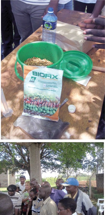
Fig. 13.7 Ready-to-mix commercial inoculum with soybean seeds (top), and scientists learning (bottom). Muhoho, western Kenya.
Rhizobia can survive in a free-living state for over 30 years, even in the absence of legumes (Giller Reference Giller2001), so the question of whether successive inoculations are necessary for subsequent grain legume crops of the same species depends on the visual evidence of healthy nodules in the current crop.
Inoculation with other nitrogen-fixing bacteria is different. Anabaena azollae is an obligate, meaning it is never separated from the host Azolla species, hence no inoculation is necessary (Ladha and Watanabe Reference Ladha and Watanabe1982). A similar mechanism may take place in the Frankia–gymnosperm symbiosis. Endophytic bacteria in cereals and grasses have no true symbiosis with the host plant (JK Ladha, personal communication, 2012).
Inoculating with free-living nitrogen-fixing bacteria is a different story and depends largely on the supply of energy as dissolved carbon in the rhizosphere of the crop, and also energy produced from rhizosphere exudation. Some positive plant growth responses take place, but these are largely attributed to bacteria that produce growth-stimulating substances such as indole acetic acid and other hormones, but not much to nitrogen fixation, which contributes perhaps 5 kg N/ha per year (Giller Reference Giller2001). The amounts of nitrogen fixed are larger in flooded anaerobic soils grown to rice, which have copious amounts of straw as a carbon source, with the flooded soil acting as a carbon sink (Roger and Ladha Reference Roger and Ladha1992).
Scientists have dreamed for decades about cereals that could fix N2 from the atmosphere, just like legumes. Giller (Reference Giller2001) points to two research avenues: (1) to introduce the nitrogenase enzyme, so the cereal can fix nitrogen directly; and (2) to manipulate the cereal genome so it can nodulate with rhizobia. For rice, the International Rice Research Institute initiated a Global Frontier project on nitrogen fixation, with an aim to assess the potential of rice to fix its own nitrogen, similarly to legumes. Through this project, scientists have shown that rice possesses a genetic mechanism for nodulation, as in legumes, and hence the potential exists (Ladha and Reddy Reference Ladha and Reddy2003). It was, however, recognized that the project is a long-term one. Unfortunately, it was stopped about 7 years after its initiation due to lack of continuing funding, but there seems to be renewed interest now. There’s no significant progress yet, but let’s keep researching.
13.4.7 Amounts Fixed
Rhizobia
The quantities of nitrogen fixed by different crops in symbiotic relationships with rhizobia are shown in Table 13.5. It can be seen that the bigger the plant species are, and the longer they live, the larger are the amounts of nitrogen fixed. Grain legumes fix the smallest amounts, and trees the largest. Grain legumes, the earliest maturing group, fix on average around 60–100 kg N/ha per crop. Among the grain legumes, the longer-lived soybean, peanut and pigeon pea (all of which undergo symbiosis with Bradyrhizobium strains) fix higher amounts of nitrogen than the earlier maturing common bean. A rule of thumb is that, under optimum conditions, grain legumes fix 1–2 kg N/ha per day (Giller Reference Giller2001).
Table 13.5 Nitrogen-fixation estimates (above-ground) by tropical grain legumes and green manures. Selected from tables by Giller (Reference Giller2001) and J. K. Ladha (personal communication, 2012).
Most pasture legumes (grown without grazing) and green manures at 6 months of age fix nitrogen in the same range as grain legumes (around 60–120 kg N/ha), ranging from 1 kg N/ha to 458 kg N/ha, with the stem-nodulating Sesbania rostrata fixing the highest amounts in 2 months (Ladha et al. Reference Ladha, Pareek and Becker1992b). Lastly, trees and shrubs growing for 6 months to over 2 years fix much larger quantities of nitrogen, some reaching over 1000 kg N/ha in 2 years. In all cases there is large variability among and within species, making it difficult to predict the amounts of nitrogen fixed. This is because that depends on many other factors, particularly management and phosphorus status.
What is somewhat less variable is the proportion of a plant’s nitrogen uptake coming from nitrogen fixation in legumes, which ranges from 30 percent to 90 percent. This means that nitrogen-fixing legumes take 10–70 percent of their nitrogen from nitrate and ammonium ions in the soil solution. Given the high energy requirements of nitrogen fixation, legumes prefer to take the easy way out if inorganic sources are readily available (Silsbury Reference Silsbury1977). When the soil has high levels of inorganic nitrogen ions, the nitrogen-fixing mechanism can shut down. This is why grain legumes should only receive minimal nitrogen fertilization (say 5–10 kg N/ha) as a starter fertilizer. In the ustic tropics, the Birch effect may act like a starter fertilizer.
There are three principal factors affecting the quantities of nitrogen that are fixed in a cropping system as opposed to the single crop estimates in Table 13.5. Giller (Reference Giller2001) listed them as follows:
Probably the most important one is the amount of land with legumes or other nitrogen-fixing plants, as obvious as it sounds. This is notoriously evident in Malawi, where farmers often claim they have a maize–pigeon pea intercropped system, while in fact it is only true in some corners of their fields.
The ability of the nitrogen-fixing plants to establish symbiosis, which is often restricted by environmental or management factors (see Fig. 13.8).
The ability of the established symbioses to fix nitrogen, which is determined by the genetic potential of the bacteria, the plant and the symbiosis itself.

Fig. 13.8 Peas (Pisum sativum) in the highlands of Ruhiira, Uganda, showing very uneven growth. In the front, stunted, chlorotic, poorly nodulated plants, in contrast with good growth and nodulation in back because weeds and crop residues are customarily removed from the center and piled along the field boundaries. Extension agent Richard Gumisiriza.
Frankia-Casuarina symbiosis
This symbiosis is limited to eight families of angiosperms, mostly shrubs and trees (Giller Reference Giller2001). Bohlool et al. (Reference Bohlool, Ladha, Garrity and George1992) report that a Frankia–Casuarina association fixes 40–60 kg N/ha per year. This is not much in comparison with rhizobial associations with trees.
Free-Living Bacteria in the Rhizosphere
There was intense interest when Johanna Döbereiner’s group in Brazil announced that large quantities of nitrogen were fixed by free-living bacteria in the rhizosphere of grass plants (Döbereiner Reference Döbereiner1961). This was unfortunately an early extrapolation from small containers of soils in the laboratory, which had been spiked with lots of sugar. Nevertheless, this work did start a new avenue of tropical soils research, which has matured in the last 50 years. Ken Giller (Reference Giller2001) reminds us of a few basic facts. Soil microorganisms live mostly in near-starvation conditions, being largely nitrogen-limited. They are more abundant in the rhizosphere of plants because there is more carbon and nutrients there, due to root exudation, and this is where most of the organic and inorganic fertilizer inputs end up. Giller further states that up to 30 percent of the carbon fixed by photosynthesis in cereals and as much as 50 percent in grasslands is translocated to the root system, which eventually decomposes into CO2 and dissolved organic carbon. Different bacteria have evolved to occupy microenvironments in the rhizospheres of different plants.
Regardless of whether biological nitrogen fixation is symbiotic or not, how important is it? Giller (Reference Giller2001) estimates that 1 kg N is fixed by free-living bacteria per 1000 kg of carbon translocated below ground. So, let us consider a 5 t/ha maize crop that produces, say, 10 t/ha of total biomass, 50 percent of which is carbon, of which 30 percent (1500 kg C/ha) goes to the roots. Then we are dealing with a minuscule amount, 1.5 kg N/ha. Considering a 100 t/ha crop of sugar cane, with 50 percent of the photosynthate going into the roots, the same calculation results in a carbon input of 25 t C/ha, which would only produce 25 kg N/ha from free-living nitrogen-fixers. It is a help, but hardly meets the needs of sugar cane. Some other process must be taking place.
Crop yield responses to inoculation with Azospirillum species and related free-living bacteria have produced inconsistent results. Giller painfully analyzed the literature and the methodologies used and concluded that the “amounts of N fixed by free-living soil bacteria will rarely exceed 5 kg N/ha per year in aerobic soils, although the amounts may be larger in anaerobic conditions.” In a typical Ken Giller statement he praised the attention to detail in many publications by promoters of free-living nitrogen fixation, which enabled him to debunk their claims (see Giller Reference Giller2001, pp. 116–121).
Flooded rice fields benefit from 10–80 kg N/ha per rice crop from free-living cyanobacteria, plus an additional 10–30 kg N/ha per rice crop from other free-living bacteria (Bohlool et al. Reference Bohlool, Ladha, Garrity and George1992), and these are hard data.
Azolla
Similar disappointing results have occurred with Anabaena bacteria in association with the fern Azolla but for different reasons. A crop of Azolla fixes large amounts, 20–150 kg N/ha in about 3 months (Roger and Ladha Reference Roger and Ladha1992), but requires a very high phosphorus content in the water, plus large quantities of water in irrigation ditches or empty paddies for keeping the fern alive when the rice crop is not flooded. The Azolla species can be grown as a green manure and incorporated into the soil, which is not an easy task while rice is growing, and works well as a green manure. Giller concludes that despite the enthusiasm by scientists during the 1970s, the use of Azolla has declined drastically, being limited currently to its traditional niche, the cool (isothermic) highland rice areas in northern Vietnam.
Endophytic Nitrogen Fixation
Giller (Reference Giller2001) is rather silent on this issue, focusing on the major methodological constraints. Boddey et al. (Reference Boddey, Jantalia, Zotarelli, Okito, Alves, Urquiaga, Dakora, Chimphango, Elmerich, Newton and Valentine2008) describe that in order to use 15N-isotope dilution techniques in the field, it is necessary to harvest and analyze several neighboring non-fixing reference plants, so the nitrogen fixed is estimated by the difference between two different plant species, one being the “control.” This is questionable. To assume that such differences are caused by endophytic biological nitrogen fixation is certainly a big leap, which may ignore other factors such as inorganic nitrogen availability and differences in plant uptake patterns by different species. This contrasts with the rhizobia–legume nitrogen-fixation techniques where, if a difference is needed, the control is a non-nitrogen-fixing cultivar of the same legume species.
However, growing sugar cane in Oxisols and Ultisols of Brazil suggests that something is going on. Urquiaga et al. (Reference 369Urquiaga, Cruz and Boddey1992) indicate that sugar cane typically accumulates between 100 and 200 kg N/ha at harvest. Boddey and Victoria (Reference Boddey and Victoria1986) indicate that this is probably done by Acetobacter diazotrophicus, which occurs in large numbers in the stems and roots of sugar cane.
13.4.8 Transfer of Fixed Nitrogen to Other Plants
It is commonly assumed that nitrogen fixed via biological nitrogen fixation can be used by the next crop or by a cereal intercropped with the legume, thus “increasing soil fertility.” Such generalizations fall apart with actual data, but there are still major contributions. Let’s summarize what we know.
The processes by which nitrogen from nitrogen-fixing plants can be made available to others were reviewed by Giller (Reference Giller2001). He found just three that have major importance:
Root and nodule senescence, decomposition and mineralization;
Mineralization of cut or senesced above-ground plant parts; and
Consumption by grazing animals or insects and return in excreta.
Since then, a synergy between roots and mycorrhizal hyphae has shown promise in increased nitrogen fixation at the greenhouse scale (Chalk et al. Reference Chalk, Souza, Urquiaga, Alves and Boddey2006), but not at the field scale. Grain legumes are greedy, and put most of the nitrogen they take up in the seed (see Table 13.6), leaving little in the stover and roots. Whatever effects grain legumes have on soil properties and subsequent crops depend solely on the crop residues (stover) and how they are managed. Of particular interest are the promiscuous soybean varieties (Sanginga et al. Reference Sanginga, Abiadoo, Dashiell, Carsky and Okogun1996, Reference Sanginga, Dashiell, Okogun and Thottappily1997, Mpepereki et al. Reference Mpepereki, Javaheri, Davis and Giller2000) because they also produce large quantities of stover, in addition to high grain yields. Table 13.6 also shows that cowpeas, pigeon peas and peanuts can produce large quantities of stover, but apart from the promiscuous soybeans, most soybean cultivars leave very little stover after harvest, just the stems. Harvesting of peanuts by hand often involves compete removal of the plant, and the stover usually goes to feed livestock, so in this case they contribute nothing. Common beans produce 0.1–7.5 t/ha of stover, so the high-end cases represent a significant contribution.
Table 13.6 Contribution to soil fertility by tropical grain legumes, grown as sole crops with all stover returned to the soil. Adapted from Giller (Reference Giller2001).
| Parameter | Soybean | Cowpea | Mung bean | Common bean | Peanut | Pigeon pea |
|---|---|---|---|---|---|---|
| Growth duration (days) | 96–104 | 69–115 | 70–84 | 72–114 | 90–140 | 90–241 |
| Grain yield (t/ha) | 0.8–3.0 | 0.2–2.7 | 0.7–1.7 | 0.1–4.0 | 0.3–3.1 | 0.2–1.4 |
| Stover yield (t/ha) | 1.0–10.4 | 0–8.4 | 1.3–3.9 | 0.1–7.5 | 1.4–6.7 | 1.8–13.8 |
| Nitrogen taken up from nitrogen fixation (%) | 12–100 | 32–76 | 0–100 | 0–73 | 16–92 | 0–88 |
| Nitrogen fixed (kg N/ha) | 26–188 | 9–201 | 61–107 | 2–125 | 21–206 | 0–166 |
| Nitrogen in stover (kg N/ha) | 30–170 | 20–94 | 30–88 | 3–38 | 52–166 | 12–50 |
| Net input from nitrogen fixation (kg N/ha) | –37 to 59 | –11 to 136 | –20 to 10 | - | –37 to 100 | -32–41 |
| Recovery of stover nitrogen (%) | 14–23 | 12–24 | 4–58 | - | 12–26 | 9–15 |
| Residual effect in fertilizer equivalents (kg N/ha) | 0–22 | 38–205 | 68–94 | - | 0–97 | 0–67 |
Assuming all the stover is returned to the soil and all grain is removed, the nitrogen contribution of grain legumes to the soil (net input from nitrogen fixation) ranges from –11 to –37 kg N/ha per crop to a positive 10 to 136 kg N/ha per crop. Negative values occur when grain legumes remove more nitrogen from the soil to the grain than they fix, a fact that is not commonly realized. The positive values indicate the actual contribution to subsequent nitrogen fertility, the highest being soybean, cowpea, peanut and pigeon pea.
The recovery of stover nitrogen by the subsequent crop is generally quite low, 4–26 percent, in comparison with fertilizer nitrogen recovery (30–70 percent, see Section 13.9.3), with only one impressive value of 58 percent with mung beans. Translating this contribution into nitrogen fertilizer equivalents, grain legumes can provide from 0 to 205 kg N/ha, a very wide range. So the choice of grain legume cultivar, the rhizobial strain and management can make a huge difference, from negligible to contributions above 100 kg N/ha, which is what a good subsequent crop of maize normally needs.
When grain legumes are intercropped with a cereal there is no immediate benefit to the companion crop because there is little decomposition of the stover or roots in growing plants. The real effect (if any) is on the subsequent crop, after the grain legume has been harvested, and provided that the stover is added to the soil. The residual effects are the increases in inorganic nitrogen after the legume stover mineralizes. Figure 13.9 shows that maize yields almost doubled when it was preceded by a Bambara nut crop (Vigna subterranea, a grain legume), and also almost doubled when preceded by peanut, with the stover incorporated in the soil in both cases, in comparison with maize being preceded by a maize crop, all with no fertilizer nitrogen applied. This is the real residual effect in this subhumid environment with one crop per year. When fertilizer nitrogen was applied, the effect of the legume grain crops disappeared. In this case, it does not make sense to apply nitrogen fertilizer at all, letting the grain legume residual effect produce 6–8 t/ha of maize in Zimbabwe.
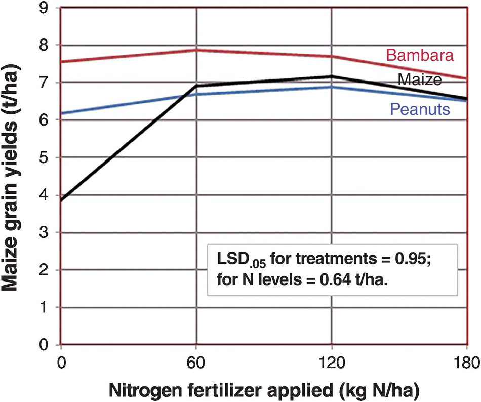
Fig. 13.9 Maize yields without nitrogen fertilizer applications increased drastically when two grain legumes preceded the current crop in Marondera, Zimbabwe, but the effect of the legumes pretty much disappeared when nitrogen fertilizers were added.
Okito et al. (Reference Okito, Alves, Alves, Urquiaga and Boddey2004), in a longer-term field trial in Brazil, quantified the contribution of peanuts and mucuna using the 15N natural abundance technique, finding that peanut contributed 41 kg N/ha to the subsequent maize crop and mucuna, a green manure, 60 kg N/ha. But Okito and colleagues found that the peanut–maize rotation eventually depletes soil nitrogen reserves (just as Giller warned about some grain legumes), while the mucuna–maize sequence builds up soil nitrogen.
13.4.9 Overall Contribution of Biological Nitrogen Fixation to Food Production
The magnitude of nitrogen fixation in agricultural systems worldwide will be about 50 Tg N per year (Table 13.1). It is a small fraction in relation to the total agricultural land of the world, 4937 million hectares (Table 2.10), representing an average of 6.5 kg N/ha per year (including all land with and without nitrogen-fixers). It was not possible for me to calculate the percentage of agricultural land in the world where nitrogen fixation takes place, and thus a quantitative estimate of the contribution of biological nitrogen fixation to world or tropical food production.
The potential contribution of biological nitrogen fixation is usually based on experimental plot data, which provide a rosy picture. Giller (Reference Giller2001) indicates that legumes can fix 60 kg N/ha under experimental conditions, but I feel the reality in much of the tropics is a fraction of that because of management limitations of germplasm, rhizobial strains, phosphorus fertilization, rainfall variability and particularly low plant populations. As Norman Borlaug famously said “you can’t eat potential.” There are major exceptions, such as high-yielding soybean cultivation and tropical plantations that have an effective, well-managed, legume understorey, such as rubber and oil palm, which will be described in Chapter 19.
Nevertheless, it is well accepted that free-living bacteria add nitrogen to the SON pool, which certainly helps long-term sustainability (Bohlool et al. Reference Bohlool, Ladha, Garrity and George1992, Giller Reference Giller2001).
One country has provided sound data. Brazil stands alone as not only the tropical but probably the world leader in using biological nitrogen fixation. Based on sound science, Brazil uses very little nitrogen fertilizer (10 kg N/ha) in relation to its overall planted area. It devotes 13 million hectares to soybean production, with a national average yield of 2.4 t/ha (Alves et al. Reference Alves, Boddey and Urquiaga2003). It uses essentially no nitrogen fertilizer on soybeans. Urquiaga et al. (Reference Urquiaga, Alves, Soares and Boddey2008) estimated that 3.8 Tg N was fixed by improved strains of Bradyrhizobium and related species, worth about US $4 billion in nitrogen fertilizer equivalent every year (Fig. 13.10). The little nitrogen fertilizer used in sugar cane, with world-class yields, is presumably also due to nitrogen fixation, although whether it’s due to endophytic nitrogen fixation or another mechanism that remains to be determined.
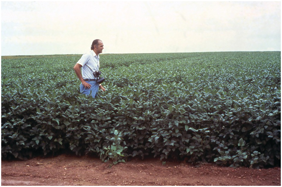
Fig. 13.10 Alfredo Lopes, one of the leaders in the development of the Cerrado, in the first soybean crop planted in Fazenda Nova Vida, near Brasília in 1975. These Oxisols received lime, phosphorus and the rhizobial inoculum. Such practices are worth about US $4 billion per year in nitrogen fertilizer equivalents.
13.5 Mineral Fertilizers
The third and the largest source of reactive nitrogen inputs to agriculture are the inorganic, synthetic or mineral fertilizers. The term “chemical” is misleading because all fertilizers, including organic ones, are chemical. That word makes some people’s noses turn up, as well as the word “synthetic,” i.e. manufactured, which modern fertilizers certainly are. I will refer to them as mineral fertilizers. Mineral fertilizers have been used since the dawn of agriculture, when farmers discovered, centuries ago, the value of kitchen ashes, followed by Chilean nitrate in the nineteenth century – but all were used on a small scale.
13.5.1 The Haber–Bosch Ammonia Synthesis
It was not until the development of the Haber–Bosch industrial process of ammonia synthesis in the early 1900s that mineral nitrogen fertilizers became to be used at scale. This is the number one way of transferring N2 into Nr in agriculture, with an estimated 100 Tg N per year in 1990. This compares with 32 Tg per year from agricultural biological nitrogen fixation (Table 13.1). Tilman et al. (Reference Tilman, Cassman, Matson, Naylor and Polasky2002) found a linear relationship between global fertilizer use and global cereal grain production from 1940 to 2000. They did not find such close relationships between phosphorus fertilizer or irrigation and global cereal grain production.
The Haber–Bosch process has been labeled “the world’s greatest fix (Leigh Reference Leigh2004).” Smil (Reference Smil2004) calls it the most important technical invention of the twentieth century. Is this hyperbole or an exaggeration? No. While electricity, cars, airplanes, medical sciences, the space program, the rule of law and the internet have done much to improve the quality of life, it is clear that the world could not support today’s population without mineral nitrogen fertilizers. Vaclav Smil (Reference Smil2004) estimated that about 40 percent of the world’s dietary protein supply in the mid 1990s came from the Haber–Bosch process, considering both the high dietary protein consumption of richer countries (100 g/person per day) and low consumption in the poorer counties of Africa, Asia and Latin America (66 g/person per day). Smil calculated that nitrogen-fertilizer-free practices, along with fisheries and grazing, would feed about 3.2 billion people today or 42 percent of the 7.5 billion population in 2017. Such fertilizer-free practices would feed only one-third of the world population of 9.5 billion people by the year 2050.
Fig. 13.11 A modern Haber–Bosch plant.
A Haber–Bosch plant is shown in Fig. 13.1. Unlike biological nitrogen fixation, which operates at normal pressure and temperatures, the Haber–Bosch process breaks the N2 molecule by brute force, using high temperatures (up to 400 °C) and high pressures (up to 35 000 kPa or 350 atmospheres), and no O2, which is poison to nitrogen fixation (Leigh Reference Leigh2004) just as it is to biological nitrogen fixation’s nitrogenase enzyme. The endless supply of N2 in the air is made to react with the explosive hydrogen (H2) gas. Natural gas (mainly methane [CH4]) and steam (water [H2O] gas) combine to produce H2 at high temperatures and pressures. Methane is the most economical feedstock because it has the highest H:C ratio of all hydrocarbons. The reaction is helped by iron (magnetite) and other catalysts (Smil Reference Smil2004).
The main reactions are:
CO is then removed by the “water gas shift reaction:”
Then N2 from the air is converted into ammonia:
Modern plants produce from 300 to 1000 tons of NH3 per day. Ammonia gas (12–18 percent NH3) is cooled and kept as a liquid at –33 °C, just below the boiling point of NH3 (Smil Reference Smil2004). Finally, NH3 is converted into actual fertilizers by reactions shown in Table 13.7.
Table 13.7 Principal nitrogen fertilizers, synthesis, market share and nutrient content, all derived from the Haber–Bosch NH3 synthesis. Adapted from Smil (Reference Smil2004), Brady and Weil (Reference Brady and Weil2008) and others.
About 80 percent of the product of Haber–Bosch process is used to make fertilizer and the remaining 20 percent to make explosives, plastics, nylon, plexiglass, polyurethane, feed supplements, glues and other synthetic products, accounting for 23 Tg N in 2005 (Galloway et al. Reference Galloway, Townsend, Erisman, Bekunda, Cai, Freney, Martinelli, Seitzinger and Sutton2008). Fertilizer use has driven a global change in the nitrogen cycle. China and India account for 80 percent of the total increase in nitrogen fertilizer use since 2000.
Today, synthetic nitrogen fertilizers supply approximately 45 percent of the total nitrogen input for global food production (Ladha et al. Reference Ladha, Reddy, Padre and van Kessel2011). The rest is supplied mostly by soil nitrogen mineralization, but also by biological nitrogen fixation and atmospheric deposition.
Fritz Haber and Carl Bosch were awarded the Nobel Prize in chemistry, Haber in 1918, and Bosch in 1931. More detailed descriptions of the process and the fascinating history behind it are found in books by Leigh (Reference Leigh2004) and Smil (Reference Smil2004).
13.5.2 Nitrogen Fertilizers
Out of the Haber–Bosch process, several fertilizers were produced (Table 13.7), starting with ammonium sulfate, by Imperial Chemical Industries in 1923. The last fertilizer released for large-scale application was sulfur-coated urea, by the US National Fertilizer Development Center in Muscle Shoals, Alabama, in the 1960s. It is disheartening to realize that no new nitrogen fertilizer for agricultural use has been developed and marketed in the last 50 years, and probably longer since sulfur-coated urea is not used at large scale because of its cost. Many “boutique” nitrogen fertilizers are on the market, some with unsubstantiated claims, but these are mainly devoted to golf courses, backyard gardens and nurseries. A significant modification is the compression of urea into super-granules or briquettes, which seems effective in flooded rice culture. The development of the fertilizer industry is still very much mid-twentieth century, and is yet to take advantage of breakthroughs such as nanotechnology. Hopefully, I will stand corrected in the near future. Currently, there is more emphasis on blends that incorporate sulfur, zinc and iron with the major elements nitrogen, phosphorus and potassium.
The amounts of fertilizers applied per hectare of agricultural land varies widely between countries. Some countries apply too much (Netherlands, Vietnam, Japan, UK, China, France), some reasonable amounts (Brazil, United States, India, South Africa, Cuba) and others apply too little, mostly African countries (Fig. 13.12).
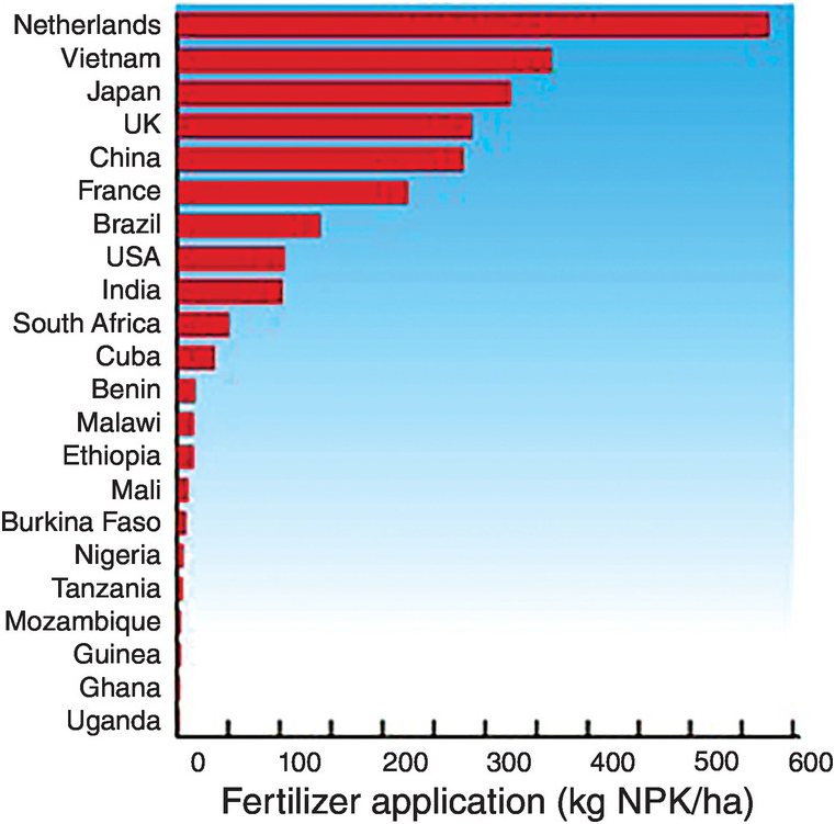
Fig. 13.12 National fertilizer applications are very uneven.
The Africa Fertilizer Summit, held in Abuja, Nigeria, in 2006, committed African countries to increase their annual fertilizer use from 8 kg NPK/ha to 50 kg NPK/ha by 2015. Malawi and Zambia have almost attained that target, Malawi reaching 48 kg/ha NPK and Zambia 43 kg/ha NPK (Peter Crauford, personal communication, 2017).
Nitrogen fertilizer management practices depend on many factors. Some are specific to the fertilizer. Others depend on germplasm and soil and climate conditions, as well as on the agronomic management. Wetland rice is a special case and will be discussed in Chapter 17. Let’s start with the real game changer, germplasm.
13.5.3 Green Revolution Germplasm
The main impact of the Green Revolution of the 1960s–1980s was to drastically change the plant type: new varieties of rice and wheat put more nitrogen into the grain when nitrogen fertilizers were applied, thus making grain to straw ratios of above 1 instead of ~0.5 (Chapter 2). Most traditional varieties responded to nitrogen fertilization by producing more leaf, lodging (falling over on the ground) and losing yield, while the new ones increased grain yields drastically by remaining short-statured and erect. Figure 13.13 shows the results of a typical trial.
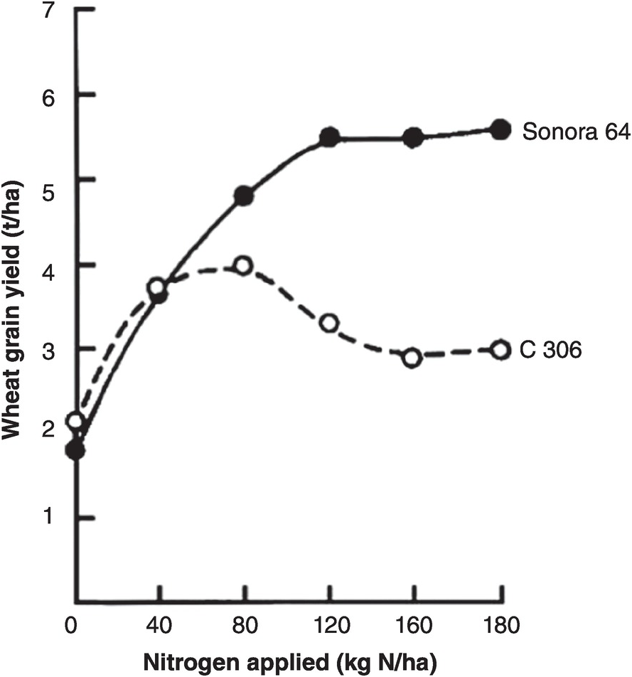
Fig. 13.13 One of the early Asian Green Revolution trials showing the different responses of the short-statured Sonora 64 wheat variety from Mexico versus a local one in Pantnagar, India (Sharma et al. Reference Sharma, Misra, Wright and Krantz1970).
The main nitrogen fertilizer management practices are to determine the right source, the right rate of application, the right placement and the right timing. This well-known paradigm has been made popular as the 4Rs (Roberts Reference Roberts2009).
13.5.4 Nitrogen Fertilizer Sources
Much research has been conducted to compare urea, ammonium sulfate and other nitrogen sources on corn, rice, wheat and sorghum in the tropics. For most crops, the overwhelming evidence indicates that there are no differences between urea and ammonium sulfate or other ammonium fertilizers. In instances where ammonium sulfate was superior to urea, the effect was due to sulfur deficiency or volatilization losses of surface-applied urea in high-pH soils. Where urea was superior, differences were due to the acidifying effect of large, long-term applications of ammonium sulfate in already acid soils. The bulk of the evidence indicates few differences in ammonium sources when properly applied, including DAP. Nitrate sources are usually inferior to ammonium sources under conditions favoring leaching or denitrification.
13.5.5 Rates of Application
Choosing the correct rate of application is one of the two most important fertilizer management practices, the other being timing of application. The most common point of departure for determining the rate (kg N/ha) is the existence of nitrogen response curves, which are available in most tropical agricultural regions. The zero fertilizer rate (the control) gives an idea of how much nitrogen a cultivar can obtain from the remaining mineral nitrogen from SOM mineralization, manure applications, legumes in rotation and atmospheric deposition.
There are numerous ways to determine rates, ranging from the empirical, using a response curve like the graphs of Fig. 13.14 combined with local experience, to sophisticated mass balance models and geographical information systems and remote sensing algorithms, with equipment that can be tractor-mounted (Meisinger et al. Reference Meisinger, Schepers, Raun, Schepers and Raun2008). The latter is great for precision agriculture, but for most small- and medium-sized tropical farms I would use the Linear Response and Plateau model (LRP), reproduced as Figure 13.14. Such a rate must also guarantee the maintenance of SOM using the fertilizer nitrogen that is immobilized by bacteria and eventually converted to SOM.
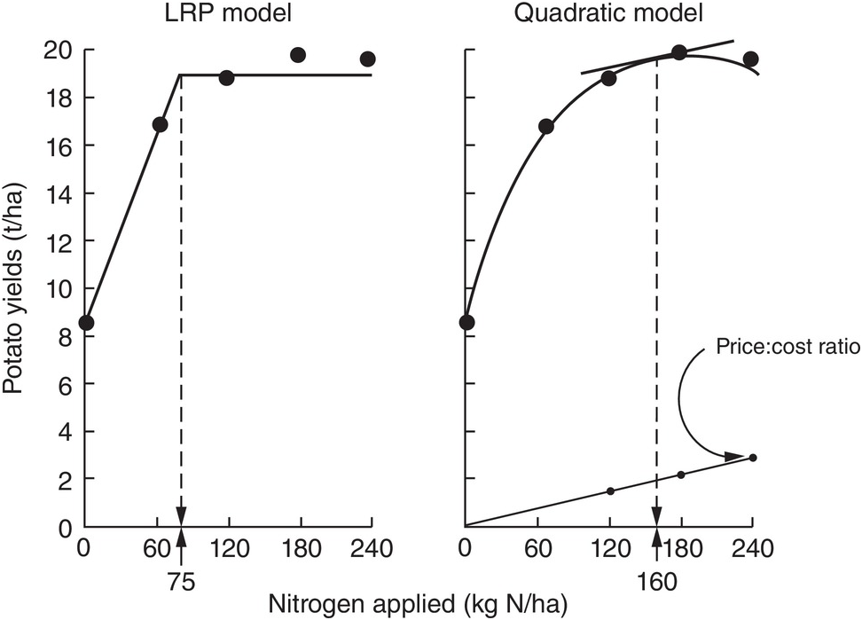
Fig. 13.14 Comparison between the LRP and the quadratic models, using the same field data from potatoes in Peru. The recommended rate is much lower using LRP (Waugh et al. Reference Waugh, Cate and Nelson1973).
13.5.6 Fertilizer Placement
Nitrogen fertilizer placement is determined by seed spacing. Plant population itself affects the shape of the response curve of improved germplasm. At low levels of applied nitrogen, a population of 30 000 plants per hectare is optimum for maize, whereas at higher nitrogen rates with the best hybrids, populations nowadays are 100 000 plants per hectare, and above. Figure 13.15 shows the relationship between nitrogen rate and population on maize yields, in an old experiment in Guadalajara, Mexico. To achieve high yields, both high populations and high nitrogen rates are needed. Sub-optimal plant populations are unfortunately very common in smallholder tropical farms without mechanization, and when a poor quality of seed is used. This is partly because the spacing between rows is not constant, or because too many seeds are placed in the same planting hole and then have to be thinned, wasting a valuable resource. In very poor areas, maize and other seeds are broadcast over the soil surface, guaranteeing very low yields. In such cases, the first task of an extension worker is to demonstrate how to plant in rows at the right population. Individual maize seeds are planted with close spacing, about 10–25 cm within the row and 75 cm between rows. This is called the Sasakawa method in parts of Africa, and is an effective way to increase maize yields in comparison with the common 90 × 90-cm spacing (Nziguheba et al. Reference Nziguheba, Palm, Berhe, Denning, Dicko, Diouf, Diru, Flor, Frimpong, Harawa, Kaya, Manumbu, McArthur, Mutuo, Ndiaye, Niang, Nkhoma, Nyadzi, Sachs, Sullivan, Teklu, Tobe and Sanchez2010). Other crops have their particular spacing requirements.
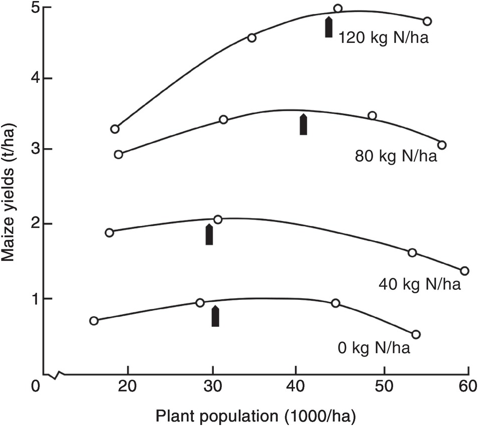
Fig. 13.15 Increasing population and nitrogen applications increase maize yields in Mexico. The optimum population for each nitrogen rate is indicated by an arrow (Laird and Lizárraga Reference Laird and Lizárraga1959).
Seasonal rainfall also exerts a marked influence on maize responses to nitrogen. Figure 13.16 illustrates the lower responses obtained when either excess moisture or drought occurred in a series of maize experiments in Mexico. Also, as discussed before in Chapter 6, short-term droughts during the rainy season (veranicos) can cause crop failures if they happen during the reproductive stage of crops. Such short-term droughts may be predictable in places where topography and soil texture varies, as in southern Malawi.

Fig. 13.16 Excess moisture or drought decreases maize response to nitrogen fertilizers in Mexico (Rockefeller Foundation 1963–64).
13.5.7 Timing of Applications
The timing of nitrogen applications for most crops consists of a basal application at planting and a topdressing application just before the crop’s grand period of growth. Pre-planting applications are usually determined by the need for phosphorus fertilizers, which is critical at early growth stages. But unlike phosphorus, nitrogen can be rapidly lost by leaching while the seed germinates and establishes a root system. Incorporating the fertilizer close to the seed, but with soil in between to avoid fertilizer burn (due to high salinity), is the best way. Due to the danger of leaching, normally only one-third of the nitrogen rate is applied at planting and the rest at topdressing time, when the plant is at about knee height. It is applied close to the maize rows and normally before the second weeding so the topdressing is also incorporated into the soil. It is seldom profitable, however, to have more than two split applications.
Fox et al. (Reference Fox, Talleyrand and Bouldin1974) summarized nitrogen responses to maize and sorghum in Oxisols and Ultisols in udic areas of Puerto Rico, and obtained nitrogen fertilizer recoveries of 51 percent with one side-dressed application, but only 33 percent when the same rate was incorporated into the soil surface at planting. In semiarid Zimbabwe, Piha (Reference Piha1993) found split applications better for sorghum, perhaps because of the unpredictability of rainfall events.
If there is likely to be a drought, farmers may minimize their losses by lowering the rate or avoiding the topdressing application. Also, the topdressing application can be fine-tuned with nitrate sensors or chlorophyll meters (Meisinger et al. Reference Meisinger, Schepers, Raun, Schepers and Raun2008).
Fertilizer applications should not be done after the crop has flowered because there will be little grain yield response. This unfortunately happens in many parts of Africa where subsidized fertilizer arrives too late but farmers still apply it after maize has tasseled. Avoiding this is another simple extension message in areas with no prior experience with mineral fertilizers.
13.6 Organic Nitrogen Mineralization
The fourth source of inorganic nitrogen to plants is organic nitrogen mineralization. It is not equivalent to the other three because SON has to come from the other three sources (nitrogen fertilizers, biological nitrogen fixation and atmospheric deposition). The decomposition of organic nitrogen into inorganic compounds (mineralization) consists of three steps: (1) aminization, the transformation of proteins into amines; (2) ammonification, the transformation of amines into NH4+; and (3) nitrification, the transformation of NH4+ into NO3– with a short intermediate stage of NO2– formation. Most nitrogen mineralization occurs in the topsoil, although its importance in deep tropical subsoils may be similar to that of carbon as described in Chapter 11.
Aminization and ammonification are done by enzymes carried by diverse heterotrophic and autotrophic bacteria, as well as fungi, as follows:
The hydroxide (OH–) ion formed produces a higher soil pH (Addiscott Reference Addiscott2005).
Nitrification, the aerobic oxidation of NH4+ to NO3– via NO2–, is one of the central processes in the nitrogen cycle. The process of nitrification is carried out by chemoautotrophic bacteria (those that derive their energy from the oxidation of nitrogen in contrast with the heterotrophic bacteria that derive their energy from carbon). It is a two-stage process, previously believed to be carried out by only four genera of bacteria (Mosier et al. Reference Mosier, Wassmann, Verchot, King and Palm2004, Norton Reference Norton, Schepers and Raun2008). First, the chemoautotrophs Nitrosomonas and Nitrosospira oxidize NH4+ to form NO2–:
Then the chemoautotrophs Nitrobacter and Nitrospira rapidly oxidize NO2– to NO3–:
Equation 13.10 produces four H+ ions, which is the reason for the secondary acidity that can be produced by ammonium-based fertilizers (Chapter 9).
New molecular techniques have found several more genera of ammonium- and nitrite-oxidizing bacteria. Most exciting has been the discovery of ammonium-oxidizing archea (Peter Groffman, personal communication, 2013), which, like bacteria, oxidize NH4+ to NO2– (Eq. 13.10), radically challenged our bacteriocentric view of nitrification and stands as an example of the fascinating complexity of microbes involved in biogeochemical cycling (Hatzenpichler Reference Hatzenpichler2012). Yao et al. (Reference Yao, Gao, Nicol, Campbell, Prosser, Zhang, Han and Singh2011) found ammonium-oxidizing archea to be the dominant NH4+ oxidizers in acid Ultisols (pH 3.5–5.5) that were grown with tea in tropical and subtropical China, and heavily fertilized with nitrogen.
These three equations are simplified ones, not including intermediate products that produce N2O or NO; they will be discussed later.
There’s been much interest and excitement about observations that plants can take up simple organic forms of nitrogen, mostly amino acids. The evidence is from boreal forest and tundra ecosystems (frigid soil temperature regimes) that are very nitrogen-poor. Schimel and Bennett (Reference Schimel and Bennett2004) consider that direct plant uptake of simple organic nitrogen molecules may dominate in such nitrogen-poor systems because the microbes assimilate most of the inorganic nitrogen ions. As temperatures increase, plants and microbes actively compete for NH4+ and NO3–, and small organic nitrogen molecules are taken up in lower proportions by plants. When nitrogen resources are high, as in tropical forests and fertilized agriculture, Schimel and Bennett hypothesize that uptake of NH4+ and NO3– becomes the dominant process because there is plenty of inorganic nitrogen ions to meet the demands of microbes and plants. It would be relevant to see how these processes are affected by variable-charge clays.
13.6.1 SON Pools and Nitrogen Mineralization
The pools that account for most nitrogen mineralization are the metabolic nitrogen pool and the active SON pool (which includes microbial biomass), while the structural nitrogen pool and the slow and passive SON pools (Fig. 13.4) have limited roles in nitrogen mineralization
Organic resources or organic inputs, as explained in Chapter 11, are partitioned into metabolic or structural nitrogen pools (Fig. 13.4) according to their nitrogen and lignin contents. In the case of manures, where lignins have largely been digested by ruminant animals, the only indicator of quality (in this case mineralization versus immobilization) is nitrogen content, where the critical level seems to be 1.25 percent N (Murwira and Mukurumbira Reference Murwira and Mukurumbira1984), half of the critical level for plant materials (2.5 percent N). C:N ratios do not work because the carbon content of manures varies widely as explained in Chapter 11.
In addition to input quality as defined by the metabolic and structural nitrogen pools, the dominant factor affecting nitrogen mineralization rates in the tropics is topsoil moisture content. Calder (Reference Calder1957) and Semb and Robinson (Reference Semb and Robinson1969) found that mineralization may take place at moisture tensions higher than –1500 kPa, the “wilting point.” The water content present at high tensions in clayey, variable-charge soils, although unavailable to plants, seems to be available to mineralizing microorganisms. Both these pioneering studies took place in East Africa, probably on soils high in iron and aluminum oxides or allophane.
Nitrogen mineralization rates also depend on temperature. Low temperatures can be limiting in the tropical highlands, but high temperatures in tropical lowland areas seldom limit nitrogen mineralization per se. On the contrary, Mosier et al. (Reference Mosier, Wassmann, Verchot, King and Palm2004) indicated that the production of trace nitrogen gases – a product of initial mineralization and subsequently of water-filled pores – increases within the range of 20–40 °C in the tropics.
Between these extremes of moisture and temperature content, most tropical soils undergo several periods of alternate wetting and drying. Nitrogen mineralization is likely to be faster under alternate wetting and drying than under “optimum” moisture conditions. But these dynamics are short term, which results in a decline of the total SON (Ladha et al. Reference Ladha, Reddy, Padre and van Kessel2011).
13.6.2 Immobilization
Immobilization, the opposite process to mineralization, is where a high diversity of bacteria and other microorganisms convert NO2– or NH4+ into organic forms of SON. Immobilization occurs primarily in the active nitrogen pool, initially by the microbial biomass fraction of that pool. Manipulating the balance between nitrogen mineralization and immobilization can be a key management practice. The NO2– or NH4+ ions from fertilizers are immobilized and then subsequently mineralized as described later.
The balance between mineralization and immobilization is illustrated in Fig. 13.17, with 2.5 percent N being the critical level.

Fig. 13.17 Whether nitrogen is mineralized or immobilized from plant materials is determined by the nitrogen concentration of the materials and modified by high lignin or polyphenol contents. The regression equation is for all materials. Black squares or circles represent materials with > 2.5 percent N. White squares or circles are those with < 2.5 percent N. Squares represent materials with < 15 percent lignin and < 4 percent polyphenol. Circles represent materials with > 15 percent lignin or > 4 percent polyphenol.
13.6.3 Influence of the Core Properties
The three core soil properties also play important roles. Sandy topsoils have low levels of SON, mostly in the active pool where SON can be mineralized rapidly, releasing inorganic nitrogen to plants. Clayey soils have a higher SON content and generally have more labile carbon substrates for mineralization to proceed. Mineralogy also plays a role, particularly allophane, whereby Bornemisza and Pineda (Reference Bornemisza and Pineda1969) found that nitrogen mineralization is inversely proportional to its allophane content in Andisols. Mineralization at very high soil moisture tensions has been recorded in variable-charge oxidic and allophanic soils, as mentioned before, but it is not known whether the same happens in permanent-charge soils.
13.7 Nitrogen Fertilizer Reactions in Soils
The following sections describe the reactions that nitrogen fertilizers undergo in tropical environments. The acidification of some nitrogen fertilizers has been discussed in Section 9.8.
13.7.1 Urea Hydrolysis
Urea is the most commonly used inorganic nitrogen source in the tropics. Its popularity is partly due to its high nitrogen content (46 percent), low unit cost and its availability in the world market. When applied to a moist soil, urea is hydrolyzed into ammonium carbonate [(NH4)2CO3] by the enzyme urease in the following way:
 (13.12)
(NH4)2CO3 dissociates into the NH4+ and CO3– ions in the presence of water. Before hydrolysis, urea is as mobile as NO3– and may be leached to down below the root zone with heavy rainfall if soil structure permits. Tamini and Kanehiro (Reference Tamini and Kanehiro1962) showed that urea hydrolysis proceeds at about the same speed in the tropics as in the temperate region, and is complete within 1 to 4 days. In flooded soils, DeLaune and Patrick (Reference Delaune and Patrick1970) found that the rate of urea hydrolysis is similar to that in well-drained soils.
13.7.2 Ammonia Volatilization
At soil pH values higher than 7, the NH4+ ions can be converted to NH3 (ammonia gas) and lost to the atmosphere.
Volatilization losses of NH3 were first recognized in the tropics by Jewitt (Reference Jewitt1942), working with high-pH Vertisols in the Sudan. Broadcast nitrogen applications to the soil surface are very common in the tropics; therefore, volatilization losses can be of practical importance in high-pH soils, particularly when high nitrogen rates of urea are applied (Fig. 13.18). Shankaracharya and Mehta (Reference Shankaracharya and Mehta1971), working with a loamy sand of pH 7.1 in Gujarat, India, measured field volatilization losses of 4 percent when 28 kg N/ha was applied as urea to the soil surface. When the rate was increased to 277 kg N/ha, volatilization losses increased to 44 percent. Such high rates are common in areas where high-yielding cereals are planted. They also become the effective rate when fertilizers are point-placed around the planting hole in smallholder farming systems.

Fig. 13.18 A wasteful practice: broadcasting urea on Inceptisols of pH 8.3 in Koraro, Ethiopia.
Urea volatilization losses can be reduced if the material is placed below the soil surface before hydrolysis. This can be accomplished by incorporation, deep placement, or simply by moving the freshly applied urea down with irrigation water or rainfall. Table 13.8 shows the reduction in volatilization losses when irrigation followed a surface application. In the presence of moisture, volatilization of ammonia does not take place. This table also indicates that urea volatilization losses are essentially eliminated by incorporating the material to about 5 cm depth. The practical implication is that urea should be incorporated into the soil if it is to be applied to a dry calcareous soil.
Table 13.8 Volatilization losses of applied urea as a function of placement depth and timing in relation to irrigation in a calcareous loamy sand in Gujarat, India (nitrogen rate: 222 kg N/ha). Adapted from Shankaracharya and Mehta (Reference Shankaracharya and Mehta1971).
| Placement depth (cm) | Applied before irrigation | Applied after irrigation |
|---|---|---|
| Loss of applied nitrogen (%) | ||
| Surface | 8.1 | 40.2 |
| 1.2 | 1.2 | 33.4 |
| 2.5 | 0.6 | 18.1 |
| 5.0 | 0.05 | 0.5 |
| 7.5 | 0 | 0 |
13.7.3 Ammonium Fixation
NH4+ ions can be trapped between sheets of 2:1 layer-silicate minerals when they expand and contract with wetting and drying. This process is limited to clayey topsoils with smectitic, illitic or vermiculitic mineralogy, all of which have permanent charge, and does not happen in the more common kaolinitic, siliceous or oxidic mineralogies. Nevertheless, it is important in Vertisols of the tropics, although little work has been done on these. A good review with a temperate-region focus is that of Kissel et al. (Reference Kissel, Cabrera, Paramisavam, Schepers and Raun2008).
13.7.4 Immobilization of Fertilizer NH4+ and NO3–
Contrary to common agronomic knowledge, many, if not most, of the NH4+ and NO3– ions released by fertilizers are immobilized by microbes before they are taken up by crop roots (Myrold and Bottomley Reference Myrold, Bottomley, Schepers and Raun2008, Mulvaney et al. Reference Mulvaney, Khan and Ellsworth2009). Microbes are at near-nitrogen-starvation levels, and their large numbers in a rhizosphere that is rich in labile carbon impedes much of the direct uptake of fertilizer nitrogen by plant roots (Vitousek et al. Reference Vitousek, Haettenschweiler, Olander and Allison2002). Much of this immobilized nitrogen is mineralized quickly because many microbes have very high turnover rates (hours, days), and then it is quickly taken up by the crop roots. Vanlauwe et al. (Reference Vanlauwe, Diels, Aihou, Iwuafor, Lyasse, Sanginga, Merckx, Vanlauwe, Diels, Sanginga and Merckx2002) cited two laboratory experiments in which 50 ppm of fertilizer nitrogen was immobilized during the first 25 days after application, and mineralized 40–50 days afterwards. Also, much of a high nitrogen fertilizer application rate (168 kg N/ha) to Mollisols in Kansas was immobilized, released and taken up by maize plants 50–120 days afterwards (Brady and Weil Reference Brady and Weil2008). Such processes may improve the synchrony between nutrient supply and plant demand and reduce nitrate leaching and N2O losses. It is one reason why the recovery of fertilizer nitrogen by crops is seldom higher than 50–70 percent. More on this issue later.
The above paragraph is full of the phrase “much of,” showing the need for quantification. How much fertilizer nitrogen is immobilized? For how long? How much is released under different soil conditions in tropical agricultural systems? What are the turnover times? How much of the fertilizer nitrogen is building SOM via this mechanism?
Microbial immobilization of fertilizer nitrogen may be a good thing for basal nitrogen applications, which are in danger of loss because the crop seedlings do not have much of a root system at their early stages of growth. However, not having much of a root system means little rhizosphere and probably less free-living bacteria to immobilize the basal fertilizer applied. I did not find any data to confirm this, one way or the other.
13.8 Fluctuations of Inorganic Nitrogen
Inorganic nitrogen in most tropical areas shows a marked seasonal fluctuation, as illustrated in Fig. 13.19. The pattern consists of (1) a slow build-up of nitrate in the topsoil during the dry season; (2) a large but short-lived increase at the onset of the rainy season; (3) downward nitrate movement during the rainy season plus crop nutrient uptake, which finishes with the crop harvest.
The following is an analysis of the individual components of this seasonal pattern. Although this pattern is typical of ustic soil moisture regimes, it occurs to a lesser extent in udic regimes.
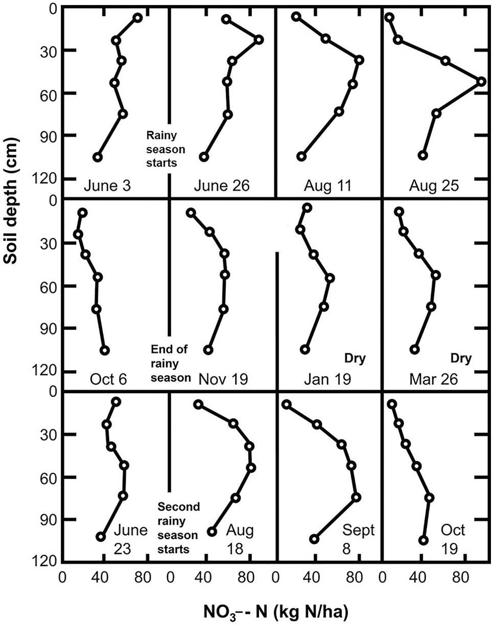
13.8.1 Nitrate Accumulation during the Dry Season
The accumulation of NO3– ions in the topsoil during the dry season can be explained by the upward movement of NO3– with the evaporation stream and the existence of nitrification at soil moisture tensions of –1500 kPa to –8000 kPa (Semb and Robinson Reference Semb and Robinson1969). Although the topsoil may be drier than those tensions indicate, the subsoil may have moisture to support mineralization. Since most of the water movement during the dry season is upward, NO3– ions previously present or recently mineralized in the subsoil may move up and accumulate in the topsoil. Wetselaar (Reference Wetselaar1961), working with an Alfisol from northern Australia, found evidence of dramatic nitrate build-ups in the top 5 cm. He explained that NO3– ions were mineralized in the subsoil where adequate moisture existed during the dry season, and accumulated just below a soil surface crust where capillary conductivity is broken.
Wild (Reference Wild1972aReference Wildb) followed the nitrate content of a profile in northern Nigeria for 2 years. His results, shown in Fig. 13.19, indicate an upward movement of NO3– ions during the dry season. This figure suggests that nitrate was leached into the subsoil during the previous rainy season and moved upward during the dry season. Hardy’s original data (Table 13.9) from a study in Trinidad shows nitrate levels increase in the topsoil (A horizon) during the dry season.
Table 13.9 Seasonal levels of soil nitrate and moisture content of a sandy soil in Trinidad, mean of 3 years. Adapted from Hardy (Reference Hardy1946).
| Season | Rainfall | Soil horizon | Inorganic nitrogen (kg NO3–-N/ha) | ||
|---|---|---|---|---|---|
| Maize | Pasture | Fallow | |||
| Rainy | 190 mm/month | A | 9 | 8 | 18 |
| B | 10 | 7 | 13 | ||
| Dry | 38 mm/month | A | 22 | 10 | 35 |
| B | 10 | 9 | 17 | ||
13.8.2 The Birch Effect: Nitrogen Flushes at the Onset of the Rainy Season
Within a few days after the first heavy rains, dramatic increases in inorganic nitrogen take place in the subhumid and semiarid tropics. In the field, such increases may range from 23 kg N/ha to 121 kg N/ha within 10 days after the onset of the rains (Semb and Robinson Reference Semb and Robinson1969). The sharpness of the peaks is directly proportional to the duration and intensity of the preceding dry period. These sharp increases are accompanied by similarly sharp decreases, caused by rapid leaching or plant uptake at the start of the rainy season (Fig. 13.20). Note that these changes are less pronounced in the “short rains” in the bimodal climate of the forest zone of Ghana, shown in this figure. Semb and Robinson’s work in East Africa provided clear evidence of NO3– ions moving into the subsoil after such flushes.
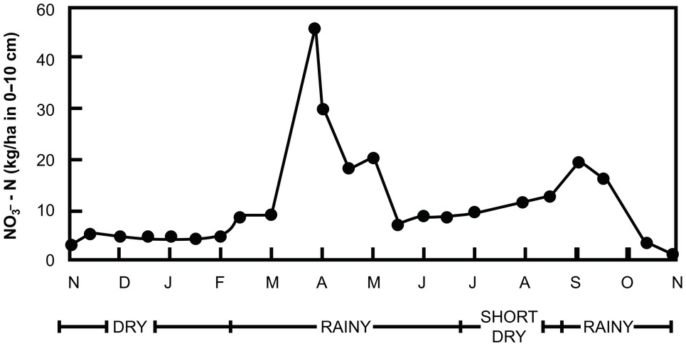
Fig. 13.20 Seasonal pattern of NO3–-N fluctuation in the top 10 cm of a cultivated Alfisol in Ghana with a bimodal udic soil moisture regime.
These short-term peaks were first described by Hardy in 1946 in Trinidad. Subsequent work in Africa by Birch and other workers substantiated their existence in a wide range of soil conditions (Birch Reference Birch1958, Reference Birch1960aReference Birchb, Reference Birch1964). The flushes are called the Birch effect because of the popularity of Birch’s articles (Chapters 6 and 7).
Birch (Reference Birch1958, Reference Birch1960aReference Birchb, Reference Birch1964) found that drying promotes faster carbon than nitrogen mineralization, thus reducing the C:N ratios. He also found that the critical C:N ratio above which mineralization stops is higher under alternate wetting and drying than under constant soil moisture. For example, an organic material containing 1.5 percent N was mineralized under alternate wetting and drying but was immobilized under constant moisture. Much of the microbial population is dead by the end of a strong > 6 month dry season. Active microbial populations build up rapidly when the rains start, using the dead microbial biomass as a substrate.
This is a very important process that has been largely ignored in the tropics outside of Africa and in the world in general. Gutschick (Reference Gutschick1981) noted that many crops were domesticated from weedy plants, and are adapted to exploit flushes of nitrogen. But for them to take advantage of the short-lived Birch effect, plants need to have a sufficiently developed root system to start with or to be capable of developing one within the first month or so into the rainy season. Ratoon crops of sugar cane are especially suited to take advantage of the Birch effect because they have most of the live root system of the previously cut crop already in the ground – as are natural systems, permanent pastures and tree crops.
This is why I think the Birch effect could explain part of the dilemma of changing soil nitrogen availability during what is supposed to be endophytic nitrogen fixation. Data are needed, particularly by South American scientists. We need to get a handle on how important, or not, this Birch effect is, where sugar cane is grown in ustic soil moisture regimes in Brazil.
The Birch effect is very important in the ustic soil moisture regime of the subhumid and semiarid tropics. It is probably of low importance in the udic, humid tropics due to the lack of a sufficiently prolonged dry season to kill and desiccate a sufficient microbial biomass so it can serve as a substrate for new microbes to rapidly grow at the onset of the rains. It is also unlikely to be important in the arid tropics because insufficient microbial biomass may accumulate during the previous very short rainy season. It will be unimportant in aquic soil moisture regimes, and probably less important in the highland tropics (isomesic and isofrigid soil temperature regimes) because of the constantly low soil temperatures.
The flushes of nitrogen mineralization at the start of the growing season are unlikely to take place in temperate-region soils, characterized by cold, wet springs preceded by winters where much denitrification takes place. In summary, the Birch effect is an important phenomenon in the nitrogen cycle only in ustic soil moisture regimes with isohyperthermic, hyperthermic, isothermic and thermic soil moisture regimes, which cover much of the tropics and some of the subtropics. This flush probably explains why new grass growth appears so green at the beginning of the rainy season in areas that have undergone no burning during the dry season. Where burning does take place, ash deposition, particularly in phosphorus-deficient soils, is a major reason for the greening. The relative effects of the flush of nitrogen mineralization and ash deposition need to be determined.
The Birch effect has been found by Fierer and Schimel (Reference Fierer and Schimel2002), Miller et al. (Reference Miller, Schimel, Meixner, Sickman and Melack2005) and Placella et al. (Reference Placella, Brodieb and Firestone2012) in temperate xeric soil moisture regimes of Mediterranean climates using up-to-date methodologies. The cause is the same, a long, dry summer followed by a wet winter. It is interesting that tropical soil scientists were over 60 years ahead in reporting this important phenomenon. Part of the reason is that many young scientists nowadays only pay attention to the literature that is available on the internet, and much of this old stuff is not digitized.
13.8.3 Downward Nitrate Movement During the Rainy Season
As the rainy season progresses, the inorganic nitrogen supply is reduced by plant uptake and leaching. Hardy (Reference Hardy1946) showed the effect of crop uptake in decreasing NO3– content in Table 13.9. Leaching depends on a series of soil factors.
Going back to Fig. 13.19, Wild (Reference Wild1972aReference Wildb) found that peak NO3– concentration in the profile gradually moves down as the rainy season progresses. At the beginning of the rainy season (June 3) most of the nitrates were concentrated in the top 15 cm. Three weeks later, after the flush, leaching started and the peak concentration moved down to between 15 cm and 30 cm. By August 11, well into the rainy season, the peak concentration was at 30–45 cm, and 2 weeks later it was at 45–60 cm.
In Wild’s experiment, NO3– ions moved at the approximate rate of 0.5 mm per mm of rain. The topsoil of this Alfisol is probably loamy, with clay increasing with depth. This movement is considerably slower than in sandy soils. Terry and McCants (Reference Terry and McCants1970), for example, found that nitrate moved at a rate of 1–5 mm per mm of rain in sandy Ultisols of North Carolina.
In well-aggregated Oxisols (not the loamy Alfisol of Figure 13.19), both downward movement of rainwater through large channels and slow lateral diffusion through the microaggregates occurs. Consequently, although many of the well-aggregated Oxisols act like sands in terms of water retention, their leaching losses of mineralized soil nitrogen are bound to be slower than those in sands because the NO3– ions mineralized inside the aggregates have to move through the micropores and out into the macropores before they can be susceptible to leaching. If the subsoil has some degree of anion exchange capacity, as shown in Chapter 8, nitrate movement will be reduced.
Wild (Reference Wild1972aReference Wildb) also found that the total nitrate content in the top 120 cm of the Fig. 13.19 Alfisol did not change significantly during the year, except at the end of the rainy season, when larger leaching losses took place because of a drop in the valley water table. In his 2 years of observations, therefore, most of the inorganic nitrogen never left the soil profile.
Fluctuations are also minimal if actively growing crops absorb nitrate quickly. Hardy’s data in Table 13.9 show that a soil under pasture had lower nitrate content than under maize because of year-round nitrogen uptake by pastures.
It is important to realize that the inorganic nitrogen fluctuation pattern just described is quite different from the one commonly found in much of the temperate region. The growing season in the humid (udic) temperate region begins with a cold, wet soil, low in inorganic nitrogen because of the slow mineralization rates during fall and winter as well as high denitrification losses. As temperatures warm up gradually in the spring, there is a correspondingly gradual increase in organic nitrogen mineralization. Inorganic nitrogen increases slowly, without flushes, because of the high soil moisture status. During the summer, mineralization rates can be very high, and the inorganic nitrogen content will depend on crop uptake, leaching and denitrification. Most of the nitrogen management practices used in the temperate region have been developed to fit such a pattern. Nitrogen management practices in the tropics should give more consideration to the Birch effect pattern.
13.9 Combining Mineral and Organic Nitrogen Fertilizers
The agronomic ideal is to synchronize the plant’s nutrient needs with the nutrient release from the added inputs (Swift Reference Swift1985), which is difficult to do, as shown graphically in Fig. 12.4 of the previous chapter. Palm et al. (Reference Palm, Myers, Nandwa, Buresh, Sanchez and Calhoun1997) and Vanlauwe et al. (Reference Vanlauwe, Diels, Aihou, Iwuafor, Lyasse, Sanginga, Merckx, Vanlauwe, Diels, Sanginga and Merckx2002) proposed that synchrony is probably best done with a combination of mineral and organic fertilizers. The mineral nitrogen fertilizers are so soluble that some of them may leach before bacteria can immobilize them or plant roots have the opportunity to take them up. Organic fertilizers may immobilize nitrogen from mineral fertilizers and then bacteria mineralize them slowly afterwards, improving synchrony. Organic fertilizers are usually applied and incorporated into the soil at planting or pre-planting time, sometimes combined with the basal applications of mineral fertilizers.
13.9.1 Classifying Organic Fertilizers
Ten classes of organic fertilizers are described in Table 13.10. The first four are leafy plant biomass, classified according to Palm et al. (Reference Palm, Gachengo, Delve, Cadisch and Giller2001), and the remaining are animal manures and composts that I am adding, based on Chapter 11, the work from Zimbabwe and the Sahel on manures, and my limited experience with composts. The high percentage of phosphorus criterion is designed not to add too much phosphorus to a crop, which can happen with poultry manures. The polyphenol requirement of Palm et al. (Reference Palm, Gachengo, Delve, Cadisch and Giller2001) was dropped because experience indicated it is of little value.
Table 13.10 Classes of organic fertilizers.
Class 1 plant biomass inputs are almost equivalent to nitrogen fertilizers in terms of mineral nitrogen release. Low-quality (class 4) plant biomass inputs immobilize mineral nitrogen but do not mineralize it fast enough to be synchronized with crop demand (Palm et al. Reference Palm, Myers, Nandwa, Buresh, Sanchez and Calhoun1997). Classes 2 and 6 may immobilize nitrogen from fertilizers and mineralize it slowly enough to increase crop yields, thus improving synchrony and reducing leaching – according to Vanlauwe et al. (Reference Vanlauwe, Diels, Aihou, Iwuafor, Lyasse, Sanginga, Merckx, Vanlauwe, Diels, Sanginga and Merckx2002) and Chivenge et al. (Reference Chivenge, Vanlauwe, Gentile, Wangechi, Mugendi, van Kessel and Six2009) for plant biomass inputs; and Pieri (Reference Pieri1992) and Mugwira and Murwira (Reference Mugwira, Murwira, Waddington, Murwira, Kumwenda, Hikwa and Tagwira1998) for manures. They may also decrease NO and N2O emissions.
All organic fertilizers contain the other 13 essential nutrients besides nitrogen, and their application often prevents the development of other nutrient deficiencies. Combining does not necessarily mean mixing. Organic fertilizers could be applied before planting followed by topdressing with mineral nitrogen fertilizers.
Chivenge et al. (Reference Chivenge, Vanlauwe and Six2011) conducted a meta-analysis of 104 experiments that compared plant biomass inputs (classes 1 to 4) with mineral nitrogen fertilizers, mixed or applied separately, using rainfed maize in 12 countries of tropical Africa. They measured crop responses; agronomic efficiency (AEN), in kilograms of additional grain per kilogram of nitrogen applied, either as mineral or organic fertilizers; changes in SOC content; and residual yield effects, in experiments lasting at least 5 years. Control yields ranged from 0 t/ha to 7 t/ha, covering a wide range of initial soil nitrogen fertility conditions. Their main results were as follows:
Maize yield responses were higher with the combined organic and nitrogen fertilizer applications (114 percent response over the control), while nitrogen fertilizers produced an 84 percent response, and class 1 to 4 of organics alone produced a 68 percent response. The authors attribute this to a temporary immobilization of nitrogen from fertilizers by the organic inputs, which may have improved synchrony.
Classes 1 and 2 of organics increased yields by about 90 percent (similar to nitrogen fertilizers); class 3 organics increased yields by 50 percent, while the lowest quality class 4 barely increased yields by about 7 percent. Crop yield responses definitely were higher with higher organic input quality, confirming the Palm et al. (Reference Palm, Gachengo, Delve, Cadisch and Giller2001) model, although the separation between classes 1 and 2 was minimal.
Class 4 organics alone depressed yields in sandy soils but, when combined with nitrogen fertilizers, yield responses were much larger in sandy than in clayey soils. Chivenge et al. (Reference Chivenge, Vanlauwe and Six2011) believe this combination, applied every year, could increase sustainability in sandy soils. This augurs well for the Sahel, where most of the soils are sandy and most biomass that can be added is of low quality. With class 4, low-quality organics, temporary immobilization of the nitrogen from fertilizer and subsequent release may proceed too slowly to benefit the current crop but will be beneficial in the long term.
The trend in agronomic use efficiency was different in the mineral–organic combinations compared to mineral fertilizers alone. The AEN value for the combination was only 14 ± 2 kg grain/kg N, far below that of nitrogen fertilizers alone (23 ± 4 kg grain/kg N), and almost the same as with organics alone, 13 ± 3 kg grain/kg N. So, nitrogen fertilizers in this meta-analysis were almost twice as efficient as classes 1 to 4 of organics, but the combination provided higher yield responses, which could be due to the addition of other nutrients in the organics.
Soil texture had additional effects. Clayey soils were doubly superior in agronomic use efficiency (AEN = 21 percent) to loamy (AEN = 8 percent) and sandy soils (AEN = 10 percent). Most of the soils that had low control yields, but also greater yield responses, were sandy soils.
The lower the fertilizer nitrogen rate the larger the beneficial effect of combining it with organic biomass resources.
High-quality organic fertilizers produce longer residual effects. This contradicts the common belief that the lower-quality organic fertilizers may have longer residual effects because of their slow rate of decomposition.
The above results indicate that combining plant biomass resources with nitrogen fertilizers is beneficial, and more so if the organics are of high quality. The combination will also increase SON, which will improve nutrient storage. The latter is particularly the case in sandy soils since it is most likely that the increase in SON will be in the active SON pool where nitrogen will be rapidly mineralized, improving soil fertility but not total SON content.
In a previous study, Chivenge et al. (Reference Chivenge, Vanlauwe, Gentile, Wangechi, Mugendi, van Kessel and Six2009) compared classes 1 to 5 of organics, which included high-quality cattle manure in two soils near Embu, Kenya, over a 10-year period. Class 1 (Tithonia diversifolia) and class 5 (high-quality manure) produced the highest maize yields at both sites. Classes 2, 3 and 4 produced progressively lower yields. Class 5 cattle manure was as effective as the class 1 leafy organics.
As mentioned before, the two newly introduced animal manure classes in Table 13.10 are based primarily on the work of Zimbabwean and Sahelian soil scientists. In Zimbabwe, Mugwira and Murwira (Reference Mugwira, Murwira, Waddington, Murwira, Kumwenda, Hikwa and Tagwira1998) reviewed cattle manure research since 1913 in sandy soils of communal areas and with large cattle populations, which I classify as class 6 organic fertilizers. These authors concluded that “these studies indicated that manure alone generally produced low yields and needed supplementing with inorganic fertilizers, particularly N, for optimum yields.” They further stated that “these benefits derive primarily from the ability of cattle manure to supply other nutrients. Manure application to granitic sands [sandy Alfisols or Ultisols] has been shown to overcome or prevent deficiencies of nutrients including S, Mg, Zn and B, and to enhance soil available N, P and K.”
Summarizing 30 years of research in Francophone West Africa, in mostly long-term field experiments on sandy Alfisols of the Sahel, and using cattle manure similar to the Zimbabwe situation (class 6), Pieri (Reference Pieri1992) concluded the following:
Where animal traction is used, manure becomes a resource. The best results were obtained when ~ 5 t/ha per year of manure were combined with annual applications of NPK (nitrogen, phosphorus and potassium) fertilizers, eliminating yield declines for many years. Manure applications often eliminated the need for liming to counteract secondary soil acidity in these sandy soils. Apparently, the calcium and magnesium content in the manure had some liming effect, although no nutrient composition data were provided.
In very sandy, unbuffered soils (> 90 percent sand), even a 10 t/ha manure application could not prevent the loss of SOC with cultivation, which proceeds at a very high rate – 6 percent per year in the hot, semiarid climate of Bambey, Senegal – suggesting that the active SOC level could not be maintained.
On better textured soils (> 10 percent silt and clay), as in Saria, Burkina Faso, the decomposition rate is reduced to 2 percent with mineral fertilizer plus manure, and decomposition rates of SOC become lower by adding a grain legume in rotation.
The best results were invariably obtained with the combination of cattle manure and NPK fertilizers. Generally, crop yields increased from values as low as 0.4 t/ha to 2–3 t/ha.
13.9.2 Importance of Knowing Nutrient Composition
Comparisons of cattle manure versus mineral fertilizers in the tropics have been carried out principally in India and Africa (Pieri Reference Pieri1992). The main problem is that the nutrient contents of the manure must be known for comparisons to be valid, but that seldom happens. The large difference in nitrogen lost during manure storage (Chapter 11) further complicates the issue if manure sampling is done shortly after excretion.
Several long-term comparisons in Africa did take into account the nutrient composition of the animal manure employed (Djokoto and Stephens Reference Djokoto and Stephens1961, Stephens Reference Stephens1969, Heathcote Reference Heathcote1970). They show that crop responses to animal manures can be explained in terms of their nutrient composition, particularly the potassium and phosphorus content. For example, Stephens (Reference Stephens1969) found, in 18 long-term experiments in Uganda, that manure applications were superior to mineral fertilizers. Manure provided 75 kg K/ha annually, whereas the fertilizer used supplied only 25 kg K/ha to potassium-deficient soils. Obviously, the difference was due to nutrient composition.
Nevertheless, it is possible to generalize that the combined use of organic and mineral nutrient inputs often produces higher long-term yields than in either full organic or full mineral applications (Greenland Reference Greenland, Leigh and Johnston1994, Swift et al. Reference Swift, Seward, Frost, Qureshi, Muchena, Leigh and Johnston1994, Palm and Swift Reference Palm and Swift2002, Sanginga and Woomer Reference Sanginga and Woomer2009). Livestock manures (classes 5 and 6) often buffer the soil against acidification by continued use of acid-forming nitrogen fertilizers (Pieri Reference Pieri1992). Class 6 manures often do not add enough nutrients, including nitrogen (Murwira and Mukurumbira Reference Murwira and Mukurumbira1984).
The ratio of mineral to organic nutrient inputs usually increases with agricultural intensification. Therefore, identification of the threshold amounts of organic inputs necessary to maintain non-nitrogen functions should be considered in the integrated management of soil fertility (Palm and Swift Reference Palm and Swift2002).
13.9.3 Dynamics of Mineral and Organic Fertilizers with Time
When I was a graduate student, attending International Rice Research Institute (IRRI) seminars in the Philippines, I repeatedly heard Felix Ponnamperuma, Akira Tanaka, Richard Bradfield and SK DeDatta saying that about 50 percent of the nitrogen used by rice came from fertilizers. I wondered, where does the other 50 percent come from? But I was too overwhelmed by these world-class scientists to dare ask them such a seemingly stupid question. It has taken decades for me to answer that question. Advice to present day students: Ask.
Because of the immobilization of fertilizer nitrogen and leaching and denitrification losses, the recovery of applied fertilizers by the crop to which it is applied is generally about 30–50 percent, which is known as percentage of fertilizer recovery, the most commonly used fertilizer efficiency metric. So what happens to the rest?
Dourado Neto et al. (Reference Dourado Neto, Powlson, Abu Bakar, Bacchi, Basanta, thi Cong, Keerthisinghe, Ismaili, Rahman, Reichardt, Safwar, Sangakkara, Timm, Wang, Zagal and van Kessel2010), supported by the International Atomic Energy Agency, conducted a coordinated set of field trials in five tropical countries (Bangladesh, Brazil, Malaysia, Sri Lanka and Vietnam) plus four others (China, Chile, Egypt and Morocco), using the local cropping systems and both 15N-labeled fertilizer and 15N-labeled crop residues that were generated from the first cropping season. The results are summarized in Table 13.11.
Table 13.11 Cumulative crop recovery, soil immobilization and losses of one application of fertilizer nitrogen with and without its crop residues, using 15N-labeled material, in 13 long-term field trials in nine countries with five successive harvests. Ammonium sulfate was the main nitrogen source, and rates varied according to the cropping system, in the range of 28–300 kg N/ha. Calculated from data by Dourado Neto et al. (Reference Dourado Neto, Powlson, Abu Bakar, Bacchi, Basanta, thi Cong, Keerthisinghe, Ismaili, Rahman, Reichardt, Safwar, Sangakkara, Timm, Wang, Zagal and van Kessel2010) and Chris van Kessel, personal communication, 2012.
| Nitrogen Source | Recovered in | Crop 1 | Crop 2 | Crop 3 | Crop 4 | Crop 5 |
|---|---|---|---|---|---|---|
| Cumulative recovery of labeled fertilizer or crop residue (%); the change from previous crop is given in parentheses | ||||||
| 15N fertilizer plus unlabeled crop residue | Crop (uptake) | 29.6 | 34.4 (4.8) | 35.4 (1.0) | 32.1 (–3.3) | 32.4 (0.8) |
| Soil (immobilized) | 35.0 | 32.9 (–3.9) | 21.0 (–11.9) | 16.1 (–4.9) | 15.9 (–4.2) | |
| Lost | 36.1 | 33.1 (–3.0) | 44.0 (10.9) | 51.7 (7.7) | 51.8 (0.1) | |
| 15N crop residue plus unlabeled fertilizer | Crop (uptake) | 7.2 | 10.8 (3.6) | 14.5 (3.8) | 11.5 (–3.0) | 13.3 (1.8) |
| Soil (immobilized) | 65.3 | 64.2 (–1.1) | 43.3 (-20.9) | 36.8 (–6.5) | 38.7 (–11.9) | |
| Lost | 29.3 | 28.1 (1.2) | 43.0 (14.9) | 52.1 (9.1) | 48.5 (–3.6) | |
In spite of the wide array of soils, cropping systems and climates involved, only an average of 30 percent (ranging from 7 percent to 58 percent in the individual country trials – data not shown) of the 15N fertilizer was recovered by the first crop. The rest of the 15N fertilizer was found immobilized in the SON (35 percent) and lost by leaching or gaseous losses (36 percent). So, we have a first quantification of the amount of nitrogen fertilizer immobilization.
The 15N-labeled crop residues contributed only 7 percent of the original crop uptake; 65 percent was immobilized into SON, and 29 percent was lost as leaching and gaseous losses – a similar amount to losses from the 15N fertilizer.
With subsequent crops, the crop recovery from the original 15N fertilizer increased by about 4.8 percent with the second crop, with no significant residual effects. Afterwards, according to the literature review by Dourado Neto et al. (Reference Dourado Neto, Powlson, Abu Bakar, Bacchi, Basanta, thi Cong, Keerthisinghe, Ismaili, Rahman, Reichardt, Safwar, Sangakkara, Timm, Wang, Zagal and van Kessel2010), the residual effect of nitrogen fertilizers usually stops at the second crop. They conclusively proved that.
The amount of 15N fertilizer immobilized by SON decreased gradually from 35 to 16 percent at the fifth crop, indicating that SON was being mineralized and used by the plant. But nitrogen losses also increased, suggesting that some of the SOM mineralized was lost, and not taken up by the crop (Table 13.11).
The treatments receiving crop residues fared worse than those with 15N fertilizer. Recovery of 15N crop residues was only 7 percent by the first crop but increased with time to 11–15 percent, indicating the slow mineralization of nitrogen in crop residues. However, 39 percent of the 15N nitrogen in crop residue was still present in the SOM after 5 years, that is twice the amount from 15N fertilizer nitrogen, which presumably may enter the slow SON pool. The overall losses were similar in both 15N sources after 5 years.
Using unlabeled materials (not shown in Table 13.11), Dourado Neto et al. (Reference Dourado Neto, Powlson, Abu Bakar, Bacchi, Basanta, thi Cong, Keerthisinghe, Ismaili, Rahman, Reichardt, Safwar, Sangakkara, Timm, Wang, Zagal and van Kessel2010) concluded that 79 percent of all the nitrogen uptake by the five crops originated from SOM, either nitrogen immobilized before this study or during it.
This excellent study showed that the residual effect of fertilizer nitrogen recovery by the crop is short-lived, and that most of the nitrogen taken up by crops came from the mineralization of SON. The authors concluded that the main residual effect of fertilizer nitrogen is to replenish SON pools. This study provides excellent support of the role of nitrogen inputs for maintaining SOM levels as a major component of sustainability.
13.10 Environmental Consequences
The main environmental consequences of nitrogen fertilization are both positive and negative. The main positive ones are their role in maintaining or increasing SON (as shown above), and in converting excessive reactive nitrogen into inert N2 via denitrification. The main negative ones are emissions of greenhouse gases and leaching losses of nitrate.
13.10.1 Can Mineral Fertilizers Increase SOC?
The answer in most cases is yes, provided that carbon is also added, for instance, by incorporating crop residues or adding organic inputs of differing qualities.
The SOC equilibrium content is a function of the following simple formulas, copied here from Chapter 11, and developed by Greenland and Nye (Reference Greenland and Nye1959). It shows these relationships:
where C is the SOC stock in equilibrium (t/ha or kg C/m2); b is the annual amount of fresh organic inputs added to the soil (t C/ha per year); m is the fraction of fresh organic annual input that enters the SOC pools, i.e. the fraction of total fresh organic matter that is not respired in the initial decay of litter (fraction per year); a is the annual addition of SOC (t C/ha per year); and k is the annual decomposition rate of SOC (fraction per year). Nitrogen fertilization can increase the value of b, change the value of m and decrease the value of k.
Increasing the Annual Amount of Fresh Organic Inputs (b)
When crop yields increase in response to mineral nitrogen fertilization, they add more above-ground crop residues as well as roots to the soil. Unfortunately, in many tropical farming systems, crop residues are removed and used for animal feed, cooking fuel and even fencing. Crop residues are often piled up and burned in rice cropping systems, increasing soil variability. Since 1 ton of additional grain generally produces another 1–2 tons of above-ground crop residues, the return of above-ground crop residues to the soil is an important contribution. But if crop residues are removed, fertilizer applications will have to rely on root decomposition to increase SOC. Roots at harvest time constitute 11–22 percent of the total dry mass production, which includes 5–21 percent of the nutrients that are accumulated by grain crops (Sanchez et al. Reference Sanchez, Palm, Szott, Cuevas, Lal, Coleman, Oades and Uehara1989). This may not be sufficient b input to increase SOC, and in some cases may cause SOC depletion.
Long-term research on Inceptisols and Alfisols in semiarid India shows that the increase in SOC by mineral fertilization was a function of the carbon inputs added by the different rotations and soils, which in turn depended on the proper fertilizer combination. Figure 13.21 shows that insufficient organic inputs resulted in SOC depletion, but adequate inputs increased the SOC. The carbon input required to increase SOC varied with soil texture, being about 6 t C/ha per year in a sandy loam in Barrackpore, about 3 t C/ha per year in the sandy clay loam in Ranchi and about 1.5 t C/ha per year in the clayey soil in Akola. This shows once again that it is harder to increase SOC in sandy soils because of the greater accessibility by decomposing microbes, due to larger pores. The correlation between carbon inputs added and SOC changes shown in Fig. 13.21 shows the importance of the b factor in the Greenland and Nye equation and its relationship with texture, one of the core soil properties.
Fig. 13.21 The total above- and below-ground organic carbon inputs (b value) determined whether nitrogen fertilization added or decreased SOC in (a) the top 30 cm of a sandy loam Inceptisol for 29 years, (b) a sandy clay loam Alfisol for 30 years, and (c) a clayey Vertisol for 14 years, in long-term trials in semiarid India (Manna et al. Reference Manna, Swarup, Wanjari, Ravankar, Mishra, Saha, Singh, Sahi and Sarap2005).
Manna et al. (Reference Manna, Swarup, Wanjari, Ravankar, Mishra, Saha, Singh, Sahi and Sarap2005) also found large declines in crop yields and topsoil SOC when fertilization included only nitrogen and phosphorus, but not when NPK fertilizer or NPK fertilizer plus manure were added, indicating the need for potassium and probably micronutrients contained in the manure. It is not reasonable to expect nitrogen fertilizers to increase SOC if the soil is deficient in another element, unless this is corrected.
Changing the Decomposition Rate of Organic Inputs (m) with fertilization
Knorr et al. (Reference Knorr, Frey and Curtis2005) conducted a meta-analysis of 24 published studies across the world that assessed the effects of both nitrogen fertilization and nitrogen atmospheric deposition on above-ground litter decomposition (not SOC decomposition) with rates of fertilization at high or low atmospheric deposition rates. They found that when atmospheric nitrogen deposition was low (0.5 kg N/ha per year), the value of m increased with nitrogen fertilization.
Decreasing the SOC Decomposition Rate (k)
Mineral fertilizer use can also reduce the value of k by keeping a lower soil temperature under a complete soil cover, provided by a vigorously growing crop. A long-term study of tea soils in India, illustrated in Fig. 13.22, shows that higher SON equilibrium levels were obtained when tea was fertilized annually with a 120–25–36 kg/ha rate of nitrogen, phosphorus and potassium. The unfertilized plots kept losing organic nitrogen at an annual rate of 1.5 percent, with correspondingly lower total nitrogen content as equilibrium was approached (Gokhale Reference Gokhale1959). In contrast, the fertilized plots had a decomposition rate of 1.0 percent. Tea is a perennial crop with year-round ground cover, so the effect will be less marked with annual crops that provide a ground cover for only a few months per year.
Fig. 13.22 Mineral fertilization increases the equilibrium SOM content (expressed as SON) in a long-term experiment in a tea plantation in Assam, India (Gokhale Reference Gokhale1959). Annual fertilizer rates are equivalent to 120–25–36 kg/ha of nitrogen, phosphorus and potassium.
Overall Effects
In a meta-analysis of 104 African experiments, Chivenge et al. (Reference Chivenge, Vanlauwe and Six2011) reported that topsoil SOC content increased by an average of 17 percent with the addition of plant biomass inputs alone and by 12 percent when plant biomass inputs were combined with nitrogen fertilizer, but there was no change when only nitrogen fertilizers were added. All residues were removed.
Table 13.12 shows some other long-term comparisons in Africa. With two exceptions, one in SOC and the other in SON, nitrogen fertilizers increased topsoil SOC from 10 percent to 40 percent in relative values and by about 10 percent for SON. The common practice of full residue removal may possibly account for the relatively low increases.
Table 13.12 Nitrogen fertilizer applications generally increase topsoil SOC content in long-term trials in West Africa. Adapted from Vanlauwe and Giller (Reference Vanlauwe and Giller2006).
An exceptional case was found in Australia, described in Chapter 11, in very phosphorus-deficient soils where phosphorus fertilizer applications increased topsoil SOC by 150 percent relative to the native pasture (Six et al. Reference Six, Paustian, Elliott and Combrink2000). Certainly, overcoming severe nutrient deficiencies with fertilizers does add more organic inputs to the soil, but how long such an increase lasts depends on whether or not it is reflected in the active SOC pool, where the effect is transient, or in the slow or passive SOC pools, where this added carbon is sequestered.
Pieri (Reference Pieri1992), reviewing the large experimental data from Francophone West Africa, concluded that using only mineral fertilizers increased or maintained SOC content in the Sahel because of the greatly increased carbon inputs to the soil, although the effect is transient in the sandy topsoils. Such increases probably go no further than the active SOC pool, although they do have an important effect in mineralizing nutrients for crop production.
Ladha et al. (Reference Ladha, Reddy, Padre and van Kessel2011) conducted a meta-analysis on the effect of mineral fertilization on topsoil SOC content. The study compared 114 long-term experiments located in 100 sites throughout the world over decadal time scales. Only 11 sites were in the tropics, and about half of those were in flooded rice. Overall, nitrogen fertilizers increased topsoil SOC content by 8 percent over the control. Ladha and co-workers found that SOC increased much more, by 37 percent, when animal manures were the nitrogen source, which makes sense because cattle manures have little lignin and polyphenolic content (Chapter 11). But nitrogen fertilizers can contribute directly when the mineral nitrogen dissolved from them is immobilized, causing the available soluble carbon to be immobilized as well. The Dourado Neto et al. (Reference Dourado Neto, Powlson, Abu Bakar, Bacchi, Basanta, thi Cong, Keerthisinghe, Ismaili, Rahman, Reichardt, Safwar, Sangakkara, Timm, Wang, Zagal and van Kessel2010) data indicated that 18 percent of the nitrogen fertilizer applied remained in the SOM after 5 years (Table 13.11).
Although a modest increase, it is relevant to note that, unlike some popular assertions, mineral fertilizers do not necessarily decrease SOM. The nitrogen contribution of mineral and organic fertilizers may be key to maintain or increase the SOC content in stable agricultural systems. But the real winner is high-quality (Class 5) cattle manure, and the reasons are probably the slow release, as it has all essential nutrients, and perhaps some liming effect due to its calcium and magnesium content. This raises the question as to whether or not cattle manure acts as active SOC because of its slow decomposition rate in the soil, part of which also becomes slow SOC.
The positive effect of nitrogen fertilizers in increasing SOC is more marked under anaerobic conditions (Cassman et al. Reference Cassman, Dobermann, Walters and Yang2003), which will be discussed in Chapter 17.
13.10.2 Denitrification, NH3, NO and N2O Emissions
The leaky pipe concept illustrated in Fig. 13.3 shows that various gaseous losses can occur upon the application of mineral and organic fertilizers. One is NH3 volatilization, which occurs largely with organic manures (see Chapter 11), but also from surface-applied urea in high-pH soils, as described above. NH3 is not a greenhouse gas, but it binds with particulate matter in aerosols, which in fact has the effect of decreasing atmospheric warming.
Denitrification is the microbial reduction of NO3– to N2, which includes the production of N2O and NO as intermediate compounds. The determinants of denitrification are the availability of NO3– (the electron acceptor), labile carbon (the electron donor that provides energy to the microbes), and O2, the competing electron acceptor (Del Grosso et al. Reference Del Grosso, Parton, Mosier, Ojima, Kulmala and Phongpan2000). Biological denitrification is performed by a highly biodiverse, adaptable and widely distributed group of aerobic, heterotrophic bacteria that are also facultative anaerobes (Mosier et al. Reference Mosier, Wassmann, Verchot, King and Palm2004, Coyne Reference Coyne, Schepers and Raun2008, Baggs Reference Baggs2011). The reaction progresses as follows:
Full denitrification is about the only way for Nr to be converted back to its original inert form (N2) by agriculture. Denitrification from the world’s terrestrial ecosystems is expected to reach 98 Tg N by 2050, at a time that the Haber–Bosch process is expected to reach 165 Tg N (Table 13.1). About 80 percent of the nitrogen fixed by the Haber–Bosch process goes into nitrogen fertilizer production (132 Tg N). Therefore, terrestrial denitrification returns back to the atmosphere 72 percent of the N2 that was taken out to produce these fertilizers, bringing an additional consideration to the global nitrogen cycle. Natural systems, particularly wetlands, are obviously responsible for a large proportion of terrestrial denitrification and have nothing to do with fertilized agriculture. The nitrogen cycle starts and ends with N2.
Figure 13.23 shows the relative importance of the emissions of the three gases at different levels of water-filled pore space, a good indication of oxidation–reduction status of the soil. The importance of nitrification increases as pores are better aerated, while the importance of denitrification increases as pores get more waterlogged. Denitrification of inorganic nitrogen can happen simultaneously with nitrification in nearby microsites, where one is under anaerobic conditions and an adjacent microsite is well-aerated. Often, the anaerobic microsites are at the center of microaggregates. Both N2O and NO can be emitted as intermediate products of both nitrification and denitrification. The end product of denitrification (N2) does not have an environmental effect, although it represents a loss of nitrates from the soil.
Fig. 13.23 As soil pores get filled with water the distribution of NO, N2O and N2 gas emissions varies.
Field capacity (–10 kPa of soil moisture tension in most tropical soils) often occurs at about 60 percent of the water-filled pore space. Davidson et al. (Reference Davidson, Keller, Erickson, Verchot and Veldkamp2000) indicate that, at this tension, soil micropores are water-filled, which permits microbial activity without water stress, while soil macropores are air-filled, which permits relatively good aeration of the bulk of the soil, providing an equal production of NO and N2O.
DNRA and Anammox
Two additional processes have now been observed in tropical soils: dissimilatory nitrate reduction to ammonium (DNRA) and anaerobic ammonium oxidation (anammox). DNRA is the reversal of nitrification, where NO3– is reduced to NO2– and then to NH4+ in anaerobic environments. Silver et al. (Reference Silver, Herman and Firestone2001) observed this process in udic and perudic clayey Ultisols of Puerto Rican rainforests, in anaerobic microsites also adjacent to aerobic ones, as mentioned before. Silver and co-workers found that the fluxes of DNRA were equal to the opposite nitrification (NH4+ → NO3– ) fluxes in these soils, with the overall effect being a maintainance of more NH4+ in the soil solution and a reduction of leaching losses of NO3–, which is a nitrogen conservation mechanism in the nearly closed nitrogen cycle in tropical forests. How important this process is in udic agricultural systems is yet to be learned. Its importance in ustic and aridic soil moisture regimes is likely to be small.
The second process, anammox converts NH4+ and NO2− into N2 and H2O without producing NO3– (Burgin et al. Reference Burgin, Yang, Hamilton and Silver2011). Burgin and co-workers consider the discovery of this process to have transformed the concept of nitrogen cycling because unlike nitrification–denitrification, anammox provides a pathway for reactive forms of nitrogen to be converted to the unreactive form, N2, just like denitrification. Being an anaerobic process, it must take place in flooded rice soils (Chapter 17), probably aided by the reduction of Fe3+ to Fe2+. Anammox could possibly take place in anaerobic microsites of well-drained soils, but this is yet to be proven (Burgin et al. Reference Burgin, Yang, Hamilton and Silver2011).
DNRA and anammox should be further tested in soils with different core properties, but particularly in soils with different mineralogy, where micro- and macropores vary in soils with variable charge (especially in Oxisols and Andisols) those with permanent. Then we could get a handle on how these two relatively new processes apply to tropical soils.
Nitric Oxide
Nitric oxide is the gas that regulates ozone production (O3) in the troposphere and ozone destruction in the stratosphere. Ozone is the third most powerful greenhouse gas after CO2 and CH4. Although NO is not a greenhouse gas it does affect important atmospheric processes.
Nitrous Oxide
N2O is the fourth most potent greenhouse gas (Davidson Reference Davidson2009), with agriculture accounting for over 70 percent of the global N2O emissions (Matson et al. 1988). Mosier et al. (Reference Mosier, Wassmann, Verchot, King and Palm2004) reported that the current atmospheric N2O concentration is ~ 317 ppbv (parts per billion by volume), an increase from ~ 275 ppbv in 1900, and that the bulk of the increase has been in the past 50 years, coinciding with the large increases in nitrogen fertilization. The highest rates of N2O production occur when nitrogen availability to bacteria exceeds carbon availability. The main sources of N2O are inorganic fertilizers, animal manures and sewage, and, to a lesser extent, patches of animal urine and feces in pastures (Davidson Reference Davidson2009). About 1.7–2.7 percent of nitrogen fertilizer and cattle manures become N2O. The rule of thumb used by the Intergovernmental Panel on Climate Change (IPCC) is that 1 percent of the applied fertilizer nitrogen becomes N2O. The tropical data I have been able to review on nitrogen fertilization has a wider range (0.1–10.7 percent). That in temperate-region agricultural studies is about the same, where 0.1–12 percent of the nitrogen applied is being emitted as N2O from temperate crops, grasslands and fallow fields (Mosier et al. Reference Mosier, Wassmann, Verchot, King and Palm2004), suggesting that there are no major differences between tropical and temperate fertilized agriculture.
Davidson et al. (Reference Davidson, Keller, Erickson, Verchot and Veldkamp2000) summarized data obtained from mature humid forests and pastures in several locations in Latin America, three of which are shown in Table 13.13. Annual emissions of both gases were higher in a fertile Andisol than in infertile Oxisols or Ultisols, and the pastures of different ages at the same location produce higher emissions in the Andisol and lower emissions in the Oxisol/Ultisol sites.
Table 13.13 Annual N2O and NO fluxes from two sites with old-growth forest and pastures, expressed both as gases and as nitrogen. Adapted from Davidson et al. (Reference Davidson, Keller, Erickson, Verchot and Veldkamp2000). Conversion from N to N2O = 3.1; from N to NO = 2.1.
N2O has a long atmospheric lifetime, ~ 120 years, compared with ~ 10 years for CH4 and ~ 5 years for CO2. Also, N2O has 298 times the global warming potential of CO2. Even though the absolute emissions from fertilizer agriculture cover a wide range, 0.1–32 kg N/ha per year (Table 13.13), this translates into 0.3–99.2 kg N2O-N/ha per year, which is equivalent to 0.09–31 t CO2-C/ha per year in terms of global warming potential. Assuming an average emission of 19 t CO2-C/ha per year from soil respiration in the tropics (calculated from Schlesinger and Andrews Reference Schlesinger and Andrews2000), then the range of N2O emissions from the soil is 0.07–163 percent, including the emissions from CO2 from soil respiration. Furthermore, N2O is also involved in depleting the stratosphere of ozone. It’s a nasty molecule.
Cropping systems are different from the more stable forests and pastures in terms of nitrogen inputs. It can be expected that N2O and NO under cropping are usually emitted in three peaks: (1) shortly after the onset of the rains, preceded by a protracted dry period: a Birch effect; (2) after tillage and basal nitrogen fertilizer application; and (3) after topdressing nitrogen fertilizer applications. Let’s look at a few tropical examples.
Dick et al. (Reference Dick, Kaya, Soutoura, Skiba, Smith, Niang and Tabo2008) estimated that the Birch effect increases N2O emissions by 45–80 percent in African soils. In their study of a millet-based system in sandy Alfisols of the Sahel, Dick et al. (Reference Dick, Kaya, Soutoura, Skiba, Smith, Niang and Tabo2008) found that adding 50 kg N/ha as urea released 4.6 kg N2O-N/ha per year, but when the fertilizer was mixed with 8 t/ha of class 6 ruminant manure, N2O emissions were reduced by half (2.5 kg N2O-N/ha per year), perhaps due to immobilization of the fertilizer nitrogen by this low-quality manure.
At the other extreme of productivity and land intensification are the irrigated calcareous clayey alluvial desert soils (Calciorthids) of the Yaqui Valley in Sonora, Mexico, which is one of the world’s highest-yielding wheat areas and a cradle of the Green Revolution (Meisner et al. Reference Meisner, Acevedo, Flores, Sayre, Ortiz-Monasterio, Byerlee and Limon1992). The traditional fertilization practice is to apply 250 kg N/ha, split in two applications, two-thirds incorporated in dry soil 1 month prior to planting and irrigating, and one-third 6 weeks afterwards. Matson et al. (Reference Matson, Naylor and Ortiz-Monasterio1998) reported very high fluxes of N2O and NO with this practice, 8.5 kg N/ha per crop, because of partial denitrification of the applied nitrogen (and probably from the nitrogen mineralized by the Birch effect as well) upon irrigating the dry soil prior to planting. When a lower fertilizer rate, 180 kg N/ha was used but timing reversed, one-third pre-planted and two-thirds incorporated 6 weeks after, the N2O and NO emissions were cut in half (to 4.4 kg N/ha per crop), while yields remained the same and fertilizer recovery by the crop increased from 46 percent with the farmer’s practice to 57 percent. After tax, profits also increased from 12 to 18 percent. Management certainly helped, reducing N2O and NO emissions by half, and increasing fertilizer use efficiency and profits without a yield penalty. However, in this region it is difficult to effectively apply topdressing applications because of a lack of equipment that incorporates nitrogen into the soil (Ivan Ortiz-Monasterio, personal communication, 2013).
In the same fertile Andisol of Costa Rica shown in Table 13.13, Veldkamp et al. (Reference Veldkamp, Keller and Nuñez1998) recorded an annual flux of 22.6 kg N2O-N/ha per year (7.3 kg N/ha per year) in pastures fertilized with 300 kg N/ha per year, a very high and probably unprofitable rate, which resulted in a loss of 2.4 percent of the fertilizer as N2O. An adjacent, unfertilized pasture lost only 2 kg N2O-N/ha per year and a grass–legume pasture lost 4.3 kg N2O-N/ha per year.
In Oxisols of western Kenya, Millar et al. (Reference Millar, Ndufa, Cadisch and Baggs2004) recorded N2O emissions of 4.1 kg N2O-N/ha over 84 days after incorporating class 1 above-ground litter residues from legume fallows of agroforestry systems. They recorded much lower emissions from incorporating class 3 weedy fallows (0.2 kg N2O-N/ha), and noted that the higher the nitrogen content of the organic input the higher the N2O emissions were, as well as the percentage of those that occurred in the range of water-filled pore space that promotes nitrification and subsequently N2O emissions (Fig. 13.23). Most of the emissions took place during the first 4 weeks, which is common with other data, including NO data. Millar and co-workers concluded that such short-lived emissions were probably due to the creation of anaerobic microsites and the increased carbon substrate available for nitrification and denitrification that normally follows the incorporation of biomass. In some cases, they observed a decrease in mineral nitrogen in the soil after residue incorporation, together with lower N2O emissions, which suggests temporary microbial immobilization of nitrate or ammonium ions by the organic inputs, which is also positive in terms of agronomic use efficiency. These emissions were lower than in the natural system of the Brazilian Oxisol in Table 13.13.
No differences in N2O emissions were observed between conventional and organic agriculture with similar yield levels in a worldwide review by Cassman et al. (Reference Cassman, Dobermann, Walters and Yang2003). Nitrogen fixation per se does not produce NO and N2O emissions, but when the nitrogen-rich residues are incorporated into the soil and converted into NO3– they do.
From these few data points, some tentative conclusions can be made. Mosier et al. (Reference Mosier, Wassmann, Verchot, King and Palm2004) indicated there is high spatial and temporal variability in these studies everywhere. Emissions of both gases are substantial in the tropics and depend on many factors such as the nitrogen content of the soil, the rates of nitrogen fertilizer application, labile carbon substrate and soil moisture regime. Emissions are higher in the udic examples from Costa Rica, Puerto Rico and Kenya than in the ustic examples from Paragominas, Brazil; and they are lowest in the ustic, semiarid Sahel, and the highest in irrigated Aridisols of Mexico.
The Three Core Soil Properties
The three core soil properties, texture, mineralogy and SOM, also affect the balance between NO, N2O and N2 emissions. Texture affects the percentage of water-filled pores under the same soil water content, being higher in clayey than in sandy soils. Mineralogy is another determinant. As indicated in Chapter 6, clayey soils with permanent- and variable-charge mineralogy have a different soil water retention pattern, with oxidic clayey soils acting more like sands at low soil moisture tensions, holding less water in their macropores than permanent-charge clayey soils. This is why clayey Oxisols can often be tilled shortly after a heavy rain, while it takes days for clayey Vertisols to lose enough water to be able to till them without making a muddy mess. The water held in the micropores of either soil, however, is likely to be the same.
Mosier and Delgado (Reference Mosier and Delgado1997) confirmed this assertion when they found that N2O emissions from fertilized pastures in Puerto Rico represented 0.8 percent of the nitrogen fertilizer applied in Oxisols and Ultisols (both with clayey oxidic mineralogies), and four times as much (3.3 percent) in a Vertisol with permanent-charge mineralogy, using the same nitrogen fertilizer rate. I am familiar with Puerto Rican soils, so I can attest to their mineralogy. The macropores in the clayey Vertisol hold more water, promoting a lower redox potential that is more favorable to N2O (and probably also denitrification to N2) than the clayey oxidic soils. Since the Oxisols of Paragominas are very phosphorus-deficient, this may also contribute to the lower emissions, if it limits microbial activity.
The contents of active SOC or of metabolic carbon derived from the decomposition of high-quality organic inputs will determine the energy required for the bacteria to reduce NO3–. Sandy soils have lower SOM content than clayey soils, and the SOM content in Oxisols and Mollisols is similar. Therefore, one can hypothesize a sequence where sandy soils will tend to produce more NO, while clayey oxidic soils may produce NO and N2O, and clayey smectitic soils will produce more N2O and N2 under similar soil water contents. However, this relationship will probably not hold in waterlogged soils, which already have low redox potentials.
Denitrification is difficult to measure, so attempts have been made to develop N2O:N2 ratios that can be used to estimate N2. Such ratios are highly variable, but are higher in acid soils where N2O production can be 16 times that of N2 at pH 4.2, about equal at pH 6, and at pH > 7.2, N2 is produced much more than N2O, according to a review by Rochester (Reference Rochester2003). This review unfortunately did not include oxidic soils.
Therefore, the main management focus is on (1) using the more conservative nitrogen application rates of the LRP model (Fig. 13.14); (2) managing the timing of nitrogen application; and, if possible, (3) managing the timing of irrigation in ways that avoid excessive NO and N2O production. When denitrification goes all the way to N2 there is no damage to the environment. Much more research must be done in the tropics on this important issue, including the roles of texture, mineralogy and the quality of organic inputs.
13.10.3 Leaching to Groundwater
The magnitude of leaching losses depends on texture and hydraulic conductivity, the stage of crop growth, the nitrogen application rates and anion exchange capacity, all of which determine the amount of NO3– that can be leached below the soil during high-rainfall periods. Temporary immobilization of applied nitrogen also helps to retard leaching. Incorporating urea with low-quality (class 3) maize stover has delayed leaching losses in a lysimeter experiment. Vanlauwe et al. (Reference Vanlauwe, Diels, Aihou, Iwuafor, Lyasse, Sanginga, Merckx, Vanlauwe, Diels, Sanginga and Merckx2002) attributed this to immobilization by the maize stover, but when this organic input was applied as mulch on the soil surface before urea application, no retardation of leaching happened.
The main point (again) is to avoid excessive nitrogen application rates by using the LRP model to determine the appropriate application rate. This is the case regardless of whether the nitrogen comes from organic or mineral fertilizers because no differences in leaching losses have been found between organic or conventional farms, aiming at a similar crop yield level (Cassman et al. Reference Cassman, Dobermann, Walters and Yang2003). The leaching losses of NO3–, NH4+ and DON can cause eutrophication if they reach estuaries in large amounts. About 15–30 percent of nitrogen from NO3– leached from farmland is denitrified in estuaries; the rest goes to the sea (Matson et al. Reference Matson, Naylor and Ortiz-Monasterio1998; Pamela Matson, personal communication, 2013).
Looking at inorganic nitrogen leaching at the watershed scale instead of at the field scale makes eminent sense, and some work has been done in tropical rainforest watersheds (Groffman et al. Reference Groffman, McDowell, Myers and Merriam2001, McDowell et al. Reference McDowell, Bowden and Asbury1992). The use of vegetative filter strips, such as a riparian forest to take up NO3– or NH4+ ions, or a wetland to denitrify them, may “mop up” excess nitrogen in the landscape before entering water bodies.
13.11 Efficiency of Nitrogen Fertilization
There are several ways to assess the efficiency of nitrogen fertilization, and consideration is needed of both the agronomic importance of fertilizers and the environmental consequences.
13.11.1 Nitrogen Use Efficiency
The simplest evaluation of fertilizer nitrogen efficiency is nitrogen use efficiency (NUE), commonly referred to as partial factor productivity (Ladha et al. Reference Ladha, Pathak, Krupnik, Six and van Kessel2005). NUE is the ratio of yield over fertilizer applied:
 (13.15)
NUE is an empirical value where the denominator N includes the nitrogen released by SOM mineralization, biological nitrogen fixation and atmospheric deposition, as well as nitrogen from fertilizer, but usually only the latter is considered.
NUE values can be misleading because the ratio of yield to nitrogen does not tell us about the actual quantities of nitrogen and yield we are dealing with. It may imply to some that we are using fertilizers less efficiently, but that is not always true. NUE values are highest at low rates of applied nitrogen. Pre-Green Revolution world cereal NUE values averaged 0.75 in 1960 (when cereal yields and nitrogen rates were both low), and decreased to about 0.22 in 1998 (Tilman et al. Reference Tilman, Cassman, Matson, Naylor and Polasky2002). Nitrogen response curves are curves with decreasing yield increases per unit of fertilizer added until they flatten out (see the right-hand graph of Fig. 13.14). They tell us there is “more bang for the buck” in the more linear portion of the response curve, which is another reason why I prefer the LRP model (the left-hand graph).
NUE values in the linear part of the LRP model are similar but not the same because the control with no fertilizer already produced a yield which represents the nitrogen input of SOM mineralization, biological nitrogen fixation and atmospheric deposition. Nevertheless, if the potato farmer chooses to apply only 30 kg N/ha she (as most tropical farmers are) will get a yield of 12 t/ha with an NUE of 0.40 tons of potatoes per kilogram of nitrogen fertilizer added (see Fig. 13.14). If she chooses to apply the recommended rate by the LRP model (75 kg N/ha) she will get 18.5 t/ha of potatoes with an NUE of 0.25. If, overriding my recommendation, she chooses the point in the quadratic model where marginal revenue equals marginal cost, the yield will be 19 t/ha and the nitrogen rate 160 kg N/ha, giving her an NUE of 0.19. Obviously, I would apply the 75 kg N/ha rate even though the NUE is not the highest. Therefore, NUE is not recommended as a useful metric.
Cassman et al. (Reference Cassman, Dobermann, Walters and Yang2003) disaggregated NUE into three more useful parameters: agronomic efficiency, fertilizer recovery and physiological efficiency.
13.11.2 Agronomic Efficiency
Agronomic efficiency (AEN) differs from NUE because it deals with yield response produced by the nitrogen fertilizer only, while NUE includes the total grain produced regardless of the origin of the nitrogen. Therefore:
 (13.16)
where Yf is the yield with fertilizer, Yc the yield of the control plot and F is the fertilizer nitrogen applied.
The terms NUE and AEN are frequently used synonymously in the literature. Also, the definitions of NUE and AEN varied in two major review articles (Cassman et al. Reference Cassman, Dobermann, Walters and Yang2003, Ladha et al. Reference Ladha, Pathak, Krupnik, Six and van Kessel2005). NUE is often used without an actual definition and, as mentioned before, it can be misleading.
The AEN value is also related to value in terms of cost:benefit ratios, an important economic indicator of fertilizer profitability. In economic terms, AEN is the partial factor productivity of nitrogen fertilization.
AEN values for cereals globally average 37 kg grain/kg N (Cassman et al. Reference Cassman, Dobermann, Walters and Yang2003). However, in Malawi, which uses one subsidized blanket fertilizer rate recommendation for the whole country, an estimate of 12 kg grain/kg N was obtained (Denning et al. Reference Denning, Kabambe, Sanchez, Malik, Flor, Harawa, Nkhoma, Zamba, Banda, Magombo, Keating, Wangila and Sachs2009), and Chisanga (Reference Chisanga2008) reported a value of 14 kg grain/kg N. These AEN values are not purely due to nitrogen in this case because the Malawi subsidy included phosphorus and sulfur in the basal fertilizer plus improved maize seed.
Higher AEN values occur on the linear part of the response curve, while values are lower when nitrogen rates are excessively high, for instance in recently cultivated soils with high SOM mineralization where there is no nitrogen response (AEN = 0), or when high nitrogen rates are applied as organic inputs, which illogically is not counted as fertilizer in most agronomic efficiency studies.
Chivenge et al. (Reference Chivenge, Vanlauwe and Six2011) calculated AEN values more broadly in a meta-analysis comparing organic and mineral fertilizer inputs, so the terms Yf and F in the above equation could be the nitrogen fertilizer applied alone, the organic nitrogen input applied alone, or the total nitrogen applied by the combination of both. All values were within the range normally found in Africa. The mean AEN for organic nitrogen alone was 13 ± 3 kg/kg N and the combined values 14 ± 2 kg/kg N, both much below that of nitrogen fertilizers alone, 23 ± 4 kg/kg N as previously indicated. So, nitrogen fertilizers in this meta-analysis were almost twice as efficient as organic nitrogen fertilizers. There were, however, large differences in AEN values between organic quality classes and soil texture, shown in Table 13.14.
Table 13.14 AEN values of organic biomass combined with nitrogen fertilizer varied with quality, but was higher in clayey topsoils than in sandy topsoils in a meta-analysis of African sites. Calculated from a graph by Chivenge et al. (Reference Chivenge, Vanlauwe and Six2011). Mean ± 95 percent confidence interval.
| Organic quality class (Table 13.10) | Sandy | Loamy | Clayey | All textures |
|---|---|---|---|---|
| AEN (kg maize yield increase/kg N applied as mineral or organic fertilizer) | ||||
| Class 1: high + mineral fertilizer | 12 ± 2 | 7 ± 2 | 21 ± 3 | 13 ± 2 |
| Class 2: intermediate + mineral fertilizer | 6 ± 2 | 5 ± 2 | 22 ± 5 | 14 ± 3 |
| Class 3: intermediate + mineral fertilizer | 12 ± 3 | 12 ± 3 | 19 ± 3 | 15 ± 4 |
| Class 4: low+ mineral fertilizer | 4 ± 4 | 4 ± 5 | 12 ± 4 | 6 ± 3 |
| Mean | 10 ± 2 | 8 ± 2 | 21 ± 3 | 13 ± 2 |
In maize-growing areas in the United States, the AEN value has increased from 42 kg/kg N in 1980 to 57 kg/kg N in 2000, which, according to the Cassman et al. (Reference Cassman, Dobermann, Walters and Yang2003) review, was due to improved stress tolerance of new cultivars, higher plant densities, conservation tillage, improved genetically modified germplasm and better nitrogen management. They also cite that rice AEN values increased from 57 kg/kg N to 75 kg/kg N between 1961 and 1985 in Japan. These increases are easy to understand and represent the trend of more grain for less fertilizer. They represent a different picture, with basically the same US data, than that produced from NUE values, as reviewed by Tilman et al. (Reference Tilman, Cassman, Matson, Naylor and Polasky2002) and others.
Can something like this be achieved in the tropics? Certainly, this is no problem in highly mechanized, modern tropical agriculture with precision farming, which mimics much of what the United States does. But what about the smallholder farmer?
Vanlauwe et al. (Reference Vanlauwe, Kihara, Chivenge, Pypers, Coe and Six2011) did a meta-analysis of 90 smallholder farm experiments with maize in Africa and obtained the AEN ranges shown in Table 13.15. Fertilizer nitrogen in researcher-led trials was slightly more efficient than farmer-led trials. When hybrids were incorporated into the researcher-led trials, AEN values increased further, but additional organic inputs did not have much effect. Standard deviations were all high. Upper-quartile AEN values with hybrids and full integrated soil fertility management (ISFM) were within the range of the temperate literature, indicating that, with good management, efficiencies can be comparable to the temperate region.
Table 13.15 AEN values in African smallholder maize trials (721 data points) varied with management, but some treatments reached temperate-region levels. Adapted from Vanlauwe et al. (Reference Vanlauwe, Kihara, Chivenge, Pypers, Coe and Six2011).
| Management | Mean | Standard deviation | Upper quartile | Lower quartile |
|---|---|---|---|---|
| AEN (kg grain/kg N [ inorganic or organic] applied) | ||||
| Farmer-led | 19 | 15 | 20 | 11 |
| Researcher-led | 23 | 19 | 30 | 9 |
| Researcher-led + hybrids | 34 | 23 | 52 | 13 |
| Researcher-led + hybrids + organic inputs (ISFM) | 32 | 29 | 46 | 12 |
Vanlauwe et al. (Reference Vanlauwe, Kihara, Chivenge, Pypers, Coe and Six2011) also observed the following:
Hybrid maize (AEN = 26) was superior to open-pollinated varieties (AEN = 17).
Mixing fertilizer and two types of organic resources (classes 2 and 5) substantially increased AEN values.
Infields (those close to the homestead) had values (AEN = 31) almost double those of outfields (AEN = 17). Infields receive more organic waste and ash and act like responsive soils, while outfields resemble the less responsive soils.
Another significant development has taken place across tropical Asia and China using a technique called site-specific management in rice. Dobermann et al. (Reference Dobermann, Wit, Dawe, Abdulrachman, Gines, Nagarajan, Satawathananont, Son, Tan, Wang, Chien, Thoa, Phung, Stalin, Muthukrishnan, Ravi, Babu, Chatuporn, Sookthongsa, Sun, Fu, Simbahan and Adviento2002) were able to increase AEN values from 11 kg/kg N to 16 kg/kg N, using a lower fertilizer rate, in 179 sites in eight key irrigated rice domains. This involved a large extension effort in the Philippines, China, India, Thailand, Indonesia and Vietnam. It is interesting to note that these field AEN values are lower than those obtained by farmer-managed maize in Africa (shown in Tables 13.14 and 13.15), and a fraction of what Japan obtains with rice.
Pixley and Banziger (2001, cited in Vanlauwe et al. Reference Vanlauwe, Kihara, Chivenge, Pypers, Coe and Six2011) found that replanting maize seed resulted in a yield loss of 32 percent for hybrids, but only 5 percent for open-pollinated varieties (OPVs). The advantages of hybrids are well understood by smallholder farmers. In the Malawi fertilizer and seed subsidy program, farmers were given a choice between 2 kg of hybrid seed or 3 kg of improved OPVs. About 76 percent of them chose the hybrid seeds even though they were aware that they should not replant them (Denning et al. Reference Denning, Kabambe, Sanchez, Malik, Flor, Harawa, Nkhoma, Zamba, Banda, Magombo, Keating, Wangila and Sachs2009).
What is becoming clear is that nitrogen fertilizer has no chance of being efficient unless hybrids or improved varieties are used, and in many instances organic inputs need to be added. With such management, AEN values in smallholder tropical situations can approximate those obtained in large-scale mechanized farming in North America and Europe or, who knows, even higher.
13.11.3 Fertilizer Recovery
The most popular way to express the efficiency of nitrogen fertilization is using the fertilizer recovery (REN), expressed as a percentage. By knowing the nitrogen uptake at a certain rate and the uptake without added nitrogen, the percentage recovery can be calculated as follows:
 (13.17)
where Uf is the nitrogen uptake of the whole above-ground plant biomass with the fertilizer rate F, and Uc is the nitrogen uptake of the whole above-ground plant in the control plot.
REN values are usually determined from research-station data, with or without the use of 15N. Without isotopes, it is often termed the “N-difference method” or “apparent fertilizer recovery,” and it is the most commonly reported method. Recovery values are about 7–11 percent higher with the N-difference method than with the 15N isotope dilution method, which is obviously more accurate (Ladha et al. Reference Ladha, Pathak, Krupnik, Six and van Kessel2005). Fertilizer recovery is sometimes calculated by the nitrogen uptake in the grain, which does not make sense because the nitrogen in other plant parts is needed to produce that grain.
REN values in rice, maize and wheat range from 20 percent to 90 percent for the first crop, with 1–7 percent recovery in subsequent crops (Ladha et al. Reference Ladha, Pathak, Krupnik, Six and van Kessel2005). This lack of a significant residual effect is shown also with 15N labeling in the seminal study by Dourado Neto et al. (Reference Dourado Neto, Powlson, Abu Bakar, Bacchi, Basanta, thi Cong, Keerthisinghe, Ismaili, Rahman, Reichardt, Safwar, Sangakkara, Timm, Wang, Zagal and van Kessel2010), presented in Table 13.11.
The range in REN values for cereals in developed countries quoted by Ladha et al. is 50–55 percent, while in developing countries the estimate is 20–30 percent for rainfed cereals and 30–40 percent for irrigated cereals. More than 40 years ago, Jones (Reference Jones1973) obtained a recovery of 70 percent for maize in an Alfisol of Samaru, northern Nigeria, under rainfed conditions and no leaching. So, it can be done in the tropics.
But is the unrecovered fertilizer (100 – REN) lost? Obviously not, since much of it is immobilized into SOM. Only a portion of the applied nitrogen fertilizer is really lost by the two main mechanisms we know, which are leaching to groundwater and gas emissions of NO, N2O via denitrification to the atmosphere. A third possible mechanism is runoff and erosion from the soil surface after a broadcast nitrogen application.
The unrecovered nitrogen or “missing nitrogen,” therefore, includes both storage and loss mechanisms. Groffman (Reference Groffman, Schepers and Raun2008) raises the question of whether or not nitrogen sequestered in SOM could reach nitrogen saturation just like sequestered carbon can reach carbon saturation levels (Chapter 11). Groffman also pointed out that relatively little is quantitatively known about SOM storage; given that the C:N ratio of slow SOM is pretty stable, you can’t be sequestering more nitrogen if you are not sequestering more carbon.
The Dourado Neto et al. (Reference Dourado Neto, Powlson, Abu Bakar, Bacchi, Basanta, thi Cong, Keerthisinghe, Ismaili, Rahman, Reichardt, Safwar, Sangakkara, Timm, Wang, Zagal and van Kessel2010) data shown in Table 13.11 indicate that 42 percent of added 15N fertilizer was stored in SOM during the first crop. Part of this newly immobilized SOM was mineralized during the five subsequent crops, with that stored in SOM going down to 18 percent. The percent immobilized from the 15N crop residues was higher, 62 percent, decreasing to 40 percent in five years.
I believe this positive effect should be considered in the efficiency of fertilizer nitrogen utilization, and I propose a new term:
where RSN is the percent of fertilizer nitrogen immobilized in SOM, REN is the same percent recovery of fertilizer N in the plant, and RESN is the percent recovery in the crop plus that stored in the soil (this needs a better name!). Then the losses LN will be calculated as the difference:
If both leaching (LL) and gaseous losses (LNO, LN2O and LN2) are measured or estimated at the same site, then
13.11.4 Physiological Efficiency
The third parameter, physiological efficiency (PEN), reflects the crop cultivar’s internal efficiency and capacity to produce high grain:straw ratios, as in the Green Revolution varieties. It may also reflect a larger or deeper root system that captures more mineral nitrogen in the soil or that better tolerates adverse factors such as drought, acidity or low available phosphorus. Breeding research is underway on these aspects together with increasing yield potential. This may result in the next big jump in yields since the Green Revolution. The formula, with all parameters defined earlier, is:
 (13.21)
PEN values range from 29 kg to 53 kg of grain increase per kg N taken up (Ladha et al. Reference Ladha, Pathak, Krupnik, Six and van Kessel2005).
Jain and Kumar (Reference Jain and Kumar2011) edited a book reviewing molecular approaches to improve nitrogen use efficiency, such as post-translational regulation of nitrate reductase, nitrate sensing and signaling, and other aspects related to PEN. This is frontier stuff and may pay off well in the future.
13.12 Profitability
Using October 2012 world prices for maize grain (US $200/t or $0.20/kg or $8/bushel) and urea (US $350/t N or $0.76/kg N or $0.30/lb N), the following gross revenues could be achieved under a wide range of agronomic efficiencies. Profitability is often indicated by value:cost ratios higher than 2 (Morris et al. Reference Morris, Kelley, Kopicki and Byerlee2007). The value is the income generated by the extra harvest (Vf) minus Vc (the control) in response to fertilizers and seed inputs. Cost (C) is what was spent in fertilizers and seed at unsubsidized (market) prices.
 (13.22)
Table 13.16 shows calculations based on data reported previously. Profitability increases with AEN. Note that V:C ratios are 10 in China (Xiping Chen, personal communication, 2013) because fertilizers are cheap.
Table 13.16 Value:cost ratios, an estimate of profitability, increase as the AEN values increase in maize, both in tropical and temperate regions. October 2012 world prices.
| Metric | AEN (kg grain/kg N) | ||||||
|---|---|---|---|---|---|---|---|
| 14 (Malawi subsidy program)a | 17 (Local variety)b | 26 (Hybrid maize)b | 32 (Full ISFM mean)b | 37 (Global cereal average)c | 46 (Full ISFM upper quartile)c | 57 (US maize mean in 2000)c | |
| Value of maize (US $/kg grain) | 2.80 | 3.40 | 5.20 | 6.40 | 7.40 | 9.60 | 11.40 |
| Cost of urea (US $/kg N) | 0.76 | 0.76 | 0.76 | 0.76 | 0.76 | 0.76 | 0.76 |
| Gross revenue (US $/kg N) | 2.04 | 2.64 | 4.44 | 5.64 | 6.64 | 8.84 | 10.64 |
| Value:cost ratio | 3.7 | 4.5 | 6.8 | 8.4 | 9.7 | 12.6 | 15.0 |
a Chisanga (Reference Chisanga2008).
b Vanlauwe et al. (Reference Vanlauwe, Kihara, Chivenge, Pypers, Coe and Six2011).
c Cassman et al. (Reference Cassman, Dobermann, Walters and Yang2003).
Nziguheba et al. (Reference Nziguheba, Palm, Berhe, Denning, Dicko, Diouf, Diru, Flor, Frimpong, Harawa, Kaya, Manumbu, McArthur, Mutuo, Ndiaye, Niang, Nkhoma, Nyadzi, Sachs, Sullivan, Teklu, Tobe and Sanchez2010) reported the results of eight African Millennium Villages over three consecutive years, each with grain yields measured in the fields of 30 randomly chosen households. Both nitrogen and phosphorus fertilizers were used for maize, with DAP at planting and urea for topdressing, both at recommended rates that averaged 84 kg N/ha and 19 kg P/ha in the five villages that grew maize (Sauri, western Kenya; Bonsaaso, southern Ghana; Mwandama, southern Malawi; Pampaida, northern Nigeria; and Mbola, central Tanzania). Value:cost ratios exceeded 2 (ranging from 2.3 to 9.0) in all but two of 16 maize harvests, as well as with teff in Koraro, northern Ethiopia (V:C ranging from 3.1 to 8.2), but were below 2 with millet and peanuts in Tiby, Mali and Potou, Senegal, where traditional varieties were used in semiarid conditions. Unlike most other data, these measurements were obtained in actual smallholder farmer fields.
Under such conditions, the timing of when the grain is sold is critical. Crop prices at harvest time are low and increase rapidly, peaking at 45–100 percent higher, 6–9 months later. The data reported reflect those peak prices because farmers individually or collectively store the surplus grain they intended to sell. Those who were desperate to sell in order to buy essentials such as soap lost most of their profitability, with value:cost ratios lower than 2 in nine out of 16 maize harvests (Nziguheba et al. Reference Nziguheba, Palm, Berhe, Denning, Dicko, Diouf, Diru, Flor, Frimpong, Harawa, Kaya, Manumbu, McArthur, Mutuo, Ndiaye, Niang, Nkhoma, Nyadzi, Sachs, Sullivan, Teklu, Tobe and Sanchez2010). This is a common situation with smallholder African farmers, so in order to profit from their investments in fertilizers and seed they must wait for the peak prices and store the grain properly.
There was huge volatility in both fertilizers and grain prices during the 3 years of cultivation, which included 2008, the year when prices peaked all over the world. The price of DAP in Mbola, central Tanzania varied by almost 600 percent, urea by 248 percent. Thankfully, maize grain prices doubled, maintaining high value:cost ratios (Table 13.17). It is noteworthy just how much higher these prices are compared to the world market prices of maize (US $200/t) and urea (US $350/t in October 2012). Fertilizers are a global commodity; the fact that urea costs 37–274 percent more in Africa than the global price reflects the added transaction costs in port clearing and transport (including bribes).
Table 13.17 Volatility of fertilizers and maize prices in Mbola, Tabora Region, Tanzania over three seasons. Maize is planted around November–December and harvested the following April–May. Peak prices occur 6–9 months after harvest. Nziguheba et al. (Reference Nziguheba, Palm, Berhe, Denning, Dicko, Diouf, Diru, Flor, Frimpong, Harawa, Kaya, Manumbu, McArthur, Mutuo, Ndiaye, Niang, Nkhoma, Nyadzi, Sachs, Sullivan, Teklu, Tobe and Sanchez2010) and unpublished data.
Nitrogen fertilizers are expensive, but they are very profitable, even at low AEN levels. Many people, however, claim that smallholder farmers cannot afford fertilizers. What they mean is that they cannot afford to buy fertilizers with cash. Neither do farmers in rich countries; they include fertilizers in their crop loans to be paid after harvest. What is needed is a credit system for smallholder farmers who have little or no collateral, and a warehouse receipt system for storage and cash forwarding. Progress is being made in many tropical countries, with innovative finance mechanisms such as credit guarantees to banks, and smart cards, also called electronic wallets. Such cards, deployed to millions of Nigerian farmers, have the thumbprint and photo of the farmer and a chip that she can insert in an ATM machine to pay back a loan, or to access subsidized credit for seeds and fertilizer, bypassing the often corrupt dealers.
13.13 Summary and Conclusions
The Nitrogen Cycle
Nitrogen is not only the most commonly deficient nutrient in soils for plant growth, but one of the most dynamic. We face the paradox that while 78 percent of our air is inert nitrogen (N2), most of our crops, many of our natural systems and many soil microorganisms suffer from lack of nitrogen. The nitrogen cycle cascades and has a “leaky pipe” whereby losses can happen in many parts of the cycle.
There is a disconnect between microbes and higher plants; soil bacteria live at almost nitrogen-starvation levels because they have a higher demand for nitrogen relative to carbon due to their narrow C:N ratios – about 4 in bacteria, in contrast with plants, which have C:N ratios of 15–25.
The negative environmental and public health consequences of reactive nitrogen (Nr) creation are groundwater contamination; eutrophication of waterways and coastal areas, inducing hypoxia and “dead zones”; photochemical smog; fine-particulate aerosols; stratospheric ozone depletion; acid rain; toxic algal blooms; global warming; nitrate toxicity in water; and some respiratory diseases, caused by aerosols. The consequences can be grouped into “too much nitrogen” or “too little nitrogen” in agriculture, depending on the overall Nr balance. The problems manifested are totally different, and both take place in the tropics.
The four main kinds of nitrogen inputs that feed the mineral nitrogen pool are atmospheric deposition, biological nitrogen fixation, mineral fertilizers and organic nitrogen mineralization.
Atmospheric deposition is caused by the emission of reactive nitrogen gases such as NOx and NH3, plus nitrogen oxides produced by lightning. The tropical hotspots are mostly around urban and industrial areas where atmospheric deposition can reach high levels, 10–60 kg N/ha per year.
Biological Nitrogen Fixation
Biological nitrogen fixation remained the largest way of converting N2 into Nr until the discovery of the Haber–Bosch process in the early 1900s. Estimates in the early 1900s were 139 Tg N fixed per year via biological nitrogen fixation, of which 107 Tg were fixed in natural systems and 32 Tg in agricultural ones. In contrast, the Haber–Bosh process was estimated to fix about 90 Tg N year in 2000, becoming the main Nr source in agricultural systems.
The N2 molecule is transformed into Nr by the nitrogenase enzyme in bacteria. The main symbiosis is between Rhizobium bacteria and leguminous plants. Others include cyanobacteria, Frankia in symbiosis with a few gymnosperms and angiosperms in the tropics, free-living nitrogen-fixers in the soil solution of the rhizosphere, and entophytic nitrogen-fixing bacteria, loosely associated inside some crops.
Commercial inoculum is produced in many tropical countries for smallholder farmers. The basic method is to add pure cultures of the desired rhizobial strain to peat, which serves as the carrier and also prevents desiccation of the bacteria. Small quantities of phosphate rock, lime and molybdenum are often added.
The quantities of nitrogen fixed by different crops in symbiosis with rhizobia are related to how big the plants are and how long they live. Grain legumes, being the earliest maturing group, usually fix around 60–100 kg N/ha per crop. But these legumes are greedy, and put most of the nitrogen they take up in the seed. In general, green manures grown for 6 months fix nitrogen in that same range. Lastly, trees and shrubs growing for 6 months to 2 years fix much larger quantities of nitrogen, some species reaching over 1000 kg N/ha in 2 years.
What is somewhat less variable is the proportion of a plant’s nitrogen uptake coming from nitrogen fixation, which ranges from 30 percent to 90 percent. Given the high energy requirements of nitrogen fixation, legumes prefer to take the easy way out if inorganic nitrogen sources are available because they require much less energy to take up. When the soil has high levels of mineral nitrogen, the nitrogen-fixing mechanism often shuts down.
It is commonly assumed that nitrogen fixed via biological nitrogen fixation can be used by the next crop or by a cereal intercropped with the legume, thus “increasing soil fertility.” Such generalization falls apart with data, although there are still important contributions.
Assuming all crop residues are returned to the soil and all grain is removed, the contribution of grain legumes ranges from negative (–11 to –37 kg N/ha per crop) to a positive values (10 to 136 kg N/ha per crop). Negative values occur when the grain legumes remove more nitrogen from the soil than they fix, a fact that is not commonly realized. The positive values indicate the actual contribution to nitrogen fertility, the highest values being found for the promiscuous soybean, cowpea, peanuts and pigeon pea. The contribution of pasture legumes and nitrogen-fixing trees can be much higher, but this depends on their population in the agricultural system.
When grain legumes are intercropped with a cereal, there is no immediate benefit to the cereal crop because there is little decomposition of the roots from growing legumes.
Mineral Fertilizers
The third and the largest source of Nr inputs to agriculture is the mineral fertilizers developed by the Haber–Bosch industrial process of ammonia synthesis, considered “the world’s greatest fix” because it supplied about 40 percent of the world’s dietary protein in the mid 1990s. Nitrogen-fertilizer-free practices would feed only one-third of the world population of 9.5 billion people by the year 2050, with the remaining two-thirds being supplied by mineral fertilizers.
Fertilizer use has driven the global change in the nitrogen cycle. No truly new fertilizer for agricultural use has been developed and marketed in the last 50 years.
The amounts of fertilizer applied per hectare ranges between those that apply too much (China, Netherlands, Vietnam, Japan, UK, France), those applying reasonable amounts (Brazil, United States, India, South Africa) and those that apply too little, mostly African countries.
Nitrogen fertilizer management practices depend on many factors. Some are specific to the fertilizer, such as source, rate, timing and placement of the application. Others depend on germplasm, soil and climate conditions, as well as the agronomic management. The bulk of the evidence indicates few differences in ammonium sources when properly applied. Nitrate sources are usually inferior to ammonium sources under conditions favoring leaching or denitrification.
The main impact of the Green Revolution of the 1960s–1980s was to drastically change the plant type, so varieties would put more nitrogen in the grain when nitrogen fertilizers are applied. Most traditional varieties responded to nitrogen fertilization by producing more leaf and lodging, losing yield, while the new ones increased grain yields drastically by remaining short-statured and erect.
There are numerous ways to determine the correct nitrogen rate. I recommend the Linear Response and Plateau (LRP) model over quadratic or other curvilinear models. Due to the danger of leaching when there is not a crop root system to take up nitrogen, normally only one-third of the N rate is applied at planting and the rest at topdressing time.
Organic Nitrogen Mineralization
The fourth source of inorganic nitrogen to plants is organic nitrogen mineralization. It is a consequence of the previous three, because soil organic nitrogen (SON) had to form from the other sources that generated Nr.
A key dynamic is nitrogen mineralization versus immobilization, the opposite reaction that converts inorganic nitrogen back into organic nitrogen. Immobilization happens primarily in the active SON pool, initially in the microbial biomass fraction of that pool. Nitrogen fertilizers can also be immobilized by microbes and then subsequently mineralized.
Nitrogen Fertilizer Reactions in Soils
Urea hydrolysis. When applied to a moist soil, urea is hydrolyzed into ammonium carbonate by the enzyme urease. Ammonium carbonate in the presence of water dissociates into the ammonium (NH4+) and carbonate (CO32–) ions. Before hydrolysis, urea is as mobile as nitrate (NO3–).
Ammonia volatilization. At soil pH values higher than 7, the NH4+ ions can be converted to NH3 (ammonia gas) and lost to the atmosphere if the soil is dry. Losses can be as high as 50 percent of the nitrogen applied.
Immobilization of fertilizer NH4+ and NO3–. Contrary to common agronomic knowledge, much, if not most of the NH4+ and NO3– released by fertilizers is immobilized by microbes before it is taken up by crop roots. Much of this immobilized nitrogen is mineralized quickly because microbes have very fast turnover rates, and then it is taken up by the crop roots. But part of the immobilized nitrogen becomes soil organic matter (SOM) if there is sufficient available carbon as well.
Fluctuations of Inorganic Nitrogen
Inorganic nitrogen in most tropical areas shows marked seasonal fluctuations. The pattern consists of a slow nitrate build-up in the topsoil during the dry season, a large but short-term increase at the onset of the rainy season and a rapid decrease during the rest of the rainy season. When short-term droughts occur during the rainy season, they are followed by sharp but smaller increases in inorganic nitrogen, and then by gradual decreases.
These short-term peaks, called the “Birch effect,” may range from around 20 kg N/ha to more than 100 kg N/ha within 10 days after the onset of the rains. Active microbial populations build up rapidly when moisture becomes available and use the easily decomposable substrate, the dead microbial biomass that didn’t survive the dry season.
The Birch effect is a very important process that has been largely ignored in the tropics outside of Africa, and it helps explain many dynamics affecting mineralization and emissions of nitric oxide (NO) and nitrous oxide (N2O), in natural and agricultural systems. To take advantage of the short-lived Birch effect, plants need to have a sufficiently developed root system to start with or to be capable of developing one within the first month or so into the rainy season. The Birch effect is an important phenomenon in the nitrogen cycle only in ustic soil moisture regimes with isohyperthermic, hyperthermic, isothermic and thermic soil moisture regimes, which cover much of the tropics and some of the subtropics. It has recently been quantified in Mediterranean climates of the temperate region
Combining Mineral and Organic Nitrogen Fertilizers
The agronomic ideal is to synchronize the plant’s nutrient needs with the nutrient release from all inputs, which is difficult to do and is probably best done with a combination of mineral and organic fertilizers.
Eight classes of organic fertilizers are proposed, the first four are plant biomass and the rest manures and compost. All organic fertilizers contain the other 13 essential nutrients besides nitrogen, and their application often prevents the development of other nutrient deficiencies.
Combining does not necessarily mean mixing. One could apply organic fertilizers before planting and topdress with mineral nitrogen fertilizers.
When class 1 organic fertilizers are applied at the same time as nitrogen fertilizers, they may immobilize some of the nitrates dissolved from the mineral fertilizer, and then release them slowly, which may increase agronomic efficiency. Class 4 organic fertilizers immobilize mineral nitrogen but do not mineralize it fast enough to be synchronized with crop demand.
In a meta-analysis with smallholder farmers in Africa, crop yield responses were generally higher with the combined organic inputs plus nitrogen fertilizer applications.
The lower the nitrogen fertilizer rate, the larger the beneficial effect of combining it with organic biomass resources.
High-quality plant biomass fertilizers produce longer residual effects. This contradicts the common belief that the lower quality plant biomass fertilizers may have longer residual effects because of their slow rate of decomposition.
It is possible to generalize that the combined use of organic and mineral nutrient inputs often produces higher long-term yields than in either full organic or full inorganic systems.
We Are Underestimating the Actual Recovery of Nitrogen Fertilizers
Because of the immobilization of fertilizer nitrogen, together with leaching and denitrification losses, the recovery of applied fertilizers by the crop to which it was applied is generally about 30–50 percent. So, what happens to the rest?
A major study, sponsored by the International Atomic Energy Agency, found that 33 percent of the nitrogen from labeled fertilizer was recovered by the first crop, 42 percent was found immobilized in the SOM and 25 percent was lost by leaching or gaseous losses. In this case, fertilizer recovery is commonly stated at 33 percent. This is really an underestimate because the nitrogen immobilized in the SOM is not a loss, and will be mineralized and then taken by the crop. The only loss is the 25 percent indicated. The fertilizer industry and soil fertility researchers should take note of that.
In this most comprehensive experiment, in nine countries in the tropics and subtropics, around 40 percent of the fertilizer nitrogen applied was immobilized into active SOM and about half of it was released to four subsequent crops.
The residual effect of nitrogen fertilizers in terms of crop uptake stops at the second crop, which recovered less than 7 percent of the fertilizer applied. The main residual effect of nitrogen fertilizer is to replenish SOM pools.
Environmental Consequences
The main positive consequences of nitrogen fertilization are in maintaining or increasing soil organic carbon (SOC), and in converting excessive Nr into inert N2 via denitrification. The main negative ones are emissions of NO and N2O gases and leaching losses of nitrate.
Mineral fertilizers do increase SOC, provided that carbon is also added. Nitrogen fertilizers may not increase SOC if all residues are removed from the field and no organic fertilizers are added, or if the soil remains extremely deficient in another element, such as phosphorus. It takes twice the carbon inputs to build SOC in a sandy soil than in a loamy one, which is twice what it takes to do the job in a clayey one. The relative increase may be around 8–17 percent, but is much higher (37 percent) when cattle manures are used. The reason for the superiority of cattle manures is not clear, except for the fact that they add lots of carbon.
Denitrification is the microbial reduction of NO3– to N2, which includes the production of NO and N2O as intermediate products. Both NO and N2O can be emitted as intermediate products of both nitrification and denitrification.
Denitrification of NO3– can happen simultaneously with nitrification in nearby microsites, where one is under anaerobic conditions while an adjacent microsite is well aerated.
In waterlogged soils with more than 75 percent water-filled pore space, with a low redox potential, denitrification proceeds to the N2 state, posing no environmental damage and simply returning the inert nitrogen back to the atmosphere where it came from.
N2O is a very potent greenhouse gas, with agriculture accounting for over 70 percent of the global N2O emissions. It is produced when denitrification takes place in less aerated but not totally waterlogged sites, at about 60–75 percent of water-filled pore space. The highest rates of N2O production occur when nitrogen availability to bacteria exceeds carbon availability; therefore, the main sources of N2O are inorganic fertilizers, animal manures and human sewage. About 1.7–2.7 percent of nitrogen fertilizer and cattle manures become N2O.
N2O emissions are high in udic soil moisture regimes and lowest in the ustic, semiarid Sahel; they are highest in irrigated Aridisols of Mexico. N2O emissions are much lower in Oxisols than in permanent-charge soils.
The best ways to reduce N2O emissions are to (1) use the more conservative nitrogen application rates using the LRP model, (2) manage the timing of nitrogen application and, if possible, (3) manage the timing of irrigation in ways that avoid excessive NO and N2O production. The same applies to decrease nitrate leaching losses in rainfed agriculture, except for item (3).
Efficiency of Nitrogen Fertilization
The simplest evaluation of fertilizer nitrogen efficiency is nitrogen use efficiency (NUE), which is the ratio of yield over fertilizer applied. NUE values can be misleading because the ratio of yield to nitrogen does not tell us about the actual quantities of nitrogen and yield we are dealing with. It is not recommended as a useful metric.
The agronomic efficiency of nitrogen (AEN) differs from NUE because the AEN gives only the additional grain produced by the nitrogen fertilizer over the nitrogen rate applied. It is the best metric for estimating fertilizer use efficiency.
AEN values for cereals globally average 37 kg grain/kg N applied, while in Malawi, which uses one subsidized blanket fertilizer recommendation for the whole country, the estimate is about 14 kg grain/kg N. AEN values of about 50 have been obtained in researcher‐led smallholder trials in Africa with maize hybrids and organic inputs.
Infields in small farms (those close to the homestead) had values (AEN = 31) almost double those of outfields (AEN = 17). Infields receive more organic waste and ash and are responsive soils, while outfields resemble the less responsive soils to fertilizer applications.
What is becoming clear is that nitrogen fertilizer has no chance of being agronomically efficient unless hybrids or improved varieties are used, and in many instances organic inputs need to be added. With such management, AEN values in smallholder tropical situations can approximate those obtained in large-scale mechanized farming in North America and Europe.
Nitrogen fertilizer recovery values, a third metric, are reported to range from 50 percent to 90 percent by cereals in developed countries and from 20 percent to 70 percent in the tropics. In both regions there is little to no residual effect.
But is the unrecovered fertilizer really lost? As mentioned before, but worth repeating, the answer is obviously not, because much of it is immobilized into SOM. Only a portion of the applied nitrogen fertilizer is really lost by the two main mechanisms we know: leaching to groundwaters and gas emissions related to denitrification.
Profitability
Although nitrogen fertilizers are expensive, they are very profitable when applied at rates indicated by the LRP model at the right planting date and with the right agronomic practices. Profitability is often indicated by value:cost ratios higher than 2.
The timing of grain selling is critical in Africa. Crop prices at harvest time are low and increase rapidly, peaking at 45–100 percent higher 6–9 months later.
Fertilizer prices have been very volatile in inland Africa, but are usually accompanied by sharp increases in maize prices, maintaining, in most cases, value:cost ratios.
Many people claim that smallholder farmers cannot afford fertilizers. What they mean is that they cannot afford to buy fertilizers with cash. Neither do farmers in richer countries.
Phosphorus (P) is a complicated subject in soil science and particularly so in the tropics. There are several reasons. Contrary to carbon (C) and nitrogen (N) cycles, which are organic, the phosphorus cycle involves both organic and inorganic stocks. Some reactions are very fast, some very slow, and many of them are not well understood. Important differences exist between and within plants and microorganisms in their ability to cope with low levels of available phosphorus. In addition, the nomenclature is not uniform and often confusing in the literature.
Phosphorus is a scarce element in our planet when compared with carbon and nitrogen. It does not exist in significant amounts in the atmosphere, ranks eleventh in the lithosphere, and thirteenth in seawater (Smil Reference Smil2000). Its content in plant leaves is approximately 0.1 percent P compared with ~ 45 percent C and ~ 2 percent N. Nevertheless, humans almost always consume phosphorus in sufficient quantities, so phosphorus deficiency is not a public health concern, unlike nitrogen (protein), which is often deficient in the diets of people living in poor countries of the tropics. Phosphorus intake by humans is mainly in the form of cereals, meat and milk products. It is abundant in the bones and teeth of vertebrate animals, about 60–70 percent of which are hydroxyapatite, containing about 12 percent P (Smil Reference Smil2000).
Phosphorus deficiencies in relation to plant needs are very common in Oxisols, Ultisols and oxidic groups of Alfisols and Inceptisols. They are also common in Andisols and Vertisols, as well as in sandy Alfisols, Spodosols and Histosols. In large areas of tropical South America (Cerrado, Llanos; Fig. 14.1) and Africa (Sahel), phosphorus is the first nutrient deficiency that has to be corrected in agriculture, ahead of nitrogen. Ecologists assert that natural systems on highly weathered soils are primarily phosphorus-limited, while young, slightly weathered soils of the glaciated temperate region are primarily nitrogen-limited (Vitousek and Sanford Reference Vitousek and Sanford1986). Since the tropics have both highly weathered and slightly weathered soils, soils of the tropics can be limited in either of these two elements. Using the k attribute of the Functional Capability Classification (FCC) system, which indicates low content of primary weatherable minerals (< 10 percent in the sand and silt fractions in the top 50 cm), about 45 percent of the tropics (1.7 billion hectares) are primarily phosphorus-limited and 55 percent are primarily nitrogen-limited. The corresponding estimate for the temperate region (excluding boreal latitudes) is in the opposite direction: about 10 percent being primarily phosphorus-limited (653 million hectares) while the vast majority are primarily nitrogen-limited (Chapter 5).
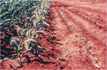
Fig. 14.1 Extreme phosphorus deficiency and phosphorus sorption in a clayey Oxisol at Planaltina, Brazil. The right-hand row is the check plot without phosphorus, maize plants about dead. The center row is a border row, showing strong phosphorus deficiency symptoms. The upper left-hand row is one that received phosphorus fertilizer.
Exacerbating phosphorus limitations, many soils in the tropics have very high capacity to sorb (retain or fix) added phosphorus in slowly soluble forms, making the element immediately unavailable to plants, though eventually part of it is released. Soils with high phosphorus sorption capacity cover about 1.11 billion hectares in the tropics (Chapter 5) but that is only 24 percent of the area, meaning that three-fourths of the soils do not have high phosphorus sorption as a constraint. In contrast, the prevalence of such soils in the temperate region is only 1.7 percent (113 million hectares), mainly in the southeastern United States and southeastern China.
This chapter describes the phosphorus cycle at two time scales (geologic and human), the various phosphorus fractions and fluxes in soils, the critical issue of phosphorus sorption and release, plant adaptation to low levels of available phosphorus, fertilizer management strategies, residual effects, efficiency of utilization and environmentally positive interventions.
14.1 The Phosphorus CycleFootnote 1
The global phosphorus cycle is different from those previously described (water, carbon, nitrogen) in that the atmosphere does not participate in a major way. Phosphorus is not directly involved in global warming as carbon and nitrogen are. In addition, phosphorus does not have a biotic input akin to biological nitrogen fixation.
14.1.1 The Phosphorus Cycle at the Geologic Time Scale
A closed cycle (Fig. 14.2) exists only at a geologic time scale (107–108 years). Phosphorus constitutes 0.1 percent of the Earth’s crust; 95 percent of this phosphorus is apatite (calcium phosphate), its three main forms being fluorapatite [Ca10(PO4)6F2], hydroxyapatite [Ca10(PO4)6(OH)2], and chlorapatite [Ca10(PO4)6Cl2]. Marine sediments containing 4 × 10⁶ Pg (billion tons) of phosphorus occupy vast coastal areas, for example from the coast of Florida to the Grand Banks of Canada in the Atlantic Ocean (22 Pg P), off the coast of southwest Africa and other continental shelves. Estimates of the US coastal resources at different depths by Stewart et al. (Reference Stewart, Hammond, van Kauwenbergh, Sims and Sharpley2005) add up to 727 Pg P.

Fig. 14.2 The global phosphorus cycle in geologic time. Boxes are stocks in Tg (million tons) or Pg (billion tons) of phosphorus (P) or phosphate rock (PR), while fluxes (in red) are in Tg P or Tg PR per year.
Tectonic uplift in geologic time raises apatite-rich phosphate rock to land and continental shelves at an annual rate of 111–185 million tons (Tg) of phosphate rock per year. Interestingly, this is within the range of the world’s annual extraction rate of phosphate rock, currently estimated at 140 Tg of phosphate rock per year (Fig. 14.2). Strictly speaking, phosphorus is a renewable resource at the geologic time scale, something I have not read in the literature, because tectonic uplift inputs are more or less balanced by phosphate rock mining extraction. This may be of little practical value because of the unknown location of these new uplifted deposits (presumably in the coastal continental shelves), their accessibility and cost of extraction, and whether or not sea level rise caused by global warming would adversely affect phosphate rock extraction.
Another, albeit small, input comes from the excreta and bones deposited on arid tropical islands where sea birds choose to roost. The product is called biogenic phosphate rock, or guano. Biogenic phosphate rocks are apatites of very high solubility and can be used for direct application to the soil, as the Incas did for centuries from the Peruvian guano islands. Some tropical Pacific and Indian ocean islands covered by guano are sinking into the sea as phosphate rock is harvested. Most notable is the island state of Nauru. The current global reserves of biogenic phosphate rock are unknown, but a relevant one, the Minjingu phosphate rock deposit of northern Tanzania, has an estimated reserve of 8–10 Tg of phosphate rock (van Kauwenbergh Reference van Kauwenbergh2010). This is a small deposit, compared to sedimentary deposits.
Approximately 112 Tg of phosphate rock are currently converted into phosphorus fertilizers every year. An additional 28 Tg of phosphate rock are annually converted into detergents, soft drinks, livestock salt licks and other industrial uses of phosphoric acid, adding up to 140 Tg of phosphate rock per year. About 1.5 Tg of phosphate rock per year are directly applied to the soil, including much of the biogenic phosphate rock.
The main process used for converting phosphate rock into soluble phosphorus fertilizers, the wet phosphoric acid process, is very polluting. The process leaves a byproduct called phosphogypsum, some of which often ends up in surface waters, causing eutrophication.
Phosphorus applied to agricultural soils from fertilizers was 14.2 Tg P in 2000 and the manure applied in that year contained 9.6 Tg P (MacDonald et al. Reference MacDonald, Bennett, Potter and Ramankutty2011). Phosphorus fertilizer use increased to 18 Tg P per year by 2007 (Sattari et al. Reference Sattari, Bouwman, Giller and van Ittersum2012).
Soil phoshorus stocks are considerable (~ 50 Pg P in the top 50 cm) and constitutes the largest phosphorus stock in terrestrial systems, of which over 90 percent is inorganic. This is roughly an average stock in the world’s soils of 3570 kg P/ha of which about 400 kg P/ha is organic phosphorus (Smil Reference Smil2000). The world’s croplands (arable and permanent crops), total ~1.5 billion hectares in 2013 (Table 2.10); they have a stock of 5–6 Pg P or about 10–12 percent of the total global soil stock. Terrestrial plant stocks are relatively small, about 0.6 Pg P.
Unlike other element cycles – as mentioned above – there is no major atmospheric component of the phosphorus cycle. However, particulate phosphorus is thrown to the air by wind erosion and biomass burning, but returns to the soil, usually at another location, and can be deposited in the oceans as well. These fluxes are small (1–2 Tg P per year).
The two main loss pathways from the soil are harvest removals and runoff and erosion. Large parts of harvest removals turn into sewage. The fluxes of phosphorus in runoff and erosion and sewage are the main loss pathways from terrestrial to aquatic environments. These two pathways carry 30–35 Tg P per year to freshwater and eventually the oceans, where they accumulate as sediments, and together with dead marine biomass a flux of 20–30 Tg P per year are buried in the continental shelves of oceans, adding to the immense stock of 4 × 10⁶ Pg P. Some of this stock eventually becomes phosphate rock. In geologic time, it is uplifted tectonically to the Earth’s surface, closing the phosphorus cycle.
14.1.2 The Phosphorus Cycle at a Human Time Scale
There is no closed phosphorus cycle at the human time scale (102–103 years), because what we have is one source (phosphate rock) and one sink (marine sediments) without a feedback loop to make it a cycle (Fig. 14.3). Unlike nitrogen and potassium, much of the phosphorus that is added to the soil tends to remain there, often building up large residual stocks. Except in very sandy soils there usually is no leaching of the phosphate anions, with the exception of movement just below the topsoil by tillage or other disturbances (see for example Beck and Sanchez Reference Beck and Sanchez1996, Garcia-Montiel et al. Reference Garcia-Montiel, Neill, Melillo, Thomas, Steudler and Cerri2000). Agronomically, the largest agricultural area in the tropics where phosphorus leaching is an important factor is the northern Sahel, because of the predominance of coarse sandy soils (Chapter 4). If the subsoil is clayey (having an argillic horizon), like many sandy Alfisols in that region, the phosphorus leached can be sorbed by the subsoils, which often have reddish colors indicative of iron oxides, giving them phosphorus sorption capacity.
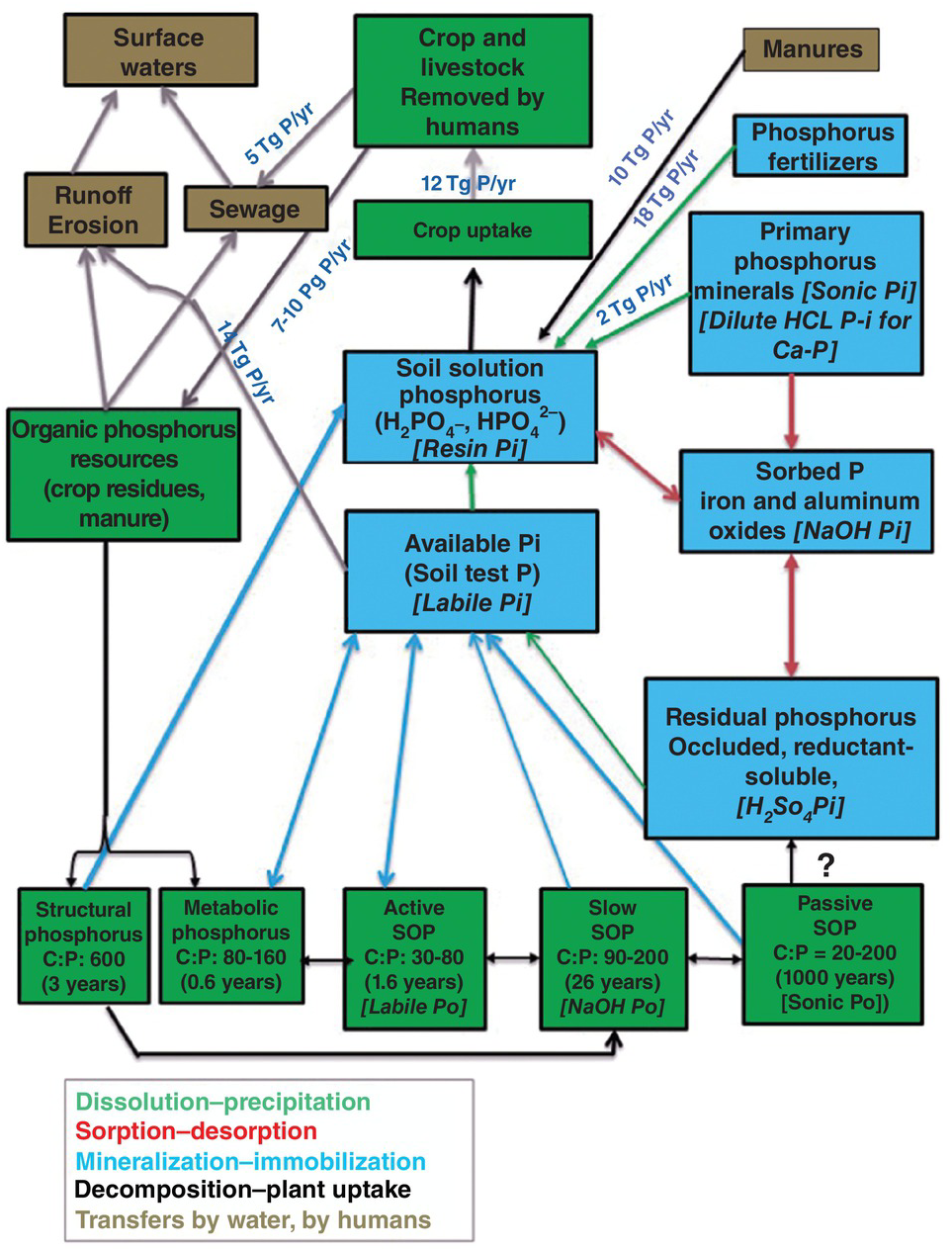
Fig. 14.3 Soil phosphorus stocks and fluxes in the world’s cropland (crops plus cultivated forages) at about the year 2000. The main flux processes are color-coded as shown below the graph. Doubled-pointed arrows indicate opposite processes are happening. Single arrows indicate only one flux process. Stocks are also color-coded. Green for organic phosphorus (Po) and blue for inorganic phosphorus (Pi). Hedley fractions are indicated in italics for each relevant stock. Please note that no arrows have been drawn from the organic and inorganic stocks to erosion and runoff for clarity, but these fluxes are an important part of the system. Many unknown fluxes remain.
Dissolved organic phosphorus, however, has been found to move down and out of the profile in loamy, permanent-charge Alfisols of the long-term plots in Rothamsted, UK, from plots that had accumulated high levels of available phosphorus in the A horizon (Syers et al. Reference Syers, Johnston and Curtin2008). Rothamsted soils don’t have much phosphorus sorption, but Olibone and Rosolem (Reference Olibone, Rosolem and Alves2006) detected movement of dissolved organic phosphorus down to 40 cm in a clayey Oxisol of Brazil, which sorbs phosphorus strongly. There are no clear conclusions, but this is an area for future research.
Between the sources (phosphorus fertilizers 18 Tg P per year, plus 10 Tg P per year from manure phosphorus and 2 Tg P/ha from weathering of primary minerals) and the sink (surface waters) there are many phosphorus fractions or pools, six inorganic (in blue) and eight organic (in green) plus three combined ones (brown background) in Fig. 14.3. These stocks are connected by several opposite fluxes: dissolution and precipitation; sorption and desorption; mineralization and immobilization; decomposition of organic inputs and plant uptake. In addition, there are several one-way physical transfers: crop residue returns, manures, runoff and erosion, and sewage to surface waters.
Harvest removal by crops and cultivated pastures was 12.3 Tg P per year in the year 2000 (MacDonald et al. Reference MacDonald, Bennett, Potter and Ramankutty2011). Runoff and subsequent erosion of phosphorus are the main transfer mechanisms to water bodies, which Smil estimates to be 14 Tg P per year in cultivated land. Since phosphorus does not move much in the soil (except in very sandy soils) leaching losses are usually negligible. Much of the runoff and erosion losses happen during intense rainfall, particularly upon converting phosphorus-rich farmland to urban expansion and road development.
The phosphorus consumed as food from crop harvest removals and livestock products eventually winds up in cemeteries and urban sewer systems, the latter receiving 2–4 Tg P per year worldwide. Organized urban sewer systems are the norm in rich countries and in some cities of tropical Asia and Latin America. The exceptions are mainly in tropical Africa and remote areas of the other regions where sewage systems are seldom organized and are mostly non-point. Also interesting is Japan, where Smil observed that only half its population was connected to sewer systems at the end of the twentieth century. I can testify to that when visiting friends in Hokkaido in the 1980s.
Urban sewer systems also receive domestic waste and industrial detergents (with high phosphorus contents), which raise the total flux to 5 Tg P per year globally (Smil Reference Smil2000). Treatment of urban sewage decreases some of these phosphorus inputs by sedimentation and other means, and frequently biosolids are recycled to crop fields if they do not contain heavy metals.
14.1.3 Will the World Run Out of Phosphorus?
Because phosphorus is a finite resource at the human time scale, a key question to our survival is how long phosphate rock resources will last. Such a question has cropped up about once a decade during my professional career, with advocates estimating that we would run out of phosphorus by the year 2000, 2033, 2100 or similar times. It is an important question because phosphorus is one of the two plant nutrient elements where supplies are not only finite, but they are used at increasing rates that are highly correlated with the increasing demand for food (Stewart et al. Reference Stewart, Hammond, van Kauwenbergh, Sims and Sharpley2005). (The other major nutrient element is potassium where the supplies are also finite, but they are so large that it is not a concern.)
The best estimate I am aware of describes phosphate rock supply in terms of its price, as it will only be mined if it is economical. Stewart et al. (Reference Stewart, Hammond, van Kauwenbergh, Sims and Sharpley2005) calculated that at the global price US $40/Tg P of phosphate rock of the known above-ground reserves as of 2002, 12 Pg of phosphate rock would last for about 90 years, in other words, to the end of the twenty-first century. With an increase in phosphate rock price to about US $100/Tg P, the known above-ground phosphate rock reserves would almost quadruple, to 47 Pg of phosphate rock, which would last for 343 years (Stewart et al. Reference Stewart, Hammond, van Kauwenbergh, Sims and Sharpley2005). Subsequent estimates (van Kauwenbergh Reference van Kauwenbergh2010, Malingreau et al. Reference Malingreau, Eva and Maggio2012) agree with Stewart’s assessment. These estimates are alarming for centuries to come, but not for the century we live in. Such estimates assume the same level of technologies in phosphate rock beneficiation and phosphorus fertilizer use as well as current efficiencies. This should not make us complacent or give us an excuse not to be more efficient and recycle better. Ways of increasing the efficiency of phosphorus fertilizer and manure are presented towards the end of this chapter.
We do not have a mechanism to fully recycle the P used at a human time scale. It is unacceptable in virtually all cultures to recycle our ancestors’ bones, but something can be done about solid waste, livestock bones, erosion and runoff control.
I asked the International Fertilizer Industry Association (IFA) if new extraction technologies from coastal marine sediments are being developed. Michel Prud’homme (personal communication, 2012) indicated that there are a few ongoing projects investigating the economic feasibility of dredging shallow ocean sediments off the coasts of Namibia and New Zealand, but this is work in progress. A promising effort is that found off the coast of North Carolina (Christopher Lambe, personal communication, 2013).
The following sections describe in more detail the stocks and fluxes of phosphorus in the soil that are illustrated in Fig. 14.3, organized in terms of total, inorganic and organic phosphorus stocks.
14.2 Total Soil Phosphorus
The 50 Pg P in the top 50 cm of the world’s soils (Fig. 14.2) is an important metric, but the total phosphorus content of soils has no direct relevance to plant uptake. Olson and Englestad (Reference Olson and Englestad1972) stated that representative soils from the US Midwest average about 3000 mg/kg total phosphorus in the topsoil, the more weathered soils of southeastern United States about 500 mg/kg P; and “tropical soils” about 200 mg/kg P. Total phosphorus in soils has been used as a weathering index. Walker and Syers (Reference Walker and Syers1976), Cross and Schlesinger (Reference Cross and Schlesinger1995) and Porder and Hilley (Reference Porder and Hilley2011) all found that total phosphorus decreases with weathering stage. In Venezuela, for example, total phosphorus contents are correlated with increasing weathering in different soils, as estimated by the cation exchange capacity (CEC) of the clay fraction (Table 14.1).
Table 14.1 Distribution of topsoil phosphorus fractions (mg/kg P) in contrasting Venezuelan soils in terms of their degree of weathering. Adapted from Westin and de Brito (Reference Westin and de Brito1969).
Although Oxisols are generally low in total phosphorus, some are extremely high. Moura et al. (Reference Moura, Buol and Kamprath1972) reported 3760 mg/kg total topsoil phosphorus in a Eutrustox from Brazil, the highest level I have encountered. Ultisols and Alfisols are also generally low in total phosphorus, with topsoil values mostly below 200 mg/kg P. Andisols are generally high in total phosphorus, with ranges of 1000–3000 mg/kg P, but usually deficient in available phosphorus because of high phosphorus sorption. Most Vertisols are low in total P, ranging from 20 mg/kg P to 90 mg/kg P. The total phosphorus contents of Entisols and Inceptisols vary with parent materials.
As mentioned several times before, there is great variability among soils of the tropics. Within the Amazon, upland soils (non-alluvial) are classified as Oxisols and closely related Ultisols and Alfisols, all highly weathered. Data shown in Table 14.2 for topsoils covering a wide range of pH, clay and soil organic carbon (SOC) also show a wide range in total phosphorus and in its inorganic and organic phosphorus fractions. They vary in total phosphorus and the different phosphorus fractions. The soil from Altamira is a Eutrustox similar to that of Moura et al. (Reference Moura, Buol and Kamprath1972), with very high levels of total phosphorus.
Table 14.2 Phosphorus fractions in A horizons of 12 profiles from well-drained soils in the Brazilian Amazon, using the Chang and Jackson method. Adapted from Vieira and Bornemisza (Reference Vieira and Bornemisza1968).
| Locality and soil | pH | Clay (%) | SOC (%) | Total phosphorus | Organic phosphorus (% total P) | Inorganic phosphorus | ||||
|---|---|---|---|---|---|---|---|---|---|---|
| Ca-bonded phosphates | Al-bonded phosphates | Fe-bonded phosphates | Residual phosphorus | Total inorganic P | ||||||
| (mg/kg P) | ||||||||||
| Itacoatiara (Oxisol) | 4.2 | 60 | 2.87 | 198 | 27 (14) | 6 | 49 | 39 | 77 | 171 |
| Manaus (Oxisol) | 4.1 | 10 | 0.90 | 176 | 39 (23) | 16 | 75 | 30 | 16 | 137 |
| Porto Velho (Oxisol) | 4.9 | 39 | 4.00 | 327 | 116 (36) | 1 | 63 | 42 | 105 | 211 |
| Altamira (Eutrustox) | 5.8 | 41 | 1.47 | 1521 | 698 (46) | 15 | 14 | 126 | 667 | 823 |
| Alenquer (Alfisol?) | 6.8 | 29 | 1.75 | 522 | 320 (61) | 12 | 16 | 33 | 139 | 202 |
Andisols, as mentioned above, have high total phosphorus values (Table 14.3). In sharp contrast, sandy Alfisols from the Sahel of Africa have overall low total phosphorus contents, mostly as residual phosphorus, with very low levels of organic phosphorus, reflecting the low SOM levels. The soils in Table 14.3 are not highly weathered but their texture and mineralogy produce such great contrasts.
Table 14.3 Andisol topsoils from Central America show high contents in their various phosphorus fractions (Fassbender Reference Fassbender1969) in contrast with two sandy Alfisol topsoils from the Sahel (Bationo Reference Bationo2008).
| Soils | Total P | Organic phosphorus (percent of total phosphorus) | Inorganic phosphorus | ||||
|---|---|---|---|---|---|---|---|
| Ca-bonded phosphates | Al-bonded phosphates | Fe-bonded phosphates | Residual phosphorus | Total inorganic phosphorus | |||
| (mg/kg P) | |||||||
| Andisols (mean of 34) | 1142 | 496 (43) | 124 | 92 | 55 | 274 | 646 |
| Sandy Alfisol, Sadoré, Niger | 41 | 2 (5) | 9 | 19 | 33 | ||
| Sandy Alfisol, Gobery, Niger | 39 | 7 (18) | 11 | 18 | 32 | ||
Please note that all these data are from topsoils. With phosphorus, the focus is on the topsoil because phosphate ions are strongly held there and this is where the sorption of fertilizer phosphorus occurs.
14.3 Inorganic Phosphorus
14.3.1 Primary Minerals
The primary phosphorus soil minerals (mainly apatites) are present in the sand and silt fractions. They are slowly dissolved by the soil’s natural acidity and organic acid secretions from microorganisms, roots and mycorrhizae at the rate of 2 Tg P per year in cultivated soils (Smil Reference Smil2000). The resulting phosphate anions are short-lived in the soil solution because they are rapidly sorbed as secondary phosphorus minerals, or immobilized by microorganisms in soil organic matter (SOM). This is the origin of soil organic phosphorus (SOP).
14.3.2 Secondary Minerals
The secondary phosphorus minerals form in the soil as clay particles. They are grouped into three active fractions and one recalcitrant fraction in terms of their solubility, according to the classic method of Chang and Jackson (Reference Chang and Jackson1957). It is noteworthy that Chang and Jackson included two soils from the tropics out of the four soils used to develop their fractionation method. The active inorganic phosphorus fractions are grouped as calcium (Ca)-bonded phosphates, which are more prevalent in neutral to calcareous soils, and aluminum (Al)-bonded phosphates and iron (Fe)-bonded phosphates, both of which are most common in variable-charge acid soils. Calcium phosphates are more soluble than aluminum phosphates, which, in turn, are more soluble than iron phosphates. Calcium phosphates are present as discrete particles, while aluminum phosphates and iron phosphates are present as films adsorbed on clay surfaces.
The recalcitrant fractions are called occluded phosphorus and reductant-soluble phosphorus in the Chang and Jackson (Reference Chang and Jackson1957) method and as residual inorganic phosphorus extracted by concentrated sulfuric acid in the Hedley sequential fractionation (Hedley et al. Reference Hedley, Stewart and Chauhan1982a). Most of the total phosphorus found in Moura’s Brazilian Eutrustox was also in this fraction. In aerobic soils, occluded and reductant-soluble inorganic phosphorus act pretty much the same and are normally lumped together as occluded phosphorus. They often constitute the largest inorganic phosphorus fraction in the Chang and Jackson method shown in Tables 14.1, 14.2 and 14.3.
The transformation of one fraction of secondary inorganic phosphorus into another is controlled mainly by soil pH (Guo et al. Reference Guo, Yost, Hue, Evensen and Silva2000). As soils become more acid, the activity of iron and aluminum increases and the relatively soluble calcium phosphates are converted into less soluble aluminum and iron phosphates. These processes are slow enough to permit considerable quantities of calcium phosphates to be present in acid soils with pH values below 5.5, as shown in Table 14.2, with some even in a soil of pH 3.9, as will be shown later.
14.3.3 Sorbed Phosphorus and Available Phosphorus
Because of the importance of these two fractions, they will be discussed separately.
14.3.4 Soil Solution Phosphorus
Two phosphate anions exist in the soil solution: the dihydrogen phosphate anion (H2PO4–), more abundant in soils < pH 7, and the hydrogen phosphate ion (HPO42-), most abundant in soils > pH 7.2. Both anions move by the slow diffusion process as opposed to the fast mass flow process of many other nutrient ions, and both are readily taken up by plants.
The dynamics of soil solution phosphorus are very fast. Fluxes shown in Fig. 14.4 that add phosphorus to the soil solution – dissolution of phosphorus fertilizers, dissolution of secondary minerals, desorption of sorbed phosphorus and mineralization of organic phosphorus – vie constantly with depletion fluxes such as phosphorus sorption, immobilization by microorganisms and plant uptake. Plants accumulate in their tissues 1000–5000 mg/kg P (0.1–0.5 percent on a dry mass basis) from a soil solution of 0.2 mg/L P or less. Syers et al. (Reference Syers, Johnston and Curtin2008) estimated that when crops are having a rapid rate of uptake (0.3–0.5 kg P/ha per day), the average root hair cylinder needs to have its surrounding soil solution replaced 10–20 times per day. This varies with the discontinuity and tortuosity of the water films that contain the soil solution. Even at the wilting point, (–1500 kPa of soil moisture tension), water films around clays can be continuous. Other actors also vie for soil solution phosphorus; weeds and microorganisms want to take it up, iron and aluminum oxide surfaces sorb it. It’s a tough neighborhood there.
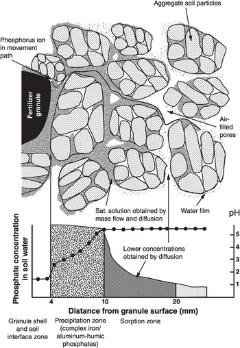
Fig. 14.4 Representation of the movement of phosphorus from a triple superphosphate granule to a well-granulated soil by mass flow and diffusion, indicating the precipitation and adsorption zones, as pH and phosphorus concentration changes.
14.4 Organic Phosphorus
It is commonly believed that the majority of soil phosphorus in highly weathered soils of the tropics is in the form of organic phosphorus (I wrote as much in the first edition). Tables 14.1, 14.2 and 14.3 indicate that this is not always the case. The variability in the proportion of the total phosphorus that is organic is not a matter of weathering, as total phosphorus seems to be. Organic phosphorus is very important for soil fertility in the tropics (Duxbury et al. Reference Duxbury, Smith, Doran, Coleman, Oades and Uehara1989, Nziguheba and Bünemann Reference Nziguheba, Bünemann, Turner, Frossard and Baldwin2005).
There is a positive relationship between total organic phosphorus content and clay content (Table 14.4), which is no doubt related to SOM content, which normally increases as particle size decreases.
Table 14.4 Organic phosphorus content is related to soil texture in topsoils. Adapted from a worldwide review by Harrison (Reference Harrison1987).
| Textural class | Number of samples | Organic phosphorus (mg/kg; mean + SD) | Percentage of total phosphorus (mean + SD) |
|---|---|---|---|
| Sands | 77 | 147 ± 20 | 36 ± 2 |
| Loams | 155 | 290 ± 20 | 37 ± 2 |
| Clay loams | 113 | 324 ± 24 | 45 ± 2 |
| Clays | 80 | 277 ± 31 | 44 ± 3 |
14.4.1 Composition
Most SOP compounds have phosphorus bonded to oxygen in ester bonds (–C–O–P), unlike in soil organic nitrogen (SON) compounds where the nitrogen is bonded to carbon (–C–N–). More than half of the organic phosphorus is composed of monoesters, mainly inositol phosphate (phytate); about 5 percent is in phospholipids and 2 percent in nucleic acids, but a large amount is yet to be chemically identified (Stewart and Tiessen Reference Stewart and Tiessen1987, Majid et al. Reference Majid, Tiessen, Condron and Piccolo1996, Condron and Tiessen Reference Condron, Tiessen, Turner, Frossard and Baldwin2005). They are probably located in the slow and passive SOP pools shown in Fig. 14.3.
Phosphate ester bonds can be readily broken by one extracellular enzyme, phosphatase, which is produced by microorganisms, roots and mycorrhizae, while the release of nitrogen from its carbon bond requires the coordinated action of several enzymes (Vitousek et al. Reference Vitousek, Haettenschweiler, Olander and Allison2002). Because of this, Vitousek and co-workers assert that the organic component of the phosphorus cycle is more flexible than the nitrogen cycle. When fertilizing annual crops, only 3–10 percent of the applied phosphorus becomes organic phosphorus. Pastures convert more (5–30 percent) and perennial crops, agroforestry and forestry plantations the most (17–44 percent).
14.4.2 The Hedley Fractionation
A method of sequential phosphorus fractionation was developed by Hedley et al. (Reference Hedley, Stewart and Chauhan1982aReference Hedley, White and Nyeb), which has increasingly become the standard for soil phosphorus fractionation with minor modifications. It separates soil phosphorus into five inorganic fractions (Pi), three organic fractions (Po) and one residual fraction, largely inorganic. Increasingly strong reagents extract phosphorus fractions that are believed to be less available to plants. The organic Po fractions were determined by measuring total phosphorus in each extract and subtracting the Pi already determined. The version that I used (Beck and Sanchez Reference Beck and Sanchez1994) starts with an anion resin extraction (called resin Pi), a fraction that is used as a soil test in acid soils of Brazil (van Raij and Quaggio Reference 414van Raij and Quaggio1990). Then comes the 0.5 M NaHCO3 extraction (called bicarb Pi and bicarb Po), which is the Olsen phosphorus soil test. This is then followed by a 0.1 M NaOH extraction (called NaOH Pi and Po), another 0.1 M NaOH extraction followed by sonication (called sonic Pi and Po), then a 1 M HCl (called HCl Pi) extraction and finally a concentrated H2SO4 digestion (called residual phosphorus). Regardless of the size of the residual phosphorus, it represents the most recalcitrant forms of soil phosphorus that have little to do with soil fertility. However Guo et al. (Reference Guo, Yost, Hue, Evensen and Silva2000) observed that the residual phosphorus fraction decreased with exhaustive cropping in soils with permanent charge while there was no change in soils with variable charge.
Cross and Schlesinger (Reference Cross and Schlesinger1995) stated that one advantage of the Hedley scheme over previous methods is that the same soil sample is sequentially treated with the various reagents. As a result, one can establish the proportion of the different fraction in each sample. The largest disadvantage is that residual phosphorus often accounts for the largest proportion of total phosphorus, and we don’t really know whether it is organic or inorganic, or both. This was improved by Tiessen and Moir (Reference Tiessen, Moir and Carter1993) by adding a hot concentrated HCl extraction that separates the residual Po from residual Pi, but it is not commonly used. The organic SOP pools are based on modeling, while the inorganic SOP ones are measured, so they are fractions of the total inorganic phosphorus content of a soil.
Some scientists see sequential extractions as potentially misleading, because they may redistribute the different phosphorus species (Roel Merckx, personal communication, 2013). Perhaps what Guo et al. (Reference Guo, Yost, Hue, Evensen and Silva2000) found is such a case, but the differences due to mineralogy are noteworthy.
Below I have attempted to call each Hedley fraction by what I feel is the most appropriate functional name, and relate them to the organic phosphorus pools of the Century model (Parton et al. Reference Parton, Schimel, Cole and Ojima1987) as well as the Chang and Jackson (Reference Chang and Jackson1957) inorganic phosphorus fractions. They are:
Soil solution Pi: resin Pi, capturing phosphate anions in the soil solution.
Labile Pi: available Pi, or Olsen soil test available phosphorus (bicarb Pi). When another soil test is more effective in a region, such as Mehlich or Bray, it can be used instead. This is why I call this fraction labile and not bicarb.
Active Po: labile Po. Clearly, this is because it contributes directly to plant available phosphorus by rapid mineralization.
Sorbed Pi: The NaOH-extractable Pi fraction, phosphorus sorbed on the surfaces of iron and aluminum oxides (Garcia-Montiel et al. Reference Garcia-Montiel, Neill, Melillo, Thomas, Steudler and Cerri2000).
Slow Po: NaOH-extractable Po.
Primary weatherable phosphorus minerals: sonic Pi.
Passive Po: sonic Po + residual Po: extracted with hot, concentrated HCl (Tiessen and Moir Reference Tiessen, Moir and Carter1993) if measured.
Calcium-bonded Pi (Ca-Pi): dilute HCl-extractable Pi. May reflect the phosphorus fertilizer that has not reacted, as well as any apatite present.
Residual phosphorus: H2SO4-extractable Pi: Mostly occluded and reductant soluble Pi.
Needless to say, this classification is likely to require verification. All the Hedley fractions are incorporated in Fig. 14.3.
14.4.3 Organic Inputs, Metabolic and Structural Phosphorus Fractions
The organic inputs or organic resources include the additions to the soil of above- and below-ground plant litter, crop residues, animal manures, green manures, sewage and cadavers of animals that died in the soil. For nitrogen, the plant resources are split in terms of their quality according to their lignin:nitrogen ratios (Chapters 12 and 13). This is not directly applicable to phosphorus (Palm and Sanchez Reference Palm and Sanchez1991). For phosphorus, the main quality parameter is the C:P ratio, which Parton et al. (Reference Parton, Sanford, Sanchez, Stewart, Coleman, Oades and Uehara1989) used to split metabolic and structural phosphorus fractions.
Metabolic phosphorus comes from the decomposition of plant material that has a C:P ratio lower than 200, constituting the high-quality resource that is mineralized quickly and goes directly to the available phosphorus and soil solution phosphorus fractions or enters the active SOP pool (Nziguheba and Bünemann Reference Nziguheba, Bünemann, Turner, Frossard and Baldwin2005). The microbial biomass included in the metabolic phosphorus pool also immobilizes soil solution phosphorus; hence, the two-way flux in Fig. 14.3.
The structural phosphorus results from organic materials with C:P ratio of above 200, which is converted into the slow SOP pool and is then mineralized slowly into available phosphorus and soil solution phosphorus. This flux is one way, because there will be little immobilization by the slow SOP pool. Nziguheba (Reference Nziguheba and Bationo2007) confirmed these limits with African plant materials and related them to the percentage phosphorus content of plants.Footnote 2 The organic inputs that result in net mineralization had more than 0.25 percent P, while the ones that resulted in immobilization of phosphorus had less than that amount. Included in the mineralizing group is Tithonia diversifolia with 0.4 percent P in its tissue. Soil moisture and temperature affect the rate of these decomposition, mineralization and immobilization fluxes.
Terrestrial plants take up about 70–100 Tg P per year, all from the soil. Of that amount, Smil (Reference Smil2000) estimates that 18–22 Tg P are annually harvested, and thus removed in crops and livestock products. It is surprising that a major proportion of these removals by humans are recycled back to the soil. Smil (Reference Smil2000) estimates that the actual crop residue returns (1–2 Tg P per year) plus animal manure applications (6–10 Tg P per year) recycle back 7–10 Tg P per year, though the manure portion usually ends up in another field or in feedlots. Childers et al. (Reference Childers, Corman, Edwards and Elser2011) believe that the proportion recycled is only about 25 percent.
14.4.4 Active SOP Fraction
This is the first true organic phosphorus pool in Fig. 14.3, which is equivalent to the Labile Po fraction in the Hedley fractionation. It consists of microbial biomass and organic phosphorus that is not physically protected or chemically recalcitrant as described in Chapter 11. The C:P ratio of this organic phosphorus is about 30–80. This is the fraction recognized by Hedley and co-workers to be the organic phosphorus fraction most responsible for supplying phosphorus to plants, and, as in the case of nitrogen, the main organic one responsible for soil fertility provision. The microbial biomass included in the active pool also immobilizes available or soil solution phosphorus, hence the two-way flux in Fig. 14.3.
14.4.5 Slow and Passive SOP Fractions
Part of the active SOP pool that is not mineralized or taken up by plants decomposes into the slow SOP pool, with a C:P ratio of 90–200, and into the passive SOP pool with a C:P ratio of 20–200 (Parton et al. Reference Parton, Schimel, Cole and Ojima1987, Reference Parton, Sanford, Sanchez, Stewart, Coleman, Oades and Uehara1989). The nice thing about the Hedley fractionation is that the NaOH Po fraction and the Sonic Po fractions represent well the slow and the passive pools, respectively. What is not clear is whether the residual phosphorus fraction, extracted by concentrated sulfuric acid in the Hedley scheme, has any organic phosphorus present. Therefore, a question mark flux is placed in Fig. 14.3 between the passive SOP pool and the residual phosphorus fraction. As in the case of nitrogen, the slow and passive SOP pools will mineralize very slowly and most of the phosphorus will remain in the aggregates, either protected by coatings or in very chemically recalcitrant forms. They contribute little to soil fertility but much to aggregate stability and related soil physical properties. Again, the results of Guo et al. (Reference Guo, Yost, Hue, Evensen and Silva2000) suggest that there is a difference between soils with permanent charge and those with variable charge with regard to the plant availability of the residual phosphorus fraction.
14.5 Phosphorus Sorption and ReleaseFootnote 3
Phosphorus sorption (also known as phosphorus fixation and phosphorus retention) is the transformation of phosphorus in the soil solution into solid, sparingly soluble forms of phosphorus on the surface of soil clays by processes that make them not readily available to plants. The basic principles and practices had been well researched before the 1980s (Hedley and McLaughlin Reference Hedley, McLaughlin, JT Sims and Sharpley2005); hence, much of the literature quoted refers to that period.
The older term fixation implies some sort of capture, sequestration or immobilization. Here is where soil science nomenclature shows inconsistency. Biological nitrogen fixation is the capture of atmospheric N2, “fixing” it into reactive nitrogen forms by bacteria. Carbon sequestration is the capture of carbon from organic decomposition into slow or passive SOC pools, while nitrogen immobilization is the capture of inorganic nitrogen by bacteria into SON pools. In all cases, what is captured is eventually released by opposite processes, organic nitrogen decomposition, carbon dioxide emission and nitrogen mineralization. Even with biological nitrogen fixation, the reactive nitrogen is eventually released back to where it came from by denitrification and other processes. Phosphorus sorption is similar in the sense of capture and subsequent release. The different nomenclature most likely came from different research groups, but all the terms refer to the capture and release of the nutrient in question.
Three mechanisms of phosphorus sorption by soils are recognized:
precipitation, in three-dimensional amorphous or crystalline solids such as calcium phosphates;
adsorption, in two-dimensional films or sheets where phosphate ions are chemically bonded to reactive surfaces of soil clays (Pierzynski et al. Reference Pierzynski, McDowell, Sims, Sims and Sharpley2005), and
absorption, a slow, continuing reaction, where phosphate anions penetrate into the matrix of iron and aluminum oxides (Barrow Reference Barrow1974, Reference Barrow1985, Linquist et al. Reference Linquist, Singleton, Yost and Cassman1997)
The latter two are collectively called sorption in the soils literature, or sometimes the fast and slow reactions. Dissolution is the opposite process of precipitation while desorption is the opposite process of sorption.
I will use the term sorption to refer to precipitation, adsorption and absorption reactions, and the term release to cover both the dissolution of precipitated phosphorus and the desorption of sorbed phosphorus.
Although phosphorus sorption is a common occurrence in soils, it is a major management challenge in clayey soils that are high in iron and aluminum oxides.Footnote 4 Phosphorus sorption is not much of a problem in calcareous soils because the amounts sorbed are not large. It is very low in sandy soils and almost nil in coarse-sandy soils.
Phosphorus deficiency is a different issue; it can happen in any soil, and can be determined by soil tests. A phosphorus-deficient soil that can be corrected by an application of 10–20 kg P/ha is not a problem soil, but a soil that requires 200 kg P/ha to over 1000 kg P/ha to supply enough phosphorus for crop growth needs a different management approach. This is why there are no flux rates in the sorption–desorption fluxes in Fig. 14.3; they are very variable among soils and a global rate for cultivated soils is yet to be calculated.
A soil can be deficient in phosphorus without being a high-phosphorus-sorption soil, for example, the sandy Alfisols of the Sahel, but all high-phosphorus-sorption soils are also phosphorus-deficient, as shown by the clayey Oxisol shown in Fig. 14.1 at the beginning of this chapter. There are critical levels for both, as will be described later. Let us turn to the main processes of phosphorus sorption.
14.5.1 Precipitation from the Dissolution of Phosphorus Fertilizers
Precipitation is the first process that occurs to the phosphorus that has been added to soil as a fertilizer (Fig. 14.4). When a triple superphosphate granule containing mainly monocalcium phosphate [Ca(H2PO4)2·H2O] is added to an acid mineral soil, water moves into the hygroscopic granule, dissolves it and forms dicalcium phosphate (CaHPO4·2H2O) and phosphoric acid, which produces a solution saturated with P, as indicated in the Eq. 14.1.
In a dry soil, this solution is very acid (pH 1.5) and moves outward from the granule by mass flow to about 10 mm, releasing silica (SiO2), and iron, aluminum and manganese (Mn) ions. As the granule gets wetter the pH increases. The residue is the insoluble CaHPO4·2H2O, and the soluble phosphate ions precipitate with iron and aluminum oxides, represented as Al(OH)2+ in the following equation:
In moist soils, the pH increases, releasing aluminum and iron compounds and precipitating them as sparingly soluble phosphates.
These precipitates are some of the secondary phosphorus minerals previously described – crystalline calcium, iron and aluminum phosphates, amorphous iron and aluminum phosphates and iron or aluminum organophosphates. As these precipitates dissolve in an acid medium the H2PO4– ions are sorbed by the aluminum and iron oxides on the clay surfaces and are gradually released, as will be explained later.
It is important to realize that these reactions are not acid-forming and therefore soluble phosphorus fertilizers do not produce secondary acidity as some nitrogen fertilizers do (Chapter 9). Also, it is important to recognize that the H2PO4– and HPO42– ions the plants take up do not come directly from the water-soluble fertilizer but from fertilizer reaction products (White Reference White2006).
In acid soils that contain significant quantities of exchangeable aluminum ions (Al3+), phosphorus fertilizers can also be precipitated by exchangeable Al3+(Coleman et al. Reference Coleman, Thorup and Jackson1960). Exchangeable Al3+, however, must first be displaced into the soil solution by the calcium contained in fertilizers and then hydrolyzed into Al(OH)2+ or Al(OH)2+ before being able to precipitate H2PO4–. About 102 mg/kg P as H2PO4– can be precipitated by 1 cmolc/kg of exchangeable Al3+ after being hydrolyzed.
Diammonium phosphate (DAP) is the most common phosphorus fertilizer used in the tropics. It is important to contrast the different reaction that occurs when a DAP granule enters contact with water in the soil, as compared with TSP, described above.
The resulting phosphorus-saturated solution has a pH of 10.6 (Ganga Hettiarachchi, personal communication, 2013) totally the opposite from the strongly, short-lived, acid solution (pH 1.5) produced by the superphosphates. DAP causes less dissolution of iron and aluminum (Hedley and McLaughlin Reference Hedley, McLaughlin, JT Sims and Sharpley2005) and many of the phosphate ions remain in solution and are subject to sorption.
In alkaline soils (> pH 7), phosphate anions are precipitated by Ca2+ and Mg2+ cations, as relatively insoluble compounds, which are slowly dissolved by organic acids.
14.5.2 Adsorption
In acid soils (< pH 7) phosphate ions in a soil solution that is not saturated with phosphorus enter into ligand exchange reactions with OH– ions on the surface of iron and aluminum oxide particles or films. Ligand exchange occurs when an ion or molecule binds with metal ions, such as Fe3+, Al3+, Ca2+, Mg2+, K+, etc. In acid soils, aluminum and iron are the most abundant metals on the surface of clay particles. Oxide surfaces may exhibit net negative, net positive or net zero charge, as discussed in Chapter 8. Equation 14.4 illustrates a ligand exchange reaction at an acid pH value above the zero point of charge, which is the case in most topsoils:
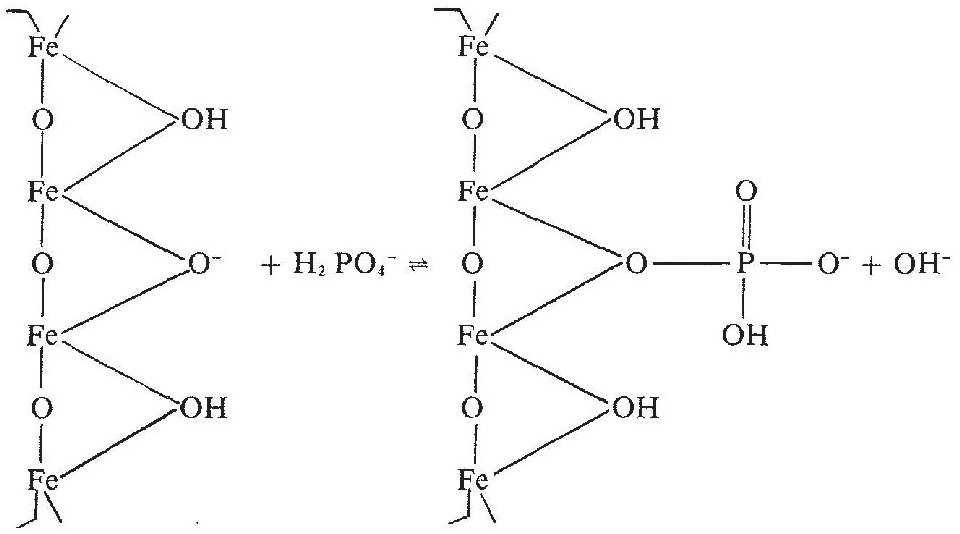
Above the zero point of charge, the sorbed phosphate ion displaces hydroxide (OH–) ions, and an increase in pH may take place. (This is sometimes referred to as “liming with phosphorus,” which does not make agronomic or economic sense.)
As Fig. 14.4 illustrates, the phosphate ions do not penetrate much into the micropores located inside macroaggregates, because of their slow diffusion and the discontinuities of the soil solution. In fact, most adsorbed phosphorus is on the surface of macroaggregates, the water films of which are in contact with the soil solution containing phosphate anions. Linquist et al. (Reference Linquist, Singleton, Yost and Cassman1997) found that phosphate ions were sorbed in a 188-μm layer around the macroaggregates of a clayey, oxidic Hawaiian Ultisol. Likewise, the precipitation products are also likely to be at the surface of macroaggregates unless they were present when microaggregates coalesced into macroaggregates (see Chapter 11). However, in Linquist et al.’s soil, 88 percent of the aggregates were macroaggregates (> 250 μm). The few microaggregates fully adsorbed all the phosphate throughout their mass, since most of them had a diameter smaller than 188 μm.
There is usually less adsorption in alkaline soils because they have low amounts of iron and aluminum oxide coats.
14.5.3 Absorption
It is common for well-aggregated soils that are high in iron and aluminum oxides to retain over 90 percent of the phosphate applied within the first hour of contact by adsorption or precipitation. Diffusion from this 0.2-mm layer into the rest of the macroaggregate (absorption) is a slow process, requiring at least 2 years to reach equilibrium (Linquist et al. Reference Linquist, Singleton, Yost and Cassman1997). Barrow (Reference Barrow1974) suggested that these slower absorption reactions are a consequence of the disruption of hydroxy-aluminum gels and the displacement of the silicate layer in the crystal structure by phosphate ions penetrating the mineral matrix. Some scientists suggest that the slow reaction is the formation of a second bond of a phosphorus molecule to an oxide surface (Russell Yost, personal communication, 2013).
At high phosphorus concentrations in the soil solution, H2PO4– is adsorbed in new sites arising from slow absorption (Rajan and Perrot Reference Rajan and Perrott1975), meaning that high phosphorus fertilization rates open new phosphorus sorption sites. This is particularly the case with Andisols, where allophane (a hydroxy-aluminum gel) is dominant.
14.5.4 Estimating Phosphorus Sorption in the Laboratory
Most soils retain some amount of phosphorus, which has been estimated by a variety of methods involving widely diverging amounts of phosphorus added and extracted.
Perhaps the most widely used method is an adaptation of the Freundlich and Langmuir sorption isotherms – originally developed to describe the adsorption of a monomolecular layer of gas on a solid surface. Beckwith (Reference Beckwith1965) suggested that the data be plotted in terms of straightforward quantity–intensity relationships. The amount of phosphorus sorbed by the soil surfaces (PS) is expressed in mg/kg P, kg P/ha or μmol P/cm2 as the quantity factor plotted on the y axis; the phosphorus concentration in the soil solution (PL) is expressed in mg/L P or μmol P/cm3 as the intensity factor, plotted on the x axis at a logarithmic scale.
There are some conceptual problems with the use of sorption isotherms. Most methodologies focus on adsorption and ignore the absorption and precipitation processes, the latter being particularly important in calcareous soils. Pierzynski et al. (Reference Pierzynski, McDowell, Sims, Sims and Sharpley2005) emphasize that the parameters obtained with such equations are empirical artifacts and do not physically exist in soils. This is the third time in this book that we realize that empirical artifacts are used as practical tools of soil science (the previous ones being humic and fulvic acids in Chapter 11, and available nutrients from soil tests in Chapter 12). Barrow (Reference Barrow1985) observed that the term “isotherm” is inappropriate because it implies that temperature is the only factor affecting the shape of the curves. He suggested the more straightforward term “sorption curve,” which I prefer, to make terminology clearer with less jargon.
Fox and Kamprath (Reference Fox and Kamprath1970) developed the most widely used analytical procedure for developing phosphorus sorption curves. A known amount of soil is equilibrated with different concentrations of Ca(H2PO4)2·H2O dissolved in 0.01M CaCl2 and shaken for 30 minutes, twice a day for 6 days, after which the phosphorus remaining in solution (PL) is assumed to be in equilibrium with the sorbed PS. A 0.01M CaCl2 solution has been a reasonable approximation of the soil solution from the analytical standpoint (Rajan and Fox Reference Rajan and Fox1972). The amount of PS sorbed by the soil that results in a PL soil solution concentration of 0.2 mg/L (0.2 ppm) was then considered the agronomically relevant estimate of phosphorus sorption. The Fox–Kamprath method still dominates tropical soil science, but it fell out of favor in the soil chemistry community for some years. Pierzynski et al. (Reference Pierzynski, McDowell, Sims, Sims and Sharpley2005) indicate that it has come back in vogue, because the sorption curves accommodate the high phosphorus levels present in manures, organic wastes and heavily fertilized soils (1–8 mg/L PL).
This method, however, does not differentiate between the fast adsorption and the slow absorption processes, which can continue to decrease PL for weeks or months (Barrow Reference Barrow1985).
Figure 14.5 shows several representative phosphorus sorption curves encompassing a wide range of soils (all topsoils). As a group, Andisols and related andic soils, high in allophane or imogolite, are the highest phosphorus retainers with about 500 mg/kg of added phosphorus to reach 0.01 mg/L PL. Clayey, oxidic soils, including kaolinitic soils with oxide coatings, mainly Oxisols, Ultisols and rhodic Alfisols, follow, with values ranging from 100 mg/kg PS to 400 mg/kg PS to reach 0.01 mg/L PL. Coarse-textured Ultisols retain little phosphorus. Mollisols with permanent-charge minerals sorb very little phosphorus, as illustrated by the Haplustoll from Hawaii, with 72 percent clay.
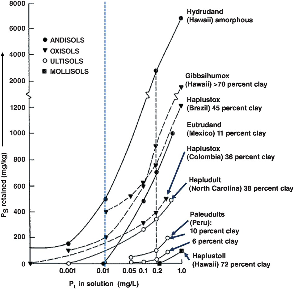
Fig. 14.5 Examples of phosphorus sorption curves determined by the Fox and Kamprath (Reference Fox and Kamprath1970) method. The general critical level for crops is 0.2 mg/L (0.2 ppm) PL in the x axis (right dotted line). Instead I propose that those soils with a PL of 0.01 mg/L or less be considered as those with high phosphorus sorption capacity (left dotted line).
14.5.5 Proposed New Limit for Soils with High Phosphorus Sorption Capacity
The critical level of 0.02 mg P/L as the best estimate of what plants need is a gross overstatement when compared with critical soil test levels, which, as described later, represent a well-correlated empirical estimate with plant uptake. Table 14.5 shows the overestimate, where critical soil test levels on the order of 150 mg/kg (ppm) of available phosphorus corresponds to a soil solution level of 0.2 mg/L PL, as originally suggested by Fox and Kamprath (Reference Fox and Kamprath1970). In contrast, a 0.012–0.006 mg/L PL relates to critical soil test levels orders of magnitude lower (3–30 mg/kg of available phosphorus), which is the range encountered in practice (8–30 mg/kg P).
Table 14.5 Calibration of soil test values with PL soil solution values, after seven continuous crops and broadcast triple superphosphate applications to a clayey Eutrudox of Hawaii, a soil with high phosphorus sorption capacity. Adapted from Yost and Fox (Reference Yost and Fox1979).
| Soil solution PL (mg P/L) | Soil test values (available phosphorus [mg/kg]) | ||
|---|---|---|---|
| Bray 1 | Mehlich 1 (North Carolina) | Olsen | |
| 0.003 | 2 | 6 | 12 |
| 0.006 | 3 | 9 | 15 |
| 0.012 | 14 | 20 | 30 |
| 0.025 | 28 | 35 | 44 |
| 0.05 | 55 | 57 | 72 |
| 0.1 | 72 | 86 | 93 |
| 0.2 | 144 | 158 | 164 |
| 0.4 | 156 | 209 | 160 |
| 1.6 | 339 | 337 | 295 |
Therefore I propose that soils with PL of 0.01 mg/L or less be considered to have high phosphorus sorption capacity. This is a more realistic PL critical level relative to the amount of PS sorbed to provide that critical soil test value. A value of 1 mg/kg PS sorbed is roughly equivalent to 2 kg P/ha in most soils (100–500 kg P/ha) except in Andisols, where because of low bulk density the conversion factor would be about 1.4 (70–350 kg P/ha).
14.5.6 Estimating High Phosphorus Sorption in the Field
Luckily, a complex metric like high phosphorus sorption can be estimated in the field for topsoils using the FCC system created by Buol et al. (Reference Buol, Sanchez, Cate, Granger, Bornemisza and Alvarado1975), described in Chapter 5. High phosphorus sorption is identified by two FCC attributes as show in Table 14.6.
Table 14.6 Estimates of high phosphorus sorption methods in the FCC system (Chapter 5).
Except for the first two methods that are used for the i attribute, and one of those used for the x attribute, all are field tests. In addition the x attribute can be quantitatively detected by near-infrared spectroscopy, making this technique very useful, as shown in Chapter 5. Unfortunately, this technique cannot currently be used for identifying soil solution PL or in soil tests for available phosphorus.
14.5.7 Geographical Distribution of Soils with a High Phosphorus Sorption Capacity
The tabular distribution of soils with high phosphorus sorption capacity by tropical geographic region is shown in Table 14.7. About half of these soils are in tropical America, covering 32 percent of the region, followed by tropical Asia, with a regional prevalence of 30 percent, mainly in the upland areas with Oxisols, Ultisols and Andisols. Tropical Africa has a low prevalence of soils with high phosphorus sorption capacity, and they occur mostly in the Lake Victoria Basin. The only biome in the world with more than 20 percent of such soils is the tropical–subtropical moist broadleaved forest.
Table 14.7 Percentage of tropical regions with high phosphorus sorption (from Sanchez and Logan Reference Sanchez, Logan, Lal and Sanchez1992) and prevalence of high phosphorus sorption in the biomes with significant phosphorus sorption. Adapted from Palm et al. (Reference Palm, Sanchez, Ahamed and Awiti2007).
| Region and biome | High phosphorus sorption | |
|---|---|---|
| Regions: | Area (million hectares) | Regional area (%) |
| Tropical Africa | 171 | 11 |
| Tropical America | 601 | 32 |
| Tropical Asia | 241 | 30 |
| Total tropics | 1013 | 22 |
| Temperate | 113 | 2 |
| Boreal | 0 | 0 |
| World | 1126 | 9 |
| Biomes: | ||
| Tropical–subtropical moist broadleaved forest | 421 | 21 |
| Tropical–subtropical grassland, savanna, shrubland | 157 | 8 |
| Temperate broadleaf and mixed forest | 19 | 2 |
| Tropical–subtropical dry broadleaved forest | 16 | 4 |
14.5.8 Influence of the Core Soil Properties on Phosphorus Sorption
Reminding ourselves that in phosphorus sorption we are dealing with the topsoil, the influences of the three core properties are considered below.
Texture
Among soils of similar clay mineralogy, phosphorus sorption increases with increasing clay content. Lopes and Cox (Reference Lopes and Cox1979) found that clay content explains 92 percent of the variability in phosphorus sorption capacity of Cerrado soils, which largely have kaolinitic and oxidic mineralogy. Figure 14.5 shows that the slopes of phosphorus sorption curves for the Ultisols and Oxisols become steeper as texture becomes finer. Among the Ultisols, in order to reach the old 0.2 mg/L PL level, the sandy Paleudult from Yurimaguas, Peru, with 6 percent clay, retains 24 mg/kg PS, while the one with 10 percent clay retains 80 mg/kg PS, but the Hapludult from North Carolina, with 38 percent clay, retains 340 mg/kg PS.
Similar relationships are found among Oxisols, which by definition must have at least 15 percent clay in the topsoil. The loamy Haplustox from the Llanos Orientales of Colombia, with 36 percent clay, sorbed 390 mg/kg PS to reach 0.2 mg/L PL. Another Haplustox from the Cerrado of Brazil, with 45 percent clay, sorbed almost twice that amount, 750 mg/kg PS. A Gibbsihumox from Hawaii, with more than 70 percent clay, sorbed 900 mg/kg PS. These relationships do not follow a straight line because of variation in the amount and degree of crystallinity of the oxide minerals. Many positive correlations have been reported between clay contents and phosphorus sorbed in Oxisols of Brazil (Syers et al. Reference Syers, Evans, Williams and Murdock1971, Leal and Velloso Reference Leal and Velloso1973aReference Leal and Vellosob, Oliveira et al. Reference Oliveira, Lourenço and Goedert1982, de Sousa and Lobato Reference de Sousa, Lobato, Yamada, Stipp and Abdalla2004, Lopes et al. Reference Lopes, Wiethölter, Guilherme and Silva2008). Texture, therefore, is the most important determinant of phosphorus sorption for areas with soils of similar clay mineralogy.
Mineralogy
The influence of clay mineralogy is well illustrated by the three soils from Hawaii in Fig. 14.5 all of which have more than 70 percent clay. The Mollisol (Haplustoll) sorbed no phosphorus within the agronomic range because of the preponderance of smectite. This is a typical example of soils that are dominated by layer-silicate permanent minerals, which pose little phosphorus sorption problems. To reach the 0.2 mg/L PL level, the Oxisol (Gibbsihumox), which consists primarily of the aluminum hydroxide gibbsite, sorbed about 900 mg/kg P. The Andisol (Hydrudand), composed primarily of amorphous allophane and finely divided gibbsite and goethite, sorbed about 2800 mg/kg P. Among soils with high contents of sesquioxides, it is well established that the less crystalline they are, the higher their phosphorus sorption capacity because of greater surface area (Colwell Reference Colwell1959, Pratt et al. Reference Pratt, Peterson and Holzley1969, Fox et al. Reference Fox, Hassan and Jones1971, Kamprath Reference Kamprath1973, Jackman et al. Reference Jackman, Jones, Yost and Babcock1997).
Because of the high contents of amorphous colloids, texture is often meaningless in Andisols. Phosphorus sorption, however, is positively correlated with X-ray amorphous colloid content and with surface area (Schalscha et al. Reference Schalscha, Pratt and Soto1974). Andisols can also develop considerable phosphorus sorption capacity rather rapidly. For example, Fox (Reference Fox1974b) studied a sequence of volcanic deposits of known age along the Irazú volcano in Costa Rica. He measured 70 mg/kg PS sorbed in a ~ 4-year-old deposit near the crater. Phosphorus sorption increased as the proportion of silica in the amorphous fraction decreased with weathering (Fox et al. Reference Fox, Hassan and Jones1971).
Andisols, as a soil order, are the highest phosphorus-retainers. As mentioned above, because of their generally low bulk densities (0.4–0.7 t/m3) the amounts indicated on the y axis of the sorption curves cannot be multiplied by a factor of 2 for conversion to kg P/ha as in most other soils. When an adjustment is made for bulk density, the PS requirements become much lower. A factor of about 1.4 can be used, assuming a 50 percent porosity. For example, the actual PS requirement of the Hydrudand shown in Fig. 14.5 is much less than the y axis indicates, but is still an enormous amount (Fox Reference Fox1974aReference Foxb).
SOM
In soils with high oxide contents, organic radicals of SOM can block exposed hydroxy groups on the surfaces of iron or aluminum oxides and thus decrease phosphorus sorption (Moshi et al. Reference Moshi, Wild and Greenland1974, Appelt et al. Reference Appelt, Coleman and Pratt1975). This is one reason why topsoils of Oxisols and Andepts with texture and clay mineralogy similar to their subsoils retain considerably less phosphorus than the subsoil layers. The main difference between the topsoil and subsoil horizons is the generally higher SOM content of the topsoils. Negative correlations between SOM content and phosphorus sorption in horizons of the same soil are often reported in the literature (Fassbender Reference Fassbender1969, Hinga Reference Hinga1973, Leal and Velloso Reference Leal and Velloso1973aReference Leal and Vellosob), but these correlations do not necessarily reflect a cause–effect relationship because SOM does not sorb or retain phosphorus.
14.5.9 Ways to Decrease Phosphorus Sorption
The high phosphorus sorption capacity of soils can be ameliorated by liming and silicate amendments, by adding inorganic phosphorus fertilizers and, to a lesser extent, by repeated applications of high-quality leafy organic inputs.
Liming
Liming aluminum-toxic topsoils to a pH of 5.5 neutralizes exchangeable Al3+ (Eqs. 9.9 and 9.10). As mentioned previously, 1 cmolc/kg of exchangeable Al3+ when hydrolyzed may precipitate up to 102 mg/kg P as aluminum phosphates, but such precipitation does not always happen because of incomplete hydrolysis (Syers et al. Reference Syers, Evans, Williams and Murdock1971).
Figure 14.6 shows the decrease in phosphorus sorption when an Oxisol from Panama was limed to pH 5.5. In this case less than half the phosphorus application rate was needed in the limed soil to approach the critical soil test level of available phosphorus in relation to the unlimed soil, as aluminum saturation decreased from 70 percent to 20 percent. This is an effective way to reduce phosphorus sorption in acid soils.
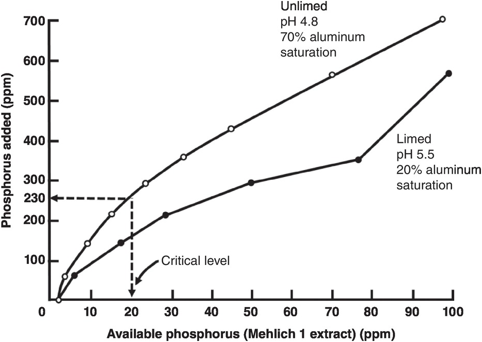
Fig. 14.6 Liming a strongly acid Oxisol from Panama decreases phosphorus sorption to attain the critical soil test level for millet.
Liming, however, has little or no influence in decreasing phosphorus sorption in soils with pH values of 5.0–6.0, which generally have low aluminum saturation levels (0–45 percent). These results have been observed in Oxisols of South Africa (Reeve and Sumner Reference Reeve and Sumner1970), Brazil (Leal and Velloso Reference Leal and Velloso1973b), Hawaii (Fox and Benavides Reference Fox and Benavides1974); Ultisols of North Carolina (Woodruff and Kamprath, Reference Woodruff and Kamprath1965); and Andisols of the Island of Reunion (Truong et al. Reference Truong, Bertrand, Burdin and Pichot1974). Phosphorus sorption by iron and aluminum oxides per se is not affected by liming. The effect of liming is to prevent phosphate ions from precipitating with exchangeable Al3+ after hydrolysis. That’s why it does not work when aluminum saturation is low.
There are many soils that retain large quantities of phosphorus at low levels of aluminum saturation; the most common case is with Andisols. Liming such soils could trigger detrimental effects of overliming (Chapter 9).
In their pioneering research on the Cerrado, de Freitas et al. (Reference de Freitas, McClung and Lott1960) suspected that liming may have a positive effect on SOP. Awan (Reference Awan1964), working in Honduras, found that increased yields of maize, sorghum and cowpea due to liming were associated with increased mineralization of SOP, thus confirming the suspicions of de Freitas’ group.
Silicate Applications
Silicate applications, usually as calcium silicate (CaSiO4), sodium silicate or basic slag can also decrease phosphorus sorption and increase its uptake by crops in certain Oxisols and Andisols. In some cases, the increased phosphorus uptake may result from a direct growth response to silica in soils that are very deficient in this element, but in many others, there is a direct effect of decreasing phosphorus sorption. Silicate anions replace phosphate ions from the sorption sites, increasing the availability of phosphorus (Silva Reference Silva1971). Table 14.8 shows similar reductions in phosphorus fixation with CaSiO4 and calcium carbonate (CaCO3) when both were applied at rates sufficient to neutralize the exchangeable Al3+ in an Oxisol from Brazil which was not deficient in silicon. The table also shows the decrease in phosphorus sorption with phosphorus fertilization alone. Most of the phosphorus application rates are very high (multiply by 2 to convert to kg P/ha).
Table 14.8 Lime and silicate applications that are sufficient to neutralize exchangeable Al3+ in a clayey Oxisol from Brazil decrease the phosphorus sorption. Initial values: pH 4.6, 1.45 cmolc Al/kg, 80 percent aluminum saturation. Adapted from Smyth and Sanchez (Reference Smyth and Sanchez1980).
| Amendment rate to neutralize 1.45 cmolc Al/kg | Amendment | Applied phosphorus (mg/kg ) | |||
|---|---|---|---|---|---|
| 0 | 380 | 460 | 540 | ||
| Decrease in phosphorus sorption (%) | |||||
| 0 | None | 0 | 44 | 54 | 65 |
| 1 × exchangeable Al3+ | CaCO3 | 18 | 59 | 68 | 77 |
| CaSiO4 | 24 | 65 | 77 | 84 | |
| Combined | 18 | 65 | 71 | 82 | |
| 2 × exchangeable Al3+ | CaCO3 | 16 | 62 | 77 | 85 |
| CaSiO4 | 28 | 75 | 82 | 91 | |
| Combined | 32 | 74 | 77 | 85 | |
Silicate applications are routinely done in some Oxisols of Brazil. Table 14.8 also shows that doubling the lime and silicate rates to neutralize twice the exchangeable Al3+ decreases phosphorus sorption even more, but then there is the danger of overliming. One practical implication is that phosphorus sorption curves should be constructed after lime and silicate applications in order not to overestimate the amount of phosphorus required.
Organic Inputs
Plant-based organic inputs (crop residues, biomass transfers, leaves of nitrogen-fixing trees) generally cannot provide sufficient phosphorus to meet crop requirements because their phosphorus contents are low (0.1–0.2 percent, 0.01–0.02 mg/kg P) (Palm Reference Palm1995). The use of plant organic materials is also hampered by limited amounts of dry matter available. Organic inputs, particularly those with C:P ratios lower than 200 and thus considered high quality, can temporarily decrease phosphorus sorption because the organic anions produced during decomposition compete with H2PO4– for adsorption sites (Nziguheba et al. Reference Nziguheba, Palm, Buresh and Smithson1998, Kpomblekou-a and Tabatabai Reference Kpomblekou-a and Tabatabai1994). Nziguheba et al. (Reference Nziguheba, Merckx, Palm and Rao2000) also showed no differences in phosphorus sorption during the first maize crop in an Oxisol, but after four consecutive crops that received 5 t/ha per crop of organic inputs, PS sorption to provide 0.2 mg/L PL significantly decreased from 300 mg/kg PS with inorganic fertilizers alone to about 230 mg/kg PS with the high-quality organic Tithonia diversifolia.
14.5.10 Phosphorus Release
Eventually, much of the phosphorus sorbed is released back to the soil solution, particularly when plant roots remove phosphate ions from this solution, creating a concentration gradient that causes phosphate ions to be released from sorbed sites or precipitates, and to move towards the roots by diffusion.
Phosphorus release is not quantitatively the reverse of phosphorus sorption. There is a hysteresis. Linquist et al. (Reference Linquist, Singleton, Cassman and Keane1996, Reference Linquist, Singleton, Yost and Cassman1997) and Wang et al. (Reference Wang, Yost and Linquist2001) demonstrated that the effect of aggregate size on sorption differed from that on desorption. They estimated the phosphorus release of different-sized aggregates in their Hawaiian Ultisol using a continuous flow of the Mehlich 1 soil test extractant. At 56 hours, all aggregate sizes released phosphorus but the release was larger from microaggregates (< 250 μm), which were depleted of most of the sorbed phosphorus in 2 years. Linquist et al. (Reference Linquist, Singleton, Yost and Cassman1997) concluded that the release of sorbed phosphorus is faster in oxidic soils with a large proportion of microaggregates. The conundrum associated with this conclusion is that tillage is necessary to incorporate significant quantities of phosphorus fertilizers but macroaggregates are often destroyed by tillage (Chapter 6). How might this affect phosphorus sorption and release? This could be a future research topic.
14.6 Soil Tests for Available Phosphorus
Phosphorus soil tests are empirical determinations that attempt to extract, in a few minutes, an amount of phosphorus that will correlate with plant uptake of phosphorus throughout the crop’s life. A description of the processes involved is in Chapter 12. Basically, soil tests attempt to estimate the labile or “bioavailable” pool in one shot, which according to Pierzynski et al. (Reference Pierzynski, McDowell, Sims, Sims and Sharpley2005) consists of adsorbed phosphorus, slightly soluble phosphorus compounds, phosphorus in organic inputs and some organic phosphorus forms. When used and interpreted properly, soil tests can distinguish soils that will probably respond to phosphorus fertilization from those that are not likely to do so. The point of inflection is called the critical soil test level. Soil tests do not tell you how much phosphorus to add.
The main phosphorus soil tests used in the tropics, described in Table 14.9, tackle forms of aluminum and calcium phosphates, and are basically empirical. The Bray tests are the oldest used in the tropics. The Olsen or modified Olsen with ethylenediaminetetraacetic acid (EDTA) tests are probably the most widely applicable and have the advantage that they represent the actual bicarb Pi in the Hedley fractionation. The Mehlich 1 or North Carolina extraction is used widely in acid tropical soils.
Table 14.9 Main phosphorus soil tests used in the tropics. Adapted from Kamprath and Watson (Reference Kamprath, Watson, Khasawneh, Sample and Kamprath1980), Hammond et al. (Reference Hammond, Chien and Mokwunye1986), Beegle (Reference Beegle, Sims and Sharpley2005) and my ideas.
| Name | Extractant | Year released | Applicability |
|---|---|---|---|
| Bray I | 0.03 M NH4F + 0.025 M HCl | 1945 | Not for calcareous soils. Good for phosphate rock applications. Correlates with organic phosphorus in unfertilized soils. |
| Bray 2 | 0.03 M NH4F + 0.1 M HCl | 1945 | Widely used. Overestimates phosphate rock solubility. |
| Olsen | 0.5 M NaHCO3 at pH 8.5 | 1954 | Wide range. |
| Modified Olsen | 0.5 M NaHCO3 + 0.01M EDTA at pH 8.5 | 1960s | Widely used in a broad range of soils. A multinutrient extractant. |
| Resin P | Resin acting as a sink for phosphorus | 1955 | Used in Brazil; but use of resin bags is cumbersome – use of beads is not. |
| Mehlich 1 (double acid, North Carolina) | 0.05 M HCl + 0.0125 M H2SO4 | 1953 | Used widely in kaolinitic soils, pH < 7. Overestimates phosphate rock solubility. |
| Mehlich 3 | 0.015 M NH4F + 0.2 M CH3COOH +0.25 M NH4NO3 +0.013 M HNO3 +0.001M EDTA | 1984 | A multinutrient extractant. Extracts more phosphorus in clayey soils, and less phosphorus in soils fertilized with phosphate rock than Mehlich 1 (Bortolon and Gianello Reference Bortolon, Gianello, Alves, Guimarães and de Magalhaes2006). Overestimates phosphate rock solubility. |
| Houba | 0.01 M CaCl2 | 1990 | A multinutrient extractant (Houba et al. Reference Houba, Novozamsky, Lexmon and van der Lee1990). Still experimental in the tropics. Tries to approximate phosphorus in the soil solution. |
Routine Methods
The phosphorus sorption curves shown earlier in Fig. 14.5 are limited to research laboratories. The time requirement of 6 days and the analytical precision required to determine fractions of 1 mg/kg prevent their routine use in service laboratories. That is why soil test methods continue to be useful.
What is missing in the literature is a meta-analysis of algorithms that translate each major soil test method with others on a wide range of soil textures, mineralogy and SOM levels for different crops across the tropics, and with the appropriate boundary conditions. Comparisons among the different methods have been done with soils of Germany and Austria (Wuenscher et al. Reference Wuenscher, Unterfrauner, Peticzka and Zehetner2015), which are mostly permanent-charge soils. They found highly significant correlations (p < 0.001) between the extraction methods of CaCl2, Olsen, Bray 2 and Mehlich 3 that are – with the exception of the modified Olsen method – those most commonly used in the tropics. This is useful but the next logical step, comparing the critical soil test levels for a variety of plants, remains to be done.
14.7 Plant Phosphorus Requirements
This discussion now shifts from the soil to the plant. Plant roots remove phosphate ions from the soil solution, creating a concentration gradient and causing phosphate ions to move towards the roots by diffusion.
14.7.1 External and Internal Phosphorus Requirements
Plant species and cultivars (varieties, hybrids, accessions) differ in their external phosphorus requirements (critical soil test level – varies with soils) and internal phosphorus requirements (phosphorus content in the plant tissue or in grain).
Data for the main tropical food crops have been compiled by Rao et al. (Reference Rao, Friesen, Osaki and Pessarakli1999) and show major differences in internal phosphorus requirements at high yield levels of the principal crops (Table 14.10). The internal phosphorus requirements from grain legumes are the highest, showing the higher needs for phosphorus in nitrogen-fixing crops. Tropical root crops like cassava and sweet potato have the lowest. Potato and the main cereals rank in between. Among cereals, wheat has the highest internal phosphorus requirement and rice the lowest, with maize in between. Data from other crops can be calculated from data presented in Table 12.2 of Chapter 12.
Table 14.10 Internal phosphorus requirement of major food crops. Calculated from Rao et al. (Reference Rao, Friesen, Osaki and Pessarakli1999).
| Crop | Plant part | Yield (t/ha) | Phosphorus uptake (kg P/ha) | Internal phosphorus requirement in plant part (% P) |
|---|---|---|---|---|
| Maize | Grain | 9.4 | 26 | 0.28 |
| Total | 19.5 | 44 | 0.23 | |
| Rice | Grain | 5.4 | 10 | 0.19 |
| Total | 11.0 | 16 | 0.15 | |
| Wheat | Grain | 2.7 | 12 | 0.45 |
| Total | 6.1 | 15 | 0.25 | |
| Cassava | Roots | 13.5 | 13 | 0.10 |
| Total | – | 24 | – | |
| Sweet potato | Tubers | 10.5 | 18 | 0.17 |
| Total | 16.7 | 30 | 0.18 | |
| Potato | Tubers | 11.9 | 34 | 0.29 |
| Total | 18.3 | 44 | 0.24 | |
| Soybean | Grain | 3.0 | 22 | 0.73 |
| Total | 6.7 | 25 | 0.37 | |
| Common bean | Grain | 0.9 | 4 | 0.38 |
| Total | – | 9 | – |
A simpler situation to illustrate the concept is with forage species as the entire above-ground plant is harvested. The internal phosphorus requirement of the grasses and legumes shown in Table 14.11 lie within the same range, even though nitrogen-fixing legumes like the ones indicated are supposed to have larger requirements for phosphorus, as was the case for soybeans and beans in Table 14.10. The differences in the case of these forage species seem to be related to the general soil fertility and phosphorus status of their center of origin.
Table 14.11 Internal and external phosphorus requirements of important tropical legumes and grass pasture species. Adapted from Sanchez and Salinas (Reference Sanchez and Salinas1981).
| Plant type | Species or genera | Internal phosphorus requirement (%) | External phosphorus requirement Bray 2 (mg/kg )c |
|---|---|---|---|
| Legumes: | Stylosanthes spp.a | 0.17 | 2.5–5.5 |
| Centrosema pubescens | 0.16 | ||
| Desmodium spp.b | 0.22 | 3.0–11.4 | |
| Perennial soybean (Glycine wightii) | 0.23 | ||
| Alfalfa (Medicago sativa) | 0.25 | ||
| Grasses: | Andropogon gayanus CIAT 621 | 0.11 | 5.0 |
| Brachiaria decumbens CIAT 606 | 0.12 | 7.0 | |
| Molasses grass (Melinis minutiflora) | 0.18 | ||
| Guinea grass (Panicum maximum) CIAT 604 | 0.19 | 10.0 | |
| Kikuyu grass (Pennisetum clandestinum) | 0.22 | ||
| Rhodes grass (Chloris gayana) | 0.25 | ||
a S. hamata (Townsville Stylo) for internal requirement; S. capitata (five accessions) and S. guianensis (two accessions) for external requirement.
b D. intortum for internal requirement; D. ovalifolium, D. scorpirius and D gyroides for external requirement.
c For 80 percent maximum yield.
The legumes Stylosanthes humilis and Centrosema pubescens originated in low-phosphorus Oxisols and Ultisols of Latin America while the higher-phosphorus-requiring perennial soybean and alfalfa arose from temperate regions high in available phosphorus and other nutrients. The same situation takes place among the grass species. Andropogon gayanus, Brachiaria decumbens and molasses grass arose from low-fertility areas of tropical Africa, Guinea grass and kikuyu grass from medium-fertility regions of tropical Africa, and Rhodes grass from high-fertility areas of southern Africa.
14.7.2 Genotype Adaptation to Low Available Phosphorus
It is now possible to select varieties or cultivars of crop and pasture species that have a lower external phosphorus requirement for maximum growth than those presently used. Fortunately, aluminum tolerance and “low-phosphorus tolerance” often occur jointly because the latter seems to be associated with the plant’s ability to absorb and translocate phosphorus in the presence of high levels of aluminum in the soil solution and/or root tissue (Chapter 9).
Embrapa, the Brazilian Agricultural Research Corporation, has been conducting research on selecting maize cultivars for tolerance to low phosphorus and high aluminum saturation since the 1970s in the Cerrado. Perentoni et al. (Reference Perentoni, Alves, Gama, Coelho, Guimarães, Guimarães, Pacheco, Magalhães, Godoy, Oliveira, Meireles, Vasconcelos, Souza, Schaffert and Alves2006) have found maize hybrids that are high-yielding, aluminum-tolerant and are able to yield 6–8 t/ha of grain with as little as 5 mg/kg of available phosphorus by the Mehlich 1 method.
Reviewing the genetics of phosphorus tolerance in maize, Vasconcelos and Raghothama (Reference Vasconcelos, Raghothama and Alves2006) concluded that it is a complex trait involving several genes and that there is no phosphorus-efficiency gene, but there is an opposite one; the Bat-3 gene is strongly suppressed by phosphorus deficiency in maize and sorghum. Similar advances in identifying genes and quantitative trait loci are being found in rice (Ismail et al. Reference Ismail, Gatula, Heuer, Lu, Wissuwa and Alves2006) and wheat (Silva et al. Reference Silva, Delatorre, Bertoldi and Alves2006).
The physiological mechanisms responsible for these cultivar and species differences are not well understood. Rao et al. (Reference Rao, Friesen, Osaki and Pessarakli1999) provide a comprehensive review and divide the processes into those that improve phosphorus acquisition (uptake) and those that improve phosphorus utilization inside the plant.
An early review by Salinas and Sanchez (Reference Salinas and Sanchez1976) observed that cultivars and species that are more tolerant of low available soil phosphorus can either acquire it at a faster rate or translocate it to the tops at a faster rate than sensitive cultivars or species. In some cases, tolerant cultivars have a slower growth rate that enables them to operate at a low level of external phosphorus supply. In a later review, Rao et al. (Reference Rao, Friesen, Osaki and Pessarakli1999) considered that crops and pastures tolerant to low phosphorus have low phosphorus requirements to start with, and/or higher uptake efficiency and/or higher utilization efficiency.
The following is largely based on Rao et al.’s (Reference Rao, Friesen, Osaki and Pessarakli1999) review as well as Sanchez and Salinas (Reference Sanchez and Salinas1981) and Brazilian data in the volume edited by Alves et al. (Reference Alves, Guimarães, de Magalhães, Schaffert, Coelho, Bahia-Filho and Santana2006).
14.7.3 Effective Root Volume
Differences in root growth, root length, diameter, duration and distribution explain differences among cultivars on phosphorus uptake efficiency in low-phosphorus soils (Rao et al. Reference Rao, Friesen, Osaki and Pessarakli1999). Even more important are two features, root hairs and mycorrhizal associations.
Root hairs can triple the acquisition volume of roots, and since hairs are perpendicular to the roots they exploit wider volumes (Rao et al. Reference Rao, Friesen, Osaki and Pessarakli1999, Vandamme et al. Reference Vandamme, Renkens, Pypers, Smolders, Vanlauwe and Merckx2013).
Mycorrhizal associations with roots are extremely important for most tropical plants and increase the effective root area from 2 to over 800 times. Mycorrhizal plants take up not only the soil solution Pi and labile Pi and Po pools but are also able to access sorbed (NaOH) Pi (see Chapter 10).
14.7.4 Rhizosphere Exudation
Plant roots continually exude complex mixtures of carbon compounds into the rhizosphere. This includes organic acids such as citric, malic, acetic, lactic, oxalic, piscidic acids, and others. These acids dissolve solid fractions of inorganic and organic phosphorus, bringing it into the labile and soil solution phosphorus.
Some acids can be quite specific. Ae et al. (Reference Ae, Okada, Yoshihara and Johansen1990) found that piscidic acid exudates by pigeon pea dissolved some of the iron-bound phosphorus in a red Alfisol but did not react with calcium-bonded phosphorus in an adjacent black Vertisol in Patancheru, India. In a phosphorus-deficient (2 mg/kg Olsen P) Oxisol of western Kenya, George et al. (Reference George, Gregory, Robinson and Buresh2002) found that the phosphorus-accumulating shrub Tithonia diversifolia slightly acidified the rhizosphere, lowering the pH from 4.8 to 4.5, causing a significant decrease in the soil solution Pi, sorbed Pi and the slow Po fractions up to about 6 mm distance, suggesting that part of these fractions were taken up by the plant. In contrast, the legume Tephrosia vogelii increased the rhizosphere pH from 4.8 to 5.4, which decreased the slow Po fraction. While such research cannot establish quantitative effects, or whether it is the effect of organic acid exudation or of a proton balance, George et al.’s data imply that these two very different agroforestry species may be able to tap sorbed Pi and the slow organic Po fraction. It is interesting that the labile Pi and active Po fractions were not affected.
Roots can secrete acid phosphatase ectoenzymes, which they do faster and in larger quantities when phosphorus deficiency occurs, breaking down some organic phosphorus pools. Rao et al. (Reference Rao, Friesen, Osaki and Pessarakli1999) also suggested that species tolerant to low available phosphorus levels, such as Stylosanthes guianensis and Brachiaria decumbens secrete phytase, the enzyme that breaks down inositol hexaphosphate (the main constituent of organic phosphorus) in these phosphorus-deficient soils. The rhizosphere processes are an evolving science, with few hard data at the field level.
14.8 Phosphorus Fertilization
14.8.1 Phosphorus Fertilizers
All phosphorus fertilizers, including the organic ones, originate from phosphate rock. Superphosphates and other soluble inorganic fertilizers are the product of reacting phosphate rock with acids. Organic fertilizers come from plant or animal products that originated from the dissolution of phosphate rock. The main fertilizers are listed in Table 14.12.
Table 14.12 Main kinds of phosphorus fertilizers. Adapted from Hammond et al. (Reference Hammond, Chien and Mokwunye1986), Rajan et al. (Reference Rajan, Watkinson and Sinclair1996), Johnston and Syers (Reference Johnston and Syers1998), van Straaten (Reference van Straaten2002), Stewart et al. (Reference Stewart, Hammond, van Kauwenbergh, Sims and Sharpley2005), Hedley and McLaughlin (Reference Hedley, McLaughlin, JT Sims and Sharpley2005), Andrade (Reference Andrade, Novais, Alvarez and de Barros2007) and my own information.
| Sources | Deposits or properties | Characteristics | Reactivity | Contents | Comments |
|---|---|---|---|---|---|
| Igneous and metamorphic phosphate rocks |
| Ca10(PO4)6F2, Ca10(PO4)6(OH)2 | Very low reactivity, especially fluorapatite | 16–18% P | Nil for direct application; 15–20 percent of world phosphate rock production, used for making soluble phosphorus fertilizers |
| Sedimentary phosphate rocks | Central Florida, Togo, Ca10–x–y,NaxMgy(PO4)6F2, formed mainly in marine environments | Francolite (carbonate-substituted apatite) | Moderate reactivity | 15–17% P | 80% of world phosphate rock production, and type of phosphate rock most commonly used for soluble P fertilizer production |
| Biogenic phosphate rocks |
| Ca10(PO4)6(OH)2 and carbonate-substituted Ca10(PO4)6(OH)2 | High reactivity; good for direct application in acid soils | 4–5% P (Peru) | Locally important; 1–2% of world phosphate rock production; Many are used for direct application |
| Partially acidulated phosphate rock | Phosphate rocks + usually 50 percent less acid than for producing superphosphates | Low reactivity Phosphate rocks + sulfuric acid | Medium solubility (40–50%) | Variable | Limited use, mainly experimental (Hammond et al. Reference Hammond, Chien and Mokwunye1986; Nziguheba Reference Nziguheba and Bationo2007) |
| Single (simple, ordinary) superphosphate | 3Ca(H2PO4)2·H2O + 7CaSO4 | Phosphate rock + H2SO4 | High solubility (~85%) | 7–10% P, 1–3% S | 21 percent of the world market (1999) |
| TSP | Ca(H2PO4)2·H2O | Phosphate rock + H3PO4 | High solubility (~87%) | 20% P | 7 percent of the world market (1999) |
| DAP | (NH4)2HPO4 | H3PO4 + NH4+ | High solubility (~100% ) | 23%, 18–21% N | 42 percent of the world market (1999): best in basal application |
| NPK/PK compounds | For example 15–15–15 (N–P2O5–K2O) | Blend | Variable solubility | Variable | 21 percent of the world market |
| Thermal phosphates (Rhenania) | Sodium silicophosphate “Termofosfato, ” Ca3(PO4)2CaSiO4 | Phosphate rock with Na2CO3 + silica + steam ~1100 °C | Low solubility (< 1%) | 10–12% P | High cost of electricity and water; little use |
| Fused magnesium phosphate | Ca3(PO4)2MgSiO4 | Phosphate rock with olivine, or serpentine fused at 1500 °C | Low solubility (< 1%) | 6% P , 7% Mg, 18–20% Ca | High expense of electricity and water; little use |
| Cattle manures | Feces | High solubility; slow release | 0.15– 1.1% P | Widely used; cattle manures provide improved soil properties not fully understood | |
| Poultry manure | Feces + uric acid | High solubility; slow release | 0.7–2.1% P | Very concentrated; can be a pollutant due to low N:P ratio | |
| Pig manure | Feces | High solubility; slow release | 0.8% P | Can be a pollutant due to low N:P ratio | |
| Tithonia diversifolia leaves | Unusually high nutrient content; a nutrient accumulator (Jama et al. Reference Jama, Palm, Buresh, Niang, Gachengo, Nziguheba and Amadalo2000) | Fast decomposition | 0.2–0.6% P, 4% N, 4% K | Good for biomass transfers for high‐value crops | |
| Crop residues | Straw, stover | Maize stover < 0.1% P | Slow decomposition | < 0.1–0.2% P | Phosphorus is too low; main interest is carbon, and potassium |
| Ash from burning wood | Slash-and-burn agriculture; cooking fires | High solubility | 0.14% P | ||
| Biosolids | Urban sewage, semisolid and solid wastes | Variable composition | < 0.1–15% P; Median: 0.7–2.4% P | Possible heavy metal contamination (arsenic, cadmium, chromium, lead, mercury); also molybdenum, nickel, selenium, zinc |
Superphosphate fertilizers are formed by reacting the phosphate rock – Ca10(PO4)6F2, for example – with an acid. For single superphosphate the reaction is with sulfuric acid, producing gypsum (CaSO4) and monocalcium phosphate Ca(H2PO4)2.H2O:
For triple superphosphate, the reaction is phosphate rock with phosphoric acid, which is previously produced from phosphate rock (Leikam and Achorn Reference Leikam, Achorn, Sims and Sharpley2005):
DAP is produced by reacting phosphoric acid with anhydrous ammonia:
14.8.2 Phosphate Rocks
The largest producers of phosphate rocks in 1999, in descending order are United States, China and Morocco (together accounting for 64 percent of the total) followed by Russia, Tunisia, Jordan, Brazil, Israel, South Africa, Syria, Senegal, Togo, Colombia, Peru, Sri Lanka and Venezuela (Stewart et al. Reference Stewart, Hammond, van Kauwenbergh, Sims and Sharpley2005; Fig. 14.7). The eight tropical countries in this list together produce only ~8 percent of the world’s total. Presently, additional countries are producing phosphorus fertilizers, notably Saudi Arabia, Malaysia and Indonesia (both in Borneo), Australia and the Central Asian republics. Morocco has discovered new deposits, and currently has the largest reserves.
Fig. 14.7 Minjingu biogenic phosphate rock deposit in northern Tanzania.
Igneous and metamorphic phosphate rock deposits are the least soluble and consist mainly of fluorapatites and hydroxyapatites; they are almost never used for direct application and relatively little for phosphate rock production. The least soluble are the fluorapatites, which are never used for direct application, even if finely ground to < 0.02 mm (Rajan et al. Reference Rajan, Watkinson and Sinclair1996). Sedimentary resources (of marine origin) are more soluble and consist largely of fluorapatite and carbonate-substituted fluorapatite (francolite), accounting for the vast majority of phosphate rock production and soluble phosphorus fertilizers. The main differences in reactivity lie in the crystal chemistry of apatite, particularly isomorphic substitution (van Straaten Reference van Straaten2002).They constitute the bulk of phosphate rock production and exports. Many of the sedimentary deposits can be used for direct application in acid soils, as indicated in Table 14.12. Biogenic deposits are the most soluble and are great for direct application in acid soils, but are only locally important.
The percentage of total phosphorus that is soluble in either 2 percent neutral ammonium citrate or in 2 percent citric acid is the most common measure for estimating the reactivity of phosphate rocks. Using the Hedley fractionation, the increase in the sorbed (NaOH-extractable) Pi fraction after phosphate rock application indicates the transformation of phosphate rock into sorbed iron- and aluminum-bonded phosphates, and the amount not reactive can be determined by the increase in calcium-bonded phosphate with the HCl extraction (Rajan et al. Reference Rajan, Watkinson and Sinclair1996).
The most important deposits used in the tropics are grouped in Table 14.13. It is interesting to note the paucity of highly reactive phosphate rocks in the tropics compared with the temperate region, particularly North Africa. Tropical Latin America has a wide variety of medium- to high-reactivity phosphate rocks, where research has concentrated in Brazil and Colombia. Brazil seems to have mainly low-reactivity phosphate rocks, which are widely used. Tropical Africa appears to have the medium-reactivity rocks in West Africa, while the low-reactivity ones predominate in East and southern Africa. This is probably due to the largely sedimentary geology of West Africa in comparison to the largely mountainous/plateau backbone of East and southern Africa, which includes past and present volcanic activity. Surprisingly, there seem to be few known phosphate rock deposits in tropical Asia.
Table 14.13 Examples of phosphate rock deposits with different reactivity in the tropics. Adapted from León and Fenster (Reference León and Fenster1979), Sanchez and Salinas (Reference Sanchez and Salinas1981), Hammond et al. (Reference Hammond, Chien and Mokwunye1986), Rajan et al. (Reference Rajan, Watkinson and Sinclair1996), Buresh et al. (Reference Buresh, Smithson, Hellums, Buresh, Sanchez and Calhoun1997), Johnston and Syers (Reference Johnston and Syers1998), van Straaten (Reference van Straaten2002), and Yampracha et al. (Reference Yampracha, Attanandana, Sidibe-Diarra and Yost2005).
| Region and deposit | High reactivity | Medium reactivity | Low reactivity |
|---|---|---|---|
| Temperate region phosphate rocks used in the tropics | North Carolina, Gafsa (Tunisia, Morocco), Arad (Israel), Jordan | Central Florida | Missouri |
| Tropical Latin America | Bayóvar/Sechura (Peru)a | Huila (Colombia); Baja California, Zacatecas (Mexico); Lobatera, Riecito (Venezuela) | Abaeté, Araxá, Catalão, Olinda, Patos de Minas (Brazil); Pesca, Sardinata (Colombia) |
| Tropical Africa | Iles Barrens (Madagascar); 13 offshore islands (Namibia); Minjingua; Pyramids (Tanzania) | Cabinda, Lucunga (Angola); Mekrou, Pobe (Benin); Arly, Kodjari (Burkina Faso); Matongo (Burundi); Douala (Cameroon); Bokouma (CAR); Comba, Holle, Offshore (Congo Republic); Lueshe (Democratic Republic of Congo); Gorrakel, (Ethiopia); Iguela (Gabon); Saliquinhe (Guinée-Bissau); Secondi (Ghana); Bambuta (Liberia); Tilemsi (Mali)a; Bofal-Lubboira (Mauritania); Tauhoa,a Maputo (Mozambique); Parc W, Tahoua, Muambe, Tapoa (Niger); Sokoto, Abeokuta (Nigeria)a; Empembe, Kalkfeld (Namibia); Taiba-Thies,b Matam, Ziguinchor, Taiba (Senegal); El Bur (Somalia); Akoumape-Hahotoe (Togo)c | Bikilal (Ethiopia); Mrima Hill, Rangwa (Kenya); Tundulu, Chilwa Island Mlindi (Malawi)a; Evite (Mozambique); Phalaborwa (South Africa)b; Panda Hill (Tanzania); Tororo, Sukulu,d Busumbud (Uganda); Chilembwe,d Rifisa, Nkfombwa (Zambia); Dorowa,d Shawa, Chisaya (Zimbabwe)b |
| Tropical Asia and Pacific | Nauru | Christmas Island (Australia); Lao Cay (Vietnam); Mussooire (India); Kanchanaburi (Thailand) | Eppawala (Sri Lanka) |
Phosphate rock reactivity in soil depends on the solubility product of the main minerals, fineness and soil pH. The general reaction with the acidity of the soil using the most common form, fluorapatite is as follows (van Straaten Reference van Straaten2002).
The reaction is similar with other forms of apatite. Obviously, the reaction will not proceed to the right in calcareous soils. This is why soluble fertilizers had to be invented.
The reactivity of phosphate rocks is higher in soils with low exchangeable Ca2+ levels and soils low in available phosphorus (Hammond et al. Reference Hammond, Chien and Mokwunye1986). Interestingly, high phosphorus sorption in Oxisols and clayey Ultisols enhances the dissolution of phosphate rock particles by having a low concentration of soil solution phosphorus around the particle (Smyth and Sanchez Reference Smyth and Sanchez1982). SOM often forms complexes with exchangeable Ca2+, thus decreasing Ca2+ concentration and driving the dissolution reaction towards the right. Therefore, the higher the SOM content the better the dissolution of phosphate rock will be (Hammond et al. Reference Hammond, Chien and Mokwunye1986, Rajan et al. Reference Rajan, Watkinson and Sinclair1996).
The size of phosphate rock particles applied to the soil also affects the reactivity, because this increases with the particle’s surface area. Generally, grinding machines used in phosphate rock extraction should produce particles fine enough that 80 percent of them pass a 100-mesh (150-μm) screen, which is essentially powder (Hammond et al. Reference Hammond, Chien and Mokwunye1986). The application of phosphate rock as powder is best applied early in the morning when there is still dew and no wind.
14.8.3 Managing Phosphorus Fertilizers in Low Phosphorus Sorption Soils
Phosphorus fertilizer management in soils with low to moderate phosphorus sorption capacity is usually a simple proposition. Phosphorus fertilizers should be at least 40–50 percent water-soluble (Englestad Reference Englestad1972) to insure an adequate phosphorus supply early in crop growth stages, when it is needed the most. Single and triple superphosphate, together with monoammonium and diammonium phosphates, meet this requirement and can be used effectively in most soils with low to moderate phosphorus sorption capacity.
Phosphorus deficiency probably is the first nutrient deficiency to be overcome in the West African Sahel, south of the Sahara and north of the savanna belt, extending from Senegal in the Atlantic coast eastwards until facing the Ethiopian Highlands. The soils are unusual for such a semiarid tropical climate because the majority of them are not calcareous and do not suffer from salinity or alkalinity (they do not have the FCC attributes b, s or n). The reason for this is that their parent materials are mainly quartz sand and ironstone, which produce sandy Alfisols with pH 5–6, without aluminum toxicity, with low phosphorus sorption and little SOM. Their phosphorus sorption levels, shown by Bationo (Reference Bationo2008), are negligible. Annual rainfall varies from 200 mm to 600 mm, concentrated in a short 3-month rainy season.
The soil test critical levels and follow-up steps shown in Chapter 12 are applicable. However, when using phosphate rocks, the Bray 2, Mehlich 1 and Mehlich 3 soil tests overestimate phosphate rock dissolution (Hammond et al. Reference Hammond, Chien and Mokwunye1986). Low annual rates of superphosphate or diammonium phosphate can be broadcast and incorporated into the topsoil or banded once a year. All phosphorus fertilization should be done at planting time, because plants have the ability to accumulate and translocate phosphorus to younger plant parts (Rao et al. Reference Rao, Friesen, Osaki and Pessarakli1999). Therefore, regardless of sorption capacity, there is no need for topdressing applications of phosphorus fertilizers.
Bationo et al. (Reference Bationo, Baethgen, Christianson and Mokwunye1991), in an exemplary work to calibrate soil tests with yield response, found that over 75 percent of the soils sampled had available phosphorus values of less than 8 mg/kg P (Bray 1), which was considered the critical level for the main crop, pearl millet. In very sandy Alfisols of Niger the rates of phosphorus needed for achieving 90 percent of the maximum millet yield were extremely low, 17 kg P/ha, when the Bray 1 soil test level was 2 mg/kg P, and 4 kg P/ha when the soil test level was 7 mg/kg P, approaching the critical level. Millet yields were also very low: 190 kg/ha without fertilizers, and 714 kg/ha with 13 kg P/ha. There was no response to nitrogen without phosphorus being applied, but when both 13 kg P/ha and 60 kg N/ha were applied, millet yields increased to about 1 t/ha. Bationo (Reference Bationo2008) did not detect significant millet and cowpea responses to sulfur or potassium applications. Therefore the central issue was phosphorus.
With ample sedimentary phosphate rock deposits in West Africa, it was logical to try them in comparison with imported superphosphates. The only one of medium reactivity is the Tilemsi deposit and it is essentially as effective as superphosphates (Bationo et al. Reference Bationo, Ayuk, Ballo and Koné1997). Unfortunately, the Tilemsi phosphate rock deposit is in a remote area of northern Mali. Although increased yield responses due to crop residue incorporation or biomass transfers have been reported, it is extremely difficult to grow sufficient biomass in this semiarid climate and virtually all crop residues are consumed by cattle after the grain harvest. Furthermore, the only fertilizer currently available is imported 15–15–15, which works but wastes potassium, according to our experience in the Tiby Millennium Villages, near Segou, Mali.
14.8.4 Managing Soluble Fertilizers in Soils with High Phosphorus Sorption Capacity
In certain Andisols of Japan and Oxisols of Latin America, agronomists were convinced that these soils did not respond to phosphorus fertilization, even though crops showed severe phosphorus deficiency symptoms. This changed when they applied rates of 500–1000 kg P/ha and obtained dramatic yield responses. When the topsoils have phosphorus sorption capacities higher than 100 mg/kg PS (or 200 kg P/ha) to reach 0.01 mg P/L, as indicated in Fig. 14.5, crop fertilization strategies have to look at a 5–10-year horizon. The best strategy is to use what the Brazilians call adubação corretiva – corrective fertilization, followed by small, banded maintenance phosphorus applications every year. While clearing Cerrado, Brazilian farmers called the corrective strategy amansar Cerrado (tame or domesticate the Cerrado).
I have seen the epitome of corrective applications near Stellenbosch, South Africa, where large rates of phosphorus, lime and gypsum were mixed with the top meter of soil (either a clayey Ultisol or Oxisol), using a tractor-mounted back hoe. The land was being prepared to grow vineyards that produce high-quality wines. Such a strategy is considered an investment in natural capital and is often financed accordingly.
One of the best examples of various options is shown in the classic experiment that started in 1972 in a clayey Red Latosol (Typic Haplustox) at Embrapa’s Cerrado Research Center near Brasília by Yost et al. (Reference Yost and Fox1979) and continued for 13 years. The results of the first 9 years are shown in Fig. 14.8. Broadcast rates, applied only once in 1972 before planting the first crop, ranged from 70 kg P/ha to 560 kg P/ha (no point having a control since the yield without applied phosphorus is zero). The highest rate, in retrospect, was close to a full corrective application to produce the desired 0.01 mg P/L. Looking at Fig. 14.5, this same soil (Haplustox from Brazil) needed ~ 200 mg/kg PS (800 kg P/ha) to reach 0.01 mg/L PL. Discounting for the lime applications (1 × exchangeable Al3+) in Table 14.8, which lowers the phosphorus sorption by 18 percent, the recommended amount would be 656 kg P/ha, which is reasonably close to what Yost and co-workers applied – 560 kg P/ha.
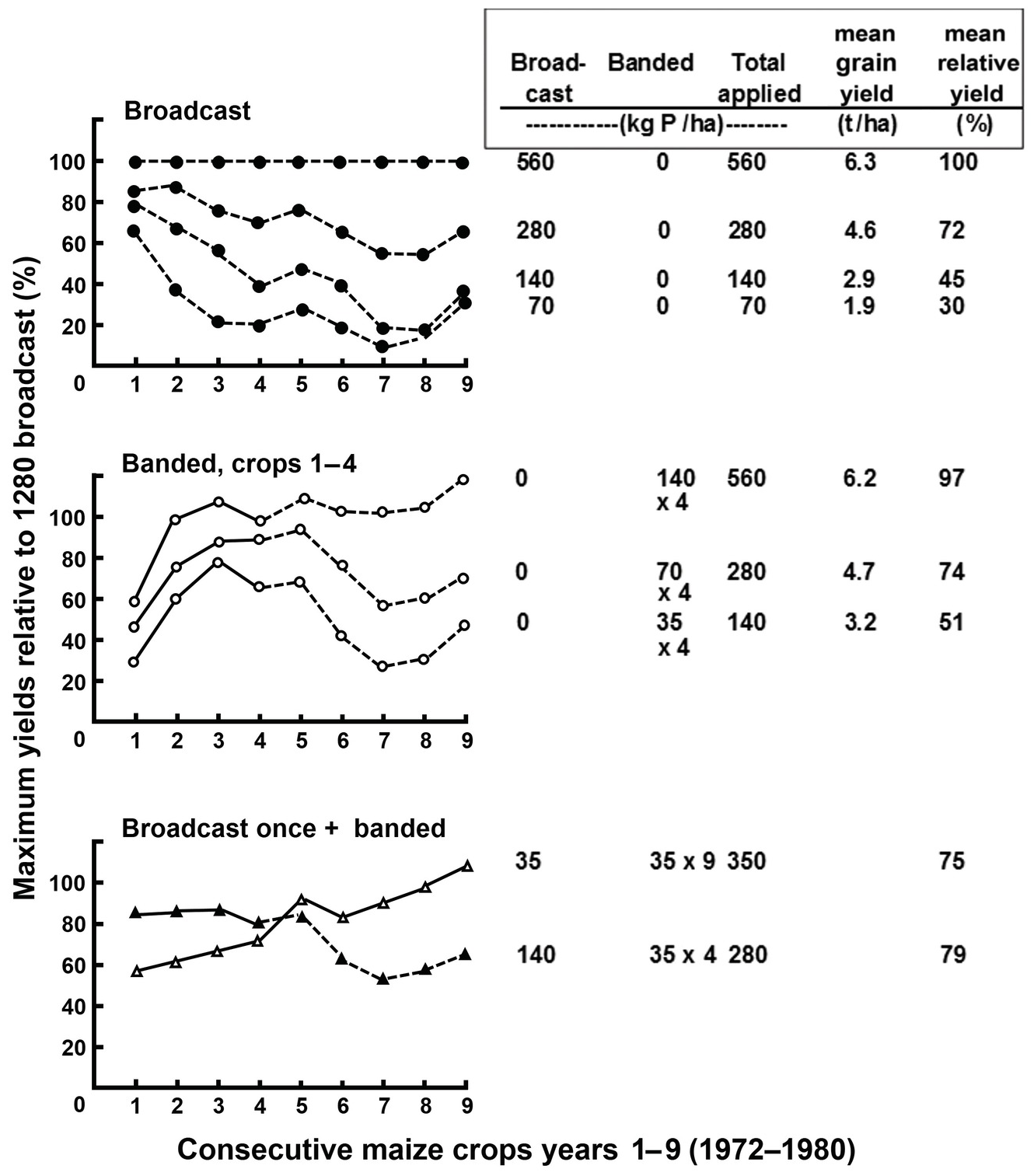
Fig. 14.8 Performance of different phosphorus broadcast and banded strategies on nine consecutive maize crops in a Typic Haplustox in Planaltina, Brazil. The phosphorus source was simple superphosphate. All treatments were limed and fertilized with other nutrients. Without phosphorus, maize yields were zero.
The highest broadcast rate provided the highest maize yields for 9 years, averaging a very respectable 6.3 t/ha, but banding 140 kg P/ha for four consecutive years did just as well (the total rate was the same 560 kg P/ha) achieving 97 percent of the maximum yield. A yield of around 72 percent of the maximum was obtained using two strategies, both totaling 280 kg P/ha, the one-time broadcast application of 280 kg P/ha, or banding 70 kg P/ha to four consecutive crops.
The experiment continued for a total of 13 years, with no additional phosphorus applications, but not all treatments were reported (Table 14.14). de Souza and Lobato (Reference de Sousa, Lobato, Yamada, Stipp and Abdalla2004) reported that the phosphorus recovery by the 13 consecutive crops ranged from 35 percent with the highest rate to 62 percent with the lowest, with the applications totaling 140 kg P/ha or 280 kg P/ha hovering at about 50 percent recovery.
Table 14.14 Continuation of experiment in Fig. 14.8 showing yields and phosphorus recovery. Adapted from de Souza and Lobato (Reference de Sousa, Lobato, Yamada, Stipp and Abdalla2004).
| Phosphorus applied (kg P/ha) | Cumulative maize grain yields in 13 crops (t/ha) | Relative yield for 13 crops (%) | Applied phosphorus recovered by 13 crops | Applied phosphorus remaining in topsoil after 13 crops (kg P/ha) | |||
|---|---|---|---|---|---|---|---|
| Broadcast | Banded | Total | (%) | (kg P/ha) | |||
| 70 | 0 | 70 | 17.3 | 26 | 62 | 43 | 27 |
| 140 | 0 | 140 | 28.1 | 43 | 49 | 69 | 71 |
| 280 | 0 | 280 | 43.8 | 66 | 45 | 126 | 154 |
| 560 | 0 | 560 | 66.1 | 100 | 35 | 196 | 364 |
Applying phosphorus fertilizers in bands is a simple practice that probably satisfies the phosphorus sorption capacity of a small soil volume. It thus makes much of the fertilizer applied directly available to plants. Yost et al. (Reference Yost and Fox1979; Fig. 14.8) found that banded applications concentrated maize root development around the band, and, when a temporary drought struck, plants suffered more than those of the broadcast plots, which showed more extensive root volume.
With continuous cropping and tilling, banded applications are mixed with a greater volume of soil after each tillage operation. In a sense, annual banding begins to approach broadcast applications in terms of phosphorus distribution with time. For soils with high phosphorus sorption capacity the most appropriate scheme is a moderately high initial broadcast application followed by small, banded applications at each subsequent planting.
14.8.5 Managing Direct Applications of Phosphate Rock
For soils with pH < 5.5, with high phosphorus sorption, low exchangeable Ca2+, and low available phosphorus, van Straaten (Reference van Straaten2002) summarized the suitability of phosphate rock for direct application as follows (with additional data for Latin American phosphate rocks from Hammond et al. Reference Hammond, Chien and Mokwunye1986):
For phosphate rocks with high neutral ammonium citrate solubility (> 5.9 percent): Apply directly to most annual and perennial crops. Examples: Minjingu, Tanzania (5.6–12.9 percent); Bayóvar, Peru (18.0 percent); Pesca, Colombia (9.5 percent).
For phosphate rocks of medium to high neutral ammonium citrate solubility (3.4–5.9 percent): Apply directly to low phosphorus-demanding crops like many forage species, sugar cane, tree crops and crops with high effective root volume, like pigeon pea. Example: Tilemsi, Mali (4.5 percent).
For phosphate rocks of low neutral ammonium citrate solubility (< 3.4 percent): Apply directly to tea, perennial tree crops, rape and cabbage. Examples: Hahotoe, Togo (< 3.1 percent); Taiba, Senegal (3.1 percent).
Considering the wide differences in phosphate rock deposits around the tropics, their use will be illustrated by two long-term examples, one using low-reactivity phosphate rocks in Brazil and another with a high-reactivity phosphate rock in Kenya, which included organic inputs.
14.8.6 Brazilian Strategies for Managing Phosphorus Applications in Soils with High Phosphorus Sorption Capacity
Because Brazil’s many phosphate rock deposits are all of low reactivity, Brazilian scientists have done a large number of long-term research projects on how to use these phosphate rocks, usually comparing them to superphosphates and imported high-reactivity phosphate rocks. The relative agronomic efficiency index of phosphate rock (RAEPR), described by Goedert et al. (Reference Goedert, de Souza, Lobato and Goedert1986), is commonly used. (Both phosphate rock and superphosphate in this equation must have the same phosphorus content.)
 (14.9)
In many Brazilian soils this equation is further simplified because the yields without phosphorus are usually zero. Another long-term experiment on the same Oxisol as the one used in Fig. 14.8 is shown in Table 14.15.
Table 14.15 RAEPR values of one high-reactivity phosphate rock (Gafsa from Tunisia) and four Brazilian phosphate rocks, all broadcast once, planted for 5 years with annual crops plus 3 years of the phosphorus-efficient grass Andropogon gayanus in a clayey Oxisol of Planaltina, Brazil. Adapted from Goedert and Lobato (Reference Goedert and Lobato1984).
| Phosphate source | Broadcast rate 87 kg P/ha | Broadcast rate 350 kg P/ha | ||||
|---|---|---|---|---|---|---|
| Annual crops | Andropogon | Total (8 years) | Annual crops | Andropogon | Total (8 years) | |
| RAEPR: | ||||||
| TSP | 100 | 100 | 100 | 100 | 100 | 100 |
| Gafsa phosphate rock | 93 | 110 | 104 | 106 | 106 | 106 |
| Patos de Minas phosphate rock | 45 | 81 | 59 | 56 | 91 | 70 |
| Araxá phosphate rock | 27 | 69 | 41 | 47 | 74 | 58 |
| Abaeté phosphate rock | 21 | 86 | 43 | 47 | 71 | 76 |
| Catalão phosphate rock | 8 | 36 | 17 | 26 | 43 | 33 |
The high-reactivity Gafsa phosphate rock (from Tunisia) performed as well and even slightly better than triple superphosphate throughout the 8 years. All the low-reactivity Brazilian phosphate rocks performed poorly in comparison. Gafsa had 22 percent P solubility in neutral ammonium citrate, while values for the Brazilian phosphate rocks ranged from 4 percent to 7 percent (Lopes Reference Lopes1983). Very importantly, the effectiveness of the Brazilian phosphate rocks increased with time. Except for the highly unreactive Catalão, the other phosphate rocks reached ~ 60–75 percent of the agronomic efficiency of superphosphate with the high broadcast rate, and ~ 40–60 percent at the 87 kg P/ha rate. Even these low-reactivity Brazilian phosphate rocks had a significant residual effect.
Brazilian scientists tried many combinations of their phosphate rocks with superphosphate banded applications. These were summarized by Lopes (Reference Lopes1983) in five strategies depending on how quickly the farmer wishes to achieve 80 percent of the maximum yield, called “target” yield – a worthy concept that is repeatedly advocated in this book. The strategies are all based in the previously mentioned fact which Alfredo Lopes found, that topsoil clay content alone accounted for 92 percent of the variation in phosphorus sorption and release in Oxisols and related Cerrado soils (Lopes and Cox Reference Lopes and Cox1979). The strategies (Lopes Reference Lopes1983, Reference Lopes2016, with some of my modifications) are:
1. Quick response and high investment: Achieve the 80 percent target yield in the second year of application. Broadcast 4–5 kg P/ha for each 1 percent topsoil clay content (180–225 kg P/ha in a clayey Oxisol with 45 percent topsoil clay) with either superphosphate or imported high-reactivity phosphate rock, followed by annual band applications of superphosphates to maintain an adequate soil test level – 12–16 mg P/kg (Mehlich 1) as recommended by de Sousa and Lobato (Reference de Sousa, Lobato, Yamada, Stipp and Abdalla2004) for this clayey soil. Alfredo Lopes feels this is a high investment cost that few farmers can afford. This is what Sanchez et al. (Reference Sanchez, Shepherd, Soule, Place, Buresh, Izac, Mokwunye, Kwesiga, Ndiritu, Woomer, Buresh, Sanchez and Calhoun1997) called a recapitalization strategy for African soils with high phosphorus sorption capacity.
2. Achieve target yield in 4 years: Broadcast 1.5–2 kg P/ha per 1 percent topsoil clay content (67–90 kg P/ha) and annual band applications of superphosphate to maintain an adequate soil test level. Lopes comments that this strategy was widely applied in millions of hectares of Cerrado Oxisols during the 1970s with a credit subsidy for fertilizers (which no longer exists), and many farmers still use it, without subsidies. Another recapitalization strategy is to use Minjingu phosphate rock in East Africa and medium-reactivity Taiba, Hahotoe and Tilemsi phosphate rocks in West Africa at the same rate per 1 percent clay.
3. Achieve target yield in 6 years: Yearly banded applications of superphosphate or high-reactivity phosphate rocks according to crop needs but with a small excess (8–10 kg P/ha). Tillage operations (not no-till) gradually build up soil phosphorus. Suitable to farmers who cannot afford a capital investment.
4. Achieve target yield in 8–10 years: Broadcast 1.5–2 kg P/ha per 1 percent topsoil clay content (67–90 kg P/ha) as finely ground (200-mesh) low-reactivity Brazilian phosphate rocks plus annual banded applications of superphosphate according to crop needs, to gradually build up soil phosphorus. This is good for pastures and perennial crops.
5. “Perpetuate poverty in high phosphorus sorption soils” (Lopes Reference Lopes2016): Small (8–10 kg P/ha), banded phosphorus applications each year to crop or pasture. Should not be used for crop production in Cerrado soils or other soils with high phosphorus sorption capacity.
14.8.7 East African Strategies for Managing Phosphorus Applications in Soils with High Phosphorus Sorption Capacity
Oxisols and related soils in humid and subhumid western Kenya, Uganda, Rwanda, Burundi and eastern Democratic Replublic of Congo have high phosphorus sorption in a similar range to Brazilian soils. The East African soils are not as phosphorus-deficient (2–5 mg P/kg Olsen soil test versus almost zero in the Brazilian Cerrado), so they require a control plot. Also, these East African soils respond to phosphorus rates as low as 10 kg P/ha (Nziguheba et al. Reference Nziguheba, Merckx and Palm2002b). Smallholder farmers tend to use available sources of phosphorus, particularly DAP, high-phosphorus biomass transfers (cut and carry), manures, as well as the high-reactivity Minjingu phosphate rock (Semoka et al. Reference Semoka, Mnkeni and Ringo1992). East Africa has a research tradition of combining inorganic phosphorus fertilizers with organic, plant-derived sources of phosphorus (Palm et al. Reference Palm, Myers, Nwanda, Buresh, Sanchez and Calhoun1997; Jama et al. Reference Jama, Buresh and Place1998, Reference Jama, Palm, Buresh, Niang, Gachengo, Nziguheba and Amadalo2000; Otinga et al. Reference Otinga, Pypers, Okalebo, Njoroge, Emong’ole, Six, Vanlauwe and Merckx2013) and tackling nitrogen and phosphorus deficiencies together (Jama et al. Reference Jama, Buresh and Place1998, Ikerra et al. Reference Ikerra, Semu and Mrema2006). The farming systems are totally different. The Brazilian experience is from large, mechanized commercial farms, while in East Africa we are dealing with smallholder farming (< 1–5 hectares), using little if any mechanization.
A key component of East African strategies are the organic phosphorus resources. Organic leafy inputs can immobilize or mineralize available phosphorus in the soil, with the tipping point being about 0.25 percent P content (Fig. 14.9). Tithonia (Tithonia diversifolia), gliricidia (Gliricidia sepium), soybean and alfalfa (Medicago sativa) mineralize phosphorus, while sesbania (Sesbania sesban), flemingia (Flemingia congesta), calliandra (Calliandra calothyrsus) and neem (Azadirachta indica) leaves and wheat straw immobilize phosphorus. Those that mineralize phosphorus are used in what is called biomass transfers.
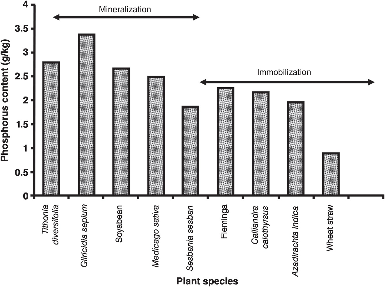
Fig. 14.9 Main organic plant phosphorus resources used in East Africa, grouped according to whether they mineralize or immobilize phosphorus (Nziguheba Reference Nziguheba and Bationo2007).
Jama et al. (Reference Jama, Palm, Buresh, Niang, Gachengo, Nziguheba and Amadalo2000) summarized the literature on tithonia, a shrub of the Asteraceae family. Tithonia diversifolia, the Mexican sunflower, is an amazing tropical resource for smallholder farmers. It is a nutrient accumulator with leaf contents of 4 percent N (even though it is not a legume), very high phosphorus contents (0.2–0.6 percent) and 4 percent K. As mentioned above, tithonia roots acidify their rhizospheres. As indicated in Chapter 13, tithonia is classified as a class 1 organic resource (> 2.5 percent N and < 15 percent lignin), which provides a fast nutrient release, similar to soluble fertilizers. It grows naturally in roadsides from sea level to about 1800 m in humid and subhumid Africa (Fig. 14.10) but not in semiarid climates. It also grows in Latin America where it originated. It is also used as an effective nutrient source for flooded rice and in indigenous fallow systems in Asia and it has been studied in Sri Lanka (Jama et al. Reference Jama, Palm, Buresh, Niang, Gachengo, Nziguheba and Amadalo2000).

Research in acid Oxisols and Inceptisols of Vietnam (Cong and Merckx Reference Cong and Merckx2005; Pypers et al. Reference Pypers, Verstraete, Cong and Merckx2005, Reference Pypers, Bimponda, Lodi-Lama, Lele, Mulumba, Kachaka, Boeckx, Merckx and Vanlauwe2012) showed that tithonia biomass transfers in acid soils temporarily eliminated aluminum toxicity, preventing exchangeable Al3+ from precipitating phosphorus sufficiently to carry a germinating crop over the initial growth when phosphorus is needed the most. (The temporary effect of organic inputs on aluminum toxicity has also been shown in Chapter 9.)
Other species of the Asteraceae family (formerly known as Compositae), such as Lantana camara and Chromolaena odorata probably have similar nutrient accumulation properties. Other species of Asteraceae are abundant in secondary “daisy” fallows in the Peruvian Amazon.
Biomass transfer technologies (Fig. 14.11) are more profitable in high-value crops such as vegetables, and possibly in small-scale organic farming systems. It is not practical to apply tithonia at rates higher than 5 tons of dry mass per hectare on crops in Africa, because of the high labor costs of gathering it from roadsides or field boundaries. This rate provides about 15–20 kg P/ha, which may not be sufficient in soils with high phosphorus sorption capacity, but probably is so in soils with low phosphorus sorption capacity. Nevertheless, nutrient accumulators like tithonia can play a strategic role in the management of soils in the tropics. The following information shows examples of the use of tithonia in Africa.
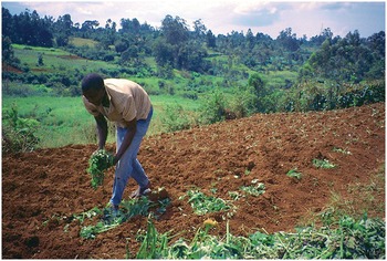
Fig. 14.11 Farmer transferring tithonia biomass to planting holes after cutting branches from the roadside in the previous photo. The greatest limitation of biomass transfer technologies is high labor costs.
One strategy is to combine tithonia with phosphorus fertilizers. Nziguheba et al. (Reference Nziguheba, Merckx, Palm and Mutuo2002a) did that using one low phosphorus rate (15.5 kg P/ha) applied as NPK fertilizer and tithonia alone or in combination with several proportions of the two inputs. All treatments received enough nitrogen and potassium, so they would not be limiting and these eutric Oxisols were not aluminum-toxic.
Table 14.16 indicates that maize yields were low, reaching about 2 t/ha, no doubt because of the low phosphorus rates used. Maize yields increased with the increasing proportion of phosphorus from tithonia in the mixture. The highest yield was obtained with all the phosphorus applied as tithonia. This was not significantly different from the application of 1.8 t/ha + NPK (36 percent tithonia-P), but both were significantly higher than the yields with NPK alone. This led Nziguheba et al. (Reference Nziguheba, Merckx, Palm and Mutuo2002a) to recommend the proportion of one-third tithonia-P in the mixture as the most advantageous in terms of gains in yields, cost-benefits and availability of tithonia. The relative agronomic efficiency and phosphorus recovery will be discussed below.
Table 14.16 Effects of tithonia and NPK combinations on maize yields, RAEP and recovery of two consecutive maize crops plus two residual crops in an Oxisol of western Kenya. SED = standard error of the difference. Adapted from Nziguheba et al. (Reference Nziguheba, Merckx, Palm and Mutuo2002a).
| Treatments T = tithonia (t/ha) | kg P/ha added | Phosphorus from Tithonia (%) | Average yields (t/ha) | Applied phosphorus recovered by four crops | Applied phosphorus remaining in topsoil after four crops | Net benefits (US $/ha) | ||
|---|---|---|---|---|---|---|---|---|
| Tithonia | NPK | (RAEP)a | (kg P/ha) | (kg P/ha) | ||||
| N and K | 0 | 0 | 0 | 0.82 | - | 0 | 0 | –448 |
| NPK | 0 | 15.5 | 0 | 1.86 | 28 | 4.3 | 11.2 | 50 |
| NPK + T (0.45) | 1.4 | 14.1 | 9 | 1.75 | 30 | 4.7 | 10.8 | 270 |
| NPK + T (0.9) | 2.8 | 12.7 | 18 | 1.90 | 39 | 6.0 | 9.5 | 365 |
| NPK + T (1.8) | 5.6 | 9.9 | 36 | 2.06 | 36 | 6.0 | 9.5 | 457 |
| NPK + T (3.6) | 11.2 | 4.3 | 72 | 1.94 | 28 | 4.3 | 11.2 | 329 |
| Tithonia (4.8) | 15.5 | 0 | 100 | 2.22 | 41 | 6.4 | 9.1 | 539 |
| SED | 0.16 | 9 | ||||||
a 
Nziguheba et al. concluded that a high-quality organic input such as tithonia can increase maize production to a greater extent than fertilizers at low phosphorus application rates, and that there was a positive interaction in the mixture of organic and mineral phosphorus fertilizers in economic terms, especially with a high proportion of the phosphorus added as tithonia.
Another dimension of the East Africa strategy is to combine tithonia with high-reactivity phosphate rocks and triple superphosphate at high P rates. This was done by Jama and Kiwia (Reference Jama and Kiwia2009), in a 5-year experiment on another Oxisol of western Kenya. They applied a recapitalization or corrective application rate of 250 kg P/ha as Minjingu phosphate rock and triple superphosphate once, and annual broadcast applications of 50 kg P/ha per year, with a cumulative 5-year total equal to the corrective rate. They also compared these treatments with two sources of nitrogen, urea and tithonia, both applied at a rate of 60 kg N/ha per year, which, in the case of tithonia, also added about 6 kg P/ha per year or 30 kg P/ha in the 5-year period (Table 14.17).
Table 14.17 Effect of high-input strategies, comparing two phosphorus sources, two application strategies and the effect of tithonia for 5 years in an Oxisol with high phosphorus sorption capacity (Kandiudalfic Eutrudox) in western Kenya, topsoil pH = 5.1, clay = 29 percent, Modified Olsen soil test P = 2 mg/kg, Ps to reach 0.2 mg/L PL = 500 kg P/ha). Adapted from Jama and Kiwia (Reference Jama and Kiwia2009).
| Nitrogen applied (60 kg N/ha/crop) | No phosphorus | Broadcast once (250 kg P/ha) | Annual 50 kg P/ha | ||
|---|---|---|---|---|---|
| Triple superphosphate | Minjingu phosphate rock | Triple superphosphate | Minjingu phosphate rock | ||
| Average maize grain yield (t/ha) | |||||
| Urea | 0.9 | 3.8 | 3.7 | 3.7 | 3.5 |
| Tithonia | 1.9 | 4.1 | 3.9 | 4.0 | 3.8 |
| Percentage relative yield (100 = TSP 250 + 30 kg P/ha tithonia) | |||||
| Urea | 22 | 93 | 91 | 92 | 85 |
| Tithonia | 48 | 100 | 96 | 98 | 93 |
| Percentage marginal rate of return to capital (US $/ha)a | |||||
| Urea | 10 | 145 | 99 | 125 | 149 |
| Tithonia | 154 | 97 | 117 | 88 | 109 |
a [Gross benefit – Labor cost/Capital cost] × 100. TSP = triple superphosphate.
Maize yields averaged about 4 t/ha, about twice that of Table 14.16 with a low phosphorus rate. There were no significant differences between triple superphosphate and Minjingu phosphate rock at either fertilization strategy. When tithonia was used yields increased but again the differences with urea were not significant, except at the zero phosphorus where tithonia doubled yields. The relative yields showed a similar trend, with all treatments with tithonia being slightly higher, but at the zero phosphorus rate tithonia alone produced almost half the yield of the phosphorus treatments, in sharp contrast with urea. The marginal rates of return to capital (including a 20 percent annual interest rate) were high with all phosphorus treatments, somewhat lower with tithonia, because of the labor costs. Tithonia with no phosphorus applied had the highest returns to capital but low yields.
This experiment also shows that Minjingu phosphate rock can be as profitable as TSP, showing what a high-reactivity phosphate rock, directly applied to a pH 5.1 soil with high phosphorus sorption capacity, can do.
The effects of phosphate rock plus cattle manures or composts made from smallholder farms and household refuse depend on the reactivity of phosphate rocks. A review of research on the combination of phosphate rocks and organic inputs indicates that high-quality manure inputs (C:P ratios < 150) increased the solubility of low-reactivity phosphate rocks, but decreased or did not affect the solubility of high-reactivity rocks, apparently because of the calcium contained in the phosphate rocks and in the organic inputs, which increases soil pH and thus decreases the dissolution of phosphorus from the rocks (Nziguheba Reference Nziguheba and Bationo2007). It is worth remembering that when poultry manure is used, it has such a low N:P ratio that when trying to apply the correct amount of nitrogen, there may be excess phosphorus applied.
14.9 Residual Effects and Efficiency of Utilization
Unlike mineral nitrogen fertilizers that have a short residual effect or none at all, phosphorus fertilizers – mineral or organic – can have long residual effects, because of the phosphorus sorption and release processes.
The parameters used for nitrogen, nitrogen recovery (REN) and agronomic use efficiency (AEN) in Chapter 13 are not directly applicable to phosphorus, unless they are calculated for several consecutive crops to estimate the residual effect. Unlike nitrogen where 15N is a stable isotope, phosphorus isotopes are not; the half-lives of 32P and 33P, 14.3 and 25.4 days, respectively, makes their use difficult (Syers et al. Reference Syers, Johnston and Curtin2008). Hence, their use is restricted to confined, short-term experiments, and rarely in the field.
The percentage of phosphorus recovery (REP) becomes more relevant when the residual effect of several crops is calculated. The formula to be used is given in Eq. 14.10:
 (14.10)
where Uf is the phosphorus uptake by a phosphorus fertilization treatment, Uc is the phosphorus uptake by the control; numbers 1 … n are the consecutive crops and F is the sum of phosphorus fertilizer added during the trial. All units are in kg P/ha.
Only 10–20 percent of the phosphorus fertilizer applied is generally recovered by the first crop (Syers et al. Reference Syers, Johnston and Curtin2008) leaving the rest in the soil, assuming no losses from runoff and erosion. The second crop recovers only 20–80 percent of that which the first crop did (Hedley and McLaughlin Reference Hedley, McLaughlin, JT Sims and Sharpley2005); that amounts to an additional 2–16 percent recovered, so the total phosphorus recovery of the first two crops ranges from 12 percent to 36 percent.
Equation 14.11 is used to estimate the amount of residual (also called legacy) phosphorus remaining in the topsoil, called, for lack of a better symbol, RRP:
or their equivalents in kg P/ha.
14.9.1 Phosphorus Balance Studies
Four phosphorus balance studies, using the above parameters, give a good idea of the magnitude of the residual phosphorus that stays in agricultural soils.
Sattari et al. (Reference Sattari, Bouwman, Giller and van Ittersum2012) reported residual effects of added phosphorus at the global scale; they calculated the inputs in inorganic fertilizers and manure, and the phosphorus removed by crop harvests every year as outputs. Absent from their calculation were phosphorus removals by livestock production and by runoff and erosion as well as phosphorus added as mineral salts for livestock. In spite of these limitations Sattari and co-workers provide a global picture of residual soil phosphorus that accumulated in world soils during a 40-year period.
Table 14.18 shows the enormous amounts of phosphorus that accumulated in soils, ranging from 215 kg P/ha during 40 years in Africa and North America to 820 kg P/ha in Western Europe during the same time span, where large quantities of manure were added.
Table 14.18 Residual soil phosphorus estimates calculated from data by Sattari et al. (Reference Sattari, Bouwman, Giller and van Ittersum2012) for different regions of the world. Cumulative values for 1967–2007.
| Region | Phosphorus added as fertilizer and manure | Phosphorus recovery by crop harvests | Residual (legacy) phosphorus remaining in soil | Percentage phosphorus recovery, REP | Percentage residual phosphorus, RRP |
|---|---|---|---|---|---|
| (kg P/ha per year over 40 years) | |||||
| Africa | 320 | 105 | 215 | 66 | 34 |
| North America | 465 | 250 | 215 | 54 | 46 |
| Latin America | 980 | 250 | 730 | 26 | 74 |
| Eastern Europe/Former Soviet Union | 430 | 120 | 310 | 28 | 72 |
| Asia (south and east) | 690 | 250 | 440 | 36 | 64 |
| Oceania | 560 | 100 | 460 | 18 | 82 |
| Western Europe | 1170 | 350 | 820 | 30 | 70 |
| World | 4615 | 1425 | 3190 | 31 | 69 |
For Africa as a whole, the phosphorus inputs were the same for fertilizers as from manure (in 1965, 0.2 Tg P per year each), but phosphorus fertilizer doubled (0.4 Tg P per year) and phosphorus manure (0.6 Tg P per year) tripled in 2007. In south and east Asia, phosphorus fertilizer increased from 0.8 Tg P in 1965 to 10 Tg per year in 2007, while manure increased from 2 to 4.5 Tg P per year, very likely the effect of the Asian Green Revolution. Sattari et al. (Reference Sattari, Bouwman, Giller and van Ittersum2012) indicated that global phosphorus recovery by plants increased with time, from 30 percent in 1961 to ~ 45 percent in the 2000s, except in Africa. The bottom line of this study is that 69 percent of the applied phosphorus remained in the soil.
A second global balance study was calculated from the crop side and only for 1 year, providing a snapshot. MacDonald et al. (Reference MacDonald, Bennett, Potter and Ramankutty2011) used 123 crops and cultivated pastures during the year 2000. Their results indicate that the global inputs of fertilizer (14.2 Tg P) and manures (9.6 Tg P) exceeded the global removal of phosphorus by crop harvests (12.3 Tg P). This provided an additional 11.5 Tg P to the residual soil pool, which is 48 percent of what was added to the soil that year. MacDonald et al. also found that about 70 percent of the cropland and cultivated pastures had a positive phosphorus balance and the remaining 30 percent had a negative (depleting) balance. The geographic distribution of phosphorus balances is shown in Fig. 14.12.

Fig. 14.12 Phosphorus balances during the year 2000, expressed in kg P/ha per year at a 50 × 50 km resolution (MacDonald et al. Reference MacDonald, Bennett, Potter and Ramankutty2011).
According to this impressive map, the largest positive balances in tropical Latin America were found in Brazil, Ecuador, Colombia and Venezuela, but surpluses occurred throughout the region, except for large deficits in parts of Paraguay and Bolivia, with smaller deficits in Cuba, Haiti, parts of southern Mexico and northeast Brazil.
In tropical Asia, enormous surpluses were found in China (both tropical and temperate parts), Vietnam and most of India, Bangladesh and Thailand. Only a few areas showed deficits, including Myanmar, Malaysia, New Guinea and parts of Australia.
Tropical Africa showed small areas of large surpluses in Ethiopia, South Sudan, Tanzania, Malawi, Zimbabwe, Angola and South Africa, but MacDonald et al. (Reference MacDonald, Bennett, Potter and Ramankutty2011) indicated that although such surplus areas appear to be widespread, they actually cover less than 2 percent of Africa’s cropland, including, I assume, large commercial farms. The map also shows small deficits throughout tropical Africa.
The temperate region shows large phosphorus surpluses in China, Japan, Pakistan, South Korea, Chile, Uruguay, much of Western Europe, the eastern seaboard of the United States and California. There are moderate surpluses elsewhere in the temperate zone, except for depletion in Eastern Europe and Russia and extreme depletion in Argentina and parts of the northern United States.
MacDonald et al. (Reference MacDonald, Bennett, Potter and Ramankutty2011) also noted that cereal crops accounted for about 50 percent of the phosphorus fertilizers and manure applied in the year 2000. This is much lower than the share of nitrogen inputs applied to cereal crops, indicating a more even application of phosphorus across the many farming systems.
A third balance study compared examples of subnational regions known for their surpluses and deficits (Table 14.19). Vitousek et al. (Reference Vitousek, Naylor, Crews, David, Drinkwater, Holland, Jones, Katzenberger, Martinelli, Matson, Nziguheba, Ojima, Palm, Robertson, Sanchez, Townsend and Zhang2009) observed enormous phosphorus surpluses in the North China Plain, amounting to 90 kg P/ha per year, a great pollution potential for runoff and erosion to waters in these loess soils (Alfisols and Mollisols) with low sorption capacity. The second region, the US Midwest, is responsible for the eutrophication in the Mississippi River and the anoxic “dead” zones in the Gulf of Mexico. But the data presented actually show a negative phosphorus balance, after the effective environmental controls put in place in this region over the past 20 years. The third region, western Kenya, shows a small phosphorus accumulation, as opposed to the nitrogen depletion shown in Chapter 13. The current rapid increase in phosphorus fertilization in this region is likely to increase phosphorus accumulation by the dominant Oxisols, Ultisols and reddish Alfisols.
Table 14.19 Phosphorus balances in three contrasting regions. Adapted from Vitousek et al. (Reference Vitousek, Naylor, Crews, David, Drinkwater, Holland, Jones, Katzenberger, Martinelli, Matson, Nziguheba, Ojima, Palm, Robertson, Sanchez, Townsend and Zhang2009) and unpublished data for Kenya.
| North China Plain | United States Midwest | Western Kenya | |
|---|---|---|---|
| kg P/ha per year | |||
| Inputs: | |||
| Mineral fertilizer | 92 | 14 | 8 |
| Manure | 18 | 2 | 0.5 |
| Total: | 110 | 16 | 8.5 |
| Outputs: | |||
| Grain harvest removal | 20 | 23 | 4 |
| Stover removal | – | – | 3 |
| Total: | 20 | 23 | 7 |
| Balance | +90 | –7 | +1.5 |
The fourth “study” is my compilation of eight well-run studies from the literature, ranging from 2 years’ to 145 years’ duration. Table 14.20 summarizes the various data sets.
Table 14.20 Applied phosphorus recovery and accumulation in the soil of different long-term trials. Locations with more than one line correspond to different rates of applied phosphorus.
| Soil, topsoil texture, location, reference, phosphorus sorption (high if > 100 kg P/ha is needed to reach 0.01 mg/L PL in soil solution), number of applications, crops | Treatments | Years | Total phosphorus applied | Applied phosphorus recovered by crops | Applied phosphorus remaining in topsoil (legacy phosphorus) | |||
|---|---|---|---|---|---|---|---|---|
| Mineral | Organic | |||||||
| kg P/ha | (REP) | (kg P/ha) | (RRP) | kg P/ha | ||||
| Clayey Rhodic Eutrudox, pH 5.4; western Kenya; Nziguheba et al. (Reference Nziguheba, Merckx, Palm and Mutuo2002a) (Table 14.16); high phosphorus sorption; maize (–P control not subtracted) | NPK | 2 | 15.5 | 4.3 | 28 | 11.2 | 72 | 8.6 |
| Tithonia | 15.5 | 6.4 | 41 | 9.1 | 59 | 10.7 | ||
| Sandy Alfisol (Psammentic Paleustalf), pH 5.1; Sadoré, Niger, calculated from data by Bationo (Reference Bationo2008), insignificant phosphorus sorption; one application; millet; no control | SSP (mean of broadcast treatments) | 2 | 8.2 | 6.5 | 79 | 1.7 | 21 | 13.0 |
| Clayey Typic Palehumult, pH 4.8; Hawaii; Linquist et al. (Reference Linquist, Singleton, Cassman and Keane1996); high phosphorus sorption; one application for 4 years; soybean–maize; control not subtracted | 4 years fertilized +3 residual years | 7 | 155 | 82 | 53 | 73 | 47 | 164 |
| 930 | 145 | 73 | 785 | 27 | 290 | |||
| Sandy, Oxic Paleustult; Maravilhas, Pernambuco, Brazil; Ball-Coelho et al. (Reference Ball-Coelho, Salcedo, Tiessen and Stewart1993); low phosphorus sorption; several applications; sugar cane |
| 10 | 260 | 104 | 41 | 154 | 59 | 210 |
| Clayey Typic Haplustox, Planaltina, Brazil; de Souza and Lobato (Reference de Sousa, Lobato, Yamada, Stipp and Abdalla2004), Table 14.14; high phosphorus sorption; one application | TSP maize | 13 | 70 | 43 | 61 | 27 | 39 | 86 |
| 560 | 196 | 48 | 364 | 52 | 392 | |||
| Sandy Typic Paleudult, pH 3.9; Yurimaguas, Peru; calculated from Beck and Sanchez (Reference Beck and Sanchez1994); low phosphorus sorption; rice, maize, soybean | Full fertilizer yearly to annual rotation minus control | 18 | 1420 | 662 | 37 | 758 | 63 | 1324 |
| Sandy, calcareous soil, pH 8.7; Ludhiana, Punjab, India; Aulakh et al. (Reference Aulakh, Kabba, Baddesha, Bahl and Gill2003); low phosphorus sorption; yearly applications | Peanut summer crop rotated yearly with winter crops | 25 | 231 | 124 | 30 | 107 | 70 | 248 |
| 426 | 177 | 41 | 249 | 59 | 354 | |||
| 621 | 263 | 40 | 358 | 60 | 526 | |||
| Silty clay loam, Alfisol, pH 7; exhaustion land, Rothamsted, UK; Syers et al. (Reference Syers, Johnston and Curtin2008); low phosphorus sorption; annual crops, wheat, potatoes, barley 46 years (1856–1901), fertilized with 1410 kg P/ha, followed by none for 99 years (1902–2001) | Phosphorus fertilizer minus control (–P) | 145 | 1410 | 584 | 41 | 824 | 59 | 1170 |
This table is comprised of soils of different texture, mineralogy, SOM and phosphorus sorption levels. It includes trials with a residual effect after stopping phosphorus applications, as well as those where phosphorus applications were frequent, mostly yearly. From this disparate evidence, the following conclusions can be made:
Phosphorus fertilizer recovery by crops averaged 58 percent, ranging from 28 percent to 79 percent without a trend of decreasing recovery with increasing rates of application, which is commonly the case. The low number of trials (13) may be the reason for this.
Crops on soils with clayey textures generally recovered more fertilizer phosphorus than those with sandy textures, although there were some exceptions. Crops on clayey soils with variable charge (Oxisols and Ultisols in this table) had recovery values in a similar range to crops on clayey soils with permanent charge.
Regardless of soil, texture, mineralogy or length of trial, the median RRP value was 59 percent, with only 3 out of 13 trials showing values lower than 40 percent. The standard deviation is ±15. These values assume negligible runoff, erosion and leaching losses.
Even with 99 years since the last application of phosphorus fertilizer, in the classic exhaustion trial at Rothamsted, UK, almost 59 percent of it remained in the soil (coincidentally the same as the median value).
The legacy phosphorus, therefore, is a very significant amount. Let’s calculate it. Total world phosphorus fertilizer inputs (mineral and organic) totaled 23.8 Tg P in the year 2000 (MacDonald et al. Reference MacDonald, Bennett, Potter and Ramankutty2011). Assuming the average phosphorus remaining in the soil is 59 percent, the legacy phosphorus represents 17 Tg P remaining in the soil that year. As indicated in Fig. 14.3, 140 Tg of phosphate rock were extracted every year in the early 2000s. Assuming an average content of 13 percent P in phosphate rock, this amounts to 18.2 Tg P per year. Therefore, legacy phosphorus remaining in the soil from mineral and organic fertilizer additions, 17 Tg P is equivalent to 93 percent of the annual phosphate rock extraction. In other words, the amount of legacy phosphorus in the soil is about nine-tenths of what we mine as phosphate rock annually.
So, what happens to this truly residual phosphorus? It is definitely not lost, because it stays in the soil, mainly in the topsoil, probably in the more recalcitrant Pi and Po fractions. The only fractionation dynamics exercise I was involved with was the 18-year field trial in Yurimaguas, Peru, in the same sandy Ultisol (Beck and Sanchez Reference Beck and Sanchez1994, Reference Beck and Sanchez1996). About 80 percent of the increases in total phosphorus in the fertilized treatment were accounted for by the increases in five Hedley fractions: sorbed (NaOH-extractable) Pi; slow Po (NaOH-extractable Po); passive (sonic) Po; Ca-Pi (HCl-extractable) and residual (H2SO4-extractable) Pi, shown in Table 14.21. The remaining increases were in the labile Pi fraction and soil solution Pi, with decreases in the active Po (bicarb Po). It will vary in other soils, but it seems reasonable that what stays is in the more recalcitrant fractions.
Table 14.21 Changes in topsoil Hedley fractions after 18 years of continuous cultivation of an annual upland rice–maize--soybean rotation (38 crops) with complete fertilization and liming (+F), and without fertilization (0) -- the control plot, on a Typic Paleudult of Yurimaguas, Peru. Both plots received 23 kg P/ha after slash and burn (time 0) – 6 kg P/ha from ash, 7 kg P/ha from below-ground biomass and 10 kg P/ha from unburned above-ground biomass (Sanchez et al. Reference Sanchez, Palm, Smyth, Tiessen, Lopez-Hernandez and Salcedo1991). The control plot also received one accidental application of 80 kg P/ha, totaling 103 kg P/ha, while the fertilized plot received 1458 kg P/ha in 18 years. Simple superphosphate was the phosphorus fertilizer used. Topsoil depth sampled was 0–15 cm at time 0 and 0–20 cm at 18 years. Laboratory determinations were converted to kg P/ha considering the depth change. Recalculated from Beck and Sanchez (Reference Beck and Sanchez1994).
| Fractions | Method | Time 0 | Change in 18 years | |
|---|---|---|---|---|
| +Fertilizer | 0 | |||
| (kg P/ha) | ||||
| Inorganic: | ||||
| Soil solution Pi | Resin Pi | 4 | +12 | –1 |
| Labile Pi | Bicarb Pi | 10 | +35 | +3 |
| Sorbed Pi | NaOH Pi | 24 | +82 | –9 |
| Primary min | Sonic Pi | 2 | +9 | +6 |
| Ca-Pi | 1 M HCl Pi | 0 | +8 | 0 |
| Residual Pi | H2SO4 Pi | 76 | +76 | +38 |
| Total Pi | Sum | 116 | +222 | +37 |
| Organic: | ||||
| Active Po | Bicarb Po | 24 | –5 | –5 |
| Slow Po | NaOH Po | 64 | +34 | +5 |
| Passive Po | Sonic Po | 10 | +11 | +6 |
| Total Po | Sum | 98 | +40 | +6 |
| Total P | Sum | 214 | +262 | +43 |
| Total residual: H2SO4 Pi + HCl Pi+ NaOH Pi +NaOH Po + sonic Po | 174 | +197 | +38 | |
| RRP (remaining in the soil – legacy phosphorus 1) | 75 | 88 | ||
| Additional data: | ||||
| Total phosphorus added (kg P/ha) | 23 | 1458 | 103 | |
| Harvest removal (kg P/ha) | 700 | 38 | ||
| Phosphorus remaining in topsoil (kg P/ha) | 758 | 65 | ||
| RRP (remaining in the soil – legacy phosphorus 2) | 52 | 63 | ||
Table 14.21 shows data from this tropical version of an exhaustion trial. In the control plot, yields went down to zero in the third crop and stayed so for the rest of the 18-year trial (Sanchez et al. Reference Sanchez, Villachica and Bandy1983). Still, there was a small increase in total phosphorus (43 kg P/ha) in the control plot.
This sandy loam soil was very acid (pH 3.9) with low soil fertility and variable charge under a high-rainfall, humid tropical climate. The Rothamsted exhaustion trial was in a clayey, fertile Alfisol (pH 7) with permanent charge in a humid temperate environment. It continued to produce crops throughout the 99-year period (Syers et al. Reference Syers, Johnston and Curtin2008). This shows the extremes – the acid, infertile soil stereotype of the tropics and the younger, fertile soil that is stereotypic of the temperate zone. (As mentioned above there are wide variations between these extremes in both tropical and temperate regions.) I do not know of any data from soils of either high or low phosphorus sorption capacity where all the phosphorus added was totally released to crops.
Table 14.21 also shows two ways of calculating legacy phosphorus, the first one, using the Hedley fractionation and the second the balance approach. The Hedley fractionation method gives a higher percent legacy phosphorus (72–88 percent) than the balance method used in other studies (52–63 percent). Additional research may explain why, but since the Hedley fractionation involves sequential extractions it may be subject to more errors, as Roel Merckx indicated earlier in this chapter.
14.9.2 Increasing Phosphorus Use Efficiency and Decreasing Environmental Damage
There is no question that the world’s cropland soils are being loaded with phosphorus. Is this good or bad? It is bad if much of this phosphorus is lost by runoff and erosion, entering water bodies, which may result in eutrophication. It is good, however, if part of that residual stock can be made available to plants, lowering the fertilizer needs and thus the rate of phosphate rock extraction. The question of how this enormous resource is used requires innovative research. Several possibilities exist.
The first and most obvious one is to use more realistic methods for determining the optimum rates of phosphorus required, such as the Linear Response and Plateau model as described in Chapter 12 over the quadratic methods, because the recommended rates are much lower (Anderson and Nelson Reference Anderson and Nelson1975). We have learned in this chapter that the recovery of applied phosphorus by plants decreases with increasing rates of application. MacDonald et al. (Reference MacDonald, Bennett, Potter and Ramankutty2011) found the same relationship in their metadata study. Again, this is the advantage of being where the linear part meets the plateau part of the yield response function. Phosphorus application rates can decrease by significant amounts without yield decreases. Sattari et al. (Reference Sattari, Bouwman, Giller and van Ittersum2012) made this point forcefully.
The second is to use crop cultivars that are more efficient in phosphorus acquisition, further lowering the rates of phosphorus fertilizer to apply. Brazilian breeders have done this with maize, lowering the critical soil test level from 20 to 5 mg/kg Mehlich 1 P.
The third is to find out how to mobilize the half of the residual phosphorus that plants are not able to take up over decadal time scales. This is a major research question.
The fourth is to prevent runoff and erosion losses of phosphorus. This includes farm fields fertilized with phosphorus, not only inorganic sources but particularly manure applications. Soil conservation structures are a good option in fields subject to runoff by intense rainfall, particularly after the applications of phosphorus fertilizers and manures. This is also the case where fertile farmland is being transformed into housing developments, roads and industrial sites.
The fifth is to reverse the uncoupling of ruminant animals no longer able to graze from pastures. Livestock are now spending fattening periods in confined animal feeding operations (CAFOs). Manure piles (or sometimes small mountains) accumulate, unprotected near CAFOs of both ruminants and monogastric livestock. Much of this manure is land-applied, repeatedly, to fields close to the feeding facilities, leading to large phosphorus surpluses. Such fields mineralize lots of phosphorus, which will probably end up in surface waters. Cattle return most of the phosphorus they eat as feces and urine. Under grazing, this is a very efficient recycling system that really benefits the soil and avoids manure being accumulated as a waste product (see Chapter 18).
The sixth is improving the phosphorus capture in sewage sludge treatment plants, using iron and aluminum oxides to retain phosphorus and take it out of the sludge. Pattnaik et al. (Reference Pattnaik, Yost, Porter, Masunaga and Attanandana2008), working on how to minimize phosphorus levels from occasional overflows of dairy effluents in Hawaii, found innovative systems that eliminated a high percentage of phosphorus from such effluents.
Finally, something that is now regulated in rich countries: and that is decreasing the phosphorus content of detergents and other domestic chemicals.
14.10 Summary and Conclusions
Phosphorus is a complicated subject in soil science and particularly so in the tropics. Contrary to carbon and nitrogen cycles, which are basically organic, phosphorus involves both organic and inorganic stocks. Some reactions are very fast, some very slow, and many of them are not well understood.
Phosphorus deficiencies in relation to plant needs are very common in the tropics. In large areas of tropical South America (Cerrado, Llanos) and Africa (Sahel), phosphorus is the first nutrient deficiency that has to be corrected in agriculture, ahead of nitrogen.
Phosphorus Cycling
The global phosphorus cycle is different from those previously described in that the cycle exists only at a geologic time scale. Tectonic uplift in geologic time raises apatite-rich phosphate rocks to land and continental shelves at an annual rate of 111–185 Tg of phosphate rock per year. This is within the range of the world’s annual extraction rate of phosphate rock, currently estimated at 140 Tg of phosphate rock per year.
There is no phosphorus cycle at the human time scale, because we have one source (phosphate rock) and one sink (marine sediments) without a feedback loop to make it a cycle. Much of the phosphorus that is added to the soil tends to remain there, often building up large residual stocks in the soil, part of which stays there for the long term.
Soil Stocks and Flows
Between the source and the sink there are many phosphorus fractions or pools, inorganic and organic. These stocks are connected by several opposite fluxes: dissolution–precipitation; sorption–desorption; mineralization–immobilization; decomposition of organic inputs–plant uptake. In addition there are several one-way physical transfers: harvest removals of crop and livestock products, crop residue returns, manures, fertilizer applications, erosion and runoff to surface waters, and sewage.
With phosphorus, the focus is on the topsoil because phosphate ions are strongly held there (except in sandy soils) and this is where the sorption of fertilizer phosphorus occurs.
The primary soil mineral fraction is present in the sand and silt fractions. Apatites and other minerals are slowly dissolved by the soil’s acidity and organic acid secretions from soil microorganisms, roots and mycorrhizae. The resulting phosphate anions are short-lived in the soil solution because they are rapidly sorbed as secondary phosphorus minerals or immobilized by microorganisms in soil organic matter (SOM). This is the origin of soil organic phosphorus (SOP).
The secondary phosphorus minerals that are formed in the soil are grouped into three active fractions and one recalcitrant fraction in terms of their solubility. In decreasing order of solubility they are calcium-bonded phosphates, which are more prevalent in neutral to calcareous soils, aluminum-bonded phosphates and iron-bonded phosphates, both of which are most common in acid soils. The least soluble is the residual Pi (i = inorganic) fraction, considered the sum of occluded and reductant-soluble fractions. The transformation of one fraction of secondary inorganic phosphorus into another is controlled mainly by soil pH and calcium, in the soil solution. As soils become more acid, the activity of iron and aluminum increases and the relatively soluble calcium phosphates are converted into less soluble aluminum and iron phosphates.
Organic phosphorus is variable in soils of the tropics. Organic phosphorus mineralization is the main flux supplying soil solution phosphorus to plants in natural systems, but not in fertilized agricultural systems. Most SOP compounds are bonded to oxygen in ester bonds (–C–O–P). More than half of the organic phosphorus is composed of monoesters, mainly inositol phosphate (phytate). Phosphate ester bonds can be readily broken by one extracellular enzyme, phosphatase, which is produced by microorganisms, roots and mycorrhizae. Iron oxides sorb inositol phosphates more strongly than phosphate anions, perhaps protecting them from enzyme attacks.
When fertilizing annual crops, only 3–10 percent of the applied phosphorus becomes organic phosphorus. Pastures convert more (5–30 percent) and perennial crops, agroforestry and forestry plantations the most (17–44 percent).
The Hedley sequential fractionation of both Po and Pi fractions has become useful in the tropics, although some scientists think otherwise.
Phosphorus Sorption
Phosphorus sorption (ex-fixation, ex-retention) is the transformation of phosphorus in the soil solution into solid, sparingly soluble forms of phosphorus on the surface of soil clays by processes that make them not readily available to plants.
Three mechanisms of phosphorus sorption by soils are recognized: precipitation, in three-dimensional amorphous or crystalline solids such as calcium phosphates; adsorption, in two-dimensional films or sheets where phosphate ions are chemically bonded to reactive surfaces of soil clays; and absorption, a slow, continuing reaction, where phosphate anions penetrate into the matrix of iron and aluminum oxides. Some scientists suggest that the slow reaction is the formation of a second bond of a phosphorus molecule to an oxide surface.
The latter two processes are collectively called sorption in the soils literature, or sometimes the fast and slow reactions. Dissolution is the opposite process of precipitation while desorption is the opposite process of sorption.
In alkaline soils (> pH 7) phosphate ions are precipitated by calcium and magnesium as relatively insoluble compounds, which are slowly dissolved by organic acids.
Fox and Kamprath developed the most widely used analytical procedure for developing phosphorus sorption curves. The amount of phosphorus sorbed (PS) to give a soil solution concentration of 0.2 mg P/L PL was then considered the agronomically relevant estimate of phosphorus sorption. Data presented in this chapter suggest a concentration of 0.01 mg/L PL or lower fits better to provide 80 percent of the maximum crop yields and is well related to the critical levels of many phosphorus soil tests.
High phosphorus sorption can be estimated in the field for topsoils using two attributes of the Soil Functional Classification (FCC) system.
Phosphorus sorption largely depends on the three core soil properties: texture, mineralogy and SOM. Phosphorus sorption increases with increasing clay content. Clayey soils with permanent-charge mineralogy have little phosphorus sorption, those with kaolinitic and oxidic mineralogy have high phosphorus sorption levels and those with allophanic mineralogy have the highest. Among the kaolinitic and oxidic mineralogies, the less crystalline the iron and aluminum oxide coats and films are, the higher the phosphorus sorption. In soils with high oxide contents, organic radicals of SOM can block exposed hydroxy groups on the surfaces of iron or aluminum oxides and thus decrease phosphorus sorption capacity.
The high phosphorus sorption capacity of some soils can be ameliorated by liming aluminum-toxic soils, and silicate amendments in soils low in silica, as well as by adding inorganic phosphorus fertilizers. To a lesser extent, phosphorus sorption can temporarily be decreased by repeated applications of high-quality leafy organic inputs. One practical implication is that phosphorus sorption curves should be constructed after lime and silicate applications in order not to overestimate the amount of phosphorus required.
Phosphorus Release
Eventually, much of the phosphorus sorbed is released back to the soil solution, particularly when plant roots remove phosphate ions from the soil solution, creating a concentration gradient and causing phosphate ions to be released from sorbed sites or precipitates and move towards the roots by diffusion. In addition, the active pool of SOP can be mineralized in response to phosphorus nutrient demand by microorganisms.
Phosphorus release is not quantitatively the reverse of sorption. There is a hysteresis.
Soil Tests
Phosphorus soil tests are empirical determinations that attempt to extract, in a few minutes, an amount of phosphorus that will correlate with a plant’s response to phosphorus fertilization throughout the crop’s life.
When used and interpreted properly, soil tests can distinguish soils that will probably respond to phosphorus fertilization from those that are not likely to do so. The point of inflection is called the critical soil test level. Soil tests do not tell you how much phosphorus to add.
Critical levels have been developed all over the tropics for the main crops. In general, the Bray 1 hovers around 8–14 mg/kg P, Mehlich 1 around 12–30 mg/kg P and Olsen around 30 mg/kg P. These values roughly correspond to 0.01 mg/L PL in the phosphorus sorption curves.
What is needed is a meta-analysis of algorithms that translate one major soil test method into others on a wide range of soil textures, mineralogy and SOM levels for different crops across the tropics and the world, with the appropriate boundary conditions.
Phosphorus Requirements of Plants
The external phosphorus requirements of plants are most practically measured by the soil tests that correlate best with about 80 percent of maximum crop yields in specific regions. The internal phosphorus requirement is the percentage of phosphorus in plant tissue that also correlates best with 80 percent of maximum crop yields. Internal requirements vary with stages of growth as well as between species and cultivars.
It is now possible to select varieties or cultivars of crop and pasture species that have a lower external phosphorus requirement for 80 percent maximum yield than those presently used. Fortunately, aluminum tolerance and “low phosphorus tolerance” often occur jointly and therefore cultivars can be bred for joint tolerance.
Embrapa scientists in the Cerrado of Brazil have found maize hybrids that are high-yielding, aluminum-tolerant and able to yield 6–8 t/ha of grain with as little as 5 mg/kg of available phosphorus by the Mehlich 1 method, in contrast with the usual critical level of about 20 mg/kg P by the same method, saving considerable phosphorus fertilizer.
The physiological mechanisms responsible for these cultivar and species differences are not well understood. The main ones that affect phosphorus uptake are differences in effective root volume (particularly root hairs and mycorrhizal associations) and rhizosphere exudation.
Phosphorus Fertilizers
All phosphorus fertilizers, including the organic ones, originate from phosphate rock. Superphosphates and other soluble inorganic fertilizers are the product of reacting phosphate rock with acids. Organic fertilizers come from the immobilization of phosphate ions that originated from the dissolution of phosphate rock by microbes.
Phosphorus fertilizer management in soils with low to moderate phosphorus sorption capacity is usually a simple proposition. Fertilizers should be at least 40–50 percent water-soluble to insure an adequate phosphorus supply early in the crop growth stages, when needed the most. Single and triple superphosphate and diammonium phosphate meet this requirement and can be used effectively in most soils with low to moderate phosphorus sorption capacity.
Phosphorus fertilizer management in soils with high phosphorus sorption capacity is based on an initial broadcast “corrective” application, followed by small, banded maintenance phosphorus applications every year. The various options were shown by the classic experiment that started in 1972 in a clayey Oxisol near Brasilia and continued for 13 years. The highest broadcast rate of 280 kg P/ha provided the highest maize yields for 13 years.
Igneous and metamorphic phosphate rock deposits are the least soluble; they are almost never used for direct application and relatively little for phosphate rock production. Sedimentary resources (of marine origin) are more soluble and consist largely of fluorapatite and francolite, accounting for the vast majority of phosphate rock production and soluble phosphorus fertilizers. Many of the sedimentary deposits can be used for direct application in acid soils. Biogenic deposits (guano) are the most soluble, great for direct application in acid soils, but only locally important.
Tropical Latin America has a wide variety of medium to high reactivity phosphate rocks. Brazil has mainly low-reactivity phosphate rocks, which are widely used. Tropical Africa appears to have medium-reactivity phosphate rocks in West Africa, while the low-reactivity ones predominate in East and southern Africa, due to the largely sedimentary geology of West Africa in comparison to the largely mountainous/plateau backbone of East and southern Africa. Surprisingly, there seem to be few known phosphate rock deposits in tropical Asia.
Phosphate rock dissolution releases a lot of calcium, which can increase soil pH. The reactivity of phosphate rocks is higher in soils with low exchangeable Ca2+ levels. High phosphorus sorption in Oxisols and Ultisols enhances the dissolution of phosphate rock particles. The higher the SOM content the better the dissolution of phosphate rock will be.
Phosphate rocks with high (>5.9 percent) neutral ammonium citrate solubility can be applied directly to most annual and perennial crops. Those of medium to high neutral ammonium citrate solubility (3.4–5.9 percent) can be applied directly to low phosphorus-demanding crops like many forage species, sugar cane and tree crops. Phosphate rocks of low neutral ammonium citrate solubility (< 3.4 percent) can be applied directly to tea, perennial tree crops, rape and cabbage.
Brazilian scientists tried many combinations of their phosphate rocks with superphosphate, banded applications, which were summarized in five strategies depending on how quickly the farmer wishes to achieve the target of 80 percent of the maximum yield: in 2 years, 4 years, 6 years, 8–10 years and one that perpetuates poverty in soils with high phosphorus sorption capacity.
In contrast with the large mechanized farms of Brazil, East African scientists, also confronted with high phosphorus sorption soils but with smallholder farms, have developed strategies based on combining soluble fertilizers, biomass transfers of high-quality plant resources, manures and high-reactivity biogenic Minjingu phosphate rock.
Organic plant inputs can immobilize or mineralize available phosphorus in the soil, with the critical level being about 0.25 percent P in their leaves. Given the high phosphorus content (~ 0.2–0.6 percent) and high quality, Tithonia diversifolia fresh leaves act very much like soluble phosphorus fertilizers, combining well with superphosphates and showing similar residual effects. It is not practical to apply tithonia at rates higher than 5 tons of dry mass per hectare per crop (which provides about 15–20 kg P/ha) because of the high labor costs of gathering it from roadsides or field boundaries. Nutrient accumulators like tithonia and other members of the Asteraceae family can play a strategic role in the management of soils in the tropics.
The effects of cattle manures and composts made from smallholder farms and household refuse depend on the reactivity of phosphate rocks. When these inputs are of high quality (C:P ratios < 150) they increased the solubility of low-reactivity phosphate rocks, but decreased or did not affect the solubility of high-reactivity rocks, apparently because of increasing pH and calcium contained in the phosphate rocks as impurities and in the organic inputs. Poultry manure has such a low N:P ratio that when trying to apply the correct amount of nitrogen, there may be phosphorus pollution.
Phosphorus Recovery by Crops and Phosphorus Remaining in the Topsoil
Unlike mineral nitrogen fertilizers that have a short residual effect or none at all, phosphorus fertilizers – mineral or organic – can have long residual effects, because of the phosphorus sorption and release processes. Only 10–20 percent of the phosphorus fertilizer applied is generally recovered by the first crop. The total phosphorus recovery of the first two crops ranges from 12 percent to 36 percent.
A compilation of trials ranging from 2 years’ to 145 years’ duration, comprising soils of different topsoil textures, mineralogy and phosphorus sorption levels, shows remarkable trends:
Regardless of soil texture, mineralogy or length of trial, the majority (59 percent median) of the phosphorus fertilizer applied remained in the topsoil. Even after 99 years since the last application of phosphorus fertilizer, almost 60 percent of it remained in the soil in the classic exhaustion trial at Rothamsted, UK.
The phosphorus fertilizer recovered by crops ranged from 28 percent to 79 percent, with a mean of 58 percent recovered in the 13 trials.
In a clayey Brazilian Oxisol, 61 percent of the 70 kg P/ha rate was recovered in 13 years, but this value was only 35 percent for a rate of 560 kg P/ha. This may simply be the effect of the lower rates being at the linear portion of the phosphorus response curve. This suggests the lowering of application rates as a general policy.
So, what happens to this truly residual phosphorus? It is definitely not lost, because it stays in the soil, probably in the more recalcitrant inorganic and organic phosphorus fractions.
In a sandy, low phosphorus sorption Ultisol in Yurimaguas, Peru, about 80 percent of the increases in total phosphorus remained in the soil after 18 years of fully fertilized continuous cultivation. The increases could be accounted for by the increases in five Hedley fractions: sorbed Pi, slow Po, passive Po, and residual Pi and the non-recalcitrant Ca-Pi fraction, which probably represents recent superphosphate applications that had not reacted.
Two “exhaustion” trials showed similar results. The 99-year trial in a permanent-charge Alfisol, with pH 7, in Rothamsted, UK still kept 59 percent of the phosphorus added in the topsoil, while the Yurimaguas case, in a variable-charge Ultisol, with pH 3.9, kept 52 percent of the added phosphorus, virtually all of it in the same four recalcitrant fractions as in its fertilized counterpart. I do not know of any data from either high or low phosphorus sorption soils where all the phosphorus added was totally released to crops.
There is no question that the world’s cropland soils are being loaded with phosphorus. Is this good or bad? It is bad if much of this phosphorus is lost by runoff and erosion, entering water bodies, which may result in eutrophication. It is good, however, if about half the residual phosphorus is released by desorption and mineralization from the different inorganic and organic fractions making available phosphorus that plants can utilize.
Legacy phosphorus is a very significant amount. Total world phosphorus fertilizer inputs (mineral and organic) totaled 23.8 Tg P in the year 2000. Assuming the average phosphorus remaining in the soil is 59 percent, the legacy phosphorus represents 17 Tg P. About 140 Tg phosphate rock were extracted every year in the early 2000s. Assuming an average content of 13 percent phosphorus in phosphate rock, this amounts to 18.2 Tg P per year. Therefore, the legacy phosphorus remaining in the soil from mineral and organic fertilizer additions, 17 Tg P is equivalent to 93 percent of the annual phosphate rock extraction. In other words, the amount of legacy phosphorus in the soil is about nine-tenths of what we mine as phosphate rock annually.
Increasing Phosphorus Use Efficiency and Decreasing Environmental Damage
Several options now exist that could increase the efficiency of phosphorus fertilizer use. These options would not only make better use of the existing phosphate rock reserves, but also decrease the environmental damage resulting from soil phosphorus. They include using the linear response and plateau model, which results in lower recommendations of how much phosphorus to add without sacrificing yields; using crop cultivars that are more efficient in phosphorus acquisition; preventing runoff and erosion losses; and reversing the uncoupling of ruminant animals, no longer able to graze.
In addition, there is a research imperative: find out how to mobilize the legacy phosphorus in soils.
In the first edition I wrote: “Rapidly accumulating evidence indicates that sulfur deficiencies may be more widespread in the tropics than potassium deficiencies. Sulfur deficiencies have been unconsciously corrected by the use of sulfur-bearing fertilizers such as ammonium sulfate and single superphosphate. With the use of high-analysis sources that contain no sulfur, such as urea and triple superphosphate, reports of severe sulfur deficiencies have become widespread.” That was an understatement.
The sulfur-bearing fertilizers actually contain more sulfur (S) than nitrogen (N) or phosphorus (P) (ammonium sulfate contains 21 percent N and 24 percent S; single superphosphate contains 9 percent P and 12 percent S), thereby preventing sulfur deficiencies (Weil and Mughogho Reference Weil and Mughogho2000). On the positive side, atmospheric deposition of sulfur nowadays plays a major role, but higher-yielding crop cultivars require more nutrients because of their higher biomass. Weil and Mughogho also suspected that mineralization of soil organic sulfur, and manure applications that provide sufficient sulfur to produce 1 t/ha of grain crop yield, are unable to do so with higher-yielding cultivars (Fig. 15.1).

Fig. 15.1 Sulfur response in wheat in Arsi, Ethiopian Highlands. Nutrients added are indicated; CK = control plot.
Widespread sulfur deficiencies and crop yield responses to sulfur have been reported throughout the tropics for over half a century, with Greenwood’s (Reference Greenwood1951) work in the savannas of northern Nigeria being among the first. This contrasts with the history of field research on sulfur deficiency in the temperate region (Haneklaus et al. Reference Haneklaus, Bloem, Schnug and Jez2008), where major efforts started in the 1980s – with noteworthy exceptions, such as earlier research on Ultisols of the southeastern United States (Ensminger Reference Ensminger1954, Kamprath et al. Reference Kamprath, Nelson and Fitts1957).
One of the first tropical reports was from the Cerrado of Brazil, where McClung et al. (Reference McClung, de Freitas and Lott1959) observed crop responses to sulfur. In Central America, sulfur deficiencies are also widespread, particularly in Andisols, where their volcanic origin would lead one to assume that such soils would be high in available sulfur (Muller Reference Muller1965, Bornemisza and Llanos Reference Bornemisza and Llanos1967, Fitts Reference Fitts1970). Volcanic ash soils are often high in sulfates but sulfur is rapidly leached in humid climates (Hasan et al. Reference Hasan, Fox and Boyd1970). In Africa, sulfur is limiting in Alfisols and Oxisols with annual rainfall greater than 600 mm (Bolle-Jones Reference Bolle-Jones1964). Sulfur deficiencies are known to occur in Asia, particularly the Indo-Gangetic Plain of southern Asia and in Malaysia (Olson and Englestad Reference Olson and Englestad1972). They also have been reported in Australia (Williams Reference Williams and Donald1972), Hawaii (Fox et al. Reference Fox1971) and Zambia (Vogt Reference Vogt1966).
Since the 1980s, reports of sulfur deficiencies from all over the tropics have continued (Kanwar and Mudahar Reference Kanwar and Mudahar1986, Buri et al. Reference Buri, Masunaga and Wakatsuki2000, Itanna Reference Itanna2005, Lilienfein et al. Reference Lilienfein, Wilcke, Ayarza, Vilela, Lima and Zech2000, Weil and Mughogho Reference Weil and Mughogho2000, Ribeiro et al. Reference Ribeiro, Dias, Alvarez, Mello and Daniels2001, Yamada et al. Reference Yamada, Stipp and Vitti2007, Khurana et al. Reference Khurana, Sadana, Singh and Jez2008, Weil Reference Weil2011 and many others). From the temperate region, a book was published by the American Society of Agronomy with the noteworthy title, Sulfur: A Missing Link between Soils, Crops and Nutrition, edited by Joseph Jez (Jez Reference Jez2008). However, generally little attention continues to be given to sulfur deficiency in spite of the fact that it not only decreases crop yields but decreases the formation of two amino acids in plants, methionine and cysteine, and hence of protein, with the direct detriment to human and animal nutrition.
Sulfur deficiency to plant growth occurs in a wide variety of soils. These are often sandy, well-drained and subject to leaching, with variable- or permanent-charge mineralogy, and low in soil organic matter (SOM). Soils subject to repeated annual burning are often sulfur-deficient because most of the plant sulfur is volatilized by fire. Sulfur-deficient soils generally occur in unpolluted inland areas where the atmosphere is low in sulfur.
Unlike nitrogen deficiency, which starts as chlorosis (yellowing) of the older leaves, sulfur deficiency starts as chlorosis of the younger leaves (shown Fig. 12.1). Chlorophyll meters or other spectrally based instruments can establish the degree of deficiency of nitrogen when aimed at the older leaves and for sulfur when aimed at the younger leaves. Iron deficiencies show similar symptoms, but since they occur only on calcareous soils, chlorosis of the youngest leaves in soils below pH 7.2 is likely to indicate sulfur deficiency.
15.1 The Sulfur Cycle
The sulfur cycle contains elements of both the nitrogen and phosphorus cycle. It resembles the nitrogen cycle in that the atmosphere plays an important role, although its sulfur content is very small. It also resembles the nitrogen cycle, in that most of the topsoil’s sulfur is in the organic form and that sulfur undergoes similar mineralization–immobilization processes; and also as sulfate anions, like nitrate, can both be retained in subsoils by anion exchange and can be leached. The sulfur cycle resembles the phosphorus cycle in that the original sources of sulfur are primary minerals and that sulfur retention is important in soils high in iron and aluminum oxides. It differs from both cycles in that microbial oxidation–reduction (redox) reactions play a central role. Figure 15.2 shows the main stocks and flows.

Fig. 15.2 The global soil sulfur cycle. Assembled from Stevenson (Reference Stevenson1986), Parton et al. (Reference Parton, Sanford, Sanchez, Stewart, Coleman, Oades and Uehara1989), Ribeiro et al. (Reference Ribeiro, Dias, Alvarez, Mello and Daniels2001), Aita and Giacomini (Reference Aita, Giacomini, Yamada, Stipp and Vitti2007), Brady and Weil (Reference Brady and Weil2008), Dick et al. (Reference Dick, Kost, Chen and Jez2008), Schoenau and Malhi (Reference Schoenau, Malhi and Jez2008) and my own ideas. Stocks in green are mainly in the oxidized state, those in red are in the reduced state and those in purple are in both. The legend for the flows is in different colors.
Redox reactions are central to the sulfur cycle, and most are carried out by bacteria. Oxidation of elemental sulfur, sulfides and thiosulfates to sulfate are carried by the autotrophic genus Thiobacillus and the heterotrophic genera Pseudomonas, Arthrobacter and Bacillus. Autotrophic bacteria of the genera Desulfovibrio and Desulfotomacalum are responsible for the reduction of sulfates into sulfides and elemental sulfur (Brady and Weil Reference Brady and Weil2008, Schoenau and Malhi Reference Schoenau, Malhi and Jez2008). The main oxidation reactions are the oxidation of hydrogen sulfide (H2S) and elemental sulfur (S) to sulfate (SO42–):
Equation 15.2 is relevant when applying elemental sulfur as fertilizer, which is in the reduced state. This equation also partly explains the acidifying effect of ammonium sulfate fertilizers.
The main reduction reaction is the reduction of sulfate to sulfide using an electron acceptor, in this case an alcohol (RCH2OH):
15.1.1 Sources of Soil Sulfur
The main sulfur inputs to soils are from primary minerals, organic inputs and atmospheric deposition of sulfur.
The primary soil minerals are gypsum (CaSO4·2H2O) and pyrite (FeS2) in igneous rocks, also known as fool’s gold. Gypsum is highly soluble in acid soils, rapidly producing SO42– ions. It can accumulate in Aridisols (suborder Gypsids), which cover 28 million hectares in tropical deserts. Such accumulation has been recorded in Aridisols of northern Kenya (Hesse Reference Hesse1957) and the Ethiopian Rift Valley (Itanna Reference Itanna2005). Pyrite requires microbial oxidation to transform S into SO42- as indicated in Fig. 15.2. The SO42– ions are readily taken up by roots. Sulfide ions (S2-) and S are in the reduced state and are not available to plants.
Organic inputs of plant origin, including manures, generally contain about 0.3 percent S in dry mass, but low-quality cattle manures in Africa contain about 0.1 percent (Chapter 11). The factors affecting their decomposition in soils are presumed to be similar to organic nitrogen inputs, described in Chapter 13.
The atmosphere contains various forms of sulfur gases, including sulfur dioxide (SO2), carbonyl sulphide (COS), H2S, plus solid aerosols. Their main sources are volcanic eruptions, biomass burning, H2S emissions from soils and wetlands, sea spray, SO2 from electricity generation (burning high-sulfur coal) and the combustion of high-sulfur diesel fuels. The decomposition of organic resources, particularly under anaerobic conditions, also produces H2S emissions. These gases are eventually oxidized to sulfuric acid (H2SO4) in the atmosphere, which along with nitric acid causes acid rain. Rainfall contributes sulfur from sea spray near the oceans. Atmospheric deposition rates were as high as 200 kg S/ha per year, downwind from industrial areas with no pollution controls (Stevenson Reference Stevenson1986). They are now 8–15 kg S/ha per year around industrial areas with effective clean-air controls in rich countries, but not around rapidly developing industrial areas in the tropics. Brady and Weil (Reference Brady and Weil2008) estimate the atmospheric deposition to be very small, 1–4 kg S/ha per year, in Africa.
Atmospheric sulfur gases such as SO2 can also be taken up by the stomata of plant leaves and by the surfaces of fruits and then converted into SO42–. Dick et al. (Reference Dick, Kost, Chen and Jez2008) consider that a concentration of at least 60 ppm S in the atmosphere can provide adequate sulfur nutrition to plants, absorbed both by soils and the plants themselves.
15.1.2 Total Sulfur
In the temperate region, total topsoil sulfur is positively correlated with SOM content and inversely correlated with the degree of weathering. Olson and Englestad (Reference Olson and Englestad1972) provided the following average topsoil values for total sulfur in the temperate region: 500 mg/kg for Mollisols, 400 mg/kg for Alfisols and 200 mg/kg for Ultisols. Following this reasoning, they assumed that most tropical soils would average about 100 mg/kg. A summary of eastern Australian soils by Williams and Steinbergs (Reference Williams and Steinbergs1958) shows an average content of 167 mg/kg S. Andisols that are high in organic matter and allophane, however, have large quantities of total sulfur. A Eutrudand from Hawaii contained 1280 mg/kg S in its topsoil (Fox et al. Reference Fox1971), while a clayey Oxisol under native savanna contained 251 mg/kg S and a sandy Ultisol only 40 mg/kg S, the latter two from Brazil (McClung et al. Reference McClung, de Freitas and Lott1959).
Unlike phosphorus, the subsoil often contains significant quantities of sulfur, which is very relevant to soil fertility management, especially in the tropics.
In neutral and alkaline soils, sulfate salts of calcium and magnesium can accumulate.
15.1.3 Organic Sulfur
Most (> 95 percent) of the sulfur in topsoils outside of arid climates is in the organic form. In subsoils with variable-charge clays, the relationship often flips over, with the vast majority being inorganic sulfur because of sulfate retention processes (Fig. 15.2). Hesse (Reference Hesse1957) was probably the first to report such a profile pattern, in forest soils of Kenya, Uganda and Tanzania. The C:N:S ratio of SOM is about 126:10:1 for soils of Nigeria and eastern Australia, according to surveys by Oke (Reference Oke1971) and Williams and Steinbergs (Reference Williams and Steinbergs1958).
Soil organic sulfur stocks can be grouped into three fractions depending on their redox status and turnover rates: ester sulfates, carbon-bonded sulfur and inert organic sulfur (So) (Fig. 15.2). The oxidized forms are the ester sulfates (R–O–S) and thioglucosides and sulfamates (R–N–S) where carbon is not directly bonded to sulfur. They are easily hydrolyzed into sulfates, and in the case of the esters they are easily cleaved by extracellular enzymes, largely aryl sulfatase, as in the ester phosphates described in the previous chapter. Carbon-bonded sulfides (R–C–S) comprise complex reduced forms that include the amino acids methionine, cysteine and cystine. Many are chemically recalcitrant to mineralization (Schoenau and Malhi Reference Schoenau, Malhi and Jez2008). Inert organic sulfur can range from 3 percent to 59 percent of the organic sulfur and has very slow turnover (Aita and Giacomini Reference Aita, Giacomini, Yamada, Stipp and Vitti2007).
These three fractions resemble the active, slow and passive soil organic carbon (SOC) fractions in the Century model (Parton et al. Reference Parton, Sanford, Sanchez, Stewart, Coleman, Oades and Uehara1989). They are eventually mineralized under aerobic conditions at different turnover rates into SO42– ions, which are taken up by plants (Fig. 15.2).
15.1.4 Mineralization
Barrow (Reference Barrow1961) found that organic sulfur mineralization occurs at C:S ratios lower than 200, while organic compounds with a C:S ratio > 400 or a sulfur concentration of less than 0.15 percent S are immobilized into microbial biomass, but eventually mineralized. The processes could go either way in ratios between 200 and 400 C:S (Dick et al. Reference Dick, Kost, Chen and Jez2008). Andisols and other soils that are high in allophane are often high in organic sulfur, but plants growing on these soils are often deficient in sulfur because the mineralization rate of SOM is very slow when intimately associated with allophane (Munévar and Wollum Reference 429Munévar and Wollum1977).
Flushes of sulfur mineralization upon wetting of previously dried soils have also been observed by Barrow (Reference Barrow1961). It seems logical to assume that the processes involved are similar to those governing nitrogen flushes – the Birch effect. In fact, Cooper (Reference Cooper1972) found increased aryl sulfatase activity at the start of the rainy season after a 6-month dry season in Alfisols of northern Nigeria. This ectoenzyme is responsible for the mineralization of sulfate esters. The fate of the mineralized sulfur, however, may be different from that of nitrates because of the sulfur sorption capacity of many soils of the tropics.
15.1.5 Inorganic Sulfur
Sulfates are the main inorganic form of sulfur in aerobic soils, and plants take it directly from the soil solution by mass flow pulled by the transpiration stream. Sulfates represent less than 5 percent of the total soil sulfur in the topsoil since most sulfur is present in the three organic pools shown in Fig. 15.2. Sulfate fertilizers like gypsum rapidly dissolve in acid soils and are immediately available to plants unless microorganisms immobilize them earlier to satisfy their needs, but then they are subsequently mineralized and made available to plants – just like nitrogen.
Reduced sulfur fertilizers like elemental sulfur have to be oxidized into sulfate before they can be taken up by plants. The same is the case with the primary mineral pyrite. In anaerobic soils, most of the oxidized forms of sulfate (gypsum [either as a primary mineral or fertilizer], some of the organic ester sulfates and soil solution SO42–) are reduced to sulfites and H2S. Some of the H2S is volatilized and some reacts with reduced iron to form pyrite (not shown in Fig. 15.2). So, how do rice and other plants that thrive under anaerobic conditions take up sulfur? Oxidation occurs in the rhizosphere of such plants and oxygen is thus actually transported from the shoots to the roots and exuded to the rhizosphere – like a sort of snorkel effect, similar to that used by divers (Chapter 17).
15.1.6 Plant Uptake
Plant roots only take up sulfur in the oxidized sulfate form, which is reduced to sulfides (S2–) after entering the plants and later converted to the amino acid cysteine (Malavolta and Moraes Reference Malavolta, Moraes, Yamada, Stipp and Vitti2007). Cysteine is then converted into methionine and most other organic sulfur compounds (Kovar and Grant Reference Kovar, Grant, Hatfield and Sauer2011). As mentioned before, stomata in plant leaves and some fruits also take up sulfur from the air.
Although we focus on the role of sulfur in amino acids and protein formation, Malavolta and Moraes (Reference Malavolta, Moraes, Yamada, Stipp and Vitti2007) remind us that “sulfur is present in all functions and processes that are part of the life of higher plants, from ion uptake to RNA and DNA.”
15.1.7 Changes with Cultivation
As in the case with nitrogen, cultivation reduces the topsoil organic sulfur content because of the increased SOM decomposition rates. McClung et al. (Reference McClung, de Freitas and Lott1959) observed that the main decrease with cultivation was in the topsoil organic sulfur fraction, coupled by an increase in inorganic sulfur in the subsoil, suggesting organic sulfur mineralization and some leaching of sulfates into the subsoil (Table 15.1).
Table 15.1 Total, organic and inorganic topsoil sulfur in two Cerrado soils of São Paulo, Brazil, under native savanna vegetation, and after 20–30 years of cultivation. Adapted from McClung et al. (Reference McClung, de Freitas and Lott1959).
| Soil (location) | Vegetation | Topsoil | Subsoil | ||||
|---|---|---|---|---|---|---|---|
| Total | Organic | Inorganic | Total | Organic | Inorganic | ||
| (ppm S) | |||||||
| Sandy Ultisol (Baurú) | Savanna | 40 | 36 | 4 | 18 | 12 | 6 |
| Cultivated | 27 | 24 | 3 | 22 | 10 | 12 | |
| Clayey Oxisol (Riberão Preto) | Savanna | 251 | 247 | 4 | 14 | 11 | 3 |
| Cultivated | 67 | 60 | 7 | 22 | 10 | 12 | |
In volcanic soils of the Ethiopian highlands, Solomon et al. (Reference Solomon, Lehmann, Tekalign, Frizsche and Zech2001) compared topsoils under natural forest, a tree plantation and cultivated areas with maize and sorghum without fertilization (Table 15.2). The plantations and cultivated areas were cleared from tropical mountain forests, 25–35 years before. Like the previous example, topsoil organic sulfur decreased under the two types of cultivation, with little change in inorganic sulfur. Solomon and co-workers also found that the carbon-bonded organic fraction also exhibited a significant decrease, while the sulfate ester fraction changed the least.
Table 15.2 Changes in topsoil sulfur fractions upon 25–35 years of land-use change at two volcanic sites in the Ethiopian highlands. Adapted from Solomon et al. (Reference Solomon, Lehmann, Tekalign, Frizsche and Zech2001).
| Soil | Land use | Clay | Bulk density | Total sulfur | Inorganic sulfur | Total organic sulfur | Carbon-bonded organic sulfur | Sulfate ester organic sulfur |
|---|---|---|---|---|---|---|---|---|
| (%) | (g/cm3) | (mg/kg S) | ||||||
| Ultisol | Forest | 57 | 0.69 | 1082 | 17 | 1065 | 891 | 174 |
| Tea plantation | 57 | 0.87 | 719 | 14 | 705 | 544 | 161 | |
| Crop cultivation | 59 | 0.89 | 635 | 11 | 624 | 502 | 122 | |
| Oxisol | Forest | 52 | 0.62 | 1041 | 16 | 1025 | 804 | 221 |
| Cypress plantation | 44 | 0.77 | 903 | 11 | 892 | 712 | 180 | |
| Crop cultivation | 49 | 1.04 | 520 | 11 | 509 | 425 | 84 | |
15.1.8 Acid Sulfate Soils
An extreme situation occurs in the 12.5 million hectares of the tropical soils classified as Sulfaquepts and Sulfaquents, also known as cat clays or acid sulfate soils. They are defined by the sulfidic c attribute in the Soil Functional Classification (FCC) system. They occur in some coastal areas where sulfate from ocean waters reacts with large quantities of reduced iron, forming pyrite. They have pH values of about 7 then they remain anaerobic, but when drained, pyrite is oxidized to sulfate and even forms free sulfuric acid, with a pH of 1.5–3, which make them toxic to plants and harmful to life in drainage waters. There is more on how to manage these extreme soils in Chapter 17.
15.2 Sulfur Sorption
There are two mechanisms of sulfur retention in soils high in iron and aluminum oxides: anion exchange and sulfur sorption. The first process is similar to nitrate anions, and the second one, sorption, is similar to what happens to phosphate anions. Because SO42– is subject to leaching like NO3–, but unlike H2PO4–, many of these processes take place primarily in the subsoil. Figure 15.3 compares the organic and inorganic sulfur profiles in a Mollisol and an Oxisol (Brady and Weil Reference Brady and Weil2008). The Mollisols do not have anion exchange capacity or sulfur sorption in the subsoil, but often have gypsum in the parent material, as in this example. Even in topsoils such relationships hold between Brazilian soils (mainly Oxisols) and Iowa soils (mainly Mollisols) (Neptune et al. Reference Neptune, Tabatabai and Hanway1975).
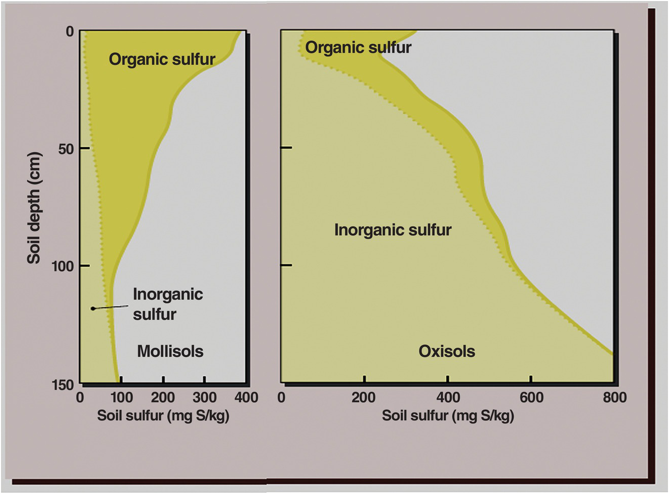
Fig. 15.3 While organic sulfur predominates in the topsoil of both Mollisols and Oxisols, inorganic sulfur (SO42–) predominates in the subsoils, but for different reasons.
15.2.1 Anion Exchange
Anions are held by positive charges and sorption sites at different bonding strengths. Among the macronutrients, H2PO4– is held the tightest, followed by SO42–, and last by NO3–.
Anion exchange occurs primarily when clay surfaces of iron and aluminum oxides (defined in Chapter 14 to include hydroxides and other species of iron and aluminum) have net positive charge because they are below the zero point of charge and have positive ΔpH values (Chapter 8). Most anion exchange capacity is located in the subsoil since topsoils usually have negative ΔpH even in oxidic mineralogies because SOM reacts with such minerals. H2PO4– anions seldom leach into the subsoil.
SO42– can displace NO3– from these positive exchange sites. Anion exchange levels are generally low, 1–2 cmolc/kg of soil, but such subsoil layers can be very deep, retaining large quantities of anions, as shown in Chapter 13 for NO3– and in Fig. 15.3 for SO42–.
15.2.2 Sorption
The second mechanism is sorption. Sulfate ions are adsorbed by ligand exchange between SO42– and OH–, in soils high in iron and aluminum oxides. This is shown in Eq. 15.4:

This reaction also occurs in exchange sites along the edges of kaolinite particles and positively charged organic radicals. In subsoils it may result in pH increases of 0.3 to 0.9 units.
Adsorbed sulfates are readily available to plant roots (Kovar and Grant Reference Kovar, Grant, Hatfield and Sauer2011), in sharp contrast with adsorbed phosphates, which are not available to plant roots. Sulfate anions are retained more tightly by sorption than by anion exchange.
In addition, sulfates can also be absorbed when the SO42– ions become part of an aluminum oxide matrix such as:
This happens in Andisols of Nicaragua (Delfosse et al. Reference Delfosse, Delmelle and Delvaux2006), perhaps in a similar way as Barrow’s (Reference Barrow1974) slow reaction of phosphate absorption.
The sorption and desorption properties of sulfur can be characterized by “sorption isotherms,” better termed sulfur retention curves, in a similar way to those used for phosphorus. Figure 15.4 shows examples of these relationships in some soils of the tropics. The smectitic, permanent-charge Mollisol from the Cauca Valley of Colombia does not exhibit any sulfur sorption, a finding typical also of other soils with similar mineralogy from Hawaii and Australia, and of course the temperate region (Fox et al. Reference Fox1971). Sandy and loamy Inceptisols and Entisols of the Indo-Gangetic Plain, which are derived from permanent-charge alluvium, also do not show sulfate sorption or anion exchange; most of them are deficient in sulfur (Khurana et al. Reference Khurana, Sadana, Singh and Jez2008).

Fig. 15.4 Sulfate sorption retention curve of a permanently charged, clayey Mollisol shows negligible sorption, in contrast with strong sorption by two clayey Oxisols. The strength of sorption depends on the Oxisols’ mineralogy, being higher in the oxidic Gibbsihumox than in the kaolinitic Haplustox.
It is important to remember at this juncture that although this book focuses on variable-charge soils of the tropics, 10 percent of tropical soils have permanent charge, like the Mollisols, Entisols and Inceptisols indicated, and an additional 30 percent have a mixture of variable and permanent charge (Chapter 8). So, permanent-charge soils are important in the tropics, also because many of them are inherently fertile and are cultivated by high human populations, like in the Indo-Gangetic Plain of South Asia.
Several Oxisols show strong sulfur sorption, the Hawaiian Gibbsihumox showing stronger sorption capacity than the less oxidic Colombian Haplustox (Fig. 15.4). Figure 15.5 shows how much lower the sulfur sorption of the topsoil is than in the subsoil because of the higher SOM content of the topsoil that can block sorption sites.

How does sulfur retention compare with phosphorus retention? Figure 15.6 shows both retention curves with the same soils (Fox et al. Reference Fox1971). The first observation is that the amounts of phosphorus sorbed are an order of magnitude higher than SO42–-S sorbed. The second is that the curves give an indication of the mineralogy (the Gibbsihumox is oxidic, the Haplustox is kaolinitic and the Aqualf is probably siliceous).

Fig. 15.6 Comparison of phosphate and sulfate retention curves in soils of different mineralogies.
Finally, the critical level of sulfur in soil solution obtained by Fox et al. (Reference Fox1971) for maximum yields of Pennisetum clandestinum (kikuyu grass) was 5 mg/L SO42–-S (1.6 mg/L S), an order of magnitude higher than the 0.2 mg/L P level commonly believed at that time to be the critical level, and two orders of magnitude higher than the 0.01 mg/L P proposed in the previous chapter. This shows that sorbed sulfur is held much less tightly than sorbed phosphorus by the same soils.
Sulfur retention is affected by the three core soil properties – texture, mineralogy and SOM, with mineralogy playing the predominant role. Since retention takes place in the clay fraction, the finer the texture the higher the potential to retain sulfur. Mineralogy is paramount, retaining sulfur in the following order: andic (allophanic) > oxidic > kaolinitic > smectitic, siliceous. SOM decreases sulfur retention because it can bond with clay surfaces that otherwise retain sulfates. In addition, phosphorus applications can kick sulfate ions out from the sites of retention and subject them to leaching. Ribeiro et al. (Reference Ribeiro, Dias, Alvarez, Mello and Daniels2001) showed how differing textures and SOM levels affect sulfur retention among 13 Oxisols with similar clay mineralogy.
The two sulfate retention mechanisms (anion exchange and sorption) put sulfate ions in an intermediate but good position for plant uptake – they are not too easily displaced from subsoil anion exchange sites, as nitrate ions are, and they are not so strongly retained, like phosphate, which makes the uptake of sulfate by plant roots easier.
15.3 Crop Requirements
Sulfur uptake levels by crops are similar to those of phosphorus (Table 15.3). Therefore, sulfur is a macronutrient and should be considered in the same group as nitrogen, phosphorus and potassium.
Table 15.3 Sulfur uptake of tropical crops as compared with phosphorus uptake. Adapted from Howeler (Reference Howeler, Hillocks, Thresh and Bellotti2002), Oliveira et al. (Reference Oliveira, Machado, Bernardi, Naumov, Yamada and Roberts2005), Vitti and Heirinchs (Reference Vitti, Heirinchs, Yamada, Stipp and Vitti2007), Fancelli and Tsumanuma (Reference Fancelli, Tsumanuma, Yamada, Stipp and Vitti2007), Khurana et al. (Reference Khurana, Sadana, Singh and Jez2008), Dick et al. (Reference Dick, Kost, Chen and Jez2008).
Sulfur concentrations in plant tissue are also similar to phosphorus concentrations, ranging from 0.1 percent to 0.3 percent S, as is the range of nutrient uptake by crops (7–45 kg S/ha and 6–29 kg P/ha). A good indication of sulfur deficiency is a decline in the N:S ratio of tissues below 17:1 because the ratio of protein nitrogen to protein sulfur is 15:1.
The sulfur requirements of crops varies among crops, their cultivars, plant parts and the stage of growth, often decreasing as the crop matures. Cereals and root crops have the lowest sulfur contents, while oilseeds, legumes and the Brassica genus have the highest. Table 15.3 shows there is considerable variability in this generalization.
15.4 Nutrition
Crop yields and nutritional quality are affected by sulfur, with important effects on animal and human nutrition. I use data from Kanwar and Mudahar (Reference Kanwar and Mudahar1986), Malavolta and Moraes (Reference Malavolta, Moraes, Yamada, Stipp and Vitti2007), Brady and Weil (Reference Brady and Weil2008) and Kovar and Grant (Reference Kovar, Grant, Hatfield and Sauer2011) to summarize the nutritional effects as follows:
Deficiencies in the sulfur-containing amino acids methionine, cysteine and cystine, caused by inadequate sulfur uptake, can result in serious malnutrition in monogastric animals such as humans and pigs.
Sulfur increases the methionine content in cereal proteins, increasing their nutritional value.
Sulfur also increases the protein content of grain legumes, important in the diets of humans.
Baking quality and loaf volume decreases with sulfur deficiency in wheat when used in bread-making. The critical level is an N:S ratio of 16:1.
Sulfur fertilization often increases yields and protein content of grass and legume pastures, as well as vitamin A content in alfalfa and the chlorophyll content of red clover, thereby improving feed quality and ruminant performance. Sulfur contents of feed should range from 0.18 percent S to 0.25 percent S in ruminant diets.
The joint additions of nitrogen and sulfur help reduce high nitrate levels in animal feed.
Several sulfur compounds are responsible for the flavors of garlic, onion, asparagus, lettuce and cabbage.
Vegetables that are low in sulfur are hard, with low commercial value.
Good sulfur nutrition of plants enhances several secondary metabolites, which improves defense mechanisms against pests and diseases.
15.4.1 Sulfur Fertilization
Sulfur fertilization in sulfur-deficient Entisols and Inceptisols of the Indo-Gangetic Plain increases protein and oil content in various oilseed crops (Khurana et al. Reference Khurana, Sadana, Singh and Jez2008), with concomitant general increases in the amino acids methionine and cysteine, as shown in Table 15.4. Considering that hundreds of millions of people inhabit this region, sulfur fertilization has a major positive effect on these people’s well-being.
Table 15.4 Sulfur fertilization increases protein, methionine and cysteine levels in mungbean grain (Phaseolus aureus) that is grown in a sulfur-deficient alluvial soil of the Indo-Gangetic Plain. Adapted from Kamat et al. (Reference Kamat, Kankute, Puranik, Kohadkar and Joshi1981).
| Applied sulfur | Protein | Methionine | Cysteine |
|---|---|---|---|
| kg S/ha | (%) | (% total protein) | |
| 0 | 24.4 | 2.42 | 2.63 |
| 10 | 24.5 | 2.45 | 2.25 |
| 20 | 24.8 | 3.02 | 4.58 |
| 30 | 26.3 | 3.13 | 3.80 |
15.5 Soil Testing
Water, 1 M potassium chloride (KCl), 0.01 M calcium chloride (CaCl2), 0.01 M calcium phosphate [Ca(H2PO4)2], 0.5 M sodium bicarbonate (NaHCO3), ammonium acetate in acetic acid, and the Mehlich 3 double acid are the main extractants used to estimate available sulfur in soils (Fox et al. Reference Fox1971, Ribeiro et al. Reference Ribeiro, Dias, Alvarez, Mello and Daniels2001, Dick et al. Reference Dick, Kost, Chen and Jez2008). The first three provide variable results because they extract mostly sulfate in the soil solution. Calcium phosphate also extracts some sorbed sulfur and has provided the best correlations with plant growth (Probert Reference Probert1976). Using the isotope 35S in five topsoils of North Queensland grown with Stylosanthes guianensis in pots, Probert also found a near full recovery of the sulfur extracted by calcium phosphate in the plants’ tissue in four of the five soils. The exception was a sodic, permanent-charge soil, probably a Natraqualf, with little sulfur sorption capacity. Research by Ribeiro et al. (Reference Ribeiro, Dias, Alvarez, Mello and Daniels2001) in Brazil and Weil and Mughogho (Reference Weil and Mughogho2000) in Malawi indicated a less clear advantage of the calcium phosphate extractant.
Nevertheless, the calcium phosphate extraction is the most common soil test for sulfur. In general, the critical levels are 5–10 mg/kg S (Dick et al. Reference Dick, Kost, Chen and Jez2008), while in Brazil it is mainly 10 mg/kg S (Malavolta and Moraes Reference Malavolta, Moraes, Yamada, Stipp and Vitti2007), and in Hawaii, 8–10 mg/kg S (Hasan et al. Reference Hasan, Fox and Boyd1970), all with the calcium phosphate extraction.
A soil test performed in the topsoil, however, tells only part of the picture. In sandy Ultisols, where the topsoil is deficient in sulfur, crops show symptoms of sulfur deficiency until the roots penetrate clayey, oxidic or kaolinitic subsoils that are loaded with sulfate, retained by anion exchange or sorption. Sulfur deficiency gradually disappears as the roots come in contact with the SO42–-rich subsoil. This was first observed in North Carolina Ultisols by Kamprath et al. (Reference Kamprath, Nelson and Fitts1957), although it happens all over the tropics. Therefore, subsoil sampling may be a good management practice in Ultisols and Alfisols of contrasting textural profiles, or in Oxisols and Andisols in general. Since sulfur retention is not as tight as phosphorus retention, plants can tap much of the retained sulfates.
15.6 Sulfur Fertilization
15.6.1 Sources
Most of these sulfur requirements are small enough that many nitrogen and phosphorus carriers can supply them. An application of 50 kg N/ha as ammonium sulfate provides 12 kg S/ha, while an application of 50 kg P/ha as single superphosphate provides 6 kg S/ha. When urea and diammonium phosphate are used, there is no sulfur added. Although triple superphosphate should contain zero sulfur, an actual analysis that was conducted by Weil and Mughogho (Reference Weil and Mughogho2000) using commercial triple superphosphate fertilizers showed that it contained 2–3 percent.
The ability to return crop residues or to incorporate manure may add enough sulfur to a crop without mineral fertilization. An application of 5 t/ha of high-quality cattle manure containing 0.3 percent S would provide 15 kg S/ha, but the same application using low-quality manure would provide only about 5 kg S/ha.
Elemental sulfur and gypsum are also used to reduce the pH and ameliorate sodic soils, those with the n FCC attribute. Gypsum is used extensively in Oxisols to bring calcium (Ca2+) ions into the subsoil (Chapter 9) and supply calcium to peanuts and other high-calcium-requiring crops. Ammonium thiosulfate is used in fertigation and in blends with other fertilizers (Dick et al. Reference Dick, Kost, Chen and Jez2008).
The main fertilizer sources of sulfur are shown in Table 15.5.
Table 15.5 Main sulfur fertilizers (Vitti and Heirinchs Reference Vitti, Heirinchs, Yamada, Stipp and Vitti2007, Dick et al. Reference Dick, Kost, Chen and Jez2008, Chapter 13, Kirchmann and Pettersson Reference Kirchmann and Pettersson1995 for urine).
15.6.2 Rates
In general, rates on the order of 5–50 kg S/ha are sufficient to overcome sulfur deficiencies. The average sulfur application rate for crops in Brazil is 20 kg S/ha (Malavolta and Moraes Reference Malavolta, Moraes, Yamada, Stipp and Vitti2007). Jones and Quagliato (Reference Jones and Quagliato1970) showed that 10–20 kg S/ha is sufficient for most tropical pasture legumes and alfalfa. For coffee, an annual rate of 30 kg S/ha increased yields by 82 percent over a 10-year period in Brazil (de Freitas et al. Reference de Freitas, Tanaka, Lobato and Soares1972).
In Brazil, a country with a majority of variable-charge soils, deficient in sulfur, the generally recommended rates are as follows, all in bands or close to trees at planting time (Vitti and Heirinchs Reference Vitti, Heirinchs, Yamada, Stipp and Vitti2007):
annual crops: 30 kg S/ha
perennial crops: 30–40 kg S/ha
sugar cane: 50 kg S/ha per cut
vegetable crops: 40–50 kg S/ha
reforestation: 30 kg S/ha.
In Africa, with lower crop yields than Brazil, the recommended rates are lower. Weil and Mughogho (Reference Weil and Mughogho2000) conducted replicated trials in 20 farmer fields for two years in four major agroecolgical zones of Malawi. Nineteen of the 20 trials showed yield responses to sulfur. They also found that a critical N:S ratio of 11.5:1 in maize ear leaves was the best predictor of sulfur deficiency. Rates of 5–6 kg S/ha were found to be best, with few differences among agroecological zones, two of them dominated by variable-charge red Alfisols, Oxisols and Ultisols, while the other two, closer to Lake Malawi, had permanent-charge soils (Fig. 15.7). They also noted that nitrogen had to be applied before sulfur responses were observed, a classic “law of the minimum” situation where nitrogen deficiency has to be overcome before addition of sulfur. Results from many previous field experiments in Malawi convinced the Ministry of Agriculture to add four units of sulfur in their special blend, imported by the Malawian government (23 N–21 P–0 K–4 S). This undoubtedly has reduced sulfur deficiency in this country.
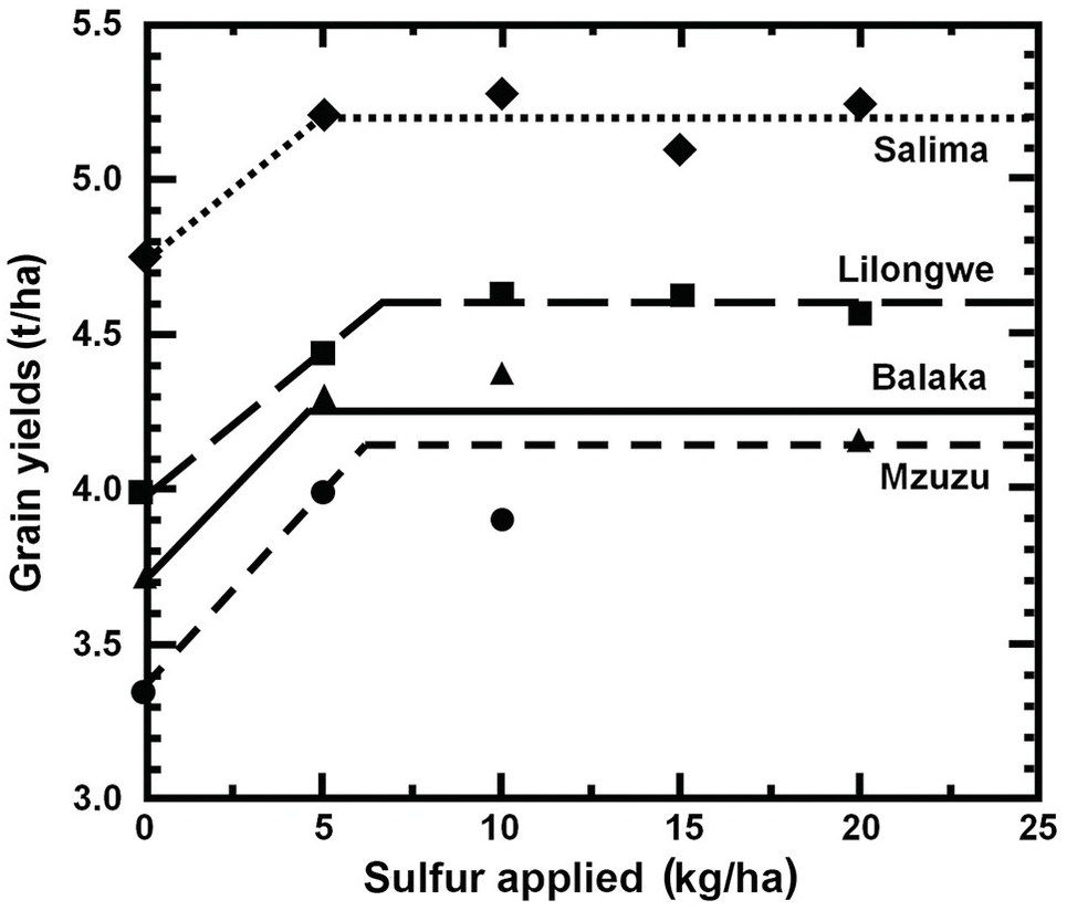
Fig. 15.7 Maize responds to 5–7 kg S/ha in four agroecolgical zones of Malawi. Salima and Balaka regions have mainly permanent-charge soils and are close to Lake Malawi. Lilongwe and Mzuzu are upland areas with mainly variable-charge Alfisols (Weil and Mughogho Reference Weil and Mughogho2000).
15.6.3 Timing and Placement
All sulfur fertilization should be incorporated at planting time for food crops because it helps in root development and the early synthesis of amino acids, as well as in stimulating biological nitrogen fixation in legumes (Fancelli and Tsumanuma Reference Fancelli, Tsumanuma, Yamada, Stipp and Vitti2007). When elemental sulfur is used it should be applied 2–4 weeks before planting so it oxidizes into SO42– by the time seeds are planted. Gypsum is also applied at the pegging time for peanuts because of the high demand for calcium at this time. In cases where sulfur deficiency is diagnosed during plant growth it is possible to correct it by fertilizing while the plant is growing (Kovar and Grant Reference Kovar, Grant, Hatfield and Sauer2011).
15.6.4 Agronomic Efficiency and Fertilizer Recovery
The agronomic efficiency of sulfur fertilization (AES) was in the range 3–13 kg grain/kg S applied to oilseed crops, and 17–19 kg grain/kg S applied to rice and wheat in India (Khurana et al. Reference Khurana, Sadana, Singh and Jez2008). These values are lower than the agronomic efficiency of nitrogen (AEN) reported in Chapter 13.
The fertilizer recovery of sulfur (RES) by the first crop is rather low, ranging from 7 percent to 23 percent in India, but higher recoveries (37–73 percent) have been recorded with cotton in temperate North Carolina, according to a compilation by Kanwar and Mudahar (Reference Kanwar and Mudahar1986). This may be due to soil differences. Most of the Indian data comes from Entisols and Inceptisols of the Indo-Gangetic Plain, which do not have a subsoil with sulfur retention capacity and thus much of the sulfur applied may be lost by leaching. North Carolina Ultisols usually have an argillic B horizon, rich in iron and aluminum oxides, which, as mentioned before, when the crop roots reach it, can take up much of the sorbed sulfur (Kamprath et al. Reference Kamprath, Nelson and Fitts1957).
Residual effects of sulfur fertilization are likely to be better than those of nitrogen (most of it in the first crop and a small amount in the second crop – Chapter 13). Khurana et al. (Reference Khurana, Sadana, Singh and Jez2008) reported that in the rice–wheat rotations in the Indo-Gangetic Plain the first crop recovered 33–82 percent of the applied sulfur while the subsequent crop recovered the remaining 18–67 percent. In one case, the residual effect of sulfur was felt up to the fourth crop of an annual rice–wheat rotation. In general, this is much better than nitrogen even though these soils usually do not have subsoil sulfur retention.
The only long-term trial I was able to find in the literature is the work of Donald and Williams (Reference Donald and Williams1955) and Williams and Donald (Reference Williams1957) in which they sampled grazed paddocks with introduced subterranean clover with periodic single superphosphate applications, for up to 26 years of sheep grazing, located in a “podzolic soil” (probably an Ultisol) in the Crockwell District of New South Wales, Australia. Amazingly, they found that all the sulfur applied as single superphosphate (156 kg S/ha over 26 years) was accounted for in the top 10 cm of soils, presumably in an organic fraction. Being an efficient grazing system, the sheep excreta generally recycles about 70–80 percent of the nutrients they ingest (more on that in Chapter 18). The soils must have an argillic, sulfur-retaining B horizon, where the pasture species certainly tapped inorganic sulfur. This is probably the best example I have read of the synchrony principle. Obviously, more research is needed on the long-term effects of sulfur applications.
15.7 Summary and Conclusions
Sulfur should be considered a macronutrient, along with nitrogen, phosphorus and potassium. The reason for this proposal is that the sulfur content of plants is similar to that of phosphorus (0.1–0.3 percent in both cases), as is the range of nutrient uptake by crops (7–45 kg S/ha and 6–29 kg P/ha). Most importantly, the current response to sulfur fertilization is as frequent or probably more so than that of phosphorus. The NPK paradigm should be updated to NPKS in practical agronomy.
Most sulfur requirements are small enough that many nitrogen and phosphorus carriers can supply them. An application of 50 kg N/ha as ammonium sulfate provides 12 kg S/ha, while an application of 50 kg P/ha as single superphosphate provides 6 kg S/ha.
Sulfur deficiencies are increasing throughout the tropics as well as worldwide. The main reasons are the increasing use of high-analysis fertilizers that contain no sulfur, the increasing use of higher-yielding crop cultivars that require more sulfur, and the decreased atmospheric deposition downwind from industrial urban centers that have air-pollution control.
Sulfur deficiency in crops occurs in a wide variety of soils. They are often sandy, well-drained, subject to leaching, with variable- or permanent-charge mineralogy and low in soil organic matter (SOM). They generally occur in unpolluted, inland areas where the atmosphere is low in sulfur. Unlike nitrogen deficiency, which starts as chlorosis (yellowing) of the older leaves, sulfur deficiency starts as chlorosis of the younger leaves.
The sulfur cycle resembles the nitrogen cycle in that the atmosphere plays an important role, that most of the topsoil’s sulfur is in the organic form, that sulfur undergoes similar mineralization–immobilization processes and as sulfate anions can be retained in subsoils by anion exchange and also leached, similarly to nitrates. The sulfur cycle resembles the phosphorus cycle in that the original sources of sulfur are primary minerals and that sulfur retention is important in soils that are high in iron and aluminum oxides. It differs from both cycles in that microbial oxidation–reduction (redox) reactions play a central role.
The main sulfur inputs to soils are primary minerals (gypsum and pyrite), organic inputs and atmospheric deposition of sulfur gases. Organic inputs of plant origin, including manures, generally contain about 0.3 percent S in dry mass, except for low-quality cattle manures in Africa, which contain about 0.1 percent S.
The atmosphere contains various forms of sulfur gases. These gases are eventually oxidized to sulfuric acid, which along with nitric acid causes acid rain. Atmospheric deposition rates were as high as 200 kg S/ha per year downwind from industrial areas with no pollution controls. Atmospheric deposition rates are 8–15 kg S/ha per year around industrial areas with effective clean-air controls in rich countries, but not around rapidly developing industrial areas in the tropics. Atmospheric deposition in Africa is about 1–4 kg S/ha per year.
Total topsoil sulfur in the tropics varies from very high in Andisols (1280 mg/kg S) to very low (40 mg/kg S) in sandy Ultisols. Unlike phosphorus, the subsoil often contains significant quantities of sulfur, which are very relevant to soil fertility management in the tropics.
Most (> 95 percent) of the sulfur in topsoils outside of arid climates is in the organic form. In subsoils with variable-charge clays, the relationship often flips over, with the vast majority being inorganic sulfur because of sulfate retention processes.
Soil organic sulfur stocks can be grouped into three fractions depending on their redox status and turnover rates: ester sulfates, carbon-bonded sulfur and inert organic sulfur. Ester sulfates are easily hydrolyzed into sulfates. Carbon-bonded sulfur comprises complex reduced forms that include the amino acids methionine, cysteine and cystine. Inert organic sulfur can range from 3 percent to 59 percent of the organic sulfur and has a very slow turnover.
Mineralization of organic sulfur occurs at C:S ratios lower than 200, while organic compounds with a C:S ratio > 400 produce net immobilization. Organic compounds with a sulfur concentration less than 0.15 percent S are immobilized into microbial biomass but eventually mineralized. The processes could go either way in ratios between C:S values of 200 and 400.
Flushes of sulfur mineralization upon wetting of previously dried soils have also been observed in the tropics. The processes involved are similar to those governing nitrogen flushes – the Birch effect.
There are two mechanisms of sulfur retention in subsoils that are high in iron and aluminum oxides: anion exchange and sulfur sorption. The first process is similar to that for nitrates (NO3–) – anion exchange; and the second one, sorption, is similar to what happens to phosphate (H2PO4–) anions. Because sulfate ions (SO42–) are subject to leaching, like NO3– but unlike H2PO4– , many of these processes take place primarily in the subsoil.
Anions are held by positive charges and sorption sites at different bonding strengths. Among the macronutrients, H2PO4– is held the tightest, followed by SO42–, and last by NO3–. Adsorbed sulfates are readily available to plant roots in sharp contrast with adsorbed phosphates, which are not readily available. Sulfate anions are retained more tightly by sorption than by anion exchange.
Sulfur retention curves resemble phosphorus retention curves, but the amounts of sulfate sorbed are an order of magnitude lower than sorbed phosphate, while the critical level in the soil solution that approaches maximum yield (1.6 mg/L S) is two orders of magnitude higher than that of phosphorus (0.01 mg/L P). This shows that sorbed sulfur is held much less tightly than sorbed phosphorus by the same soils.
Sulfur retention is affected by the three core soil properties – texture, mineralogy and SOM, with mineralogy playing the dominant role. Since retention takes place in the clay fraction, the finer the texture the higher the potential to retain sulfur. Mineralogy is paramount, retaining sulfur in the following order: andic (allophanic) > oxidic > kaolinitic > smectitic, siliceous. SOM decreases sulfur retention because it can bind with clay surfaces that otherwise retain sulfates. This is why sulfur retention is lower in topsoils than subsoils. In addition, phosphorus applications can kick sulfate ions out from the sites of retention and subject them to leaching.
The two sulfate retention mechanisms (anion exchange and sorption) put sulfate ions in an intermediate but good position for plant uptake – they are not too easily displaced from subsoil anion exchange sites, as nitrate ions are, and thus leached, and they are not so strongly sorbed like phosphate, which makes the uptake of sulfate by plant roots easier.
The sulfur requirement of crops varies among crops, their cultivars, plant parts and the stage of growth, but it depends on the seed protein content. Cereals and root crops have the lowest sulfur contents, while oilseeds, legumes and the Brassica genus (canola, cabbage) have the highest.
Crop yields and nutritional quality are affected by sulfur, with important effects on animal and human nutrition. Deficiencies in the sulfur-containing amino acids methionine, cysteine and cystine, caused by inadequate sulfur uptake, can result in serious malnutrition in monogastric animals. Sulfur increases the methionine content of cereal proteins, thereby increasing their nutritional value. Sulfur also increases the protein content of grain legumes.
Baking quality and loaf volume decreases with sulfur deficiency in wheat when used in bread making. The critical level is an N:S ratio lower than 16:1.
Sulfur fertilization often increases yields and protein content of grass and legume pastures, improving feed quality and ruminant performance. Sulfur content of feed should range from 0.18 percent to 0.25 percent S in ruminant diets. The joint additions of nitrogen and sulfur help reduce high nitrate levels in animal feed.
Several sulfur compounds are responsible for the flavors of garlic, onion, asparagus, lettuce and cabbage. Vegetables that are low in sulfur are hard, with low commercial value.
Good sulfur nutrition of plants enhances several secondary metabolites, which improves defense mechanisms against pests and diseases.
Sulfur fertilization in sulfur-deficient Entisols and Inceptisols of the Indo-Gangetic Plain increases protein and oil content in various oilseed crops, with concomitant increases in the amino acids methionine and cysteine. Considering that hundreds of millions of people inhabit this region, sulfur fertilization has a major positive effect on these people’s well-being.
Calcium phosphate extraction is the most commonly used soil test for sulfur. In general, the critical levels are 5–10 mg/kg S. Other methods can be used.
A soil test performed in the topsoil, however, tells only part of the picture. In sandy Ultisols, where the topsoil is deficient in sulfur, crops show symptoms of sulfur deficiency until the roots penetrate the clayey, oxidic or kaolinitic subsoil, loaded with sulfate that is retained by anion exchange or sorption. Sulfur deficiency gradually disappears as the roots come into contact with the sulfate-rich subsoil.
The ability to return crop residues or to incorporate manure may add enough sulfur to a crop, without mineral fertilization. An application of 5 t/ha of high-quality cattle manure containing 0.3 percent S would provide 15 kg S/ha, but the same application using low-quality manure would provide only about 5 kg S/ha.
In general, rates on the order of 5–50 kg S/ha are sufficient to overcome sulfur deficiencies. The average sulfur application rate for crops in Brazil is 20 kg S/ha. In Africa, where there are lower crop yields, the recommended rates are lower, 5–6 kg S/ha. In Malawi, nitrogen had to be applied before sulfur responses were observed, a classic “law of the minimum” situation.
Results from many previous field experiments in Malawi convinced the Ministry of Agriculture to add four units of sulfur in their special blend, imported by the Malawian government. This undoubtedly has reduced sulfur deficiency in this country.
All sulfur fertilization (organic or mineral) should be incorporated at planting time for food crops because it helps in root development and the early synthesis of amino acids, as well as in stimulating biological nitrogen fixation in legumes.
When elemental sulfur is used, it should be applied 2–4 weeks before planting so it oxidizes into SO42– by the time seeds are planted.
Gypsum is also applied at the pegging time of peanuts because of the high demand for calcium at this time. In cases where sulfur deficiency is diagnosed during plant growth it is possible to correct it by fertilizing while the plant is growing.
The agronomic efficiency of sulfur fertilization (AES) was in the range of 3–13 kg grain/kg S applied in oilseed crops, and 17–19 kg grain/kg S applied in rice and wheat in India. These values are lower than the agronomic efficiency of nitrogen (AEN) reported in Chapter 13.
The residual effect of sulfur fertilization seems to be better than that of nitrogen. Sulfur recovery by the first crop is higher when a sulfur-retaining subsoil is present.
The long-term effect of periodic single superphosphate applications for up to 26 years of sheep grazing an Ultisol in Australia resulted in all the applied single superphosphate (156 kg S/ha over 26 years) being accounted for in the top 10 cm of the soil, presumably as organic sulfur. This is probably due to the high recycling rate of sulfur as it goes through the sheep. This the best example I have read of the synchrony principle.