


Policy Significance Statement
In this paper, we introduce a methodology and software tools that aim to transform existing policy-making routines from intuition-based to evidence-based by exploiting the wealth of heterogeneous sources of data already available in modern cities. We examine the case of Thessaloniki’s controlled parking system trying to optimize its operation by balancing effectively between economic growth, environmental protection, and citizen satisfaction. Our goal is to properly collect, analyze, and visualize heterogeneous sources of data, so as to support different policy decisions.
1 Introduction
In the past decade, interest in the study and improvement of policy-making procedures in public administrations has gained increased interest. The major issue with the current paradigm of policy-making and therefore governmental effectiveness is that there is not enough evidence to support data-driven decision-making, thus forcing policy-makers to rely on their intuition or past experience. Although, the increased availability of heterogeneous data sources and the explosion of big data has motivated some governmental organizations to engage in interesting experiments for improving policy-making, the intuition-based paradigm is still prominent (Dror, Reference Dror2017). As stated in Sanderson (Reference Sanderson2002), there are two main forms of evidence required to improve governmental effectiveness. The first is evidence to promote accountability in terms of results—evidence that the government is working effectively. The second is evidence to promote improvement through more effective policies and programs—evidence of how well such policies and programs “work” in different circumstances. These two forms of evidence are different in nature. The first is primarily in the form of information on attributes of performance and is reflected in the growth of performance management in government (Treasury, Reference Treasury2000). The second form of evidence is qualitatively different from the first and is concerned with the knowledge of how policy interventions achieve change in social systems. Conventionally, we assume that reliable knowledge provides a sound basis for effective action; it is explanatory and theoretical, providing an understanding of how policies work. In the notion of a modern government, evaluation, in particular, is required to play an enhanced role, on the one hand, in providing information on performance to enhance accountability and “control by results,” and, on the other hand, in providing evidence of what works to inform policy-learning and improvement.
The purpose of this article is to explore the notion of evidence-based policy-making in the context of policy intervention in increasingly complex social systems and the potential role of piloting and evaluation. Instead of only relying on evaluation during or after the piloting phase after a specific policy is in place, we contribute toward transforming the existing paradigm of policy-making into an evidence-driven approach aided by the proactive use of heterogeneous sources of data. In this article, we take the first step toward achieving this goal by showing how the interaction with fully interconnected data can reveal valuable insights to aid policy-making. We examine a policy involving the controlled-parking system (CPS) of Thessaloniki and demonstrate how our interactive dashboard aids the policy-makers in making informed decisions throughout a specific step-by-step scenario.
In existing literature, we witness the importance of evidence and analysis in policy-making (Banks, Reference Banks2009; Brownson et al., Reference Brownson, Chriqui and Stamatakis2009), and a focus on the optimal management and visualization of information, but only during the policy-design process (Desouza and Lin, Reference Desouza and Lin2011). In Head (Reference Head2010), it is apparent that a focus on the forms of evidence that are of greatest relevance or utility for decision-makers leads to improved policy analysis, while the interaction between the policy-makers and the end-users is also considered of great importance. According to Stevens (Reference Stevens2011), policy-makers display a high level of commitment in using evidence. However, the use of evidence is often hampered by the huge volume of available data and by the unsuitability of much of the ICT-related (Information and Communications Technology) research in answering policy questions. The evidence is used to create policy scenarios, incorporating interactive visualizations, that boost the persuasiveness of the policy narrative. This narrative use of evidence is ideal in that it supports transparency in decision-making.
In what refers to system architectures supporting the analysis of heterogeneous sources of data, a very interesting framework is presented in Puiu et al. (Reference Puiu, Barnaghi, Toenjes, Kümper, Ali, Mileo, Parreira, Fischer, Kolozali, Farajidavar, Gao, Iggena, Pham, Nechifor, Puschmann and Fernandes2016), that supports smart city service creation integrating a multimodal, heterogeneous, often incomplete dataset, and data analytics modules for the easy development of custom-made applications for citizens. Similarly, in Badii et al. (Reference Badii, Belay, Bellini, Cenni, Marazzini, Mesiti, Nesi, Pantaleo, Paolucci, Valtolina, Soderi and Zaza2018), the authors present the Snap4City solution that aims to develop sophisticated Internet-of-Things (IOT) applications that can control the city dashboards, as well as IOT mobile applications. The City Enabler presented by Evertzen et al. (Reference Evertzen, Effing, Constantinides, Pappas, Mikalef, Dwivedi, Jaccheri, Krogstie and Mäntymäki2019) is another conceptual model for the creation of smart cities that discusses how to address a number of critical challenges and argues that citizen involvement, business collaboration, and strong leadership prove to be key success factors in the Smart City development process. It is evident from the above that the majority of existing works highlight the importance of using interactive visualization tools in the process of policy-making and, in some cases, various architectures that homogenize heterogeneous data sources are detailed. However, these architectures lack scalability and support for near real-time interaction with the data, enabling their interpretation and evidence extraction.
Our ambition is to differentiate from existing approaches by simultaneously considering environmental, economic, and social data facilitating in this way a holistic approach to policy design, monitoring, and evaluation that focuses on urban resilience. To this end, we propose an approach to homogenize the heterogeneous sources of data by using their spatio-temporal properties to interconnect them. In this way, we can support complex queries and facilitate decision-making processes that need to simultaneously evaluate the impact of more than one aspects (i.e., environmental, economic, and social). We then visualize the data using an architecture that supports real-time data operations in a way that helps the policy-makers to easily create policy scenarios, facilitating the narrative use of evidence to justify their policy approach. This is the cardinal objective of the CUTLER H2020 Project (Project, 2018) that aims to develop a platform that enables policy design, implementation, and evaluation, that is filtered through the lens of urban resilience. The work presented in this paper is a result of CUTLER project in the context of one of its pilots.
The rest of the article is organized as follows. In Section 2, we present the challenges of using heterogeneous sources of data to aid policy-making. In Section 3, we present our methodology for data-driven policy-making and present the architecture of the decision support software platform, the key software technologies employed by the proposed software solution, the utilized data types, the approaches used for their harmonization, as well as the data processing pipeline. Section 4 describes the policy examined in this paper, that is the CPS installed in the city center of Thessaloniki. Section 5 presents the dashboard we have created to facilitate policy-making with regard to the aforementioned CPS, along with the usage scenario and the associated evaluation study. Finally, Section 6 contains the Discussion and Conclusions of our work.
2 Policy-Making Challenges in the Era of Big Data
Policy-making and society at large face a number of fundamental challenges with regard to urban development. The different components of the urban system are strongly interwoven, giving rise to complex dynamics and making it difficult to anticipate the impact and unintended consequences of public action. Moreover, urban development policies are subject to highly distributed, multi-level decision processes and have a profound impact on a wide variety of stakeholders, often with conflicting or contradictory objectives. The increasing growth and availability of municipal data sets represents a significant opportunity for municipalities and their citizens to develop tools for coping with these problems, especially in newly urbanizing countries where new sources of digital data can both help to make sense of changing needs and demographics, and can enable interactive urban planning and governance. These new sources of data are already the subject of interest and experiment. However, harnessing the potential for economic, social, and environment betterment through analysis of this data requires new configurations of actors and institutes in order to address the challenges of data access and data analysis capacity (Taylor, Reference Taylor2014).
With respect to data access, while some sources of data are generated and channeled by city authorities—for example via traffic sensors or e-government applications, and are easier to access (provided that privacy restrictions of personal data are met), many data are channeled by the private sector—for example the license plates or personal information of citizens that receive penalties for illegal parking. Similarly, some other forms of data, such as public feedback projects, are channeled by civil society organizations, often in combination with academia. These new sources of data require for the municipality to negotiate and cooperate with new partners to gain access to information that can greatly enrich urban planning and dialogue. They also raise questions of power and representation: under what conditions should the private sector share data with city authorities? What does it mean for the private sector to become the mediator between the citizen and the city? Does the citizen gain leverage as a producer of valuable data, and can the process be participatory despite the technical skills involved? Although these questions may hinder the use of data in the context of public administration, the GDPR (General Data Protection Regulation) (Allen and Overy, 2018) European directive offers a framework for addressing some of these questions making sure to respect the privacy of personal data. In addressing the data access issue, data crawling mechanisms are set up that are able to handle effectively the different types of data sources. Mechanisms for data cleaning, harmonization, and integration with common standards have also been developed along with privacy-preserving techniques to protect the confidentiality of the data throughout its life-cycle, namely data anonymization and data encryption as described in CUTLER (2020e). A legal framework clearly summarizing the legal requirements for data collection and processing based on a novel legal taxonomy has also been established, ensuring adherence to GDPR and other EU (European Union) and national legislation (CUTLER, 2020b; CUTLER, 2020c).
With respect to data analysis capacity, big databases require big resources. Although not every big data problem requires a supercomputer, significant software and hardware resources are necessary to manage and analyze big data due to its richness and real-time aspects. In addressing the analysis capacity issue, we focus on homogenizing the heterogeneous data sources by enabling a spatio-temporal reference so as to support uniform interaction with the data.
3 Methodology
In this section, we describe the methodology adopted in this work so as to support evidence-driven policy-making based on heterogeneous data sources. More specifically, we analyze our multi-step approach to policy-making, we detail the architecture of the proposed software solution, we describe the utilized data types and the approach adopted for their homogenization, and finally, we list the technology enablers and describe the overall data processing pipeline.
3.1 Multi-step approach for data-driven policy-making
Our proposed methodology foresees the use of heterogeneous data sources to facilitate the decisions required to reach the strategic goals of the city of Thessaloniki, with regard to the management of the established CPS. In facilitating this process, we adopt the IAMER (Inform—Advise—Monitor—Evaluate—Revise) methodological approach for policy development, which has been proposed in the context of CUTLER (CUTLER, 2020a). The IAMER methodology explains how we envision the use of heterogeneous data in the context of policy-making as the enabler to:
-
• Inform policy-makers by effectively visualizing and presenting them all the available social, economic, and environmental data/information that are relevant to the policies under consideration.
-
• Advise policy-makers about the estimated impact of planned policy measures with respect to the resiliency of the city.
-
• Monitor the progress of enforced measures and ensure compliance with set objectives by visualizing in real-time data obtained from the sensing infrastructures and detecting significant changes.
-
• Evaluate, that is quantify and assess the effectiveness of implemented policy measures based on the information gathered through the monitoring mechanisms and a set of key performance indicators (KPIs) that serve as the criteria for success or failure of the enforced policies.
-
• Revise the action plans depending on the value of the KPIs, considering also the weaknesses that have caused certain policies to fail.
The IAMER methodology was crafted in close collaboration with the policy-makers in the city of Thessaloniki after walking through the existing procedures for policy development, implementation, and evaluation. More specifically, the IAMER methodology has been conceptualized with the intention to support a data-driven version of the existing processes, where the decisions in all different stages of a policy development process are based on evidence rather than on intuition. In this work, our focus lies primarily on the Inform phase, while certain aspects of the presented dashboard concern also the phases of Monitor and Evaluate.
3.2 Architecture
Our platform uses an adaptation of the architecture proposed in CUTLER (Project, 2018), consisting of seven incremental layers that establish a powerful Software as a Service solution supporting decision-making for urban development policies. These layers have been carefully selected to support the harmonization of heterogeneous source of data, as well as the integration of cross-domain information under a unified dashboard for decision support. Therefore, although the design of the proposed architecture can be considered rather conventional, its merit lies on the employment of such an architecture to integrate, under a unified dashboard, the data collected across three different domains (environment, sociey, and economy). Each layer is briefly explained below while the overall architecture is depicted in Figure 1.

Figure 1. Platform architecture.
Data Layer: There are three main categories of data that are used in our platform: (a) Real-time data coming from sensors such as vehicle emission measurements, but also historical data found in archives to form time-series data. These data are used in the analytics layer to sense the environmental impact. (b) Structured data coming from official sources, for example, GIS-based (Geographic Information System) data on revenues from a car parking system. These data are used in the analytics layer to sense the economic activity. (c) Unstructured data coming from open participatory platforms, making engaged citizens to act as living sensors. These data are used in the analytics layer to sense the social consequences.
Collection Layer: This layer focuses on the mechanisms developed for the collection of the aforementioned heterogeneous data so as to handle effectively different types of data sources like data streams from sensors, databases, static documents, web pages, and so on. Mechanisms for data cleaning (to identify and fix formatting and integrity errors, remove duplicates and outliers), harmonization (to have similar attributes), and integration under a common analysis framework are developed and described more thoroughly in CUTLER (2020f).
Storage Layer: Our platform’s secure large scale storage and processing infrastructure is based on a hybrid cloud based approach (Mehmood et al., Reference Mehmood, Gilman, Cortes, Kostakos, Byrne, Valta, Tekes and Riekki2019), with a flexible and horizontally scalable architecture that can be easily customized to meet the specific needs of different public administrations and uses open source technologies such as Kafka (Kafka, 2020), Elasticsearch (Elasticsearch, 2020), and Kibana (Kibana, 2020) for data management and processing. The solution leverages open source and proprietary technologies and takes a security-by-design approach to address significant threats (CUTLER, 2020d).
Analytics: The purpose of this layer is to translate information into evidence and actionable knowledge by utilizing data analytics. This layer consists of algorithms that operate and aggregate time-series data, interconnect and filter data on a spatio-temporal level, as well as analyze data using machine learning algorithms (e.g., sentiment analysis on textual data provided by citizens in participatory platforms).
Business Logic: The business logic layer is intended to bridge the gap between the developed platform with the policy development routines of municipalities and public administrations. The use of Business Process Models allows the linking of existing policy-development processes with evidence-based decision-making methodologies.
Visualization: The platform is designed to act as a multi-tenant, cloud-based, advanced data analytics tool for policy-makers and is deployed as a multi-facet interactive Kibana dashboard. The visualization layer is designed to facilitate the easy customization of widgets based on the needs of policy-makers, while power users can also develop new charts (widgets) that can be used by many different dashboards. The widgets are of economic, environmental, and social interest and build upon visualization methods such as clustering maps, bar/line/pie charts, tag clouds, and others.
Policies: The outcome and integration of the above layers forms the proposed decision-making platform, the purpose of which is to facilitate data-driven policy design that effectively balance between economic growth, environmental impact and social consequences. In its full deployment, the policy-makers will be able to use this platform for carrying out a full cycle of policy development process, including design, implementation, monitoring and evaluation.
3.3 Data types and harmonization
The basis of our approach is the sensing infrastructure that is already available in the city and is able to offer a wealth of sensor readings, user contributed content and statistical information. More specifically, the heterogeneous nature of the data sources, which include structured, unstructured, and time-series data, necessitates the adoption of different techniques for data collection. The selection of the most appropriate technique depends on the nature of the source (i.e., whether we have to deal with static data or real-time data streams) and the available data sharing mechanisms of public administrations. Various data cleaning methodologies were used to identify incomplete, inaccurate, or inconsistent parts of the data and improve data quality.
Data harmonization refers to the process of aligning data from heterogeneous sources into a coherent and unambiguous set (CUTLER, 2020f). Therefore, to deal with various naming and structural differences among diverse data sources, we have relied on the following rules:
-
• Time: Date and time information within the different data sources follow different naming conventions and data representation models. It was decided to use the following naming conventions where present: Time, Date, DateTime, Timestamp, Year, Month, WeekDay.
-
• Geographical: Geographic information, is mostly provided as geographical coordinates, but sometimes it is also given at the level of territorial units, for example municipalities. It was decided to follow the approach suggested by the Nomenclature of Territorial Units for Statistics. If geographical coordinates are provided, then we use the “latitude,” “longitude,” and “altitude” naming scheme accepting decimal values.
-
• Environmental: A unified schema was established to model each parameter in terms of naming, units, timezone, and usage of spatial information and is described in CUTLER (2020f).
-
• Economic: Reproducibility of data regarding economic activity is achieved through the SDMX (Statistical Data and Metadata Exchange) ISO standard (CUTLER, 2020f). SDMX is supported by all international organizations such as Eurostat and International Monetary Fund among others. Some economic data, for example provided directly by municipalities, may not follow SDMX standards. For these data sources, we try to align to suitable standards and common sense best practices to assure that data can be shared with third parties.
-
• Social: Considering the heterogeneity of social data sources, it is necessary to define a unified data model, so that the data is harmonized before processing. The data model that we have used in our approach is an extension of the Socially Interconnected MultiMedia-enriched Objects model (CUTLER, 2020f).
Moreover, the need to take into account different aspects of a certain policy (i.e., economic growth, environmental impact, and social consequences), calls for an approach that would enable to query and interact with heterogeneous sources of data in a seamless manner. In this direction, all sources of data need to be tightly interconnected so as to enable their dynamic filtering and interactive interrogation. To this end, we have relied on the spatio-temporal properties of the data to interconnect them. More specifically, we are harmonizing our heterogeneous data sources by using various techniques to make sure that each one of them has a spatio-temporal dimension. In this way the different datasets can be projected in the same space and we can find correlations between them that impact the envisioned policies. For instance, by adding a longitudinal dimension to our datasets that are lacking one, allows us to test new hypotheses about urban structure and dynamics, and by taking into account the specific timeframes that these data belong to, we can predict with certainty specific recurring events.
3.4 Technology enablers
In the following we describe the key software technologies employed in our solution.
3.4.1 Elasticsearch
Elasticsearch is an open-source, RESTful, distributed search and analytics engine, commonly used for indexing any kind of heterogeneous data, full-text search and business analytics. It enables the transmission of data in the form of JSON documents to Elasticsearch using an API (Application Programming Interface) or ingestion tools for data harmonization such as Logstash. Elasticsearch automatically stores the original document and adds a searchable reference to it in the cluster’s index, which is a NOSQL database. A search query can then be performed and the resulting document is retrieved using the Elasticsearch API. Elasticsearch operations such as reading or writing data usually take less than a second to complete, thus making Elasticsearch ideal for supporting interactive visualizations and near real-time analytics, as well as having top speed performance irregardless of the datasets size, neutralizing the overhead needed to scale big data. Lots of client libraries in different programming languages are available for interaction with Elasticsearch, while its powerfull indexing capabilities that require only very simple meta-information about the structure of the indexed data, renders elasticsearch the ideal infrastructure for integrating data of heterogeneous types that are also generated from different domains of interest.
3.4.2 Kibana
Kibana is an open-source data visualization and exploration tool used for log and time-series analytics, application monitoring, and operational intelligence use cases. It offers powerful and easy-to-use interactive features such as histograms, line graphs, pie charts, heat maps, and built-in geospatial support. It allows putting geodata on any map using the Elastic Maps Service to visualize heterogeneous geospatial data and offers inherent support for time-based indexing. It also enables the creation of dashboards, which is a collection of widgets, in a user friendly, easily shareable way, through a web browser. Policy-makers can create different interactive dashboards for each policy they wish to analyze monitor and evaluate, in an intuitive way while adding only the charts they want. Finally, Kibana provides tight integration with Elasticsearch enabling very efficient interaction with the visualized data, since all interconnected indexes can be dynamically filtered based on every single field that appears in these indexes. This property has motivated the decision to use the spatio-temporal dimension as the joint ground for all different data types and domains, so as to enable the development of a unified dashboard incorporating environmental, social and economic information.
3.4.3 Apache Kafka
Apache Kafka is a distributed streaming platform. It publishes and subscribes to streams of records, similar to a message queue or enterprise messaging system, it stores streams of records in a fault-tolerant durable way, and process them as they occur. Kafka is run as a cluster on one or more servers that can span multiple data-centers. The Kafka cluster stores streams of records in categories called topics. A topic is a category or feed name to which records are published and is always multi-subscriber; that is, a topic can have zero, one, or many consumers that subscribe to the data written to it. From the four Kafka core APIs we utilize the first two, namely the Producer and Consumer APIs. The Producer API allows an application to publish a stream of records to one or more Kafka topics while the Consumer API allows an application to subscribe to one or more topics and process the stream of records produced to them. It is used in our approach as a data transport and real-time notification system.
3.4.4 Turf.js
Spatial analysis includes a variety of techniques and processes used to understand the patterns and relationships of geographic features. Turf (Turf, 2020) is a GIS-enabled JavaScript open source library that allows spatial operations in the browser. It can analyze, aggregate, and transform data to easily visualize them on a map. In our work, we have used the plethora of functions offered in this library in our Node.js services to analyze geospatial data and establish common data fields across various datasets, before indexing them in Elasticsearch, in order to interconnect them and enhance their interactive visualization in Kibana.
3.5 Processing pipeline
As illustrated in Figure 2, our input raw data are collected through sensors or crawlers. Each raw data entry is siphoned through an analyzer module, where various preprocessing and data-mining techniques take place, such as data filtering and formatting of the data entry in a notation that Elasticsearch can understand. Advanced geospatial analysis functions of the JavaScript Turf library are used in this stage to create common fields among the different datasets, so we can geospatially homogenize them while interconnecting them.

Figure 2. Processing pipeline.
The data entry is then passed on to an Apache Kafka Producer (Streamer), that assigns a category topic in respect to the data type (e.g., Economic, Environmental or Social) and broadcasts it. We are using Apache Kafka as a messaging system in our platform, so as to facilitate seamless data integration in Elasticsearch and establish efficient communication between the services that are integrated with the sensors and crawlers.
Each Apache Kafka consumer that is listening for a specific topic, catches the data entry that is interested in, forming it further into an indexable object and sends it to ElasticSearch database for indexing. After the indexing process is complete, the Kibana charts are now updated with the new data entries. New charts can also be created using the Kibana configuration tool and added to Dashboards so as to present new cases of policy changes.
4 Policy Under Examination
4.1 Controlled parking system
Thessaloniki is a densely inhabited city with limited space available for building new infrastructure. A way of providing solutions to persistent urban problems is to change the use of the existing infrastructure (Deloitte, 2018). The area with the highest variety of uses is the city centre, with people moving toward or away from it throughout the day resulting in a very high demand for parking spaces for both residents and visitors (Thessaloniki, 2018). Consequently, the available parking space needs to be controlled.
Since November 2017, a new CPS has been installed in the first and third Municipal Districts of Thessaloniki near the city center (thesi, 2020). The available parking space is divided into white and blue sectors as shown in Figure 3. White sectors are destined for visitors while blue sectors are reserved for permanent residents. More specifically, every visitor must pay a fee in order to park his vehicle in one of the spots of a white sector. At the same time, each resident can become a holder of a parking card that will allow him to park his vehicle in any spot inside a blue sector of his district. Each of the different white or blue sectors include multiple parking spots. The system is supervised by the Municipal Police, which plays a crucial role in the management of the CPS.
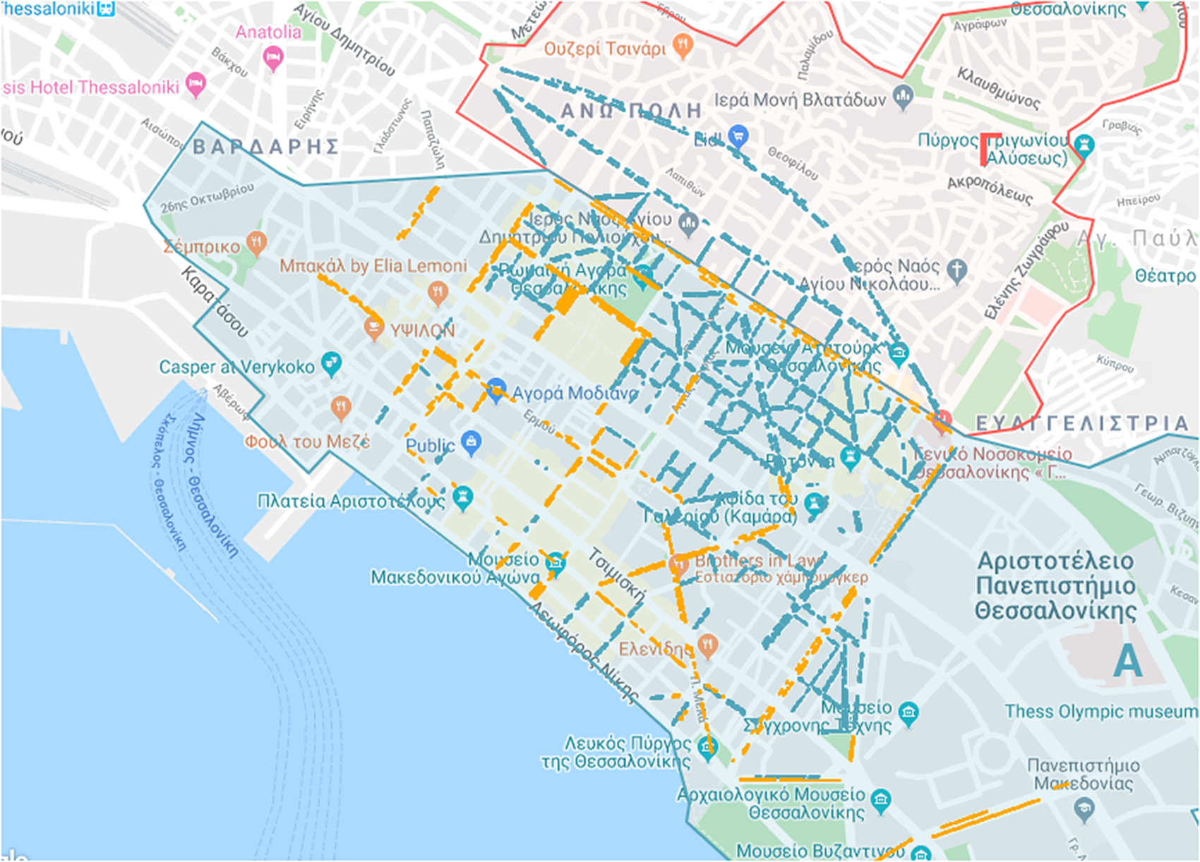
Figure 3. Thessaloniki parking spots, blue spots (Residents)—Yellow spots (Visitors) (yellow color has been used instead of white for easier map readability).
Whenever a new measure is imposed, there is always dissatisfaction expressed by part of the population and social risk needs to be taken into consideration. Visitors that do not pay a parking fee, visitors that park in blue sectors, permanent residents that do not apply for a parking card but persist to park in blue sectors, all have to receive penalty notices. In addition, there are often complaints from residents that the parking spots are not enough in their area so the Municipality was confronted with the request to change the type of some parking sectors from white to blue. Nevertheless, the selection of which parking sectors are to be offered to visitors/residents while taking into account economic revenue, environmental impact, and social consequences is a problem of combined optimization.
4.2 Deciding on the distribution of parking spots
When deciding which parking spots to change from one category to the other, there is a multitude of factors to be taken into account, including: (a) Economic: Select parking spots that are underperforming in terms of occupancy and revenue generation. (b) Environmental: Select parking spots that are placed on streets exhibiting high levels of traffic so as to reduce vehicle emissions. (c) Social: Select parking spots in streets where there seems to be expressed dissatisfaction from citizens about illegal parking. In addition, select parking spots that exhibit an increased level of penalty notices that impacts both economic (loss of revenue due to reduced parking fees) and social (delinquent behavior showing dissatisfaction) aspects. However, in order to take into account the aforementioned factors, concrete evidence must be extracted from data as explained below.
The Municipal Police is providing data for illegal parking coming from daily patrols and also data for penalty notices. The goal of using this data is to locate parking sectors with large numbers of penalty notices so as to switch their function (from visitors to residents) and, in this way reduce the number of penalty notices and increase citizens’ satisfaction.
The Economic Department provides data about the daily income and occupancy of the parking spots. This data is used as evidence when deciding which sector should be switched from visitor to resident, while minimizing profit loss.
The Environmental Department is providing data for air pollution, obtained by existing monitoring stations (Papastergios et al., Reference Papastergios, Tzoumaka and Kelessis2019). The data are processed to obtain values at street level, so as to allow evaluating the impact of switching a sector that belongs to a certain street. Working under the assumption that by changing a sector from visitor to resident we reduce the associated traffic and thus the generated emissions, a sector that belongs to a street with increased level of emissions should be preferred over a sector belonging to a street with low emissions.
The ImproveMyCity platform (ImproveMyCity, 2020; Tsampoulatidis et al., Reference Tsampoulatidis, Ververidis, Tsarchopoulos, Nikolopoulos, Kompatsiaris and Komninos2013; Tsampoulatidis et al., Reference Tsampoulatidis, Nikolopoulos, Kompatsiaris and Komninos2020) is a tool that is being used by the municipality of Thessaloniki in order to administer non-emerging issues reported by citizens. Using data from the aforementioned tool, we can identify citizen dissatisfaction with respect to CPS in certain streets by analyzing the sentiment of the textual part of the reported issues associated with these streets.
4.3 Data sources
A GeoJSON file (a file format for encoding a variety of geographical data structures) has been provided by the Municipality of Thessaloniki that features the full details of the CPS such as each parking spot area as a polygon, the address and Municipal District that the parking spot belongs to, and their sector unique identification number. We use this file in conjunction with our data sources to cross correlate information between datasets and find a common dimension between them. More specifically, the data sources are comprised of:
4.3.1 Parking scans
The municipal police is patrolling the streets of Thessaloniki, where the CPS is in place. They are equipped with a device that reads the license plate of the scanned vehicle, checks the status of the vehicle and saves a multitude of data for each scan. The data includes a pair of GPS (Global Positioning System) coordinates (latitude and longitude), a date time timestamp, the device id, and the result of the scan. The scan result can be:
-
• Legal: The car owner has paid for the parking spot and the parking duration has not exceeded the time limit period that the payment covers.
-
• Resident: The car owner is a resident of the area so parking there is legal and free of charge.
-
• Illegal: The car owner is not a resident and the specific parking spot has not been paid for.
Using its GPS coordinates we assign each scan, to the nearest parking spot.
4.3.2 Parking sector revenue
From the economic department, we have daily revenue data per parking sector, collected during the use of the parking system. This dataset includes a sector’s address, number of parking spots, sector economic performance, and income per spot.
4.3.3 Vehicle emissions
There are nitrous oxide (NOx) and nonmethane volatile organic compound (NMVOC) emission data readings available about a number of major streets in Thessaloniki, spread out over 15-min intervals. We cross-referenced the street address of each emission entry with the parking sectors that reside in these streets, in order to attach vehicle emissions to as many sector entries as possible.
4.3.4 ImproveMyCity social data
To incorporate a social aspect into our dataset, we took advantage of the data contributed by citizens in the ImproveMyCity platform. By using this platform, citizens submit their everyday issues through a web page or a mobile app to the Municipality, and get feedback on the expected resolution. A mechanism has been set up that indexes the submitted issues to our platform, with information like the issue title, description and category that are useful for tag cloud creation, sentiment analysis and category filtering. Sentiment analysis has been performed on the textual description associated with each issue using the algorithm presented in Tsakalidis et al. (Reference Tsakalidis, Papadopoulos, Voskaki, Ioannidou, Boididou, Cristea, Liakata and Kompatsiaris2018). The issues also contain information that connects them to our previous datasets like street address, sector id, Municipal Area and GPS location. To calculate the GPS location coordinates of each issue we have followed the same approach as in the parking scans, assigning each issue to the nearest spot. Finally, for the purposes of the policy examined in this work we filter the issues that have been submitted under the category “Illegal Parking,” but in different policy scenarios the data can be filtered using other relevant categories.
An overview of the datasets can be found in Table 1.
Table 1. Overview of the different datasets used

Abbreviations: NMVOC, nonmethane volatile organic compound; NOx, nitrous oxide.
5 Use Case
Before we proceed to the description of the use case examined in this paper, it is important to mention that what we describe below is an example output of a generic approach that may accommodate the creation of many different scenarios and policy measures. The generic approach can be described as follows: (a) researchers from the environmental, economic, and social domain, in consultation with policy-makers, create an extended series of visualization widgets with the intention to expose “what the data can tell,” (b) data scientists, acting as a consultant to policy-makers, go through a specific policy scenario with the intention to populate the unified dashboard with the appropriate visualization widgets that are relevant to the examined scenario, and (c) policy-makers use the populated dashboard to interact with the data and extract the specific pieces of evidence that are necessary to support their decisions. In the following, we present the very final output of this process that consists of a unified dashboard with properly selected visualization widgets in respect to the examined policy scenario.
5.1 Dashboard
A Kibana dashboard has been set up and populated with charts from economic, social, and environmental data from the Municipality of Thessaloniki. We focused on creating charts that contribute to decision-making, when trying to decide which sector should change type, minimizing economic losses and vehicle emissions per street, while maximizing citizen satisfaction. Inside the dashboard a user can select a date range and since all sources of data are time bound, all charts update their content accordingly. The user can also select an area on any of the map charts that are available, performing a spatial query. Charts with the parking scans clustered all around the city, are intended to provide a quick overview of which sectors or streets are more frequently inspected by the Municipal Police. The user can also see the vehicle emission data for a number of large streets and decide which sector to select considering the emission levels of the street hosting this sector. Information about the economic performance of a specific sector and the distribution of scan types per sector, can be also observed so as to draw conclusions on the income generated by each sector and the level of illegal parking activity. Extracted social data from the ImproveMyCity platform, namely the textual information of an issue submitted by a user for a specific street, are included in our dataset in the form of user sentiment using sentiment analysis. This way citizen sentiment about a street or sector can be recognized, and further analyzed if tied to the parking system.
Designing a data-driven decision-support system requires the establishment of an interdisciplinary team of experts that will bring to the table IT expertise, on one hand, and experience in policy-making, on the other. Since in many cases, software developers and public administration stakeholders do not speak the same language or hold different pieces of the puzzle, extensive communication and collaboration was required to jointly design the dashboard. In the context of CUTLER, an AGILE-based methodology for eliciting user requirements was established based on writing “user-stories” and compiling “user-story maps” that illustrate the flow of tasks that are implemented via the dashboard (CUTLER, 2020g). This methodology was also followed for the design of the dashboard presented in this paper.
5.2 Usage scenario
A usage scenario was created as a starting point for decision-makers to use our dashboard as a policy-making tool. In this scenario, the Municipality of Thessaloniki is receiving complaints from residents about the insufficient number of parking spots in a specific district and our platform is intended to help the decision-makers to select the optimal sector for changing its use. A top down approach is followed, by first evaluating environmental, economic, and social information on area and street level, then narrowing it down to sector level. It is important to note that the visualization widgets included in the dashboard offer multiple options for interaction and interrogation of the data, since every single parameter that appears in these widgets can be practically used to dynamically filter the information that appears in all other widgets. Our goal in the remaining of this section is to illustrate how a certain filtering combination can lead to solid evidence for supporting a concrete decision. More specifically:
5.2.1 Overview
As we access the dashboard, in the chart shown in Figure 4a, there is a clustered view of the total parking scans intended to provide an overview of how the administration patrols the parking sectors. Bigger circles denote larger scan frequency. In Figure 4b, the user can click on a Municipal Area to select it and filter the data that belong only to this area. In our case, we want to see data only from the first Municipal Area, so we can click on Municipal Area “A.” We can see that the changes reflect on all charts, so the dashboard is now refreshed to show only data from Municipal Area “A.”
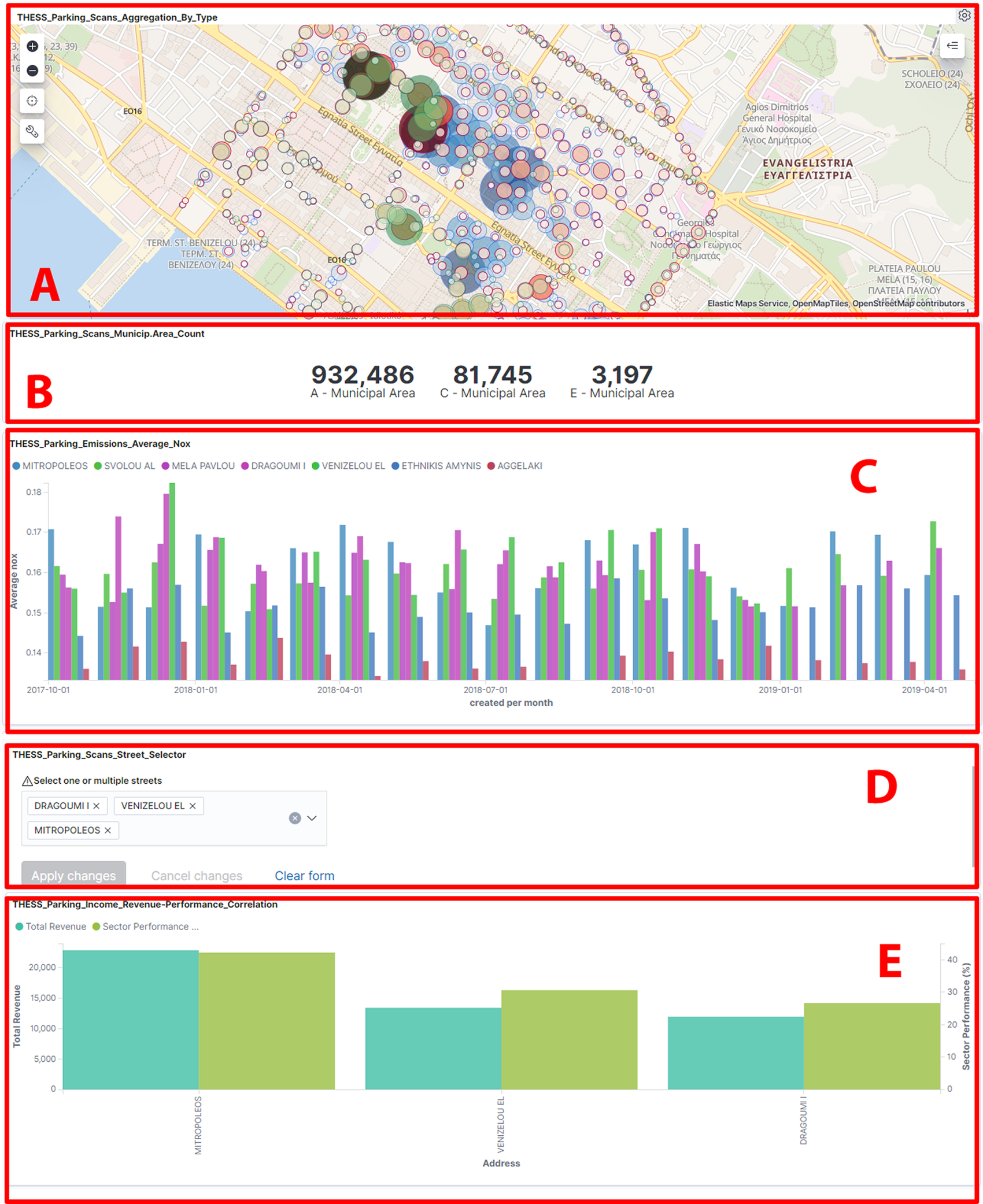
Figure 4. Dashboard showing: (a) Parking scans aggregation clustering, (b) parking scans municipality area count, (c) emission data, (d) street selector component, and (e) parking income revenue/performance correlation.
5.2.2 Selecting streets based on environmental impact
Next, we observe the Nitrous Oxide emissions for a number of large streets in the chart of Figure 4c. Some streets have higher emissions than others, so hypothetically we can lower emissions if we focus our attention to sectors that are included in these streets. From the Street Selector component as shown in Figure 4d, we can select only the streets that have high Nitrous Oxide emissions to filter the dashboard accordingly, namely “DRAGOUMI I.,” “VENIZELOU EL,” and “MITROPOLEOS” streets.
5.2.3 Selecting streets based on revenue performance of relevant sectors
In Figure 4e, we can see the chart for the revenue/performance data for each sector. We can filter through the sectors that are located inside certain streets that are performing better than others. Thus, we can safely exclude streets that were included in the previous step from our list of options since we want the sectors that are generating a high amount of revenue to remain intact. In our case we exclude “MITROPOLEOS” street, so we are left with “DRAGOUMI I.” and “VENIZELOU EL”.
5.2.4 Selecting streets based on social sentiment
Next, we go to the social data charts illustrated in Figure 5a, that are populated with data from the ImproveMyCity platform, cross referenced with street addresses. There is a heatmap that depicts how many issues the residents of Thessaloniki submitted in this area, a Pie chart that shows a percentage for the categories of these issues, and a dropdown where you can filter the category that you want to further investigate. We select the illegal parking category from the dropdown so we can only see citizen issues that are related to parking. In the sentiment stacked bar chart as seen in Figure 5b, we can see the sentiment of the people as extracted from the submitted issues. This way we can identify in which sectors the citizens have negative feelings on issues related to parking. So we can safely exclude streets that users are less negative about and remove them from the Street Selector of Figure 4c, so as to end up with one street. In our case we exclude the street “VENIZELOU EL.” and end up with “DRAGOUMI I.”

Figure 5. Dashboard showing: (a) ImproveMyCity charts, (b) social sentiment bar chart, and (c) parking income/performance and spots per sector charts.
5.2.5 Selecting sectors based on performance
Going further down on the charts of the dashboard to the “Economic—Performance per sector” chart illustrated in Figure 5c, we can see all sectors that belong to the “DRAGOUMI I.” street. This chart features the economic performance of a sector, which is shown as a percentage on the Y axis, and the yearly income for each sector, depicted as a disk with variable size. Right next to this chart there is another chart that shows the number of parking spots per sector. We can see that two sectors, namely 21.324 and 21.184 have the lowest performance and also low yearly incomes while spanning a low number of spaces. Comparing the two sectors we can safely assume that sector 21.324 can be switched to a Resident type, minimizing the loss of income and parking spaces while also tackling with the negative comments of local residents about parking. The entire process can be repeated if there is a need to allocate more parking spots for residents, or vice versa.
5.3 Evaluation study
To assess the effectiveness of the proposed solution, an Evaluation Study was organized, which consisted of:
-
• The recruitment of users (i.e., policy-makers from the Municipality).
-
• A training session for the users to get introduced to the dashboard and the specific use case.
-
• The testing process during which the users freely interacted with the dashboard for a period of few weeks.
-
• The evaluation process where users were asked to complete questionnaires that carefully examined different aspects of the dashboard.
-
• A reflection workshop after the end of the testing process to collect verbal user feedback beyond questionnaires about the usage of the dashboard.
During the recruitment phase, the selected end-users satisfied one or more of the following criteria: (a) High administrative decision-making roles connected to the CPS, (b) participation in the working group of the CUTLER H2020 project, and (c) basic IT knowledge. In total, 27 users were involved in the evaluation from the Municipal police, the Reception and Supervision committee, the Environmental department, the E-governance department and the department of Operational Planning and Monitoring of Structural Funds, which is responsible for monitoring, adapting, and improving the resilience strategy developed by participating in the 100 Resilient Cities network (Thessaloniki, 2018).
For the training process, the end-users used their own laptops to interact with the dashboard. The training process involved a presentation of the general features of the dashboard and an in-depth walkthrough of the usage scenario. Also training material in the form of a user manual was provided to the users so they could refer to it while using the dashboard. After the completion of the basic training procedure, the participants were provided with information and details on how the evaluation process will take place.
The pilot testing process lasted for a period of few weeks, during which the end-users were tasked with using the dashboard to make different CPS related decisions. They were encouraged to visit the dashboard from their workstations in the Municipality or their laptops at home on a daily basis.
After the testing phase was over, the evaluation phase started and two types of questionnaires were filled-in and collected for feedback; a “Quality-based” and a “Feature-based” questionnaire. The “Software Evaluation: Criteria-based Assessment” issued by the Software Sustainability Institute (UK) (Jackson et al., Reference Jackson, Crouch and Baxter2011) was used as a guide for selecting the assessment criteria.
The Quality-based questionnaire covers the evaluation of the platform based on specific criteria. It allowed the end-users to evaluate various qualities of the dashboard and consisted of 12 parts. The Unified Theory of Acceptance and Use of Technology (Venkatesh et al., Reference Venkatesh, Thong and Xu2012) was used as a source for the questions. More specifically:
-
1. Introduction: Brief information about the dashboard and the goals of this questionnaire.
-
2. Usage Statistics: Dashboard use frequency by the users as well as which charts, chart types (economic, environmental, and social) and chart categories (bar charts, pie charts, etc.) were the most useful in the context of the use case.
-
3. Usefulness: Evaluation of the overall dashboard usefulness. It examines the usefulness of combining different data sources (economic, environmental, and social), and using multiple parameters to make a decision. It also evaluates the quantity and quality of the data in the dashboard.
-
4. Usability: Platform usability evaluation with questions pertaining to the complexity of the dashboard, the amount of assistance needed from a technical person to overcome the learning curve of the dashboard and confidence when using it. The questions featured in this section where taken from the System Usability Scale (Brooke et al., Reference Brooke1996), with five response options for end-users slightly altered; from “Not easy at all” to “Very easy,” so as to not cause biased results, as usually people tend to agree according to Dillman et al. (Reference Dillman, Smyth and Christian2014) and Revilla et al. (Reference Revilla, Saris and Krosnick2014).
-
5. Visualization: Questions about the effectiveness of visualizing complex data and the complexity of the dashboard.
-
6. Interaction: Evaluates generic interaction with the dashboard.
-
7. Training material: Evaluates the usefulness and information provided in the training material document.
-
8. Learnability: Features questions about how easy it was to learn how to use the dashboard.
-
9. Future intentions: Features questions on if and how often they are planning on using the dashboard.
-
10. Objectives: Evaluation of the platform goal to reach its objectives in regard to making more informed and effective decisions.
-
11. Free comments section: In this section, the end users could leave a comment about any issue they encountered while using the dashboard or suggestions on improving it.
-
12. Demographic: Demographic information about the participants, for example age range, gender and professional background.
In the Feature-based questionnaire, the end users evaluated the features (widgets) of the dashboard one by one using the same structure as in the Quality-based questionnaire but answering for each widget specifically the following five questions:
-
• How useful the information included in this widget is for their work.
-
• How satisfied they are with the visualization of the information in this widget.
-
• If they experienced any technical problems while using this widget.
-
• If they have any recommendations on improving this widget.
-
• In which way this widget was useful for their decision-making.
The first two questions were closed-ended and evaluated each widget both by means of contained information and visualization, while the other three were open-ended questions.
As a result of the collection of questionnaires and the reflection workshops, a great deal of information was gathered on the usability and practicalities of the dashboard. More specifically, the usefulness of the dashboard about the specific use case was evaluated positively, as it allowed faster decisions, encouraging the combination of different types of data (economic, environmental, and social) for decision-making (Figure 6). The contribution of the dashboard that was evaluated most positively by the users was the fact that more parameters than before are now considered before making a decision for the specific policy at hand. The users performed comparisons that were impossible to perform before, and they emphasized that the dashboard offered better understanding of the various problems they face in their work on a daily basis, and that they made more effective decisions (Figure 7). The visualization of data in a simple and comprehensive way made it easier for them to extract valuable information and helped them save time in the decision-making process, when trying to decide which sector should switch type.

Figure 6. Usefulness of the dashboard on making informed decisions.

Figure 7. Usefulness of the visualizations in extracting information for decision-making.
The social charts of the dashboard helped the end-users discover problematic areas in the city (illegal parking or other types of issues while cross referencing them with the ImproveMyCity dataset) and mix them up with decision-making in other policy fields. Public sentiment extraction pointed out the most frequent problems and gave the end-users the incentive to try and improve the quality of life in their city.
Concerning the usability and interaction quality of the dashboard, the majority of the end users found the dashboard quite easy to use (Figure 8). It was relatively easy for them to combine the different elements to make a decision and most of them felt confident in using the dashboard and they stated that they intend to continue using the dashboard in the future (Figure 9).

Figure 8. Usability of the dashboard.

Figure 9. Intention of using the dashboard in the future.
The end users also made some suggestions for improvements based on the current use case. Many users would like more charts to be included in the environmental section, and specifically more data to be available on air quality. They also suggested that the maps should include more GIS data on land use, concerning all aspects of economic activity like tourism and commerce, and cover more policy fields. They would find useful information of how busy a street is commercially-wise, whether there are hospitals or public service buildings close to specific sectors, or if they knew the number of residential buildings of a street. They believe that the sources of social data should be enriched as this would lead to more transparency. For example, analysis of the comments of the well known service TripAdvisor that regard the most visited touristic sites of the city, Facebook pages which concentrate citizen’s comments about the CPS, and relevant online news articles would be a useful addition.
6 Discussion and Conclusions
In this paper, we have presented a dashboard for the management of the Controlled Parking System in the city of Thessaloniki, that aims to contribute in effectively shifting the existing intuition–based paradigm of policy-making toward a more evidence-driven approach. However, there are certain limitations that we need to point out.
By using a big collection of heterogeneous sources of data our system might be prone to selection bias due to feedback loops. This type of bias could occur due to the fact that the policy model itself influences the generation of data that is used to get insights from. When sharing policy projections with the public, feedback loops can also be established. For example, through the change of behavior of car owners due to the switch of parking sector types, city officials can discover newly congested sectors or citizen dissatisfaction and act accordingly. Omitted variable bias can also occur if critical data on any of the aforementioned datasets that influence the policy outcome is missing. This usually happens when data generation relies on human input which is the case in most of the Municipality data gathering processes, more specifically in the parking and economic datasets.
In evaluating our work, based on a detailed analysis of user feedback, a list of recommendations was formulated that will guide the future research and development of our platform. However, we also need to acknowledge that there are some inherent limitations in the evaluation study presented in this paper, since it was based solely on the subjective opinion of the user as harvested through the questionnaires, lacking a mechanism to obtain subjective measurements about the usage of the system. Toward this end and following the completion of the evaluation study reported in this paper, we have extended our system to incorporate a logging functionality able to capture additional information about the usage of the system, like the number of sessions performed by each user, the duration of each session, the number of interactions received by each widget in the dashboard, etc. Using this logging functionality, we hope to conduct more subjective assessments of our system in future evaluations.
Another limitation of our work, and specifically of the presented methodology, arises when there is a need to examine radically different parameters. Different parameters usually involve different datasets that have to be homogenized, indexed and visualized in respect to the current ones, adding a new dimension of complexity when handling the data. In general, there is no plug-n-play solution to that, however our architecture and design choices do manage to streamline this process, making the effort necessary to scale in different scenarios and/or datasets rather small.
Finally, our choice to support the homogenization of data at the dimensions of space and time was motivated by the need to be as generic as possible and have an approach that could be effective in various different policy scenarios. Potential future work about the homogenization of heterogeneous data sources can also incorporate more sophisticated approaches that rely on inference and are typically addressed in related literature as “assignment problems.”
Acknowledgments
The research leading to these results has received funding from the European Community’s Horizon 2020—Research and Innovation Framework Programme under grant agreement no 770469, CUTLER.
Funding Statement
This research was supported by grants from the European Community’s Horizon 2020—Research and Innovation Framework Programme under grant agreement no 770469, CUTLER.
Competing Interests
The authors declare no competing interests exist.
Authorship Contributions
Conceptualization, T.F., N.S., and K.N.; Methodology, T.F. and N.S.; Formal Analysis, T.F., N.S., and K.N.; Data Curation, P.C.A., T.I., D.K., P.G., P.,P., and K.S.; Writing-Original Draft, P.C.A. and N.S.; Writing-Review and Editing, P.C.A., T.F., N.S., and K.I.; Supervision, T.F., N.S., and K.I.; Funding Acquisition, N.S. and K.I.; Software, P.C.A. and T.I.; Visualization, P.C.A. and T.I.; Resources, P.C.A, T.I., D.K., P.G., P.P., K.S., and C.C.; Project administration, T.F., N.S., and K.I.
Data Availability Statement
Data availability is not applicable to this article as no new data were created or analyzed in this study.


 Open access
Comments
No Comments have been published for this article.