


Legislators at the federal, state and local level subject to redistricting are first and foremost concerned about the impact of new district boundaries on their ability to get re-elected. However, many also fight hard to keep or have included in their new boundaries structures which have no voters. Examples are major corporate headquarters, sports arenas, airports, historical landmarks.
– Former Congressperson involved in redistricting (emphasis ours)
INTRODUCTION
Every 10 years, state mapmakers redraw the geographic boundaries of United States’ legislative districts. Academics typically study this as an allocation problem in which mapmakers place voters into districts, maximizing some criteria. Partisan mapmakers, for example, might optimize their party’s delegation or individual politicians’ reelection chances, commonly known as gerrymandering, while court-appointed or nonpartisan bodies might optimize other criteria such as competitiveness or fairness. This article broadens the study of this allocation problem beyond voters, asking whether mapmakers also consider other objects, notably firms when drawing district boundaries.Footnote 1
Having firms in one’s district is politically valuable for many reasons:Footnote 2
-
i. firms provide campaign financing via political action committees (Stratmann Reference Stratmann1996), executives (Bonica Reference Bonica2016; Fremeth, Richter, and Schaufele Reference Fremeth, Richter and Schaufele2013; Reference Fremeth, Richter and Schaufele2018; Gordon, Hafer, and Landa Reference Gordon, Hafer and Landa2007; Richter and Werner Reference Richter and Werner2017), and employee contributions (Ovtchinnikov and Pantaleoni Reference Ovtchinnikov and Pantaleoni2012; Stuckatz Reference Stuckatz2022);
-
ii. they are viewed as signals of economic health and provide many opportunities for credit claiming (Yang Reference Yang2023).
-
iii. they provide a path to power via committee assignments (Jenkins Reference Jenkins2021);
-
iv. they help politicians connect to and mobilize voters (Hertel-Fernandez Reference Hertel-Fernandez2018);
-
v. they provide public goods in their districts (Bertrand et al. Reference Bertrand, Bombardini, Fisman and Trebbi2020; Card, Hallock, and Moretti Reference Card, Hallock and Moretti2010; Slattery and Zidar Reference Slattery and Zidar2020); and,
-
vi. they provide legislative subsidies to enable more policymaking (Ellis and Groll Reference Ellis and Groll2020; Hall and Deardorff Reference Hall and Deardorff2006).
Decennial redistricting presents both a rare opportunity for partisan mapmakers to bind firms to the districts they represent and incentives to exploit that opportunity. By contrast, non-partisan mapmakers have the same opportunity but different incentives. We demonstrate that when given the opportunity, partisan legislators disproportionately allocate firms to their co-partisans, while commissions and courts distribute firms more proportionately. Our results hold even when we consider that seats may be gerrymandered as well. We also find evidence of firm gerrymandering when we consider a reasonable set of potential confounding variables at the precinct level using multivariate regressions (see Supplementary Appendix D). In short, variation in who draws the maps influences how (the headquarters of prominent) firms are allocated across districts.
The complex nature of gerrymandering makes it difficult to distinguish between seat gerrymandering and firm gerrymandering (and potentially the gerrymandering of other things). State-level mapmakers could over-allocate firms to their party (a) unintentionally, as a byproduct of intentional seat gerrymandering, (b) intentionally, in conjunction with intentional seat gerrymandering, or (c) intentionally, without any seat gerrymandering.Footnote 3 We present clear evidence that, at least in some states, firm gerrymandering results are independent of seat gerrymandering. There are states (e.g., Pennsylvania) in which firms are overallocated to the mapmakers’ party, even controlling for the number of seats that the party wins. In other states (e.g., Texas), firms are gerrymandered while seats are not (in aggregate). Even in states where we cannot separate intentional and unintentional firm gerrymandering —typically smaller states with fewer firms—the result itself (the alignment between firms and political parties at the state level) has important implications for the performance of democratic institutions.
Our findings contribute important new evidence to the long-standing study of how redistricting shapes both economic and political outcomes (Artés, Richter, and Timmons Reference Artés, Richter and Timmons2019; Nagaraj and Stern Reference Nagaraj and Stern2020). Existing theories of gerrymandering focus on voters and margins of safety in winning districts (e.g., Coate and Knight Reference Coate and Knight2007; Gul and Pesendorfer Reference Gul and Pesendorfer2010; Friedman and Holden Reference Friedman and Holden2008; Kolotilin and Wolitzky Reference Kolotilin and Wolitzky2023; Owen and Grofman Reference Owen and Grofman1988). We show that there are other objects of political value worth capturing in legislative maps, namely firms, providing the first step toward a more general theory of economic gerrymandering that could include other objects of interest, such as wealthy residents, political donors, universities, hospitals, or specific landmarks. Not only does our work demonstrate that gerrymandering needs to be studied as a multidimensional problem, but it also illustrates a research design for doing so.
We also bring fresh evidence to theories of corporate political power. The dominant theory of firms and politics (Stigler Reference Stigler1971) posits that firms endeavor to capture politicians, granting corporations outsized influence in the political process. Our results suggest that politicians also seek to bring firms under their patronage: to the extent that partisan mapmakers are successful, they may systematically align major firms with the statewide majority party, whichever it may be.Footnote 4
PARTISAN INCENTIVES TO DRAW FIRMS INTO DISTRICTS
Why should partisan mapmakers care about whether their districts, and not their opponents’ districts, contain firms? And how do the incentives differ among non- or bi-partisan commissions? Partisan mapmakers differ from commission mapmakers in that they have incentives to stack the electoral deck in their favor. By contrast, independent commissions are generally designed to be insulated from political considerations. We might expect a different allocation of firms in partisan-drawn maps than in commission-drawn maps if firms are of political value, just like we observe with voters. Our hypothesis is that firms hold political value, independent of voters, by providing politicians with both (i) electoral benefits and (ii) power and prestige. We address these mechanisms in turn.
Electoral Benefits
According to Ricco Garcia, a Democratic political operative with extensive redistricting experience in Texas: “Politicians are interested in the companies [being assigned to their district or party] for fundraising.”Footnote 5 This claim is supported by copious academic literature on corporations as a source of campaign finance, particularly to politicians representing districts where firms are located (e.g., Bombardini and Trebbi Reference Bombardini and Trebbi2011). Gopoian (Reference Gopoian1984), for example, finds that firms are nearly as likely to give to the representative of their headquarters as they are to the representatives who sit on that firm’s most relevant committee, and that both are more important than candidate ideology. Fouirnaies and Hall (Reference Fouirnaies and Hall2014) find that corporate PACs disproportionately donate to the incumbent party, helping create the incumbency advantage, while Ovtchinnikov and Pantaleoni (Reference Ovtchinnikov and Pantaleoni2012) find that individuals are more likely to contribute to incumbents when firms in a district cluster in a single industry.
This money can help win seats: “war chests” can deter potential challengers, can be re-allocated to marginal legislators within the own party to build intra-party support, and can be transferred by politicians as “party dues” in exchange for advantageous Congressional committee assignments (Jenkins Reference Jenkins2021).
In addition to being a source of money that parties can use to advertise their candidates, firms are visible actors in local economies, giving representatives opportunities to attend events such as ribbon cuttings. According to Garcia, “When you’re at these things you get to interact with [the] Governor, other Committee Chairmen, etc. which helps you get to know them and ultimately makes you powerful,” a mechanism also highlighted by Fenno (Reference Fenno1977). Site visits from government officials can also boost firms’ market valuations, indicating some sort of reciprocity (Schuler et al. Reference Schuler, Shi, Hoskisson and Chen2017). Overall, firms’ public events in home districts provide opportunities for parties and politicians to advertise themselves and credit-claim for their activities in the district.Footnote 6 Firms can also influence voters more directly to assist politicians by mobilizing their employees (Hertel-Fernandez Reference Hertel-Fernandez2018) or manipulating employment decisions (Bertrand et al. Reference Bertrand, Kramarz, Schoar and Thesmar2018).
Finally, and especially relevant for our purposes, Yang (Reference Yang2023) shows that headquarters are particularly politically valuable: they have large economic spillovers, meaningful symbolic value for the public at large, and direct electoral effects for incumbents, as evidenced by the massive subsidies used to attract and retain them. To borrow one such example from Yang: Amazon’s plan to add a second headquarters generated incentive packages from 238 state and local governments in the US and Canada, with offers reaching $8.5 billion.
Power and Prestige
Firms can also help politicians elevate their position within their party, an important criterion for advancing in Congress and to higher office. For example, politicians often receive committee appointments related to the sectors of the firms in their districts. Ricco Garcia notes that “one of the reasons firms are drawn into districts is to [help politicians] get on prestige committees.” This builds a dependency between firms and politicians: firm support helps politicians advance in seniority on relevant committees, which in turn improves the value of those firms’ privileged access to government services. At the same time, serving on prestige committees helps politicians attract more campaign contributions from firms both inside and outside of their districts (Grier and Munger Reference Grier and Munger1991).
Secondly, local businesses are a vital source of information and potent public signal about the health of the local economy for parties and politicians; this information enables them to sponsor relevant legislation, engage in more credit claiming, and improve policymaking, all of which is directly tied to re-election prospects (Fenno Reference Fenno1977; Hall and Deardorff Reference Hall and Deardorff2006; Hertel-Fernandez, Mildenberger, and Stokes Reference Hertel-Fernandez, Mildenberger and Stokes2019; Yang Reference Yang2023).
Finally, firms may provide valuable connections in politicians’ careers after office, improving their value as “revolving door” lobbyists or on corporate boards (Blanes i Vidal, Draca, and Fons-Rosen Reference Blanes i Vidal, Draca and Fons-Rosen2012).
Firm Heterogeneity
If a firm’s value to a politician is in its contributions to that politician’s electoral, financial, and career development, especially through visibility, prestige, economic spillovers, and financial support, we might expect that some firms are more valuable than others. Firms may be especially coveted due to their size, the sector they operate in, their popularity, or their willingness to donate to their representative’s campaign. Similarly, some firms may be “toxic” for a representative in a district (McDonnell and Werner Reference McDonnell and Werner2016), something also pointed out by Garcia. For example, a pro-union candidate may not be interested in anti-union firms, or a candidate with a salient position on environmental issues may not want to represent an oil company.
Our theory does not exclude that, in certain cases, specific politicians may not be interested in specific firms or that they may be more interested in some firms than others. Instead, we conjecture that despite the idiosyncrasies and constraints at the state, firm, or politician level, there are strong reasons both for parties and individual politicians to covet firms in their districts (as opposed to in districts of rivals); therefore, we hypothesize that firms will generally be an object of desire for mapmakers.Footnote 7 This is particularly true for the sorts of large and visible firms and business units (headquarters) found in our sample. Furthermore, given the emphasis on electoral, financial, and career-building incentives, our theory should also apply to other influential non-publicly traded firms, large employment centers separate from headquarters, military bases, major economic infrastructure like ports and airports, prisons, or major events venues; it might even extend to corporate executives.Footnote 8
Below, we present a stylized illustration of our theory in which we assume, for tractability, that only seats and firms are desirable for politicians and in which all firms are of interest.Footnote 9
ILLUSTRATING SEAT AND FIRM GERRYMANDERING
Given that firms typically have value to politicians, we expect partisan mapmakers to consider them in their redistricting plans. Our core hypothesis is that maps drawn by partisan districters disproportionately allocate firms to districts that their party controls.Footnote 10
In this section, we explore three ideas: (i) what firm gerrymandering might look like, (ii) how it is different from seat gerrymandering, and (iii) how both firm and seat gerrymandering might interact. We use a stylized example to develop the intuition and set up our simulation approach.
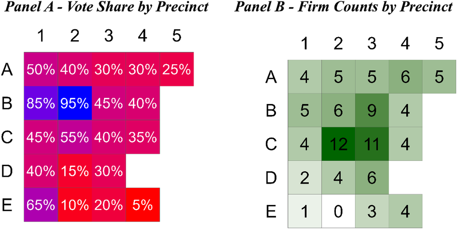
Figure 1 introduces New Gerryland, a hypothetical state with 20 equally sized and equally populated voting precincts to be allocated by a mapmaker into 5 electoral districts of 4 precincts each. Each precinct has a share of Democratic voters (Panel a) and a number of firms (Panel b). The top-left precinct (a1) has a 50% vote share for Democrats and 4 firms; the top-right precinct (a5) has a 25% vote share for Democrats and 5 firms. Overall, 40% of voters in New Gerryland are Democrats and there are 100 firms. A completely proportional allocation would yield 2 Democratic districts with 40 firms in total and 3 Republican districts with 60 firms in total.Footnote 11
New Gerryland Precinct Map: Location and Attributes of 20 Equal-Population Voting Precincts to Be Allocated to Five Electoral Districts
Notes: Panel A. The percentages in each cell/district refer to the Democratic party’s vote share. The color emphasizes the partisanship of each cell/district (blue for Democratic leaning districts and red for Republican leaning districts). Panel B. The number in each cell/district refers to the number of firms located in that district. Darker precincts contain more firms.
A State-Wide Proportional Redistricting Plan
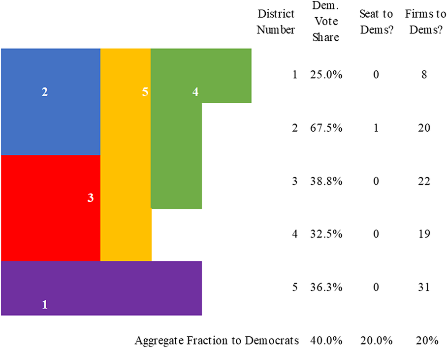
First, consider a mapmaker seeking to allocate both seats and firms proportionally to voters, such that Democrats win 2 of 5 seats and 40 of 100 firms. Figure 2 provides an example. Districts 1 (blue) and 4 (green) are majority-Democratic, with 55.0% and 52.5% of the vote share respectively, and contain 15 and 25 firms. The table’s bottom row presents state-wide summary statistics: the state-wide vote share, the percentage of districts won by Democrats, and the percentage of firms allocated to districts with a Democratic majority.
New Gerryland Redistricting Plan 60: Democrats Win Seats and Firms Equal to Their Vote Share
Note: Each colored and numbered area represents a different district.

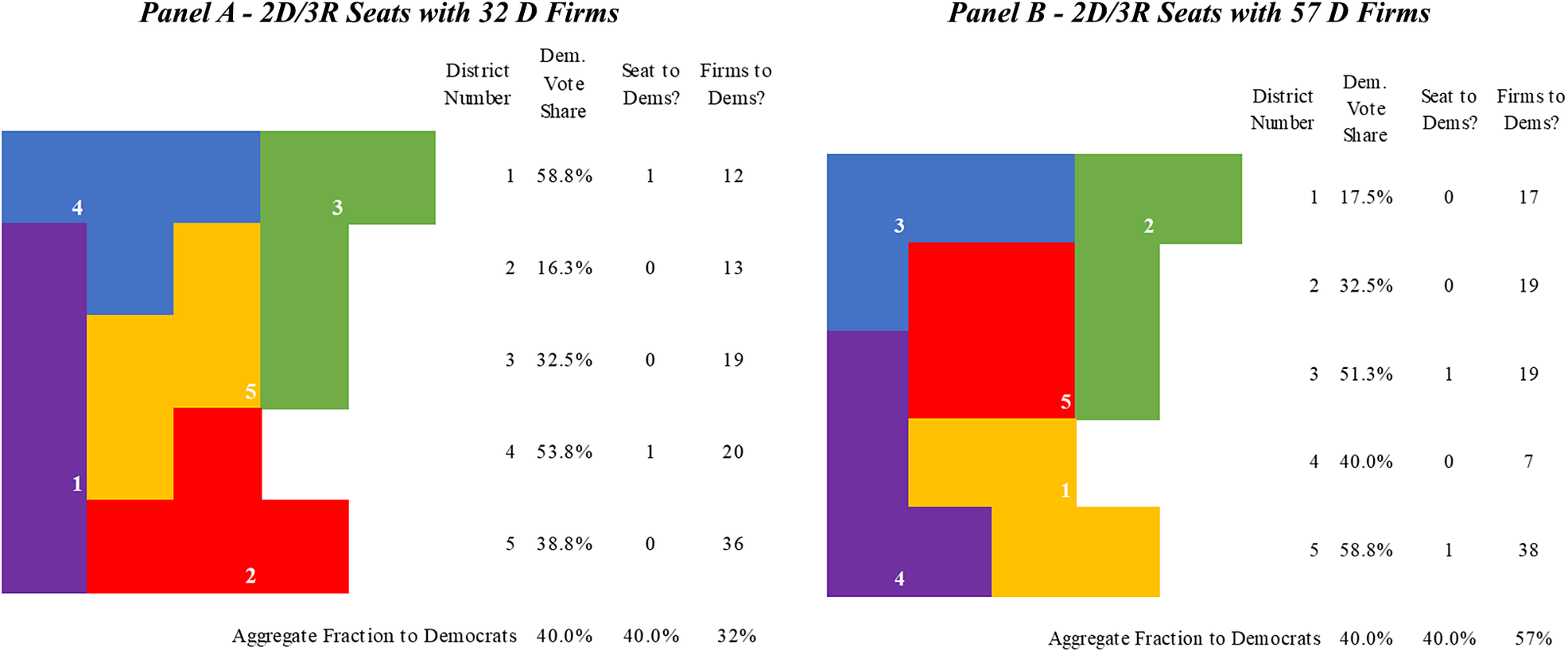
It is also possible to draw maps where seats are proportional to voters, but where the allocation of firms is not. In both panels of Figure 3, Democrats win 2 of 5 seats, but their firm yield varies considerably. Plan 41 in Panel a yields 32 firms for Democrats while Plan 97 in Panel b yields 57, a large and politically meaningful difference: even when seat allocations must be proportional to vote shares, mapmakers can reallocate 25% of a state’s total firms from one party to another. Plans that look seat-neutral may favor one party in terms of firms, allowing mapmakers to gerrymander firms.
New Gerryland Redistricting Plan 41 and Redistricting Plan 97: Democrats Win Seats Proportional to Their Vote Share, but May Receive Disproportionately Fewer Firms (A) or More Firms (B)
Note: Each colored and numbered area represents a different district.
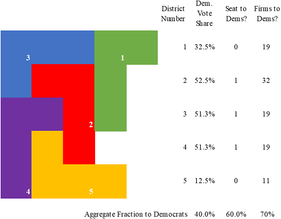
A Republican-Biased Plan
Now consider a biased mapmaker seeking to favor their party. Since Republicans control the majority of voters, they might prefer a plan that holds Democrats to 1 seat, giving Republicans 4 out of 5 seats and maximizing their delegation.
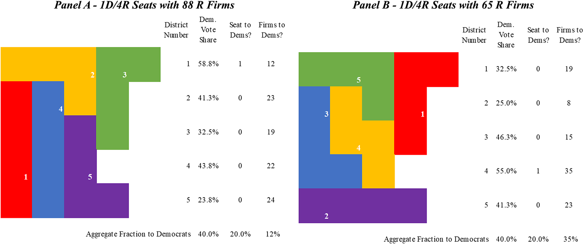
Plan 20, displayed in Figure 4, is one such plan. It allocates 80 firms to Republicans (and 20 to Democrats), what we might expect from a 1D/4R split if seats were proportional to firms. Republicans strictly prefer Plan 20 to any plan giving them 3 seats: 68 firms are the most they can obtain with any 3-seat plan, whereas in Plan 20 they receive 80 firms. But even among plans where Republicans win 4 seats, there is substantial variation in firm allocations: Plan 1, shown in Figure 5, Panel a, gives Republicans 88 firms, while Plan 48, shown in Panel b, gives them only 65 firms. The range of firm allocations is 23, similar to the range of 25 for 2D/3R plans. Therefore, firm gerrymandering may exist within extreme seat allocations.Footnote 12
New Gerryland Redistricting Plan 20: Democrats Win Disproportionately Few Seats and Equally Disproportionately Few Firms
Note: Each colored and numbered area represents a different district.
New Gerryland Redistricting Plan 1 and Redistricting Plan 48: Democrats Win Disproportionately Few Seats, and Even Fewer Firms (A) or a Proportionate Number of Firms (B)
Note: Each colored and numbered area represents a different district.
Full Distribution of Gerrymandering Possibilities
New Gerryland has only 20 precincts, so we can draw all 100 feasible redistricting plans and summarize their characteristics, sketching a possibility frontier for both seats and firms. This frontier identifies which outcomes might be gerrymandered by revealing if they are statistical outliers, falling in the extremes of the seat distribution, firm distribution, or the joint distribution of both.
Seat Gerrymandering Defined
First, we look at the empirical distribution of seats. For each of the 100 plans, we calculate how many seats Democrats would win and present that distribution in Figure 6. Each bin represents a possible seat allocation, from 5 Republican to 5 Democratic seats; each bin’s height represents how many possible plans result in that allocation. Although there are six conceivable outcomes, only three are feasible: 1D/4R, 2D/3R, and 3D/2R. The expected outcome of redistricting in New Gerryland is a 2D/3R plan—occurring in 55 out of 100 plans—consistent with an expectation that a neutral plan might allocate seats proportional to voters.
New Gerryland: Histogram of Seat Allocation in Population of Feasible Redistricting Plans
Note: Each bin represents a possible seat allocation, from 5 Republican to 5 Democratic seats; each bin’s height represents how many possible plans result in that allocation.
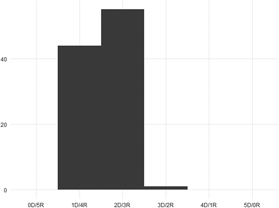
Which of the alternative outcomes might we call a seat gerrymander? A 1D/4R seat allocation biased toward Republicans arises in 44 out of 100 feasible plans, illustrating that not all deviations from that expectation are gerrymanders. A 3D/2R seat allocation biased toward Democrats, however, only occurs once among all 100 feasible plans. Hence, the 3D/2R seat allocation falls at the 99th percentile of the seat distribution, providing compelling evidence of seat gerrymandering. A one-sided p-value for a randomly selected plan being as, or more, favorable to Democrats than a 3D/2R realization is 0.01, while the p-value of selecting a random plan as or more favorable to Republicans as a 1D/4R seat allocation is 0.44.
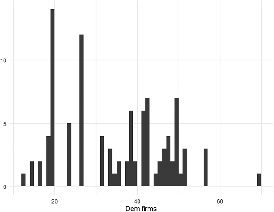
Firm Gerrymandering Defined
We can extend the same logic for seats to firms to identify firm gerrymanders. Looking again at each of the 100 plans, we calculate how many firms fall into districts that Democrats win, presenting that distribution in Figure 7. In a proportional plan, 40 firms land in Democratic districts, which we find near the distribution median. The modal outcome, occurring in 14 distinct plans and represented by the tallest bar, places 20 firms in Democratic districts. A plan where Democrats receive the minimum possible 12 firms falls at the 99th percentile of Republican firm gerrymandering, while the plan where they receive the maximum possible 70 firms falls at the 99th percentile of Democratic firm gerrymandering. With a one-sided quantile threshold of 0.1, we can consider the 10 left-most plans (out of 100) to be Republican firm gerrymanders and the 10 right-most plans to be Democratic firm gerrymanders. Hence, any New Gerryland plan allocating 19 or fewer firms to Democrats is a firm gerrymander for Republicans, while any plan allocating 51 or more firms to Democrats is a firm gerrymander for Democrats.
New Gerryland: Histogram of Firm Allocations in Population of Feasible Redistricting Plans
Note: Each bin’s height represents the number of simulated plans that result in the allocation of firms represented in the horizontal axis.
Joint Seat and Firm Gerrymandering
Firm and seat gerrymandering interact in important ways, as apparent in the joint distribution of firms and seats in Figure 8. The vertical axis indicates seats allocated to Democrats, while the horizontal axis presents firms allocated to Democrats; darker bars indicate more frequent firm-seat combinations. The lightest bars appear in cells for 1D seat/12 Democratic firms and 3D seats/70 Democratic firms as these allocations only occur once among the 100 feasible redistricting plans.
Joint Distribution of Seat and Firm Allocation Pairs in Population of Feasible Redistricting Plans for New Gerryland
Note: The vertical axis indicates seats allocated to Democrats, while the horizontal axis presents firms allocated to Democrats; darker bars indicate more frequent firm-seat combinations.
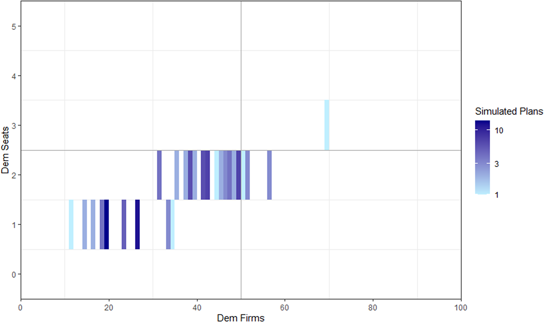
The top right of the figure is a plan that allocates 3 seats and 70 firms to Democrats. It is as extreme as possible on both dimensions and therefore appears to be the optimal choice for Democrats. According to our definitions above, it is both a seat gerrymander (because there are 3 or more seats allocated to Democrats) and a firm gerrymander (because there are 51 or more Democratic firms). But importantly, because there is only one map allocating 3 seats to Democrats, we cannot positively conclude that by selecting this plan, mapmakers intentionally maximized firms rather than targeting seats.
However, consider the most Republican extreme, a redistricting plan allocating only 1 seat and only 12 firms to Democrats. In this case, we have enough leverage to disentangle firm targeting from seat targeting. If Republicans were merely trying to maximize seats, they need not pick the most extreme plan in the bottom left; there is a large range of options for how many firms they could obtain among the 44 plans that do so. These options form the seat-conditional firm distribution, supplying Democrats with anywhere from 12 to 35 firms, with 20 being both the mode and the median. If Republicans were to allocate only 12 firms to Democrats we would consider it a seat-conditional firm gerrymander, or firm targeting, since an allocation of firms as extreme occurs only 1 out of 44 times (p-value = 0.023) among the set of plans that yield 1D/4R seats.
Disambiguating between merely maximizing seats versus firms being targeted explicitly by mapmakers is complex. If we define firm gerrymandering only as an extreme firm allocation relative to the unconditional full set of possible maps, we may miss cases where firms are targeted in conditional firm gerrymanders. Consider plans in the 2D/3R row. Given this allocation of seats, Democrats may yield anywhere from 32 to 57 firms. The 57-firm plan is extreme both overall/unconditionally and conditional on its firm allocation and is a Democratic firm gerrymander either way; however, a 32-firm plan is only extreme in the conditional distribution and is a Republican conditional firm gerrymander but not an unconditional one. Either a 32-firm allocation or a 57-firm allocation, nevertheless, provides strong evidence that mapmakers prized firms, given some reason to select a 2D/3R plan. Hence, it is important to analyze both the overall/unconditional allocation of firms into districts and the allocation conditional on the number of seats in the enacted plan to detect firm targeting by mapmakers.
Importantly, the New Gerryland example exposes that extreme outcomes on the firm distribution could be intentional (i.e., reflecting specific targeting by mapmakers), or merely a by-product of the mapmakers’ focus on seats. Regardless of why a firm gerrymander occurs, an extreme, disproportionate allocation of firms to one party is consequential: it structurally aligns those firms with the party in power that drew the lines, changing incentives for both firms and politicians.
Picking the Optimal Plan
Mapmakers may not always want to select the plan that maximizes either firms or seats or both. There are a number of potential reasons why they may prefer a second best. First, though we think most firms will have value, not every firm will. Second, even members of the same party will have different preferences about the exact borders, as allocating firms or voters into one district implies taking them away from another. Third, all maps involve speculation about the future: a good map today may not be good tomorrow as populations and politics change. Finally, mapmakers may be optimizing over more than two dimensions, including things besides firms and voters. These constraints alone make maximization (even of seats) unlikely in many cases.
Consider, for example, Figure 9, Redistricting Plan 100. This plan maximizes both seats (3 of 5) and firms (70 of 100) for Democrats despite a minority of 40% of the voters. While Democrats win three seats in this plan, their margins are slim. The safest seat is won by only 5 percentage points, and the others by less than 3; a normal-size national swing would endanger 2 of the 3 seats. Democratic incumbents or a risk-averse mapmaker might prefer 2 safe seats to 3 marginal ones, and may instead maximize the firms they yield conditional on winning just 2. On the other hand, Democratic mapmakers might have more optimistic expectations. If demographic changes in their marginal districts bode well, they might ambitiously opt to seize 3 seats, after all, betting that they will become safer over time.
Plan 100: Democrats Win Disproportionately Many Firms and Seats, but Their Vote Margins Are Narrow
Note: Each colored and numbered area represents a different district.
The discussion above highlights that redistricting is an idiosyncratic process, relying on political geography, incumbent demands (Forgett and Platt Reference Forgett and Platt2005), partisan constraints, judicial scrutiny, party power structures, and much more. Fully capturing the tradeoffs in a simplified example like New Gerryland is impossible; nonetheless, we have outlined clear expectations about how partisan mapmakers might draw lines with firms in mind and a straightforward method for identifying when these expectations are met.
METHODS: SIMULATING REDISTRICTING PLANS
In our 20-precinct New Gerryland example, we can enumerate the complete set of redistricting plans and identify optimal ones for different partisan actors. It is not feasible to identify every unique redistricting plan in the real world; there are too many ways to draw district boundaries in a given state.
Using real-world data with simulation methods (McCartan and Imai Reference McCartan and Imai2020), however, we can randomly sample from the set of all redistricting plans and obtain the probability of each seat or firm allocation; our inferences use those representative samples as a null distribution for outlier analysis as above. This analysis is rooted in the outlier analysis of Ramachandran and Gold (Reference Ramachandran and Gold2018), commonly included in expert reports and used as evidence in redistricting court cases (see Chen and Rodden Reference Chen and Rodden2015). We are the first to apply these long-standing Monte Carlo methods for identifying racial and partisan gerrymandering (Cain et al. Reference Cain, Cho, Liu and Zhang2018; Chen and Rodden Reference Chen and Rodden2013; Chen and Stephanopoulos Reference Chen and Stephanopoulos2020; Fifield et al. Reference Fifield, Higgins, Imai and Tarr2020; Tam Cho and Liu Reference Tam Cho and Liu2016) to firms. In particular, we are the first to consider both the counterfactual distribution of firms and the joint distribution of firms and voters rather than the counterfactual distribution of only voters.
We calculate p-values by quantifying how extreme an observed plan’s firm allocation is relative to the simulated null distribution of potential firm allocations, indicating how likely it is that such an outcome occurred by chance. If a partisan redistricting plan generates a firm allocation in the 500 most extreme allocations out of 50,000 simulated plans, the p-value for observing something as extreme by chance would be 0.01—strong evidence of firm gerrymandering.
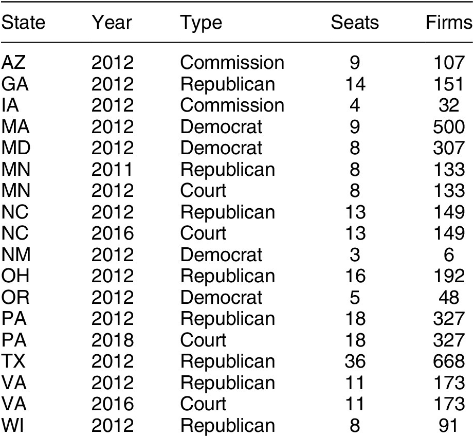
State Sample
We conduct simulations with 18 districting plans for the 14 states with the required precinct-level data (see Table 1).Footnote 13 Most of the results and statistics we calculate are state-specific, meaning that our inferences do not depend on which states are included in our analysis. As such, we can fairly assess the question of whether firms are ever gerrymandered in a partisan manner. One limitation of our sample, however, is that compared to Democratic states, Republican states tend to be larger and have more firms. In addition, many of the available Democratic states are clearly partisan while several of the Republican are swing states. In practice, this means that we have more variation across Republican states compared to Democratic states, allowing for stronger claims about the firm gerrymandering in red states; in many Democratic states, we are unable to separate firm from seat gerrymandering.
State Districting Plans in Our Analysis
Firm and Precinct-Level Data
The simulations require complete precinct-level data on population (to satisfy One Person, One Vote requirements), racial and ethnic characteristics (to satisfy Voting Rights Act compliance), and vote shares (to calculate district winners) linked to precinct geographies.Footnote 14 We draw these data from the Metric Geometry and Gerrymandering Group’s MGGG States Project.Footnote 15 We link these data to the geolocated addresses of publicly traded US firms’ headquarters acquired from COMPUSTAT and to other demographics from the US Census. As noted earlier, our sample of firms and units constitutes a most likely case for our hypothesis, given their political and economic salience. We believe that large publicly traded firms are the most valuable ones to politicians (given their size and visibility) and that headquarters are probably these firms’ most valuable location on average (Yang Reference Yang2023),Footnote 16 though we acknowledge that both private firms and major non-headquarters facilities may also be gerrymandered.
We include an analysis of the characteristics of firms and precincts in our database in Supplementary Appendices D and E.
Simulation Mechanics
Our simulation follows the state-of-the-art Sequential Monte Carlo (SMC) procedure of McCartan and Imai (Reference McCartan and Imai2020), described in Supplementary Appendix B, which produces representative samples of legal redistricting plans (Kenny et al. Reference Kenny, McCartan, Simko, Kuriwaki and Imai2023). Considering a precinct map as a network with precincts as nodes and precinct adjacency as edges connecting those nodes, the process of generating a district map involves selectively removing edges of that network. Our simulation procedure has five steps. First, we create the precinct adjacency matrix from a state precinct map.Footnote 17 Second, we conduct the SMC procedure, drawing 50,000 plans per state, with constraints for compactness, contiguity, county boundaries, and majority-minority districts, thereby ensuring that each district is legally valid.Footnote 18 Third, we overlay each plan with our dataset of geolocated firms. Fourth, we infer expected two-party vote shares for every district in every plan. Finally, we assign firms to parties based on district vote shares.Footnote 19
Estimating District Vote Shares
In estimating vote share for simulated districts, researchers typically make a number of key assumptions. Consider the 2012 Congressional districts for a given state. Once we simulate 50,000 plans, we must identify how many seats Democrats are expected to win in each plan. To do this, we identify how each precinct voted in the 2012 House of Representatives elections, then sum each party’s vote in each district in each plan.
This makes an implicit district invariance assumption: a precinct’s vote is invariant to the district that precinct is in. Moreover, for some states, precinct-level vote totals for the election of interest may not be publicly available, and researchers may use 2012 Presidential vote share or 2014 House of Representatives vote share to infer how precincts would vote under simulated plans in the 2012 House of Representatives. Using these introduces new assumptions: for the 2012 Presidential election results, that vote share is invariant to the ballot item, and for the 2014 House of Representatives election results, that vote share is stable over time.
These assumptions are standard in the literature and discussed further in Supplementary Appendices C and D. To weaken our reliance on them, we take a novel approach. We first average the precinct-level vote for up to four proximate elections to produce an estimate of a precinct’s latent vote share for each party, rather than rely on a single, possibly idiosyncratic, election to infer precinct-level vote. Furthermore, Supplementary Appendix C presents an extreme bounds analysis that explores the consequences of shifts in vote share for our results. The analysis details how firm and seat counts respond to changes in vote shares in marginal districts, increasing the variance in potential outcomes in a way that tests the district invariance assumption. While our main results are unaltered, the extreme bounds analysis reveals that states pushing the limits of firm gerrymandering are more vulnerable to swings in seat shares.
Assigning Firm Allocations to Parties
Having identified the partisan balance of each district in each simulated plan, we can calculate test statistics to capture seat or firm gerrymandering. Just as we calculate the number of seats that Democrats win to measure seat gerrymandering, our primary test statistic of firm gerrymandering calculates the proportion of firms that fall in districts with a simple Democratic majority.
In states where Democrats (Republicans) draw the lines, we expect that the realized proportion of firms in Democratic (Republican) districts will be much higher than in the modal simulated plan. In states redistricted by non-partisan or bipartisan agents, the realized proportion of firms in Democratic (and Republican) districts should be closer to the modal simulated plan.
RESULTS: EXTREME FIRM ALLOCATIONS
Our main analysis parallels our approach to detect firm gerrymandering in New Gerryland. First, we look for unconditional firm gerrymandering across 14 states, comparing firm allocations in the enacted plans to the distribution of simulated allocations. Next, we present a more detailed analysis of three states (Oregon, Pennsylvania, and Texas), showing different possibilities for how seat and firm gerrymandering interact in practice, focusing on firm allocations conditional on seats. Supplementary Appendices C–F provide additional robustness, validation, and details about the empirical analysis.
Comparing Simulated Plans to Enacted Plans
Figure 10 displays the simulated distribution of firms located in districts won by Democrats across 14 states; these are the null distributions from the 50,000 simulations per state. We present one histogram for each of the 14 states (covering 18 redistricting plans) in our sample. This null distribution represents our expectations for how firms would be allocated across districts if districts were drawn in an as-if random way, using knowledge only of precinct populations and racial composition and considering only the constitutional constraints of compactness, contiguity, minimizing county splits, and the Voting Rights Act (VRA).Footnote 20
Distributions of the Fraction of Firms Assigned to Democratic Districts by State Arising from Our Simulations
Note: these null distributions are based on our simulated data. The vertical dotted lines represent 2012 enacted plans, while the vertical dashed lines represent plans that were redrawn after courts struck earlier plans after 2012.
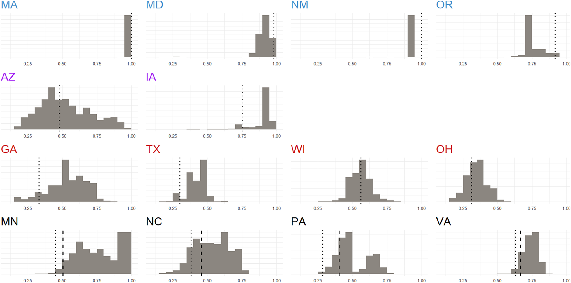
Figure 10 displays histograms of the proportion of firms expected to fall in districts won by Democrats, in 5% bins. The vertical dashed line represents the actual enacted plans. The mass under the distribution to the left or right of the vertical line tells us how extreme an enacted redistricting plan is compared to simulations. If 50% of plans land both to the right and left of the enacted plan, that enacted plan falls on the simulated median; it meets our expectations under the null distribution and we might conclude that firms are not gerrymandered. If 90% of simulated redistricting plans fall to the right (left) of the vertical line representing the enacted plan, then that plan biases in favor of locating firms in Republican (Democratic) districts, suggesting that factors other than constitutional requirements are influencing firm placement.
If an enacted plan falls in the bottom 1% of the null distribution, it means that out of every 100 simulated redistricting plans such a Republican-biased plan appears only once—or that it happened fewer than 500 times out of 50,000 simulations. Likewise, if a plan falls at the 99th percentile, then out of every 100 simulated plans, we only observe one plan as extreme in its bias favoring Democrats. We can interpret these numbers as p-values: they encode how extreme an observed plan is relative to a null distribution and form the basis for our statistical inference.
Row 1 of Figure 10 shows states in which Democrats controlled the redistricting process. In each of these states, the distribution of simulated plans is skewed to the right—almost no simulation allocates more than 40% of the firms to Republicans in these states—indicating that due to the geography of voters, more firms fall naturally into Democratic districts. However, we observe that the enacted plans (dotted vertical lines) consistently fall near the right edge of the simulated distribution: Democrats place a disproportionate number of firms in districts they control in states where they draw the lines, beyond what the skewed natural geography of firms and voters might dictate.
States in Row 2 of Figure 10 use some form of a commission to decide district boundaries, which, presumably, would generate less gerrymandered outcomes as they should not exploit redistricting as a mechanism to bind firms to politicians’ districts. Consistent with this expectation, we find the enacted plan falls at a global or local mode. Arizona’s commission is the exemplar of insulation from politics, as its maps become law without legislative approval. Correspondingly, we find that the enacted plan sits at the center of the distribution and the global mode in Arizona, where the simulated distribution is relatively symmetric. Iowa’s commission, by contrast, allows a (Republican) legislative veto, reducing its insulation from politics. And though its enacted plan falls at a local mode, it still appears to favor Republicans. (The fact that Iowa only has 4 districts complicates inference.)
Row 3 contains states where Republicans led redistricting and courts did not intervene. In the first two cases, the realized plans fall far to the left of the realized distributions; Republicans capture more firms than expected. This result, again, indicates that the party drawing the lines places a disproportionate number of firms in districts they control, even accounting for the natural geography of firms and voters. Ohio and Wisconsin do not appear to be firm gerrymanders; later, however, (Figure 18), we will show that Ohio, Texas, and Georgia are all conditional firm gerrymanders.
Row 4 displays plans in states where Republicans drew lines that were later redrawn by courts.Footnote 21 There are two vertical lines, a dotted line for the original plan and a dashed line for those resulting from court orders. In every state, the party-drawn enacted plans placed a higher number of firms in Republican districts than expected, consistent with results in Row 3. Furthermore, every court-ordered plan shifted the firm allocation toward the median of the simulated distribution; costing Republicans’ firms, especially in Pennsylvania.
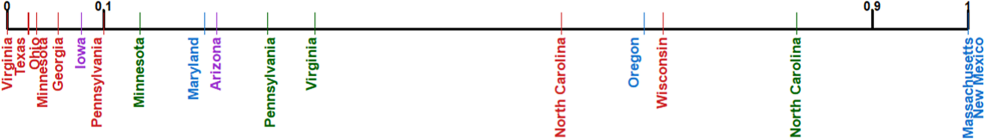
Figure 11 summarizes the results, collapsing each state’s enacted plans onto a single graph displaying quantile values comparing those plans to the simulated null distributions.Footnote 22 For example, a value of 0.25 means that in 25% of simulated plans, the same number or fewer firms than in the enacted plan are placed in Democratic districts. Hence, a plan with a value close to 0 favors Republicans, while a value close to 1 favors Democrats.
Plans Drawn by Republicans (Democrats) Put Fewer (More) Firms in Democratic Districts Compared to Simulated Plans
Note: Red indicates Republican mapmakers; Blue indicates Democratic mapmakers; Purple indicates Commission-drawn maps; Green indicates court-drawn maps.

The results reveal a consistent pattern. When Republicans draw the lines, firms end up in Republican districts beyond what we would expect in the absence of firm gerrymandering (generally with a quantile <0.1). Similarly, when Democrats draw the lines, firms end up in Democratic districts beyond what we would expect in the absence of firm gerrymandering (generally with a quantile >0.9). When courts redraw partisan maps (creating a within-state comparison), the firm allocations always move toward the middle, indicating an increasingly nonpartisan allocation. Note the variation in how much a court’s map improves may reflect the particular legal challenge and the court’s composition, structure, and mandate.Footnote 23 When commissions draw the map, the firm distribution falls closer to the center as well, most notably in Arizona, where we have a reasonable sample size and highly insulated redistricting process. (Iowa’s p-value is 0.094, indicating a Republican gerrymander.)
We can combine these independent state-level tests into a global p-value (Caughey, Dafoe, and Seawright Reference Caughey, Dafoe and Seawright2017), testing the sharp null that no states have firm gerrymandering. Our theory tells us that in states drawn by Democrats, we expect quantiles in the right tail, and the opposite for Republicans, so first we convert quantiles to one-sided p-values. In states with commission-drawn plans, we expect quantiles close to 0.5, so we convert those to p-values by subtracting 0.5 such that if an enacted plan produces the simulated modal number of firms for Democrats, its p-value would be 0. Following Caughey, Dafoe, and Seawright (Reference Caughey, Dafoe and Seawright2017), we then take the Fisher product and calculate a global p-value of 1.11 × 10⁻⁹—robust statistical evidence that firm gerrymandering exists in at least some states.
Optimizing for Seats, Firms, or Both
Having established unconditional firm gerrymandering exists, we turn to conditional firm gerrymandering for evidence that mapmakers specifically target firms. As we show in New Gerryland, identifying when firms are targeted is challenging, since acquiring more seats generally leads to acquiring more firms.
To show some ways that firm gerrymandering appears in practice, we provide three case studies—Oregon, Pennsylvania, and Texas—working through both (i) joint distributions of firm-and-seat allocations, and (ii) conditional distributions of firm allocations, holding the number of seats fixed. Oregon provides a case where firm and seat targeting by mapmakers may be observationally equivalent. Pennsylvania shows that even when there is an extreme partisan seat gerrymander, we can still sometimes disentangle seat gerrymandering from firm gerrymandering. Finally, in Texas, we show that mapmakers can gerrymander firms even without gerrymandering seats.
Oregon: When Firm Targeting and Seat Targeting Are Observationally Equivalent
Figure 12 presents the simulated joint distribution of seat (vertical axis) and firm (horizontal axis) allocations in Oregon. Each bar is a unique combination of firms and seats; darker bars indicate a higher proportion of simulated plans with that allocation. The red circle marks the 2012 Democratic-enacted map.
Oregon’s Joint Distribution of Firms and Seats from Simulation
Note: The vertical axis indicates seats allocated to Democrats, while the horizontal axis presents firms allocated to Democrats; darker bars indicate more frequent firm-seat combinations. The circle marks the enacted plan.

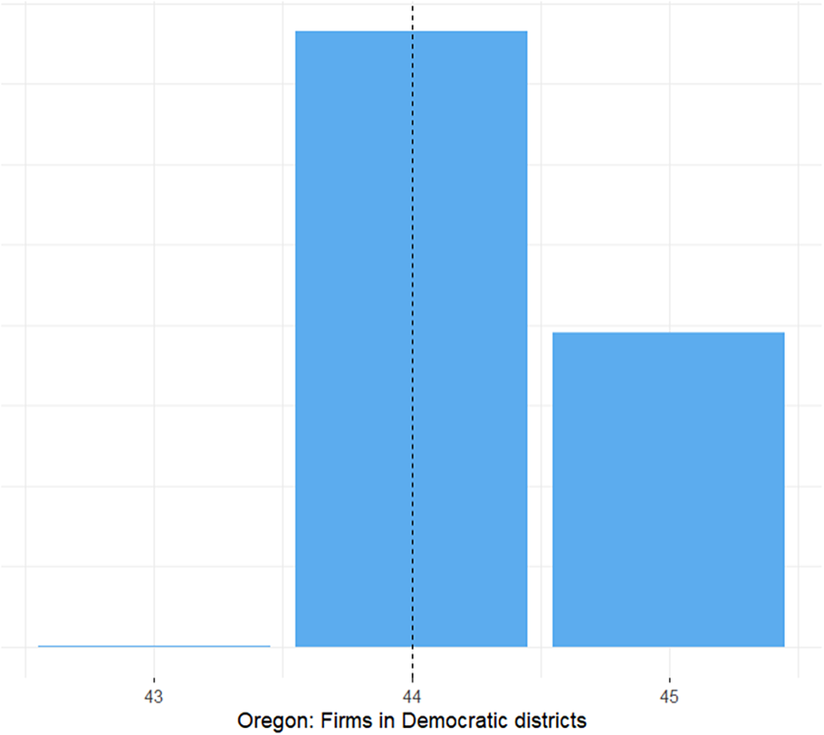
In Oregon, there were 5 seats and 48 firms to be allocated. No simulated plan granted Democrats more than 4 seats or 45 firms. In practice, Democratic mapmakers enacted a plan allocating 4 seats and 44 firms to themselves, maximizing the number of feasible seats and taking an unusually large number of firms.
Is this a seat gerrymander, a firm gerrymander, both, or neither? The answer is both: it is a seat gerrymander since allocating 4 seats to Democrats occurs in only 5.8% of simulations; it is a firm gerrymander since allocating 44 firms or more to Democrats occurs in only 6.3% of simulations.
Nevertheless, any plan that allocates 4 seats to Democrats must also allocate at least 43 firms to Democrats, so observing a plan with 4 seats and 44 firms does not require deliberate firm gerrymandering. The extreme allocation of firms we observe in Oregon might be a consequence of mapmakers’ maximizing seats.
In New Gerryland, we examined the joint distribution of firm allocations (Figure 8). Doing so taught us that to learn whether firms are targeted, we might consider the conditional distributions of firms holding seats fixed. Figure 13 presents that data for Oregon, focusing on the 2,893 plans that allocate exactly 4 seats to Democrats as in the enacted plan. While we previously found that Oregon is an unconditional firm gerrymander, looking at the 4-seat conditional distribution, we cannot say that firms were targeted beyond seats due to the natural geography of firms and voters. The range of feasible firm allocations is so narrow in the conditional distribution—from 43–45 firms—that variation within it may not be meaningful.Footnote 24
Oregon’s Distribution of Firms Conditional on Four Democratic Seats as in Enacted Plan
Note: Each bin’s height represents the number of simulated plans that result in the allocation of firms represented in the horizontal axis. The dashed line represents the enacted plan.
Pennsylvania: Optimizing for Firms and Seats
In Pennsylvania, by contrast, we can show more conclusively that mapmakers targeted firms beyond seats: Republican mapmakers nearly maximized firm allocation conditional on seizing the maximum feasible number of seats. Figure 14 presents the simulated joint density of seat and firm allocations in Pennsylvania.Footnote 25 There are 18 seats and 401 firms to be allocated. The simulated range of seats allocated to Democrats is 4 to 9; the range for firms is 108 to 309.
Pennsylvania’s Joint Distribution of Firms and Seats from Simulation
Note: The vertical axis indicates seats allocated to Democrats, while the horizontal axis presents firms allocated to Democrats; darker bars indicate more frequent firm-seat combinations. The circle marks the enacted plan.
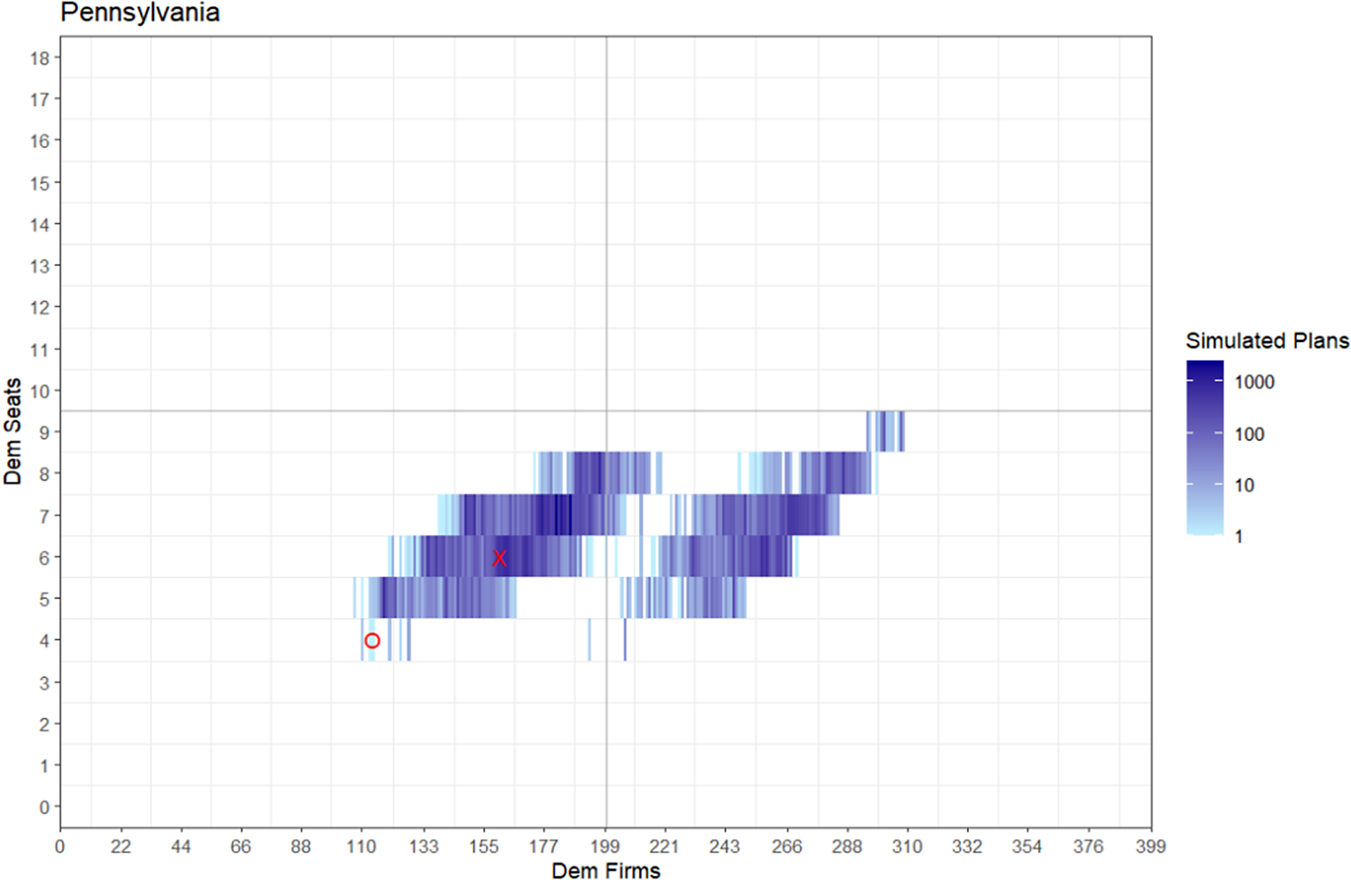
In 2012, Republican mapmakers allocated the lower bound of 4 seats to Democrats. This is a Republican seat gerrymander (p-value = 0.001), as only 50 out of 50,000 plans have 4 Democratic majority districts. Republican mapmakers allocated only 114 firms to Democrats in their plan. This is also a clear unconditional Republican firm gerrymander (p-value = 0.0002), as only 12 of 50,000 plans give fewer firms to Democrats.
Moreover, the 2012 Pennsylvania map is a conditional firm gerrymander as well. Figure 15 shows the conditional distribution of firms Democrats would receive if they won 4 seats, which occurs in only 50 of 50,000 of simulations; in this distribution, the range of firm allocations spans from 111 to 207. The enacted plan allocates only 114 firms to Democrats, nearly the most extreme conditional allocation of firms possible (only 4 of the 50 simulated plans are more extreme), suggesting that Pennsylvania mapmakers targeted firms above and beyond seats. Additional evidence of firm gerrymandering of Pennsylvania can be found in Supplementary Appendices D and E.
Pennsylvania’s Distribution of Firms Is Conditional on Four Democratic Seats as in Enacted Plan
Note: Each bin’s height represents the number of simulated plans that result in the allocation of firms represented in the horizontal axis. The dashed line represents the enacted plan.

While the Pennsylvania case may appear to be maximal for partisan mapmakers in seat-firm space, there is a hidden trade-off for mapmakers in choosing this allocation. By maximizing on both seats and firms they have spread their voters’ thinner, making more districts vulnerable to small swings in vote share, increasing the party’s risks in the event of a wave election. We explore vulnerability in the robustness checks in Supplementary Appendix C, where we change the margins that determine the partisan alignment of districts.
Texas: Ceding Seats While Capturing Firms
In Texas, Republican mapmakers chose not to maximize their seat allocation, possibly because a seat grab would spread votes thin and, hence, generate major vulnerabilities amidst rapid demographic change (see Supplementary Appendix C for an example of those risks). Surprisingly, perhaps, in fact, partisan seat maximization only occurs in 6 of the 12 partisan plans in our sample, suggesting that the constraints identified are fairly binding. While not a seat gerrymander, Texas is an unconditional firm gerrymander (p-value of 0.084) and a compelling conditional firm gerrymander (p = value of 0.021).
Figure 16 presents the simulated joint distribution of firm and seat allocations in Texas. There are 36 seats and 715 firms to allocate; Democrats may capture from 6 to 14 seats and from 78 to 467 firms. The enacted plan drawn by Republicans yields 11 seats to Democrats, surprisingly above the modal simulation outcome. A standard notion of partisan gerrymandering would reject the claim that Texas’ map was gerrymandered to favor Republicans in terms of seats.
Texas’ Joint Distribution of Firms and Seats from Simulation
Note: The vertical axis indicates seats allocated to Democrats, while the horizontal axis presents firms allocated to Democrats; darker bars indicate more frequent firm-seat combinations. The circle marks the enacted plan.
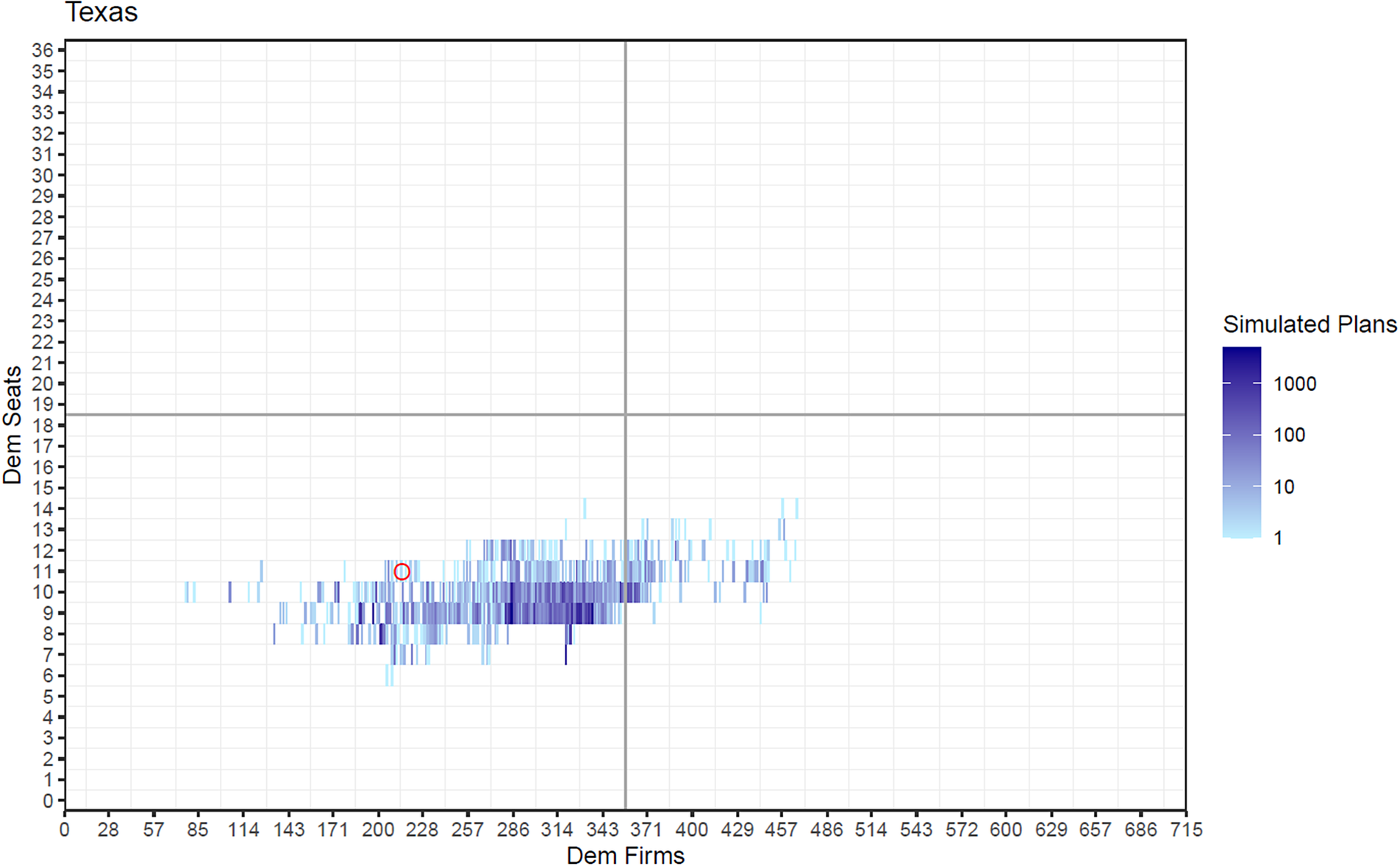
However, examining firm allocations suggests otherwise. The 215 firms that the 2012 enacted plan allocated to Democrats is substantially lower than the mean of 303 or the median of 317, suggesting that the Republican mapmakers preferred to over-allocate firms to themselves rather than seats.
Examining Texas’ conditional firm distribution (Figure 17), moreover, provides strong evidence that Texas is a firm gerrymander. Fixing the Democrats to 11 seats, the conditional distribution of firms ranges from 126 to 463, covering over 45% of the entire range. The 215 firms given to Democrats in the enacted plan falls far to the left within this distribution (p = 0.02). Even though Republicans chose a relatively bipartisan seat allocation, conditional on that choice, they allocated far more firms to themselves than can be explained by random chance.
Texas’ Distribution of Firms Conditional on 11 Democratic Seats, as in Enacted Plan
Note: Each bin’s height represents the number of simulated plans that result in the allocation of firms represented in the horizontal axis. The dashed line represents the enacted plan.
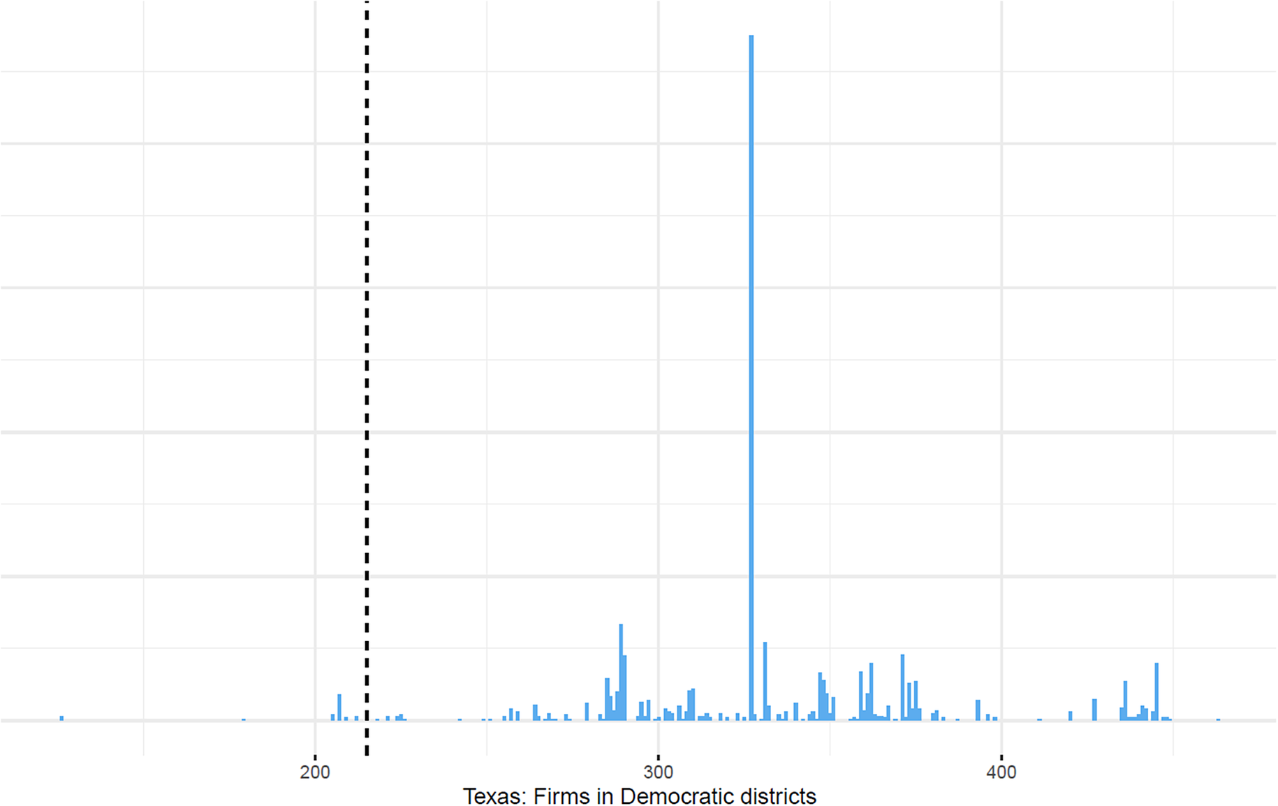
Figure 18 presents the conditional results for all maps. While a full discussion and state-by-state histograms can be found in Supplementary Appendix C, the main things to highlight are that 8 of the 12 partisan states are statistically significant conditional firm gerrymanders favoring the party in charge of mapmaking, including Georgia and Ohio, neither of which is an unconditional firm gerrymander. No partisan state is a partisan gerrymander for the party not drawing the lines, and all but one commission or court state is near the center of the distribution; furthermore, conditional on seats, both the Virginia and Minnesota court-ordered maps cease to be firm gerrymanders.
Plans Drawn by Republicans (Democrats) Put Fewer (More) Firms in Democratic Districts Compared to Simulated Plans, Using the Conditional Distribution
Note: Red indicates Republican mapmakers; Blue indicates Democratic mapmakers; Purple indicates Commission-drawn maps; Green indicates court-drawn maps.
Targeting of Firms Conditioning on Other Considerations
As noted earlier, one concern for dispositively identifying firm targeting is that precincts might be targeted by mapmakers for factors that might be co-located with firms: racial groups, urbanization, wealthy individuals, and more. Supplementary Appendix D presents a precinct-level analysis of unusual precincts (defined as ones that are consistently allocated to a different party in the simulations than in the realized plan), using data for the four states in which there is cross-party allocation of firms in unusual precincts.Footnote 26 The analysis provides confirming evidence that unusual precincts containing firm headquarters are selected into co-partisan districts, controlling for racial composition, urban/rural status, and high-income households.Footnote 27
DISCUSSION
We find that when partisans control the redistricting process, firms are over-allocated to the mapmakers’ party. Six of our 12 partisan maps, in fact, satisfy our definitions of firm gerrymandering in both the unconditional and conditional distributions, and four additional partisan maps are firm gerrymanders in either the unconditional or conditional distribution. Only six partisan-drawn maps, by contrast, are seat gerrymanders favoring the mapmakers’ Party under an equal standard of evidence. More importantly, we find that while firm gerrymandering occurs in instances when seats are gerrymandered, it also occurs in instances when seats are not gerrymandered. This confirms that firm gerrymandering cannot simply be a byproduct of seat gerrymandering. A few partisan states—notably WI—do not seem to gerrymander firms, but none of the partisan states in our sample cede firms to the other party. Given that our sample of states was not cherry-picked, we see no reason to believe that firm gerrymandering would not exist in additional states. But even if the results fail to generalize, the finding that firm gerrymandering exists in some states would be important. Our results also indicate that even accounting for two key facets of gerrymandering leaves considerable residual variation in the characteristics of the maps actually chosen. Identifying the existence of this unexplained variation is an additional contribution of the article.
We may also ask how many firms might be gerrymandered nationwide, based on our sample. Compared to the median number of firms in our simulated counterfactuals, we find that the mapmakers’ party received 324 more firms than we would expect. This is approximately 12% of the 2,800 firms in our sample of states where partisans draw the lines. In practice, however, all of these firms are not available to be reallocated in a partisan firm gerrymander given (i) the constraints of the natural geography of firms and voters and (ii) that parties only want to acquire more (not fewer) firms. By calculating the simulated range of firms—the minimum and maximum a party receives in our simulations—we estimate that parties acquire approximately 49% of the 665 firms that can be feasibly gerrymandered to their advantage.Footnote 28
Why might firm gerrymandering be at least as common as seat gerrymandering? First, there is more opportunity to gerrymander firms, as firms exceed seats.Footnote 29 Second, while the most extreme seat allocation is not always a seat gerrymander, the most extreme firm allocation is always a firm gerrymander in our sample.Footnote 30 Third, courts and viewers are aware of seat gerrymandering, but probably not firm gerrymandering.
Implications for Politicians, Firms, and Voters
While the prevailing wisdom is that firms capture politicians (Stigler Reference Stigler1971), our results suggest that politicians (and political parties) also capture firms: drawing firms into majority party districts creates a structural alignment between firms and the majority party in the state, regardless of which party is in the majority. While, in some instances, we do not have the statistical leverage to make an inference that firm gerrymandering is distinct from seat gerrymandering, whether firm gerrymandering occurs intentionally is irrelevant to the structural alignment it creates. As Ricco Garcia notes: “This [redistricting not only voters but also of firms] is the framework of what determines how policy debates shake out—I always say we didn’t lose on a specific bill when the vote came up—we lost in November—but actually we lost 9 years earlier when we got screwed on redistricting—not just on seats but on the relationships we could have had with firms.” Among the many implications of a systematic lock-in between firms and majority-party politicians, some are testable while others are consistent with findings in existing literature.
One testable implication of our findings is that having (more) firms in a district should increase the incumbency advantage (Fouirnaies and Hall Reference Fouirnaies and Hall2014). Another testable implication is that the alignment with politicians we identify could generate long-term ties, reducing lobbying needs in majority-party districts (de Figueiredo and Richter Reference De Figueiredo and Richter2014; Faccio and Parsley Reference Faccio and Parsley2009), while increasing it for firms in minority-party districts, as they lack a natural ally in power who is predisposed to listen. Finally, from a citizen’s perspective, both the diminished political competition and politicians’ incentives to focus on policies that benefit firms in their district may alter the quality of representation. It may lead both parties to act in more pro-business ways at the expense of labor-oriented voters. Out-party voters located near firms the majority party has captured, in particular, may not have a member of Congress advocating for them.
More importantly, our results point to gerrymandering extending far beyond voters, paving the way for research on related questions. Politicians will seek to incorporate into their districts anything that gives them advantages—and this may stretch well beyond firms to things like wealthy individuals, donors, universities, military bases, ports, airports, stadiums, national parks, and hospitals. Likewise, politicians may also seek to keep undesirable things like waste facilities or troublesome constituents outside of their districts.Footnote 31 Politicians gain power from all the contents of their districts, and future research could benefit from thoroughly examining how gerrymandering might not be only about gaining seats, but rather maximizing a party or legislator’s structural power derived from their districts.
Limitations and Opportunities for Future Research
Recognizing the assumptions and simplifications in this article opens avenues to contribute separately to the existing literatures on (i) partisan gerrymandering, and (ii) firms and politics.
First, we focused on the headquarters of publicly traded firms, rather than the universe of firms or establishment locations. These firms and their headquarters are visible, large, and likely to be especially valuable to politicians. We are not showing that gerrymandering is confined only to the headquarters of these publicly traded firms, but that it at least exists for this subset of the corporate world.
Second, while our analysis estimates whether and how many firms are gerrymandered, we did not attempt to explain which firms are gerrymandered in practice—in effect, treating all firms as being equally feasible and equally desirable to gerrymander. While Supplementary Appendix E presents a first cut at the question of which firms are more valuable, we largely leave this question for future research; within our sample, which is fairly homogenous on key dimensions, notably size, and visibility, compared to the universe of firms, we do not have strong ex ante reasons to believe the firms that are gerrymandered are any different than firms that are not gerrymandered; the key feature of gerrymandered firms may be their location, rather than any particular firm characteristic.Footnote 32
Third, we focus on firm gerrymandering at a state level rather than within specific districts, but individual districts may have been gerrymandered even if the allocation of firms (and/or seats) is not extreme at the state level. For example, we might expect a majority party to locate firms in the districts of more powerful politicians or to incumbents under threat. A district-level analysis could unpack other aspects of firm gerrymandering; for example, are firms more likely to be gerrymandered if they are near borders of existing districts?
Fourth, our test statistic emphasizes party well-being, not individual politician utility: redistricting battles within parties may explain some of the idiosyncratic state outcomes. For example, why do not more states select the most extreme seat and firm gerrymanders available? The answer may reflect individual politicians’ priorities, such as district safety over firm count (Supplementary Appendix C shows that spreading voters too thin can also put firms at risk). Relatedly, parties may reallocate firms from disloyal incumbents to those seen as rising stars, a pattern our analysis cannot observe.
Fifth, we do not consider how mapmakers choose to optimize between seats, firms, and other things, which is an interesting research avenue, both theoretically and empirically.
CONCLUDING REMARKS
This article lays out a theory of firm gerrymandering, brings attention to constraints mapmakers find to gerrymander firms (and other objects of interest), documents a systematic overallocation of publicly traded firm headquarters to mapmaker’s districts, and provides evidence that at least in some states this overallocation is likely to be the result of specific targeting of firms and not just a byproduct of seat/voter gerrymandering. There are many possibilities for expanding this finding into a broader theory of gerrymandering that considers the entire universe of what politicians might gerrymander, and under what conditions they might do so.
SUPPLEMENTARY MATERIAL
To view supplementary material for this article, please visit http://doi.org/10.1017/S0003055424000558.
DATA AVAILABILITY STATEMENT
Research documentation and data that support the findings of this study are openly available in the APSR Dataverse at https://doi.org/10.7910/DVN/TM8ZDB.
ACKNOWLEDGEMENTS
Any errors are our own. We thank Steve Ansolabehere, Mathilde Bombardini, Devin Caughey, John Friedman, Ruth Greenwood, Bernie Grofman, Kosuke Imai, Gary King, Michael Kistner, Michael McDonald, Luke Miratrix, Alec Ramsey, Jonathan Rodden, and seminar participants at the Stanford Graduate School of Business, Trinity University, Vanderbilt University, University of Georgia, Copenhagen Business School, American University, and UC San Diego for their helpful suggestions. We are especially grateful to Chris Kenny, Cory McCartan, and the ALARM Project for providing software, the Metric Geometry and Gerrymandering Group for providing data, and Jess Ma for careful research assistance.
FUNDING STATEMENT
Artés acknowledges funding from the Spanish Research Agency (Agencia Estatal de Investigación) through grant PID2020-119460RB-I00.
CONFLICT OF INTEREST
The authors declare no ethical issues or conflicts of interest in this research.
ETHICAL STANDARDS
The authors affirm this research did not involve human participants.


 Open access
Comments
No Comments have been published for this article.