

The founding generation of cliometricians fundamentally changed our understanding of American economic growth. They showed that U.S. per capita income growth began before 1860, before the American Civil War, which had previously been considered the watershed event creating the modern economy. High sustained rates of per capita income growth appear to have started sometime before 1840, but after 1790. U.S. income per capita grew from a high initial base. Early America had an agricultural sector that was prosperous and progressing.Footnote 1 The cliometricians further contended that growth accelerated gradually, not in a burst. It was not driven by a single force, such as the railroad or slave-produced cotton. Rather, growth was broadly based.
There was not a single event leading to a sudden “takeoff” in income growth (Atack and Passell Reference Atack and Passell1994, pp. 8–11). It took time for the signal to exceed the noise of events, such as wars and financial panics. It took time for participants to notice that sustained growth was occurring. But once growth was ongoing, negative shocks did not derail the growth process. Extensive growth—territorial expansion—did not generally bolster per capita income growth, and indeed may have been a drag. But it did contribute to maintaining a level of per capita income that was high by historical world standards.
Based on the evidence presented, the cliometricians’ claims about the early gradual multi-causal acceleration of growth should be treated more as conjectures than as solid conclusions. The chief support for these claims is that prominent alternative mono-causal accounts fail. Rostow’s (Reference Rostow1962) railroad-based takeoff story and North’s (Reference North1961) “cotton as the prime mover” story ultimately fail to withstand detailed scrutiny. It feels like the acceleration took some time and was not due to any single force. However, this multi-factor, slow-acceleration account is not really solidly based on evidence, but rather on impressionistic interpretations, on vibes, so to speak. As David (1967b, p. 152, 1996, p. 4) noted, the exact timing and sources of growth remain a “vexed question.”
The problem is that, in the absence of solid evidence, old claims can reemerge. I know many economic historians have moved on from studying macro growth topics to investigating microeconomic questions based on linked census samples. So let me provide an analogy. The cliometricians’ claims are vague and rather sketchy. It says we have a birth record with the handwritten name “modern economic growth,” but no record of the date it arrived, where growth first appeared, and who its parents were. But now there is another claimant with a printed birth certificate making strong, definitive statements about what, when, where, and why: American capitalist development was born in 1793 with Eli Whitney’s invention of the cotton gin. Its parents were coercion and conquest. Which claim yields a better match with the available evidence?
David (1967a) called the formative pre-1840 period the “statistical dark age” because the censuses of 1810, 1820, and 1830 were lacking; 1840 was the first comprehensive U.S. economic census. David used the 1840 census and other data to create a set of controlled conjectures for income growth back to 1800.Footnote 2 This approach serves as the basis of the annual series in Historical Statistics before 1840 (see Carter et al. Reference Carter, Gartner, Haines, Olmstead, Sutch and Wright2006).Footnote 3 The annual numbers reported there are heavily interpolated between the decadal benchmarks based on controlled conjectural estimates (refined by Weiss Reference Weiss1989, Reference Weiss, Robert and Wallis1992). There is no takeoff or hockey stick, but this is almost by design (see also Johnston and Williamson Reference Johnston and Williamson2025).
Easterlin (Reference Easterlin and William1960) had made further use of the 1840 census to generate estimates of economic activity by U.S. state. His striking finding was that the Midwest looked like a backward region, one of the poorest areas in terms of income per capita. Yet people moved to the Midwest, and in the process, appeared to have lowered national per capita income. Perhaps the migrants did not have the opportunities in the East that the typical person had; perhaps they were driven by land hunger, or a desire to have large families, or perhaps other forces were at play.Footnote 4
Another early leading cliometrician working on the same period was Peter Temin. In his classical study of the Jacksonian economy, Temin (Reference Temin1969) investigated a boom-and-bust episode in the 1830s. He critiqued the traditional explanations for the inflation and financial crisis that blamed domestic policy missteps. Instead, Temin emphasized international forces, foreign demand for cotton and canal bonds. The boom ended in a sudden stop when the Bank of England tightened credit, leading to the panics of 1837 and 1839. He claimed the bust caused deflation and financial distress, but not a real-side depression. Modern economic growth kept GNP growth chugging along despite nominal-side problems and the boom-bust cycle.
When Paul David labeled the 1800–40 period the “statistical dark age,” he asserted that comprehensive information did not exist before the 1840 Census. He knew scattered information was available—numbers on the mackerel catch, flour inspection, New York auction payments, anthracite coal shipments, and so on (see Gallman Reference Gallman and William1960; Davis Reference Davis2004, Reference Davis2006). But not much more.
This paper’s core contention is that we do have abundant, systematic, comprehensive statistical evidence related to economic activity in this early period. The U.S. Post Office published consistent data on activity levels by local offices on a yearly or every-other-year basis for nearly a quarter-century before 1840. This paper compiles the Post Office data to shine light on the statistical dark age in early U.S. history (Rhode Reference Rhode2026).
Over the key 1825–35 period, local postmasters reported their net proceeds every year. This was the sum returned to the Post Office Department.Footnote 5 From 1817 on, the Register of All Officers and Agents reported postmaster compensation (which was tied to local activity) and the salaries of clerks every other year.Footnote 6 From 1841 on, the data on compensation and net proceeds were reported together in the Register with detailed location information, including the county. In this paper, I will combine compensation for postmasters and clerks’ pay with net proceeds to form measures of local postal activity. Before 1841, the reports provide the postmaster’s name and office location, but not necessarily the county.Footnote 7 However, one can use concurrent lists and tables of the post office name and their county to geo-locate many of the offices. Post offices were located nearly everywhere. Postmaster General Joseph Habersham exclaimed in 1801: “Cross-roads are now established so extensively that there is scarcely a village, court house or public places of any consequence but is accommodated with the mail.”Footnote 8
The statistics in Figure 1 document the rise of post office revenues relative to the U.S. population and annual GDP, as reported in Historical Statistics. The series show that, from 1817 to 1860, “real” postal revenues grew much faster (6.1 percent per annum) than either population (3.0 percent) or real income (4.1 percent). The number of local offices also rose dramatically. In 1817, there were 3,500; by 1859, there were some 28,500.
TIME SERIES ON POST OFFICES, REVENUES, POPULATION, AND GDP, 1790–1860
Sources:
These data are from Historical Statistics: U.S. population (Ca 14); real annual GDP (Ca9); postal revenue (Dg182); and number of post offices (Dg181). The post office revenues are divided by the David-Solar price index (Cc2) to create the “real” series.
Carter et al. (Reference Carter, Gartner, Haines, Olmstead, Sutch and Wright2006).

Figure 1 Long description
The line graph illustrates the trends of four different data sets from 1790 to 1860. The x-axis represents the years, ranging from 1790 to 1860, while the y-axis represents the number, ranging from 10 to 100000 on a logarithmic scale. The data sets include the number of post offices, real postal revenues, population, and GDP. The number of post offices, represented by a blue line, shows a steady increase from around 1790 to 1860. Real postal revenues, depicted by an orange line, also exhibit a gradual rise over the same period. The population, shown by a gray line, increases consistently. GDP, represented by a yellow line, follows a similar upward trend. All values are approximated.
Post office activity was closely related to economic development (Fuller Reference Fuller1972, p. 249). The correlation between the postal net proceeds for 1841 and Easterlin’s (Reference Easterlin and William1960) estimated income by state for 1839/40 was 97.2 percent.Footnote 9 The evidence on post office activity provides something akin to the night lights for that period.Footnote 10
I am not the first person to think of using local post office statistics as economic indicators in the antebellum period. In his Survey of the State of Maine, Greenleaf (Reference Greenleaf1829, pp. 462–66) included postal receipts to gauge local economic conditions. An 1840 article in Hazard’s Register opined: “There is perhaps no branch of statistical information that indicates more accurately the condition of the commercial business of the country, than the revenues received for postages. By far the greater portion of postage is paid on business letters, and it is the increase or diminution of this branch of correspondence, which mainly occasions an augmentation or declension of the revenues of the Department.”Footnote 11
There are also modern-day scholars and postal enthusiasts advocating the use of the nineteenth-century post office data. Leading postal historian Richard John told me that he had long wanted to use these reports. DeBlois and Dalton Harris (Reference DeBlois and Dalton Harris2006) had similar intentions. But the big data involved was quite overwhelming, given the tools available. Hines and Velk (Reference Hines and Velk2010) performed a prototype study for New Hampshire.Footnote 12 Blevins and Helbock (2021) assembled a nearly comprehensive list of the local post offices. They worked to geo-locate the offices precisely, attaining a coverage rate of about 68 percent.
In this paper, I collect and analyze the voluminous data on the dollar value of postal activity by local office for the 1817–59 period nationally. This adds a great deal of new information to what was previously available. There are 300,000 observations on compensation by post office in the sample, with 90,000 observations before 1840.Footnote 13 The disaggregated data promise to inform future studies of the local effects of government policy changes and specific events. Here, I will focus on using the new county-level data on postal activity to investigate conjectures about the advent of modern economic growth in antebellum America and related claims about regional development. To interpret the postal data as economic indicators, we must first understand the U.S. Post Office’s goals and operations.
GOALS AND OPERATIONS OF THE U.S. POST OFFICE
The Post Office Department was the largest single function of the central government. Many people interacted with the Department with some frequency. Even some African Americans, members of an oppressed and excluded group, were able to send letters in the antebellum period.Footnote 14 In 1828, Postmaster General John McLean asserted: “There is no branch of government in whose operations the people feel a more lively interest than in those of this Department; its faculties being felt in the various transactions of business, in the pleasures of correspondence, and the general diffusion of information” (U.S. Post Office Department 1828d, p. 2).Footnote 15
From the beginning of the Republic, the goal of the U.S. postal system was to spread information. It was a form of state capacity to allow people in a vast and expanding country to communicate with one another. In contrast to the postal systems in colonial America or Britain before 1841, the U.S. Post Office Department in the early national period did not attempt to generate revenues for the Treasury (Fuller Reference Fuller1972, pp. 42–58). The U.S. postal system was intended basically to break even. It sought to maximize the spread of information, subject to revenues covering costs. There was extensive cross-subsidization, with letter postage covering the costs for newspapers, and the Northeast paying for the South. There was a monopoly to prevent private carriers from taking over the most profitable routes (John Reference John1995).
The U.S. Post Office Department received revenue, out of which it paid postmaster compensation. The compensation was given on (non-linear) commission rates based on local-level activity. For a small office, the share was roughly one-third of the local postal revenues generated. As size increased, the share fell. For very large offices, postmaster compensation was capped at nearly $2,000 per year, but these offices could also hire clerks. There were other incidental expenses and, in some places, rents. But these were negligible.
Mailing letters was initially very expensive. Postal rates were structured so that newspapers travelled very cheaply. Newspapers made up the bulk of the physical volume of the mail handled (U.S. Post Office Department 1844, 1845). In 1851, Congressman John S. Phelps of Missouri estimated that newspapers, pamphlets, and magazines made up 81 percent of the volume of mail by weight but paid only 18.5 percent of the postage (Congressional Globe, 18 Jan. 1851, p. 218). The newspaper publishers were a lobbying group that sent petition after petition to Congress to urge that newspaper rates be reduced or eliminated entirely. They considered postage a “tax on knowledge” (Kielbowicz Reference Kielbowicz1989; Starr Reference Starr2004).
Elected federal officials could frank their mail, that is, send letters for free. Postmasters also had franking privileges. Otherwise, sending letters were very costly for most common people in this early period. Up until 1845, to mail a letter over 400 miles cost $0.25 per sheet (Smith Reference Smith1918, p. 71). At this time, the going wage for a male common laborer was 0.75–1.0 dollars per day (Margo Reference Margo2000).
Given the expense, correspondents took their sheets of paper and they wrote across them, then flipped the sheets 90 degrees and wrote the other way (Fuller Reference Fuller1972, p. 48). Travelers would use newspapers as postcards. A friend who was sojourning to New Orleans could cheaply send greetings by putting one of the city’s newspapers in the mail; the rates were low as long as the sender did not add any of their own writing to the printed material (see Henkin Reference Henkin2006, pp. 43–51). Well-off planters and their family members sent letters, but most common people did not in this early period.
There were several zones, so it was cheaper to send something less than 400 miles.Footnote 16 But still not cheap. Early on, the receiver typically paid for the letter. It would arrive at the local post office. The receiver would go and then decide whether to pay the quarter or whatever for the letter. When the railroad came in the late 1830s, costs fell. Private carriers entered the Northeast in the early 1840s to serve the dense, more profitable routes. These were among the forces leading to reform (Priest Reference Priest1975, pp. 35–80).
The postal reforms that went into effect in July 1845 and July 1851 cut postal rates and simplified the rate structure. The July 1845 reform reduced letter prices by an estimated 56.3 percent.Footnote 17 The July 1851 reform again cut letter rates by more than half, creating a 3 cent per half-ounce letter rate blanketing most of the country. It also shifted from receiver to sender pay. The reforms extended the Post Office monopoly to railroad traffic from stage and water, thus eliminating competition from private services in the Northeast metro corridor (Fuller Reference Fuller1972, pp. 148, 162–63).
The United States gained cheap postage, developing a social world where common people began using the mail for regular correspondence. After each reform passed, revenues initially declined. Then people got into the postal habit and started sending more letters, so revenues recovered. In the first wave, there was nearly a fully compensatory response.Footnote 18 After the second wave, the recovery of revenues was less complete. In the U.S. Post Office Department (1853, p. 709) report, the Postmaster General noted “the act of 1851 afforded but little further inducement to use the mails.”Footnote 19 Overall, the price elasticity of demand was approximately minus one.
Figure 2, based on data from Miles (Reference Miles1855, pp. 26–27, 1857b, pp. 363–64, 437, 444) and John Hutchins (Reference Hutchins1862, p. 17), charts the great expansion in the average number of letters per person from 1790 to 1860.Footnote 20 Historian David M. Henkin (Reference Henkin2006, p. 2) observed: “During the middle decades of the nineteenth century, ordinary Americans began participating in a regular network of long-distance communication, engaging in relationships with people they did not see.” A letter-writing culture developed.
NUMBER OF LETTERS MAILED PER PERSON PER YEAR, 1790–1860
Sources:
Series 1: Miles (Reference Miles1855, pp. 26–27).
Series 2: Miles (Nov. 1857b, pp. 363–64, Dec. 1857b, pp. 437–44) and Hutchins (Reference Hutchins1862, p. 17).
Population is the annual series on resident population (Ca 14, or Aa7) from Historical Statistics.

Figure 2 Long description
A two line graph displays the number of letters mailed per person per year from 1790 to 1860. The x-axis represents the years from 1790 to 1860, while the y-axis represents the number of letters mailed per person per year, ranging from 0 to 7. The graph includes two data series: Series 1, represented by blue dots, and Series 2, represented by green dots. Both series show a gradual increase in the number of letters mailed per person per year over time. Series 1 starts at a lower point and shows a steady increase, with a noticeable rise around the 1830s. Series 2 starts higher and also shows a steady increase, with a more pronounced rise around the 1850s. All values are approximated.
Henkin (Reference Henkin2006, p. 30) added that with the increased migration of people, “the desire to correspond with absent friends, family members, and business associates intensified.” He argued that the postal reforms led, in turn, to more migration, as “cheap and uniform postage encouraged Americans to imagine that they might travel (and even relocate) without severing their existing social and familial ties.” Henkin is perhaps too focused on domestic conditions. The American advocates of postal reforms in the 1840s were looking abroad as well, to Rowland Hill’s Penny Post Law of 1839 in Great Britain.
It is helpful for our purposes that the postal reforms occurred after the “statistical dark age” had already lifted, after the 1840 Census appeared. The postal regime was largely stable before 1840, when we can most use the light that it can shed. Having more overlap with the later period would have been desirable, of course. But change was part of that age.
MAPPING POST OFFICE ACTIVITY AND INCOME
Before proceeding to examine the expansion of postal activity in detail, I find it advantageous to have a sound basis for comparisons. I will start by using the 1840 census to estimate income by county. The year 1840 was before modern economic growth began to exert huge cumulative effects on local incomes and before the age of mass migration. The numbers promise to reflect something close to initial conditions.
Estimating 1840 county income numbers is something that Paul David had long dreamed of doing. I will apply the well-established methods of Easterlin (Reference Easterlin and William1960) and Gallman (Reference Gallman and William1960) to drill down to the county level to create numbers consistent with their state and national estimates. This exercise was made possible by the data entry efforts of Haines (Reference Haines2010), who built on the work of Lee Craig and Thomas Weiss. For details about the construction of the county-level income dataset, see the Appendix.
In addition to estimating total income at the county level, I will calculate sectoral shares. The “Agricultural share” includes agriculture and forestry; the “Manufacturing and Mining share” includes manufacturing and mining activity (as well as residential construction); and the “Commerce share” includes commercial activity, which was better enumerated in the 1840 census than in other mid-nineteenth-century U.S. censusesFootnote 21 (see the Appendix for maps).
Figure 3 presents a set of maps comparing the density of population and income, as well as income per capita and postal activity per capita. Population and income are measured in 1840. Postal activity, which adds together compensation plus clerks’ pay plus net proceeds, is measured in 1841. As Easterlin (Reference Easterlin and William1960) found, income per capita in 1840 was lower in the Midwest than elsewhere in the country. This was especially true off the frontier.Footnote 22 Postal activity per capita was high in urban pockets. (For reference, Figure 3 postal activity per unit area is graphed.)
POPULATION, INCOME, AND POSTAL ACTIVITY
Sources:
Population: Haines (Reference Haines2010).
Land area: Schroeder et al. (2025).
Income: Appendix.
Postal Activity is the sum of postmaster compensation, clerks’ pay, and net proceeds. These are compiled in the Dataset of Postal Activity by 1840 Counties.

Figure 3 Long description
The first map displays population density in 1840, with darker shades indicating higher population density. The second map shows income density in 1840, with darker shades representing higher income per unit area. The third map illustrates income per capita in 1840, with varying shades indicating different income levels per person. The fourth map depicts postal activity per capita in 1841, with darker shades showing higher levels of postal activity.
The regressions in Table 1 relate postal activity in 1841 to population and income and their components in 1840. This is not intended as a test of causal mechanisms but rather as an exploration into the correlates of postal activity. The panels refer to total income per county, income per unit area, and income per capita. Population, literacy, and income all had statistically significant coefficients. A one-standard-deviation (OSD) increase in log population was associated with a 0.59 standard-deviation increase in log postal activity and a OSD increase in log income (as estimated) was associated with a 0.13 standard-deviation change. But income generated by commerce “mattered” more than income generated by agriculture (the bulk of the omitted category). An OSD increase in the commerce share was associated with a 0.18 standard-deviation change. The coefficients for state capital and the presence of a postal distributing office in the county were also positive and statistically significant. Perhaps more surprising are the positive coefficients on percentage of the population enslaved. The R-squares are reasonably high for the cross-sectional regressions on total postal income per county—above 0.8. They are in the same neighborhood for postal density per county area and around 0.46 for postal activity per capita.Footnote 23
CORRELATES OF POSTAL ACTIVITY, 1841

Table 1 Long description
The table presents summary statistics and regression results for correlates of postal activity in 1841. It includes data on postal activity, population, income, and other variables for 1840. The summary statistics section lists the number of observations, mean, standard deviation, minimum, and maximum values for various variables such as log of postal activity, log of postal activity per land area, log of postal activity per person, log of population, log of land area, log of income, log of income per area, log of income per capita, commerce share, manufacturing and management share, slave population share, illiterate population share, distribution office presence, and state capital status. The regression results section shows coefficients and robust standard errors for different models predicting log of postal activity, log of postal activity per land area, and log of postal activity per person. The table highlights significant relationships between postal activity and variables like population, income, commerce share, and the presence of a distribution office.
Notes:
Postal_activity_1841 combines postmaster compensation, clerks’ pay, and net proceeds in 1841.
Population is the1840 total population from U.S. Census.
Income is 1839/40 income as calculated in the Appendix.
Commerce_share is the share of 1840 income originating from commerce.
Mfg_Mng_share is the share of 1840 income originating from manufacturing and mining.
Slave_pop_share is the 1840 share of the total population enslaved.
Illiterate_pop_share is the 1840 share of the white population that is illiterate.
Distribution_office captures whether the county included a postal distributing office in 1840/41.
State_capital captures whether the county included the state’s capital in 1840.
Slavery Legal is Delaware, Maryland, Virginia, North Carolina, South Carolina, Georgia, Florida, Alabama, Mississippi, Louisiana, Arkansas, Tennessee, Kentucky, and Missouri.
Sources:
Dataset on Postal Activity by 1840 Counties.
U.S. Post Office Department (1842).
Income by county derived in the Appendix.
The takeaway messages from the regressions are that postal activity nationally was closely related to commercial economic activity and that in the South, postal activity was positively associated with slave-based agriculture. The latter observation re-enforces the idea that postal activity captures patterns of regional development even though a large fraction of the population was excluded from its use.
GROWTH VISUALIZED
The U.S. Post Office data can help us to visualize the growth process. They offer a more fluid and continuous picture than decadal snapshots. With higher-frequency data, there is less concern about temporal abnormalities or early/late dating. With the decadal data, one worries that the census year is unusual. For example, we know the 1859 cotton crop was a bumper crop, making lessons drawn solely from the 1860 census suspect.
For the presentation, I made “home movies” of the spread of postal activity at high frequency for the 1817 to 1859 period. I hope they will be useful to those teaching American economic history. The maps of biennial data used standardized counties for 1840 and 1860 and standardized value categories. There was one set for compensation per acre and another set for the net proceeds per acre. One could see the effects of business cycles—such as the panics of 1819, 1837, 1839, and 1857—and of postal policy events—such as the reforms of 1845 and 1851. The home movies are not in the right format to present in this printed version of this address, but they will be made available online. I will summarize the changes by focusing on maps of total activity for 1822, 1841, and 1859 displayed in Figure 4.Footnote 24
MAPS OF POSTAL ACTIVITY PER UNIT AREA FOR 1822, 1841, AND 1859
Sources: Postal Activity is the sum of postmaster compensation, clerks’ pay, and net proceeds. These are compiled in the Datasets on Postal Activity by 1820, 1840, and 1860 Counties.

Figure 4 Long description
Three maps of the United States illustrate postal activity per unit area for the years 1822, 1841, and 1859. Each map uses a color gradient to represent different levels of postal activity, ranging from light beige for low activity to dark red for high activity. The maps show a progression of increased postal activity over time, with notable concentrations in the northeastern United States. The color gradient is divided into four categories: [0,1], [1,2], [2,5], and [5,10], with the darkest red indicating the highest level of activity. The maps highlight the growth and spread of postal services across the country over the specified years.
The first map illustrates how the South and the Midwest were similar in the 1810s and early 1820s. In both regions, postal activity took place on tendrils of commercial routes, natural rivers, and wagon routes. In the South, postal activity was associated with plantation areas. The Ohio-Mississippi River system was an integrated whole. Over the decade, the Erie Canal region in New York State began to fill out. It became more and more like the solid mass in New England. The canal regions of Ohio started to flourish as connections developed between the Ohio-Mississippi River system and the Great Lakes region.
The second map shows how the Erie Canal saliant crossed over to southern Michigan by the late 1830s and early 1840s. But rather than following a water route, this was along the path of the Michigan Central Railroad. And development in the upper Midwest took the form of a front rather than mere strips. The third map shows how, in the late 1850s, Chicago became the center of an advancing frontal wave. Postal locations were not patchy, nor were they jumping from one node to another, leaving empty land in between. The Midwest was now very different from the American South, where postal activity remained along commercial tendrils. The patches of activity in the South also tended to be areas of slave agriculture, as in the Black Belt in Alabama and Mississippi. These patterns closely match Wright’s (Reference Wright2006, pp. 62–63) descriptions of regional population density in 1860.
The patterns are much more evident in the maps using the value of postal activity than in maps of the number of post offices alone. Adding the intensive margin of activity levels brightens up the picture relative to the extensive margin alone. Natchez, Mississippi, appears in maps of the office data, but one does not see the bright cluster of activity there until one uses the value data. The road in the Shenandoah Valley, heading south, pops out in the maps of activity data; it is not so apparent in maps of offices alone.
The spread of postal activity displays an image of American development similar to what traditional historians and economic historians conceived before the advent of the cliometricians. Fogel (Reference Fogel1964) reacted against traditional historians who had asserted that railroads and water transport were fundamentally different. Fogel (Reference Fogel1989, p. 104) also pushed the idea that the American South was an economically dynamic region, much like the North. He thought that traditional historians were prone to exaggerate the differences. That may be, but the activity maps suggest the differences were real. By the 1830s, railroads had become important, advancing through new territories apart from navigable waterways. By the 1850s, the Midwest was growing as a settled block of development with a few unfilled patches; the South remained largely a low-density region with strips of settlement. The regions looked similar in 1822 but not in 1859.
GAUGING EXTENSIVE AND INTENSIVE GROWTH
American economic historians have long emphasized the tension between the processes of spreading out—territorial expansion associated with extensive growth—and building-up—urban and industrial development associated with intensive growth. There is much debate about whether the processes were complementary or competitive. Both processes were occurring simultaneously in antebellum America. The standard classroom example is that the share of population living beyond the Atlantic Seaboard grew from about 1-in-35 people in 1790 to almost one-half in 1860. Over the same period, the share of the U.S. population living in urban areas rose from 1-in-20 people to about 1-in-5.
The data in Figure 5 display the evolving distribution of economic activity, including postal activity, in the antebellum United States by population density. The figure deploys the six density categories used in the 1890 Census in its famous discussion of the closure of the frontier. Places below two persons per square mile were “practically unsettled territory.” Those with densities between two and six persons had a “very sparse population” and were considered the edge of the frontier line. A density of “6 to 18 inhabitants… indicates almost universally the existence of defined farms or plantations… in an early stage of settlement or upon more or less rugged soil.” A density of “18 to 45 inhabitants… almost universally indicates a highly successful agriculture.” The Census treated a threshold of 45 people per square mile as separating agricultural from industrial areas. A population density between 45 and 90 people “indicates the existence of commercial and manufacturing industry and the multiplication of personal and professional services.” And finally, a density of 90 and above “represents a very advanced condition of industry.”Footnote 25
DISTRIBUTION OF U.S. POPULATION, LAND AREA, POST OFFICES, AND POSTAL ACTIVITY BY COUNTY POPULATION DENSITY, 1820–60
Sources:
Population county density categories as defined in Walker (Reference Walker1874) and U.S. Office of the Census (1895, pp. xxx–xxxi).
The population numbers are from the U.S. Census, as compiled in Haines (Reference Haines2010).
The land areas are from Schroeder et al. (2025).
The data on post offices and postal activity are compiled in the Datasets on Postal Activity by 1820, 1830, 1840, 1850, and 1860 Counties.

Figure 5 Long description
The image contains four line graphs that illustrate the distribution of U.S. population, land area, post offices, and postal activity by county population density from 1820 to 1860. Each graph represents different density categories: less than 2, less than 6, less than 18, less than 45, and greater than 90 people per square mile. The x-axis of each graph represents the years from 1820 to 1860, while the y-axis represents the shares of each category. In the population graph, the share of counties with a density greater than 90 people per square mile decreases over time, while the shares of other density categories remain relatively stable. The land area graph shows that the share of counties with a density greater than 90 people per square mile remains high throughout the period, while the shares of other density categories fluctuate slightly. The post offices graph indicates that the share of counties with a density greater than 90 people per square mile increases over time, while the shares of other density categories decrease. The postal activity graph shows a similar trend to the post offices graph, with the share of counties with a density greater than 90 people per square mile increasing over time. All values are approximated.
The panels of Figure 5 cover the shares of population, land area, number of post offices, and postal office activity. The variables are measured at the county level. The population, land area, and density numbers refer to the census years. The postal figures refer to 1822, 1831, 1841, 1849, and 1859. (The differences in date should not matter greatly.)
The top panel displays the distribution of U.S. population. The fraction in very-low-density areas—below 6 persons per square mile—is perhaps lower than the conventional wisdom suggests. The share was 7.1 percent in 1820, and dropped by more than one-half to 3.2 percent in 1860. It had been declining since 1790, when the fraction stood at 11.3 percent; it remained at its 1860 level through the end of the nineteenth century. This declining share of the frontier in the U.S. population occurred despite the conquest and incorporation of “new lands.” This change is illustrated in the second panel with the rebound in the share of very-low-density land in the 1840s. (The second panel does serve to emphasize that most U.S. land was in the very-low-density counties.)
A key development during the 1820 to 1860 period was the rapid increase in the population share of high-density areas. The fraction living in counties with 90 or more people per square mile almost quadrupled, rising from 6.0 percent in 1820 to 22.3 percent in 1860. The fraction in counties with 45 or more people per square mile rose from 26.4 percent to 43.9 percent over the same period. This is the building-up form of growth associated with intensive development.
For this paper, we are most interested in the distribution of postal business, the number of post offices, and postal activity. These variables displayed highly divergent patterns. The number of post offices was over-represented relative to population in very-low-density areas. Circa 1860, for instance, 23.0 percent of post offices were in counties with fewer than 18 people per square mile, and 5.4 percent in counties with fewer than 6. For comparison, the population shares were 16.0 percent and 3.2 percent, respectively. In low-density areas, state capacity in post offices was “built ahead of demand.”
The distribution of postal activity was disproportionately located in high-density areas. The concentration became greater over time. The fraction of postal activity in counties with 90 or more people per square mile rose from 24.4 percent circa 1820 to 42.4 percent circa 1860. The fraction of activity in counties with 45 people or more increased from 45.4 percent to 66.5 percent over the same period. People in high-density areas generated much more postal activity per capita than those in low-density areas (as can be seen in the postal activity per capita panel of Figure 3). And they generated much more activity per post office.
Drilling down, we can see that metropolitan counties disproportionately generated postal activity. In 1820, there were six counties including metropolitan places with populations of 25,000 or more. These counties accounted for 4.7 percent of the total population in 1820, but generated 28.3 percent of gross postal proceeds in 1822. In 1840, there were nine metro counties. They accounted for 6.9 percent of the total population but 24.1 percent of total 1841 postal activity. By 1860, the number of metro counties had grown to 32. They accounted for 16.7 percent of the total population and 36.2 percent of total 1859 postal activity.
The postal statistics then illuminate both key developments of the antebellum economy—the spreading out process associated with extensive expansion and the building-up process associated with intensive development.
GROWTH OVER TIME
The postal receipts give a new glimpse of the growth process. Our existing time series before 1840 are numbers such as antebellum land sales (Cole Reference Cole1927). The series are very spiky, dominated by booms and busts, as one might expect from an investment process. Data on postal receipts, available annually at the state level, are smoother. They have ups and downs, especially with the reforms. But, in general, growth is cumulative.
Table 2 shows growth ratios across two-year windows for the nation and major regions, the Northeast, Midwest, and South, for the period before 1841. The top panel displays growth ratios for postmaster compensation. (The ratios are calculated for the sample of counties with positive activity at the beginning of the two-year window and are weighted by the initial levels.) The middle panel does the same for net proceeds between 1825 and 1835. The very bottom panel shows growth ratios for net proceeds across one-year windows. The biennial series for compensation and net proceeds generally move together, which bolsters our confidence in using the annual net proceeds series to capture higher-frequency changes.
GROWTH RATIOS IN CONSISTENT COUNTIES

Table 2 Long description
The table presents growth ratios for compensation, net proceeds, and annual net proceeds across various regions, including the Northeast, South, and Midwest, from 1817 to 1841. The table is divided into three panels. The top panel shows compensation growth ratios for two-year windows, with values ranging from 0.96 to 1.36. The middle panel displays net proceeds growth ratios for two-year windows from 1825 to 1835, with values ranging from 1.13 to 1.50. The bottom panel shows annual net proceeds growth ratios, with values ranging from 1.06 to 1.15. Notable trends include higher compensation ratios in the Midwest during certain periods and consistent net proceeds growth across regions.
Notes:
Recall for postmaster compensation, the numbers refer to the year ending 30 June, so 1819 is really 1818/19. For net proceeds before 1835, the numbers refer to the year ending 31 March.
Northeast is Maine, New Hampshire, Vermont, Massachusetts, Rhode Island, Connecticut, New York, New Jersey, and Pennsylvania.
South is Delaware, Maryland, Virginia, North Carolina, South Carolina, Georgia, Florida, Alabama, Mississippi, Louisiana, Arkansas, Tennessee, Kentucky, and Missouri.
Midwest is Ohio, Michigan, Indiana, Illinois, Wisconsin, Iowa, and Minnesota.
Source: Dataset of Postal Activity by 1840 Counties.
The Northeast was almost always growing, with only minor interruptions over the 1817–41 period. The Midwest was more volatile, with bigger advances and retreats. Overall, its expansion was faster, as one might expect for a frontier region. The South was growing too, but it was hardly leading the way. For the biennial compensation series, southern growth never exceeded national average growth. From 1823 to 1839, it was always below midwestern growth and almost always below northeastern growth. For the (shorter) biennial net proceeds series, southern growth very slightly exceeded the national average in 1829–31 and only meaningfully exceeded it in 1833–35. Southern growth in net proceeds was always below midwestern growth and, in most periods, below northeastern growth as well. These patterns run counter to the “cotton was the prime mover hypothesis,” asserting that the South was driving the national growth process in the period.
Table 3 reports statistics on the diffusion index, an alternative measure based on the percentage of counties experiencing growth in post office activity from 1817 to 1841. Focusing on whether a county was expanding allows us to gauge the breadth of growth, providing a fuller sense of the distribution of expansions and contractions. The diffusion index for the compensation data shows postal activity grew after the War of 1812 ended. The aftermath of the Panic of 1819 temporarily pushed growth down. In the 1821–23 period, the contraction hit the Midwest hard. Fewer than 30 percent of midwestern counties had growing postal activity. The fraction was about 45 percent in the South and 60 percent in the Northeast.
DIFFUSION INDEX OF THE FRACTION OF COUNTIES GROWING

Table 3 Long description
The table presents the diffusion index of counties experiencing growth in post office activity from 1817 to 1841, segmented by regions and periods. It includes data for compensation, net proceeds, and annual net proceeds, with values for all regions, the Northeast, the South, and the Midwest. The table has 21 rows and 4 columns, with headers for Compensation, Net Proceeds, and Net Proceeds: Annual. Notable trends include a general increase in postal activity after the War of 1812, a temporary decline following the Panic of 1819, and significant regional variations, particularly in the Midwest during the 1821-23 period.
Notes: Same as Table 2. 1825–29 covers the entire period.
Source: Dataset of Postal Activity by 1840 Counties.
But after the mid-1820s, growth was ubiquitous. This is especially notable because prices were generally falling over this time, up to the mid-1830s. The panels on the diffusion indices for biennial compensation and net proceeds end with bolded numbers for the combined 1825–29 period. Almost 91 percent of counties nationally experienced expansion in postal compensation. And these were quite evenly spread across the country: 97 percent of northeastern counties grew, as did 89 percent of southern counties and 90 percent of midwestern counties. The statistics on the diffusion index of net proceeds are similar. The overall picture is one of broadly based growth. The Panic of 1839 ended this long period of expansion. It was felt nationwide, but especially in the South and Midwest.
Again, American economic historians often tell stories of North versus South, East versus West, industry versus agriculture, urban versus rural, settlers versus indigenous inhabitants. In this period, there were serious conflicts between peoples, including the grievous episodes of Indian Removal. And there were tensions between places, for example, over the 1828 Tariff of Abominations. Relative changes matter, of course. But in terms of the absolute volumes of postal activity, virtually every place was growing from the mid-1820s through the late-1830s. There is a list of usual suspects. The U.S. economy was recovering from the 1819 panic. The Erie Canal was being constructed and then opened in October 1825. There were flush times, with slave-based cotton agriculture in Alabama and Mississippi. There was a Merino Sheep boom in the North. Nicholas Biddle, as president of the Second Bank of the United States, prevented a downturn in Britain in 1825 from having really harsh effects. Crisis averted (see Temin Reference Temin1969). In terms of other policies, Henry Clay advanced his “American System” of tariffs and internal improvements (such as extending the Cumberland Road).
Beginning in 1841, the Register reported postmaster compensation, clerks’ payments, and net proceeds together, allowing construction of a comprehensive measure of local postal activity. These data extend the analysis through 1859. Table 4 displays statistics that parallel those shown in Tables 2 and 3. The top panel of Table 4 presents annual growth ratios for consistently available counties over two-year windows. The bottom panel shows the diffusion index of the fraction of counties experiencing growth in postal activity.
GROWTH IN TOTAL POSTAL ACTIVITY, 1841–59

Table 4 Long description
The table presents data on growth ratios and the fraction of counties experiencing growth in postal activity from 1841 to 1859. It is divided into two panels. The top panel shows annual growth ratios for consistently available counties over two-year windows, with columns for All, Northeast, South, and Midwest regions. The bottom panel displays the diffusion index of the fraction of counties experiencing growth in postal activity. Notable trends include varying growth ratios across different periods and regions, with some periods showing higher growth in specific regions. For example, the Northeast region shows higher growth ratios in several periods compared to other regions.
Notes: 1843 is the average of 1842 and 1843, which are combined in the postal reports. The regions are the same, with Texas included in the South.
Source: Dataset on Postal Activity by 1860 Counties.
The broad-based growth that was visible in the 1820s and 1830s continued, with a brief pause, through the mid-1840s and 1850s. The effects of the 1839-43 downturn—when the U.S. wholesale price level fell by 42 percent—are evident. As were the effects of private competition in the early 1840s in the Northeast. But after 1843, postal activity expanded, with revenue growth interrupted only by the postal reforms of 1845 and 1851. The Northeast, South, and Midwest all showed positive growth in most periods, with the Midwest appearing as the most rapidly-developing region. The 1851 price cut reduced revenues in all three regions before the increase in postal volume kicked back in.
However, regional trajectories began diverging after the mid-1850s. The Midwest benefited from the Crimean War boom (1853–56), which raised demand for grain exports, but suffered disproportionately from the Panic of 1857. The South, in contrast, maintained steady growth into the late 1850s, driven by the cotton boom.
The growth patterns in postal activity generally support the cliometricians’ account of gradual, multi-factor acceleration while providing the systematic empirical evidence that we previously lacked. Growth was robust, persisting despite an initial period of deflation. And growth was resilient, rebounding after temporary shocks such as the Panics of 1837, 1839, and 1857. The postal data do reveal important differences in regional growth trajectories—particularly the Midwest’s transformation from a region similar to the South in the 1820s to one more closely resembling the Northeast by the 1850s. The next section examines these regional patterns in greater detail.
THE MIDWEST’S CATCHUP
Here, I seek to rescue the Midwest from the notion implicit in Easterlin’s (Reference Easterlin and William1960) research that the region was a frontier backwater in the antebellum period. Table 5 reports the estimated number of letters per person by major region from 1801 to 1859. Letters per capita were rising everywhere. However, the numbers go up more in the Midwest, which started at a lower base, than in the South or Northeast. The Midwest was converging to the national average, while the South was diverging.
ESTIMATED NUMBER OF LETTERS PER PERSON, 1801–59

Table 5 Long description
The table presents data on the estimated number of letters per person across different regions from 1801 to 1859. It includes columns for the years 1801, 1820, 1843, 1845, 1852, 1856, 1859, and 1859/1843, and rows for the Nation, Northeast, South, and Midwest. The table also includes ratios for South/Nation and Midwest/Nation. Notable trends include a steady increase in the number of letters per person across all regions, with the Midwest showing the most significant growth. The Midwest started with a lower base but converged towards the national average, while the South diverged from it.
Notes:
For 1801 and 1820, I estimated the number of letters from state data on letter postage under the assumption that the letters cost the same everywhere; this assumption biases the early midwestern and southern estimates upward. Available evidence indicates long-distance mail was more common in the Midwest and South than in the Northeast. In the Oct. 1843 survey, 18.6 percent of letters nationally were sent over 400 miles; 40.7 percent over 150 miles. In the Midwest, the shares were 32.0 and 50.7 percent, respectively; in the South, 27.0 and 48.3 percent; and in the Northeast, 12.0 and 35.2 percent. In the Oct. 1845 survey, 25.5 percent of letters nationally were sent over 300 miles. There was a larger share in the Midwest (40.4 percent) and South (34.5 percent) than in the Northeast (17.1 percent). In the early 1840s, private postal services undercut the U.S. mail in traffic between the major northeastern cities. John (Reference John1986, p. 142) estimated the share of private carriers in the Boston-New York market in 1843 was as high as 50 percent.
Sources:
1801: U.S. Post Office Department (1804, pp. 31–33).
1820: U.S. Post Office Department (1824b).
1843: U.S. Post Office Department (1844). Pre-reform survey for Oct. 1843 multiplied by 12.
1845: U.S. Post Office Department (1844). Post-reform survey for Oct. 1845 multiplied by 12.
1852: Miles (1857a, p. 185).
1856: Miles (1857b).
1859: U.S. Post Office Department (1860, p. 86). Letter postage and stamps divided by 3 cents. This likely biases the estimates upward.
Population figures are interpolated based on decadal growth rates.
One might worry that the growth in the Midwest after the 1851 reforms was an artifact of the shift from receiver pay to sender pay.Footnote 26 If there were unbalanced flows out of the region, the regime shift might have led to a reallocation of the location of measured activity without any actual change in mail flows. Note that the shift in the payment system was not merely allocative. It did change the participants’ incentives and levels of demand. Sender payment became mandatory in July 1855; it had been optional before.Footnote 27 (And in the Northeast, the mandate was not fully enforced after 1855.) One can look at the use of prepaid postal stamps, the movement of receipts relative to transportation costs, and differential changes in postal activity across space. My takeaway is that flows were generally balanced and local, so the shift from receiver pay to sender pay did not greatly affect the location of postal activity. The series do not show sudden breaks at the time of payment reforms.
We see a similar pattern of midwestern development in the evolving location of print media. In Democracy in America, de Tocqueville (1969, orig. 1835, p. 185) exclaimed that “[t]here is hardly a hamlet in America without its newspaper” (see also Pierson Reference Pierson1938, pp. 588–89). The traveler MacKay (1849, p. 241) observed: “In connexion with American newspapers, the first thing that strikes the stranger is their extraordinary number. They meet him at every turn, of all sizes, shapes, characters, prices, and appellations.” Boorstin (Reference Boorstin1965, pp. 125–36) considered the post office, the newspaper, and the hotel as the anchor tenants of fledgling towns and cities in antebellum America. Highlighting the role of postal subsidies, Sellers (Reference Sellers1991, p. 370) asserted: “By 1840 the United States had more newspapers than any other country and nearly twice as many as in slightly less populous Great Britain.”
Using historical newspaper lists from Thomas (1810), Hewitt (1828), Census (1840), and Kennedy (1850), I can test de Tocqueville’s claims and reveal its geographic limitations. While providing an apt description for the Northeast and, eventually, for the Midwest, de Tocqueville appears to have exaggerated the prevalence of newspapers in the South. Figure 6 maps the location of print media over the antebellum period; the measure is whether the county had an entry included on the list.Footnote 28 In 1850, 787 counties had newspapers or periodicals, 50 percent of total U.S. counties. The fraction in the Northeast was 94 percent, which aligns with de Tocqueville’s observation. The fraction was 64 percent in the Midwest and 35 percent in the South. Publishing had grown greatly since 1828, the closest observation to the date of de Tocqueville’s tour. In that year, Hewitt’s list included 316 counties with print media operations. For the Northeast, almost 70 percent of counties were on the list. Just over 10 percent of the midwestern counties were included, slightly above the fraction in the South. The prevalence of print media in the U.S. South might be higher than in other parts of the Americas in the first half of the nineteenth century, but by 1850 it was well below that of the U.S. North. What is especially notable is the growth of print media in the Midwest.
PRESENCE OF PRINT MEDIA PUBLISHERS (DARK INDICATE PRESENCE)
Sources:
1810: North (Reference North1884).
1828: No author (1934, pp. 365–98).
1840: Haines (Reference Haines2010).
1850: Kennedy (Reference Kennedy1852).

Figure 6 Long description
Four maps illustrate the presence of print media publishers in the United States over four different years: 1810, 1828, 1840, and 1850. Each map uses a color gradient to indicate the presence of publishers, with darker shades representing higher presence. The maps are arranged in a 2x2 grid. The top left map shows the year 1810, the top right map shows the year 1828, the bottom left map shows the year 1840, and the bottom right map shows the year 1850. The maps cover the entire United States, including regions that were not yet states in the earlier years. The presence of publishers is concentrated in the northeastern part of the country in 1810 and gradually spreads westward over the years. By 1850, the presence of publishers is more widespread, extending into the central and southern regions of the country. The maps provide a visual representation of the growth and spread of print media publishers over the first half of the 19th century.
Figure 7 pulls together evidence on total postal activity per capita by major region. The series include state-level data, which are available in select years when the county data are not. The figure graphs per capita activity by region relative to the national average from 1822 to 1859. The Midwest converged to the national mean, whereas the South diverged. Again, this runs counter to the picture conveyed by Easterlin’s 1840 income data.
RELATIVE PER CAPITA POSTAL ACTIVITY BY REGION
Notes: This figure combines postmaster compensation, clerks’ pay, and net proceeds for available odd numbered years from the Dataset on Postal Activity by 1860 Counties.
Sources: It supplements these series with 1822 data on gross proceeds from U.S. Post Office Department (1824a) and 1838 data on compensation and net postage by state from no author (1840b, p. 155).

Figure 7 Long description
The line graph illustrates the relative per capita postal activity by region in the United States from 1820 to 1860. The x-axis represents the years, while the y-axis indicates the relative activity levels. Four lines represent different regions: Northeast, South, Midwest, and the national average. The Northeast consistently shows higher postal activity compared to other regions, peaking around 1855. The South and Midwest exhibit lower and more fluctuating activity levels, with the South showing a decline over time. The national average remains relatively stable throughout the period.
CONCLUSION
The voluminous post office data assembled here shines new light on the “statistical dark age” during the formative period of the modern American economy. The evidence presented is consistent with the cliometricians’ long-standing belief that modern economic growth in the United States began before 1840, emerging gradually and broadly across regions. Gallman had demonstrated that after 1834–36, the American economy was growing at rates consistent with modern economic growth. He suggested it had been doing so for some time. The postal data, available on a consistent basis at very granular level and at a reasonably high frequency for the period in question, strongly supports Gallman’s assertions.
Postal activity grew robustly almost everywhere after the early 1820s. It outpaced population growth and per capita levels rose. With deflation during the 1820s, real activity grew even faster than the nominal figures suggest. While growth was broadly based, it varied significantly by region. Initially, the Midwest and South appeared similar, with postal activity concentrated near rivers and, in the South, near slave plantations. Canal improvements in New York and Ohio brightened these areas on the maps. Railroads like the Michigan Central further transformed the landscape. By the 1850s, the Midwest was densely active with few empty patches, while the South remained characterized by striations of activity with many vacant areas. The Midwest developed distinctly from the South and was not a backward region.
The Midwest’s growth as a center of postal activity contradicts the idea that westward expansion represented movement to a lower state of economic development. By the 1850s, the Midwest had caught up in terms of postal activity. High literacy rates, common schools, and libraries also contributed to the Midwest becoming a communications culture. It was an “impoverished sophisticate” region where inhabitants, though not as well off as others, were literate and communicating. Like those in colonial New England before them, they could learn and grow. Migrants to the Midwest were not moving to isolated frontier hovels. On the development versus growth continuum, postal activity indicates development rather than just income levels—it reflects literacy and the potential for future growth.
Much more remains to be done with the postal data to shed light on antebellum American economic development. The new data, I hope, will open up rich opportunities to investigate the effects of specific policy changes and local economic events during a key period of transition.
Appendix: Estimating 1840 Income by County
The year 1840 was the base of the first comprehensive U.S. economic census. For the service sector, the coverage of the census of 1840 was better than that of subsequent antebellum censuses were. This allows one to allocate income originating in agriculture, manufacturing, mining, and the services across states, and now across counties.
In the antebellum period, Tucker (Reference Tucker1843) and Seaman (Reference Seaman1852) separately employed the 1840 census to estimate numbers akin to national income. They provided some mortar to fill in gaps and combine the bricks from the census. Their numbers showed the South was doing well. Later, Gallman (Reference Gallman and William1960) and Easterlin (Reference Easterlin and William1960) used their methods, with appropriate revisions, to generate national income and state income, respectively.
In creating county-level estimates, I seek a balance between creating accounts that are as accurate and comprehensive as possible and linking with the existing literature. These objectives are not truly opposing because the existing literature also seeks accuracy. However, there are cases where computational complexity hindered previous efforts. I will leverage recent technical advances to pursue making better estimates.
One of the striking discoveries of the so-called New Economic History literature was that the South was prospering under slavery, at least during the 1840 to 1860 period. This idea was based on the regional per capita income estimates initially developed by Easterlin (Reference Easterlin and William1960) and extended by Engerman (Reference Engerman1967). Easterlin used the detailed statistics of the 1840 Census to derive state-level personal income estimates. Another striking finding by Easterlin was that the Midwest was a low-per-capita income region in the antebellum period.
Gallman (Reference Gallman and William1960) estimated the growth of national commodity production over the antebellum period. It showed high levels and rates of growth in the agricultural and manufacturing/mining sectors. In creating his estimates, Gallman studied the numbers and procedures of Tucker and Seaman. He concluded that both were good, but Seaman was better, using concepts and techniques that were closer to modern standards. As an example, Tucker generally based estimates on employment, whereas Seaman used both employment and capital. Gallman (Reference Gallman and William1960) took issue with Seaman for underestimating agricultural production by undercounting livestock production. Gallman (Reference Gallman and Dorothy1966) created GNP series for the same 1840–60 period.
Easterlin (Reference Easterlin, Kuznets and Dorothy1957) had created state-level estimates of personal income, agricultural production, and commodity production for 1880 and 1900. He also created per capita income, which documented the South’s low relative status. Easterlin (Reference Easterlin and William1960) sought to extend his state-level personal income series from 1880 back to 1840. He took Seaman’s state-level income estimates and made adjustments based on Gallman’s livestock accounting method. Easterlin made the state-level total income estimates, based on agricultural income, value added in mining and manufacturing, and commerce. He made estimates (with and without commerce).
Easterlin (Reference Easterlin and William1960) basically replaced Seaman’s estimates of livestock production and feed deductions with those derived from Gallman’s approach. Seaman estimated animal products net of feed (feed allocated to crops), whereas Gallman estimated animal products gross of feed (netting feed out of crops). Easterlin (Reference Easterlin and William1960, p. 108) stated Seaman’s animal products “appeared to be badly understated” and sought to make corrections.
Easterlin (Reference Easterlin and William1960) state-level estimates for agricultural income and national income using state-level prices. Implicitly, he also made estimates of state-level ag output using national average prices. He called the estimates based on state-level prices “income” and those based on national-level prices “production.”
The series reflecting “production” uses physical output to allocate Gallman’s value added over space. The series reflecting “income” use the value of output as measures of local prices to do so. That is, the production measure is Gallman VA*Qi/Sum(Qj) and the income measure is Gallman VA*Vi/Sum(Vj), where Vj=Pj*Qj.
Easterlin (Reference Easterlin and William1960) estimates showed the South was doing well relative to the North in 1840. This confirmed the findings of Seaman and Tucker. The Midwest was a low performer.
Here, I seek to extend the advances of these scholars into more geographic depth. For 1840, we use the state-level procedures of Seaman and Easterlin and the data in ICPSR Study No. 2896 to create county-level estimates of the level and composition of economic activity. The estimates cover value added in commodity production—agriculture, manufacturing, and mining—and some services—specifically trade and commerce.
We are fortunate that Seaman and Easterlin-Gallman explain their data sources and procedures in sufficient depth that we can produce state-level estimates that replicate their numbers with reasonable (if not exact) fidelity. This adds to our confidence that we can push the estimation approach to smaller geographic subunits. Two further points merit mention. (1) Pushing the estimation process to smaller subunits obviously increases the scope for variability, including spurious variability. Some errors generated at the county-level units will cancel out when summed to the state level. (2) The estimation procedure includes the use, in specific instances, of state-level data. An example is the use of state-level prices to value crop products. The use of such state-level data can induce spurious changes at state boundaries. So we will have to exercise appropriate caution in our analysis.
For 1840, I take the detailed 1840 Census file and apply the estimating procedures of Seaman (Reference Seaman1846) to calculate state- and county-level statistics on income originating in (a) agriculture; (b) forestry; (c) fishery; (d) manufacturing; (e) mining; (f) commerce, and (g) total value added. I match Seaman’s published state-level estimates well. The totals are within 6 percent. The correlation across the state series exceeds 0.993 for total income; 0.992 for each output series for manufacturing, mining, and commerce individually; and 0.963 for agriculture. The correlation of the per capita income series exceeds 0.953. This is in the ballpark—0.959—of the correlation between the published per capita income series of Seaman and Easterlin.
Recreating Seaman’s statistics is the first step in making the county-level estimates, incorporating adjustments based on Easterlin’s procedures. Easterlin largely used unchanged Seaman’s estimates for mining, manufacturing, and commerce. To calculate his revised agricultural estimates (based on Gallman’s approach), Easterlin took state-level price information from Seaman for the major crops (as well as Tucker for some minor crops).
My calculations match Easterlin’s published state-level estimates quite well, better than they matched Seaman’s original numbers. The correlation between the calculated per capita income, including commerce, and Easterlin’s published numbers was above 0.98. The correlation for per capita income excluding commerce—basically, per capita commodity production—was near 0.97. The correlation for total income by both measures was approximately 0.998.
My estimates implement the Easterlin adjustments to create county-level measures of economic activity. These adjustments matter most for agriculture. It is important to recognize that David (1967a, 1996), Weiss (Reference Weiss, Robert and Wallis1992, p. 27), and others have offered refinements to Gallman’s estimates. I do not engage with these revisions.
I assert that the estimates of value added for agriculture constructed here are superior to the statistics presented in ICPSR 02896 for the total value of agricultural output. The latter statistics were not published in the Census but rather calculated by the study author based on summing the product of physical crop outputs multiplied by state prices (from the 1860 prices). The resulting series differs from the present estimates by double-counting (failing to subtract crop inputs to create value added) and by using prices at elevated levels. As a result, the total value of agricultural output figures in the ICPSR 02896 study are artificially high, nearly double the value-added figures. They are not readily compared to the value of other sectors reported in the 1840 census data.
Figure A1 compares the estimates of value added constructed here with the statistics presented in ICPSR 02896 (Haines Reference Haines2010) for the total value of agricultural output. They are correlated but differ greatly in levels.
COMPARING CALCULATED AGRICULTURAL INCOME ORIGINATING WITH ICPSR TOTAL VALUE OF AGRICULTURAL OUTPUT
Source: Appendix and Haines (Reference Haines2010).

Figure A1 Long description
A scatter plot with hundreds of data points illustrating the relationship between A I on the x-axis and the value of agricultural output on the y-axis. The values are actual and show a positive correlation, with data points clustering more densely at lower values and spreading out as the values increase. There are no significant outliers or gaps in the data. The plot does not include any color-coded or differently shaped data points, nor does it feature a regression or trend line. All values are approximated.
I will follow Easterlin, who, in turn, largely followed Seaman. I will discuss the construction of the estimates, sector by sector, starting with the easier sectors.
COMMERCE
Seaman used both employment and capital to make his estimate. Following Seaman, Easterlin multiplied employment by an imputed wage and capital by an interest rate (0.125).
Value added=
Following Easterlin, I boosted compensation for persons employed in commerce to $1,000 for Baltimore, Boston, New Orleans, New York, and Philadelphia.
I ignore employment in internal trade and lumber yards to maintain consistency with Easterlin (Reference Easterlin and William1960, pp. 120–21). Easterlin was seeking to follow Seaman. (My preference would be to include these workers at a wage of $333.)
FISHERIES
Value added is value or price (from Seaman Reference Seaman1852, p. 457) times Census output.
FORESTRY
Value added is value or price (from Seaman Reference Seaman1852, p. 457) times Census output.
Easterlin allocated $30m for firewood across the state’s share of the nation’s farmers. I did this using the county share of farmers.
MINING
This is the sum of value added (or, actually, the value of the product). The prices are from Seaman (Reference Seaman1852, p. 457).
MANUFACTURING
Total manufacturing value added is more complicated. It is the sum of value added by industry, calculated as value (or price times quantity produced) times (1 minus the ratio of the cost of materials to the value of the product). The industry-level prices and ratio of the cost of materials to the value of product are from Seaman (Reference Seaman1852, pp. 445–46) and summarized in Appendix Table 1. Gallman (Reference Gallman and William1960) took issue with Seaman’s method of estimating value added in manufactures due to the magnitude of his deduction for the cost of materials. For the sake of consistency, I follow Easterlin here.
DETAILS OF MANUFACTURING VALUE ADDED CALCULATION

Appendix Table 1 Long description
The table presents a detailed breakdown of manufacturing value added calculations across various categories. It includes columns for activity, unit, price, and ratio. The activities range from machinery and hardware to residential construction, with each row specifying the unit of measurement, price, and ratio for value added. Notable entries include machinery with a ratio of 0.333, precious metals with a ratio of 0.75, and drug, medicine, paint, and dye manufacture with a ratio of 0.667. The table also highlights specific products like soap and candle manufacture, which lists pounds of soap and tallow candles produced, and distilled and fermented liquor manufacture, which lists gallons of distilled liquor and brewed spirits produced. The data provides insights into the economic value and material costs associated with different manufacturing sectors.
Notes: Ratio is cost of materials divided by the value of product.
Source: Seaman (Reference Seaman1852) and Easterlin (Reference Easterlin and William1960).
AGRICULTURE
I have discussed some of the issues previously in general terms. The text following may include some repetition for the sake of clarity and immediate relevance to the specific calculations.
Seaman’s agricultural estimates used state prices for wheat, corn, oats, potatoes, and sugar. Tucker also had state prices for barley, rye, buckwheat, hemp, flax, wool, tobacco, rice, and cotton. Easterlin (p. 107) discarded Tucker’s calculations and used Seaman except for this estimation of the production of animal products. Using Gallman’s approach, Easterlin (Reference Easterlin and William1960, p. 108) argued the animal production estimates “appeared to be badly understated.” Seaman estimated animal products net of feed (feed allocated to crops), whereas Gallman estimated animal products gross of feed (netting feed out of crops). This has large effects for corn and oats (buckwheat and rye), but little for hay. Easterlin preferred Gallman’s corn seed and feed ratio of 0.815.
For crops, the calculations were done on the Seaman (Reference Seaman1852) basis, using either state or national prices as specified. The seed deduction factors are 0.111 for wheat, barley, rye; 0.083 for oats, buckwheat, potatoes. Seaman had a varying ratio of hay fed locally. He had the cost of materials for home manufacturing equal one-half of output. Easterlin appears to follow.
For livestock, Seaman calculated the income generated from cattle, swine, and sheep as the number of heads times the price times 0.25. For horses, income was the number of heads times the price times a coefficient that varied by area. The value of poultry was included in livestock values.
Using Gallman’s numbers, Easterlin argued that Seaman miscalculated the value of pork, beef, and corn. Easterlin (and I) correct using Gallman’s procedure. In 1840, it took 7 bushels of corn to raise 100 lb of pork. The ratio of hogs slaughtered to Jan. 1 inventories is 100 percent. Pork produced is 0.1725 of swine inventory as of 1 June. Beef cattle inventory in 1850 is the ratio of other cattle to total meat cattle times the 1840 cattle inventory. Beef equals 0.304 times beef cattle inventory. Easterlin calculated, and I follow, revised estimates for the value of pork and beef production. He also calculated, and I follow, estimates of corn feed to animals. These estimates are deducted from corn production to generate local agricultural value-added estimates.
Easterlin (Reference Easterlin and William1960, p. 110) distributed agricultural improvements based on the changes in the state population between 1830 and 1840. I do so for positive changes in county populations, after adjusting to make consistent counties (using Perlman’s (Reference Perlman2018) dataset from https://elisabethperlman.net/code.html).
Figures A2–A4, respectively, map the shares of agriculture, manufacturing and mining, and commerce in income. Figure A5 displays the Herfindahl-Hirschman Index of diversity.
AGRICULTURAL SHARE OF INCOME, 1840
Source: Compiled in Appendix.

Figure A2 Long description
A heat map representing the agricultural share of income in 1840 across the United States. The map is divided into a grid layout with varying shades of green indicating different levels of agricultural income share. The color scale ranges from light green to dark green, with light green representing lower values and dark green representing higher values. The values range from 0.2 to 8.1. The map shows a concentration of higher agricultural income shares in the Midwest and parts of the South, with lower shares in the Northeast and some areas of the West. The data is compiled from sources listed in the appendix.
MANUFACTURING AND MINING SHARE
Source: Compiled in Appendix.

Figure A3 Long description
A heat map of the United States showing the share of manufacturing and mining by county. The map uses a color gradient ranging from light beige to dark red to indicate the share of manufacturing and mining in each county. Darker colors represent higher shares, while lighter colors represent lower shares. The map is divided into numerous small regions, each representing a county. The legend at the bottom indicates the range of values from 0.2 to 8.1. The northeastern and midwestern regions of the United States show higher concentrations of manufacturing and mining, as indicated by the darker colors. The western and southeastern regions generally show lower concentrations, as indicated by the lighter colors.
COMMERCIAL SHARE
Source: Compiled in Appendix.

Figure A4 Long description
The map of the United States displays commercial share data across different regions, with varying shades of blue indicating different levels of commercial activity. The darkest blue areas represent the highest commercial share, while the lightest blue areas indicate the lowest. The map includes a legend on the right side, showing a gradient from light blue to dark blue, corresponding to commercial share values ranging from 0 to 8.1. The map highlights specific regions with higher commercial activity, such as parts of the Midwest and the Northeast.
HH6 DIVERSITY INDEX
Source: Compiled from data in Appendix. The HH Index is the sum of squared shares.

Figure A5 Long description
The map of the United States displays diversity index values for each county, represented by different shades of gray. The legend indicates the range of values from 0.2 to 8.1. Darker shades represent higher diversity index values, while lighter shades indicate lower values. The map provides a visual representation of the distribution of diversity across the country, with varying levels of diversity in different regions.
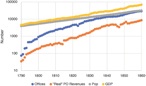
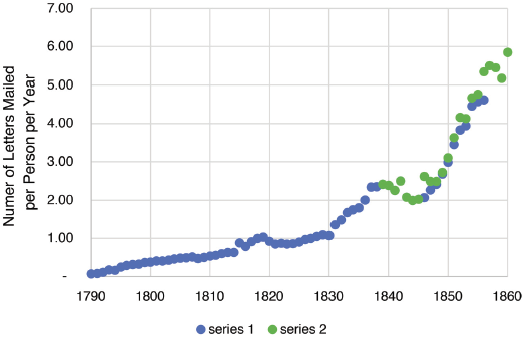
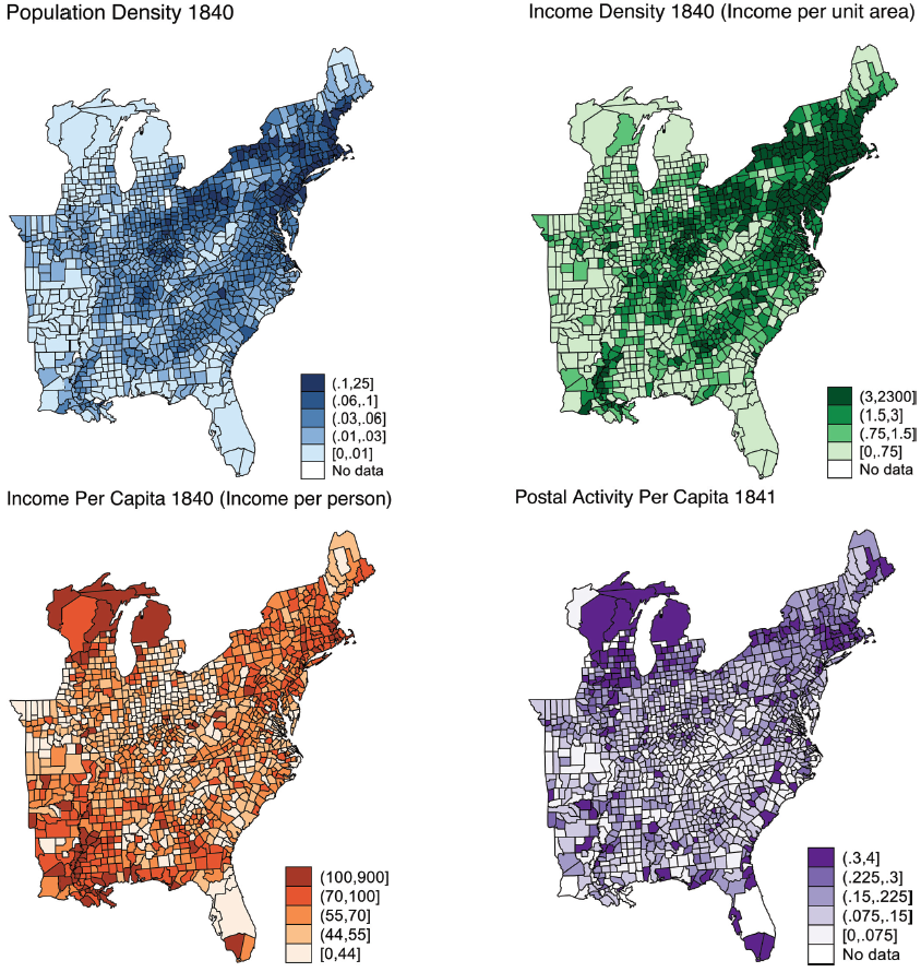
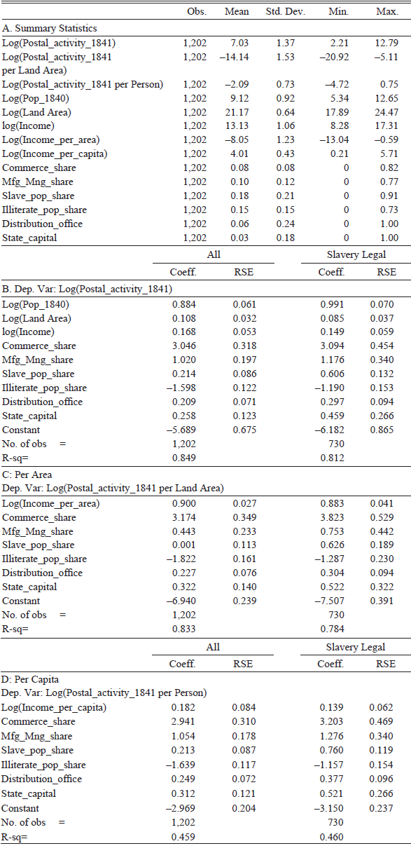
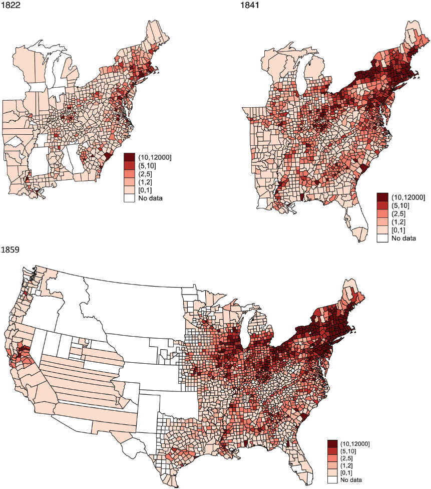
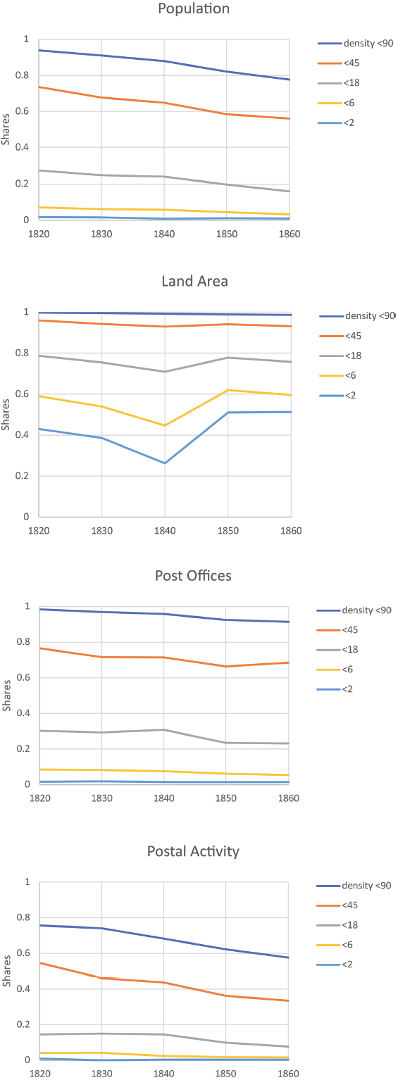
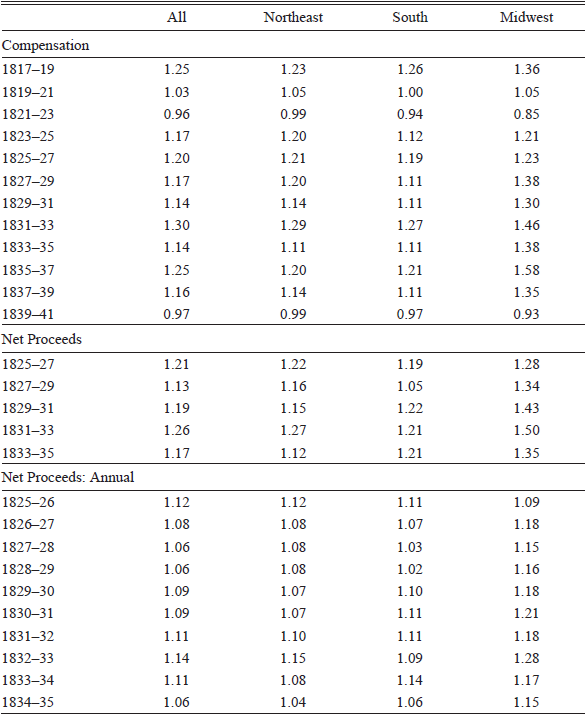
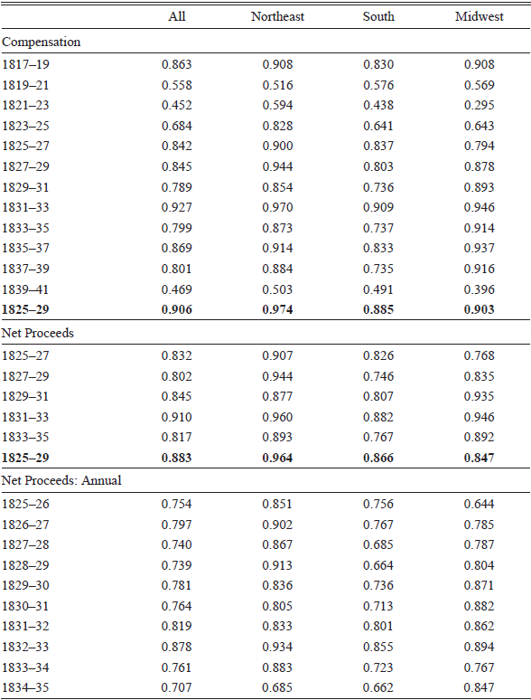
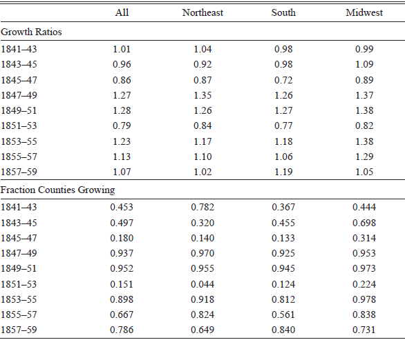
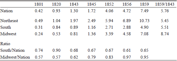
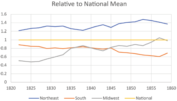
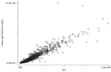
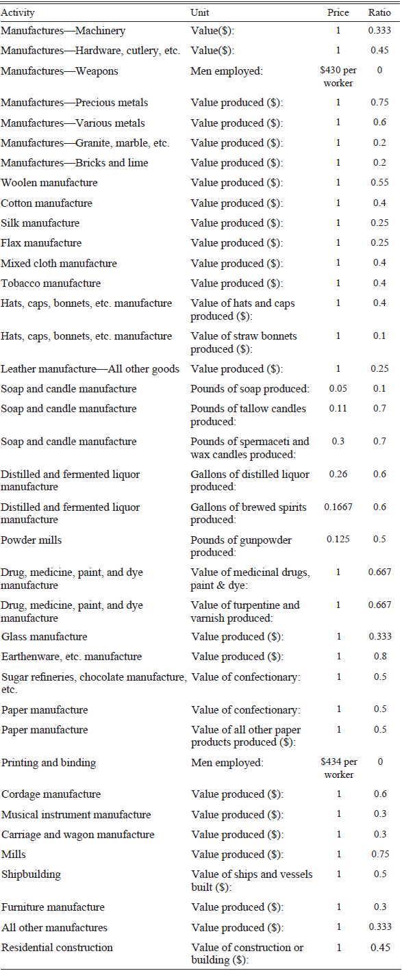
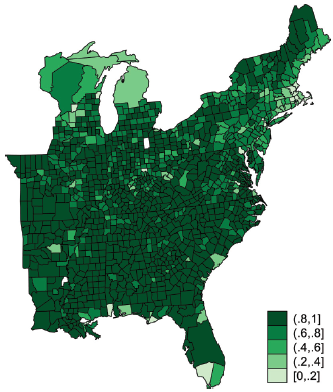
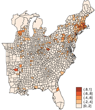
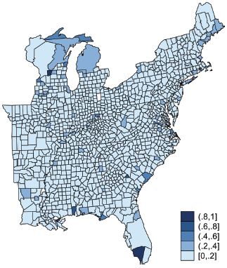


 Open access