

1. Introduction
Studies addressing speakers’ “naïve” perception of linguistic boundaries help both the sociolinguists and the dialectologists in understanding mechanisms and dynamics of language change and in questioning the validity of geolinguistic constructs, that is, the reality of linguistic boundaries drawn by the linguists as experienced by the speakers.
The complexity of its linguistic repertoire makes Italy an ideal territory for the analysis of perceived linguistic variation. In this respect, the Tuscan repertoire appears to be even more challenging. Indeed, since the Florentine dialect is at the origin of what is now Standard Italian, the relationship between the two poles of standard and vernacular is, in Tuscany, different from the rest of Italy. The boundaries between the two codes are blurred, with several dialectal features found even in formal contexts, and subregional variation manifests itself in peculiar ways. Speech varieties have the same phonological inventories and differ only in terms of the distribution of single phonemes (Calamai, Reference Calamai, Cerruti, Crocco and Marzo2017; Giannelli, Reference Giannelli2000). Because the tracking of linguistic boundaries is particularly challenging, relying on speakers’ perceptions of subregional linguistic variation could, thus, shed light on the role of isoglosses in the construction of mental maps.
In this article, we present research based on the analysis of mental maps collected among young speakers from different Tuscan cities scattered throughout the regional territory. Moreover, we propose a novel approach to the quantitative inspection of folk linguistic perception, one which relies on open-access web dialectometric tools. The paper is structured as follows: in Section 2 we detail the framework and the methods of perceptual dialectology, with a specific focus on perceptual dialectology in Italy; Section 3 addresses the challenges involved in a quantitative analysis of a map corpus; in Section 4 we offer a dialectological sketch of Tuscany and detail the corpus, the research questions, and the experimental design; Sections 5 and 6 contain the results of our experiments and a discussion of them. Lastly, Section 7 concludes our work.
2. Perceptual dialectology
Perceptual dialectology aims at gathering data concerning what people think about and how people process social and geographical language variation (Niedzielski & Preston, Reference Niedzielski and Preston2000, Reference Niedzielski, Preston, Coupland and Jaworski2009). PD deals with the regional distribution of linguistic features as observed by nonspecialists, together with considering social and attitudinal factors in perceiving variation (Preston, Reference Preston, Boberg, Nerbonne and Watt2018:177). Analyzing language attitudes and feelings of linguistical affiliation, together with the perception of linguistic borders, can be crucial in justifying language change and can also inform policies developed by educators and politicians so that such policies will take into account the attitudes of the speakers to whom the policies apply (Cramer, Reference Cramer2016).
Space appears to be a crucial concept for perceptual dialectology. It is, indeed, imbued with social meaning, being not only the locus of variation—languages and dialects vary across space, across cities and territories—but, above all, a lived space, in which people meet and interact with each other (Britain, Reference Britain, Lameli, Kehrein and Rabanus2010). Thus, the mental representation of space affects not only the perception of variation, but it plays a role in modeling variation itself, leading to the possible strengthening or repositioning of old and new isoglosses (Auer, Reference Auer, Markku Filppula, Palander and Penttilä2005). It is indeed the community itself that recognizes its own borders and that decides then to fit in with them rather than conforming to borders imposed on communities (Iannàccaro & Dell’Aquila, Reference Iannàccaro and Dell’Aquila2001:267).
2.1 The draw-a-map task
Among the many techniques developed by Preston (Reference Preston and Preston1999) for the study of language regard, only the draw-a-map technique can be considered a real geographical task (Calaza Díaz et al., Reference Calaza Díaz, Soraya Suárez Quintas, Crujeiras, Sousa and Ramón Ríos Viqueira2015). People are asked to reflect on orienting themselves not solely on their judgment, but they are given a tool—i.e., a real map—in which they have access to other information, such as geographical distance, names of the cities, etc. The draw-a-map technique is thus a task in which the main focus is, exclusively, on speakers’ spatial correlates of linguistic difference.
The very first studies conducted with the draw-a-map technique tended to focus on “broad, non-local assessment of dialect distinctions” in vast geographical areas (Preston, Reference Preston, Lameli, Kehrein and Rabanus2010:128), whereas recent studies tend to focus on more restricted contexts (e.g., for the Qassim area of Saudi Arabia, Al-Rojaie, Reference Al-Rojaie2020; for Ohio, Benson, Reference Benson2003; for California, Bucholtz et al., Reference Bucholtz, Nancy Bermudez, Edwards and Vargas2007, Reference Bucholtz, Nancy Bermudez, Vargas and Edwards2008; for southwestern Germany, Montgomery & Stoekle, Reference Montgomery and Stoeckle2013; for Northern England, Pearce, Reference Pearce2009, Reference Pearce2011). Nonspecialist perception of dialect similarity appears to be heavily grounded in geographic distance (Gooskens, Reference Gooskens2005, Reference Gooskens2012; Van Bezooijen & Heeringa, Reference Van Bezooijen and Heeringa2006): the more two dialects are spatially separated, the more they are perceived as dissimilar. Moreover, it has been shown that respondents tend to draw their dialect area first and to describe its surroundings with a high level of detail (Preston, Reference Preston and Preston1999:xxxiv–xxxv). This effect is related to the idea that information about an area is more readily available to those living in its proximity (Montgomery, Reference Montgomery2012, Reference Montgomery, Braber and Jansen2018).Footnote 1 Of course, this pattern is not mechanistic; geographical and cultural boundaries can alter the flow of information between adjacent areas. The analysis of mental maps usually shows that speakers have a multidimensional perception of space because they evaluate landscapes, economic flows, industrial development together with linguistic variation, which is commonly used by informants to identify at some level similarities and differences between dialects. These partitions sometimes recall strictly dialect grouping as made by linguists (Evans, Reference Evans2011), whereas sometimes respondents happen to detect “subtle differences in specific linguistic markers of variety” (Preston, Reference Preston, Boberg, Nerbonne and Watt2018:200).
2.2 Perceptual dialectology in Italy
Italian dialectology has been in close relation with folk linguistics. From its beginning, it has been focused on the relationship between speakers and their linguistic space and on the importance of the emotional and ideological dimensions of language (Telmon, Reference Telmon2002; Terracini, Reference Terracini1963). The concept of “lived space” has been interpreted as the terrain in which mental images about languages and speakers are deeply linked to geographic places, and this link between speakers and places is imbued with an emotional component, sensations, and perceptions, rather than being informed by the abstract spatial structure (D’Agostino, Reference D’Agostino2007). Perceptual dialectology in Italy has mainly privileged methods such as the matched guise techniques (Calamai, Reference Calamai2019; Calamai & Ricci, Reference Calamai and Ricci2005; Marzo, Crocco & De Pascale, Reference Marzo, Crocco and De Pascale2018), or qualitative investigations using focus groups, interviews, and linguistic autobiographies (Iannàccaro, Reference Iannàccaro2002), often neglecting other experimental methods like the draw-a-map technique. Despite that, examples of maps that reflect subjective dialectal boundaries are in Iannàccaro (Reference Iannàccaro2002), Rabanus & Lameli (Reference Rabanus and Lameli2011) and, for Tuscany, in Heinz (Reference Heinz2004) and Calamai (Reference Calamai2018). However, not all these works include extensive samples of informants. Additionally, sometimes they do not take into account adequate techniques for statistical analysis. For example, Calamai (Reference Calamai2018) collected a corpus of 258 maps, but the analysis was conducted entirely on aggregate data. In this regard, this present paper represents the very first Italian research aiming at applying quantitative methods and statistical analysis to a conspicuous corpus of mental maps collected in Tuscany.
3. Maps, mapping, and quantitative data
The choice of using a specific semiotic object, i.e., the map, almost seems to reinforce the link between perceptual dialectology and dialectology itself. Linguistics appears to go hand in hand with cartography with the aim of providing visually handy representations of language documentation and interpretation (Girnth, Reference Girnth, Lameli, Kehrein and Rabanus2010:100), and maps and cartographic processes were at the core of the first geolinguistic works. First-generation linguistic atlases were structured according to lexical criteria: variants of individual lexical forms were transcribed following phonetic conventions and charted on maps. The analysis of these maps led to identification of isoglosses, of regular patterns of variation, and to the theorization of areal norms by Matteo Giulio Bartoli (Reference Bartoli1945) (see, for example, Rabanus, Reference Rabanus, Boberg, Nerbonne and Watt2018).
Nevertheless, until recently, the large amount of data represented in the linguistic atlases has scarcely benefited from sufficient techniques that would permit a thorough quantitative analysis. The emergence of dialectometry has allowed for the discovery, through the combination of statistical and cartographic methods with linguistic analysis, of abstract patterns that were difficult to observe through qualitative investigation (Goebl, Reference Goebl, Boberg, Nerbonne and Watt2018; Séguy, Reference Séguy1971; Wieling & Nerbonne, Reference Wieling and Nerbonne2015).
Choropleth maps appear to be a peculiar tool in dialectometric analysis (Rabanus, Reference Rabanus, Boberg, Nerbonne and Watt2018:356). Unlike a simple chorochromatic map, choropleth maps allow for the visualization of a statistically grounded gradience of similarity: areas that share a feature are filled with the same color in proportion to a statistical variable, so that the darker the color the higher the adherence of the subarea to the reference statistical variable. With this technique, linguists can easily offer a user-friendly visualization of patterns of variation across a territory.
Dialectometry also makes possible an in-depth analysis of the relationship between linguistic and geographic distance. The use of “as the crow flies” distances for the explanation of the diffusion of linguistic differences and their perception was called into question for those countries with huge geomorphological complexities given the risk of oversimplifying the spatial processes of linguistic diffusion (Gooskens, Reference Gooskens2005). Alternative measures of distance, such as modern and old travel times between places, appear to improve the correlation coefficients with objective and perceived differences between places.
Thanks to new software and different kinds of quantitative analysis (Nerbonne, Reference Nerbonne2009), dialectometric techniques were applied successfully to different geographical and linguistic contexts (Goebl, Reference Goebl1981, Reference Goebl2007, Reference Goebl2008 with data coming from AIS) and to different levels of analysis of the linguistic system (see, for example, Heeringa, Johnson & Gooskens, Reference Heeringa, Johnson and Gooskens2009 for phonetic data; Elvira-García et al., Reference Elvira-García, Balocco, Roseano and Maria Fernández Planas2018 for prosodic distance and, for the Tuscan context, Montemagni et al., Reference Montemagni, Wieling, De Jonge and Nerbonne2012, Reference Montemagni, Wieling, De Jonge and Nerbonne2013; Montemagni & Wieling, Reference Montemagni, Wieling, Côté, Knooihuizen and Nerbonne2016 with evidence of linguistic change).
3.1. A perceptual dialectometry?
Until recently, perceptual dialectology did not have adequate tools for a real quantitative analysis of the perception of linguistic variation, probably because of the nature of the task itself, one that typically requires a freehand drawing on a blank map. Thus, the processing of large amounts of data was usually extremely time-consuming, with routines that commonly involved individual scanning and incorporation of the maps as layers. Additionally, the identification of the area is usually furnished with qualitative annotations (such as nicknames about places, shibboleth, etc.), and it is sometimes difficult to find a method to process these data (Montgomery, Reference Montgomery, Montgomery and Moore2017). For example, Preston (Reference Preston and Schneider1996) processed 147 southeastern Michigan hand-drawn maps of US dialect areas using a light pen and a light-sensitive pad, but the task required the discarding of regions that were not identified by the respondents. Other studies conducted quantitative analyses only on survey answers, disregarding geographical information collected through the compilation of mental maps (e.g., Bucholtz et al., Reference Bucholtz, Nancy Bermudez, Vargas and Edwards2008), whereas others still decided to encode the maps on the basis of the groupings listed by the subjects (see Calamai, Reference Calamai2018).
Thanks to new instruments, we are now facing a turning point in the analysis of perceptual dialectological data. Tools such as GIS were proven useful in the analysis of maps, as shown by works that take into account multidimensional geographical information (Al-Rojaie, Reference Al-Rojaie2020; Calaza Díaz et al., Reference Calaza Díaz, Soraya Suárez Quintas, Crujeiras, Sousa and Ramón Ríos Viqueira2015; Cukor-Avila et al., Reference Cukor-Avila, Lisa Jeon, Rector and Shelton2012; Evans, Reference Evans2011, Reference Evans2013, Reference Evans2016; Kendall & Fridland, Reference Kendall, Fridland, Côté, Knooihuizen and Nerbonne2016; Montgomery & Stoeckle, Reference Montgomery and Stoeckle2013), and dialectometric analysis allowed researchers to consider the perceived distance expressed by the speakers as a factor in the evaluation of dialects (Gooskens, Reference Gooskens2005; Gooskens & Heeringa, Reference Gooskens and Heeringa2004, Reference Gooskens and Heeringa2006).
Applying quantitative methods to perceptual dialectology not only allows investigators to retain the data usually collected in the field, but also to apply statistical techniques to enhance the analysis. Moreover, the application of dialectometric methods permits (1) to consider geographical information, such as distance in kilometers between points, and (2) to offer a visualization of the data in order to make them more readable, being graphicacy (Balchin & Coleman, Reference Balchin and Coleman1966) a fundamental fourth ace for any research on spatial relationships.
Given these premises, and in order to investigate the role of the geographic component in the perception of dialect areas, we have relied on the dialectometric software Gabmap (Leinonen, Çöltekin & Nerbonne, Reference Leinonen, Çöltekin and Nerbonne2016; Nerbonne et al., Reference Nerbonne, Rinke Colen, Kleiweg and Leinonen2011) with the aim of proposing a novel pathway to graphicacy in perceptual dialectology. Gabmap is a free, web-based software that allows for the aggregation and clustering of large amounts of data. The Gabmap platform was not originally conceived for perceptual data (Nerbonne et al., Reference Nerbonne, Rinke Colen, Kleiweg and Leinonen2011: 68–9). However, its easy-to-use and fast-to-process utilities can vastly benefit our field of interest as well. In particular, the processing of data with Gabmap enables researchers to achieve three different tasks: (1) analysis: the software itself permits automatic clustering; (2) visualization: the clustered data can be used to generate different kinds of maps that will facilitate the analysis and can be used as a tool in other nonspecialistic contexts; and (3) replicability: the maps, coded as matrices, can be reanalyzed by other scholars and, moreover, the corpus can always be updated. By performing a statistical clustering of people’s subjective perceptions of dialect areas, Gabmap introduces ready-made cartographic realism (Hallisey, Reference Hallisey2005:356).
4. The experimental research
This section is devoted to the experimental research and it is conceived as follows. First, we will express the research questions, then we will offer a synthesis of the Tuscan taxonomy made by linguists. Finally, we will detail the experimental design and the sample.
4.1 Research questions
The broad goal of this paper is to understand the contribution of geographical and personal data information (e.g., residence of the respondent) to the perception of linguistic variation. We want to verify the role of geographic distance, as computed with different methods, and the place of residence of the respondents in modeling perceived variation. Additionally, we want to verify the relationship between dialect groupings as made by linguists and perceived taxonomies of sublinguistic areas.
We will try to answer to the following research questions:
-
1. What are the most common perceptual areas in the region, regardless of the origin of the respondents?
-
2. What are the effects of geographical distances between subareas on our participants’ classifications? Does the preference of distances by road instead of as the crow flies significantly contribute to our understanding of the draw-a-map results?
-
3. Is there a proximity factor, that is, do the borders vary according to the origin of the respondents? Do the responses become more uncertain as the distance between the participants’ homeplaces and the clustered areas grows?
-
4. Which “official” classification as made by dialectologists appears to be the most consistent with speakers’ classifications? Did speakers rely on their historical, synchronic, or sociolinguistic knowledge when completing the draw-a-map task? How do these dialect groupings coexist with spatial distance in the explanation of our participants’ responses?
4.2 Tuscan dialects: The taxonomies made by linguists
The present section is devoted to an excursus concerning the linguistic classification of the region from Medieval times to the present. It would be rather hard to be exhaustive, and the scrutiny of all the known authors would probably occupy an entire volume on the topic. Nevertheless, even a limited selection of the sources reveals some recurrent patterns.
Medieval Tuscany was usually divided into four fundamental linguistic varietiesFootnote 2 : Pisan-Lucchese, Florentine, Sienese, and Eastern Tuscan (Arezzo, San Sepolcro, Cortona). Pratese and Pistoiese (with several influences from Western Tuscan), Volterran (influenced by Pisan), and Sangimignanese-Colligiano (conditioned by Sienese) are considered minor dialects.
The short treatise Degl’idiomi toscani by Celso Cittadini is usually considered the very first work of geolinguistic study after Dante’s De vulgari eloquentia (Faithfull, Reference Faithfull1962:269; Poggi Salani, Reference Poggi Salani and Bruni1994:448). Cittadini listed six speech varieties: Florentine, Sienese, Pisan, Pistoiese, Lucchese, and Arretine, a classification which remained more or less the same until the nineteenth century (see infra). In the second half of the sixteenth century, the “image” of Tuscany as a unified region, despite political fragmentation, is apparent in the essays by Claudio Tolomei, Orazio Lombardelli, and Celso Cittadini (Poggi Salani, Reference Poggi Salani and Bruni1992:403). In this period, it was quite common to emphasize both the linguistic homogeneity of the different dialects in the region and, simultaneously, the phonetic and lexical differences among the different speech varieties, as Claudio Tolomei’s text demonstrates:
Laonde, se ben riguardiamo, non una sola lingua o una sola pronunzia è in Toscana, ma sono molte e molte, secondo le diversità de le cittadi e de le castella, perché e in accenti e in parole son diversi gli Aretini da’ Volterrani, i Senesi da’ Fiorentini, i Pisani da’ Pistolesi, i Lucchesi da que’ di Cortona […] e per ogni luogo v’è varietà di pronunzie e di vocaboli. […] se cerchiamo questa cosa col martello de la verità affinare, vedremo così minute esser cotali differenze, che coloro che fuor di Toscana son nati o nissuna differenze tra ‘l Fiorentino, Senese, Pisano, Lucchese e altre simili favelle conoscano, o con grandissima loro difficultà la comprendano (Claudio Tolomei, Il Cesano, in Castellani Pollidori, Reference Castellani Pollidori1996:26, 71).Footnote 3
Thus, a superimposed Tuscan variety exists despite the different dialects of the region (whose differences are mostly in the realm of phonetics and morphology).
The number six appears to be consistent in the majority of the consulted sources. The traditional dialectological literature also divides the territory of Tuscany into six dialects: Florentine, Sienese, Western Tuscan (split in turn into Pisan, Leghornese, and Elban), Arretine, Grossetan-Amiatine, Apuan. The same number of dialects is also present in older descriptions by linguists and grammarians prior to the nineteenth century. From Girolamo Gigli in his Vocabolario Cateriniano (under the heading pronunzia, Mattarucco, Reference Mattarucco2008) to Carl Ludwig Fernow, scholars are all inclined to identify six varieties (Florentine, Sienese, Pistoiese, Pisan, Lucchese, and Arretine), with Pistoiese in place of “Grossetan-Amiatine” (J.C. Adelung, Reference Adelung1809:516; F. Adelung, Reference Adelung1824:60; Blanc, Reference Blanc1844:628; Fernow, Reference Fernow1808:264).
However, alternative proposals are also documented in the history of Italian dialectology. A relevant example is the work of Francesco Cherubini, whose partition appears to be highly refined. In his Prospetto nominativo dei dialetti italiani the following speech varieties are enumerated: Florentine, Sienese, Pisan (split into “true Pisan,” Pisano proprio, and Sassarese), Lucchese (together with Garfagnine), Pistoiese, Pesciatine and Pratese, Leghornese, Elban, Arretine and Cortonese, Maremman, Volterran, Corsican, and Massese (Cherubini, Reference Cherubini1824:114). The handwritten materials that were intended to be used as a general description of the Italian dialects (the project was unfortunately aborted) proved an uncommon and deep knowledge of the Italian linguistic landscape (Faré, Reference Faré1966:43). With respect to Tuscany, the partition described in the handwritten material is quite similar to the one presented in the Prospetto but with an additional note concerning the characterization of the Leghornese variety, which is divided into two subvarieties (suddialetti, in his terminology): “true Leghornese” (livornese proprio) and “low Leghornese” (livornese plebeo).
In Biondelli ([1846] Reference Biondelli and Biondelli1856:186), the partition is somewhat different:
Il ramo tosco, posto nella parte settentrionale, suddividesi propriamente in quattro gruppi distinti, che abbiamo denominato Fiorentino, Sienese, Tiberino e Corso. Il gruppo Fiorentino abbraccia tutto il bacino dell’Arno, non che le valli del Serchio e di Cecina. Ivi è suddiviso in molti dialetti, dei quali è principal tipo il fiorentino. […] Le sue varietà più distinte sono: il lucchese, il pisano, che si estende lungo le valli dell’Era e della Cecina, ed il livornese, ch’è il più corrotto.Footnote 4
According to Parodi (Reference Parodi1889:590), there are four main dialects of Tuscany: Central Tuscan, Western Tuscan, Sienese, and Arretine. According to Nieri (Reference Nieri1901:v–vi), the Tuscan linguistic landscape is as follows (with varieties other than Florentine listed from the most similar to the most diverse from Florentine itself): Florentine, Pistoiese, Sienese and Maremman, Pisan and Leghornese, Arretine and Lucchese. Four subregions appear in Devoto & Giacomelli (Reference Devoto and Giacomelli1971:65): the eastern area (with influences from Umbria), the southern area (with influences from Latium), the western area (Leghornese, Pisan, Lucchese), and the central area (Sienese and Florentine). In Giovan Battista Pellegrini’s renowned classification (Carta dei dialetti d’Italia), again six varieties are listed: Florentine, Sienese, Western Tuscan, Arretine, Grossetan-Amiatine, and Apuan. Western Tuscan is further divided into Pisan-Leghornese-Elban, Lucchese, and Pistoiese (Pellegrini, Reference Pellegrini1977:30).
In the seminal work by Giannelli ([1976]Reference Giannelli2000), ten different varieties are identified, mostly according to morphological and syntactical features. These are comprised of Florentine, Sienese, Pisan-Leghornese, Lucchese, Elban, Arretine, Amiatine, Low Garfagnine-High Versiliese, High Garfagnine, and Massese. Furthermore, eight “gray” varieties are identified (Viareggine, Pistoiese, Casentinese, High Valdelsan, Volterran, Grossetan-Massese, Chianine, the dialects spoken in the southwestern area of Grosseto). These are more difficult to isolate as they present features originating from disparate varieties. A rather different perspective emerges from Giannelli (Reference Giannelli1988:604), whereby a partition within single dialects and areas of sociolinguistic influence is presented. The seven areas of sociolinguistic influence are, according to size, as follows: Florentine influence, Pisan and Leghornese influence, Sienese influence, Lucchese influence, Grosseto influence, Arezzo influence, and Pistoiese influence. The dialects whose influence is not expanding are Chianine (seemingly stemming from the Sienese dialect), Casentine, Amiatine and southern Maremma, Elban, the Capraia dialect (of Corsican origin), Garfagnana/northern Versilia/Massa dialects, and the dialects of the North (or, at least, mixed varieties). Within this picture, a transitional area is also identified between the areas influenced by the Pisan-Leghornese and Grosseto dialects with the following label: Volterran, Massetan, Piombinese transition area.Footnote 5
It is known that not all parts of the Tuscan region use Tuscan dialects. In Massa-Carrara and in very small areas of the Apennines (the so-called Romagna Toscana), Northern Italian dialects are spoken, whereas in the southern part of the region (Mount Amiata, in particular) some features of the so-called Italia mediana permeate. Here, the repertoire is assumed to be similar to the rest of Italy, where code-switching is at work. The identification of boundaries is easier in the North where Tuscan dialects are delimited by the bundle of isoglosses of the “La Spezia-Rimini line”Footnote 6 and where historical and geographical features make the identification of Tuscan dialects (versus non-Tuscan dialects) straightforward. On the contrary, the identification of Tuscan features is more difficult along the southern and eastern borders at the boundary between Tuscany, Umbria, and Latium (Giannelli, Reference Giannelli, Maiden and Parry1997).
It is challenging to track the boundaries among speech varieties that, in most cases, have remarkable phonological similarities and differ only in terms of the distribution of single phonemes. Tellingly, from a sociolinguistic point of view, the main areas are listed as follows: Florentine, Pisan-Leghornese, Lucchese, Arretine, Sienese, Grossetan (Agostiniani & Giannelli, Reference Agostiniani, Giannelli, Cortelazzo and Mioni1990:221). Central Tuscan has already absorbed the Prato and Pistoia varieties. The Leghorn variety has come to the forefront in the last two centuries, showing some expanding features along the coast (Calamai, Reference Calamai2005). Given the above, Section 5 will show how such linguistic diversity is mirrored in perceptual maps.
4.3. The experimental design and the sample
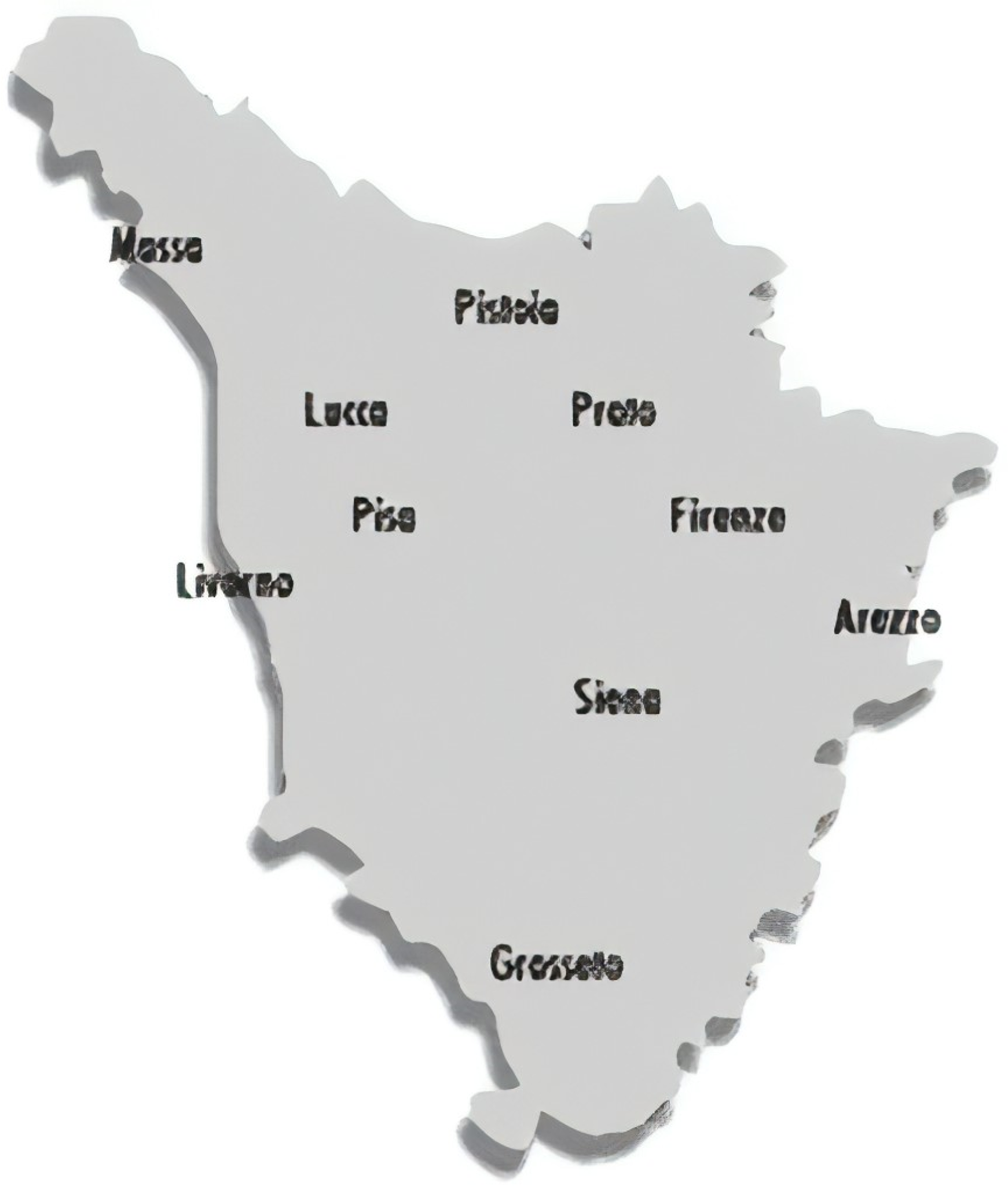
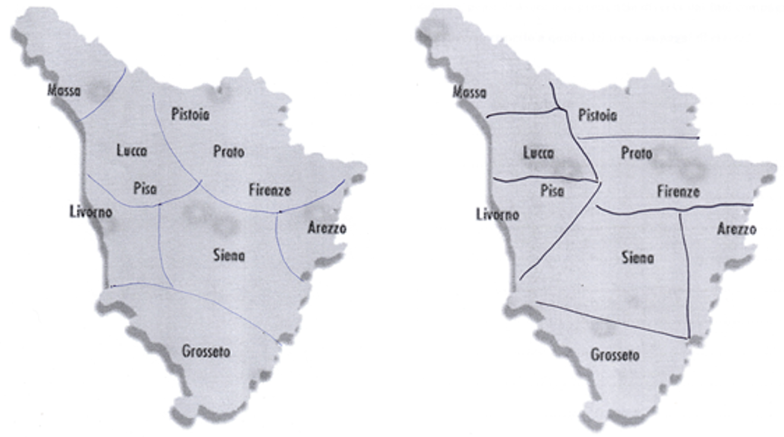
In the map-drawing task, informants were given a simplified map of the region under investigation (see Map 1) and asked to draw borders identifying the locations where they believed that different dialects existed. This method provides information about how the participants mentally represent dialect areas, since they would be indicating on their map all of the places where they believe people talk in the same way. The fieldwork was run in Tuscan high schools. Students were provided with simplified Tuscan maps showing only the names of the provinces. We restricted the information contained on the maps to avoid any influences that could have come from additional geographical information.Footnote 7 Participants were asked to identify relevant areas using circles and/or dividing lines (see Maps 2 and 3) and to provide additional information such as labels, shibboleths, or specific dialectal features. Students were reassured of the following conditions: anonymity of their answers and absence of the “right” answer (that is, it was important for each informant to give his/her own point of view on the task). A total of 813 secondary school students were involved in the map-drawing task in several parts of the region. Data were always collected by one of the authors of the present paper (SC), thus assuring complete homogeneity in the style of data collection. In the data preprocessing phase, each map was identified by progressive numbers together with the acronym of the town in which the fieldwork was carried out (e.g., LU1, LU2…, GR1, GR2…).
The map used in the fieldwork.
Mental maps drawn by a participant from Florence (left) and Prato ( right).
Data discussed in the present paper were collected in the years 2010–2020 in the following towns, listed in alphabetical orderFootnote 8 :
-
Arezzo (school 1, 35 respondents; school 2, 97 respondents)
-
Lido di Camaiore – Lucca (98 respondents)
-
Montevarchi – Arezzo (36 respondents)
-
Grosseto (73 respondents)
-
Empoli – Florence (70 respondents)
-
Massa (73 respondents)
-
Prato (school 1, 80 respondents; school 2, 15 respondents)
-
Florence (school 1, 29 respondents; school 2, 36 respondents)
-
Siena (43 respondents)
-
Pisa (128 respondents)
The ten samples correspond to different linguistic areas.Footnote 9 Elba Island was excluded from the fieldwork since Elban appears to be a dying variety (Giannelli, Reference Giannelli2000).
5. Results
Maps were processed through the Gabmap web application in order to generate a visual, statistically grounded representation of the main perceptual clusters elicited by the participants. Gabmap requires two files in order to perform its functionalities: a map (.kml or.kmz) and a data (.txt) file. We first recreated the map of Tuscany that was administered to our participants by means of the add polygon and add placemark functions of Google Earth.Footnote 10 Placemarks were directly imported from the software. Province boundaries were added to the original map with the aim of visually enhancing the understanding of the geopolitical properties of the Tuscan region for the benefit of non-Italian readers. For the reason explained above (Section 4.3), the Tuscan Archipelago was not included on the map.
Then, the 813 maps constituting our corpus were manually coded into difference matrices (one matrix per map coded in a separate Excel worksheet). A difference matrix is a symmetric matrix containing pairwise linguistic distance values. In our case, the matrices had a 10×10 grid; each row and column corresponded to a Tuscan province. For this first Gabmap-based perceptual study, we devised a coarse-grained binary distance measure: the areas that were clustered together in the respondent’s map were coded as 0 in the pertinent slot of the matrices, whereas the areas which were kept separate were coded as 1. Therefore, the diagonals of the matrices were composed by zeroes in compliance with the data format requirements of Gabmap.Footnote 11 Following a common practice in difference data treatment (e.g., Preston, Reference Preston and Preston1993:356–59), we computed the mean between the matrix values using Excel 3D-reference formulae. Mean difference matrices were generated at the following levels of analysis: all Tuscan maps (813), maps produced by the respondents from the provinces of Arezzo (168), Florence (135), Grosseto (73), Lucca (98), Massa (73), Pisa (128), Prato (95), and Siena (43). Each of the eight mean matrices were imported as a .txt file in separate Gabmap projects.
For further statistical analyses, the Gabmap matrix format was then reformulated in tables with one variable per column. The pairwise relationships of the matrices were translated into a “Combination” column including each of the 45 possible items (for example, for the pairwise relationship between the provinces of Prato and Siena, a “SI_PO” item was created). Three “official” grouping solutions (i.e., Agostiniani & Giannelli, Reference Agostiniani, Giannelli, Cortelazzo and Mioni1990; Giannelli, Reference Giannelli2000; Pellegrini, Reference Pellegrini1977; see below Section 5.4) were coded in three separate columns using the same binary values of the participant’s matrices (0 = the two provinces are grouped together; 1 = the two provinces are considered as different linguistic areas). Two conceptualizations of spatial distance (see below Section 5.2) between the chief towns of the provinces for each “Combination” slot were also entered into the table. Following the dialectometric tradition, we ran correlation analyses between the aforementioned factors and aggregate linguistic differences (i.e., the values that were previously fed to Gabmap in order to obtain the cartographic representation of the whole Tuscan dataset). However, in order to evaluate the best explanatory combination between distance and objective grouping solutions through regression analyses, we created a second table substituting the aggregate difference column with one including the individual participant’s binary responses. By doing so, we were able to build questionnaire-like regression models, including random intercepts for each participant (i.e., map) and combination (i.e., pairwise relationship between Tuscan provinces).
5.1 Perceptual areas in the region
In this section, we offer three different visualizations for our perceptual data in order to answer question 1. With respect to difference data, Gabmap can indeed process up to three main types of linguistic maps: (1) difference maps; (2) choropleth maps; and (3) automatic clustering of dialect varieties.
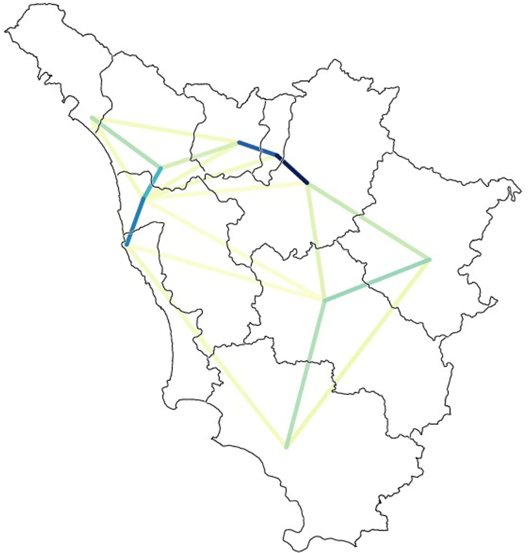
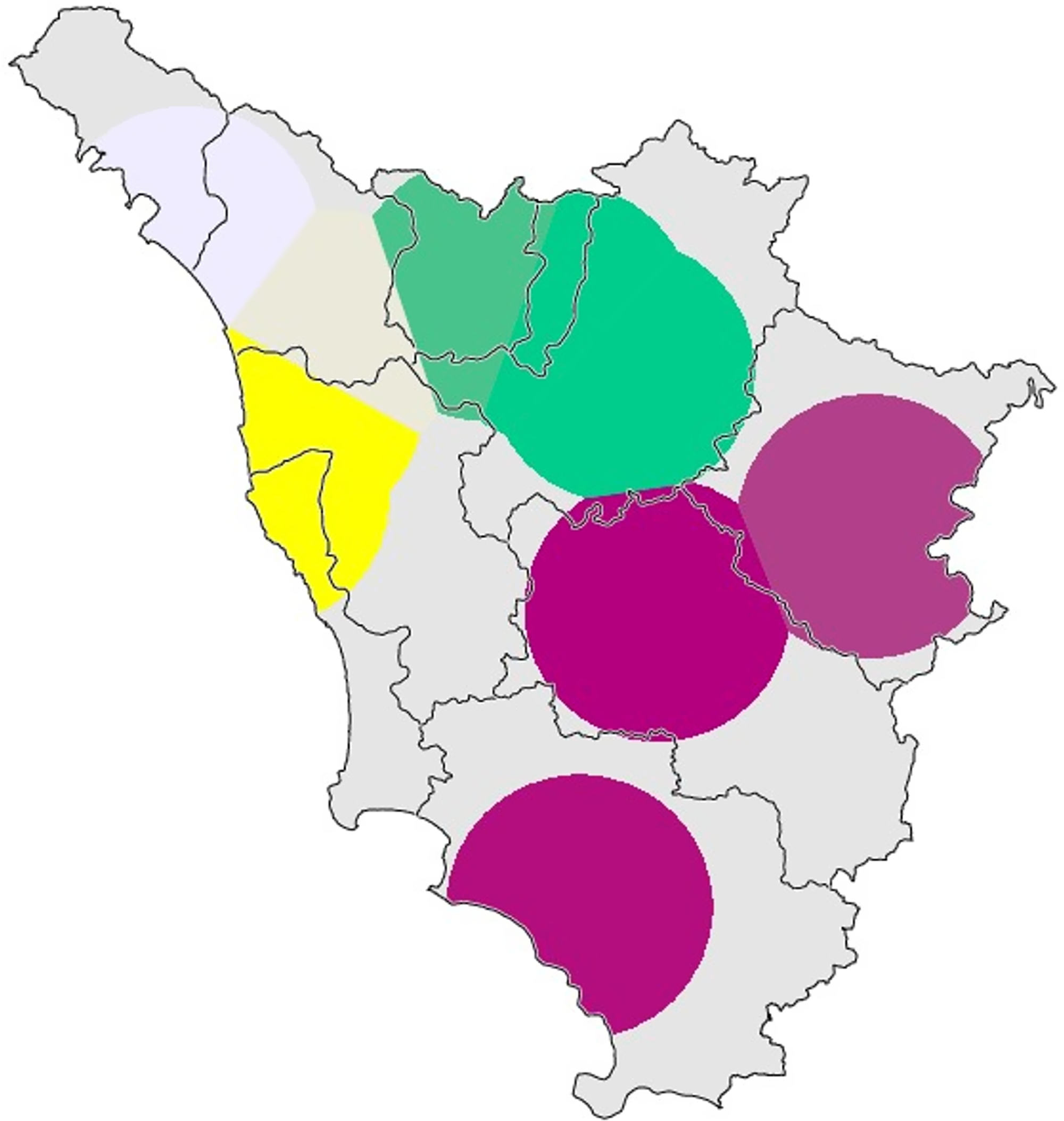
Difference maps (1) (e.g., Goebl, Reference Goebl2010:69–70) can be useful tools for the visualization of linguistic similarities between adjacent areas. Lines are drawn connecting the placemarks; the strength of the dialect analogies are underscored through an intuitive color-coding, with darker lines suggesting stronger connections. Map 4 exemplifies this map type using the whole Tuscan database. In our case, the lines represent impressions of similarity between subregional areas. Apparently, closeness is a particularly effective correlate of similarity in the case of the areas of Pistoia-Prato-Florence and Leghorn-Pisa-Lucca.
Gabmap difference map showing different degrees of perceived linguistic solidarity between adjacent areas. The whole Tuscan corpus is the source data. Darker lines mean higher levels of perceived similarity (e.g., Florence-Prato-Pistoia, Pisa-Leghorn).
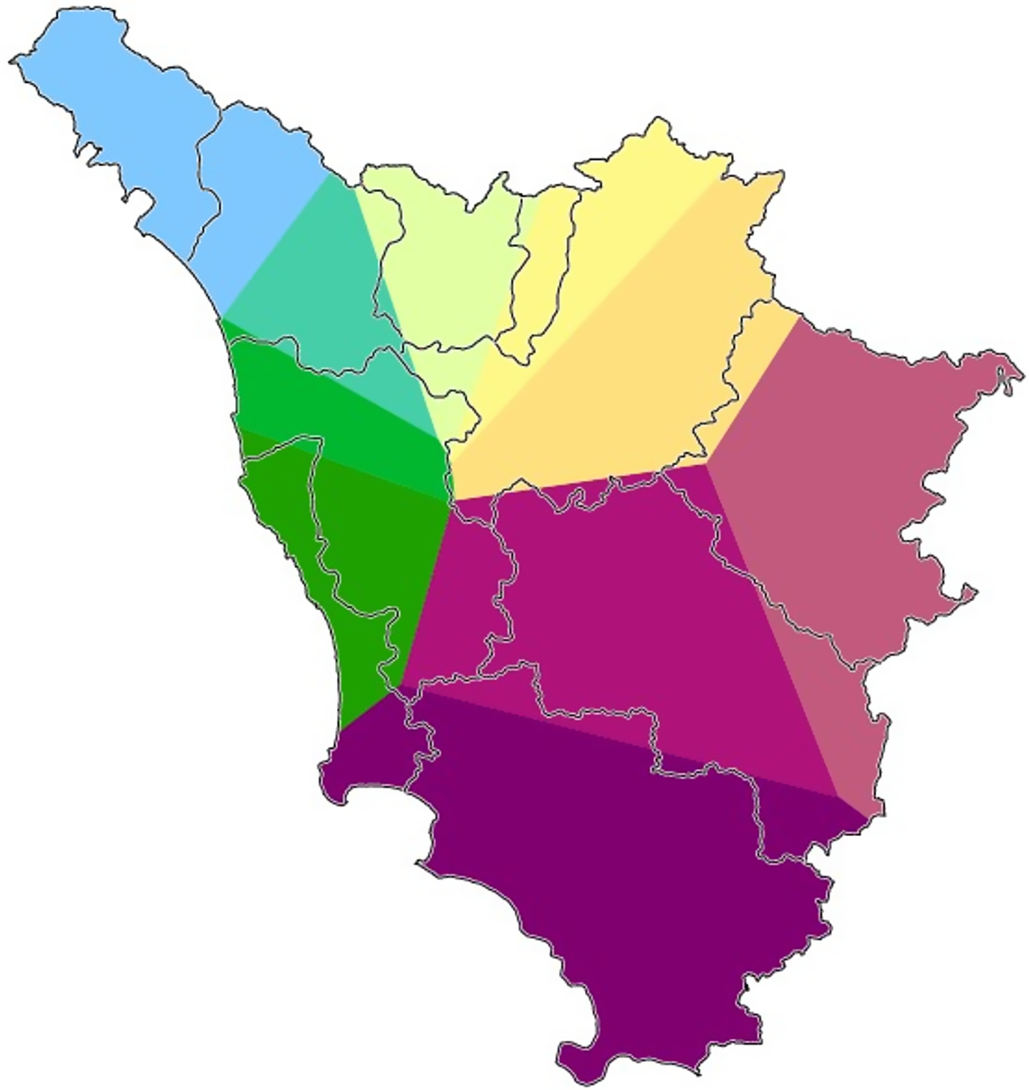
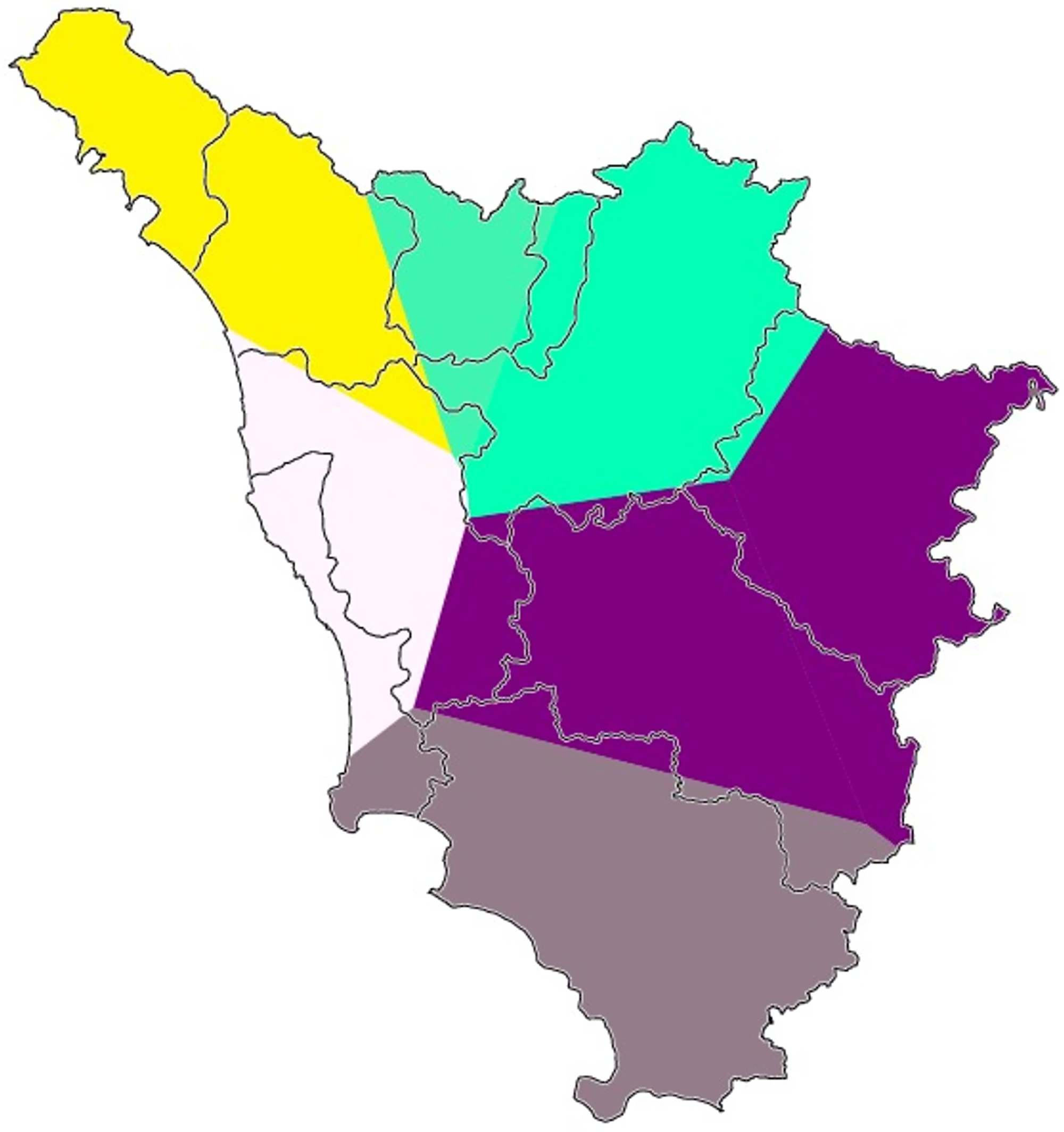
Second, Gabmap relies on multidimensional scaling (Black, Reference Black1973; Embleton, Reference Embleton, Köhler and Rieger1993) in order to generate (2) choropleth maps of dialect continua. Multidimensional scaling is a family of statistical techniques used to represent the properties of large amounts of data in an underlying low-dimensional space following similarity criteria.Footnote 12 The first three dimensions usually manage to explain over 90% of the data variance (e.g., 98% in Prokić & Nerbonne, Reference Prokić and Nerbonne2008). Gabmap assigns a color to each of the first three dimensions using a hue, saturation, value representation of the RGB color model. By doing so, Gabmap generates a map that represents the perceived linguistic similarity of each area with each of the other ones, simultaneously. By superimposing the maps pertaining to the first three dimensions, the RGB model allows the user to obtain a compact visualization of the perceived dialect continua. Red areas of the map are associated with the first dimension, green with the second, and blue with the third (Leinonen, Reference Leinonen2010:208). Map 5 displays the RGB multidimensional scaling map using our whole Tuscan dataset, while Maps 6, 7, and 8 contain the choropleth maps for each of the first three dimensions taken separately. The most evident interruption in the continuum of perceived similarity is the one between Pisa-Leghorn and Siena-Grosseto. In fact, the pure green of the former cluster suggests the pertinence of the western provinces to the second dimension; however, Siena and Grosseto do not reside on this dimension at all, while being part of the third and, for the most part, of the first one.
Gabmap multidimensional scaling map of Tuscany (whole Tuscan dataset). The colors of the three principal dimensions (I: red, II: green, III: blue) are plotted simultaneously, creating a visual representation of the perceived Tuscan dialect continua.
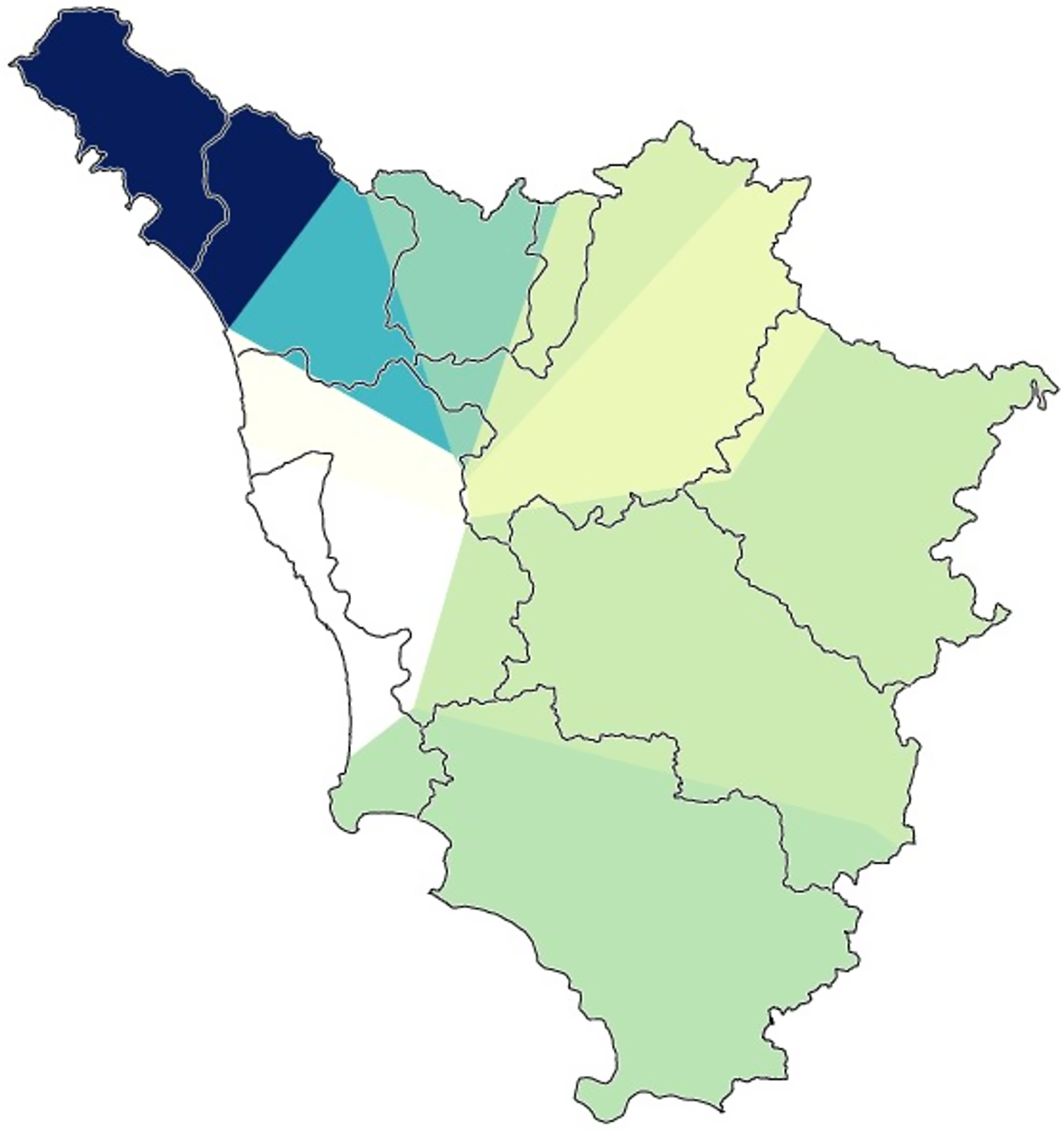
Gabmap multidimensional scaling map of Tuscany (whole Tuscan dataset). The map shows the areas lying on the first dimension that were discerned by the algorithm.
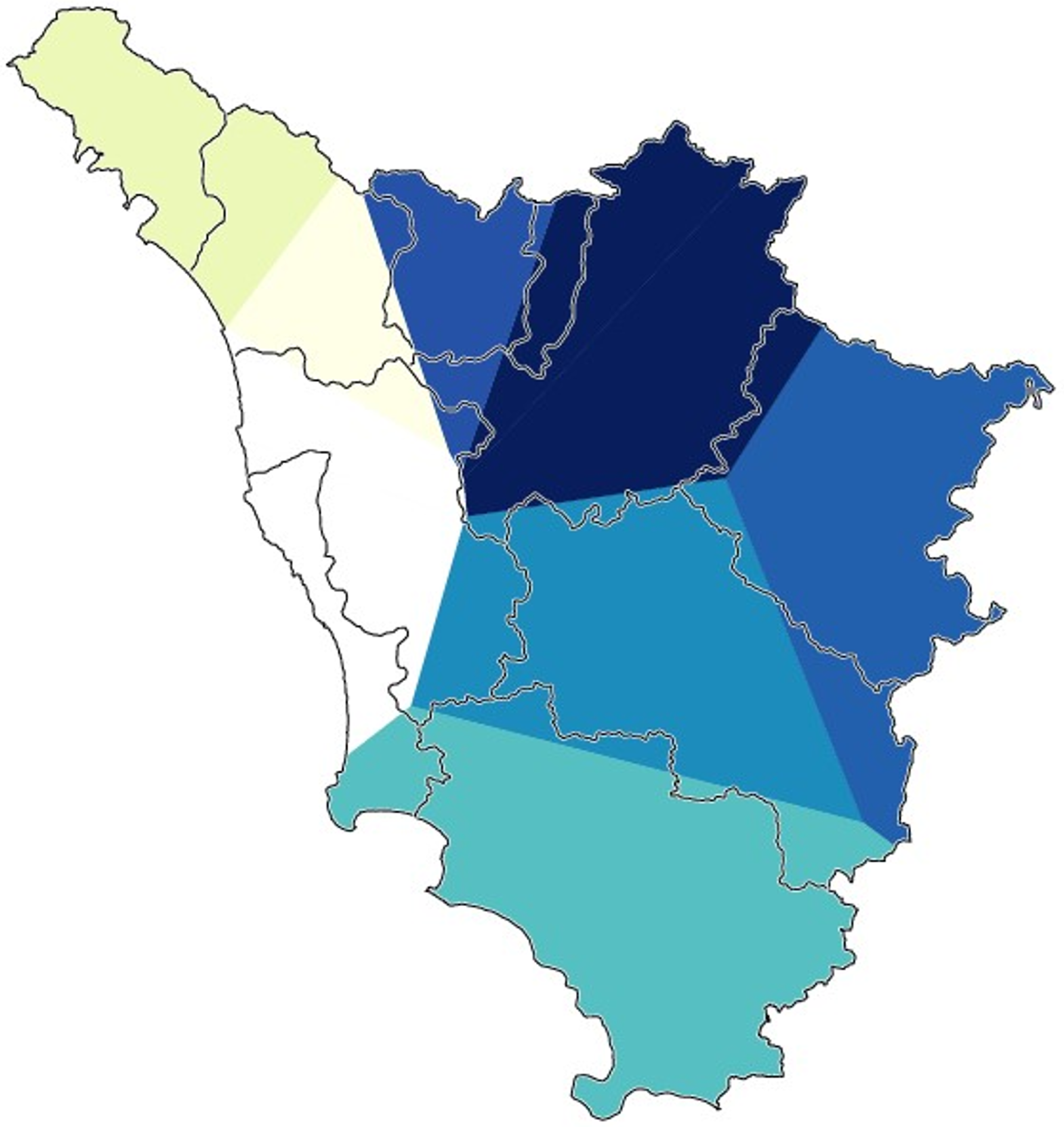
Gabmap multidimensional scaling map of Tuscany (whole Tuscan dataset). The map shows the areas lying on the second dimension that were discerned by the algorithm.

Gabmap multidimensional scaling map of Tuscany (whole Tuscan dataset). The map shows the areas lying on the third dimension that were discerned by the algorithm.
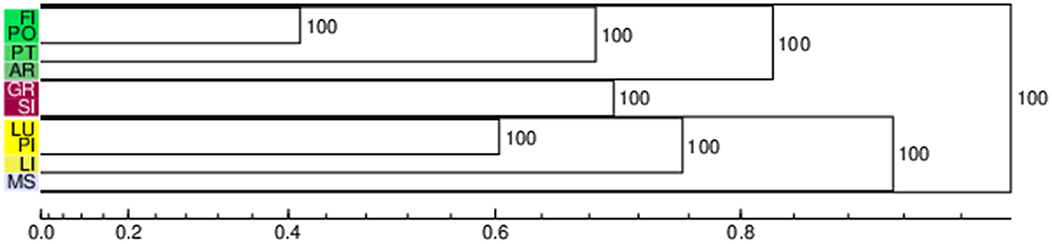
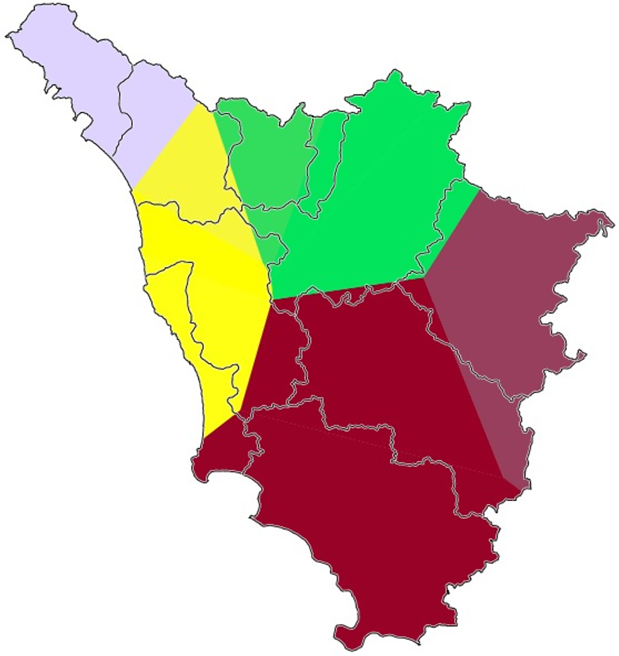
The last cartographic functionality of Gabmap is the most similar to the draw-a-map task of perceptual dialectology. The platform presents several built-in algorithms to perform (3) the automatic clustering of dialect varieties. Four (complete link, group average, weighted average, and Ward’s method) algorithms provide solutions for discrete clustering. However, these methods are extremely sensitive to minimal changes in the difference matrix, leading to instability (Nerbonne et al., Reference Nerbonne, Kleiweg, Heeringa, Manni, Christine Preisach, Schmidt-Thieme and Decker2008:649), and require validation analyses. For this reason, we will rely on the noisy clustering technique (ibid.). This method consists in running the clustering algorithm several times on the data matrices, with a random portion of noise added each time. The procedure outputs a probabilistic dendrogram, which retraces the clustering operations while adding a probability percentage to each node. This estimates the number of encounters of a cluster over the number of runs of the algorithm. The results of the noisy technique are also plotted in a map, in which the color-coding of the clusters corresponds to the pertinent dendrogram tags. Here, the colors do not have any peculiar dimensional meaning and are assigned randomly. Figure 1 show the probabilistic dendrogram and the map generated using Gabmap default settings (noise: 0.2; limit: 60%; exponent: 1.5; method: group average + weighted average) on the matrix representing the whole Tuscan dataset (Map 9). Results suggest that the varieties of Prato and Florence and of Pisa and Leghorn are consistently perceived as very similar by our Tuscan respondents. Arezzo and Siena are also grouped together; however, the correspondent node is quite high (= less similarity), and the clustering does not emerge with a 100% probability. Pistoia and Grosseto are clustered with Florence/Prato and Siena/Arezzo, respectively; the latter manifests a considerably higher node. Massa is clearly perceived as different from all the other Tuscan varieties.
Gabmap cartographic visualization of the probabilistic dendrogram shown in Figure 1 (whole Tuscan dataset).

Gabmap probabilistic dendrogram (whole Tuscan dataset).

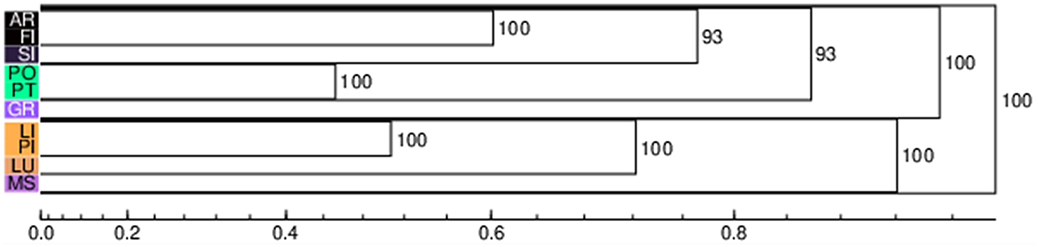
Let us now have a look at the correspondent outputs of the noisy clustering algorithm run on geographically determined subsets of the dataset. Figures 2-9 and Maps 10-17 show the probabilistic dendrograms and maps of the matrices representing the responses of the participants from Arezzo, Florence, Grosseto, Lucca, Massa, Pisa, Prato, and Siena. Florence-Prato and Pisa-Leghorn appear to be the most common two-element clusters. Concerning the former, the only exception resides in the Pisan matrix, showing a first-order (but quite high) node between Florence and Arezzo, while Prato and Pistoia form a separate first-order group. The Pisa-Leghorn first order cluster is questioned by the respondents from Massa and Grosseto only. Both matrices manifest a preference toward a Pisa-Lucca first-order cluster, which is linked to Leghorn in a second level. Another recurrent element is the perceived singularity of the dialect of Massa. Only in the maps generated through the Florence and Arezzo datasets is Massa represented in a first-order cluster together with Lucca. Nevertheless, both clusters are quite high, and the latter emerges in just 66% of the algorithm iterations. Pistoia is usually clustered together with Prato-Florence through a second-order node; other than the Pisan exception, described above, the participants from Siena differed from the others in their perception of a first-order cluster including Pistoia and Lucca. Grosseto, Siena and Arezzo are variably bundled together (hence the high nodes in the general dendrogram, see Figure 1). Participants from Arezzo, Lucca, Prato, Siena, and Grosseto prefer to form a first-order cluster including Siena and Grosseto. In the Lucca and Prato dendrograms, Arezzo joins the two provinces through a second-order node. Arezzo is clustered together with Florence in the data from Grosseto and Siena through nonfirst-order nodes. However, in these cases, the node is very high (> 0.8) so that Arezzo is more or less considered an isolated variety. Lastly, Grosseto has a similar status in the dendrograms from Pisa and Florence.
Gabmap probabilistic dendrogram (Arezzo dataset).

Gabmap probabilistic dendrogram (Florence dataset).

Gabmap probabilistic dendrogram (Grosseto dataset).
Gabmap probabilistic dendrogram (Lucca dataset).

Gabmap probabilistic dendrogram (Massa dataset).

Gabmap probabilistic dendrogram (Pisa dataset).
Gabmap probabilistic dendrogram (Prato dataset).

Gabmap probabilistic dendrogram (Siena dataset).

Gabmap cartographic visualization of the probabilistic dendrogram shown in Figure 2 (Arezzo dataset).
Gabmap cartographic visualization of the probabilistic dendrogram shown in Figure 3 (Florence dataset).
Gabmap cartographic visualization of the probabilistic dendrogram shown in Figure 4 (Grosseto dataset).

Gabmap cartographic visualization of the probabilistic dendrogram shown in Figure 5 (Lucca dataset).

Gabmap cartographic visualization of the probabilistic dendrogram shown in Figure 6 (Massa dataset).

Gabmap cartographic visualization of the probabilistic dendrogram shown in Figure 7 (Pisa dataset).

Gabmap cartographic visualization of the probabilistic dendrogram shown in Figure 8 (Prato dataset).
Gabmap cartographic visualization of the probabilistic dendrogram shown in Figure 9 (Siena dataset).

5.2 Effects of geographical distances
In order to answer question 2, we decided to compare different conceptualizations of distance (Gooskens, Reference Gooskens2005), namely straight-line distance with a first basic level of spatial alternative, that is, road distances. As we saw in Section 5, Gabmap cartography is based on Google Earth data. For this reason, the platform allows the user to download a geographic distance table (km) including all the placemarks. Moreover, Gabmap automatically runs an R regression code predicting linguistic difference (dependent variable) from geographic distance data (independent variable). Gabmap relies on “as the crow flies” (from here on “crow”) distances between localities, whereas road distances between Tuscan cities were computed through the pertinent Google Maps function. The shortest route was selected for each pairing.
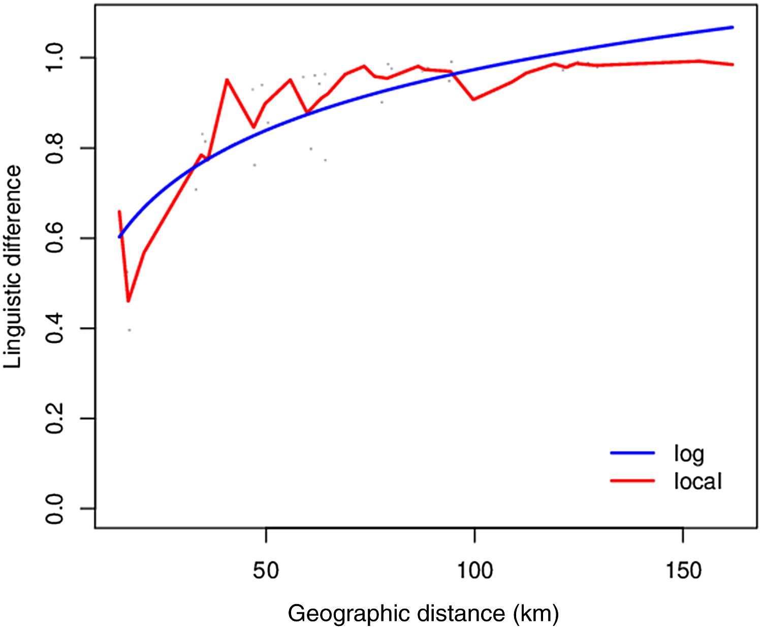
Correlation and regression analyses were performed in order to estimate the pertinence of different conceptualizations of distance to the participants’ maps. The Gabmap regression plot of our whole Tuscan dataset is shown in Figure 10. Geographic distance significantly predicts perceived linguistic similarity; in other words, the spatially closest places are perceived more similarly from a linguistic point of view. Table 1 shows the correlation results between aggregate linguistic perceived differences and the different conceptualizations of geographic distance. Crow and road distances are substantially identical factors in terms of correlation coefficients. Indeed, the two conceptualizations are almost perfectly correlated (r = 0.99, p < 0.001) with one another. Additionally, the correlation between distance and perceived difference is rather strong (r = 0.70/0.71).
Gabmap regression plot concerning our whole Tuscan dataset.
Coefficients of the correlations between perceived dialect difference and geographic distance/objective difference. *** = p < 0.001

5.3 The proximity factor: Entropy as a measure of classification uncertainty
In order to investigate the role of the participants’ homeplaces in determining different nuances of the general classification pattern (question 3), we decided to resort to an information-theory approach (Shannon, Reference Shannon1948; see the linguistic reviews in, among others, Blevins, Reference Blevins2013; Goldsmith, Reference Goldsmith2000; Kawahara, Reference Kawahara2016:43–45) with the aim of providing a Tuscan test to the proximity factor in dialect folk categorization. Namely, we rephrase the proximity problem by shifting the focus to classification uncertainty using Shannon’s (Reference Shannon1948) information entropy.Footnote 13 In other words, we should expect that classification uncertainty about the potential dialect similarities (the 0 in our data format) or differences (the 1 in our data format) between two areas grows along the physical distance from the two areas to the participant’s place of residence.
Entropy estimates the uncertainty of a variable by looking at the distribution of its outcomes; in other words, it is a measure of response variability. In our case, the variable consists in a classification subgroup (e.g., the responses of the Florentine participants about the equivalence or discrepancy between the areas of Siena and Arezzo), and the outcomes in the 0 and 1 values that were explained in the previous sections. Entropy is computed as follows, where k stands for the number of outcomes and pi for the proportion of responses corresponding to each outcome:
 $$\sum\nolimits_{{\rm{i = 1}}}^{\rm{k}} {{{\rm{p}}_{{\rm{i}}\;}}} {\rm{lo}}{{\rm{g}}_{\rm{2}}}({\rm{1/}}{{\rm{p}}_{{\rm{i}}\;}}).$$
In our specific instance, the number of possible outcomes is set at two, that is, “two geographic areas are linguistically equivalent” and “two geographic areas are linguistically discrepant.” For this reason, we relied on the following binary entropy formula, which requires only one outcome proportion in order to be computed: −p log2(p) − (1−p) log2(1−p). The resulting entropy values range from 1 (the same number of 1 and 0 responses) to 0 (complete agreement).
$$\sum\nolimits_{{\rm{i = 1}}}^{\rm{k}} {{{\rm{p}}_{{\rm{i}}\;}}} {\rm{lo}}{{\rm{g}}_{\rm{2}}}({\rm{1/}}{{\rm{p}}_{{\rm{i}}\;}}).$$
In our specific instance, the number of possible outcomes is set at two, that is, “two geographic areas are linguistically equivalent” and “two geographic areas are linguistically discrepant.” For this reason, we relied on the following binary entropy formula, which requires only one outcome proportion in order to be computed: −p log2(p) − (1−p) log2(1−p). The resulting entropy values range from 1 (the same number of 1 and 0 responses) to 0 (complete agreement).
Using the above reported formula, we computed the binary entropy of 360 classificatory variables (45 place combinations × 8 participants’ homeplaces). Entropy values ranged from 0 to 0.99996, with a mean of 0.34739 and a standard deviation of 0.31232. Then, we tried to conceptualize a distance parameter to use as a predictor of entropy in a regression analysis. We decided to compute a simple mean of the distances separating the participant’s place of residence from each of the two localities included in the classificatory combination. Again, both crow and road distances were computed following the methods explained in Section 5.2. However, given the results of Section 5.2, we report here only the analysis including road distances. For instance, in the above-mentioned example of the Florentine decisions about Siena and Arezzo, we obtained a mean of 80.25 road kilometers (Florence-Siena: 78.3 km.; Florence-Arezzo: 82.2 km.).
The 360 entropy and distance values corresponding to all the possible classificatory variables of our corpus were entered in a linear regression analysis. Figure 11 shows the regression plot. It should be noted that the regression line does not provide a good fitting of our data. Indeed, the curvilinearity of the distribution suggests that a nonlinear relationship exists between the two variables. In order to build an appropriate model, we opted for spline models, because they are usually considered to be a more refined approach to nonlinear regression (Sonderegger, Wagner & Torreira, Reference Sonderegger, Wagner and Torreira2018:§9.3). Splines connect polynomials together, smoothing the transitions between them through the so-called knots. The relationship between the number of knots and the bends of the curve is n knots = n−2 bends. Our data visualization suggests that the curve may be represented with a maximum of three bends (a W structure). Starting from this observation, we built models of increasing complexity until we reached a six-knot spline model. Parallel models including 6, 5, 4, and 3 knots were built using the rms package (Harrell, Reference Harrell2020). Restricted cubic splines (rcs) are usually recommended, since they more accurately fit the extreme values of the predictor (Baayen, Reference Baayen2008:177). Table 2 summarizes the results of an ANOVA comparison between the models. Indeed, significant differences stop at the fifth knot, substantiating the W structure. However, not all the predictors may equally contribute to the model fit. In this circumstance, Bayesian Information Criterion (BIC) values can be used to perform model selection, since they penalize the addition of extra terms to the compared models. Let us take a look at the BIC values of the tested models (Table 2). Interestingly, the two-bend structure is here considered worse than both the single and the three-bend ones, and the single-bend model has the best BIC score. However, the BIC scores of the 3, 4, and 5 knot models are roughly equivalent (ΔBIC < 2). With this due caveat, we interpreted the relationship between entropy and distance with reference to a simple curvilinear U-structure. In other words, response entropy is higher when the participants judge the dialect of two areas that are very close or very far from their place of residence. Conversely, the responses converge when the two localities under scrutiny are neither too close nor too far from the participant’s place of residence. Table 3 summarizes the final three-knot model, and Figure 12 shows its marginal effects.
Regression plot of a linear model struggling to fit the entropy data. Data distribution is clearly nonlinear.

ANOVA table of the comparisons between the spline models of increasing complexity. BIC values of each model are also displayed on the right. *** = p < 0.001, * = p < 0.05

Summary of the best spline model (3 knots) in terms of BIC values. *** = p < 0.001

Marginal effect plot from the 3-knot spline model (Table 3).

5.4 The role of “official” classification in explaining the perception of linguistic boundaries and the relationship between spatial distance and dialect grouping
As we reviewed in Section 4.2, over the years many alternative groupings of the Tuscan dialects have been proposed by linguists. Here we focus on three of these solutions. The first is the Carta dei Dialetti d’Italia by Pellegrini (Reference Pellegrini1977). The Carta was mainly based on the AIS materials, thus representing the Tuscan dialect landscape in the very first decades of the twentieth century. The second is the Toscana monography by Giannelli (Reference Giannelli1976), which was critically updated in the year 2000. Giannelli’s work can be viewed as a classification model based on the contemporary “objective” differences between Tuscan varieties. Lastly, we consider Calamai’s (Reference Calamai2018) interpretation of the sociolinguistic grouping that was advanced in Agostiniani & Giannelli (Reference Agostiniani, Giannelli, Cortelazzo and Mioni1990). In this analysis, varieties are clustered by their areas of contemporary sociolinguistic influence while giving less importance to the historical processes leading to the “objective” differences. By comparing the correlation results between these three conceptualizations and the perceptions of our participants, we try to reach a better understanding of the type of knowledge that is activated during the draw-a-map task, whether it is historical (Pellegrini, Reference Pellegrini1977), synchronic (Giannelli, Reference Giannelli2000), or sociolinguistic (Agostiniani & Giannelli, Reference Agostiniani, Giannelli, Cortelazzo and Mioni1990). Additionally, we want to verify if these different types of knowledge are directly linked to spatial proximity and geographical distances. Correlation analyses were performed in order to estimate the pertinence of the individual parameters to the participants’ maps. Then, generalized mixed models were built with the aim of investigating the joint effectiveness of distance and objective boundaries as explanatory factors of folk categorization. Our results (Table 1) show that Pellegrini’s groupings lag behind (r = 0.50) both the synchronic solution of Giannelli (r = 0.67) and the sociolinguistic clusters of Agostiniani & Giannelli (r = 0.80). Thus, at first glance, the participant’s mental maps seem to be mainly based on his/her sociolinguistic knowledge of the Tuscan region. However, Table 4 (point-biserial correlations) suggests that the Agostiniani & Giannelli grouping is more correlated to spatial distance than that of Giannelli. Therefore, there is the possibility that the portions of variance explained by the Agostiniani & Giannelli and distance variables manifest a higher degree of overlapping than the ones in the Giannelli/distance pairing. In order to substantiate this assumption, we ran six generalized linear mixed effect models in R (lme4 package: Bates et al., Reference Bates, Mächler, Bolker and Walker2015: lmerTest package, Kuznetsova, Brockhoff & Christensen, Reference Kuznetsova, Brockhoff and Christensen2017) trying to predict the 36,585 individual classificatory responses (see above, Section 5). Each model contained one of the possible distance/objective difference combinations along with random “Participant” (813) and “Combination” (45) terms. The six models were compared in terms of Akaike Information Criterion (AIC) scores. Table 5 summarizes the structure of the six models and reports their respective Variance Inflation Factor (VIF: car package, Fox & Weisberg, Reference Fox and Weisberg2019), R2 (marginal and conditional, as they were reported through the tab_model function of sjPlot: Lüdecke, Reference Lüdecke2021), and AIC.
Coefficients of the correlations between the different conceptualizations of distance and objective differences. *** = p < 0.001, ** = p < 0.01

Comparison of the six generalized linear mixed effect models evaluating the best explanatory combination between the different conceptualizations of spatial distance and objective linguistic difference
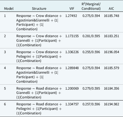
Overall, despite the positive correlations between the predictors (see above), our models do not suffer from collinearity issues and can be safely interpreted. As expected from the correlation results, the models including the “Giannelli” variable along with spatial distance are the ones with lower VIF scores. In particular, the second model (“Giannelli” + crow distance) has the lowest VIF. This model is also the best in terms of AIC and amount of variance explained by the fixed factors. The fifth model (“Giannelli” + road distance) shows almost the same AIC score (Δ < 2) and those including the “Agostiniani & Giannelli” variable also have moderate support (Δ < 4). Lastly, the third and sixth models, those including Pellegrini’s division of the Tuscan dialects, have no support (Δ > 10; Burnham & Anderson, Reference Burnham and Anderson2004:271). Indeed, in these models, the “Pellegrini” predictor does not reach statistical significance. From these results we may infer that the best explanatory model is the one with the most conceptually separate predictors. Social rationales are partially overlapped with the relative proximity between locations, thus performing worse in explaining the participant’s responses. Table 6 summarizes the best model (n. 2).
Summary of the best model explaining the participant’s responses to the draw-a-map task. Random effects include Participant (813: variance 1.8971, standard deviation 1.3774) and Combination (45: variance 0.6523, standard deviation 0.8077). *** = p < 0.001

6. Discussion
Our research questions found partial answers in the analyses we ran. Here we will report the main findings and discuss them in detail.
As far as the participants’ clustering proposals are concerned (question 1), visual inspection of the difference map of our whole Tuscan dataset revealed that geographical proximity enhanced the perception of dialect similarity between, in particular, the areas of Pistoia-Prato-Florence and Leghorn-Pisa-Lucca. Additionally, a multidimensional scaling analysis suggested that the most evident fracture in the perception of dialect continua lies between the areas of Leghorn-Pisa and Siena-Grosseto. Cluster analyses show that, for all the respondents, the provinces listed as showing linguistic similarities in first-order nodes are (1) Prato and Florence; (2) Pisa and Leghorn; and (3) Arezzo and Siena. As we saw in Section 4.2, the latter pairing does not correspond to any objective linguistic cluster. Other provinces, conversely, appear to be opaquer. Pistoia is sometimes clustered with Florence and Prato, Grosseto sometimes clusters both with Siena and Arezzo, Lucca is sometimes associated with the Pisa-Leghorn cluster, whereas Massa is almost always considered in isolation. When looking in detail at the respondents’ place of birth, we noted some idiosyncrasies in the individual cluster formation processes. However, we could not discern an area that manifests significant deviations from the results of the mean regional perceptions. In general, it appears that the most common perceptual areas in the region are the Florence-Prato cluster and the Pisa-Leghorn one. Unsurprisingly, Florence seems to be the most recognized area, together with Prato. The linguistic affiliation of Prato with Florence is longstanding; by virtue of its sociolinguistic prestige, the Florentine dialect spread its area of influence westward, and this was already observed in Agostiniani & Giannelli (Reference Agostiniani, Giannelli, Cortelazzo and Mioni1990). Conversely, as already mentioned in Section 4.2, the expanding features of the Leghorn variety have come to light in the last two centuries. Despite its recent sociolinguistic prestige, the perceptual saliency of a west coast cluster (Pisa-Leghorn) appears to be quite robust. Such prominence might be correlated with the high visibility that characterizes the Leghornese variety. Popular satirical magazines such as Il Vernacoliere are indeed distributed throughout and outside Tuscany and show a widespread use of the Leghornese dialect in juxtaposition with the Pisan variety (Calamai, Reference Calamai2005). It should also be noted that analyses with Gabmap did not allow for the verification of the statistical significance in the differences between the ways of perceiving spatiality. In the future, more effort will be made in order to verify how perceived spatiality varies according to the area of origin of the respondents and how different processes of clustering are distributed through the region.
Turning to geographic distance (question 2), our data show that there is no difference between crow and road distance in the perceptual identification of similar areas. This means that contiguous areas that are divided by geographical obstacles such as mountain ranges or rivers (as for Monte Pisano) are, anyway, in spatial relationship. Even if improvements are still planned today, such as the highway from Grosseto to the Leghorn province, Tuscany is, indeed, a rather well-developed region in terms of its highway system. This result clearly resembles similar tests based on Dutch data (e.g., Nerbonne, van Gemert & Heeringa, Reference Nerbonne, van Gemert and Heeringa2005) or the Norwegian “modern” travel distances in Gooskens (Reference Gooskens2005). The structure of the Tuscan highway system dampens the potential explanatory benefit of such refinements in the conceptualization of geographic distance. It is also thanks to the efficiency of the infrastructures that varieties such as the Florentine dialect have spread throughout the region. In any case, other studies are needed in order to understand the role of road distance in determining the perception of linguistic clusters. Dialectological data have shown that sociolinguistic centers of prestige, such as Florence, can, in some cases, spread their linguistic influence, prevailing over nearer geographic centers (such as in the case of the Casentino area, which tends to receive its prestige forms from Florence rather than from Arezzo; see Cravens & Giannelli, Reference Cravens and Giannelli1995). Other studies are needed in order to understand, from a perceptual perspective, the relationship between geographical distance, road distance, and commuting. Clusters of interaction determined by frequent commuting flows between localities with many opportunities for contacts can indeed explain the spreading of linguistic varieties and the subsequent increasing in recognition of particular varieties (Montgomery, Reference Montgomery, Montgomery and Moore2017).
Our tests on the proximity effect (question 3) revealed that the participants’ classification uncertainty does not simply grow linearly along with the distance between their homeplaces and the regional subareas. The participants’ uncertainty is positively affected by both the distance and closeness to the objects of their classifications. Conversely, the participants’ responses converge when the areas are neither too distant nor too close to their homeplaces. Thus, it appears that the two peaks of uncertainty can be put in relationship to different processes. When participants were asked to classify places, cultural aspects play a role. Folk classifications appear to reflect an esprit de clocher, postulating that the strongest distinction is between “us” and “them,” where “them” are our closest neighbors. As observed in other perceptual studies (e.g., D’Agostino et al., Reference D’Agostino, Ruffino, Castiglione and Lo Nigro2002), “closest places” are the ones that are usually judged as the most linguistically different and recognizable. This behavior could have interfered with a rational acknowledgment of equivalence between spatially contiguous areas (see Section 2.1), creating classification uncertainty. Conversely, when asked to judge on more distant places, the spatial aspect is more prominent. People may indeed have no idea on how some dialects sound, so their classifications will be more uncertain. In the future, other relevant variables will be tested, and estimates will be made to test for the complexity of the objects to be classified. It is indeed possible that linguistically complex areas will lead to greater uncertainty about classifications.
The comparison with the dialectological data (question 4) shows that the classification by Pellegrini (Reference Pellegrini1977) does not reflect folks’ perception of the region. When looking at the other two partitions, we observed through correlation analyses that respondents’ classifications resemble the partition proposed by Agostiniani & Giannelli (Reference Agostiniani, Giannelli, Cortelazzo and Mioni1990). Respondents, as already observed in other studies (Evans, Reference Evans2011), sometimes happen to detect “subtle differences in specific linguistic markers of variety” (Preston, Reference Preston, Boberg, Nerbonne and Watt2018:200). However, when testing for the combined effects of geographical distance and objective linguistic differences, the sociolinguistic partition by Agostiniani & Giannelli (Reference Agostiniani, Giannelli, Cortelazzo and Mioni1990) lags behind Giannelli’s (Reference Giannelli2000) synchronic solution. This is explained by the mixed nature of the sociolinguistic partition, which contains noticeable portions of shared variance with the distance variable.
To sum up, the model that best explains the results of our draw-a-map task suggests that our participants made their decisions looking at (1) a keen sense of spatial contiguity; and (2) the synchronic presence of linguistic differences between the Tuscan subregions. However, the role played by geographical distance in explaining our model is probably related to the bidimensional nature of the task itself. Other tasks that do not involve spatial representations are needed in order to understand the processes underlying the perception of language variation.
7. Conclusion
The question of spatial delimitation of languages and dialects has for a long time been the main object of study of dialectologists. We considered the notion of linguistic space itself in the perception that respondents (high school students) have of it, and we investigated the differences between linguistic borders and perceived language borders. Although it is sometimes difficult to determine whether it is actually dialect areas that the informants are identifying or simply administrative districts, we found that the results of the present survey of perceptual dialectology connect in many ways with other dimensions of linguistic research. The 813 maps we investigated show a detailed, lively, and dynamic “common folk knowledge” with respect to linguistic variation. They represented the perceived space not only according to landscape or geographical borders, or according to traffic and economic flows, but also according to concrete linguistic variation.
From the methodological viewpoint, we sketched a fast and accessible workflow based on the publicly available web software Gabmap. Gabmap can contribute to the ongoing discussion on the procedures for the quantitative processing of draw-a-map data. Among the other statistical techniques that were selected to answer our research question, the nonlinear spline models provide a first assessment of the role of information entropy in the analysis of dialect perceptual distances (Heeringa & Prokić, Reference Heeringa, Prokić, Boberg, Nerbonne and Watt2018).
The next step would be to expand the analysis to different areas with different sociolinguistic scenarios throughout the Italian peninsula and to find differences according to sex/gender, age, social class, and education of the respondents. The vast majority of perceptual dialectology studies have been conducted among university or high school students, thus implicitly focusing on a majority of white, middle-class speakers (Mitchel, Lesho & Walker, Reference Mitchel, Lesho and Walker2017). Hence, a broadening of the sample appears to be opportune and can no longer be postponed. From a different perspective, the processes of indexicality and stereotyping (Campbell-Kibler, Reference Campbell-Kibler2012) need to be better investigated, too. Once an in-depth analysis of the perceptual salience of Tuscan varieties has been done, it can be put into relationship with the collected perceptual maps. It is precisely this cross-fertilization of different perspectives and methods that makes the linguistic picture of a given region more complete and thorough.
Acknowledgments
We would like to thank all the schools’ headmasters, the teachers, and all the students who contributed to the research project. We would also like to thank Dr. Paolo Roseano for suggesting the use of Gabmap for a perceptual dialectometric analysis and Dr. Valon Muzlija for his help in creating the matrices.
Author contributions
The three authors jointly developed the research presented here and the design of the studies, and collaboratively edited the entire paper. For academic purposes, the authors’ responsibilities are divided as follows. Silvia Calamai: Supervision, fieldwork, project administration, funding acquisition, writing. Duccio Piccardi: Conceptualization, methodology, investigation, writing, formal analysis, visualization. Rosalba Nodari: Conceptualization, methodology, investigation, writing.
Funding statement
This work was supported by the ConcertAzioni Project (Fondazione Con i bambini, Rome - Italy) and by the LISTEN project (Landscape in Sounds through Eco-Museums Network, POR FSE 2014 - 2020).
Conflicts of interest
No potential conflict of interest was reported by the authors.


 Open access