

Introduction
King George Island (KGI) has an area of 1250 km2 (Reference Simões, Bremer, Aquino and FerronSimões and others, 1999) and is the largest of the South Shetland Islands situated at the northwestern tip of the Antarctic Peninsula (Fig. 1). The island reaches elevations of up to 700 m. More than 90% of the island is ice-covered, and the ice cover can be subdivided into several connected ice caps (Reference Simões, Bremer, Aquino and FerronSimões and others, 1999). The ice cap is regarded as sensitive to changing climatic conditions due to its small size and location in a subpolar, maritime zone. Several authors have reported a retreat of the tidewater glacier fronts since the 1950s (Reference Simões and BremerSimões and Bremer, 1995; Reference Braun, Gossmann, Beyer and BölterBraun and Gossmann, 2002), and some of them have linked this directly to the observed regional warming on the Antarctic Peninsula (Reference Kejna, Láska, Caputa, Glowacki and BednarekKejna and others, 1998; Reference Park, Chang, Yoon and ChungPark and others, 1998; Reference Simões, Dani, Bremer, Aquino and Arigony-NetoSimões and others, 2004b).
Overview map of King George Island and its location on the Antarctic Peninsula. Background image: SPOT satellite image mosaic (© Eurimage, 1995/2000).

According to ground-penetrating radar (GPR) studies by Reference BlindowBlindow and others (2010), the ice cap is temperate (at least below 400 m surface height), which means that at some locations the ice temperature is at, or close to, pressure-melting point conditions. This conclusion was drawn from abundant radar diffractions interpreted as water inclusions in the lower parts. Furthermore, an extended water layer (at up to 35 m depth) at the firn/ice transition was detected. The mean annual air temperature is –2.4˚C at sea level and is estimated to be about –6˚C at the high elevations of the ice cap (Reference Wen, Kang, Xie, Han and LluberasWen and others, 1994, Reference Wen, Kang, Han, Xie, Liu and Wang1998). In contrast, measured firn temperatures in boreholes differ considerably from the observed 2 m mean annual air temperature: our measurements (1999/2000) taken at Arctowski Icefield (the western part of the main ice cap of KGI) at 615 m showed a 10 m deep firn temperature of about –0.3˚C; Reference SimõesSimões and others (2004a) measured temperatures down as far as 45 m, the values varying from –0.35 to –0.25˚C; Reference Wen, Kang, Han, Xie, Liu and WangWen and others (1998) derived 15 m deep firn temperatures at different altitudes at Arctowski Icefield, measuring –0.1, 0, 0 and –0.2˚C (at 380, 510, 610 and 702 m, respectively). The difference between 10 m firn temperatures and the 2 m mean annual air temperature is explained by water percolation in the firn layer and the release of latent heat by refreezing. We assume that, due to the extended water layer, the measured 10 m firn temperatures are not representative of ice temperatures. Therefore, ice surface temperature for numerical model runs is unknown.
Previous flow-modelling studies of the KGI ice cap by Reference Breuer, Lange and BlindowBreuer and others (2006) emphasized the need for modification of a cold-ice model before applying it to a temperate ice body. Due to the lack of in situ measurements these studies could not present well-validated ice dynamics of the KGI ice cap.
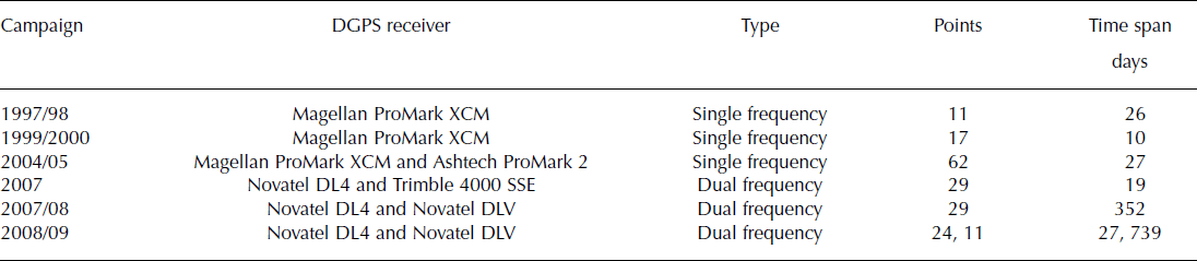
Here we rely on an extensive database of ice geometry and ice surface velocities that was built up during several field campaigns. Ice thickness and ice surface topography were measured using GPR and differential global positioning system (DGPS), respectively (for details see Reference BlindowBlindow and others (2010)). Horizontal surface flow velocities were obtained using repeated DGPS measurements with centimetre precision. Since the 1997/98 austral summer, several field campaigns have been conducted to determine short-term/monthly (3–4 weeks) surface velocity measurements at various locations on the KGI ice cap. In addition, measurements of ice surface velocities were carried out over an entire year (Table 1). To identify whether the short-term velocities are representative of annual velocities, some locations were surveyed for a longer time (for up to 2 years). In the first part of this paper, we present the analysis of these field surveys, which sets up the database for numerical ice-flow modelling.
Overview of the DGPS measurements on KGI for velocity determination, indicating the DGPS receiver used and short-term and annual ice surface velocity measurements in the different campaigns
In the second part, we describe a modelling approach valid for partly temperate ice and high basal topographic variability. Hence, the diagnostic dynamics of Arctowski Icefield were simulated with a three-dimensional (3-D) full-Stokes ice-sheet model. Since this assumes that temperate ice partly contains liquid water in veins at grain boundaries, which strongly modifies the ice rheology (Reference DuvalDuval, 1977; Reference Lliboutry and DuvalLliboutry and Duval, 1985), the water content was calculated according to the moisture-mixture approach by Reference HutterHutter (1982, Reference Hutter1993) and Reference GreveGreve (1995, Reference Greve1997) in the temperate areas.
As the transition from cold to warm ice, and the distribution and the magnitude of ice temperature at different elevations are unknown, we performed comprehensive sensitivity runs of the model under different temperature boundary conditions in order to study the effect of various horizontal extensions of temperate ice on ice-flow dynamics. The modelled domain is restricted to Arctowski Icefield for tuning the numerical model. For subsequent validation, the modelled area will be extended (Arctowski Icefield and the central part). In this study we greatly benefit from the availability of measured surface flow velocities, which allows us to test the choice of our parameters by comparing observed and simulated surface velocities. This kind of improved model set-up can be used in the future when performing time-dependent simulations to investigate impacts of climate-change scenarios on larger areas of the KGI ice cap.
Field Measurements
Short-term measurements
During the field seasons (austral summer) 1997/98, 1999/2000, 2004/05, 2007 (beginning of the year), 2007/08 and 2008/09, measurements of ice surface velocities were carried out at 109 points (Fig. 2) on Arctowski Icefield (62 points) and the central part of the KGI ice cap (not all points were measured in each season). There were heavily crevassed areas at lower elevations close to the coast, and measurements could only be performed in the higher elevated uncrevassed parts of the ice cap (Arctowski Icefield >300 m; central part >400 m). Aluminium stakes 3–4.5 m long were fixed 2 m deep into the firn surface. Their position was measured at the beginning and end of each campaign with DGPS (data acquisition depended on receiver type and base length and ranged from 10 min to 2 hours), from which ice surface velocities were calculated (displacements ranging from 0.06 to 7.8 m over a period of 20–30 days). Annual velocity values were estimated by linear extrapolation. A compilation of all measured short-term velocities from the various campaigns is shown in Figure 2. In the case of multiple readings, the average is plotted, since no significant changes occurred. At four points a slight velocity increase of up to 3.3±4% is noticeable. However, this is still within the range of velocity determination errors (see below).
Surface velocities on KGI measured by DGPS (109 velocity stakes). All measured points from the various campaigns are shown: short-term velocities (black points and black squares) and annual velocities (black squares). In case of multiple readings, the average is plotted. The thin black curve indicates ice divides. Background image: SPOT satellite image mosaic (© Eurimage, 1995/2000).

As expected, the highest velocities were observed near the coastal areas, and lower velocities were detected near the ice divide and at inner parts of the ice cap. In the southeast of Arctowski Icefield the maximum value of 112.1 m a−1 was measured at a major outlet glacier. In the northwest of Arctowski Icefield we obtained a maximum value of 63.7 m a−1. A minimum velocity of 0.7 m a−1 was observed at a dome on Arctowski Icefield. In contrast, on the central part, we observed a maximum surface velocity of 88.2 m a−1 and a lowest ice-flow velocity of 3.3 m a−1.
The relative error of measured short-term ice surface velocity is given by maximum error estimation
where Δv/v is the relative error of the velocity, v, Δx is the error of the displacement, x is the calculated displacement of the aluminium stake, Δt is the precision of time observation and t is the elapsed time. Time is accurate to seconds, and the accuracy of displacement by static DGPS varies from ±0.005 m up to ±0.02 m (depending on length of baseline and type of receiver used). Since Δt/t is negligible, Δx/x determines the relative error of the velocity. A high relative velocity error for small displacements is observed (e.g. for the minimum velocity at the ice divide the error is estimated as up to ±60%, while the error is less than ±10% for velocity values higher than 7 m a−1 (corresponding to 94% of the dataset)).
Long-term measurements
To observe seasonal fluctuations, 60 aluminium stakes were left in the ice at various locations (Fig. 2) in 2007 as markers for the annual displacement. In the 2007/08 and 2008/09 field seasons these stakes were completely covered with snow, and their subsurface position was detected by 200MHz GPR and DGPS in the following summer campaign. During the 2007/08 and 2008/09 field campaigns, we detected 29 and 11 previously positioned aluminium stakes, respectively. The determined positions were used to calculate annual surface velocity.
In case of a seasonal periodic ice-flow behaviour, a disagreement of the extrapolated velocities from short-term observation to long-term observation is expected. Two different scenarios of seasonal periodic behaviour are feasible: (1) if the ice reacts instantaneously to temperature changes, higher velocities may be expected for the austral summer, whereas (2) a delayed reaction of the ice flow may result in lower velocities in the austral summer.
An error estimation of calculated annual velocity is performed in a similar way to the short-term measurements (Equation (1)). Here a third input quantity needs to be considered: neglecting stake tilting, the position accuracy of the rediscovered stake is estimated by ±1 m. Therefore, DGPS accuracy is relatively high. For a time span of 1 year (2007 to 2007/08) a relative error less than ±10% for velocities above 20 m a−1 is calculated, while for 2 years (2007 to 2008/09) the ±10% error margin even applies to velocities below 10 m a−1.
In Figure 3, annual and monthly ice surface velocities are compared. No significant differences, or even a trend to lower or higher velocities, from short-term to annual periods are identified with respect to the root-mean-square error, rms = 2.23 m a−1, the mean difference Δvm = –0.38 m a−1 and the coefficient of determination, r 2 = 0.99. Therefore, the monthly observed displacements are considered representative of ice surface velocities. However, seasonal variations may be underestimated due to the low accuracy of the applied methods. Permanent DGPS stations installed on the ice surface would be more appropriate for the detection of minor variations.
Scatterplot of short-term ice surface velocities versus annual ice surface velocities.

Numerical Model
Governing equations
The 3-D ice-sheet model is based on conservation laws of momentum and mass (e.g. Reference HutterHutter, 1983). Assuming a stationary system, the Stokes equation and continuity equation for incompressible media are used to describe the flow of ice
where η is the effective viscosity, F = −egez is the acceleration due to gravity, Q is the ice density, ez is the unit vector in the z direction, u is the velocity field and p the pressure. Ice deformation is modelled using a non-Newtonian rheology and applying Glen’s flow law, which relates stresses and strain rates via the flow-rate factor, A, and the enhancement factor, E,
with D the strain-rate tensor, f(σ) the creep function, σ the stress tensor and n the power-law exponent. The viscosity for non-Newtonian rheology follows as
where E s = E −1/n is the stress-enhancement factor and d is the effective strain rate (second invariant of the strain-rate tensor). The flow-rate factor, A, depends on the temperature and water content of ice, while the enhancement factor, E, describes contributions from all other factors, such as inclusions, anisotropy and damage.
Reference PatersonPaterson (1994) describes the temperature dependence of the flow-rate factor as an Arrhenius law of the form
with A 0 a flow-rate constant, Q the activation energy and R the universal gas constant. This equation is applied whenever the temperature is below T = 0˚C.
According to Reference BlindowBlindow and others (2010), the ice body of the KGI ice cap is temperate. In these areas the temperature reaches pressure-melting point conditions with a non-negligible water content in the ice body. The effect of water on the flow-rate factor was studied by Reference DuvalDuval (1977). He performed ice deformation tests using temperate glacier ice and found a linear relation for the flow-rate factor
where ω = 100 W is the water content in per cent. This equation is valid for n = 3, a water content ω up to 1 % and water present in veins along the junctions of three or four grains, arising from melt due to pressure melting or strain heating. Water inclusions in the form of water tables, water lenses and other macroscopic liquid inclusions are not parameterized by Equation (7).
In contrast to Reference Breuer, Lange and BlindowBreuer and others (2006) who prescribed the depth dependence of ω, we calculate the water content with a moisture-mixture approach according to Reference HutterHutter (1982, Reference Hutter1993) and Reference GreveGreve (1995, Reference Greve1997). Assuming a stationary system, the diffusion equation for the water content, ω, becomes
where v is the water diffusivity and M is a water production term. Water production within the ice body is generated by strain heating
where L is the latent heat of ice. Water production due to lithostatic pressure is neglected. Furthermore, no physical water diffusion is considered (v = 0) in our model. However, the diffusive term in Equation (8) is kept for numerical reasons with a small number for v. A maximum water content of ωmax = 1 is introduced in order to assure consistency with the validity range of Equation (7).
Since the energy-balance equation is not solved for the temperature, we assume a depth-independent temperature (T(x, y, z) = T(x, y)). For our simulations we prescribe the temperature at the ice surface, so the temperature in each vertical column corresponds to the given surface temperature. For cold-ice areas, Equation (6) is used, whereas Equations (7) and (8) are applied to temperate areas.
Boundary conditions
At the ice surface a stress-free boundary condition is given
where p 0 = p air ≈ and ns is the unit normal vector at the ice surface pointing upwards.
Basal sliding has not been introduced, as it increases the flow velocities and we seek an upper limit of the extent of a temperate ice mass. The water content was assumed to vanish at the ice surface. At the base, melting can occur due to geothermal heat flux and sliding friction of the ice mass. Since no physical water diffusion is considered, the basal water content does not need a boundary condition (Reference GreveGreve, 1995). However, the parabolic type of diffusion equations (Equation (8)) require a boundary condition as ν is considered for numerical stability, which we set to
where nb is the unit normal vector pointing towards the bedrock. At the lateral boundaries (black curve in Fig. 4), velocities are derived from the shallow-ice approximation (SIA; Reference PatersonPaterson, 1994). This boundary condition has no effect on the flow field of the northwestern Arctowski Icefield, as it was set far away from the ice divide (blue curve in Fig. 4).
Modelled area (black curve), ice divide (blue curve; modelled domain according to Reference Breuer, Lange and BlindowBreuer and others, 2006) and velocities (38 points) used for tuning the numerical model (black dots). Background image: SPOT satellite image mosaic (© Eurimage, 1995/2000).

Geometry and Input Quantities
Surface and bedrock topographies obtained in the 1997/98 and 2007 field campaigns were used to define the 3-D present-day geometry of KGI (Reference BlindowBlindow and others, 2010). The mean ice thickness is 250 m, with a maximum value of 380 m at Arctowski Icefield. The bedrock shows a rough, highly variable topography. Detailed maps of ice-thickness distribution, bedrock and surface topography are taken from Reference BlindowBlindow and others (2010).
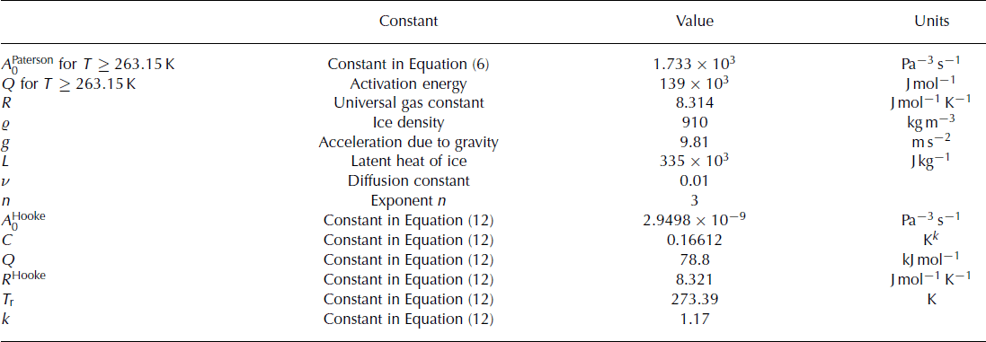
Following Reference Breuer, Lange and BlindowBreuer and others (2006), the modelled area was restricted to the northwestern part of Arctowski Icefield. However, we extended the modelling domain to calculate the flow field at the ice divide (black curve in Fig. 4). As mentioned above, we used this part of the ice cap for tuning the model, while the whole ice cap will be used for subsequent validation and time-dependent simulation studies. Thirty-eight velocity measurements were used for tuning. All constant values applied to the numerical ice-sheet model are given in Table 2. The 3-D full Stokes ice-sheet model is implemented in the commercial finite-element software COMSOL Multiphysics (see Appendix).
Standard physical parameters of the full-Stokes model
Simulations
Before we begin, we note a major uncertainty on which our KGI parameter studies are based: two different parameterizations of the flow-rate factor, A(T), have been proposed in the past, which specifically differ close to the melting point. Therefore, we carried out simulations for a spatially isothermal ice cap at T = –0.05, –0.25 and –3.0˚C. In the first set-up of these simulations, the rate factor was assumed to follow Equation (6); in the second set-up we used the relation described by Reference HookeHooke (1981):
with the constants A Hookee, Q,R Hooke, C, T r and k listed in Table 2. The corresponding values of the rate factor, A, for the three selected temperatures are:


Comparing these values it becomes obvious that the two different parameterizations will affect the temperate ice most, as A differs at T = −0.05˚C by a factor of ∼3.8. Most probably, large differences close to the melting point arise because Reference HookeHooke (1981) included temperate ice with a certain water content in his analysis, while he did not separate the softening, due to the water content, from the effect of temperature. This points out the need for a re-analysis of the two rate-factor parameterizations, including data which have been obtained since Hooke’s study.
For these simulations the stress-enhancement factor was set to E s = 1. The resulting velocities are displayed in Figure 5, comparing simulated velocities using A Hooke to those using A Paterson. The resulting velocities differ most for T = - 0.05˚C (green) with a factor of ∼4.9; at T = - 0.25˚C (blue) they differ by a factor of 1.9 and at T = –3.0˚C (red) the effect reduces to a factor of 0.89. These simulations demonstrate that the simulated flow velocities are highly sensitive to the parameterization of the flow-rate factor. In the following modelling studies we used the Reference PatersonPaterson (1994) parameterization, as our study requires a clear separation between the effects of temperature and water content.
Simulations with different parameterizations of the flow-rate factor, A. Scatterplot of the simulated ice surface velocities with a parameterization following Reference HookeHooke (1981) versus simulated ice surface velocities with a parameterization following Reference PatersonPaterson (1994).

Simulated flow fields, applying various temperate/cold-ice extents
As the extent of the temperate ice and the temperature distribution on KGI is uncertain, simulations with different surface temperature boundary conditions were carried out. By comparing the measured velocities, the hypothesis of the extension of temperate ice, and the temperature of the cold ice were tested. In these simulations, the stress-enhancement factor was kept constant (Es = 1), which represents an upper limit, because the anisotropy of temperate ice softens the ice. Taking anisotropy or inclusions into account, the value of Es decreases, leading to softer ice, and thus to even higher flow velocities. An overview of the scenarios presented below and their corresponding ice surface temperature boundary condition is shown in Figure 6.
Overview of the different scenarios. The profiles show the ice surface temperature boundary condition for: scenario 1 (entirely temperate): T = 0˚C (red); scenario 2 (entirely cold): T = –2.4˚C at sea level and a climate gradient of –0.6˚C/100 m (blue); scenario 3: temperate ice below 300 m and an ice temperature gradient of –0.7˚C/100 m above, reaching T = –2.8˚C at the dome (black); scenario 4: a temperature of –0.15˚C below 323 m and an ice temperature gradient of –0.7˚C/100 m above, reaching –2.8˚C at the dome (grey).

Entirely temperate vs entirely cold
We begin by comparing two extreme scenarios: the ice cap temperate throughout (scenario 1) and the ice cap entirely cold, including an elevation-dependent temperature gradient (scenario 2). In scenario 1 the entire ice body is at melting point, the flow-rate factor is calculated using Equation (7) and the water content, ω, is computed by Equations (8) and (9). In scenario 2, we assume the ice temperature to correspond to the 2 m mean annual air temperature. Starting with –2.4˚C at sea level and a standard hypsometric gradient of –0.6˚C/100 m (Reference WeischetWeischet, 1979), the 2 m air temperature at the dome is –6.6˚C. This differs slightly from the –6˚C estimated by Reference Wen, Kang, Xie, Han and LluberasWen and others (1994).
The results of the comparison with measured velocities are shown in Figure 7 for both scenarios. Comparing the simulated velocity distribution, we find that velocities simulated according to scenario 1 are about twice as fast as the measured ones, while in scenario 2 they are too low, by about a factor of two. These results indicate that the ice cap is neither entirely cold nor entirely temperate, and thus we aim to modify the extent of the temperate ice area in further simulations.
Scatterplot of the in situ surface velocities, v in situ, versus the simulated surface velocities, vsimulated, for scenario 1 (red) and scenario 2 (blue).

Partly temperate
In order to estimate the temperate ice extent, we modified the volume of temperate ice and compared measured and simulated flow velocities. This is done by introducing an elevation isoline below which the ice is assumed to be temperate (a cold–temperate transition surface, CTS). Sincewe chose a depth-independent ice temperature, the CTS was a contour line in the x–y plane. Above the CTS (the cold part) we prescribed either a constant temperature so the cold part was entirely isothermal or we assumed a horizontal ice temperature gradient (depending on the elevation, but vertically isothermal). All these parameters (elevation of CTS + constant temperature in the cold part; elevation of CTS + temperature gradient in the cold part) were varied step by step over a wide range in a sensitivity analysis. Simulations were assessed by looking at the agreement between simulated and measured surface velocities.
First, we varied the CTS and the constant temperature in the cold part: simulations with low ice temperatures in the cold domain (≤−2˚C) led to underestimated simulated velocities in the lower parts of the ice cap, while high ice temperatures (>−2˚C) led to overestimated values in the higher parts. Moderate agreements are achieved (1) by setting the CTS at 300 m and the temperature at –1˚C in the cold part or (2) by setting the CTS at different levels (50, 100, 150, 200, 250 and 300 m) and the temperature to –0.5˚C in the cold part. As these simulations overestimate and/or underestimate the velocities (relative error up to 100%), we do not show these results.
Second, we introduced a linear ice temperature gradient in the cold part, with the ice temperature gradient in the cold area depending on surface elevation with T = 0˚C at the CTS. In Figure 8 we show the resulting rms error for various values of the CTS elevation and ice temperature gradients. The colour of the symbols denotes the rms error. This figure makes it evident that no pronounced single minimum of the difference between measured and simulated velocities exists. In general, the choice of a higher-elevation CTS requires a higher ice temperature gradient, whereas a lower CTS elevation requires a smaller ice temperature gradient (Fig. 8). Therefore, we introduced another statistical quantity: we selected the simulations in which at least 29 of the 38 in situ velocities have a relative velocity difference lower than ±20% compared to the simulated velocities.
Comparison between measured and simulated velocities for a wide range of CTS elevations and temperature gradients. The colour denotes the rms error. Squares indicate set-ups with a good relative velocity difference (see main text for details). Details for set-up marked ‘3’ are shown in Figure 9. Simulations that match this criterion are marked with a box in Figure 8.

We selected one of the set-ups which led to good agreement and show this in detail in Figure 9. This set-up, scenario 3, has a CTS at 300 m and an ice temperature gradient of –0.7°C/100m, so the temperature at the top of the ice cap is –2.8°C. Figure 9c shows a scatterplot (black dots) of measured versus simulated velocities, while Figure 9b displays the simulated and measured velocities on a map. It is noticeable that some velocities in the lower parts remain too high, while some are still too low. This effect might be attributed to basal properties which have not been considered here. In general, they match reasonably well with the in situ velocities. At higher elevations the velocities are slightly overestimated. Simulated directions match well with field observations (Fig. 9d). Figure 9e and f show that scattering of the relative velocity error and velocity difference is uniform with a mean relative deviation of ±14%.
Simulation results of scenario 3. (a) Model set-up. The thin black curve indicates modelled domain. (b) Comparison of in situ surface velocities (black arrows) and simulated velocities (yellow arrows). The thin black curve indicates the ice divide. (c) Scatterplot of the in situ surface velocities vs the simulated surface velocities. (d) Scatterplot of the in situ surface velocity directions vs the simulated surface velocity directions. (e) Number of measured velocities vs difference of measured and simulated velocities. (f) Relative deviation of simulated to measured velocities (%). Background image: SPOT satellite image mosaic (© Eurimage, 1995/2000).

Finally, we present the simulated ice surface velocity field for scenario 3 in Figure 10. Close to the domes and the ice divides, the velocities are low, while they increase following the topographic gradient. The maximum value reached is ∼150ma∼1. In the higher parts the flow-field pattern is characterized by a slight northwest-southeast separation. This can be explained by the ice-thickness distribution and the bedrock topography: ice-thickness values are lower than in the surrounding area and a ridge is present in the bedrock topography. In order to demonstrate that the simulated and observed surface velocities match reasonably well, in situ surface velocities were plotted (coloured points in Fig. 10).
Simulated surface velocity field of scenario 3. Black thin curve indicates the boundary of the modelled area, and coloured dots display the in situ ice surface velocities. Background image: SPOT satellite image mosaic (© Eurimage, 1995/2000).

At the coast, velocities decrease dramatically, which is not consistent with outlet glaciers where velocities increase towards the coast, as corroborated by field observations. Our underestimation of outlet glacier velocities is probably due to insufficient knowledge of the geometry (ice thickness and surface elevation) close to the coast. This should be constrained by future measurements. Moreover, sliding may occur in this part of the ice cap, which would considerably affect the velocity field. Future simulations will thus need to include further ice properties (e.g. softness, damage, water inclusions and basal properties).
Close to temperate
We also assessed the possibility that our results could be influenced by the choice of the temperature of the cold-ice mass and not by the existence of temperate ice. Thus, we ran a simulation (scenario 4) in which the temperature gradient and the temperature at the dome were set as in scenario 3. Below the elevation, where the ice temperature reached –0.15˚C (323 m), the ice temperature was kept constant at –0.15˚C. This set-up then assumed cold ice everywhere (as in scenario 2), but with a refined initialization of the temperature gradients. The results, shown in Figure 11, indicate that simulated and modelled surface velocities also match well, despite a slight underestimation of the high-velocity values compared to scenario 3, and they show the strong dependence of the flow velocities on the choice of temperature of the cold ice. Only field measurements of the ice temperature down to several hundreds of metres will clarify this boundary condition. This type of measurement would also shed some light on the spatial extent of the CTS. Although we implemented the CTS as a vertical surface, in reality it is a 3-D surface that might be closer to the ice surface near the domes (indicated by the layer of water at the firn/ice transition), and also closer to the ice base at low elevations. Further analysis of radio-echo-sounding data would also help in the investigation of the spatial position of the CTS.
Simulation results of scenario 4. (a) Model set-up. The thin black curve indicates modelled domain. (b) Comparison of in situ surface velocities (black arrows) and simulated velocities (yellow arrows). The thin black curve indicates the ice divide. (c) Scatterplot of the in situ surface velocities vs the simulated surface velocities. (d) Scatterplot of the in situ surface velocity directions vs the simulated surface velocity directions. (e) Number of measured velocities vs difference of measured and simulated velocities. (f) Relative deviation of simulated to measured velocities (%). Background image: SPOT satellite image mosaic (© Eurimage, 1995/2000).

Conclusions
This study presents observations of the flow velocities of the ice cap of KGI from various field surveys by means of DGPS. The surface flow velocities do not vary on a monthly basis, and only minor variations occurred between the 1997/98 and 2008/09 seasons. The flow velocities range from 0.7 m a−1 at the domes and ice divides to 112.1 m a−1 along steep slopes in the upper part of major outlet glaciers.
Diagnostic modelling of Arctowski Icefield aimed to reproduce the ice-flow field by solving the full-Stokes system of equations. The model distinguishes between cold and temperate ice and computes the water content within the latter by solving a diffusion equation. The modelling studies of the ice flow of the northwestern Arctowski Icefield suggest that the ice cap consists of a cold part and a temperate part. Reasonable agreement between simulated and measured surface velocities was obtained with either higher elevations of the CTS and a larger ice temperature gradient (300 m and –0.4 to –0.7˚C/100 m) or lower CTS elevation and smaller ice temperature gradients (150–300 m and –0.3˚C/100 m). The derived extent of the temperate ice as a result of our parameter studies is an upper limit, as there are uncertainties arising from factors that were presumed not to contribute, such as basal sliding and different parameterizations of the rate factor, as well as softening due to anisotropy of temperate ice. All these factors may increase ice-flow velocities, so the CTS is expected to shift to lower altitudes when they are accounted for.
Our modelling results differ from the findings of Reference BlindowBlindow and others (2010), who suggest a temperate ice cap, at least below 400 m surface height, based on the interpretation of internal macroscopic scattering features observed by GPR surveys. The differences may indicate that the ice cap is in a transition state due to the strong surface air-temperature rise along the Antarctic Peninsula during the last century. This may have led to a situation where the measured firn temperatures represent the more recent warm state while ice dynamics in this part are still driven by colder situations from former climate conditions.
Previous studies of the same area by Reference Breuer, Lange and BlindowBreuer and others (2006) are based on different parameterizations of the flow-rate factor and the flow-enhancement factor, and result in an overestimation of the flow velocities, although a large variety of scenarios for the extent of temperate ice and its effect on the softness of the ice were chosen. Our results corroborate a smaller extent of temperate ice.
In conclusion, numerical modelling suggests noticeably less temperate ice than observations indicate. There are three ways to interpret this: (1) the dynamics of the ice cap have a self-regulating feedback that balances the stresses in the vertical, which is not included in the modelling; (2) the use of Glen’s flow law and the current approach of describing the water content of ice in general overestimates the softness of temperate ice once its extension exceeds the bottom layer; (3) the extent of the temperate ice is overestimated by the current observation techniques and further observations are required to constrain the water content.
Climate warming will probably increase the amount of temperate ice in polar regions. Therefore, the differences between modelled and observed polythermal conditions require further attention. A higher amount of temperate ice in the upper part of the ice column presumably increases strain, which leads to strain heating.
Acknowledgements
We gratefully acknowledge financial support by the German Research Foundation (DFG) for the field campaigns 1997 (DFG contract SA 694–1/1), 2004/05 (DFG contracts BR 2105/4–1/2/3) and 2007, 2008, 2009 (DFG contracts BL 307–1/2) and respective evaluation periods. We thank the Alfred Wegener Institut for Polar and Marine Research (AWI), Instituto Antártico Argentino (IAA), Instituto Antártico Chileno (INACH) and Instituto Antártico Uruguayo (IAU) for logistic support. We particularly thank A. Lluberas and the crews of Artigas (IAU) and Bellingshausen stations for their logistic support during the fieldwork. A.H. thanks P. Duval for discussions about the anisotropy of temperate ice. Thanks also to B. Breuer, T. Kleiner and R. Greve for discussions on numerics, B. Boemer, H. Knese and S. Ueding, our team in the workshop, and A. Moll, H. Mayer and F. Fernandoy for the collaboration and support in fieldwork. We are indebted to M. Thoma and F. Saito for constructive comments that improved this paper.
Appendix: Implementation in COMSOL Multiphysics
The 3-D full-Stokes ice-sheet model is implemented in the commercial finite-element software ‘COMSOL Multi-physics’, including high-performance solvers for stationary and non-stationary non-linear systems (http://www.comsol.com). The full-Stokes equation is solved in the entire domain using the Navier–Stokes application mode (neglecting the acceleration term) and using second- and first-order Lagrange elements for computing the velocity variables and the pressure, respectively. A Galerkin least-squares type of streamline diffusion is introduced to stabilize the pressure. The SIA serves as initial estimate. For calculating the water content in the whole domain, the convection–diffusion application mode is coupled to the Navier–Stokes application mode.
The mesh consists of 19 970 elements, whereas in the vertical direction a swept 11-layer mesh is applied. After 60 min and seven iterations the non-linear solver (Direct Solver Pardiso) converged using 25 GB memory and four CPUs in parallel mode (Quad-Core AMD Opteron 2.1 GHz) for 364 922 degrees of freedom. Convergence is achieved when the relative tolerance (10−6) exceeds the relative error computed as the weighted Euclidean norm.
Participation in the ISMIP (Ice-Sheet Model Intercompari-son Project) benchmark experiment (Reference PattynPattyn and others, 2008) showed good agreement with other full-Stokes models. So far, in glaciological modelling studies (e.g. alpine glaciers, ice shelves and ice sheets) COMSOL has been applied successfully (Reference PralongPralong, 2005; Reference HumbertHumbert, 2007; Reference AschwandenAschwanden, 2008; Reference Aschwanden and BlatterAschwanden and Blatter, 2009; Reference Humbert, Kleiner, Mohrholz, Oelke, Greve and LangeHumbert and others, 2009).


