


Policy Significance Statement
The availability of timely, accurate, and consistent data is key to evaluate public health policies adopted in response to the COVID-19 pandemic. In this work, we illustrate several inconsistencies of national and local data reporting practices in Europe, through the examples of Italy and Spain. Moreover, we show that such inconsistencies may hamper the evaluation of policies and interventions, not only retrospectively, but also in the process of decision making. Our analysis underscores the need of more uniform and consistent data collection and reporting procedures across Europe, to properly guide policymakers and make cross-country comparisons of interventions.
1. Introduction
In response to the COVID-19 pandemic, governments worldwide adopted a wide range of intervention policies aimed at containing or mitigating the spread of SARS-CoV-2. Over the course of the first pandemic year, in absence of a vaccine and other effective treatments, mitigation policies in Europe and the US mostly relied on nonpharmaceutical interventions (NPIs) based on enforcing social distancing, school closure, and national stay-at-home orders or lockdowns. As the adoption of NPIs comes with significant economic losses and social disruption, evaluating the effectiveness of such policies has been a priority for public health authorities, looking for a way to minimize the economic impact while curbing the disease spread.
Several studies have examined the effects of different intervention strategies on the spread of SARS-CoV-2 (Dehning et al., Reference Dehning, Zierenberg, Spitzner, Wibral, Neto, Wilczek and Priesemann2020; Flaxman et al., Reference Flaxman, Mishra, Gandy, Unwin, Mellan, Coupland, Whittaker, Zhu, Berah, Eaton, Monod, Ghani, Donnelly, Riley, MAC, Ferguson, Okell and Bhatt2020; Haug et al., Reference Haug, Geyrhofer, Londei, Dervic, Desvars-Larrive, Loreto, Pinior, Thurner and Klimek2020; Bo et al., Reference Bo, Guo, Lin, Zeng, Li, Zhang, Hossain, JWM, Yeung, Kwok, SYS, AKH and Lao2021; Brauner et al., Reference Brauner, Mindermann, Sharma, Johnston, Salvatier, Gavenčiak, Stephenson, Leech, Altman, Mikulik, Norman, Monrad, Besiroglu, Ge, Hartwick, Teh, Chindelevitch, Gal and Kulveit2021). To quantify the effectiveness of these policies and make comparative analyses across countries, most studies rely on publicly available epidemiological data released by national or international public health authorities, such as the daily number of reported cases or the daily number of reported deaths (Flaxman et al., Reference Flaxman, Mishra, Gandy, Unwin, Mellan, Coupland, Whittaker, Zhu, Berah, Eaton, Monod, Ghani, Donnelly, Riley, MAC, Ferguson, Okell and Bhatt2020; Brauner et al., Reference Brauner, Mindermann, Sharma, Johnston, Salvatier, Gavenčiak, Stephenson, Leech, Altman, Mikulik, Norman, Monrad, Besiroglu, Ge, Hartwick, Teh, Chindelevitch, Gal and Kulveit2021). These studies also rely on data regarding the timing and strictness of NPIs implemented by different countries that have been collected in public repositories (Desvars-Larrive et al., Reference Desvars-Larrive, Dervic, Haug, Niederkrotenthaler, Chen, Di Natale, Lasser, Gliga, Roux, Sorger, Chakraborty, Ten, Dervic, Pacheco, Jurczak, Cserjan, Lederhilger, Bulska, Berishaj, Tames, Álvarez, Takriti, Korbel, Reddish, Grzymała-Moszczy´ nska, Stangl, Hadziavdic, Stoeger, Gooriah, Geyrhofer, Ferreira, Bartoszek, Vierlinger, Holder, Haberfellner, Ahne, Reisch, Servedio, Chen, Pocasangre-Orellana, Garncarek, Garcia and Thurner2020; Hale et al., Reference Hale, Angrist, Goldszmidt, Kira, Petherick, Phillips, Webster, Cameron-Blake, Hallas, Majumdar and Tatlow2021). However, COVID-19 incidence data released by public health authorities can significantly vary in type and quality across countries, worldwide. For instance, Hong Kong SAR publicly reports the epidemic curve by onset date and stratified by additional case and age classifications (see, for instance, https://covid19.sph.hku.hk/), providing researchers with the highest quality standard of data availability. In other countries, and, notably, in the US, the number of daily new COVID-19 cases has been reported in differing units and with varying definitions by states and territories, and the illness onset date is not known. Similar problems were found for other metrics, such as hospitalizations or deaths. This led the “Prevent Epidemics” collaboration to label the situation in the US an “Information Catastrophe” (Prevent-Epidemics, 2020). Similarly, in Switzerland, the date of symptom onset was not routinely collected by local public health authorities (Petermann and Wyler, Reference Petermann and Wyler2020). Finally, data regarding the adoption of NPIs suffers from serious drawbacks, such as substantial differences in the implementation of the same NPI (e.g., physical distancing) across countries, uncertainty with respect to the timing of introduction, and poor spatial granularity (i.e., substantial heterogeneity in the implementation within a single country). Some initiatives have tried to collect data with higher spatial resolution, but it is still scarce and highly heterogeneous (Desvars-Larrive et al., Reference Desvars-Larrive, Dervic, Haug, Niederkrotenthaler, Chen, Di Natale, Lasser, Gliga, Roux, Sorger, Chakraborty, Ten, Dervic, Pacheco, Jurczak, Cserjan, Lederhilger, Bulska, Berishaj, Tames, Álvarez, Takriti, Korbel, Reddish, Grzymała-Moszczy´ nska, Stangl, Hadziavdic, Stoeger, Gooriah, Geyrhofer, Ferreira, Bartoszek, Vierlinger, Holder, Haberfellner, Ahne, Reisch, Servedio, Chen, Pocasangre-Orellana, Garncarek, Garcia and Thurner2020; Hale et al., Reference Hale, Angrist, Goldszmidt, Kira, Petherick, Phillips, Webster, Cameron-Blake, Hallas, Majumdar and Tatlow2021).
Therefore, it is of uttermost importance to account for the bias that such inaccurate or limited surveillance data introduces when assessing the effect of mitigation policies. Our work is precisely aimed at this endeavor. While methods for the evaluation of NPIs effectiveness may vary, the estimation of the time-varying reproduction number, $ R(t) $
, remains central in gauging the variation of the transmissibility originated by the implementation of NPIs.
$ R(t) $
, remains central in gauging the variation of the transmissibility originated by the implementation of NPIs. $ R(t) $
represents the mean number of secondary infections generated by one primary infected individual, over the course of an epidemic. In contrast to the basic reproductive number,
$ R(t) $
represents the mean number of secondary infections generated by one primary infected individual, over the course of an epidemic. In contrast to the basic reproductive number, $ {R}_0 $
(Keeling and Rohani, Reference Keeling and Rohani2011), which assumes the population to be fully susceptible, the temporal variations of
$ {R}_0 $
(Keeling and Rohani, Reference Keeling and Rohani2011), which assumes the population to be fully susceptible, the temporal variations of $ R(t) $
reflect the changes in transmissibility caused by the depletion of susceptibles during the epidemic, by the presence of control interventions, and spontaneous behavioral responses. When
$ R(t) $
reflect the changes in transmissibility caused by the depletion of susceptibles during the epidemic, by the presence of control interventions, and spontaneous behavioral responses. When $ R(t) $
decreases below the threshold value of 1, the number of new infections begins to decline. This quantity is thus pivotal to evaluate the impact of interventions, calibrate epidemiological models, and guide the lift of restrictions, where in place. In this article, we will thus focus on the impact of the accuracy of publicly available data sources in the estimation of
$ R(t) $
decreases below the threshold value of 1, the number of new infections begins to decline. This quantity is thus pivotal to evaluate the impact of interventions, calibrate epidemiological models, and guide the lift of restrictions, where in place. In this article, we will thus focus on the impact of the accuracy of publicly available data sources in the estimation of $ R(t) $
.
$ R(t) $
.
The time-varying reproduction number can be usually estimated by means of various inference algorithms applied to epidemic incidence data (the number of new recorded cases at successive times). A precise estimate of $ R(t) $
would require knowledge of the true infection date, which is usually very difficult to reconstruct. The next best is the date of onset of symptoms, which is still hard to obtain and many regions do not or did not use to report it. As a consequence, many published estimates of
$ R(t) $
would require knowledge of the true infection date, which is usually very difficult to reconstruct. The next best is the date of onset of symptoms, which is still hard to obtain and many regions do not or did not use to report it. As a consequence, many published estimates of $ R(t) $
during the first wave of the COVID-19 pandemic have relied on incidence curves reporting cases by notification date, since the date of symptoms’ onset is usually not publicly available (Remuzzi and Remuzzi, Reference Remuzzi and Remuzzi2020; Yuan et al., Reference Yuan, Li, Lv and Lu2020). Several estimation methods account for such lack of information by using time-independent delay distributions from symptom onset to reporting (Abbott et al., Reference Abbott, Hellewell, Thompson, Sherratt, Gibbs, Bosse, Munday, Meakin, Doughty, Chun, Yung-Wai Desmond, Finger, Campbell, Endo, CAB, Gimma, Russell, Flasche, Kucharski, Eggo and Funk2020; Gostic et al., Reference Gostic, McGough, Baskerville, Abbott, Joshi, Tedijanto, Kahn, Niehus, Hay, De Salazar, Hellewell, Meakin, Munday, Bosse, Sherrat, Thompson, White, Huisman, Scire, Bonhoeffer, Stadler, Wallinga, Funk, Lipsitch and Cobey2020; Shim et al., Reference Shim, Tariq, Choi, Lee and Chowell2020). Researchers are therefore compelled to rely on estimated delay distributions to compute
$ R(t) $
during the first wave of the COVID-19 pandemic have relied on incidence curves reporting cases by notification date, since the date of symptoms’ onset is usually not publicly available (Remuzzi and Remuzzi, Reference Remuzzi and Remuzzi2020; Yuan et al., Reference Yuan, Li, Lv and Lu2020). Several estimation methods account for such lack of information by using time-independent delay distributions from symptom onset to reporting (Abbott et al., Reference Abbott, Hellewell, Thompson, Sherratt, Gibbs, Bosse, Munday, Meakin, Doughty, Chun, Yung-Wai Desmond, Finger, Campbell, Endo, CAB, Gimma, Russell, Flasche, Kucharski, Eggo and Funk2020; Gostic et al., Reference Gostic, McGough, Baskerville, Abbott, Joshi, Tedijanto, Kahn, Niehus, Hay, De Salazar, Hellewell, Meakin, Munday, Bosse, Sherrat, Thompson, White, Huisman, Scire, Bonhoeffer, Stadler, Wallinga, Funk, Lipsitch and Cobey2020; Shim et al., Reference Shim, Tariq, Choi, Lee and Chowell2020). Researchers are therefore compelled to rely on estimated delay distributions to compute $ R(t) $
in the US and other countries with similar data-poor policies. In addition, often the delay from symptom onset to reporting is computed from line list data collected in different countries (Xu et al., Reference Xu, Gutierrez, Mekaru, Sewalk, Goodwin, Loskill, Cohn, Hswen, Hill, Cobo, Zarebski, Li, Wu, Hulland, Morgan, Wang, O’Brien, Scarpino, Brownstein, Pybus, Pigott and MUG2020), thus assuming that this is a general property of the epidemic neglecting the large heterogeneities existing in surveillance systems across the world and even within single countries (Prevent-Epidemics, 2020; Aleta et al., Reference Aleta, Blas-Laina, Tirado Anglés and Moreno2021).
$ R(t) $
in the US and other countries with similar data-poor policies. In addition, often the delay from symptom onset to reporting is computed from line list data collected in different countries (Xu et al., Reference Xu, Gutierrez, Mekaru, Sewalk, Goodwin, Loskill, Cohn, Hswen, Hill, Cobo, Zarebski, Li, Wu, Hulland, Morgan, Wang, O’Brien, Scarpino, Brownstein, Pybus, Pigott and MUG2020), thus assuming that this is a general property of the epidemic neglecting the large heterogeneities existing in surveillance systems across the world and even within single countries (Prevent-Epidemics, 2020; Aleta et al., Reference Aleta, Blas-Laina, Tirado Anglés and Moreno2021).
In this article, we make two main contributions. First, we highlight several limitations of case surveillance and NPIs implementation data, and quantify the impact of such inaccuracies on the estimation of $ R(t) $
for Italy and Spain, two European countries among the most severely hit by the COVID-19 pandemic during the first wave. Second, we show that a biased estimation of
$ R(t) $
for Italy and Spain, two European countries among the most severely hit by the COVID-19 pandemic during the first wave. Second, we show that a biased estimation of $ R(t) $
might have had direct consequences on the decisions taken by the Spanish and Italian governments during the first wave of the pandemic.
$ R(t) $
might have had direct consequences on the decisions taken by the Spanish and Italian governments during the first wave of the pandemic.
2. Surveillance Data and the Time-Varying Reproductive Number
We can distinguish four main types of data in relation to case surveillance during the spreading of an epidemic. First, the number of cases by infection date. This quantity reflects the exact time when one individual contracts the disease, something that can be obtained only for a handful of cases. Second, the number of cases by date of symptom onset. In this case, the time when an infected individual started showing symptoms is recorded. This data might be subject to recall biases and is unavailable for asymptomatic individuals. Third, the number of cases by date of diagnosis. This data is based on the date when an infected individual is diagnosed with the infection. The relation between date of symptom onset and date of diagnosis is not trivial, since individuals might get tested because they showed symptoms (and thus the diagnosis date will follow the symptom onset) or as a result of contact tracing or screening (and thus they might be still in the incubation phase and symptom onset will follow the diagnosis date). Lastly, the number of cases by notification date. In simple terms, it captures the number of new cases reported by the authorities. The criteria to decide which date should be assigned to a new case can also vary. For instance, the notification date can correspond to the date when the test returns positive, or the actual date of testing. Most importantly, these criteria are generally undisclosed by public health authorities, and can vary across countries and even across regions within the same country.
The complex relation between different data sources is exemplified in Figure 1. Here, we contrast two different surveillance data for Italy and Spain. We report the data provided by the European Centre for Disease Prevention and Control (ECDC), which is based on the daily number of new cases notified by each region. This is the set of data used by most papers to estimate the effectiveness of NPIs imposed by the authorities (Flaxman et al., Reference Flaxman, Mishra, Gandy, Unwin, Mellan, Coupland, Whittaker, Zhu, Berah, Eaton, Monod, Ghani, Donnelly, Riley, MAC, Ferguson, Okell and Bhatt2020; Brauner et al., Reference Brauner, Mindermann, Sharma, Johnston, Salvatier, Gavenčiak, Stephenson, Leech, Altman, Mikulik, Norman, Monrad, Besiroglu, Ge, Hartwick, Teh, Chindelevitch, Gal and Kulveit2021). Yet, on December 2020 the ECDC stopped reporting this quantity due to its unreliability (ECDC, 2020). In contrast, we show the time-series of new cases by symptom onset as reported by the Health ministries of Spain and Italy. Several observations are in order. First, one can easily note that while the curves for Spain are very similar (the main difference is just a shift in the x-axis), the curves for Italy do not match for the second wave. The reason for this discrepancy is that Spain reports the date of symptom onset and, if it is unavailable, the date of diagnosis minus 6 days before May 10 and minus 3 days after that date. Thus, all notified cases have an assigned date of symptom onset. On the other hand, the Italian ministry only reports the cases for which the date of symptom onset is known, and thus asymptomatic cases are not included (this also shows that during the first wave the number of asymptomatic cases detected was negligible).
Time-series of the incidence per 10,000 individuals in (a) Spain and (b) Italy. In red, the incidence reported by European Centre for Disease and Control (ECDC) based on the daily notification of cases provided by each European region. In light blue, the incidence with updated data of the corresponding Health Ministries on symptom onset date. Time-series are smoothed with a moving average of 7 days. The pointed red lines show the estimated delay (in days) between the two curves (right scale), showing that such delay is not constant in time.
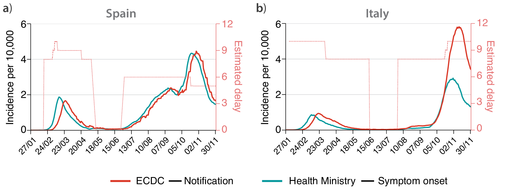
Second, the delay between symptom onset and notification is not constant over time, with a larger lag during the first wave than for the cases detected after the summer of 2020. The delay between symptom onset and notification can vary in time for several reasons, most importantly, it crucially depends on the stress of the testing system: if testing capacity is overwhelmed, the delay will increase. Lastly, the information on cases by symptom onset was not publicly available during the first wave. Spain used to report only cases by notification date until early June 2020, following the introduction of a new “Strategy for Surveillance and Control” implemented on May 11, while now reports only cases by symptom onset (with the addition of asymptomatic as previously described) (Spanish Health Ministry, 2021). Similarly, Italy started to report this type of data since late June 2020 (Italian Health Institute, 2021). Therefore, policies about data collection and release considerably vary both in time and across countries, making meaningful cross-country comparisons difficult.
A second class of problems emerges when dealing with data regarding the implementation of NPIs. For instance, the dataset on the mitigation measures imposed by each European country provided by the ECDC signals that schools were closed in Spain on March 12 (ECDC, 2021). However, the true picture is more complex: education in Spain is decentralized, controlled by each autonomous region. On March 12, most of them announced their intention to close schools, some of them starting on the next day and many of them from next Monday, March 16. For instance, the region of Madrid (14.2% of the Spanish population) had already closed schools on Wednesday 11, Catalonia (16%) announced the closure on Thursday and starting on Friday 13 and Andalusia (17.84%) announced the closure on Thursday but starting on Monday 16. Therefore, school closure did not uniformly happen in Spain on March 12. Note also that in Spain education is closed during weekends, so effectively only a handfull of regions closed for 1 day before March 16, and thus the effect of the closure should be very small. Nonetheless, many studies rely on the ECDC dataset for NPIs implementation, thus assuming that schools in Spain closed on March 12 (Flaxman et al., Reference Flaxman, Mishra, Gandy, Unwin, Mellan, Coupland, Whittaker, Zhu, Berah, Eaton, Monod, Ghani, Donnelly, Riley, MAC, Ferguson, Okell and Bhatt2020). Note that, especially during the first wave, many NPIs were implemented within a few days. A precise timing of each NPI implementation is thus pivotal in order to distinguish between the effects of different NPIs.
A similar class of problems regards the spatial implementation of NPIs. For instance, the ECDC dataset reports that social distancing was encouraged on March 9, but this is true only for the most affected region in Spain, Madrid. This is clearly shown in Figure 2 (top panels), where we report the variation of workplace mobility provided by Google’s mobility reports (Google, 2020). In the case of Spain, we can clearly see how mobility starts to decrease earlier in the region of Madrid than in the whole country (note that Madrid accounts for over 14% of the Spanish population). A similar observation holds for Italy. Lombardy was the most affected region during the initial outbreak of the epidemic, and local NPIs were imposed there (Pepe et al., Reference Pepe, Bajardi, Gauvin, Privitera, Lake, Cattuto and Tizzoni2020). As a consequence, we observe a drop in mobility in Lombardy since late February, while in the rest of Italy, it remained higher (note that Lombardy accounts for over 16% of the Italian population). However, the ECDC dataset only reports mitigation measures in Italy starting from March 4, neglecting the measures taken in late February and early March.
Evolution of mobility during the first wave of COVID-19 in (a) Spain and (b) Italy, represented by the change in workplace mobility as reported by Google’s mobility data. Estimated value of $ R(t) $
during the first wave of COVID-19 in (c) Spain and (d) Italy. In all plots, the hardest-hit region in each country (Madrid and Lombardy) are colored in red, while in light blue we plot the same values obtained with data aggregated at the country level.
$ R(t) $
during the first wave of COVID-19 in (c) Spain and (d) Italy. In all plots, the hardest-hit region in each country (Madrid and Lombardy) are colored in red, while in light blue we plot the same values obtained with data aggregated at the country level.
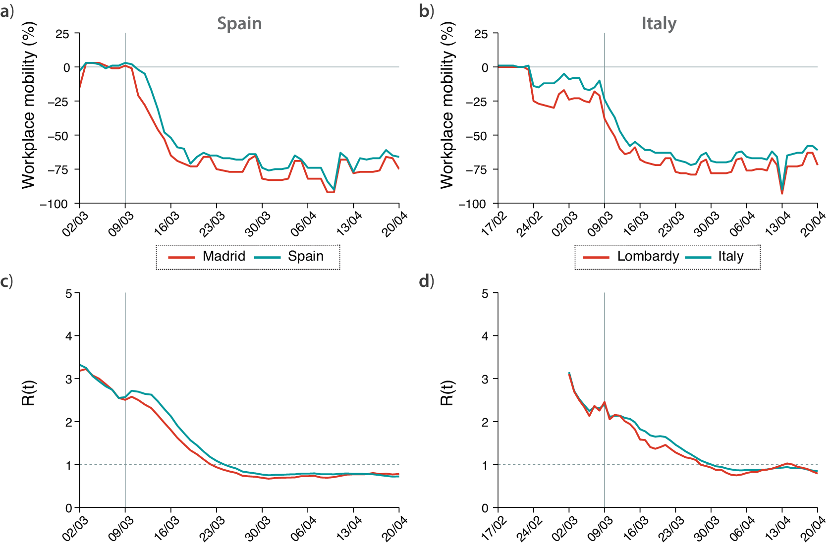
These effects can be properly captured by the evolution of $ R(t) $
in time. Figure 2 (bottom panels) shows the value of
$ R(t) $
in time. Figure 2 (bottom panels) shows the value of $ R(t) $
for Madrid compared to the whole Spain, and Lombardy compared to Italy. We estimated
$ R(t) $
for Madrid compared to the whole Spain, and Lombardy compared to Italy. We estimated $ R(t) $
by means of EpiEstim, a state-of-the-art method for the estimation of
$ R(t) $
by means of EpiEstim, a state-of-the-art method for the estimation of $ R(t) $
currently adopted by several national public health authorities (Cori et al., Reference Cori, Ferguson, Fraser and Cauchemez2013), and using data on symptom onset. One can see that, before March 9, the
$ R(t) $
currently adopted by several national public health authorities (Cori et al., Reference Cori, Ferguson, Fraser and Cauchemez2013), and using data on symptom onset. One can see that, before March 9, the $ R(t) $
evolution obtained by using cases detected in Spain and cases detected only in Madrid is the same. Then, from March 9 on, the value of
$ R(t) $
evolution obtained by using cases detected in Spain and cases detected only in Madrid is the same. Then, from March 9 on, the value of $ R(t) $
decays faster in Madrid than it did in Spain. As such, if one assumes that social distancing started in Spain from March 9, and tries to estimate its effect on
$ R(t) $
decays faster in Madrid than it did in Spain. As such, if one assumes that social distancing started in Spain from March 9, and tries to estimate its effect on $ R(t) $
using data for the whole country, the results would be flawed. A similar picture emerges by looking at the
$ R(t) $
using data for the whole country, the results would be flawed. A similar picture emerges by looking at the $ R(t) $
evolution in Italy, where the drop in
$ R(t) $
evolution in Italy, where the drop in $ R(t) $
starts sooner in Lombardy than in the rest of the country.
$ R(t) $
starts sooner in Lombardy than in the rest of the country.
Therefore, it is straightforward to conclude that not only the precise timing of NPIs adoption matters to evaluate its effects, but also spatial granularity is crucial. Here, we consider an example from the first wave of COVID-19, where NPIs were generally implemented uniformly at the country level. With the following waves, this issue becomes even more relevant, as NPIs have been managed at most at the regional level in both Spain and Italy, and in many other countries. Finally, we stress that the implementation of the same NPI can vary across regions within the same country.
3. Policy Implications
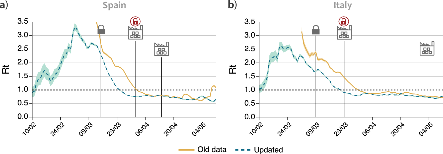
The usage of inaccurate data not only has an impact on studies evaluating the NPIs effectiveness a posteriori, but it also has important implications in the process of decision making. Figure 3 shows the evolution of $ R(t) $
obtained using two different sets of data for each country. The dataset indicated as “old” refers to information made available by the authorities up to June 2020, which was essentially the number of cases by notification date (i.e., it is the one currently provided by the ECDC). The “updated” dataset, on the other hand, represents the number of cases by symptom onset currently made available by national health authorities. One can see that, in both countries, after the implementation of the national lockdown (indicated in the figure), the
$ R(t) $
obtained using two different sets of data for each country. The dataset indicated as “old” refers to information made available by the authorities up to June 2020, which was essentially the number of cases by notification date (i.e., it is the one currently provided by the ECDC). The “updated” dataset, on the other hand, represents the number of cases by symptom onset currently made available by national health authorities. One can see that, in both countries, after the implementation of the national lockdown (indicated in the figure), the $ R(t) $
curve obtained by old notification dates declines slower than the one obtained for the real symptom onset. In particular, one can focus on the date on which
$ R(t) $
curve obtained by old notification dates declines slower than the one obtained for the real symptom onset. In particular, one can focus on the date on which $ R(t) $
gets below one, indicating that the epidemic will start to steadily decline all other things remaining equal, and thus it can be considered under control since such a date. Figure 3 shows that using the old data this occurs 8–9 days later than what is obtained when using symptom onset data, for both countries. These dates are explicitly shown in Table 1. The reason for this discrepancy is the delay between symptom onset and testing, which was slow during the first wave. To solve this issue, one could shift the old time-series by a constant value (Gostic et al., Reference Gostic, McGough, Baskerville, Abbott, Joshi, Tedijanto, Kahn, Niehus, Hay, De Salazar, Hellewell, Meakin, Munday, Bosse, Sherrat, Thompson, White, Huisman, Scire, Bonhoeffer, Stadler, Wallinga, Funk, Lipsitch and Cobey2020). However, the proper value to be shifted was not available back then, and as we have shown in Figure 1, the delay between the dates of symptom onset and notification is not constant through the epidemic. Besides, even if this technique is well-known within certain domains, it might not have been used by the authorities. For instance, the national Spanish television reported on April 6 that
$ R(t) $
gets below one, indicating that the epidemic will start to steadily decline all other things remaining equal, and thus it can be considered under control since such a date. Figure 3 shows that using the old data this occurs 8–9 days later than what is obtained when using symptom onset data, for both countries. These dates are explicitly shown in Table 1. The reason for this discrepancy is the delay between symptom onset and testing, which was slow during the first wave. To solve this issue, one could shift the old time-series by a constant value (Gostic et al., Reference Gostic, McGough, Baskerville, Abbott, Joshi, Tedijanto, Kahn, Niehus, Hay, De Salazar, Hellewell, Meakin, Munday, Bosse, Sherrat, Thompson, White, Huisman, Scire, Bonhoeffer, Stadler, Wallinga, Funk, Lipsitch and Cobey2020). However, the proper value to be shifted was not available back then, and as we have shown in Figure 1, the delay between the dates of symptom onset and notification is not constant through the epidemic. Besides, even if this technique is well-known within certain domains, it might not have been used by the authorities. For instance, the national Spanish television reported on April 6 that $ R(t) $
had finally gone below 1 and that the epidemic was under control based on the estimation of
$ R(t) $
had finally gone below 1 and that the epidemic was under control based on the estimation of $ R(t) $
provided by the Health ministry (RTVE, 2020). In other words, the authorities thought that the epidemic was still growing up until the first week of April, even though it was already under control 2 weeks before. Notably, the current estimates for
$ R(t) $
provided by the Health ministry (RTVE, 2020). In other words, the authorities thought that the epidemic was still growing up until the first week of April, even though it was already under control 2 weeks before. Notably, the current estimates for $ R(t) $
provided by the Health ministry show that it went below one on March 24, agreeing with our calculation and contradicting its own reports from April 2020.
$ R(t) $
provided by the Health ministry show that it went below one on March 24, agreeing with our calculation and contradicting its own reports from April 2020.
Evolution of $ R(t) $
using the old data available until June or the updated datasets in (a) Spain and (b) Italy. Solid lines represent the value of
$ R(t) $
using the old data available until June or the updated datasets in (a) Spain and (b) Italy. Solid lines represent the value of $ R(t) $
estimated using the data that was made publicly available by the authorities of each country, while the dashed lines use the updated data on symptom onset. The lock represents the data when each country went into lockdown. The factory icon with a lock shows when a further closure of some industries was imposed, and the factory without an icon when it was released.
$ R(t) $
estimated using the data that was made publicly available by the authorities of each country, while the dashed lines use the updated data on symptom onset. The lock represents the data when each country went into lockdown. The factory icon with a lock shows when a further closure of some industries was imposed, and the factory without an icon when it was released.
First day for which the value of $ R(t) $
is consistently below 1 within a 95% credible interval for each time-series
$ R(t) $
is consistently below 1 within a 95% credible interval for each time-series
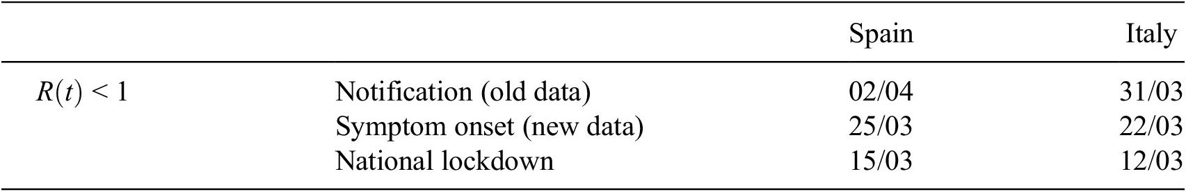
The consequences of this observation are important. In both Spain and Italy, few weeks after the national lockdown, there was a further closure of all nonessential activities, including most of the manufacturing activities that had been allowed to remain open, in an effort to get the epidemic under control (Bertacche et al., Reference Bertacche, Orihuela and Colten2020; Moncloa, 2020). These measures are not included in the ECDC dataset and, hence, are generally not taken into account in studies measuring the effectiveness of the restrictions, which already suggests that the effect on the propagation of the disease was small. Yet, the economic impact of these further closures might not have been small. If we look back at Figure 2, we can notice a decrease in workplace mobility in Spain and Italy on the date where these further closures were imposed, April 1 and March 23, respectively. Note also that even though the change is noticeable, the overall effect on the mobility is fairly small, with a drop of roughly 5% in mobility compared to the previous 65% resulting from the initial lockdown. If we now look at the date for which $ R(t) $
falls below 1, in Table 1, we can see that in both countries this happened before the closure of all nonessential industries, provided that
$ R(t) $
falls below 1, in Table 1, we can see that in both countries this happened before the closure of all nonessential industries, provided that $ R(t) $
is properly estimated using data of symptom onset. On the contrary, the evolution of
$ R(t) $
is properly estimated using data of symptom onset. On the contrary, the evolution of $ R(t) $
is rather flat during the period in which nonessential activities were closed, pointing out that the effect of such measure on the epidemic propagation was negligible. Therefore, the decision to impose those further closures might have been unnecessary, because it might have been based on inaccurate data. If the information available to the authorities had been up to date, they would have seen that the epidemic was already under control, and might have decided differently. Certainly, during the first wave accurate data of symptom onset was not promptly available, and likely this lack of information played an important role, but our previous observations show the importance of assessing and making decisions on the establishment and implementation of NPIs based on the most recent and accurate data available in any future evaluation of possible interventions.
$ R(t) $
is rather flat during the period in which nonessential activities were closed, pointing out that the effect of such measure on the epidemic propagation was negligible. Therefore, the decision to impose those further closures might have been unnecessary, because it might have been based on inaccurate data. If the information available to the authorities had been up to date, they would have seen that the epidemic was already under control, and might have decided differently. Certainly, during the first wave accurate data of symptom onset was not promptly available, and likely this lack of information played an important role, but our previous observations show the importance of assessing and making decisions on the establishment and implementation of NPIs based on the most recent and accurate data available in any future evaluation of possible interventions.
4. Discussion
During the COVID-19 pandemic, in a much-needed effort to promote data availability, the national health authorities of many countries have released, often on a daily basis and at a subnational spatial granularity, the time-series of epidemiologically relevant quantities as measured through their surveillance systems. Such publicly released data typically include the new number of laboratory-confirmed COVID-19 positives, hospitalized cases, and deaths. Although the dates of symptoms’ onset are also collected by surveillance systems for a fraction of cases, such information is often missing from publicly available data. In the two countries analyzed in this article, this information was released after the first wave, evidencing that the data was collected but improperly managed. Furthermore, for these two countries, we have also shown examples of limitations present in datasets collecting NPIs adoption, with respect to both their timing and spatial granularity.
As a consequence, the evaluation of the effectiveness of NPIs can be unreliable due to two different sources of bias in the data: inaccurate case surveillance data, leading to a biased estimation of $ R(t) $
, and the temporal and spatial limitations in the data regarding NPIs adoption. Even by taking into account all these caveats, the evaluation of NPIs effectiveness and in particular cross-country comparison remains difficult. For instance, testing capacity is known to have considerably increased after the first COVID-19 wave and yet be heterogeneous across regions, thus affecting the accuracy of case surveillance data and hence introducing further biases in the estimation of
$ R(t) $
, and the temporal and spatial limitations in the data regarding NPIs adoption. Even by taking into account all these caveats, the evaluation of NPIs effectiveness and in particular cross-country comparison remains difficult. For instance, testing capacity is known to have considerably increased after the first COVID-19 wave and yet be heterogeneous across regions, thus affecting the accuracy of case surveillance data and hence introducing further biases in the estimation of $ R(t) $
. While the representativeness of the data analyzed in this article is limited to Spain and Italy, similar data limitations and effects on the
$ R(t) $
. While the representativeness of the data analyzed in this article is limited to Spain and Italy, similar data limitations and effects on the $ R(t) $
estimation might be expected also in other countries. Recent studies have proposed different approaches to further improve the estimation of
$ R(t) $
estimation might be expected also in other countries. Recent studies have proposed different approaches to further improve the estimation of $ R(t) $
, however, additional research work is needed to determine how best to infer infections from observations and to account for all relevant forms of uncertainty when estimating
$ R(t) $
, however, additional research work is needed to determine how best to infer infections from observations and to account for all relevant forms of uncertainty when estimating $ R(t) $
(Gostic et al., Reference Gostic, McGough, Baskerville, Abbott, Joshi, Tedijanto, Kahn, Niehus, Hay, De Salazar, Hellewell, Meakin, Munday, Bosse, Sherrat, Thompson, White, Huisman, Scire, Bonhoeffer, Stadler, Wallinga, Funk, Lipsitch and Cobey2020). In this study, we investigated the issues arising when estimating
$ R(t) $
(Gostic et al., Reference Gostic, McGough, Baskerville, Abbott, Joshi, Tedijanto, Kahn, Niehus, Hay, De Salazar, Hellewell, Meakin, Munday, Bosse, Sherrat, Thompson, White, Huisman, Scire, Bonhoeffer, Stadler, Wallinga, Funk, Lipsitch and Cobey2020). In this study, we investigated the issues arising when estimating $ R(t) $
, however, similar arguments apply to other COVID-19 outcomes of interest. Although
$ R(t) $
, however, similar arguments apply to other COVID-19 outcomes of interest. Although $ R(t) $
represents the most common metric under consideration when gauging the effects of interventions, other outcomes may be relevant for policy evaluation, such as the number of hospitalizations, the number of deaths, the test positivity rate, or vaccine uptake. In all cases, varying delays of notifications and lack of spatial granularity represent significant issues for data quality that may hamper the evaluation of interventions. For instance, it has been estimated that the delay in death reporting in the US ranges from 2 to 12 weeks depending on the state (Rosenbaum et al., Reference Rosenbaum, Stillo, Graves and Rivera2021). Similarly, the CDC estimates that only 63% of deaths are reported within 10 days, with large variability across states.
$ R(t) $
represents the most common metric under consideration when gauging the effects of interventions, other outcomes may be relevant for policy evaluation, such as the number of hospitalizations, the number of deaths, the test positivity rate, or vaccine uptake. In all cases, varying delays of notifications and lack of spatial granularity represent significant issues for data quality that may hamper the evaluation of interventions. For instance, it has been estimated that the delay in death reporting in the US ranges from 2 to 12 weeks depending on the state (Rosenbaum et al., Reference Rosenbaum, Stillo, Graves and Rivera2021). Similarly, the CDC estimates that only 63% of deaths are reported within 10 days, with large variability across states.
In general, COVID-19 policy impact evaluation is a complex endeavor that is challenged by several methodological issues of study design and statistical approaches, as recently exemplified by Haber et al. (Reference Haber, Clarke-Deelder, Feller, Smith, Salomon, MacCormack-Gelles, Stone, Bolster-Foucault, Daw, Hatfield, Fry, Boyer, Ben-Michael, Joyce, Linas, Schmid, Au, Wieten, Jarrett, Axfors, Nguyen, Griffin, Bilinski and Stuart2021a,Reference Haber, Clarke-Deelder, Salomon, Feller and Stuartb). In particular, identifying causal effects of COVID-19 policies requires carefully designed studies to overcome such challenges (Goodman-Bacon and Marcus, Reference Goodman-Bacon and Marcus2020). In this study, we have shown that the quality of the observational data used to evaluate COVID-19 policies, which has received less attention so far in the literature, represents an important issue to be taken into account for a proper assessment. This is in line with recent observations in other data-driven fields such as machine learning and artificial intelligence, where too much emphasis is put on the models while the importance of data quality is often undervalued (Sambasivan et al., Reference Sambasivan, Kapania, Highfill, Akrong, Paritosh and Aroyo2021).
Given the past, present, and future importance of a reliable evaluation of the effectiveness of NPIs for the management of the COVID-19 pandemic, our work calls for an improvement of the process of data collection, management, storage and release, at all stages. In particular, two recent examples reveal that improper data management and storage can have significant consequences on the conclusions reached. In a very recent paper (Bhopal et al., Reference Bhopal, Bagaria, Olabi and Bhopal2021), children mortality in Spain appeared to be twice the value obtained from other European countries such as Italy and France. A deeper inspection carried out by a journalist revealed that in some regions in Spain individuals older than 100 years old were incorrectly categorized as older than 0 (presumably because their system only allowed two digit ages), inflating the number of deceased specially in the group between 0 and 10 years old (García, Reference García2021). Even worse, this flaw seems not to be systematic and present only in some Spanish regions, which makes it harder to fix the error. A somewhat similar error was detected in the UK, where many records of case surveillance data were lost because the table reached the maximum number of allowed rows in an Excel file (Kelion, Reference Kelion2020). These issues, together with the ones presented in the paper, call for a profound change in the data culture of our institutions.
In particular, we conclude with a list of specific suggestions for policymakers:
-
1. Open data. COVID-19 outcome data should be made publicly available in a machine readable format, preferably using open source versioning repositories that allow for keeping track of updates. Stratifying data by age, sex, race, and ethnicity is also essential.
-
2. Timeliness. All necessary efforts should be put in place to minimize delays of reporting between the event of interest (either positive test, hospitalization, or death) and the date of reporting. Besides, the definition of each event should be made available explicitly (e.g., which event corresponds to notification date, or whether the date of a positive test corresponds to the day when it was collected or when the result was obtained).
-
3. Centralization. Data should be collected in a centralized way by the public health authority, minimizing the number of actors that are in charge of the data collection and release process. In particular, locally collected data should be stored and made available only through a single national public repository.
-
4. Spatial resolution. Repositories should provide data counts disaggregated by subnational administrative units, at the most granular available resolution.
-
5. Beware of aggregation. The full heterogeneity of healthcare and management systems should be acknowledged and, unless recommendations 1–3 are properly implemented, aggregating data from very different sources should be discouraged. Centralized repositories cannot be properly created or used, and cross-country comparisons carried out, unless it is completely clear that all sets of data are totally compatible. Also, care should be taken when extracting conclusions from aggregated data that could represent different administrative units, as the aggregation process could mix together data outcomes rooted at different causes or measures.
In conclusion, more accurate data will allow a more precise evaluation of the effects of containment measures, and consequently they will allow public health authorities to make more informed decisions when facing future health crises.
Funding Statement
M.S. acknowledges partial support from Intesa Sanpaolo Innovation Center. A.A. and Y.M. acknowledge the financial support of Soremartec S.A. and Soremartec Italia, Ferrero Group. M.T. acknowledges partial support by the European Union’s Horizon 2020 research and innovation programme—project EpiPose (No. 101003688) and by the Lagrange Project funded by Fondazione CRT. Y.M. acknowledges partial support from the Government of Aragon and FEDER funds, Spain through grant E36-20R (FENOL) and 17030/5423/440189/91019, and by MINECO and FEDER funds (FIS2017-87519-P). The funders had no role in study design, data collection, and analysis, decision to publish, or preparation of the manuscript.
Competing Interests
M.T. reports consulting fees from GSK outside of the submitted work. The remaining authors declare no conflict of interest.
Author Contributions
M.S. and A.A. designed the study with contributions from Y.M. and performed research. M.S., A.A., M.T., and Y.M. analyzed and discussed the results, wrote the paper, and approved the final version of the manuscript.
Data Availability Statement
All data used in this article is freely available at the original sources (Google, 2020; ECDC, 2021; Italian Health Institute, 2021; Spanish Health Ministry, 2021).
Ethical Standards
The research meets all ethical guidelines, including adherence to the legal requirements of the study country.


 Open access
Comments
No Comments have been published for this article.