The specter of a backlash against globalization is haunting the world. Despite major differences in form, content, and degree, Brexit, the election of Donald Trump, and the rising influence of populist and nationalist parties in Europe all share a hostility to aspects of the integration of national economies and politics, and a rejection of existing political institutions, political parties, and politicians. This upsurge of hostility to some of the founding principles of the modern international economic and political order has now affected many advanced industrial countries.
The populist backlash against globalization poses a serious threat to the Liberal International Order (LIO). As discussed in the introduction to this special issue, populist parties and their leaders—most notably Donald Trump—challenge the core principles and institutions of the LIO. The fact that the backlash is strongest among voters and parties from wealthy democracies means that challenges to the LIO come from “within.” An understanding of the causes of support for these nationalist, anti-integrationist movements is therefore central to any explanation of the viability of the LIO, or of what may come to replace it.
There are clearly identifiable economic sources of the current globalization backlash, although there are, of course, cultural, ethnic, and other components as well. Still, the nationalist political movements in the developed world that have intensified their attack on international integration share strong and important economic features.
This article makes three points about the current reaction to integration. We provide suggestive evidence about the importance of these three points. We then discuss how future research might help us better understand the backlash against globalization.
The first analytical point is that the backlash has been building for a long time. The decline of traditional manufacturing employment in the Organisation for Economic Cooperation and Development (OECD) began in the early 1970s. Technological change and competition from low-wage developing countries devastated many OECD industries through the 1970s and 1980s, with turbulent effects on labor markets. The full entry of China and other new manufacturing exporters into the world economy after 2000 came on top of a long-standing trend that had already eroded the position of many previously well-paid industrial workers in North America and Western Europe.
The second point is that these broad economic trends affect communities. Their direct impact on individuals who lose their jobs or have their wages cut initiates a more widespread impact on local communities. Jobs and income decline, property values fall, the local tax base erodes, more educated residents leave, and local public services deteriorate. After a couple of decades the city, town, or neighborhood is reeling from waves of economic and social shocks, affecting everything from school quality to opioid addiction. There are strong geographic patterns to the populist backlash, and political choices are powerfully affected by local socioeconomic conditions. The regional component of these trends is heightened by the growing importance of firm-based economic advantages, and of local network externalities. This reinforces economic divergence among communities. The most productive firms and their employees benefit from deeper integration, whereas less productive firms and their workers face globalization with deep insecurity, and the superstar firms tend to concentrate spatially, deriving distinct benefits from being close to other innovative firms.
The third point is that the financial crash and global economic crisis of 2008 catalyzed long-run pressures that had been building at the community level since the 1970s. Communities already in decline suffered deeper and longer economic downturns than metropolitan areas where superstar knowledge, technology, and service-oriented firms agglomerate. The geographic unevenness of the recovery magnified trends in inequality of wealth and income that had been decades in the making.Footnote 1 In this environment, it was easier for populist politicians and parties to mobilize voters along anti-globalization, anti-European, or anti-immigration lines. Populism found its principal support in areas where the recovery was slower, and where economic decline had been underway for a long time.
Although similar economic forces appear to drive the backlash to globalization across wealthy countries, there are important differences in the degree to which populists have captured power, as well as in the extent to which they threaten to undermine the LIO. In the final section of the article, we argue that a portion of this variation is likely the result of the institutional differences across developed democracies. As an illustration, we focus on labor-market institutions and electoral rules. Variation in labor-market institutions may mediate or cushion voters from the vicissitudes of globalization, dampening the popular revolt against the LIO. Electoral rules such as proportional representation influence the ability of populist parties to gain power. Because of the lack of attention given to these and other national-level political institutions in explaining the backlash, this discussion is more speculative. It is our hope that by illustrating some of the gaps in the literature, we can provide a source of inspiration for future research.
Background
There are substantial economic sources of the populist backlash against economic and political integration. Regions harmed by greater exposure to the international economy, in particular to imports from China and other low-wage countries, are more likely to vote for political parties and candidates hostile to globalization or European integration. This is true of Western European countries generally,Footnote 2 of France specifically,Footnote 3 and of the British referendum to leave the European Union (“Brexit”).Footnote 4 It is also true of analogous trends in American politics, especially in regions that have experienced job losses and reduced wages because of low-wage imports from developing countries. These regions have become more politically polarized since 2000,Footnote 5 their legislators have tended to vote in more protectionist directions,Footnote 6 and they were more likely to swing their votes toward Donald Trump in the 2016 presidential election.Footnote 7
Figure 1 illustrates the geographic variation in support for the populist campaign of Donald Trump in the 2016 general election compared with Mitt Romney, who in 2012 ran as a more traditional Republican. Trump significantly outperformed Romney in the “industrial belt”—areas in the Midwest once known for manufacturing prowess but now often sites of abandoned factories and economic blight following decades of plant closures and manufacturing layoffs.
Trump's (2016) two-party vote share compared with Romney's (2012) two-party vote share
The political phenomenon that we associate with a backlash against globalization takes different forms in different contexts. Most of the movements in question fall under the general rubric of right-wing populism, and we focus on this form, although we recognize that there are also left-wing strains. Populists, in one way or another, question the existing multilateral institutional structure of the international economic order. Since World War II, this has involved the delegation of some important aspects of economic policy—overseeing international monetary and financial relations, concessional lending to developing countries, the monitoring of trade disputes—to international institutions. In Europe, the process has gone much further because many more components of traditional government policy have been delegated to the institutions of the European Union. Supporters of the LIO typically believe in the desirability—even necessity—of multilateral agreement to allow international bodies to monitor and supervise international cooperation.
Populists contest what they see as a surrender of sovereignty to international institutions and their unelected overseers.Footnote 8 America's populists have been explicit in their hostility to international trade, investment, and finance, and in some contexts to immigration as well. Donald Trump framed this in classic antiglobalist terms in an address to the United Nations General Assembly: “America is governed by Americans. We reject the ideology of globalism … [R]esponsible nations must defend against threats to sovereignty … from global governance.” Speaking of international institutions, Trump proclaimed, “We will never surrender America's sovereignty to an unelected, unaccountable, global bureaucracy.”Footnote 9
In Europe, populist movements share a skepticism about, or hostility to, European integration, and usually to immigration. Supporters of Brexit framed their goal very explicitly as “taking back control from Brussels.” More specifically, they argued, “EU law is supreme over UK law. This stops the British public from being able to vote out those who make our laws. Our ‘Supreme Court’ is the European Court of Justice. We've lost control of trade, human rights, and migration.”Footnote 10 In all variants, populists are hostile to existing mainstream political institutions, parties, and politicians.
Nonetheless, questions persist about the mechanisms by which these international economic trends translate into domestic political effects. One consideration is that although trade is undoubtedly responsible for some of the downward pressure on unskilled and semiskilled labor in the OECD, technological change is also part of the process. There have been long-standing debates on the relative importance of each factor; it is hard to imagine resolving the debates because, to some extent, globalization and technological change are jointly determined and affect each other. Still, the current state of the economics literature allows for a substantial portion of the impact to be caused by the free movement of goods and capital.Footnote 11 It is not surprising that political entrepreneurs looking for a way to capture discontent focus on trade rather than technological change because trade is a policy variable whereas technological change generally is not.Footnote 12
More important for our purposes is that some studies of individual opinions, typically based on surveys, find either weak or little relationship between individual economic experiences, on the one hand, and individual political beliefs and policy preferences, on the other.Footnote 13 This highlights the need for a careful attempt to understand precisely how these economic trends affect political behavior.
The Long Decline in Manufacturing
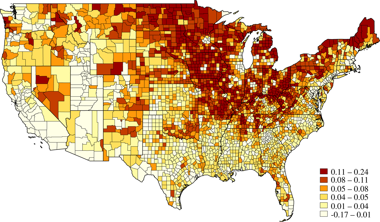
The first point of emphasis in explaining the backlash against globalization and the rise of populism is that the core phenomenon—the decline of manufacturing employment—has been going on for more than forty years. Whether driven by technological change, by economic integration, or by other considerations, employment in manufacturing as a share of the labor force in the United States—and nearly every other rich country—has declined continually since the early 1970s, falling from 26 percent in 1970 to less than 10 percent by 2016. In the 1970s and 1980s, the international economic context was the rise of manufactured exports from low-wage developing countries such as South Korea, Taiwan, Singapore, and Mexico.Footnote 14 Competitive pressures on traditional low-wage manufacturing in the industrial countries had a particularly negative impact on job opportunities for less skilled workers. The result is that conditions for less skilled workers in the OECD have been difficult for decades. Figure 2 demonstrates the dramatic decline in manufacturing employment shares across advanced economies between 1970 and 2012. As we will discuss in greater detail, the specific impact of this decline on populism may depend on local labor-market and political institutions, but the general pattern is clear: important segments of the labor force have been struggling for a long time.
Share of manufacturing in total employment, 1970 through 2012
Note: The data are from the US Bureau of Labor Statistics, International Labor Comparisons Program.
The most direct effects of lost manufacturing jobs are economic. Along with rising unemployment, wages tend to decline. One reason is that manufacturing wage premiums are high: workers in the manufacturing sector earn higher wages conditional on education compared with workers in other sectors.Footnote 15 Furthermore, when one local plant shutters, associated businesses also suffer. As a result, local suppliers and downstream producers often experience job losses and wage pressure.Footnote 16 In the United States, for example, the real wages of unskilled and semiskilled workers began stagnating and even falling (in relative and absolute terms) in the early 1970s, and have remained stagnant. The full entry of China and other new manufacturing exporters such as Vietnam into the world economy after 2000 was a major shock, but it came on top of a long-standing trend that had eroded the position of many previously well-paid industrial workers in North America and Western Europe.
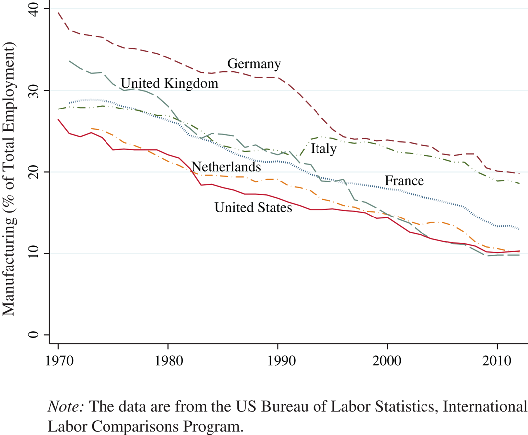
To examine the recent economic decline in former manufacturing hubs compared with other communities, we gathered data on manufacturing employment in US counties in 1970, and changes in economic conditions between 2000 and 2015. The scatterplots in Figure 3 suggests a correlation between recent economic decline and former industrial strength. In particular, counties with higher shares of workers in manufacturing in 1970 suffered the largest drops in manufacturing employment shares since the turn of the century (panel A). Moreover, economic decline in these communities appears to extend beyond the manufacturing sector: former manufacturing strongholds suffered larger recent drops in labor force participation (panel B) and slower growth in median household income (panel C). The scatterplots indicate that recent economic distress is most pronounced in the former industrial communities of the United States.
The decline of US manufacturing communities
Notes: The dots represent US counties. Manufacturing employment data come from the US Bureau of Economic Analysis. Labor force participation is estimated as total employment data (from the US Bureau of Labor Statistics) divided by population (from National Bureau of Economic Research [NBER] and the US Census). Median household income statistics are from the US Census Small Area Income and Poverty Estimates Program.
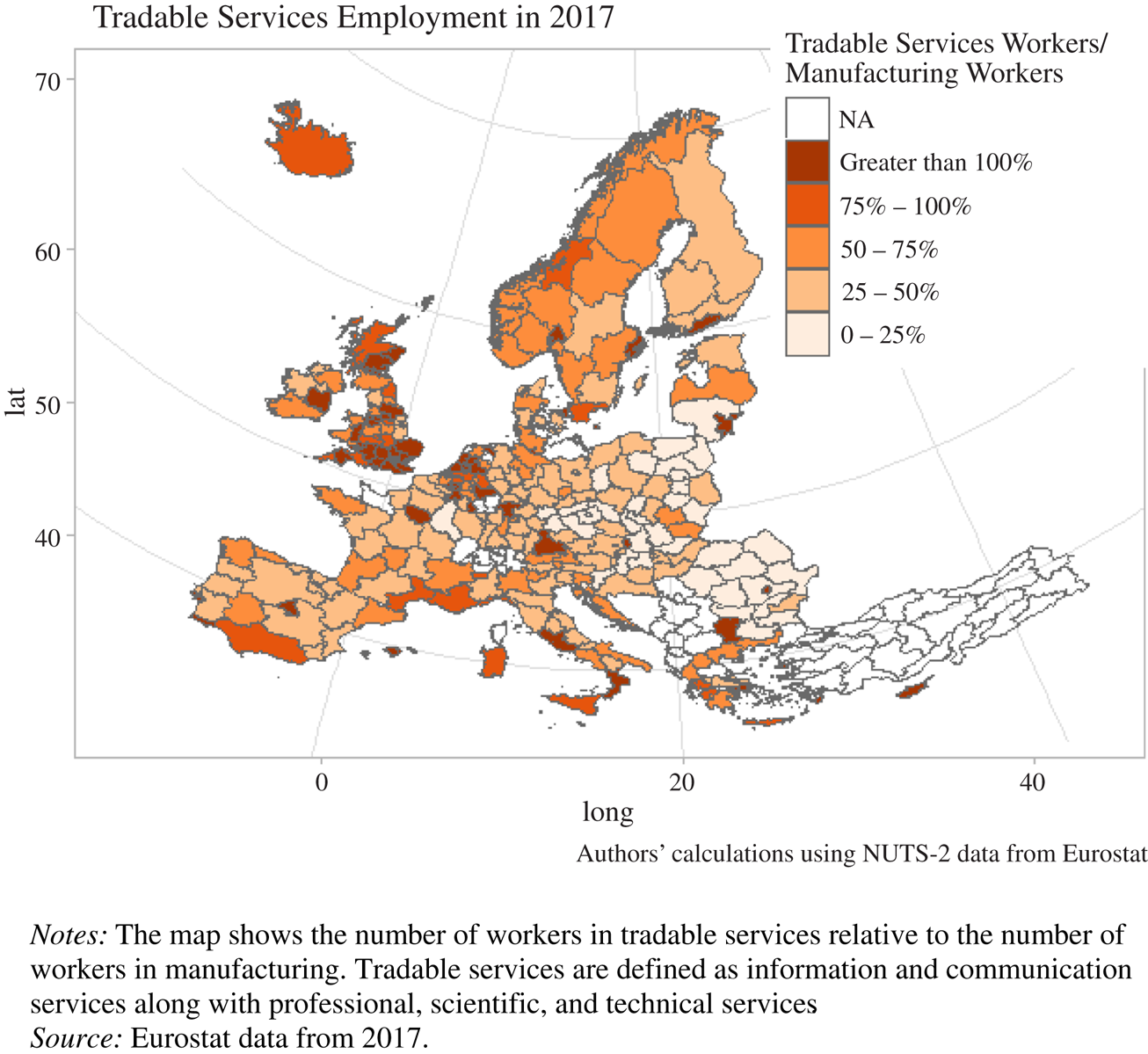
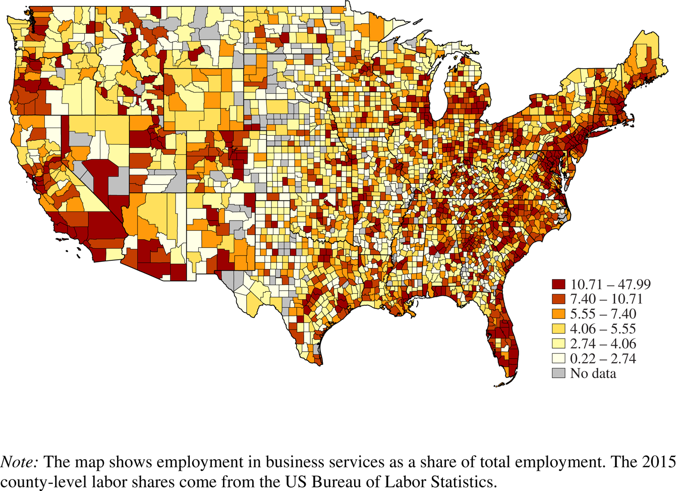
The mirror image of this trend is the increasing concentration of more successful economic activities in specific regions of the country. There are significant agglomeration effects that lead many “superstar firms” to locate in areas close to each other.Footnote 17 At the same time, the decline of manufacturing has been associated with a rise in service employment. In both the United States and Europe, many of the most successful firms and industries are in fact engaged in skill-intensive service activities, whereas the less-skilled tasks are sent offshore or automated. High-wage, high-skill employment is concentrated in the major cities, which have largely benefited from globalization. Figure 4 demonstrates the concentration of tradable services employment in the major European capitals and Figure 5 illustrates a similar urban concentration of professional services employment in the United States.
The urban concentration of tradable services in Europe
Notes: The map shows the number of workers in tradable services relative to the number of workers in manufacturing. Tradable services are defined as information and communication services along with professional, scientific, and technical services.
Source: Eurostat data from 2017.
The urban concentration of tradable services employment in the United States
Note: The map shows employment in business services as a share of total employment. The 2015 county-level labor shares come from the US Bureau of Labor Statistics.
Right-wing populism, like industrial decline, began long before the election of Donald Trump, the Brexit referendum, and the recent success of the Alternative for Germany (AfD). But the timing, and the form that it took, were conditioned by electoral institutions, as we will discuss. In European parliamentary elections in which the electoral threshold is low, the share of votes for right-wing populist parties has increased steadily since the early 1980s, rising from a low of 1 percent in 1982 to an historic high of 12.3 percent in 2016.Footnote 18 However, in first-past-the-post electoral systems, in which candidates and parties need to win the most number of votes in their respective constituencies, the backlash to industrial decline took other forms. In the United States, billionaire outsider H. Ross Perot campaigned as an economic nationalist in 1992 and won 18.9 percent of the popular vote, making him the most successful third-party presidential candidate since 1912, in terms of the popular vote. Yet despite winning nearly 20,000,000 votes, Perot did not receive a single Electoral College vote, which speaks to the importance of electoral institutions in aggregating populist sentiment (see subsequent discussion). Although a populist did not win the presidency until 2016, populism had been growing for decades in the United States, as witnessed by the rising popularity of antiglobalist, far-right media personalities such as Rush Limbaugh, and the success of the Fox News cable channel.Footnote 19
The Impact on Communities
The second important feature of the economic trends of the past decades is that the impact of international economic integration—and, for that matter, of technological change—is best understood as affecting geographically specific areas rather than individuals.Footnote 20 Regions, cities, and towns are economically specialized, and difficulties in their core industries have broad and deep implications for their economic and social structures. The initial direct economic impact of industrial decline puts downward pressure on wages and employment. This then leads to broader and more indirect effects: labor force participation declines, young people leave, property values decline, local tax revenue falls, and local public services deteriorate.Footnote 21 After a couple of decades the city, town, or neighborhood is reeling from waves of economic and social shocks, affecting everything from school quality to opioid addiction.Footnote 22
Because of the regional impact of structural economic change, we think that the appropriate unit of analysis for studying populism is the community, not the individual. The localization of economic activity means that individuals within a community are linked together by economic spillovers. Standard trade theory usually assumes that individuals are atomistic and that their welfare depends only on their individual income. But when a person's welfare is tied to the health of the local economy and encompasses more than just income, “community” takes on added significance as an analytical concept. Consider an employed, high-skilled homeowner in Gary, Indiana, an industrial city specializing in steel production. Although this person enjoys income gains from freer trade, the local contractionary effects of trade reduces the person's asset holdings by lowering housing demand and therefore housing values.Footnote 23 Here, trade competition affects home values but this mechanism operates independently of trade's effect on labor income.
In the example, a person's overall economic welfare depends on both income and asset holdings, and free trade affects these two channels differently. The same holds for the other spillovers of economic decline. For example, in communities exposed to trade competition (and technological change), the wages of those directly affected fall, but the decline in regional economic activity also leads to declines in property taxes and therefore in local public services.Footnote 24 Declines in school quality, policing, and other local amenities harm other people in the community, even if they are not directly employed in the declining sector. The material effects of industrial decay do not end with the direct effects on wages and employment: the spillovers to labor force participation, property values, public services, health outcomes, and drug abuse harm the wider community. The cumulative political effect of these negative spillovers is that people in struggling communities are more likely to reject the status quo and embrace populism than are people in more prosperous communities.
Our concept of “community” recognizes that the direct and indirect economic effects of globalization and technological innovation are concentrated at the local level. It can be distinguished from other conceptions, such as when people are assumed to have “sociotropic” or “altruistic” preferences and therefore identify with the good of their communities, rather than with self-interest. When the economic health of core industries in a community generates externalities for other members of the community, there is little need to invoke these types of nonstandard preferences. Individuals’ economic welfare rises and falls with local economic conditions. Spatial concentration of economic activity generates positive externalities within the agglomeration; so too can economic decline disrupt agglomeration economies and harm the wider community. That is, the decline of core industries in a region is the mirror image of the positive agglomeration effects that give rise to successful spatial concentrations in the first place.
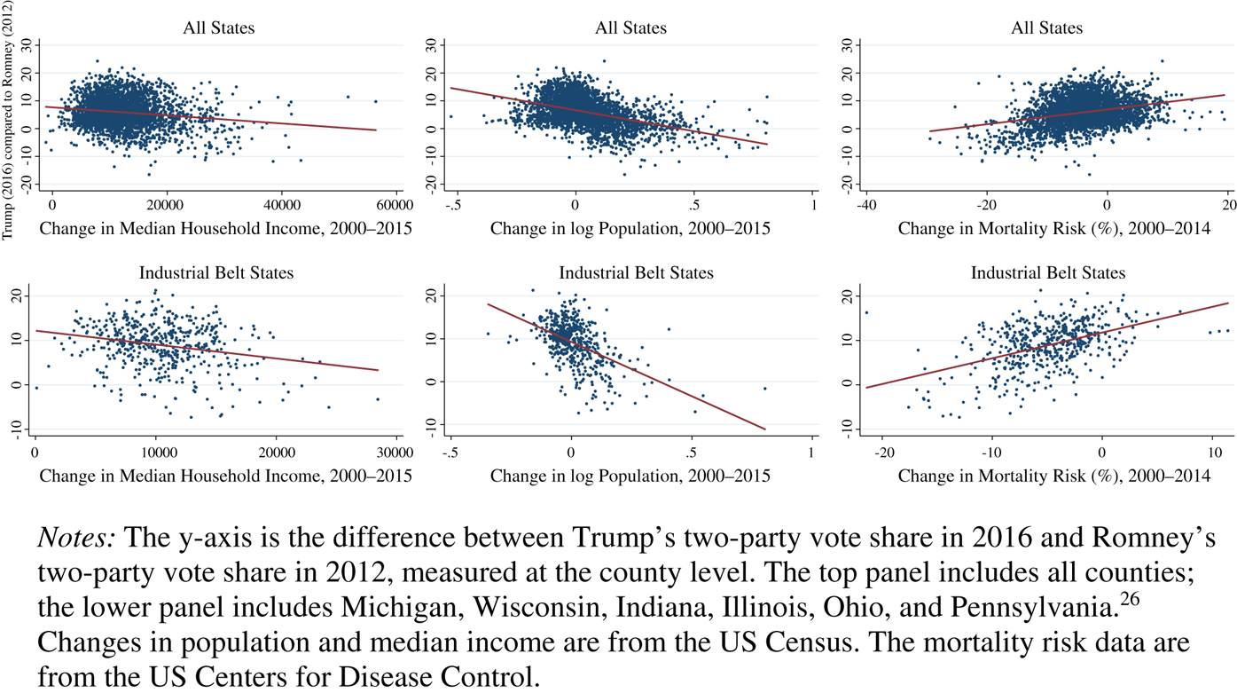
Figure 6 illustrates that the populist upsurge in the United States was strongest in counties with declining economic and social conditions. Drawing on county-level data, we plot changes in Trump two-party vote shares in 2016 (again, compared with Romney in 2012) against changes in the following three indicators: median household income, population, and mortality rates for twenty-five- to forty-five-year-olds. As shown in the top panel, Trump's populist appeal (relative to the more traditional Republican) was most resonant in counties with the weakest income growth, declining populations, and rising mortality rates. The lower panel in Figure 6 demonstrates that these relationships appear even stronger in counties in the industrial belt.Footnote 25
Correlates of voting for Trump in 2016 compared with voting for Romney in 2012
Notes: The y-axis is the difference between Trump's two-party vote share in 2016 and Romney's two-party vote share in 2012, measured at the county level. The top panel includes all counties; the lower panel includes Michigan, Wisconsin, Indiana, Illinois, Ohio, and Pennsylvania.Footnote 26 Changes in population and median income are from the US Census. The mortality risk data are from the US Centers for Disease Control.
Analyzing populism requires understanding the connections among the location of economic activities, the effects on local communities, and economic voting. The spillovers of spatial concentration are at the community level: for every new job created in a metropolitan area's productive exporting firms, five new jobs are created in that metropolitan area, three of which are for workers who have not attended college.Footnote 27 In metropolitan areas, export-oriented companies drive opportunities for less-educated workers outside of their industry, raising salaries and standards of living for all. By the same token, the spillovers are all negative for dying manufacturing regions where populism finds its strongest supporters: for each manufacturing job lost to trade competition or technical change, an additional 1.6 jobs are lost outside that sector in these communities.Footnote 28 As discussed earlier, the negative spillovers of closing industrial plants have left many once-prosperous manufacturing communities in ruins.
We explore the relationship between long-term, localized deindustrialization and support for Donald Trump in the 2016 election by estimating a simple regression model using county-level voting data. As the dependent variable, we again rely on the change in Republican two-party vote share between 2012 and 2016. We regress the dependent variable on the county-level declines in the share of manufacturing workers between 1970 and 2015, and a set of demographic and economic control variables.
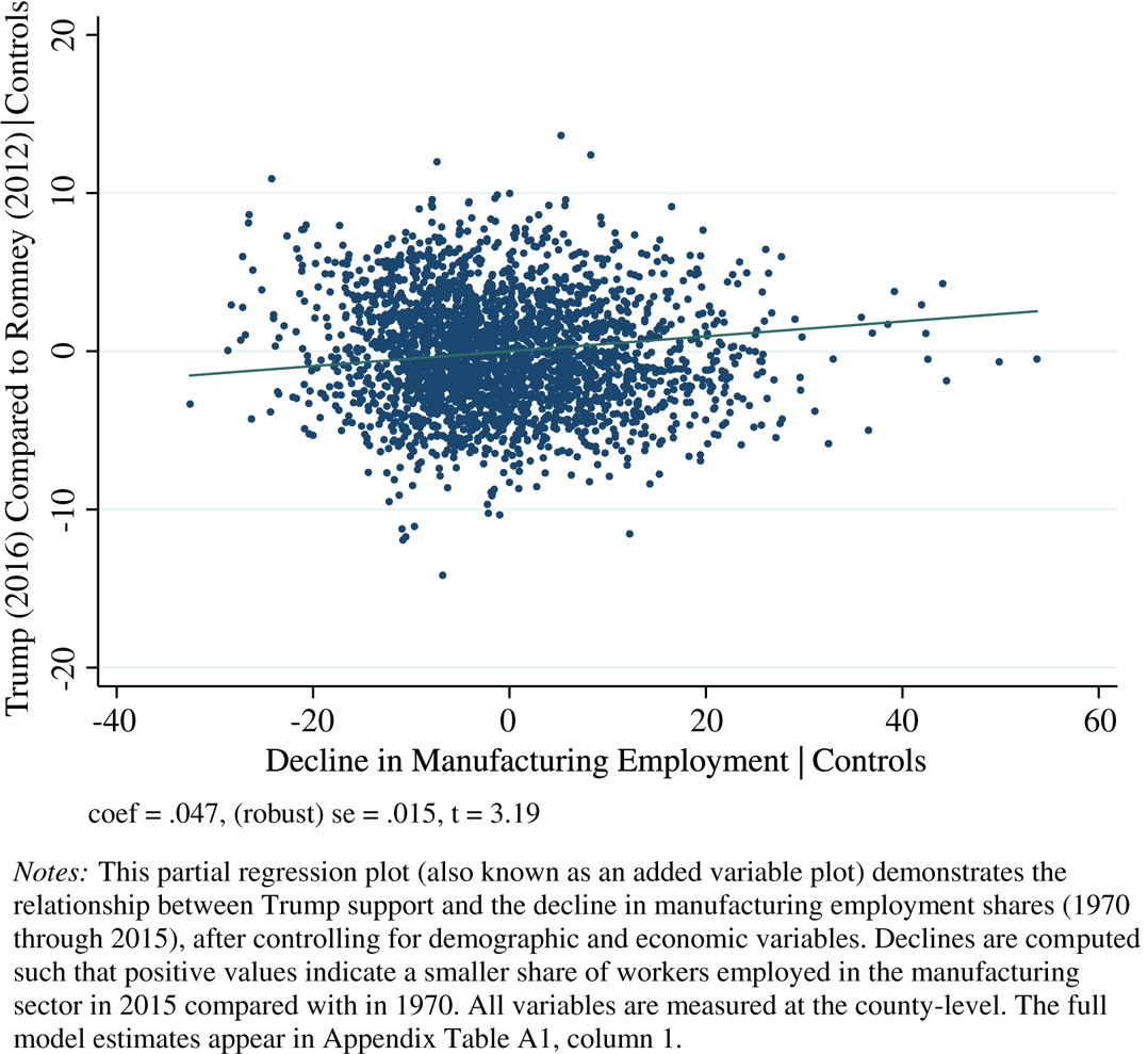
The estimates indicate stronger Trump support in counties with larger declines in manufacturing employment. The relationship is displayed as a partial regression plot in Figure 7, and the full model estimates appear in the appendix. A one-standard deviation decline in the manufacturing employment share between 1970 and 2015 (equivalent to approximately 11 percentage points) is associated with a 0.5 percent increase in Trump vote share. We also found that less populated (more rural) counties and those with older, whiter, and less educated populations were more supportive of Trump.Footnote 29 Deindustrializing communities appeared drawn to the candidate's more populist, antiglobalization campaign.
Deindustrialization and support for Trump in the 2016 US presidential election (county-level regression estimates)
coef = .047, (robust) se = .015, t = 3.19
Notes: This partial regression plot (also known as an added variable plot) demonstrates the relationship between Trump support and the decline in manufacturing employment shares (1970 through 2015), after controlling for demographic and economic variables. Declines are computed such that positive values indicate a smaller share of workers employed in the manufacturing sector in 2015 compared with in 1970. All variables are measured at the county-level. The full model estimates appear in Appendix Table A1, column 1.
In contrast, voters in more competitive local economies were less likely to support Trump in 2016. Appendix Figure A1 shows that higher shares of workers in business services—an industry in which the United States has a strong comparative advantage and from which exports have increasedFootnote 30—negatively correlate with increases in Trump vote shares at the county level. That is, US communities featuring more workers in comparatively advantaged industries are more likely to shun right-wing populism.
Populism has its roots in the stark geographic inequalities in prosperity and opportunity over past decades. In the United States, communities’ economic prospects have diverged along a number of dimensions. Income has become progressively more unequally distributed since the early 1970s. Social mobility has also declined dramatically and is now lower than in most European countries. Perhaps just as striking is the fact—in line with the points made previously—that social mobility varies dramatically across American regions: children in the prosperous Northeast and West have substantially more promising futures than children from poorer families in the Midwest and South.Footnote 31 The effects of the regional specificity of many of these trends are heightened by the fact that inter-regional mobility in the United States has declined dramatically, so that those “stuck” in declining areas find it ever more difficult to leave.Footnote 32
The decline in social mobility in the hardest-hit regions, along with the decline in inter-regional mobility, help explain why regional economic fortunes have tended to diverge rather than converge. If children in declining regions have access to only poor educational systems, they cannot develop the skills that would allow them to move to more prosperous areas. And as housing prices fall in communities in decline and rise in prosperous communities, homeowners—and even renters—in struggling regions find it increasingly difficult to move to areas doing better.Footnote 33
Populist sentiment in Europe exhibits similarly strong regional and community features. In Western Europe overall, Chinese import shocks are associated, at the level of electoral district, with “an increase in support for nationalist and isolationist parties … [and] an increase in support for radical-right parties.”Footnote 34 Higher local unemployment leads to more votes for populist parties.Footnote 35 District-level economic characteristics had a powerful impact on the vote on the British referendum to exit the European Union.Footnote 36 In the United Kingdom, local susceptibility to Chinese imports—a British China shock—is strongly associated, at the level of the individual, with the emergence of authoritarian personality traits.Footnote 37 The success of the right-wing populist Sweden Democrats is closely related to the “local increase in the insider-outsider income gap, as well as the share of vulnerable insiders.”Footnote 38 These and many other studies make it clear that in Europe, too, there is a strong association between local economic distress, on the one hand, and political reactions that contribute to right-wing populism, on the other.
Although we emphasize the economic and social interdependences within communities, local cultural characteristics interact with local conditions to affect support for populism.Footnote 39 The two main explanations for populist outcomes—one emphasizing economic anxiety, the other emphasizing white voters’ loss of status as the dominant group in society—are not mutually exclusive. For example, congressional districts with majority white populations are more likely to elect conservative Republicans in response to an increase in import competition, whereas trade-affected districts with non-white majority populations are more likely to elect liberal Democrats.Footnote 40 Similarly, the impact of manufacturing employment on the 2016 Trump vote is conditional on the racial composition of the county: support for Trump is positively correlated with manufacturing (and manufacturing layoffs) in predominantly white counties and among white voters, and negatively correlated with manufacturing in ethnically diverse counties.Footnote 41 When whites and non-whites react differently to similar economic pressures, it is consistent with the argument that voters separate according to their cultural identities during hard times. We discuss the implications of this community–cultural interaction in the conclusion.
Immigration from low-income countries has also been a target of at least some of the populist movements. The association between increased immigration and anti-integrationist movements has many interpretations, both economic and non-economic. For our purposes, we are especially interested in how high and/or accelerating levels of immigration relate to local socioeconomic conditions. There is substantial evidence that local unemployment or other economic distress interacts with immigration to spur a political response.Footnote 42 For example, individuals economically harmed by the Great Recession increased their opposition to immigration.Footnote 43 County-level US election results between 1990 and 2010 also reveal a pro-Republican voting response to localized increases in low-skilled immigrants in counties with more low-skilled residents.Footnote 44 This suggests a nativist political reaction to labor-market and public resource competition from immigrants, another source of support cultivated and exploited by Trump and other nationalist politicians.
Labor-market distress in manufacturing communities and/or other socioeconomic features of local areas may amplify the political effects of immigration. For example, right-wing populists may gain support by blaming immigrants (including refugees) for undermining social safety nets in communities where economic conditions are poor or deteriorating as a result of deindustrialization. If economic hardship causes people to close ranks around their cultural identities, then whites may respond to economic pressure by blaming immigrants especially if they dramatically overestimate the number of immigrants in their communities, perceive that immigrants are culturally and religiously more distinct from them, and believe that immigrants benefit disproportionately from the welfare state.Footnote 45 Although research has yet to establish whether the link between immigration and populism is caused by misperceptions on the part of voters, disinformation flowing from populists to voters about the level, composition, and costs of immigration, or some combination, the link is most evident in communities that experience long-term economic decline.
The nature of these non-economic elements varies across countries. In some cases, the populist upsurge is related to a strong urban–rural divide, with rural and exurban areas expressing hostility to the cities, whether for their cosmopolitanism, multiculturalism, or prosperity. In other cases, populists make powerful appeals to traditional cultural values. In still others, hostility is aimed, with different degrees of openness, at ethnic or racial minorities. Populist politicians have successfully built on economic distress to direct hostility toward existing political institutions and socioeconomic and political elites. They have also used, or fanned the flames of, existing cultural, racial, or ethnic prejudices to drum up support for their invocation of traditional values against the purported adversaries. Donald Trump blamed immigrants and foreign economic competition for national economic decline, all the while explicitly linking a promised revival to a nationalist agenda that would “Make America Great Again.” He also lamented the breakdown of tradition, which fed into a nationalist-populist response in areas where people were in economic distress.Footnote 46
Overall, the decline of traditional manufacturing in the OECD has had a powerful impact on these countries’ socioeconomic realities. Although there are substantial differences across countries—in line with the major social, economic, and institutional differences among them—the past four decades have not been good for communities that had previously relied on traditional manufacturing, and the decline of these communities has had important political effects.
The Impact of the Crisis
Many of the trends discussed came to a head with the global financial crisis that began late in 2007. In most countries, the pre-crisis economic expansion had dampened some of the growing discontent, although the fruits of that expansion were not evenly distributed. But the crisis had a particularly severe and long-lasting effect on the middle class and on the already-struggling regions of most countries. In the United States, it took ten years for real median household income to return to its pre-crisis levels, even as overall national income rose substantially. Median household wealth has suffered even more.Footnote 47 In much of the depressed American industrial belt, median household income remains below its pre-crisis levels, while unemployment remains high and labor force participation has dropped dramatically.
The economic crisis that began at the end of 2007 brought forth a collection of different experiences that varied greatly across localities.Footnote 48 Some localities suffered the full force of the downturn in employment, economic activity, and housing prices whereas others escaped with hardly any lasting impact. The pattern was not random. The crisis lingered in places where there had been industrial decay and hardship for a long time, magnifying the spatial economic disparities between booming cities with knowledge industries and struggling communities suffering from industrial decline. Figure 8 reveals a strong correlation between the drop in manufacturing employment share between 1970 and 2015, and the average post-crisis unemployment rate (2010 through 2015). Industrial regions already battered by the pressures of trade and technological change experienced deeper and longer economic declines than the service economies of the major metropolitan areas. Housing prices recovered quickly in cities specializing in high-skill industries and occupations, such as San Francisco, New York, and London, but remained flat or declined in manufacturing areas.
Deindustrializing counties and unemployment following the 2008–2009 financial crisis
Note: County-level correlation between the decline in manufacturing employment share between 1970 and 2015, and the average rate of unemployment from 2010 through 2015.

We examine the lingering effect of the crisis on support for Trump by considering the post-crisis average unemployment rate. To our Trump-vote-share model, we introduce the average unemployment rate between 2010 and 2015. The results reported in column 3 of Appendix Table A1 show no evidence of a statistically significant relationship between post-crisis unemployment and Trump support. However, high unemployment is associated with increasing support for Trump in localities where manufacturing employment declined more precipitously between 1970 and 2015. (Appendix Figure A2 depicts the results, which appear in column 4 of Table A1.) Contrasting experiences with the crisis catalyzed populism by even more sharply demarcating areas of prosperity from areas of decline.
In Europe, the relationship between the crisis and increased populist sentiment and voting is clear. The crisis—which was much longer and more severe in Europe than in the United States—led to a massive drop in citizens’ confidence in existing political institutions, both at the national and at the European levels. The countries hardest hit by the crisis, and the groups within countries that suffered the most, were those that saw the biggest decline in trust in government and, eventually, the biggest rise in protest voting for populists of the right and left.Footnote 49 By the same token, regions of Great Britain and France that were harder hit by the decline in housing prices—a good proxy for local economic conditions—were more likely to vote for Brexit and the National Front, respectively.Footnote 50
The connection between the crisis and the rise of Right populism in the United States is not so straightforward. Certainly the Tea Party movement was a direct reaction to the Bush and Obama administrations’ response to the crisis—one can recall that the movement began on the floor of the Chicago Mercantile Exchange with an attack on government bailouts. There is a connection between the Tea Party movement and the Trump campaign, but it is not clear cut. Nonetheless, as we have demonstrated, the counties that swung most heavily toward Donald Trump (as compared with Mitt Romney's mainstream Republican candidacy) were largely in regions of long-standing manufacturing decline. These regions were among those hardest hit by the crisis, and those where local conditions recovered more slowly if they recovered at all. The issue requires more research, but we believe that the crisis and its aftermath—both in the United States and in Europe—were a crucial catalyst that inflamed an already volatile public, especially in long-suffering areas of industrial decline.
The confluence of long-standing trends that left many small cities, towns, and rural areas in distress, and an economic crisis of a magnitude that had not been seen for seventy-five years, sparked an upsurge of anger at governments that appeared not to be able to deal effectively with either the long-term deterioration or the short-term crisis. Populist movements of various sorts started growing, reaching large proportions by 2015. Their victories in the United States and the United Kingdom in 2016, and subsequent victories or increases in influence elsewhere, appear to have ushered in an era in which powerful opposition to globalization or European integration is likely to persist and, perhaps, determine policy in many developed countries.
Our discussion to this point has focused on the sources of voters’ demand for change, and on the reasons that this demand takes on such a strong regional character. Prosperous and distressed regions—and, of course, their inhabitants—have behaved very differently in the political arena. But this political behavior is mediated through national social and political institutions that aggregate and channel regional economic and social effects into political movements and electoral outcomes. The great variety of social and political institutions across developed countries helps explain the variation in the nature of the backlash against globalization. In what follows, we analyze how this decline is reflected in different political systems, in particular with respect to the rise of anti-integrationist populism.
The Supply Side: Compensation Mechanisms and Political Institutions
The economic pressures associated with globalization and technological change are present across advanced economies, but right-wing populism is not evident everywhere, nor is it evident to the same degree in all places. In this section, we discuss how two “supply-side” institutions might help us understand crossnational and subnational differences in far right support: compensation mechanisms and electoral institutions.
Compensation Mechanisms
The postwar “bargain of embedded liberalism” recognized that mass support for globalization could be maintained by way of a government transfer system that taxed the winners from economic integration in order to fund a social safety net for the losers.Footnote 51 That bargain started to erode in many countries with the market-oriented reforms that began in the 1980s; in Europe, the fiscal austerity that followed the sovereign debt crisis reduced the safety net even further.Footnote 52 However, substantial variation in social and labor-market policies persists across the OECD. Indeed, countries with more open economies tend to have bigger governments, an outcome that many scholars attribute to election-minded governments supplying compensation as a compromise to maintain free trade policies.Footnote 53
It remains an open question whether nations with more generous compensation mechanisms have been able to moderate the effects of economic hard times on support for populists. For example, it would seem straightforward that more generous unemployment benefits could limit the impact of economic downturns on support for populists. Even in the United States, where unemployment benefits are far less generous than in most of Europe, targeted compensation has had an effect in shielding globalization's losers and providing a bulwark against protectionism. The US Trade Adjustment Assistance program (TAA)—which provides temporary income support, job retraining, and relocation assistance for workers who lose their jobs because of trade and offshoring—moderates the negative impact of globalization on support for incumbent presidents.Footnote 54 Trade adjustment assistance also curbed protectionism among voters: in the 2016 primary and the general elections, TAA benefits were significantly associated with reduced support for the antiglobalization candidate, Donald Trump.Footnote 55 However, there is not enough evidence yet to confirm a strong relationship between more generous unemployment benefits, on the one hand, and reduced populist voting, on the other. As we alluded to, the lack of evidence may be related to immigration and refugee flows, in that natives may feel that waves of migrants and refugees threaten to undermine national social policies. Although the policy tools in place to shield workers from the impact of globalization and technological change were insufficient to forestall the backlash, preliminary evidence suggests that populist parties fare worse when countries spend more on social support, and when spending has not been reduced from historical levels.Footnote 56
Labor-Market Institutions
Labor-market institutions may moderate the impact of economic downturns on support for populists, but the impact is more nuanced than in the case of unemployment insurance. Labor-market “rigidities”—including employment-protection regulations, powerful unions, and minimum wages—hinder employers’ responses to changes in business conditions, making it more onerous to hire and fire workers. The direct beneficiaries of rigid labor-market rules are employed workers—insiders—whose jobs, wages, and benefits are protected from economic shocks. Although this sort of labor-market institution may be expected to moderate the immediate impact of a recession on support for populists, it can also contribute to long-term structural unemployment, especially among the young, who have never had a chance to enjoy the protections of these institutions. More generally, labor-market rigidities create a strong “insider–outsider” dynamic, which suggests that support for populists should be highest among the outsiders: mainly temporary workers and the unemployed.Footnote 57
Active Labor-Market Policies
Government programs that intervene in the labor market to help the unemployed find work are another form of compensation that can moderate the political response to economic pressures. These policies include retraining and relocation assistance to help the unemployed improve their skills and increase their employability. Some governments also provide short-term employment subsidies that directly create jobs and allow unemployed workers to build up work experience and prevent skill atrophy. In contrast to rigid labor-market institutions, active labor-market policies benefit unemployed outsiders, which has been shown to increase support for economic integration.Footnote 58 Unlike institutions that benefit well-protected insiders with little risk of being unemployed, these programs directly benefit jobless workers by giving them access to the labor market.Footnote 59 In addition, individuals are more positive about globalization if welfare state generosity is proxied using government spending on active labor-market programs.Footnote 60
Evidence on the impact of compensation mechanisms also comes from instances in which they were rolled back, creating a new class of unprotected workers. Areas of the United Kingdom more affected by austerity measures were more likely to vote for the United Kingdom Independence Party and for Brexit.Footnote 61 Similarly, a reduction in social spending has been associated with an increase in populist voting across seventeen European countries since 1990.Footnote 62 In Sweden, for example, the center-right coalition government that was elected in 2005 implemented a six-year program of social-insurance austerity that triggered a sharp increase in inequality and sparked a populist backlash. Swedes who experienced a relative income decline and higher job insecurity as a result of these reforms are over-represented among the politicians and voters of the radical-right Swedish Democrats, compared with the general population and other political parties.Footnote 63 The recent problems of embedded liberalism in Europe and at its Scandinavian core reinforce the sense that the maintenance of the LIO may require redistributive compensation.
Inasmuch as compensation was originally designed to protect citizens from the vagaries of the global economy in return for political support for economic integration, it remains puzzling that mainstream political parties failed to extend such protections as they systematically dismantled barriers to trade and capital flows. Well before Donald Trump captured the Republican Party, critics argued that the US TAA program was an inadequate barrier against the rise of protectionism as globalization deepened.Footnote 64 As Edward Alden documents in his book Failure to Adjust, a 1971 memorandum by Nixon administration aide Pete Peterson advocated an ambitious set of adjustment assistance policies to “facilitate the processes of economic and social change brought about by foreign competition.”Footnote 65 Peterson warned: “A program to build on America's strengths by enhancing its international competitiveness cannot be indifferent to the fate of those industries, and especially those groups of workers, which are not meeting the demands of a truly competitive world economy. It is unreasonable to say that a liberal trade policy is in the interest of the entire country and then allow particular industries, workers, and communities to pay the whole price.”Footnote 66
Peterson's advice was, of course, largely ignored. And well before the UK Independence Party (UKIP) transformed party politics in Britain by pushing the Conservatives toward economic nationalism, skeptics were warning about inadequate social protections for workers and communities.Footnote 67 The populist threat to the LIO cannot be fully comprehended without understanding why compensation has failed to keep pace with the deepening of globalization. The answer may have to do with electoral institutions.
Electoral Institutions
Electoral institutions are clearly part of the story of the differential rise of populism, but their role is complex. Throughout the OECD, political life has been dominated by political parties that have, broadly speaking, accepted the desirability of the LIO. But this centrist consensus masked the gradual emergence of political dissatisfaction. Today, political institutions across the OECD are in crisis precisely because dominant parties and politicians ignored the socioeconomic trends that had been fracturing their societies for decades. There were clear warning signs. In the 1990s in the United States, Ross Perot and Pat Buchanan garnered millions of votes as political outsiders campaigning on economic nationalism. In Europe, right-wing and Euro-skeptic parties have long been a feature of political life, but mainstream parties have always shunted them to the margins. In regions of Europe more exposed to globalization, centrist parties have been losing votes to extremist parties for more than a quarter of a century, but did little to stop the bleeding.Footnote 68
Electoral institutions help explain the nature of political competition and therefore the nature of parties’ responses to economic pressures such as industrial decline. Where first-past-the-post plurality systems are in place, politics has been dominated by two major parties or blocs.Footnote 69 In such political systems, those who feel unrepresented by the dominant parties have only two choices: they can vote for new political parties that challenge the mainstream, or for insurgent candidates within the existing parties. France's experience with the National Front seems closest to the former pattern; the US trajectories of the Sanders and Trump candidacies conform to the latter pattern. The United Kingdom experienced a similar phenomenon: given general agreement between the bulk of both major parties, disgruntled politicians and voters found a way to reject existing trends via Brexit. When the two dominant parties give dissatisfied voters few options that they like, these voters can react either by deserting traditional parties or by voting to fundamentally transform them. On the left, Syriza in Greece and Podemos in Spain would appear to fit into the category of creating a new force in what had been a largely two-party (or two-bloc) system.
Proportional representation (PR) systems tend to produce multiple parties, and are more open to new populist parties, because entry into the legislature is easier. This may defuse some of the populist sentiment, but if they gain enough strength, these parties can be essential to forming a government. In any event, the nature of the national political system will surely affect the form that a populist backlash might take.
The aggregation of economic preferences depends on electoral rules and institutions, but scholarship largely ignored political geography in the run-up to populism.Footnote 70 Politicians, by contrast, have been keenly aware of the interplay between economic and political geography. In the United States, manufacturing decline is concentrated in the industrial heartland, centered on the Great Lakes and the Ohio River valley. The political importance of this region is magnified in national—especially presidential—elections because the country's two major political parties hotly contest the swing states in the industrial belt. Although the industrial Midwest has been typically a Republican stronghold, the big cities were more commonly Democratic, and elections in such states as Pennsylvania, Ohio, Michigan, Illinois, and Wisconsin have, since the 1970s, often been fiercely contested by the two parties. This has made these swing states central to the politics of globalization. To win a presidential election, a candidate has to take the bulk of the swing states in the industrial belt. This has given antiglobalization communities in the industrial belt an outsized role in national elections, as Donald Trump demonstrated in 2016.
The economic pressures of globalization and automation are ubiquitous across the OECD, but right-wing populism varies in degree as well as in kind. Populist parties of the right have seen strong growth in Eastern Europe and some Nordic countries but have barely registered on the Iberian Peninsula. National-level differences in social and political institutions help explain this variation, but their impact needs more research. The ability of compensation mechanisms and active labor-market policies to mitigate support for extremism may be conditional on immigration and refugee flows. Rigid labor-market institutions may cushion insiders temporarily from economic pressures but the increase in long-term unemployment may lead outsiders to vote for populists. A focus on electoral institutions would lead us to expect that people would not waste their votes on right-wing populist parties in majoritarian systems, but populists usurped the mainstream center-right party in the United States and circumvented it by referendum in the Unied Kingdom.
Despite differences in its timing or form, the populist backlash has run roughshod over existing political institutions. The traditional party systems of France and Italy are gone; those of Germany and Spain are in big trouble; and in the big two-party systems, the United States and the United Kingdom, the backlash has torn both parties apart. Through it all, it is unclear why centrist political parties failed to respond to the underlying economic and political trends, allowing populists (both right and left, but mostly right) to step into the vacuum.
Confronting the Populist Assault
It may be that supporters of the LIO will be able to regroup and organize themselves to confront the populist assault on globalization and European integration. There are powerful interests with a great deal at stake in defending the contemporary economic system. These include the major international banks and nonfinancial corporations that tend to support both economic integration and the basic principles underpinning multilateral international institutions. Important segments of the population of the advanced industrial countries continue to support economic and political integration—especially those high-skilled and highly educated individuals who have benefited from the process. As we have pointed out, most countries exhibit striking geographical differences, with clear distinctions between the prosperous cities and regions, on the one hand, and the struggling distressed areas, on the other. The prosperous regions continue to dominate politics and policy in many countries.
Nonetheless, there are very real threats to the international economic order as currently constituted, and the opponents of these threats appear weak in many countries, especially in the United States. The disarray in which most parties and party systems find themselves demonstrates the difficulty that mainstream politicians have had in providing an alternative to populism. In many cases, mainstream parties have moved in the direction of populist policies in an attempt to recoup some of their prior political losses. In the United States, for example, the Democratic Party's response to the Trump administration's rhetoric or policies toward international trade has largely been to accuse it of not being protectionist enough. Indeed, Chuck Schumer, the Democrats’ leader in the Senate, has said that “Trump bent to China,” and that “he has sold out” with a “weak, feckless … trade deal.”Footnote 71 In this context, it is easy to believe that little stands in the way of a continued trend in American economic policy toward greater hostility to international trade, investment, and finance.
Although it is possible that the LIO may limp along in the absence of US participation and leadership—as with the rebranded Comprehensive and Progressive Agreement for Trans-Pacific Partnership, and the World Trade Organization (WTO) Appellate Body workaround agreement formalized by the European Union and fifteen other WTO members in March 2020—the LIO without the United States will surely sustain a rollback of global economic integration.
Conclusion
Understanding the sources of the upsurge in populist hostility toward economic and political integration in Europe and the United States is arguably the most important task facing contemporary social scientists. The threat to the LIO is real. In this article, we mapped a path forward that emphasizes three points. First, the distributional effects of globalization, and of the structural decline of the manufacturing sector, have been at work for a long time in the OECD. Although the entry of China into the world economy exacerbated ongoing pressures on lower-skilled, less-educated industrial workers, those pressures have existed since the 1970s. Second, the appropriate unit of analysis to study populism is the community, not the individual. This is because economic shocks have strong local spillovers. In places where manufacturing is in consistent decline, industrial workers obviously are harmed, but so are other people who live near the shuttered factories: local businesses of all kinds suffer, young people often leave or turn to drugs, real estate values plummet, and social services decline. Third, the global crisis of 2008 through 2009 compounded the pressures of industrial decline and catalyzed populism in the OECD. The costs of the crisis fell most heavily on the places and the people that were already under duress—industrial communities and those with middle-class incomes—fueling populist anger toward elites and resentment toward the status quo. In addition to these three main points, we also provided conjectures about how domestic compensation mechanisms and political institutions may affect the level and the form of populism.
Future research on populism has much to analyze. We need to know more about how long-term patterns of localized economic prosperity and decline affect political behavior, such as support for populism. Scholars have examined the direct impact of trade and technological change on industrial workers and communities, but it is clear that these effects resonate well beyond firms and workers in the manufacturing sector. New research should focus on how entire communities, not just specific individuals, occupations, industries, or factors of production, are affected by economic change. It should also explore how the indirect effects of manufacturing decline affect local turnout and voting behavior, and through which channels: employment, real estate prices, local public services, disability, opioid use, or mortality? We also need more and better research about the conditioning effects of cultural identities. Even though combining local economic hardship with identity politics is complicated, this is the research frontier. A crucial question is why whites and non-whites respond differently to manufacturing decline in their communities. Economic geography might again help explain the difference: if non-white manufacturing workers are more likely to live in economically robust cities such as New York and Los Angeles, they might be more likely to find re-employment in a dynamic sector than white manufacturing workers in the industrial heartland would be. But cities are also ideologically specialized, with large majorities of left-wing voters, and this might suggest a political geography explanation: parties on the left may be structurally incapable of fielding nativist candidates because of their racially diverse urban constituencies.Footnote 72
Our understanding of the broad and deep impact of the global financial crisis is similarly incomplete, although it is clear that in most cases, already declining industrial communities suffered longer and more deeply from the crisis than booming metropolitan areas did. There are differences in the nature of the populist upsurge among developed—and developing—countries, much of which is undoubtedly driven by differences in the labor-market and social institutions of these societies, as well as differences in their electoral institutions. All of this calls out for substantial further research.
Other important unresolved questions have to do with the failure of mainstream political parties and political elites to anticipate the backlash and take steps to address it before populists overwhelmed them. No one should be surprised that there has been a backlash against globalization, given the scale of the disruption that has resulted from there being more interconnected economies. What is surprising is that little was done to temper it. Why didn't existing parties, or parts of them, moderate their support for globalization or the EU, or combine such support with the expansion of compensation? Why did the challenges largely come from outside existing party systems rather than from within them? Why did the new challengers adopt such a powerfully populist, anti-elite (and demagogic) message? In short, why did political institutions in advanced democracies fail to represent the people and the communities that were left behind by globalization and skill-biased technological change?
Populist movements, parties, and governments around the world have called into question the structure of the contemporary international economy. Whatever one's views on their goals and methods, today's populist upsurge represents a serious internal opposition to the established socioeconomic and political order. A full analysis of the bases of support of this upsurge, and of the way it navigates existing political systems, is essential for understanding populism's challenge to the reigning liberal international economic order and, potentially, to addressing that challenge.
We close with the policy implications of our analysis. We have argued that the populist threat to the LIO has its base in the long-term decline of manufacturing communities. It follows that policies to reduce populism and increase support for international cooperation should target communities, as opposed to individuals, and should extend beyond existing policies, such as the TAA program, which target directly affected workers. For most of the twentieth century, the forces of convergence worked to eliminate geographic differences in incomes, employment, and economic activity, rendering place-based policies moot. But economic convergence across regions has slowed greatly in recent decades, and rising inequality—and the populist political backlash that it has engendered—has led experts to embrace “place-based” policies that bolster economic and social conditions in declining areas.Footnote 73 In the presence of persistent geographical disparities in economic performance, place-based policies have the potential to affect the location of economic activity, wages, employment, and industrial mix of communities. Well-designed policies, such as spatially targeted employment credits and public investments in agglomeration-intensive infrastructure and higher education,Footnote 74 may be able to address the geographic differences in economic performance that have given rise to populism.
Data Availability
Replication files for this article may be found at <https://doi.org/10.7910/DVN/H6AEVV>.
Supplementary Material
Supplementary material for this article is available at <https://doi.org/10.1017/S0020818320000314>.
Acknowledgments
We thank Sophie Hill for exceptional research assistance. We are grateful to Alena Drieschova, Barry Eichengreen, Judy Goldstein, Jana Grittersova, Michael Klein, Margaret Peters, Kenneth Scheve, and Dustin Tingley for comments. We also thank seminar participants at New York University, the University of California, Riverside, the University of California, San Diego, the University of Wisconsin, the University of Zurich, and Washington University in St. Louis for helpful feedback.


