

Introduction
Many societal challenges, such as public health crises and climate change, require policymakers to implement interventions aimed at changing behaviour (Carroll et al., Reference Carroll, Caulfield and Ahern2019). However, these interventions often fail without public support, which is crucial for policy implementation and compliance (Burstein, Reference Burstein2003, Reference Burstein2020; Reynolds et al., Reference Reynolds, Stautz, Pilling and Marteau2020; Grelle and Hofmann, Reference Grelle and Hofmann2024; WHO Regional Office for Europe, 2024). The current research examines how communicating evidence of policy effectiveness influences public support. This strategy has increased the public’s acceptance of interventions, such as vaccine uptake, by enhancing perceptions of policy effectiveness – a key predictor of support (Bigman et al., Reference Bigman, Cappella and Hornik2010; Promberger et al., Reference Promberger, Dolan and Marteau2012; Pechey et al., Reference Pechey, Burge, Mentzakis, Suhrcke and Marteau2014; Reynolds et al., Reference Reynolds, Stautz, Pilling and Marteau2020). However, it remains unclear whether statistical evidence from scientific research, personal anecdotes from the public, or a combination of both is most effective in achieving this goal.
The persuasiveness of different types of evidence
Policy information may be communicated using statistical evidence (e.g., ‘Research shows this policy could reduce greenhouse gas emissions by 22.1%’) and qualitative, anecdotal evidence (e.g., ‘I think this policy would help us reduce our carbon footprint’). While statistics are often regarded as the most effective way to change people’s beliefs, attitudes and intentions (Graeber et al., Reference Graeber, Roth and Zimmermann2024), evidence on this issue is mixed. Recent meta-analyses (Freling et al., Reference Freling, Yang, Saini and Itani2020; Xu, Reference Xu2023) found that while statistical and anecdotal evidence had similar effects on beliefs, attitudes, and intentions overall, anecdotal evidence was more persuasive when issues were personally relevant or contained high emotional stakes (Freling et al., Reference Freling, Yang, Saini and Itani2020). For example, anecdotes were more effective in public health messaging about personal health issues (Betsch et al., Reference Betsch, Renkewitz, Betsch and Ulshöfer2011; Xu, Reference Xu2023). This suggests that anecdotes may be more persuasive than statistics in certain contexts.
Combining statistical and anecdotal evidence may be more persuasive than either alone. Combined evidence improved U.S. public attitudes and intentions towards skin cancer interventions more than anecdotes or statistics alone (Zhou and Yang, Reference Zhou and Yang2024). However, its effectiveness may depend on anecdote type, with combined evidence using individual-based anecdotes being more effective than single pieces of evidence, while combined evidence using group-based anecdotes are not (Niederdeppe et al., Reference Niederdeppe, Roh and Dreisbach2016; Hornikx, Reference Hornikx2018; Zhou and Yang, Reference Zhou and Yang2024).
In real-world policy communication, the public often encounters conflicting evidence, including contradictory expert opinions and mixed messages from social media. For example, exposure to conflicting information on red meat and health risks reduces public trust in scientific consensus and confidence in the evidence (Iles et al., Reference Iles, Feldman, Quick, Ho and Barnes2022). Similarly, counterarguments using statistics in online comments from the public can weaken belief in climate crisis news (Hinnant et al., Reference Hinnant, Subramanian and Young2016, Reference Hinnant, Hu and Ash2023). Long-term exposure to conflicting health messages also increases resistance to health campaigns, even on unrelated health issues (Nagler et al., Reference Nagler, Bigman, Cappella and Hornik2022).
Overall, these mixed and sometimes limited research findings highlight the need for further study into the effect of anecdotal, statistical, combined, and conflicting evidence in policy communication to avoid eroding public trust and support (Reynolds et al., Reference Reynolds, Stautz, Pilling and Marteau2020).
Overview of current research
We conducted three online experiments to examine how different types (statistical, anecdotal or combined) and directions of evidence (for or against a policy) influenced UK adults’ perceived policy effectiveness and support across various policy domains. Ongoing debates question whether people process political evidence through rational evaluation or motivated reasoning, emphasising the need to establish effects across various evidence types and policy domains before examining the underlying mechanisms. Recent meta-analyses have produced inconclusive findings on the impact of different evidence types (Freling et al., Reference Freling, Yang, Saini and Itani2020; Xu, Reference Xu2023), highlighting the importance of first documenting these effects before delving into the mechanisms involved.
We focused on policies addressing pressing societal issues with typically low public support, including public health (e.g., banning e-cigarettes), climate change (e.g., taxing meat and seafood), and community safety (e.g., 20 mph speed limits). In all three studies, we used a within-subjects design. Participants saw various policies (e.g., meat/seafood tax, 20 mph speed limit) and rated the effectiveness of each policy and their support for it. They were then shown a specific type of evidence about each policy (different for each policy) and asked to rate each policy again. In Study 1, we used the following types and directions of evidence: statistical evidence supporting policy effectiveness, personal anecdotes covering a positive or negative opinion on effectiveness, a combination of positive statistical and anecdotal evidence, and a combination of positive statistical and negative anecdotal evidence. In Study 2, we added a stronger statistics condition for the statistical evidence, and in Study 3, we added a new condition combining positive and negative anecdotes. Our first research question was:
What effect (if any) does evidence condition have on (a) change in perceived policy effectiveness and (b) change in policy support?
A key limitation of research on communicating policy effectiveness is that studies only identify the effects of different evidence types, and offer limited insight into why these effects occur (Oeberst and Imhoff, Reference Oeberst and Imhoff2023; Simon and Read, Reference Simon and Read2023), which is crucial for informing communication strategies (Bago et al., Reference Bago, Rand and Pennycook2023). To address this, we used qualitative methods in Studies 1 and 2 to examine participants’ thought processes when evaluating policy evidence, identifying policy considerations beyond effectiveness that may inform changes in perceived policy effectiveness and support. Similar approaches have been applied in health and climate communication (Guan et al., Reference Guan, He, Yang and Zeng2023; Song and So, Reference Song and So2023; Wolf et al., Reference Wolf, White, Poortinga, Fisher and Whitmarsh2024). Our second research question was:
What issues do people consider when reasoning with policy evidence and explaining their policy views?
Study 1
Method
All studies were approved by the UCL Psychology Ethics Committee
(EP/2018/005). The Open Science Framework project for this research (Rodger et al., Reference Rodger, Sanna, Cheung, Raihani and Lagnado2025; https://doi.org/10.17605/OSF.IO/3QTZJ) contains all pre-registered protocols (https://doi.org/10.17605/OSF.IO/M7X4R), supplementary materials and measures (https://doi.org/10.17605/OSF.IO/H6YGR), raw data (https://doi.org/10.17605/OSF.IO/Z4WEM) and analysis files (https://doi.org/10.17605/OSF.IO/YKCS4).
Participants
We performed an a priori power analysis with SIMR (Green and MacLeod, Reference Green and MacLeod2016), which uses simulation-based power calculations appropriate for mixed-effects models, using pilot data (N = 100; see demo2_pilot2_analysis.Rmd on OSF). The effect size was defined by setting fixed effects at 4 points on the 100-point scale when comparing evidence conditions. We powered for 4% as previous work noted that small changes to public support, such as 4%, can impact policy outcomes (e.g., the EU referendum, which came down to 3.8%, Reynolds et al., Reference Reynolds, Stautz, Pilling and Marteau2020). We calculated that a sample size of 250 participants would provide 90% power to detect this effect, based on power curve analysis for samples of 100, 150, 200, and 250 participants. We recruited 301 participants via Prolific (http://www.prolific.com), as 300 was the minimum required by Prolific for their representative sampling. After collecting Study 1 data, we conducted a further power analysis with the same method (see demo2_study_2_analysis.Rmd on OSF), which validated our sample size decisions for subsequent studies.
We recruited UK adults eligible to vote and representative of the UK voting population in terms of age, gender and political affiliation using UK census data. Participants were UK residents aged 18 and above, fluent in English and paid £4.11. Table A1 (Supplemental Methods) detail participant demographics. The Study 1 sample (N = 301) had a mean age of 46.2 years (SD = 15.92), 52% identified as women, 48% as men, 87% as white, 54% were employed full-time, and 59% held a Bachelor’s degree or higher. Politically, 47% were affiliated with the Labour Party and 18% with the Conservative Party.
Design
We conducted a within-subjects experiment through Qualtrics (http://www.qualtrics.com), where participants were exposed to all six evidence conditions (Table A2), with each evidence condition randomly paired with a different policy (Table A3). This resulted in a repeated measures design with evidence condition as the fixed effect of interest and policy as a crossed random factor to enhance generalisability across different policy domains. Note that the ‘Combined Congruent’ condition includes two pieces of positive evidence (and not negative evidence), and the ‘Combined Incongruent’ condition in Study 1 included positive statistical evidence and negative anecdotal evidence. We did not test the full factorial of evidence types and directions, excluding negative statistical evidence. This decision was made for two reasons: (1) including negative statistical evidence would have significantly increased study length, potentially burdening participants, and (2) policymakers are unlikely to use statistics to highlight policy ineffectiveness in communication campaigns, making it slightly less relevant to current research.
Our dependent variables were changes in perceived policy effectiveness and policy support before versus after exposure to evidence. We also collected open-text data by asking participants to freely list their thoughts while viewing policy evidence (‘thought-listing’) and to explain their posterior policy judgements via open-text responses.
Materials and measures
Policies. We selected policies aimed at changing public behaviour that have varying levels of public support (<70%) and have not been rolled out nationwide across the UK. We reviewed academic research and reports from organisations such as the OECD to identify recommended policies for tackling public health, climate change, and community safety issues and to assess public support for each policy (see Table A3 for references used to source these policies). Support levels observed in our pilot study confirmed that these policies met our selection criteria (see OSF, demo2_pilot2_analysis.Rmd). This approach ensured we tested evidence effects across diverse policy contexts with varying levels of baseline support to enhance generalisability.
Policy evidence. Across all policies, we followed the same stimuli-generation protocol for each evidence condition (see OSF). For the ‘Control’ condition, we presented a brief rationale that the policy aimed to tackle a societal challenge. The ‘Statistic’ condition presented plausible UK-relevant statistics on policy effectiveness from existing research. For the ‘Anecdote For’ and ‘Anecdote Against’ conditions, we used ChatGPT to generate anecdotes based on real public opinions from existing qualitative research on each policy. The research team reviewed all anecdotes to ensure they accurately reflected authentic public concerns and maintained appropriate tone and realism (see OSF, demo2_stimuli_generation_protocol.docx). The credibility scores (M > 60 out of 100 across all conditions) from the pilot study and Study 1 also suggested that participants viewed the stimuli as credible and did not systematically interpret certain evidence types as less credible. Table A2 shows an overview of evidence conditions and example stimuli.
Measures. We used the following measures in the study:
Perceived effectiveness: Participants rated (dis)agreement with the statement: ‘[Policy X] is an effective solution for tackling [Issue Y] in the UK as it will change [Behaviour Z].’ (1 = Strongly disagree, 100 = Strongly agree). For example: ‘Introducing energy quotas is an effective solution for tackling climate change in the UK, as it will reduce household energy use.’ We calculated a change score by subtracting the posterior from the prior judgment. This measure was adapted from prior research on communicating policy effectiveness evidence (Mantzari et al., Reference Mantzari, Reynolds, Jebb, Hollands, Pilling and Marteau2022; Reynolds et al., Reference Reynolds, Hobson, Marteau and Pilling2022) and follows typical measurement formats in belief updating research (Vlasceanu et al., Reference Vlasceanu, McMahon, Van Bavel and Coman2023). In Study 1, participants provided open-text explanations for their posterior effectiveness ratings.
Support: ‘How much do you support or oppose the implementation of [Policy X] in the UK?’ (1 = Strongly oppose, 100 = Strongly support). We calculated a change score by subtracting the posterior from the prior judgment. This measure was also adapted from prior research on communicating policy effectiveness evidence (Mantzari et al., Reference Mantzari, Reynolds, Jebb, Hollands, Pilling and Marteau2022; Reynolds et al., Reference Reynolds, Hobson, Marteau and Pilling2022). We added a reference to policy ‘implementation’ to align with current definitions of policy support (Grelle and Hofmann, Reference Grelle and Hofmann2024) and broader policy support research (Petrescu et al., Reference Petrescu, Hollands, Couturier, Ng and Marteau2016). In Study 1, participants provided open-text explanations for their posterior support ratings.
Thought listing: We asked participants to read the evidence and write their thoughts without filtering them in an open-text box.
Evidence credibility: Based on Appelman and Sundar (Reference Appelman and Sundar2016), participants rated how well different adjectives (e.g., accurate, authentic, believable) described the evidence (1 = Describes very poorly, 100 = Describes very well). We averaged responses (α = 0.96, high reliability). More details and results (no credibility differences across conditions) are available on OSF.
Procedure
Study 1 took an average of 30 minutes. The full Qualtrics survey, available on OSF, included the following steps:
1. Instructions: Participants were informed that the study examined public opinions on UK government policies related to health, safety, and climate change, as well as how people evaluate policy-related information.
2. Baseline measures: Participants reported their prior perceived effectiveness and support for each of the six policies in a random order.
3. Evidence conditions. Participants were told they would read six excerpts from citizens’ juries discussing various policies. The six evidence conditions were presented in random order, with the following process for each
i. Each evidence condition was paired with a randomly selected policy (without replacement), meaning once a policy had been selected, it was not selected in any proceeding evidence conditions.
ii. Participants read the stimulus related to the selected policy and evidence condition, then responded to the thought-listing task and message credibility questions.
iii. After viewing the stimulus, participants reported their posterior perceived effectiveness and support, providing open-text justifications for their responses.
4. Final measures: Participants responded to demographic measures.
Data analysis
Quantitative data analysis. All analyses were conducted in R (Team, R Core, 2023), following the preregistered analysis plan on OSF. We used the lme4 package (Bates et al., Reference Bates, Maechler, Bolker and Walker2024) to run linear mixed-effects models assessing the effect of evidence condition on change in perceived effectiveness and support. The model was specified as: Outcome ∼ Evidence Condition + (1 | Participant) + (1 | Policy) + (1 | Stimuli)Footnote 1. To test direct comparisons, we ran the model with two different reference groups: the ‘Control’ and the ‘Statistic’ condition. We hypothesised that in comparison to each reference condition, the ‘Statistic’ (compared to the control condition only), ‘Anecdote For’, and ‘Combined Congruent’ conditions would have a larger increase in both outcomes, the ‘Anecdote Against’ would have a larger decrease in both outcomes and the ‘Combined Incongruent’ would have different change in both outcomes. We had a non-directional hypothesis for the ‘Combined Incongruent’ condition due to limited prior research on the effect of this type of evidence. We applied a significance threshold of p < .005, using the Bonferroni correction for ten direct comparisons across two models.
Qualitative data analysis. We conducted a ChatGPT-assisted qualitative content analysis (Bijker et al., Reference Bijker, Van de Walle and Voorn2024) using GPT-4o (OpenAI, 2025) to develop a coding scheme and code the dataset. GPT-4o was accessed via the API using the openai package (Rudnytskyi, Reference Rudnytskyi2023) in R. The full protocol, including code, prompts, and the researcher-developed codebook, is available on OSF. The process is summarised below:
Data Preparation: Participants’ open-text responses were processed by GPT-4o to generate discrete meaning units (1–4 per response). This was repeated three times, producing three datasets. Two authors reviewed the discrete meaning units to assess whether they accurately reflected content in the original response for 75 responses per dataset, resolving discrepancies through discussion. Precision, calculated as correct meaning units divided by total units, ranged from 0.87 to 0.91. The most precise dataset was selected for analysis.
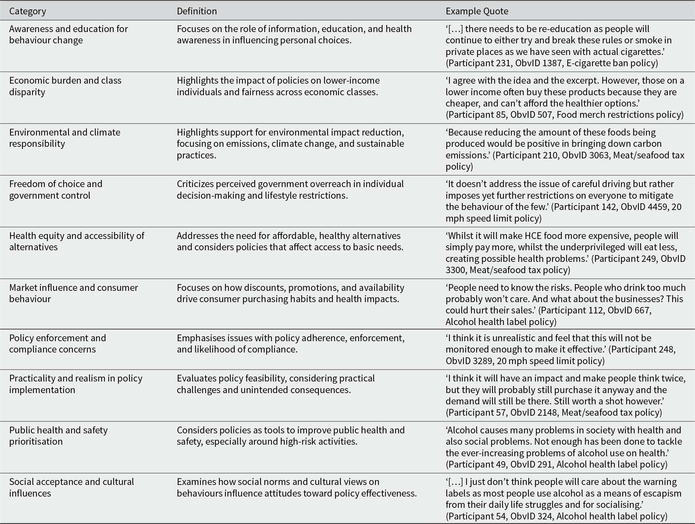
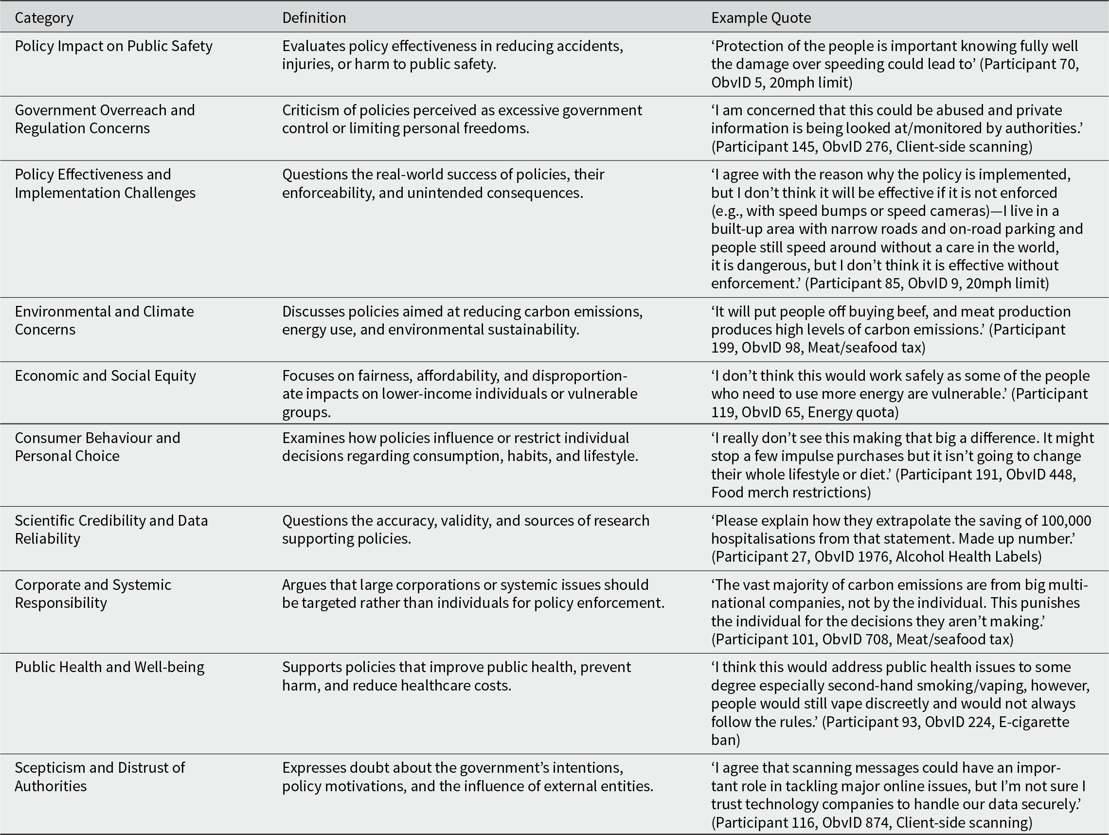
Coding Scheme Development & Coding: GPT-4o generated three coding schemes from the most precise dataset based on patterns in the first 75 responses, removing one for redundancy. The full dataset was coded using the remaining two, each coded three times to simulate multiple coders. Inter-rater agreement (0.79 vs 0.82) was calculated, and the highest agreement scheme (0.82) was selected. R was used to compare category distributions across evidence conditions, policies, and participant groups. The final codebook (Table 1) includes example quotes. Unclassifiable responses were categorised as N/A. Table A4 reports N/A responses per policy.
Study 1: GPT-developed codebook for qualitative data analysis
Validity Assessment: GPT-4o’s coding scheme was compared to a manually developed scheme based on 25% of the dataset. While GPT-4o identified similar themes (e.g., fairness), it produced fewer, higher-level codes. This aligned with the study’s goal of providing a broad descriptive overview of issues raised by participants.
Results
Quantitative results
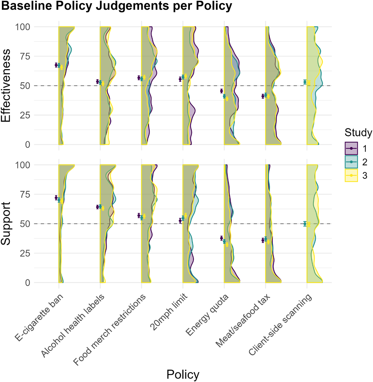
At baseline, participants generally opposed energy quotas and meat/seafood taxes, rating them as ineffective (M < 50). Most other policies received neutral ratings (∼50%) for effectiveness and support, while the e-cigarette ban and alcohol health labels had the highest support ratings. Figure 1 shows similar baseline trends across studies.
The plot shows the distribution (density plots), mean (points) and standard error of baseline policy judgements per policy for each study. The grey dashed line denotes a neutral policy judgement (i.e., Neither effective nor ineffective & neither support nor oppose). Each policy was rated by N = 301 (Study 1; 1806 observations), N = 300 (Study 2; 2100 observations) and N = 307 participants (Study 3; 2149 observations).
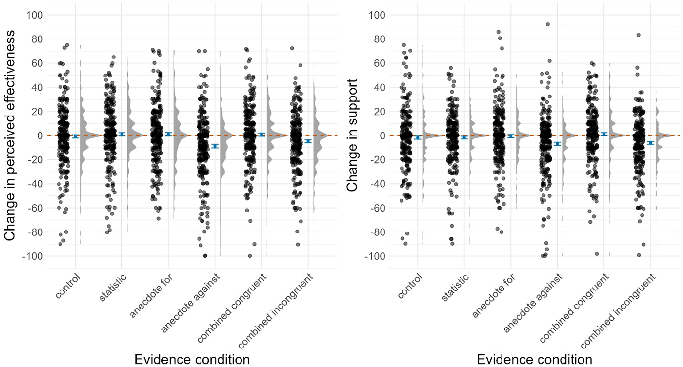
Tables B1 and B2 (Supplemental Results) summarise the models testing the effects of evidence conditions on perceived effectiveness and support. The data underlying these models is visualised in Figure 2 (see Figure 3 for comparison across studies).
Study 1: The plot shows the change in perceived effectiveness and support per evidence condition. The points to the left of the blue mean and standard error bars show a participant’s policy judgement for one of the six policies. The points are filled with a transparent grey, making overlapping points appear darker and distinguishing areas with high concentrations of data points. The density distribution to the right of the boxplot shows the data distribution. The Orange dashed line at zero represents no change in the policy judgements.
The plots show the mean and standard error of change in perceived effectiveness (left) and support (right) per evidence condition across policies for each study. The grey dashed line at zero represents no change in the policy judgement.
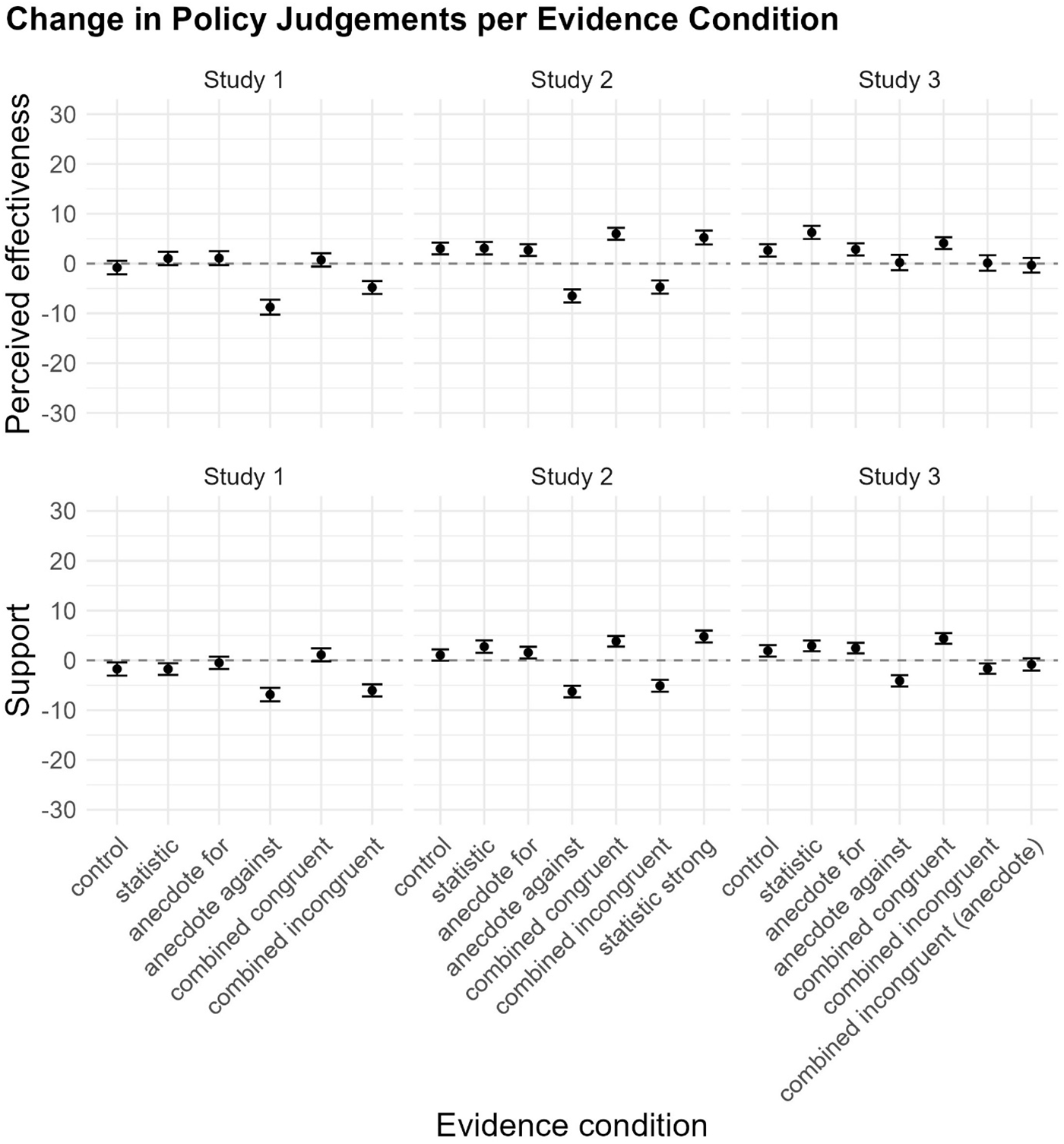
In contrast to our hypotheses, the models suggest the ‘Statistic’, ‘Anecdote For’ and ‘Combined Congruent’ conditions showed changes in perceived effectiveness and support comparable to the ‘Control’ and ‘Statistic’ conditions. This suggests that exposure to evidence supporting policy effectiveness, regardless of type, did not affect perceived effectiveness or support.
In line with our hypotheses, the models suggest the ‘Anecdote Against’ condition (Mchange = − 8.8, SD = 26) decreased perceived effectiveness by 7.9 points (t(22.645) = 3.44, p = .002, d = .35) compared to the ‘Control’ (Mchange = −0.8, SD = 23.6) and 9.7 points (t(22.647) = 4.23, p < .001, d = .43) compared to the ‘Statistic’ condition (Mchange = 1.0, SD = 23.2). The ‘Anecdote Against’ condition (Mchange = − 6.9, SD = 23.6) also decreased support by 5.10 (t(1495.036) = 3.01, p = .003, d = .25) and 5.08 points (t(1495.104) = 3.00, p = .003, d = .24), respectively, compared to the ‘Control’ (Mchange = −1.7, SD = 22.9) and ‘Statistic’ (Mchange = −1.8, SD = 20.2) conditions. This suggests that exposure to negative anecdotal evidence about policy effectiveness reduces perceived effectiveness and support.
In contrast to our hypotheses, the ‘Combined Incongruent’ condition showed changes in perceived effectiveness and support comparable to the ‘Control’ and ‘Statistic’ conditions. This suggests that the effects of negative anecdotes on policy judgements may be mitigated by introducing positive statistical evidence.
Qualitative results
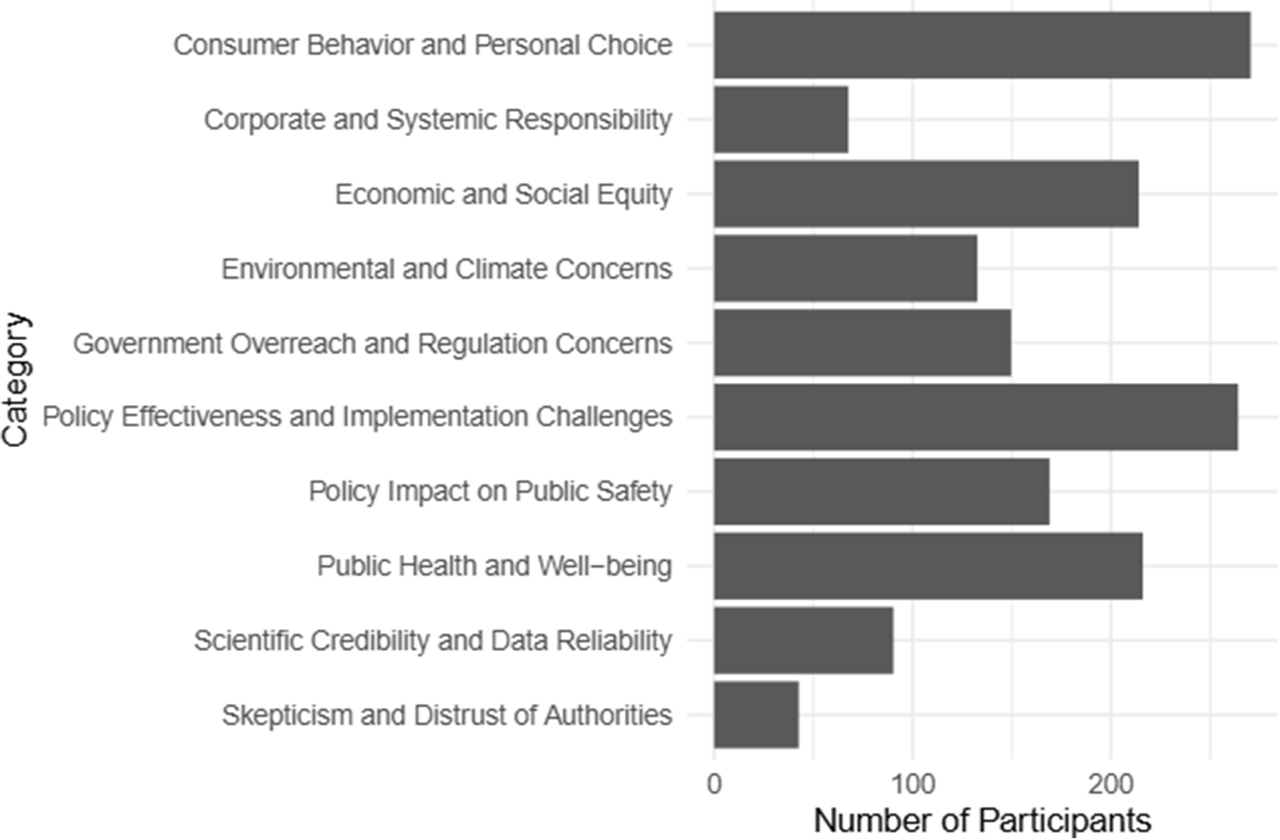
We identified various topics participants mentioned when reading new policy evidence and justifying posterior policy judgments. Figure 4 shows that most participants mentioned policy qualities such as fairness (i.e., economic burden), enforcement and compliance concerns, and more general beliefs such as freedom of choice. While these topics were mentioned across all policies, we observed some differences. For example, more participants mentioned issues with fairness for the meat/seafood tax, food merchandising restrictions, and energy quotas than the e-cigarette ban, 20 mph limit, and alcohol health labels (see Figure B3).
Number of participants mentioning each category in their responses.

We also grouped participants into quantiles based on their baseline perceived effectiveness and support for each policy, exploring whether these topics were mentioned by more individuals in lower quantiles. Figure B4 shows that more participants with lower ratings for perceived effectiveness and support (Q1 and Q2) mentioned fairness, enforcement and compliance concerns, and freedom of choice compared to the other quantiles, while more participants with higher prior policy ratings (Q3 and Q4) emphasised public health and safety. Neutral topics, such as the need for awareness, education for behaviour change, social acceptance and cultural influences, were mentioned more evenly across quantiles.
Discussion
Unlike Reynolds et al. (Reference Reynolds, Stautz, Pilling and Marteau2020), evidence supporting policy effectiveness, regardless of type, did not increase policies’ perceived effectiveness or support. However, consistent with their findings, negative anecdotes reduced both. A key finding is that combining statistical evidence with negative anecdotal evidence mitigated the effect of negative anecdotes. Additionally, combining statistical and positive anecdotal evidence did not produce an additive effect, a finding consistent with Hornikx (Reference Hornikx2018) and Niederdeppe et al. (Reference Niederdeppe, Roh and Dreisbach2016), but contrary to Zhou and Yang (Reference Zhou and Yang2024). Our qualitative results indicate that participants considered factors beyond policy effectiveness, including fairness, enforcement, compliance, and personal freedom, when evaluating evidence and justifying policy judgments. This supports a recent theory of public acceptance that suggests both general and policy-specific beliefs, beyond policy effectiveness, influence policy support (Grelle and Hofmann, Reference Grelle and Hofmann2024).
Study 2
In Study 2, we aimed to replicate Study 1’s findings while addressing limitations. First, the ‘Anecdote For’ and ‘Anecdote Against’ conditions in Study 1 did not focus on the same aspects of policy effectiveness. For instance, in the 20 mph speed limit policy, the positive anecdote addressed changes in speeding behaviour, whereas the negative anecdote discussed enforcement challenges. This imbalance may have contributed to the lack of effect from positive anecdotes. To address this, we generated more balanced anecdotes. Second, the lack of effect from statistical evidence in Study 1 may have resulted from the evidence’s strength rather than an inherent ineffectiveness of statistics. We introduced a new evidence condition featuring stronger statistical evidence to test this. Finally, we added a more targeted open-text question asking why participants agreed or disagreed with the evidence, as the previous thought-listing task generated limited data directly related to the evidence being shown.
Method
Participants
We recruited 300 participants. The participants had a mean age of 46.44 years (SD = 15.99), 53% identified as women, 46% as men, 85% as white, 47% were employed full-time, and 52% held a Bachelor’s degree or higher. Politically, 47% were affiliated with the Labour Party and 18% with the Conservative Party (see Table A1).
Materials and measures
We used the same design as Study 1, with the addition of the ‘Strong Statistic’s condition (see Table A2) and an online safety policy (see Table A3), resulting in a within-subjects experiment, where participants were exposed to all seven evidence conditions (Table A2), with each evidence condition randomly paired with a different policy. Differences from Study 1 are noted below.
Policy evidence. We revised the anecdotes in Study 1’s ‘Anecdote For’ condition to ensure they argued for the same specific point about policy effectiveness as in the ‘Anecdote Against’ condition. For the ‘Strong Statistic’ condition, we doubled the values presented in the original ‘Statistic’ condition in Study 1.
Measures. In addition to the measures for perceived effectiveness and support used in Study 1, participants indicated their (dis)agreement with the point(s) being made in each evidence condition (1 = ‘Strongly disagree’ to 100 = ‘Strongly agree’), then provided open-text explanations of their agreement rating.
Procedure
Study 2 took an average of 19 minutes, and participants were paid £3.75. The full Qualtrics survey for the study is available on OSF.
The procedure matched Study 1, except in Step 3, Part ii. While viewing the stimulus, participants rated agreement with the evidence and answered an open-text question but did not complete the thought-listing task, message credibility questions, or justify posterior policy judgments.
Data analysis
For the quantitative data, we followed the preregistered analysis plan in our study protocols (see OSF), the same as Study 1.
For the qualitative data, we conducted a ChatGPT-assisted qualitative content analysis, as outlined in Study 1. The final codebook, with example quotes, is shown in Table 2. It had an inter-rater agreement of 0.81.
Study 2: GPT-developed codebook for qualitative data analysis
Results
Quantitative results
Tables B3 and B4 summarise the models testing the effects of evidence condition on perceived effectiveness and support (see Figures 5 and 3).
Study 2: The plot shows the change in perceived effectiveness and support per evidence condition. The points to the left of the blue mean and standard error bars show a participant’s policy judgement for one of the six policies. The points are filled with a transparent grey, making overlapping points appear darker and distinguishing areas with high concentrations of data points. The density distribution to the right of the boxplot shows the data distribution. The Orange dashed line at zero represents no change in the policy judgements.
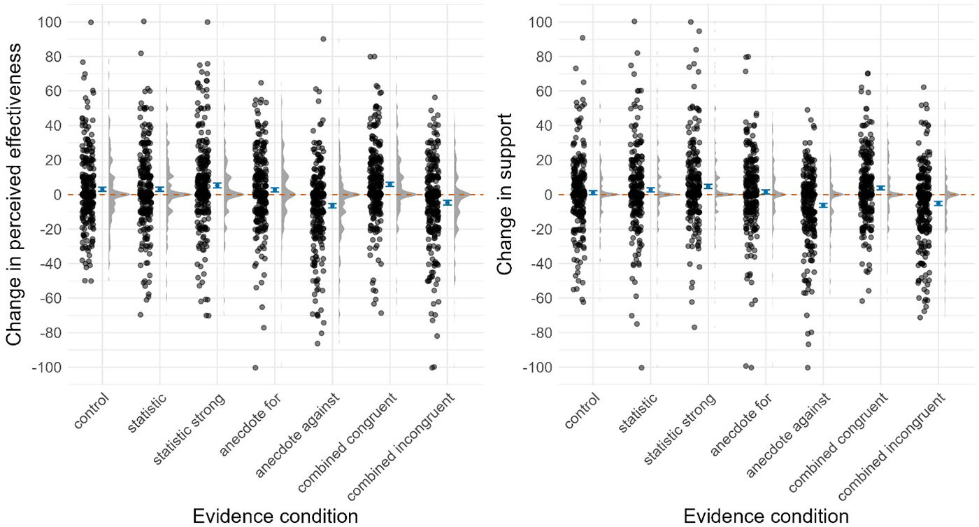
In line with Study 1, the ‘Statistic’, ‘Anecdote For’, and ‘Combined Congruent’ conditions showed changes in perceived effectiveness and support comparable to the ‘Control’ and ‘Statistic’ conditions. Similarly, the ‘Strong Statistic’ condition did not differ from the ‘Statistic’ condition, indicating that doubling statistical strength did not affect perceived effectiveness or support.
We also replicated the negative anecdote effect. The ‘Anecdote Against’ condition (Mchange = − 6.5, SD = 22.5) decreased perceived effectiveness by 9.52 points (t(33.493) = 5.08, p < .001, d = .45) compared to control (Mchange = 3.0, SD = 20.3) and 9.58 points (t(33.485) = 5.11, p < .001, d = .45) compared to the ‘Statistic’ condition (Mchange = 3.1, SD = 21.7). The ‘Anecdote Against’ condition also (Mchange = − 6.3, SD = 20.0) decreased support by 7.32 points (t(34.293) = 3.61, p < .001, d = .38) compared to control (Mchange = 1, SD = 19.8) and 9.05 points (t(34.291) = 4.46, p < .001, d = .46) compared to the ‘Statistic’ condition (Mchange = 2.8, SD = 21.5).
In contrast to Study 1, the ‘Combined Incongruent’ condition (Mchange = −4.7, SD = 22.9) decreased perceived effectiveness by 7.74 points (t(33.487) = 4.13, p < .001, d = .29) compared to control, and 7.80 points (t(33.496) = 4.17, p < .001, d = .37) compared to the ‘Statistic’ condition. The ‘Combined Incongruent’ condition (Mchange = −5.1, SD = 20.6) also decreased support by 6.12 points (t(34.290) = 3.02, p = .005, d = .31) compared to control and 7.84 points (t(34.288) = 386, p < .001, d = .40) compared to the ‘Statistic’ condition. This suggests that combining statistical and negative anecdotal evidence does not mitigate the effect of negative anecdotes alone on perceived effectiveness and support, which contrasts with results from Study 1.
Qualitative results
Similar to Study 1, Figure 6 shows that most participants discussed policy qualities such as fairness (e.g., economic and social equity), enforcement and compliance (e.g., implementation concerns), and freedom of choice (e.g., personal autonomy). The frequency of these topics varied by policy. For example, fairness concerns were more frequently mentioned for the meat/seafood tax, quotas, and food merchandising restrictions than for other policies. A new topic identified in Study 2 was concerns about government overreach, which was most frequently mentioned in relation to client-side scanning (a newly introduced policy) compared to all other policies (see Figure B5).
Number of participants mentioning each category in their responses (Study 2).
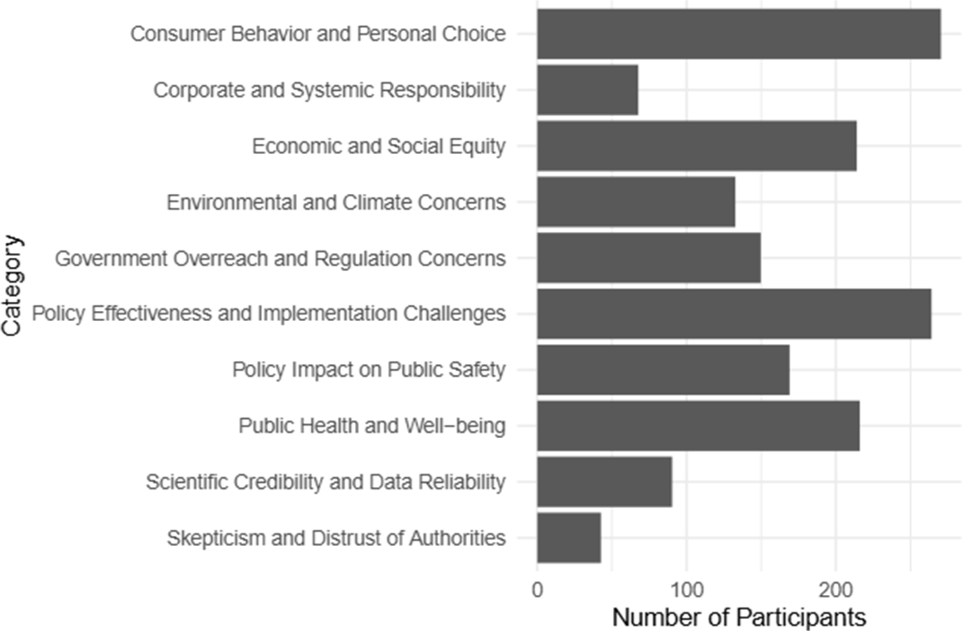
Similar to Study 1, Figure B6 shows that more participants in lower quantiles of baseline perceived effectiveness and support mentioned topics with negative sentiment towards policies, such as concerns with fairness, government overreach, and distrust of authorities, than higher quantiles. In contrast, more participants in higher quantiles mentioned positive topics, such as improvements to public safety and health. However, some topics, such as personal choice and implementation challenges, were mentioned consistently across support levels.
In Study 2, approximately 90 participants mentioned concerns about scientific credibility and data reliability. Figure B7 shows that these concerns were most common in conditions featuring statistical evidence (e.g., Statistic, Statistic Strong, and Combined). This scepticism may partly explain the lack of effect observed for statistical evidence in this study.
Discussion
In line with Study 1, evidence supporting policy effectiveness, regardless of type, did not increase perceived effectiveness and support, whereas negative anecdotes consistently reduced both. The asymmetry in the effect of anecdotal evidence persisted even after balancing the anecdotal arguments for and against policy effectiveness. The introduction of the ‘Strong Statistic’s condition had no additional effect on perceived effectiveness and support compared to the original ‘Statistic’ condition, aligning with prior research (Reynolds et al., Reference Reynolds, Pilling and Marteau2018). The limited effect of statistical evidence may not be due to insufficient strength but may reflect a broader challenge in leveraging statistical evidence to influence policy judgements. A key difference from Study 1 was that combining negative anecdotes with statistical evidence did not mitigate the negative anecdote effect. This finding warrants further investigation, as determining whether statistical evidence can reliably mitigate this effect is important for improving evidence-based policy communication. Finally, the qualitative results align with Study 1, indicating that participants consider both policy-specific issues (e.g., effectiveness, fairness, compliance) and broader beliefs (e.g., personal choice, the role of government) when evaluating policy evidence.
Study 3
In Study 3, we again aimed to replicate the negative anecdote effect and examine the effect of ‘Combined Incongruent’ evidence, given the mixed findings across the previous studies. We also aimed to understand how people evaluate policy evidence by examining whether participants updated their policy judgments in line with Bayesian models of rational belief updating across the different evidence types.
Bayesian models predict that individuals adjust their beliefs in proportion to the diagnostic value of new evidence, systematically integrating information based on its credibility and relevance. To assess this, we asked participants to judge how likely different types of evidence would be if a given policy were truly effective. If participants believed that statistical evidence showing reductions in carbon emissions would be highly likely under an effective meat and seafood tax but unlikely under an ineffective one, this would indicate that statistical evidence holds high diagnostic value. Under a Bayesian model, such evidence should increase participants’ perceived effectiveness of the policy. We compared participants’ belief updates to Bayesian predictions.
While individuals generally update beliefs in the expected direction, they often do so more conservatively than Bayesian predictions (Kovach, Reference Kovach2021). Therefore, we examined whether participants’ change in perceived effectiveness was qualitatively (i.e., in the right direction) and quantitatively (i.e., in the right direction and magnitude) consistent with Bayesian predictions.
Method
Participants
We recruited 307 participants. The participants had a mean age of 46.09 years (SD = 16.13). Of the sample, 51% identified as women, 48% male, 87% as white, 46% were employed full-time and 51% held a Bachelor’s degree or higher. Politically, 48% were affiliated with the Labour Party and 18% with the Conservative Party. For more details, see Table A1.
Materials and measures
Policy evidence. We used the same stimuli as in Study 2, except we replaced the ‘Strong Statistic’ condition with a ‘Combined Incongruent’ (Anecdotes) condition, which presented excerpts from both ‘Anecdote For’ and ‘Anecdote Against’ conditions.
Measures. We used the same measures for perceived effectiveness and support as in previous studies. Participants also rated the evidence’s diagnostic value, in all but the control condition, by providing two conditional probability judgements, with items adapted from (Shengelia and Lagnado, Reference Shengelia and Lagnado2021):
1. The probability of the evidence (E) given a policy is effective (H): P(E|H).
2. The probability of the evidence given a policy is not effective (H): P(E|˜H).
In the ‘Statistic’ condition, participants were asked: ‘If the policy IS effective, how likely is it that research would show these results?’ followed by the same question but with ‘If the policy IS NOT effective…’ In both ‘Anecdote For’ and ‘Anecdote Against’ conditions, they were asked: ‘If the policy IS effective, how likely is it that someone would make this claim about the policy?’ and again followed by ‘If the policy IS NOT effective…’ In the Combined conditions, participants rated each piece of evidence separately using the same questions outlined above, depending on whether the evidence was a statistic or anecdote. These measures were adapted from research on Bayesian belief updating in legal domain.
Procedure
Study 3 took an average of 15 minutes, and participants were paid £2.55. The full Qualtrics survey is available on OSF.
The procedure matched Study 1 except in Step 3, Part ii. While viewing the evidence, participants completed the likelihood of evidence and posterior policy judgment measures. The order of these measures was randomised, with participants answering either the likelihood of evidence or posterior policy judgment measure first.
Data analysis
We followed the preregistered analysis plan in our study protocols (see OSF), using the same models for the effect of evidence condition on perceived effectiveness and support in the previous studies.
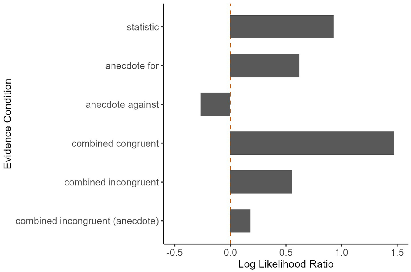
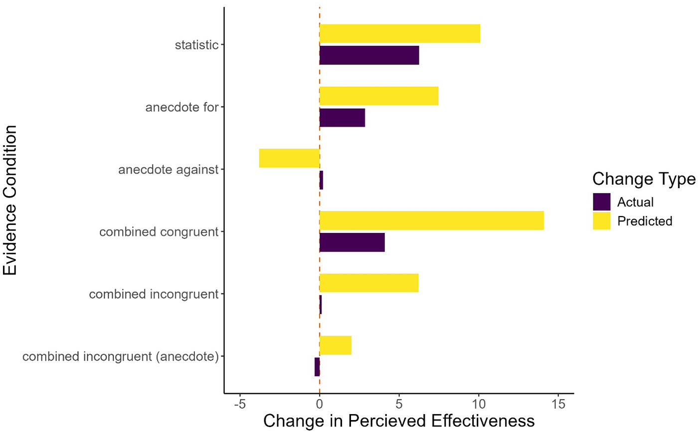
For the Bayesian belief updating analysis, we calculated the mean log-likelihood ratio for each evidence condition using conditional probability judgments. A log-likelihood ratio > 0 indicates evidence increases the probability that the policy is effective (H), < 0 indicates it decreases this probability, and = 0 indicates no diagnostic value. For the ‘Statistic’, ‘Anecdote For’, and ‘Anecdote Against’ conditions, the likelihood ratio was P(E | H)/P(E | ˜H). For the Combined conditions, it was [P(E1 | H)/P(E1 | ˜H)] × [P(E2 | H)/P(E2 | ˜H)]. Log transformations were applied to assess the diagnostic value of different evidence types. We also calculated each participant’s predicted posterior belief in policy effectiveness by inputting their conditional probability judgments and prior belief into Bayes’ theorem and compared this to people’s actual posterior beliefs.
Results
Tables B5 and B6 (SM) summarise the models testing the effects of evidence conditions on change in perceived effectiveness and support (see Figure 7 and Figure 3).
Study 3: The plot shows the change in perceived effectiveness and support per evidence condition. The points to the left of the blue mean and standard error bars show a participant’s policy judgement for one of the six policies. The points are filled with a transparent grey, making overlapping points appear darker and distinguishing areas with high concentrations of data points. The density distribution to the right of the boxplot shows the data distribution. The Orange dashed line at zero represents no change in the policy judgements.
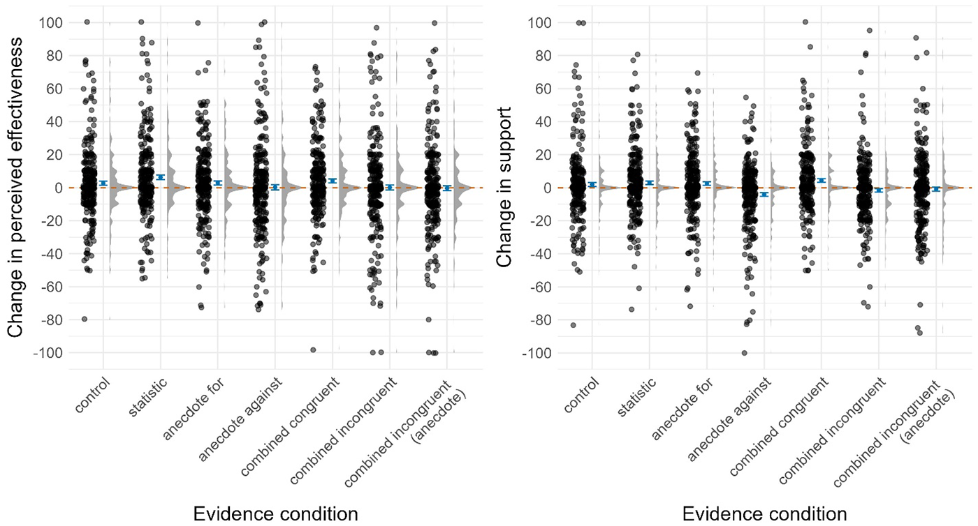
In line with the previous studies, the ‘Statistic’, ‘Anecdote For’, and ‘Combined Congruent’ conditions showed changes in perceived effectiveness and support comparable to the ‘Control’ and ‘Statistic’ conditions.
We only partially replicated the negative anecdote effect observed in prior studies. The ‘Anecdote Against’ condition (Mchange = 0.2, SD = 27) decreased perceived effectiveness by 2.45 points compared to control (Mchange = 2.6, SD = 21.6) and 6.06 points compared to the ‘Statistic’ condition (Mchange = 6.3, SD = 23.2), but these differences were not significant given the adjusted significance threshold of p < .005 (t(33.657) = 1.09, p = .282, d = .10, and t(33.657) = 2.71, p = .011, d = .26, respectively). However, the ‘Anecdote Against’ condition (Mchange = − 4.1, SD = 19.6) significantly decreased support by 6.05 points (t(33.812) = 3.30, p = .002, d = .32) compared to control (Mchange = 1.9, SD = 20.3) and 7.04 points (t(33.812) = 3.84, p = .001, d = .37) compared to the ‘Statistic’ condition (Mchange = 2.9, SD = 18.8).
For the change in perceived effectiveness, we did not replicate the negative effect of the ‘Combined Incongruent’ condition in Study 2. This condition showed changes in perceived effectiveness and support comparable to the ‘Control’ and ‘Statistic’ conditions. In light of the lack of negative anecdote effect, this result cannot inform whether combining statistical and negative anecdotal evidence either does (Study 1) or does not (Study 2) mitigate the effect of negative anecdotes alone on perceived effectiveness. However, it does seem to mitigate the negative anecdote effect for policy support.
The ‘Combined Incongruent’ (Anecdote) condition had similar results to the ‘Combined Incongruent’ condition with changes in perceived effectiveness and support comparable to the ‘Control’ and ‘Statistic’ conditions. This suggests either statistical or anecdotal evidence supporting policy effectiveness may mitigate the negative anecdote effect for policy support.
Figures B1 and B2 show a consistent effect of conditions across policies and studies, with some exceptions. Notably, perceived effectiveness and support did not decrease in the negative anecdote condition for the 20 mph speed limit and client-side scanning.
Bayesian belief updating
We assessed the diagnostic value of each evidence type (see Figure 8). Log-likelihood ratios for each condition suggest participants generally evaluated the evidence as expected based on prior research: statistical and anecdotal evidence supporting the policy should increase belief in its effectiveness, whereas combining these two types of evidence (in the ‘Combined Congruent’ condition) has a greater increase than either type alone. In contrast, anecdotal evidence against the policy should decrease belief in its effectiveness. For the ‘Combined Incongruent’ condition, the log-likelihood ratios should increase belief in policy effectiveness, though this increase was smaller than that of statistical and supportive anecdotal evidence. However, these results are harder to interpret due to limited research and mixed findings on the impact of conflicting evidence.
Log Likelihood Ratio per Evidence Condition. Note. The plot shows the mean log-likelihood ratio for each evidence condition. A log-likelihood ratio > 0 indicates that the evidence (E) increases the posterior probability that the policy is effective (H); < 0 indicates that the evidence decreases the posterior probability of H; and 0 indicates no probative value.
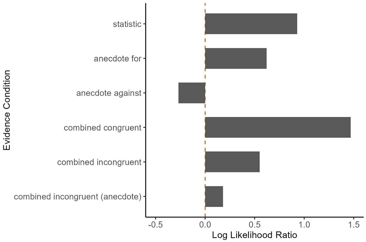
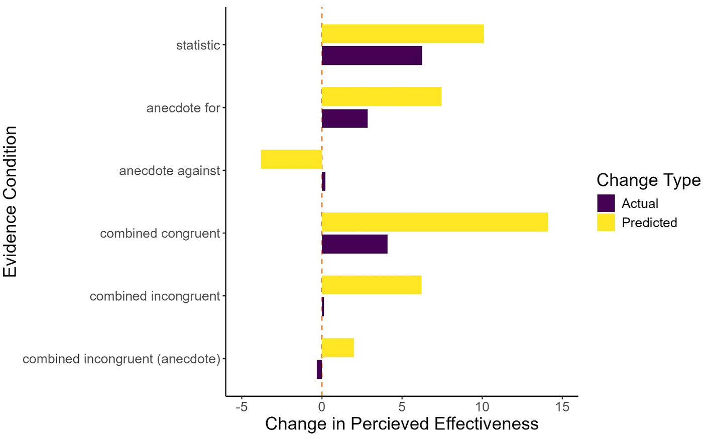
Figure 9 illustrates that belief updating did not fully align with Bayesian predictions. While the ‘Statistic’, ‘Anecdote For’ and ‘Combined Congruent’ conditions showed changes in the expected direction, these changes were consistently smaller than predicted. The ‘Anecdote Against’ and ‘Combined Incongruent’ conditions showed belief changes around zero, deviating from the predicted changes. This pattern is known as conservatism (i.e., participants updating less than expected or not updating at all) and is a common result in this type of modelling (Corner, Reference Corner2010). Table B7 in the supplemental materials shows that despite discrepancies, predicted and actual posterior beliefs were moderately positively correlated in each condition, with r ranging from 0.47 to 0.67.
Predicted versus Actual Change in Belief in Policy Effectiveness per Evidence Condition. Note. The plot shows the mean change in belief in policy effectiveness for each evidence condition. The bars are coloured to indicate whether the change represents the actual change observed in the sample (yellow) or the predicted change.
To assess whether the discrepancies between actual and predicted changes were driven by conservatism, we classified participants based on the magnitude and direction of their actual belief update compared to the predicted. Figure 10 shows that while most participants updated as predicted or in the expected direction, conservatively, a notable proportion updated in the opposite direction to their likelihood ratio. Additionally, a small proportion of participants changed their belief even though they did not rate the evidence as diagnostic of the policy’s effectiveness or ineffectiveness.
Predicted versus actual direction and magnitude of Change in Perceived Effectiveness per Evidence Condition. Note. The plot displays all possible combinations of predicted versus actual direction of change in belief in policy effectiveness on the x-axis. These combinations are named with the predicted direction followed by the actual direction. For example, ‘Increase-No Change’ represents a predicted increase in belief but no actual change observed. ‘As Predicted’ represents that the actual change aligned with the predicted direction and magnitude. The bars indicate the percentage of participants within each combination, and their colours reflect the interpretation of each grouping.

Discussion
We conducted three online experiments with representative UK samples to test whether evidence on effectiveness changes perceived policy effectiveness and support. The findings suggest there was no evidence that evidence supporting policy effectiveness – whether statistical, anecdotal or both – increased perceived effectiveness or support compared to simply stating the policy aimed to address a societal issue. In contrast, negative anecdotes significantly reduced perceived effectiveness (though this effect was not replicated in Study 3) and support (replicated in all three studies). These results challenge an earlier meta-analysis (Reynolds et al., Reference Reynolds, Stautz, Pilling and Marteau2020) suggesting that evidence supporting policy effectiveness increases support, but aligns with its finding that evidence against policy effectiveness can lower support. Our results also align with recent research showing evidence supporting public health food policy does not increase support (e.g., reducing portion sizes, Reynolds et al., Reference Reynolds, Hobson, Marteau and Pilling2022), suggesting that evidence of policy effectiveness may not always be an effective communication strategy.
The negative anecdote results suggest that anecdotal evidence may be more persuasive than statistical evidence in policy communication. However, we found no evidence that positive anecdotes increased outcomes more than statistical evidence, even on health-related topics where anecdotes are typically more impactful (Freling et al., Reference Freling, Yang, Saini and Itani2020; Xue and Taylor, Reference Xue and Taylor2023). This asymmetry suggests that while negative anecdotes may undermine policy support, positive anecdotes may not have the opposite effect. This finding reflects a common psychological principle: negative events, cues and memories influence outcomes more than positive ones, affecting cognition, motivation and social interactions (Baumeister et al., Reference Baumeister, Bratslavsky, Finkenauer and Vohs2001). While theories suggest negative information is more diagnostic or salient, they don’t fully explain the phenomenon. Baumeister et al. suggest that this may have adaptive benefits, helping individuals avoid threats and increase survival. Recent studies on framing reinforce this pattern in policy decisions, revealing that negative framing triggers stronger emotional responses and makes problems seem more urgent and deserving of government intervention, even when information is logically equivalent (Sahn et al., Reference Sahn, Stoker and Lerman2025). This finding also presents a notable challenge for effective policy communication. If the effects of negative anecdotes on public support are replicated in real-world settings, the impact could be substantial. Compared to statistical evidence, misinformation presented with anecdotal evidence is perceived as less false and less likely to prompt verification behaviours (Zhao and Tsang, Reference Zhao and Tsang2024). Negative news is also more widely read and shared online (Oh et al., Reference Oh, Goh and Phan2023).
In most studies, there was no evidence that combining statistical and negative anecdotal evidence altered perceived effectiveness or support. This suggests that while statistical evidence alone may not increase these outcomes, it could help mitigate the negative anecdotal effect. Yet, findings were mixed: study 2 showed that the negative anecdote effect persisted even when paired with statistical evidence supporting policy effectiveness. This aligns with research on public decision-making about medical treatments, where negative anecdotes reduced belief in effectiveness and willingness to adopt treatments despite statistical evidence supporting the treatments (Line et al., Reference Line, Chen, Patel and Johnson2024).
Although we did not directly investigate the mechanisms behind the effects, related research offers some explanations, but no single theory fully explains the findings. We highlight key mechanisms with limitations and recommend further research to understand why the negative anecdote effect occurs.
One possible explanation is that emotional language or stories can increase emotional engagement and reduce counterarguments (Ecker et al., Reference Ecker, Butler and Hamby2020; Line et al., Reference Line, Chen, Patel and Johnson2024). However, post-hoc sentiment analysis (see Appendix B; Figures B8 and B9) indicated that, although anecdotes varied in emotional tone as expected (i.e., anecdotes against the policy having a negative sentiment and anecdotes for the policy having a positive one), most language within all of the anecdotes was classified as neutral. Additionally, the positive sentiment in supportive anecdotes had a higher compound score than the negative sentiment in opposing anecdotes, while both had compound scores close to zero, which also indicates a neutral overall framing. This suggests that emotional intensity alone doesn’t explain the asymmetry effects.
An explanation based on motivated reasoning suggests participants were more influenced by negative evidence because it aligned with their beliefs and identities (Taber and Lodge, Reference Taber and Lodge2006; Kahan, Reference Kahan2017; Druckman and McGrath, Reference Druckman and McGrath2019). For instance, the negative anecdote effect may reflect confirmation bias (Oeberst and Imhoff, Reference Oeberst and Imhoff2023), where participants were more influenced by negative evidence because it aligned with their prior beliefs. This explanation also corresponds with research indicating that decisions on educational interventions are often driven more by prior beliefs than evidence quality (Michal et al., Reference Michal, Zhong and Shah2021), and corrective information rarely changes political beliefs (Nyhan and Reifler, Reference Nyhan and Reifler2010). However, this has limitations; not all policies had low initial support (e.g., banning e-cigarettes), yet negative anecdote effects appeared across policies and participants in the top quantiles of prior policy support.
Alternatively, these patterns could be explained by framing effects, where anecdotal conditions activate different cognitive frames influencing policy considerations like personal freedom versus collective responsibility or government effectiveness versus overreach (Chong and Druckman, Reference Chong and Druckman2007). These frames may influence which beliefs are accessible and relevant when participants assess the evidence. However, Study 2’s results challenge this: even with balanced anecdotes addressing the same aspects of policy effectiveness, asymmetrical effects persisted. This suggests differences arise from how positive and negative information is processed, not from different framing due to content.
Finally, from a rational updating perspective – where people objectively weigh new evidence against their prior beliefs to form updated opinions – our Bayesian modelling in Study 3 suggests that most participants adjusted their policy beliefs in the expected direction but conservatively, based on how strongly they believed the evidence indicated policy effectiveness. This conservatism in belief updating is common and often linked to scepticism about evidence reliability in experimental settings (Corner, Reference Corner2010; Howe et al., Reference Howe, Tadmor, Gurney, Baxter, Jackson and Lewandowsky2022). However, our simple Bayesian model did not incorporate parameters such as prior belief strength (Druckman and McGrath, Reference Druckman and McGrath2019), which may have explained the conservatism and other deviations from the predictions, limiting conclusions about rational updating processes and limiting our ability to rule out motivated reasoning.
Overall, our quantitative findings can be explained by multiple and sometimes competing theoretical perspectives, highlighting the need for future research to robustly test proposed mediators through experimental manipulation and establish causal pathways.
Our qualitative results suggest that participants integrate broader beliefs (e.g., regarding personal freedom and government’s role) and policy-specific concerns (e.g., fairness and enforcement) when evaluating policy evidence. These issues were more frequently cited by participants with lower baseline perceived effectiveness and support, varying by policy (e.g., fairness was mentioned by more participants for taxes than for alcohol health labels). While aligning with recent theories on how general and policy-specific beliefs shape policy support (Huber et al., Reference Huber, Wicki and Bernauer2020; Grelle and Hofmann, Reference Grelle and Hofmann2024), our findings also highlight additional considerations, such as implementation and enforcement concerns, which may have been overlooked. These results also highlight the potential complexity of reasoning and belief updating in policy communication, where evidence evaluation is likely influenced by factors such as prior beliefs, emotions and knowledge (Sommer et al., Reference Sommer, Musolino and Hemmer2023).
Policy implications
Consistent with prior surveys, there was limited support for environmental policy (OECD, 2023). However, public health policies, such as banning e-cigarettes in public places, received greater support, suggesting these types of measures may be currently acceptable to the UK public (Laverty et al., Reference Laverty, Filippidis, Vardavas, Patelarou, Gratziou and Connolly2017). For online safety, findings indicate a neutral to slightly positive stance on client-side scanning under the Online Safety Act, consistent with studies showing public support for such measures in the USA and Germany to tackle online child sexual exploitation and abuse despite privacy concerns (Geierhaas et al., Reference Geierhaas, Hammer, Hermanns and Kuehne2023; Deldari et al., Reference Deldari, Thakkar and Yao2024).
To improve public support, communicating policy effectiveness alone is likely insufficient, though it may help counteract negative narratives. Our qualitative data suggest that strategies should also address policy qualities like fairness and enforcement, as well as broader beliefs about government intervention infringing personal freedom (Reynolds et al., Reference Reynolds, Pilling and Marteau2018). While these factors were mentioned across policies and individuals, policy-specific approaches informed by public engagement may help develop effective communication strategies, particularly for non-supporters. This is evident in attitudes towards client-side scanning, where support exists despite privacy concerns only when framed as a tool against child abuse or terrorism, but not other illegal activities (Geierhaas et al., Reference Geierhaas, Hammer, Hermanns and Kuehne2023).
Limitations, strengths & future directions
We tested different evidence types using a highly powered, representative UK sample, focusing on policies addressing major societal challenges. Our within-subjects design extended prior between-subjects research by exposing participants to multiple evidence types across various policies, better reflecting real-world contexts where people encounter diverse policy issues and evidence. We also expanded conditions beyond statistical and anecdotal evidence to include combined evidence, enabling direct comparisons.
However, our anecdotal stimuli differed not only in argument direction but potentially in emotional tone, with anecdotes opposing the policy likely containing more negative language than neutral statistical evidence. While this confounds evidence type with emotional content, it reflects the ecological validity of real-world policy communication where supportive and opposing arguments naturally employ different emotional registers. Post-hoc sentiment analysis confirmed directional differences but showed these were moderate rather than extreme (see Figure B8). Additionally, the anecdotal evidence conditions may have inadvertently contained content that activated broader ideological beliefs (e.g., personal freedom, government overreach, fairness), creating a confound between evidence type and ideological content that we did not fully control for. While we included a control condition providing only policy rationale, separating evidence format effects from ideological priming effects would require either a neutral anecdote condition with matched ideological content across evidence types or a more complex experimental design manipulating these factors independently.
Future research can improve the validity of this design, for example, by replicating our study in more naturalistic settings such as online social media environments to assess the broader applicability of our findings, as well as evaluating the potential confounds between argument direction and other factors such as emotional language and ideological priming across evidence types. Additionally, since we omitted a negative statistic condition, it remains unclear whether negative statistics would have similar effects as negative anecdotes. Future research should test whether evidence type (statistic vs anecdote) or sentiment (supporting vs opposing policy effectiveness) plays a greater role in shaping policy support. Finally, improvements can be made to how to perceived policy effectiveness and policy support are measured. For instance, our perceived policy effectiveness measure combined policy efficacy assessments (‘X is effective for Y’) and mechanism explanations (‘as X will change Z’) in single items, potentially introducing measurement error if participants held different views about these components.
While our samples were representative of the UK voting population during the study period in terms of age, gender and political affiliation, other demographic measures were not representative. Our sample was majority white, had higher education levels than the general population, and included limited representation from devolved nations (Scotland, Wales, Northern Ireland), which may limit generalisability to the broader UK voting population. Additionally, the sample was mostly affiliated with the Labour Party, reflecting the political landscape after the last election, which is already changing. We note that attrition rates for participants who started but did not complete the survey and were therefore not compensated or included in the analysis, as per Prolific’s guidelines, ranged from 4% to 8% across studies. While this did not affect the representative quotas for age, gender and political affiliation, we cannot determine whether attrition was non-random by assessing whether attrition correlated with other demographics or study characteristics.
Replicating these results is crucial for understanding their robustness and broader applicability, particularly given their divergence from recent meta-analyses. While some trends were consistent (e.g., negative anecdotal evidence reducing policy support), other effects (e.g., positive statistical evidence mitigating the negative anecdote effect) were not. Further research should continue to test the effect of different combinations of evidence on policy support using a wider variety of materials. Beyond replication, it is essential to investigate the underlying mechanisms driving these effects, for example by building and testing causal models to examine theorised mechanisms such as confirmation bias (Sunstein et al., Reference Sunstein, Schkade, Reisch and Kahneman2016; Michal et al., Reference Michal, Zhong and Shah2021) or emotional engagement (Ecker et al., Reference Ecker, Butler and Hamby2020; Line et al., Reference Line, Chen, Patel and Johnson2024).
ChatGPT-assisted content analysis proved reliable for capturing descriptive qualitative results on how people evaluate policy interventions. Given the brief nature of the responses (averaging 17–30 words), deeper analysis of how participants reasoned about each policy and evidence type was impractical. Most participants provided single-sentence responses, making it difficult to identify complex reasoning patterns. Future research should employ more in-depth qualitative methods, such as think-aloud studies, to better understand the reasoning processes underlying policy evidence evaluation and whether observed effects reflect motivated reasoning, emotional processing or other mechanisms. Additionally, future research should apply Bayesian modelling more robustly to assess whether belief updating is rational or motivated, informing strategies to influence policy support (Druckman and McGrath, Reference Druckman and McGrath2019).
Conclusion
Communicating policy effectiveness may not always increase public support. While negative anecdotes consistently reduced support, there was no evidence that positive evidence – statistical or anecdotal – affected support. However, statistical evidence may help counter negative narratives. To improve public acceptance, policy communication should address broader public concerns beyond effectiveness, such as fairness.
Supplementary material
To view supplementary material for this article, please visit https://doi.org/10.1017/bpp.2025.10028
Funding statement
This work was supported by the Economic and Social Research Council [Grant number ES/Y001044/1].







 Open access