

I. Introduction
Stock markets do crash. Over the past century, the U.S. stock market has experienced at least five of these episodes, two of them just 10 years apart: the global financial crisis crash in 2008 and the COVID-19 pandemic crash in 2020.Footnote 1 Due to their rarity, they are very hard to predict and investors are left with the only option to hedge against these events, rather than avoiding them. The option market provides an ideal laboratory to study the pricing of crash risk. Investors can protect themselves from market crashes by purchasing put options or more sophisticated option portfolios which provide hedges against variance and skewness risk. Indeed, a significant body of literature focusing on variance risk, skewness risk, and crash risk has examined the returns generated by these hedging option portfolios, particularly variance swaps and skewness swaps (see, e.g., Bakshi and Kapadia (Reference Bakshi and Kapadia2003), Bollerslev and Todorov (Reference Bollerslev and Todorov2011), Bondarenko (Reference Bondarenko2014b), Carr and Wu (Reference Carr and Wu2009), Kozhan et al. (Reference Kozhan, Neuberger and Schneider2013), and Schneider and Trojani (Reference Schneider and Trojani2019)). These studies have consistently documented highly negative returns, indicating that investors are willing to pay exceptionally high premia to protect themselves against market downturns and turmoils.Footnote 2
Individual stocks do crash as well and they do so even outside periods of market stress.Footnote 3 Surprisingly, the evidence on pricing of crash risk for individual stocks is limited. Early studies agree that single-stock put options are cheap and demand for out-of-the-money puts is low compared to out-of-the-money calls (see, e.g., Bakshi, Kapadia, and Madan (Reference Bakshi, Kapadia and Madan2003), Bollen and Whaley (Reference Bollen and Whaley2004), and Garleanu, Pedersen, and Poteshman (Reference Garleanu, Pedersen and Poteshman2009)). Prior studies that have employed option returns to assess the premium paid by investors to be protected against the risk associated with individual stocks have predominantly concentrated on measuring variance risk premiums using variance swaps or variance portfolios (Carr and Wu (Reference Carr and Wu2009), Duarte, Jones, and Wang (Reference Duarte, Jones and Wang2024), and Heston and Todorov (Reference Heston and Todorov2023)).
This article contributes to this literature by studying skewness swap returns on individual stocks within the S&P 500 index from 2003 to 2020. Specifically, the article’s contribution can be divided into two key aspects.
First, it proposes a methodology to construct skewness swaps at the individual stock level. These swaps provide a direct exposure to skewness, while being designed to be independent of other moments. The methodology builds on Schneider and Trojani (Reference Schneider and Trojani2019), with the added feature of independence from the fourth moment as well. I provide both convergence results and a simulation analysis, which demonstrate the accuracy of the approach. Skewness swaps are trading strategies in which an investor buys the stock’s risk-neutral skewness via an option portfolio at the beginning of the month and receives, as a payoff, the realized skewness of the stock at the end of the month. The strategy is a pure bet on skewness: it performs well when realized returns exhibit high positive skewness and incurs losses when they exhibit low negative skewness.Footnote 4 While skewness swaps have been used to study the skewness risk premium on the market index (see, e.g., Kozhan et al. (Reference Kozhan, Neuberger and Schneider2013), Schneider and Trojani (Reference Schneider and Trojani2015)), to the best of my knowledge, they have not been employed to investigate the skewness risk premium at the individual stock level.
Empirical implementation of skewness swaps across the cross section of stock options reveals consistently positive swap returns of remarkable magnitude, with an average Sharpe ratio of 0.53. Despite their overall positivity, the time-series pattern of swap returns displays a strong negative skew, characterized by infrequent but significant losses. These returns resemble the performance of selling crash insurance, which typically generates profits until the triggering event occurs (in this case, a crash of the stock, leading to substantial losses in the strategy). The notably high average returns strongly indicate the presence of a significant crash risk premium priced within individual stock options. Incorporating transaction costs, such as bid–ask spreads, does diminish profits to some extent but does not alter the primary finding: skewness swap returns remain positive for the majority of stocks. These results hold up even when accounting for the discrete nature of option prices and considering the limited range of moneyness. Importantly, these returns cannot be attributed to equity and variance risk premia alone, as their combined effect can only account for approximately 50% of the variability observed in skewness swap returns.
Second, skewness swap returns become especially pronounced following the 2007/2009 financial crisis. In fact, when the results are segmented into pre-crisis and post-crisis subsamples, it becomes evident that skewness swap returns experienced a significant right shift in distribution after the financial crisis. Moreover, a greater number of stocks display statistically significant positive swap returns during this post-crisis period. In addition to the increase in crash risk premium measured by skewness swap returns, I also document an increase in the price of crash risk in individual stocks. This is reflected by a more left-skewed implied volatility smile, driven by a higher price of deep out-of-the-money options.
Complementing this evidence, a portfolio sort analysis shows that swap returns are higher for stocks with greater systematic crash risk and overvaluation risk, a relationship that arises specifically in the post-crisis period. This pattern aligns with the broader macroeconomic environment: the years between the financial crisis and the COVID-19 crisis were marked by exceptionally low interest rates, which encouraged reaching-for-yield behavior and drove asset valuations higher (see, e.g., Hau and Lai (Reference Hau and Lai2016), Lian, Ma, and Wang (Reference Lian, Ma and Wang2019)). These findings reinforce the idea that skewness swap returns reflect the stock-level crash risk in the economy.
The article is related to several strands of literature. The methodology implemented is the skewness swap of Schneider and Trojani (Reference Schneider and Trojani2019), which provide a simple approach to trading skewness in both the stock and option markets. This methodology is situated within an extensive body of research that stems from the findings of Breeden and Litzenberger (Reference Breeden and Litzenberger1978) and Carr and Madan (Reference Carr and Madan2001).Footnote 5 On the empirical front, numerous studies have explored the dynamics of variance swaps or variance portfolios applied to the market and individual stocks (see, e.g., Aït-Sahalia, Karaman, and Mancini (Reference Aït-Sahalia, Karaman and Mancini2020), Dew-Becker, Giglio, Le, and Rodriguez (Reference Dew-Becker, Giglio, Le and Rodriguez2017), Duarte, Jones, and Wang (Reference Duarte, Jones and Wang2024), Filipović, Gourier, and Mancini (Reference Filipović, Gourier and Mancini2016), Heston, Jones, Khorram, Li, and Mo (Reference Heston, Jones, Khorram, Li and Mo2023), and Johnson (Reference Johnson2017)). In contrast, the empirical investigation of skewness swaps has thus far only centered on skewness swaps on the market index (Kozhan et al. (Reference Kozhan, Neuberger and Schneider2013), Orłowski, Schneider, and Trojani (Reference Orłowski, Schneider and Trojani2024), and Schneider and Trojani (Reference Schneider and Trojani2019)).Footnote 6
Furthermore, this article is related to the broader literature exploring the risk premium associated with the skewness of individual stocks. Typically, individual stocks exhibit positive skewness (Bessembinder (Reference Bessembinder2018)). However, the ex ante measurement of skewness has traditionally presented challenges, leading to a variety of methodologies and occasionally conflicting findings. Notably, contradictory outcomes emerge when ex ante skewness is computed from stock returns versus the option market. For example, Boyer, Mitton, and Vorkink (Reference Boyer, Mitton and Vorkink2010) find that stocks with the lowest expected idiosyncratic skewness outperform those with the highest idiosyncratic skewness. In contrast, Stilger, Kostakis, and Poon (Reference Stilger, Kostakis and Poon2017) document that stocks exhibiting a greater ex ante negative skewness in the risk-neutral distribution tend to yield lower subsequent returns.Footnote
7 The approach to skewness risk premium analysis outlined in this article distinguishes itself from prior research by not depending on conventional portfolio-based cross-sectional methods intended to predict stock returns based on ex ante skewness information. Instead, it employs an individualized trading strategy for each stock, specifically a skewness swap. The returns generated by this strategy directly capture the difference between the $ \mathrm{\mathbb{P}} $
skewness (skewness in the real-world measure), and
$ \mathrm{\mathbb{P}} $
skewness (skewness in the real-world measure), and $ \mathrm{\mathbb{Q}} $
skewness (skewness in the risk-neutral measure) of each individual stock. The positive swap returns documented in this article align with investor preferences for positively skewed payoffs, as proposed in the model by Barberis and Huang (Reference Barberis and Huang2008) (see also Eraker and Ready (Reference Eraker and Ready2015)).
$ \mathrm{\mathbb{Q}} $
skewness (skewness in the risk-neutral measure) of each individual stock. The positive swap returns documented in this article align with investor preferences for positively skewed payoffs, as proposed in the model by Barberis and Huang (Reference Barberis and Huang2008) (see also Eraker and Ready (Reference Eraker and Ready2015)).
Finally, the article is also related to the literature that connects crash risk and skewness risk with overvaluation risk, as is done, for example, in Chen, Hong, and Stein (Reference Chen, Hong and Stein2001), Stilger, Kostakis, and Poon (Reference Stilger, Kostakis and Poon2017), and Rehman and Vilkov (Reference Rehman and Vilkov2012).
The article is structured as follows: Section II presents the methodology, while Section III provides an overview of the data used. Section IV presents the principal findings: Section IV.A analyzes the distribution of swap returns, Section IV.B compares skewness swap returns with equity and variance swap returns, and Section IV.C explores the post-financial crisis period in detail. Section V includes the model-based and corridor-based versions of skewness swaps as robustness checks. Finally, Section VI concludes. The Appendices include the methodological details and proofs.
II. Skewness Swaps: Theory and Implementation
A skewness swap is a trading strategy with which an investor can directly buy the skewness of an asset and gain the skewness risk premium. The methodology employed in this article is an application of Schneider and Trojani (Reference Schneider and Trojani2019) but incorporates two modifications: i) isolating skewness from kurtosis, and ii) considering the early exercise of American options. The econometric details and a convergence analysis are reported in Appendices A and B, while this section only presents the intuition and the main formulas used in the empirical section.
A. Background on Variance Swaps
Before introducing the skewness swaps, this section recalls some known results on variance swaps. As outlined in Carr and Wu (Reference Carr and Wu2009), the payoff at maturity $ T $
to the long side of the variance swap is equal to the difference between the realized variance over the life of the contract,
$ T $
to the long side of the variance swap is equal to the difference between the realized variance over the life of the contract, $ {RV}_{t,T} $
, and a constant called the variance swap rate,
$ {RV}_{t,T} $
, and a constant called the variance swap rate, $ {SW}_{t,T} $
:
$ {SW}_{t,T} $
:
 $$ \left[{RV}_{t,T}-{SW}_{t,T}\right]\hskip1em L, $$
where $ L $
denotes the notional dollar amount, and
$ L $
denotes the notional dollar amount, and $ t $
is the start date of the contract. By no arbitrage,
$ t $
is the start date of the contract. By no arbitrage, $ {SW}_{t,T}={E}_t^{\mathrm{\mathbb{Q}}}\left[{RV}_{t,T}\right] $
, and the variance swap has zero net market value at entry. The return on the strategy thus depends on the difference between the realized variance
$ {SW}_{t,T}={E}_t^{\mathrm{\mathbb{Q}}}\left[{RV}_{t,T}\right] $
, and the variance swap has zero net market value at entry. The return on the strategy thus depends on the difference between the realized variance $ {RV}_{t,T} $
and the risk-neutral variance
$ {RV}_{t,T} $
and the risk-neutral variance $ {SW}_{t,T} $
and is a direct measure of the realized variance risk premium.
$ {SW}_{t,T} $
and is a direct measure of the realized variance risk premium.
It is a known result that the swap rate can be measured at time $ t $
with the price of a portfolio of options with maturity
$ t $
with the price of a portfolio of options with maturity $ T $
(see, e.g., Carr and Madan (Reference Carr and Madan2001), Carr and Wu (Reference Carr and Wu2009), and Martin (Reference Martin2017), among others). The realized variance can be measured with the sum of squared daily returns (Carr and Wu (Reference Carr and Wu2009)), or by squaring the return over the time period from
$ T $
(see, e.g., Carr and Madan (Reference Carr and Madan2001), Carr and Wu (Reference Carr and Wu2009), and Martin (Reference Martin2017), among others). The realized variance can be measured with the sum of squared daily returns (Carr and Wu (Reference Carr and Wu2009)), or by squaring the return over the time period from $ t $
to
$ t $
to $ T $
.Footnote
8 The latter can be measured with the payoff of the option portfolio employed in calculating the swap rate (see, e.g., the variance portfolios in Heston et al. (Reference Heston and Todorov2023)).
$ T $
.Footnote
8 The latter can be measured with the payoff of the option portfolio employed in calculating the swap rate (see, e.g., the variance portfolios in Heston et al. (Reference Heston and Todorov2023)).
B. Skewness Swaps: Theory
The skewness swap is defined in a similar way to the variance swap. The payoff at maturity $ T $
to the long side of the skewness swap is equal to the difference between the realized skewness over the life of the contract,
$ T $
to the long side of the skewness swap is equal to the difference between the realized skewness over the life of the contract, $ {RS}_{t,T} $
,Footnote
9 and a constant called the skewness swap rate,
$ {RS}_{t,T} $
,Footnote
9 and a constant called the skewness swap rate, $ {SSW}_{t,T} $
, which measures the risk-neutral skewness, times the notional
$ {SSW}_{t,T} $
, which measures the risk-neutral skewness, times the notional $ L $
:
$ L $
:
 $$ \left[{RS}_{t,T}-{SSW}_{t,T}\right]\hskip1em L. $$
Skewness portfolios can be constructed in different ways, depending on how realized skewness and risk-neutral skewness are measured. For the baseline analysis, I implement the simple swap methodology of Schneider and Trojani (Reference Schneider and Trojani2019), which extends the model-free methodology of Bakshi et al. (Reference Bakshi, Kapadia and Madan2003) to measure the swap returns of every moment of the distribution.Footnote 10 I postpone the analyses of more complex model-based and corridor-based alternatives in the robustness (see Section V).Footnote 11
The structure of the swap strategy of equation (1) involves a fixed leg ( $ {SSW}_{t,T} $
) and a floating leg (
$ {SSW}_{t,T} $
) and a floating leg ( $ {RS}_{t,T} $
), which are exchanged at maturity between two counterparts. These components are defined in Schneider and Trojani (Reference Schneider and Trojani2019) using the following general formulas, which can be applied to trade not only skewness but any moment of the distribution:
$ {RS}_{t,T} $
), which are exchanged at maturity between two counterparts. These components are defined in Schneider and Trojani (Reference Schneider and Trojani2019) using the following general formulas, which can be applied to trade not only skewness but any moment of the distribution:
 $$ \mathrm{fixed}\hskip0.52em {\mathrm{leg}}_{t,T}=\frac{1}{B_{t,T}}\left({\int}_0^{F_{t,T}}{\Phi}^{{\prime\prime} }(K){P}_{t,T} dK+{\int}_{F_{t,T}}^{\infty }{\Phi}^{{\prime\prime} }(K){C}_{t,T} dK\right) $$
 $$ {\displaystyle \begin{array}{c}\mathrm{floating}\hskip0.42em {\mathrm{leg}}_{t,T}=\underset{\mathrm{Payoff}\ \mathrm{of}\ \mathrm{the}\ \mathrm{option}\ \mathrm{portfolio}}{\underbrace{\left({\int}_0^{F_{t,T}}{\Phi}^{{\prime\prime} }(K){P}_{T,T} dK+{\int}_{F_{t,T}}^{\infty }{\Phi}^{{\prime\prime} }(K){C}_{T,T} dK\right)}}\\ {}+\underset{\mathrm{Dynamic}\ \mathrm{trading}\ \mathrm{in}\ \mathrm{the}\ \mathrm{underlying}}{\underbrace{\sum \limits_{i=1}^{n-1}\left({\Phi}^{\prime}\left({F}_{i-1,T}\right)-{\Phi}^{\prime}\left({F}_{i,T}\right)\right)\left({F}_{T,T}-{F}_{i,T}\right)}}.\end{array}} $$ $ {P}_{t,T} $
and
$ {P}_{t,T} $
and $ {C}_{t,T} $
are the prices of put and call options at time
$ {C}_{t,T} $
are the prices of put and call options at time $ t $
with maturity
$ t $
with maturity $ T $
and strike
$ T $
and strike $ K $
,
$ K $
, $ {B}_{t,T} $
is the zero-coupon bond with maturity
$ {B}_{t,T} $
is the zero-coupon bond with maturity $ T $
, and
$ T $
, and $ {F}_{t,T} $
is the forward price at time
$ {F}_{t,T} $
is the forward price at time $ t $
for delivery at time
$ t $
for delivery at time $ T $
.
$ T $
. $ {P}_{T,T} $
and
$ {P}_{T,T} $
and $ {C}_{T,T} $
denote the put and call option payoff at maturity, defined as
$ {C}_{T,T} $
denote the put and call option payoff at maturity, defined as $ \mathit{\max}\left(0,K-{S}_T\right) $
and
$ \mathit{\max}\left(0,K-{S}_T\right) $
and $ \mathit{\max}\left(0,{S}_T-K\right) $
, respectively.
$ \mathit{\max}\left(0,{S}_T-K\right) $
, respectively.
Equation (2) shows that the fixed leg is an option portfolio with weights given by the function $ {\Phi}^{{\prime\prime} } $
, which determines the moment of the distribution traded with the swap (e.g., variance or skewness). Equation (3) shows that the floating leg is composed of two parts: the payoff at maturity of the same option portfolio defined in equation (2), plus a dynamic trading strategy in the forward market, which is rebalanced on the
$ {\Phi}^{{\prime\prime} } $
, which determines the moment of the distribution traded with the swap (e.g., variance or skewness). Equation (3) shows that the floating leg is composed of two parts: the payoff at maturity of the same option portfolio defined in equation (2), plus a dynamic trading strategy in the forward market, which is rebalanced on the $ n $
intermediate dates:
$ n $
intermediate dates: $ t<{t}_1<\cdots <{t}_{n-1}<{t}_n=T $
. To simplify the notation, I denote
$ t<{t}_1<\cdots <{t}_{n-1}<{t}_n=T $
. To simplify the notation, I denote $ {F}_{t_i,T} $
with
$ {F}_{t_i,T} $
with $ {F}_{i,T} $
.
$ {F}_{i,T} $
.
I implement the above swap strategy with a specific choice of the $ \Phi $
function, which makes the swap a trading strategy specifically designed to target skewness. This is formally demonstrated in the following proposition:
$ \Phi $
function, which makes the swap a trading strategy specifically designed to target skewness. This is formally demonstrated in the following proposition:
Proposition 1. The skewness swap $ S $
with the floating leg given by equation (3) and the fixed leg given by equation (2) with
$ S $
with the floating leg given by equation (3) and the fixed leg given by equation (2) with
 $$ {\displaystyle \begin{array}{c}\Phi (x)={\Phi}_S\left(\frac{x}{F_{0,T}}\right)=-24{\left(\frac{x}{F_{0,T}}\right)}^{1/2}\log \left(\frac{x}{F_{0,T}}\right)\\ {}+24\left[{\left(\frac{x}{F_{0,T}}\right)}^{1/2}\left(\log {\left(\frac{x}{F_{0,T}}\right)}^2+8\right)-8\right]\end{array}} $$
verifies the following property:
 $$ fixed\hskip0.62em {leg}_{\Phi_S,0,T}={E}_0^{\mathrm{\mathbb{Q}}}\left[{\left(\log \left(\frac{F_{T,T}}{F_{0,T}}\right)\right)}^3+O\left(\log {\left(\frac{F_{T,T}}{F_{0,T}}\right)}^5\right)\right]. $$
Proof. See Appendix A.
Proposition 1 formally proves that, under the choice of the $ \Phi $
function given by equation (4), the leading term of the floating leg corresponds to the third non-standardized moment of the forward return distribution.Footnote
12 This leg is independent of the first, second, and fourth moments, while the error component is a function of the fifth moment.
$ \Phi $
function given by equation (4), the leading term of the floating leg corresponds to the third non-standardized moment of the forward return distribution.Footnote
12 This leg is independent of the first, second, and fourth moments, while the error component is a function of the fifth moment.
To better visualize how the option strategy defined by $ \Phi $
relates to the third moment, Figure 1 plots the payoff of the option portfolio as a function of the forward return
$ \Phi $
relates to the third moment, Figure 1 plots the payoff of the option portfolio as a function of the forward return $ \left(\log \left(\frac{F_{T,T}}{F_{0,T}}\right)\right) $
.Footnote
13
$ \left(\log \left(\frac{F_{T,T}}{F_{0,T}}\right)\right) $
.Footnote
13
Figure 1 illustrates the payoff of the skewness swap option portfolio as a function of the forward return $ \mathit{\log}\left(\frac{F_{T,T}}{F_{0,T}}\right) $
. For comparison, it also displays the payoff of the Hellinger skewness swap option portfolio, as implemented in Schneider and Trojani (Reference Schneider and Trojani2019), along with the cubic function
$ \mathit{\log}\left(\frac{F_{T,T}}{F_{0,T}}\right) $
. For comparison, it also displays the payoff of the Hellinger skewness swap option portfolio, as implemented in Schneider and Trojani (Reference Schneider and Trojani2019), along with the cubic function $ \mathit{\log}{\left(\frac{F_{T,T}}{F_{0,T}}\right)}^3 $
as a benchmark.
$ \mathit{\log}{\left(\frac{F_{T,T}}{F_{0,T}}\right)}^3 $
as a benchmark.

Figure 1 shows that the payoff accurately traces the cube of the return. The figure also displays the payoff of the option portfolio implemented by Schneider and Trojani (Reference Schneider and Trojani2019) and (Reference Schneider and Trojani2015), which relies on a different choice of $ \Phi $
function based on the Hellinger distance.Footnote
14
$ \Phi $
function based on the Hellinger distance.Footnote
14
In this case the accuracy is lower, especially in the tails of the distribution. Numerically, Appendix B shows that the gain in the convergence of the skewness swap implemented in this article over that implemented in Schneider and Trojani (Reference Schneider and Trojani2019) can be as high as 20%, underscoring the importance of isolating the third moment from the fourth.
C. Skewness Swaps: Implementation and Convergence
The fixed and floating legs of the swap contain a theoretical portfolio with a continuum of options with strikes in the range $ \left[0,+\infty \right] $
. However, only a finite number of strikes is listed on the options market. Thus, I implement the following discrete approximation. Suppose that at time
$ \left[0,+\infty \right] $
. However, only a finite number of strikes is listed on the options market. Thus, I implement the following discrete approximation. Suppose that at time $ t $
there are
$ t $
there are $ N $
calls and
$ N $
calls and $ N $
puts traded in the market. I order the strikes of the calls such that
$ N $
puts traded in the market. I order the strikes of the calls such that $ {K}_1<\cdots <{K}_{Mc}\le {F}_{t,T}<{K}_{Mc+1}<\cdots <{K}_N $
and the strikes of the puts such that
$ {K}_1<\cdots <{K}_{Mc}\le {F}_{t,T}<{K}_{Mc+1}<\cdots <{K}_N $
and the strikes of the puts such that $ {K}_1<\cdots <{K}_{Mp}\le {F}_{t,T}<{K}_{Mp+1}<\cdots <{K}_N $
. The integrals of the fixed leg in equation (2) are then approximated with the following quadrature formula:
$ {K}_1<\cdots <{K}_{Mp}\le {F}_{t,T}<{K}_{Mp+1}<\cdots <{K}_N $
. The integrals of the fixed leg in equation (2) are then approximated with the following quadrature formula:
 $$ \mathrm{fixed}\hskip0.52em {\mathrm{leg}}_{t,T}=\frac{1}{B_{t,T}}\left(\sum \limits_{i=1}^{Mp}{\Phi}^{{\prime\prime}}\left({K}_i\right){P}_{t,T}\left({K}_i\right)\Delta {K}_i+\sum \limits_{i= Mc+1}^N{\Phi}^{{\prime\prime}}\left({K}_i\right){C}_{t,T}\left({K}_i\right)\Delta {K}_i\right), $$
where
 $$ \Delta {K}_i=\left\{\begin{array}{ll}\left({K}_{i+1}-{K}_{i-1}\right)/2,& \mathrm{if}\;1<i<N,\\ {}\left({K}_2-{K}_1\right),& \mathrm{if}\;i=1,\\ {}\left({K}_N-{K}_{N-1}\right),& \mathrm{if}\;i=N.\end{array}\right. $$
The floating leg in equation (3) is composed of two parts: the payoff of the option portfolio plus the delta hedge. The integrals of the option portfolio are approximated with the same quadrature approximation outlined above; the delta hedge is implemented each day $ {t}_i $
, starting from day
$ {t}_i $
, starting from day $ {t}_1 $
(the day after the start date of the swap) until day
$ {t}_1 $
(the day after the start date of the swap) until day $ {t}_{n-1} $
(the day before the maturity of the swap).
$ {t}_{n-1} $
(the day before the maturity of the swap).
In Appendix B, I verify the numerical convergence of the discretized swap methodology to the true skewness under the Merton jump-diffusion model. The results, shown in Table 1, indicate that the value obtained using just four call and four put options deviates from the model-implied skewness by approximately 5%, demonstrating that the methodology achieves a high level of accuracy even with a small number of options.

Another empirical adjustment to the theoretical formulas is necessary because single-stock options are American-style, meaning they can be exercised at any time before maturity. To account for this and ensure the tradability of the skewness swap, I incorporate quoted American option prices in the fixed leg formula and determine the option payoff in the floating leg by evaluating the optimal exercise of these options daily, following the market-based rule introduced by Pool et al. (Reference Pool, Stoll and Whaley2008). The accuracy of this American version of the skewness swap in measuring skewness depends on the early exercise premium. In Section IV, I show that in this empirical setting, the error remains negligible, as the skewness swap consists exclusively of out-of-the-money options. For a detailed explanation of the construction of the American skewness swap, see Appendix A.
What Is the Return on a Skewness Swap?
The payoff of the long side of a skewness swap is defined in dollars by equation (1). The return is then calculated by standardizing this payoff by the capital required to establish the position (i.e., the cost of purchasing the fixed leg of the swap). This cost is given by
 $$ \mathrm{capital}=\frac{1}{B_{t,T}}\left({\int}_0^{F_{t,T}}|{\Phi}^{{\prime\prime} }(K)|{P}_{t,T} dK+{\int}_{F_{t,T}}^{\infty }|{\Phi}^{{\prime\prime} }(K)|{C}_{t,T} dK\right). $$
The formula contains the absolute values of the portfolio weights, $ \mid {\Phi}^{{\prime\prime} }(K)\mid $
, in the integrals to account for the fact that the skewness swap portfolio involves both long and short option positions. This ensures that all positions are properly incorporated in terms of capital requirements and total exposure.
$ \mid {\Phi}^{{\prime\prime} }(K)\mid $
, in the integrals to account for the fact that the skewness swap portfolio involves both long and short option positions. This ensures that all positions are properly incorporated in terms of capital requirements and total exposure.
III. Data
This section describes the data sources, the data filtering, and the main variables used in the empirical analysis.
Time Period and Roll-Over of the Trading Strategies: I apply the skewness swap to all the components of the S&P 500 separately over the period from January 2003 to December 2020. I fix a monthly horizon for the skewness swaps, starting and ending on the third Friday of each month, consistent with the maturity structure of option data. Because the issue of new options sometimes occurs on the Monday after the expiration Friday, I take as the starting day of the swaps the Monday after the third Friday of each month.
Security Data: The list of the actual components of the S&P 500 is taken from Compustat. This sample is merged with Optionmetrics and CRSP, with the exclusion of the stocks for which there is not an exact match between the daily close price reported by Optionmetrics, CRSP, and Compustat. The data on the security prices and returns are taken from CRSP, while the data on firm characteristics are taken from Compustat. After this selection, the sample consists of 835 stocks. The methodology requires the calculation of the forward price at time $ t $
for delivery of the asset at time
$ t $
for delivery of the asset at time $ T $
. It is calculated as
$ T $
. It is calculated as $ {F}_{t,T}={S}_t{e}^{r\left(T-t\right)}- AVD $
according to standard no-arbitrage arguments, where
$ {F}_{t,T}={S}_t{e}^{r\left(T-t\right)}- AVD $
according to standard no-arbitrage arguments, where $ r $
is the risk-free interest rate,
$ r $
is the risk-free interest rate, $ {S}_t $
is the stock price at time
$ {S}_t $
is the stock price at time $ t $
, and
$ t $
, and $ AVD $
is the accumulated value of the dividends paid by the stock between time
$ AVD $
is the accumulated value of the dividends paid by the stock between time $ t $
and time
$ t $
and time $ T $
. The data on the dividend distribution and the risk-free rate are taken from Optionmetrics. I consider only the periods in which stocks do not distribute special dividends in order to avoid special behavior of stocks.
$ T $
. The data on the dividend distribution and the risk-free rate are taken from Optionmetrics. I consider only the periods in which stocks do not distribute special dividends in order to avoid special behavior of stocks.
Options Data: The data on option prices and attributes for both single stocks and the S&P 500 index come from Optionmetrics. The following data filtering is applied at the start of the swap: I include only options with positive open interest and exclude those with negative bid–ask spreads, negative implied volatility, or a bid price of zero. The swap is implemented only if at least two call options and two put options pass these filters to construct the fixed leg. After filtering, each stock has an average of 100 monthly swap returns over the full sample period, with approximately 10 to 12 options used in each swap implementation.
FOMC Announcement Data: The information regarding interest rate announcements from the Federal Open Market Committee (FOMC) is sourced from the Federal Reserve Board’s website (https://www.federalreserve.gov/monetarypolicy/fomc_historical_year.htm). The analysis exclusively incorporates meetings, both scheduled and unscheduled, that have associated statement files. This selection criteria is applied because these meetings are the ones where discussions regarding potential interest rate adjustments took place.
Start and end of the Financial Crisis 2007/2009: As in Kelly et al. (Reference Kelly, Lustig and Van Nieuwerburgh2016), I consider the start date of the crisis as August 2007 (the asset-backed commercial paper crisis) and June 2009 as the end date of the crisis. The COVID-19 recession is set to begin in February 2020, in line with NBER recession dating.
IV. Empirical Results
The monthly returns from skewness swaps provide a means to assess the time-series and cross-sectional aspects of skewness risk premiums in individual stocks. Section IV.A analyzes the swap return distribution; Section IV.B investigates the relation between skewness swaps and equity and variance swap returns; and Section IV.C analyzes the returns before and after the 2007–2009 financial crisis.
A. Skewness Swap Returns
Skewness swaps are implemented independently each month for every individual stock in the sample. As a result, each stock has its own time series of monthly swap returns. Panel A1 of Table 1 presents the mean, median and annualized Sharpe ratio of the returns of a value-weighted portfolio of skewness swaps on individual stocks. Each month, the portfolio is constructed by including all individual skewness swaps, with weights proportional to the market capitalization of each stock. For comparison, Panel A2 presents the findings for the skewness swaps on the S&P 500 index. Panel A3 analyzes the skewness swap returns for each stock separately, and reports cross-sectional averages of mean and median skewness swap returns, along with the number of stocks exhibiting statistically significant positive or negative swap returns.
The results in Panel A of Table 1 are very strong across all three cases: the returns of skewness swaps are positive, significant, and very high.
The average return of the portfolio of skewness swaps is 21.91% per month, yielding a Sharpe ratio of 0.54 (Panel A1 of Table 1). Graph A of Figure 2 presents the histogram of these portfolio returns. The distribution has a positive mean but it also exhibits a negative skewness. Indeed, the distribution has a very long left tail, which corresponds to months in which the skewness swap returns are highly negative.
Graph A of Figure 2 shows the histogram of returns for the skewness swap portfolio in individual stocks, as analyzed in Panel A1 of Table 1, while Graph B presents the time series of the same portfolio returns. The sample period runs from Jan. 1, 2003, to Dec. 31, 2020. In Graph B, red markers indicate months when returns dropped below −100%. Graph C depicts the growth of a one-dollar investment in a portfolio partially allocated to the risk-free rate and skewness swaps. Each month, 95% of the portfolio is allocated to 1-month T-bills and 5% to the swap portfolio strategy, with returns compounding over time. Shaded gray regions represent the financial crisis and COVID-19 crisis periods.

Graph B of Figure 2 presents the time series of the portfolio’s monthly returns, while Graph C illustrates the cumulative growth of a one-dollar investment in a portfolio that allocates each month 95% to T-bills and 5% to the skewness swap portfolio. On average the return is positive, but the dispersion is huge: there are months in which the return is below $ - $
100% or above +100%. The gain shares some similarities with the return on selling insurance: on average it is profitable until the trigger event happens (a crash in this case), at which point it generates large losses. For the swap strategy, the risk is even higher because the return can be less than
$ - $
100% or above +100%. The gain shares some similarities with the return on selling insurance: on average it is profitable until the trigger event happens (a crash in this case), at which point it generates large losses. For the swap strategy, the risk is even higher because the return can be less than $ - $
100% due to the short positions in the portfolio of options. Two main crashes stand from the graph: the financial crisis of 2007–2009 and the COVID-19 crisis. These graphs show that the skewness swap is a highly profitable and highly risky strategy. This is also reflected in the difference between the mean and the median of the skewness swap portfolio returns in Table 1: due to these rare crash events, the mean is much lower than the median. We can interpret the median as the average return outside the crashes. From a hedging perspective, an investor who wants to hedge against a drop in the skewness will sell the skewness swap, and the results in Table 1 show that investors are willing to accept deep negative returns for this hedge.
$ - $
100% due to the short positions in the portfolio of options. Two main crashes stand from the graph: the financial crisis of 2007–2009 and the COVID-19 crisis. These graphs show that the skewness swap is a highly profitable and highly risky strategy. This is also reflected in the difference between the mean and the median of the skewness swap portfolio returns in Table 1: due to these rare crash events, the mean is much lower than the median. We can interpret the median as the average return outside the crashes. From a hedging perspective, an investor who wants to hedge against a drop in the skewness will sell the skewness swap, and the results in Table 1 show that investors are willing to accept deep negative returns for this hedge.
The results for the skewness swap on the S&P 500, reported in Panel A2 of Table 1, are consistent with those documented in the existing literature,Footnote 15 and demonstrate that the magnitude of swap returns in individual stocks is considerably lower, approximately around half, than the corresponding swap return on the S&P 500. These results are consistent with the hypothesis that investors are more concerned about market crash risk than crash risk in individual stocks.
Panel A3 of Table 1 analyzes the cross-sectional distribution of skewness swap returns, confirming that S&P 500 stocks predominantly exhibit positive and substantial skewness swap returns. The average monthly swap return is 20.55%, comparable to the portfolio returns in Panel A1. The mean return is significantly positive for 146 stocks, while the median return is significantly positive for 673 stocks. Notably, no stocks display a statistically significant negative mean or median swap return. Consistent with the portfolio results, the median return exceeds the mean, due to occasional instances of extreme negative returns.
Altogether, the results from Panels A1–A3 of Table 1 support the idea that investors have a preference for positive skewness not only at the market level but also at the individual stock level.
The Table 1 also provides the outcomes of three robustness checks. Panel B computes the return of a skewness swap without the dynamic trading in the underlying asset in the floating leg of equation (3). The results show that, even without delta-hedging, the returns of the skewness swaps are still highly positive and significant.
Panel C of Table 1 calculates the swap return while accounting for the bid–ask spread incurred by investors. Optionmetrics provides quoted bid–ask spreads for each option at the close of each trading day. Based on prior research showing that investors typically pay 40% to 60% of the quoted option spread (see, e.g., Muravyev and Pearson (Reference Muravyev and Pearson2020)), I adopt a conservative approach to transaction costs. Specifically, for this analysis, I assume investors pay 60% of the option bid–ask spread and 100% of the stock bid–ask spread. Incorporating transaction costs significantly reduces the average return, underscoring the bid–ask spread as a key friction that some investors pay while others profit from. Nonetheless, for those fully paying the transaction costs, the mean swap return remains 10.58% for the swap portfolio (Panel C1) and 4.95% across the cross section of stocks (Panel C3). Even if the return for the portfolio is not statistically significant, 62 stocks display significantly positive swap returns and only one significantly negative. Overall, these results emphasize the positive returns of the strategy even after accounting for transaction costs.
Finally, Panel D of Table 1 computes the return of a skewness swap that uses synthetic European option prices instead of the actual American option prices.Footnote 16 Also in this case, the returns are still positive and significant.
B. Relation Between Skewness Swaps, Variance Swaps, and Stock Returns
In this section, I examine the interplay among skewness swaps, variance swaps, and stock returns. The objective is to determine whether skewness swaps are fully explained by variance swaps and equity returns or if they provide supplementary insights.
Figure 3 depicts the time-series of three cross-sectional quantiles (10%, 50%, and 90%) of skewness swap and variance swap returns for individual stocks.Footnote 17 The figure also highlights three significant crashes that resulted in deep negative returns for skewness swaps: September 2008 (Lehman default), August 2011 (U.S. credit rating downgrade), and March 2020 (COVID-19 crisis). Corresponding to these events, variance swap returns display major positive spikes. This is expected since, during crashes, volatility rises while skewness generally drops. However, outside of these pivotal events, the negative correlation between the two series is less evident.
Figure 3 shows the cross-sectional times series of skewness swap returns and variance swap returns for the stocks which are part of the S&P 500 index. For each month, the picture shows the cross-sectional 10% quantile, 50% quantile, and 90% quantile. The figure highlights the timing of three major events: i) The default of Lehman Brother in September 2008, ii) the U.S. credit rating downgrade in August 2011, and iii) the COVID-19 pandemic in March 2020.

Table 2 compares skewness swap returns with equity returns (Panel A), and variance swap returns (Panel B). It reports i) the percentage of months in which equity or variance swap returns share the same sign as skewness swap returns, and ii) the R 2 from regressing skewness swap returns on equity or variance swap returns. The analysis is computed for the portfolio of swaps (Panels A1 and B1) and for the individual swaps, for which the table reports cross-sectional averages and quantiles (Panels A2 and B2). Finally, Panel C presents the R 2 from a regression of skewness swap returns on equity returns, variance swap returns, and, to capture potential nonlinearities, the square and cube of equity returns. Only the stocks with at least 100 swaps are included in this analysis (401 stocks).

As expected, skewness swap returns tend to align with the same sign as equity returns in most instances, 74% of the months on average for individual swaps and 82.71% for the portfolio (see Panel A of Table 2). The average cross-sectional R 2 is 21.08% for individual swaps and 45.90% for the portfolio, indicating that there is a substantial portion of the variation in skewness swap returns unexplained by equity returns.
Similar observations hold when examining the relationship between skewness swap returns and variance swap returns (Panel B of Table 2). As expected, the variables display a negative comovement, since they have the same sign for less than 30% of the months for both the individual and portfolio of swaps. While the R 2 are higher than in Panel A (around 61% for the portfolio and an average of 41.2% for individual swaps), there is still substantial variation left unexplained.
In the most stringent specification in Panel C of Table 2, the R
2 are about 88% for the skewness swap portfolio and an average of 67% for individual swaps. This is not surprising, given that the specification also includes $ {r}_i^2 $
and
$ {r}_i^2 $
and $ {r}_i^3 $
which are proxies for realized variance and skewness, respectively.
$ {r}_i^3 $
which are proxies for realized variance and skewness, respectively.
Figure 3 suggests that the R 2 reported above may be inflated by a few major market crashes, during which skewness swap returns (and equity returns) decline sharply, while variance swap returns surge.Footnote 18 Excluding the six market crashes in the sample (August 2008, October 2008, August 2011, February 2018, and March 2020) results in a substantial decline in explanatory power, with the R 2 in the most stringent specification dropping from 88% to 54%.Footnote 19
Overall, this analysis highlights that, while skewness swap, variance swap, and equity returns are correlated with the expected sign, especially during extreme market crashes, the information in skewness swap returns is not spanned by these other variables.
C. Skewness Swap Returns After the Financial Crisis
The time-series graphs of Graphs B and C in Figure 2 suggest that there is a substantial increase in the skewness swap returns after the financial crisis.
The period between the end of the financial crisis and the onset of the COVID-19 recession represents a distinct phase in financial markets. In response to the crisis, policymakers, most notably the FOMC, lowered interest rates to near zero and maintained them at those levels for an extended period. This prolonged low-rate environment, as widely documented in the literature (e.g., Hau and Lai (Reference Hau and Lai2016), Lian et al. (Reference Lian, Ma and Wang2019)), encouraged increased risk-taking and contributed to elevated asset valuations. Indeed, following the crisis, the U.S. stock market surged, with valuations rising well above historical levels, as also documented in the Federal Reserve’s 2018 Financial Stability Report (https://federalreserve.gov/publications/files/financial-stability-report-201811.pdf), and reflected in the time-series of Tobin’s Q for the U.S. economy (see Graph A of Figure D.1 in Appendix D).
This section examines the distribution of skewness swap returns during this peculiar period. First, it formally tests for differences in the distribution of returns between the pre-crisis and post-crisis periods (Section IV.C.1). Second, it also documents changes in the implied volatility smile (Section IV.C.2). Finally, it investigates whether post-crisis skewness swap returns are particularly linked to systematic and firm-specific measures of crash risk and overvaluation risk (Section IV.C.3).
1. Pre- Versus Post-Crisis Swap Returns
Table 3 reports the mean and median skewness swap returns for the periods before the financial crisis (January 2003–July 2007) and after the financial crisis (June 2009–February 2020). The average return of the skewness swap portfolio (Panel A) increases by almost 50% in relative terms, from 26.17% to 38.32% after the crisis. The increase in the median return is even more pronounced, from 29.27% to 51.43%. These results suggest a post-crisis shift in the swap return distribution, characterized by a higher mean and greater left skewness. The kernel densities, reported in Graph A of Figure 4, visually confirm this change in the swap return distribution. A formal test for distribution differences is presented in the last column of Panel A in Table 3, which shows a statistically significant Kolmogorov–Smirnov t-statistic.

Graph A of Figure 4 presents the kernel density estimation of the return distribution for the portfolio of skewness swaps before the financial crisis (January 2003–August 2007) and after the financial crisis (June 2009–February 2020). Graphs B and C show the average implied volatility smile before and after the financial crisis for both the cross section of individual stocks (Graph B) and the S&P 500 index (Graph C). The implied volatility smile is constructed by grouping options into five moneyness categories based on their deltas, following Bollen and Whaley (Reference Bollen and Whaley2004), and averaging implied volatilities within each category. To better illustrate differences in slope, the pre-crisis smile curves are vertically shifted so that the implied volatility of the at money options (category 3) overlaps with that of the post-crisis smile, allowing for a clearer comparison of their relative shapes.

The results for the S&P 500 index swap, reported in Panel B of Table 3, document a more modest post-crisis increase of approximately 12% (from 71.20% to 80.28%).
Panel C of Table 3 completes the analysis and presents the cross-sectional averages of the mean and median skewness swap returns for individual stocks. The mean rises from 6.98% to 24.29%, while the median increases from 28.64% to 49.38%. Additionally, the numbers in parentheses indicate that before the financial crisis, only 172 (302) stocks had a significantly positive mean (median) skewness swap return, whereas after the crisis, this number rises to 311 (614).
Overall, these results indicate that, after the financial crisis, investors demanded a much higher compensation for crash risk in individual stocks.
2. Pre- Versus Post-Crisis Implied Volatility Smile
The crash of October 1987 (i.e., Black Monday) is considered a landmark event in the history of the option market. The literature documented that following Black Monday, the implied volatility smile of the S&P 500 index became asymmetric (see Bates (Reference Bates2000) and Rubinstein (Reference Rubinstein1994), among others), due to the disproportionate increase in the price of out-of-the-money put options compared to the price of out-of-the-money call options. This new asymmetry, known as “smirk,” is commonly interpreted as evidence of a pronounced aversion of investors to market crashes (see, e.g., Bates (Reference Bates2000)).
On the other hand, for individual stocks, early studies (see, e.g., Bollen and Whaley (Reference Bollen and Whaley2004)) using samples ending prior to the 2007–2009 financial crisis, document an overall symmetry of the implied volatility smile. If the change previously documented in skewness swap returns genuinely reflect a change in investors preferences and beliefs about stock-specific crashes, I should also observe a smirk in individual stocks following the financial crisis.
To test whether this is the case, I create pre- and post-crisis average smiles, following the methodology in Bollen and Whaley (Reference Bollen and Whaley2004).Footnote 20 The results, displayed in Graphs B and C of Figure 4, distinctly reveal that, after the financial crisis, the implied volatility smile became more asymmetric for individual stocks due to a pronounced increase in the price of deep out-of-the-money put options (moneyness category 1). Indeed, the average difference between the implied volatility of the most out-of-the-money puts and calls increases from 5% to about 11% for individual stocks (more than a 100% increase), and from 11% to 15% for S&P 500 options (about a 35% increase). While the change is statistically significant at the 1% level in both cases, it is relatively smaller in magnitude for S&P 500 options.
These results are consistent with those based on skewness swap returns, and further confirm an increased concern among investors for stock-specific crashes.
3. The Cross Section of Swap Returns After the Crisis
This section investigates the cross-sectional dynamics of skewness swap returns across the pre- and post-crisis subsamples. Given the distinctive features of the post-crisis environment, characterized by persistently low interest rates and elevated asset valuations, the analysis focuses on whether exposures to systematic crash risk and firm-specific overvaluation risk are reflected in skewness swap returns during this period.Footnote 21 Specifically, it tests whether stocks with higher exposure to these risks earn higher average swap returns, and how these relationships differ across the two periods.
I consider the following measures of systematic crash risk exposure. First, for each stock $ i $
, I regress the skewness swap return time series
$ i $
, I regress the skewness swap return time series $ {r}_{sk,i,t} $
on the market skewness swap return
$ {r}_{sk,i,t} $
on the market skewness swap return $ {r}_{sk,S\&P500,t} $
and its square
$ {r}_{sk,S\&P500,t} $
and its square $ {r}_{sk,S\&P500,t}^2 $
. The regression coefficients
$ {r}_{sk,S\&P500,t}^2 $
. The regression coefficients $ {\beta}_{i, swap,1} $
and
$ {\beta}_{i, swap,1} $
and $ {\beta}_{i, swap,2} $
serve as the first two systematic risk exposures considered. Following Duan and Wei (Reference Duan and Wei2009), I also consider the regression R
2, which captures the proportion of systematic variance in the total variance of each swap, denoting it as
$ {\beta}_{i, swap,2} $
serve as the first two systematic risk exposures considered. Following Duan and Wei (Reference Duan and Wei2009), I also consider the regression R
2, which captures the proportion of systematic variance in the total variance of each swap, denoting it as $ {SysRiskProp}_i $
.Footnote
22
$ {SysRiskProp}_i $
.Footnote
22
I then consider the tail beta proposed by De Jonghe (Reference De Jonghe2010), which quantifies the probability of a stock price crash conditional on a crash in the market index.Footnote 23 I calculate these systematic crash risk measures for each stock separately for the pre- and post-crisis periods, and I sort the stocks into quartiles according to each measure.
Panel A of Table 4 reports the average skewness swap return for each portfolio and for the difference portfolio. t-statistics for the difference portfolio are computed using the Newey and West (Reference Newey and West1987) correction method with the optimal lag length suggested by Andrews and Monahan (Reference Andrews and Monahan1992). The results show that, while none of the systematic crash risk measures are correlated with skewness swap returns in the pre-crisis period, two measures, systematic risk proportion and tail beta, are significantly correlated with skewness swap returns in the post-crisis period. Stocks with higher systematic risk proportion and higher tail beta earn higher skewness swap returns, with a clear monotonic pattern.

Panel B of Table 4 presents the results for firm specific characteristics that are most likely to reflect the stock’s crash risk. First, following the literature linking overvaluation to increased crash risk (see, e.g., Abreu and Brunnermeier (Reference Abreu and Brunnermeier2003), Hong and Stein (Reference Hong and Stein2003)), I consider three standard measures of overvaluation: i) the logarithm of the book-to-market ratio (BM), ii) the logarithm of company’s Tobin’s Q, and iii) the maximum daily return of the stock over the preceding month (MAX), as outlined in Bali et al. (Reference Bali, Cakici and Whitelaw2011).Footnote
24 Second, following the literature linking the put option market to crash risk (see, e.g., Carr and Wu (Reference Carr and Wu2011)), I consider i) the number of put options traded at the start of the swap, denoted as $ Np $
, and ii) the moneyness of the most out-of-the-money put option traded, which I calculate as
$ Np $
, and ii) the moneyness of the most out-of-the-money put option traded, which I calculate as $ \mathit{\min}\left(K/{F}_{0,T}\right) $
, where
$ \mathit{\min}\left(K/{F}_{0,T}\right) $
, where $ K $
is the strike price of the put option and
$ K $
is the strike price of the put option and $ {F}_{0,T} $
is the forward price at time 0 for delivery at time T. The first measure reflects the overall activity in the put market, while the second captures the depth of downside protection sought by investors, with lower values indicating a higher demand for deep out-of-the-money puts. Finally, I consider the risk-neutral variance of the stock, denoted as
$ {F}_{0,T} $
is the forward price at time 0 for delivery at time T. The first measure reflects the overall activity in the put market, while the second captures the depth of downside protection sought by investors, with lower values indicating a higher demand for deep out-of-the-money puts. Finally, I consider the risk-neutral variance of the stock, denoted as $ Qvar $
, which is computed using a portfolio of options as described in Section IV.B.
$ Qvar $
, which is computed using a portfolio of options as described in Section IV.B.
Each month, I sort stocks into quartiles based on the variables above calculated at the start of the month. Panel B of Table 4 reports average swap returns for each portfolio and the difference portfolio in the pre- and post-crisis subsamples. The results show that, in the post-crisis period only, overvaluation measures emerge as significantly correlated with skewness swap returns: stocks with lower book-to-market ratios and higher Tobin’s Q earn higher returns, with a clear monotonic pattern. $ MaxRet $
is mildly negatively correlated with swap returns, consistent with Bali et al. (Reference Bali, Cakici and Whitelaw2011), suggesting it captures short-term overpricing that is corrected in the following month. Instead,
$ MaxRet $
is mildly negatively correlated with swap returns, consistent with Bali et al. (Reference Bali, Cakici and Whitelaw2011), suggesting it captures short-term overpricing that is corrected in the following month. Instead, $ BM $
and Tobin’s Q appear to reflect more persistent overvaluation. Trading activity in the put option market is significantly related to skewness swap returns in both samples: stocks with a higher number of put options traded and deeper out-of-the-money puts exhibit higher swap returns, reinforcing the idea that the put option market provides meaningful information about a firm’s crash risk. Finally, risk-neutral variance is related to skewness swap returns in the post-crisis period only and with a negative sign, further highlighting that variance and skewness capture different dimensions of risk.
$ BM $
and Tobin’s Q appear to reflect more persistent overvaluation. Trading activity in the put option market is significantly related to skewness swap returns in both samples: stocks with a higher number of put options traded and deeper out-of-the-money puts exhibit higher swap returns, reinforcing the idea that the put option market provides meaningful information about a firm’s crash risk. Finally, risk-neutral variance is related to skewness swap returns in the post-crisis period only and with a negative sign, further highlighting that variance and skewness capture different dimensions of risk.
In summary, the findings of this section indicate that skewness swap returns are particularly high during the post-crisis period, where they appear to be positively correlated with exposures to both systematic and firm-specific crash risk, as well as overvaluation risk. These results suggest that skewness swap returns capture the stock-level crash risk prevailing in the economic environment.
V. Robustness Checks
Options are not available for all strike values, and moneyness coverage varies across months. This section addresses this limitation by implementing two robustness checks to examine skewness swap returns before and after the financial crisis while maintaining a constant moneyness range. First, I compute the return of a model-based skewness swap with a fixed moneyness range and a fixed number of options. Second, following the literature on corridor swaps, I construct a corridor-version of the skewness swap using different corridor values.Footnote 25
In both of these alternative specifications, the results align consistently with the earlier findings: swap returns exhibit positivity, notably high values, and a post-financial crisis increase.
A. The Model-Based Skewness Swap
As a first robustness check, I introduce a model-based version of the skewness swap. In this approach, rather than relying on actual option prices, I utilize option prices derived from a fitted model. I chose the Merton jump-diffusion model of Merton (Reference Merton1976) as a benchmark model due to its well-documented ability to fit short-term options and its mathematical tractability (see, e.g., Hagan, Kumar, Lesniewski, and Woodward (Reference Hagan, Kumar, Lesniewski and Woodward2002)).
The dynamics of the stock under the Merton jump-diffusion model is as follows:
 $$ {ds}_t=\left(r-\lambda \kappa -\frac{1}{2}{\sigma}^2\right) dt+\sigma {dW}_t+\log \left(\psi \right){dq}_t, $$
where $ {s}_t $
is the logarithm of the stock price,
$ {s}_t $
is the logarithm of the stock price, $ r $
is the risk-free interest rate,
$ r $
is the risk-free interest rate, $ \sigma $
is the instantaneous variance, and
$ \sigma $
is the instantaneous variance, and $ {q}_t $
is a Poisson process, independent from
$ {q}_t $
is a Poisson process, independent from $ {W}_t $
, which equals 1 when a jump occurs. I follow the standard assumptions that jumps occur within
$ {W}_t $
, which equals 1 when a jump occurs. I follow the standard assumptions that jumps occur within $ dt $
with probability
$ dt $
with probability $ \lambda dt $
, and that the jump size follows
$ \lambda dt $
, and that the jump size follows $ \log \left(\psi \right)\sim N\left(\mu, {\delta}^2\right) $
. Finally,
$ \log \left(\psi \right)\sim N\left(\mu, {\delta}^2\right) $
. Finally, $ \kappa =E\left[\psi -1\right] $
represents the mean jump size.
$ \kappa =E\left[\psi -1\right] $
represents the mean jump size.
The implementation of the skewness swap based on the Merton jump-diffusion model consists of two main steps: i) calibrating the model parameters to option prices at the swap inception date, and ii) constructing the swap using a regular grid of option prices generated from the calibrated model. The details of the implementation are provided in Appendix C. This approach ensures a consistent moneyness range and a fixed number of options across different stocks and time periods. However, a key limitation is that the model-based skewness swap is not tradeable.
Panel A of Table 5 reports the mean and median return of the model-based portfolio of swaps in the pre- and post-crisis samples. The results indicate that the mean (median) model-based skewness swap return is 22.97% (32.59%) before the financial crisis and 29.43% (42.62%) after, representing a 20%–30% increase. The Kolmogorov–Smirnov statistic confirms a shift in the distribution of swap returns between these periods. These findings are consistent with the baseline analysis, though slightly smaller, likely due to the smoother nature of model-derived option prices compared to actual market prices.

B. Corridor Skewness Swaps
In this section, I apply the corridor variant of Andersen, Bondarenko, et al. (Reference Andersen, Bondarenko and Gonzalez-Perez2015) to the skewness swaps. Corridor swaps focus on price changes within a fixed moneyness range, applying a consistent truncation rule to both swap legs. Varying the corridor range enables analysis of deep far out-of-the-money options’ impact on skewness swap returns.
In formulas, given a corridor $ \left[a,b\right] $
, and a generating
$ \left[a,b\right] $
, and a generating $ \Phi $
function, the fixed leg and floating leg of the corridor swap are defined as follows:
$ \Phi $
function, the fixed leg and floating leg of the corridor swap are defined as follows:
 $$ \mathrm{Corridor}\ \mathrm{fixed}\hskip0.52em {\mathrm{leg}}_{t,T}=\frac{1}{B_{t,T}}\left({\int}_a^{\min \left(b,{F}_{t,T}\right)}{\Phi}^{{\prime\prime} }(K){P}_{t,T} dK+{\int}_{\max \left({F}_{t,T},a\right)}^b{\Phi}^{{\prime\prime} }(K){C}_{t,T} dK\right), $$
 $$ {\displaystyle \begin{array}{l}\mathrm{Corridor}\ \mathrm{floating}\hskip0.52em {\mathrm{leg}}_{t,T}=\left({\int}_a^{\min \left(b,{F}_{t,T}\right)}{\Phi}^{{\prime\prime} }(K){P}_{T,T} dK+{\int}_{\max \left({F}_{t,T},a\right)}^b{\Phi}^{{\prime\prime} }(K){C}_{T,T} dK\right)\\ {}+\sum \limits_{i=1}^{n-1}\left({\Phi}_{a,b}^{\prime}\left({F}_{i-1,T}\right)-{\Phi}_{a,b}^{\prime}\left({F}_{i,T}\right)\right)\left({F}_{T,T}-{F}_{i,T}\right).\end{array}} $$
The option portfolio in the fixed and floating leg has weights given by $ {\Phi}^{{\prime\prime} }(K) $
inside the corridor and zero outside of the corridor, that is, out-of-the-money calls (puts) with strike
$ {\Phi}^{{\prime\prime} }(K) $
inside the corridor and zero outside of the corridor, that is, out-of-the-money calls (puts) with strike $ K>b $
(
$ K>b $
( $ K<a $
) have no contribution in the skewness swap. The dynamic trading in the underlying is rebalanced according to the function
$ K<a $
) have no contribution in the skewness swap. The dynamic trading in the underlying is rebalanced according to the function $ {\Phi}_{a,b}^{\prime } $
, which is equal to
$ {\Phi}_{a,b}^{\prime } $
, which is equal to $ {\Phi}^{\prime }(a) $
if
$ {\Phi}^{\prime }(a) $
if $ x<a $
,
$ x<a $
, $ {\Phi}^{\prime }(x) $
if
$ {\Phi}^{\prime }(x) $
if $ a\le x\le b $
, and
$ a\le x\le b $
, and $ {\Phi}^{\prime }(b) $
if
$ {\Phi}^{\prime }(b) $
if $ x>b $
. In other words, the dynamic trading is rebalanced only on price changes inside the corridor or on price changes from regions inside (outside) the corridor to regions outside (inside) the corridor.
$ x>b $
. In other words, the dynamic trading is rebalanced only on price changes inside the corridor or on price changes from regions inside (outside) the corridor to regions outside (inside) the corridor.
Panel B of Table 5 presents the mean and median returns for five corridor-based skewness swaps. These corridors are defined as nested intervals around $ {F}_{t,T} $
, ranging from one to five standard deviations away.Footnote
26 The results consistently show positive returns across all corridors except the first, which covers only one standard deviation.Footnote
27 Skewness swap returns increase as the corridor widens, highlighting the crucial role of out-of-the-money options in measuring the skewness risk premium. Additionally, for corridors spanning two to five standard deviations, returns are higher in the post-crisis subsample. The widest corridor, covering five standard deviations, aligns most closely with the baseline skewness swap returns without corridor restrictions (Panel A of Table 3), as expected.
$ {F}_{t,T} $
, ranging from one to five standard deviations away.Footnote
26 The results consistently show positive returns across all corridors except the first, which covers only one standard deviation.Footnote
27 Skewness swap returns increase as the corridor widens, highlighting the crucial role of out-of-the-money options in measuring the skewness risk premium. Additionally, for corridors spanning two to five standard deviations, returns are higher in the post-crisis subsample. The widest corridor, covering five standard deviations, aligns most closely with the baseline skewness swap returns without corridor restrictions (Panel A of Table 3), as expected.
VI. Conclusion
This article examines the crash risk premium in individual stocks through the returns of skewness swaps.
Similar to variance swaps, a skewness swap strategy involves taking positions in the skewness of a stock by buying and selling out-of-the-money put and call options. The return of this strategy captures the difference between the stock’s realized skewness and its risk-neutral skewness, providing a tradable measure of the compensation investors require for exposure to the risk of a sudden decline in skewness. Notably, this return is independent of the first, second, and fourth moments, offering a pure bet on skewness.
I apply this strategy to the S&P 500 index constituents from 2003 to 2020 and show that skewness swap returns are positive and statistically significant. The findings are robust across different implementations of the skewness swap strategy and indicate that investors demand significant compensation for skewness risk in individual stocks, which is not subsumed by compensation for variance risk.
The crash risk premium, measured by skewness swap returns, becomes particularly pronounced after the 2007/2009 global financial crisis. This shift also coincides with a rise in the price of crash risk, as reflected in a more left-skewed implied volatility smile, driven by higher prices for deep out-of-the-money options. A portfolio sort analysis further shows that, in the post-crisis period only, skewness swap returns are positively correlated with measures of systematic crash risk and overvaluation. These findings reinforce the idea that skewness swap returns reflect the stock-level crash risk in the economy.
These results have broad implications for asset pricing. They highlight the importance of measuring higher-order moments of return distributions and suggest that models incorporating skewness and tail risk provide a more complete framework for understanding investor preferences.
Appendix A. The Skewness Swaps
A.1. Background and Theory on Skewness Swaps
The skewness swap is a contract through which an investor can buy the skewness of an asset by taking positions in options. At the contract’s initiation, the investor purchases a portfolio of options, and upon the options’ expiration, she receives the payoff associated with this option portfolio. The fundamental concept underpinning this contract is that the price of the option portfolio quantifies the risk-neutral skewness of the asset, while the option portfolio’s payoff plus a continuous hedging in the underlying stock market quantifies the realized skewness of the asset. In essence, it functions akin to a swap contract in which two parties agree to exchange a fixed leg, determined by the price of the option portfolio, for a floating leg, determined by the payoff of the option portfolio plus the hedge, at the contract’s maturity.
I build on the general divergence trading strategies of Schneider and Trojani (Reference Schneider and Trojani2019) and Schneider and Trojani (Reference Schneider and Trojani2015) to construct the skewness swap implemented in this article. Schneider and Trojani (Reference Schneider and Trojani2019) introduce a new class of swap trading strategies with which an investor can take a position in the generalized Bregman (Reference Bregman1967) divergence of the asset. The skewness can be seen as a special type of divergence, and Schneider and Trojani (Reference Schneider and Trojani2015) propose a Hellinger skew swap for trading skewness. The swap developed in this article builds on the Hellinger skewness swap of Schneider and Trojani (Reference Schneider and Trojani2015) with the following differences: (a) this skewness swap is a pure bet on the third moment of the stock returns while being independent of the first, second, and fourth moments, and (b) the swap is applied directly to American options.
The swap consists of a fixed leg and a floating leg, which investors exchange at maturity. These are defined by equations (2) and (3) in the main text.
A key part of the formulas is the function $ \Phi :\mathrm{\mathbb{R}}\to \mathrm{\mathbb{R}} $
, which is a twice-differentiable generating function that defines the moment of the distribution we want to trade. For example, if
$ \Phi :\mathrm{\mathbb{R}}\to \mathrm{\mathbb{R}} $
, which is a twice-differentiable generating function that defines the moment of the distribution we want to trade. For example, if $ \Phi (x)={\Phi}_2(x)=-4\left({\left(x/{F}_{0,T}\right)}^{0.5}-1\right) $
, then
$ \Phi (x)={\Phi}_2(x)=-4\left({\left(x/{F}_{0,T}\right)}^{0.5}-1\right) $
, then $ \mathrm{fixed}\hskip0.42em {\mathrm{leg}}_{0,T}={E}_0^{\mathrm{\mathbb{Q}}}\left[\log {\left({F}_{T,T}/{F}_{0,T}\right)}^2+O\left(\log {\left({F}_{T,T}/{F}_{0,T}\right)}^3\right)\right] $
. In this example,
$ \mathrm{fixed}\hskip0.42em {\mathrm{leg}}_{0,T}={E}_0^{\mathrm{\mathbb{Q}}}\left[\log {\left({F}_{T,T}/{F}_{0,T}\right)}^2+O\left(\log {\left({F}_{T,T}/{F}_{0,T}\right)}^3\right)\right] $
. In this example, $ {\Phi}_2 $
captures the second-order variation of the returns. The
$ {\Phi}_2 $
captures the second-order variation of the returns. The $ \mathrm{fixed}\hskip0.32em {\mathrm{leg}}_{0,T} $
quantifies the risk-neutral moment and is established at time
$ \mathrm{fixed}\hskip0.32em {\mathrm{leg}}_{0,T} $
quantifies the risk-neutral moment and is established at time $ 0 $
, whereas the
$ 0 $
, whereas the $ \mathrm{floating}\hskip0.32em {\mathrm{leg}}_{0,T} $
measures the realization of the moment between time
$ \mathrm{floating}\hskip0.32em {\mathrm{leg}}_{0,T} $
measures the realization of the moment between time $ 0 $
and time
$ 0 $
and time $ T $
, with its value known at time
$ T $
, with its value known at time $ T $
. It is worth noting that dividends do not affect the methodology because the modeled return is the forward return
$ T $
. It is worth noting that dividends do not affect the methodology because the modeled return is the forward return $ y=\log \left({F}_{T,T}/{F}_{0,T}\right) $
in which the dividends are included in the calculation of
$ y=\log \left({F}_{T,T}/{F}_{0,T}\right) $
in which the dividends are included in the calculation of $ {F}_{0,T} $
. Equation (3) shows that the floating leg is composed of two parts: the payoff of the option portfolio at maturity plus dynamic trading in the forward market, which is rebalanced at the intermediate dates
$ {F}_{0,T} $
. Equation (3) shows that the floating leg is composed of two parts: the payoff of the option portfolio at maturity plus dynamic trading in the forward market, which is rebalanced at the intermediate dates $ i $
. All the payments of the swap are made at maturity, when the investors exchange the fixed leg with the floating leg. The value of the swap at time
$ i $
. All the payments of the swap are made at maturity, when the investors exchange the fixed leg with the floating leg. The value of the swap at time $ 0 $
is zero, as
$ 0 $
is zero, as $ {E}_0^{\mathrm{\mathbb{Q}}}\left[\mathrm{floating}\hskip0.42em {\mathrm{leg}}_{0,T}\right]=\mathrm{fixed}\hskip0.32em {\mathrm{leg}}_{0,T} $
.
$ {E}_0^{\mathrm{\mathbb{Q}}}\left[\mathrm{floating}\hskip0.42em {\mathrm{leg}}_{0,T}\right]=\mathrm{fixed}\hskip0.32em {\mathrm{leg}}_{0,T} $
.
If the function $ \Phi $
is
$ \Phi $
is
 $$ \Phi (x):= {\Phi}_3\left(\frac{x}{F_{0,T}}\right)=-4{\left(\frac{x}{F_{0,T}}\right)}^{1/2}\log \left(\frac{x}{F_{0,T}}\right), $$
then
 $$ \mathrm{fixed}\hskip0.42em {\mathrm{leg}}_{\Phi_3,0,T}={E}_0^{\mathrm{\mathbb{Q}}}\left[\frac{1}{6}{y}^3+\frac{1}{12}{y}^4+O\left({y}^5\right)\right], $$
where $ y=\log \left({F}_{T,T}/{F}_{0,T}\right) $
. This is the Hellinger skewness swap proposed by Schneider and Trojani (Reference Schneider and Trojani2015) for studying the third moment of the returns. However, the formula (A.2) shows that the swap depends theoretically on the fourth moment as well, and in Appendix B I will show that this dependence could potentially lead to a biased measure of the third moment.
$ y=\log \left({F}_{T,T}/{F}_{0,T}\right) $
. This is the Hellinger skewness swap proposed by Schneider and Trojani (Reference Schneider and Trojani2015) for studying the third moment of the returns. However, the formula (A.2) shows that the swap depends theoretically on the fourth moment as well, and in Appendix B I will show that this dependence could potentially lead to a biased measure of the third moment.
A.2. The Skewness Swap Implemented in this Article
To mitigate the reliance on the fourth moment, as discussed earlier, and enhance the isolation of the third moment, I introduce a new skewness swap denoted as $ S $
. The function
$ S $
. The function $ {\Phi}_S $
for this swap is a fusion of
$ {\Phi}_S $
for this swap is a fusion of $ {\Phi}_3 $
and
$ {\Phi}_3 $
and $ {\Phi}_4 $
, with
$ {\Phi}_4 $
, with $ {\Phi}_4 $
being the function that characterizes the kurtosis swap in Schneider and Trojani (Reference Schneider and Trojani2015). In detail,
$ {\Phi}_4 $
being the function that characterizes the kurtosis swap in Schneider and Trojani (Reference Schneider and Trojani2015). In detail, $ {\Phi}_4\left(\frac{x}{F_{0,T}}\right)=-4\left[{\left(x/{F}_{0,T}\right)}^{1/2}\left(\log {\left(x/{F}_{0,T}\right)}^2+8\right)-8\right] $
and verifies
$ {\Phi}_4\left(\frac{x}{F_{0,T}}\right)=-4\left[{\left(x/{F}_{0,T}\right)}^{1/2}\left(\log {\left(x/{F}_{0,T}\right)}^2+8\right)-8\right] $
and verifies $ \mathrm{fixed}\hskip0.32em {\mathrm{leg}}_{\Phi_4,0,T}={E}_0^{\mathrm{\mathbb{Q}}}\left[\frac{1}{12}{y}^4+O\left({y}^5\right)\right] $
, where
$ \mathrm{fixed}\hskip0.32em {\mathrm{leg}}_{\Phi_4,0,T}={E}_0^{\mathrm{\mathbb{Q}}}\left[\frac{1}{12}{y}^4+O\left({y}^5\right)\right] $
, where $ y=\log \left({F}_{T,T}/{F}_{0,T}\right) $
. By taking a long position in six times
$ y=\log \left({F}_{T,T}/{F}_{0,T}\right) $
. By taking a long position in six times $ {\Phi}_3 $
and a short position in six times
$ {\Phi}_3 $
and a short position in six times $ {\Phi}_4 $
, I can construct a new simple skewness swap which does not depend on the fourth moment anymore. The formal result is stated in Proposition 1 in the main text, and I outline the proof below.
$ {\Phi}_4 $
, I can construct a new simple skewness swap which does not depend on the fourth moment anymore. The formal result is stated in Proposition 1 in the main text, and I outline the proof below.
Proof of Proposition 1.
For every $ \Phi $
,
$ \Phi $
,
 $$ {\displaystyle \begin{array}{rcl}\mathrm{fixed}\hskip0.22em {\mathrm{leg}}_{\Phi, 0,T}& =& {E}_0^Q\left[\mathrm{floating}\hskip0.32em {\mathrm{leg}}_{\Phi_3,0,T}\right]\\ {}& =& {E}_0^Q\left[{\int}_0^{F_{0,T}}{\Phi}^{{\prime\prime} }(K){P}_{E,T,T} dK+{\int}_{F_{0,T}}^{\infty }{\Phi}^{{\prime\prime} }(K){C}_{E,T,T} dK\right],\end{array}} $$
because $ {E}_i^Q\left[{F}_{T,T}-{F}_{i,T}\right]=0 $
for every
$ {E}_i^Q\left[{F}_{T,T}-{F}_{i,T}\right]=0 $
for every $ i $
, and hence the conditional expectation of the second term of the floating leg defined by equation (3) is zero.
$ i $
, and hence the conditional expectation of the second term of the floating leg defined by equation (3) is zero.
By applying the result of Carr and Madan (Reference Carr and Madan2001) to our case, I obtain the following:
 $$ {\displaystyle \begin{array}{l}{\int}_0^{F_{0,T}}{\Phi}^{{\prime\prime} }(K){P}_{E,T,T}(K) dK+{\int}_{F_{0,T}}^{\infty }{\Phi}^{{\prime\prime} }(K){C}_{E,T,T}(K) dK\\ {}\hskip3em =\Phi \left({F}_{T,T}\right)-\Phi \left({F}_{0,T}\right)-{\Phi}^{\prime}\left({F}_{0,T}\right)\left({F}_{T,T}-{F}_{0,T}\right).\end{array}} $$
I substitute the definition of $ \Phi $
of equation (4), and with some calculations I obtain
$ \Phi $
of equation (4), and with some calculations I obtain
 $$ {\displaystyle \begin{array}{l}\Phi \left({F}_{T,T}\right)-\Phi \left({F}_{0,T}\right)-{\Phi}^{\prime}\left({F}_{0,T}\right)\left({F}_{T,T}-{F}_{0,T}\right)\\ {}\hskip3em ={\displaystyle \begin{array}{l}72-\frac{\left(72{F}_{T,T}\right)}{F_{0.T}}-24{\left(\frac{F_{T,T}}{F_{0.T}}\right)}^{0.5}\log \left[\frac{F_{T,T}}{F_{0.T}}\right]\\ {}+\hskip2px 24\left(-8+{\left(\frac{F_{T,T}}{F_{0.T}}\right)}^{0.5}\left(8+\log {\left[\frac{F_{T,T}}{F_{0.T}}\right]}^2\right)\right)\end{array}}\\ {}\hskip3em =72-72{e}^y-24{e}^{y/2}y+24\left(-8+{e}^{y/2}\left(8+{y}^2\right)\right)\\ {}\hskip3em ={y}^3+O\left({y}^5\right),\end{array}} $$
where $ y=\log \left({F}_{T,T}/{F}_{0,T}\right) $
, and the last equality is obtained by substituting
$ y=\log \left({F}_{T,T}/{F}_{0,T}\right) $
, and the last equality is obtained by substituting $ {e}^y $
with its power series expansion
$ {e}^y $
with its power series expansion $ {e}^y={\sum}_{n=0}^{\infty}\frac{y^n}{n!}. $
A.3. American Versus European Skewness Swap
The preceding formulas for the skewness swap pertain to options with a European-style exercise, meaning they can only be exercised at maturity. However, in the equity market, European options are available only for indexes, while options on individual stocks are American, allowing exercise at any point before maturity.
This section illustrates a straightforward adjustment to equations (2) and (3) for crafting a tradable skewness swap involving American options. The discrepancy stemming from the use of American options instead of European options is a simple function of the early exercise premium, which, in this context, is negligible.
I start by defining the American call option payoff at time $ T $
:
$ T $
:
 $$ {C}_{A,T,T}=\frac{\left({S}_{t^{\ast }}-K\right)}{B_{t^{\ast },T}}, $$
where $ {t}^{\ast }=\min \left\{0\le t\le T:\left({S}_{t^{\ast }}-K\right)>C\left({t}^{\ast },{S}_{t^{\ast }},K,T-{t}^{\ast}\right)\right\} $
, and analogously, the American put option payoff:
$ {t}^{\ast }=\min \left\{0\le t\le T:\left({S}_{t^{\ast }}-K\right)>C\left({t}^{\ast },{S}_{t^{\ast }},K,T-{t}^{\ast}\right)\right\} $
, and analogously, the American put option payoff:
 $$ {P}_{A,T,T}=\frac{\left(K-{S}_{t^{\ast }}\right)}{B_{t^{\ast },T}}, $$
where $ {t}^{\ast }=\min \left\{0\le t\le T:\left(K-{S}_{t^{\ast }}\right)>P\left({t}^{\ast },{S}_{t^{\ast }},K,T-{t}^{\ast}\right)\right\} $
. The idea is that the investor exercises the American options optimally, and the final payoff at maturity is given by the compounded optimal exercise proceeds.Footnote
28
$ {t}^{\ast }=\min \left\{0\le t\le T:\left(K-{S}_{t^{\ast }}\right)>P\left({t}^{\ast },{S}_{t^{\ast }},K,T-{t}^{\ast}\right)\right\} $
. The idea is that the investor exercises the American options optimally, and the final payoff at maturity is given by the compounded optimal exercise proceeds.Footnote
28
I define a new swap whose floating leg is given by
 $$ {\displaystyle \begin{array}{l}\mathrm{floating}\hskip0.42em {\mathrm{leg}}_{A,0,T}=\left({\int}_0^{F_{0,T}}{\Phi}^{{\prime\prime} }(K){P}_{A,T,T} dK+{\int}_{F_{0,T}}^{\infty }{\Phi}^{{\prime\prime} }(K){C}_{A,T,T} dK\right)\\ {}+\sum \limits_{i=1}^{n-1}\left({\Phi}^{\prime}\left({F}_{i-1,T}\right)-{\Phi}^{\prime}\left({F}_{i,T}\right)\right)\left({F}_{T,T}-{F}_{i,T}\right),\end{array}} $$
and whose fixed leg is given by the expectation of the floating leg
 $$ {\displaystyle \begin{array}{rcl}\mathrm{fixed}\hskip0.32em {\mathrm{leg}}_{A,0,T}& =& {E}_0^{\mathrm{\mathbb{Q}}}\left[\mathrm{floating}\;{\mathrm{leg}}_{A,0,T}\right]\\ {}& =& \frac{1}{B_{0,T}}\left({\int}_0^{F_{0,T}}{\Phi}^{{\prime\prime} }(K){P}_{A,0,T} dK+{\int}_{F_{0,T}}^{\infty }{\Phi}^{{\prime\prime} }(K){C}_{A,0,T} dK\right).\end{array}} $$
The subscript $ A $
indicates that the prices are American option prices. The next proposition shows that
$ A $
indicates that the prices are American option prices. The next proposition shows that $ \mathrm{fixed}\;{\mathrm{leg}}_{A,0,T} $
equals
$ \mathrm{fixed}\;{\mathrm{leg}}_{A,0,T} $
equals $ \mathrm{fixed}\;{\mathrm{leg}}_{0,T} $
plus the price of the early exercise and that
$ \mathrm{fixed}\;{\mathrm{leg}}_{0,T} $
plus the price of the early exercise and that $ \mathrm{floating}\;{\mathrm{leg}}_{A,0,T} $
equals
$ \mathrm{floating}\;{\mathrm{leg}}_{A,0,T} $
equals $ \mathrm{floating}\;{\mathrm{leg}}_{0,T} $
plus the realization of the early exercise.
$ \mathrm{floating}\;{\mathrm{leg}}_{0,T} $
plus the realization of the early exercise.
Proposition 2. The swap with fixed leg given by equation (A.4) and floating leg given by equation (A.3) verifies the following properties:
 $$ {\displaystyle \begin{array}{l} fixed\hskip0.42em {leg}_{A,0,T}= fixed\hskip0.42em {leg}_{0,T}+\frac{1}{B_{0,T}}\left({\int}_0^{F_{0,T}}{\Phi}^{{\prime\prime} }(K)\left({P}_{A,0,T}-{P}_{E,0,T}\right) dK\right)+\\ {}+\frac{1}{B_{0,T}}\left({\int}_{F_{0,T}}^{\infty }{\Phi}^{{\prime\prime} }(K)\left({C}_{A,0,T}-{C}_{E,0,T}\right) dK\right),\end{array}} $$
 $$ {\displaystyle \begin{array}{l} floating\hskip0.42em {leg}_{A,0,T}= floating\hskip0.42em {leg}_{0,T}+\left({\int}_0^{F_{0,T}}{\Phi}^{{\prime\prime} }(K)\left({P}_{A,T,T}-{P}_{E,T,T}\right) dK\right)+\\ {}+\left({\int}_{F_{0,T}}^{\infty }{\Phi}^{{\prime\prime} }(K)\left({C}_{A,T,T}-{C}_{E,T,T}\right) dK\right).\end{array}} $$
The difference between the American and European prices $ \left({P}_{A,0,T}-{P}_{E,0,T}\right) $
and
$ \left({P}_{A,0,T}-{P}_{E,0,T}\right) $
and $ \left({C}_{A,0,T}-{C}_{E,0,T}\right) $
measures the price of the early exercise. The difference between the payoff of American and European options
$ \left({C}_{A,0,T}-{C}_{E,0,T}\right) $
measures the price of the early exercise. The difference between the payoff of American and European options $ \left({P}_{A,T,T}-{P}_{E,T,T}\right) $
and
$ \left({P}_{A,T,T}-{P}_{E,T,T}\right) $
and $ \left({C}_{A,T,T}-{C}_{E,T,T}\right) $
measures the realization of the early exercise.
$ \left({C}_{A,T,T}-{C}_{E,T,T}\right) $
measures the realization of the early exercise.
Proof. The proof can be readily derived by simply adding and subtracting the European option prices and payoffs in equations (A.4) and (A.3), respectively.
Appendix B. Numerical Analysis: Convergence of the Skewness Swap
Appendix B delves into an examination of the accuracy of skewness swaps in measuring the third moment of stock returns within the Merton jump-diffusion model.Footnote 29 Within this section, two convergence exercises are conducted. First, I apply equation (6) in the main text with an increasing number of options to verify numerically that the skewness swap accurately estimates the skewness of the stock as the number of options approaches infinity. Second, while keeping a constant number of ten options (which aligns with the average number used in empirical analyses), I assess the error magnitude when these ten options span a wider range of moneyness levels.
The dynamics of the Merton (Reference Merton1976) model is described by equation (7) in the main text.
The characteristic function is given by
 $$ \phi (u)=E\left[{e}^{i u\left({s}_t-{s}_0\right)}\right]={e}^{t\left(i\left(r-0.5{\sigma}^2-\lambda \kappa \right)u-0.5{\sigma}^2{u}^2+\lambda \left({e}^{i\mu u-0.5{\delta}^2{u}^2}-1\right)\right)}, $$
and the moments can be recovered from the property of the characteristic function:
 $$ E\left[{\left({s}_t-{s}_0\right)}^k\right]={\left(-i\right)}^k\frac{d^k}{du^k}\phi {(u)}_{\mid u=0}. $$
As a result, the third moment can be expressed in closed form by the following formula:
 $$ E\left[{\left({s}_t-{s}_0\right)}^3\right]={\displaystyle \begin{array}{l}3{\delta}^2\lambda \mu t+{\lambda \mu}^3t-3\left(-{\delta}^2\lambda -{\lambda \mu}^2-{\sigma}^2\right)\left(r+\left(-\kappa \lambda +\lambda \mu -0.5{\sigma}^2\right)\right){t}^2\\ {}+\hskip2px {\left(r-\kappa \lambda +\lambda \mu -0.5{\sigma}^2\right)}^3{t}^3.\end{array}} $$
I chose the following standard parameter values for the simulation study: $ r=0 $
,
$ r=0 $
, $ \mu =-0.05 $
,
$ \mu =-0.05 $
, $ \delta =0.08 $
,
$ \delta =0.08 $
, $ \sigma =0.2 $
,
$ \sigma =0.2 $
, $ \lambda =3 $
,
$ \lambda =3 $
, $ t=30/365 $
. With these parameters, the Merton implied volatility smile is left skewed, as shown in Figure B.1.
$ t=30/365 $
. With these parameters, the Merton implied volatility smile is left skewed, as shown in Figure B.1.
Figure B.1 displays the 1-month implied volatility smile generated by the Merton model with the following set of representative parameters: $ r=0,\mu =-0.05,\delta =0.08,\sigma =0.2,\lambda =3 $
.
$ r=0,\mu =-0.05,\delta =0.08,\sigma =0.2,\lambda =3 $
.

B.1. Convergence in the Number of Options
Table B.1 shows the convergence of the fixed leg of the swap to the true model-based third moment when the number of options used increases from $ 8 $
to
$ 8 $
to $ 100 $
. The fixed leg of the swap is evaluated using equation (6), with option prices derived analytically from the Merton jump-diffusion model. The price of a call option is given by (see Merton (Reference Merton1976)):
$ 100 $
. The fixed leg of the swap is evaluated using equation (6), with option prices derived analytically from the Merton jump-diffusion model. The price of a call option is given by (see Merton (Reference Merton1976)):
 $$ {C}_{MRT}\left(0,t,K\right)=\sum \limits_{n=0}^{\infty }{e}^{-{\lambda}^{\prime }t+n\log \left({\lambda}^{\prime }t\right)-{\sum}_{i=1}^n\log n}C\left({S}_0,K,{r}_n,{\sigma}_n\right), $$
where $ {\lambda}^{\prime }=\lambda \left(1+k\right) $
,
$ {\lambda}^{\prime }=\lambda \left(1+k\right) $
, $ k={e}^{\mu +\frac{1}{2}{\delta}^2}-1 $
,
$ k={e}^{\mu +\frac{1}{2}{\delta}^2}-1 $
, $ C\left({S}_0,K,{r}_n,{\sigma}_n\right) $
is the Black–Scholes price of an European call with volatility
$ C\left({S}_0,K,{r}_n,{\sigma}_n\right) $
is the Black–Scholes price of an European call with volatility $ {\sigma}_n=\sqrt{\sigma^2+\frac{n{\delta}^2}{t}} $
and risk-free rate
$ {\sigma}_n=\sqrt{\sigma^2+\frac{n{\delta}^2}{t}} $
and risk-free rate $ {r}_n=r-\lambda k+\frac{n\log \left(1+k\right)}{t} $
. The price of a put option is defined analogously. The initial stock price, denoted as
$ {r}_n=r-\lambda k+\frac{n\log \left(1+k\right)}{t} $
. The price of a put option is defined analogously. The initial stock price, denoted as $ {S}_0 $
, is set at 100, and the options cover an evenly spaced range of strike prices from 50 to 150.
$ {S}_0 $
, is set at 100, and the options cover an evenly spaced range of strike prices from 50 to 150.
I evaluate the precision of two skewness swaps in this analysis. The first is the skewness swap utilized in the empirical study of this article, labeled as $ {\Phi}_S $
, where the
$ {\Phi}_S $
, where the $ \Phi $
function is defined by equation (4). The second is the skewness swap originally introduced by Schneider and Trojani (Reference Schneider and Trojani2015), referred to as
$ \Phi $
function is defined by equation (4). The second is the skewness swap originally introduced by Schneider and Trojani (Reference Schneider and Trojani2015), referred to as $ {\Phi}_3 $
, where the
$ {\Phi}_3 $
, where the $ \Phi $
function is defined by equation (A.1).
$ \Phi $
function is defined by equation (A.1).
Table B.1 illustrates the measurement errors as a percentage of the true skewness. The third column reveals a consistent reduction in measurement errors as the number of options increases, eventually stabilizing at around 0.7% to 0.8% when using twenty or more options. It’s important to note that the error cannot reach zero due to its dependence on the fifth moment in equation (5). Nevertheless, the error magnitude remains quite low, with an error of approximately 1.7% even with just ten options. On the other hand, the second column demonstrates the error of the skewness swap defined by $ {\Phi}_3 $
, which displays a more pronounced bias that persists even as the number of options increases. This discrepancy arises from the error term’s dependence on the fourth moment, which naturally holds greater significance than the fifth moment.
$ {\Phi}_3 $
, which displays a more pronounced bias that persists even as the number of options increases. This discrepancy arises from the error term’s dependence on the fourth moment, which naturally holds greater significance than the fifth moment.
In summary, this analysis underscores the convergence of the skewness swap implemented in this article to the stock’s skewness within the Merton jump diffusion model. It emphasizes the importance of isolating the third moment from the fourth moment for achieving a precise measurement.

B.2. Convergence in the Range of Moneyness
As a second convergence exercise, I check how the precision of the methodology depends on the range of moneyness available. In this context, the moneyness of an option is defined in standard deviations ( $ SD $
) as
$ SD $
) as $ \log \left(K/{F}_{0,T}\right)/\left(\sigma \sqrt{T}\right) $
, where
$ \log \left(K/{F}_{0,T}\right)/\left(\sigma \sqrt{T}\right) $
, where $ K $
is the strike price,
$ K $
is the strike price, $ {F}_{0,T} $
is the forward price,
$ {F}_{0,T} $
is the forward price, $ \sigma $
is the at-the-money implied volatility, and
$ \sigma $
is the at-the-money implied volatility, and $ T $
is the time to maturity. In this exercise, I maintain a constant number of options, set at 10, and assess the error of the swap when these ten options span moneyness ranges of
$ T $
is the time to maturity. In this exercise, I maintain a constant number of options, set at 10, and assess the error of the swap when these ten options span moneyness ranges of $ \pm 1 SD $
,
$ \pm 1 SD $
, $ \pm 2 SD $
,
$ \pm 2 SD $
, $ \pm 3 SD $
, and
$ \pm 3 SD $
, and $ \pm 4 SD $
.Footnote
30
$ \pm 4 SD $
.Footnote
30
Figure B.2 illustrates the results. Every quadrant $ i $
, where
$ i $
, where $ i=1,\dots, 4 $
, illustrates the part of the Merton implied volatility smile spanning
$ i=1,\dots, 4 $
, illustrates the part of the Merton implied volatility smile spanning $ \pm iSD $
. Each plot provides a zoomed out perspective compared to the previous one by 1SD. Positioned at the top of each graph is the measurement error (expressed as a percentage of the true skewness) of a skewness swap calculated using ten options spanning the corresponding moneyness range of
$ \pm iSD $
. Each plot provides a zoomed out perspective compared to the previous one by 1SD. Positioned at the top of each graph is the measurement error (expressed as a percentage of the true skewness) of a skewness swap calculated using ten options spanning the corresponding moneyness range of $ \pm iSD $
as described above. The results show that the precision changes considerably depending on the moneyness range available. At least three standard deviations are needed in order to have an error around 10%, and four standard deviations are needed to have an error around 1%.
$ \pm iSD $
as described above. The results show that the precision changes considerably depending on the moneyness range available. At least three standard deviations are needed in order to have an error around 10%, and four standard deviations are needed to have an error around 1%.
Figure B.2 illustrates the volatility smile derived from the Merton jump-diffusion process, with the following parameters: $ \mu =-0.05 $
,
$ \mu =-0.05 $
, $ \delta =0.08 $
,
$ \delta =0.08 $
, $ \sigma =0.2 $
,
$ \sigma =0.2 $
, $ \lambda =3 $
,
$ \lambda =3 $
, $ r=0 $
, and
$ r=0 $
, and $ t=30/365 $
. The illustration covers increasing moneyness ranges. In Graph B.2A, a moneyness range of
$ t=30/365 $
. The illustration covers increasing moneyness ranges. In Graph B.2A, a moneyness range of $ \left[-1 SD,1 SD\right] $
is considered, followed by Graph B.2B with
$ \left[-1 SD,1 SD\right] $
is considered, followed by Graph B.2B with $ \left[-2 SD,2 SD\right] $
, B.2C with
$ \left[-2 SD,2 SD\right] $
, B.2C with $ \left[-3 SD,3 SD\right] $
, and finally, B.2D with
$ \left[-3 SD,3 SD\right] $
, and finally, B.2D with $ \left[-4 SD,4 SD\right] $
. Here,
$ \left[-4 SD,4 SD\right] $
. Here, $ SD $
is defined as
$ SD $
is defined as $ SD=\log \left(K/{F}_{0,T}\right)/\left(\sigma \sqrt{T}\right) $
, where
$ SD=\log \left(K/{F}_{0,T}\right)/\left(\sigma \sqrt{T}\right) $
, where $ K $
represents the strike price,
$ K $
represents the strike price, $ {F}_{0,T} $
is the forward price,
$ {F}_{0,T} $
is the forward price, $ \sigma $
is the at-the-money implied volatility, and
$ \sigma $
is the at-the-money implied volatility, and $ T $
is the time to maturity. Each plot provides a zoomed-out perspective compared to the previous one by
$ T $
is the time to maturity. Each plot provides a zoomed-out perspective compared to the previous one by $ 1 SD $
. Within each moneyness range, the fixed leg of the skewness swap is computed and compared to the true skewness derived through a closed-form expression. The measurement error is presented at the top of each graph.
$ 1 SD $
. Within each moneyness range, the fixed leg of the skewness swap is computed and compared to the true skewness derived through a closed-form expression. The measurement error is presented at the top of each graph.

Appendix C. Model-Based Skewness Swap
This section provides a comprehensive breakdown of the procedures entailed in constructing the model-based skewness swap, as employed in the robustness Section V.A. The implementation of the model-based skewness swap consists of two principal steps: i) calibration of the Merton model, and ii) implementation of the swap based on the calibrated model. These steps are detailed below.
C.1. Calibration
The model-based skewness swaps are implemented monthly, as the tradable skewness swaps, and they start and end on the third Friday of each month. The months in which the stocks pay dividends are excluded in order to simplify the calculation of the model-based option prices. The model is recalibrated at each start date of the swap and for each stock separately. In detail, at each start date of the swap $ t $
and for each stock
$ t $
and for each stock $ {S}_t $
, I consider all the out-of-the-money options with a maturity 30 days provided by the Optionmetrics implied volatility surface file. This sample constitutes the calibration sample. The benchmark model is the Merton jump-diffusion model with Gaussian jump-size distribution, whose dynamics is given by equation (7) in the main text.
$ {S}_t $
, I consider all the out-of-the-money options with a maturity 30 days provided by the Optionmetrics implied volatility surface file. This sample constitutes the calibration sample. The benchmark model is the Merton jump-diffusion model with Gaussian jump-size distribution, whose dynamics is given by equation (7) in the main text.
I then calibrate the parameters of the model by minimizing the implied volatility mean squared error (IVMSE) as
 $$ IVMSE\left(\chi \right)=\sum \limits_{i=1}^n{\left({\sigma}_i-{\sigma}_i\left(\chi \right)\right)}^2, $$
where $ \chi =\left\{\lambda, \mu, \delta, \sigma \right\} $
is the set of parameters to estimate,
$ \chi =\left\{\lambda, \mu, \delta, \sigma \right\} $
is the set of parameters to estimate, $ {\sigma}_i={BS}^{-1}\left({O}_i,{T}_i,{K}_i,S,r\right) $
is the market implied volatility provided by Optionmetrics, and
$ {\sigma}_i={BS}^{-1}\left({O}_i,{T}_i,{K}_i,S,r\right) $
is the market implied volatility provided by Optionmetrics, and $ {\sigma}_i\left(\chi \right)={BS}^{-1}\left({O}_i\left(\chi \right),{T}_i,{K}_i,S,r\right) $
is the model implied volatility, where
$ {\sigma}_i\left(\chi \right)={BS}^{-1}\left({O}_i\left(\chi \right),{T}_i,{K}_i,S,r\right) $
is the model implied volatility, where $ {O}_i\left(\chi \right) $
is the Merton model price of the option
$ {O}_i\left(\chi \right) $
is the Merton model price of the option $ i $
. The model implied volatility is obtained by inverting the Black–Scholes formula, where the option price is given by the Merton model price. The choice of the implied volatility mean squared error (IVMSE) loss function follows the argumentation of Christoffersen and Jacobs (Reference Christoffersen and Jacobs2004), who show that the calibration made on implied volatilities is more stable out of sample. Table C.1 displays the average calibrated parameters for the cross section of stocks.
$ i $
. The model implied volatility is obtained by inverting the Black–Scholes formula, where the option price is given by the Merton model price. The choice of the implied volatility mean squared error (IVMSE) loss function follows the argumentation of Christoffersen and Jacobs (Reference Christoffersen and Jacobs2004), who show that the calibration made on implied volatilities is more stable out of sample. Table C.1 displays the average calibrated parameters for the cross section of stocks.

C.2. Implementation of the Model-Based Swap
Following the calibration procedure outlined in the preceding step, the parameters $ \hat{\lambda},\hat{\mu},\hat{\delta},\hat{\sigma} $
of the Merton jump-diffusion model are estimated individually for each stock
$ \hat{\lambda},\hat{\mu},\hat{\delta},\hat{\sigma} $
of the Merton jump-diffusion model are estimated individually for each stock $ {S}_t $
on each starting date of the swaps, denoted as
$ {S}_t $
on each starting date of the swaps, denoted as $ t $
. Subsequently, Merton option prices are computed for a regularly spaced grid of strikes, covering the moneyness range
$ t $
. Subsequently, Merton option prices are computed for a regularly spaced grid of strikes, covering the moneyness range $ \left[{S}_t{e}^{-4\sigma \sqrt{T-t}},{S}_t{e}^{4\sigma \sqrt{T-t}}\right] $
. In this formula,
$ \left[{S}_t{e}^{-4\sigma \sqrt{T-t}},{S}_t{e}^{4\sigma \sqrt{T-t}}\right] $
. In this formula, $ \sigma $
is determined as the implied volatility of an at-the-money option, represented as
$ \sigma $
is determined as the implied volatility of an at-the-money option, represented as $ \sigma ={BS}^{-1}\left({C}_{MRT},T-t,{S}_t,{S}_t,r\right) $
, where
$ \sigma ={BS}^{-1}\left({C}_{MRT},T-t,{S}_t,{S}_t,r\right) $
, where $ {C}_{MRT} $
corresponds to the Merton price of a call option with a strike equal to
$ {C}_{MRT} $
corresponds to the Merton price of a call option with a strike equal to $ {S}_t $
. The equispaced grid is designed to include twenty out-of-the-money puts with strikes spanning the range
$ {S}_t $
. The equispaced grid is designed to include twenty out-of-the-money puts with strikes spanning the range $ \left[{S}_t{e}^{-4\sigma \sqrt{T-t}},{S}_t\right] $
, along with twenty out-of-the-money calls having strikes covering the range
$ \left[{S}_t{e}^{-4\sigma \sqrt{T-t}},{S}_t\right] $
, along with twenty out-of-the-money calls having strikes covering the range $ \left[{S}_t,{S}_t{e}^{4\sigma \sqrt{T-t}}\right] $
. The fixed leg of the swap, as defined in equation (6), is then calculated using these model-derived option prices. The floating leg of the swap comprises the total of the payoff from the same option portfolio and a continuous delta-hedge executed in the forward market. The return of the swap is computed as outlined in Section I in the main text.
$ \left[{S}_t,{S}_t{e}^{4\sigma \sqrt{T-t}}\right] $
. The fixed leg of the swap, as defined in equation (6), is then calculated using these model-derived option prices. The floating leg of the swap comprises the total of the payoff from the same option portfolio and a continuous delta-hedge executed in the forward market. The return of the swap is computed as outlined in Section I in the main text.
Appendix D. Additional Figures
Graph A of Figure D.1 presents the time series of the Tobin’s Q metric for the U.S. economy. The data are sourced from the FRED database operated by the Federal Reserve Bank of St. Louis, specifically from the variable denoted as (Nonfinancial Corporate Business; Corporate Equities; Liability, Level/1000)/(Nonfinancial Corporate Business; Net Worth, Level). Graph B presents the time-series of the average value of the fixed leg of the swaps across stocks, accompanied by the corresponding time-series for the Federal Funds Rate. The data source for the Federal Funds Rate is the H15 Report of the Federal Reserve accessed from Wharton Research Data Service (WRDS). The regions in gray highlight the financial crisis and COVID-19 recessions, as officially defined by the National Bureau of Economic Research (NBER).

Appendix E. Additional Tables


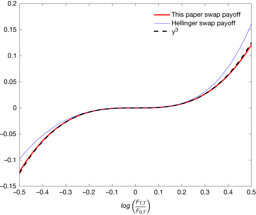


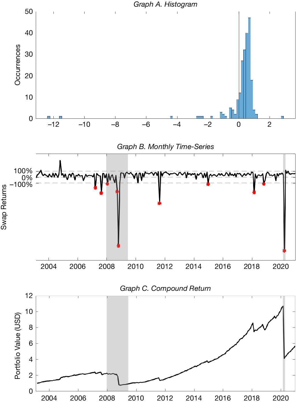

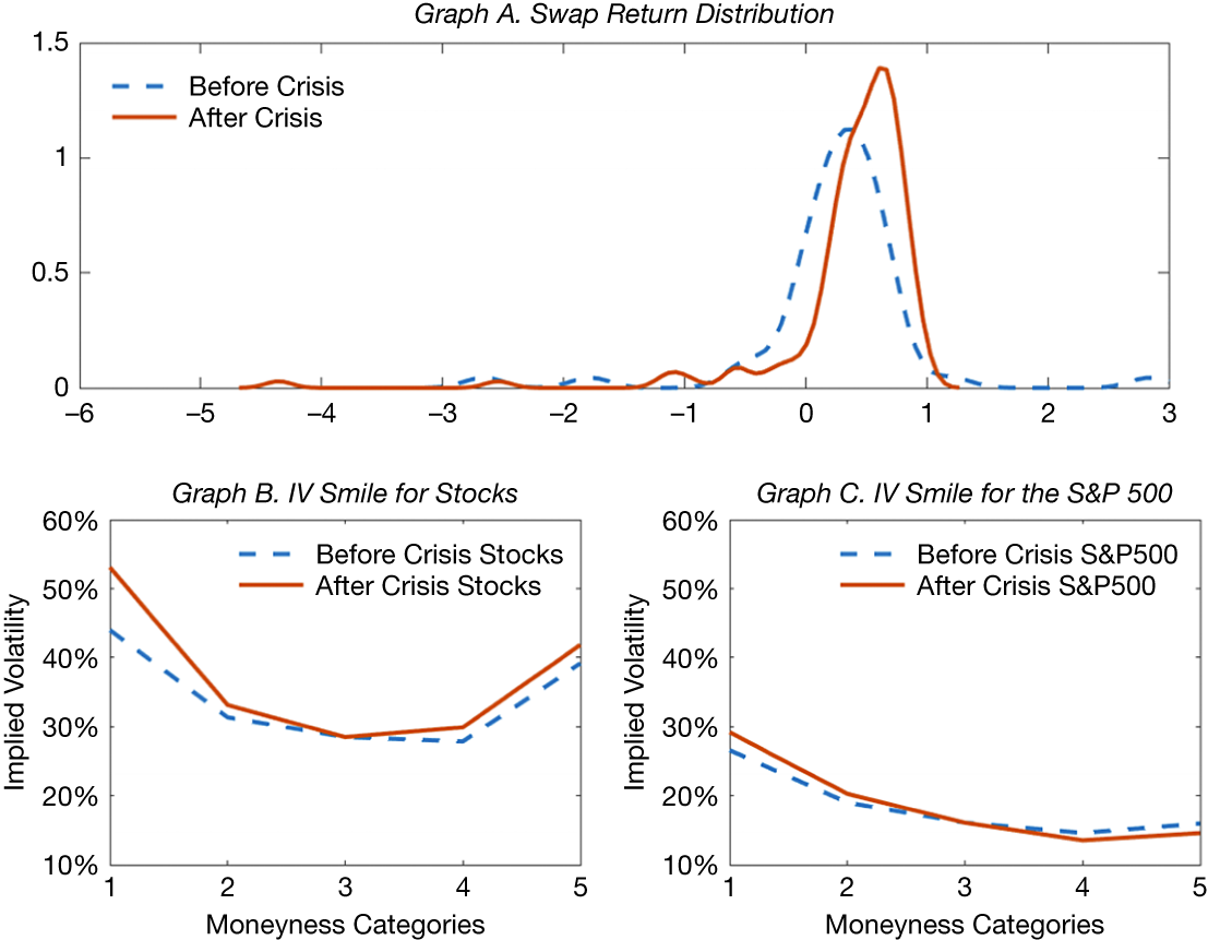
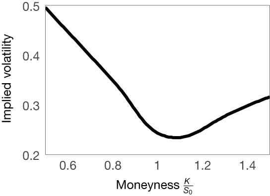


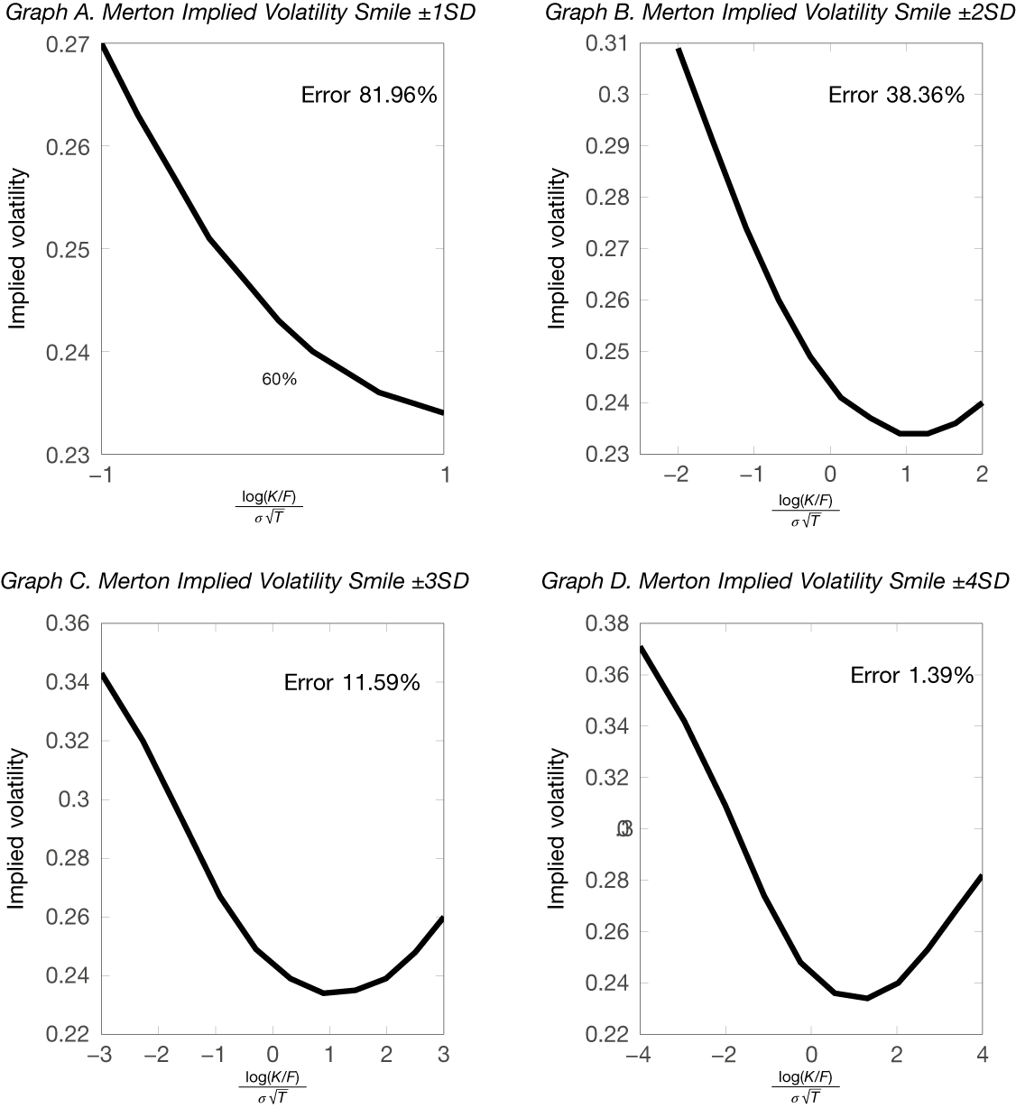


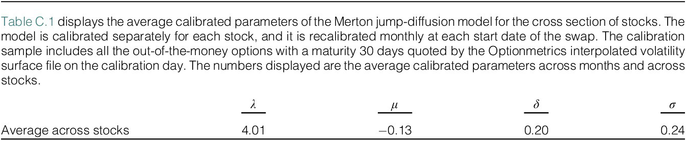
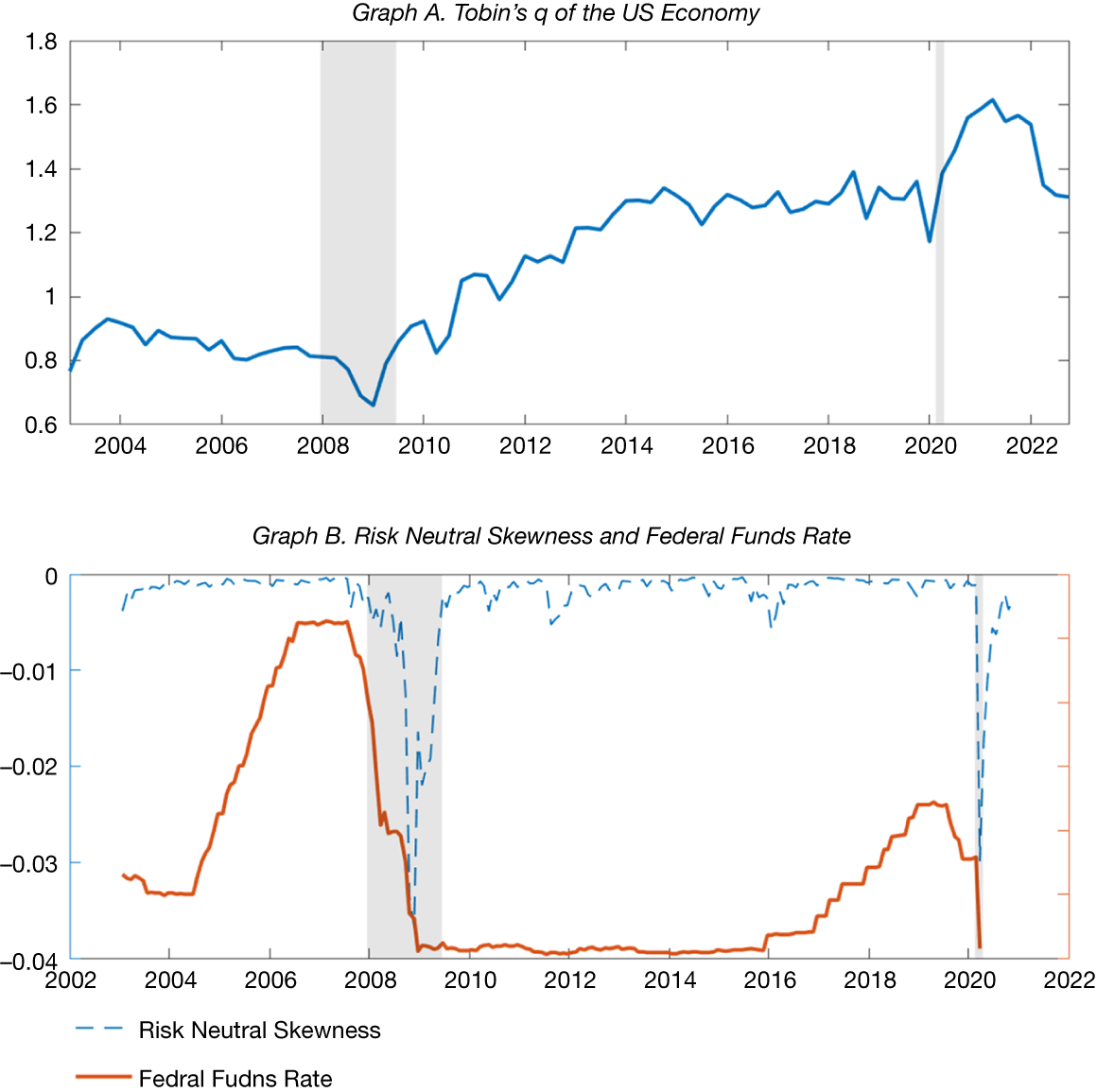


 Open access