

1. INTRODUCTION
The widespread use of the Automatic Identification System (AIS) (ITU, 2010) on ships has provided authorities in charge of maritime situational awareness with a wealth of information on vessel movements. These authorities now routinely handle thousands of AIS messages every second from sources like Maritime Safety and Security Information System (MSSIS) (USDoT, 2011). AIS data has been particularly valuable because each vessel is identified in every AIS transmission, making it much easier to keep track of individual ships. This benefit, however, is balanced by the potential for AIS misuse (Hammond et al., Reference Hammond, McIntyre, Chapman and Lapinski2006) and for the sheer volume of the data to overwhelm human operators (Davenport et al., Reference Davenport, Rafuse and Widdis2004). Both of these concerns suggest the need for automated anomaly detection (Lane et al., Reference Lane, Nevell, Hayward and Beaney2010).
The simplest AIS anomaly of interest to most authorities arises when expected AIS transmissions are not received. According to the rules set out by the International Maritime Organization (IMO, 2011), vessels are supposed to keep their (Class A) AIS transponder in operation at all times (except where international agreements, rules or standards provide for the protection of navigational information). A time interval with no AIS transmission from a vessel is of concern for at least two reasons: a non-transmitting vessel can pose a navigation hazard, and the lack of transmission may indicate a desire to be covert. Thus, authorities say they would like to be notified of these events (Davenport, Reference Davenport2008; van Laere and Nilsson, Reference van Laere and Nilsson2009). Unfortunately, in meeting this request, it is not sufficient to raise an alert whenever an AIS report from a vessel is not received because AIS reception varies widely in both space and time. Designing an automated alert for this type of anomaly requires knowledge of AIS coverage, in order to keep the rate of false alarms to a manageable level. Thus, this paper is concerned with estimating AIS coverage. Knowing the coverage is also useful in planning maritime patrols, or in deciding where to place new stationary sensors. It also helps in detecting false AIS position reports. First, let us define the concept more precisely.
The AIS coverage at a point X, namely c(X), for X in a domain D of points on the surface of the Earth is defined, for a reference vessel, to be the probability of receiving a position report from the vessel at X. It is a surface of probability values that can depend on time. This definition matches the definition of ‘AIS coverage quality’ suggested by the Helsinki Commission Expert Working Group for Mutual Exchange and Deliveries of AIS data (HELCOM, 2011). The coverage clearly depends on weather, sea state, antenna heights and obstacles, among other factors (HELCOM, 2011). One of these other factors is the traffic density. Theoretically, there could be so many AIS transponders near X that they interfere with reception. In practice, the Self-Organizing Time Division Multiple Access (SOTDMA) protocol that controls most AIS messages was designed to manage the transmissions from hundreds of vessels (Hammond and Kessel, Reference Hammond and Kessel2003), so few ground-level receivers should experience problems with interference. Indeed, the methods discussed in this paper ignore interference.
There are two types of approaches to modelling coverage: considering the physics of VHF radio propagation and the characteristics of the relevant antennas (Green, et al., Reference Green, Tunaley, Fowler and Power2011), or using the AIS receptions themselves to estimate the coverage empirically (Lane et al., Reference Lane, Nevell, Hayward and Beaney2010; Lapinski and Isenor, Reference Lapinski and Isenor2011). Little consideration will be made here of the former because, in many practical situations, the necessary information is not available. For example, in data from MSSIS (which typically includes only the AIS messages themselves, with appended timestamps), users may not be privy to information on the source of the AIS data. In such situations, using empirical methods is the only available choice.
Empirical methods have some general limitations. All of them treat the coverage as effectively time-invariant while the AIS observations they use are being collected. When an empirical estimate of coverage is applied to a task (such as anomaly detection), its utility will depend on the similarity of the conditions at the time of application to those at the time of the collection of the data from which the estimate was made. These conditions can include the availability of AIS receivers. Hence, the interpretation of the results is most straightforward when all the AIS receivers are stationary. Another limitation of empirical methods is that they treat all ships as having equivalent transmission characteristics. This is a source of error, insofar as the data set used for the empirical estimate will generally originate from multiple vessels having different antenna heights, which, as already noted, leads to different probabilities of reception.
This paper proposes a new method for empirical estimation of AIS coverage provided by a network of AIS receivers. The new method is unique in that it makes probabilistic inferences about the time and location of missed AIS transmissions.
2. AIS TRANSMISSION AND DECIMATION
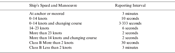
In addition to the variability in coverage, there are at least two other reasons why the time interval between consecutive AIS reports received from a given vessel will vary. First, the interval between transmissions from an AIS transponder is determined automatically from the ship's speed and manoeuvre. Table 1 shows the time intervals for position reports from an AIS transponder that is working as intended (assuming that no one has shut it down nor tampered with it). Thus, if you knew the track and speed of a vessel (from radar, for example) and were given the time of an initial transmission, you could make a good prediction of the time of subsequent ones.
The transmission rate of AIS data varies with the ship's speed and manoeuvre. Class B AIS is for smaller vessels (ITU, 2010).
Second, AIS data collectors (typically ports or government bodies) may decimate the data they receive, to cut down on bandwidth requirements. When we speak of applying a decimation period r, we mean that reports that are separated from the previous retained report from the same ship by a time interval less than r are discarded. Finally, distributors of AIS data, like MSSIS, may apply their own decimation rates in giving the data to end users.
For an illustration of the decimation procedure, see the timeline of AIS transmissions in Figure 1. The variability in temporal spacing between AIS transmissions is based on Table 1. (In this illustration, the vessel in question is changing course for several seconds in the middle of the interval. Near the end of the interval it accelerates to a speed greater than 14 knots.) The transmission at point A initiates a decimation period (here taken to be one minute) during which all received transmissions, if any, are deleted (red marks). Subsequently, it is possible for some transmissions to be missed (green marks) before another one is received (point B).
Example of AIS data decimation. The horizontal black line from A to B is a timeline. Black marks along the timeline indicate ten second intervals starting from A. Blue, red, and green marks along the timeline represent AIS transmissions. Here, the decimation period is set to one minute.

Except where otherwise indicated, we assume in this paper that the decimation history of the data is known and that only one decimation is applied, but we discuss the implications of both assumptions below. In these discussions, we speak of cascading decimation, by which we mean applying the decimation procedure twice in succession, using two different decimation periods. Cascading decimation is of most concern when the second period is greater than the first (otherwise the second decimation has no effect).
3. THE LAPINSKI-ISENOR COVERAGE (LIC) ESTIMATOR
Regions of sporadic AIS reception indicate poor AIS coverage, while reception should be nearly continuous in areas with good coverage. Thus, an examination of the time interval between successive reports from the same vessel should be useful in coverage estimation. The Lapinski-Isenor (LIC) estimation algorithm considered in this section (Lapinski and Isenor, Reference Lapinski and Isenor2011) is based on examining such intervals. See the previous section for a discussion of the different sources of variability in these intervals.
The LIC algorithm estimates coverage by superimposing a grid of squares on the region of interest. Let ΔA denote the width of each square in the grid. Let us number the grid cells from 1 to n to identify them uniquely, and define the function g(X) to be the index of the grid cell containing the point X. This function can then be used to assign AIS transmissions to the grid cells in which they occur. An estimate of the coverage is made for each cell. Let Ĉ(i) denote that estimate for the i-th grid cell, for each i from 1 to n. Then for every point X in the region of interest, the final estimate of the coverage c(X) is given by Ĉ(g(X)).
The LIC algorithm identifies three key subsets of the received and retained AIS transmissions: births, deaths, and active transmissions. Births and deaths are both defined with respect to a reference time interval (Δt) as follows: Whenever two successive AIS reports from a given ship are separated in time by more than Δt, the earlier report is defined as a death and the later one as a birth. Also, the first report from any ship is a birth. Note that, under these rules, it is possible for a single transmission to be both a birth and a death. A transmission that is neither a birth nor a death is considered active, if it is the next transmission from a ship after a birth or it is in a different grid cell than the previous transmission from the same ship.
To complete the specification of the LIC algorithm, we define the computation of Ĉ(i) in each cell. Let A i, Bi and D i refer, respectively, to the number of active transmissions, births and deaths in the i-th cell, and let let F i=A i+B i+D i. The LIC estimate is:
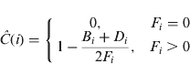
Thus, an abundance of active transmissions is taken to indicate good coverage, while an abundance of births and deaths is taken to indicate poor coverage. Note that, when F i >0, the coverage estimate has a range from 0·5 to 1·0.
4. A NEW COVERAGE ESTIMATION METHOD
In comparison with a simple glance at a map of AIS transmission locations, the LIC method adds value by considering the time gap between successive transmissions from the same vessel. Our new method (‘HPC’) goes a step further by making inferences about the times and locations of the missed transmissions. In doing so, it uses knowledge about how AIS transponders work (Table 1). This development requires that we take into account geographical constraints and make assumptions about vessel behaviour. It also greatly increases the computational requirements.
Like the LIC algorithm, HPC employs a grid to estimate coverage. The HPC method estimates the coverage for any given grid cell by considering the number of ‘hits’ and the number of ‘misses’ in that cell. Here, a ‘hit’ is a received AIS signal, and a ‘miss’ is an AIS signal that is not received but is inferred to have been transmitted and not removed by the decimation process.
We use a binomial model for the ‘hits’ and ‘misses’. In accordance with typical Bayesian practice, we employ a Beta prior for the reception probability (Gelman et al., Reference Gelman, Carlin, Stern and Rubin1995). Let h(i) and m(i) denote respectively the number of ‘hits’ and the number of ‘misses’ in the i-th cell. The posterior distribution (derived from Bayes’ theorem) then also follows a Beta law, with density proportional to xα (i)−1(1−x)β(i)−1 for 0 <x <1 and zero elsewhere, where α(i)=α 0+h(i) and β(i)=β 0+m(i).
The constants α 0 and β 0 are the parameters of our Beta prior distribution. We use a ‘non-informative’ prior distribution so that it will have as little influence on the result as possible. Thus, we take ![]() , corresponding to the Jeffreys prior (Gelman et al., Reference Gelman, Carlin, Stern and Rubin1995). Our estimate of the coverage probability in the i-th cell is the mean of this beta distribution:
, corresponding to the Jeffreys prior (Gelman et al., Reference Gelman, Carlin, Stern and Rubin1995). Our estimate of the coverage probability in the i-th cell is the mean of this beta distribution:
The variance (Equation 3) provides a measure of uncertainty in our estimate: A lower variance corresponds to greater confidence.
The key issue of the method is how the missed transmissions can be inferred. Let A and B denote two consecutive received transmissions from a given vessel. If we knew the exact path of the vessel between A and B, we would be able to infer the missed transmissions from the AIS transmission rules, as discussed in the previous section (see Figure 1).
Since we do not know the exact path, we create a set of random interpolated paths from A to B. The procedure for making a random path (Peters and Hammond, Reference Peters and Hammond2011) goes roughly as follows. If the time interval is shorter than a constant parameter τ min, we assume that the vessel follows the shortest route at a constant speed. Otherwise, the time interval is subdivided, by picking a random position X at a random time coordinate within the interval (subject to various constraints), and the path creation procedure calls itself recursively from A to X and from X to B. The case of a time interval shorter than τ min terminates the recursion. The choice of τ min represents a compromise: Decreasing τ min would have the benefit of giving the interpolated paths more flexibility, but would also require more computation.
As well as τ min, other parameters of our interpolation method include the maximum and preferred speeds of the ship; the minimum, peak and mean duration of port stays; an index of the ships’ tendency to visit ports rather than sailing on (the ‘landlust’); and a Boolean flag that permits or forbids immediate revisits to the same port.
In general, the number of paths to generate is a matter of compromise between better statistics and lower computational requirements. The longer the interval between successive AIS reports, the more variability there is in the intervening voyage. We deal with the greater variability by making the number of interpolated paths an increasing function of the time interval; up to some pre-set maximum interval, beyond which we deem it impractical even to attempt an interpolation. Thus, we introduce two further parameters, τ max and N max. For a time interval longer than τ max, we make no interpolations at all. For a time interval whose length T is longer than τ min but shorter than τ max, the number of random paths we generate is the greatest integer that is no greater than ![]() . For a time interval shorter than τ min, we generate only one path, which as already noted simply follows the shortest route at a constant speed.
. For a time interval shorter than τ min, we generate only one path, which as already noted simply follows the shortest route at a constant speed.
Missed transmissions are inferred for each random path, but are given fractional value: If there are N random paths in a given interval, then each inferred transmission is given a weight of 1/N for purposes of counting the number of “misses”. Hence m(i), the number of ‘misses’ in the i-th grid cell, is often not integer-valued. Nevertheless, we base the coverage estimate on the beta distribution described above, using Equations (2) and (3) without modification.
The method we use for inferring the missed transmissions for a given random path is based on the discussion in Section 2 (see Figure 1) with one small change; in order to avoid any possible conflict with the transmission schedule at the end of the interval in question, we infer the missed transmissions by tracing the interpolated path backwards in time. Figure 2 provides an example of such inference in the case of a random interpolated path between two points (A and B) from which AIS transmissions have been received. The positions of the inferred missed transmissions are determined by applying the transmission rules (Table 1) to the path as traced backwards from B to the end of the decimation period initiated by the transmission at A.
Inferring missed transmissions from a randomly interpolated path. AIS transmissions are received from points A and B. Between those points, an interpolated path consisting of five straight segments is generated. The green marks represent the positions of the inferred missed transmissions. The spacing is based on Table 1, except that here we follow the timeline backwards from B to the end of the decimation period (red). The vessel is taken to be going faster than 14 knots in the fourth segment (between X3 and X4) but not in the third or fifth.

Though developed independently, our coverage estimation method resembles a previously-outlined binomial approach (Lane et al., Reference Lane, Nevell, Hayward and Beaney2010). A major difference between this previous work and our method is that in the former, only a single interpolation, corresponding to the most direct route, is made in each gap, whereas we account for the uncertainty inherent in interpolation by making multiple random paths. The other known difference is in the prior distribution. Unfortunately the paper by (Lane et al., Reference Lane, Nevell, Hayward and Beaney2010) does not specify their method sufficiently to make a direct comparison in performance.
5. SIMULATION BASED TEST DATA
This paper uses simulated AIS data to compare and evaluate coverage estimation methods in a situation where the true coverage is known exactly. This section is devoted to a description of how the AIS data sets were created. Figure 3 consists of a simple map of the situation, showing three landmasses, two ports, and three AIS receivers. The area depicted in that figure is 240 nautical miles (Nm) by 130 Nm. Figure 4 depicts the true coverage using a heat map. For purposes of creating the true coverage in this simulation, there was no need for a realistic model of coverage. In order to allow a wide range of coverage probabilities to be represented within the geographical bounds of the area of interest, we assumed that each of the three receivers had the same reception characteristics, and we used the following (arbitrary) logistic model:
Scenario Map. Three landmasses are shown in grey. The locations of two ports and three AIS receivers are also shown. The large rectangle shows the region in which the vessels started and ended the simulation.

True (simulated) AIS Coverage. Three landmasses are shown in grey. The water area is partitioned into a grid of cells that are 2 Nm wide. Different colours are used to represent different levels of AIS reception probability (p) over the cells, as shown in the legend below the map. Thus, red areas indicate good coverage, blue areas indicate poor coverage and green areas are intermediate.

In Equation (4), p is the reception probability at the receiver and R is the range to the target in Nm. The indicator variable Λ was set to 1 if the vector from receiver to target crossed any land, and to 0 otherwise. Equation (4) makes the range dependence of the reception probability roughly resemble the results of a study of reception quality by the Australian Maritime Safety Authority (Cooper and Surendonk, Reference Cooper and Surendonk2008).
The surface depicted in Figure 4 is the probability that at least one of the three receivers detects the transmission (assuming independent reception). To be more precise, it represents the average reception probability over each of the 2 Nm grid cells. That average was computed using a weighted average of the reception probabilities at cell corners and at the cell midpoint. In that weighted average, the cell centre got four times the weight of each corner, and any cell corners or midpoints that were on land were excluded.
Our method for generating random paths between AIS reports (Peters and Hammond, Reference Peters and Hammond2011) was used to simulate ship movements within the area shown in Figure 3 and Figure 4. The former figure shows a rectangular region that represents a zone of high vessel traffic. To create a random ship track and the resulting AIS data, we did the following steps:
Step 1. Select start and end points at random in the water portions of the rectangle in Figure 3.
Step 2. Attach a time stamp of March 25, 2011 04:24:12 to the start point and make the end point 24 hours later.
Step 3. Connect the two points with a random track (using our interpolation method and the parameters specified below).
Step 4. Simulate the AIS transmissions along that random track according to the (Class A) rules of Table 1.
Step 5. Determine which of the three receivers detected each transmission at random using reception probabilities from Equation (4).
Step 6. Retain only those transmissions detected by at least one receiver.
Step 7. Decimate the retained transmissions with period r set to equal 5 minutes.
We repeated these seven steps 60 times to produce a data set containing the received and decimated transmissions from 60 distinct ships. To introduce additional replication, we produced ten such data sets (60 ships each), denoted S 1 through S 10.
The simulation region was designed to ensure that all combinations of high and low traffic and high and low coverage were represented. The area near the top left receiver (see Figure 3) has high coverage but low traffic. Areas near the other two receivers have both high traffic and high coverage. The top right area has low coverage and low traffic, and the strait in the middle has high traffic but low coverage. We suspected that the different coverage estimation algorithms would have different relative performance in some of the four area types.
Our interpolation method (Peters and Hammond, Reference Peters and Hammond2011) is parameterized by the maximum and preferred speeds of the ship (here 15 and 10 knots, respectively); by the minimum, peak and mean duration of port stays (here 1 hour, 4 hours and 5 hours, respectively); by an index of the ships’ tendency to visit ports rather than sailing on (here the ‘landlust’ L=10, as a result of which 83·3% of ships visit port at least once, a proportion that increases with increasing L); by a flag that permits or forbids immediate revisits to the same port (here forbidden); and by the minimum time interval τ min over which paths are considered random (here 15 minutes).
6. RESULTS
Our approach to understanding the differences between the coverage estimation methods is twofold: we examined results in detail on one of the data sets (S 1) and we also looked at several average performance indices (averaged over S 1 through S 10). In pursuing the latter, we were interested in the change in the performance indices as a function of the number of ships used. Thus, we computed coverage estimates using only the first 20 ships in each data set, then using the first 40 ships and lastly using all 60 ships.
Figure 5 gives a visual presentation of the AIS data in S 1. Comparison of that figure with Figure 4 shows that the areas with the best coverage do indeed have most of the data.
Plot of AIS report positions from the first simulated data set (S1). The scale (width 240 Nm, height 130 Nm), and the landmasses (grey) are the same as in Figure 4. Many of the simulated ship tracks visit one of the two ports.

In subsequent figures we present estimation results for the HPC and LIC methods. Both coverage estimation methods have various configuration options and the purpose of this section is to define what was used in each case. The values given in this paragraph define the ‘base case’ configuration for each method. For the LIC method, the configuration options are Δt=600 s and ΔA=2 Nm (recall that ΔA is the grid cell size). For the HPC, ΔA=2 Nm as well, but there is no analogue for Δt. The interpolation parameters were set to the same values used in simulation (see the last paragraph of the previous section), and in addition, set τ max=24 hours and N max=100. The true value of the decimation period (here r=300 s) is assumed to be known. We examined the sensitivity of the results to several of these choices below.
Figure 6 shows the LIC estimate on the first simulated data set. In this figure, we have shown coverage results only in cells for which there are AIS data. When there are no AIS data, the LIC estimator gives a coverage estimate of 0 (Lapinski and Isenor, Reference Lapinski and Isenor2011). The lack of AIS data, however, cannot be reliably attributed to a lack of coverage, since it could also be that there was simply a lack of traffic. Thus, we only evaluate the estimator where it has data and results are therefore constrained to the range 0·5 ⩽ Ĉ ⩽ 1 (Equation 1).
LIC coverage estimate from the first simulated data set (S1). The scale (width 240 Nm, height 130 Nm), and the landmasses (grey) are the same as in Figure 4. The colour scheme of the estimate is also the same as in Figure 4, except that white areas indicate grid cells with no AIS reports in them.

Figure 7 shows the new (HPC) coverage estimate on a scale to facilitate comparison both to the true coverage (Figure 4) and to the LIC estimate. Again, we have used white for cells with no data, but in this case the data in question include inferred missed reports as well as received reports. Note that the default value in the case of no data is 0·5.
HPC coverage estimate from the first simulated data set (S 1). The scale (width 240 Nm, height 130 Nm), and the landmasses (grey) are the same as in Figure 4. The colour scheme of the estimate is also the same as in that figure, except that white areas indicate grid cells with no AIS reports (whether received or inferred) in them.

Figure 8 depicts the variance in the HPC estimate as a function of position. Here, the blue areas correspond to the maximum value (0·125) of the variance, which occurs only where there are no data (received or inferred). The variance can be used as a tool to indicate where the HPC estimate should or should not be trusted. Our use of white in Figure 7 represents a decision to distrust the estimate where the variance is greater than or equal to 0·125. If desired, the threshold of trust can be set more strictly.
Variance in the results of the HPC coverage estimator, from the first simulated data set (S1). The scale (width 240 Nm, height 130 Nm), and the landmasses (grey) are the same as in Figure 4. The colour scheme is as shown in the legend below the map. Variance is highest in blue areas, lowest in red areas and intermediate in green ones.

In Figure 9, we plot the estimates in every grid cell for which there is at least one received AIS report, based on all 60 ships from the first data set (S 1). The estimated value is on the vertical axis and the true value is on the horizontal axis. The plotted points from an ideal estimator would fall along the diagonal line from (0,0) to (1,1). Most of the plotted points from the HPC estimator can be seen to be distributed roughly along this diagonal. The LIC estimator gives a value of unity for grid cells covering the full range of true coverage values from 0 to 1.
Comparison of estimated coverage to true coverage values. Each point represents the results in one grid cell. Only the grid cells in which at least one AIS report was received are included. This plot is based on the first data set (S 1).
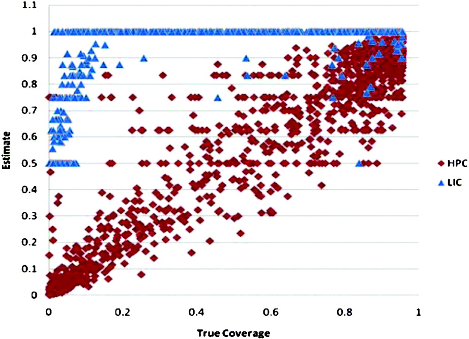
The Mean Squared Error (MSE) from the set of points shown in Figure 9 is 0·017 for the HPC and 0·184 for the LIC estimator. A similar difference in performance held for each of the ten data sets.
Figure 10 presents the MSE for the two methods, computed from the grid cells with received AIS transmissions, averaged over all ten data sets. The difference in performance between methods is statistically significant (the Wilcoxon signed rank test gives a P-value of 0·001). In addition to the base case, we ran the results with some parameters changed. Both methods were tested with ΔA=5 Nm; the LIC method was tested with Δt=480 s; and the HPC method was tested with the ship speed parameters changed (the maximum and preferred speeds set to 20 knots and 15 knots, respectively) and again with the port stay parameters changed (the mean and peak port stay lengths changed to 9 hours and 7 hours, respectively). The results of the latter two parameter changes in the HPC method are indistinguishable from those of the base case in the figure.
Mean Squared Error (MSE), averaged over the ten data sets, for each of the three coverage estimators under different configuration options. HPC results are shown in tints of red, and LIC results in tints of blue.

Figure 10 reveals a counter-intuitive result for the LIC method. As the number of ships increases (as you get more AIS data) the MSE for this method gets worse. This result, however, should be seen in light of the fact that the estimation area, over which the MSE is being computed, is also increasing as a function of the number of ships. Over a fixed set of grid cells, the LIC MSE values do improve with more data (result not shown), though only slowly. In contrast to the LIC, when given more data, the HPC is able to improve estimates fast enough to keep pace with the expanding estimation area, so that the MSE improves overall.
We attribute HPC's performance advantage over the LIC largely to its use of information on how AIS transponders work (Table 1). If this attribution is correct, then any changes to the way the data arise that break the expectations resulting from Table 1 should reduce HPC performance. We investigated two such changes: transponders being turned off and unknown decimation history. It turns out that one of these has a dramatic effect.
The HPC method might be vulnerable to vessels turning off their AIS transponders because it would attribute the resulting gap to missed transmissions. Thus, we examined the impact of having the first ship in each data set turn off the AIS transponder for two hours starting from seven hours into the simulation. Table 2's second row (after the header) gives the results of this estimation scenario for comparison with the base case results (row one), showing a small deterioration in MSE in the third decimal place. Thus the effects of a single two-hour hiatus are relatively small. Not surprisingly, the effects of turning off a transponder are greatest when fewer vessels are used in estimation.
This table examines the effects of various data and estimation scenarios on the MSE for the HPC method. Results are averaged over the 10 data sets, and shown in three columns according to the number of ships used in estimation. MSE results were evaluated for grid cells in which there was at least one received AIS report.
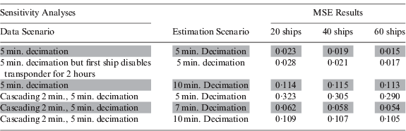
The last three rows of Table 2 examine the effects of cascading decimation. To compute these results, we redid the decimation of the simulated data sets (S 1 to S 10). Instead of applying a single five minute decimation period, as in previous results, we applied first a two minute decimation followed by a five minute decimation. Row four of the table shows that the effects of such cascading decimation can be very detrimental to HPC. Performance is worst if, in ignorance of the decimation history, HPC estimates as if the true decimation period were five minutes (the observed minimum gap between transmissions). Note that column 2 of the table shows the decimation period used in estimation.
To see why performance is degraded in row four of Table 2, consider a grid cell where the true coverage is perfect. In such a cell, the cascading decimation scheme would give an interval between retained reports of six minutes. Comparing this gap to the five minute period used in estimation gives a full minute of inferred missed reports (at least six such reports if the ship is not at dock). With six ‘misses’ for each ‘hit’, the estimate in such a cell would be about 1/7, which compares poorly to 1. On the other hand, where the true coverage is poor enough to give 5 minute gaps between received transmissions, the estimator could produce a result near 1. Cascading decimation can break our natural expectation that longer intervals between reports are indicative of poor coverage.
Had the true cascading decimation history been known (i.e., two minutes followed by five minutes), HPC should have estimated as if the (single) decimation period was 7 minutes to recover nearly all of its performance, as shown in the second last row of Table 2. This is because we can only infer that there must have been a missed transmission after seven minutes have passed. In general, if there has been cascading decimation with periods r 1 followed by r 2, then HPC should estimate as if the decimation was r 1+ r2.
If the decimation history is uncertain, precautions can be taken to avoid the poor performance shown in row four of Table 2. In general, if the minimum interval between reports is r and the decimation history is completely unknown, we recommend estimating as if the decimation was 2r. We arrived at this by noting that the worst effects of cascading decimation occur when the first period is just slightly less than the second. This conservative option will protect against worst case performance, at the cost of reduced performance in the best case, as shown in rows three and six of Table 2.
7. DISCUSSION
This paper presented a new Automatic Identification System (AIS) coverage estimation algorithm (HPC) that draws inference about missed transmissions based on knowledge of how AIS transponders work. HPC was compared to the Lapinski-Isenor (LIC) method on simulated data. This comparison showed that HPC has significantly lower Mean Squared Error (MSE) (Figure 10) and that it estimates effectively over a wider area (compare Figure 6 to Figure 7). The HPC method also provides a measure of the uncertainty in its results (see Figure 8 and related discussion), so that the user can judge where the results should or should not be trusted. These improvements come at the cost of increased computational load.
Our claim to improved performance is vulnerable to all the usual limitations of simulation studies. In principle, the difference between the real processes and the simulated ones could prove to be important enough to change the results, so we discuss aspects of this objection below. We tried to anticipate real situations that might reduce HPC performance. We looked at four potential vulnerabilities: HPC might be more vulnerable to transponders being turned off (or other AIS misuse), HPC does not consider traffic and manoeuvrability constraints in interpolation, HPC has more parameters to set and, finally, we looked at cascading decimation.
If vessels shut off their AIS transponders while the AIS reports to be used in coverage estimation are being collected, HPC can be expected to be affected since it will attribute the time gap (while the device is off) to missed transmissions (many of them), introducing a potentially strong downward bias in nearby coverage estimates. Clearly, HPC has to be very careful not to interpolate over time intervals where vessels are at dock because vessels are most likely to shut off their AIS at dockside. Fortunately, recognizing such dockside intervals is straightforward. In the results above, we showed that one vessel could disable its transponder for two hours without much reduction in the HPC method's performance (MSE increased by 0·002).
HPC inherits, from its interpolation method, an assumption that the movements of ships are limited primarily by their maximum speed and not by such things as traffic density or manoeuvrability constraints. Again, we can anticipate the likely bias. If ships actually move much more slowly than the interpolator thinks (because they are constrained by traffic) then the interpolator will both create more missed transmissions than there should be (because ships transmit more when they move faster – recall Table 1) and spread these over a wider area. We would predict a small downward bias in the coverage estimate. One of our sensitivity analyses examined exactly this and found but a tiny change in MSE (in the fourth decimal place) when there was 5 knots of error in the maximum and preferred speeds. Thus, a realistic error in the assumed ship speed is unlikely to have much effect.
HPC's interpolation model also includes parameters that represent assumptions about the duration of port stays, and these parameters may also induce bias. Changing these parameters also had a small effect on the MSE (in the third decimal place), indicating that the results are insensitive within the ranges tested.
There was something that gave HPC trouble, however, and that was cascading decimation. The problem was especially serious if HPC was implemented as if cascading decimation was not a possibility. Unfortunately, with AIS distributors like the Maritime Safety and Security Information System (MSSIS), cascading decimation is possible. The usual practice of MSSIS is to decimate the data they distribute to end users with a default period of five minutes. They will, however, refrain from applying this decimation on request, so avoiding cascading decimation may be a simple matter of making the appropriate arrangements. Where the problem is unavoidable, but the decimation history is known, then HPC's performance advantage can be largely recovered (Table 2). Where the decimation history is unknown, HPC can be configured so as to be robust against cascading decimation, at a potentially acceptable cost to best case performance. The key lesson here is that knowledge about what processes have been applied to the data is valuable to empirical coverage estimators. We recommend that distributors of AIS data, like MSSIS, share meta-data about what decimation has been applied with their users. We also suggest they share meta-data on whether reports come from mobile or fixed sources. Neither recommendation would significantly compromise classified sources. Both would facilitate the empirical estimation of coverage and ensure that HPC could provide coverage estimates of sufficient quality to support reliable anomaly detection. These recommendations might be more broadly applied, if they were endorsed by Helsinki Commission Expert Working Group (HELCOM, 2011).
Current empirical AIS coverage estimation methods have been unable to provide true statistical estimates of coverage because they lack knowledge of the missed transmissions. By including inferred missed transmissions, HPC has been able to provide a proper statistical estimate, with appropriate accounting for uncertainty. This capability in turn opens up the opportunity for a broad variety of decision aids in maritime domain awareness, especially anomaly detection.


