

The importance of residential segregation in explaining modern racial differences in socioeconomic outcomes is well known. There are a variety of studies linking segregation in the United States to schooling and labor market outcomes for African Americans (Kain Reference Kain1968; Cutler, Glaeser, and Vigdor Reference Cutler, Glaeser and Vigdor1999; Cutler and Glaeser Reference Cutler and Glaeser1997; Collins and Margo Reference Collins and Margo2000). Segregation has also been shown to impact the health of African Americans through a lack of access to health care (Almond, Chay, and Greenstone Reference Almond, Chay and Greenstone2006). Additionally, there is a growing literature on the importance of neighborhood effects and social networks suggesting that segregated neighborhoods could contribute to racial gaps in a variety of socioeconomic outcomes (Case and Katz Reference Case and Katz1991; Brooks-Gunn et al. Reference Brooks-Gunn, Duncan and Kato Klebanov1993; Borjas Reference Borjas1995; Cutler, Glaeser, and Vigdor Reference Cutler, Glaeser and Vigdor2008; Ananat Reference Ananat2011; Ananat and Washington Reference Ananat and Washington2009; Echenique and Fryer Reference Echenique and Fryer2007). It is clear that any explanation of modern racial differences in socioeconomic outcomes must consider the effects of residential segregation on a host of factors.
The effects of segregation, however, are not only contemporary but also part of a long-run process of racial sorting which requires historical investigation. Understanding segregation in the decades between the Civil War and the Great Migration is essential to understanding the historical origins of racial gaps in socioeconomic outcomes as well as modern patterns of segregation and discrimination. However, a lack of data essential to estimating traditional measures of segregation has led to few quantitative estimates of segregation prior to the second half of the twentieth century. Given the significant impacts of segregation on outcomes in the modern economy, it would be tremendously valuable to understand how segregation patterns evolved and influenced outcomes in the period between Reconstruction and the Great Migration, a period during which blacks became a predominately urban group and a period that ushered in Jim Crow laws and other racially-restrictive codes, institutionalizing segregation. A broad, long-run view of segregation that encompasses both urban and rural areas is required if we are to understand its function and change over time.
A comprehensive measure of segregation is also an important empirical element in a growing literature seeking to analyze the institutional development of the United States. While regional income differences are well known, scholars have found strong evidence in support of the persistence of regional-specific institutions on a range of economic outcomes (Naidu Reference Naidu2012; Alston and Ferrie Reference Alston and Ferrie1993; Wright Reference Wright1986; Margo Reference Margo1990; Hornbeck and Naidu Reference Hornbeck and Naidu2014; Ramcharan Reference Ramcharan2010). The effects of these institutional developments have important implications for the residential living patterns of black and white residents in urban and rural communities.
To date, however, we do not know how historical residential segregation in rural communities impacted racial gaps in outcomes or how it related to institutional developments given the focus of existing empirical studies of historical segregation on urban areas. David Cutler, Edward Glaeser, and Jacob Vigdor Reference Cutler, Glaeser and Vigdor1999) document changes in urban residential patterns over the entire twentieth century. Allison Shertzer and Randall Walsh Reference Shertzer and Walsh2016) further examine the 1900 to 1930 period using neighborhood-level data for ten major cities while William Collins and Robert Margo Reference Collins and Margo2000) provide further analysis of changing urban residential patterns from 1940 to 1990. These studies find that urban segregation rose drastically over the twentieth century as blacks migrated to cities and then became concentrated in city centers as white residents moved to suburbs. However, these studies utilize traditional segregation measures that are specific to cities. These measures compare the racial composition of wards within a city to the racial composition of the city as a whole and are not well-suited to rural areas that lack equivalent geographic subunits. Consequently, there is little quantitative evidence of segregation and its effects prior to the Great Migration when the black population was still a primarily rural population. Between 1870 and 1940, the share of the black population living in rural areas fell from roughly 90 percent to under 50 percent. There are few theoretical reasons to believe that segregation in these rural communities is unimportant or unrelated to socioeconomic outcomes (Lichter et al. Reference Lichter, Parisi and Grice2007). Furthermore, the segregation patterns in the rural communities that black residents left may be a crucial piece to understanding the causes and consequences of the Great Migration.
In an effort to allow for a more comprehensive analysis of segregation, this article introduces a new measure of residential segregation. Our measure uses the newly available complete manuscript pages of the 1880 and 1940 federal censuses to identify the races of nearby neighbors. We measure segregation by comparing the number of households in an area living next to neighbors of a different race to the expected number under complete segregation and under no segregation (random assignment). The resulting statistic provides a measure of how much residents segregate themselves given the particular racial composition of the area. The measure allows us to distinguish between the effects of differences in racial composition and the tendency to segregate given a particular racial composition. By exploiting actual residential living patterns of individual households, this measure is equally applicable to rural and urban areas and can be consistently applied over time. Previous advances in the measurement of segregation have attempted to use smaller geographic units (Reardon and O' Sullivan Reference Reardon and O'Sullivan2004; Echenique and Fryer Reference Echenique and Fryer2007; Reardon et al. Reference Reardon, Matthews and O'Sullivan2008), but none has comprehensively exploited the actual pattern of individual household location as we do here nor have they been extended to rural communities. Our measure is the first to give a complete picture of segregation for the entire United States and does so at the finest level of detail possible for residential location. For an understanding of the evolution of racially distinct residential living patterns and for uncovering the root causes of changes in segregation, the dimension of segregation captured by this new measure is essential.
Our neighbor-based measure establishes several new facts about segregation in the United States. First, we find that segregation, as measured by our neighbor-based index, doubled nationally from 1880 to 1940. This is the first evidence of a national increase in segregation. Second, contrary to previous estimates which implied that Northern cities were the most segregated areas (Cutler, Glaeser, and Vigdor Reference Cutler, Glaeser and Vigdor1999), we find that cities in the South were the most segregated in the country and remained so over time. While blacks and whites occupied the same wards and districts in Southern cities, they were the least likely to be neighbors. This finding is a direct result of a measure of segregation that builds from individual household position as opposed to ward population shares. Third, we find that increasing segregation over time was not confined to cities, was not driven by black migratory patterns, nor was urbanization the sole driving force behind increasing segregation. Our neighbor-based measure of segregation shows that population sorting by race changed just as dramatically in rural areas as in urban areas. The broad, national increase in racial sorting we document is a new historical fact that alters the existing segregation narrative that depends critically on African American migratory flows and points to a more general trend in residential racial separation than has been previously suggested.
These results suggest that the traditional story of increasing segregation in urban areas in response to black migration to urban centers must be augmented with a discussion of the contemporaneous increasing racial segregation of rural areas. Both rural and urban areas in every region experienced marked increases in segregation. Our findings show that the likelihood of opposite-race neighbors declined precipitously in every region in the United States. Our findings complicate traditional explanations of blacks clustering in small areas abutting white communities (Kellogg Reference Kellogg1977), and of racial segregation being driven by restrictive covenants (Gotham Reference Gotham2000), as both of these were urban phenomena. The increase in rural segregation also challenges historical narratives which view population dynamics in rural areas as stagnant. The focus on urban segregation has neglected the fact that rural areas were segregated and, as we have discovered, became increasingly segregated over time. While there are studies which seek to look at the causal effect of black social networks in rural areas on outcomes (Chay and Munshi Reference Chay and Munshi2013), they use county racial proportions which we show are relatively poorly correlated with residential segregation. Overall, the national trend in increasing segregation through the middle of the twentieth century adds a new chapter to American history and shows that patterns of racial sorting were quite general over time.
A NEIGHBOR-BASED MEASURE OF SEGREGATION
We begin with a brief overview of existing segregation measures and use that discussion to motivate the usefulness of our new approach to segregation. In particular, the limited applicability of the most widely-used measures of segregation to non-urban areas creates a problem when attempting to describe the broad change in racial residential segregation which is our task here.
The Limitations of Traditional Segregation Measures
A wide range of measures have been introduced to measure segregation. Douglas Massey and Nancy Denton (1988) provide an overview of 20 different measures in use in the segregation literature. These various measures all capture different dimensions of segregation. Massey and Denton broadly categorize these as centralization, concentration, exposure, evenness, and clustering. The majority of the segregation literature has focused on the dimensions of evenness and exposure; the two dimensions of segregation economists have held as most important in determining how segregation influences socioeconomic outcomes.
Evenness is the differential distribution of social groups across geographic subunits. As evenness decreases it becomes more likely that minorities have significantly different access to schooling and health resources as well as labor markets due to their concentration in specific subunits. Exposure measures the degree of potential contact between social groups. To the extent that social networks and peer effects are important for outcomes, differences in the levels of exposure will have potentially significant consequences for groups excluded from such networks due to limited contact. The economics literature on segregation has typically relied on two specific measures of these dimensions: the index of dissimilarity as a measure of evenness and the index of isolation as a measure of exposure.
The index of dissimilarity is a measure of how similar the distribution of minority residents among geographical units is to the distribution of non-minority residents among those same units.Footnote 1 The index compares the percentage of the overall black population living in each geographical subunit to the percentage of white residents living in that same area. The index of isolation provides a measure of the exposure of minority residents to other individuals outside of their group.Footnote 2 This is a measure of the racial composition of the geographical unit for the average black resident, where racial composition is measured as the percentage of the residents in the unit who are black.
While Cutler, Glaeser, and (Vigdor Reference Cutler, Glaeser and Vigdor1999) and Werner Troesken (Reference Troesken2002) demonstrate that these traditional measures of segregation can be applied to historical data, their studies also highlight the limitations of measures of isolation and dissimilarity when applied to the early 1900s. Chief among these limitations are the measures' data requirements. Estimation of either index requires observing variation in the racial composition of the geographical subunits making up the larger geographical unit of interest. Cities have a somewhat natural subunit of wards or, in more recent decades, census tracts. Rural counties do not necessarily have a comparable subunit. The index of dissimilarity and the index of isolation therefore allow us to understand historical levels of segregation in cities but not in the areas surrounding those cities or in rural counties. This presents a severe limitation on our understanding of segregation in the past when the majority of individuals, and particularly black individuals, lived in rural areas. The index of isolation and index of dissimilarity can tell us how segregation in cities changed with the influx of these individuals but they cannot tell us how segregation in the rural counties contributed to that migration and changed as a result of it.
An additional problem with these traditional measures is that they only use population shares within a given geographic subunit, obscuring within-area segregation and making them poor proxies for social interactions, social networks, and interpersonal exchange. This is particularly problematic for rural areas where geographical subunits may be less meaningful proxies for social interactions.Footnote 3 Furthermore, if the size of these geographical subunits or the economic implications of living in a particular subunit differ across rural and urban communities, it becomes difficult to make meaningful comparisons of the traditional segregation indices between rural and urban areas.
There is a final critique of using these traditional measures that has special importance when considering the history and evolution of segregation. Federico Echenique and Roland Fryer Reference Echenique and Fryer2007) and Barrett Lee et al. (Reference Lee, Reardon and Firebaugh2008) note that these measures are highly dependent on the way the boundaries of the geographical subunits are drawn. The measures are sensitive to the number of geographic subunits used, the way the boundaries for those subunits are drawn, and small changes in the distribution of people across those subunits when they contain small numbers of minority residents. These are issues that Cutler, Glaeser, and Vigdor must deal within estimating city segregation when the available data switches from ward-level data to census tract-level data in 1950. In the cases where Cutler, Glaeser, and Vigdor have data at both the ward and census tract levels, the correlation between the index of dissimilarity for Southern cities using wards and the same index using census tracts is only 0.59—0.35 with one outlier removed.
What makes this particularly problematic for measuring historical segregation patterns is that political motivations when drawing ward boundaries can have dramatic effects on segregation measures and the inference we draw from them. A city in which wards are drawn to minimize the voting power of black residents by dispersing their votes across wards may appear to be highly integrated. If the same city had wards drawn to make it easier to discriminate in the provision of public services by placing black residents in a small number of wards it would appear completely segregated (see (Rabinowitz Reference Rabinowitz1996), for examples of gerrymandering in American cities). The endogenous nature of political boundaries makes it difficult to analyze segregation as the cause or consequence of institutional development using traditional measures. Regardless of the motivations for drawing boundaries, existing measures tell us little about proximity or sorting within any boundary, arbitrary or not.
In an Online Appendix, we simulate completely integrated and completely segregated areas, varying the size of the black population and the number and location of subunit boundaries and estimate dissimilarity, isolation, and our neighbor-based measure. These simulations demonstrate the sensitivity of traditional measures to the number of boundaries used and how those boundaries are drawn. Confidence intervals are as large as 0.2 units for the dissimilarity index and 0.5 units for the isolation index for the completely segregated areas, substantially larger than the empirical standard deviation of these measures across counties. In the case of perfectly integrated areas, both the isolation index and the dissimilarity index are significantly larger than zero when the black population is small (under 50 black households in an area of 2,000 households total). These simulations confirm the limitations of using traditional measures to capture historical segregation, particularly for small black populations and rural areas.
A Neighbor-Based Measure of Segregation: Advantages and Limitations
Our measure provides an intuitive approach to quantifying residential segregation that avoids the pitfalls of traditional measures. We use the location of households in adjacent units in census enumeration to measure the degree of integration or segregation in a community, similar to Schelling's classic model of household alignment. At its core, the Schelling model of segregation is based on next-door neighbors.Footnote 4 Next-door neighbors are also the focus of surveys on preferences about racial integration (see, for example, Bobo and Zubrinsky (Reference Bobo and Zubrinsky1996), Zubrinsky and Bobo (Reference Zubrinsky and Bobo1996), and Farley, Fielding, and Krysan (Reference Farley, Fielding and Krysan1997)).Footnote 5 By looking at the races of next-door neighbors rather than racial proportions, we ask a fundamentally different question about segregation than traditional measures, one that aligns more closely to existing models of segregation and the intuition of residential segregation. Areas that are well integrated will have a greater likelihood of opposite-race neighbors corresponding to the underlying racial proportion of households in the area. The opposite is also true—segregated areas will have a lower likelihood of opposite-race neighbors than racial proportions would predict.
This measure uses census enumeration ordering of households to define neighbors, exploiting the fact that adjacent households appear next to each other on the census manuscript page. This is a one-dimensional approach to neighbors given the limitations of the data; the census manuscript pages do not identify neighbors living behind or across the street from a household. Whether one has an opposite-race neighbor across the street or across a back alley, however, is highly correlated with the segregation of the community.
Our approach has additional compelling features. First, we focus on households as opposed to the population.Footnote 6 If members of one group have larger household sizes or different household structure (as was the case historically, Ruggles et al. (Reference Ruggles, Genadek and Grover2009)) there will be a difference between the population share and the household share. Another advantage is that this measure is an intuitive proxy for social interactions at the extensive margin. Neighbors are quite likely to have some sustained interactions with each other; an increasing likelihood of opposite-race neighbors implies that the average level of interactions across racial lines would be higher.Footnote 7 Social interaction models of segregation are inherently spatial and assume that close proximity is related to social interactions both directly and indirectly (Echenique and Fryer Reference Echenique and Fryer2007; Reardon et al. Reference Reardon, Matthews and O'Sullivan2008). Our next-door neighbor approach guarantees this proximity, whereas relying on population shares in geographical subunits such as wards does not. Lastly, our measure can distinguish between areas with similar racial proportions but different tendencies to sort within areas on the basis of race.
The neighbor-based measure is no panacea, however. The focus on individual households, while useful for considering social interactions, is less helpful for considering public goods provision, voting patterns, school district quality, and other outcomes for which ward boundaries are highly relevant. If social networks and exposure to other racial groups are of interest, the neighbor-based measure is useful but still falls short of an ideal measure which would capture a fuller range of social interactions. The measure focuses only on next-door neighbors and the nearest neighbor. While the measure could be extended in theory to encompass larger sets of neighbors, in practice the ability to do so is limited by the available data. Another issue is that the measure treats next-door neighbors the same whether they are near or far from the household of interest. While distance between neighbors is important for understanding the strength of social interactions, incorporating that information requires each household to have a geocoded address, something not available in historical census data. Finally, the focus on household location to capture the likelihood of social interactions ignores interracial social interactions that occur through other channels and which may be unrelated to residential location.
Next Door Neighbors and Census Enumeration
Census enumerators went door-to-door to survey households until 1960, when the Census Bureau first began mailing questionnaires. The position on the manuscript census form therefore provides a measure of the actual location and composition of households as one would “walk down the street” from residence to residence. Proximity in the manuscript census form is, by design, a measure of residential proximity because enumeration was recorded in sequenced order.
Our assumption is that households adjacent on the manuscript page are next-door neighbors. For this to hold, two conditions are necessary. First, census enumerators must visit every household. Second, they must visit those households in the order in which they are physically situated. There are several historical facts supporting the first condition of complete enumeration (Magnuson and King Reference Magnuson and King1995; Grigoryeva and Ruef Reference Grigoryeva and Ruef2015; Agresti Reference Agresti1980). Official training of enumerators specifically required an accurate accounting of dwellings containing persons in order of enumeration; a personal visit to each household was required. Enumeration instructions directed enumerators to obtain information on households who could not be surveyed from “the family or families, or person or persons, living nearest to such place of abode” (U.S. Department of the Interior 1880). The completeness of the enumeration was further ensured by the public posting of each enumeration for several days for public comment and correction and by being cross-checked with external sources such as voting records and other municipal information. Accuracy of the records had to be ascertained before the enumerator received payment.
The door-to-door nature of these personal visits to each household and the ability to obtain information for missing households from neighbors suggests that the second condition, that households are recorded in the order in which they are physically situated, also holds. Angelina Grigoryeva and Martin Ruef Reference Grigoryeva and Ruef2015) provide confirmation of this assessment, documenting that the census enumeration of Washington, DC in 1880 followed an ordered process in which the enumerator moved between adjacent households facing the same street. However, the linear path cannot be verified for other locations due to data limitations and the incomplete records pertaining to the specifics of enumeration in each locality. Census enumeration does not typically contain addresses, even for urban areas. In general, however, the policies and procedures of enumeration since 1880 give us confidence that our approach is the best available proxy for household adjacency.
An obvious concern for rural communities would be the distance between neighbors identified in census manuscript files. If distance plays a role in the likelihood of opposite race neighbors we would expect significant differences in the level and change of segregation in rural communities relative to urban ones. However, one should not overstate the expected differences between urban and rural areas with respect to segregation. First, the nearest neighbor is still the nearest. Since enumeration districts were quite compact, even for rural areas, these adjacent households were closer than one may be led to believe. Those at quite a distance would be placed in a different enumeration district for practical purposes of efficient enumeration. Furthermore, the typical farm is relatively small. In 1880, 29 percent of farms were under 50 acres, less than 0.3 miles wide, putting adjacent farmers within walking distance from each other. More than 50 percent were under 100 acres, less than 0.4 miles on each side. By 1940, 38 percent of farms were under 50 acres while 59 percent were under 100 acres (Department of Commerce 1943, Table 1). Another important consideration is that African Americans were far less likely to be landowners and, if landowners, owned smaller farms. As such, they would be less distant from their opposite race neighbors. Differences in land ownership greatly impacted the residential location of the average African American family—they were usually not living on independent farms but rather more likely to live in compact tenant farming communities (Litwack Reference Litwack1998; Ransom and Sutch Reference Ransom and Sutch2001).
It is also important to note that rural communities had recognized neighborhoods. Any town smaller than 2,500 residents or any town that was unincorporated was considered rural by census definitions, leading to many communities with distinct neighborhoods falling under the rural designation. The federal government used rural neighborhood location and ethnic population shares in determining farm value in early twentieth century mortgage underwriting, which implies that neighborhoods were clearly defined in rural communities and that their racial and ethnic distributions were important. These criteria date back to Federal Land Banks, established by the Federal Farm Loan Act of 1916. In the Senate investigations of European farm credit systems leading up to the Federal Farm Loan Act, investigators noted the importance of homogeneity among people in European farming neighborhoods as a key feature of getting land banks to function, expressing concern over the racial and ethnic heterogeneity of American farming neighborhoods (see, for example, discussion of German versus American farm communities in U.S. Senate Committee on Banking and Currency 1914) and McMillan (Reference McMillan1916)).Footnote 8 Similarly, John Parman (Reference Parman2012) shows that human capital spillovers worked through neighboring farms in early-twentieth-century Iowa and varied in strength depending on whether adjacent farmers shared a common religious or ethnic background, suggesting that interactions in sparsely populated areas are significant and have a measurable economic impact.Footnote 9 In short, living in a rural community with less dense population did not necessarily imply that neighbors were excessively distant from one another nor that social and economic interactions between neighbors were any less important than in urban areas.
Deriving the Segregation Measure
Construction of the measure begins by identifying neighbors in manuscript census records.Footnote 10 Our method requires the complete, 100 percent census since all households are needed. The complete set of household heads in the census is sorted by reel number, microfilm sequence number, page number, and line number. This orders the household heads by the order in which they appear on the original census manuscript pages, meaning that next-door neighbors typically appear next to one another. Institutions, boarding houses and other non-households (dormitories, etc.) are excluded from the calculation. Households in apartments or other multi-family units are recorded as separate households in the census and are retained. Domestic servants living with their employers were listed as servants in the census rather than household heads and are therefore not included as separate households. We focus our analysis on black households, assessing whether they have a neighbor of a different race. All racial groups other than blacks or whites constituted less than 0.5 percent of the total population from 1870 to 1940 in census returns. As such, a black household with a neighbor of a different race is equivalent to saying they have a white neighbor.Footnote 11 Given the extremely low levels of interracial marriage in the past (fewer than 0.2 percent of households had opposite race spouses from 1870 to 1940), we assume the race of the household head applies to all household members.
We define the next-door neighbors as the households appearing before and after the individual on the census manuscript page. An individual that is either the first or last household head on a particular census page will only have one next-door neighbor identified using this method. To allow for the next-door neighbor appearing on either the previous or next census page and to account for the possibility that two different streets are covered on the same census manuscript page, an alternative method for identifying neighbors is to look at the observations directly before and after the household in question and declare them next-door neighbors if and only if the street name matches the street name of the individual of interest. While this alternative approach has the advantage of finding the last household on the previous page if an individual is the first household on his census manuscript page (or the first household on the next page if the individual was the last household on a manuscript page), the number of observations is reduced substantially relative to the first method as the majority of individuals have no street name given in the manuscript census files. For this reason, the results presented in this article use the first method of identifying neighbors.Footnote 12
Once next-door neighbors are identified, we construct an indicator variable that equals one if the individual has a next-door neighbor of a different race and zero if all observed next-door neighbors are of the same race as the household. As such, the measure of opposite-race neighbors is measured at the extensive margin. Summing this indicator variable across all black households for the entire county gives us the number of black households with a next-door neighbor of the opposite race, xb
. The segregation measure compares this number of black households with opposite-race neighbors to the expected number under complete segregation, ![]() , and the expected number under complete integration (random assignment of neighbors),
, and the expected number under complete integration (random assignment of neighbors), ![]() .Footnote
13
These two values are calculated based on the total number of black households and white households in a county.
.Footnote
13
These two values are calculated based on the total number of black households and white households in a county. ![]() is calculated assuming that only the two households on either end of the black neighborhood, in other words the first and last black households appearing on the census manuscript pages, have white neighbors.Footnote
14
is calculated assuming that only the two households on either end of the black neighborhood, in other words the first and last black households appearing on the census manuscript pages, have white neighbors.Footnote
14
![]() is calculated assuming that households are randomly assigned by race: the probability of a next-door neighbor being of the opposite race is given by the fraction of the households in the county of that race.Footnote
15
is calculated assuming that households are randomly assigned by race: the probability of a next-door neighbor being of the opposite race is given by the fraction of the households in the county of that race.Footnote
15
The degree of segregation in an area is defined as the distance between these two extremes, measured from the case of no segregation:

This segregation measure increases as black residents become more segregated within an area. The measure equals zero in the case of random assignment of neighbors (no segregation) and equals one in the case of complete segregation. The measure is only defined for racially heterogeneous communities, as racially homogeneous communities are neither segregated nor integrated. The segregation measure is normalized by the population size and the percent of African Americans in the community, which allows for comparison of segregation across communities with different population sizes and racial compositions.
We have derived the segregation measure for analysis of neighbors situated along a line in order to match the way in which neighbors can be identified in the census manuscript pages. However, it should be noted that the measure can be easily extended to considering two-dimensional residential patterns rather than simply household sequences along a line. Expanding the definition of next-door neighbors to include those living behind a household or across the street from the household simply requires adjusting the probability terms in the definition of ![]() to account for the probability that any one of the four next-door neighbors is white and adjusting
to account for the probability that any one of the four next-door neighbors is white and adjusting ![]() to account for all of the black households on the perimeter of the two-dimensional black neighborhood having white neighbors rather than simply the two households on the ends of the one-dimensional neighborhood. This highlights the advantages of constructing a household-level measure of segregation; unlike traditional segregation measures based on geographic subunits or runs in the sequence of households, our measure can accommodate any definition of next-door neighbors fully exploiting available information on household location. While existing federal census information limits us to considering neighbors to the right and left of a household, our measure can accommodate less restrictive definitions of next-door neighbors as richer household-level spatial data become available.
to account for all of the black households on the perimeter of the two-dimensional black neighborhood having white neighbors rather than simply the two households on the ends of the one-dimensional neighborhood. This highlights the advantages of constructing a household-level measure of segregation; unlike traditional segregation measures based on geographic subunits or runs in the sequence of households, our measure can accommodate any definition of next-door neighbors fully exploiting available information on household location. While existing federal census information limits us to considering neighbors to the right and left of a household, our measure can accommodate less restrictive definitions of next-door neighbors as richer household-level spatial data become available.
Empirical Comparison of Segregation Measures in 1880
County-Level Measures
We begin with estimates of the segregation measure using the 100 percent sample of the 1880 U.S. federal census.Footnote 16 The next section will examine changes in segregation from 1880 to 1940, the most recent publicly available complete count census data. The geographic unit of analysis of primary interest is the county. Counties allow us to analyze the differences in segregation between urban and rural areas. They are well-defined civil jurisdictions and a wealth of additional information is available at the county level.Footnote 17 For comparison purposes for both urban and rural counties, we calculate the index of dissimilarity and the index of isolation for all counties. To our knowledge, this produces the first estimates of dissimilarity and isolation for every county in the United States.
As noted earlier, dissimilarity and isolation are typically calculated only at the city level using wards as the geographic subunit for the calculation. Given that rural areas lack wards, we instead use the census enumeration district as the subunit. The enumeration district is typically a smaller unit in terms of population than a ward but still contains several hundred households, on average.Footnote 18 The mean rural enumeration district in the 1880 census contains 350 households while the mean urban enumeration district contains 450 households. The mean number of enumeration districts in a rural county is 10 while the mean for urban counties is 39. A key advantage of enumeration districts is that they were designed to maintain the boundaries of civil divisions (towns, election districts, wards, precincts, etc.). The use of enumeration districts helps guard against finding differences between the measures that are simply the product of a higher level of aggregation (calculating dissimilarity and isolation over a larger area) as opposed to actual differences in living arrangements by race.
Figure 1 depicts the variation in our segregation measure and the traditional measures for both rural and urban counties across regions.Footnote 19 The figure depicts the means and ranges of the measures with the end points of the range being one standard deviation above and below the mean. When calculating the means and standard deviations, counties are weighted by the number of black household heads to provide a more accurate picture of the experience of the typical black household and to minimize the effects of outlier counties with few black households. This figure and subsequent maps exclude the mountain and pacific regions, as their populations are less than 1 percent black.
Black household-weighted measures of segregation for rural counties by region

The figure reveals a substantial amount of heterogeneity in segregation within regions, across regions and between urban and rural areas. However, the data also reveal that the patterns of segregation depend heavily on the chosen measure of segregation. To get a better sense of how the measures relate to one another, correlations between the measures are provided in Table 1. Our neighbor-based measure is positively correlated with the percentage of households who are black and with the index of isolation in urban counties. Surprisingly, our measure is negatively correlated with the index of dissimilarity for both rural and urban counties and with isolation in rural counties. However, after weighting by the number of black households in each county these correlations turn positive. In general, the correlations in Table 1 show that our measure is weakly correlated with traditional measures of segregation. This is likely due to the fineness of our measure as opposed to the groupings required of traditional measures. For example, Echenique and Fryer propose a spectral index of segregation that is well correlated with the percent black (.90) and isolation (.93), but less well correlated with dissimilarity (.42). Our measure is substantially less well correlated with any of these measures (.43, .55, and .29 for percent black, isolation and dissimilarity, respectively) but does share the same general pattern of correlations.Footnote 20
Correlations in segregation measures for rural and urban counties, 1880

Sources: Authors' own calculations based on the IPUMS 100 percent sample of the 1880 federal census.
For a more detailed view of how the geographical distribution of segregation varies by measure, maps of the eastern and midwestern United States are given in Figure 2. The most striking feature is that the index of dissimilarity shows the North and, more generally, areas with a low percentage of black residents as more segregated on average while our neighbor-based measure identifies the South as more segregated (but not necessarily the areas of the South with dense populations). That is, the percent black and the index of dissimilarity do not reveal the same spatial pattern of segregation as our neighbor-measure does.
Segregation Measures by County, 1880: (A) Our Neighbor-Based Measure and (B) Index Of Dissimilarity (C) Index Of Isolation And (D) Percent Black

City-Level Measures
One striking feature of our segregation measure is that it yields stark differences in regional segregation patterns. When looking at dissimilarity, the results suggest that urban counties in the North were more segregated than those in the South. This is consistent with the city-level segregation estimates in Cutler, Glaeser, and Vigdor Reference Cutler, Glaeser and Vigdor1999). Our segregation measure, however, reveals the opposite pattern. This finding is not an artifact of using counties rather than cities; city-level estimates produce the same patterns. Means and standard deviations of our segregation measure and traditional measures at the city level weighted by number of black households are given in Table 2. Southern cities are the most segregated on the basis of next-door neighbors despite Northern cities appearing more segregated on the basis of traditional measures. The set of cities we use for this calculation is larger than the set used by Cutler, Glaeser, and Vigdor Reference Cutler, Glaeser and Vigdor1999) because they were limited to cities with populations greater than 25,000. Since we use the complete 100 percent sample of the census, we are able to look at all cities with populations more than 10,000 in the United States. Restricting our sample to the cities with populations greater than 25,000 produces the same patterns across regions as those in Table 2.
City-level segregation by region weighted by number of black households, 1880
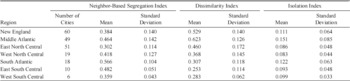
Sources: Authors' own calculations based on the IPUMS 100 percent sample of the 1880 federal census. Dissimilarity and isolation are calculated using enumeration district as the geographic subunit.
The city estimates reinforce our finding that traditional measures obscure a substantial amount of within-district segregation that is particularly pronounced in the South. The traditional measures of segregation, with their reliance on geographic boundaries and population shares, paint a portrait of regional differences in segregation that is not consistent with residential location patterns by race. Southern cities were the most segregated. While whites and blacks may have lived in the same wards and districts in Southern cities, they were much less likely to be neighbors compared to Northern cities. Such patterns are consistent with racial hierarchies mapping onto residential living patterns such as whites living on street-facing avenues and blacks living in dwellings that face an alley. This finding leads to a reinterpretation of the narrative of segregation—regional differences in segregation did not arise with black population inflows to Northern cities, they came from a preexisting segregated pattern in the South.
Given the maps for the traditional measures in Figure 2, one could make the argument that de jure racial restrictions in the South led to low levels of racial segregation. That is, if blacks were systematically restricted from access to public spaces, schools, and other public accommodations the residential pattern would not need to be segregated. This is reinforced by a noticeable discontinuous change in dissimilarity moving from South to North across the southern borders of Pennsylvania, Ohio, and Indiana. One would be tempted to conclude that institutional or cultural differences led to dramatic differences in residential segregation between the North and South. However, the map of our measure and the statistics in Figure 1 suggest that no such discontinuity exists; the South had substantial residential segregation in 1880 obscured by traditional measures but revealed by the neighbor-based measure.
Segregation and Population Shares
Until now, studies focused on racial differences in rural areas have had to characterize residential patterns by the percent black in a county. Studies of the strength of social networks and socioeconomic outcomes in the South (Munshi Reference Munshi2014), interracial economic competition and lynching (Beck and Tolnay Reference Beck and Tolnay1990; Tolnay and Beck Reference Tolnay and Beck1992), and even studies focused specifically on rural residential patterns of minority groups (Lichter and Johnson Reference Lichter and Johnson2006) all rely on the black population share within a county. However, the distribution of the black population within a county is crucial to the theories of social interactions and economic competition underlying these studies. In panel (a) of Figure 3, we show that the percent of a county that is black is a relatively poor approximation of the level of segregation in the community. At each level of percent black in a county there is significant heterogeneity in the neighbor-based measure of segregation. Given the wide variation in segregation levels by percent black, counties with small and large black population shares could be equally segregated or more/less integrated than one another. This highlights the importance of having a household-level measure of segregation. It also suggests the importance of moving beyond a focus on black population shares when estimating tipping point models like those of Thomas Schelling (Reference Schelling1969) and Card et al. (Reference Card, Mas and Rothstein2008). The substantial heterogeneity in terms of how black populations are distributed suggests that communities with similar black population shares may have exhibited very different population dynamics if it is the racial composition of very local neighborhoods that matters to individuals when making migration decisions. This is salient both for the population dynamics underlying the historical migration of black individuals out of the South and the more modern movement of individuals from cities to suburbs and exurbs.
Moving beyond county-level estimates, our segregation measure can be calculated at the enumeration district level. This measure of sub-county segregation is not possible with traditional segregation measures—the enumeration district population shares are the input into traditional segregation measures, which cannot be further disaggregated. In panel (b) of Figure 3 we show the segregation measure and the percent black in each enumeration district in the United States.Footnote 21 The dispersion in the relationship at the enumeration district level is even greater than at the county level, suggesting that a focus on percent black in rural and urban areas obscures a great deal of heterogeneity, and that this obscurity increases with the fineness of detail. The correlation of the segregation measure and percent black for enumeration districts is only 0.13, even less than the county correlation of 0.43. These low correlations suggest that the neighbor-based measure reveals substantial variation in segregation within counties across enumeration districts, variation that traditional segregation indices cannot capture.
Segregation and the percentage black by: (a) all counties in the United States; (b) all census enumeration districts in the United States

Segregation Over Time
The 1940 census offers a fascinating bookend to our study of residential segregation. The 1880 census comes after the Civil War and before the nation moved to Jim Crow. For example, at the time of the 1880 census, the Civil Rights Act of 1875, which guaranteed equal protection in public accommodation, was still in place although not necessarily enforced. The 1940 census, however, depicts residential patterns after the rise of Jim Crow, the Great Migration, and the influx of European immigrants. Importantly, the 1940 census comes largely before the rise of significant suburbanization seen in the post-war years. It is this period from the late-nineteenth century to 1940 that Cutler, Glaeser, and Vigdor Reference Cutler, Glaeser and Vigdor1999) cite as the rise of the American ghetto. While urban segregation as measured by isolation and dissimilarity was generally rising, the segregation patterns across cities tended to persist over time, with the most segregated cities at the turn of the century also being the most segregated cities at the end of the century.Footnote 22 The complete census returns for 1880 and 1940 allow us to see whether our neighbor-based segregation index shows a similar rise in urban segregation and whether a comparable change in segregation occurred in rural areas.
Increasing Residential Segregation in Rural and Urban Counties
We begin by focusing on county-level estimates by region. Table 3 shows the variation in our neighbor-based segregation index by census region in both 1880 and 1940. All statistics are weighted by the number of black households in the county so they should be interpreted as representing the level of segregation experienced by the average black household. Counties are divided between rural and urban to distinguish between the segregation patterns described by Cutler, Glaeser, and Vigdor specific to cities and more general patterns affecting the rest of the population. As noted earlier, we designate a county as urban if more than one-quarter of the households from that county live in an urban area and rural if less than one-quarter of the households live in an urban area. For 1880, this leads to 88 percent of counties being classified as rural. For 1940, 60 percent of counties are classified as rural.
Changes in the county-level segregation index from 1880 to 1940 by region, counties weighted by number of black households
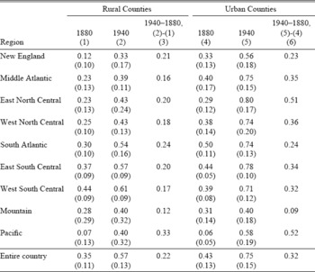
Notes:Means are reported with standard deviations given in parentheses. All means and standard deviations are weighted by the number of black households in the county. Urban counties are defined as those having greater than 25 percent of inhabitants living in an urban area. The urban-rural distinction is based on the year the statistic corresponds to, so some of the counties in the 1880 rural calculations appear in the 1940 urban calculations.
Sources: Authors' own calculations based on the 100 percent samples of the 1880 and 1940 federal censuses.
The table shows several stark trends. First, segregation varied substantially across regions. Southern regions, in particular the East South Central and West South Central regions, were substantially more segregated than the North or the Midwest. This is true in both 1880 and 1940 and for both rural and urban counties. The higher level of segregation in Southern cities established in the previous section persisted over time despite the dramatic increases in segregation in other areas of the country.
The truly striking feature of Table 3 is the difference between the 1880 and 1940 segregation levels, given in columns (3) and (6) for rural and urban counties, respectively. In all regions, there is a substantial increase in segregation in urban areas. The increases are particularly large in regions that were receiving large inflows of black residents during the Great Migration; the largest changes in segregation are for the urban areas in the East North Central and West North Central regions.Footnote 23 However, the table suggests that the story of rising segregation levels is not strictly an urban story. While the first decades of the twentieth century may have seen the rise of the American ghetto, they also witnessed a substantial rise in rural segregation levels as well. All of the regions show substantial increases in segregation comparable in size to one to two standard deviations of the county-level segregation index distribution. Between 1880 and 1940 the United States became more segregated overall—urban and rural, North and South.Footnote 24
This rise in segregation across all regions is not simply a story of black households becoming concentrated in selected counties. Table A5 in the Online Appendix shows the variation in percent black by region and over time. There were modest increases in the percentage of households with black household heads by county in the Northeast and Midwest but there were actually declines in the percentage of black households for the South. These patterns hold for both rural and urban counties and are consistent with mass migration. Despite the North and the South experiencing very different demographic change in terms of the distribution of black households across counties, all regions experienced an increase in segregation within counties whether those counties were urban or rural.
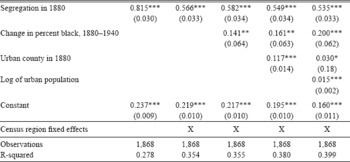
Regressing 1940 segregation levels on 1880 segregation levels, shown in Table 4, reveals the strong persistence of differences in segregation across locations and a general, dramatic increase in segregation across all locations. The baseline regression given in the first column yields a large slope coefficient of 0.815, suggesting strong persistence in differences in segregation across locations over time.Footnote 25 The large intercept of 0.237, coupled with the large slope coefficient, suggests that county-level segregation rose substantially on average: the county level mean essentially doubled from 1880 to 1940, rising from 0.22 to 0.42.Footnote 26 Regional controls do not alter the substantive implications. Even when adding changes in the percent black, regional controls, and urban population, the point estimates for 1880 segregation remain large.
The persistence of segregation, 1880–1940, segregation in 1940 as dependent variable
Significant at the 10 percent level.
Significant at the 5 percent level.
Significant at the 1 percent level.
Notes: Ordinary least squares (OLS) estimates with standard errors given in parentheses. The unit of observation is a county. Counties are defined as urban if greater than 25 percent of the county population lives in an urban area.
Sources: Authors' own calculations based on the 100 percent sample of the 1880 and 1940 federal censuses.
Increasing Segregation in American Cities
Looking at segregation at the city level reinforces the findings that rising segregation is not strictly a northern phenomenon and that segregation in Southern cities was more pronounced than in Northern cities. Table 5 shows the mean level of segregation in 1940 for cities by region. As with the results in Table 2, Northern cities were less segregated than Southern cities. The level of segregation in cities in all regions, however, is much higher in 1940 than in 1880.
City-level segregation by region weighted by number of black households, 1940
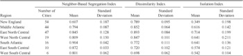
Sources:
Authors' own calculations based on the 100 percent sample of the 1940 federal census. Dissimilarity and isolation are calculated using enumeration district as the geographic subunit.
Figure 4 plots the neighbor-based segregation index for 1940 against the index for 1880 for cities in the Northeast, South, and Midwest. Consistent with the county-level results, nearly every city across all regions lies above the 45-degree line, with higher levels of segregation in 1940 than in 1880. However, the striking feature of the graph is that the Southern cities exhibited the highest levels of segregation in both 1880 and 1940 while Midwestern cities that experienced large inflows of black migrants experienced some of the highest increases in segregation. While there is a wide range of segregation levels for Northeastern cities, the rise in neighbor-based segregation for these cities is less pronounced than the rise for the Midwest and the South. The regional variation in Figure 4 coupled with the changes in segregation over time for rural counties in Table 3 suggest that the rise of the American ghetto described by Cutler, Glaeser, and Vigdor is one piece of a much larger and more complex story of increasing residential segregation in the United States over the first half of the twentieth century.
CITY-LEVEL SEGREGATION IN 1880 AND 1940

Racial Sorting and the Likelihood of Opposite-Race Neighbors Over Time
The neighbor-based segregation measure highlights the extent to which racial sorting reduced opposite-race interactions over time. The large increases in our measure suggest that even in locations where rising black population shares would suggest increasing likelihood of white households having black neighbors, growth in the number of opposite-race neighbors was substantially muted by increased sorting. The role of sorting at the household level over time has played a large role in the narrative of segregation but has not been empirically analyzed in detail. A simple way to demonstrate the extent to which the rise in racial sorting reduced opposite-race interactions is to look at the percentage of black or white households with a neighbor of the opposite race, a number that depends both on the racial composition of the local area and the household-level sorting captured by our measure.
While the presence of an opposite-race neighbor does not guarantee opposite-race social interactions, it is reasonable to assume that a decline in the number of opposite-race neighbors would be correlated with a decline in opposite-race interactions. Overall, in the unweighted median county in 1880 a black household had roughly a 50 percent chance of having a white neighbor. By 1940, however, this likelihood declined by more than 15 percentage points, a decrease of more than 25 percent in the likelihood of an opposite-race neighbor. Using only areas where blacks were greater than 1 percent of the population in 1880 results in more than a 25 percentage point decline in the likelihood, a decrease of more than 35 percent.Footnote 27
These declines suggest substantially reduced exposure of individuals to opposite-race neighbors over time. Consider the example of Chicago, a city that went from moderate levels of segregation in 1880 to the highest level of segregation in 1940. While the black population share rose from 1.2 percent to 7.7 percent of the city population, the percentage of white households with a black neighbor declined from 1 percent to 0.4 percent. The percentage of black households with a white neighbor declined from 66 percent to only 5 percent. Compounding these declines is a reduction in the number of individuals living with their employer, an additional and important source of interracial interaction not captured by the next-door neighbor measure. From 1880 to 1940, the ratio of black individuals living with their employers relative to black household heads fell from 0.27 to 0.04.Footnote 28
This significant change in the degree of opposite-race neighbors holds across regions that saw relative declines and increases in the black population, across urban and rural areas, and across large and small populations.Footnote 29 These findings add a new dimension to the changing residential patterns of the late nineteenth and early twentieth centuries. At a minimum, the results suggest that increasing racial isolation was not driven solely by urbanization or the Great Migration: racial sorting at the household level was a truly national trend in the twentieth century.
Exploring the National Rise in Segregation
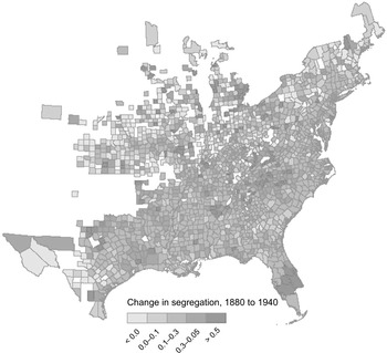
While the national level change in segregation is noteworthy, it is important to establish that the increase in segregation is not simply a mechanical function of population growth or driven by outliers where either the population or racial composition changed dramatically. For example, the measure could increase (decrease) as more counties gained (lost) black residents with the Great Migration. We address these concerns in Figure 5 and Figure 6. In Figure 5 we show that the change in segregation was quite general. The level changes in neighbor-based segregation are not concentrated in a small number of counties nor one region of the country. Consistent with the results of Table 4, the vast majority of counties in every region saw substantial increases in segregation.
Change in the neighbor-based measure of segregation, 1880–1940
Changes in segregation by county, 1880–1940, by: (a, b) the change in the log of the number of black households, 1880–1940 and (c, d) the log number of total households in 1880 (e, f) the percent black in 1880 and (g, h) change in the percent black, 1880–1940

In Figure 6 we show the distribution of the change in the neighbor-based segregation measure against other measures of population change for Northern and Southern counties to further test the traditional narrative of black migration from the rural South to the urban South and North leading to increases in segregation. In panels (a) and (b) of Figure 6 we show that the change in the segregation measure is not driven mechanically by increases in the number of black households. When we plot the change in the segregation measure by the change in the log of the number of black households the relationship shows a muted upward trend but there are still substantial increases in segregation in counties that experienced significant declines in the black population as well. This is consistent with segregation being driven by sorting as opposed to population flows. In panels (c) and (d) of Figure 6 we plot the change in the segregation measure against the log of the number of households in 1880 and find that the change in segregation was observed for both large and small counties. Panels (e) and (f) plot the change against the percent black in 1880, revealing that counties with small and large proportions of black households experienced similar changes in segregation. Finally, panels (g) and (h) plotting the change in segregation against the change in the percent black from 1880 to 1940 demonstrate that the result is not driven by counties where African American population share grew or declined substantially. Overall, the traditional story that black migration drove increasing racial segregation, either in the North or in the South, appears incomplete. While panels (a) and (b) show a positive relationship between the change in segregation and growth of the black population, substantial increases in segregation also occurred in counties losing black residents and areas with declining population shares.
Further clouding the traditional narrative are the changes in rural segregation relative to urban segregation. Using dissimilarity, rural segregation increased 48 percent while urban segregation increased by 86 percent. Using isolation, rural segregation increased 112 percent while urban segregation increased by more than 300 percent. However, when measuring segregation at the household level rather than ward level, we find that segregation was not primarily an urban phenomenon. Our neighbor-based measure of segregation shows that both rural and urban segregation increased by roughly the same amount (62 percent for rural areas and 68 percent for urban areas). While urban areas became more segregated, rural residents sorted by race as well in a way that is not easily captured in existing segregation measures or explained by existing theories of white flight.
This rise in rural segregation presents an entirely new set of issues for explaining the roots of segregation and its consequences given that traditional narratives have focused on urban issues. While a full exploration of these issues is beyond the scope of this article, Table 6 presents a series of linear regressions examining which rural county characteristics in the South are correlated with levels of and changes in neighbor-based segregation. Consistent with the history literature suggesting that free blacks tended to live in segregated communities in the antebellum South (Spain Reference Spain1979; Fischer Reference Fischer1969; Sumpter Reference Sumpter2008), we find the percentage of black population that is free in 1860 to be positively related to levels of segregation in 1880 but not predictive of changes in segregation from 1880 to 1940. One might assume that areas with large slave plantations prior to the Civil War would have different segregation patterns after the Civil War. However, we find no significant relationship between the number of large slave plantations in 1860 and segregation in 1880 and only a very weak positive relationship between the presence of large slave plantations and rising segregation over time. Counties with larger farms tended to be less segregated in 1880 but followed the same trend over time as other counties. Given existing studies linking changes in the cotton economy to black migratory patterns (Higgs Reference Higgs1976; Holley Reference Holley2000), cotton production may also factor into segregation patterns. However, we find that counties with higher levels of cotton production are no more or less segregated than other counties either in 1880 or over time. Finally, given the segregation in industry documented by Gavin Wright (Reference Wright1986), we explore whether the share of manufacturing in a county is related to segregation, a possibility if occupational segregation in manufacturing was related to residential segregation through households living near their place of employment. Counties with more manufacturing in 1860 did tend to be more segregated in 1880 and to experience larger increases in segregation over time. However, even after controlling for the share of manufacturing and all of the other county characteristics, we are left with a large, statistically significant constant in column (6), reinforcing once again that while county characteristics can explain some of the variation in levels and trends in segregation, there remains a much more general increase in segregation over time across all areas.
Rural characteristics and segregation in the South

Significant at the 10 percent level.
Significant at the 5 percent level.
Significant at the 1 percent level.
Notes:
Standard errors in parentheses. Southern U.S. counties only. Large plantations are defined as those with more than 10 enslaved members. Large farms are defined as those above 100 acres. Cotton production is measured in bales ginned. Share of manufacturing is manufacturing's share of total value of manufacturing and farm output in 1860.
Sources: Segregation numbers are based on authors' own calculations using the 100 percent samples of the 1880 and 1940 federal population censuses. Other variables come from the 1860 and 1880 censuses of agriculture.
CONCLUSION
We have derived a new measure of segregation from the complete federal census manuscripts using the simple criterion of the race of an individual's next-door neighbors. Our measure gives a direct assessment of the likelihood of interracial interaction in residential communities. If neighbors are less likely to be of a different race than random assignment would predict then that location is more segregated than another that is closer to random assignment. Our neighbor-based measure reveals substantial heterogeneity in segregation across regions, within regions, and between rural and urban areas that could not be captured with existing measures focused on sorting across political units.
When using our new measure to assess change in segregation over time, we find that the United States not only became a more segregated society from 1880 to 1940, consistent with the findings of Cutler, Glaeser, and Vigdor (1999), but that this increase in segregation was far more general than previously thought. Our findings show that the likelihood of opposite-race neighbors declined precipitously in every region of the United States. The substantial rise in segregation occurred in areas with small black population shares, areas with large black population shares, areas that experienced net inflows of black residents, areas that experienced net outflows of black residents, urban areas with large populations, and rural areas with smaller populations. The traditional story of increasing segregation in urban areas in response to black migration to urban centers must be augmented with a discussion of the increasing racial segregation of rural areas and other areas that lost black residents.
Our findings complicate traditional explanations for increasing segregation as being due to blacks clustering in small areas abutting white communities (Kellogg Reference Kellogg1977), the use of restrictive covenants (Gotham Reference Gotham2000), the presence of large manufacturing firms which employed blacks, or differences in transportation infrastructure, as these were all urban phenomena. The increase in rural segregation is also at odds with historical narratives which view population dynamics in rural areas as stagnant. The focus on urban segregation has neglected the fact that rural areas were segregated and, as we have discovered, became increasingly segregated over time. While there are studies that seek to look at the causal effect of black social networks in rural areas on outcomes (Chay and Munshi Reference Chay and Munshi2013), they use county proportions. To the extent that networks are a function of the likelihood of contact, proportions may be a noisy proxy for networks given our finding that racial proportions are relatively poorly correlated with residential segregation. Overall, the national trend in increasing segregation in the twentieth century adds a new chapter to American history.
Our measure allows us to look at a key factor behind that trend—racial sorting at the household level. We found that the likelihood of a black family having an opposite-race neighbor declined by more than 15 percentage points from 1880 to 1940, more than a 25 percent decline in the likelihood of opposite-race neighbors. Rather than being the product of black migratory patterns, regional differences in black location patterns, or white population flows out of central cities, the increase in racial sorting was quite general. Areas that both gained and lost African American residents saw substantial increases in racial segregation at the household level. This new fact calls for a reinterpretation of segregation trends over time and suggests that a broader range of outcomes could be related to segregation in rural and urban areas which may have persistent effects.
Our finding that segregation and its rise over the first half of the twentieth century was a truly national phenomenon occurring in both the cities people were moving to and the rural areas they left also opens new, important lines of inquiry. First, the level and change in rural segregation suggests that population sorting was strong in rural areas and could be related to a host of outcomes. Second, understanding the relationship between segregation, urbanization, and population flows will help us understand the dynamics of segregation in cities and rural communities over the twentieth century. These links have important implications for the skill mix of cities, public finance, education, inequality, health, and other measures of social well-being. The availability of complete count census data will allow researchers to explore these historical links in more detail than ever before. Third, the strong persistence of our segregation measure suggests that the roots of contemporary segregation may be more varied than previously thought. Both rural and urban areas had different levels of segregation that were highly persistent over time. This finding poses a range of questions about the impact of Jim Crow, racial violence, European immigration, internal migration, and the differences and similarities between racial segregation in rural and urban areas in the United States. The scope of segregation research is now broader with this neighbor-based measure.
 In the case of including households with only one observed neighbor, this equation must be modified somewhat to account for the possibility of observing one of the black households with a white neighbor but not observing the white neighbor. Full details are provided in the appendix.


