


I. Introduction
Opioid usage in the United States has surged over the past 2 decades, resulting in nearly 500,000 deaths from overdoses between 1999 and 2019, according to the Centers for Disease Control and Prevention (www.cdc.gov/drugoverdose/epidemic/index.html). The National Institute on Drug Abuse estimates that, in 2017 alone, 1.7 million Americans suffered from substance abuse related to prescription opioid pain relievers, with documented public health and economic consequences (www.drugabuse.gov/drug-topics/opioids/opioid-overdose-crisis). While the literature has focused on analyzing the role of economic conditions in the opioid crisis and “deaths of despair” (Case and Deaton (Reference Case and Deaton2015), Finkelstein, Gentzkow, Li, and Williams (Reference Finkelstein, Gentzkow, Li and Williams2022)), fewer studies have examined the impact of the opioid crisis on the real economy (Cornaggia, Hund, Nguyen, and Ye (Reference Cornaggia, Hund, Nguyen and Ye2022), Harris, Kessler, Murray, and Glenn (Reference Harris, Kessler, Murray and Glenn2020), Ouimet, Simintzi, and Ye (Reference Ouimet, Simintzi and Ye2025)). We contribute to the understanding of this problem by estimating the impact of opioid abuse on real estate values.
Opioid abuse degrades human capital and hurts families, among the noncollege-educated population in particular (Alpert, Evans, Lieber, and Powell (Reference Alpert, Evans, Lieber and Powell2021), Harris et al. (Reference Harris, Kessler, Murray and Glenn2020)). Prolonged drug use can lead to reduced labor productivity, lower household income, and increased likelihood of job loss, resulting in mortgage delinquencies. This, in turn, can degrade home quality and area attractiveness, as residents may opt to invest less in their properties. Understanding the impact of opioid usage on home values is important, as homes are often the most valuable asset held by many households (Favilukis, Ludvigson, and Van Nieuwerburgh (Reference Favilukis, Ludvigson and Van Nieuwerburgh2017)). When home prices stagnate or fall, people’s financial situation can suffer, as rising home equity can alleviate financing issues and facilitate access to credit, promoting entrepreneurship and job creation (Adelino, Schoar, and Severino (Reference Adelino, Schoar and Severino2015), DeFusco (Reference DeFusco2018), Jensen, Leth-Petersen, and Nanda (Reference Jensen, Leth-Petersen and Nanda2022), Mian and Sufi, (Reference Mian and Sufi2011)).
We start by documenting a negative association between opioid abuse and home values. To estimate the sensitivity of home values to opioid abuse, we measure values at the county level using the Zillow Home Value Index (ZHVI), and opioid abuse in two ways. First, we follow Cornaggia et al. (Reference Cornaggia, Hund, Nguyen and Ye2022) and use the opioid death rate, which corresponds to the number of opioid-related deaths per 100,000 people at the county level. Second, we construct a new measure of excess opioid prescriptions that corresponds to the residual of a regression of prescription rates on variables that plausibly capture legitimate usage of these medicines (cancer rate, prevalence of hospice admissions, and ambulatory surgery).
Exploiting within-county (over time) variation, we find that the change in house price growth over 5 years is between 0.23 percentage points to 1.37 percentage points lower for a 1-standard-deviation increase in opioid death rates and excess prescription rates, respectively. The upper bound of the estimated effect across the three opioid abuse measures (opioid death rates, excess prescription rates, and prescription rates) corresponds to 23.5% relative to the mean percentage change in home values over 5 years. To understand how the most affected areas compare to the least affected ones, we also examine a P5–P95 interpercentile range change in opioid abuse. A P5–P95 change in excess prescription rates is associated with 4.26 percentage points less house price growth over 5 years, which corresponds to 55.5% relative to the mean percentage change in home values. For an average home in our sample, these estimated differences translate into a dollar value differential of up to $6,100. As a benchmark, the monthly income for the median household in the United States in 2018 was $5,265.
These associations could be driven by observed and unobserved confounding effects, such as local economic conditions. Hence, we continue our analysis by exploiting variation in opioid abuse induced by the staggered adoption of laws aimed at reducing opioid abuse. Since 2016 and in response to the opioid crisis, several United States have passed laws or implemented regulations limiting opioid prescriptions to address prescription misuse, drug abuse, and overdoses. These measures generally aim to restrict the duration of prescriptions or total dosage, in particular for first-time prescriptions, to prevent overly generous prescriptions and subsequent addiction. Their staggered adoption by different states arguably induces exogenous variation in opioid abuse, as most evidence suggests that supply drives abuse (Finkelstein et al. (Reference Finkelstein, Gentzkow, Li and Williams2022)) and demand does not have the same effect (Currie, Jin, and Schnell (Reference Currie, Jin and Schnell2019), Paulozzi, Mack, and Hockenberry (Reference Paulozzi, Mack and Hockenberry2014)).Footnote 1
We provide a difference-in-differences (DID) estimate, in which we compare the changes in home values in years before and after the passage of one of these opioid-limiting laws (the treatment) in treated versus control counties. We first show that the passage of these laws reduced excess opioid prescriptions. We also document that the growth in overdose death rates declines, despite overdose death rates continue to increase after the passage of the laws, possibly due to an increase in usage of illicit drugs in the short run, as access to prescription drugs shrinks. This pattern suggests that the effects of these laws are likely to operate mostly at the extensive margin of consumption of prescription drugs, preventing new addictions. We then show that house values in treated counties increased on average upon the adoption of these laws. We document that house values increased by 0.42 percentage points more in the year of passage, 0.78 percentage points more in the first year after passage, and 1.76 percentage points more in the second year after passage. This effect corresponds to an increase in home value of $4,274 over 3 years for the average house. Considering that the average home value in our sample is $143,150, this is economically meaningful. Importantly, we also evaluate our main identifying assumption: we show that states in which an opioid-limiting law passed and those in which one did not pass were on parallel trends in terms of home value changes before the laws’ passage.
Since our treatment is at the state level, we interact the passage of the state laws with measures of opioid supply at the county level to measure treatment intensity at the same level as the observed outcome. First, we establish that the decline in excess prescriptions and the growth rate of opioid deaths in treated states is primarily driven by counties with the highest opioid supply, as proxied by the number of physicians per capita and by opioid-related payments to physicians by pharmaceutical companies.Footnote 2 Second, we find that home values rise significantly more in these counties upon the passage of an opioid-limiting law. We similarly show that the impact of the reduction in opioid abuse and the growth in house prices were more pronounced in counties with higher opioid abuse. Taken together, these results suggest that variation in opioid abuse mostly drives the observed change in home values at the county level and not the other way around.
To explore the possible drivers of the link between opioid abuse and home values, we study the effect of opioid usage on delinquent mortgages, vacancy rates, and home improvement loans. Delinquent mortgages have been shown to affect home values and could generate negative price spillovers to nondistressed neighboring houses (e.g., Anenberg and Kung (Reference Anenberg and Kung2014), Campbell, Giglio, and Pathak (Reference Campbell, Giglio and Pathak2011), and Gupta (Reference Gupta2019)). We show that the rate of change in mortgage delinquency rates was about 6.66 percentage points lower on average 1 year after the passage of the opioid-limiting laws in treated counties, relative to the control group. We also find that the relative percentage of home improvement loans increased, while residential vacancy rates decreased significantly more 1 year after the passage of the laws in treated counties, relative to the control group.
Next, we show that the passage of the opioid-limiting laws led to an increase in (high-income) migration inflow, with the effect becoming most pronounced 2 years after the laws’ enactment. Poverty driven by opioid abuse can degrade local real estate quality and make local areas less attractive, reducing in-migration. By curbing opioid abuse, these laws may have helped stabilize or reverse economic decline, making communities more appealing to new residents, particularly relative to areas where opioid abuse continued unabated. Consistent with individuals needing time to update their expectations to respond to changing conditions, the effect grows over time. Taken together, our findings suggest that the opioid epidemic affects home values through two channels: changes in local real estate quality and shifts in demand for space.
We use two additional approaches to study the impact of opioid abuse on house values. First, we use a spatial regression discontinuity (RD) design, where we compare border counties in states that passed opioid-limiting laws with neighboring counties in states that did not see a change (i.e., counties on the other side of a state line). Our results are consistent with the DID estimates. In the second approach, we follow Cornaggia et al. (Reference Cornaggia, Hund, Nguyen and Ye2022) and use instrumental variables to estimate the impact of opioid abuse on home values. We instrument opioid abuse in two ways. The first is based on the aggressiveness of Purdue Pharma’s marketing of Oxycontin, which induced overprescription.Footnote 3 The second is based on “leaky” supply chains and the desirability of the product for patients when compared to less available and less attractive painkillers. Overall, the findings using the instrumental variable approach support our baseline results.
Estimating aggregate economic effects is challenging in the absence of a general equilibrium model. However, simple back-of-the-envelope calculation suggests that total home value increased by $68.9 billion in the 32 states that enacted opioid-limiting legislation relative to control states in the years of the laws’ passage alone. This estimate is based on a total home value base of $16.4 trillion in these states in the year before the laws took effect and a 0.42% increase in house prices. For comparison, Purdue Pharma’s 2022 settlement agreement required the company to pay $6 billion to several United States as compensation for damages related to the opioid crisis.
Our article contributes to the rapidly growing literature on the impact of the opioid crisis on the U.S. economy. Harris et al. (Reference Harris, Kessler, Murray and Glenn2020), Van Hasselt, Keyes, Bray, and Miller (Reference Van Hasselt, Keyes, Bray and Miller2015), and Florence, Luo, Xu, and Zhou (Reference Florence, Luo, Xu and Zhou2016) study the impact of the opioid epidemic on human capital. They show a negative impact of opioid prescriptions on labor supply and quantify the costs associated with lost labor productivity. Agarwal, Li, Roman, and Sorokina (Reference Agarwal, Li, Roman and Sorokina2023), Cornaggia et al. (Reference Cornaggia, Hund, Nguyen and Ye2022), Ho and Jiang (Reference Ho and Jiang2021), Li and Zhu (Reference Li and Zhu2019), Li and Ye (Reference Li and Ye2024), and Jansen (Reference Jansen2023) document financial effects of the crisis, including the impact of opioid abuse on municipal bond rates, firms’ stock prices, banks’ deposit growth, and consumer credit. Our article focuses on the impact of the opioid crisis on the price of real estate, which is a key indicator of the local economy and many household’s most valuable asset.
A few related papers also investigate the relationship between the opioid crisis and the local real estate market. Karimli (Reference Karimli2022) and Luo and Tidwell (Reference Luo and Tidwell2025) study the implications for the mortgage market and find that lenders are less likely to approve loans from areas with higher rates of opioid abuse. Karimli (Reference Karimli2022) further suggests that the opioid epidemic depressed local house prices, resulting in more defaults using a sample between 2004 and 2017. Ho and Jiang (Reference Ho and Jiang2021) document a positive impact on real estate prices in California between 2010 and 2018 following a regulation that aimed to limit opioid overuse, but they do not analyze the channel. D′Lima and Thibodeau (Reference D’ Lima and Thibodeau2023) use prescription data from Ohio between 2006 and 2012 to document a negative association between home values and opioid usage.Footnote 4 While this body of literature focus on local real estate markets, our article looks at real estate prices as main outcome variable in a nationwide setting and sheds light on the causal impact of the opioid crisis on real estate prices at this scale. Importantly, we cover all three stages of the opioid crisis with our sample period from 2006 to 2018, where different types of opioids played different roles.
More broadly, we contribute to the literature that examines the effects of public health conditions and resulting regulations on real estate and housing markets. Davis (Reference Davis2004) studies the elasticity of housing values with respect to cancer health risks, while (Conklin, Diop, and Li (Reference Conklin, Diop and Li2020), Tyndall (Reference Tyndall2021)) assess the impact of marijuana dispensaries on nearby house prices. A nascent line of research also investigates the effects of public health crises, such as the COVID-19 pandemic, the 2003 Hong Kong SARS epidemic, or the 7th century Amsterdam plague, on housing markets (e.g., Francke and Korevaar (Reference Francke and Korevaar2021), Gupta, Mittal, Peeters, and Van Nieuwerburgh (Reference Gupta, Mittal, Peeters and Van Nieuwerburgh2022), and Wong (Reference Wong2008)). We contribute to the literature by studying whether the economic consequences of opioid abuse can be reversed by opioid-limiting regulation and, if so, how quickly. We find that, following the passage of an opioid-limiting law, excess prescriptions decrease, the growth of overdose death rates slow, and house prices increase in treated states.
II. Data
A. Measuring Opioid Abuse at the County Level
A key step of our empirical analyses is measuring opioid abuse, that is, the excessive or improper use of opioid drugs, either prescription or illicit, in a way that leads to harm, dependence, or addiction.Footnote 5 First, we follow Cornaggia et al. (Reference Cornaggia, Hund, Nguyen and Ye2022) and measure opioid abuse through mortality. Because opioid mortality captures the worst consequence of addiction, we also use opioid prescriptions and a measure of excess prescriptions. While opioid prescriptions may be initially intended for legitimate purposes, opioids have been excessively prescribed, and Alpert, Powell, and Pacula (Reference Alpert, Powell and Pacula2018) show that nonmedical use is highly correlated with oxycodone supply and OxyContin prescriptions. Following this line of reasoning, we introduce a new measure “excess prescriptions” to better capture opioid prescriptions that are not likely medically necessary.
For opioid mortality, we license the restricted All-County Mortality Micro data from the Centers for Disease Control and Prevention (CDC). These data record the precise cause of every death in the United States by county, allowing us to identify all opioid-related deaths in each county.Footnote 6 Following Cornaggia et al. (Reference Cornaggia, Hund, Nguyen and Ye2022), we construct the variable OpioidDeathRate, which is the number of opioid-related deaths scaled by the county’s population (in 100,000s). We describe the exact steps and death cause codes used for identification of opioid-related deaths in Supplementary Material Section C.2.
Opioid mortality data have advantages over opioid prescription data. First, mortality statistics represent the entire population, while prescription data may not. Second, opioid mortality data are less influenced by such factors as travel for treatment and prescriptions. Additionally, mortality data are unaffected by legitimate use of opioids. However, it is important to note that opioid mortality, as an extreme outcome, is a low-frequency measure and only captures the worst cases of abuse. It provides a lower bound for opioid abuse since people can misuse opioids without fatally overdosing and yet can still endure significant health and social consequences. Therefore, we also collect historical data on opioid prescriptions for a more comprehensive understanding.
For total prescriptions and excess prescriptions, we use data from the CDC, which reports county-level opioid prescriptions sourced from IQVIA Xponent starting in 2006. IQVIA Xponent collects opioid prescriptions as identified by the National Drug Codes from approximately 49,900 retail (nonhospital) pharmacies, which covers nearly 92% of all retail prescriptions in the United States. We construct the variable PrescriptionRate, which is the count of annual opioid prescriptions at the county level per 100 people.
Finally, we construct a new measure of excess prescriptions. This measure corresponds to the residual of a regression where the dependent variable is prescription rates and the explanatory variables aim to capture the prevalence of conditions that lead to legitimate opioid prescriptions. Dowell, Ragan, M, T, and Roger (Reference Dowell, Ragan, M, T and Roger2022), in the 2022 CDC clinical practice guidelines, provide a list of conditions for which opioids can be called for. Opioids may be appropriate for managing short-term acute postoperative pain, for treating pain related to active cancer treatment, and for palliative or end-of-life care. We measure these dimensions through the cancer rate, hospice percentage, and ambulatory surgery percentage. CancerRate is the cancer incidence rate from the restricted access file from the National Cancer Institute’s Survey of Epidemiology and End Results (SEER). As county information is only available for 21 states, we use the state cancer incidence rate from National Program of Cancer Registries and SEER for counties without information. HospicePercentage is the percentage of Medicare beneficiaries using hospice services, and AmbulatorySurgeryPercentage is the percentage of Medicare beneficiaries using ambulatory surgery centers. Both measures are collected from the Medicare Geographic Variation file and are available at the county level from 2007 onward. More formally, excessive prescriptions correspond to the residual of the following regression:

We also include year fixed effects to account for time-varying trends in prescription use or illnesses across all counties. Ideally, we would like to estimate this model on a set of counties without opioid prescription abuse and then apply those coefficients to calculate excessive opioid prescriptions. Following this idea, we estimate this model for all counties, except counties with more than eight medical offices or pharmacies prescribing medically unnecessary opioids so called “pill mills” (i.e., we drop the counties with the highest likelihood of excessive prescriptions and apply the estimated coefficients to the full population).Footnote 7 We report the coefficients of this regression in Supplementary Material Table A2. In line with our expectations, all three variables are generally positively related with opioid prescriptions.
Panel A in Table 1 reports summary statistics. The number of observations varies with the opioid abuse proxy because the data coverage differs across measures. The average opioid death rate is 7.4 per 100,000 residents, and the average prescription rate corresponds to 83.5 opioid prescriptions per 100 residents. The average excess prescription rate is 1.1 and thus larger than 0, which suggests that the excluded pill mill counties do have excess prescriptions.

Table 1 Long description
The table contains 8 columns of statistics: Number of Observations, Minimum, P 25, Median, P 75, Maximum, Mean, and Standard Deviation.
Panel A. Opioid Abuse Proxies:
* Opioid death rate: 40,513 observations; Mean 7.378; Median 4.541; Max 139.978.
* 1-year difference opioid death rate: 37,205 observations; Mean 0.443; Median 0.000; Range -130.719 to 130.719.
* Illicit death rate: 40,513 observations; Mean 3.260; Median 0.000; Max 132.720.
* Prescription death rate: 40,513 observations; Mean 4.118; Median 1.807; Max 130.719.
* Excess prescription rate: 32,526 observations; Mean 1.061; Median -4.798; Max 506.042.
* Prescription rate: 36,704 observations; Mean 83.548; Median 77.800; Max 583.800.
Panel B. Home Values:
* Average home value in dollars: 33,481 observations; Mean 143,150; Median 117,307; Max 1,529,600.
* 1-year percentage change H V: 30,633 observations; Mean 1.403; Median 1.930.
* 3-year percentage change H V: 24,990 observations; Mean 3.406; Median 4.131.
* 4-year percentage change H V: 22,227 observations; Mean 4.407; Median 4.868.
* 5-year percentage change H V: 19,524 observations; Mean 5.414; Median 5.422.
B. County House Prices, Demographics, and Economic Conditions
To measure average annual value of a typical house within a county, we use the 2019 revision of the ZHVI. This smoothed, seasonally adjusted measure incorporates property hedonic characteristics, location, and market conditions for more than 100 million U.S. homes, including new construction and nontraded homes, to compute the typical value for homes in the 35th to 65th percentile within a county. We calculate 1- to 5-year percentage changes in home values. The average home value across counties was $143,150 between 2006 and 2018 and grew by 1.4% over 1 year and 5.4% over 5 years with considerable cross-sectional variation (compare Panel B in Table 1).
We collect additional county demographic and economic variables for our analysis. Demographic variables include male population ratio, White population ratio, Black population ratio, Indian American population ratio, Centers for Disease Control and Prevention population ratio, age 20–64 ratio, over age 65 ratio, and migration flow; these are obtained from the Census Bureau. Cancer (i.e., neoplasms) mortality is obtained from the CDC. The number of primary care physicians, excluding hospital residents or those age 75 years or over, is obtained from the Area Health Resources Files of the Health Resources & Service Administration. Economic variables include poverty ratio and median household income, obtained from the Census Bureau, as well as the unemployment rate and the labor force participation rate, obtained from Bureau of Labor Statistics. These variables are normalized by contemporaneous county population and winsorized at the 2
$ \% $
 and 98
$ \% $
and 98
$ \% $
 levels. All variables are defined in Supplementary Material Section C.1.
C. Opioid-Limiting State Laws
Starting with Massachusetts in 2016, several states passed laws or regulations to limit opioid prescriptions.Footnote 8 We collect information on the laws and their year of the passage.Footnote 9 Including Massachusetts, 9 states passed legislation that limited opioid prescriptions in 2016, while 18 states followed in 2017, and another 5 in 2018. Supplementary Material Figure A1 depicts the treated states on a map, and Supplementary Material Table A3 translates this into county observations.
To measure opioid supply side drivers at the county level, we use data on the number of primary physicians per capita and collect data on direct or indirect payments or other transfers of value made from pharmaceutical and medical device manufacturers and their distributors to physicians, nonphysician practitioners, and teaching hospitals. Data on physician opioid-related payments come from the Centers for Medicare & Medicaid Services Open Payments database and cover August 2013 to December 2019 (www.cms.gov/priorities/key-initiatives/open-payments/data). To compute opioid-related physician payments by the manufacturers, we follow Fernandez and Zejcirovic (Reference Fernandez and Zejcirovic2018) and Hadland, Rivera-Aguirre, Marshall, and Cerdá (Reference Hadland, Rivera-Aguirre, Marshall and Cerdá2019): we identify opioid-related payments through the National Drug Code directory published by the U.S. Food and Drug Administration, which includes information on the substance names included in drugs (www.fda.gov/drugs/drug-approvals-and-databases/national-drug-code-directory). We then use the substance names to identify opioids following the Anatomical Therapeutic Chemical (ATC) Classification System of the WHO (ATC code N02A) (www.whocc.no/atc_ddd_index/?code=n02a). If a payment occurred for multiple drugs, we split the amount paid by the number of drugs promoted. We consider all payments made to physicians and teaching hospitals related to the identified opioid drugs. We identify the county of the physician or teaching hospital based on unique city and state combinations. If this is impossible, we use the zip code and assign the county based on the zip code centroid. Finally, we aggregate by county and year. Counties without payments related to opioid payments are set to 0, as the coverage is countrywide and no information therefore equals no payments.
III. Opioid Abuse and Home Values
A. County-Level Correlation
We begin by documenting the correlation between home values and opioid abuse. We exploit within-county variation as well as within state-year variation. Figure 1 presents county-level heat maps of average 5-year lagged opioid death rates and average 5-year percentage changes in home values over the sample period. The maps show that counties in the bottom quintile of percentage change in home values overall correspond to counties with the highest opioid death rates, suggesting a negative correlation in the cross section between opioid abuse and home values.
The unit of observation in Figure 1 is the county. We calculate within-state quintiles based on the average 5-year percentage change in home values and the 5-year lagged opioid death rate over our sample period (2006–2018). We restrict the sample to counties with averages based on more than five observations and those in the highest opioid death rate quintile within each state. These counties are colored based on their within-state quintile of average home value change: Dark red indicates counties in the lowest quintile (lowest home value growth), and light yellow indicates those in the highest quintile (highest home value growth). Excluded counties are shown in dark gray, and counties without data are shown in light gray. Dark red thus reflects a negative correlation between opioid death rates and home value changes.

Figure 1 Long description
A map of the United States including Alaska and Hawaii displays county-level data. A legend at the bottom right titled Quantiles on 5-year Perc. Change in Home Value defines the color scale.
* Dark red represents quintile 1, the lowest home value growth.
* Orange represents quintile 2.
* Dark yellow represents quintile 3.
* Yellow represents quintile 4.
* Light yellow represents quintile 5, the highest home value growth.
* Dark gray indicates dropped counties.
* Light gray indicates N A or no data available.
The majority of the map is filled with dark gray, indicating excluded counties. The colored counties, representing those in the highest quintile for opioid death rates, are scattered throughout the country.
* In the West, there are clusters of dark red and orange in Washington, Oregon, and Northern California, with a large dark red county in Nevada.
* The Southwest shows scattered yellow and orange counties in Arizona and New Mexico.
* The Midwest and Rust Belt regions, particularly around the Great Lakes and Ohio River Valley, show a high density of small, dark red and orange counties.
* The Northeast and Appalachia also show a concentration of dark red and orange counties.
* Florida and the Gulf Coast contain several scattered orange and yellow counties.
* Alaska shows one yellow county, while Hawaii is shown in light gray.
We further examine this relationship by estimating the following specification:

The dependent variable
$ {PCHomeValue}_{c,t-x\; to\;t} $
 in equation (2) is the log percentage change of average county
$ c $
in equation (2) is the log percentage change of average county
$ c $
 home values, (
$ \mathit{\log}\left({HV}_t/{HV}_{t-x}\right)\ast 100 $
home values, (
$ \mathit{\log}\left({HV}_t/{HV}_{t-x}\right)\ast 100 $
 ) over
$ X=\left\{\mathrm{3,4,5}\right\} $
) over
$ X=\left\{\mathrm{3,4,5}\right\} $
 years.
$ {OpioidAbuse}_{c,t-x} $
years.
$ {OpioidAbuse}_{c,t-x} $
 captures one of the three opioid abuse measures (i.e., opioid death rates, excess prescriptions, and opioid prescription rates) for county
$ c $
captures one of the three opioid abuse measures (i.e., opioid death rates, excess prescriptions, and opioid prescription rates) for county
$ c $
 at
$ t-x $
at
$ t-x $
 . We also include a vector of time-varying county-level controls
$ {\boldsymbol{X}}_{c,t-x} $
. We also include a vector of time-varying county-level controls
$ {\boldsymbol{X}}_{c,t-x} $
 , measured with a lag at time
$ t-x $
, measured with a lag at time
$ t-x $
 . Following Ouimet et al. (Reference Ouimet, Simintzi and Ye2025), county-level controls measured at
$ t-x $
. Following Ouimet et al. (Reference Ouimet, Simintzi and Ye2025), county-level controls measured at
$ t-x $
 include male population ratio, White population ratio, Black population ratio, American-Indian population ratio, Hispanic population ratio, age 20–64 ratio, age over 65 ratio, migration inflow ratio, poverty ratio, unemployment ratio, labor force participation ratio, neoplasm mortality, and number of physicians per county. We include county fixed effects
$ {\theta}_c $
include male population ratio, White population ratio, Black population ratio, American-Indian population ratio, Hispanic population ratio, age 20–64 ratio, age over 65 ratio, migration inflow ratio, poverty ratio, unemployment ratio, labor force participation ratio, neoplasm mortality, and number of physicians per county. We include county fixed effects
$ {\theta}_c $
 , and control for general macroeconomic conditions by including year fixed effects
$ {\tau}_t $
, and control for general macroeconomic conditions by including year fixed effects
$ {\tau}_t $
 . In addition, in a separate specification, we use state-year fixed effects
$ {\zeta}_{s,t} $
. In addition, in a separate specification, we use state-year fixed effects
$ {\zeta}_{s,t} $
 instead of
$ {\theta}_c $
instead of
$ {\theta}_c $
 and
$ {\tau}_t $
and
$ {\tau}_t $
 to control for time-varying local market conditions.
Table 2 reports the results of estimating equation (2) and shows robust statistically significant negative correlations between home values and each opioid abuse measure.Footnote 10 Columns 1–3 include county fixed effects
$ {\theta}_c $
 and year fixed effects
$ {\tau}_t $
and year fixed effects
$ {\tau}_t $
 , whereas we use state-year fixed effects
$ {\zeta}_{s,t} $
, whereas we use state-year fixed effects
$ {\zeta}_{s,t} $
 in columns 4–6. Starting with opioid mortality in Panel A, we observe that the negative association persists across the different time horizons and strengthens in the long run.Footnote 11 The correlation between opioid death rates and 5-year percentage change in home values is estimated at −0.029 (−0.026), when exploiting within county (state-year) variation. A 1-standard-deviation increase in opioid death rates (7.912) translates into a 0.23 (0.21) percentage point reduction in home value growth rates, which is equivalent to 4.08% (3.77%) of the 5-year average percentage home value increase (5.54%).

Table 2 Long description
The table is titled Opioid Abuse and Home Values and is divided into three panels. The columns are categorized by Percentage Change in Average Home Value Over 3 Years, 4 Years, and 5 Years, repeated for two sets of specifications (columns 1 through 3 and 4 through 6).
Panel A. Opioid Mortality Rates:
Opioid death rate coefficients are all negative, ranging from -0.016 to -0.030. R-squared values range from 0.738 to 0.859. N ranges from 15,544 to 20,494. Standard deviation of opioid abuse measure is approximately 8.
Panel B. Excess Prescription Rates:
Excess prescription rate coefficients are all negative, ranging from -0.005 to -0.029. R-squared values range from 0.770 to 0.856. N ranges from 13,056 to 17,943. Standard deviation of opioid abuse measure is approximately 46.
Panel C. Prescription Rates:
Prescription rate coefficients are all negative, ranging from -0.005 to -0.028. R-squared values range from 0.739 to 0.859. N ranges from 15,068 to 19,984. Standard deviation of opioid abuse measure is approximately 46.
Fixed Effects (F E) and Controls:
Columns 1 through 3 include County F E and Year F E but no State-year F E. Columns 4 through 6 include State-year F E but no County or Year F E. All columns include Controls.
Panels B and C show the results for opioid prescriptions.Footnote 12 The estimated economic magnitude is larger for the excess prescription and prescription rates. Point estimates obtained from within-county variation for the correlation between excess prescriptions (opioid prescriptions) and the 5-year percentage change in home values are −0.029 (−0.028). A 1-standard-deviation increase in excess prescription rates (opioid prescriptions), 46.59 (46.42) translates into a 1.37 (1.29) percentage point reduction in the home value growth rate, which is equivalent to 17.78% (23.49%) of the 5-year average percentage of home value increase (7.68% and 5.50%, respectively).
We also consider the P5–P95 interpercentile range in excess prescription rates to capture the variation between counties that are more and less affected by opioid abuse. Focusing on within-county variation, we find that a P5–P95 interpercentile range change is associated with a 4.26 percentage point difference in house price growth over 5 years. This corresponds to 55.5% relative to the mean percentage change in home values. For an average home in our sample, these estimated differences translate into a dollar value differential of up to $6,100. As a benchmark, the monthly income for the median household in the United States in 2018 was $5,265.
The spatial patterns from the map as well as the correlations are consistent with opioid abuse affecting home prices. We next exploit some plausibly exogenous variation from the passage of opioid-limiting state laws. In the subsequent analyses, we focus only on opioid mortality and excess prescriptions as the more precise measures of opioid abuse.
B. Adoption of Opioid-Limiting State Laws: DID Estimates
1. Impact on Opioid Abuse
In this section, we exploit variation in opioid usage induced by the staggered adoption of state laws limiting prescriptions to estimate the impact of opioid abuse on home values.
The aim of the laws was to limit unnecessary first-time prescriptions and therefore avoid those prescriptions leading to long-term opioid addiction. Yet the impact of the passage of these laws is unclear. The laws may have impacted both the intensive margin (i.e., already users of prescription opioids) and the extensive margin (i.e., new users). On the one hand, reducing first-time prescriptions should reduce the likelihood of addictions and therefore reduce long-term opioid abuse in these states. On the other hand, the impact on the intensive margin is less clear. Reducing access to prescription opioids may worsen opioid abuse if it diverts demand to heroin and illegally manufactured opioids. Although we do not directly observe the intensive and extensive margins, we consider as dependent variables the opioid death rate, the prescription death rate, the 1-year difference in opioid death rate, and excess absolute prescriptions. The opioid death rate is defined as in Section III.A and includes both opioid deaths related to illicit and prescription opioids. The prescription death rate is the number of prescription opioid-related deaths per 100,000, similar to the opioid death rate. The 1-year difference in opioid death rates is simply the first difference in opioid death rates. Excess absolute prescriptions are the residual of absolute opioid prescriptions, similar to the excess prescription rate. We start by examining the link between the passage of the laws and opioid abuse to establish the effectiveness of the laws. We implement a DID framework to compare changes in county-level opioid abuse in years before and after the passage of the laws (the treatment) in treated versus control counties. We run a regression with lead and lag dummies relative to the year of the passage to establish the path of county-level opioid abuse before and after a law.
We follow the Sun and Abraham (Reference Sun and Abraham2021) approach to estimate cohort-specific average treatment effect on the treated
$ \left( CATT\left(e,\mathrm{\ell}\right)\right) $
 ,
$ \mathrm{\ell} $
,
$ \mathrm{\ell} $
 periods from initial treatment for cohort first treated at time
$ e $
periods from initial treatment for cohort first treated at time
$ e $
 . The control group therefore consists of never-treated counties (i.e., counties in states that did not pass opioid-limiting legislation). Standard errors are clustered at the state level, as the laws were introduced at the state level. Our baseline specification to estimate the impact of the passage of the laws on opioid abuse across time and states therefore is:

All opioid abuse variables are measured at the county
$ c $
 and year
$ t $
and year
$ t $
 level.
$ {\tau}_t $
level.
$ {\tau}_t $
 and
$ {\theta}_c $
and
$ {\theta}_c $
 are time and unit fixed-effects, representing calendar year and county fixed effects.
$ {D}_{i,t}^{\mathrm{\ell}} $
are time and unit fixed-effects, representing calendar year and county fixed effects.
$ {D}_{i,t}^{\mathrm{\ell}} $
 are relative period indicators, which are equal to 1 for a county calendar year observation, where the time relative to the passage of the law statement matches the dummy statement, and 0 otherwise. For instance, the relative period dummy minus 2,
$ {D}_{i,t}^{-2} $
are relative period indicators, which are equal to 1 for a county calendar year observation, where the time relative to the passage of the law statement matches the dummy statement, and 0 otherwise. For instance, the relative period dummy minus 2,
$ {D}_{i,t}^{-2} $
 , is equal to 1 for any county in calendar year 2014 that passed a law in 2016. As standard, we drop the relative period dummy “minus 1” to avoid multicollinearity and focus on the change around the passage of the law. Sun and Abraham (Reference Sun and Abraham2021) interact these standard lead lag dummies with cohort specific indicators (i.e.,
$ \mathbf{1}\left\{{E}_i=e\right\} $
, is equal to 1 for any county in calendar year 2014 that passed a law in 2016. As standard, we drop the relative period dummy “minus 1” to avoid multicollinearity and focus on the change around the passage of the law. Sun and Abraham (Reference Sun and Abraham2021) interact these standard lead lag dummies with cohort specific indicators (i.e.,
$ \mathbf{1}\left\{{E}_i=e\right\} $
 ). In our specification, there are three cohorts, with states (and thus counties) implementing opioid laws in 2016, 2017, and 2018. Thus, there are three dummies that are equal to 1 for counties that passed the law in the specific cohort year, and 0 for any other county. This approach allows us to estimate cohort-specific average treatment effects. We additionally include county controls as defined before.
We restrict
$ t $
 to 2013–2018 to focus on the years around the passage of the laws, with the first law being passed in 2016 and the last in 2018. Hence, for counties where a law passed in 2016, the relative period goes from “minus 3” to “plus 2.” For counties where a law passed in 2018, the relative period goes from “minus 5” to “plus 0.” Finally, we calculate the proposed interaction-weighted estimator by aggregating the cohort-specific coefficients across each relevant time by their sample share in the relevant period. Figure 2 plots the estimates of the total interaction weighted coefficient for each relative period with the 95% confidence interval.
The unit of observation in Figure 2 is county-year. The sample period is 2013–2018. The dependent variable is the annual opioid death rate in Graph A, the annual prescription death rate in Graph B, the 1-year difference in opioid death rate (in %) in Graph C, and the excess absolute total county prescriptions in Graph D. One year-lagged controls include male population ratio, White ratio, Black ratio, American-Indian ratio, Hispanic ratio, age 20–64 ratio, age over 65 ratio, migration inflow ratio, poverty ratio, unemployment ratio, labor force participation ratio, neoplasm mortality, and physicians. In Graph D, we additionally control for log total county population. We plot the interaction weighted total coefficient with a 95% confidence interval for each relative time period following Sun and Abraham (Reference Sun and Abraham2021). Standard errors are clustered at the state level.

Figure 2 Long description
A four-panel set of line graphs. Each graph shares a common X axis labeled Relative Year ranging from minus 5 to 2, with a vertical gray shaded region between minus 1 and 0 representing the policy implementation. The Y axis for all graphs is Coefficient Estimates.
* Graph A, Opioid Death Rate. The Y axis ranges from minus 6 to 6. Data points show a steady upward trend from minus 3 at year minus 5 to approximately 3.5 at year 2. Error bars are wide in early years and narrow slightly over time.
* Graph B, Prescription Death Rate. The Y axis ranges from minus 1 to 3. Data points start high at 1.7 at year minus 5, drop to near 0 by year minus 4, and remain relatively flat until year minus 1. After the policy implementation, estimates drop below 0 to approximately minus 0.5 at year 2.
* Graph C, 1-Year Difference in Opioid Death Rate. The Y axis ranges from minus 3 to 1. Data points fluctuate between minus 1.5 and 0 before the policy. Following the policy, there is a sharp drop to minus 2 at year 1 and year 2.
* Graph D, Excess Absolute Prescriptions. The Y axis ranges from minus 40000 to 0. Data points are near 0 before the policy. After the policy implementation at year 0, there is a significant and accelerating downward trend, reaching approximately minus 25000 by year 2.
Graph A of Figure 2 shows that the opioid death rates increased in treated counties relative to control counties before the passage of the law and continued to increase afterward. In terms of opioid death rates, treated and control counties seem to be on different trajectories. This result is consistent with Supplementary Material Table A4 and Ouimet et al. (Reference Ouimet, Simintzi and Ye2025) documenting that the only variable that significantly predicts the passage of these laws in the cross section of states is the (age-adjusted) opioid overdose death rate, while economic conditions or political economy are insignificant.
Because the legislation targeted opioid prescriptions, we next zoom in on opioid deaths related to prescriptions. Graph B of Figure 2 reports parallel trends for the prescription opioid-related death rate. In contrast to opioid death rates in general, we observe parallel trends up to 4 years before the passage of a law and a drop in prescription-related opioid deaths after passage. Graph C also shows a drop in the 1-year difference in the opioid death rate following the passage of one of these laws. The parallel trends of the growth rate in opioid death rates suggest that treated and control counties were on similar paths when considering the growth rate in opioid deaths.Footnote 13 Finally, Graph D suggests that there was also a pronounced drop in excess absolute prescriptions following the passage of an opioid-limiting law.
While the laws did not lead to an immediate drop in total opioid death rates, we interpret the evidence as consistent with a trend break in opioid death rates. First, opioid prescriptions and prescription deaths drop following the passage of a law. We then observe that the growth in opioid death rates slows, which suggests that the laws did break the trend of new addictions.
2. Impact on House Prices
We next apply the same framework to compare the changes in county-level home values in years before and after the passage of the law in treated versus control counties.

Where the dependent variable
$ {PCHomeValue}_{c,t} $
 is a 1-year percentage change in home values defined as in equation (2). County controls are the same as in the previous specification. Figure 3 plots the estimates of the total interaction weighted coefficient for each relative time period with the 95% confidence interval. We report average treatment effect on the treated in Supplementary Material Table A6 and the full set of coefficients for each
$ CATT\left(e,\mathrm{\ell}\right) $
is a 1-year percentage change in home values defined as in equation (2). County controls are the same as in the previous specification. Figure 3 plots the estimates of the total interaction weighted coefficient for each relative time period with the 95% confidence interval. We report average treatment effect on the treated in Supplementary Material Table A6 and the full set of coefficients for each
$ CATT\left(e,\mathrm{\ell}\right) $
 in Supplementary Material Table A7.
The unit of observation in Figure 3 is county-year. The sample period is 2013–2018. The dependent variable is log 1-year percentage change in average county home values (in %). One year-lagged controls include male population ratio, White ratio, Black ratio, American-Indian ratio, Hispanic ratio, age 20–64 ratio, age over 65 ratio, migration inflow ratio, poverty ratio, unemployment ratio, labor force participation ratio, neoplasm mortality, and physicians. We plot the interaction weighted total coefficient with a 95% confidence interval for each relative time period following Sun and Abraham (Reference Sun and Abraham2021). Standard errors are clustered at the state level.

Figure 3 Long description
The x-axis is labeled Relative Year and ranges from minus 5 to 2. The y-axis is labeled Coefficient Estimates and ranges from minus 2 to 2. A horizontal gray line is fixed at 0 on the y-axis. A vertical gray shaded region covers the period between Relative Year minus 1 and 0.
From left to right, the data points represent interaction weighted total coefficients:
* At Relative Year minus 5, the coefficient is approximately minus 0.4 with a wide confidence interval spanning from minus 2.4 to 1.6.
* At Relative Year minus 4, the coefficient is approximately minus 0.4 with an interval from minus 1.4 to 0.6.
* At Relative Year minus 3, the coefficient is approximately minus 0.3 with an interval from minus 1.0 to 0.4.
* At Relative Year minus 2, the coefficient is approximately minus 0.1 with an interval from minus 0.4 to 0.3.
* At Relative Year minus 1, the coefficient is exactly 0 with no error bars, serving as the reference point.
* At Relative Year 0, the coefficient rises to approximately 0.4 with an interval from 0.1 to 0.7.
* At Relative Year 1, the coefficient rises to approximately 0.8 with an interval from 0.2 to 1.4.
* At Relative Year 2, the coefficient rises to approximately 1.8 with an interval from 1.0 to 2.5.
The trend shows stable, near-zero estimates prior to the law change, followed by a significant and increasing positive impact on home values in the years following the implementation.
Treated counties experienced a higher increase in home values, relative to untreated counties. Counties in states that passed a law saw their home values rise 0.42 percentage points more in the year of passage, 0.78 percentage points more in the first year afterward, and 1.76 percentage points more in the second year afterward relative to control counties.Footnote 14
An identifying assumption in our analysis is that states in which a law has passed (treatment) as well as those in which one has not (control) are on parallel trends of home value changes before the passage of the law. As mentioned in Section III.B.1 and documented in Supplementary Material Table A4, the only variable that significantly predicts the passage of these laws in the cross section of states is the (age-adjusted) opioid overdose death rate. In contrast, economic differences, societal conditions, or political economy are not associated with the passage of a law. This finding gives us confidence that it is likely that home value changes were on a similar growth pattern prior to the passage of opioid-limiting laws. Further, Figure 3 suggests that the parallel trends assumption is not violated.
These results suggest that the adoption of state laws limiting opioid abuse had a significant effect on the housing markets, resulting in an increase in home values.
3. County-Level Evidence
In our baseline results, the treatment variable is defined at the state level, while the outcome variable (home values) varies at the county level. In this section, we exploit county-level variation in opioid abuse and the propensity to dispense opioids prior to the passage of an opioid-limiting law to define the treatment variable at the same level as the outcome.
To begin, we exploit county-level variation in the propensity to dispense opioids prior to the passage of a law to define the treatment variable at the county level. As the laws limit opioid prescriptions, they should be particularly effective in limiting the onset of abuse and thus affecting house prices in counties that had a higher opioid-prescription propensity. We use two proxies for opioid supply at the county level. First, we follow Finkelstein et al. (Reference Finkelstein, Gentzkow, Li and Williams2022), who show that the number of physicians per capita is positively correlated with opioid prescriptions and is an important supply factor for opioids. Second, we follow Engelberg et al. (Reference Engelberg, Parsons and Tefft2014) and use opioid-related pharmaceutical company payments to physicians as a proxy for physicians’ propensity to prescribe opioids. We estimate the following standard two-way fixed effect regression with calendar year
$ {\tau}_t $
 and county
$ {\theta}_c $
and county
$ {\theta}_c $
 fixed effects:Footnote 15

As dependent variables
$ {y}_{c,t} $
 , we consider the excess prescription rate, the 1-year difference in the opioid death rate as well as home value changes. To account for different propensities to supply opioids within a state and therefore different impacts of the law at the county level, we construct an indicator variable,
$ {OpioidSupplyTop}_c $
, we consider the excess prescription rate, the 1-year difference in the opioid death rate as well as home value changes. To account for different propensities to supply opioids within a state and therefore different impacts of the law at the county level, we construct an indicator variable,
$ {OpioidSupplyTop}_c $
 , that is equal to 1 for counties in the top half of the distribution within a given state based on the average number of physicians per capita between 2009 and 2013 or is equal to 1 for counties in the top half of the distribution within a given state based on total opioid-related payments to physicians between August 2013, the first month of data, and December 2015, and thus before the first passage of any state law.
$ {Post}_{c,t} $
, that is equal to 1 for counties in the top half of the distribution within a given state based on the average number of physicians per capita between 2009 and 2013 or is equal to 1 for counties in the top half of the distribution within a given state based on total opioid-related payments to physicians between August 2013, the first month of data, and December 2015, and thus before the first passage of any state law.
$ {Post}_{c,t} $
 is an indicator variable that is equal to 1 for the county-years following a law’s introduction. The coefficient of interest is
$ {\beta}_2 $
is an indicator variable that is equal to 1 for the county-years following a law’s introduction. The coefficient of interest is
$ {\beta}_2 $
 , which captures the intensity of the opioid-limiting laws on counties that were more exposed to opioid abuse, as proxied by likely opioid supply.
In Table 3, columns 1 and 3 show that the drop in opioid abuse, as measured by excess prescriptions and the 1-year difference in the opioid death rate, following the passage of a law, was concentrated in the counties with the most physicians per capita, in line with Finkelstein et al.’s (Reference Finkelstein, Gentzkow, Li and Williams2022) findings. This finding is echoed in columns 2 and 4, where we proxy for opioid supply using opioid-related pharmaceutical company payments to physicians. While home values seem to increase following the passage of the laws across all counties, they were more pronounced in counties in the top half of the distribution of physician payments (column 6). These results provide county-level evidence that opioid-limiting laws had the strongest home value effect in counties that were more exposed to the opioid crisis.

Table 3 Long description
The table consists of 6 columns grouped into three dependent variables: Excess Prescription Rate (columns 1 and 2), 1-Year Difference in Opioid Death Rate (columns 3 and 4), and Percentage Change Home Prices (columns 5 and 6).
Key findings include:
* Post sub c,t: Shows a significant positive effect on home prices in column 5 (0.590) and column 6 (0.509).
* Post sub c,t times Physicians Rate StateTop sub c: Shows a significant negative impact on Excess Prescription Rate (-4.544) and Opioid Death Rate (-1.228).
* Post sub c,t times Opioid Payments StateTop sub c: Shows a significant negative impact on Excess Prescription Rate (-7.296) and a significant positive impact on Home Prices (0.280).
Statistical metrics at the bottom of the table:
* R-squared values range from 0.0728 to 0.950.
* Sample size N ranges from 14,695 to 14,988.
* All models include County Fixed Effects, Year Fixed Effects, and Controls.
As an alternative measure of county-level variation in opioid abuse, we consider the 3-year average opioid death rates prior to the passage of a law (i.e., between 2013 and 2015). Opioid-limiting laws should have the strongest impact on home values in counties most exposed to the opioid crisis. The interaction term in regression 5 is now
$ {OpioidDeathRateTop}_c $
 , which is equal to 1 for counties in the top half of the distribution across the United States (within a given state) based on average opioid death rates. Table 4 reports the results. These results mirror the opioid supply interaction results in Table 3. The drop in opioid abuse, as measured by excess prescription and the 1-year difference in the opioid death rate, was more pronounced in counties with higher opioid death rates following the passage of a law. We also observe that the growth in home values was more pronounced in counties with higher opioid death rates following the passage of a law.

Table 4 Long description
The table contains six columns of data grouped into three main outcome categories.
1. Excess Prescription Rate (Columns 1 and 2): Shows a significant decrease when Post sub c,t is interacted with Opioid Death Rate Top sub c (-6.119) and State Top sub c (-4.689).
2. 1-Year Diff. Opioid Death Rate (Columns 3 and 4): Shows a significant decrease for the interaction terms (-1.429 and -1.718 respectively) while the baseline Post sub c,t coefficient is positive (0.801 and 0.790).
3. Percentage Change Home Prices (Columns 5 and 6): Shows a positive correlation with the law implementation, specifically a significant 0.611 increase in column 6 for the baseline and a 0.444 increase in column 5 for the interaction term.
Statistical controls include County F E, Year F E, and other controls, all marked as Yes. R-squared values range from 0.0735 to 0.950. Sample sizes N range from 14,695 to 14,988. Standard errors are provided in parentheses below each coefficient.
Following this line of reasoning, opioid-limiting laws should have little to no impact on opioid abuse and therefore house prices in counties where opioid abuse was low. We exploit this idea and use counties with low abuse as a placebo test. Specifically, we identify as placebo counties the ones that were in the lowest opioid abuse quintile based on average opioid death rates between 2013 and 2015. We restrict the sample to placebo counties and control counties and rerun specifications 3 and 4. We report the parallel trend plots in Supplementary Material Figure A4. Panels A and B highlight that there was no significant change in opioid abuse, the 1-year difference in the opioid death rate, or excess absolute prescriptions, after the passage of a law. The introduction of the opioid-limiting laws did not seem to have any effect in these counties. Panel C highlights that there was also no significant change in home price growth following the passage of opioid-limiting laws in these counties. These results further corroborate our conclusion that the reduction in opioid abuse, following the passage of the laws, drove changes in house prices rather than unobservable differences across states.
C. Economic Mechanisms
1. House Market Dynamics: Delinquency Rates, Home Improvement Loans, and Vacancy Rates
The evidence presented in the previous section shows that opioid abuse affects home values. The decrease in home values can be driven by a reduction in household income and less ability to service a mortgage, which may lead to defaults and higher vacancy rates in the most affected areas. In less extreme cases, drops in home value might be due to lack of maintenance, reflected in fewer home improvement loans. In this section, we explore these channels.
We collect data on the percentage of mortgages delinquent by 90 or more days by county and month from the Consumer Financial Protection Bureau. The data comes from the National Mortgage Database and is aggregated at the county level. Ninety-day delinquency rates generally capture borrowers that have missed three or more payments and hence arguably capture more severe and persistent economic distress. The coverage of this measure is less extensive than our main data, covering only 470 counties. Delinquency rates are only reported for counties with a sufficient number of sample records to avoid unreliable estimates.
We also collect data on the number of home improvement loans from the Home Mortgage Disclosure Act and residential property vacancy rates from the United States Postal Service. We report summary statistics for these variables in Supplementary Material Table A8. We apply the same framework as in equation (4) to compare the changes in delinquent mortgages, residential vacancy rates, and home improvement loans in years before and after the passage of a law (the treatment) in treated versus control counties.
Figure 4 plots the estimated coefficients for these channels. We find that the rate of change in mortgage delinquency rate is about 6.7 percentage points lower on average 1 year after the passage of the laws in treated counties, relative to the control group. Similarly, the rate of change in home improvement loans is up to 17.0 percentage points higher 1 year after the passage of a law, and the rate of change in the vacancy rate is as much as 8.6 percentage points lower 1 year after treatment.
The unit of observation in Figure 4 is county-year. The sample period is 2013–2018. The dependent variable is the log 1-year percentage change in mortgages 90 plus days past due (in %) in Graph A, the log 1-year percentage change in the number of home improvement loans (in %) in Graph B, and the log 1-year percentage change in the residential vacancy rate (in %) in Graph C. One year-lagged controls include male population ratio, White ratio, Black ratio, American-Indian ratio, Hispanic ratio, age 20–64 ratio, age over 65 ratio, migration inflow ratio, poverty ratio, unemployment ratio, labor force participation ratio, neoplasm mortality, and physicians. We plot the interaction weighted total coefficient with a 95% confidence interval for each relative time following Sun and Abraham (Reference Sun and Abraham2021). Standard errors are clustered at the state level.

Figure 4 Long description
A multi-panel set of three coefficient plots. Each plot shares a common X-axis labeled Relative Year ranging from minus 5 to 2, with a vertical gray shaded region between minus 1 and 0 representing the policy implementation period. The Y-axis represents Coefficient Estimates.
* Graph A. Mortgages 90 Plus Days Past Due: Shows a downward trend. Estimates start positive at approximately 8 at year minus 5 and gradually decrease, crossing the zero line at year minus 1. Post-implementation, the coefficients become increasingly negative, reaching approximately minus 14 at year 2. Error bars are widest at the start and end of the period.
* Graph B. Home Improvement Loan: Shows an upward trend post-implementation. Pre-policy estimates hover near zero with small fluctuations. Following the shaded period, the coefficients rise sharply from 0 at year 0 to approximately 18 at year 1 and 30 at year 2. Error bars expand significantly in years 1 and 2.
* Graph C. Residential Vacancy Rate: Displays a dip followed by a recovery. Pre-policy estimates are near zero with large error bars. At year 0 and year 1, the coefficients drop to approximately minus 5 and minus 9 respectively. By year 2, the estimate returns to a positive value of approximately 3.
These results suggest that the adoption of state laws limiting opioid abuse had a significant effect on the housing markets: It reduced the relative percentage of delinquent mortgages and vacancy rates while significantly increasing the number of home improvement loans, ultimately resulting in an increase in home values.
2. Migration
Motivated by the established association between opioid abuse and housing market metrics, in this section, we study the impact of opioid abuse on migration. Impoverishment from opioid abuse and the change in the quality of life in the area would make local areas less attractive and consequently reduce in-migration. Relatedly, the passage of the laws leading to a reduction in opioid abuse may facilitate in-migration, as the overall desirability of these areas improves.
We collect county-level inflow migration data from the Internal Revenue Service (IRS). The Statistics of Income Tax Stats estimate migration inflows based on year-to-year address changes reported on individual income tax returns filed. Three measures of migration inflow are calculated from number of returns filed, number of personal exemptions claimed, and total adjusted gross income. We define them as “number of households,” “number of individuals,” and “total income,” in line with the IRS.
Figure 5 shows the results of estimating equation (4), with county migration inflow as the dependent variable. Graph A shows the results with the natural logarithm of the total household income inflow, Graph B shows the natural logarithm of the number of households moving into the county, and Graph C shows the natural logarithm of the number of individuals moving into the county as the dependent variables. We can see that the treated counties experienced an inflow of (high-income) households following treatment, suggesting that positive income shocks bolstered housing demand. Across all three measures of migration inflow, the effect is more pronounced after 2 years, consistent with individuals having more time to update their beliefs and change their behavior.
The unit of observation in Figure 5 is county-year. The sample period is 2013–2018. The dependent variable is the log total migration inflow income in Graph A, the log total migration inflow number of households in Graph B, and the log total migration inflow number of individuals in Graph C. One year-lagged controls include male population ratio, White ratio, Black ratio, American-Indian ratio, Hispanic ratio, age 20–64 ratio, age over 65 ratio, migration inflow ratio, poverty ratio, unemployment ratio, labor force participation ratio, neoplasm mortality, and physicians. We plot the interaction weighted total coefficient with a 95% confidence interval for each relative time period following Sun and Abraham (Reference Sun and Abraham2021). Standard errors are clustered at the state level.

Figure 5 Long description
A three-panel set of event study graphs. Each graph shares a horizontal x-axis labeled Relative Year ranging from minus 5 to 2, and a vertical y-axis labeled Coefficient Estimates. A vertical gray shaded bar highlights the period at relative year minus 1, which serves as the reference point with a coefficient of 0.
* Graph A, Total Income: Pre-treatment coefficients from years minus 5 to minus 2 are near zero with wide 95% confidence intervals. Post-treatment, the coefficient at year 0 rises to approximately 0.05, remains stable at year 1, and increases to over 0.1 at year 2.
* Graph B, Number of Households: Pre-treatment coefficients are slightly below zero. Post-treatment, the estimate at year 0 jumps to approximately 0.04, stays consistent at year 1, and rises to nearly 0.1 at year 2.
* Graph C, Number of Individuals: Similar to the other panels, pre-treatment estimates are statistically insignificant. Post-treatment, there is a clear upward trend starting at year 0 (approximately 0.05) and reaching approximately 0.11 by year 2.
In all graphs, the error bars for the post-treatment periods are narrower than the early pre-treatment periods, indicating more precise estimates after the law's implementation.
D. Interpretation and Discussion
The results from the previous section show that the passage of opioid-limiting laws is followed by a decrease in mortgage delinquencies and property vacancy rates as well as an increase in home improvement loans and population inflows. These effects are consistent with a decrease in defaults, an improvement in the quality of local real estate, and an increase in the local demand for space. This can be due to improving labor markets, as argued by Ouimet et al. (Reference Ouimet, Simintzi and Ye2025), or because of improvements in the area’s quality of life and economic conditions (Dougal, Parsons, and Titman (Reference Dougal, Parsons and Titman2015)).
The results of our empirical analysis are also consistent with a “spatial externalities” argument à la Ambrus, Field, and Gonzalez (Reference Ambrus, Field and Gonzalez2020), according to which, if a negative shock to a county is severe enough, there is an outflow of (high-income) households and the county tips into an equilibrium with relatively low-income households. In the context of the cholera-outbreak in one neighborhood of nineteenth century London, Ambrus et al. (Reference Ambrus, Field and Gonzalez2020) model a rental market with frictions in which low-income households exert a negative externality on their neighbors. Similar to their setup, the opioid crisis affected people directly and not the local infrastructure (as would be the case with hurricanes or earthquakes).Footnote 16 In contrast to Ambrus et al. (Reference Ambrus, Field and Gonzalez2020), the opioid crisis affected the whole country, with varying treatment intensity across counties.
While the goal of the introduction of the laws was to limit first-time prescriptions and reduce long-term opioid addiction and abuse, an unintended consequence might have been to divert demand to heroin and illegally manufactured opioids. To shed light on this important unintended consequence, we test whether the passage of a law had stronger effects in counties where drug possession was more heavily prosecuted and the switch to illegal drugs was therefore likely harder. We collect county-level data on the number of cocaine and opium possession arrests from the Uniform Crime Reports of the Federal Bureau of Investigation. Supplementary Material Table A9 documents that counties with stricter drug enforcement regulation experienced a larger reduction in excess prescriptions and 1-year difference in opioid death rate and a stronger increase in house prices.Footnote 17 These findings suggest that the extent of substitution to illegal drugs may have indeed played a role in shaping the laws’ overall effectiveness and the impact on house prices.
Our preferred interpretation relies on the internal validity of our quasi-natural experiment. We have discussed in Section III the formal identifying assumption of parallel trends. We assume that states that adopted a law (treatment) and the ones that did not (control) are on parallel trends in terms of home values before treatment. Roth (Reference Roth2022) highlights that such a pretest may fail to detect preexisting trends that produce meaningful bias in the treatment effect. We follow Roth (Reference Roth2022) to identify whether our pretest is likely to be effective. To assess that, we plot a linear violation in Supplementary Material Figure A5 with a hypothesized slope based on having 50% power (i.e., the probability of passing the pretest is 50%). The estimated slope is 0.268, meaning that treated states’ home values rise every year by 0.268 percentage points more relative to control states. Given a 1-year average percentage change in home values of 1.40% and a standard deviation of 5.02%, we consider this an economically meaningful deviation. The likelihood ratio for this hypothesized trend is 0.461 (i.e., the chance of seeing the observed pretest coefficients under the hypothesized trend relative to under parallel trends is only about half). Further, the 95% confidence interval on the point estimate on percentage change in home value in
$ t=+2 $
 , is outside of the expected coefficient (in blue) we would find based on the hypothesized trend. This result gives us confidence that our pretest is reasonably effective.
We assume that no other regulatory changes have occurred simultaneously in treated states that could have influenced both opioid abuse and home values. Additionally, we assume there is no contamination between treated and control states, meaning that opioid users do not migrate from treated to control states. Furthermore, we assume that, at the state level, no other laws that could affect housing prices were enacted around the same time as the opioid prescription-limiting laws. These laws could include changes in local zoning, permitting, housing affordability initiatives, and other housing market regulations. We provide a list of relevant real estate market regulation changes in Supplementary Material Section I for the period from 2016 to 2018. Note that these regulations would need to have been passed simultaneously in the same states that enacted opioid prescription-limiting laws and must have impacted the housing market in the same direction to be a significant concern affecting our estimates. Since most of these laws aimed to increase housing supply—which could damp home price growth, assuming constant demand—this could result in our estimates being understated.
IV. Alternative Identification Strategies
A. State-Border RD Design
In this section, we employ a spatial RD design exploiting state borders. In our estimation, we compare counties located within a narrow distance from the state border under the assumption that border counties share otherwise similar general economic conditions. We define as treated counties located in the state that passed an opioid-limiting law. The border distance of treated counties is measured to the nearest county where no opioid-limiting state law was passed. Formally, we estimate the following model:

where
$ {y}_c $
 is a county-level outcome of opioid abuse or house prices. We consider a 1- or 2-year difference in excess prescription rates or opioid death rates as measures of opioid abuse and a 1- or 2-year percentage change in home values. We calculate the difference (percentage change), from the treatment year −1 to the treatment year for 1 year changes, and to the treatment year +1 for 2 year changes. For control counties, we calculate the difference (or percentage change) from 2015 to 2016 or 2017, as the first law passed in 2016. We therefore assume that there were no state-specific shocks in 2016 or 2017 and that control observations from 2015 are valid comparisons for later treated counties.
$ {Treat}_c $
is a county-level outcome of opioid abuse or house prices. We consider a 1- or 2-year difference in excess prescription rates or opioid death rates as measures of opioid abuse and a 1- or 2-year percentage change in home values. We calculate the difference (percentage change), from the treatment year −1 to the treatment year for 1 year changes, and to the treatment year +1 for 2 year changes. For control counties, we calculate the difference (or percentage change) from 2015 to 2016 or 2017, as the first law passed in 2016. We therefore assume that there were no state-specific shocks in 2016 or 2017 and that control observations from 2015 are valid comparisons for later treated counties.
$ {Treat}_c $
 is an indicator variable equal to 1 for counties in a state that passed an opioid-limiting law, and
$ \sum_{p=1}^P({\gamma}_{p0}+{\gamma}_{p1}\hskip2pt {\mathrm{Treat}}_c){\mathrm{Distance}}^p $
is an indicator variable equal to 1 for counties in a state that passed an opioid-limiting law, and
$ \sum_{p=1}^P({\gamma}_{p0}+{\gamma}_{p1}\hskip2pt {\mathrm{Treat}}_c){\mathrm{Distance}}^p $
 is a polynomial of order P (one or two) of the border distance (distance to the threshold). As controls, we include the following variables as of 2015: male population ratio, White ratio, Black ratio, American-Indian ratio, Hispanic ratio, age 20–64 ratio, age over 65 ratio, migration inflow ratio, poverty ratio, unemployment ratio, labor force participation ratio, neoplasm mortality, and the number of physicians. We follow Calonico, Cattaneo, and Titiunik (Reference Calonico, Cattaneo and Titiunik2014) to choose the optimal bandwidth, which in this case corresponds to the distance to the border, and use robust standard errors.
Table 5 shows the results. We show that treated counties show significantly lower excess prescription rates when compared to control ones. Estimated coefficients for the difference in excess prescription rates over 1 year and 2 years are between 4.1 and 4.9 prescriptions per 100 people. Similarly, estimated coefficients for the difference in opioid death rates over 1 year and 2 years are between 4.1 and 5.5 opioid deaths per 100,000 people. We then estimate the difference in terms of the percentage change in average home values over 1 year and 2 years between treated and control counties around the border. The estimated coefficient is between 1.2 for the 1-year period and 2.3 for the 2-year period. Figure 6 shows the RD plots for the abuse variables, and Figure 7 shows the RD plots for the percentage change in house prices. The results are overall consistent with previous DID approach.Footnote 18

Table 5 Long description
Panel A, titled Opioid Abuse, presents R D estimates for two metrics across 8 columns. For Difference in Excess Prescription Rates Over 1 Year, column 1 (polynomial order 1) shows -4.853 and column 2 (order 2) shows -4.866. Over 2 Years, column 3 shows -4.327 and column 4 shows -4.089. For Difference in Opioid Death Rates Over 1 Year, column 5 shows -4.438 and column 6 shows -4.141. Over 2 Years, column 7 shows -5.471 and column 8 shows -5.198. Standard errors are provided in parentheses below each estimate. Additional rows list Number of observations, M S E Bandwidth, Effective L H S Observations, and Effective R H S Observations.
Panel B, titled Home Values, presents the Percentage Change in Home Values over 4 columns. Over 1 Year, column 1 (order 1) shows an R D Estimate of 1.226 and column 2 (order 2) shows 1.293. Over 2 Years, column 3 shows 2.296 and column 4 shows 2.236. Standard errors are provided in parentheses. The panel includes the same supporting statistical rows as Panel A, including Number of observations ranging from 2,012 to 2,326.
The unit of observation in Figure 6 is county-year. In Graph A, the dependent variable is a 1- or 2-year difference in excess prescription rates. In Graph B, the dependent variable is a 1- or 2-year difference in opioid death rate. For treated counties, we calculate the difference from the treatment year −1 to the treatment year and treatment year +1, respectively. For control counties, we calculate the difference from 2015 to 2016 or 2017, as the first law was passed in 2016. We include the following control variables as of 2015: male population ratio, White ratio, Black ratio, American-Indian ratio, Hispanic ratio, age 20–64 ratio, age over 65 ratio, migration inflow ratio, poverty ratio, unemployment ratio, labor force participation ratio, neoplasm mortality, and physicians. We follow Calonico et al. (Reference Calonico, Cattaneo and Titiunik2014) to choose the optimal bandwidth. Standard errors are clustered at the state level. The regression continuity plots correspond to Panel A in Table 5.

Figure 6 Long description
The image contains eight scatter plots with regression lines, divided into two groups of four. All plots share a common x-axis labeled Treat/Untreated border distance, with a vertical dashed line at zero representing the state border.
Graph A: Excess Prescription Rates.
- Graph A1 and A2 show 1-year differences. A1 uses a linear polynomial and A2 uses a quadratic polynomial. Both show a sharp downward jump at the zero threshold, with data points shifting from approximately minus 4 to minus 9.
- Graph A3 and A4 show 2-year differences. A3 (linear) and A4 (quadratic) show a similar downward discontinuity at zero, dropping from roughly minus 13 to minus 18.
Graph B: Opioid Death Rate.
- Graph B1 and B2 show 1-year differences. B1 (linear) shows an upward trend toward the border, followed by a drop at zero from approximately 3 to 0. B2 (quadratic) shows a similar drop at the border.
- Graph B3 and B4 show 2-year differences. B3 (linear) shows a trend increasing toward the border and a sharp drop at zero from 4 to 0. B4 (quadratic) mirrors this discontinuity, with the post-treatment side showing a slight curve that levels off around a value of 2.
The unit of observation in Figure 7 is county-year. The dependent variable is a 1- or 2-year percentage change in home values. For treated counties, we calculate the difference from the treatment year – 1 to the treatment year and treatment year +1, respectively. For control counties, we calculate the percentage change from 2015 to 2016 or 2017, as the first law was passed in 2016. We include the following control variables as of 2015: male population ratio, White ratio, Black ratio, American-Indian ratio, Hispanic ratio, age 20–64 ratio, age over 65 ratio, migration inflow ratio, poverty ratio, unemployment ratio, labor force participation ratio, neoplasm mortality, and physicians. We follow Calonico et al. (Reference Calonico, Cattaneo and Titiunik2014) to choose the optimal bandwidth. Standard errors are clustered at the state level. The regression continuity plots correspond to Panel B in Table 5.

Figure 7 Long description
A four-panel set of regression continuity R D plots. Each plot features a vertical dashed line at zero on the x-axis, representing the state border threshold. The x-axis is labeled Treat forward slash Untreated border distance.
* Graph A, top-left. Y-axis is 1-Yr Perc. Change Home Value ranging from 3 to 6. A linear polynomial shows a downward trend from negative 100 to 0, followed by a sharp upward jump at 0, continuing with a slight upward linear trend to positive 100.
* Graph B, top-right. Y-axis is 1-Yr Perc. Change Home Value ranging from 3 to 6. A quadratic polynomial shows a concave curve peaking around negative 100 before dropping toward 0. At 0, there is a vertical jump, followed by a concave curve peaking around positive 100.
* Graph C, bottom-left. Y-axis is 2-Yr Perc. Change Home Value ranging from 4 to 12. A linear polynomial shows a downward trend from negative 100 to 0, a significant upward jump at the threshold, and a slight upward linear trend toward positive 100.
* Graph D, bottom-right. Y-axis is 2-Yr Perc. Change Home Value ranging from 6 to 12. A quadratic polynomial shows a concave curve on the left side of the border and a similar concave curve on the right side, separated by a distinct upward jump at the zero threshold.
In all panels, gray circular data points are scattered around the fitted polynomial lines, with a visible discontinuity at the zero point indicating a treatment effect.
An identifying assumption in our RD design is that there are no spillover effects across the state borders. This would occur, for instance, if users can cross the border to fill their prescriptions or due to “doctor shopping,” when patients search for (out-of-state) for doctors who will prescribe opioids. Although recent evidence suggests that only 0.7% of all patients with an opioid prescriptions are “doctor shoppers” (McDonald and Carlson (Reference McDonald and Carlson2013), (Reference McDonald and Carlson2014)), it might still be the case that patients can cross borders to have their prescriptions filled, which can bias our estimates upward.Footnote 19 To address this concern we exclude counties with five or more “pill mill” pharmacies and eight or more “pill mill” pharmacies from our analysis, respectively. Supplementary Material Table A12 documents the results, which are overall consistent with our main specification.
The internal validity of our quasi-experimental design relies also on the assumption that the treatment and control groups are similar, on average, in all other relevant aspects, except for the treatment assignment, allowing us to isolate the causal effect of the treatment on the outcome. Supplementary Material Figure A8 shows no significant differences in main economic variables across the state border, including our outcome variables, home values, opioid death rates, and excess prescription rates, before treatment.
B. Instrumental Variable Strategies
Following Cornaggia et al. (Reference Cornaggia, Hund, Nguyen and Ye2022), we employ instrumental variables to study the impact of opioid abuse on house prices. We apply two alternative instruments. The first is based on the aggressiveness of Purdue Pharma’s marketing of reformulated oxycodone (branded as OxyContin) between 1997 and 2004. The second relies on the supply of opioid types that offer the same level of pain relief but carry a higher risk of addiction and are distributed through channels with weak oversight.Footnote 20 While both instruments are highly correlated with opioid death in a county, Cornaggia et al. (Reference Cornaggia, Hund, Nguyen and Ye2022) show that both instruments are uncorrelated with socioeconomic conditions. Purdue Pharma’s marketing aggressiveness and supply chain conditions are thus unlikely to be related to local home values through any other economic mechanism than opioid abuse (identifying assumption). We describe the IV construction and results in detail in Supplementary Material Section H. Overall, the IV results are consistent with our main DID approach.
V. Conclusion
This article estimates the sensitivity of home values to opioid abuse. We find a negative association between home values and opioid abuse that increases monotonically and persists over a 5-year period. We exploit variation in opioid abuse induced by the staggered passage of state opioid-limiting laws. Home values respond positively to the passage of state laws intended to reduce opioid abuse.
Our analysis identifies several economic mechanisms behind this relationship. Anti-opioid legislation reduces mortgage delinquencies and vacancy rates and leads to an increase in home improvement loans and migration inflows. These results are consistent with a decrease in defaults, an improvement in the quality of local real estate, and an increase in the local demand for space driving the observed effect. Additionally, residential sorting may contribute to the impact on house values. Overall, our results point to a broad set of area externalities driving the observed patterns in home values.
These results have two main implications. First, while opioid abuse is linked to economic disadvantages (Case and Deaton (Reference Case and Deaton2015)), restricting prescription supply not only curbs usage but also strengthens housing markets. Second, opioid-related labor productivity losses and spatial externalities contribute to home value declines, reinforcing the broader economic consequences of the crisis.
Overall, our work offers insights into externalities of public health policies. We find evidence that public health policies that were instituted with the aim of limiting opioid abuse had a far reaching effect on the real economy. We believe that this study will foster further interest in examination of transmission and feedback effects of public health policies and real economic outcomes.
Supplementary Material
To view supplementary material for this article, please visit http://doi.org/10.1017/S0022109025102275.

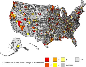
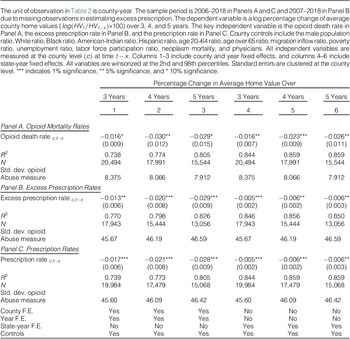
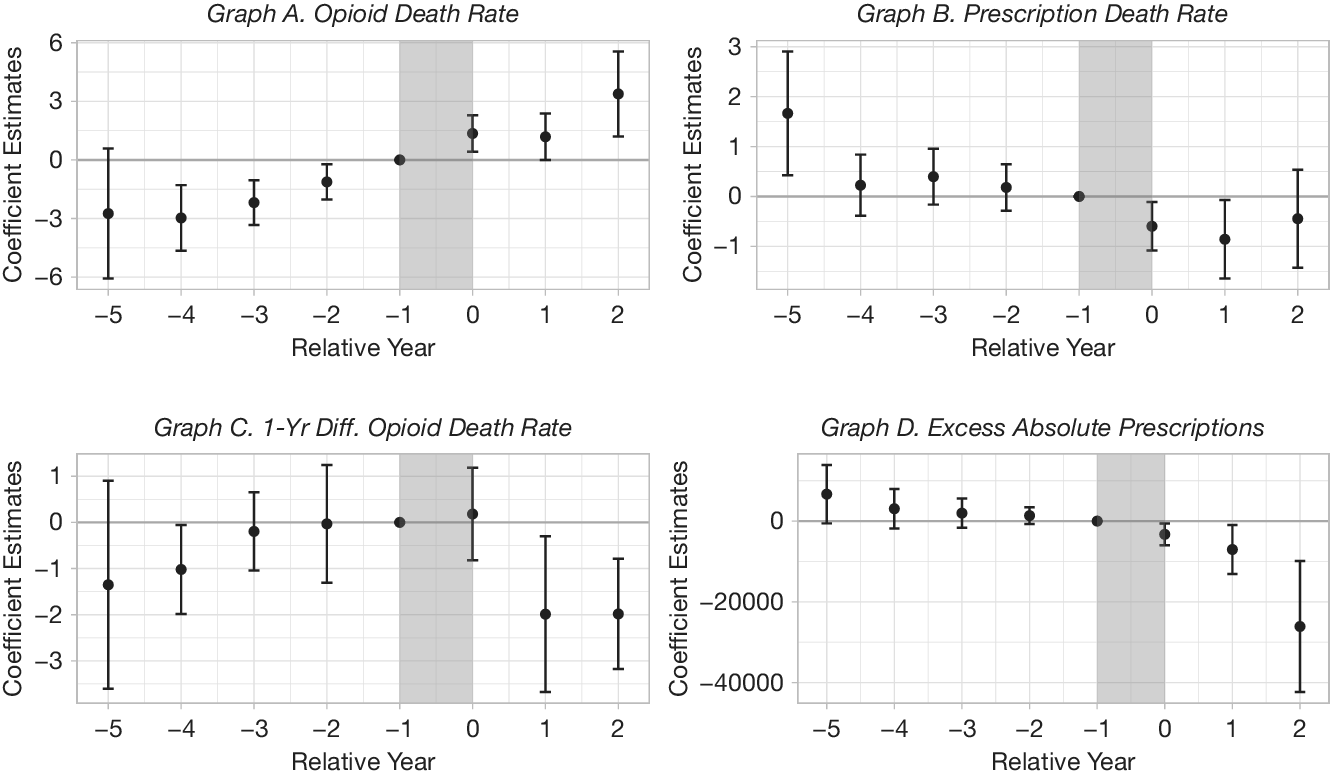
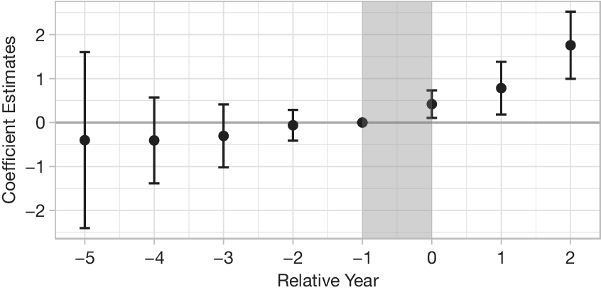
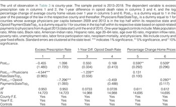
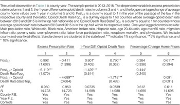
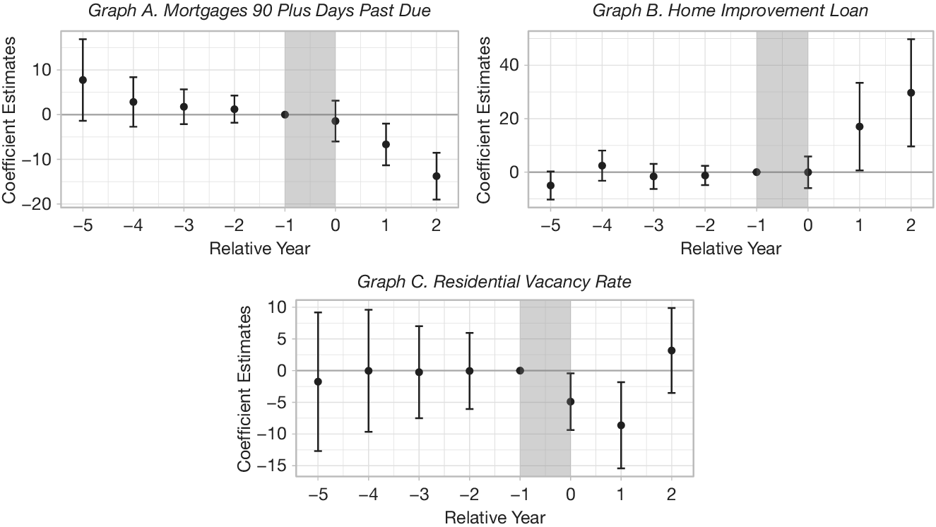
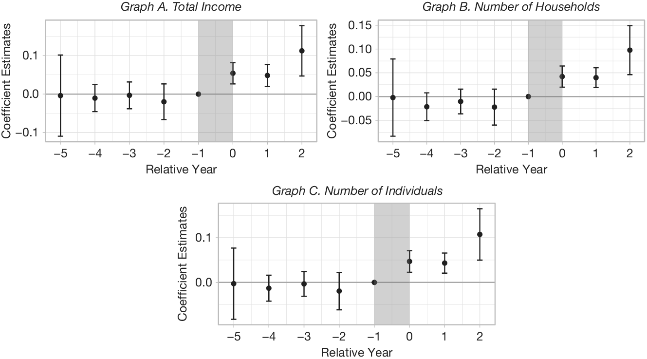
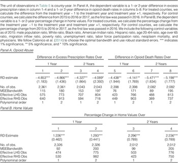

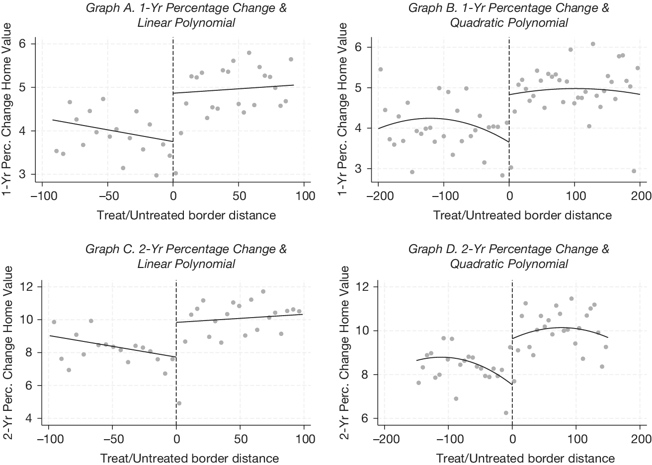


 Open access