


Impact Statements
Our research employs topological data analysis to extract a novel spatio-temporal feature from tropical cyclone wind fields. We construct graphs where nodes represent clusters of wind speed expanses and edges signify a type of inter-cluster continuity. This methodological shift allows for the detection of complex organizational transitions, offering a new diagnostic capability for identifying structural recurrence and unusual behavior in extreme weather events that may otherwise be smoothed over by traditional magnitude-based metrics. The method is validated through a case study of Hurricane Sandy, where we identify a previously unquantified, complete cyclical rotation in high wind speed radii. This dynamic behavior, a unique example of wind speed asymmetry and its phase rotation, directly corresponds to distinct structural properties within the generated graphs.
1. Introduction
Tropical cyclones (TCs) represent an ongoing and evolving risk to life and property. The importance of their investigation can hardly be overstated; for example, see Jewson (Reference Jewson2023), Krishna et al. (Reference Krishna, Amin and Sutley2023), and Xi et al. (Reference Xi, Lin and Gori2023). Anomalous behavior in TCs can be particularly dangerous (Wood and Ritchie, Reference Wood and Ritchie2012; Qian et al., Reference Qian, Du, Ai, Leung, Liu and Xu2024). In the study of TCs, we find that important characteristics are intertwined with wind field structure and size (Irish et al., Reference Irish, Resio and Ratcliff2008; Lu et al., Reference Lu, Lin, Emanuel, Chavas and Smith2018). Studies such as Uhlhorn et al. (Reference Uhlhorn, Klotz, Vukicevic, Reasor and Rogers2014) demonstrate the complex role of phase rotation wavenumber-1 wind speed asymmetries in environmental shear and TC motion, and the work of Knaff et al. (Reference Knaff, Sampson and Chirokova2017) and Sampson et al. (Reference Sampson, Fukada, Knaff, Strahl, Brennan and Marchok2017) underscores the importance of wind radii dynamics. Yet, capturing and communicating the nuances of wind speed radii remains difficult (Rey and Mulligan, Reference Rey and Mulligan2021; Chen and Chavas, Reference Chen and Chavas2023). Many visualization techniques are confined to too few variables to reflect important properties, and extracting meaningful research directions is not always obvious. Recent advances in data science have allowed for new and promising techniques (Sufi et al., Reference Sufi, Alam and Alsulami2022; Su et al., Reference Su, Smith and Villarini2023; Galea et al., Reference Galea, Kunkel and Lawrence2024). We introduce a method that reveals significant wind radius configurations hiding in high-dimensional data.
Topological data analysis (TDA) is an emerging field at the intersection of algebraic topology and data science, concerned with the computation of data properties invariant under continuous deformation. The role of TDA varies between studies, making important contributions at different points in a research pipeline. For example, Carrière et al. (Reference Carrière, Michel and Oudot2018) discuss the role of parameter tuning and show that TDA maps can approximate Reeb graphs, providing convergence rates and confidence regions for topological features. Frédéric and Bertrand (Reference Frédéric and Bertrand2021) and Munch (Reference Munch2017) consider the ability to uncover geometric and topological structures in data. They consider the role that persistence diagrams and TDA maps can play in feature extraction and dimensionality reduction, even in the face of noisy data. Scientific applications are also explored. Saggar et al. (Reference Saggar, Shine, Raphaël, Dosenbach and Fair2022) extend the role of TDA in application to the dynamic spatiotemporal structure of whole-brain functional configurations through the use of neuroimaging landscapes, and identify topological properties like hub nodes. In one of the few applications of TDA to TCs, Tymochko et al. (Reference Tymochko, Munch, Dunion, Corbosiero and Torn2020) study the diurnal cycle in hurricanes using persistent homology. Ver Hoef et al. (Reference Ver Hoef, Adams, King and Ebert-Uphoff2023) also presents the use of persistent homology as a TDA tool that can help in environmental science imaging. Particularly important for our study is TDA’s established record for detecting unusual characteristics in data sets (Lum et al., Reference Lum, Singh, Lehman, Ishkanov, Vejdemo-Johansson, Alagappan, Carlsson and Carlsson2013; Guo and Banerjee, Reference Guo and Banerjee2017). In our study, we consider the following question: Can unusual or extreme TC wind field behavior be detected from wind field data using TDA maps?
To answer this question, we studied the topological property of connectivity between clusters of similar wind fields within a single storm and between multiple storms, and how connectivity can be used to identify and classify wind field activity. We found evidence supporting a positive answer to the question through the detection of a high wind speed radius cycle in Hurricane Sandy. Unlike traditional frameworks that rely on scalar thresholds or parametric fits, the novelty of our topological approach lies in its ability to extract structural signatures that provide an objective basis for detecting anomalies in the organization of tropical cyclone wind fields. Previous studies have found other anomalous behavior in Sandy, suggesting it as a viable case study for our purpose (Fu et al., Reference Fu, Li and Fu2015; Qian et al., Reference Qian, Huang and Du2016; Martínez et al., Reference Martínez, Pérez, Sánchez, García and Pardo2021). While there have been some applications of TDA to atmospheric science (Tymochko et al., Reference Tymochko, Munch, Dunion, Corbosiero and Torn2020; Ver Hoef et al., Reference Ver Hoef, Adams, King and Ebert-Uphoff2023), our results are the first known implementation of TDA maps to wind speed radii.
2. Data
Open source HURDAT2 data (Landsea and Franklin, Reference Landsea and Franklin2013) was obtained, cleaned, formatted, and standardized for use in the computation described below. The HURDAT data set has been integral in previous studies linked to TC anomaly detection; e.g., see Hallam et al. (Reference Hallam, Marsh, Josey Simon, Hyder, Moat and Hirschi2019) and Stanković et al. (Reference Stanković, Messori, Pinto and Caballero2024). Data includes wind radii maximum extent measured in nautical miles (nmi) at three wind speed thresholds corresponding to slower tropical storm force winds, faster tropical storm force winds, and hurricane storm force winds measured in knots (kts) over four directional quadrants for each type of wind speed. We often refer to these variables as quadrants of the low, mid, or high wind speed radii. We also include maximum sustained wind speed in the data set we studied. Data points were recorded every 6 hours for each named storm, with the exception of landfall times. We extracted the data from these 12 wind radius variables, along with maximum sustained wind speed, to form 13 dimensional point clouds, and restricted the HURDAT2 data to the years 2007–2015. Note that to avoid making sequential wind field development a prominent influence, location and time were not included. For example, Table 1 displays the data before standardization for Hurricane Noel on November 2nd, 2007, at noon. The number of data points varies between storms, and there are a total of 4080 points in the point cloud generated from all TCs across the 9 year period.
Sample data point from the cleaned HURDAT2 data set

Note. Maximum radial extent is given in nautical miles for 34-knot, 50-knot, and 64-knot (hurricane-force) wind speed thresholds in each directional quadrant. Maximum sustained wind speed is given in knots.
3. Methods
We used a Python-based TDA Mapper (van Veen et al., Reference van Veen, Saul, Eargle and Mangham2019a, Reference van Veen, Saul, Eargle and Mangham2019b), to generate maps which we refer to as wind field connectivity signatures (WFCS) when generated from individual storms and collective wind field connectivity map (CWFCM) when generated from the entire set of storms.
3.1. A brief introduction to TDA maps
As TDA is still a relatively young method, we offer readers new to Mapper an introductory example that is easy to visualize, first given in Escolar et al. (Reference Escolar, Hiraoka, Igami and Ozcan2023). Consider the $ 2 $
-dimensional point cloud
$ 2 $
-dimensional point cloud $ L $
, depicted by black dots (somewhat resembling a fish) in Figure 1. In step 1, a projection function is applied, assigning each point to its value on the horizontal axis. In step 2, a sequence of overlapping intervals is chosen that defines a cover of the horizontal axis. A bin is the collection of data from
$ L $
, depicted by black dots (somewhat resembling a fish) in Figure 1. In step 1, a projection function is applied, assigning each point to its value on the horizontal axis. In step 2, a sequence of overlapping intervals is chosen that defines a cover of the horizontal axis. A bin is the collection of data from $ L $
that projects into the same interval in the cover. A clustering method is applied to each bin in step 3. Finally, in step 4, each cluster is represented by a node and an edge is constructed between nodes if there is a common data point for each node. The graph constructed by Mapper streamlines the original point cloud, but preserves and highlights topological structure, like loops and flares.
$ L $
that projects into the same interval in the cover. A clustering method is applied to each bin in step 3. Finally, in step 4, each cluster is represented by a node and an edge is constructed between nodes if there is a common data point for each node. The graph constructed by Mapper streamlines the original point cloud, but preserves and highlights topological structure, like loops and flares.
Graphical example of the Mapper pipeline from Escolar et al. (Reference Escolar, Hiraoka, Igami and Ozcan2023). This low-dimensional geometric toy example results in a map that visualizes some of the key shapes and structures in the original point cloud. Data that falls in the overlap of two bins are marked in red in Step 3; dashed lines indicate these repeated points between bins.

In each step of the process, we make choices based on the data and the intent of the analysis; parameters are often chosen empirically through experimentation (see Lum et al., Reference Lum, Singh, Lehman, Ishkanov, Vejdemo-Johansson, Alagappan, Carlsson and Carlsson2013). In step 1, numerous projection combinations are possible, such as a kernel density estimator, distance to measure, or principal component analysis. For example, in Lum et al. (Reference Lum, Singh, Lehman, Ishkanov, Vejdemo-Johansson, Alagappan, Carlsson and Carlsson2013) the authors study a breast cancer data set and apply two filter functions: L-infinity centrality and event death. In step 2, the number of intervals and the percent overlap are selected. More intervals will result in a map that gives a finer resolution of $ L $
, while more overlap will increase the likelihood of having common points between nodes and therefore more edges. In step 3, one chooses a clustering algorithm to further strain points in each respective bin by some proximity measurement; for example, in Chen and Volić (Reference Chen and Volić2021) DBSCAN clustering is used (this is the default clustering method in Mapper (van Veen et al., Reference van Veen, Saul, Eargle and Mangham2019a, Reference van Veen, Saul, Eargle and Mangham2019b), while in Guo and Banerjee (Reference Guo and Banerjee2017), hierarchical clustering with single-linkage is used. The sequence of choices in the map construction combines to give a large variety of possible maps. For a more in-depth introduction to TDA, see, for example, Frédéric and Bertrand (Reference Frédéric and Bertrand2021).
$ L $
, while more overlap will increase the likelihood of having common points between nodes and therefore more edges. In step 3, one chooses a clustering algorithm to further strain points in each respective bin by some proximity measurement; for example, in Chen and Volić (Reference Chen and Volić2021) DBSCAN clustering is used (this is the default clustering method in Mapper (van Veen et al., Reference van Veen, Saul, Eargle and Mangham2019a, Reference van Veen, Saul, Eargle and Mangham2019b), while in Guo and Banerjee (Reference Guo and Banerjee2017), hierarchical clustering with single-linkage is used. The sequence of choices in the map construction combines to give a large variety of possible maps. For a more in-depth introduction to TDA, see, for example, Frédéric and Bertrand (Reference Frédéric and Bertrand2021).
3.2. Applying mapper to tropical cyclone wind fields
In this subsection, we describe the implementation of Mapper on the HURDAT2 data. We provide sensitivity analysis and discussion of parameter selection, demonstrating how the Mapper pipeline works in concert to visualize the wind field point cloud.
3.2.1. Step 1: Projection
We computed many projections with multiple TCs in combination with various choices and parameter values in later steps. PCA, row-sum, summed-neighbor-distance, and projections onto various wind field quadrants and wind speeds were computed. For example, Hurricane Philippe’s hurricane status was detected in many of them; see Figure 2 for the maps resulting from a sample of these projections.
The maps displayed in this figure were each constructed with a different projection space. Other choices in the Mapper pipeline were not changed; we used 10 overlapping intervals with $ 75\% $
overlap for each dimension, and agglomerative clustering within bins. Nodes are colored by average maximum sustained wind speed (MSW) relative to Philippe. The red clusters in the maps using the radii of the eastern middle wind speed, northeast low wind speed, and western low wind speed projection spaces correspond to Philippe’s time at hurricane status. Philippe’s WFCS, using the final parameter settings, is given in Figure 5.
$ 75\% $
overlap for each dimension, and agglomerative clustering within bins. Nodes are colored by average maximum sustained wind speed (MSW) relative to Philippe. The red clusters in the maps using the radii of the eastern middle wind speed, northeast low wind speed, and western low wind speed projection spaces correspond to Philippe’s time at hurricane status. Philippe’s WFCS, using the final parameter settings, is given in Figure 5.

To construct the WFCSs and the CWFCM in our study, we projected each data point onto its low wind speed eastern quadrant radii (i.e., the maximal radial extent of the 34-kt wind speed in Northeast and Southeast directional quadrants). Some TC characteristics are known to favor the eastern quadrants, for example: asymmetry in wind speed radii (Hong et al., Reference Hong, Zheng, Chen, Su and Ke2020), and energy input into the ocean and Ekman pumping (Yubin et al., Reference Yubin, Zengan and Ting2023). Also, the low wind speed radii see greater variation than at the higher wind speeds, which are often zero for a large duration during many TCs. These reasons suggest the radii of the low wind speed eastern quadrants as a plausible projection. Other projections led to less informative maps for different reasons: too many edges, less defined flares, and replication of multiple symmetric components were some of the undesirables.
3.2.2. Step 2: Covers and bins
We see from Step 1 that the projection space is 2-dimensional (one dimension for the low wind speed radii in the northeastern quadrant and one for the southeastern quadrant). To create a cover for that space, we define a collection of overlapping squares. Squares’ sides are intervals along each dimension, defined from two parameters: the number of intervals and their percent overlap. The cover must span the projection space and is recalculated for each storm.
Wind fields having low wind speed eastern quadrant radii values in the same square (i.e., wind fields that project into the same square in the cover) form a bin.
Graphical features that persist across parameter values may correlate with meaningful point cloud structure and suggest the possibility that the feature is not a random artifact. We considered various combinations of these parameters for multiple TCs, finding that many TC components corresponding to hurricane status persisted across different covers. (The cycle in Hurricane Sandy’s high wind speed wind field also persisted. This cycle is the main topic of the results section, where it will be given further explanation.) See Figure 3 for Hurricane Sandy’s map-sensitivity to the covering parameters.
A sample of maps from Hurricane Sandy was computed by varying the covering parameters, number of intervals, and percent overlap, providing maps of varying resolution. Each pair of parameter values defines a new cover of the low wind speed eastern quadrants radius projection space. Maps are then created using agglomerative clustering. Each map in the figure has the corresponding pair of covering parameter values displayed above it. Nodes are colored by maximum sustained wind speed (MSW), standardized relative to Sandy. In Results, we reference the hole in Sandy’s WFCS, which we see emerging in the figure, being more pronounced along $ \left(\mathrm{7,0.65}\right) $
,
$ \left(\mathrm{7,0.65}\right) $
, $ \left(\mathrm{9,0.70}\right) $
, and
$ \left(\mathrm{9,0.70}\right) $
, and $ \left(\mathrm{9,0.75}\right) $
. For our results, we defined WFCSs at
$ \left(\mathrm{9,0.75}\right) $
. For our results, we defined WFCSs at $ \left(\mathrm{10,0.75}\right) $
.
$ \left(\mathrm{10,0.75}\right) $
.

Covering each eastern quadrant of the low wind speed radii with 10 intervals at 75% overlap creates a 100-square cover over the whole projection space that gives the best combination of feature retention and resolution, and is thus used for defining the WFCSs. For the sake of comparison between TCs, each WFCS is created using the same cover parameter values. The CWFCM, built from the collected wind field radii data of all TCs $ 2007-2015 $
, is used differently, allowing for computation using different covering parameter values. In this case, 10 intervals gave too fine a resolution and 75% overlap resulted in too many edges. We instead define the CWFCM with eight overlapping intervals with an overlap percentage of 40% on each dimension.
$ 2007-2015 $
, is used differently, allowing for computation using different covering parameter values. In this case, 10 intervals gave too fine a resolution and 75% overlap resulted in too many edges. We instead define the CWFCM with eight overlapping intervals with an overlap percentage of 40% on each dimension.
In step 2, we took an empirical approach to determining parameter values appropriate to our study. However, there has been some recent research where this step is automated; e.g., on the theory of automation, see Carrière et al. (Reference Carrière, Michel and Oudot2018); and see Saggar et al. (Reference Saggar, Sporns, Gonzalez-Castillo, Bandettini, Carlsson, Glover and Reiss2018) for an applied example where automation is used in the pipeline.
3.2.3. Step 3: Clustering
As mentioned above, bins are collections of wind fields determined by the similarity between their low wind speed radii in the eastern quadrants. Within each bin, our implementation of the Mapper pipeline further clusters wind fields using agglomerative hierarchical clustering (Tokuda et al., Reference Tokuda, Comin and Costa2022), an iterative bottom-up method that merges data points into a cluster and then continues merging clusters. We use the cosine metric to compute distance between data points; distance between clusters is computed using complete linkage (maximum distance between points in the clusters), and; we stop merging clusters when data has been narrowed to three clusters per bin. Each of these clusters is a node in the final map. To summarize this step, clustering is computed within the bins, and the cosine distance is computed on 13-dimensional data points. The cosine metric measures the angle between these points that share a bin; relative to all of the other wind fields with similar low speed expanse in the eastern quadrants, wind fields in a node are those with similar distribution across all of the dimensions of the data set.
To assess sensitivity, we computed additional maps for 4, 5, and 6 clusters per bin. Increasing the number of clusters has the general effect of further partitioning the maps, which could be useful for identifying characteristics as disconnected components; see Figure 4 for a sensitivity sample.
We used agglomerative clustering in step 3 of the WFCS construction, which has the parameter: number of clusters per bin. We conducted a sensitivity analysis of this parameter for several TCs. The maps for Hurricane Nadine, as we varied the number of clusters per bin from 3 to 6, are shown. Nadine’s maps become more fragmented, which is also typical of other TCs. However, storm features are detected across the settings. For example, when the number of clusters per bin is set to 3, Nadine’s strongest wind fields are detected through its location at the end of the red flare. When the setting is set to 6, the same wind fields have emerged as the disconnected component with 3 deep red nodes.

It is important to note that wind fields and wind field clusters lie in multiple bins, and that data points common to distinct bins can be clustered differently depending on the bin, even though their cosine distance is the same. This is due to the clustering technique. At the same time, a cluster is initially created based on its presence in a single bin. We may therefore assign each cluster to a bin; while this assignment is well-defined, it is not one-to-one since the three disjoint clusters created per bin identify with that same bin. The extent of similarity between wind fields within a cluster is bin-dependent in the sense that defining the cluster is not only influenced by the cosine metric and complete linkage, but also by the data present in the assigned bin.
3.2.4. Step 4: Nodes and edges
Wind field clusters correspond to nodes in the map and edges are drawn between them in the map if the clusters share at least one common wind field. If the clusters were required to share more than one common wind field, then fewer clusters would be considered overlapping, and the map would contain fewer edges. (Edges also tell us that the adjacent nodes (clusters) were created within different bins since clusters within a bin do not overlap.)
3.2.5. Visualization
After constructing a map, nodes are colored by average maximum sustained wind speeds relative to that map’s data. Red nodes have the highest average maximum sustained winds, with blue nodes corresponding to lower wind speeds. Larger nodes indicate more wind fields in the cluster.
To generate the $ 2D $
visualization, the abstract graph structure was geometrically embedded using a Force-Directed Layout (FDL) algorithm, which translates the graph’s inherent connectivity features into a stable and interpretable spatial configuration. The FDL treats edges as attracting springs and nodes as repelling particles. The resulting visualization reveals topological structures, such as flares and holes of the underlying abstract graph.
$ 2D $
visualization, the abstract graph structure was geometrically embedded using a Force-Directed Layout (FDL) algorithm, which translates the graph’s inherent connectivity features into a stable and interpretable spatial configuration. The FDL treats edges as attracting springs and nodes as repelling particles. The resulting visualization reveals topological structures, such as flares and holes of the underlying abstract graph.
3.2.6. Cluster continuity
We now summarize our implementation of the Mapper pipeline with a view toward continuity between clusters; first, a little notation. Let $ X\subset {\mathrm{\mathbb{R}}}^{13} $
denote the space of wind field observations. Let
$ X\subset {\mathrm{\mathbb{R}}}^{13} $
denote the space of wind field observations. Let $ Z\subset {\mathrm{\mathbb{R}}}^2 $
be the projection space spanned by the low wind speed radii in the northeastern and southeastern quadrants. Let
$ Z\subset {\mathrm{\mathbb{R}}}^2 $
be the projection space spanned by the low wind speed radii in the northeastern and southeastern quadrants. Let $ f:X\to Z $
be the projection map. We cover the image of
$ f:X\to Z $
be the projection map. We cover the image of $ f(X) $
with overlapping sets
$ f(X) $
with overlapping sets $ {\left\{{U}_i\right\}}_{i\in I} $
. For each
$ {\left\{{U}_i\right\}}_{i\in I} $
. For each $ {U}_i $
, define its preimage
$ {U}_i $
, define its preimage $ {V}_i={f}^{-1}\left({U}_i\right)\subset X $
, and apply the clustering algorithm described in 3.2.3 to
$ {V}_i={f}^{-1}\left({U}_i\right)\subset X $
, and apply the clustering algorithm described in 3.2.3 to $ {V}_i $
, producing:
$ {V}_i $
, producing: $ {C}_i=\left\{{C}_{i,1},{C}_{i,2},{C}_{i,3}\right\},\mathrm{where}\hskip0.532em {C}_{i,j}\subset {V}_i. $
The Mapper graph has vertices corresponding to these clusters. Two vertices
$ {C}_i=\left\{{C}_{i,1},{C}_{i,2},{C}_{i,3}\right\},\mathrm{where}\hskip0.532em {C}_{i,j}\subset {V}_i. $
The Mapper graph has vertices corresponding to these clusters. Two vertices $ {v}_{i,j} $
and
$ {v}_{i,j} $
and $ {v}_{k,\mathrm{\ell}} $
are connected by an edge if their corresponding clusters share at least one data point:
$ {v}_{k,\mathrm{\ell}} $
are connected by an edge if their corresponding clusters share at least one data point: $ {C}_{i,j}\cap {C}_{k,\mathrm{\ell}}\ne 0 $
.
$ {C}_{i,j}\cap {C}_{k,\mathrm{\ell}}\ne 0 $
.
We interpret these edges as indicating a type of cluster continuity; they appear precisely when small changes in the projection space (moving from $ {U}_i $
to an overlapping
$ {U}_i $
to an overlapping $ {U}_k $
) correspond to small changes in the high-dimensional wind fields (moving from
$ {U}_k $
) correspond to small changes in the high-dimensional wind fields (moving from $ {C}_{i,j} $
to an overlapping
$ {C}_{i,j} $
to an overlapping $ {C}_{k,\mathrm{\ell}} $
). Edges provide a path of continuous change in the wind field clusters with respect to the change in the low wind speed radii in the eastern quadrants. Since this connectivity is with respect to the projection space, it is sensitive to the choice of projection; as mentioned above, there is some evidence that the eastern quadrants capture other cyclonic properties (Hong et al., Reference Hong, Zheng, Chen, Su and Ke2020; Yubin et al., Reference Yubin, Zengan and Ting2023). Additional discussion of continuity in this topological context is given in Barcelo et al. (Reference Barcelo, Kramer, Laubenbacher and Weaver2001), Barmak (Reference Barmak2011), Carlsson (Reference Carlsson2009), and Rieser (Reference Rieser2021), for example.
$ {C}_{k,\mathrm{\ell}} $
). Edges provide a path of continuous change in the wind field clusters with respect to the change in the low wind speed radii in the eastern quadrants. Since this connectivity is with respect to the projection space, it is sensitive to the choice of projection; as mentioned above, there is some evidence that the eastern quadrants capture other cyclonic properties (Hong et al., Reference Hong, Zheng, Chen, Su and Ke2020; Yubin et al., Reference Yubin, Zengan and Ting2023). Additional discussion of continuity in this topological context is given in Barcelo et al. (Reference Barcelo, Kramer, Laubenbacher and Weaver2001), Barmak (Reference Barmak2011), Carlsson (Reference Carlsson2009), and Rieser (Reference Rieser2021), for example.
3.2.7. Limitations of the method: sequential information
We have deliberately omitted time stamps from the wind field data. Also, nodes are colored based on average maximum sustained wind. The resulting maps do not model TCs as time series. Graphical properties of the map that might correspond to meaningful wind field properties, such as flares and loops, do not necessarily correlate with temporal sequences of wind fields, making analysis of wind field evolution impossible for some TCs.
To quantify the extent to which a WFCS declares temporal ordering, we introduce terminology and compute a metric. If a node represents a set of consecutively sequenced wind fields, then we call the node sequenced; unsequenced nodes represent a collection of wind fields that are not consecutively indexed in the HURDAT2 data set, i.e. there are (potentially large) time gaps between the wind fields in an unsequenced node. If two sequenced nodes are connected by an edge and the latest occurring wind field in one node is also contained in the adjacent node, we call the edge a sequenced edge. Paths comprised of sequenced nodes and edges represent the temporal evolution of the wind field. For a sample of TCs, Table 2 provides the percentage of nodes that are sequenced, and the percentage of (nonisolated) sequenced nodes connected by a sequenced edge. Similar metrics could be helpful for other such non-temporal implementations of the Mapper pipeline as an initial computation to determine if the maps are likely to correspond to sequential data.
Metrics measuring how well WFCSs retain the temporal ordering of wind fields for a sample of Hurricanes: A WFCS node represents a cluster of wind fields that may have occurred out of temporal order, and edges may further connect these out-of-sequence wind fields

Note. We computed the percentage of nodes that represent only wind fields that are in-sequence and the percentage of these sequenced nodes that lead sequentially to another such node. Higher percentages indicate more chronological pathways through the WFCS.
3.2.8. Interpretation
Assume we have a TC whose WFCS maintains a high extent of temporal ordering. Transitions in the WFCS then correspond to an evolution of the overall wind field configuration that is smooth (with respect to the evolution of the northeast and southeast low-speed wind field expanses.) On the other hand, disconnected components represent abrupt development in the overall wind field.
Our implementation of Mapper is capable of relating the graphical structure to the real physical characteristics of the storm. For instance, Hurricane Philippe’s time at hurricane status corresponds to a disconnected component in its WFCS; see Figure 5. We cataloged WFCSs for numerous TCs. To help orient the reader, Figure 5 includes a small sample of these. Our main results below explore a more nuanced graphical property that identifies a novel wind field occurrence in Hurricane Sandy.
WFCSs for a sample of TCs. From left to right: Hurricanes Igor, Nadine, Joaquin, and Philippe. Nodes are colored by maximum sustained wind speed (MSW), standardized relative to each respective storm. Nodes corresponding to hurricane status are highlighted in gray. In some cases, hurricane status corresponds to graphical properties; for example, the flare in Hurricane Nadine and the disconnected component in Hurricane Philippe.

3.2.9. Comparative methodological effectiveness
The effectiveness of the WFCS/CWFCM approach lies in its ability to detect structural recurrence and topological branching—features that are not captured by standard radial or statistical metrics. Traditional characterizations of TC wind fields, such as the quadrant-based radii used in operational forecasting (Knaff et al., Reference Knaff, Sampson and Chirokova2017; Sampson et al., Reference Sampson, Fukada, Knaff, Strahl, Brennan and Marchok2017) are designed to measure the spatial extent of specific wind thresholds. While effective for forecasting and other applications, such as surge and risk assessment (Irish et al., Reference Irish, Resio and Ratcliff2008), these magnitude-based metrics do not account for the inter-cluster connectivity or the internal organization of the wind field expanses. Similarly, structural asymmetry analysis often relies on Fourier-based wavenumber-1 decomposition (Uhlhorn et al., Reference Uhlhorn, Klotz, Vukicevic, Reasor and Rogers2014); while it provides a phase angle of asymmetry, the use of a geometric fit may limit effectiveness when the storm undergoes complex structural transitions.
Our TDA-based method provides a distinct advantage in structural anomaly detection. By constructing graphs based on the similarity of wind field expanses, we identify topological features; specifically, cycles (holes) and elongated branches (flares). While holes represent a return to a previously occupied structural state, flares indicate a departure into a rare or extreme structural configuration.
While previous anomaly-based models for tropical cyclones (Qian et al., Reference Qian, Huang and Du2016, Reference Qian, Du, Ai, Leung, Liu and Xu2024) effectively isolate unusual behavior by comparing storm fields to climatological means, and those anomalies are identified in terms of magnitude or intensity. In contrast, the WFCS method identifies topological anomalies that arise from the internal organization of the data itself. This allows for the detection of behaviors such as the 360-degree rotation in Hurricane Sandy (discussed in Section 4), which manifests as a unique topological hole in its WFCS and a distinct flare in the CWFCM. This feature is hidden in traditional datasets because standard metrics do not track the continuous connectivity between asymmetrical states, focusing instead on scalar deviations.
4. Results
The results of this study are stated in the form of data maps generated using techniques from TDA, which we call wind field connectivity signatures (WFCS) and collective wind field connectivity map (CWFCM). An important value of TDA maps in general is their ability to extract unusual features in data sets. We now consider this potential for feature detection using WFCSs and the CWFCM through the exploration of a case study. Hurricane Sandy presents as a viable case; it is well-documented to have exhibited unique and extreme behavior. Sandy began on October 22nd, 2012, in the western Caribbean Sea and tracked north and northeast before making landfall in New Jersey on October 29th. It was one of the largest hurricanes on record. Sandy’s coastal flooding was extreme. At 3.4 meters above sea level, New York City’s flooding was ranked as a 1-in-900-year event (Brandon et al., Reference Brandon, Woodruff, Donnelly and Sullivan2014). Unusual characteristics of its extratropical transition are observed in Fu et al. (Reference Fu, Li and Fu2015). Its track was also unique Qian et al. (Reference Qian, Huang and Du2016). In particular, its unusual left turn before making landfall on October 29th has been noted (Qian et al., Reference Qian, Du, Ai, Leung, Liu and Xu2024). In this section, we describe the correspondence between Sandy’s WFCS, its place in the CWFCM, and the physical characteristics of the storm. The analysis identifies a previously undocumented anomaly in its wind field, validating the potential of the novel application of the method presented above.
4.1. Hurricane Sandy’s signature
Sandy generated a WFCS with 63 nodes, 246 edges, and three main clusters that are connected by relatively few edges (Figure 6). Clusters in the graph were first identified visually using FDL, which is well-suited for revealing community structure because it positions densely connected nodes close together and separates weakly connected regions. This visualization clearly displayed three distinct groups in the largest connected component. We also computed greedy modularity-based community detection, whose results validated the visual evidence. (The clusters had a modularity score of 0.546, indicating strong separation, along with low per-community conductance values (0.064, 0.096, 0.151), further supporting that these clusters are well-defined.).
Hurricane Sandy’s WFCS. In the main component, note the appearance of a hole in the upper left portion, an unusual feature among other WFCSs in our catalog. To help describe this feature and classify Sandy’s wind fields, we defined node clusters (i.e., clusters of clusters of wind fields) based on their position and connectivity. In this figure, node clusters 1, 2, and 3 are circled by pink, lavender, and gray rings, respectively. Nodes are colored by average maximum sustained wind speed (MSW) relative to Sandy.

We describe below the correspondence between node clusters and Sandy’s evolution; see Table 3 for a brief summary.
WFCS generated classification timeline of Hurricane Sandy

Note. Wind fields are classified by membership in node-clusters defined from Sandy’s WFCS; see Figure 6.
4.1.1. Node cluster overview
Node cluster 1 (Figure 6) consists of wind field moments in Sandy’s early development and evolution into hurricane status. The placement of the nodes is roughly consistent with the passage of time; nodes at the bottom of the cluster are the earliest wind field moments and the passage of time corresponds roughly to moving upward through the cluster. Node cluster 1 begins at 12 am, October 24th, 2012 and ends at 12 am, October 26th. It includes 12 consecutive rows from the HURDAT2 data set during which time Sandy went from tropical storm to hurricane status while passing northward over Jamaica and Cuba. Node cluster 1 contains the peak of Sandy’s maximum sustained winds and category rating; hence, the red colored nodes. The connectivity between the red nodes indicates multiple wind field variations formed during its highest maximum sustained winds, providing a WFCS more structured than, for instance, Nadine was at its peak, but less structured at its peak than, for instance, Joaquin (see Figure 5 above).
Node cluster 2 contains 10 wind fields that correspond to the storm’s progression from 6 pm, October 25th, until 6 am, October 27th, and 3 later wind field moments from 12 am, October 30th to 12 pm, October 30th. The mixture of wind fields from different times makes it more difficult to identify a path through the cluster that corresponds to the passage of time. Some of the nodes in cluster 2 contain wind fields that correspond to Sandy weakening while moving parallel to the southeast coast of the United States, and the remaining wind fields in the cluster took place soon after landfall.
The time gap in node cluster 2 makes up node cluster 3, from 12 pm, October 27th, until 12 am, October 30th. Following node cluster 3 from right to left roughly corresponds to the passage of time as Sandy moved along the mid-Atlantic states before turning sharply to the left and making landfall shortly after. During this time, Sandy regains category 2 status, dramatically increases in size, and experiences an extratropical transition while interacting with a preexisting upper-level trough; Fu et al. (Reference Fu, Li and Fu2015).
4.1.2. Complete cycle of asymmetry in Sandy’s high wind speed radii
The emergence of a region like that of node cluster 3, and the existence of the hole it bounds, are topologically unique when compared to other signatures we computed (see Figure 5 for a sample of other WFCSs). The hole’s existence was confirmed independently of the visualization’s FDL. Analysis of the abstract graph’s connectivity confirmed a sparse cycle spectrum: while the graph contains 120 chordless cycles of length 3 (reflecting high local density), it contains zero chordless cycles of length 4 or 5. Crucially, the graph features a unique chordless cycle of length 6 and one of length 7. Together, these unique cycles create the boundary of the hole.
Importantly, the graphical uniqueness identifies real, unique physical features of the storm. Indeed, node cluster 3 corresponds to a sequence in the hurricane when the quadrants with non-zero high wind speed radii rotate counterclockwise from the northwest to the northeast. The collective spatial distribution of the non-zero high wind speed radii across the four directional quadrants is asymmetrical. The rotation discussed here refers to the temporal progression of this asymmetry around the storm center. That is, the phase of the asymmetry in the non-zero directional quadrants in the high wind speed radii completes a 360-degree rotation. Figure 7 provides a visualization of this cycle. Nowhere else in the HURDATA2 data, 2007–2015, is this phenomenon of a complete cycle in the asymmetry of wind speed radii observed. In fact, not only does the comparative uniqueness of Sandy’s WFCS suggest an interesting phenomenon, but so does the CWFCM (see Figure 8), as we will see below.
Six polar charts illustrating the temporal progression of the high wind speed distribution in Hurricane Sandy from October 27th to October 30, corresponding to node cluster 3 in Sandy’s WFCS (see Figure 6). Each chart represents the maximal observed high wind speed radius (in miles, indicated by the arcs and radial labels) for each of the four directional quadrants (NE, SE, SW, NW) during the specified time frame. Charts 1, 2, and 4 each represent multiple snapshots where the high wind speed was similar throughout the respective time durations. Quadrants without an arc have high wind speed radii of zero during the corresponding time frame, and help define the asymmetry in the wind field distribution at that time. A 360-degree cycle of asymmetry in the wind field distribution can be seen, moving predominantly from the Northwest sector (1) through the Southwest and Southeast, concluding in the Northeast sector (6).

The figure displays the CWFCM, which differs from WFCSs since the data is from all TCs, 2007–2015. Most nodes in this figure represent clusters comprised of wind fields from multiple TCs. Nodes are colored by average maximum sustained wind speed (MSW) relative to all TCs, 2007–2015. The CWFCM offers another tool for suggesting unusual structure. It reinforces our claim that the wind fields from node cluster 3 in Sandy’s WFCS are anomalous since they also reside in nodes on a well-defined flare in the CWFCM; the CWFCM nodes where these wind fields reside are circled by the gray ring in the figure. To determine if a wind field resides on a flare, we computed the number of edges between each node and a node identified as the central anchor.

Previous studies have observed other anomalous behavior in Sandy during this stage. Differential equation-based beta-advection models are used to analyze Sandy’s unusual left turn during this stage in relation to outside anomalous systems (Qian et al., Reference Qian, Huang and Du2016), where the stage is singled out. Martínez et al. (Reference Martínez, Pérez, Sánchez, García and Pardo2021) notes there is a notable shift in Sandy’s recirculation factor during this stage, and track uniqueness is again observed by the left turn. Although multiple studies declare this stage anomalous, nowhere else is this cyclical feature in the high wind speed radii identified; nor does it appear in studies with wind-radii and asymmetry focus, such as Knaff et al. (Reference Knaff, Sampson and Chirokova2017), Sampson et al. (Reference Sampson, Fukada, Knaff, Strahl, Brennan and Marchok2017), and Uhlhorn et al. (Reference Uhlhorn, Klotz, Vukicevic, Reasor and Rogers2014).
It is notable that the novel method put forth in this article found a new feature of TC wind field instances that many atmospheric scientists have previously identified as worth further study, corroborating our claim that WFCSs have potential as a data-driven approach for detecting unique and extreme TC characteristics.
4.2. A map for all storms, 2007–2015
The data used in this subsection is the same as used above for individual storms, only combined into one larger data set: all TCs, 2007–2015. The procedure for constructing the map is also the same, with the exception of some adjustments to parameters. The resulting map provides another perspective on wind field categorization and toward suggesting unusual structure. As the map is no longer a unique attribute for an individual storm, we do not refer to it as a signature, calling it the collective wind field connectivity map (CWFCM) instead. Compared to WFCS presented above, the CWFCM in this section provides a higher-level view of the wind fields.
The wind field point cloud from 2007 to 2015 consists of 4080 points, generating the CWFCM with 106 nodes and 295 edges, where each node represents a cluster of wind fields from (potentially) many different TCs from within one or more storms that have been grouped based on similarity, as described in Methods; see ( Figure 8 ). Since the data set for the CWFCM is much larger than for WFCSs, one might expect there to be many more nodes and edges. However, this difference is smaller than expected because of our parameter adjustments to the low wind speed eastern quadrants. By lowering the overlap percentage to 40%, fewer wind fields reside in multiple squares covering the low wind speed eastern quadrants, decreasing the opportunity for clusters to overlap.
Below, we describe how the CWFCM also detects the high wind speed radii cycle in Hurricane Sandy, noted above in 4.1.2.
4.2.1. Flare analysis
The densely connected nodes in the center of the CWFCM correspond to more typical wind radii. Nodes positioned on a flare of a topological data map are graphically distinct from more central nodes and can correspond to meaningful features in the underlying data set; indeed, see Chen and Volić (Reference Chen and Volić2021), Kalyanaraman et al. (Reference Kalyanaraman, Kamruzzaman and Krishnamoorthy2017), and Lum et al. (Reference Lum, Singh, Lehman, Ishkanov, Vejdemo-Johansson, Alagappan, Carlsson and Carlsson2013) for computational flare analysis and examples of the use of flares in other disciplines. For this study, flare positioning of wind fields in the CWFCM can potentially indicate interesting or unusual wind field configurations. To quantify a wind field’s flare position, we use standard graph-theoretical metrics. Finding a node at the center of the graph, we then compute how long the shortest path is from each wind field to that central node.
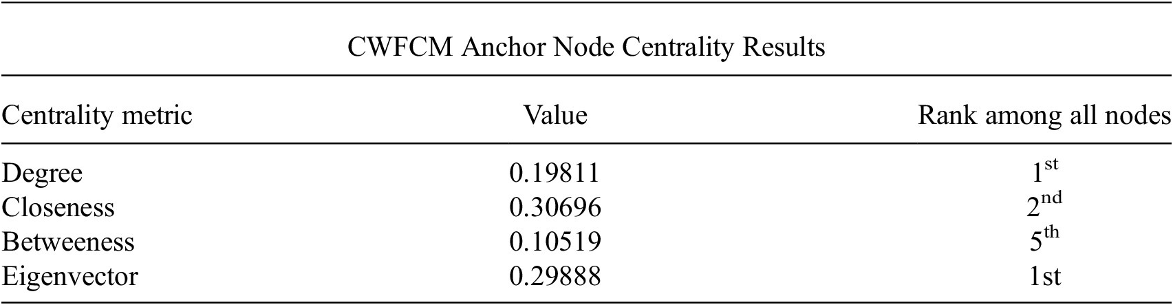
We used a metric to measure wind field progression along flares in the CWFCM, and then compared the results to our earlier findings on Hurricane Sandy’s high wind field cycle. We describe the metric and results below. The main chunk of nodes in the CWFCM is well-connected to the center, while paths to the center for nodes further down flares will traverse more edges. To quantify this concept, we first identify a special node as the central anchor (from which we can then compute lengths of shortest paths to the other nodes). We computed degree, closeness, betweenness, and eigenvector centrality for every node in the CWFCM, and chose as a central anchor the node that these measurements favored; Table 4 gives the results of these measurements for the anchor node. Physically, these centrality metrics identify the structural typicality of wind field configurations. High centrality values for the anchor node indicate that it represents a common organizational state shared by the majority of tropical cyclones in the dataset. By establishing this statistical baseline, we can then objectively define flares as departures from this typicality, providing a geometric basis for identifying unusual or extreme wind field behaviors like those observed in Hurricane Sandy.
Four centrality metrics were computed for each node in the CWFCM

Note. The table displays the results for the node we used as the central anchor. The metrics indicate that the anchor, comprised of 527 wind fields from various TCs, is well-connected and easily reachable for most wind fields in the data set. Further out from the central anchor reside nodes along flares, which may have unique wind field configurations.
We then computed the minimum number of edges between each wind field and the central anchor. Wind fields with a higher number of edges toward the center are more likely to be further down a flare. Most wind fields were within 2 edges of the center and nearly all were within 3. Only 1.25% of wind fields had a path to the center that was longer than 3 edges, making these fields unusual in this graphical sense. We confirmed that these results visually coincide with the CWFCM: all wind fields further than 3 edges to the center were located along flares. In particular, each wind field from Hurricane Sandy’s node cluster 3 had such a path. The position of Sandy’s high wind speed radii cycle along a well-defined flare on the CWFCM provides a second piece of evidence suggesting that these wind fields may correspond to unusual TC behavior.
5. Conclusion
The topological data maps presented above (WFCS and CWFCM) were constructed by an original application of a method from TDA. The maps visualize high-dimensional TC data of wind speed radii. We tested the use of graphical structure in the maps for feature extraction and anomaly detection in TCs. An analysis of the graphical structure of WFCSs and the CWFCM was conducted. Hurricane Sandy was given special focus. Our results provide two graph structures, loops and flares, that point to an unusual feature in Hurricane Sandy. Upon inspection of the corresponding points of the wind field data, a previously undocumented wind field phenomenon was observed: a complete cycle of high wind speed radius asymmetry. Without the use of the novel method presented above, we would not have discovered the cycle. In view of these results, we submit that, when paired with additional atmospheric analysis, these data analytic techniques may be a useful tool for identifying TC wind fields worth closer study. They may uncover additional unique and extreme TC wind field phenomena beyond Sandy’s high wind speed radii cycle. For example, Hurricanes Noel, Laura, and Rafael also have wind fields appearing in the nodes of the bottom flare of the CWFCM and may be worth further study. Future studies will continue to explore WFCSs of other storms, looking for more unusual structure that corresponds to phenomena in TC wind fields.
The current study utilizes TC intensity coloring to provide a benchmark for structural transitions. However, the WFCS/CWFCM framework is flexible. Parameter adjustments and graph filtering may allow for future research with meaningful temporal or seasonal metadata colorings of collective graphs, like the CWFCM, to investigate climatological trends. Furthermore, while the current study focuses on the objective characterization of wind field structures, the detection of recurrence and topological anomalies offers a potential foundation for future forecasting applications. Alternative pipelines that integrate these structural signatures with real-time data could eventually translate topological insights into actionable metrics for public safety.
Acknowledgments
We thank the authors of Escolar et al. (Reference Escolar, Hiraoka, Igami and Ozcan2023) for permission to reuse their previously published figure in Figure 1.
Author contribution
Conceptualization:
Data availability statement
The data that support the findings of this study are openly available in the HURDAT2 data set published through the National Hurricane Center and available at https://www.nhc.noaa.gov/data/.
Funding statement
This work received no specific grant from any funding agency, commercial or not-for-profit sectors.
Competing interests
The author declares no competing interests.


 Open access
Comments
Dear Editors,
I am pleased to submit this paper, Detecting Unique Wind Field Features in Hurricane Sandy From Topological Data Maps, to Environmental Data Science. This paper is submitted for consideration as part of the journal’s forthcoming Special Issue Connecting Data-Driven and Physical Approaches: Application to Climate Modeling and Earth System Observation. This paper engages with the scope and aims of the Special Issue by presenting an innovative, data-driven method and application for the identification of wind field features in tropical cyclones. I can confirm that this paper is original and has not been submitted elsewhere. I declare no conflict of interest.
Sincerely,
Justin Hoffmeier