


1. Introduction
Our planet faces growing challenges related to climate change and environmental degradation (Reference BrundtlandBrundtland, 1987). Companies are increasingly urged to take responsibility for their ecological impacts, particularly within the packaging industry. One solution for more sustainable packaging is standardisation, which through reuse and uniform shapes can reduce waste (KIDV, 2020). In response, the European Union introduced the Packaging and Packaging Waste Regulation (European Commission, 2025), aiming to make all EU packaging more sustainable through uniform design rules. Standardised packaging, defined as uniform in structure and material, facilitates recycling and reuse.
However, standardisation also creates uncertainty. Packaging plays a crucial role in communicating brand identity (Reference UnderwoodUnderwood, 2003; Reference Orth, Rose and MerchantOrth et al., 2019), fostering differentiation, recognisability, and profitability. For heritage-oriented brands, the consequences may be even more substantial (Reference Ho-dac and Mulder-NijkampHo-dac & Mulder-Nijkamp, 2025). Heritage conveys authenticity through references to history, tradition, and cultural roots, and companies fear that standardisation may weaken visual identity, consumer engagement, and ultimately profitability. This tension between differentiation and uniformity forms a central challenge for brands adapting to industry-wide standards.
This challenge is visible in supermarkets, where similar products appear in highly varied shapes and forms. As Reference Ho-dac and Mulder-NijkampHo-dac and Mulder-Nijkamp (2025) note, packaging diversity is driven not only by technical requirements but also by marketing, usability, and cost considerations. This research therefore examines to what extent heritage-focused design cues can be retained within standardised formats while maintaining brand identity. Structural elements such as protruded logos may disappear under standardisation, raising the question whether consumers perceive a decline in brand quality and heritage. The main research question is: How does the transition to standardised packaging affect consumer perception of brand recognition, and to what extent can brand-specific design elements maintain brand identity?
The plan of the paper is to investigate how the transition to standardised packaging affects consumer perceptions of brand heritage and recognition. The focus is on whether brand-specific visual and verbal cues can effectively preserve brand identity within structurally uniform packaging formats. To address our research, a specific brand is selected for further investigation. The aim was to identify a product with a strong brand identity, allowing to explore how far the packaging could be transformed into a standardised format and how this transformation might influence the brand’s identity. So, a refined scope of the analysis is done by selecting a product that would serve as a suitable case study. For this purpose, the focus is on Bertolli since this is a classic Italian brand with a strong visual and narrative brand identity, represented in the supermarkets by mainly its pasta sauces, olive oils and pastas. Olive oil and pasta sauce were selected as two distinct yet representative product categories within the same heritage brand to test consistency of findings across packaging formats and thereby increase the robustness of the results. It is important to note that within this paper, Bertolli is employed solely as a case study, chosen because of its high-end positioning and strong heritage.
In Bertolli’s original packaging designs, all three levels of design cues (Reference SteenisSteenis, 2019) are present and together they strongly communicate the brand’s heritage. Structural elements such as embossed, protruding letters, visual elements like the imagery of Italian landscapes, and verbal elements including the classic logo and Italian words each reinforce Bertolli’s values of authenticity and tradition. These cues are essential for expressing the brand’s identity and for distinguishing Bertolli from competitors in categories such as pasta sauces and olive oils. Based on this, it is anticipated that brand recognition, perceived quality, and potentially consumers’ willingness to buy will still be maintained when designers will use the visual and verbal cues to express heritage. Based on our research question, the following hypotheses are purposed:
-
• H1) Maintaining brand-specific visual and verbal cues in standardized packaging preserves brand heritage and perceived quality.
-
• H2) Consumers’ willingness to buy is sustained when standardized packaging effectively conveys brand quality and promotes brand loyalty.
-
• H3) Alternative brand identity cues, such as QR codes linking to recipes or paper seals, could lead to generating a comparable heritage-focused brand experience.
The case studies show that the transition to standardized packaging does not necessarily harm brand recognition when key brand-specific cues are preserved on a visual and verbal level. Participants consistently viewed logo, colour, typography and coherent imagery as the strongest carriers of brand heritage. When these elements were maintained, both authenticity and recognition remained high. In contrast, designs lacking these cues led to lower perceptions of heritage and quality. The redesign experiment demonstrated that consumers accepted standardized packaging when familiar visual and verbal signals of quality were clearly present. Additional elements such as seals supported authenticity, while QR codes added limited value, indicating that supplementary cues can enhance, but not necessarily replace, core brand identity.
2. Literature review
The increasing standardisation of packaging, driven by sustainability regulations, presents a key challenge for heritage-focused brands. While standardised packaging supports environmental goals by enabling recyclability, reducing material use, and improving efficiency (Reference Dubisz and RokickiDubisz & Rokicki, 2022), it limits opportunities to communicate brand identity (Reference UnderwoodUnderwood, 2003).
Packaging standardisation, sustainability, and brand heritage therefore form a strategic triangle: standardisation facilitates circularity, sustainability sets regulatory norms, and heritage safeguards recognisability and long-term brand meaning (Reference Blombäck and ScandeliusBlombäck & Scandelius, 2013).
This balance has become more complex under the Packaging and Packaging Waste Regulation (European Commission, 2025). The PPWR requires that by 2030 all packaging on the EU market meets harmonised recyclability criteria (Regulation (EU) 2025/40), following the EU waste hierarchy and performance grades (A–C). As standardised formats facilitate reuse systems and high recyclability, they play a strategic role in the transition to a circular economy. However, increased structural uniformity restricts the creative freedom traditionally used to express brand identity and heritage (Reference Orth, Rose and MerchantOrth et al., 2019).
The focus in standardised packaging can be on the structural features like protruded lettering of a package. This could function as a distinctive branding element that reinforces the brand’s identity through the packaging, conveying a sense of authenticity and craftmanship. Another example of a structural feature that cannot be modified in the standard design is a highly distinctive shape or a specific, striking material. The shift presents a challenge for companies seeking to maintain their distinctive identity and heritage within the increasingly standardised and sustainability driven packaging designs (KIDV, 2020).
Beyond structure, packaging identity can be expressed through visual and verbal elements (Reference SteenisSteenis, 2019). In standardised packaging, where structure becomes uniform, differentiation depends on colours, imagery, typography, and text. Such symbolic cues shape perceptions of quality, authenticity, and price through learned associations (Reference van Ooijen, Verlegh, Voorveld and EisendVan Ooijen, 2016). Their effectiveness, however, depends on congruence. Alignment between visual and verbal elements enhances brand evaluations, whereas incongruence creates ambiguity and weakens clarity (Reference van Rompay, Pruyn and TiekeVan Rompay & Tieke, 2009). Under structural uniformity, maintaining this congruence becomes essential.
Reference van Rompay, Pruyn and TiekeVan Rompay, and Tieke (2009) argue that congruence among visual and textual elements enhance a positive impression on a product and its brand. The incongruence creates ambiguity that can undermine brand clarity and consumer evaluations. Their experiments show that congruent symbolic meanings (e.g. alignment of product shape and slogan) emphasize more favourable brand evaluations, particularly for brands that are in high need of a structure. For standardised packaging, as in this case, the structural level is simplified and uniform among all competitors. Therefore, it is crucial to convey the right message through visual and verbal elements, maintaining congruence between them. (Reference van Rompay, Pruyn and TiekeRompay, Pruyn, & Tieke, 2009).
Besides, as Reference Orth, Rose and MerchantOrth et al. (2019) and Reference van Rompay, Pruyn and Tiekevan Rompay et al. (2009) show, heritage and symbolic consistency are crucial to consumer trust and loyalty. Insights from Reference Setlhatlhanyo, Marope, Moalosi and SealetsaSetlhatlhanyo et al. (2019) show that even when modernising design forms, it is possible to retain the essence of cultural heritage, resulting in products that are both innovative and rooted in tradition. Finally, the findings of Reference Orth, Rose and MerchantOrth. et al. (2019) findings that stable branding elements buffer the negative effect of change indicate practical pathways for firms: embedding heritage symbols, narratives, or mascots into standardised packaging could reduce consumer confusion while advancing sustainability objectives. Taken together, these insights highlight how consumers rely on stable symbolic cues when evaluating packaging changes, this should be further tested by using case studies.
Earlier research of Reference Orth and MalkewitzOrth and Malkewitz (2008) indicated that visual and verbal elements of packaging are important extrinsic cues that shape consumers’ expectations about product characteristics such as quality and price. The study of Reference Ho-dac and Mulder-NijkampHo-dac and Mulder-Nijkamp (2025), also showed that perceptions of value and quality are more strongly linked to differentiated packaging than to standardised designs, and that this distinction significantly influences consumer’s perception of quality and willingness to buy.
Consumers interpret sustainable packaging through a combination of visual and verbal cues (Reference Magnier and SchoormansMagnier & Schoormans, 2015). However, in standardised packaging, structural cues disappear, which increases the importance of visual and verbal cues. Previous work shows that cues like eco-labels act as integrated visual and verbal signals, increasing credibility and consumer trust (Reference Magnier and SchoormansMagnier & Schoormans, 2017) and recycling behaviour and willingness to pay (Reference Borgman, Mulder-Nijkamp and de KoeijerBorgman et al., 2018). This indicates that additional elements can effectively convey meaning. However, little research is done on how heritage can be communicated specifically through these cues. Additional elements such as QR codes are increasingly used for traceability, and marketing promotion (Reference Li, Yang, Jiménez-Carvelo and ErasmusLi et al., 2024). Moreover, experimental research shows that QR codes can enhance perceived product value when delivering hedonic content related to history, tradition, and origin, indicating the potential as digital heritage cues (Reference Acuti, Vocino, Mazzoli and DonvitoAcuti et al., 2022). Yet, their potential for conveying heritage within standardised packaging has not been tested.
At the same time, the physical packaging plays a key role in communicating brand identity and heritage, besides that, a lot of research on sustainability is done, with a focus on reducing material use and efficiency (Reference Dubisz and RokickiDubisz & Rokicki, 2022). Still there is little research done about standardisation of packaging and how these can retain brand identity and heritage without losing their recognizability and emotional value. Only Reference Ho-dac and Mulder-NijkampHo-dac and Mulder-Nijkamp (2025) showed that standardisation could negatively impact brands focused on heritage. Besides, their study relied on digital representations only, and recommended testing using physical 3D prototypes, allowing participants to evaluate the design in a realistic setting. In this paper, the aim is to demonstrate how heritage brands can integrate standardisation without losing the unique packaging cues that define them.
3. Materials and methods
This study consists of two complementary case studies to explore consumers’ perception of sustainable packaging and brand identity. The aim of the first case study was to provide a broad understanding of consumers’ perceptions and expectations regarding sustainable and standardised packaging, and its impact on brand recognition and appreciation, through a questionnaire. The second case study builds on these findings through in-depth interviews in an experimental setting, where participants are presented with physical prototypes of standardised packaging. This tangible experience allows participants to give direct feedback on how visual and verbal cues communicate and maintain brand identity and heritage. The quantitative study was conducted first to identify the most heritage-related design cues across a broader sample, which subsequently informed the development of the qualitative interview with prototype testing.
3.1. Case study 1: exploring consumer attitudes
The aim of the first case study was to gain quantitative insights into how consumers perceive the brand identity, heritage and sustainability of standardised packaging. In relation to this, the case study focused on exploring the brand specific design elements that complements the design of the standardised packaging. An example of what a standardised packaging could be, was shown at the beginning of the questionnaire and can be found in Figure 1a. The study consisted of a questionnaire that was distributed via Google Forms to participants across different age groups. In total, 51 participants completed the questionnaire, with the majority being Dutch, aged between 18 and 35 years old (66.7%), and slightly more identified as female (62.7%).
(a) Standardised packaging, (b) overview of existing Bertolli’s olive oil and pasta sauce packaging

The questionnaire was divided into four subjects. First, participants rated the importance of sustainability (5-point Likert scale), reflected on their own behaviours (10-point self-assessment scale), and considered the role of standardised packaging. They evaluated packaging elements for heritage and brand identity, noting the most and least suitable features. For example, participants indicated the importance of elements such as logo, typography, founding year, origin labels, and illustrative imagery, and selected the most and least suitable cues for conveying heritage within standardised packaging formats. With a focus on Bertolli pasta sauce and olive oil, participants assessed the importance of authenticity and heritage cues, as well as their preferred packaging (Figure 1b). Finally, in three supermarket scenarios, a quick meal, a dinner for four and a meal for a large group, they chose a pasta sauce and explained their reasoning, demonstrating how packaging influences consumer choices in real-life contexts.
The responses gave insights into which heritage cues and design elements participants valued most, how they look at standardised packaging in specific scenarios and which design elements are preferred in a potential redesign. These insights formed the basis of the redesigns made and tested in case study 2.
3.2. Case study 2
The aim of the second case study was a qualitative experiment with realistic mock-ups designed to assess how consumers perceive brand identity and heritage in the redesigned Bertolli packaging.
3.2.1. Redesign of the bottles
The original design of both bottles uses features, such as embossing, reference to the year of origin, that influence the structural packaging as shown in bold in Figure 2a. In standardised packaging, these ‘structural’ cues will be eliminated, resulting in packaging that is uniform at the structural level across all brands. Figure 2b shows a deconstruction of the packaging, with the bottle on the far left representing the structural standardised bottle. Differentiation is instead achieved through verbal and visual cues. The literature and questionnaire analysis both indicated that visual elements, such as images and colours, play a crucial role in maintaining the brand identity.
(a) Deconstruction of design cues of the original bottle, (b) composition of packaging on different levels

3.2.2. Consumer testing of redesigned packaging
The second part of this case study focused on testing the physical redesigned packaging of Bertolli.
In this study, in-depth interviews were conducted, in which participants engaged with standardised bottles for olive oil and pasta sauce featuring the redesigned labels. On a structural level (shape and details of the bottles) the new bottles were kept uniform and standardised across all samples, which can be seen on the far left side of Figure 2b, while on visual and verbal levels the design cues varied based on the insights of case study 1. This approach allowed participants to experience the tactile and visual qualities of the packaging in a realistic setting.
By focusing on adjusted visual and verbal cues, such as colour, typography, and imagery, while maintaining a standardised form, this experiment tested if brand identity and heritage can be effectively communicated and still recognised by consumers.
The experiment consisted of four parts:
General Introduction: Participants reported their attitudes towards sustainability, familiarity with Bertolli, and the importance of packaging features for olive oil and pasta sauce.
Olive Oil Evaluation: Participants first watched a short video about Bertolli olive oil to evoke its Italian heritage, helping them assess whether redesigned packaging could convey the same identity. They then evaluated five digital packaging designs, four congruent and one incongruent (Figure 3b), selecting their top three based on which best conveyed the feeling of the video. From these, three physical mock-ups were developed: the original label (baseline, Figure 3a), the most congruent redesign (using green tones and illustrative heritage elements), and an incongruent version (Figure 3c). Participants comparatively ranked these mock-ups on perceived authenticity, Italian feeling, and brand quality/trust. This reduction from five digital concepts to three physical prototypes allowed comparison between original, congruent, and incongruent conditions.
(a) Original olive oil bottle, (b) digital redesigned bottles of olive oil (4 congruent and 1 incongruent), (c) redesigned physical mock-ups of olive oil

Pasta Sauce Evaluation: The same was applied to Bertolli pasta sauce, including a video showing Italian family heritage, a top three ranking of seven digital packaging designs including six congruent designs and one incongruent design, see Figure 4b, and a ranking of the three physical mock-up designs against each other on perceived authenticity/ Italian feeling and brand quality/trust, indicating which design expressed these attributes most, least, and intermediate, see Figure 4c.
The three physical designs are as follows: current label design (also copy pasted from original bottle, see Figure 4a), and two redesigns focusing on different visual cues. The same goes here for the pasta sauce, the limited number of mock-ups did not restrict the scope of the evaluation.
(a) Original pasta sauce bottle, (b) digital redesigned bottles of pasta sauce (6 congruent and 1 incongruent), (c) redesigned physical mock-ups of pasta sauce

Seal and QR code Test: To evaluate whether extra visual cues could add to the perceived value and heritage of standardisation, an additional seal featuring a QR code was introduced to reinforce the perception of quality and authenticity (Figure 5). The QR code was added to test if digital content could further communicate brand heritage and create added value for consumers. Especially in standardised packaging these extra elements can add value, because structural cues are limited. Participants explained their reasoning whether, and why, the inclusion of the seal and QR code enhanced their perception of the packaging.
Additional seals for olive oil and pasta sauce

4. Results
This section presents the findings of the two case studies separately. Case study 1 provides a broad overview of consumer perceptions of packaging standardisation and heritage. The focus is on design cues, such as logo, colour, typography and imagery, that lead to brand recognition and acceptance. Case study 2 builds on these insights through in-depth interviews and evaluations of redesigned physical packaging prototypes. The results of the first study provided the basis for the design and testing conducted in the second study.
4.1. Case study 1: questionnaire
Participant Overview: The questionnaire aimed to explore how packaging design can preserve product identity and tradition within more sustainable, standardised formats. In total, 51 participants completed the questionnaire, with the majority being Dutch, aged between 18 and 35 years old, and slightly more participants identified as female.
Sustainability Perceptions: Participants rated the general importance of sustainability in packaging highly. However, their self-assessed sustainable behaviour was more moderate, with an average score of approximately 7 out of 10. Most participants agreed that standardised packaging could contribute positively to sustainable solutions.
Design Elements: Participants identified logo, colour, and shape as the most characteristic cues for communicating brand identity and heritage. The logo was described as the most recognisable brand element (30/51). As one participant noted: “The logo gives a certain image and that gives value”. For conveying heritage specifically within standardised packaging, traditional colour schemes (37/51) typography and logo (30/51), and illustrative imagery (18/51) were considered particularly important. In contrast, founding year and origin information were perceived as less effective heritage cues, suggesting these cues are relatively weak in standardised packaging.
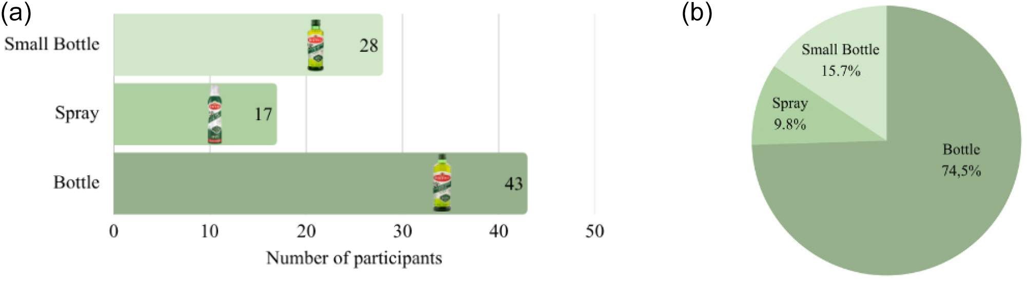
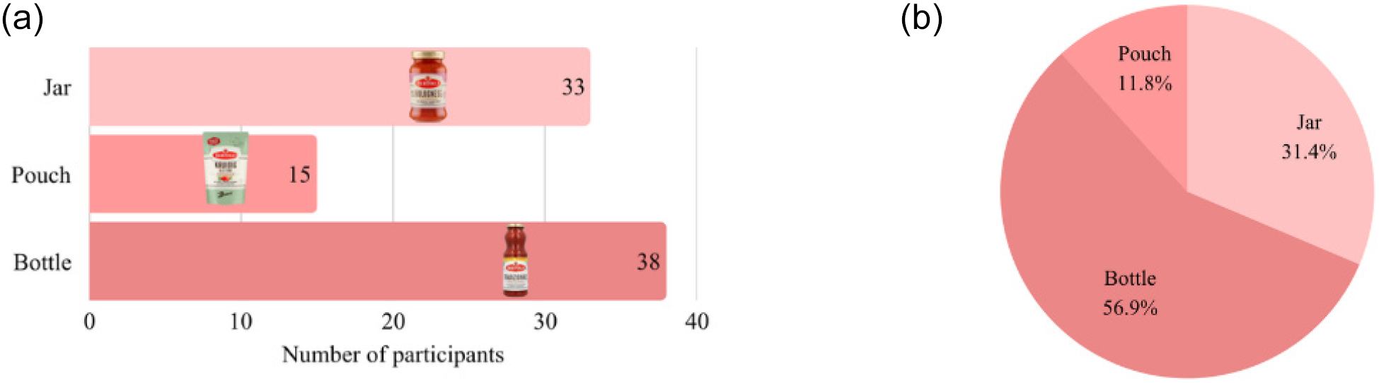
Brand Associations with Bertolli: Brand-specific questions showed that Bertolli had moderate recognition among participants. Common associations included Italy, quality, pasta sauce, olive oil, and for some, luxury. The heritage of Bertolli was most strongly associated with classic logos, traditional Italian imagery, and established colour schemes. Glass bottles were the most recognised and preferred packaging format for both olive oil and pasta sauce (Figures 6 and 7). In contrast, pouches and sprays were perceived as less familiar and less authentic. Olive oil packaging was rated as more authentic and of higher quality compared to pasta sauce packaging.
(a) Recognisability of olive oil packaging, (b) preference of olive oil packaging

(a) Recognisability of pasta sauce packaging, (b) preference of pasta sauce packaging

Importantly, the moderate recognition of Bertolli indicates a risk: the loss of visual and verbal cues through structural standardisation may reduce brand recognition. However, keeping these visual elements in standardised packaging could lead to sustained consumer acceptance.
Supermarket Scenarios: Across the three supermarket scenarios, product choice differed by occasion. It is important to note that Grand’Italia and AH’s private label were not included as direct competitors to Bertolli, but rather as reference brands representing different value segments within the category (A-brand versus private label). For quick meals, Grand’Italia (31.4%) and AH’s private label (31.4%) were selected most frequently. Formal dinners showed a clear preference for Grand’Italia (41.2%), while larger-group settings led participants to choose lower-priced options, particularly AH’s private label (33.3%). Overall, decisions were primarily driven by familiarity, trust, price, and perceived freshness.
In summary, participants valued sustainability but expected packaging to reflect brand authenticity and heritage through recognizable cues, especially color and logo. These insights directly informed the redesigns developed for case study 2.
4.2. Case study 2: experiment after redesign
This study examined whether structurally standardised packaging, differentiated only through visual and verbal elements, can elicit similar levels of authenticity, recognition, and willingness to buy as the original packaging, which differs across structural, visual, and verbal dimensions. The findings suggest that while structural standardisation can be accepted by consumers, its success depends on the extent to which visual and verbal cues preserve brand authenticity and recognition. The study involved nine participants, who evaluated various packaging prototypes through in-depth interviews and physical tests. Interview data were thematically coded, with the themes chosen before coding, structuring findings to address the research question. The themes are as follows:
Brand Associations & Authenticity and Heritage, Design Coherence and Consumer Preference, Sustainability and Price, and Additional Elements. The main codings were informed deductively by the theoretical framework in the literature review, with a focus on research into heritage cues, packaging congruence and symbolic cues. The theme “Sustainability & Price” was retained based on its relevance to the questionnaire results.
4.2.1. Brand associations & authenticity and heritage
Participants generally associated Bertolli with Italy, pasta products, and a high-quality brand. Brand authenticity was strengthened by traditional brand cues: classic logo, colours (green for olive oil, red for pasta sauce), elegant typography, and imagery depicting ingredient or Italian scenery. As one participant noted, “The elegant fonts better suit the Italian feel”.
After viewing short heritage-focused promotional videos, participants connected the brand more strongly to tradition and family, although some expressed scepticism about the genuineness of the “Italian” narrative, whether its marketing or real authenticity. Classic and coherent designs were consistently preferred, while the incongruent design was not selected as a first choice by any participant. For olive oil, the bottle with the green label was most frequently preferred and for pasta sauce the red label, emphasizing strong associative color cues. During physical testing, the incongruent olive oil bottle was considered inauthentic, highlighting the importance of congruence between visual/verbal cues and perceived brand heritage for fostering both consumer recognition and authenticity.
4.2.2. Design coherence & consumer preference
Physical product testing revealed that design coherence plays a significant role in shaping consumer preference:
Olive oil: The congruent redesigned bottle was rated highest for authenticity alongside the bottle with the current label design, while the incongruent version was consistently ranked lowest on both authenticity and quality (Figure 3c).
Pasta sauce: The design incorporating ingredient imagery and a gold label emerged as the strongest preference, evoking luxury and authenticity. The use of elegant fonts further enhanced perceptions of authenticity. The bottle with the current label design was rarely selected as the most authentic. The gold label redesign received the highest scores for both authenticity and quality (Figure 4c).
These findings suggest that consumers’ willingness to buy is closely linked to the preservation of familiar brand cues. Standardisation is acceptable only when key visual and verbal elements continue to signal authenticity and quality. This demonstrated that willingness to buy remains stable despite the standardisation on structural level, thereby supporting that effective visual and verbal communication can sustain purchasing intentions.
4.2.3. Sustainability & price
While most participants valued sustainability and expressed positive attitudes towards recyclable and reusable packaging, particularly glass bottles, their actual purchasing behaviour was influenced by price. Price was the dominant factor in decisions about what to buy; for many, lower costs outweighed sustainability preferences. Several participants stated that they would choose sustainable packaging only when priced similarly to less sustainable alternatives. This price sensitivity was likely intensified by the limited budget of the student demographic. As mentioned by a participant: “If for the same price… I would always go for the one that is more sustainable”.
Additionally, glass packaging was strongly preferred for both products, as one participant stated: “Glass feels more sustainable and gives a feeling of more quality”. Participants also valued features supporting creative reuse or easy recycling, such as removable labels and aesthetically pleasing bottles. This indicates potential ways to strengthen the appeal of sustainable packaging.
4.2.4. Additional elements: seals and QR codes
The evaluation of seals and QR codes as additional packaging elements provided insights into how visual and verbal cues could enhance the communication of brand heritage. Seals were consistently regarded by participants as valuable additions, indicating safety, quality, and freshness, and contributing positively to perceptions of authenticity. In contrast, responses to QR codes were notably diverse. While some appreciated the possibility of accessing additional information, such as recipes, via QR codes at home, most dismissed their relevance and indicated a lack of interest in interacting with them in-store or after purchase.
Placing the code on the seal was seen as problematic because it is removed when the product is opened, reducing accessibility. They recommended that future packaging should reconsider the QR code’s location and accompanying instructions to ensure they function as intended.
5. Discussion and limitations
This qualitative study, based on structured in-depth interviews and thematic coding (Brand Associations & Authenticity, Design Coherence, Sustainability & Price, and Additional Elements), provided in-depth insight into how consumers interpret standardised packaging and evaluate authenticity, quality, and trust. Participants systematically assessed physical mock-ups on perceived authenticity, Italian feeling, brand quality, and trust. To strengthen generalisability, future research should test these findings quantitatively using validated scales, for example by comparing original and redesigned packaging on authenticity, perceived quality, brand recognition, and willingness to buy.
Practically, the findings demonstrate that heritage cues can be integrated into standardised packaging, enabling brands to adopt more sustainable solutions without fully redesigning structural packaging. The study also highlights the potential of value-chain interventions and digital enhancements (e.g. QR codes, seals, Augmented Reality) to reinforce authenticity and engagement. Although the added seal was perceived as a quality cue supporting premium positioning, it introduces a sustainability trade-off due to additional material use, requiring careful evaluation in future research.
Brand strength emerged as a relevant boundary condition. As an established brand, Bertolli benefits from existing associations with quality and Italian authenticity, which may buffer potential negative effects of standardisation. Less established brands without strong heritage narratives may face greater challenges in maintaining identity under standardised conditions.
Finally, the study’s small and relatively homogeneous student sample (N = 9) limits generalisability, and price sensitivity may have influenced responses. Moreover, only redesigned standardised versions were tested, without direct experimental comparison to the original packaging. Future research should therefore include larger, more diverse samples and controlled comparisons between original and redesigned versions to assess perceived differences more precisely.
6. Conclusion
This research paper examined how standardised packaging influences consumer perception of brand heritage, authenticity, and recognition. Addressing the central research question: How does the transition to standardised packaging affect consumer perception of brand recognition, and to what extent can brand-specific design elements maintain brand identity? Across both quantitative and qualitative analyses, the findings demonstrate that while structural standardisation removes distinctive physical elements, brand identity can still be effectively preserved through coherent visual and verbal cues such as colour, typography, imagery, and logo design. This underlines the relevance to practice, especially for brands navigating sustainability guidelines while retaining recognisability. These symbolic elements, when used consistently, were sufficient to evoke the heritage-based associations that consumers rely on during product evaluation and to maintain willingness to buy. However, the results also indicate that supplementary cues, such as seals, may enhance perceptions of quality, whereas QR codes require further refinement to realize their communicative potential. Overall, this research shows that successful standardisation requires a strategic emphasis on symbolic design elements, ensuring that sustainability-driven uniformity does not come at the expense of brand meaning and consumer connection.
Acknowledgements
“During the preparation of this work the author(s) used [AI-tools] in order to [assist with rephrasing, improving clarity, and enhancing the overall coherence of the written text]. After using this tool/service, the author(s) reviewed and edited the content as needed and take(s) full responsibility for the content of the work.”



 Open access