

Introduction
The ability to track the relative improvement or degradation of human rights protections around the globe and across time is not only an important input to decisions related to aid allocations, diplomatic engagement, and military intervention decisions (Finnemore and Sikkink Reference Finnemore and Sikkink1998; Poe, Carey, and Vazquez Reference Poe, Carey and Vazquez2001; Wood and Gibney Reference Wood and Gibney2010) but also crucial to citizens’ and scholars’ understanding of the progress and setbacks faced by liberal ideas and policies. Recent backsliding on human rights issues in previously liberal countries such as Hungary and Poland, as well as the United States, makes consistently tracking and comparing the human rights behaviors of governments one of the most important social challenges of this generation (Colaresi Reference Colaresi2014; Levistky and Ziblatt Reference Levistky and Ziblatt2018).
The accelerating digital and computing revolutions continue to propagate more information, usually in the form of text and images, and useful algorithms to analyze patterns in detailed evidence. The availability of higher-resolution descriptions of human rights behaviors is ultimately a positive development for the tracking of repression over time and across the globe. However, the deluge of denser data brings new measurement challenges that must be resolved in research designs, coding schemes, and future automated systems (Clark and Sikkink Reference Clark and Sikkink2013; Fariss Reference Fariss2014).
For the last two decades, human-coded scoring of annual human rights reports have been used as the core repositories of these comparisons (Cingranelli and Richards Reference Cingranelli and Richards2010; Wood and Gibney Reference Wood and Gibney2010).Yet, because of the changing information available to the composers of these texts from the late 1970s until today, the reliability and validity of previous measures derived from these texts, if uncorrected, have been called into question (Clark and Sikkink Reference Clark and Sikkink2013) and ignited a debate about trends in human rights protections (Cingranelli and Filippov Reference Cingranelli and Filippov2018a; Fariss Reference Fariss2019b).
Although these measurement concerns are not new, the conceptual approach and empirical evidence we present here can help move research on information communication technologies (ICT) and human rights forward. The motivating question for our research is whether we can detect more direct and convincing evidence that changes in ICT over time have altered the composition of relevant human rights texts. To make progress on this research puzzle, we focus on the text composition process and particularly the underlying concepts that comprise human rights. We highlight an obvious but often ignored fact: human rights are plural.Footnote 1 Thus, the concept of human rights is itself a bundle of related concepts. Because of this reconceptualization, we are able to explore a new set of observable implications of information effects and estimate, for the first time, the evolving taxonomy of human rights concepts that structure the systematic comparison of government behaviors in given years. We also provide a new measure of the available information density that tracks changes in ICT over time.
Our research design uniquely allows us to analyze not only the changing explicit taxonomy of concepts that human rights organizations (HROs) label as being judged over time but also the implicit taxonomy of human rights that might be judged in past texts but remain unlabeled in document metadata. Adapting tools from machine learning and natural language processing to work with the concept of taxonomies, inspired by work in biology, we identify a dramatically evolving taxonomy of human rights that are being judged not only in one of the foundational human rights corpora, Country Reports on Human Rights Practices from 1977 to 2016 by the US State DepartmentFootnote 2, but also texts from Amnesty International from 1977 to 2016 and Human Rights Watch press releases from 1997 to 2016.Footnote 3 Our analysis of changes in the taxonomic structure, attention, and sharpness of human rights concepts across organizations is consistent with the explanation that the thickening scale of human-rights-relevant information is being incorporated into more specific concepts that define fine-grained distinctions between rights-violating and rights-protecting behaviors. We find that a model exploiting our available information density predicts future taxonomic change more accurately than other potential explanations do.
Further, we offer new methods and an interactive application that allows researchers to detect the specific or general human-rights concepts of interest from a given taxonomy across country reports so that comparisons could be made consistently by human coders or automated systems. We identify human rights concepts that have been consistently scored across time, providing the necessary leverage to create a valid text-based measure of human rights in the future. While both human (manual) and automated coding procedures have previously used explicit labels to guide reading and input, our analysis suggests that specific rights, such as physical integrity rights, are being judged outside of their explicit sections (locations), for example in the political-rights-labeled discussion, in previous years. Our tools can thus be used by future researchers to prioritize specific locations in reports based on the content of those sections, not potentially less accurate explicit section labels. We also show how our results and research design can reveal the different rights that are covered in reports across organizations for a given country in a given year. Finally, our evidence suggests that other concepts that are difficult to measure could be influenced by information effects.
Information Effects and the Difficulty of Measuring Human Rights
A growing body of work has begun to question the naive comparison of existing measures of human rights behaviors across periods. One group of scholars suggests that the improving quantity and quality of evidence on human rights events around the world, from satellite imagery, camera phones, and internet and social media accessFootnote 4, has led observers to mistakenly infer trends in actual violations from changes in the evidence that is available about abuses.
In an influential article, Clark and Sikkink (Reference Clark and Sikkink2013) suggest that the information-collection tools that are available to human rights observers in government agencies and (HROs) have improved drastically over the last several decades. Using an analogy of disease and medical screening, Clark and Sikkink (Reference Clark and Sikkink2013) point out that “increased awareness” and “better information” (542) have led both to “more” and “better” data on violations over time.
Building on this idea, Fariss (Reference Fariss2014, Reference Fariss2019b) suggests that new information has led to “changing standards of accountability.” Human rights organizations are now better able to detect violations, classify more acts as violations, and press governments harder for human rights reform. Thus, he argues that “[t]he standards-based data are potentially biased not because the coding procedure is biased but because the reports themselves are produced by monitoring agencies that are changing the standards that they use in the process of documenting human rights abuse” (Fariss Reference Fariss2019a, 19).
The core idea shared in the influential works by Clark and Sikkink (Reference Clark and Sikkink2013) and Fariss (Reference Fariss2014) is that the information contained in reports has second-order effects on the valid interpretation of human rights scores derived from those texts.Footnote 5
The Evidence For and Debate over Information Effects: Word Counts and Harsher Scores
Yet there are a few reasons to further explore the role that evolving information technology could play in the production of human rights reports. To date, the plausible idea that there has been an increase in the information available to the composers of textual human rights records over the last four decades has only been supported by indirect evidence through word counts and measuring the harshness of human-coded scores over time.Footnote 6 Both Clark and Sikkink (Reference Clark and Sikkink2013) and Fariss (Reference Fariss2014) count the number of words in sets of texts over time, arguing that more information could be translated into longer reports. It could be countered, however, that conceptual redundancy or attempts to signal a commitment to human rights by writing verbose reports could also explain longer texts, without a deepening information base. Richards (Reference Richards2016) uses counts of subsections to make this case, stating that overall word counts are not definitive evidence of bias in the human-coded rights measures or information effects more generally.
Additional indirect evidence of information effects has been offered by linking report length and external sources of information to the harshness of the judgments found in human-coded scores. For example, Clark and Sikkink (Reference Clark and Sikkink2013, 547) suggest the possibility that “more detailed information drives harsher coding” and present an empirical result that longer reports for a country in a given year are assigned worse scores, controlling for the previous human-assigned score. Fariss (Reference Fariss2014) uses a measurement-model approach and finds that, when a dichotomous event indicator of at least one violation in a given year is assumed as ground truth, human coders appeared to give harsher scores in later years than in earlier years. This research has generated a set of influential corrected scores as well as some controversy about whether the correction is necessary (Cingranelli and Filippov Reference Cingranelli and Filippov2018b; Richards Reference Richards2016).
However, it is important to note that none of the criticism of Fariss (Reference Fariss2014) engages with his core theoretical argument and instead focuses on his measurement strategy and necessary identifying assumptions. In the next two sections, we take up the charge of how to move the literature on information effects and changes in human-rights reporting further forward, first by offering an empirical puzzle and then by engaging specifically with the theoretical mechanism posited by the information effects and changing standards of accountability conceptualizations.
Missing Information about Information Effects
Three extant gaps in this literature have thus far blocked progress on resolving this debate and pointing a way forward. First, previous work has not systematically measured changes in relevant information and communication technology. Improvements in (a) open-source satellite imagery, (b) internet-connected camera phones, (c) the adoption of social media, and (d) internet access have not followed a linear trajectory. We fill this gap by estimating the latent available information density underlying increases in indicators of these four technologies.Footnote 7
Second, the explicit harshness of the language in the texts has not been directly analyzed. To date, only the scalar human-coded scores, not the underlying texts, have been analyzed for a trend in worsening features over time and a potential correction offered by using an explicit measurement model. A skeptic could argue that the event-based measures used by Fariss (Reference Fariss2014) to correct text-based scores may also be generated and affected by the increasing availability of information over time. If that was the case, the estimated harshness of the human rights scores would not necessarily be a reflection of the tone of the underlying texts, but simply a reflection of the relative measurement error in the event data as compared with the human rights scores themselves. On the other hand, as his measures use scalar summaries that are updated through time, it is possible he mitigates the reporting bias that Baum and Zhukov (Reference Baum and Zhukov2015) and Weidmann (Reference Weidmann2015) identify in event data.Footnote 8 Thus, the pattern of relative judgments over time in the reports is an open question.Footnote 9 Below, we map the relationship between available information density and the harshness of language in the US State Department Reports to explore this potential linkage.
Third, and even more fundamentally, previous research on information effects has largely ignored potential changes in the definition of the concept of human rights. Previous empirical work, in particular, has assumed either that human rights is a singular concept or that the relevant set of plural human rights being judged in these texts is fundamentally stable over time. However, if we conceptually disaggregate human rights, as suggested by Richards (Reference Richards2016), Bagozzi and Berliner (Reference Bagozzi and Berliner2018), and others, information effects are likely to lead to potentially dramatic shifts in types of behaviors about which human rights monitoring organizations can collect systematic evidence. Clark and Sikkink (Reference Clark and Sikkink2013) hinted at this type of potential change where they write that the recording of “on-the-ground changes in types of violations” (557) and “a wider range of rights” (560) could be evident in more recent reports than in older texts.
With a greater density of information available, more specific rights can be viewed as being violated or protected within reports. If human rights are plural, then this opens the possibility that the set of rights being judged in relevant texts could shift over time in observable ways. To be clear, the argument here is not that standards for encoding a violation of a fixed right have changed but that the very set of rights being judged across countries can evolve and grow.
Yet, as we detail further below, simply counting the number of rights being judged is insufficient to test information effects. We believe information effects are likely to be visible not only in the number of the rights being judged but also, more importantly, in the organization of those rights. Here we investigate this potentially complementary information effect, as it has gone unexplored empirically.Footnote 10 We are the first to ask whether the underlying taxonomy of human rights protections and violations being judged in reports has changed as available information density has increased. Understanding the proposed mechanism of the changing standards of accountability could be limited without a reference to the aspects of human rights that are being judged across countries because the changing expectations might consist of not only more stringent judgments on a fixed set of rights but also the addition of judgments on new forms of human rights protections and violations. Further, even if we were to find constant judgments over time, this could simply be a reflection of the different rights being judged in later years, as compared with earlier reports. For example, it may be the case that newly added rights are more difficult or costly to protect than older rights are. Thus, the comparison of countries, regions, or global behavior over time might be biased towards more negative language overall, but it may be more positive over time on specific rights that have been judged consistently over a longer period.
Only Harsher Judgments?
One way to probe whether more theorizing on the nature of information effects in human rights reports is needed is to return to the underlying texts and measure the underlying sentiments/judgments in the reports as information density has increased over time. This will help us move beyond the counting of words or indirect measurement of tone from aggregate manual scores back into the content of the reports.
If expectations and the ability to collect evidence of violations and protections have grown at a faster rate than states’ practices have improved, we would expect to see overall negativity from reports increase as information density accelerated. Although preliminary, this would potentially supply more direct evidence consistent with information effects and the changing standard of accountability.
Average Yearly Sentiment in the US State Department Reports on Human Rights
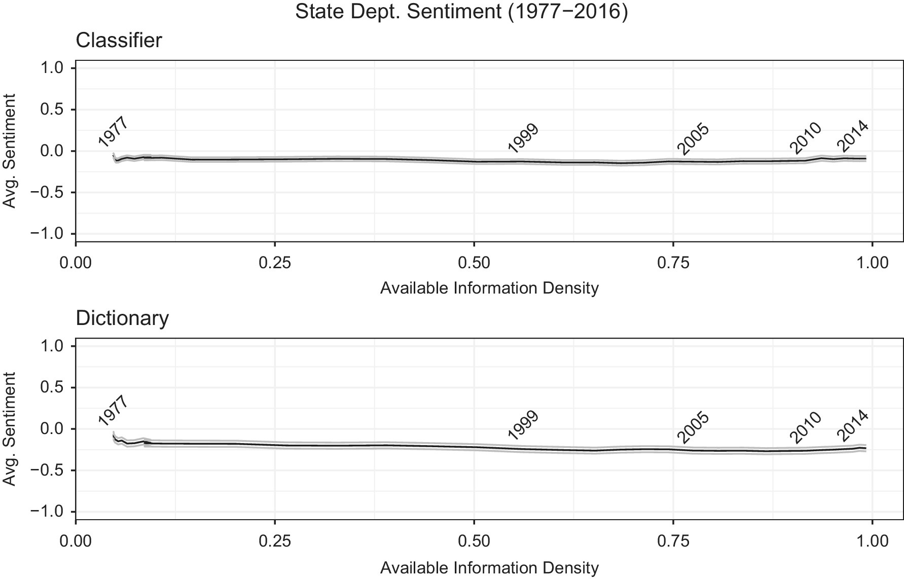
Figure 1 illustrates the average sentiment coded through a sentiment dictionary (bottom panel) and a supervised learning approach (top panel) in the reports from 1977 to 2016 (See Online Appendix for details). Interestingly, we do not see the expected trend where average judgment/sentiment becomes more negative when available information density increases in more recent years. While the dictionary approach shows a very slight decline, most of the change occurs by 1985, which is before the World Wide Web was invented (Gillies and Cailliau Reference Gillies and Cailliau2000). Moreover, the same pattern is not apparent in the more accurate classifier approach.
If the country reports do not contain more negative judgments/sentiment on states’ human rights practices, on average, as available information increased, how do information effects present themselves in the reports? Our answer to this question lies in the previously unexplored hint in Clark and Sikkink (Reference Clark and Sikkink2013) that there have been “on-the-ground changes” that are conceptually independent from judgments but involve the definition of human rights themselves. This focus on the rights being judged as compared with the judgments themselves also builds on Fariss’s (Reference Fariss2019a, 19) as yet unexplored suggestion that we need more research on “the process of documenting human rights abuse.” We accelerate and deepen this line of research below by exploring whether it is the taxonomy of human rights being judged over time that have changed (and how) rather than the positive or negative judgments themselves.
In fact, if we can identify changes in the underlying rights being judged over time, the relatively flat pattern in judgments in Figure 1 could be explained as Fariss’s (Reference Fariss2014, Reference Fariss2019a) theory of changing standards suggests. As one set of human rights was criticized and then potentially improved, another set of rights, where improvement was needed, would receive more attention. Thus, this would lead to more rights being judged, but with the overall harshness remaining relatively consistent.
A Growing Taxonomy of Human Rights across Reports?
It is important to justify our reconceptualization of human rights beyond an aggregate fixed set of concepts and then argue how increasing information is likely to be incorporated and observable in the text of human rights reports. The distinctions and connections between individual rights are central to our research design. Foremost, the concept of human rights is itself plural. Landman (Reference Landman2006, 8) explicitly defines human rights as “a set of individual and collective rights that have been formally promoted and protected through international and domestic law … .” This is mirrored in other influential work (Finnemore and Sikkink Reference Finnemore and Sikkink1998; Sikkink Reference Sikkink2011). Thus, by definition, the concept of human rights nests a taxonomy of related but distinct protections such as political, worker, civil, and physical integrity rights (Finnemore and Sikkink Reference Finnemore and Sikkink1998; Landman Reference Landman2006). Core legal texts are often dedicated to defining specific rights, such as the International Covenant on Civil and Political Rights and the International Covenant on Economic, Social, and Cultural Rights (Forsythe Reference Forsythe2017, 54).
Even more important than the number of rights being judged in reports is the organization of those rights. Many human rights reports explicitly organize the rights being focused on into hierarchies or taxonomies, where the overall concept of human rights is the root and more specific rights are defined downwards, providing explicit distinctions to classify ever more specific subsets of rights (Forsythe Reference Forsythe2009). Thus, one can think of the organization of human rights concepts as analogous to biological taxonomies used to classify life into related but distinct bins of increasing specificity as it descends the hierarchy. As we will describe in this section, denser information should allow finer-grained distinctions between rights.
In fact, the influential State Department reports include section and descending subsection headings that organize each country report in a given year. For example, each country report in 1977 included four explicit sections “Governmental Attitude Regarding International and Nongovernmental Investigation of Alleged Violations of Human Rights,” “Respect for Civil and Political Liberties,” “Respect for the Integrity of the Person,” and “Governmental Policies Relating to the Fulfillment of Such Vital Needs.” The “Respect for the Integrity of the Person” section was then itself organized into four subsections “Cruel Inhuman or Degrading Treatment or Punishment,” “Arbitrary Arrest or Imprisonment,” “Denial of Fair Public Trial,” and “Invasion of the Home.” Thus, a specific country report in a given year is usefully conceived of as not one report but as a set of reports on an unknown number of nested human-rights concepts. To date, the debate over information effects and standards has not grappled with what we argue is a key indicator of these technologically influenced processes: as technology makes relevant information more available to monitoring agencies, the taxonomy of human rights that structure the judgments of human rights reports will evolve.Footnote 11
A Theory of Information-induced Taxonomic Shifts in Human Rights Reports
As noted earlier, there has been an increase in the availability of dense information about human rights over the last four decades (Clark and Sikkink Reference Clark and Sikkink2013; Fariss Reference Fariss2014). It is difficult to ignore the dramatic change in the technology of observing human rights, moving from observers using binoculars on a hilltop to satellite images and camera phones. For example, Amnesty International noted in 2013 that social media and other tools meant that “investigators now have hundreds of potential crime scenes at their fingertips.”Footnote 12 Similarly, satellite images from DigitalGlobe were used by Human Rights Watch and Amnesty International for evidence in the Myanmar, Burundi, and IraqFootnote 13 initiatives that were run by the US State Department to call on citizens to explicitly “use your phone to stop conflict and abuse,” highlighting the documentation that can be gathered by the proliferation of internet-connected camera phones.Footnote 14 The United Nations Special Rapporteur on Summary Executions wrote in 2015 that “we have all seen how the actions of policy officers and others who use excessive force are captured on cell phones.”Footnote 15 Propelled by these technologies, the network of HROs and volunteers available to wield these tools and amplify their messages has grown in scale (Carpenter Reference Carpenter2014; Keck and Sikkink Reference Keck, Sikkink, Meyer and Tarrow1998; Murdie Reference Murdie2014a, Reference Murdie2014b; Wilson, Davis, and Murdie Reference Wilson, Davis and Murdie2016).
Because human-rights monitors have, on one hand, incentives to use as much information as possible to avoid making false accusations or missing actual violations and, on the other hand, to mitigate information overload and efficiently process the available signals on violations and protections, we posit that composers will deal with increases in information by systematically altering the way they organize the concepts that are judged in human rights reports. Specifically, denser information will allow more and sharper attention to deeper taxonomies of rights.
Incentives for Increasing Taxonomic Complexity
As denser, higher-resolution information flows into human rights monitors such as the US State Department, Amnesty International, and Human Rights Watch, there are two possible responses: the new data can be categorized within an existing taxonomy of rights that is used to create a new taxonomy of rights from scratch, or it can spur more nuanced changes in the underlying taxonomies. Research on the organization of knowledge suggests that the latter option is the most efficient for sorting and analyzing this new information.
Processing new and complex information within an unchanged, existing taxonomy that was optimized in a relatively simpler information environment is likely to be costly. A failure to adapt conceptual taxonomies to new evidence can result in information overload, whereby distinctions between cases are missed or aggregated together due to superficial similarities (DeCanio and Watkins Reference DeCanio and Watkins1989). In particular, without proportional changes in the efficiency of organizing and composing human rights reports, an influx of new information will necessarily lead to underinterpretation of relevant evidence and relevant across-country distinctions. For example, if one is simply classifying images by color, greater detail and nuance, as compared with a constant hue across pixels, is likely to impair the coding process. For human rights monitoring agencies, any unintended mistakes are likely to lead to less accurate textual descriptions of states under evaluation and invite controversies. However, creating new categories from scratch is also costly, adding additional organization overhead to the information processing that would be necessary in any system.
One way to combat the risk of information overload is to efficiently encode this new information by extending an existing network of concepts with new nodes/taxons that describe the additional distinctions and details that are systematically available. These new nodes/taxons encode new distinctions within a class, but they retain similarities that conform to its parents or neighbors (DeCanio and Watkins Reference DeCanio and Watkins1989). For example, when pictures and video of paramilitary gangs intimidating political opposition become readily available, distinctions about whether those masked troops are using government-issued weapons and vehicles or not and their potential ties to the official security apparatus are newly visible. This information could be encoded into a new facet of physical integrity violationsFootnote 16 focused on the role of the security apparatus in repression (Carey, Colaresi, and Mitchell Reference Carey, Colaresi and Mitchell2015). Previously this level of detail would have been difficult to formulate across cases and thus would not be systematically included across cases.Footnote 17 Incomprehensible piles of evidence are avoided by having an appropriately complex and deep system of related concepts/piles.
In addition, creating new human rights concepts and standards is a complicated political process.Footnote 18 A group of scholars studying the emergence of new human rights norms/issues have focused on why some human rights issues are defined and adopted as new norms and others are not (Carpenter Reference Carpenter2014; Keck and Sikkink Reference Keck, Sikkink, Meyer and Tarrow1998; Murdie Reference Murdie2014a, Reference Murdie2014b; Wilson, Davis, and Murdie Reference Wilson, Davis and Murdie2016). First, the issues involving certain types of violations that identify and establish “clear causal chain assigning responsibility” are more likely to be recognized as new norms (Keck and Sikkink Reference Keck, Sikkink, Meyer and Tarrow1998, 27). Also, human rights issues that “resonate” within preexisting moral frames or advocacy networks tend to emerge as new international standards (Bob Reference Bob and Brysk2002; Florini Reference Florini1996). Bob (Reference Bob and Brysk2002) emphasizes that most HROs have paid attention to human rights issues that can be categorized under the International Covenant on Civil and Political Rights. New issues colliding with those already existing standards are less likely to be recognized and adopted as new norms. Third, the sociopolitical dynamics between human rights advocacy networks have a significant influence on issue adoption (Carpenter Reference Carpenter2007, Reference Carpenter2014). Carpenter (Reference Carpenter2007, 116) insists that defining and adopting new human rights norms is often the result of “bureaucratic and coalitional politics” within HRO networks. Thus, processing newer information about human rights is much more difficult and complicated than is often assumed.
Computational models of organizational structure and innovations consistently find that the optimal structure to adapt to new information will vary depending on costs of information processing (DeCanio and Watkins Reference DeCanio and Watkins1989). If information is simple and easy to understand without expertise, then flat structures without much hierarchical differentiation are ideal. On the other hand, if specific expertise is needed to make sense or judge the new evidence, as in the human rights context, then deeper hierarchies are especially useful.
Observable Implications in the Texts
Our theory that increased ICT will lead to a deepening of human rights taxonomies guiding judgments in country reports in later as opposed to earlier years has important observable implications for the structure and content of the annual reports over time. Specifically, we describe three new testable predictions consistent with our proposed available-information density mechanism. We then turn to outlining the tools from machine learning and natural language processing that will allow us for the first time to extract the implicit taxonomies of human rights concepts from texts from multiple reporting agencies.
Implication 1: An Increase in the Structural Depth of Taxonomies Judged across Countries
We expect that the structure of human rights taxonomies will become increasingly hierarchical, with additional distinctions for newer concepts, as denser information is available to reveal these distinctions in evidence. Information effects and the concomitant higher-resolution signals will be most efficiently processed not by creating new orthogonal concepts out of whole cloth but by leading to new distinctions between previously aggregated violations and protections (Barner and Baron Reference Barner and Baron2016). Judgments differentiating killing as a part of the judicial system from extra-judicial killing, LGBT rights from religious protections, and freedom of information from press freedom might be consistently present only in later data, not in earlier texts where the technology for evidence collection was less available. Scholars note that more specific types of violations, such as sexual violence and the exploitation of child soldiers, were judged in recent reports but “overlooked” in older country texts (Clark and Sikkink Reference Clark and Sikkink2013, 542; Keck and Sikkink Reference Keck, Sikkink, Meyer and Tarrow1998). Alternatively, it could be the case that the same rights are judged consistently across the years, without new concepts being compared across countries. Given the literature on information overload and efficient processing, this contradictory result would imply that more relevant information was not being processed into the text over time.
In addition, because the reports attempt to compare countries across time and space, there is likely to be some continuity to facilitate these interspatial and intertemporal comparisons.Footnote 19 Greater information on repression around the world, for example, might allow governments and HROs to observe both the age of those who are fighting as well as how and why they were forced to be a child soldier, where in the past only the occurrence of repression might have been observable, not the details.Footnote 20 A preexisting category of repression would have been carried over from the past, and then new conditions/distinctions added, creating a new deeper set of taxa.
A competing possibility is that there is simply an increasing multitude of distinct, non-nested concepts in newer as opposed to older taxonomies that are being judged. If new types of violations are identified, they may have been added to the bundle of protected human rights at the top of the hierarchy. The reports would then be tracking more distinct aspects, which are only related to other sibling aspects by the fact that they are human rights. Instead of zooming in and increasing the clarity of existing pictures of human rights, new information can simply bring new concepts of rights.
The two different types of changes in taxonomies, from the sparse and flat (top) example taxonomy towards either the deeper multilevel hierarchy (left) or towards a wider, consistently flat grouping (right), are displayed in Figure 2.
These are ideal types, as it may be the case that both types of changes occur, new top-level concepts and new descendants of existing rights. In that mixed case, we are interested in the balance of new concepts and their position in the taxonomy. We will return to how we operationalize this balance below.
Two Types of Structural Changes to Human Rights Aspects Over Time
Implication 2: An Increase in the Systematic Attention to Deeper Rights
Further, with greater access to additional dense information on finer-grained rights, the amount of attention systematically payed to those rights will grow. We do not believe that the effect of ICT changes will stop with the structure of rights. Denser depictions of rights and protections allow more paragraphs to be written about the evidence relevant to judgments on those rights.
Implication 3: An Increase in the Sharpness of Distinctions between Rights
As our theory is about distinctions between rights, additional information collected by monitors from smart phones, the internet, social media, and satellites should more clearly delineate when an issue is being discussed. Just as an image at higher resolution reveals crisper distinctions between objects, so should increased information on events around the world clarify previously obscure situations and how they map to specific rights. For example, when it was only clear, given past limits to available information, that a civil war was ongoing, there may have been the possibility of sexual violence or the use of child soldiers. However, it would have been difficult to explicitly document and clearly discuss any of these specific potential violations. Alternatively, with additional information, the distinctions between situations when rights are being violated should be much sharper in discussions. Clear language and key phrases should signal when sexual violence has been detected in photographic stories and verified posts or pictures of child soldiers in the civil war shared. The inclusion of this evidence and judgment of these rights should allow for a sharper distinction than would be possible with less available information (in the past).
Detecting Explicit and Implicit Taxonomic Changes in Human Rights: Structure, Attention, and Sharpness
Our research design is inspired by aspect-based sentiment analysis, which extracts signals and concepts from texts (Liu Reference Liu2012, Reference Liu2015). However, conventional applications of aspect-based sentiment analysis are limited to movie and product reviews, and they do not attempt, as we do, to learn the systematic evolution of taxonomies from text.Footnote 21 We are partially aided in our task by the fact that the corpora of the country reports that we begin with, the US State Department Reports, include explicit metadata on the rights that are being judged within sections, subsections, and further descendant classifications.Footnote 22 Define a given labeled taxonomy as  $$ {G}_t $$ for year
  $$ t $$. Thus, with a provided
  $$ {G}_t $$ we are able to visualize the structure of the expressed taxonomies presented from 1977 to 2016 for this set of reports. Having this structure and the connections and distinctions that define the taxonomy, we can compare the depth of branches down the taxonomy, measuring whether added distinctions are more specific and complex than those that came before and thus added further down the taxonomy, as expected by implication 1.
Yet, there are reasons to probe more deeply than just extracting these explicitly labeled taxonomic structures. Explicit labels might mask the actual distinctions used in the texts. For example, older texts might have had implicit taxonomies that only become explicitly labeled in later reports. Thus, the judged human rights might have been consistently discussed in the text over time with only the labels becoming more specific recently. We solve this problem by using the later more detailed metadata as a target taxonomy and identifying high-performing classifiers that can detect when textual items are being judged in the text even if they are unlabeled. Specifically, we set  $$ {G}_{2015\_2016} $$ as the training taxonomy. For 2015/2016, we have the most detailed explicit taxonomy in use in both years. Thus, each paragraph is labeled with a location
  $$ {y}_d=\ell $$ for
  $$ \ell \in {G}_{2015\_2016} $$ and
  $$ d\in \left(1,\dots, D\right) $$ in a D-length set of paragraphs within all country reports, and the input features (document-term matrix
  $$ X $$),
  $$ {X}_{2015\_2016} $$, are generated from the text of these reports. We use the paragraph as the unit of analysis for annual reports. The topics of paragraphs are generally judgments on given rights. Sentences are not appropriate document lengths in these cases because many sentences do not contain judgments and many are ambiguous about the right being discussed. Likewise, using whole sections is not helpful because it is the implicit not explicit sections that we are attempting to infer.Footnote 23 In years before 2015, we have the text,
  $$ {X}_t $$, where
  $$ 1976<t<2015 $$, but not the labels from
  $$ {G}_{2015\_2016} $$. Thus, we use supervised learning techniques to train a set of algorithms to learn the mapping from the documents in the 2015 and 2016 reports to the location in that explicit taxonomy. This mapping then supplies a prediction for the older documents across each potential label, allowing us to detect the implicit locations in the taxonomy that are being judged across all years.
We compute accuracy scores using cross-validation within our training window (The specifics are outlined further in the Online Appendix). One important step we take is to build an automated parser that detects the aspect and judgment phrases in text. Parsing Unstructured Language into Sentiment–Aspect Representations (PULSAR) is useful because it not only finds multiword expressions but also uses the syntactic structure of a sentence to identify likely judgments and the aspects that are being judged (Park, Colaresi, and Greene Reference Park, Colaresi and Greene2018). Without a tool that explicitly recognizes passive language and the importance of terms such as “reports,” the judgment and aspect would be omitted. In the reports for a particular country, statements such as “There were no reports of politically motivated disappearances” are highly informative and provide a clear positive judgment on an identified aspect. In this case, PULSAR recognizes that the phrase “were no reports” provides the judgment, and the aspect is within the expression “politically motivated disappearances.” Thus, PULSAR resolves the sentence to [“politically_motivated_disappearances,” “NEG_were”].Footnote 24
With a set of tools to identify which rights are discussed in each paragraph, we can measure our three important sets of patterns: structure, attention, and sharpness. First, we can compare the implicit structure of taxonomies based on their number of branches and depth, as we can for the explicit taxonomies.Footnote 25
Second, this research design allows us to summarize the amount of attention, in the form of the number of paragraphs per report, that we detect on each right. We can then look at not only when human rights appear in the taxonomy but also how much emphasis they receive over time. We measure the amount of attention to each potential rights concept as the expected number of paragraphs from the model predictions.
Third, we derive from information theory a direct measure of the sharpness of distinctions between predicted rights being discussed across all years in annual reports.Footnote 26 This statistic is the expectation over document set  $$ D $$ of the relative entropy of our predictions for each document versus a uniform prior over labels. We refer to this statistic as the average sharpness, and it grows as our algorithms become more certain about classifying of a piece of text (paragraph) in a specific location in the taxonomy. Our algorithms can only increase their certainty if there is information in the text that clearly identifies a distinction between one or some rights and others. When there are no relevant textual distinctions present, the algorithm is left with a flatter set of beliefs, the maximum-entropy distribution over beliefs being the limiting case, which leads to lower average sharpness. We track these values as available information density increases over time.Footnote 27
In addition to detecting taxonomic changes in structure, attention, and sharpness, our research design provides additional tools to explore human rights reports across different dimensions. We can also now identify the judgment of rights that appear outside of their closest semantically labeled section. We will present this in an asymmetric confusion matrix, which will identify systematic patterns of when human rights are discussed under unexpected labels across years. This tool can guide future human and automated systems. Because our tool can be applied across reporting agencies, we also provide an example where we compare what rights are judged in a given report across monitoring agencies.
US State Department Reports and the Taxonomy Metadata
To assess changes within human rights reports, we first leverage the unique document metadata within the text in the State Department Reports from 1977–2016 (See Online Appendix for details). The reports provide coverage for nearly all countries in the world, recording instances of abuses of not only physical integrity rights but also economic, social, and political issues. In particular, the metadata provided in section, subsection, and related headings gives useful guidance on what is being discussed in specific sections of each state’s report. Further, this explicit metadata forms a hierarchical taxonomy, with human rights at the root, sections as the first, most general (lowest resolution) branches, and subsequent descendant subsections as more detailed (at a higher resolution) concepts. The leaves of the taxonomy are the locations where specific paragraphs of the text appear. The State Department Reports have been instrumental to highly cited and influential measures of human rights including The Political Terror Scale and the Cingranelli and Richards (Reference Cingranelli and Richards2010) Human Rights Data Project. However, because we believe information density will change not only State Department monitoring but also monitoring by other human rights-focused organizations, we extend our analysis to Amnesty International Annual Reports and Human Rights Watch press releases. While adding complexity, these extensions allow us to probe the generality of our argument across reporting organizations as well as across formats.
Explicit Evidence of Changing Human Rights Taxonomies
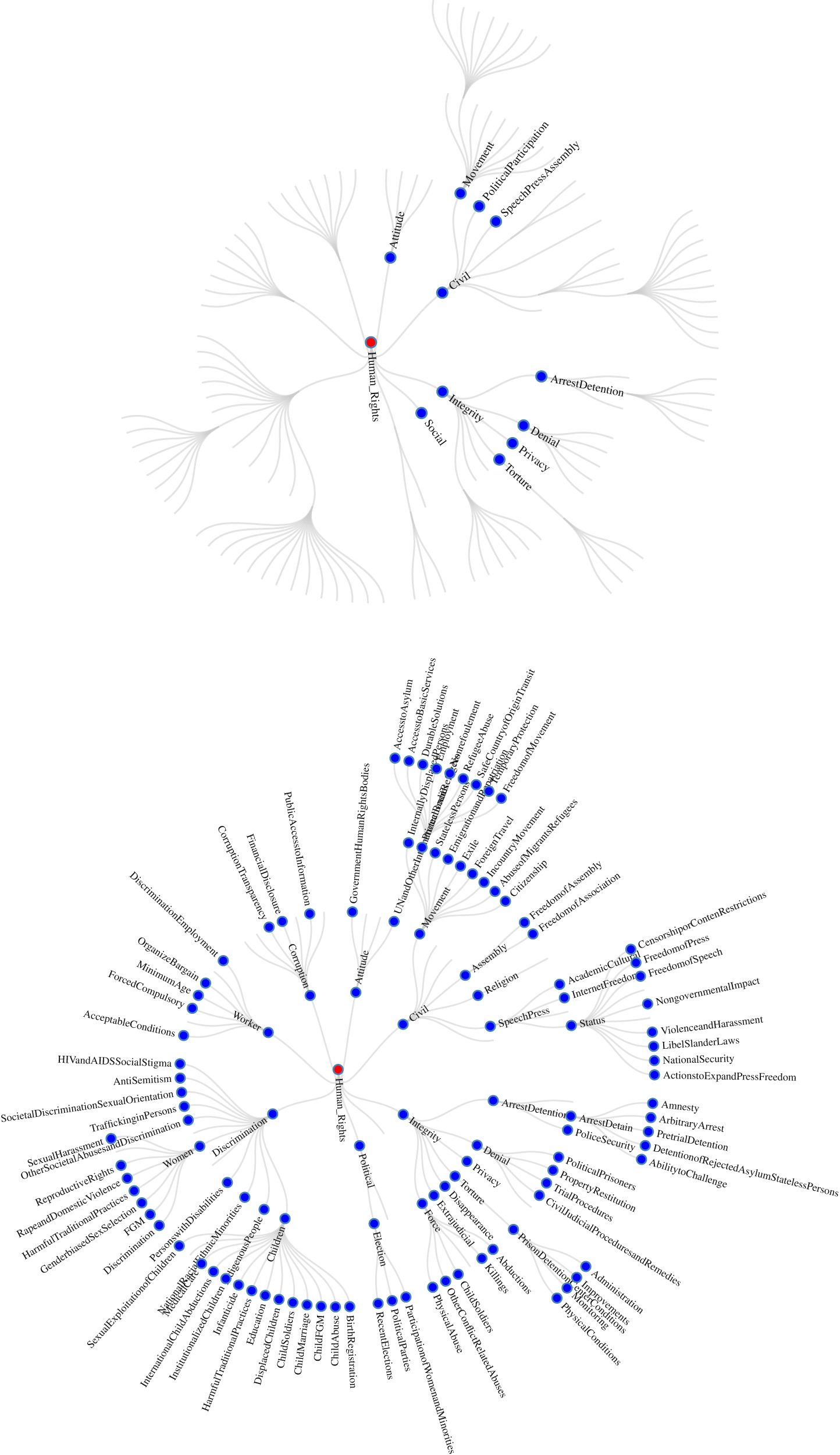
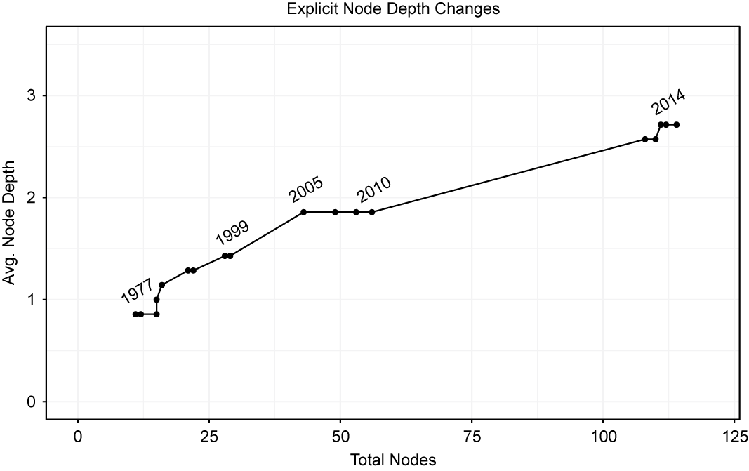
Two snap shots from our interactive application, representing the number of terminal nodes/aspects and the associated hierarchies of the State Department reports are presented in Figure 3. These illustrate the rather dramatic changes in the taxonomies over time. In 1977, there were 11 total nodes/taxons, which had an average depth across sections of 2.7.
The explicit metadata is consistent with our argument on the incentives for taxonomic change in response to information effects. Both implication 1 and 2 largely hold, as there is a larger taxonomic structure in more recent years and that structure has grown in hierarchy and complexity. Recent country reports have zoomed in on more specific aspects of predefined concepts. In 1977, “Denial of Fair Public Trial” was its own leaf, the most specific aspect category defined in the hierarchy. By 2015, “Denial of Fair Public Trial” is a bundle of related leaves, with explicit judgments on aspects including “the impartial and fair public trial procedures” and “the detention of political prisoners or detainees.” The increasing resolution of aspect categories within the hierarchy are suggestive of important changes in what is judged across the annual reports.
US State Department Sections for 1977 and 2016
We summarize the changes in the depth of the leaves in the aspect-category hierarchies over each year in Figure 4. The y-axis plots the average depth (levels down from the root) across the top-level sections of the document in each year. To calculate the average depth of the explicit taxonomy for each year, we add the maximum depth reached by each of the seven sections and then divide by the total possible number of sections. The x-axis represents the number of final nodes/concepts, the most specific concepts labeled in the texts, in a given year. This graph can tell us the relative push and pull for changes in the number and depth of new rights being explicitly judged over time. If the texts grew more specific while adding final nodes, then the path would proceed upwards and to the right over time. On the other hand, if final nodes increased, but average depth and precision remained constant, we would see a relatively flat horizontal line. Figure 4 illustrates the path of these explicit taxonomies across time. There is a clear movement upwards, slightly less than a 45 degree angle, as the later documents have both increasingly included new rights as distinctions within existing rights, adding complexity and depth to the previous taxonomy.
Total Number and Depth of Leaves in Each Aspect Hierarchy
Estimating Implicit Human Rights Taxonomies
The previous section provides new evidence that is consistent with our first observable implication stated above. It appears that over time when more detailed information is available, the explicitly labeled taxonomy of human rights evaluated in the State Department Reports has grown more distinct concepts. Further, the structure of that taxonomy has evolved more complexity, with newer nodes appearing as children of existing nodes, thus introducing new deeper distinctions. Again, this is consistent with dense information that contains the more detailed information that is available over time.
Yet, as noted above, it is possible that the changes in the section labels are not reflective of the information in the actual texts underneath those labels. It might be the case that the explicit labels change over time, but the implicit lexical and semantic content of the text might be consistent. For example, the section on government corruption did not exist until 2005. This does not mean that there were no paragraphs on government/political corruption in any earlier reports. Instead, the problems of political corruption were often included in the “Arbitrary Arrest and Imprisonment” or “Denial of Fair Public Trial” in the “Respect for the Integrity of Persons” section. In later years, the “Government Corruption and Transparency” section was created, covering corruption committed by government officials in greater detail such as “Political Corruption,” “Financial Disclosure,” and “Public Access to Government Information.” To further probe changes in the operable human rights taxonomies, we next need to analyze patterns in the natural language of the texts.
Revealing the Evolution of the Implicit Human Rights Taxonomy
Our supervised learning approach (Kotsiantis Reference Kotsiantis2007) to measuring the implicit taxonomy of rights is further detailed in the Online Appendix. With our computed model representation, we move on towards measuring and quantifying the information that we discover on the human rights being judged, first in the US State Department Reports going back from 2014 to 1977. We produce the three sets of measures denoted above. We begin by exploring the consistency of the implicit taxonomic structure through radial plots for specific years. These views allow us to present the structure of the implicit taxonomies of human rights over time, analogous to the explicit taxonomies we produced above. Using our model, we are now detecting evaluated rights, using the actual text and not just the explicit sections that were provided in a given year. Thus we can see what rights were implicitly judged in the text, even if labels were not provided in the explicit taxonomy.
Structure
We use a rule that if there is one or more paragraphs per country report detected for a potential node in the set of reports at  $$ t $$, then that node exists in the structure of
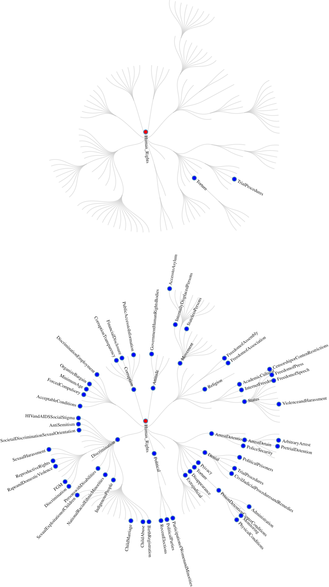
  $$ {\hat{G}}_t $$ for that year. This is a very low threshold, because it means that when five paragraphs are composed on a given rights concept in one country, the right would not have to be discussed in four other countries to meet our threshold. Further, paragraphs can be one sentence in length. These estimated implicit taxonomies for each year will allow us to calculate the number of nodes in each year and the average depth across sections, as we did in the explicit sections. Two snap shots from our interactive application representing the number of implicit terminal nodes/aspects and the associated hierarchies of the reports are shown in Figure 5. Similar to the explicit plots, these illustrate the changes in the taxonomies over time. In 1977, there were two sections that met our one-paragraph-per-country threshold, meaning that they could have been systematically judged across countries. This number increases dramatically to 62 sections in 2014.
Implicit US State Department Sections for 1977 and 2014
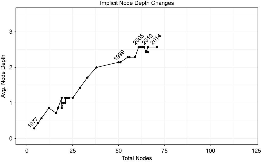
We summarize the changes in the depth of the leaves in the implicit aspect-category hierarchies for each year in Figure 6. The y-axis plots the average depth (levels down from the root) across the top-level sections of the document in each year. To calculate the average depth of the implicit taxonomy for each year, we first identify all of the nodes where the sum of the predicted probabilities for all texts in each year is larger than the total number of countries. Second, as in the case of the explicit average depth, we count the maximum number of all the nodes where they branch out to the next child nodes for each section and then average them by the total number of possible sections. The x-axis represents the number of final nodes/concepts, the most specific concepts labeled in the texts, in a given year. The plot illustrates the path of these implicit taxonomies across time. There is a clear movement upwards, as the later documents have both increasingly grown rights as distinctions within existing rights, adding complexity and depth to the previous taxonomy. In contrast to the explicit sections, the implicit contains fewer total nodes and in the middle years (1999–2010), but the implicit model shows greater average depth than the explicit model. This suggests that the reports actually contain information on violations and protection of a few specific human rights, even if they did not have an explicit section label in that year. We also affirm the inferences from the explicit taxonomy that judgments are being offered on more human rights and more hierarchically differentiated rights over time.
Total Number and Depth of Leaves in Each Aspect Hierarchy
While modeling the exact mechanism by which information enters text is beyond the scope of our paper, we also explore the relationship between our measure of taxonomic depth in the US State Department Reports and available information density in comparison with two other potential conjectures. It could be the case that (a) there is a deterministic time trend that better captures changes in depth over time (compared with our measure of information) or (b) that bureaucratic changes in US Presidential administrations are driving taxonomic evolution (Cordell et al. Reference Cordell, Chad Clay, Fariss, Wood and Wright2020). We find that information availability provides a more accurate cross-validated prediction of future depth one and two years into the future, compared with models that are fit with either features that represent a deterministic trend or shifts in administration. Interestingly, the best-fitting model includes both information and administrative indicators, suggesting that available information provides the opportunity to deepen coverage, but new bureaucratic players or a new agenda might be necessary to translate the information into the text systematically. We present these findings in the Online Appendix.
Attention
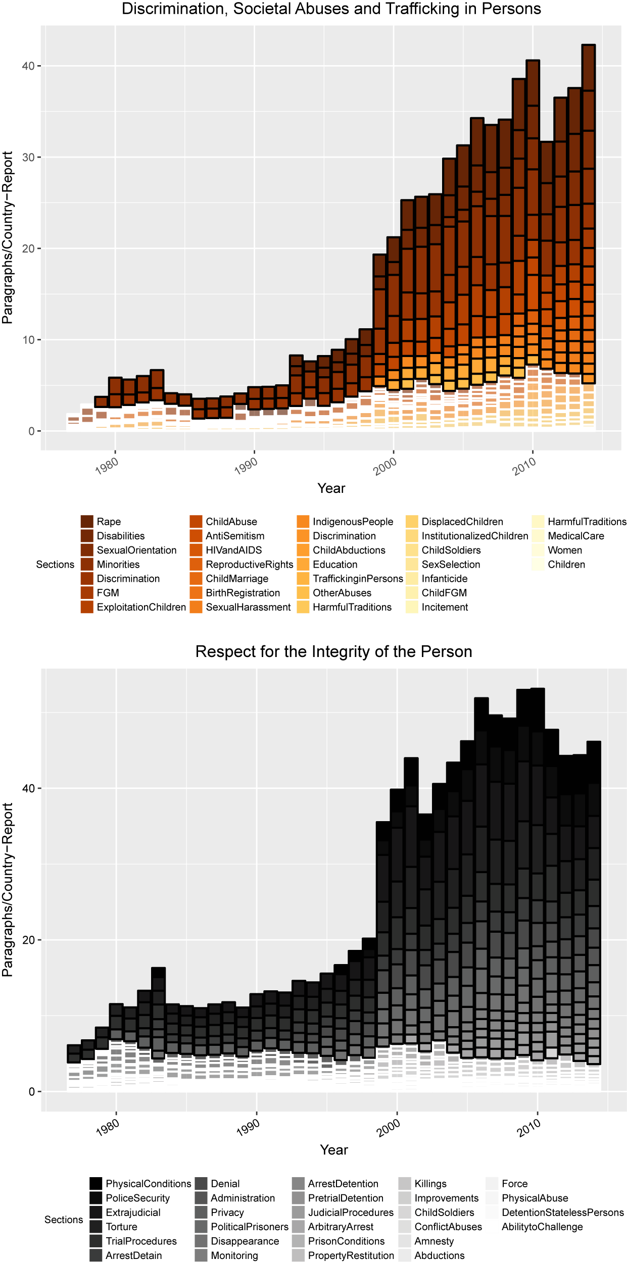
Next, we are interested in the evolution of the total amount of attention to all potential rights that we can detect across the structure of the reports.Footnote 28Figure 7 presents the number of paragraphs per country report that were classified across each specific 2015/2016 aspect category over time. We present charts for the two sections with the largest coverage; the other sections can be found in the Online Appendix.Footnote 29 We also visually demarcate the rights that are systematically compared across countries that meet our threshold (one paragraph per country in a given year) with a dark outline. If a right’s attention does not meet that threshold, it has a white border. These plots allow us to detect not only the increasing length in paragraphs of the reports over time but also the specific rights that receive increased attention in later (with higher availability of dense information) as opposed to earlier years (with lower availability of dense information).Footnote 30
There are substantial changes in several of the sections. The “Physical Conditions” aspect was the most discussed aspect of physical integrity rights in 2014, receiving roughly five paragraphs of coverage per country report, while in 1977 this right was hardly mentioned, receiving only 0.14 paragraphs per county report. The aspect “Sexual Exploitation of Children” in the Discrimination section showed a large increase in coverage from 2014, where it received roughly two paragraphs per country report, compared with 0.028 in 1977. In fact our model could barely detect any coverage before 1999.
Number of Paragraphs on Human Rights in the 2015/2016 Implicit Taxonomy
Change in the Paragraphs on High-resolution Aspect Categories
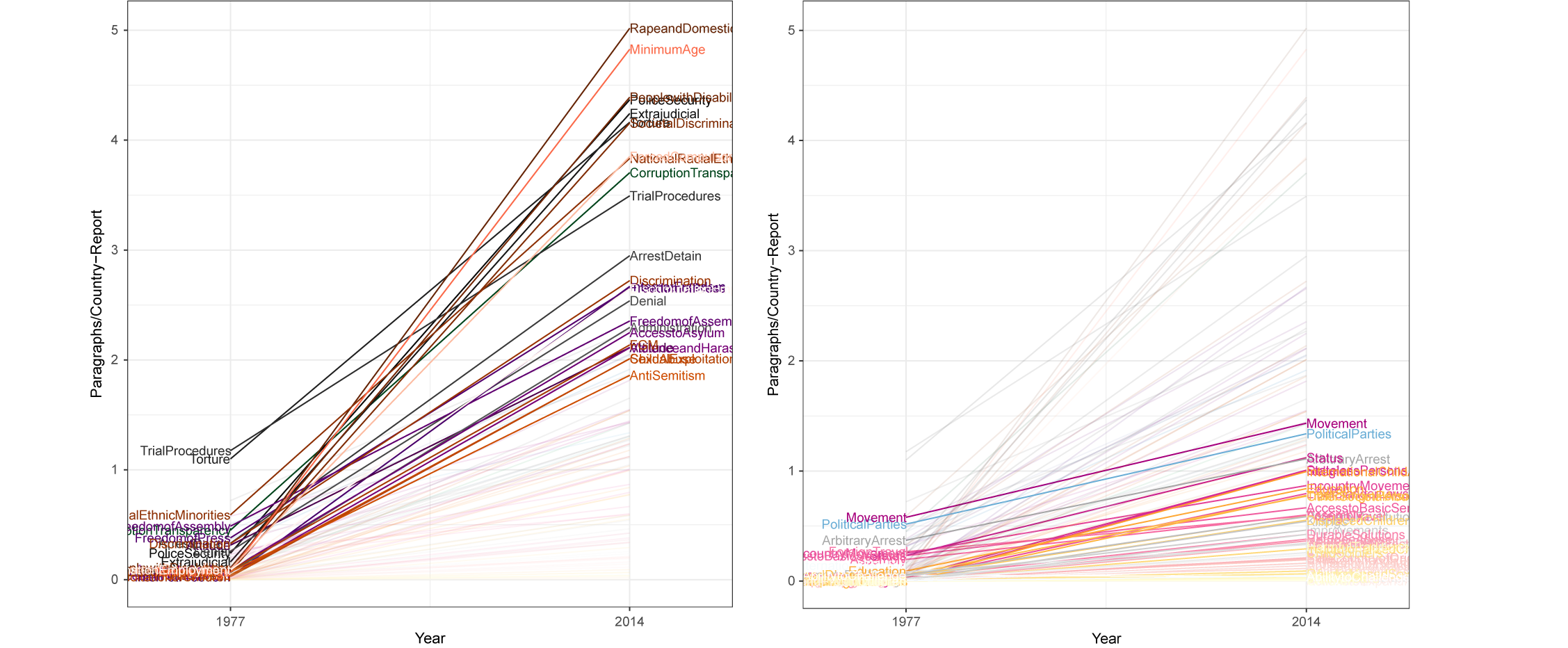
To clarify the changes over time, we provide a parallel coordinates plot in Figure 8 that presents the difference in the number of classified paragraphs per country report in 2014 and 1977 for the specific aspects that rose or declined by between one and four paragraphs per country report (left) and those that are more consistent (right).Footnote 31 The coverage of the “Rape and Domestic Violence” aspect sees one of the largest increases in coverage from older to more recent reports, as suggested by Clark and Sikkink (Reference Clark and Sikkink2013). In 2014, this right receives roughly five paragraphs per country report, while it receives almost no coverage in 1977. The coverage of the aspect “Minimum Age” of employment sees a similar increase in coverage. The plot on the right highlights aspects that have been consistently discussed across time. These include freedom of “In-Country Movement,” “Political Parties and Political Participation,” and “Arbitrary Arrest or Detention.”
Sharpness
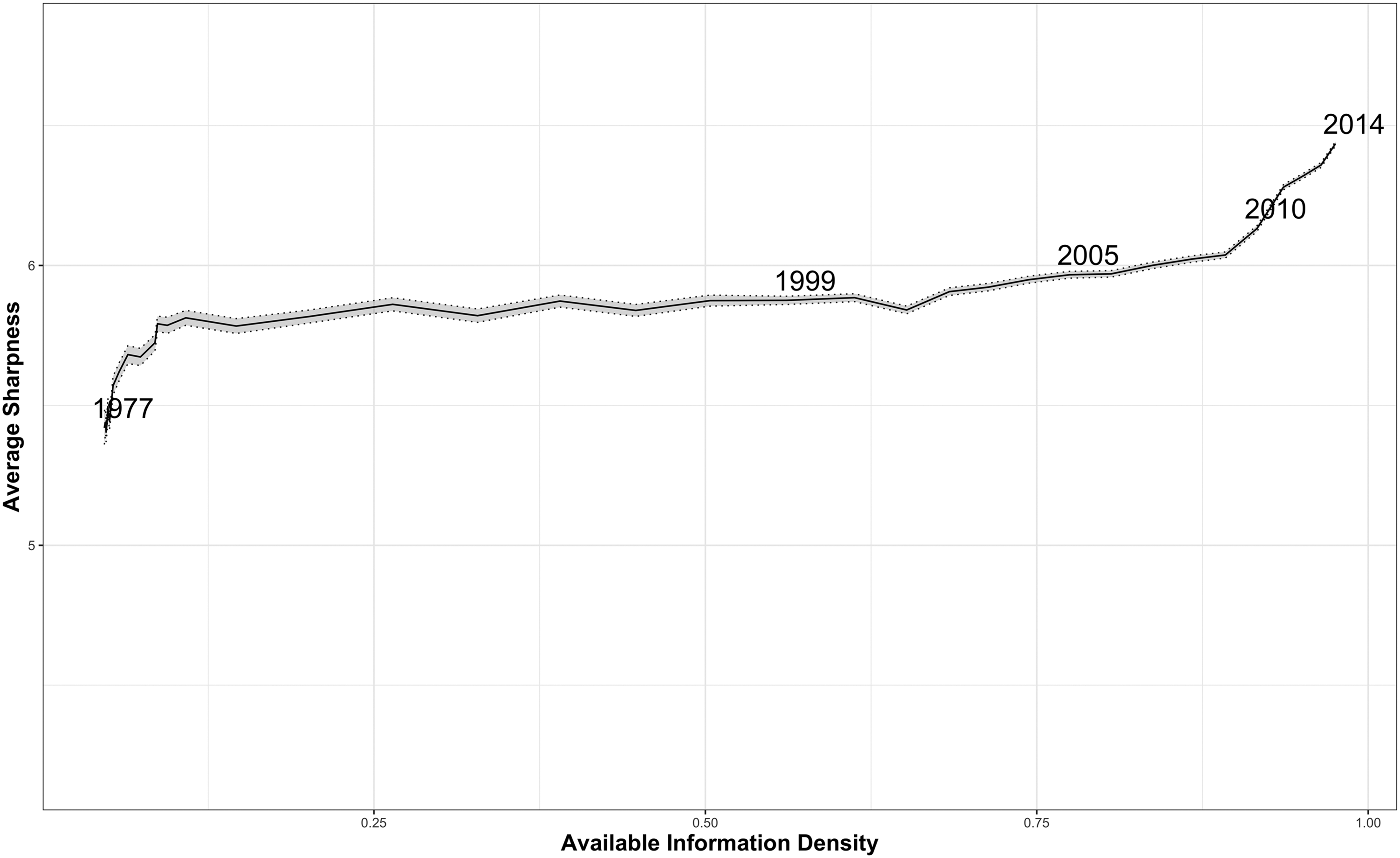
In our third conjecture, we suggested that increases in available information density will allow for sharper distinctions between concepts in the text. Our average sharpnessFootnote 32 calculation carries information as defined by Shannon (Reference Shannon1948), so it provides a nice connection to information effects and the denseness of distinctions that our model can detect in the texts.
Our evidence related to this question is presented in Figure 9. The maximum average sharpness that our predictions could theoretically hold is approximately 6.8 binary digits (bits).Footnote 33 The value in Figure 9 rises from 5.41 in 1977 to 6.43 in 2014. This one bit of sharpness information per paragraph has substantial meaning, as Shannon’s (Reference Shannon1948) information is additive. Thus, the same 1,861 paragraphs in the 1977 reports would carry 1,861 fewer bits, literally binary digits, than the same length of reports in 2014, due to the crisper language in the 2014 reports matching the detailed taxonomy. Moreover, since there are significantly more paragraphs in later reports, there are two sources of increasing information over time (a) longer reports that (b) simultaneously carry more information per paragraph. Our analysis suggests that the previous research that counted words in reports over time possibly undercounted the increases in information because the paragraphs have grown more informative. Our approximate calculation is that the 2014 report contains over 193,000 more bits of information than the 1977 report does.Footnote 34 This suggests that our model is less able to make clear predictions in earlier years, relative to later reports, supporting our conjecture concerning more information being included on more rights in later than in earlier reports. In the Online Appendix, we also present the results from an additional metric, which we call best-case proportional reduction in error, as an accuracy measure.
Average Sharpness of Our Predictions
Evidence from Amnesty International and Human Rights Watch
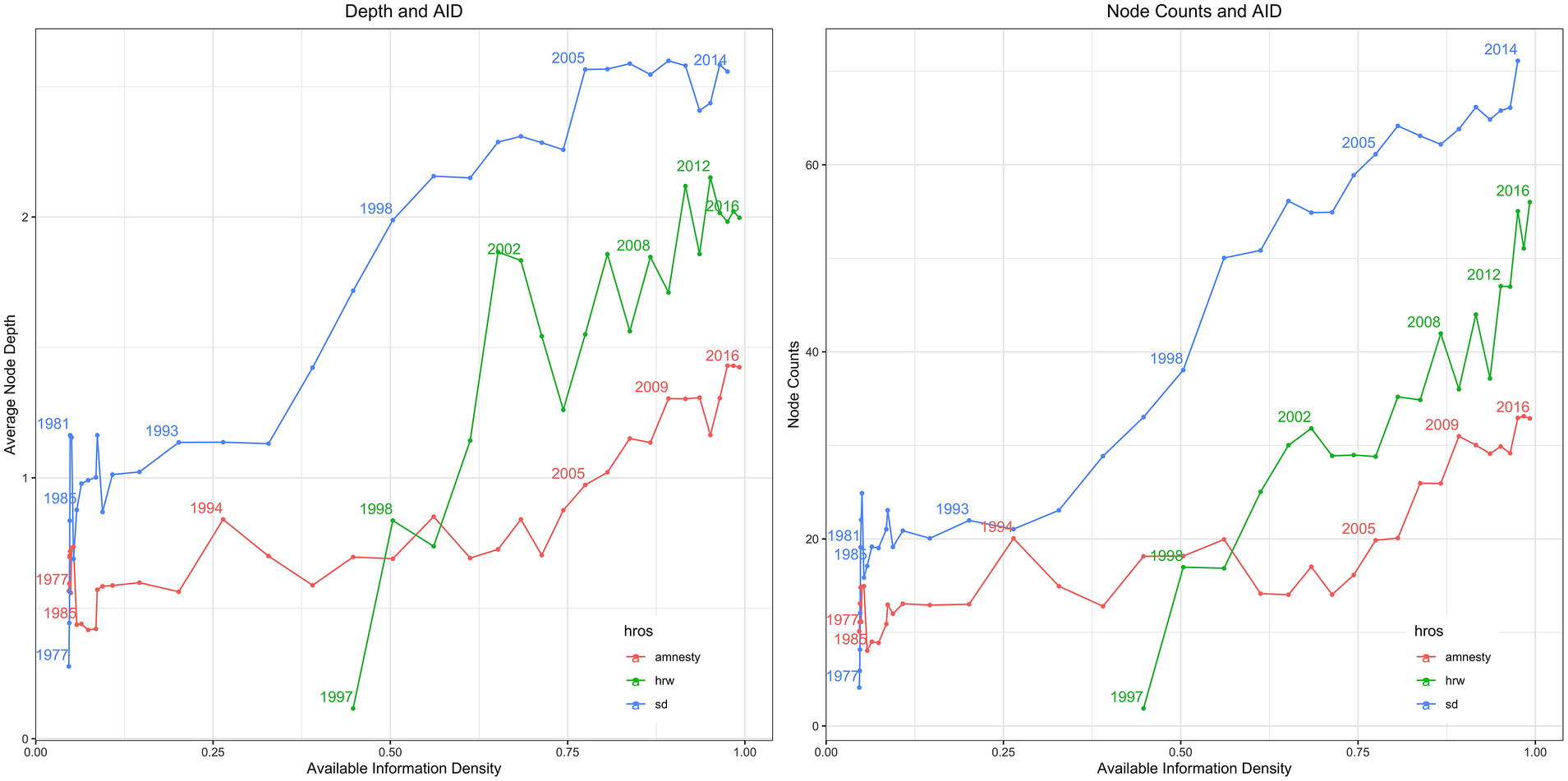
We do not believe that available-information density effects are only present in the US State Department Reports. As such, we generalize our research design and collect information from two other important corpora from monitoring agencies, Amnesty International Annual Reports (AI) (1977–2016) and press releases from Human Rights Watch (HRW) for the period 1997–2016. As discussed in the previous section, Amnesty International and Human Rights Watch are the most prominent international human rights nongovernmental organizations. However, AI and HRW do not have a comprehensive and explicit taxonomy structure included in their text that contains the same level of detail as does that of the US State Department. Thus, we use the nested set of all possible nodes from the State Department in training and make implicit predictions across that taxonomy for AI and HRW.Footnote 35Figure 10 shows how SD, AI, and HRW grew the number and depth of the rights, respectively, that they were judging as ICT evolved since 1977.Footnote 36Figure 10 illustrates an increasing plurality of human rights over time for not only the State Department but also for AI and HRW as information communication technology has expanded. Interestingly, the slope is most dramatic for HRW. Results for attention and average sharpness for these agencies are provided in the Online Appendix.Footnote 37 The overall patterns are consistent with the State Department findings. As available information density has risen, it has changed the structure of the taxonomy of rights being judged as well as the amount of attention to specific rights and the sharpness of the distinctions between these concepts.
Comparing the Taxonomic Structure of the State Department, Amnesty International, and Human Rights Watch Corpora
Comparisons across Monitoring Agencies and Implicit versus Explicit Taxonomies
Beyond demonstrating the ways in which changing information communication technologies have altered the taxonomies of implicit human rights being judged in texts over the last 40 years, our tools can help researchers probe the relative coverage of rights across monitoring agencies as well as compare explicit versus implicit coverage.
An Example of Comparing Rights Coverage across Monitoring Agencies: Iran, 2014
According to the Yearbook of International Organizations, there are more than a thousand international human rights organizations. Existing studies on HROs find that because of greatly different institutional, country-level backgrounds, resources, and clout, these legacies lead to differences in investigating and documenting states’ human rights practices and how they publish and release the collected information (Murdie Reference Murdie2014b; Stroup Reference Stroup2012; Stroup and Wong Reference Stroup2017).
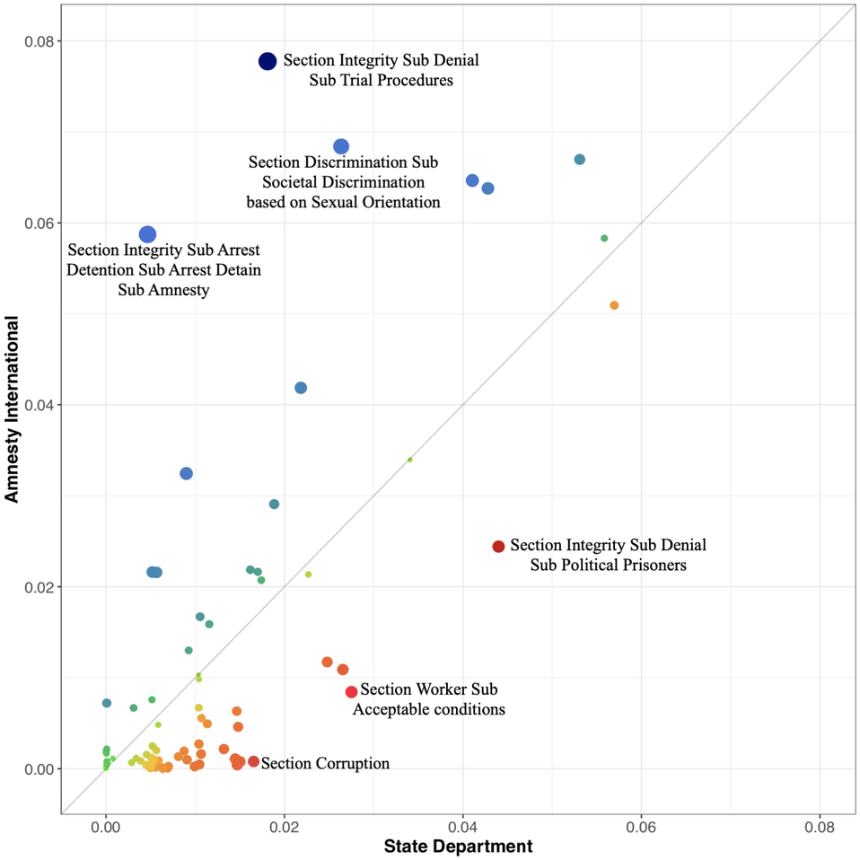
Our approach allows researchers to systematically discover, for the first time, which aspects of human rights each HRO pays attention to in a given country report. As one example, Figure 11 shows differences in the proportion of attention to specific rights within the State Department (x-axis) versus Amnesty International (y-axis) texts for the Republic of Iran in 2014.Footnote 38 Amnesty pays a significant proportion of their attention to the right to a fair trial and the administration and implementation of justice. In contrast, the State Department focused more of their attention on the issues of political prisoners or detainees as well as corruption. The tools we provide are available for researches to explore other country reports and test new hypotheses about differences in attention over time, without manually coding all of the underlying documents.
Amnesty International and State Department: Iran
The Mismatch between Implicit and Explicit Taxonomies
A use case for our tools and data that goes beyond testing for information effects in text is to allow researchers to compare the explicit rights that are signaled in the section headings of country reports versus our estimated implicit rights aspects that are discussed in the text. We are uniquely able to identify a paragraph that is highly likely to semantically signal content on physical integrity rights but appears explicitly in the section on political rights. One can imagine this comparison as an asymmetric confusion matrix, where each observation is the text of a paragraph. In later years, the explicit taxonomy nearly matches each node in  $$ {G}_{2015\_2016} $$; however, this does not mean that all of the text falls under the explicit section wherein it was labeled in the reports. We build a graphical tool that illuminates whether, for example, physical integrity rights judgments, often an important focus of human coding, can be found outside of that specific section. This has particularly important implications for the creation of human rights data because the codebooks for the Cingranelli and Richards (Reference Cingranelli and Richards2010) Human Rights Data Project and the Political Terror Scale instruct coders to search only specific sections of the reports for codable information on given human rights violations, thus creating the potential to miss meaningful information. At the same time, as the reports become increasingly longer, having humans closely read the reports is not necessarily practical. Therefore, our modeling approach could be used to guide reading across sections so relevant information is not missed. This can be used to improve both the accuracy and efficiency of the human coding of human rights violations and protections.Footnote 39 More conceptually, our tools can illustrate semantic connections between rights across nodes of the taxonomy. Some implicit rights concepts might co-occur with other explicit section labels systematically. Looking only at explicit taxonomies would not be able to uncover these cross-taxon connections
Based on the model that was trained on the 2015–2016 data ( $$ {G}_{2015\_2016} $$), we create an asymmetric confusion matrix that displays the explicit aspect labels on the x-axis and implicit aspect labels on the y-axis. The observations within the confusion matrix are the individual paragraphs from the text in that year. As with traditional confusion matrices, agreement between the implicit label (predicted label) and the explicit label (actual label) are found on the diagonal, while disagreements are found off the diagonal. An added benefit of our approach can be seen in the colored rectangles, each representing one of the seven main sections.Footnote 40 Looking for points off the diagonal (but within a colored area) can provide insights into semantic similarities between human rights aspects. In particular, this suggests that there are two distinct aspects of human rights within the same section that are conceptually similar.
Comparison of Implicit and Explicit Locations of Text Within the State Department Reports

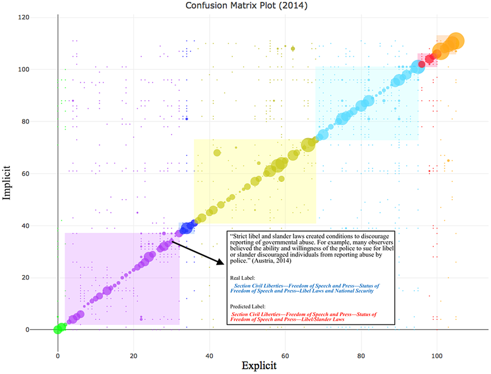
Here, we present the asymmetric confusion matrix for the year 2014 ( $$ {G}_{2014} $$). Figure 12 demonstrates how our approach can be used to explore where the implicit and explicit section labels for a given paragraph are congruent. In general, this information can be found by looking for paragraphs that fall on the diagonal. Within the application, a coder can simply mouse over a point to retrieve the explicit and implicit labels as well as the full text of the paragraph. Figure 13 presents a paragraph that is clearly about “Libel and Slander Laws,” and it categorized as such by both the implicit and explicit taxonomies.
Comparison of Implicit and Explicit Locations of Text Within the State Reports with an Example Showing Agreement Between the Implicit and Explicit Section Labels (2014 vs 2015/2016)
Comparison of Implicit and Explicit Locations of Text Within the State Reports with an Example Showing Disagreement Between the Implicit and Explicit Section Labels (1977 vs 2015/2016)
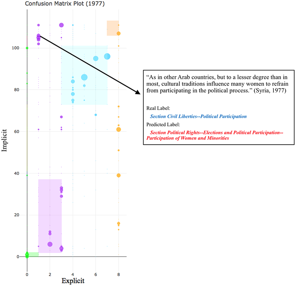
In Figure 14, we present the asymmetric confusion matrix for the year 1977 ( $$ {G}_{1977} $$). The x-axis is much shorter than the y-axis is because there were only nine explicit section labels for the year 1977, while the y-axis displays our model’s classification of each paragraph based on the 112 implicit section labels in the 2015–2016 data (
 $$ {G}_{2015\_2016} $$). The plot displays an example of disagreement between the implicit and explicit labels. The explicit label for the text is “Political Participation” within the “Civil Liberties” section. However, rather than being about political participation broadly, this paragraph (text) is about the more specific political participation of women, which our model identifies. We are able to classify this text as being about “Participation of Women and Minorities,” despite the fact that this specific section did not exist in the explicit taxonomy until 2011.Footnote 41 This provides some evidence that information on more specific rights is contained in the reports even as far back as 1977. Rather than attempting to read the entirety of the report, using this approach, human coders can focus their attention to paragraphs that fall off the diagonal. By using machine learning to indicate possible missed information and then having this information verified by human coders, we may be able to build more efficient and accurate coding of human rights (Colaresi and Mahmood Reference Colaresi and Mahmood2017).
Conclusion: Where Do We Go From Here?
Our analysis is consistent with the explanation that increased access to denser information over time—spurred by developments in open-source satellite imagery, access to social media, and the internet as well as the spread of smart phones—has led to changes in the taxonomy of human rights being judged in later as opposed to earlier reports. The plausibility of information-driven taxonomic evolution—across its structure, attention to particular rights, and the sharpness of the conceptual distinctions in the text—is crucial to moving the debate about the measurement of human rights forward (Cingranelli and Filippov Reference Cingranelli and Filippov2018a; Fariss Reference Fariss2019b). If information effects have led to judgments on different and potentially increasingly specific aspects in human rights over time, then any human or machine coding would need to account for those changes in the rights being judged. Simultaneously, comparisons across time need to be identified so that empirical information in the text of reports, for example, can uniquely update inferences (Fariss Reference Fariss2019b). Carefully tracking taxonomic changes is likely to produce improvements in both the validity and the reliability of downstream human rights scores and inferences.Footnote 42
As Fariss (Reference Fariss2019b) suggests, the validity concerns are clearest if we cast the measurement of human rights into an item-response theory framework (Clinton, Jackman, and Rivers Reference Clinton, Jackman and Rivers2004; Martin and Quinn Reference Martin and Quinn2002). Countries are analogous to respondents, each with an ability parameter or vector that would represent their latent protection of human rights. The human rights monitor sets “the test” for the respondent. To date, research has treated reports as though they were only asking a limited, consistent number of questions. For example, the Political Terror Scale (Gibney et al. Reference Gibney, Cornett, Wood, Haschke and Arnon2015) focuses on Physical Integrity Rights and grades the monitors’ text of a country’s answer, similarly to grading an essay, on a five-point scale. Likewise, the Cingranelli and Richards (Reference Cingranelli and Richards2010) human rights data grade human rights as though there were 15 questions, each being answered on a three-point scale.
The conventional approach to fixing human rights measurement over time assumes that the rights being judged in country reports across the years have remained static. This can be clearly seen in recent debates (Cingranelli and Filippov Reference Cingranelli and Filippov2018a; Fariss Reference Fariss2019b), where the axis of contention revolves around the usefulness of time-varying difficulty parameters on a given right (or set of rights).Footnote 43 The use of human-coded scores and external event-based measures to estimate evolving difficulty parameters ignores the possibility that the taxonomy of human rights that are monitored across time is also evolving. It may be not only the difficulty of a given right that is changing over time but also the differences in sets/taxonomies of rights that are judged in recent versus past reports.
In our reconceptualization of the data-generation process, each right that is being judged is an item or question, formulated by the monitor. The correctness of each country’s behavior related to a specific right defines whether there is a violation (wrong answer) or a protection (correct answer), perhaps with a signal of the intensity of the violation/protection, translated into language such as “widespread” or “systematic.” These written judgments, on specific items, represent the “grades” of responses in Item Response Theory (IRT) modeling. Our work highlights that judgments are not always offered on one general fixed right, like a right to physical integrity, but that there are different items noted across sections. Different subsections and paragraphs can speak to distinct rights within a larger taxonomy of human rights concepts.
Ignoring the taxonomy of rights in a given set of country reports is akin to assuming that all rights have the same difficulty.Footnote 44 However, if behavior is consistent across time but later taxonomies have more difficult items included within them, we would have observed worse judgments in later years, and not the consistent pattern in figure 1. Further, an analyst ignoring the differences across taxonomies, but only paying attention to judgment terms, would invalidly score countries as worse when it was the items that were changing. The way to correct this validity issue is to use tools like ours to track the taxonomies of rights that are operable in human rights reports over time and identify consistently scored rights.Footnote 45
Understanding the complexity and nested structure of human rights taxonomies over time also offers solutions to reliability concerns. Rights that share parents, for example “Extrajudicial Killings” and “Torture,” are likely to have similar judgments, all else being equal. Thus, taxonomic information supplies a hierarchical structure that can be used to adaptively shrink estimates back towards a common value (Gelman et al. Reference Gelman, Carlin, Stern, Dunson, Vehtari and Rubin2013) Additionally, our open-source tools, when fed the same information, will output the same rights labels, which will not always be the case for human-coded rights taxonomies.Footnote 46
Our research suggests that newly available dense information on human interactions raises not only privacy issues but also measurement concerns that are broadly applicable. The influence of social media, satellite imagery, internet adoption, and smart phones has changed the density of available information that is encoded in variety of texts, including human rights reports, but potentially also news reports, government cables, and other nongovernmental and intergovernmental organizations’ media. Thus, similar forms of information effects, with deepening attention to sharper taxonomies, are likely to be part of the data-generation processFootnote 47 across varied domains in the social sciences including event data, protests, international events, and the counting of battle-related deaths. However, we have demonstrated that changing information environments can leave important characteristic fingerprints within texts. These patterns can be detected and used to explore and correct for ICT changes over time.
Supplementary Materials
To view supplementary material for this article, please visit http://dx.doi.org/10.1017/S0003055420000258.
Replication materials can be found on Dataverse at: https://doi.org/10.7910/DVN/CCGPUQ.


 Open access
Comments
No Comments have been published for this article.